Colour palette analysis
11
Colour palette analysis By Ollie Davison
-
Upload
davo28 -
Category
Social Media
-
view
70 -
download
0
Transcript of Colour palette analysis

Colour palette analysisBy Ollie Davison

Warm Antique
This is a monochromatic colour scheme, meaning that different shades of one hue are used, often with the darkest colour being the base with different shades of lightness on top. This would be suitable for a women's fashion magazine as it is a similar palette seen in magazines such as ‘Vogue’. I don’t believe I will use this though as I will be creating an indie genre magazine where these colours will not be appropriate.
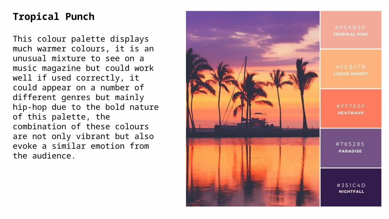
Tropical Punch
This colour palette displays much warmer colours, it is an unusual mixture to see on a music magazine but could work well if used correctly, it could appear on a number of different genres but mainly hip-hop due to the bold nature of this palette, the combination of these colours are not only vibrant but also evoke a similar emotion from the audience.

Vintage Sundown
This is another more subtle colour scheme, it represents a calmer and more soothing tone, therefore it would be unsuitable for high tempo music such as hip-hop or rap, it would suit slower music such as blue-eyed soul which is produced by artists such as Adele and Sam Smith.

Marigold Mix
This is a yellow based palette, yellow is a colour traditionally associated with happiness and so would work well with genres of music associated with the same. Indie music is a genre that is often associated with happy ‘feel good music’ and so would work well with this palette, similarly pop music traditionally promotes values of happiness and so would also be an appropriate genre of music to use this palette for.

Nordic Woods
This is a rustic combination of brown and blue based tones, when teamed together they make a masculine palette perfect for a male audience, therefore it would suit traditionally male orientated genres such as hip-hop or rap. The subtle colours allow for many different angles and themes to be used in creation of the magazine.

Green and Gold
This palette includes colours drawn from nature. The addition of the colour gold gives the combination some nuance and creates a little more contrast between the hues, giving impact when applied as text over a background. The more vibrant nature of this palette would make it more suitable for dance or pop genre based music magazines.

Afternoon Delights
Usually blue based colours create a cold mood, however this palette has been combined with two warmer tones (linen and raisin) to take the edge off. It is a modern combination which would best represent emerging new artists across a variety of genres as its ’new’ look would represent new artists well.

French Connection
This tonal combination is a blue based gradient of colours. The Gunmetal and Cashmere swatches contain a hint of warmness which offsets against the coolness of the blues nicely. The combination of the two tones means that it’s gender-neutral. This palette would be best suited to genres of music that do not lean toward appealing to one specific gender ad would be perfect for promoting bands such as Oasis or Arctic Monkeys.

Morning Mist
Dense hues form a strong, masculine combination and the easy transition from swatch to swatch creates a calming effect. These colours are Analogous which means they sit near each other in the colour wheel. This palette would work well with hip-hop or indie magazines.

Greek Salad
These are solid hues that offset well against one another and create impact. The inclusion of a strong rich tone (tomato) from an opposing side of the colour wheel creates a stand out colour that would work well for a masthead. These are bold colours that would work well for bold types of music such as is produced by bands such as ‘The Wombats’ or ‘The Courteeners’.