
Cities as Six-by-Six-Mile Squares: Zipf’s...
38
Cities as Six-by-Six-Mile Squares: Zipf’s Law? Thomas J. Holmes ∗ Sanghoon Lee †,‡ December 2008 Abstract In existing work on city size distribution, differences in population across cities arise on two margins: First, one city might encompass more land area than another. Second, one city might have higher population density per unit of area. This paper shuts down the first margin and looks only at the second. The paper divides the United States into a grid of six-by-six-mile squares and examines the distribution of population across these units. It uncovers several regularities and relates these to Zipf’s law. Gibrat’s law does not hold with squares. ––––––––––––– ∗ University of Minnesota, Federal Reserve Bank of Minneapolis, and the National Bureau of Economic Research. † Sauder School of Business, University of British Columbia. ‡ We thank NSF Grant 0551062 for research support. We are grateful to conference volume editor Ed Glaeser for his detailed and helpful comments. We thank Joel Waldfogel for his comments as a discussant at the NBER Agglomeration Conference. We received many helpful comments from the conference participants, including, in particular, a comment by Gilles Duranton. We thank Jan Eeckhout, Xavier Gabaix, and Erzo Luttmer for feedback. We thank Julia Thornton and Steve Schmeiser for research assistance. The views expressed herein are solely those of the authors and do not represent the views of the Federal Reserve Bank of Minneapolis or the Federal Reserve System.
Transcript of Cities as Six-by-Six-Mile Squares: Zipf’s...

Cities as Six-by-Six-Mile Squares: Zipf’s Law?
Thomas J. Holmes∗ Sanghoon Lee†,‡
December 2008
Abstract
In existing work on city size distribution, differences in population across cities arise on two
margins: First, one city might encompass more land area than another. Second, one city
might have higher population density per unit of area. This paper shuts down the first
margin and looks only at the second. The paper divides the United States into a grid of
six-by-six-mile squares and examines the distribution of population across these units. It
uncovers several regularities and relates these to Zipf’s law. Gibrat’s law does not hold with
squares.
–––––––––––––∗University of Minnesota, Federal Reserve Bank of Minneapolis, and the National Bureau of
Economic Research.
†Sauder School of Business, University of British Columbia.
‡We thank NSF Grant 0551062 for research support. We are grateful to conference volume editor
Ed Glaeser for his detailed and helpful comments. We thank Joel Waldfogel for his comments as
a discussant at the NBER Agglomeration Conference. We received many helpful comments from
the conference participants, including, in particular, a comment by Gilles Duranton. We thank Jan
Eeckhout, Xavier Gabaix, and Erzo Luttmer for feedback. We thank Julia Thornton and Steve
Schmeiser for research assistance. The views expressed herein are solely those of the authors and
do not represent the views of the Federal Reserve Bank of Minneapolis or the Federal Reserve
System.

1 Introduction
Economists analyzing urban economics questions commonly use geographic units from the
Census Bureau, e.g., Metropolitan Statistical Areas (MSAs). The Census Bureau, in turn,
typically uses arbitrarily defined political boundaries to construct its reporting units. The
Census Bureau must satisfy numerous constituents with its reporting. In its determination
of reporting unit boundaries, the Census Bureau would not be likely to place a high priority
on what would be best for research in urban economics. Put another way, there is a high
probability of measurement error between the economic units that researchers want and the
reporting units such as MSAs that the Census Bureau provides.
A question in urban economics that has attracted much attention is the extent to which
the size distribution of cities obeys Zipf’s law.1 If Zipf’s law holds perfectly, then when we
rank cities and plot the log of the rank against the log of the city population, we get a
straight line with a slope of one. Equivalently, the largest city is twice as big as the second
largest, three times as big as the third largest, and so on (the rank-size rule). Researchers
who have used MSAs to define cities, such as Gabaix (1999), have found that Zipf’s law
holds to a striking degree. But what does it mean to say that Zipf’s law holds when the
boundaries are determined by bureaucrats and politicians?
We are concerned about how to interpret Zipf’s law results with these data for three
reasons. First, MSAs are aggregations of counties, and the county is a crude geographic unit
for such a building block. In some parts of the country, counties cover an extremely large
land area, and locations get wrapped together as an MSA that clearly does not comprise
a coherent metropolitan area.2 We note that even if measurement error is unsystematic,
it causes potential problems for a study of the size distribution because the distribution
with measurement error is, in general, different from the one without it. Second, we are
particularly concerned about how boundaries are drawn for the largest cities. These cities
can often be found in densely populated parts of the country where MSAs form contiguous
blocks, such as the Northeast Corridor extending from Washington DC to Boston. It is often
1See Gabaix and Ioannides (2004) for a literature survey.2This point about MSAs is well appreciated in the literature. See, for example, Bryan,
Minton, and Sarte (2007) for a recent discussion.
1

a tough call determining whether a given area should be classified as one or two MSAs and,
if the latter, where to delineate the boundary. If bureaucrats tend to use broad definitions
of MSAs that subsume contiguous areas into single large MSAs, this process may itself
contribute to the findings of Zipf’s law. Third, with MSA data we leave out approximately
20 percent of the population not living in MSAs. So we do not see what is going on with
small cities, the left tail of the size distribution.3 Eeckhout (2004) has recently advocated
looking at the left tail by using data on Census places that include very small towns. But as
argued below, Census places are heavily dependent on arbitrary political decisions of where
to draw boundaries.
Our paper considers a new approach to looking at population distributions that sweeps
out any decisions made by bureaucrats or politicians. When comparing populations of ge-
ographic units, we can think of differences as falling along two margins. First, one unit
can have a larger population than another because it encompasses more land area, holding
population density fixed. Second, a unit can have larger population on a fixed amount of
land, i.e., higher population density. In our analysis of the size distribution, we completely
eliminate the first margin and allow only the second. We cut the map of the continental
United States into a uniform grid of six-by-six-mile squares (and some other size grids as
well) and examine the distribution of population across the squares. We document several
regularities that are robust to various ways of cutting the data. We also examine the extent
to which Zipf’s law holds for squares.
Our first result is that the extreme left tail of the distribution looks approximately
lognormal–roughly, a bell curve. With the Zipf distribution, there are always more smaller
cities than bigger cities; there is never a bell curve with a modal point below which the
density of log population decreases as size decreases. This works well on the right tail of
the distribution (e.g., there are more squares with 50,000 people than with 100,000) but
does not work well around the left tail. This point can be highlighted by a discussion of the
extreme cases of squares with population one and two. There are 713 squares with exactly
one person (a bachelor farmer, a forest ranger) living in them. A much larger number of
3The Census recently released data on what are called Micropolitan Areas, essentiallymoderate-sized counties that do not qualify as MSAs. So our concern that the county is acrude geographic unit applies here.
2

squares (1,285) have exactly two people living in them. (Perhaps a forest ranger couple?)
Given priors about scale economies and basic agglomeration benefits, it not surprising that
squares with one lonely person in them are rarer than squares with two. The recent literature
has not focused on scale economies and agglomeration benefits to try to understand the size
distribution; instead it has focused on the impacts of cumulative random productivity shocks
(e.g., Gabaix 1999 and Eeckhout 2004). We suspect that to understand the shape of the ex-
treme left tail of the distribution of squares, issues of scale economies and agglomeration are
of first-order importance.
Our second result throws out the extreme left tail and looks at the distribution of pop-
ulation across squares with population 1,000 or more. Approximately 24,000 squares meet
this population threshold, and these squares account for 28 percent of the surface area of
the continental United States. We construct a Zipf plot and find a striking pattern. To a
remarkable degree, the plot is linear until it hits a kink at square population around 50,000.
Below the kink the slope is approximately .75; above the kink the slope is approximately
2. This piecewise linear function fits the data extremely well. Moreover, when we split the
data by region and make a Zipf’s plot in each individual region, the same piecewise linear
relationship shows up with the kinks in approximately the same place. Our results are not
like the standard Zipf’s law findings, and the objects we are looking at–with no variation
on the land area margin–are different from the standard objects people look at. But we find
our results intriguing in the same way that the usual Zipf’s law findings are intriguing.
The third result concerns the extent that Gibrat’s law for growth rates holds with squares.
Under a typical statement of Gibrat’s law, the mean and variance of growth is independent
of initial size. Gibrat’s law does not hold for squares. The relationship between growth and
size is an inverted U, the smallest and the largest population squares having the lowest
growth rates. It is not surprising that the highest population squares have a low growth rate,
since these areas typically are fully developed and little vacant land is available for further
growth.
Our fourth result links our findings to results in the previous literature about Zipf’s law
for MSAs. As mentioned, the main finding in the literature is that when we look at the upper
tail of the MSA’s size distribution, the regression coefficient of log rank on log population
3

equals one. Now, if we were to replace MSA population with MSA average density in the
regression, we do not necessarily expect to get a coefficient of one because it depends upon the
elasticity of MSA surface area to MSA population. If this elasticity equals one-half (which
is approximately what we find it to be), then the expected slope coefficient on density is
actually two rather than one. This is, in fact, our approximate result when we replace MSA
population with MSA density. This is also our result when we use the maximum density
square, rather than the average density, in the MSA. We find it interesting that the slope
we are getting in the right tail of these MSA-level regressions is similar to the slope we
get in the right tail of the square-level regressions (i.e., the slope to the right of the above-
mentioned kink). We interpret this result as evidence of some kind of fractal structure, where
the distribution of average density of the right tail of MSAs is similar to the distribution of
the right tail of squares within MSAs, which in turn is similar to the distribution of the right
tail of squares across all of the continental United States.
Given our wariness about using theMSA surface area measure, we are somewhat surprised
that when we use it to construct average MSA density, we get numerical results that we can
connect to our results with squares. Perhaps the bureaucrats are doing a reasonably good
job after all. Even if they are, our analysis of squares rather than MSAs is still interesting
because we are looking at something different from the previous literature with new insights.
The fractal pattern of the right tails–across MSAs similar to squares within MSAs similar
to squares across the continent–suggests an underlying common explanation. The dominant
explanation in the recent literature of the size distribution of MSAs is the random growth
explanation of Gabaix (1999),4 but it certainly cannot explain the size distribution of squares
within MSAs and squares across the continent. For one thing, Gibrat’s law does not hold
for squares as noted above, and Gibrat’s law is needed to get the random growth theory
to work. For another, it is clear that the size distribution of squares within MSAs is better
understood by economic theories like the Alonzo-Muth-Mills monocentric model of the city
than a random growth theory. We believe that a unified theory of the size distribution of
squares within MSAs and across MSAs will have to incorporate economic factors like scale
economies and include an explicit spatial structure. See Hsu (2008) for an attempt to do
4For related work on firms, see Luttmer (2007).
4

exactly this.
The closely related work of Eeckhout (2004) merits further discussion. He made a com-
pelling case that the use of MSAs truncates out low population areas, and he suggested the
use of the Census place as a way to see what is happening at the bottom tail of the dis-
tribution. Interestingly, Eeckhout found that the distribution of places is lognormal rather
than Zipf. However, we are even more concerned about the use of Census places to define
geographic boundaries than we are about the use of MSAs. First, only 74 percent of the 2000
population actually lives in what the Census calls a place; the rest of the population are in
unincorporated areas.
Next, consider Table 1. To construct it, we take a list of all Census places from the 2000
Census (Eeckhout’s data) and tabulate all those places with population five or less. Two
places in the Census file have exactly one resident (including Lost Springs, Wyoming), and
two places have population equal to two, including Hove Mobile Park City, North Dakota.
The arbitrary decision that Lost Springs with its one resident is considered a place, while a
farmhouse in an unincorporated area with a family of five living in it is not a place of five
people, is dependent upon legal particulars that are not likely to be of interest in our analysis
of city size distributions. These concerns arise at the top of the size distribution as well. St.
Paul and Minneapolis in the Twin Cities are adjacent to each other and are different Census
places, since they have never merged. Manhattan and Brooklyn are part of the same Census
place (New York City) because they merged in the nineteenth century. Our six-by-six-square
analysis pulls in all of the land in the continental United States and treats it in a uniform
way: the one resident of Hove Mobile Park City is on equal footing with a bachelor farmer
in an unincorporated area, and New York City is treated the same way as the Twin Cities.
Many others have noted the inadequacies of MSA definitions for various research ques-
tions and have used geographical techniques to improve upon these boundaries. For example,
Duranton and Turner (2008) use buffers around 1976 settlements within MSA boundaries
to obtain more meaningful MSA definitions for their analysis of urban growth and trans-
portation. Others have used rich geographic data to determine the location of employment
subcenters. (See Anas, Arnott, and Small 1998 and McMillen and McDonald 1998.) In prin-
ciple, rather than fix squares like we do, it might be possible to draw some kind of optimal
5
city boundaries to let the land margin back in. We view this approach as fruitful and comple-
mentary. But once the economists take the job of drawing the metropolitan boundaries away
from the bureaucrats, we need to worry about the mistakes the economists might make. For
this reason, we think it is useful to nail down what happens when we completely eliminate
the land margin across locations, as we do here.
While the focus of our work is the size distribution and Zipf’s law, our work also makes
a broader point that research in urban economics should not be constrained by standard
geographic units handed to us by statistical agencies. The Census releases population data
at an extremely high level of geographic precision–the block level (which in urban areas is
a city block or an apartment building)–so there is great flexibility in choosing boundaries.
Moreover, such analysis is facilitated by advances in GIS software. We therefore have great
flexibility in defining the boundaries to be whatever we want them to be. In many applica-
tions in urban economics, researchers might be well served by defining their own boundaries
rather than using the off-the-shelf boundaries. The construction of segregation indices is
one example. Other papers highlighting the flexibility of continuous geographic data include
Duranton and Overman (2005) and Burchfield et al. (2006). Another related work is the
G-Econ database, which contains the worldwide geographic distribution of economic activity
(GDP) on a one degree latitude by one degree longitude grid (Nordhaus et al. 2006).
2 Data
We draw a grid of six-by-six-mile squares across the map of the continental United States.
A map is a two-dimensional projection of the three-dimensional globe, and the square grid
may look different on maps using different projection methods. We use the USA Contiguous
Albers Equal Area Conic projection method, which preserves area size: the size of an area
on a map is equal to the real size of the area on the globe.5
We use six miles for our baseline because in the first version of this paper, we used the
original township grid of six-by-six-mile squares. This grid was laid down in the early 1800s
5This may not be true in maps using other projections. For example, maps using Mercatorprojections present Greenland as being roughly as large as Africa, but Africa is about 14times as big as Greenland.
6

by the Public Land Survey System (PLSS) for the purpose of selling federal lands. (See
Linklater 2003 and Holmes and Lee 2008.) That was a good place to start, but we eventually
realized that drawing our own grid would be much cleaner. That way, we could cover states
that were otherwise left out (e.g., the original 13 states were not surveyed because there were
no federal lands to sell). Moreover, the original survey done with chains and landmarks was
sloppy compared to what we can do now on a computer. We have to anchor the grid at some
place, but as we show later, shifting the grid up or down or left or right is irrelevant. As
discussed in Section 7, a large enough change in the grid size can make a difference, but not
a small change.
The grid has 85,527 squares, each exactly 36 square miles, summing up to 3.1 million
square miles of the continental United States. Figure 1 illustrates the grid in the vicinity of
New York City. Note the six-by-six squares along the coast project into the water. We treat
these areas as full six-by-six-mile squares and do not distinguish between dry land and water
when delineating the surface area within the square. We make no distinction because people
can live on the water (e.g., on houseboats) in some cases more easily than they can live on
dry land, particularly in remote desert areas. We return to the water issue in Section 7.
We use the population data from the 2000 and 1990 Decennial Census reported at the
level of the Census block. In urban areas, a Census block is a city block or an apartment
building. For 2000, there are 7 million Census blocks in the continental United States. Of
those reporting any population, the area of the median Census block for 2000 equaled .014
square miles, a tiny unit of land compared to a six-by-six square. The 95th percentile of
block area equals 1.43 miles, still a small amount. The Census Bureau reports the longitude
and latitude of a point within the boundaries of each Census block, and we use this point to
map each block into a six-by-six square. Figure 2 illustrates the location of Census blocks in
the vicinity of New York City. In this area, a thousand or more blocks can be assigned to a
particular square.
We need to address the possibility of measurement error in the allocation of population
to squares. A block boundary might cross the boundaries of a six-by-six square, and when
this happens, someone living in the block on one side of the boundary can be mistakenly
allocated to the six-by-six square on the other side. Because blocks are typically very small,
7

this issue is negligible, except in a few extreme cases. To get some sense of this issue, we
determine for each of the 280 million people in the population what six-by-six square they are
assigned to and the number of block groups assigned to the same six-by-six square. The first
percentile of this statistic is 35 blocks. This means that all but 1 percent of the population
live in six-by-six squares with at least 35 blocks assigned to them. Now 35 blocks will trace
out a fairly clean square. The 5th percentile is 74 blocks, the 50th is 719, and the 75th is
1609. We are confident that for 99 percent of the population, our assignment is very good.
We note that even in remote rural areas, the Census typically defines blocks at a fine level
of granularity.6
To compare our results with what comes out of the traditional approach with MSA-level
data, it is useful to aggregate our squares to MSAs. We allocate squares to the MSAs as
defined for the 2000 Census. In certain metropolitan areas, the Census offers a choice of
consolidated areas (e.g., the New York CMSA) versus a breakdown into component areas.
We use the consolidated definitions. There are 274 different such MSAs in the continental
United States. We allocate squares to MSAs according to the following rule. A square gets
assigned to an MSA if any block in the square is part of the MSA. In the event a square is
at a boundary where MSAs overlap in the square, we assign the square to the MSA with the
largest surface area based on blocks.
Table 2 presents summary statistics of how population from the 2000 Census varies across
squares. Mean population across the 85,527 squares is 3,269. Population is highly skewed with
two squares in the New York MSA having 1.3 million in population. The area unit used in
the analysis to calculate density is the six-by-six-mile square. So each square has one unit of
area, and the population density equals the population.
Table 2 also presents summary statistics for the 274 MSAs. Mean density is 7,881 per
square, which is twice the density of squares overall. The mean number of squares across
MSAs is 87, with the minimum being 14 and the maximum being 981 squares. So clearly
6In a relatively small number of cases, a square has only one block group assigned to it.There are 592 such blocks accounting for 20,000 people (out of 280 million). These look likeunusual and exceptional cases rather than just simply rural cases. Of these 20,000 people,5,677 are in the 29 Palms military base in California. The base is in a Census block covering272 square miles. Another block is in the Mohave Desert. Others are in national parks andnational forests.
8
the square is a much smaller geographic unit than the MSA. The maximum land area is
attained by the Las Vegas MSA, which is a good example of the limitations of Census MSA
definitions. The surface areas of counties in Nevada are huge. Since the Census uses the
county as a building block unit for MSAs, much of the surrounding area that is not actually
part of the Las Vegas metropolitan area is folded into the MSA bearing its name.7
3 Background Equations
Discussing some background equations on the size distribution is useful. Following the
notation of Gabaix and Ioannides (2004), let Si denote the population size of city i and
suppose the distribution of populations across cities is Pareto:
Ranki = P (Size>Si) =a
Sζi
. (1)
Taking logs, we get
lnRanki = ln a− ζ lnSi. (2)
The slope ζ is called the tail coefficient. Zipf’s law is said to hold if ζ = 1.
Let Li be the land area of city i and the population density Di be
Di =SiLi.
The analysis remains in a log-linear form if there is a constant elasticity η relationship
7Another example of this problem with huge counties is the case of the Flagstaff MSA inArizona. The city of Flagstaff is located in the geographically huge Coconino County (over18,000 square miles). The Census classifies the whole county as the FlagstaffMSA. Flagstaffis the third largest MSA by land area. Cities quite distant from Flagstaff, including TubaCity (78 miles) and Page (119 miles), are folded into the FlagstaffMSA because they happento be in this county. A large percentage of the Flagstaff MSA population reported by theCensus comes from distant places like these that clearly are not part of the economic unit ofFlagstaff city. Researchers might be tempted to use the city boundaries of Flagstaff ratherthan the MSA boundaries. But this raises the issue of the often arbitrary political decisionsthat determine municipal boundaries.
9
between land and population,
Li = γSηi .
Taking logs yields
lnLi = ln γ + η lnSi. (3)
Solving the above for lnSi and substituting into (2) yields
lnRanki =
"ln a+
ζ
ηln γ
#− ζ
ηlnLi. (4)
This is a Zipf’s relationship using land instead of population. Note the slope is ζ/η, not ζ.
In the special case where population density is constant across cities (e.g., each individual
inelastically demands one unit of land), then η = 1 and the slope coefficient for the land
regression (4) is identical to the slope coefficient for the population regression (2). But
otherwise in the empirically relevant case where η < 1, the slope is higher for the land
regression than the population regression.
Analogously, using lnDi = lnSi − lnLi and (3), we can solve for lnSi in (2) in terms of
lnDi to get
lnRanki =
"ln a− ζ ln γ
(1− η)
#− ζ
1− ηlnDi. (5)
This is a Zipf’s plot for population density. The tail coefficient is ζ/ (1− η). If Zipf’s law
holds so that ζ = 1 and if η < 1, then this slope will be greater than one.
Next consider squares. Let the squares be indexed by j, and let sj be the population of
square j. Let Ai be the set of squares that are in city i. Then city population, land area, and
density equal
Si =Xj∈Ai
sj.
Li = Number of squares in Ai,
Di =SiLi= mean sj, j ∈ Ai.
10
In general, the relationship between the size distribution of the squares sj and of the cities
Si is quite complicated, except for the special case where each square is a city. We leave to
future research a theoretical analysis of this relationship and focus instead on a descriptive
analysis of the distribution of the squares sj and how it compares to the distribution of
MSA-defined cities.
We are able to make one immediate observation. Let smaxi be the highest population
square in city i,
smaxi = maxj∈Ai
sj.
If the maximum density square is proportionate to the overall city population density,
smaxi = λDi, (6)
and if we replace Di in (5) with smaxi , then we obtain the same slope coefficient. This
is interesting because the maximum population square is more reliably measured than the
average population density of anMSA. The latter heavily depends upon where the boundaries
are drawn. Typically, there is rural land at the boundary of an MSA so the wider the
boundaries are drawn, the lower the overall MSA population density. The smaxi variable is
determined in the interior of the MSA, the “central business district,” far from the boundaries
of the MSA. So it will not be affected if the MSA boundary is arbitrarily increased 20 miles
out or 20 miles in.8, 9
4 The Size Distribution of MSAs
As a benchmark, this section examines the size distribution of MSAs. Following Gabaix
(1999), we focus on the 135 largest MSAs, treating this area as the upper tail of the distri-
bution.
Figure 3 presents three Zipf plots. Panel A is the standard plot where we use population.8The MSA boundaries still impact the smaxi measure if the Census merges two MSAs into
one.9One issue with smaxi one could raise is that it might depend on where the grid is positioned.
We show below that we can shift around the grid and our results with smaxi do not change.
11

Panel B replaces population with land area as in (4); panel C replaces population with density
as in (5).10 Table 3 reports estimated slope coefficients. As is common in the literature, we
estimate the tail index two ways: standard ordinary least squares (OLS) and the Hill method
(the maximum likelihood procedure under the null hypothesis that the distribution is Pareto).
See Gabaix and Ioannides (2004) for a discussion of econometric practice in this literature.
As recommended in this work, we use simulation methods to estimate the OLS standard
errors because the usual method yields biased estimates. Zipf’s law for the population holds
in a striking fashion. The OLS estimate of the slope coefficient for the population regression
is 1.01. The fit is excellent, as can be seen by the straight line in Figure 3 and by the R2 of
.988 in Table 3.
The Hill estimate of the population coefficient is .94–a little less than one. But the
estimated standard error is .07, so we cannot reject that the slope equals one with a standard
statistical test. Here and elsewhere in the paper, the Hill estimates are a little smaller than
the OLS estimates and have a higher estimated standard error, but are otherwise similar.
Since the OLS and Hill estimates are basically telling the same story, for the rest of the
paper we will discuss just the OLS estimates in the text but report both in the tables.
The OLS slope coefficients on land and density are 1.70 and 1.90, respectively. Straight
lines fit reasonably well. To relate this result to the equations in the previous section, we look
at the relationship between land area and population in the top 135 MSAs by population. A
regression of the log of MSA area on log MSA population yields a slope coefficient of .52.11
Let us take this as an estimate of η from the previous section. Equations (4) and (5) from the
previous section suggest the slope coefficient on both land and density should approximately
equal 2 if ζ = 1 and η = .5 approximately hold. Our estimates of 1.70 and 1.90 are in the
ballpark of 2.
Next, we bring in our information about squares into an MSA-level analysis. For each
MSA i, we determine smaxi , the maximum population square of all the squares in MSA i.
We substitute smaxi for the average density Di, as discussed in the previous section. The
results are reported in the bottom row of Table 3. The estimated slope coefficient equals
10Analogous to what we do for population, for land we take the top 135 MSAs ranked byland, and for density we take the top 135 MSAs ranked by density.11The standard error is .04 and the R2 = .52.
12

1.76. The estimate is close to the 1.90 estimate obtained with average density and the fit
is little better: R2 = .988 instead of R2 = .973. Recall that the land measure for MSAs is
crude, making the derived measure of average MSA density a relatively crude object. Yet
the results are similar with the two alternative measures of density. Suppose the population
of the maximum density square is proportionate to average density as in (6) and that the
average density measure is measured precisely. Then these two regressions would yield similar
slopes. We interpret this finding as encouraging for those wishing to use MSA-defined cities.
It is worth noting that even with the smaxi regression, we are still dependent upon Census
decisions about whether two nearby metropolitan areas should be grouped into one or two
MSAs. The Census groups San Francisco and Oakland into one MSA, so the observation of
smaxi is downtown San Francisco. If Oakland were separated into a distinct MSA, we would
get another observation of smaxi for downtown Oakland. In our exercise in the next section
with squares, we do not depend upon such Census classifications.
So far, our focus has been on the upper tail of the MSA distribution. Next, we look
at the entire distribution of MSAs. It is known in the literature that Zipf plots of MSAs
tend to exhibit a concave shape when the lower tail of the distribution is included. (See,
for example, Rossi-Hansberg and Wright 2007.) When a Zipf’s plot is not a straight line, a
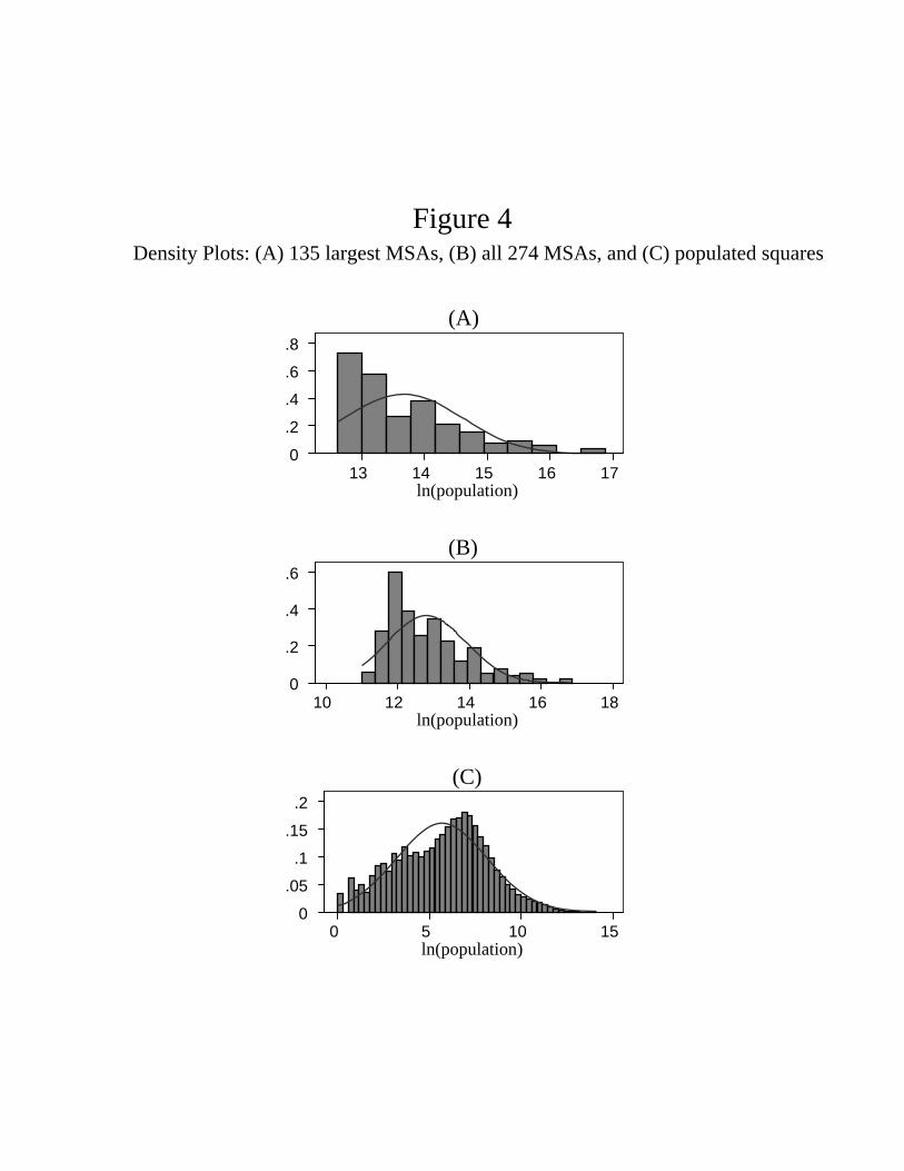
standard density plot of the distribution can be more revealing than a Zipf’s plot. As a segue
into looking at the whole distribution, we first illustrate in panel A of Figure 4 a density plot
(histogram) of log population for just the upper tail, the 135 highest population MSAs. Also
illustrated in the plot is the best-fitting normal curve. Clearly, the bell curve shape of the
normal does not fit the distribution within the top 135 MSAs very well. Rather, a Pareto
distribution is a good fit here. With the Pareto, the density is a straight line that is strictly
decreasing; the smaller the units, the more units there are.
Panel B in Figure 4 illustrates the distribution of log population for all 274 MSAs. Now
the tendency for monotone decline of the density is not as pronounced as it is with just the
top 135, but this is still the clear pattern. Certainly the bell curve of the normal does not fit
the distribution of MSAs very well.
13

5 The Size Distribution of Six-by-Six Squares
We turn now to the size distribution of six-by-six squares. Table 4 provides cell counts for
population size groupings. Approximately 15,000 of the 86,000 squares are unpopulated.
There are 713 squares where only one person lives and 1,285 where two people live. Clearly
the Pareto in which the density is always decreasing cannot fit this distribution.
Panel C of Figure 4 is a density plot of log population across all squares with at least one
person. For the unpopulated squares, the log of population is minus infinity, so the figure
leaves out a spike at minus infinity. For squares with one person, log population equals 0,
so the plot begins here. The last column of Table 4 provides a conversion from population
to log population to aid in interpretation of the figure. When log population is less than
4 (when population is less than about 50), the best fit normal curve fits reasonably well,
though the fit is choppy. Certainly the lognormal fits the distribution better than the Pareto
on the right tail.
Our finding that the lognormal is a rough approximation to the right tail of the distri-
bution of squares is like Eeckhout’s (2004) finding that the lognormal fits the right tail of
the distribution of Census places. But as argued in the introduction, the Census place is
a problematic geographic unit to use in examining the size distribution. Eeckhout presents
a random growth model with shocks to location productivities that generates a lognormal
distribution. We do not attempt any formal analysis in this paper to try to explain why the
size distribution has the shape that it has. But a look at the raw data makes us skeptical
that random location-specific productivity shocks are the main driving factor, at least at the
extreme left tail. That there are more squares with two people than with one person (1,285
instead of 713) seems to us more likely due to basic agglomeration benefits in the human
condition rather than the variance of location-specific productivity shocks. It seems likely
that as we move beyond the one- and two-person size classes, related agglomeration forces
are also at work.
We now turn our attention away from the extreme left tail and consider what the distrib-
ution looks like with the extreme left tail truncated. If any part of the distribution is to look
anything like Zipf, it has to be on the downward-sloping portion of the density. Inspection of
Figure 4(C) reveals that the mode of the distribution is approximately at a log population
14

of 7, which corresponds to approximately a population of 1,000. Henceforth, we truncate all
squares with population less than 1,000. From Table 4 we see that there are 23,974 squares
with 1,000 people or more and that these account for about 28 percent of the United States
land mass and 96 percent of the population. The coverage of the population is very significant
here. Even with the truncation, we are including areas that are quite remote.
Figure 5 is a Zipf’s plot of the population distribution of squares with 1,000 or more
people. It exhibits a clear pattern. The relationship looks piecewise linear with a kink around
log population of 11 (which corresponds to a population of approximately 50,000). Above
the kink, the relationship steepens. We use nonlinear least squares to fit a piecewise linear
function to the plot in Figure 5. The estimates are reported in Table 5. Because of the
large number of observations, the estimated standard errors are quite small, so they are not
reported. The estimated kink is at a log population of 10.89. Below the kink the (absolute
value of) the slope is .75; above the kink it is 1.94. The R2=.998 is extremely high, so the
piecewise linear function fits very well. For comparison purposes, we also fit a linear function.
The slope in the linear case is between the estimates for the piecewise linear case, and the
fit is noticeably worse.
The Census groups states into nine different Census divisions. Our next exercise is to
examine the distribution of population across squares within each Census division. Figure
6 contains Zipf plots for all nine divisions and Table 5 lists the estimates. To a remarkable
degree, the pattern we have established for the country as a whole occurs in each division
individually. Table 5 shows that the estimated location of the kink varies little across the
divisions, roughly 11 for each. In Figure 6 we see that the slope on the left side of the kink
is approximately the same for each division. The plots look something like vertical shifts
across the divisions. In all cases, the slope to the right of the kink is strictly greater than
one, and to left of the kink the slope is less than one (with the exception that for the East
South Central, the slope actually equals one to the left of the kink).
The kink at log population of 10.9 suggests we should explore this upper tail. This corre-
sponds approximately to a population of 50,000. Now, truncate all squares with population
less than 50,000. We are left with 1,182 squares accounting for 48 percent of the population.
Table 6 reports the results of a linear Zipf’s regression on this tail of the distribution. Taking
15

the country as a whole, the slope is 1.889. Looking at each Census division individually, the
variation in the slope is relatively small, and the mean is 2.
We conclude this section by connecting our results from the square-level analysis to the
previous section’s results for the MSA-level analysis. The bottom of Table 6 reports the
results of Zipf regressions across squares within MSAs. For example, there are 26 squares
with 50,000 people or more in the Boston MSA, and when we estimate the Zipf’s regression
on this sample, we get a slope of 1.46. The table reports the results of individual regressions
for the top 10 MSAs (by population), as well as the mean coefficients across these regressions
for the top 10 and top 25 MSAs. (We only do this for large MSAs, since small MSAs have
few 50,000+ squares with which to run the regression.)
Recall from Table 3 that in an MSA-level regression with the 135 top MSAs when we
use the maximum population square smaxi as the size measure, we get a slope of 1.761. It
is notable that when we take the MSA that is ranked 135 according to this measure, its
value of smaxi is 65,000, which approximately equals the 50,000 cutoff we are using here. The
1.761 slope approximately equals the slope of the within-MSA, square-level regressions we
are doing here. The average slope across the top 25 MSAs is in fact 1.776.
The results here are interesting in two ways. First, there is an interesting fractal-like
pattern among squares with 50,000 or more in population. Looking within a given MSA,
the Zipf coefficient across squares is on the order of 1.7. This is approximately what we get
when we take the maximum population square in each MSA and look across MSAs. It is
also approximately what we get when we take all such squares across the whole country and
look at them together (the 1.9 estimate in Table 6). It is also approximately what we get
when we look at squares in individual regions.
Second, this coefficient is also approximately the result we get when we do not use the
squares and just use average MSA density (the 1.896 coefficient on density in Table 3).
We have raised concerns about the arbitrary way MSAs are defined, and certainly there is
measurement error. Yet our analysis in which MSA definitions play no role whatsoever (1.889
Zipf coefficient in Table 6) is very close to our results in the MSA density analysis of Table
3 (again, the 1.896 coefficient in Table 3). Now, these are different objects that need not be
the same even if with perfect measurement. Yet the suggestive fractal pattern here hints that
16

they might very well be the same or very close if we did have perfect measurement. And
even with the imperfect measurement of MSAs we have to work with, our analysis may not
be very far off.
6 Growth Rates
The theoretical literature has emphasized the link between the size distribution of cities and
their growth rates. In particular, Gabaix has shown a connection between Gibrat’s law and
Zipf’s law. One version of Gibrat’s law is that the mean and variance of the growth rate of
a city are independent of the initial size of a city. Authors such as Ioannides and Overman
(2003) have noted that Gibrat’s law is a reasonable first-order approximation to the data.
(See also Black and Henderson 2003 for an analysis.)
Table 7 shows that Gibrat’s law is a reasonable first-order approximation for MSA growth
in our data. The measure of growth rate used here is the difference in log population between
2000 and 1990. Mean growth over all MSAs during the period is .124. The mean growth varies
relatively little over the four different MSA groupings in the table. It takes a low of .114 for
cities with less than 250,000 people and has a peak of .141 for cities in the half to one million
range. Moreover, the standard deviation does not vary much across the different groups.
Table 7 shows that Gibrat’s law is not a good approximation for the growth of squares.
The mean and variance of growth depend upon size in a clear pattern. Mean growth in the
smallest size category is .054–the lowest over all categories. Growth increases with size until
it attains a maximum value of .149 for squares in the 10,000 to 50,000 range. Beyond this,
mean growth decreases, falling to .093 in the 50,000 to 100,000 range and to around .05
beyond that. The standard deviation is not flat but decreases sharply with population.
These results for the growth rates of squares are not surprising given what we know
about the patterns of urban and rural growth. As is well known, remote rural areas have
been declining in their share of population, so not surprisingly, mean growth is lowest in
the smallest size category, under 1,000 people in the square. Also well understood is that
in large urban areas, population expansions take place at the edges where new housing is
constructed. For this reason, the most dense squares (those with more than 100,000 in 1990
17

population) have the lowest growth rate besides the under 1,000 category. These dense areas
are already built up, and additional housing units are hard to squeeze in. Those squares that
tend to be on the edge of metropolitan areas (in the range of 10,000 to 50,000 people) have
the highest growth rate of .149.
It is also easy to see why the highest population squares have the lowest variance of
growth. The absence of a large stock of vacant buildable land eliminates the possibility of
upside growth, and the existence of a housing stock decreases the downside of population
outflow (see Glaeser and Gyourko 2005). It is easy to see why the smallest locations have the
highest variance of growth. If the forest ranger living by himself (or herself) in a six-by-six
square gets married, population in the square doubles.
7 Robustness
In setting our grid of squares, we had to determine: (1) what grid size to use (we picked six
miles) and (2) where to start the grid. Let us begin by exploring this second decision, which
is analogous to the decision of where to put the prime meridian for longitude, an arbitrary
placement which by international convention passes through Greenwich. With the way we
have placed the grid in Figure 1, we can see that downtown Manhattan is in the same six-
by-six square with Jersey City and other places across the river in New Jersey. If we had
shifted the grid 2 miles to the east, downtown Manhattan would have been in a square with
Queens.
One may wonder whether this arbitrary decision on our part impacts our results. Fortu-
nately, the answer is no: where to start the grid has virtually no impact on our results. Table
8 shows what happens when we shift the grid 2 miles and 4 miles to the north. (Note that
if we shift it north 6 miles, the grid remains the same.) Analogously, it shows what happens
when we shift the grid 2 and 4 miles to the east. The top row contains the original baseline
results. The rows below are the results with the shift and show that they are the same up
to two-digit accuracy, and, for some columns, up to three digits.
Next, we consider changing the size of the grid. Significant changes in the grid will impact
the results. If we make the grid size 1,000 miles, there will be only three squares. If we make
18

the grid one meter by one meter, then our first problem is the Census data are not fine
enough for this size. Our second problem is that populations would typically be one if a
person happened to be standing in the one-by-one-meter square at the time of the Census
and zero otherwise, so the size distribution would not be interesting.
Next, we focus on the robustness of our results to relatively small changes in the grid
size. We consider two smaller grid sizes (2 and 4 miles) and four larger ones (8, 10, 15, and
20 miles). To a remarkable degree, our results are robust to these changes in grid size. Recall
that in the original 6-by-6 analysis, we used a 1,000 population cutoff for the piecewise linear
regression and a 50,000 cutoff in the linear regression. When we change the grid size, we also
change the population cutoffs to keep population density at the cutoff the same. For example,
the area of a 2-by-2 square is 1/9 times the area of a 6-by-6 square. So for the 2-by-2 case,
the linear regression cutoff is 5,556 = 50,000/9. The piecewise linear function fits extremely
well throughout all the grid sizes (R2 = .997 and above). The coefficient estimates do not
vary much: .7 to .8 below the kink and 1.8 to 2.0 above the kink. Moreover, the locations
of the kink increase by the expected magnitude. For example, going from a 2-by-2 grid to a
4-by-4 grid increases the area by a factor of four (ln(4) = 1.39). If density at the kink stayed
the same, then the kink should increase by 1.39 when moving from a 2-by-2 grid to a 4-by-4
grid. The actual increase of 1.19 = 10.26− 9.07 is fairly close. We see an analogous patternfor the other grid sizes. We conclude that our results are not an artifact of an arbitrary choice
of a 6-mile grid length.
One notable pattern in Table 8 is the decline of the MSA-level regression coefficient on
smaxi as the grid size is increased. As grid sizes increase, the squares begin to incorporate the
entirety of the MSA. So the population of the biggest square smaxi begins to approximate the
population of the MSA as a whole and the coefficient gets close to one (Zipf’s law), as it is
in Table 3.
One last issue concerns what is happening on the coasts with the squares. As can be seen
in Figure 1, some of the squares in the New York metro area are partly in the very dense
island of Manhattan and partly in the water. Since the highest population density locations
(New York, Chicago, etc.) tend to border bodies of water, one might wonder whether some
systematic biases might be present. We think this is an interesting point, but not one of much
19

quantitative significance because we are working with logs rather than levels. We make two
distinct arguments. First, in these dense cities, the log population of the squares changes
relatively slowly as we move away from the coasts (at least at a 6-by-6 grid size). The
possibility of systematic biases at the coasts is not quantitatively a big problem because
many other squares nearby that are approximately equal in log population will average
things out. Second, even at the coast, variations in density are not quantitatively significant.
Suppose, for example, that a square at the coast is half in the water (ln(12) = −.3). At
the dense squares near or in Manhattan, log population is around 14. If we shifted such a
square and put it half in the water, log population would fall to 13.7 = 14 − .3. This is a
small difference, compared to the vast differences in log population between squares close to
Manhattan (whether in the water or not) and squares in less dense places such as upstate
New York. Even if the square were 99 percent in the water, this would not matter either
because such a square at a 6-by-6 resolution would represent a negligible portion of the
downtown area.
8 Conclusion
Our paper studies the distribution of population across six-by-six-mile squares, examining
the extent to which Zipf’s law and Gibrat’s law hold. The main results are as follows:
1. At the bottom tail of the distribution, the distribution is roughly lognormal, certainly
not Zipf.
2. For squares above 1,000 in population, a Zipf’s plot has a piecewise linear shape with
a kink at around a population of 50,000. Below the kink the slope is .75; above the
kink, around 2. The finding is robust across different regions in the country.
3. Gibrat’s law does not hold with squares. Mean growth has an inverted U-shaped rela-
tionship with population size. The variance of growth declines with size.
4. The slope of 2 in the upper tail matches what we get with MSA-level data if we
substitute population density for population in a Zipf’s plot. This is consistent with
20

the usual Zipf coefficient of 1 for the population regression if the land elasticity of
population is .5. The slope of 2 also matches what we get if we use the maximum
population square in the MSA instead of average density. It also matches what we
get in the upper tail when we look at squares within MSAs. All of this suggests some
kind of fractal pattern in the left tail in which the distribution of squares within MSAs
looks like the distribution of MSAs across the country, which in turn, looks like the
distribution of squares across the country and within individual regions.
In our title, we put a question mark after “Zipf’s Law.” It is clear that the standard
Zipf’s law does not apply for squares in the upper tail because the slope is around 2, not
1. Nevertheless, if we take the land elasticity of population to be .5 (which roughly fits the
data for large MSAs), then a slope coefficient of 2 for squares (where the land margin is
fixed) is consistent with a slope coefficient of 1 for regularly defined MSAs (where the land
margin varies). In this sense, Zipf’s law holds for squares in the right tail. But what about
below the kink of a square population of 50,000? For relatively less populated squares like
these, an expansion of the population might not put much pressure on the land margin, as
vacant rural land in the square can be converted to housing sites. If the land elasticity were
zero, the coefficient on density in (5) would be the same as the coefficient on population in
(2). In this extreme case, the relevant comparison is between the .75 slope for squares and
the standard slope of 1, and Zipf’s law does not hold. If the land elasticity is a little higher
than zero, Zipf’s law works better. Regardless of this matter, the fact that the Zipf’s plot is
straight as an arrow for population in the range between 1,000 and 50,000 is very intriguing.
Also, the presence of the kink is intriguing as well.
We believe a joint analysis of the distribution of population of squares within and across
metropolitan areas is a fruitful area for further research. We see opportunities for progress in
theories that emphasize economic considerations and spatial factors, such as the work of Hsu
(2008). In terms of directions for future empirical work, we believe it would be promising to
examine the size distribution of squares in an international context.
21

References
Anas, Alex, Richard Arnott, and Kenneth A. Small (1998). “Urban Spatial Structure.”
Journal of Economic Literature 36 (September): 1426—64.
Black, Duncan, and Vernon Henderson (2003). “Urban Evolution in the USA.” Journal of
Economic Geography 3 (October): 343—72.
Bryan, Kevin A., Brian D. Minton, and Pierre-Daniel G. Sarte (2007). “The Evolution of
City Population Density in the United States.” Federal Reserve Bank of Richmond,
Economic Quarterly 93 (Fall): 341—60.
Burchfield, Marcy, Henry G. Overman, Diego Puga, andMatthewA. Turner (2006). “Causes
of Sprawl: A Portrait from Space.” Quarterly Journal of Economics 121 (May): 587—
633.
Duranton, Gilles, and Henry Overman (2005). “Testing for Localization Using Micro-
Geographic Data.” Review of Economic Studies 72 (October): 1077—1106.
Duranton, Gilles, and Matthew A. Turner (2008). “Urban Growth and Transportation.”
Manuscript, University of Toronto, November.
Eeckhout, Jan (2004). “Gibrat’s Law for (All) Cities.” American Economic Review 94
(December): 1429—51.
Gabaix, Xavier (1999). “Zipf’s Law for Cities: An Explanation.” Quarterly Journal of
Economics 114 (August): 739—67.
Gabaix, Xavier, and Yannis M. Ioannides (2004). “The Evolution of City Size Distribu-
tions.” In Handbook of Regional and Urban Economics, ed. J. V. Henderson and J. F.
Thisse, pp. 2341—78. Amsterdam: Elsevier.
Glaeser, Edward L., and Joseph Gyourko (2005). “Urban Decline and Durable Housing.”
Journal of Political Economy 113 (April): 345—75.
22

Holmes, Thomas J., and Sanghoon Lee (2008). “Economies of Density versus Natural
Advantage: Crop Choice on the Back Forty.” Manuscript, University of Minnesota,
October.
Hsu, Wen-Tai (2008). “Central Place Theory and Zipf’s Law.” Manuscript, University of
Minnesota, January.
Ioannides, Yannis M., and Henry G. Overman (2003). “Zipf’s Law for Cities: An Empirical
Examination.” Regional Science and Urban Economics 33 (March): 127—37.
Linklater, Andro (2003). Measuring America: How the United States Was Shaped by the
Greatest Land Sale in History. New York: Plume.
Luttmer, Erzo G. J. (2007). “Selection, Growth, and the Size Distribution of Firms.”
Quarterly Journal of Economics 122 (August): 1103—44.
McMillen, Daniel P., and John F. McDonald (1998). “Suburban Subcenters and Employ-
ment Density in Metropolitan Chicago.” Journal of Urban Economics 43 (March):
157—80.
Nordhaus, William, Qazi Azam, David Corderi, Kyle Hood, Nadejda M. Victor, Mukhtar
Mohammed, Alexandra Miltner, and Jyldyz Weiss (2006). “The G-Econ Database on
Gridded Output: Methods and Data.” Yale University: Geographically based Eco-
nomic data (G-Econ). http://gecon.yale.edu (accessed 2008).
Rossi-Hansberg, Esteban, and Mark L. J. Wright (2007). “Urban Structure and Growth.”
Review of Economic Studies 74 (April): 597—624.
23

Figure 1 Map of Grid Lines for Six-by-Six Squares in the Vicinity of New York City
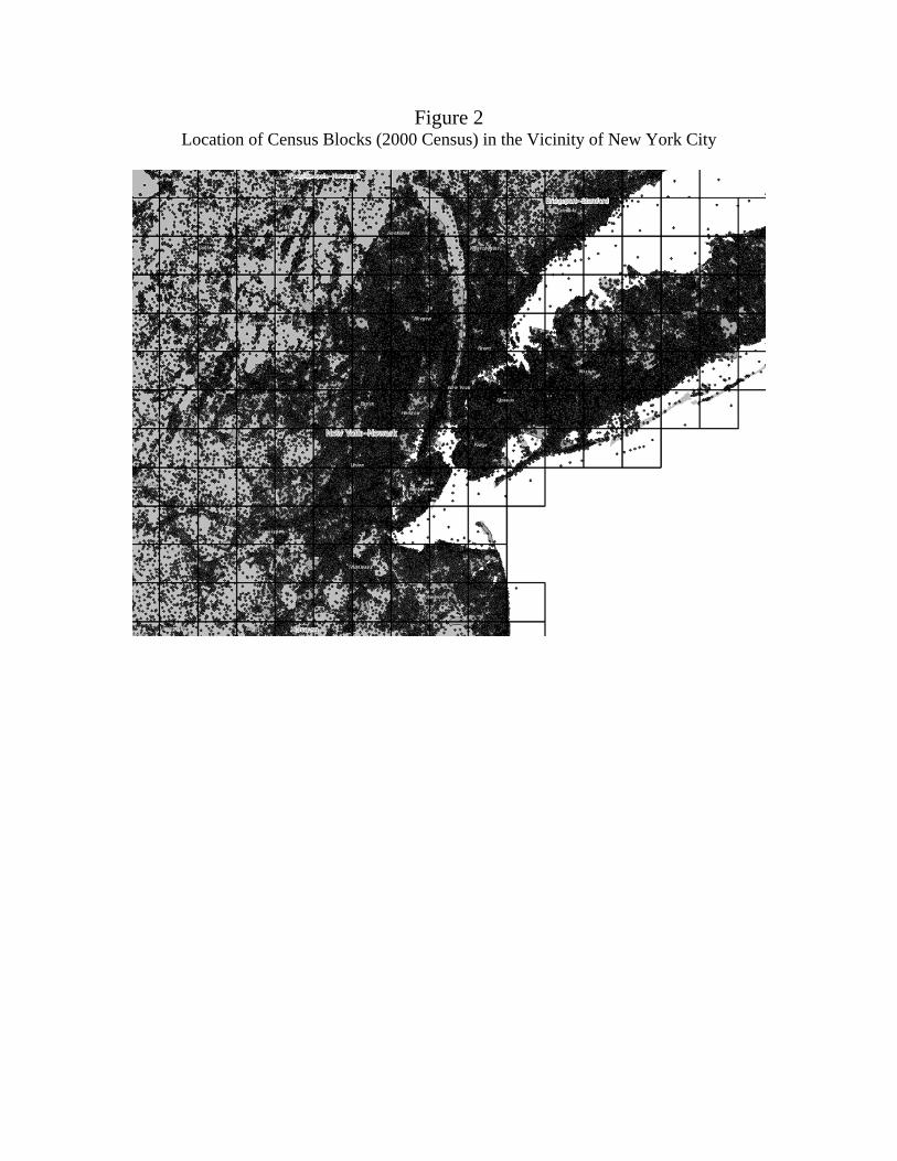
Figure 2 Location of Census Blocks (2000 Census) in the Vicinity of New York City

Figure 3MSA-Level Zipf Plots: (A) top 135 MSAs by population,
(B) top 135 MSAs by area, and (C) top 135 MSAs by population density(A)
ln(r
ank)
(so
rted
by
popu
latio
n)
0
1
2
3
4
5
ln(population)12 13 14 15 16 17
(B)
ln(r
ank)
(so
rted
by
area
)
0
1
2
3
4
5
ln(area)3 4 5 6 7 8
(C)
ln(r
ank)
(so
rted
by
popu
latio
n de
nsity
)
0
1
2
3
4
5
ln(population density)8 9 10 11 12 13
0 .2 .4 .6 .8
13 14 15 16 17ln(population)
(A)
0
.2
.4
.6
10 12 14 16 18ln(population)
(B)
0 .05
.1
.15
.2
0 5 10 15ln(population)
(C)
Density Plots: (A) 135 largest MSAs, (B) all 274 MSAs, and (C) populated squares
Figure 4

Figure 5Square-Level Zipf Plot for Continental United States
(All 23,974 Squares with Population at Least 1000)
ln(r
ank)
0
1
2
3
4
5
6
7
8
9
10
11
ln(population)
7 8 9 10 11 12 13 14 15

Figure 6Square-Level Zipf Plots for Census Divisions
(Square Population at Least 1000)
New England Middle AtlanticEast North Central West North CentralSouth Atlantic East South CentralWest South Central MountainPacific
ln(r
ank)
0
1
2
3
4
5
6
7
8
9
ln(population)
7 8 9 10 11 12 13 14 15

Table 1 Census Places with Population Five or Less
(2000 Census)
Place PopulationNew Amsterdam town, IN 1Lost Springs town, WY 1Hove Mobile Park city, ND 2Monowi village, NE 2Hobart Bay CDP, AK 3East Blythe CDP, CA 3Hillsview town, SD 3Point of Rocks CDP, WY 3Flat CDP, AK 4Blacksville CDP, GA 4Prudhoe Bay CDP, AK 5Storrie CDP, CA 5Baker village, MO 5Maza city, ND 5Gross village, NE 5

Table 2 Summary Statistics: Squares and MSAs
(Population from 2000 Census)
Unit
Variable Number Mean
Standard Deviation Min Max Sum Across Units
Square pop 85,527 3,269 18,181 0 1,317,207 279,583,434
log(pop) 70,590 5.69 2.48 0 14.09 —
area (6×6 sq.) 85,527 1 0 1 1 85,527
MSA Pop 274 843,209 1,986,836 60,744 21,343,534 231,039,389
popdensity 274 7,881 7,073 215 55,151 —
log(popdensity) 274 8.67 .80 5.37 10.92 —
area (6×6 sq.) 274 87 103 14 981 23,798

Table 3 MSA-Level Zipf Regression Results: Alternative Size Measures
(Each regression uses top 135 MSAs ranked by given size measure)
OLS Hill Method Size Measure
Slope (absolute value)
R2
Slope (absolute value)
Population 1.013 (.12)
.985 .944 (.078)
Land area 1.70
(.12) .984 1.569
(.176)
Density 1.896 (.12)
.973 1.616 (.120)
si
max (maximum population square in MSA)
1.761 (.12)
.988 1.546 (.125)

Table 4 Distribution of Population Across Six-by-Six Squares
(Census 2000 population in the contiguous United States)
Number of
Squares
Percent of Population
Log(pop) at bottom of grouping
All squares 85,527 pop = 0 14,937 0.00 −∞ pop > 0 70,590 100.00 0.00 By pop size grouping
pop = 1 713 .00 0.00 pop = 2 1,285 .00 0.69 3 ≤ pop ≤ 5 2,564 .00 1.10 6 ≤ pop < 10 2,532 .01 1.79 10 ≤ pop < 100 16,233 .23 2.30 100 ≤ pop < 1,000 23,289 3.59 4.61 1,000 ≤ pop < 10,000 19,271 21.20 6.91 10,000 ≤ pop < 50,000 3,521 27.40 9.21 50,000 ≤ pop < 1,000,000 1,179 46.28 10.82 1,000,000 ≤ pop 3 1.29 13.82 Size groupings of later interest 1,000 ≤ pop 23,974 96.17 6.91 50,000 ≤ pop 1,182 47.57 10.82
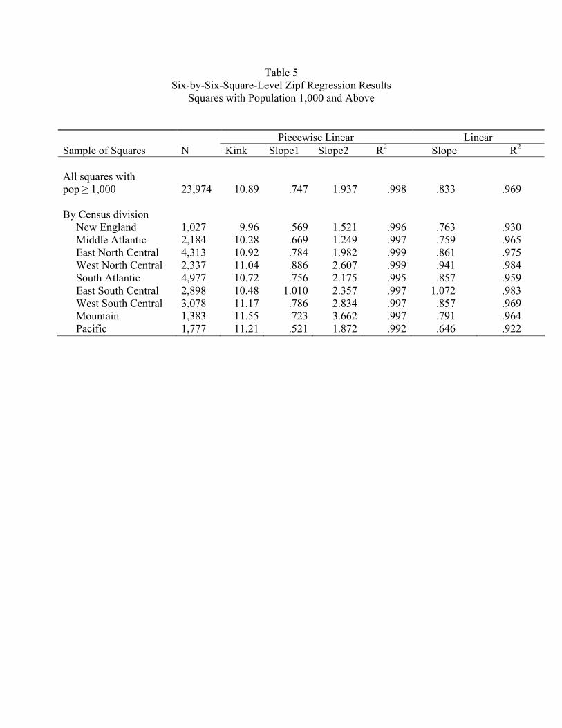
Table 5 Six-by-Six-Square-Level Zipf Regression Results
Squares with Population 1,000 and Above
Piecewise Linear Linear Sample of Squares N Kink Slope1 Slope2 R2 Slope R2
All squares with pop ≥ 1,000 23,974
10.89 .747 1.937 .998 .833 .969
By Census division New England 1,027 9.96 .569 1.521 .996 .763 .930 Middle Atlantic 2,184 10.28 .669 1.249 .997 .759 .965 East North Central 4,313 10.92 .784 1.982 .999 .861 .975 West North Central 2,337 11.04 .886 2.607 .999 .941 .984 South Atlantic 4,977 10.72 .756 2.175 .995 .857 .959 East South Central 2,898 10.48 1.010 2.357 .997 1.072 .983 West South Central 3,078 11.17 .786 2.834 .997 .857 .969 Mountain 1,383 11.55 .723 3.662 .997 .791 .964 Pacific 1,777 11.21 .521 1.872 .992 .646 .922
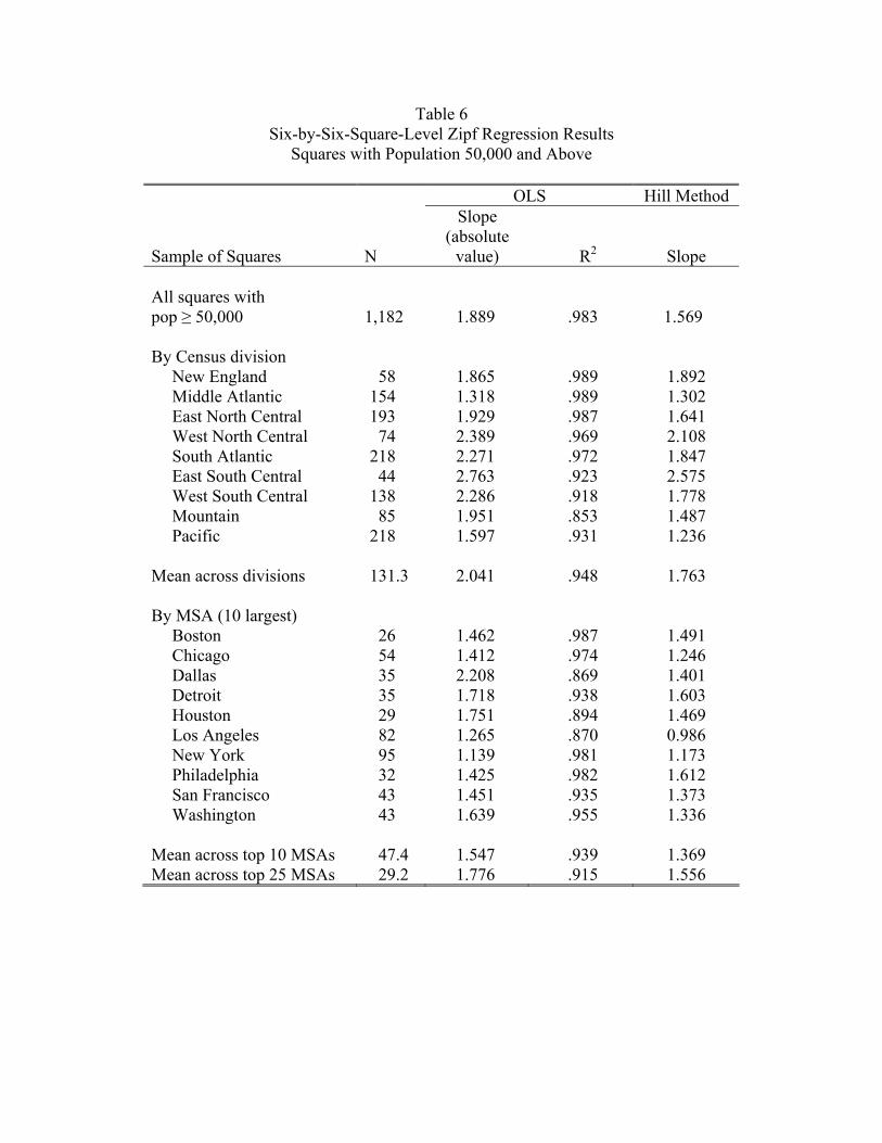
Table 6 Six-by-Six-Square-Level Zipf Regression Results
Squares with Population 50,000 and Above
OLS Hill Method
Sample of Squares N
Slope (absolute
value)
R2 Slope
All squares with pop ≥ 50,000 1,182 1.889
.983 1.569
By Census division New England 58 1.865 .989 1.892 Middle Atlantic 154 1.318 .989 1.302 East North Central 193 1.929 .987 1.641 West North Central 74 2.389 .969 2.108 South Atlantic 218 2.271 .972 1.847 East South Central 44 2.763 .923 2.575 West South Central 138 2.286 .918 1.778 Mountain 85 1.951 .853 1.487 Pacific 218 1.597 .931 1.236 Mean across divisions 131.3 2.041 .948 1.763 By MSA (10 largest) Boston 26 1.462 .987 1.491 Chicago 54 1.412 .974 1.246 Dallas 35 2.208 .869 1.401 Detroit 35 1.718 .938 1.603 Houston 29 1.751 .894 1.469 Los Angeles 82 1.265 .870 0.986 New York 95 1.139 .981 1.173 Philadelphia 32 1.425 .982 1.612 San Francisco 43 1.451 .935 1.373 Washington 43 1.639 .955 1.336 Mean across top 10 MSAs 47.4 1.547 .939 1.369 Mean across top 25 MSAs 29.2 1.776 .915 1.556

Table 7 Growth Rates (Change in Log Population) 1990 to 2000 by Size
MSAs and Squares
Number with
Positive Population
in 1990 Change in Log
Population and 2000 Mean Std. Dev. MSAs 274 .124 .100 MSAs by 1990 population Pop < 250,000 135 .114 .098 250,000 ≤ pop < 500,000 66 .127 .093 500,000 ≤ pop < 1,000,000 32 .141 .129 1,000,000 ≤ pop 41 .139 .094 Squares 65,975 .081 .6186 Squares by 1990 population Pop < 1,000 43,723 .054 .741 1,000 ≤ pop < 2,000 8,057 .129 .228 2,000 ≤ pop < 5,000 7,117 .139 .242 5,000 ≤ pop < 10,000 2,953 .144 .223 10,000 ≤ pop < 50,000 3,118 .149 .204 50,000 ≤ pop < 100,000 616 .093 .128 100,000 ≤ pop < 250,000 341 .056 .095 250,000 ≤ pop < 500,000 39 .046 .071 500,000 ≤ pop 11 .060 .061

Table 8 Robustness of Results to Alternative Grids
MSA-Level
Regression on simax
Square-Level Piecewise Linear Regression
Pop ≥ 1,000 per 6×6 square*
Square-Level Linear Regression
pop ≥ 50,000 per 6×6 square*
OLS Slope
R2
Kink
Slope1
Slope2
R2
OLS Slope
R2
Baseline 6×6 grid 1.761 .988 10.89 .747 1.937 .998 1.889 .983 Shift of baseline grid
2 miles north 1.790 .986 10.95 .751 1.984 .998 1.892 .980 4 miles north 1.838 .986 10.90 .750 1.923 .998 1.879 .981 2 miles east 1.715 .988 10.90 .745 1.957 .998 1.919 .987 4 miles east 1.774 .989 10.92 .747 1.979 .998 1.924 .983 Alternative grid size
2 miles 1.981 .977 9.072 .680 2.097 .999 1.800 .968 4 miles 1.873 .992 10.262 .719 2.037 .999 1.886 .979 6 miles 1.761 .988 10.899 .747 1.937 .998 1.889 .983 8 miles 1.595 .981 11.433 .773 1.976 .998 1.959 .986 10 miles 1.483 .978 11.655 .786 1.819 .998 1.914 .987 15 miles 1.325 .979 12.328 .816 1.850 .998 1.959 .994 20 miles 1.246 .969 12.482 .822 1.630 .997 1.994 .983
* We adjust the population cutoffs for the squares to keep the population density the same across cutoffs for the different grid sizes. For example, in the 2-by-2-square linear regression, we use all the squares with population sizes greater than or equal to 5,556 (=50,000/9). The 50,000 comes from the base case of the 6-by-6-mile square. The 9 takes account of the fact that the area of a 6-by-6 square is 9 times as large as a 2-by-2 square.