Circular Visualization in R - Zuguangzuguang.de/circlize_book/book/circlize-book.pdf · 3.5...
171
Circular Visualization in R Zuguang Gu last revised on 2017-11-17
-
Upload
vuonghuong -
Category
Documents
-
view
325 -
download
37
Transcript of Circular Visualization in R - Zuguangzuguang.de/circlize_book/book/circlize-book.pdf · 3.5...

Circular Visualization in RZuguang Gu
last revised on 2017-11-17

2

Contents
About 7
I General Functionality 9
1 Introduction 111.1 Principle of design . . . . . . . . . . . . . . . . . . . . . . . . . . . . . . . . . . . . . . . . . . 111.2 A quick glance . . . . . . . . . . . . . . . . . . . . . . . . . . . . . . . . . . . . . . . . . . . . 12
2 Circular layout 192.1 Coordinate transformation . . . . . . . . . . . . . . . . . . . . . . . . . . . . . . . . . . . . . . 192.2 Rules for making the circular plot . . . . . . . . . . . . . . . . . . . . . . . . . . . . . . . . . . 192.3 Sectors and tracks . . . . . . . . . . . . . . . . . . . . . . . . . . . . . . . . . . . . . . . . . . 222.4 Graphic parameters . . . . . . . . . . . . . . . . . . . . . . . . . . . . . . . . . . . . . . . . . 242.5 Create plotting regions . . . . . . . . . . . . . . . . . . . . . . . . . . . . . . . . . . . . . . . . 262.6 Update plotting regions . . . . . . . . . . . . . . . . . . . . . . . . . . . . . . . . . . . . . . . 262.7 panel.fun argument . . . . . . . . . . . . . . . . . . . . . . . . . . . . . . . . . . . . . . . . . 272.8 Other utilities . . . . . . . . . . . . . . . . . . . . . . . . . . . . . . . . . . . . . . . . . . . . . 29
3 Graphics 353.1 Points . . . . . . . . . . . . . . . . . . . . . . . . . . . . . . . . . . . . . . . . . . . . . . . . . 353.2 Lines . . . . . . . . . . . . . . . . . . . . . . . . . . . . . . . . . . . . . . . . . . . . . . . . . . 363.3 Segments . . . . . . . . . . . . . . . . . . . . . . . . . . . . . . . . . . . . . . . . . . . . . . . 373.4 Text . . . . . . . . . . . . . . . . . . . . . . . . . . . . . . . . . . . . . . . . . . . . . . . . . . 373.5 Rectangles and polygons . . . . . . . . . . . . . . . . . . . . . . . . . . . . . . . . . . . . . . . 383.6 Axes . . . . . . . . . . . . . . . . . . . . . . . . . . . . . . . . . . . . . . . . . . . . . . . . . . 403.7 Circular arrows . . . . . . . . . . . . . . . . . . . . . . . . . . . . . . . . . . . . . . . . . . . . 413.8 Raster image . . . . . . . . . . . . . . . . . . . . . . . . . . . . . . . . . . . . . . . . . . . . . 433.9 Links . . . . . . . . . . . . . . . . . . . . . . . . . . . . . . . . . . . . . . . . . . . . . . . . . . 453.10 Highlight sectors and tracks . . . . . . . . . . . . . . . . . . . . . . . . . . . . . . . . . . . . . 503.11 Work together with the base graphic system . . . . . . . . . . . . . . . . . . . . . . . . . . . . 53
4 Legends 55
5 Implement high-level circular plots 615.1 Circular barplots . . . . . . . . . . . . . . . . . . . . . . . . . . . . . . . . . . . . . . . . . . . 615.2 Histograms . . . . . . . . . . . . . . . . . . . . . . . . . . . . . . . . . . . . . . . . . . . . . . 625.3 Phylogenetic trees . . . . . . . . . . . . . . . . . . . . . . . . . . . . . . . . . . . . . . . . . . 635.4 Heatmaps . . . . . . . . . . . . . . . . . . . . . . . . . . . . . . . . . . . . . . . . . . . . . . . 65
6 Advanced layout 676.1 Zooming of sectors . . . . . . . . . . . . . . . . . . . . . . . . . . . . . . . . . . . . . . . . . . 676.2 Visualize part of the circle . . . . . . . . . . . . . . . . . . . . . . . . . . . . . . . . . . . . . . 69
3

4 CONTENTS
6.3 Combine multiple circular plots . . . . . . . . . . . . . . . . . . . . . . . . . . . . . . . . . . . 706.4 Arrange multiple plots . . . . . . . . . . . . . . . . . . . . . . . . . . . . . . . . . . . . . . . . 73
II Applications in Genomics 75
7 Introduction 777.1 Input data . . . . . . . . . . . . . . . . . . . . . . . . . . . . . . . . . . . . . . . . . . . . . . . 77
8 Initialize with genomic data 798.1 Initialize with cytoband data . . . . . . . . . . . . . . . . . . . . . . . . . . . . . . . . . . . . 798.2 Customize chromosome track . . . . . . . . . . . . . . . . . . . . . . . . . . . . . . . . . . . . 828.3 Initialize with general genomic category . . . . . . . . . . . . . . . . . . . . . . . . . . . . . . 848.4 Zooming chromosomes . . . . . . . . . . . . . . . . . . . . . . . . . . . . . . . . . . . . . . . . 85
9 Create plotting regions for genomic data 899.1 Points . . . . . . . . . . . . . . . . . . . . . . . . . . . . . . . . . . . . . . . . . . . . . . . . . 909.2 Lines . . . . . . . . . . . . . . . . . . . . . . . . . . . . . . . . . . . . . . . . . . . . . . . . . . 919.3 Text . . . . . . . . . . . . . . . . . . . . . . . . . . . . . . . . . . . . . . . . . . . . . . . . . . 919.4 Rectangles . . . . . . . . . . . . . . . . . . . . . . . . . . . . . . . . . . . . . . . . . . . . . . . 929.5 Links . . . . . . . . . . . . . . . . . . . . . . . . . . . . . . . . . . . . . . . . . . . . . . . . . . 929.6 Mixed use of general circlize functions . . . . . . . . . . . . . . . . . . . . . . . . . . . . . . . 92
10 modes for circos.genomicTrack() 9510.1 Normal mode . . . . . . . . . . . . . . . . . . . . . . . . . . . . . . . . . . . . . . . . . . . . . 9510.2 Stack mode . . . . . . . . . . . . . . . . . . . . . . . . . . . . . . . . . . . . . . . . . . . . . . 9610.3 Applications . . . . . . . . . . . . . . . . . . . . . . . . . . . . . . . . . . . . . . . . . . . . . . 97
11 High-level genomic functions 10311.1 Ideograms . . . . . . . . . . . . . . . . . . . . . . . . . . . . . . . . . . . . . . . . . . . . . . . 10311.2 Heatmaps . . . . . . . . . . . . . . . . . . . . . . . . . . . . . . . . . . . . . . . . . . . . . . . 10311.3 Labels . . . . . . . . . . . . . . . . . . . . . . . . . . . . . . . . . . . . . . . . . . . . . . . . . 10411.4 Genomic density and Rainfall plot . . . . . . . . . . . . . . . . . . . . . . . . . . . . . . . . . 105
12 Nested zooming 10912.1 Basic idea . . . . . . . . . . . . . . . . . . . . . . . . . . . . . . . . . . . . . . . . . . . . . . . 10912.2 Visualization of DMRs from tagmentation-based WGBS . . . . . . . . . . . . . . . . . . . . . 113
III Visualize Relations 117
13 The chordDiagram() function 11913.1 Basic usage . . . . . . . . . . . . . . . . . . . . . . . . . . . . . . . . . . . . . . . . . . . . . . 12013.2 Adjust by circos.par() . . . . . . . . . . . . . . . . . . . . . . . . . . . . . . . . . . . . . . . 12113.3 Colors . . . . . . . . . . . . . . . . . . . . . . . . . . . . . . . . . . . . . . . . . . . . . . . . . 12413.4 Link border . . . . . . . . . . . . . . . . . . . . . . . . . . . . . . . . . . . . . . . . . . . . . . 12713.5 Highlight links . . . . . . . . . . . . . . . . . . . . . . . . . . . . . . . . . . . . . . . . . . . . 12913.6 Orders of links . . . . . . . . . . . . . . . . . . . . . . . . . . . . . . . . . . . . . . . . . . . . 13313.7 Self-links . . . . . . . . . . . . . . . . . . . . . . . . . . . . . . . . . . . . . . . . . . . . . . . . 13413.8 Symmetric matrix . . . . . . . . . . . . . . . . . . . . . . . . . . . . . . . . . . . . . . . . . . 13413.9 Directional relations . . . . . . . . . . . . . . . . . . . . . . . . . . . . . . . . . . . . . . . . . 13413.10Reduce . . . . . . . . . . . . . . . . . . . . . . . . . . . . . . . . . . . . . . . . . . . . . . . . . 139
14 Advanced usage of chordDiagram() 14314.1 Organization of tracks . . . . . . . . . . . . . . . . . . . . . . . . . . . . . . . . . . . . . . . . 143
CONTENTS 5
14.2 Customize sector labels . . . . . . . . . . . . . . . . . . . . . . . . . . . . . . . . . . . . . . . 14414.3 Customize sector axes . . . . . . . . . . . . . . . . . . . . . . . . . . . . . . . . . . . . . . . . 14614.4 Put horizontally or vertically symmetric . . . . . . . . . . . . . . . . . . . . . . . . . . . . . . 14914.5 Compare two Chord diagrams . . . . . . . . . . . . . . . . . . . . . . . . . . . . . . . . . . . . 14914.6 Multiple-group Chord diagram . . . . . . . . . . . . . . . . . . . . . . . . . . . . . . . . . . . 151
15 A complex example of Chord diagram 155
IV Others 163
16 Make fun of the package 16516.1 A clock . . . . . . . . . . . . . . . . . . . . . . . . . . . . . . . . . . . . . . . . . . . . . . . . 16516.2 A dartboard . . . . . . . . . . . . . . . . . . . . . . . . . . . . . . . . . . . . . . . . . . . . . . 16616.3 Ba-Gua and Tai-Ji . . . . . . . . . . . . . . . . . . . . . . . . . . . . . . . . . . . . . . . . . . 167

6 CONTENTS

About
This is the documentation of the circlize package. Examples in the book are generated under version 0.4.2.
If you use circlize in your publications, I would be appreciated if you can cite:
Gu, Z. (2014) circlize implements and enhances circular visualization in R. Bioinformatics. DOI:10.1093/bioinformatics/btu393
7

8 CONTENTS

Part I
General Functionality
9

Chapter 1
Introduction
Circular layout is very useful to represent complicated information. First, it elegantly represents informationwith long axes or a large amount of categories; second, it intuitively shows data with multiple tracks focusingon the same object; third, it easily demonstrates relations between elements. It provides an efficient way toarrange information on the circle and it is beautiful.
Circos is a pioneer tool widely used for circular layout representations implemented in Perl. It greatlyenhances the visualization of scientific results (especially in Genomics field). Thus, plots with circular layoutare normally named as “circos plot”. Here the circlize package aims to implement Circos in R. Oneimportant advantage for the implementation in R is that R is an ideal environment which provides seamlessconnection between data analysis and data visualization. circlize is not a front-end wrapper to generateconfiguration files for Circos, while completely coded in R style by using R’s elegant statistical and graphicengine. We aim to keep the flexibility and configurability of Circos, but also make the package morestraightforward to use and enhance it to support more types of graphics.
In this book, chapters in Part I give detailed overviews of the general circlize functionalities. Part IIintroduces functions specifically designed for visualizing genomic datasets. Part III gives comprehensiveguilds on visualizing relationships by Chord diagram.
1.1 Principle of design
A circular layout is composed of sectors and tracks. For data in different categories, they are allocated intodifferent sectors and for multiple measurements of the same category, they are represented as stacked tracksfrom outside of the circle to the inside. The intersection of a sector and a track is called a cell (or a grid, apanel), which is the basic unit in a circular layout. It is an imaginary plotting region for data points in acertain category.
Since most of the figures are composed of simple graphics, such as points, lines, polygon, circlize implementslow-level graphic functions for adding graphics in the circular plotting regions, so that more complicatedgraphics can be easily generated by different combinations of low-level graphic functions. This principleensures the generality that types of high-level graphics are not restricted by the software itself and high-levelpackages focusing on specific interests can be built on it.
Currently there are following low-level graphic functions that can be used for adding graphics. The usage isvery similar to the functions without circos. prefix from the base graphic engine, except there are someenhancement specifically designed for circular visualization.
• circos.points(): adds points in a cell.• circos.lines(): adds lines in a cell.• circos.segments(): adds segments in a cell.
11

12 CHAPTER 1. INTRODUCTION
Figure 1.1: Examples by circlize
• circos.rect(): adds rectangles in a cell.• circos.polygon(): adds polygons in a cell.• circos.text(): adds text in a cell.• circos.axis() ands circos.yaxis(): add axis in a cell.
Following functions arrange the circular layout.
• circos.initialize(): allocates sectors on the circle.• circos.track(): creates plotting regions for cells in one single track.• circos.update(): updates an existed cell.• circos.par(): graphic parameters.• circos.info(): prints general parameters of current circular plot.• circos.clear(): resets graphic parameters and internal variables.
Thus, theoretically, you are able to draw most kinds of circular figures by the above functionalities. Figure1.1 lists several complex circular plots made by circlize. After going through this book, you will definitelybe able to implement yours.
1.2 A quick glance
Before we go too deep into the details, I first demonstrate a simple example with using basic functionalitiesin circlize package to help you to get a basic idea of how the package works.
First let’s generate some random data. There needs a character vector to represent categories, a numericvector of x values and a vectoe of y values.

1.2. A QUICK GLANCE 13
set.seed(999)n = 1000df = data.frame(factors = sample(letters[1:8], n, replace = TRUE),
x = rnorm(n), y = runif(n))
First we initialize the circular layout. The circle is split into sectors based on the data range on x-axes ineach category. In following code, df$x is split by df$factors and the width of sectors are automaticallycalculated based on data ranges in each category. Be default, sectors are positioned started from θ = 0 (inthe polar coordinate system) and go along the circle clock-wisely. You may not see anything after runningfollowing code because no track has been added yet.library(circlize)circos.par("track.height" = 0.1)circos.initialize(factors = df$factors, x = df$x)
We set a global parameter track.height to 0.1 by the option function circis.par() so that all trackswhich will be added have a default height of 0.1. The circle used by circlize always has a radius of 1, so aheight of 0.1 means 10% of the circle radius.
Note that the allocation of sectors only needs values on x direction (or on the circular direction), the valueson y direction (radical direction) will be used in the step of creating tracks.
After the circular layout is initialized, graphics can be added to the plot in a track-by-track manner. Beforedrawing anything, we need to know that all tracks should be first created by circos.trackPlotRegion()or, for short, circos.track(), then the low-level functions can be added afterwards. Just think in the baseR graphic engine, you need first call plot() then you can use functions such as points() and lines() toadd graphics. Since x ranges for cells in the track have already been defined in the initialization step, herewe only need to specify the y ranges for each cell. The y ranges can be specified by y argument as a numericvector (so that y ranges will be automatically extracted and calculated in each cell) or ylim argument as avector of length two. In principle, y ranges should be same for all cells in a same track. (See Figure 1.2)circos.track(factors = df$factors, y = df$y,
panel.fun = function(x, y) {circos.text(CELL_META$xcenter, CELL_META$cell.ylim[2] + uy(5, "mm"),
CELL_META$sector.index)circos.axis(labels.cex = 0.6)
})col = rep(c("#FF0000", "#00FF00"), 4)circos.trackPoints(df$factors, df$x, df$y, col = col, pch = 16, cex = 0.5)circos.text(-1, 0.5, "text", sector.index = "a", track.index = 1)
Axes for the circular plot are normally drawn on the most outside of the circle. Here we add axes inthe first track by putting circos.axis() inside the self-defined function panel.fun (see the code above).circos.track() creates plotting region in a cell-by-cell manner and the panel.fun is actually executedimmediately after the plotting region for a certain cell is created. Thus, panel.fun actually means addinggraphics in the “current cell” (Usage of panel.fun is further discussed in Section 2.7). Without specifyingany arguments, circos.axis() draws x-axes on the top of each cell (or the outside of each cell).
Also, we add sector name outside the first track by using circos.text(). CELL_META provides “metainformation” for the current cell. There are several parameters which can be retrieved by CELL_META. Allits usage is explained in Section 2.7. In above code, the sector names are drawn outside the cells and youmay see warning messages saying data points exceeding the plotting regions. That is total fine and no worryabout it. You can also add sector names by creating an empty track without borders as the first track andadd sector names in it (like what circos.initializeWithIdeogram() and chordDiagram() do, after yougo through following chapters).
When specifying the position of text on the y direction, an offset of uy(5, "mm") is added to the y position

14 CHAPTER 1. INTRODUCTION
a
−2
−10
1
2
3
b
−2
−10
12
c
−2−1
01
2
d
−2
−10
12
e−
2−1
01
2
f
−3
−2−1
01 2 3 g−2 −1
01
2
h
−2−1
01
2
text
Figure 1.2: First example of circlize, add the first track.
of the text. In circos.text(), x and y values are measured in the data coordinate (the coordinate in cell),and uy() function (or ux() which is measured on x direction) converts absolute units to corresponding valuesin data coordinate. Section 2.8.2 provides more information of converting units in different coordinates.
After the track is created, points are added to the first track by circos.trackPoints(). circos.trackPoints()simply adds points in all cells simultaneously. As further explained in Section 3.1, it can be replaced byputting circos.text() in panel.fun, however, circos.trackPoints() would be more convenient if onlythe points are needed to put in the cells. It is quite straightforward to understand that this function needsa categorical variable (df$factors), values on x direction and y direction (df$x and df$y).
Low-level functions such as circos.text() can also be used outside panel.fun as shown in above code. Ifso, sector.index and track.index need to be specified explicitly because the “current” sector and “current”track may not be what you want. If the graphics are directly added to the track which are most recentlycreated, track.index can be ommitted because this track is just marked as the “current” track.
OK, now we add histograms to the second track. Here circos.trackHist() is a high- level function whichmeans it creates a new track (as you can imagin hist() is also a high-level function). bin.size is explicitlyset so that the bin size for histograms in all cells are the same and can be compared to each other. (SeeFigure 1.3)bgcol = rep(c("#EFEFEF", "#CCCCCC"), 4)circos.trackHist(df$factors, df$x, bin.size = 0.2, bg.col = bgcol, col = NA)
In the third track and in panel.fun, we randomly picked 10 data points in each cell, sort them and connectthem with lines. In following code, when factors, x and y arguments are set in circos.track(), x valuesand y values are split by df$factors and corresponding subset of x and y values are sent to panel.funthrough panel.fun’s x and y arguments. Thus, x an y in panel.fun are exactly the values in the “current”cell. (See Figure 1.4)circos.track(factors = df$factors, x = df$x, y = df$y,
panel.fun = function(x, y) {

1.2. A QUICK GLANCE 15
a
−2
−10
1
2
3
b
−2
−10
12
c
−2−1
01
2
d
−2
−10
12
e−
2−1
01
2
f
−3
−2−1
01 2 3 g−2 −1
01
2
h
−2−1
01
2
text
Figure 1.3: First example of circlize, add the second track.
ind = sample(length(x), 10)x2 = x[ind]y2 = y[ind]od = order(x2)circos.lines(x2[od], y2[od])
})
Now we go back to the second track and update the cell in sector “d”. This is done by circos.updatePlotRegion()or the short version circos.update(). The function erases graphics which have been added.circos.update() can not modify the xlim and ylim of the cell as well as other settings related tothe position of the cell. circos.update() needs to explicitly specify the sector index and track index unlessthe “current” cell is what you want to update. After the calling of circos.update(), the “current” cell isredirected to the cell you just specified and you can use low-level graphic functions to add graphics directlyinto it. (See Figure 1.5)circos.update(sector.index = "d", track.index = 2,
bg.col = "#FF8080", bg.border = "black")circos.points(x = -2:2, y = rep(0.5, 5), col = "white")circos.text(CELL_META$xcenter, CELL_META$ycenter, "updated", col = "white")
Next we continue to create new tracks. Although we have gone back to the second track, when creatinga new track, the new track is still created after the track which is most inside. In this new track, we addheatmaps by circos.rect(). Note here we haven’t set the input data, while simply set ylim argumentbecause heatmaps just fill the whole cell from the most left to right and from bottom to top. Also the exactvalue of ylim is not important and x, y in panel.fun() are not used (actually they are both NULL). (SeeFigure 1.6)circos.track(ylim = c(0, 1), panel.fun = function(x, y) {
xlim = CELL_META$xlimylim = CELL_META$ylim

16 CHAPTER 1. INTRODUCTION
a
−2
−10
1
2
3
b
−2
−10
12
c
−2−1
01
2
d
−2
−10
12
e−
2−1
01
2
f
−3
−2−1
01 2 3 g−2 −1
01
2
h
−2−1
01
2
text
Figure 1.4: First example of circlize, add the third track.
a
−2
−10
1
2
3
b
−2
−10
12
c
−2−1
01
2
d
−2
−10
12
e−
2−1
01
2
f
−3
−2−1
01 2 3 g−2 −1
01
2
h
−2−1
01
2
text
upda
ted
Figure 1.5: First example of circlize, update the second track.

1.2. A QUICK GLANCE 17
a
−2
−10
1
2
3
b
−2
−10
12
c
−2−1
01
2
d
−2
−10
12
e−
2−1
01
2
f
−3
−2−1
01 2 3 g−2 −1
01
2
h
−2−1
01
2
text
upda
ted
Figure 1.6: First example of circlize, add the fourth track.
breaks = seq(xlim[1], xlim[2], by = 0.1)n_breaks = length(breaks)circos.rect(breaks[-n_breaks], rep(ylim[1], n_breaks - 1),
breaks[-1], rep(ylim[2], n_breaks - 1),col = rand_color(n_breaks), border = NA)
})
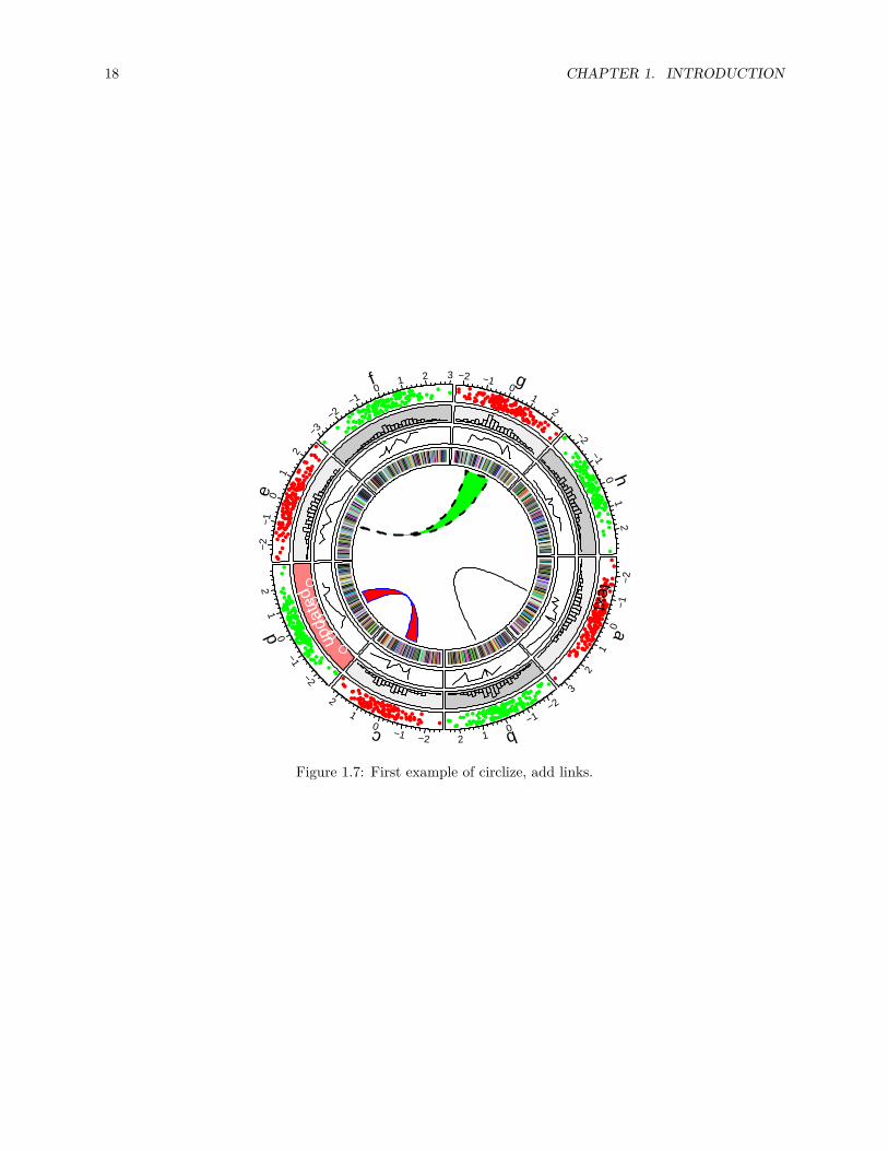
In the most inside of the circle, links or ribbons are added. There can be links from single point to point,point to interval or interval to interval. Section 3.9 gives detailed usage of links. (See Figure 1.7)circos.link("a", 0, "b", 0, h = 0.4)circos.link("c", c(-0.5, 0.5), "d", c(-0.5,0.5), col = "red",
border = "blue", h = 0.2)circos.link("e", 0, "g", c(-1,1), col = "green", border = "black", lwd = 2, lty = 2)
Finally we need to reset the graphic parameters and internal variables, so that it will not mess up your nextplot.circos.clear()
18 CHAPTER 1. INTRODUCTION
a
−2
−10
1
2
3
b
−2
−10
12
c
−2−1
01
2
d
−2
−10
12
e−
2−1
01
2
f
−3
−2−1
01 2 3 g−2 −1
01
2
h
−2−1
01
2
text
upda
ted
Figure 1.7: First example of circlize, add links.

Chapter 2
Circular layout
2.1 Coordinate transformation
To map graphics onto the circle, there exist transformations from several coordinate systems. First, thereare data coordinate systems in which ranges for x-axes and y-axes are the ranges of original data. Second,there is a polar coordinate system in which these coordinates are mapped onto a circle. Finally, there isa canvas coordinate system in which graphics are really drawn on the graphical device (figure 2.1). Eachcell has its own data coordinate and they are independent. circlize first transforms coordinates from datacoordinate system to polar coordinate system and finally transforms into canvas coordinate system. Forusers, they only need to imagine that each cell is a normal rectangular plotting region (data coordinate) inwhich x-lim and y-lim are ranges of data in that cell. circlize knows which cell you are in and does all thetransformations automatically.
The final canvas coordinate is in fact an ordinary coordinate in the base R graphic system with x range in(-1, 1) and y range in (-1, 1) by default. It should be noted that the circular plot is always drawninside the circle which has radius of 1 (which means it is always a unit circle), and from outsideto inside.
2.2 Rules for making the circular plot
The rule for making the circular plot is rather simple. It follows the sequence of initialize layout ->create track -> add graphics -> create track -> add graphics - ... -> clear. Graphics can beadded at any time as long as the tracks are created. Details are shown in Figure 2.2 and as follows:
1. Initialize the layout using circos.initialize(). Since circular layout in fact visualizes data whichis in categories, there must be at least a categorical variable. Ranges of x values on each category canbe specified as a vector or the range itself. See Section 2.3.
2. Create plotting regions for the new track and add graphics. The new track is created just inside thepreviously created one. Only after the creation of the track can you add other graphics on it. Thereare three ways to add graphics in cells.
• After the creation of the track, use low-level graphic function like circos.points(),circos.lines(), … to add graphics cell by cell. It always involves a for loop and youneed to subset the data by the categorical variable manually.
• Use circos.trackPoints(), circos.trackLines(), … to add simple graphics through all cellssimultaneously.
19

20 CHAPTER 2. CIRCULAR LAYOUT
text0 2 4 6 8 10
text
0
2
4 6
8
10
text2 4
68
10
−1.0 −0.5 0.0 0.5 1.0
−1.
0−
0.5
0.0
0.5
1.0
Figure 2.1: Transformation between different coordinates
• Use panel.fun argument in circos.track() to add graphics immediately after the creation of acertain cell. panel.fun needs two arguments x and y which are x values and y values that are inthe current cell. This subset operation is applied automatically. This is the most recommendedway. Section 2.7 gives detailed explanation of using panel.fun argument.
3. Repeat step 2 to add more tracks on the circle unless it reaches the center of the circle.
4. Call circos.clear() to clean up.
As mentioned above, there are three ways to add graphics on a track.
1. Create plotting regions for the whole track first and then add graphics by specifying sector.index.In the following pseudo code, x1, y1 are data points in a given cell, which means you need to do datasubsetting manually.
In following code, circos.points() and circos.lines() are used separatedly from circos.track(),thus, the index for the sector needs to be explicitly specified by sector.index argument. There is alsoa track.index argument for both functions, however, the default value is the “current” track indexand as the two functions are used just after circos.track(), the “current” track index is what thetwo functions expect and it can be ommited when calling the two functions.
circos.initialize(factors, xlim)circos.track(factors, ylim)for(sector.index in all.sector.index) {
circos.points(x1, y1, sector.index)circos.lines(x2, y2, sector.index)
}
2. Add graphics in a batch mode. In following code, circos.trackPoints() and circos.trackLines()need a categorical variable, a vector of x values and a vector of y values. X and y values will be splitby the categorical variable and sent to corresponding cell to add the graphics. Internally, this is doneby using circos.points() or circos.lines() in a for loop. This way to add graphics would beconvenient if users only want to add a specific type of simple graphics (e.g. only points) to the track,but it is not recommended for making complex graphics.
circos.trackPoints() and circos.trackLines() need a track.index to specify which track to add

2.2. RULES FOR MAKING THE CIRCULAR PLOT 21
circos.initialize circos.trackPlotRegion
circos.pointscircos.linescircos.text
...
circos.trackPlotRegion
circos.pointscircos.linescircos.text
...
...circos.clear
Figure 2.2: Order of drawing circular layout.
22 CHAPTER 2. CIRCULAR LAYOUT
the graphics. Similarly, since these two are called just after circos.track(), the graphics are addedin the newly created track right away.
circos.initialize(factors, xlim)circos.track(factors, ylim)circos.trackPoints(factors, x, y)circos.trackLines(factors, x, y)
3. Use a panel function to add self-defined graphics as soon as the cell has been created. This is the wayrecommended and you can find most of the code in this book uses panel.fun. circos.track() createscells one by one and after the creation of a cell, and panel.fun is executed on this cell immediately.In this case, the “current” sector and “current” track are marked to this cell that you can directly uselow-level functions without specifying sector index and track index.
If you look at following code, you will find the code inside panel.fun is as natural as using points()or lines() in the normal R graphic system. This is a way to help you think a cell is an “imaginaryrectangular plotting region”.
circos.initialize(factors, xlim)circos.track(factors, all_x, all_y, ylim,
panel.fun = function(x, y) {circos.points(x, y)circos.lines(x, y)
})
There are several internal variables keeping tracing of the current sector and track when applyingcircos.track() and circos.update(). Thus, although functions like circos.points(), circos.lines()need to specify the index of sector and track, they will take the current one by default. As a result, if youdraw points, lines, text et al just after the creation of the track or cell, you do not need to set the sectorindex and the track index explicitly and it will be added in the most recently created or updated cell.
2.3 Sectors and tracks
A circular layout is composed of sectors and tracks. As illustrated in Figure 2.3, the red circle is one trackand the blue represents one sector. The intersection of a sector and a track is called a cell which can bethought as an imaginary plotting region for data points. In this section, we introduce how to set data rangeson x and y directions in cells.
Sectors are first allocated on the circle by circos.initialize(). There must be a categorical variable (sayfactors) that on the circle, each sector corresponds to one category. The width of sectors (measured bydegree) are proportional to the data range in sectors on x direction (or the circular direction). The datarange can be specified as a numeric vector x which has same length as factors, then x is split by factorsand data ranges are calculated for each sector internally.
Data ranges can also be specified directly by xlim argument. The valid value for xilm is a two-columnmatrix with same number of rows as number of sectors that each row in xlim corresponds to one sector. Ifxlim has row names which already cover sector names, row order of xlim is automatically adjusted. If xlimis a vector of length two, all sectors have the same x range.circos.initialize(factors, x = x)circos.initialize(factors, xlim = xlim)
After the initialization of the layout, you may not see anything drawn or only an empty graphical deviceis opened. That is because no track has been created yet, however, the layout has already been recordedinternally.

2.3. SECTORS AND TRACKS 23
a:1a:2
a:3a:4
d:1
d:2
d:3
d:4
j:1
j:2
j:3
j:4
f:1
f:2
f:3
f:4c:1
c:2c:3
c:4
h:1h:2
h:3h:4
e:1
e:2
e:3
e:4
i:1
i:2
i:3
i:4
b:1
b:2
b:3
b:4g:1
g:2g:3
g:4
Figure 2.3: Sectors and tracks in circular layout.
In the initialization step, not only the width of each sector is assigned, but also the order of sectors onthe circle is determined. Order of the sectors are determined by the order of levels of the inputfactor. If the value for factors is not a factor, the order of sectors is unique(factors). Thus, if you wantto change the order of sectors, you can just change of the level of factors variable. The following codegenerates plots with different sector orders (Figure 2.4).fa = c("d", "f", "e", "c", "g", "b", "a")f1 = factor(fa)circos.initialize(factors = f1, xlim = c(0, 1))f2 = factor(fa, levels = fa)circos.initialize(factors = f2, xlim = c(0, 1))
In different tracks, cells in the same sector share the same data range on x-axes. Then, foreach track, we only need to specify the data range on y direction (or the radical direction) for cells. Similaras circos.initialize(), circos.track() also receives either y or ylim argument to specify the range ofy-values. Since all cells in a same track shares a same y range, ylim is just a vector of length two if it isspecified.
x can also be specified in circos.track(), but it is only used to send to panel.fun. In Section 2.7, we willintroduce how x and y are sent to each cell and how the graphics are added.circos.track(factors, y = y)circos.track(factors, ylim = c(0, 1))circos.track(factors, x = x, y = y)
In the track creation step, since all sectors have already been allocated in the circle, if factors argument isnot set, circos.track() would create plotting regions for all available sectors. Also, levels of factors donot need to be specified explicitly because the order of sectors has already be determined in the initializationstep. If users only create cells for a subset of sectors in the track (not all sectors), in fact, cells in remainingunspecified sectors are created as well, but with no borders (pretending they are not created).

24 CHAPTER 2. CIRCULAR LAYOUT
a:1
b:1
c:1
d:1
e:1
f:1
g:1
factor(fa)
d:1
f:1
e:1
c:1
g:1
b:1
a:1
factor(fa, levels = fa)
Figure 2.4: Different sector orders.
# assume `factors` only covers a subset of sectors# You will only see cells that are covered in `factors` have borderscircos.track(factors, y = y)# You will see all cells have borderscircos.track(ylim = ranges(y))
Cells are basic units in the circular plot and are independent from each other. After the creation of cells,they have self-contained meta values of x-lim and y-lim (data range measured in data coordinate). So if youare adding graphics in one cell, you do not need to consider things outside the cell and also you do not needto consider you are in the circle. Just pretending it is normal rectangle region with its own coordinate.
2.4 Graphic parameters
Some basic parameters for the circular layout can be set by circos.par(). These parameters are listed asfollows. Note some parameters can only be modified before the initialization of the circular layout.
• start.degree: The starting degree where the first sector is put. Note this degree is measured in thestandard polar coordinate system which means it is always reverse clockwise. E.g. if it is set to 90,sectors start from the top center of the circle. See Figure 2.5.
• gap.degree: Gap between two neighbour sectors. It can be a single value which means all gaps sharesame degree, or a vector which has same number as sectors. Note the first gap is after the firstsector. See Figure 2.5 and figure 2.6.
• gap.after: Same as gap.degree, but more understandable. Modifying values of gap.after will alsomodify gap.degree and vice versa.
• track.margin: Like margin in Cascading Style Sheets (CSS), it is the blank area out of the plottingregion, also outside of the borders. Since left and right margin are controlled by gap.after, onlybottom and top margin need to be set. The value for track.margin is the percentage to the radiusof the unit circle. The value can also be set by convert_height() or the short version uh() functionwith absolute units. See figure 2.6.
• cell.padding: Padding of the cell. Like padding in Cascading Style Sheets (CSS), it is the blankarea around the plotting regions, but within the borders. The parameter has four values, which control

2.4. GRAPHIC PARAMETERS 25
ab
c
d
e
f
g
hcircos.par("clock.wise" = FALSE,start.degree = 30)
a
b
c
d
e
fg
hcircos.par("clock.wise" = TRUE,start.degree = −30)
Figure 2.5: Sector directions.
the bottom, left, top and right padding respectively. The first and the third padding values are thepercentages to the radius of the unit circle, and the second and fourth values are the degrees. The firstand the third value can be set by uh() with absolute units. See figure 2.6.
• unit.circle.segments: Since curves are simulated by a series of straight lines, this parameter controlsthe amount of segments to represent a curve. The minimal length of the line segment is the length ofthe unit circle (2π) divided by unit.circle.segments. More segments means better approximationfor the curves, while generate larger file size if figures are in PDF format. See explanantion in Section3.2.
• track.height: The default height of tracks. It is the percentage to the radius of the unit circle. Theheight includes the top and bottom cell paddings but not the margins. The value can be set by uh()with absolute units.
• points.overflow.warning: Since each cell is in fact not a real plotting region but only an ordinaryrectangle (or more precisely, a circular rectangle), it does not remove points that are plotted outsideof the region. So if some points (or lines, text) are out of the plotting region, by default, the packagewould continue drawing the points but with warning messages. However, in some circumstances,drawing something out of the plotting region is useful, such as adding some text annotations (like thefirst track in Figure 1.2). Set this value to FALSE to turn off the warnings.
• canvas.xlim: The ranges in the canvas coordinate in x direction. circlize is forced to put everythinginside the unit circle, so canvas.xlim and canvas.ylim is c(-1, 1) by default. However, you canset it to a more broad interval if you want to leave more spaces out of the circle. By choosing propercanvas.xlim and canvas.ylim, actually you can customize the circle. E.g. setting canvas.xlim toc(0, 1) and canvas.ylim to c(0, 1) would only draw 1/4 of the circle.
• canvas.ylim: The ranges in the canvas coordinate in y direction.• clock.wise: The order for drawing sectors. Default is TRUE which means clockwise (figure 2.5. Note
that inside each cell, the direction of x-axis is always clockwise and direction of y-axis isalways from inside to outside in the circle.
Default values for graphic parameters are listed in following table.
start.degree 0gap.degree/gap.after 1track.margin c(0.01, 0.01)

26 CHAPTER 2. CIRCULAR LAYOUT
cell.padding c(0.02, 1.00, 0.02, 1.00)unit.circle.segments 500track.height 0.2points.overflow.warning TRUEcanvas.xlim c(-1, 1)canvas.ylim c(-1, 1)clock.wise TRUE
Parameters related to the allocation of sectors cannot be changed after the initialization of the circularlayout. Thus, start.degree, gap.degree/gap.after, canvas.xlim, canvas.ylim and clock.wise canonly be modified before circos.initialize(). The second and the fourth values of cell.padding (leftand right paddings) can not be modified neither (or will be ignored).
Similar reason, since some of the parameters are defined before the initialization of the circular layout, aftermaking each plot, you need to call circos.clear() to manually reset all the parameters.
2.5 Create plotting regions
As described above, only after creating the plotting region can you add low- level graphics on it. The minimalset of arguments for circos.track() is to set either y or ylim which assigns range of y values for this track.circos.track() creates tracks for all sectors although in some case only parts of them are visible.
If factors is not specified, all cells in the track will be created with the same settings. If factors, x and yare set, they need to be vectors with the same length. Proper values of x and y that correspond to current cellwill be passed to panel.fun by subsetting factors internally. Section 2.7 explains the usage of panel.fun.
Graphic arguments such as bg.border and bg.col can either be a scalar or a vector. If it is a vector, thelength must be equal to the number of sectors and the order corresponds to the order of sectors. Thus, youcan create plot regions with different styles of borders and background colors.
If you are confused with the factors orders, you can also customize the borders and background colorsinside panel.fun. get.cell.meta.data("cell.xlim") and get.cell.meta.data("cell.ylim") give youdimensions of the plotting region and you can customize plot regions directly by e.g. circos.rect(col ="#FF000040", border = 1).
circos.track() provides track.margin and cell.padding arguments that they only control track marginsand cell paddings for the current track. Of course the second and fourth value in cell.padding are ignored.
2.6 Update plotting regions
circos.track() creates new tracks, however, if track.index argument is set to a track which already exists,circos.track() actually re-creates this track. In this case, coordinates on y directions can be re-defined,but settings related to the positions of the track such as the height of the track can not be modified.circos.track(factors, ylim = c(0, 1), track.index = 1, ...)
For a single cell, circos.update() can be used to erase all graphics that have been already added in thecell. However, the data coordinate in the cell keeps unchanged.circos.update(sector.index, track.index)circos.points(x, y, sector.index, track.index)

2.7. PANEL.FUN ARGUMENT 27
plotting regioncell.padding[3]cell.padding[1]
cell.
padd
ing[
2]
cell.padding[4]
track.margin[1]
track.margin[2]
gap.
degr
ee
gap.degree
Figure 2.6: Regions in a cell.
2.7 panel.fun argument
panel.fun argument in circos.track() is extremely useful to apply plotting as soon as the cell has beencreated. This self-defined function needs two arguments x and y which are data points that belong to thiscell. The value for x and y are automatically extracted from x and y in circos.track() according to thecategory defined in factors. In the following example, inside panel.fun, in sector a, the value of x is 1:3and in sector b, value of x is 4:5. If x or y in circos.track() is NULL, then x or y inside panel.fun is alsoNULL.factors = c("a", "a", "a", "b", "b")x = 1:5y = 5:1circos.track(factors = factors, x = x, y = y,
panel.fun = function(x, y) {circos.points(x, y)
})
In panel.fun, one thing important is that if you use any low-level graphic functions, you don’t need tospecify sector.index and track.index explicitly. Remember that when applying circos.track(), cellsin the track are created one after one. When a cell is created, circlize would set the sector index andtrack index of the cell as the ‘current’ index. When the cell is created, panel.fun is executed immediately.Without specifying sector.index and track.index, the ‘current’ ones are used and that’s exactly whatyou need.
The advantage of panel.fun is that it makes you feel you are using graphic functions in the base graphicengine (You can see it is almost the same of using circos.points(x, y) and points(x, y)). It will bemuch easier for users to understand and customize new graphics.
Inside panel.fun, information of the ‘current’ cell can be obtained through get.cell.meta.data(). Alsothis function takes the ‘current’ sector and ‘current’ track by default.

28 CHAPTER 2. CIRCULAR LAYOUT
get.cell.meta.data(name)get.cell.meta.data(name, sector.index, track.index)
Information that can be extracted by get.cell.meta.data() are:
• sector.index: The name for the sector.• sector.numeric.index: Numeric index for the sector.• track.index: Numeric index for the track.• xlim: Minimal and maximal values on the x-axis.• ylim: Minimal and maximal values on the y-axis.• xcenter: mean of xlim.• ycenter: mean of ylim.• xrange: defined as xlim[2] - xlim[1].• yrange: defined as ylim[2] - ylim[1].• cell.xlim: Minimal and maximal values on the x-axis extended by cell paddings.• cell.ylim: Minimal and maximal values on the y-axis extended by cell paddings.• xplot: Degree of right and left borders in the plotting region. The first element corresponds to the
start point of values on x-axis and the second element corresponds to the end point of values on x-axisSince x-axis in data coordinate in cells are always clockwise, xplot[1] is larger than xplot[2].
• yplot: Radius of bottom and top radius in the plotting region.• cell.start.degree: Same as xplot[1].• cell.end.degree: Same as xplot[2].• cell.bottom.radius: Same as yplot[1].• cell.top.radius: Same as yplot[2].• track.margin: Margins of the cell.• cell.padding: Paddings of the cell.
Following example code uses get.cell.meta.data() to add sector index in the center of each cell.circos.track(ylim = ylim, panel.fun = function(x, y) {
sector.index = get.cell.meta.data("sector.index")xcenter = get.cell.meta.data("xcenter")ycenter = get.cell.meta.data("ycenter")circos.text(xcenter, ycenter, sector.index)
})
get.cell.meta.data() can also be used outside panel.fun, but you need to explictly specify sector.indexand track.index arguments unless the current index is what you want.
There is a companion variable CELL_META which is identical to get.cell.meta.data() to get cell metainformation, but easier and shorter to write. Actually, the value of CELL_META itself is meaningless, but e.g.CELL_META$sector.index is automatically redirected to get.cell.meta.data("sector.index"). Follow-ing code rewrites above example code with CELL_META.circos.track(ylim = ylim, panel.fun = function(x, y) {
circos.text(CELL_META$xcenter, CELL_META$ycenter,CELL_META$sector.index)
})
Please note CELL_META only extracts information for the “current” cell, thus, it is recommended to use onlyin panel.fun.
Nevertheless, if you have several lines of code which need to be executed out of panel.fun, you can flagthe specified cell as the “current” cell by set.current.cell(), which can save you from typing too manysector.index = ..., track.index = .... E.g. following codecircos.text(get.cell.meta.data("xcenter", sector.index, track.index),
get.cell.meta.data("ycenter", sector.index, track.index),

2.8. OTHER UTILITIES 29
get.cell.meta.data("sector.index", sector.index, track.index),sector.index, track.index)
can be simplified to:set.current.cell(sector.index, track.index)circos.text(get.cell.meta.data("xcenter"),
get.cell.meta.data("ycenter"),get.cell.meta.data("sector.index"))
# or more simplecircos.text(CELL_META$xcenter, CELL_META$ycenter, CELL_META$sector.index)
2.8 Other utilities
2.8.1 circlize() and reverse.circlize()
circlize transform data points in several coordinate systems and it is basically done by the core functioncirclize(). The function transforms from data coordinate (coordinate in the cell) to the polar coordinateand its companion reverse.circlize() transforms from polar coordinate to a specified data coordinate.The default transformation is applied in the current cell.factors = c("a", "b")circos.initialize(factors, xlim = c(0, 1))circos.track(ylim = c(0, 1))# x = 0.5, y = 0.5 in sector a and track 1circlize(0.5, 0.5, sector.index = "a", track.index = 1)
## theta rou## [1,] 270.5 0.89# theta = 90, rou = 0.9 in the polar coordinatereverse.circlize(90, 0.9, sector.index = "a", track.index = 1)
## x y## [1,] 1.519774 0.56reverse.circlize(90, 0.9, sector.index = "b", track.index = 1)
## x y## [1,] 0.5028249 0.56
You can see the results are different for two reverse.circlize() calls although it is the same points in thepolar coordinate, because they are mapped to different cells.
circlize() and reverse.circlize() can be used to connect two circular plots if they are drawn on a samepage. This provides a way to build more complex plots. Basically, the two circular plots share a same polarcoordiante, then, the manipulation of circlize->reverse.circlize->circlize can transform coordinatefor data points from the first circular plot to the second. In Chapter 12, we use this technique to combinetwo circular plots where one zooms subset of regions in the other one.
The transformation between polar coordinate and canvas coordinate is simple. circlize has acirclize:::polar2Cartesian() function but this function is not exported.
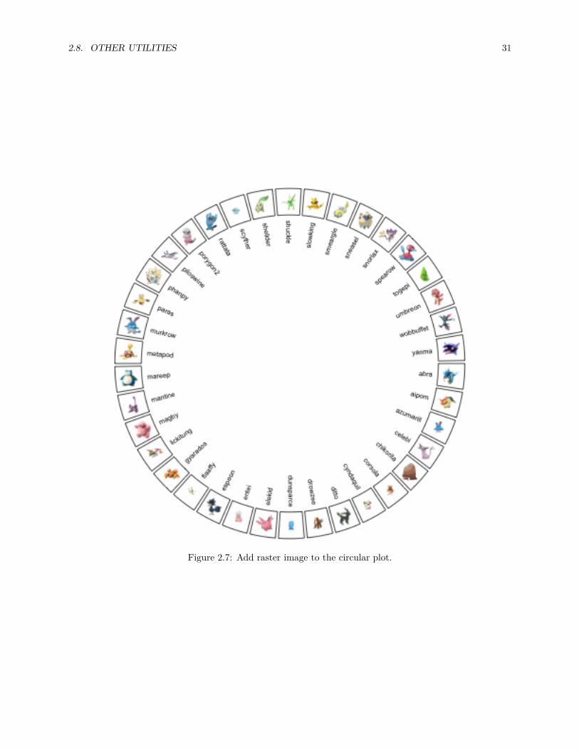
Following example (Figure 2.7) adds raster image to the circular plot. The raster image is added byrasterImage() which is applied in the canvas coordinate. Note how we change coordinate from datacoordinate to canvas coordinate by using circlize() and circlize:::polar2Cartesian().

30 CHAPTER 2. CIRCULAR LAYOUT
library(yaml)data = yaml.load_file("https://raw.githubusercontent.com/Templarian/slack-emoji-pokemon/master/pokemon.yaml")set.seed(123)pokemon_list = data$emojis[sample(length(data$emojis), 40)]pokemon_name = sapply(pokemon_list, function(x) x$name)pokemon_src = sapply(pokemon_list, function(x) x$src)
library(EBImage)circos.par("points.overflow.warning" = FALSE)circos.initialize(pokemon_name, xlim = c(0, 1))circos.track(ylim = c(0, 1), panel.fun = function(x, y) {
pos = circlize:::polar2Cartesian(circlize(CELL_META$xcenter, CELL_META$ycenter))image = EBImage::readImage(pokemon_src[CELL_META$sector.numeric.index])circos.text(CELL_META$xcenter, CELL_META$cell.ylim[1] - uy(2, "mm"),
CELL_META$sector.index, facing = "clockwise", niceFacing = TRUE,adj = c(1, 0.5), cex = 0.6)
rasterImage(image,xleft = pos[1, 1] - 0.05, ybottom = pos[1, 2] - 0.05,xright = pos[1, 1] + 0.05, ytop = pos[1, 2]+ 0.05)
}, bg.border = 1, track.height = 0.15)
circos.clear()
In circlize package, there is a circos.raster() function which directly adds raster images. It is introducedin Section 3.8.
2.8.2 The convert functions
For the functions in circlize package, they needs arguments which are lengths measured either in the canvascoordinate or in the data coordinate. E.g. track.height argument in circos.track() corresponds topercent of radius of the unit circle. circlize package is built in the R base graphic system which is notstraightforward to define a length with absolute units (e.g. a line of length 2 cm). To solve this problem,circlize provides three functions which convert absolute units to the canvas coordinate or the data coordinateaccordingly.
convert_length() converts absolute units to the canvas coordinate. Since the aspect ratio for canvascoordinate is always set to 1, it doesn’t matter whether to convert units in the x direction or in the ydirection. The usage of convert_length() is straightforward, supported units are mm, cm and inches.If users want to convert a string height or width to the canvas coordinate, directly use strheight() orstrwidth() functions.convert_length(2, "mm")
Since convert_length() is mostly used to define heights on the radical direction, e.g. track height or heightof track margins, the function has another name convert_height(), or the short name uh() (stands forunit height).
convert_x() and convert_y(), or the short version ux() and uy() (unit x and unit y), convert absoluteunits to the data coordinate. By default, the conversion is applied in the “current” cell, but it can still beused in other cells by specifying sector.index and track.index arguments. Since the width of the cell isnot identical from the top to the bottom in the cell, for convert_x() or ux() function, the position on ydirection where the convert is applied needs to be specified. By default it is at the middle point on y-axis.
Following plot (Figure 2.8) is an example of setting absolute units.
2.8. OTHER UTILITIES 31
Figure 2.7: Add raster image to the circular plot.

32 CHAPTER 2. CIRCULAR LAYOUT
fa = letters[1:10]circos.par(cell.padding = c(0, 0, 0, 0), track.margin = c(0, 0))circos.initialize(fa, xlim = cbind(rep(0, 10), runif(10, 0.5, 1.5)))circos.track(ylim = c(0, 1), track.height = uh(5, "mm"),
panel.fun = function(x, y) {circos.lines(c(0, 0 + ux(5, "mm")), c(0.5, 0.5), col = "blue")
})circos.track(ylim = c(0, 1), track.height = uh(1, "cm"),
track.margin = c(0, uh(2, "mm")),panel.fun = function(x, y) {
xcenter = get.cell.meta.data("xcenter")circos.lines(c(xcenter, xcenter), c(0, uy(1, "cm")), col = "red")
})circos.track(ylim = c(0, 1), track.height = uh(1, "inches"),
track.margin = c(0, uh(5, "mm")),panel.fun = function(x, y) {
line_length_on_x = ux(1*sqrt(2)/2, "cm")line_length_on_y = uy(1*sqrt(2)/2, "cm")circos.lines(c(0, line_length_on_x), c(0, line_length_on_y), col = "orange")
})
circos.clear()
2.8.3 circos.info() and circos.clear()
You can get basic information of your current circular plot by circos.info(). The function can be calledat any time.factors = letters[1:3]circos.initialize(factors = factors, xlim = c(1, 2))circos.info()
## All your sectors:## [1] "a" "b" "c"#### No track has been createdcircos.track(ylim = c(0, 1))circos.info(sector.index = "a", track.index = 1)
## sector index: 'a'## track index: 1## xlim: [1, 2]## ylim: [0, 1]## cell.xlim: [0.991453, 2.008547]## cell.ylim: [-0.1, 1.1]## xplot (degree): [0, 241]## yplot (radius): [0.79, 0.99]## track.margin: c(0.01, 0.01)## cell.padding: c(0.02, 1, 0.02, 1)#### Your current sector.index is c## Your current track.index is 1

2.8. OTHER UTILITIES 33
Figure 2.8: Setting absolute units

34 CHAPTER 2. CIRCULAR LAYOUT
circos.clear()
It can also add labels to all cells by circos.info(plot = TRUE).
You should always call circos.clear() at the end of every circular plot. There are several parameters forcircular plot which can only be set before circos.initialize(), thus, before you draw the next circularplot, you need to reset all these parameters.

Chapter 3
Graphics
In this chapter, we will introduce low-level functions that add graphics to the circle. Usages of most ofthese functions are similar as normal graphic functions (e.g. points(), lines()). Combination use of thesefunctions can generate very complex circular plots.
All low-level functions accept sector.index and track.index arguments which indicate which cell thegraphics are added in. By default the graphics are added in the “current” sector and “current” track, so it isrecommended to use them directly inside panel.fun function. However, they can also be used in other placeswith explicitly specifying sector and track index. Following code shows an example of using ciros.points().circos.track(..., panel.fun = function(x, y) {
circos.points(x, y)})circos.points(x, y, sector.index, track.index)
In this chapter, we will also discuss how to customize links and how to highlight regions in the circle.
3.1 Points
Adding points by circos.points() is similar as points() function. Possible usage is:circos.points(x, y)circos.points(x, y, sector.index, track.index)circos.points(x, y, pch, col, cex)
There is a companion function circos.trackPoints() which adds points to all sectors in a same tracksimultaneously. The input of circos.trackPoints() must contain a vector of categorical factors, a vectorof x values and a vector of y values. X values and y values are split by the categorical variable andcorresponding subset of x and y values are internally sent to circos.points(). circos.trackPoints()adds points to the “current” track by default which is the most recently created track. Other tracks can alsobe selected by explictly setting track.index argument.circos.track(...)circos.trackPoints(fa, x, y)
circos.trackPoints() is simply implemented by circos.points() with a for loop. However, it is morerecommended to directly use circos.points() and panel.fun which provides great more flexibility. Actu-ally following code is identical to above code.
35

36 CHAPTER 3. GRAPHICS
type
= 'l
'
type = 'o'
type = 'h'
type = 'h', baseline = 5
‘col‘ set as a vector
type = 's'
type
= 'l'
, are
a =
TRUE
type = 'o', area = TRUE type = 's', area = TRUE
type = 'l', area = TRU
E
baseline = 'top'
Figure 3.1: Line styles and areas supported in ‘circos.lines()‘
circos.track(fa, x, y, panel.fun = function(x, y) {circos.points(x, y)
})
Other low-level functions also have their companion circos.track*() function. The usage is same ascircos.trackPoints() and they will not be further discussed in following sections.
3.2 Lines
Adding lines by circos.lines() is similar as lines() function. One additional feature is that the areasunder or above the lines can be filled by specifing area argument to TRUE. Position of the baseline can beset to a pre-defined string of bottom or top, or a numeric value which is the position on y-axis. When areais set to TRUE, col controls the filled color and border controls the color for the borders.
baseline argument is also workable when lty is set to "h". Note when lty is set to "h", graphic parameterssuch as col can be set as a vector with same length as x. Figure 3.1 illustrates supported lty settings andarea/baseline settings.

3.3. SEGMENTS 37
Figure 3.2: Transformation of straight lines into curves in the circle.
Straight lines are transformed to curves when mapping to the circular layout (Figure 3.2). Normally, curvesare approximated by a series of segments of straight lines. With more and shorter segments, there is betterapproximation, but with larger size if the figures are generated into e.g. PDF files, especially for huge dataset.Default length of segments in circlize is a balance between the quality and size of the figure. You can set thelength of the unit segment by unit.circle.segments option in circos.par(). The length of the segmentis calculated as the length of the unit circle (2π) divided by unit.circle.segments. In some scenarios,actually you don’t need to segment the lines such as radical lines, then you can set straight argument toTRUE to get rid of unnecessary segmentations.
Possible usage for circos.lines() is:circos.lines(x, y)circos.lines(x, y, sector.index, track.index)circos.lines(x, y, col, lwd, lty, type, straight)circos.lines(x, y, col, area, baseline, border)
3.3 Segments
Line segments can be added by circos.segments() function. The usage is similar as segments(). Radicalsegments can be added by setting straight to TRUE.circos.segments(x0, y0, x1, y1)circos.segments(x0, y0, x1, y1, straight)
3.4 Text
Adding text by circos.text() is similar as text() function. Text is added on the plot for human reading,thus, when putting the text on the circle, the facing of text is very important. circos.text() supports sevenfacing options which are inside, outside, clockwise, reverse.clockwise, downward, bending.insideand bending.outside. Please note for bending.inside and bending.outside, currently, single line textis only supported. If you want to put bended text into two lines, you need to split text into two lines andadd each line by circos.text() separately. The different facings are illustrated in figure 3.3.
Possible usage for circos.text() is:circos.text(x, y, labels)circos.text(x, y, labels, sector.index, track.index)circos.text(x, y, labels, facing, niceFacing, adj, cex, col, font)
If, e.g., facing is set to inside, text which is on the bottom half of the circle is still facing to the top andhard to read. To make text more easy to read and not to hurt readers’ neck too much, circos.text()

38 CHAPTER 3. GRAPHICS
inside
outside
reverse.clockwise
clockwise
downward
====bending.inside====
====edistuo.gnidneb====
inside
outside
reve
rse.
cloc
kwis
e
clockwise
downward
====bending.inside=
===
====edi
stuo
.gni
dneb
==
==
insi
de
outside
reverse.clockwise
cloc
kwis
e
downward
====
bend
ing.
insid
e====
====
edi st uo. gni dneb====
inside
outs
ide
reverse.clockwise
clockwise
downward
====bending.inside====
====edi st uo. gni dneb=
==
=
Figure 3.3: Text facings.
provides niceFacing option which automatically adjust text facing according to their positions in thecircle. niceFacing only works for facing value of inside, outside, clockwise, reverse.clockwise,bending.inside and bending.outside.
When niceFacing is on, adj is also adjusted according to the corresponding facings. Figure 3.4 illustratestext positions under different settings of adj and facing. The red dots are the positions of the texts.
adj is internally passed to text(), thus, it actually adjusts text positions either horizontally or vertically(in the canvas coordinate). If the direction of the offset is circular, the offset value can be set as degrees thatthe position of the text is adjusted by wrapping the offset by degree().circos.text(x, y, labels, adj = c(0, degree(5)), facing = "clockwise")
As circos.text() is applied in the data coordiante, offset can be directly added to x or/and y as a valuemeasured in the data coordinate. An absolute offset can be set by using ux() (in x direction) and uy() (iny direction).circos.text(x + ux(2, "mm"), y + uy(2, "mm"), labels)
3.5 Rectangles and polygons
Theoretically, circular rectangles and polygons are all polygons. If you imagine the plotting region in a cell asCartesian coordinate, then circos.rect() draws rectangles. In the circle, the up and bottom edge becometwo arcs. Note this function can be vectorized.circos.rect(xleft, ybottom, xright, ytop)circos.rect(xleft, ybottom, xright, ytop, sector.index, track.index)circos.rect(xleft, ybottom, xright, ytop, col, border, lty, lwd)
circos.polygon() draws a polygon through a series of points in a cell. Please note the first data point must

3.5. RECTANGLES AND POLYGONS 39
rawText
niceFacing
rawText
niceFacing
rawText
nice
Faci
ng
rawText
niceFacing
rawText
niceFacing
facing = 'clockwise'
adj = c(0, 0.5)
raw
Text
nice
Faci
ng
rawText
niceFacing
rawText
niceFacing
raw
TextniceFacing
raw
Text
nice
Faci
ng
rawText
niceFacing
rawText
niceFacing
facing = 'reverse.clockwise'
adj = c(0, 0.5) rawText
nice
Faci
ng
rawText
niceFacing
rawText
niceFacing
raw
Text
niceFacing
raw
Text
nice
Faci
ng
rawText
niceFacing
rawText
niceFacing
facing = 'reverse.clockwise'
adj = c(1, 0.5)
rawText
nice
Faci
ng
rawText
niceFacing
rawTextniceFacing
rawText
niceFacing
rawText
nice
Faci
ng
rawText
niceFacing
rawText
niceFacing
facing = 'clockwise'
adj = c(1, 0.5)
raw
Text
nice
Faci
ng
rawText
niceFacing
rawText
nice
Faci
ng
rawText
niceFacingrawText
niceFacing
raw
TextniceFacing
raw
Text
nice
Faci
ng
facing = 'inside'
adj = c(0.5, 0) rawText
niceFacing
rawText
niceFacing
raw
Text
nice
Faci
ng
rawText
niceFacingrawTextniceFacing
rawText
niceFacingraw
Text
nice
Faci
ng
facing = 'outside'
adj = c(0.5, 0)
rawText
niceFacing
raw
Text
niceFacing
raw
Text
nice
Faci
ng
rawText
niceFacingrawTextniceFacing
rawText
niceFacingraw
Text
nice
Faci
ng
facing = 'outside'
adj = c(0.5, 1)
rawText
niceFacing
raw
Text
niceFacing
rawText
nice
Faci
ng
rawText
niceFacingrawText
niceFacing
raw
TextniceFacing
raw
Text
nice
Faci
ng
facing = 'inside'
adj = c(0.5, 1)rawText
niceFacing
rawText
niceFacing
rawTextrawTextrawTextrawTextraw
Text
niceFacingniceFacingniceFacingniceFacing
rawTextrawTextrawTextrawTextrawText
gnicaFecingnicaFecingnicaFecingnicaFecin
raw
Text
raw
Text
raw
Tex
traw
Tex
traw
Tex
t
gnic
aFec
ingn
ica
Feci
ngni
caF e
cin g
nic a
Feci
n
facing = 'bending.inside'
adj = c(0.5, 0)
t xeTwart xeTwart xeTwart xe
Twar
niceFacingniceFacingniceFacing
txeTwartxeTwartxeTwartxeTwar
gnicaFecingnicaFecingnicaFecin
txeT
wart
xeT
wart
xeT
w art
x eT
war
gnic
aFec
ingn
ica
Feci
n gni
c aFe
cin
facing = 'bending.outside'
adj = c(0.5, 0)
t xeTwart xeTwart xeTwart xeT
wart xeT
war
niceFacingniceFacingniceFacingniceFacing
txeTwartxeTwartxeTwartxeTwartxeTwar
gnicaFecingnicaFecingnicaFecingnicaFecin
txeT
wart
xeT
wart
xeT
war
txe
Tw
art x
eT
war
gnic
aFec
ingn
ica
Feci
ngni
caF e
cin g
nic a
Feci
n
facing = 'bending.outside'
adj = c(0.5, 1)
rawTextrawTextrawTextraw
Text
niceFacingniceFacingniceFacing
rawTextrawTextrawTextrawText
gnicaFecingnicaFecingnicaFecin
rawT
extra
wTe
xtra
wT
extra
wTe
xt
gnic
aFec
ingn
ica
Feci
n gni
c aFe
cin
facing = 'bending.inside'
adj = c(0.5, 1)
Figure 3.4: Human easy text facing.

40 CHAPTER 3. GRAPHICS
Figure 3.5: Area of standard deviation of the smoothed line.
overlap to the last data point.circos.polygon(x, y)circos.polygon(x, y, col, border, lty, lwd)
In Figure 3.5, the area of standard deviation of the smoothed line is drawn by circos.polygon(). Sourcecode can be found in the Examples section of the circos.polygon() help page.
3.6 Axes
Mostly, we only draw x-axes on the circle. circos.axis() or circos.xaxis() privides options to customizex-axes which are on the circular direction. It supports basic functionalities as axis() such as defining thebreaks and corresponding labels. Besides that, the function also supports to put x-axes to a specified positionon y direction, to position the x-axes facing the center of the circle or outside of the circle, and to customizethe axes ticks. The at and labels arguments can be set to a long vector that the parts which exceedthe maximal value in the corresponding cell are removed automatically. The facing of labels text can beoptimized by labels.niceFacing (by default it is TRUE).
Figure 3.6 illustrates different settings of x-axes. The explanations are as follows:
• a: Major ticks are calculated automatically, other settings are defaults.• b: Ticks are pointing to inside of the circle, facing of tick labels is set to outside.• c: Position of x-axis is bottom in the cell.• d: Ticks are pointing to the inside of the circle, facing of tick labels is set to reverse.clockwise.• e: manually set major ticks and also set the position of x-axis.• f: replace numeric labels to characters, with no minor ticks.• g: No ticks for both major and minor, facing of tick labels is set to reverse.clockwise.• h: Number of minor ticks between two major ticks is set to 2. Length of ticks is longer. Facing of tick
labels is set to clockwise.

3.7. CIRCULAR ARROWS 41
a
bc
d
e
f g
h0
24
68
1002
46810
0246810
02
46
810
13
57
9
ac
eg f
a1 c1 e1 g1
f1
a1
c1
e1
g1
f1
Figure 3.6: X-axes
As you may notice in the above figure, when the first and last axis labels exceed data ranges on x-axis inthe corresponding cell, their positions are automatically adjusted to be shifted inwards in the cell.
Possible usage of circos.axis() is as follows. Note h can be bottom, top or a numeric value.circos.axis(h)circos.axis(h, sector.index, track.index)circos.axis(h, major.at, labels, major.tick, direction)circos.axis(h, major.at, labels, major.tick, labels.font, labels.cex,
labels.facing, labels.niceFacing)circos.axis(h, major.at, labels, major.tick, minor.ticks,
major.tick.length, lwd)
Y-axis is also supported by circos.yaxis(). The usage is similar as circos.axis() One thing that needsto be note is users need to manually adjust gap.degree in circos.par() to make sure there are enoughspaces for y-axes. (Figure 3.7)circos.yaxis(side)circos.yaxis(at, labels, sector.index, track.index)
3.7 Circular arrows
Circular arrows can be used to represent stages in a circle. circos.arrow() draws circular arrows parallelto the circle. Since the arrow is always parallel to the circle, on x-direction, the start and end position of thearrow need to be defined while on the y-direction, only the position of the center of arrow needs to be defined.Also width controls the width of the arrow and the length is defined by x2 - x1. arrow.head.width andarrow.head.length control the size of the arrow head, and values are measured in the data coordinatein corresponding cell. tail controls the shape of the arrow tail. Note for width, arrow.head.width andarrow.head.length, the value can be set by ux(), uy() with absolute units. See figure 3.8.

42 CHAPTER 3. GRAPHICS
02
46
810
0246810
02
46
810
02
46
810
0246810
02
46
810
Figure 3.7: Y-axes
circos.initialize(letters[1:4], xlim = c(0, 1))col = rand_color(4)tail = c("point", "normal", "point", "normal")circos.track(ylim = c(0, 1), panel.fun = function(x, y) {
circos.arrow(x1 = 0, x2 = 1, y = 0.5, width = 0.4,arrow.head.width = 0.6, arrow.head.length = ux(1, "cm"),col = col[CELL_META$sector.numeric.index],tail = tail[CELL_META$sector.numeric.index])
}, bg.border = NA, track.height = 0.4)
circos.clear()
Circular arrows are useful to visualize events which happen in circular style, such as different phases in cellcycle. Following example code visualizes four phases in cell cycle where the width of sectors correspond tothe hours in each phase (figure 3.9). Also circular arrows can be used to visualize genes in circular genomewhere the arrows represent the orientation of the gene, such as mitochondrial genome or plasmid genome.cell_cycle = data.frame(phase = factor(c("G1", "S", "G2", "M"), levels = c("G1", "S", "G2", "M")),
hour = c(11, 8, 4, 1))color = c("#66C2A5", "#FC8D62", "#8DA0CB", "#E78AC3")circos.par(start.degree = 90)circos.initialize(cell_cycle$phase, xlim = cbind(rep(0, 4), cell_cycle$hour))circos.track(ylim = c(0, 1), panel.fun = function(x, y) {
circos.arrow(CELL_META$xlim[1], CELL_META$xlim[2],arrow.head.width = CELL_META$yrange*0.8, arrow.head.length = ux(0.5, "cm"),col = color[CELL_META$sector.numeric.index])
circos.text(CELL_META$xcenter, CELL_META$ycenter, CELL_META$sector.index,facing = "downward")
circos.axis(h = 1, major.at = seq(0, round(CELL_META$xlim[2])), minor.ticks = 1,labels.cex = 0.6)
}, bg.border = NA, track.height = 0.3)
3.8. RASTER IMAGE 43
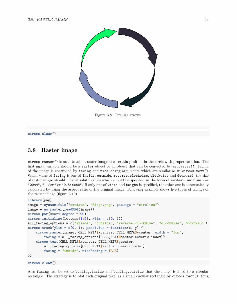
Figure 3.8: Circular arrows.
circos.clear()
3.8 Raster image
circos.raster() is used to add a raster image at a certain position in the circle with proper rotation. Thefirst input variable should be a raster object or an object that can be converted by as.raster(). Facingof the image is controlled by facing and niceFacing arguments which are similar as in circos.text().When value of facing is one of inside, outside, reverse.clockwise, clockwise and downward, the sizeof raster image should have absolute values which should be specified in the form of number- unit such as"20mm", "1.2cm" or "0.5inche". If only one of width and height is specified, the other one is automaticallycalculated by using the aspect ratio of the original image. Following example shows five types of facings ofthe raster image (figure 3.10).library(png)image = system.file("extdata", "Rlogo.png", package = "circlize")image = as.raster(readPNG(image))circos.par(start.degree = 90)circos.initialize(letters[1:5], xlim = c(0, 1))all_facing_options = c("inside", "outside", "reverse.clockwise", "clockwise", "downward")circos.track(ylim = c(0, 1), panel.fun = function(x, y) {
circos.raster(image, CELL_META$xcenter, CELL_META$ycenter, width = "1cm",facing = all_facing_options[CELL_META$sector.numeric.index])
circos.text(CELL_META$xcenter, CELL_META$ycenter,all_facing_options[CELL_META$sector.numeric.index],facing = "inside", niceFacing = TRUE)
})
circos.clear()
Also facing can be set to bending.inside and bending.outside that the image is filled to a circularrectangle. The strategy is to plot each original pixel as a small circular rectangle by circos.rect(), thus,

44 CHAPTER 3. GRAPHICS
G1
0 1
2
3
4
56
7
8
9
10
11
S
012
3
4
5
67
8
G2
0
1
2
3
4
M
01
Figure 3.9: Cell cycle.
inside
outs
ide
reverse.clockwise
clockwise
downward
Figure 3.10: Five facings of raster image.

3.9. LINKS 45
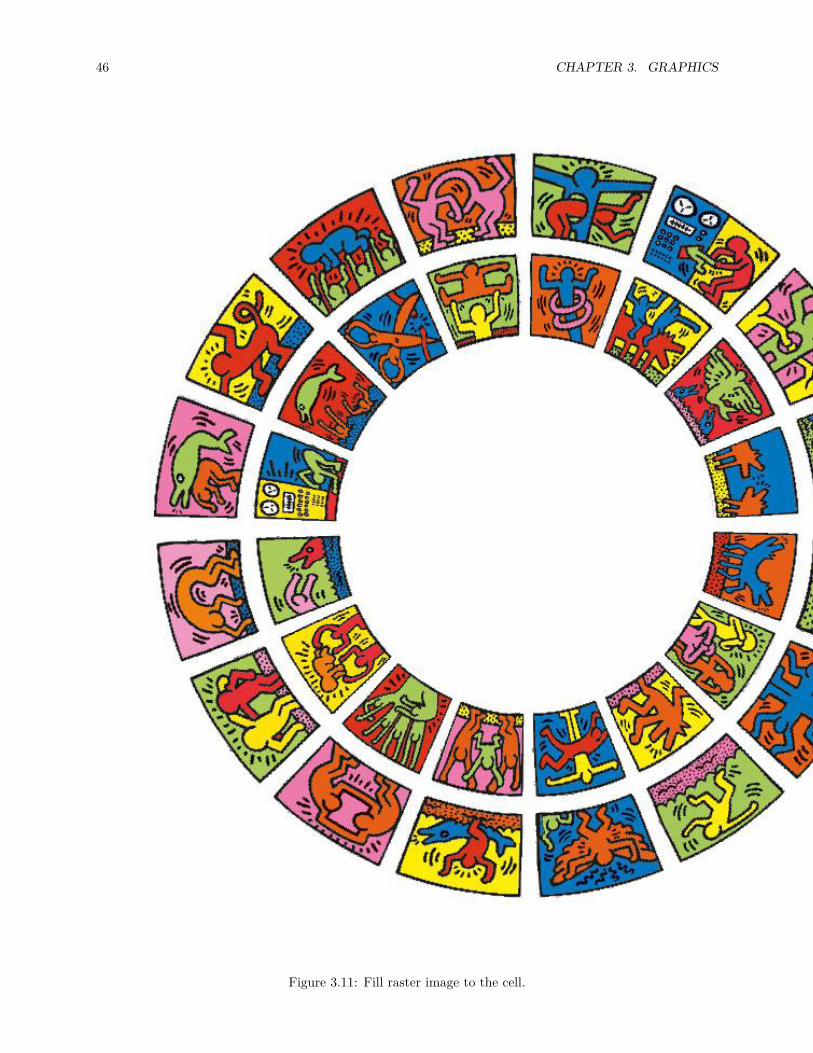
the plotting is quite slow. If the original image is too huge, scaling argument can be set to reduce the sizeof the original image.
Following code draws the image of the cover of this book which is a circular style of Keith Haring’sdoodle (Figure 3.11). The original source of the plot is from http://www.thegreenhead.com/imgs/keith-haring-double-retrospect-worlds-largest-jigsaw-puzzle-2.jpg.load(system.file("extdata", "doodle.RData", package = "circlize"))circos.par("cell.padding" = c(0, 0, 0, 0))circos.initialize(letters[1:16], xlim = c(0, 1))circos.track(ylim = c(0, 1), panel.fun = function(x, y) {
img = img_list[[CELL_META$sector.numeric.index]]circos.raster(img, CELL_META$xcenter, CELL_META$ycenter,
width = CELL_META$xrange, height = CELL_META$yrange,facing = "bending.inside")
}, track.height = 0.25, bg.border = NA)circos.track(ylim = c(0, 1), panel.fun = function(x, y) {
img = img_list[[CELL_META$sector.numeric.index + 16]]circos.raster(img, CELL_META$xcenter, CELL_META$ycenter,
width = CELL_META$xrange, height = CELL_META$yrange,facing = "bending.inside")
}, track.height = 0.25, bg.border = NA)circos.clear()
3.9 Links
Links or ribbons are important part for the circular visualization. They are used to represent relations orinteractions between sectors. In circlize, circos.link() draws links between single points and intervals.There are four mandatory arguments which are index for the first sector, positions on the first sector, indexfor the second sector and positions on the second sector. If the positions on the two sectors are all singlepoints, the link represents as a line. If the positions on the two sectors are intervals, the link represents as arobbon (Figure 3.12). Possible usage for circos.link() is as follows.circos.link(sector.index1, 0, sector.index2, 0)circos.link(sector.index1, c(0, 1), sector.index2, 0)circos.link(sector.index1, c(0, 1), sector.index2, c(1, 2))circos.link(sector.index1, c(0, 1), sector.index2, 0, col, lwd, lty, border)
The position of link end is controlled by rou. By default, it is the bottom of the most inside track andnormally, you don’t need to care about this setting. The two ends of the link are located in a same circle bydefault. The positions of two ends can be adjusted with different values for rou1 and rou2 arguments. SeeFigure 3.13.circos.link(sector.index1, 0, sector.index2, 0, rou)circos.link(sector.index1, 0, sector.index2, 0, rou1, rou2)
The height of the link is controlled by h argument. In most cases, you don’t need to care about the value of hbecause they are internally calculated based on the width of each link. However, when the link represents asa ribbon (i.e. link from point to interval or from interval to interval), It can not always ensure that one borderis always below or above the other, which means, in some extreme cases, the two borders are intersected andthe link would be messed up. It happens especially when position of the two ends are too close or the widthof one end is extremely large while the width of the other end is too small. In that case, users can manuallyset height of the top and bottom border by h and h2 (Figure 3.14).
46 CHAPTER 3. GRAPHICS
Figure 3.11: Fill raster image to the cell.

3.9. LINKS 47
Figure 3.12: Different types of links.
Figure 3.13: Positions of link ends.

48 CHAPTER 3. GRAPHICS
default ‘h‘
h = 0.5h2 = 0.2
Figure 3.14: Adjust link heights.
h.ratio = 0.7 h.ratio = 0.5default
h.ratio = 0.3
Figure 3.15: Adjust link heights by ‘h.ratio‘.
circos.link(sector.index1, 0, sector.index2, 0, h)circos.link(sector.index1, 0, sector.index2, 0, h, h2)
When there are many links, the height of all links can be systematically adjusted by h.ratio (Figure 3.15).The value is between 0 and 1.
The border of link (if it is a ribbon) or the link itself (if it is a line) is in fact a quadratic Bezier curve, thusyou can control the shape of the link by w and w2 (w2 controls the shape of bottom border). See Figure3.16 for examples. For more explanation of w, please refer to http://en.wikipedia.org/wiki/B%C3%A9zier_curve#Rational_B.C3.A9zier_curves.circos.link(sector.index1, 0, sector.index2, 0, w)circos.link(sector.index1, 0, sector.index2, 0, w, w2)
When the links represent as ribbons and the two ends overlap, the links will be de-generated as a ‘hill’ (Figure3.17).

3.9. LINKS 49
defa
ult
h=0.2
h=0.8
w=2
w=−0.
5 w=0.1h=0.3
Figure 3.16: Different link shapes.
Figure 3.17: Link as a hill.
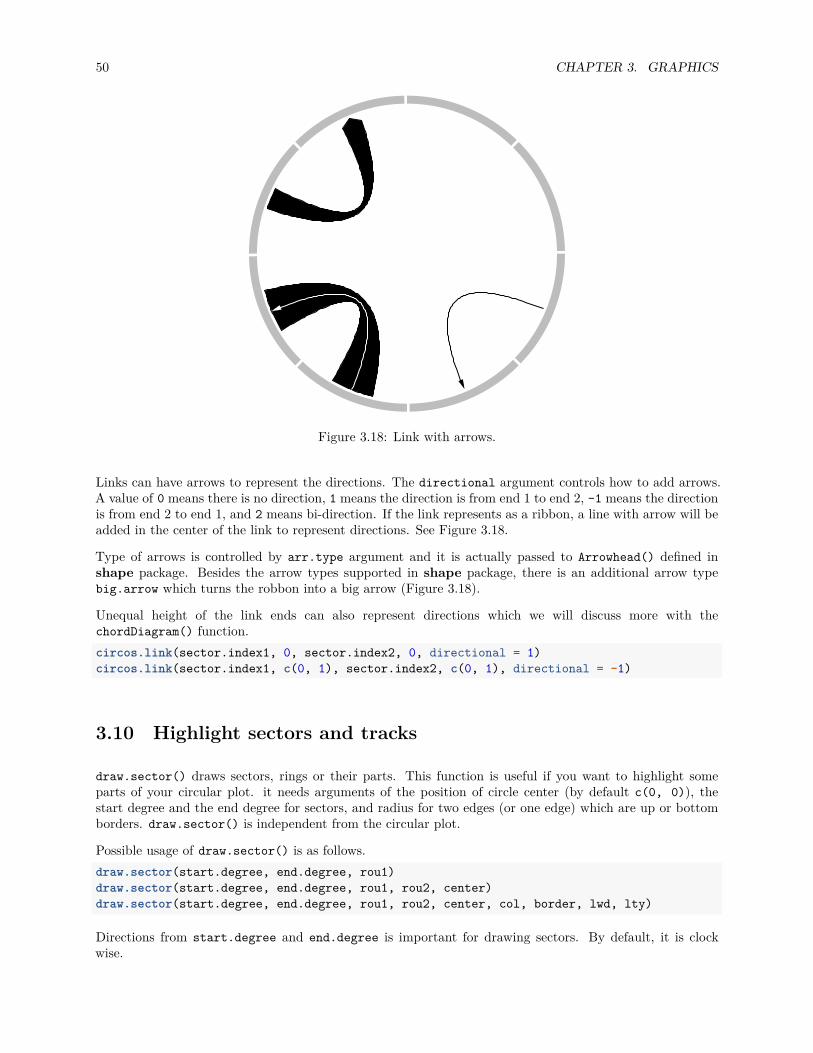
50 CHAPTER 3. GRAPHICS
Figure 3.18: Link with arrows.
Links can have arrows to represent the directions. The directional argument controls how to add arrows.A value of 0 means there is no direction, 1 means the direction is from end 1 to end 2, -1 means the directionis from end 2 to end 1, and 2 means bi-direction. If the link represents as a ribbon, a line with arrow will beadded in the center of the link to represent directions. See Figure 3.18.
Type of arrows is controlled by arr.type argument and it is actually passed to Arrowhead() defined inshape package. Besides the arrow types supported in shape package, there is an additional arrow typebig.arrow which turns the robbon into a big arrow (Figure 3.18).
Unequal height of the link ends can also represent directions which we will discuss more with thechordDiagram() function.circos.link(sector.index1, 0, sector.index2, 0, directional = 1)circos.link(sector.index1, c(0, 1), sector.index2, c(0, 1), directional = -1)
3.10 Highlight sectors and tracks
draw.sector() draws sectors, rings or their parts. This function is useful if you want to highlight someparts of your circular plot. it needs arguments of the position of circle center (by default c(0, 0)), thestart degree and the end degree for sectors, and radius for two edges (or one edge) which are up or bottomborders. draw.sector() is independent from the circular plot.
Possible usage of draw.sector() is as follows.draw.sector(start.degree, end.degree, rou1)draw.sector(start.degree, end.degree, rou1, rou2, center)draw.sector(start.degree, end.degree, rou1, rou2, center, col, border, lwd, lty)
Directions from start.degree and end.degree is important for drawing sectors. By default, it is clockwise.

3.10. HIGHLIGHT SECTORS AND TRACKS 51
Figure 3.19: General usage of ‘draw.sector()‘.
draw.sector(start.degree, end.degree, clock.wise = FALSE)
Following code shows examples of draw.sector() (Figure 3.19).par(mar = c(1, 1, 1, 1))plot(c(-1, 1), c(-1, 1), type = "n", axes = FALSE, ann = FALSE, asp = 1)draw.sector(20, 0)draw.sector(30, 60, rou1 = 0.8, rou2 = 0.5, clock.wise = FALSE, col = "#FF000080")draw.sector(350, 1000, col = "#00FF0080", border = NA)draw.sector(0, 180, rou1 = 0.25, center = c(-0.5, 0.5), border = 2, lwd = 2, lty = 2)draw.sector(0, 360, rou1 = 0.7, rou2 = 0.6, col = "#0000FF80")
In order to highlight cells in the circular plot, we can use get.cell.meta.data() to get the informationof positions of cells. E.g. the start degree and end degree can be obtained through cell.start.degreeand cell.end.degree, and the position of the top border and bottom border can be obtained throughcell.top.radius and cell.bottom.radius. Following code shows several examples to highlight sectorsand tracks.
First we create a circular plot with eight sectors and three tracks.factors = letters[1:8]circos.initialize(factors, xlim = c(0, 1))for(i in 1:3) {
circos.track(ylim = c(0, 1))}circos.info(plot = TRUE)
If we want to highlight sector a (Figure 3.20):draw.sector(get.cell.meta.data("cell.start.degree", sector.index = "a"),
get.cell.meta.data("cell.end.degree", sector.index = "a"),rou1 = get.cell.meta.data("cell.top.radius", track.index = 1),col = "#FF000040")
If we want to highlight track 1 (Figure 3.20):

52 CHAPTER 3. GRAPHICS
a:1a:2
a:3
b:1
b:2
b:3
c:1
c:2
c:3d:1
d:2d:3
e:1e:2
e:3
f:1
f:2
f:3
g:1
g:2
g:3h:1
h:2h:3
Figure 3.20: Highlight sectors and tracks.
draw.sector(0, 360,rou1 = get.cell.meta.data("cell.top.radius", track.index = 1),rou2 = get.cell.meta.data("cell.bottom.radius", track.index = 1),col = "#00FF0040")
If we want to highlight track 2 and 3 in sector e and f (Figure 3.20):draw.sector(get.cell.meta.data("cell.start.degree", sector.index = "e"),
get.cell.meta.data("cell.end.degree", sector.index = "f"),rou1 = get.cell.meta.data("cell.top.radius", track.index = 2),rou2 = get.cell.meta.data("cell.bottom.radius", track.index = 3),col = "#0000FF40")
If we want to highlight specific regions such as a small region inside cell h:2, we can use circlize() tocalculate the positions in the polar coordinate. But always keep in mind that x-axis in the cell are alwaysclock wise. See Figure 3.20.pos = circlize(c(0.2, 0.8), c(0.2, 0.8), sector.index = "h", track.index = 2)draw.sector(pos[1, "theta"], pos[2, "theta"], pos[1, "rou"], pos[2, "rou"],
clock.wise = TRUE, col = "#00FFFF40")circos.clear()
If the purpose is to simply highlight complete cells, there is a helper function highlight.sector() for whichyou only need to specify index for sectors and tracks that you want to to highlight. Paddings of the highligtedregions can be set by padding argument which should contain four values representing ratios of the widthor height of the highlighted region (Figure 3.21).
One advantage of highlight.sector() is that it supports to add text in the highlighted regions. By default,the text is drawn at that center of the highlighted region. The position on the radical direction can be setby text.vjust argument either by a numeric value or a string in form of "2 inches"`` or“-1.2cm”‘.

3.11. WORK TOGETHER WITH THE BASE GRAPHIC SYSTEM 53
a:1a:2
a:3a:4
b:1
b:2
b:3
b:4
c:1
c:2
c:3
c:4d:1
d:2d:3
d:4
e:1e:2
e:3e:4
f:1
f:2
f:3
f:4
g:1
g:2
g:3
g:4h:1
h:2h:3
h:4
a and h belong to a same group
Figure 3.21: Highlight sectors.
factors = letters[1:8]circos.initialize(factors, xlim = c(0, 1))for(i in 1:4) {
circos.track(ylim = c(0, 1))}circos.info(plot = TRUE)
highlight.sector(c("a", "h"), track.index = 1, text = "a and h belong to a same group",facing = "bending.inside", niceFacing = TRUE, text.vjust = "6mm", cex = 0.8)
highlight.sector("c", col = "#00FF0040")highlight.sector("d", col = NA, border = "red", lwd = 2)highlight.sector("e", col = "#0000FF40", track.index = c(2, 3))highlight.sector(c("f", "g"), col = NA, border = "green",
lwd = 2, track.index = c(2, 3), padding = c(0.1, 0.1, 0.1, 0.1))highlight.sector(factors, col = "#FFFF0040", track.index = 4)
circos.clear()
3.11 Work together with the base graphic system
circlize is built on the base R graphic system, then, of course the base graphic functions can be used incombination with circlize functions. On the other hand, circlize() converts data points from the datacoordinates to the canvas coordinates where the base graphic function can be directly applied.
Normally, the base functions such as title(), text(), legend() can be used to add extra information onthe plot (Figure 3.22).
Sometimes, when the text or other graphics are far from the circle, you may set par(xpd = NA) so that theplotting is not clipped.
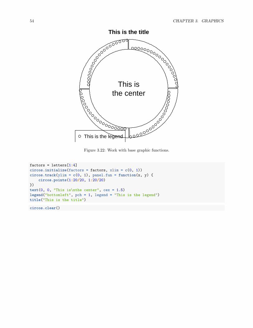
54 CHAPTER 3. GRAPHICS
This isthe center
This is the legend
This is the title
Figure 3.22: Work with base graphic functions.
factors = letters[1:4]circos.initialize(factors = factors, xlim = c(0, 1))circos.track(ylim = c(0, 1), panel.fun = function(x, y) {
circos.points(1:20/20, 1:20/20)})text(0, 0, "This is\nthe center", cex = 1.5)legend("bottomleft", pch = 1, legend = "This is the legend")title("This is the title")
circos.clear()
Chapter 4
Legends
circlize provides complete freedom for users to design their own graphics by implementing the self-definedfunction panel.fun. However one drawback arises that circlize is completely blind to users’ data so thatone important thing is missing for the visualization which is the legend.
Although legends cannot be automatically generated by circlize, by using functionality from other R pack-ages, it is just a few more lines to really implement it. Here I will demonstrate how to customize legendsand arrange to the circular plot.
As an example, a circular plot which contains two tracks and links inside the circle is generated. The firsttrack will have a legend that contains points, the second track will have a legend that contains lines, andthe links correspond to a continuous color mapping. The code is wrapped into a function so that it can beused repeatedly.library(circlize)
col_fun = colorRamp2(c(-2, 0, 2), c("green", "yellow", "red"))circlize_plot = function() {
set.seed(12345)fa = letters[1:10]circos.initialize(fa, xlim = c(0, 1))circos.track(ylim = c(0, 1), panel.fun = function(x, y) {
circos.points(runif(20), runif(20), cex = 0.5, pch = 16, col = 2)circos.points(runif(20), runif(20), cex = 0.5, pch = 16, col = 3)
})circos.track(ylim = c(0, 1), panel.fun = function(x, y) {
circos.lines(sort(runif(20)), runif(20), col = 4)circos.lines(sort(runif(20)), runif(20), col = 5)
})
for(i in 1:10) {circos.link(sample(fa, 1), sort(runif(10))[1:2],
sample(fa, 1), sort(runif(10))[1:2],col = add_transparency(col_fun(rnorm(1))))
}circos.clear()
}
In ComplexHeatmap package with version higher than 1.13.2, there is a Legend() function which cus-tomizes legends with various styles. In following code, legends for the two tracks and links are constructed.
55
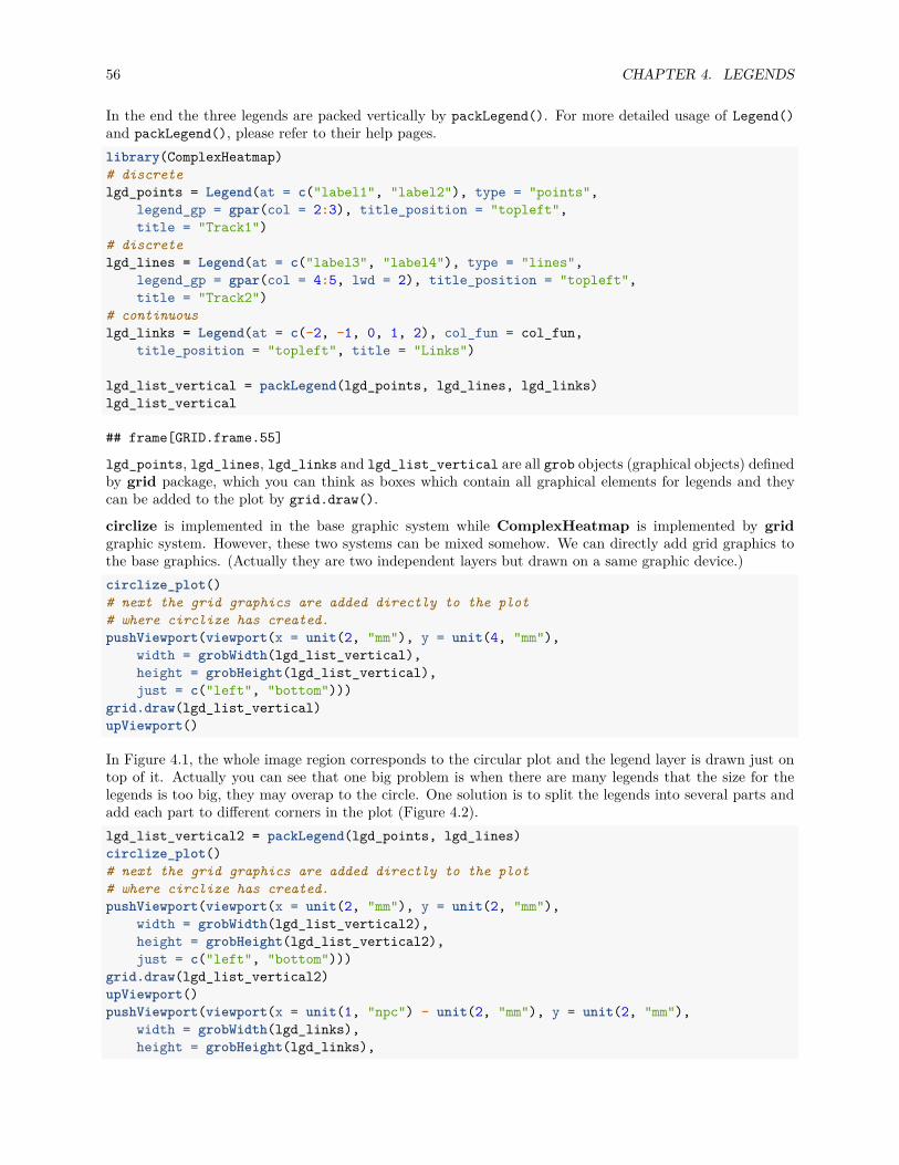
56 CHAPTER 4. LEGENDS
In the end the three legends are packed vertically by packLegend(). For more detailed usage of Legend()and packLegend(), please refer to their help pages.library(ComplexHeatmap)# discretelgd_points = Legend(at = c("label1", "label2"), type = "points",
legend_gp = gpar(col = 2:3), title_position = "topleft",title = "Track1")
# discretelgd_lines = Legend(at = c("label3", "label4"), type = "lines",
legend_gp = gpar(col = 4:5, lwd = 2), title_position = "topleft",title = "Track2")
# continuouslgd_links = Legend(at = c(-2, -1, 0, 1, 2), col_fun = col_fun,
title_position = "topleft", title = "Links")
lgd_list_vertical = packLegend(lgd_points, lgd_lines, lgd_links)lgd_list_vertical
## frame[GRID.frame.55]
lgd_points, lgd_lines, lgd_links and lgd_list_vertical are all grob objects (graphical objects) definedby grid package, which you can think as boxes which contain all graphical elements for legends and theycan be added to the plot by grid.draw().
circlize is implemented in the base graphic system while ComplexHeatmap is implemented by gridgraphic system. However, these two systems can be mixed somehow. We can directly add grid graphics tothe base graphics. (Actually they are two independent layers but drawn on a same graphic device.)circlize_plot()# next the grid graphics are added directly to the plot# where circlize has created.pushViewport(viewport(x = unit(2, "mm"), y = unit(4, "mm"),
width = grobWidth(lgd_list_vertical),height = grobHeight(lgd_list_vertical),just = c("left", "bottom")))
grid.draw(lgd_list_vertical)upViewport()
In Figure 4.1, the whole image region corresponds to the circular plot and the legend layer is drawn just ontop of it. Actually you can see that one big problem is when there are many legends that the size for thelegends is too big, they may overap to the circle. One solution is to split the legends into several parts andadd each part to different corners in the plot (Figure 4.2).lgd_list_vertical2 = packLegend(lgd_points, lgd_lines)circlize_plot()# next the grid graphics are added directly to the plot# where circlize has created.pushViewport(viewport(x = unit(2, "mm"), y = unit(2, "mm"),
width = grobWidth(lgd_list_vertical2),height = grobHeight(lgd_list_vertical2),just = c("left", "bottom")))
grid.draw(lgd_list_vertical2)upViewport()pushViewport(viewport(x = unit(1, "npc") - unit(2, "mm"), y = unit(2, "mm"),
width = grobWidth(lgd_links),height = grobHeight(lgd_links),
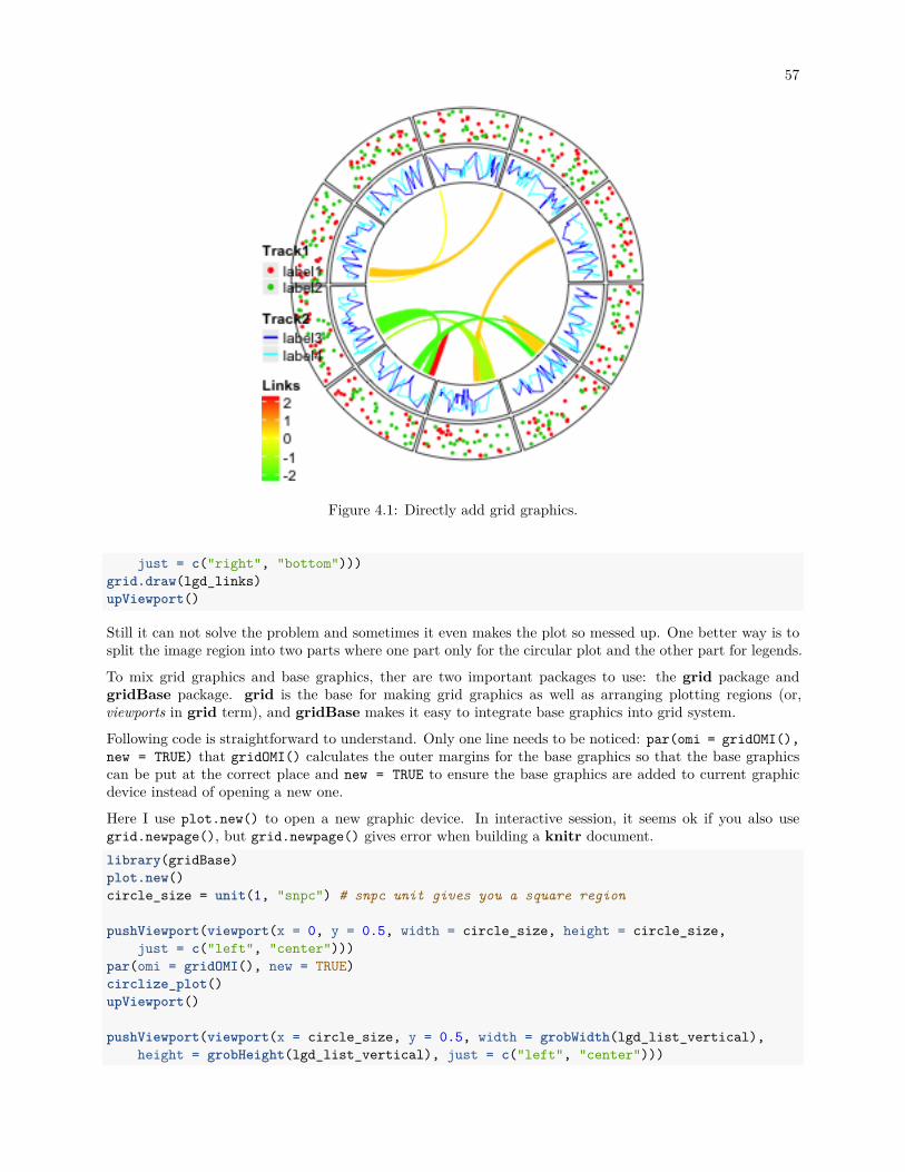
57
Figure 4.1: Directly add grid graphics.
just = c("right", "bottom")))grid.draw(lgd_links)upViewport()
Still it can not solve the problem and sometimes it even makes the plot so messed up. One better way is tosplit the image region into two parts where one part only for the circular plot and the other part for legends.
To mix grid graphics and base graphics, ther are two important packages to use: the grid package andgridBase package. grid is the base for making grid graphics as well as arranging plotting regions (or,viewports in grid term), and gridBase makes it easy to integrate base graphics into grid system.
Following code is straightforward to understand. Only one line needs to be noticed: par(omi = gridOMI(),new = TRUE) that gridOMI() calculates the outer margins for the base graphics so that the base graphicscan be put at the correct place and new = TRUE to ensure the base graphics are added to current graphicdevice instead of opening a new one.
Here I use plot.new() to open a new graphic device. In interactive session, it seems ok if you also usegrid.newpage(), but grid.newpage() gives error when building a knitr document.library(gridBase)plot.new()circle_size = unit(1, "snpc") # snpc unit gives you a square region
pushViewport(viewport(x = 0, y = 0.5, width = circle_size, height = circle_size,just = c("left", "center")))
par(omi = gridOMI(), new = TRUE)circlize_plot()upViewport()
pushViewport(viewport(x = circle_size, y = 0.5, width = grobWidth(lgd_list_vertical),height = grobHeight(lgd_list_vertical), just = c("left", "center")))

58 CHAPTER 4. LEGENDS
Figure 4.2: Split into two legends.
grid.draw(lgd_list_vertical)upViewport()
The legends can also be put at the bottom of the circular plot and it is just a matter how users arrangethe grid viewports. In this case, all legends are changed to horizontal style, and three legends are packedhorizontally as well.

59
lgd_points = Legend(at = c("label1", "label2"), type = "points",legend_gp = gpar(col = 2:3), title_position = "topleft",title = "Track1", nrow = 1)
lgd_lines = Legend(at = c("label3", "label4"), type = "lines",legend_gp = gpar(col = 4:5, lwd = 2), title_position = "topleft",title = "Track2", nrow = 1)
lgd_links = Legend(at = c(-2, -1, 0, 1, 2), col_fun = col_fun,title_position = "topleft", title = "Links", direction = "horizontal")
lgd_list_horizontal = packLegend(lgd_points, lgd_lines, lgd_links,direction = "horizontal")
Similar code to arrange viewports.plot.new()pushViewport(viewport(x = 0.5, y = 1, width = circle_size, height = circle_size,
just = c("center", "top")))par(omi = gridOMI(), new = TRUE)circlize_plot()upViewport()
pushViewport(viewport(x = 0.5, y = unit(1, "npc") - circle_size,width = grobWidth(lgd_list_horizontal), height = grobHeight(lgd_list_horizontal),just = c("center", "top")))
grid.draw(lgd_list_horizontal)upViewport()

60 CHAPTER 4. LEGENDS
Chapter 5
Implement high-level circular plots
In this chapter, we show several examples which combine low-level graphic functions to construct complicatedgraphics for specific purposes.
5.1 Circular barplots
In the following code, we put all the nine bars in one track and one sector. You can also put them into 9tracks, but the code would be very similar. See Figure 5.1.category = paste0("category", "_", 1:9)percent = sort(sample(40:80, 9))color = rev(rainbow(length(percent)))
library(circlize)circos.par("start.degree" = 90, cell.padding = c(0, 0, 0, 0))circos.initialize("a", xlim = c(0, 100)) # 'a` just means there is one sectorcircos.track(ylim = c(0.5, length(percent)+0.5), track.height = 0.8,
bg.border = NA, panel.fun = function(x, y) {xlim = CELL_META$xlimcircos.segments(rep(xlim[1], 9), 1:9,
rep(xlim[2], 9), 1:9,col = "#CCCCCC")
circos.rect(rep(0, 9), 1:9 - 0.45, percent, 1:9 + 0.45,col = color, border = "white")
circos.text(rep(xlim[1], 9), 1:9,paste(category, " - ", percent, "%"),facing = "downward", adj = c(1.05, 0.5), cex = 0.8)
breaks = seq(0, 85, by = 5)circos.axis(h = "top", major.at = breaks, labels = paste0(breaks, "%"),
labels.cex = 0.6)})
circos.clear()
When adding text by circos.text(), adj is specified to c(1.05, 0.5) which means text is aligned to theright and there is also offset between the text and the anchor points. We can also use ux() to set the offset toabsolute units. Conversion on x direction in a circular coordinate is affected by the position on y axis, herewe must set the h argument. Following code can be used to replace the circos.text() in above example.
61

62 CHAPTER 5. IMPLEMENT HIGH-LEVEL CIRCULAR PLOTS
category_1 − 41 %category_2 − 42 %category_3 − 47 %category_4 − 51 %category_5 − 52 %category_6 − 66 %category_7 − 67 %category_8 − 69 %category_9 − 72 %
0%5%
10%
15%
20%25%
80%
30%
35%
40%
45%50%
55%
60%
65%
70%75%
85%
Figure 5.1: A circular barplot.
circos.text(xlim[1] - ux(2, "mm", h = 1:9), 1:9,paste(category, " - ", percent, "%"),facing = "downward", adj = c(1, 0.5), cex = 0.8)
5.2 Histograms
circlize ships a circos.trackHist() function which draws histograms in cells. This function is a high-levelfunction which caculates data ranges on y axes and creates a new track. The implement of this function issimple, that it first calculates the histogram in each cell by hist() function, then draws histogram by usingcircos.rect().
Users can choose to visualize data distributions by density lines by setting draw.density = TRUE.
Figure 5.2 shows a histogram track under default settings, a histogram track with specified bin.size anda track with density lines. By default, bin size of histogram in each cell is calculated separatedly and theywill be different between cells, which makes it not consistent to compare. Manually setting bin.size in allcells to a same value helps to compare the distributions between cells.x = rnorm(1600)factors = sample(letters[1:16], 1600, replace = TRUE)circos.initialize(factors = factors, x = x)circos.trackHist(factors = factors, x = x, col = "#999999",
border = "#999999")circos.trackHist(factors = factors, x = x, bin.size = 0.1,
col = "#999999", border = "#999999")circos.trackHist(factors = factors, x = x, draw.density = TRUE,
col = "#999999", border = "#999999")

5.3. PHYLOGENETIC TREES 63
Figure 5.2: Histograms on circular layout.
circos.clear()
5.3 Phylogenetic trees
Circular dendrograms have many applications, one of which is to visualize phylogenetic trees. Basically,a phylogenetic tree is a dendrogram which is a combination of lines. In R, there are several classes thatdescribe such type of tree such as hclust, dendrogram and phylo. In this example, we will demonstrate howto draw the tree from the dendrogram class. Nevertheless, other classes can be converted to dendrogramwithout too much difficulty.
The bird.orders data we are using here is from ape package. This data set is related to species of birds.library(ape)data(bird.orders)hc = as.hclust(bird.orders)
We split the tree into six sub trees by cutree() and convert the data into a dendrogram object.labels = hc$labels # name of birdsct = cutree(hc, 6) # cut tree into 6 piecesn = length(labels) # number of bird speciesdend = as.dendrogram(hc)
As we mentioned before, the x-value for the phylogenetic tree is in fact index. Thus, the x-lim is just theminimum and maximum index of labels in the tree. Since there is only one phylogenetic tree, we only needone “big” sector.
In the first track, we plot the name of each bird, with different colors to represent different sub trees.circos.par(cell.padding = c(0, 0, 0, 0))circos.initialize(factors = "a", xlim = c(0, n)) # only one sector

64 CHAPTER 5. IMPLEMENT HIGH-LEVEL CIRCULAR PLOTS
Struthioniformes
TinamiformesCraciformes
Galliform
es
Anseriform
es
Turniciformes
Pic
iform
es
Gal
bulif
orm
es
Bucer
otifo
rmes
Upupiformes
Trogoniformes
Coraciiformes
Coliiformes
Cuculiformes
Psittaciformes
Apodiform
es
Trochiliformes M
usop
hagi
form
es
Str
igifo
rmes
Col
umbi
form
es
Gruifo
rmes
Ciconiiformes
Passeriformes
StruthioniformesTinamiformes
Craciformes
Galliform
es
Anseriform
es
TurniciformesP
icifo
rmes
Gal
bulif
orm
es
Bucer
otifo
rmes
UpupiformesTrogoniformes
Coraciiformes
Coliiformes
Cuculiformes
Psittaciformes
Apodiform
esTrochiliform
es
Mus
opha
gifo
rmes
Str
igifo
rmes
Col
umbi
form
es
Gruifo
rmes
Ciconiiformes
Passeriformes
Figure 5.3: A circular phylogenetic tree.
circos.track(ylim = c(0, 1), bg.border = NA, track.height = 0.3,panel.fun = function(x, y) {
for(i in seq_len(n)) {circos.text(i-0.5, 0, labels[i], adj = c(0, 0.5),
facing = "clockwise", niceFacing = TRUE,col = ct[labels[i]], cex = 0.5)
}})
In the above code, setting xlim to c(0, n) is very important because the leaves of the dendrogram aredrawn at x = seq(0.5, n - 0.5).
In the second track, we plot the circular dendrogram by circos.dendrogram() (Figure 5.3 left). You canrender the dendrogram by dendextend package.suppressPackageStartupMessages(library(dendextend))dend = color_branches(dend, k = 6, col = 1:6)dend_height = attr(dend, "height")circos.track(ylim = c(0, dend_height), bg.border = NA,
track.height = 0.4, panel.fun = function(x, y) {circos.dendrogram(dend)
})circos.clear()
By default, dendrograms are facing outside of the circle (so that the labels should also be added outsidethe dendrogram). In circos.dendrogram(), you can set facing argument to inside to make them facinginside. In this case, dendrogram track is added first and labels are added later (Figure 5.3 right).circos.dendrogram(dend, facing = "inside")
If you look at the souce code of circos.dendrogram() and replace circos.lines() to lines(), actuallythe function can correctly make a dendrogram in the normal coordinate.
With the flexibility of circlize package, it is easy to add more tracks if you want to add more corresponded
5.4. HEATMAPS 65
information for the dendrogram to the plot.
5.4 Heatmaps
Heatmaps, and sometimes combined with dendrograms are frequently used to visualize e.g. gene expression.Heatmaps are basically composed by rectangles, thus, they can be implemented by circos.rect().
In following example, we make a circular plot with two heatmaps. First we generate the two matrix andperform clustring on the two matrix.mat = matrix(rnorm(100*10), nrow = 10, ncol = 100)col_fun = colorRamp2(c(-2, 0, 2), c("green", "black", "red"))factors = rep(letters[1:2], times = c(30, 70))mat_list = list(a = mat[, factors == "a"],
b = mat[, factors == "b"])dend_list = list(a = as.dendrogram(hclust(dist(t(mat_list[["a"]])))),
b = as.dendrogram(hclust(dist(t(mat_list[["b"]])))))
In the first track, columns in the matrix are adjusted by the clustering. Also note we use circos.rect() ina vectorized way.circos.par(cell.padding = c(0, 0, 0, 0), gap.degree = 5)circos.initialize(factors, xlim = cbind(c(0, 0), table(factors)))circos.track(ylim = c(0, 10), bg.border = NA, panel.fun = function(x, y) {
sector.index = CELL_META$sector.indexm = mat_list[[sector.index]]dend = dend_list[[sector.index]]
m2 = m[, order.dendrogram(dend)]col_mat = col_fun(m2)nr = nrow(m2)nc = ncol(m2)for(i in 1:nr) {
circos.rect(1:nc - 1, rep(nr - i, nc),1:nc, rep(nr - i + 1, nc),border = col_mat[i, ], col = col_mat[i, ])
}})
Since there are two dendrograms, it is important to make the height of both dendrogram in a same scale.We calculate the maximum height of the two dendrograms and set it to ylim of the second track (Figure5.4).max_height = max(sapply(dend_list, function(x) attr(x, "height")))circos.track(ylim = c(0, max_height), bg.border = NA, track.height = 0.3,
panel.fun = function(x, y) {
sector.index = get.cell.meta.data("sector.index")dend = dend_list[[sector.index]]circos.dendrogram(dend, max_height = max_height)
})circos.clear()

66 CHAPTER 5. IMPLEMENT HIGH-LEVEL CIRCULAR PLOTS
Figure 5.4: Circular heatmaps.
Chapter 6
Advanced layout
6.1 Zooming of sectors
In this section, we will introduce how to zoom sectors and put the zoomed sectors at the same track as theoriginal sectors.
Under the default settings, width of sectors are calculated according to the data range in correspondingcategories. Normally it is not a good idea to manually modify the default sector width since it reflects usefulinformation of your data. However, sometimes manually modifying the width of sectors can make moreadvanced plots, e.g. zoomings.
The basic idea for zooming is to put original sectors on part of the circle and put the zoomed sectors onthe other part, so that in the original sectors, widths are still proportional to their data ranges, and in thezoomed sectors, the widths are also proportional to the data ranges in the zoomed sectors.
This type of zooming is rather simple to implement. All we need to do is to copy the data which correspondsto the zoomed sectors, assign new category names to them and append to the original data. The good thingis since the data in the zoomed sectors is exactly the same as the original sectors, if you treat them as normalcategories, the graphics will be exactly the same as in the original sectors, but with x direction zoomed.
Following example shows more clearly the basic idea of this “horizontal” zooming.
We first generate a data frame with six categories.set.seed(123)df = data.frame(
factors = sample(letters[1:6], 400, replace = TRUE),x = rnorm(400),y = rnorm(400),stringsAsFactors = FALSE
)
We want to zoom sector a and the first 10 points in sector b. First we extract these data and format as anew data frame.zoom_df_a = df[df$factors == "a", ]zoom_df_b = df[df$factors == "b", ]zoom_df_b = zoom_df_b[order(zoom_df_b[, 2])[1:10], ]zoom_df = rbind(zoom_df_a, zoom_df_b)
Then we need to change the sector names in the zoomed data frame. Here we just simply add “zoom_”prefix to the original names to show that they are “zoomed” sectors. After that, it is attached to the original
67

68 CHAPTER 6. ADVANCED LAYOUT
data frame.zoom_df$factors = paste0("zoom_", zoom_df$factors)df2 = rbind(df, zoom_df)
In this example, we will put the original cells in the left half of the circle and the zoomed sectors in the right.As we have already mentioned before, we simply normalize the width of normal sectors and normalize thewidth of zoomed sectors separately. Note now the sum of the sector width for the original sectors is 1 andthe sum of sector width for the zoomed sectors is 1, which means these two types of sectors have their ownhalf circle.
You may notice the sum of the sector.width is not idential to 1. This is fine, they will be further normalizedto 1 internally.
Strictly speaking, since the gaps between sectors are not taken into consideration, the width of the originalsectors are not exactly 180 degree, but the real value is quite close to it.xrange = tapply(df2$x, df2$factors, function(x) max(x) - min(x))normal_sector_index = unique(df$factors)zoomed_sector_index = unique(zoom_df$factors)sector.width = c(xrange[normal_sector_index] / sum(xrange[normal_sector_index]),
xrange[zoomed_sector_index] / sum(xrange[zoomed_sector_index]))sector.width
## b e c f a d zoom_a## 0.1685162 0.1765301 0.1732999 0.1705148 0.1518915 0.1592475 0.8097123## zoom_b## 0.1902877
What to do next is just to make the circular plot in the normal way. All the graphics in sector a and b willbe automatically zoomed to sector “zoom_a” and “zoom_b”.
In following code, since the sector names are added outside the first track, points.overflow.warning is setto FALSE to turn off the warning messages.circos.par(start.degree = 90, points.overflow.warning = FALSE)circos.initialize(df2$factors, x = df2$x, sector.width = sector.width)circos.track(df2$factors, x = df2$x, y = df2$y,
panel.fun = function(x, y) {circos.points(x, y, col = "red", pch = 16, cex = 0.5)circos.text(CELL_META$xcenter, CELL_META$cell.ylim[2] + uy(2, "mm"),
CELL_META$sector.index, niceFacing = TRUE)})
Adding links from original sectors to zoomed sectors is a good idea to show where the zooming occurs (Figure6.1). Notice that we manually adjust the position of one end of the sector b link.circos.link("a", get.cell.meta.data("cell.xlim", sector.index = "a"),
"zoom_a", get.cell.meta.data("cell.xlim", sector.index = "zoom_a"),border = NA, col = "#00000020")
circos.link("b", c(zoom_df_b[1, 2], zoom_df_b[10, 2]),"zoom_b", get.cell.meta.data("cell.xlim", sector.index = "zoom_b"),rou1 = get.cell.meta.data("cell.top.radius", sector.index = "b"),border = NA, col = "#00000020")
circos.clear()
Chapter 12 introduces another type of zooming by combining two circular plots.

6.2. VISUALIZE PART OF THE CIRCLE 69
a
b
c
d
e
f
zoom_a
zoom_b
Figure 6.1: Zoom sectors.
6.2 Visualize part of the circle
canvas.xlim and canvas.ylim parameters in circos.par() are useful to generate plots only in part of thecircle. As mentioned in previews chapters, the circular plot is always drawn in a canvas where x values rangefrom -1 to 1 and y values range from -1 to 1. Thus, if canvas.xlim and canvas.ylim are all set to c(0,1), which means, the canvas is restricted to the right top part, then only sectors between 0 to 90 degree arevisible (Figure 6.2).
To make the right plot in Figure 6.2, we only need to set one sector in the layout and set gap.after to 270.(One sector with gap.after of 270 degree means the width of this sector is exactly 90 degree.)circos.par("canvas.xlim" = c(0, 1), "canvas.ylim" = c(0, 1),
"start.degree" = 90, "gap.after" = 270)factors = "a" # this is the name of your sectorcircos.initialize(factors = factors, xlim = ...)...
Similar idea can be applied to the circle where in some tracks, only a subset of cells are needed. Gererallythere are two ways. The first way is to create the track and add graphics with subset of data that onlycorresponds to the cells that are needed. And the second way is to create an empty track first and customizethe cells by circos.update(). Following code illustrates the two methods (Figure 6.3).factors = letters[1:4]circos.initialize(factors = factors, xlim = c(0, 1))
# directly specify the subset of datadf = data.frame(factors = rep("a", 100),
x = runif(100),y = runif(100))
circos.track(df$factors, x = df$x, y = df$y,

70 CHAPTER 6. ADVANCED LAYOUT
0 1
1
0 1
1
Figure 6.2: One quarter of the circle.
panel.fun = function(x, y) {circos.points(x, y, pch = 16, cex = 0.5)
})
# create empty track first then fill graphics in the cellcircos.track(ylim = range(df$y), bg.border = NA)circos.update(sector.index = "a", bg.border = "black")circos.points(df$x, df$y, pch = 16, cex = 0.5)
circos.track(factors = factors, ylim = c(0, 1))circos.track(factors = factors, ylim = c(0, 1))
circos.clear()
6.3 Combine multiple circular plots
circlize finally makes the circular plot in the base R graphic system. Seperated circular plots actually canbe put in a same page by some tricks from the base graphic system. Here the key is par(new = TRUE)which allows to draw a new figure as a new layer directly on the previous canvas region. By setting differentcanvas.xlim and canvas.ylim, it allows to make more complex plots which include more than one circularplots.
Folowing code shows how the two independent circualr plots are added and nested. Figure 6.4 illustratesthe invisible canvas coordinate and how the two circular plots overlap.factors = letters[1:4]circos.initialize(factors = factors, xlim = c(0, 1))circos.track(ylim = c(0, 1), panel.fun = function(x, y) {
circos.text(0.5, 0.5, "outer circos", niceFacing = TRUE)})

6.3. COMBINE MULTIPLE CIRCULAR PLOTS 71
Figure 6.3: Show subset of cells in tracks.
oute
r circ
os
outer circos
oute
r circ
os
outer circos
−1.0 −0.5 0.0 0.5 1.0
−1.
0−
0.5
0.0
0.5
1.0
inner circos
inner circosinner circos
−2 −1 0 1 2
−2
−1
01
2
oute
r circ
os
outer circos
oute
r circ
os
outer circos
inner circos
inner circos
inner circos
Figure 6.4: Nested circular plots.
circos.clear()
par(new = TRUE) # <- magiccircos.par("canvas.xlim" = c(-2, 2), "canvas.ylim" = c(-2, 2))factors = letters[1:3]circos.initialize(factors = factors, xlim = c(0, 1))circos.track(ylim = c(0, 1), panel.fun = function(x, y) {
circos.text(0.5, 0.5, "inner circos", niceFacing = TRUE)})circos.clear()
The second example (Figure 6.5) makes a plot where two circular plots separate from each other. You canuse technique introduced in Section 6.2 to only show part of the circle, select proper canvas.xlim andcanvas.ylim, and finally arrange the two plots into one page. The source code for generating Figure 6.5 isat https://github.com/jokergoo/circlize_book/blob/master/src/intro-20-separated.R.
The third example is to draw cells with different radius (Figure 6.6). In fact, it makes four circular plotswhere only one sector for each plot is plotted.
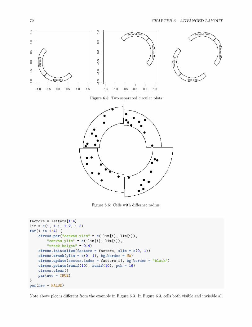
72 CHAPTER 6. ADVANCED LAYOUT
first one
first one
−1.0 −0.5 0.0 0.5 1.0 1.5
−1.
0−
0.5
0.0
0.5
1.0
1.5
second one
second one
−1.5 −1.0 −0.5 0.0 0.5 1.0
−1.
5−
1.0
−0.
50.
00.
51.
0
first onefirst one
second onesecond one
Figure 6.5: Two separated circular plots
Figure 6.6: Cells with differnet radius.
factors = letters[1:4]lim = c(1, 1.1, 1.2, 1.3)for(i in 1:4) {
circos.par("canvas.xlim" = c(-lim[i], lim[i]),"canvas.ylim" = c(-lim[i], lim[i]),"track.height" = 0.4)
circos.initialize(factors = factors, xlim = c(0, 1))circos.track(ylim = c(0, 1), bg.border = NA)circos.update(sector.index = factors[i], bg.border = "black")circos.points(runif(10), runif(10), pch = 16)circos.clear()par(new = TRUE)
}par(new = FALSE)
Note above plot is different from the example in Figure 6.3. In Figure 6.3, cells both visible and invisible all

6.4. ARRANGE MULTIPLE PLOTS 73
belong to a same track and they are in a same circular plot, thus they should have same radius. But for theexample here, cells have different radius and they belong to different circular plot.
In chapter 12, we use this technique to implement zoomings by combining two circular plots.
6.4 Arrange multiple plots
circlize is implemented in the base R graphic system, thus, you can use layout() or par(mforw, mfcol)to arrange multiple circular plots in one page (Figure 6.7).layout(matrix(1:9, 3, 3))for(i in 1:9) {
factors = 1:8par(mar = c(0.5, 0.5, 0.5, 0.5))circos.par(cell.padding = c(0, 0, 0, 0))circos.initialize(factors, xlim = c(0, 1))circos.track(ylim = c(0, 1), track.height = 0.05,
bg.col = rand_color(8), bg.border = NA)for(i in 1:20) {
se = sample(1:8, 2)circos.link(se[1], runif(2), se[2], runif(2),
col = rand_color(1, transparency = 0.4), border = NA)}circos.clear()
}
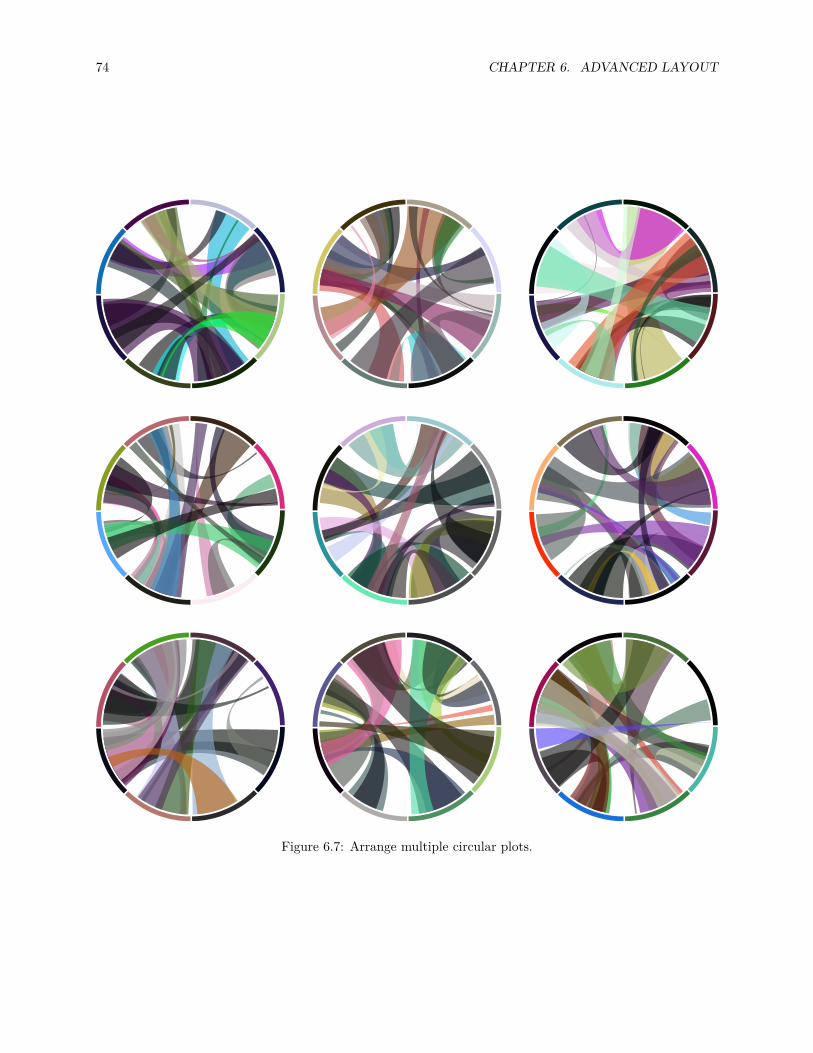
74 CHAPTER 6. ADVANCED LAYOUT
Figure 6.7: Arrange multiple circular plots.

Part II
Applications in Genomics
75


Chapter 7
Introduction
Circular visualization is popular in Genomics and related omics fields. It is efficient in revealing associationsin high dimensional genomic data. In genomic plots, categories are usually chromosomes and data on x axesare genomic positions, but it can also be any kind of general genomic categories.
To make is easy for Genomics analysis, circlize package particularly provides functions which focus ongenomic plots. These functions are synonymous to the basic graphic functions but expect special format ofinput data:
• circos.genomicTrack(): create a new track and add graphics.• circos.genomicPoints(): low-level function, add points.• circos.genomicLines(): low-level function, add lines or segments.• circos.genomicRect(): low-level function, add rectangles.• circos.genomicText(): low-level function, add text.• circos.genomicLink(): add links.
The genomic functions are implemented by basic circlize functions (e.g. circos.track(), circos.points()),thus, the use of genomic functions can be mixed with the basic circlize functions.
7.1 Input data
Genomic data is usually stored as a table where the first three columns define the genomic regions andfollowing columns are values associated with the corresponding regions. Each genomic region is composedby three elements: genomic category (in most case, it is the chromosome), start position on the genomiccategory and the end position. Such data structure is known as BED format and is broadly used in genomicresearch.
circlize provides a simple function generateRandomBed() which generates random genomic data. Positionsare uniformly generated from human genome and the number of regions on chromosomes approximatelyproportional to the length of chromosomes. In the function, nr and nc control the number of rows andnumeric columns that users need. Please note nr are not exactly the same as the number of rows which arereturned by the function. fun argument is a self-defined function to generate random values.set.seed(999)bed = generateRandomBed()head(bed)
## chr start end value1## 1 chr1 39485 159163 -0.1887635## 2 chr1 897195 1041959 -0.2435220
77

78 CHAPTER 7. INTRODUCTION
## 3 chr1 1161957 1177159 0.3749953## 4 chr1 1201513 1481406 -0.2600839## 5 chr1 1487402 1531773 -0.4633990## 6 chr1 1769949 2736215 -0.8159909bed = generateRandomBed(nr = 200, nc = 4)nrow(bed)
## [1] 205bed = generateRandomBed(nc = 2, fun = function(k) sample(letters, k, replace = TRUE))head(bed)
## chr start end value1 value2## 1 chr1 98740 566688 e e## 2 chr1 769960 887938 b q## 3 chr1 906851 933021 u o## 4 chr1 1241911 1243537 k f## 5 chr1 1385344 1410947 v x## 6 chr1 1498302 1585389 u v
All genomic functions in circlize expect input variable as a data frame which contains genomic data or alist of data frames which contains genomic data in different conditions.

Chapter 8
Initialize with genomic data
circlize is quite flexible to initialize the circular plot not only by chromosomes, but also by any type ofgeneral genomic categories.
8.1 Initialize with cytoband data
Cytoband data is an ideal data source to initialize genomic plots. It contains length of chromosomes as wellas so called “chromosome band” annotation to help to identify positions on chromosomes.
8.1.1 Basic usage
If you work on human genome, the most straightforward way is to directly use circos.initializeWithIdeogram()(Figure 8.1). By default, the function creates a track with chromosome name and axes, and a track ofideograms.
Although chromosome names added to the plot are pure numeric, actually the internally names have the“chr” index. When you adding more tracks, the chromosome names should also have “chr” index.circos.initializeWithIdeogram()text(0, 0, "default", cex = 1)
circos.info()
## All your sectors:## [1] "chr1" "chr2" "chr3" "chr4" "chr5" "chr6" "chr7" "chr8"## [9] "chr9" "chr10" "chr11" "chr12" "chr13" "chr14" "chr15" "chr16"## [17] "chr17" "chr18" "chr19" "chr20" "chr21" "chr22" "chrX" "chrY"#### All your tracks:## [1] 1 2#### Your current sector.index is chrY## Your current track.index is 2circos.clear()
By default, circos.initializeWithIdeogram() initializes the plot with cytoband data of human genomehg19. Users can also initialize with other species by specifying species argument and it will automaticallydownload cytoband files for corresponding species.
79

80 CHAPTER 8. INITIALIZE WITH GENOMIC DATA
0MB
90M
B
180M
B 1
0MB
90M
B
180M
B 2
0MB
90MB
180MB
30MB90MB180MB
40MB
90MB
180MB
5
0MB
90MB6
0MB
90MB7
0MB
90MB8
0MB
90M
B
90M
B90
MB
100M
B90
MB
11
0MB
90MB12 0MB 90MB13 0MB90MB14
0MB90MB15
0MB90MB
160MB
170MB
180MB
19
0MB
200M
B21
0MB
220M
B90M
BX
0MB
Y
default
Figure 8.1: Initialize genomic plot, default.
circos.initializeWithIdeogram(species = "hg18")circos.initializeWithIdeogram(species = "mm10")
When you are dealing rare species and there is no cytoband data available yet, circos.initializeWithIdeogram()will try to continue to download the “chromInfo” file form UCSC, which also contains lengths of chromosomes,but of course, there is no ideogram track on the plot.
In some cases, when there is no internet connection for downloading or there is no corresponding dataavaiable on UCSC yet. You can manually construct a data frame which contains ranges of chromosomes ora file path if it is stored in a file, and sent to circos.initializeWithIdeogram().cytoband.file = system.file(package = "circlize", "extdata", "cytoBand.txt")circos.initializeWithIdeogram(cytoband.file)
cytoband.df = read.table(cytoband.file, colClasses = c("character", "numeric","numeric", "character", "character"), sep = "\t")
circos.initializeWithIdeogram(cytoband.df)
If you read cytoband data directly from file, please explicitly specify colClasses arguments and set the classof position columns as numeric. The reason is since positions are represented as integers, read.table wouldtreat those numbers as integer by default. In initialization of circular plot, circlize needs to calculate thesummation of all chromosome lengths. The summation of such large integers would throw error of integeroverflow.
By default, circos.intializeWithIdeogram() uses all chromosomes which are available in cytoband datato initialize the circular plot. Users can choose a subset of chromosomes by specifying chromosome.index.This argument is also for ordering chromosomes (Figure 8.2).circos.initializeWithIdeogram(chromosome.index = paste0("chr", c(3,5,2,8)))text(0, 0, "subset of chromosomes", cex = 1)

8.1. INITIALIZE WITH CYTOBAND DATA 81
0MB
20M
B40
MB
60M
B
80M
B
100M
B
120MB
140MB
160MB180MB
3
0MB20MB
40MB
60MB
80MB
100MB
120MB
140MB
160MB
180MB
5
0MB
20M
B40
MB
60M
B80
MB
100M
B
120MB140MB 160MB 180MB 200MB 220MB240MB
20MB 20MB
40MB
60MB
80MB
100MB
120MB
140MB
8subset of chromosomes
Figure 8.2: Initialize genomic plot, subset chromosomes.
circos.clear()
When there is no cytoband data for the specified species, and when chromInfo data is used instead, there maybe many many extra short contigs. chromosome.index can also be useful to remove unnecessary contigs.
8.1.2 Pre-defined tracks
After the initialization of the circular plot, circos.initializeWithIdeogram() additionally creates a trackwhere there are genomic axes and chromosome names, and create another track where there is an ideogram(depends on whether cytoband data is available). plotType argument is used to control which type of tracksto add. (figure Figure 8.3).circos.initializeWithIdeogram(plotType = c("axis", "labels"))text(0, 0, "plotType = c('axis', 'labels')", cex = 1)circos.clear()
circos.initializeWithIdeogram(plotType = NULL)text(0, 0, "plotType = NULL", cex = 1)
circos.clear()
8.1.3 Other general settings
Similar as general circular plot, the parameters for the layout can be controlled by circos.par() (Figure8.4). Do remember when you explicitly set circos.par(), you need to call circos.clear() to finish theplotting.circos.par("start.degree" = 90)circos.initializeWithIdeogram()

82 CHAPTER 8. INITIALIZE WITH GENOMIC DATA
0MB
90M
B
180M
B 1
0MB
90M
B18
0MB 2
0MB
90MB
180MB
30MB90MB180MB
40MB
90MB
180MB
5
0MB
90MB6
0MB
90MB7
0MB
90MB8
0MB
90M
B
90M
B90
MB
100M
B90
MB
11
0MB
90MB12 0MB 90MB13 0MB90MB14
0MB90MB15
0MB90MB
160MB
170MB
180MB
19
0MB
200M
B21
0MB
220M
B90M
BX
0MB
Y
plotType = c('axis', 'labels') plotType = NULL
Figure 8.3: Initialize genomic plot, control tracks.
circos.clear()text(0, 0, "'start.degree' = 90", cex = 1)
circos.par("gap.degree" = rep(c(2, 4), 12))circos.initializeWithIdeogram()circos.clear()text(0, 0, "'gap.degree' = rep(c(2, 4), 12)", cex = 1)
8.2 Customize chromosome track
By default circos.initializeWithIdeogram() initializes the layout and adds two tracks. When plotTypeargument is set to NULL, the circular layout is only initialized but nothing is added. This makes it possiblefor users to completely design their own style of chromosome track.
In the following example, we use different colors to represent chromosomes and put chromosome names inthe center of each cell (Figure 8.5).set.seed(123)circos.initializeWithIdeogram(plotType = NULL)circos.track(ylim = c(0, 1), panel.fun = function(x, y) {
chr = CELL_META$sector.indexxlim = CELL_META$xlimylim = CELL_META$ylimcircos.rect(xlim[1], 0, xlim[2], 1, col = rand_color(1))circos.text(mean(xlim), mean(ylim), chr, cex = 0.7, col = "white",
facing = "inside", niceFacing = TRUE)}, track.height = 0.15, bg.border = NA)
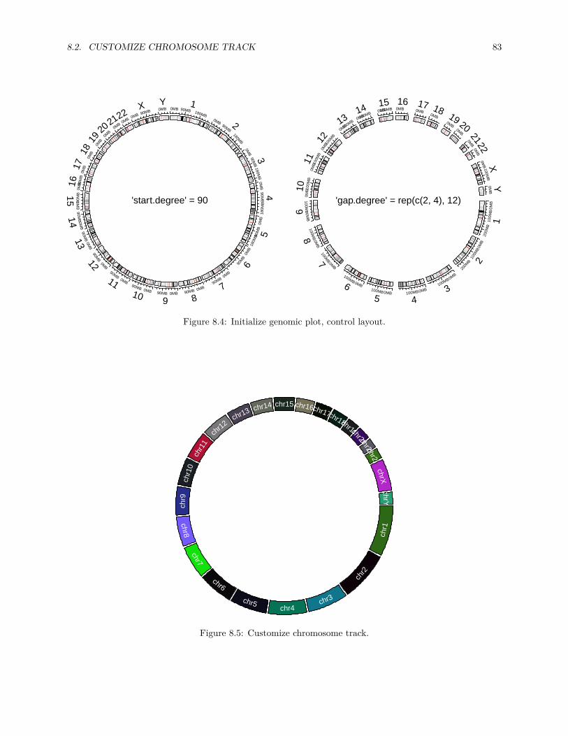
8.2. CUSTOMIZE CHROMOSOME TRACK 83
0MB 90MB 180MB
1
0MB90MB
180MB
2
0MB
90MB
180MB
30M
B90M
B
180M
B
4
0MB
90M
B
180M
B 5
0MB
90M
B6
0MB
90MB
70MB90MB
80MB90MB
90MB
90MB
10
0MB
90MB11
0MB
90MB12
0MB
90MB13
0MB
90MB14
0MB
90M
B15
0MB90
MB
160M
B170M
B180M
B19
0MB20 0MB21 0MB22 0MB 90MB
X 0MBY
'start.degree' = 90
0MB
100M
B
200M
B
1
0MB
100M
B
200M
B 2
0MB
100MB
30MB100MB
40MB
100MB
5
0MB
100MB
6
0MB
100MB7
0MB
100MB8
0MB
100MB9
0MB1
00M
B
100M
B100
MB
110M
B100
MB
12
0MB100MB13 0MB100MB14 0MB100MB15
0MB16
0MB
170MB
180MB
190MB
20
0MB
210M
B22
0MB
100MB
X0M
BY
'gap.degree' = rep(c(2, 4), 12)
Figure 8.4: Initialize genomic plot, control layout.
chr1
chr2
chr3chr4
chr5
chr6
chr7
chr8
chr9
chr1
0ch
r11
chr12
chr13 chr14 chr15 chr16chr17chr18chr19chr20chr21chr22chrX
chrY
Figure 8.5: Customize chromosome track.

84 CHAPTER 8. INITIALIZE WITH GENOMIC DATA
circos.clear()
8.3 Initialize with general genomic category
Chromosome is just a special case of genomic category. circos.genomicInitialize() can initialize circularlayout with any type of genomic categories. In fact, circos.initializeWithIdeogram() is implementedby circos.genomicInitialize(). The input data for circos.genomicInitialize() is also a data framewith at least three columns. The first column is genomic category (for cytoband data, it is chromosomename), and the next two columns are positions in each genomic category. The range in each category willbe inferred as the minimum position and the maximum position in corresponding category.
In the following example, a circular plot is initialized with three genes.df = data.frame(
name = c("TP53", "TP63", "TP73"),start = c(7565097, 189349205, 3569084),end = c(7590856, 189615068, 3652765))
circos.genomicInitialize(df)
Note it is not necessary that the record for each gene is only one row.
In following example, we plot the transcripts for TP53, TP63 and TP73 in a circular layout (Figure 8.6).tp_family = readRDS(system.file(package = "circlize", "extdata", "tp_family_df.rds"))head(tp_family)
## gene start end transcript exon## 1 TP53 7565097 7565332 ENST00000413465.2 7## 2 TP53 7577499 7577608 ENST00000413465.2 6## 3 TP53 7578177 7578289 ENST00000413465.2 5## 4 TP53 7578371 7578554 ENST00000413465.2 4## 5 TP53 7579312 7579590 ENST00000413465.2 3## 6 TP53 7579700 7579721 ENST00000413465.2 2
In the following code, we first create a track which identifies three genes.circos.genomicInitialize(tp_family)circos.track(ylim = c(0, 1),
bg.col = c("#FF000040", "#00FF0040", "#0000FF40"),bg.border = NA, track.height = 0.05)
Next, we put transcripts one after the other for each gene. It is simply to add lines and rectangles. Theusage of circos.genomicTrack() and circos.genomicRect() will be discussed in Chapter 9.n = max(tapply(tp_family$transcript, tp_family$gene, function(x) length(unique(x))))circos.genomicTrack(tp_family, ylim = c(0.5, n + 0.5),
panel.fun = function(region, value, ...) {all_tx = unique(value$transcript)for(i in seq_along(all_tx)) {
l = value$transcript == all_tx[i]# for each transcriptcurrent_tx_start = min(region[l, 1])current_tx_end = max(region[l, 2])circos.lines(c(current_tx_start, current_tx_end),
c(n - i + 1, n - i + 1), col = "#CCCCCC")circos.genomicRect(region[l, , drop = FALSE], ytop = n - i + 1 + 0.4,
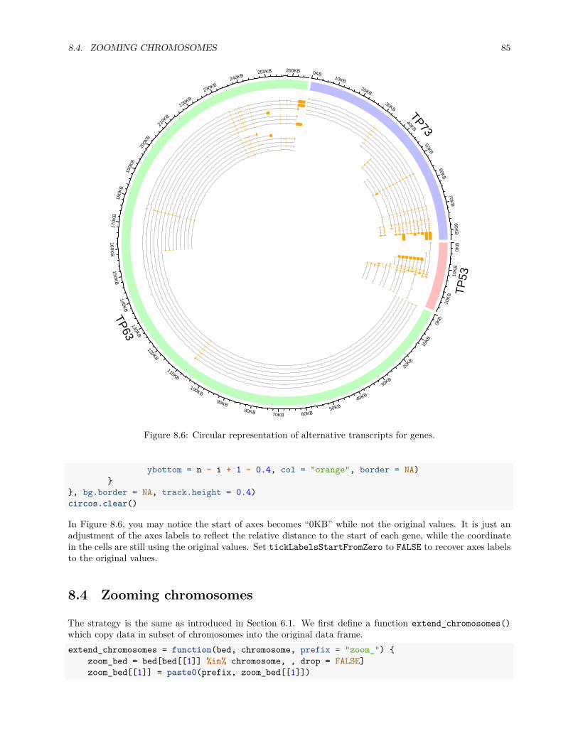
8.4. ZOOMING CHROMOSOMES 85
0KB
10K
B
20K
B TP
53
0KB
170K
B18
0KB
190K
B
200K
B
210K
B
220KB
230KB240KB
250KB
10KB
20KB
30KB
40KB
50KB
60KB70KB80KB
90KB
100KB
110KB
120KB
130KB
140KB
150KB
160KB
260KB
TP63
0KB10KB
20KB
30KB
40KB
50KB
60KB
70KB
80KB
TP73
Figure 8.6: Circular representation of alternative transcripts for genes.
ybottom = n - i + 1 - 0.4, col = "orange", border = NA)}
}, bg.border = NA, track.height = 0.4)circos.clear()
In Figure 8.6, you may notice the start of axes becomes “0KB” while not the original values. It is just anadjustment of the axes labels to reflect the relative distance to the start of each gene, while the coordinatein the cells are still using the original values. Set tickLabelsStartFromZero to FALSE to recover axes labelsto the original values.
8.4 Zooming chromosomes
The strategy is the same as introduced in Section 6.1. We first define a function extend_chromosomes()which copy data in subset of chromosomes into the original data frame.extend_chromosomes = function(bed, chromosome, prefix = "zoom_") {
zoom_bed = bed[bed[[1]] %in% chromosome, , drop = FALSE]zoom_bed[[1]] = paste0(prefix, zoom_bed[[1]])

86 CHAPTER 8. INITIALIZE WITH GENOMIC DATA
rbind(bed, zoom_bed)}
We use read.cytoband() to download and read cytoband data from UCSC. In following, x ranges for normalchromosomes and zoomed chromosomes are normalized separetely.cytoband = read.cytoband()cytoband_df = cytoband$dfchromosome = cytoband$chromosome
xrange = c(cytoband$chr.len, cytoband$chr.len[c("chr1", "chr2")])normal_chr_index = 1:24zoomed_chr_index = 25:26
# normalize in normal chromsomes and zoomed chromosomes separatelysector.width = c(xrange[normal_chr_index] / sum(xrange[normal_chr_index]),
xrange[zoomed_chr_index] / sum(xrange[zoomed_chr_index]))
The extended cytoband data which is in form of a data frame is sent to circos.initializeWithIdeogram().You can see the ideograms for chromosome 1 and 2 are zoomed (Figure 8.7).circos.par(start.degree = 90)circos.initializeWithIdeogram(extend_chromosomes(cytoband_df, c("chr1", "chr2")),
sector.width = sector.width)
Add a new track.bed = generateRandomBed(500)circos.genomicTrack(extend_chromosomes(bed, c("chr1", "chr2")),
panel.fun = function(region, value, ...) {circos.genomicPoints(region, value, pch = 16, cex = 0.3)
})
Add a link from original chromosome to the zoomed chromosome (Figure 8.7).circos.link("chr1", get.cell.meta.data("cell.xlim", sector.index = "chr1"),
"zoom_chr1", get.cell.meta.data("cell.xlim", sector.index = "zoom_chr1"),col = "#00000020", border = NA)
circos.clear()

8.4. ZOOMING CHROMOSOMES 87
0MB 200MB
10MB
200MB
2
0MB 3
0MB 40M
B 50M
B 60M
B 70M
B 8
0MB
90M
B
10
0MB
11
0MB
12
0MB
13
0MB
140MB
150MB
160MB
170MB
180MB
190MB
200MB
210MB
220MB
X0MB
Y0MB
30MB
60MB
90MB
120MB
150MB
180MB
210MB
240M
B
zoom_1
0MB
30M
B
60M
B
90M
B
120M
B
150MB
180MB210MB 240MB
zoom
_2
Figure 8.7: Zoom chromosomes.

88 CHAPTER 8. INITIALIZE WITH GENOMIC DATA

Chapter 9
Create plotting regions for genomicdata
Tracks are created and graphics are added by circos.genomicTrackPlotRegions(), or the short versioncircos.genomicTrack(). In following examples, chromosome will be used as the genomic category, and weassume data is simply a data frame in BED format (where the first column is the chromosome name, thesecond and third column are start and end positions, and the following columns are associated values). Formore complex form of data and behaviour of the functions, we will introduce in Chapter 10.
Similar as circos.track(), circos.genomicTrack() also accepts a self- defined function panel.fun whichis applied in every cell but with different form.circos.genomicTrackPlotRegion(data, panel.fun = function(region, value, ...) {
circos.genomicPoints(region, value, ...)})
Inside panel.fun, users can use low-level graphic functions to add basic graphics in each cell.panel.fun expects two arguments region and value which are automatically processed and passedfrom circos.genomicTrack(). region is a two-column data frame which only contains start position andend position in the current chromosome. value is also a data frame which contains other columns (start forthe fourth column, if it exists). Thus, basically, region can be thought as values on x axes and value asvalues on y axes.
There should be a third arguments ... which is mandatory and is used to pass user- invisible vari-ables to inner functions and make magics (explained in Chapter 10). So whenever you use panel.funin circos.genomicTrack(), please add it to the end of your function.
Following code demonstrates the values for region and value when used inside panel.fun.bed = generateRandomBed(nc = 2)head(bed, n = 2)
## chr start end value1 value2## 1 chr1 328358 515251 0.2792602 -0.1679226## 2 chr1 785289 797387 -0.4002915 0.1096555circos.initializeWithIdeogram(plotType = NULL)circos.genomicTrackPlotRegion(bed, panel.fun = function(region, value, ...) {
if(CELL_META$sector.index == "chr1") {print(head(region, n = 2))print(head(value, n = 2))
89

90 CHAPTER 9. CREATE PLOTTING REGIONS FOR GENOMIC DATA
}})
## start end## 1 328358 515251## 2 785289 797387## value1 value2## 1 0.2792602 -0.1679226## 2 -0.4002915 0.1096555
Since circos.genomicTrack() creates a new track, it needs values to calculate data ranges on y direction.Users can either specify the index of numeric columns in data by numeric.column (named index or numericindex, it can also be a vector with more than one columns) or directly set ylim. If none of them are set, thefunction will try to look for all numeric columns in data (of course, excluding the first three columns), andset them as numeric.column.circos.genomicTrackPlotRegion(data, ylim = c(0, 1),
panel.fun = function(region, value, ...) {circos.genomicPoints(region, value, ...)
})circos.genomicTrackPlotRegion(data, numeric.column = c("value1", "value2"),
panel.fun = function(region, value, ...) {circos.genomicPoints(region, value, ...)
})
Since genomic functions are implemented by basic circlize functions, you can use circos.info() anywhereto get information of sectors and tracks.
As you already see in previous examples, circlize also provides low-level graphic functions specifically de-signed for genomic data. They are all implemented by corresponding normal circlize functions, but needsinput variables with special format.
In this chapter, we introduce the basic usage of circos.genomicTrack() and low-level circos.genomic*().In Chapter 10, we will introduce more usages of these functions, which are especially designed for genomicregions measured at multiple conditions. Example plots are shown together in Chapter 10.
9.1 Points
Usage of circos.genomicPoints() is similar as circos.points(). circos.genomicPoints() expects atwo-column data frame which contains genomic regions and a data frame containing corresponding values.Points are always drawn at the middle of each region. The data column of the y values for plotting shouldbe specified by numeric.column. If numeric.column has length larger than one, all the specified columnswill be used for adding points.
If the function is called inside circos.genomicTrack() and users have been already set numeric.columnin circos.genomicTrack(), proper value of numeric.column will be passed to circos.genomicPoints()through ... in panel.fun, which means, you must add ... as the final argument in circos.genomicPoints()to get such information. If numeric.column is not set in both places, circos.genomicPoints() will use allnumeric columns detected in value.
Note here numeric.column is measured in value while numeric.column in circos.genomicTrack() ismeasured in the complete data frame. There is a difference of 3 for the column index! When numeric.columnis passed to circos.genomicPoints() internally, 3 is subtracted automatically. If you use character indexinstead of numeric index, you do not need to worry about it.
Possible usages of circos.genomicPoints() are as follows.

9.2. LINES 91
circos.genomicPoints(region, value, numeric.column = c(1, 2))circos.genomicPoints(region, value, cex, pch)circos.genomicPoints(region, value, sector.index, track.index)circos.genomicTrack(data, numeric.column = 4,
panel.fun = function(region, value, ...) {# numeric.column is automatically passed to `circos.genomicPoints()`circos.genomicPoints(region, value, ...)
})
If there is only one numeric column, graphical parameters such as pch, cex can be of length one or numberof rows of region. If there are more than one numeric columns specified, points for each numeric columnwill be added iteratively, and the graphical parameters should be either length one or number of numericcolumns specified.
circos.genomicPoints() is simply implemented by circos.points(). The basic idea of the implemen-tation is shown as following code, so, if you don’t like the circos.genomic*() functions, it would not bedifficult to directly use the circos.*() functions.circos.genomicPoints = function(region, value, numeric.column = 1, ...) {
x = (region[[2]] + region[[1]])/2for(i in numeric.column) {
y = value[[i]]circos.points(x, y, ...)
}}
9.2 Lines
circos.genomicLines() is similar as circos.lines(). The setting of graphical parameters is similar ascircos.genomicPoints().circos.genomicLines(region, value, ...)circos.genomicLines(region, value, numeric.column = c(1, 2))circos.genomicLines(region, value, area, baseline, border)circos.genomicLines(region, value, sector.index, track.index)
circlize additionally provides a new option segment for lty by which each genomic regions represent as‘horizontal’ lines at y positions (see Figure 10.2, track H).circos.genomicLines(region, value, lwd, lty = "segment")
9.3 Text
For circos.genomicText(), the position of text can be specified either by numeric.column or a separatedvector y. The labels of text can be specified either by labels.column or a vector labels.circos.genomicText(region, value, ...)circos.genomicText(region, value, y = 1, labels)circos.genomicText(region, value, numeric.column, labels.column)circos.genomicText(region, value, facing, niceFacing, adj)circos.genomicText(region, value, sector.index, track.index)

92 CHAPTER 9. CREATE PLOTTING REGIONS FOR GENOMIC DATA
9.4 Rectangles
For circos.genomicRect(), Since the left and right of the rectangles are already determined by the startand end of the genomic regions, we only need to set the positions of top and bottom of the rectangles byspecifying ytop, ybottom or ytop.column, ybottom.column.circos.genomicRect(region, value, ytop = 1, ybottom = 0)circos.genomicRect(region, value, ytop.column = 2, ybottom = 0)circos.genomicRect(region, value, col, border)
9.5 Links
circos.genomicLink() expects two data frames and it adds links from genomic regions in the first dataframe to corresponding genomic regions in the second data frame. All additional arguments are passed tocircos.link().set.seed(123)bed1 = generateRandomBed(nr = 100)bed1 = bed1[sample(nrow(bed1), 20), ]bed2 = generateRandomBed(nr = 100)bed2 = bed2[sample(nrow(bed2), 20), ]
circos.initializeWithIdeogram()circos.genomicLink(bed1, bed2, col = rand_color(nrow(bed1), transparency = 0.5),
border = NA)
circos.clear()
9.6 Mixed use of general circlize functions
panel.fun is applied on each cell, which means, besides genomic graphic functions, you can also use generalcirclize functions to add more graphics. For example, some horizontal lines and texts are added to each celland axes are put on top of each cell.circos.genomicTrack(bed, ylim = c(-1, 1),
panel.fun = function(region, value, ...) {circos.genomicPoints(region, value, ...)
for(h in c(-1, -0.5, 0, 0.5, 1)) {circos.lines(CELL_META$cell.xlim, c(0, 0), lty = 2, col = "grey")
}circos.text(x, y, labels)circos.axis("top")
})

9.6. MIXED USE OF GENERAL CIRCLIZE FUNCTIONS 93
0MB
90M
B
180M
B
1
0MB
90M
B
180M
B 2
0MB
90MB
180MB 30MB90MB180MB
40MB
90MB
180MB
5
0MB
90MB6
0MB
90MB7
0MB
90MB8
0MB
90M
B
90M
B90
MB
100M
B
90M
B
11
0MB
90MB120MB
90MB13 0MB90MB14
0MB 90MB
150MB 90MB
160MB
170MB
180MB
19
0MB
200M
B21
0MB
220M
B90M
BX
0MB Y
Figure 9.1: Add links from two sets of genomic regions.

94 CHAPTER 9. CREATE PLOTTING REGIONS FOR GENOMIC DATA

Chapter 10
modes for circos.genomicTrack()
The behaviour of circos.genomicTrack() and panel.fun will be different according to different input data(e.g. is it a simple data frame or a list of data frames? If it is a data frame, how many numeric columns ithas?) and different settings.
10.1 Normal mode
10.1.1 Input is a data frame
If input data is a data frame in BED format, region in panel.fun would be a data frame containing startposition and end position in the current chromosome which is extracted from data. value is also a dataframe which contains columns in data excluding the first three columns. Index of proper numeric columnswill be passed by ... if it is set in circos.genomicTrack(). If users want to use such information, theyneed to pass ... to low-level genomic function such as circos.genoimcPoints() as well.
If there are more than one numeric columns, graphics are added for each column repeatedly (with samegenomic positions).data = generateRandomBed(nc = 2)circos.genomicTrack(data, numeric.column = 4,
panel.fun = function(region, value, ...) {circos.genomicPoints(region, value, ...)circos.genomicPoints(region, value)# 1st column in `value` while 4th column in `data`circos.genomicPoints(region, value, numeric.column = 1)
})
10.1.2 Input is a list of data frames
If input data is a list of data frames, panel.fun is applied on each data frame iteratively to the current cell.Under such condition, region and value will contain corresponding data in the current data frame and inthe current chromosome. The index for the current data frame can be get by getI(...). Note getI(...)can only be used inside panel.fun and ... argument is mandatory.
When numeric.column is specified in circos.genomicTrack(), the length of numeric.column can only beone or the number of data frames, which means, there is only one numeric column that will be used in eachdata frame. If it is not specified, the first numeric column in each data frame is used.
95

96 CHAPTER 10. MODES FOR CIRCOS.GENOMICTRACK()
bed_list = list(generateRandomBed(), generateRandomBed())circos.genomicTrack(bed_list,
panel.fun = function(region, value, ...) {i = getI(...)circos.genomicPoints(region, value, col = i, ...)
})
# column 4 in the first bed and column 5 in the second bedcircos.genomicTrack(bed_list, numeric.column = c(4, 5),
panel.fun = function(region, value, ...) {i = getI(...)circos.genomicPoints(region, value, col = i, ...)
})
10.2 Stack mode
circos.genomicTrack() also supports a stack mode by setting stack = TRUE. Under stack mode, ylimis re-defined inside the function and the y-axis is splitted into several bins with equal height and graphicsare put onto “horizontal” bins (with position y = 1, 2, ...).
10.2.1 Input is a data frame
Under stack mode, when input data is a single data frame containing one or more numeric columns, eachnumeric column defined in numeric.column will be treated as a single unit (recall that when numeric.columnis not specified, all numeric columns are used). ylim is re-defined to c(0.5, n+0.5) in which n is numberof numeric columns specified. panel.fun is applied iteratively on each numeric column and add graphics tothe horizontal line y = i. In this case, actually value in e.g. circos.genomicPoints() doesn’t used formapping the y positions, while replaced with y = i internally.
In each iteration, in panel.fun, region is still the genomic regions in current chromosome, but value onlycontains current numeric column plus all non-numeric columns. The value of the index of “current” numericcolumn can be obtained by getI(...).data = generateRandomBed(nc = 2)circos.genomicTrack(data, stack = TRUE,
panel.fun = function(region, value, ...) {i = getI(...)circos.genomicPoints(region, value, col = i, ...)
})
10.2.2 Input is a list of data frames
When input data is a list of data frames, each data frame will be treated as a single unit. ylim is re-definedto c(0.5, n+0.5) in which n is the number of data frames. panel.fun will be applied iteratively on eachdata frame. In each iteration, in panel.fun, region is still the genomic regions in current chromosome,and value contains columns in current data frame excluding the first three columns. Graphics by low-levelgenomic functions will be added on the ‘horizontal’ bins.bed_list = list(generateRandomBed(), generateRandomBed())circos.genomicTrack(bed_list, stack = TRUE,
panel.fun = function(region, value, ...) {
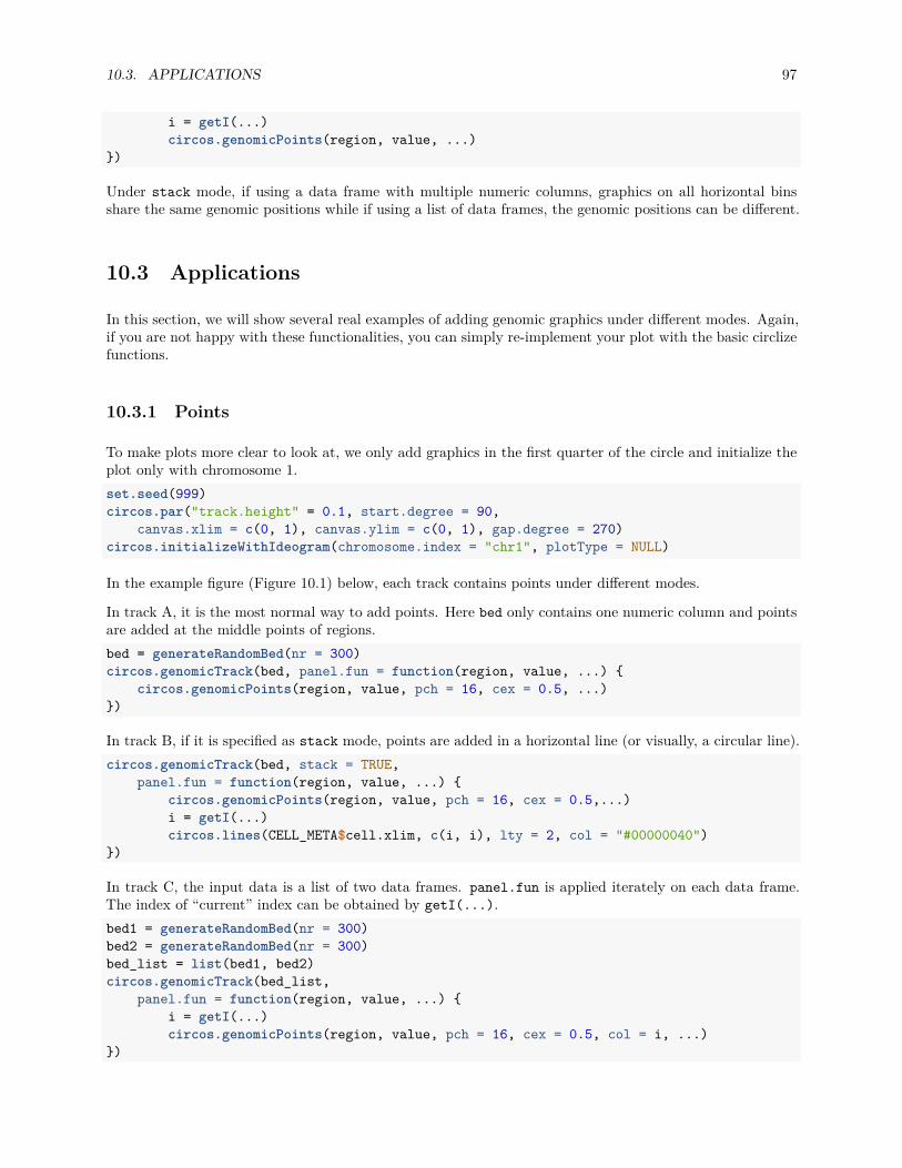
10.3. APPLICATIONS 97
i = getI(...)circos.genomicPoints(region, value, ...)
})
Under stack mode, if using a data frame with multiple numeric columns, graphics on all horizontal binsshare the same genomic positions while if using a list of data frames, the genomic positions can be different.
10.3 Applications
In this section, we will show several real examples of adding genomic graphics under different modes. Again,if you are not happy with these functionalities, you can simply re-implement your plot with the basic circlizefunctions.
10.3.1 Points
To make plots more clear to look at, we only add graphics in the first quarter of the circle and initialize theplot only with chromosome 1.set.seed(999)circos.par("track.height" = 0.1, start.degree = 90,
canvas.xlim = c(0, 1), canvas.ylim = c(0, 1), gap.degree = 270)circos.initializeWithIdeogram(chromosome.index = "chr1", plotType = NULL)
In the example figure (Figure 10.1) below, each track contains points under different modes.
In track A, it is the most normal way to add points. Here bed only contains one numeric column and pointsare added at the middle points of regions.bed = generateRandomBed(nr = 300)circos.genomicTrack(bed, panel.fun = function(region, value, ...) {
circos.genomicPoints(region, value, pch = 16, cex = 0.5, ...)})
In track B, if it is specified as stack mode, points are added in a horizontal line (or visually, a circular line).circos.genomicTrack(bed, stack = TRUE,
panel.fun = function(region, value, ...) {circos.genomicPoints(region, value, pch = 16, cex = 0.5,...)i = getI(...)circos.lines(CELL_META$cell.xlim, c(i, i), lty = 2, col = "#00000040")
})
In track C, the input data is a list of two data frames. panel.fun is applied iterately on each data frame.The index of “current” index can be obtained by getI(...).bed1 = generateRandomBed(nr = 300)bed2 = generateRandomBed(nr = 300)bed_list = list(bed1, bed2)circos.genomicTrack(bed_list,
panel.fun = function(region, value, ...) {i = getI(...)circos.genomicPoints(region, value, pch = 16, cex = 0.5, col = i, ...)
})

98 CHAPTER 10. MODES FOR CIRCOS.GENOMICTRACK()
A
B
C
D
E
F
Figure 10.1: Add points under different modes.
In track D, the list of data frames is plotted under stack mode. Graphics corresponding to each data frameare added to a horizontal line.circos.genomicTrack(bed_list, stack = TRUE,
panel.fun = function(region, value, ...) {i = getI(...)circos.genomicPoints(region, value, pch = 16, cex = 0.5, col = i, ...)circos.lines(CELL_META$cell.xlim, c(i, i), lty = 2, col = "#00000040")
})
In track E, the data frame has four numeric columns. Under normal mode, all the four columns are usedwith the same genomic coordinates.bed = generateRandomBed(nr = 300, nc = 4)circos.genomicTrack(bed,
panel.fun = function(region, value, ...) {circos.genomicPoints(region, value, pch = 16, cex = 0.5, col = 1:4, ...)
})
In track F, the data frame has four columns but is plotted under stack mode. Graphics for each column areadded to a horizontal line. Current column can be obtained by getI(...). Note here value in panel.funis a data frame with only one column (which is the current numeric column).bed = generateRandomBed(nr = 300, nc = 4)circos.genomicTrack(bed, stack = TRUE,
panel.fun = function(region, value, ...) {i = getI(...)circos.genomicPoints(region, value, pch = 16, cex = 0.5, col = i, ...)circos.lines(CELL_META$cell.xlim, c(i, i), lty = 2, col = "#00000040")
})circos.clear()

10.3. APPLICATIONS 99
10.3.2 Lines
Similar as previous figure, only the first quarter in the circle is visualized. Examples are shown in Figure10.2.circos.par("track.height" = 0.08, start.degree = 90,
canvas.xlim = c(0, 1), canvas.ylim = c(0, 1), gap.degree = 270,cell.padding = c(0, 0, 0, 0))
circos.initializeWithIdeogram(chromosome.index = "chr1", plotType = NULL)
In track A, it is the most simple way to add lines. Middle points of regions are used as the values on x-axes.bed = generateRandomBed(nr = 500)circos.genomicTrack(bed,
panel.fun = function(region, value, ...) {circos.genomicLines(region, value)
})
circos.genomicLines() is implemented by circos.lines(), thus, arguments supported in circos.lines()can also be in circos.genomicLines(). In track B, the area under the line is filled with color and in trackC, type of the line is set to h.circos.genomicTrack(bed,
panel.fun = function(region, value, ...) {circos.genomicLines(region, value, area = TRUE)
})circos.genomicTrack(bed,
panel.fun = function(region, value, ...) {circos.genomicLines(region, value, type = "h")
})
In track D, the input is a list of data frames. panel.fun is applied to each data frame iterately.bed1 = generateRandomBed(nr = 500)bed2 = generateRandomBed(nr = 500)bed_list = list(bed1, bed2)circos.genomicTrack(bed_list,
panel.fun = function(region, value, ...) {i = getI(...)circos.genomicLines(region, value, col = i, ...)
})
In track E, the input is a list of data frames and is drawn under stack mode. Each genomic region is drawnas a horizontal segment and is put on a horizontal line where the width of the segment corresponds to thewidth of the genomc region. Under stack mode, for circos.genomicLines(), type of lines is only restrictedto segments.circos.genomicTrack(bed_list, stack = TRUE,
panel.fun = function(region, value, ...) {i = getI(...)circos.genomicLines(region, value, col = i, ...)
})
In track F, the input is a data frame with four numeric columns. Each column is drawn under the normalmode where the same genomic coordinates are shared.bed = generateRandomBed(nr = 500, nc = 4)circos.genomicTrack(bed,

100 CHAPTER 10. MODES FOR CIRCOS.GENOMICTRACK()
A
B
C
D
E
F
G
H
Figure 10.2: Add lines under different modes.
panel.fun = function(region, value, ...) {circos.genomicLines(region, value, col = 1:4, ...)
})
In track G, the data frame with four numeric columns are drawn under stack mode. All the four columnsare drawn to four horizontal lines.bed = generateRandomBed(nr = 500, nc = 4)circos.genomicTrack(bed, stack = TRUE,
panel.fun = function(region, value, ...) {i = getI(...)circos.genomicLines(region, value, col = i, ...)
})
In track H, we specify type to segment and set different colors for segments. Note each segment is locatedat the y position defined in the numeric column.bed = generateRandomBed(nr = 200)circos.genomicTrack(bed,
panel.fun = function(region, value, ...) {circos.genomicLines(region, value, type = "segment", lwd = 2,
col = rand_color(nrow(region)), ...)})circos.clear()
10.3.3 Rectangles
Again, only the first quarter of the circle is initialized. For rectangles, the filled colors are always usedto represent numeric values. Here we define a color mapping function col_fun to map values to colors.Examples are in Figure 10.3.

10.3. APPLICATIONS 101
circos.par("track.height" = 0.15, start.degree = 90,canvas.xlim = c(0, 1), canvas.ylim = c(0, 1), gap.degree = 270)
circos.initializeWithIdeogram(chromosome.index = "chr1", plotType = NULL)col_fun = colorRamp2(breaks = c(-1, 0, 1), colors = c("green", "black", "red"))
To draw heatmaps, you probably want to use the stack mode. In track A, bed has four numeric columnsand stack mode is used to arrange the heatmap. You can see rectangles are stacked for a certain genomicregion.bed = generateRandomBed(nr = 100, nc = 4)circos.genomicTrack(bed, stack = TRUE,
panel.fun = function(region, value, ...) {circos.genomicRect(region, value, col = col_fun(value[[1]]), border = NA, ...)
})
In track B, the input is a list of data frames. Under stack mode, each data frame is added to a horizontalline. Since genomic positions for different data frames can be different, you may see in the figure, positionsfor the two sets of rectangles are different.
Under stack mode, by default, the height of rectangles is internally set to make them completely fill the cellin the vertical direction. ytop and ybottom can be used to adjust the height of rectangles. Note each line ofrectangles is at y = i and the default height of rectangles are 1.bed1 = generateRandomBed(nr = 100)bed2 = generateRandomBed(nr = 100)bed_list = list(bed1, bed2)circos.genomicTrack(bed_list, stack = TRUE,
panel.fun = function(region, value, ...) {i = getI(...)circos.genomicRect(region, value, ytop = i + 0.3, ybottom = i - 0.3,
col = col_fun(value[[1]]), ...)})
In track C, we implement same graphics as in track B, but with the normal mode. Under stack mode, datarange on y axes and positions of rectangles are adjusted internally. Here we explicitly adjust it under thenormal mode.circos.genomicTrack(bed_list, ylim = c(0.5, 2.5),
panel.fun = function(region, value, ...) {i = getI(...)circos.genomicRect(region, value, ytop = i + 0.3, ybottom = i - 0.3,
col = col_fun(value[[1]]), ...)})
In track D, rectangles are used to make barplots. We specify the position of the top of bars by ytop.column(1 means the first column in value).bed = generateRandomBed(nr = 200)circos.genomicTrack(bed,
panel.fun = function(region, value, ...) {circos.genomicRect(region, value, ytop.column = 1, ybottom = 0,
col = ifelse(value[[1]] > 0, "red", "green"), ...)circos.lines(CELL_META$cell.xlim, c(0, 0), lty = 2, col = "#00000040")
})circos.clear()

102 CHAPTER 10. MODES FOR CIRCOS.GENOMICTRACK()
A
B
C
D
Figure 10.3: Add rectangles under different modes.

Chapter 11
High-level genomic functions
In this chapter, several high-level functions which create tracks are introduced.
11.1 Ideograms
circos.initializeWithIdeogram() initializes the circular plot and adds ideogram track if thecytoband data is available. Actually, the ideograms are drawn by circos.genomicIdeogram().circos.genomicIdeogram() creates a small track of ideograms and can be used anywhere in thecircle. By default it adds ideograms for human genome hg19 (Figure 11.1).circos.initializeWithIdeogram(plotType = c("labels", "axis"))circos.track(ylim = c(0, 1))circos.genomicIdeogram() # put ideogram as the third trackcircos.genomicIdeogram(track.height = 0.2)
11.2 Heatmaps
Matrix which corresponds to genomic regions can be visualized as heatmaps. Heatmaps completely fillthe track and there are connection lines connecting heatmaps and original positions in the genome. ‘cir-cos.genomicHeamtap()“ draws connection lines and heatmaps as two tracks and combines them as an inte-grated track.
Generally, all numeric columns (excluding the first three columns) in the input data frame are used tomake the heatmap. Columns can also be specified by numeric.column which is either an numeric vectoror a character vector. Colors can be specfied as a color matrix or a color mapping function generated bycolorRamp2().
The height of the connection line track and the heatmap track can be set by connection_height andheatmap_height arguments. Also parameters for the styles of lines and rectangle borders can be adjusted,please check the help page of circos.genomicHeatmap().circos.initializeWithIdeogram()bed = generateRandomBed(nr = 100, nc = 4)col_fun = colorRamp2(c(-1, 0, 1), c("green", "black", "red"))circos.genomicHeatmap(bed, col = col_fun, side = "inside", border = "white")circos.clear()
103
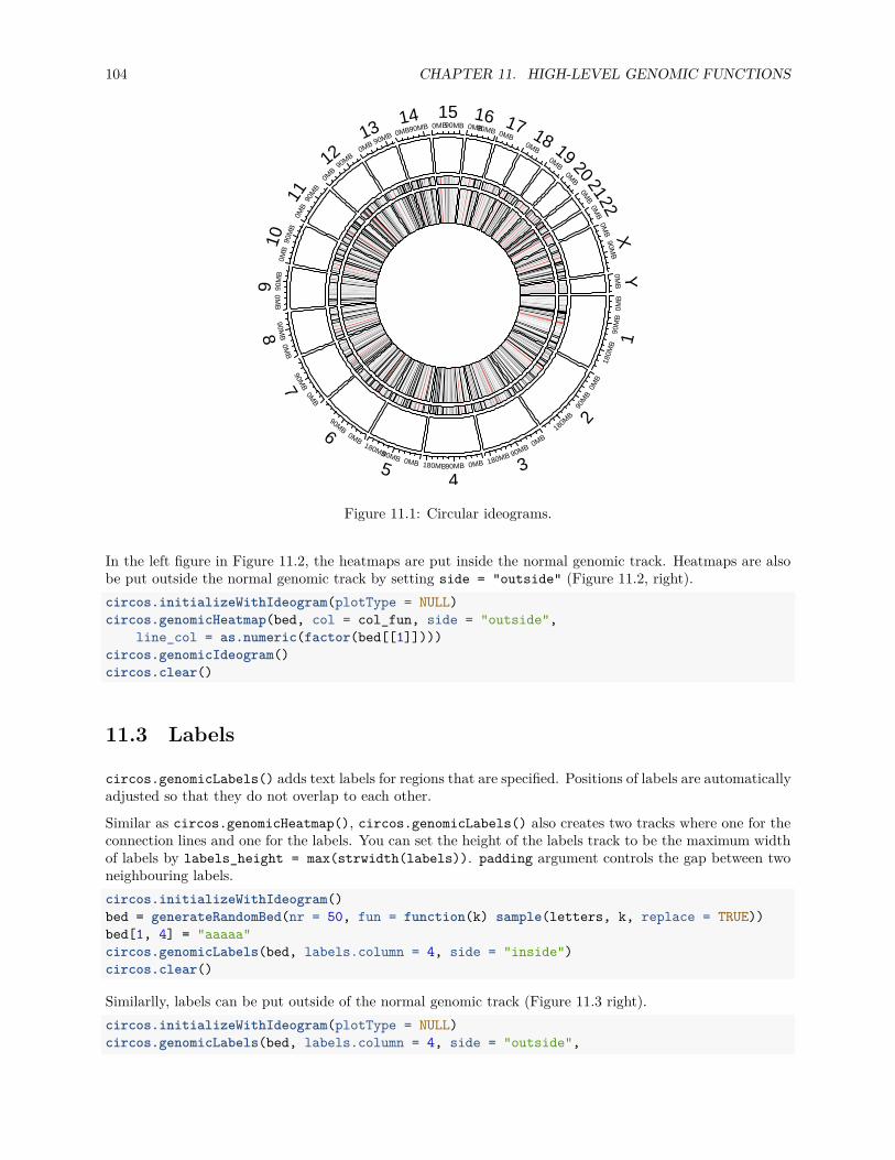
104 CHAPTER 11. HIGH-LEVEL GENOMIC FUNCTIONS
0MB
90M
B
180M
B 1
0MB
90M
B
180M
B 2
0MB
90MB
180MB
30MB90MB180MB
40MB
90MB
180MB
5
0MB
90MB6
0MB
90MB7
0MB
90MB8
0MB
90M
B
90M
B90
MB
100M
B90
MB
11
0MB
90MB12 0MB 90MB13 0MB90MB14
0MB90MB15
0MB90MB
160MB
170MB
180MB
19
0MB
200M
B21
0MB
220M
B90M
BX
0MB
Y
Figure 11.1: Circular ideograms.
In the left figure in Figure 11.2, the heatmaps are put inside the normal genomic track. Heatmaps are alsobe put outside the normal genomic track by setting side = "outside" (Figure 11.2, right).circos.initializeWithIdeogram(plotType = NULL)circos.genomicHeatmap(bed, col = col_fun, side = "outside",
line_col = as.numeric(factor(bed[[1]])))circos.genomicIdeogram()circos.clear()
11.3 Labels
circos.genomicLabels() adds text labels for regions that are specified. Positions of labels are automaticallyadjusted so that they do not overlap to each other.
Similar as circos.genomicHeatmap(), circos.genomicLabels() also creates two tracks where one for theconnection lines and one for the labels. You can set the height of the labels track to be the maximum widthof labels by labels_height = max(strwidth(labels)). padding argument controls the gap between twoneighbouring labels.circos.initializeWithIdeogram()bed = generateRandomBed(nr = 50, fun = function(k) sample(letters, k, replace = TRUE))bed[1, 4] = "aaaaa"circos.genomicLabels(bed, labels.column = 4, side = "inside")circos.clear()
Similarlly, labels can be put outside of the normal genomic track (Figure 11.3 right).circos.initializeWithIdeogram(plotType = NULL)circos.genomicLabels(bed, labels.column = 4, side = "outside",
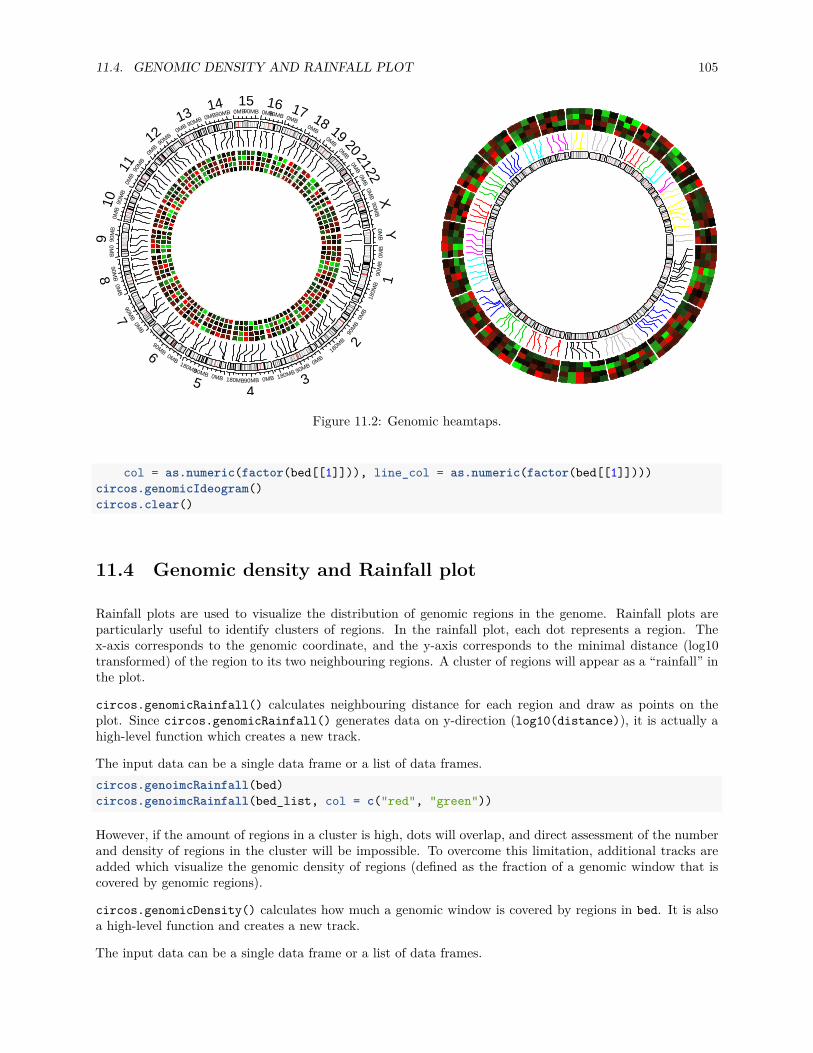
11.4. GENOMIC DENSITY AND RAINFALL PLOT 105
0MB
90M
B
180M
B 1
0MB
90M
B18
0MB 2
0MB
90MB
180MB
30MB90MB180MB
40MB
90MB
180MB
5
0MB
90MB6
0MB
90MB7
0MB
90MB8
0MB
90M
B
90M
B90
MB
100M
B90
MB
11
0MB
90MB12 0MB 90MB13 0MB90MB14
0MB90MB15
0MB90MB
160MB
170MB
180MB
19
0MB
200M
B21
0MB
220M
B90M
BX
0MB
YFigure 11.2: Genomic heamtaps.
col = as.numeric(factor(bed[[1]])), line_col = as.numeric(factor(bed[[1]])))circos.genomicIdeogram()circos.clear()
11.4 Genomic density and Rainfall plot
Rainfall plots are used to visualize the distribution of genomic regions in the genome. Rainfall plots areparticularly useful to identify clusters of regions. In the rainfall plot, each dot represents a region. Thex-axis corresponds to the genomic coordinate, and the y-axis corresponds to the minimal distance (log10transformed) of the region to its two neighbouring regions. A cluster of regions will appear as a “rainfall” inthe plot.
circos.genomicRainfall() calculates neighbouring distance for each region and draw as points on theplot. Since circos.genomicRainfall() generates data on y-direction (log10(distance)), it is actually ahigh-level function which creates a new track.
The input data can be a single data frame or a list of data frames.circos.genoimcRainfall(bed)circos.genoimcRainfall(bed_list, col = c("red", "green"))
However, if the amount of regions in a cluster is high, dots will overlap, and direct assessment of the numberand density of regions in the cluster will be impossible. To overcome this limitation, additional tracks areadded which visualize the genomic density of regions (defined as the fraction of a genomic window that iscovered by genomic regions).
circos.genomicDensity() calculates how much a genomic window is covered by regions in bed. It is alsoa high-level function and creates a new track.
The input data can be a single data frame or a list of data frames.

106 CHAPTER 11. HIGH-LEVEL GENOMIC FUNCTIONS
0MB
90M
B
180M
B 1
0MB
90M
B18
0MB 2
0MB
90MB
180MB
30MB90MB180MB
40MB
90MB
180MB
5
0MB
90MB6
0MB
90MB7
0MB
90MB8
0MB
90M
B
90M
B90
MB
100M
B90
MB
11
0MB
90MB12 0MB 90MB13 0MB90MB14
0MB90MB15
0MB90MB
160MB
170MB
180MB
19
0MB
200M
B21
0MB
220M
B90M
BX
0MB
Y
uarlzge
km
ui
yuttnlpnm
sw w x o a i
aaaaar
cl
ztd
ecsqszs
e p t v z bb t
qbmmyy
suarlzg
ek
mui
yuttn
lp
nm s
w w x o a iaaaaar
cl
zt
d
ecsqsz
e p t v zb
b
tqbmmyy
Figure 11.3: Genomic labels.
circos.genomicDensity(bed)circos.genomicDensity(bed, baseline = 0)circos.genomicDensity(bed, window.size = 1e6)circos.genomicDensity(bedlist, col = c("#FF000080", "#0000FF80"))
Following example makes a rainfall plot for differentially methylated regions (DMR) and their genomicdensities. In the plot, red corresponds to hyper-methylated DMRs (gain of methylation) and blue correspondsto hypo-methylated DMRs (loss of methylation). You may see how the combination of rainfall track andgenomic density track helps to get a more precise inference of the distribution of DMRs on genome (Figure11.4).load(system.file(package = "circlize", "extdata", "DMR.RData"))circos.initializeWithIdeogram(chromosome.index = paste0("chr", 1:22))
bed_list = list(DMR_hyper, DMR_hypo)circos.genomicRainfall(bed_list, pch = 16, cex = 0.4, col = c("#FF000080", "#0000FF80"))circos.genomicDensity(DMR_hyper, col = c("#FF000080"), track.height = 0.1)circos.genomicDensity(DMR_hypo, col = c("#0000FF80"), track.height = 0.1)
circos.clear()
Internally, rainfallTransform() and genomicDensity() are used to the neighbrouing distance and thegenomic density values.head(rainfallTransform(DMR_hyper))
## chr start end dist## 70 chr1 933445 934443 35323## 104 chr1 969766 970362 4909## 105 chr1 975271 976767 4909## 154 chr1 1108819 1109923 31522## 155 chr1 1141445 1142405 31522## 157 chr1 1181550 1182782 39145

11.4. GENOMIC DENSITY AND RAINFALL PLOT 107
0MB
90M
B
180M
B
1
0MB
90M
B
180MB 2
0MB
90MB
180MB 30MB90MB180MB
4
0MB
90MB
180MB
5
0MB
90MB6
0MB
90MB7
0MB
90M
B8
0MB
90M
B
9
0MB
90M
B
10
0MB
90MB110MB
90MB12 0MB 90MB13
0MB 90MB
140MB
90MB
150MB
90MB
16
0MB17
0MB
180M
B19
0MB
200M
B21
0MB
22
Figure 11.4: Genomic rainfall plot and densities.

108 CHAPTER 11. HIGH-LEVEL GENOMIC FUNCTIONS
head(genomicDensity(DMR_hyper, window.size = 1e6))
## chr start end pct## 1 chr1 1 1000000 0.003093## 2 chr1 500001 1500000 0.007592## 3 chr1 1000001 2000000 0.008848## 4 chr1 1500001 2500000 0.010155## 5 chr1 2000001 3000000 0.011674## 6 chr1 2500001 3500000 0.007783

Chapter 12
Nested zooming
12.1 Basic idea
In Section 6.1 we introduced how to zoom sectors to the same circle in the same track. This works fine ifthere are only a few regions that need to be zoomed. However, when the regions that need to be zoomedis too many, the method will not work efficiently. In this chapter, we introduce another zooming methodwhich puts zoomed regions in a different circular plot.
To illustrate the basic idea, we first generate a random data set.set.seed(123)df = data.frame(cate = sample(letters[1:8], 400, replace = TRUE),
x = runif(400),y = runif(400),stringsAsFactors = FALSE)
df = df[order(df[[1]], df[[2]]), ]rownames(df) = NULLdf$interval_x = as.character(cut(df$x, c(0, 0.2, 0.4, 0.6, 0.8, 1.0)))df$name = paste(df$cate, df$interval_x, sep = ":")df$start = as.numeric(gsub("^\\((\\d(\\.\\d)?).*(\\d(\\.\\d)?)]", "\\1", df$interval_x))df$end = as.numeric(gsub("^\\((\\d(\\.\\d)?),(\\d(\\.\\d)?)]$", "\\3", df$interval_x))nm = sample(unique(df$name), 20)df2 = df[df$name %in% nm, ]
correspondance = unique(df2[, c("cate", "start", "end", "name", "start", "end")])zoom_sector = unique(df2[, c("name", "start", "end", "cate")])zoom_data = df2[, c("name", "x", "y")]
data = df[, 1:3]sector = data.frame(cate = letters[1:8], start = 0, end = 1, stringsAsFactors = FALSE)
sector_col = structure(rand_color(8, transparency = 0.5), names = letters[1:8])
Following variables are used for downstream visualization. sector contains sector names and coordinate atthe x direction:head(sector, n = 4)
## cate start end## 1 a 0 1
109

110 CHAPTER 12. NESTED ZOOMING
## 2 b 0 1## 3 c 0 1## 4 d 0 1
data contains data points for a track.head(data, n = 4)
## cate x y## 1 a 0.02552670 0.5546818## 2 a 0.04210805 0.8112373## 3 a 0.04953844 0.3809037## 4 a 0.05819180 0.7151335
In sector, we randomly sampled several intervals which will be used for zooming. The zoomed intervals arestored in zoom_sector. In the zooming track, each interval is treated as an independent sector, thus, thename for each zoomed interval uses combination of the original sector name and the interval itself, just foreasily reading.head(zoom_sector, n = 4)
## name start end cate## 16 a:(0.4,0.6] 0.4 0.6 a## 37 a:(0.8,1] 0.8 1.0 a## 43 b:(0,0.2] 0.0 0.2 b## 64 b:(0.4,0.6] 0.4 0.6 b
And the subset of data which are in the zoomed intervals.head(zoom_data, n = 4)
## name x y## 16 a:(0.4,0.6] 0.4122831 0.28695762## 17 a:(0.4,0.6] 0.4286131 0.28869011## 18 a:(0.4,0.6] 0.4361300 0.04236068## 19 a:(0.4,0.6] 0.4498025 0.96864117
The correspondance between the original sectors and the zoomed intervals are in correspondance. Thevalue is a data frame with six columns. The value is the position of the intervals in the second circular plotin the first plot.head(correspondance, n = 4)
## cate start end name start.1 end.1## 16 a 0.4 0.6 a:(0.4,0.6] 0.4 0.6## 37 a 0.8 1.0 a:(0.8,1] 0.8 1.0## 43 b 0.0 0.2 b:(0,0.2] 0.0 0.2## 64 b 0.4 0.6 b:(0.4,0.6] 0.4 0.6
The zooming is actually composed of two circulat plots where one for the original track and one for thezoomed intervals. There is an additional connection track which identifies which intervals that are zoomedbelong to which sector. The circos.nested() function in circlize puts the two circular plots together,arranges them and automatically draws the connection lines.
To define “the circular plot”, the code for generating the plot needs to be wrapped into a function.f1 = function() {
circos.par(gap.degree = 10)circos.initialize(sector[, 1], xlim = sector[, 2:3])circos.track(data[[1]], x = data[[2]], y = data[[3]], ylim = c(0, 1),

12.1. BASIC IDEA 111
Figure 12.1: Nested zooming between two circular plots.
panel.fun = function(x, y) {circos.points(x, y, pch = 16, cex = 0.5, col = "red")
})}
f2 = function() {circos.par(gap.degree = 2, cell.padding = c(0, 0, 0, 0))circos.initialize(zoom_sector[[1]], xlim = as.matrix(zoom_sector[, 2:3]))circos.track(zoom_data[[1]], x = zoom_data[[2]], y = zoom_data[[3]],
panel.fun = function(x, y) {circos.points(x, y, pch = 16, cex = 0.5)
})}
In above, f1() is the code for generating the original plot and f2() is the code for generating the zoomedplot.
To combine the two plots, simply put f1(), f2() and corresponance to circos.nested() (Figure 12.1).circos.nested(f1, f2, correspondance)
In the plot, the zoomed circle is put inside the original circle and the start degree for the second plot isautomatically adjusted.
Zoomed circle can also be put outside by swtiching f1() and f2(). Actually, for circos.nested(), Itdoesn’t care which one is zoomed or not, they are just two circular plots and a correspondance (Figure 12.2).circos.nested(f2, f1, correspondance[, c(4:6, 1:3)])
## Warning: non-unique values when setting 'row.names': 'a', 'b', 'c', 'd',## 'f', 'g', 'h'
## Warning in circos.nested(f2, f1, correspondance[, c(4:6, 1:3)]): Sector order in `f2()` should be the same as in `f1()`, or else

112 CHAPTER 12. NESTED ZOOMING
Figure 12.2: Nested zooming between two circular plots, zoomed plot is put outside.
## connection lines may overlap.
There are some points that need to be noted while doing nested zoomings:
1. It can only be applied to the full circle.2. If canvas.xlim and canvas.ylim are adjusted in the first plot, same value should be set to the second
plot.3. By default the start degree of the second plot is automatically adjusted to make the difference be-
tween the original positions and zoomed sectors to a minimal. However, users can also manuallyadjusted the start degree for the second plot by setting circos.par("start.degree" = ...) andadjust_start_degree must be set to TRUE in circos.nested().
4. Since the function needs to know some information for the two circular plots, do not putcircos.clear() at the end of each plot. They will be added internally.
f1() and f2() are just normal code for implementing circular plot. There is no problem to make it morecomplex (Figure 12.3).sector_col = structure(rand_color(8, transparency = 0.5), names = letters[1:8])
f1 = function() {circos.par(gap.degree = 10)circos.initialize(sector[, 1], xlim = sector[, 2:3])circos.track(data[[1]], x = data[[2]], y = data[[3]], ylim = c(0, 1),
panel.fun = function(x, y) {l = correspondance[[1]] == CELL_META$sector.indexif(sum(l)) {
for(i in which(l)) {circos.rect(correspondance[i, 2], CELL_META$cell.ylim[1],
correspondance[i, 3], CELL_META$cell.ylim[2],col = sector_col[CELL_META$sector.index],border = sector_col[CELL_META$sector.index])
}

12.2. VISUALIZATION OF DMRS FROM TAGMENTATION-BASED WGBS 113
a
bc
d
e
fg
h
Figure 12.3: Nested zooming between two circular plots, slightly complex plots.
}circos.points(x, y, pch = 16, cex = 0.5)circos.text(CELL_META$xcenter, CELL_META$ylim[2] + uy(2, "mm"),
CELL_META$sector.index, niceFacing = TRUE, adj = c(0.5, 0))})
}
f2 = function() {circos.par(gap.degree = 2, cell.padding = c(0, 0, 0, 0))circos.initialize(zoom_sector[[1]], xlim = as.matrix(zoom_sector[, 2:3]))circos.track(zoom_data[[1]], x = zoom_data[[2]], y = zoom_data[[3]],
panel.fun = function(x, y) {circos.points(x, y, pch = 16, cex = 0.5)
}, bg.col = sector_col[zoom_sector$cate],track.margin = c(0, 0))
}circos.nested(f1, f2, correspondance, connection_col = sector_col[correspondance[[1]]])
12.2 Visualization of DMRs from tagmentation-based WGBS
Tagmentation-based whole-genome bisulfite sequencing (T-WGBS) is a technology which can examine onlya minor fraction of methylome of interest. In this section, we demonstrate how to visualize DMRs which aredetected from T-WGBS data in a circular plot by circlize package.
In the example data loaded, tagments contains regions which are sequenced, DMR1 contains DMRs for onepatient detectd in tagment regions. Correspondance between tagment regions and original genome is storedin correspondance.

114 CHAPTER 12. NESTED ZOOMING
load(system.file(package = "circlize", "extdata", "tagments_WGBS_DMR.RData"))head(tagments, n = 4)
## tagments start end chr## 1 chr1-44876009-45016546 44876009 45016546 chr1## 2 chr1-90460304-90761641 90460304 90761641 chr1## 3 chr1-211666507-211692757 211666507 211692757 chr1## 4 chr2-46387184-46477385 46387184 46477385 chr2head(DMR1, n = 4)
## chr start end methDiff## 1 chr1-44876009-45016546 44894352 44894643 -0.2812889## 2 chr1-44876009-45016546 44902069 44902966 -0.3331170## 3 chr1-90460304-90761641 90535428 90536046 -0.3550701## 4 chr1-90460304-90761641 90546991 90547262 -0.4310808head(correspondance, n = 4)
## chr start end tagments start.1 end.1## 1 chr1 44876009 45016546 chr1-44876009-45016546 44876009 45016546## 2 chr1 90460304 90761641 chr1-90460304-90761641 90460304 90761641## 3 chr1 211666507 211692757 chr1-211666507-211692757 211666507 211692757## 4 chr2 46387184 46477385 chr2-46387184-46477385 46387184 46477385
In Figure 12.4, the tagment regions are actually zoomed from the genome. In following code, f1() onlymakes a circular plot with whole genome and f2() makes circular plot for the tagment regions.chr_bg_color = rand_color(22, transparency = 0.8)names(chr_bg_color) = paste0("chr", 1:22)
f1 = function() {circos.par(gap.after = 2, start.degree = 90)circos.initializeWithIdeogram(chromosome.index = paste0("chr", 1:22),
plotType = c("ideogram", "labels"), ideogram.height = 0.03)}
f2 = function() {circos.par(cell.padding = c(0, 0, 0, 0), gap.after = c(rep(1, nrow(tagments)-1), 10))circos.genomicInitialize(tagments, plotType = NULL)circos.genomicTrack(DMR1, ylim = c(-0.6, 0.6),
panel.fun = function(region, value, ...) {for(h in seq(-0.6, 0.6, by = 0.2)) {
circos.lines(CELL_META$cell.xlim, c(h, h), lty = 3, col = "#AAAAAA")}circos.lines(CELL_META$cell.xlim, c(0, 0), lty = 3, col = "#888888")
circos.genomicPoints(region, value,col = ifelse(value[[1]] > 0, "#E41A1C", "#377EB8"),pch = 16, cex = 0.5)
}, bg.col = chr_bg_color[tagments$chr], track.margin = c(0.02, 0))circos.yaxis(side = "left", at = seq(-0.6, 0.6, by = 0.3),
sector.index = get.all.sector.index()[1], labels.cex = 0.4)circos.track(ylim = c(0, 1), track.height = uh(2, "mm"),
bg.col = add_transparency(chr_bg_color[tagments$chr], 0))}

12.2. VISUALIZATION OF DMRS FROM TAGMENTATION-BASED WGBS 115
1
2
3
4
5
6
789
10
11
12
13
1415
1617
1819
20 21 22
−0.6
−0.3
0
0.3
0.6
Figure 12.4: Visualization of DMRs.
circos.nested(f1, f2, correspondance, connection_col = chr_bg_color[correspondance[[1]]])

116 CHAPTER 12. NESTED ZOOMING

Part III
Visualize Relations
117


Chapter 13
The chordDiagram() function
One unique feature of circular layout is the circular visualization of relations between objects by links. Seeexamples in http://circos.ca/intro/tabular_visualization/. The name of such plot is called Chord diagram.In circlize, it is easy to plot Chord diagram in a straightforward or in a highly customized way.
There are two data formats that represent relations, either adjacency matrix or adjacency list. In adjacencymatrix, value in ith row and jth column represents the relation from object in the ith row and the object inthe jth column where the absolute value measures the strength of the relation. In adjacency list, relations arerepresented as a three-column data frame in which relations come from the first column and to the secondcolumn, and the third column represents the strength of the relation.
Following code shows an example of an adjacency matrix.mat = matrix(1:9, 3)rownames(mat) = letters[1:3]colnames(mat) = LETTERS[1:3]mat
## A B C## a 1 4 7## b 2 5 8## c 3 6 9
And the code in below is an example of a adjacency list.df = data.frame(from = letters[1:3], to = LETTERS[1:3], value = 1:3)df
## from to value## 1 a A 1## 2 b B 2## 3 c C 3
Actually, it is not difficult to convert between these two formats. There are also R packages and functionsdo the conversion such as in reshape2 package, melt() converts a matrix to a data frame and dcast()converts the data frame back to the matrix.
Chord diagram shows the information of the relation from several levels. 1. the links are straightforwardto show the relations between objects; 2. width of links are proportional to the strength of the relationwhich is more illustrative than other graphic mappings; 3. colors of links can be another graphic mappingfor relations; 4. width of sectors represents total strength for an object which connects to other objects oris connected from other objects. You can find an interesting example of using Chord diagram to visual-ize leagues system of players clubs by their national team from https://gjabel.wordpress.com/2014/06/05/
119
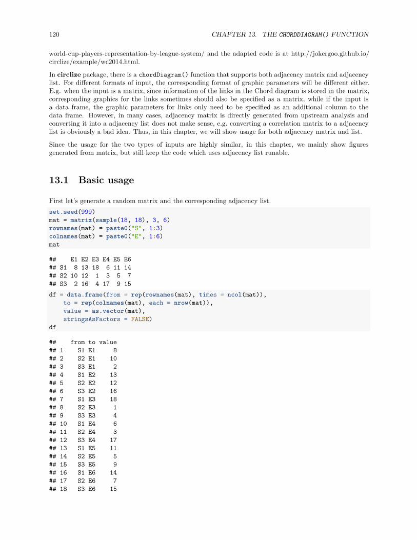
120 CHAPTER 13. THE CHORDDIAGRAM() FUNCTION
world-cup-players-representation-by-league-system/ and the adapted code is at http://jokergoo.github.io/circlize/example/wc2014.html.
In circlize package, there is a chordDiagram() function that supports both adjacency matrix and adjacencylist. For different formats of input, the corresponding format of graphic parameters will be different either.E.g. when the input is a matrix, since information of the links in the Chord diagram is stored in the matrix,corresponding graphics for the links sometimes should also be specified as a matrix, while if the input isa data frame, the graphic parameters for links only need to be specified as an additional column to thedata frame. However, in many cases, adjacency matrix is directly generated from upstream analysis andconverting it into a adjacency list does not make sense, e.g. converting a correlation matrix to a adjacencylist is obviously a bad idea. Thus, in this chapter, we will show usage for both adjacency matrix and list.
Since the usage for the two types of inputs are highly similar, in this chapter, we mainly show figuresgenerated from matrix, but still keep the code which uses adjacency list runable.
13.1 Basic usage
First let’s generate a random matrix and the corresponding adjacency list.set.seed(999)mat = matrix(sample(18, 18), 3, 6)rownames(mat) = paste0("S", 1:3)colnames(mat) = paste0("E", 1:6)mat
## E1 E2 E3 E4 E5 E6## S1 8 13 18 6 11 14## S2 10 12 1 3 5 7## S3 2 16 4 17 9 15df = data.frame(from = rep(rownames(mat), times = ncol(mat)),
to = rep(colnames(mat), each = nrow(mat)),value = as.vector(mat),stringsAsFactors = FALSE)
df
## from to value## 1 S1 E1 8## 2 S2 E1 10## 3 S3 E1 2## 4 S1 E2 13## 5 S2 E2 12## 6 S3 E2 16## 7 S1 E3 18## 8 S2 E3 1## 9 S3 E3 4## 10 S1 E4 6## 11 S2 E4 3## 12 S3 E4 17## 13 S1 E5 11## 14 S2 E5 5## 15 S3 E5 9## 16 S1 E6 14## 17 S2 E6 7## 18 S3 E6 15

13.2. ADJUST BY CIRCOS.PAR() 121
S1
S2
S3
E1
E2
E3 E4
E5
E6
010
20
30
40
50
60700
102030
0
10
20
30
4050
600
1020
010
20
30
40 010
20 0 1020
010
200
1020
30
Figure 13.1: Basic usages of ‘chordDiagram()‘.
The most simple usage is just calling chordDiagram() with mat (Figure 13.1).chordDiagram(mat)
circos.clear()
or call with df:chordDiagram(df)circos.clear()
The default Chord Diagram consists of a track of labels, a track of grids (or you call it lines) with axes, andlinks. Sectors which correspond to rows in the matrix locate at the bottom half of the circle. The order ofsectors is the order of union(rownames(mat), colnames(mat)) or union(df[[1]], df[[2]]) if input is adata frame. The order of sectors can be controlled by order argument (Figure 13.2 right). Of course, thelength of order vector should be same as the number of sectors.chordDiagram(mat, order = c("S1", "E1", "E2", "S2", "E3", "E4", "S3", "E5", "E6"))
circos.clear()
Under default settings, the grid colors which represent sectors are randomly generated, and the link colorsare same as grid colors which correspond to rows (or the first column if the input is an adjacency list) butwith 50% transparency.
13.2 Adjust by circos.par()
Since Chord Diagram is implemented by basic circlize functions, like normal circular plot, the layout can becustomized by circos.par().
The gaps between sectors can be set by circos.par(gap.after = ...) (Figure 13.3). It is useful when

122 CHAPTER 13. THE CHORDDIAGRAM() FUNCTION
S1
E1E2
S2
E3
E4
S3
E5
E6
010
20
30
40
50
60700
1020010
20
30
40
0
10
2030
0
1020
010
20
0
1020
30 40 5060 0
10
200
1020
30
Figure 13.2: Adjust sector orders in Chord diagram.
you want to distinguish sectors between rows and columns. Please note since you change default graphicalsettings, you need to use circos.clear() in the end of the plot to reset it.circos.par(gap.after = c(rep(5, nrow(mat)-1), 15, rep(5, ncol(mat)-1), 15))chordDiagram(mat)
circos.clear()
If the input is a data frame:circos.par(gap.after = c(rep(5, length(unique(df[[1]]))-1), 15,
rep(5, length(unique(df[[2]]))-1), 15))chordDiagram(df)circos.clear()
Similar to a normal circular plot, the first sector (which is the first row in the adjacency matrix or the firstrow in the adjacency list) starts from right center of the circle and sectors are arranged clock-wisely. Thestart degree for the first sector can be set by circos.par(start.degree = ...) and the direction can beset by circos.par(clock.wise = ...) (Figure 13.4).circos.par(start.degree = 90, clock.wise = FALSE)chordDiagram(mat)
circos.clear()

13.2. ADJUST BY CIRCOS.PAR() 123
S1
S2
S3
E1
E2
E3E4
E5
E6
010
2030
40
50
60
700
102030
010
20
30
40
50
60
0
1020
010
2030
400
1020
0 10 200
1020
0
1020
30
Figure 13.3: Set gaps in Chord diagram.
S1
S2
S3
E1
E2
E3
E4
E5
E6
010
20
30
4050
60 70
010
20
30
01020
30
40
50
60
01020
0
10
20
30
40
010
20
010
20
0
10
20
0 1020
30
Figure 13.4: Change position and orientation of Chord diagram.

124 CHAPTER 13. THE CHORDDIAGRAM() FUNCTION
S1
S2
S3
E1
E2
E3 E4
E5
E6
010
20
30
4050
60700
102030
0
10
20
30
4050
600
1020
010
2030
40 010
20 0 1020
010
200
1020
30
E1
E2
E3E4
E5
E6
S1
S2
S3
010
200
10
20
30
400
1020010
200
1020
0
1020
30
010
2030
40
50
6070 0 10 20 30
010
20
3040
5060
Figure 13.5: Set grid colors in Chord diagram.
13.3 Colors
13.3.1 Set grid colors
Grids have different colors to represent different sectors. Generally, sectors are divided into two groups. Onecontains sectors defined in rows of the matrix or the first column in the data frame, and the other containssectors defined in columns of the matrix or the second column in the data frame. Thus, links connect objectsin the two groups. By default, link colors are same as the color for the corresponding sectors in the firstgroup.
Changing colors of grids may change the colors of links as well. Colors for grids can be set through grid.colargument. Values of grid.col better be a named vector of which names correspond to sector names. If itis has no name index, the order of grid.col is assumed to have the same order as sectors (Figure 13.5).grid.col = c(S1 = "red", S2 = "green", S3 = "blue",
E1 = "grey", E2 = "grey", E3 = "grey", E4 = "grey", E5 = "grey", E6 = "grey")chordDiagram(mat, grid.col = grid.col)chordDiagram(t(mat), grid.col = grid.col)
13.3.2 Set link colors
Transparency of link colors can be set by transparency argument (Figure 13.6). The value should between0 to 1 in which 0 means no transparency and 1 means full transparency. Default transparency is 0.5.chordDiagram(mat, grid.col = grid.col, transparency = 0)
For adjacecy matrix, colors for links can be customized by providing a matrix of colors. In the followingexample, we use rand_color() to generate a random color matrix. Note since col_mat already containstransparency, transparency will be ignored if it is set (Figure 13.7).col_mat = rand_color(length(mat), transparency = 0.5)dim(col_mat) = dim(mat) # to make sure it is a matrix

13.3. COLORS 125
S1
S2
S3
E1
E2
E3 E4
E5
E6
010
20
30
40
50
60700
102030
0
10
20
30
4050
600
1020
010
20
30
40 010
20 0 1020
010
200
1020
30
Figure 13.6: Transparency for links in Chord diagram.
chordDiagram(mat, grid.col = grid.col, col = col_mat)
While for ajacency list, colors for links can be customized as a vector.col = rand_color(nrow(df))chordDiagram(df, grid.col = grid.col, col = col)
When the strength of the relation (e.g. correlations) represents as continuous values, col can also be spec-ified as a self-defined color mapping function. chordDiagram() accepts a color mapping generated bycolorRamp2() (Figure 13.8).col_fun = colorRamp2(range(mat), c("#FFEEEE", "#FF0000"), transparency = 0.5)chordDiagram(mat, grid.col = grid.col, col = col_fun)
The color mapping function also works for adjacency list, but it will be applied to the third column in thedata frame, so you need to make sure the third column has the proper values.chordDiagram(df, grid.col = grid.col, col = col_fun)
When the input is a matrix, sometimes you don’t need to generate the whole color matrix. You can justprovide colors which correspond to rows or columns so that links from a same row/column will have thesame color (Figure 13.9). Here note values of colors can be set as numbers, color names or hex code, sameas in the base R graphics.chordDiagram(mat, grid.col = grid.col, row.col = 1:3)chordDiagram(mat, grid.col = grid.col, column.col = 1:6)
row.col and column.col is specifically designed for matrix. There is no similar settings for ajacency list.
To emphasize again, transparency of links can be included in col, row.col or column.col, if transparencyis already set there, transparency argument will be ignored.
In Section 13.5, we will introduce how to highlight subset of links by only assigning colors to them.

126 CHAPTER 13. THE CHORDDIAGRAM() FUNCTION
S1
S2
S3
E1
E2
E3 E4
E5
E6
010
20
30
40
50
60700
102030
0
10
20
30
4050
600
1020
010
20
30
40 010
20 0 1020
010
200
1020
30
Figure 13.7: Set a color matrix for links in Chord diagram.
S1
S2
S3
E1
E2
E3 E4
E5
E6
010
20
30
40
50
60700
102030
0
10
20
30
4050
600
1020
010
20
30
40 010
20 0 1020
010
200
1020
30
Figure 13.8: Set a color mapping function for links in Chord diagram.
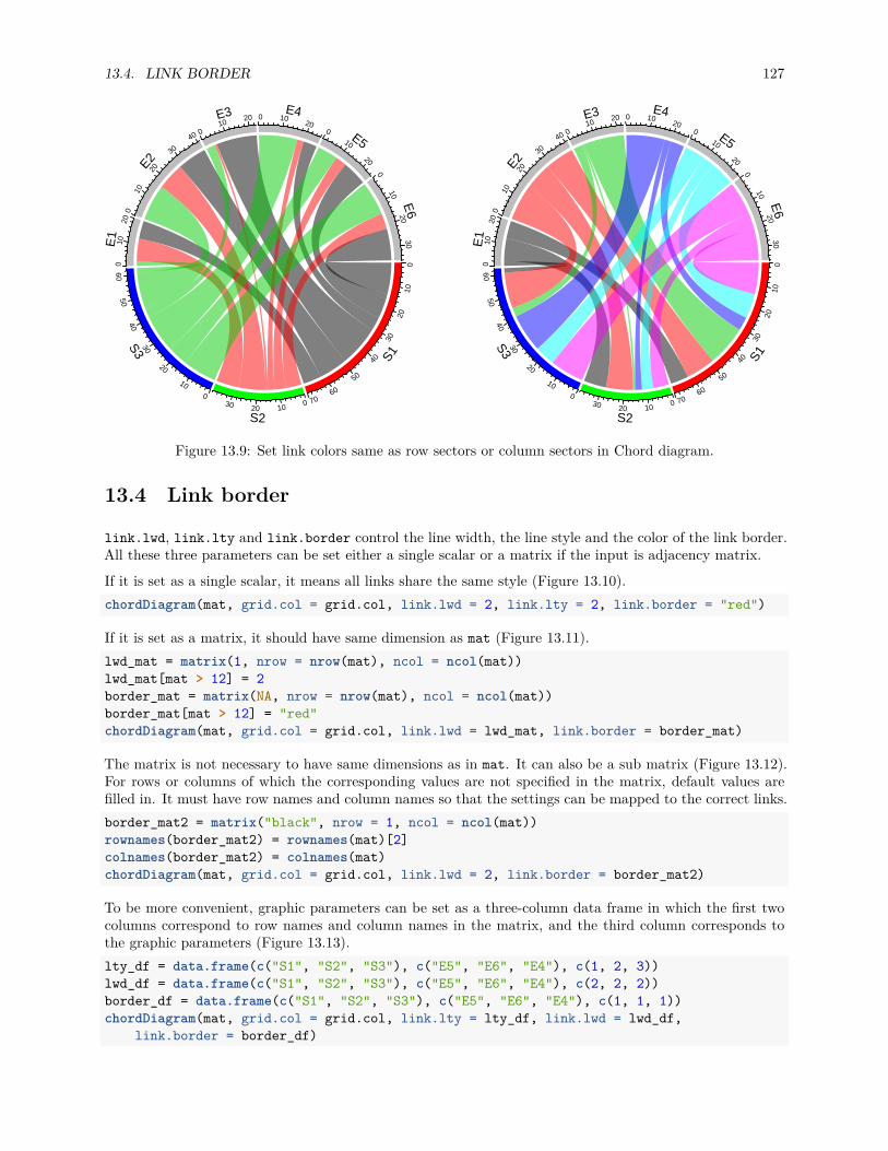
13.4. LINK BORDER 127
S1
S2
S3
E1
E2
E3 E4
E5
E6
010
20
30
4050
60700
102030
0
10
20
30
4050
600
1020
010
2030
40 010
20 0 1020
010
200
1020
30
S1
S2
S3
E1
E2
E3 E4
E5
E6
010
20
30
40
50
60700
102030
0
10
2030
4050
600
1020
010
20
30
40 010
20 0 1020
010
200
1020
30
Figure 13.9: Set link colors same as row sectors or column sectors in Chord diagram.
13.4 Link border
link.lwd, link.lty and link.border control the line width, the line style and the color of the link border.All these three parameters can be set either a single scalar or a matrix if the input is adjacency matrix.
If it is set as a single scalar, it means all links share the same style (Figure 13.10).chordDiagram(mat, grid.col = grid.col, link.lwd = 2, link.lty = 2, link.border = "red")
If it is set as a matrix, it should have same dimension as mat (Figure 13.11).lwd_mat = matrix(1, nrow = nrow(mat), ncol = ncol(mat))lwd_mat[mat > 12] = 2border_mat = matrix(NA, nrow = nrow(mat), ncol = ncol(mat))border_mat[mat > 12] = "red"chordDiagram(mat, grid.col = grid.col, link.lwd = lwd_mat, link.border = border_mat)
The matrix is not necessary to have same dimensions as in mat. It can also be a sub matrix (Figure 13.12).For rows or columns of which the corresponding values are not specified in the matrix, default values arefilled in. It must have row names and column names so that the settings can be mapped to the correct links.border_mat2 = matrix("black", nrow = 1, ncol = ncol(mat))rownames(border_mat2) = rownames(mat)[2]colnames(border_mat2) = colnames(mat)chordDiagram(mat, grid.col = grid.col, link.lwd = 2, link.border = border_mat2)
To be more convenient, graphic parameters can be set as a three-column data frame in which the first twocolumns correspond to row names and column names in the matrix, and the third column corresponds tothe graphic parameters (Figure 13.13).lty_df = data.frame(c("S1", "S2", "S3"), c("E5", "E6", "E4"), c(1, 2, 3))lwd_df = data.frame(c("S1", "S2", "S3"), c("E5", "E6", "E4"), c(2, 2, 2))border_df = data.frame(c("S1", "S2", "S3"), c("E5", "E6", "E4"), c(1, 1, 1))chordDiagram(mat, grid.col = grid.col, link.lty = lty_df, link.lwd = lwd_df,
link.border = border_df)

128 CHAPTER 13. THE CHORDDIAGRAM() FUNCTION
S1
S2
S3
E1
E2
E3 E4
E5
E6
010
20
30
40
50
60700
102030
0
10
20
30
4050
600
1020
010
20
30
40 010
20 0 1020
010
200
1020
30
Figure 13.10: Line style for Chord diagram.
S1
S2
S3
E1
E2
E3 E4
E5
E6
010
20
30
40
50
60700
102030
0
10
20
30
4050
600
1020
010
20
30
40 010
20 0 1020
010
200
1020
30
Figure 13.11: Set line style as a matrix.

13.5. HIGHLIGHT LINKS 129
S1
S2
S3
E1
E2
E3 E4
E5
E6
010
20
30
40
50
60700
102030
0
10
20
30
4050
600
1020
010
20
30
40 010
20 0 1020
010
200
1020
30
Figure 13.12: Set line style as a sub matrix.
It is much easier if the input is a data frame, you only need to set graphic settings as a vecotr.chordDiagram(df, grid.col = grid.col, link.lty = sample(1:3, nrow(df), replace = TRUE),
link.lwd = runif(nrow(df))*2, link.border = sample(0:1, nrow(df), replace = TRUE))
13.5 Highlight links
Sometimes we want to highlight some links to emphasize the importance of such relations. Highlighting bydifferent border styles are introduced in Section 13.4 and here we focus on highlighting by colors.
THere are two ways to highlight links, one is to set different transparency to different links and the otheris to only draw links that needs to be highlighted. Based on this rule and ways to assign colors to links(introduced in Section 13.3.2), we can highlight links which come from a same sector by assigning colors withdifferent transparency by row.col argument (Figure 13.14).chordDiagram(mat, grid.col = grid.col, row.col = c("#FF000080", "#00FF0010", "#0000FF10"))
We can also highlight links with values larger than a cutoff. There are at least three ways to do it. First,construct a color matrix and set links with small values to full transparency.
Since link colors can be specified as a matrix, we can set the transparency of those links to a high value oreven set to full transparency (Figure 13.15). In following example, links with value less than 12 is set to#00000000.col_mat[mat < 12] = "#00000000"chordDiagram(mat, grid.col = grid.col, col = col_mat)
Following code demonstrates using a color mapping function to map values to different transparency. Notethis is also workable for adjacency list.

130 CHAPTER 13. THE CHORDDIAGRAM() FUNCTION
S1
S2
S3
E1
E2
E3 E4
E5
E6
010
20
30
40
50
60700
102030
0
10
20
30
4050
600
1020
010
20
30
40 010
20 0 1020
010
200
1020
30
Figure 13.13: Set line style as a data frame.
S1
S2
S3
E1
E2
E3 E4
E5
E6
010
20
30
40
50
60700
102030
0
10
20
30
4050
600
1020
010
20
30
40 010
20 0 1020
010
200
1020
30
Figure 13.14: Highlight links by transparency.

13.5. HIGHLIGHT LINKS 131
S1
S2
S3
E1
E2
E3 E4
E5
E6
010
20
30
40
50
60700
102030
0
10
20
30
4050
600
1020
010
20
30
40 010
20 0 1020
010
200
1020
30
Figure 13.15: Highlight links by color matrix.
col_fun = function(x) ifelse(x < 12, "#00000000", "#FF000080")chordDiagram(mat, grid.col = grid.col, col = col_fun)
For both color matrix and color mapping function, actually all links are all drawn and the reason why youcannot see some of them is they are assigned with full transparency. If a three-column data frame is used toassign colors to links of interest, links which are not defined in col_df are not drawn (Figure 13.16).col_df = data.frame(c("S1", "S2", "S3"), c("E5", "E6", "E4"),
c("#FF000080", "#00FF0080", "#0000FF80"))chordDiagram(mat, grid.col = grid.col, col = col_df)
Highlighting links is relatively simple for adjacency list that you only need to construct a vector of colorsaccording to what links you want to highlight.col = rand_color(nrow(df))col[df[[3]] < 10] = "#00000000"chordDiagram(df, grid.col = grid.col, col = col)
The link.visible argument is recently introduced to circlize package which may provide a simple tocontrol the visibility of links. The value can be set as an logical matrix for adjacency matrix or a logicalvector for adjacency list (Figure 13.17).col = rand_color(nrow(df))chordDiagram(df, grid.col = grid.col, link.visible = df[[3]] >= 10)
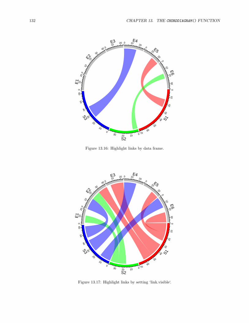
132 CHAPTER 13. THE CHORDDIAGRAM() FUNCTION
S1
S2
S3
E1
E2
E3 E4
E5
E6
010
20
30
40
50
60700
102030
0
10
20
30
4050
600
1020
010
20
30
40 010
20 0 1020
010
200
1020
30
Figure 13.16: Highlight links by data frame.
S1
S2
S3
E1
E2
E3 E4
E5
E6
010
20
30
40
50
60700
102030
0
10
20
30
4050
600
1020
010
20
30
40 010
20 0 1020
010
200
1020
30
Figure 13.17: Highlight links by setting ‘link.visible‘.

13.6. ORDERS OF LINKS 133
S1
S2
S3
E1
E2
E3 E4
E5
E6
010
20
30
40
50
60700
102030
0
10
20
30
4050
600
1020
010
2030
40 010
20 0 1020
010
200
1020
30
link.sort = TRUE, link.decreasing = TRUE
S1
S2
S3
E1
E2
E3 E4
E5
E6
010
20
30
40
50
60700
102030
0
10
2030
4050
600
1020
010
20
30
40 010
20 0 1020
010
200
1020
30
link.sort = TRUE, link.decreasing = FALSE
Figure 13.18: Order of positioning links on sectors.
13.6 Orders of links
13.6.1 Orders of positions on sectors
Orders of links on every sector are adjusted automatically to make them look nice. But sometimes sort-ing links according to the width on the sector is useful for detecting potential features. link.sort andlink.decreasing can be set to control the order of positioning links on sectors (Figure 13.18).chordDiagram(mat, grid.col = grid.col, link.sort = TRUE, link.decreasing = TRUE)title("link.sort = TRUE, link.decreasing = TRUE", cex = 0.8)chordDiagram(mat, grid.col = grid.col, link.sort = TRUE, link.decreasing = FALSE)title("link.sort = TRUE, link.decreasing = FALSE", cex = 0.8)
13.6.2 Order of adding links
The default order of adding links to the plot is based on their order in the matrix or in the data frame.Normally, transparency should be set to the link colors so that they will not overlap to each other. In mostcases, this looks fine, but sometimes, it improves the visualization to put wide links more forward and toput small links more backward in the plot. This can be set by link.rank argument which defines the orderof adding links. Larger value means the corresponding link is added later (Figure 13.19).chordDiagram(mat, grid.col = grid.col, transparency = 0)chordDiagram(mat, grid.col = grid.col, transparency = 0, link.rank = rank(mat))
Similar code if the input is a data frame.chordDiagram(df, grid.col = grid.col, transparency = 0, link.rank = rank(df[[3]]))

134 CHAPTER 13. THE CHORDDIAGRAM() FUNCTION
S1
S2
S3
E1
E2
E3 E4
E5
E6
010
20
30
4050
60700
102030
0
10
20
30
4050
600
1020
010
2030
40 010
20 0 1020
010
200
1020
30
S1
S2
S3
E1
E2
E3 E4
E5
E6
010
20
30
40
50
60700
102030
0
10
2030
4050
600
1020
010
20
30
40 010
20 0 1020
010
200
1020
30
Figure 13.19: Order of adding links.
13.7 Self-links
How to set self links dependends on whether the information needs to be duplicated. The self.linkargument can be set to 1 or 2 for the two different scenarios. Check the difference in Figure 13.20.df2 = data.frame(start = c("a", "b", "c", "a"), end = c("a", "a", "b", "c"))chordDiagram(df2, grid.col = 1:3, self.link = 1)title("self.link = 1")chordDiagram(df2, grid.col = 1:3, self.link = 2)title("self.link = 2")
13.8 Symmetric matrix
When the matrix is symmetric, by setting symmetric = TRUE, only lower triangular matrix without thediagonal will be used (Figure 13.21).mat3 = matrix(rnorm(25), 5)colnames(mat3) = letters[1:5]cor_mat = cor(mat3)col_fun = colorRamp2(c(-1, 0, 1), c("green", "white", "red"))chordDiagram(cor_mat, grid.col = 1:5, symmetric = TRUE, col = col_fun)title("symmetric = TRUE")chordDiagram(cor_mat, grid.col = 1:5, col = col_fun)title("symmetric = FALSE")
13.9 Directional relations
In some cases, when the input is a matrix, rows and columns represent directions, or when the input is adata frame, the first column and second column represent directions. Argument directional is used to

13.9. DIRECTIONAL RELATIONS 135
a
b
c
00.
20.
4
0.6
0.8
1
1.2
1.41.61.82
2.2
2.4
2.6
2.8
30
0.6
0.8
11.
2
1.4
1.61.8
0.20.4
2 0 0.2 0.4 0.60.8
1
1.2
1.41.6
1.82
self.link = 1
a
b
c
00.
20.
4
0.6
0.8
1
1.2
1.4
1.61.822.2
2.4
2.6
2.8
3
3.2
3.4
3.63.8
4 00.
20.
40.
60.
8
1
1.21.4
1.61.8 2 0 0.2 0.4
0.60.8
1
1.21.4
1.61.8
2
self.link = 2
Figure 13.20: Self-links in Chord diagram.
a
b
c
d
e
00.
20.
4
0.6
0
0.2
0.4
0.6
0.811.21.4
1.61.8
0
1.4
0.2
0.4
0.6
0.81
1.2
1.6
00.
20.
40.
6
0.8
11.2
0 0.2 0.4 0.60.8
11.2
1.41.6
1.82
2.2
symmetric = TRUE
a
b
c
de
00.
71.
4
2.1
2.8
0
0.7
1.42.12.83.5
4.2
4.9
5.60
4.2
0.7
1.4
2.12.8
3.5
4.9
00.
71.
4
2.12.8
3.54.2 0 0.7 1.4
2.12.8
3.5
4.24.9
5.66.3
symmetric = FALSE
Figure 13.21: Symmetric matrix for Chord diagram.

136 CHAPTER 13. THE CHORDDIAGRAM() FUNCTION
S1
S2
S3
E1
E2
E3 E4
E5
E6
010
20
30
4050
60700
102030
0
10
20
30
4050
600
1020
010
2030
40 010
20 0 10 200
10
200
1020
30
S1
S2
S3
E1
E2
E3 E4
E5
E6
010
20
30
40
50
60700
102030
0
10
20
30
4050
600
1020
010
20
3040 0
1020 0 10 20
010
200
1020
30
S1
S2
S3
E1
E2
E3 E4
E5
E6
010
20
30
40
50
60700
102030
0
10
2030
4050
600
1020
010
20
3040 0
1020 0 10 20
010
200
1020
30
Figure 13.22: Represent directions by different height of link ends.
illustrate such direction on the plot. directional with value 1 means the direction is from rows to columns(or from the first column to the second column for the adjacency list) while -1 means the direction is fromcolumns to rows (or from the second column to the first column for the adjacency list). A value of 2 meansbi-directional.
By default, the two ends of links have unequal height (Figure 13.22) to represent the directions. The positionof starting end of the link is shorter than the other end to give users the feeling that the link is moving out.If this is not what your correct feeling, you can set diffHeight to a negative value.par(mfrow = c(1, 3))chordDiagram(mat, grid.col = grid.col, directional = 1)chordDiagram(mat, grid.col = grid.col, directional = 1, diffHeight = uh(5, "mm"))chordDiagram(mat, grid.col = grid.col, directional = -1)
Row names and column names in mat can also overlap. In this case, showing direction of the link is importantto distinguish them (Figure 13.23).mat2 = matrix(sample(100, 35), nrow = 5)rownames(mat2) = letters[1:5]colnames(mat2) = letters[1:7]mat2
## a b c d e f g## a 55 20 84 16 14 97 57## b 82 44 78 45 54 63 31## c 77 3 99 76 86 8 18## d 70 40 6 43 39 67 60## e 79 12 25 17 10 93 30chordDiagram(mat2, grid.col = 1:7, directional = 1, row.col = 1:5)
If you do not need self-link for which two ends of a link are in a same sector, just set corresponding valuesto 0 in the matrix (Figure 13.24).mat3 = mat2for(cn in intersect(rownames(mat3), colnames(mat3))) {
mat3[cn, cn] = 0}mat3
## a b c d e f g## a 0 20 84 16 14 97 57
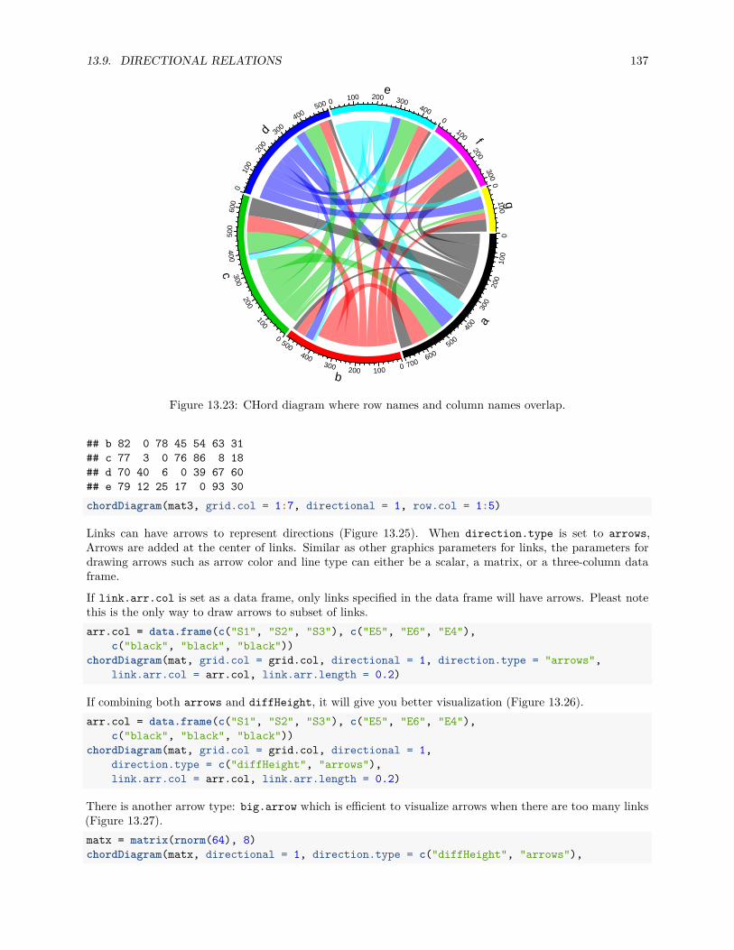
13.9. DIRECTIONAL RELATIONS 137
a
b
c
d
e
f
g
010
020
0
300
400
500
600
7000100200
300
400
5000
500
100
200
300400
600
010
020
0
300400
500 0 100 200 300400
0
100
200300
0100
Figure 13.23: CHord diagram where row names and column names overlap.
## b 82 0 78 45 54 63 31## c 77 3 0 76 86 8 18## d 70 40 6 0 39 67 60## e 79 12 25 17 0 93 30chordDiagram(mat3, grid.col = 1:7, directional = 1, row.col = 1:5)
Links can have arrows to represent directions (Figure 13.25). When direction.type is set to arrows,Arrows are added at the center of links. Similar as other graphics parameters for links, the parameters fordrawing arrows such as arrow color and line type can either be a scalar, a matrix, or a three-column dataframe.
If link.arr.col is set as a data frame, only links specified in the data frame will have arrows. Pleast notethis is the only way to draw arrows to subset of links.arr.col = data.frame(c("S1", "S2", "S3"), c("E5", "E6", "E4"),
c("black", "black", "black"))chordDiagram(mat, grid.col = grid.col, directional = 1, direction.type = "arrows",
link.arr.col = arr.col, link.arr.length = 0.2)
If combining both arrows and diffHeight, it will give you better visualization (Figure 13.26).arr.col = data.frame(c("S1", "S2", "S3"), c("E5", "E6", "E4"),
c("black", "black", "black"))chordDiagram(mat, grid.col = grid.col, directional = 1,
direction.type = c("diffHeight", "arrows"),link.arr.col = arr.col, link.arr.length = 0.2)
There is another arrow type: big.arrow which is efficient to visualize arrows when there are too many links(Figure 13.27).matx = matrix(rnorm(64), 8)chordDiagram(matx, directional = 1, direction.type = c("diffHeight", "arrows"),
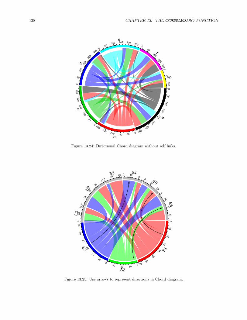
138 CHAPTER 13. THE CHORDDIAGRAM() FUNCTION
a
b
c
d
e
f
g
080
160
240
320
400
480
560080160
240320
4000
80
160
240320
400
080
160
240
320
4000
80160 240 320 400
080
160
240320
080
160
Figure 13.24: Directional Chord diagram without self links.
S1
S2
S3
E1
E2
E3 E4
E5
E6
010
20
30
40
50
60700
102030
0
10
20
30
4050
600
1020
010
20
30
40 010
20 0 1020
010
200
1020
30
Figure 13.25: Use arrows to represent directions in Chord diagram.
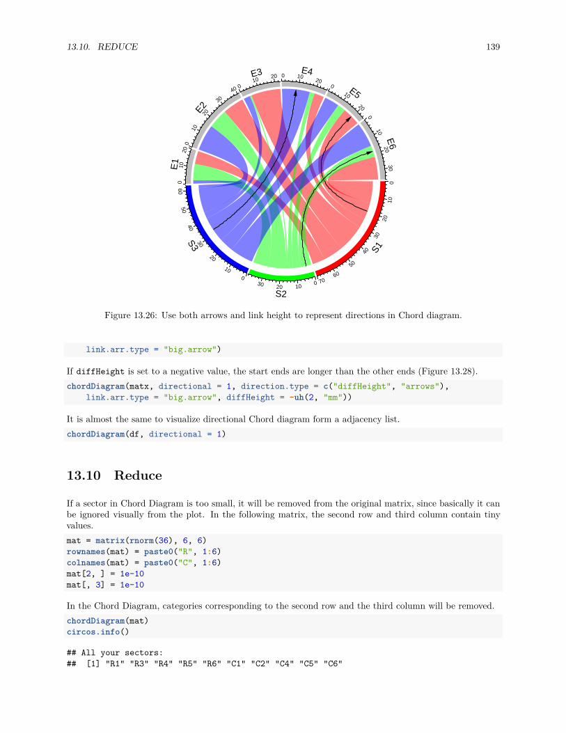
13.10. REDUCE 139
S1
S2
S3
E1
E2
E3 E4
E5
E6
010
20
30
40
50
60700
102030
0
10
20
30
4050
600
1020
010
20
30
40 010
20 0 1020
010
200
1020
30
Figure 13.26: Use both arrows and link height to represent directions in Chord diagram.
link.arr.type = "big.arrow")
If diffHeight is set to a negative value, the start ends are longer than the other ends (Figure 13.28).chordDiagram(matx, directional = 1, direction.type = c("diffHeight", "arrows"),
link.arr.type = "big.arrow", diffHeight = -uh(2, "mm"))
It is almost the same to visualize directional Chord diagram form a adjacency list.chordDiagram(df, directional = 1)
13.10 Reduce
If a sector in Chord Diagram is too small, it will be removed from the original matrix, since basically it canbe ignored visually from the plot. In the following matrix, the second row and third column contain tinyvalues.mat = matrix(rnorm(36), 6, 6)rownames(mat) = paste0("R", 1:6)colnames(mat) = paste0("C", 1:6)mat[2, ] = 1e-10mat[, 3] = 1e-10
In the Chord Diagram, categories corresponding to the second row and the third column will be removed.chordDiagram(mat)circos.info()
## All your sectors:## [1] "R1" "R3" "R4" "R5" "R6" "C1" "C2" "C4" "C5" "C6"
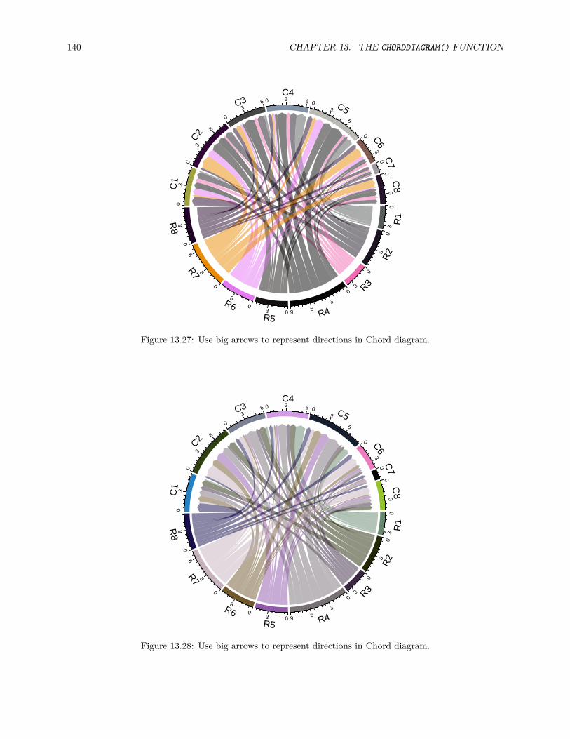
140 CHAPTER 13. THE CHORDDIAGRAM() FUNCTION
R1
R2
R3
R4R5
R6
R7
R8
C1
C2
C3C4
C5
C6
C7
C8
03
03
0
30
36903
0
3
0
3
60
3
03
0
3
6
0
36 0 3 6 0
3
6
0
30
03
Figure 13.27: Use big arrows to represent directions in Chord diagram.
R1
R2
R3
R4R5
R6
R7
R8
C1
C2
C3C4
C5
C6
C7
C8
03
03
0
30
36903
0
3
0
3
60
3
03
0
3
6
0
36 0 3 6 0
3
6
0
30
03
Figure 13.28: Use big arrows to represent directions in Chord diagram.
13.10. REDUCE 141
#### All your tracks:## [1] 1 2#### Your current sector.index is C6## Your current track.index is 2
The reduce argument controls the size of sectors to be removed. The value is a percent of the size of a sectorto the total size of all sectors.
You can also explictly remove sectors by assigning corresponding values to 0.mat[2, ] = 0mat[, 3] = 0
All parameters for sectors such as colors or gaps between sectors are also reduced accordingly by the function.

142 CHAPTER 13. THE CHORDDIAGRAM() FUNCTION

Chapter 14
Advanced usage of chordDiagram()
The default style of chordDiagram() is somehow enough for most visualization tasks, still you can havemore configurations on the plot.
The usage is same for both ajacency matrix and ajacency list, so we only demonstrate with the matrix.
14.1 Organization of tracks
By default, chordDiagram() creates two tracks, one track for labels and one track for grids with axes.chordDiagram(mat)circos.info()
## All your sectors:## [1] "S1" "S2" "S3" "E1" "E2" "E3" "E4" "E5" "E6"#### All your tracks:## [1] 1 2#### Your current sector.index is E6## Your current track.index is 2
These two tracks can be controlled by annotationTrack argument. Available values for this argument aregrid, name and axis. The height of annotation tracks can be set by annotationTrackHeight which is thepercentage to the radius of unit circle and can be set by uh() function with an absolute unit. Axes are onlyadded if grid is set in annotationTrack (Figure 14.1).chordDiagram(mat, grid.col = grid.col, annotationTrack = "grid")chordDiagram(mat, grid.col = grid.col, annotationTrack = c("name", "grid"),
annotationTrackHeight = c(0.03, 0.01))chordDiagram(mat, grid.col = grid.col, annotationTrack = NULL)
Several empty tracks can be allocated before Chord diagram is drawn. Then self-defined graphics canbe added to these empty tracks afterwards. The number of pre-allocated tracks can be set throughpreAllocateTracks.chordDiagram(mat, preAllocateTracks = 2)circos.info()
## All your sectors:
143

144 CHAPTER 14. ADVANCED USAGE OF CHORDDIAGRAM()
S1
S2
S3
E1
E2
E3 E4
E5
E6
Figure 14.1: Track organization in ‘chordDiagram()‘.
## [1] "S1" "S2" "S3" "E1" "E2" "E3" "E4" "E5" "E6"#### All your tracks:## [1] 1 2 3 4#### Your current sector.index is E6## Your current track.index is 4
The default settings for pre-allocated tracks are:list(ylim = c(0, 1),
track.height = circos.par("track.height"),bg.col = NA,bg.border = NA,bg.lty = par("lty"),bg.lwd = par("lwd"))
The default settings for pre-allocated tracks can be overwritten by specifying preAllocateTracks as a list.chordDiagram(mat, annotationTrack = NULL,
preAllocateTracks = list(track.height = 0.3))
If more than one tracks need to be pre-allocated, just specify preAllocateTracks as a list which containssettings for each track:chordDiagram(mat, annotationTrack = NULL,
preAllocateTracks = list(list(track.height = 0.1),list(bg.border = "black")))
By default chordDiagram() provides poor supports for customization of sector labels and axes, but withpreAllocateTracks it is rather easy to customize them. Such customization will be introduced in nextsection.
14.2 Customize sector labels
In chordDiagram(), there is no argument to control the style of sector labels, but this can be done by firstpre-allocating an empty track and customizing the labels in it later. In the following example, one track isfirstly allocated and a Chord diagram is added without label track and axes. Later, the first track is updatedwith adding labels with clockwise facings (Figure 14.2).

14.2. CUSTOMIZE SECTOR LABELS 145
S1
S2
S3
E1
E2
E3 E
4
E5
E6
Figure 14.2: Change label directions.
chordDiagram(mat, grid.col = grid.col, annotationTrack = "grid",preAllocateTracks = list(track.height = max(strwidth(unlist(dimnames(mat))))))
# we go back to the first track and customize sector labelscircos.track(track.index = 1, panel.fun = function(x, y) {
circos.text(CELL_META$xcenter, CELL_META$ylim[1], CELL_META$sector.index,facing = "clockwise", niceFacing = TRUE, adj = c(0, 0.5))
}, bg.border = NA) # here set bg.border to NA is important
In the following example, the labels are put on the grids (Figure 14.3). Please note circos.text() andget.cell.meta.data() can be used outside panel.fun if the sector index and track index are specifiedexplicitly.chordDiagram(mat, grid.col = grid.col,
annotationTrack = c("grid", "axis"), annotationTrackHeight = uh(5, "mm"))for(si in get.all.sector.index()) {
xlim = get.cell.meta.data("xlim", sector.index = si, track.index = 1)ylim = get.cell.meta.data("ylim", sector.index = si, track.index = 1)circos.text(mean(xlim), mean(ylim), si, sector.index = si, track.index = 1,
facing = "bending.inside", niceFacing = TRUE, col = "white")}
For the last example in this section, if the width of the sector is less than 20 degree, the labels are added inthe radical direction (Figure 14.4).set.seed(123)mat2 = matrix(rnorm(100), 10)chordDiagram(mat2, annotationTrack = "grid",
preAllocateTracks = list(track.height = max(strwidth(unlist(dimnames(mat))))))circos.track(track.index = 1, panel.fun = function(x, y) {
xlim = get.cell.meta.data("xlim")xplot = get.cell.meta.data("xplot")ylim = get.cell.meta.data("ylim")

146 CHAPTER 14. ADVANCED USAGE OF CHORDDIAGRAM()
010
20
30
40
50
60
7001020
300
10
20
30
40
5060
0
1020
010
20
30
40 010
20 0 1020
0
10
20
0
1020
30
1S
2S
3S
E1
E2
E3 E4E5
E6
Figure 14.3: Put sector labels to the grid.
sector.name = get.cell.meta.data("sector.index")
if(abs(xplot[2] - xplot[1]) < 20) {circos.text(mean(xlim), ylim[1], sector.name, facing = "clockwise",
niceFacing = TRUE, adj = c(0, 0.5), col = "red")} else {
circos.text(mean(xlim), ylim[1], sector.name, facing = "inside",niceFacing = TRUE, adj = c(0.5, 0), col= "blue")
}}, bg.border = NA)
When you set direction of sector labels as radical (clockwise or reverse.clockwise), if the labels are toolong and exceed your figure region, you can either decrease the size of the font or set canvas.xlim andcanvas.ylim parameters in circos.par() to wider intervals.
14.3 Customize sector axes
Axes are helpful to correspond to the absolute values of links. By default chordDiagram() adds axes on thegrid track. But it is easy to customize one with self-defined code.
In following example code, we draw another type of axes which show relative percent on sectors. We firstpre-allocate an empty track by preAllocateTracks and come back to this track to add axes later.
You may see we add the first axes to the top of second track. You can also put them to the bottom of thefirst track.# similar as the previous example, but we only plot the grid trackchordDiagram(mat, grid.col = grid.col, annotationTrack = "grid",

14.3. CUSTOMIZE SECTOR AXES 147
R1
R2
R3R
4R5R6R
7R8
R9
R10
C1
C2
C3
C4
C5
C6
C7
C8
C9
C10
Figure 14.4: Adjust label direction according to the width of sectors.
preAllocateTracks = list(track.height = uh(5, "mm")))for(si in get.all.sector.index()) {
circos.axis(h = "top", labels.cex = 0.3, sector.index = si, track.index = 2)}
Now we go back to the first track to add the second type of axes and sector names. In panel.fun, if thesector is less than 30 degree, the break for the axis is set to 0.5 (Figure 14.5).# the second axis as well as the sector labels are added in this trackcircos.track(track.index = 1, panel.fun = function(x, y) {
xlim = get.cell.meta.data("xlim")ylim = get.cell.meta.data("ylim")sector.name = get.cell.meta.data("sector.index")xplot = get.cell.meta.data("xplot")
circos.lines(xlim, c(mean(ylim), mean(ylim)), lty = 3) # dotted lineby = ifelse(abs(xplot[2] - xplot[1]) > 30, 0.2, 0.5)for(p in seq(by, 1, by = by)) {
circos.text(p*(xlim[2] - xlim[1]) + xlim[1], mean(ylim) + 0.1,paste0(p*100, "%"), cex = 0.3, adj = c(0.5, 0), niceFacing = TRUE)
}
circos.text(mean(xlim), 1, sector.name, niceFacing = TRUE, adj = c(0.5, 0))}, bg.border = NA)circos.clear()

148 CHAPTER 14. ADVANCED USAGE OF CHORDDIAGRAM()
010
20
30
40
50
60
700
102030
0
10
20
30
40
50
600
10
200
10
20
30
400
10
20 0 10
20
0
10
20
0
10
20
30
20%
40%
60%
80%
100%
S1
20%40%60%
80%
100%
S2
20%
40%
60%
80%
100%
S3
50%
100%
E1
20%
40%
60%
80%
100%
E2
50%100%E3 50%
100%
E4
50%
100%
E5
20%
40%
60%80%
100%
E6
Figure 14.5: Customize sector axes for Chord diagram.

14.4. PUT HORIZONTALLY OR VERTICALLY SYMMETRIC 149
14.4 Put horizontally or vertically symmetric
In Chord diagram, when there are two groups (which correspond to rows and columns if the input is anadjacency matrix), it is always visually beautiful to rotate the diagram to be symmetric on horizontaldirection or vertical direction. Actually it is quite easy to calculate a proper degree that needs to be rotatedfor the circle.
In the Chord diagram, the total width of row sectors corresponds to the sum of row sum of the matrix withabsolute values and so is for the column sectors.row_sum = sum(rowSums(abs(mat)))col_sum = sum(colSums(abs(mat)))
Assume small gaps between sectors are set to 1 degree and big gaps between row and column sectors are setto 20 degree.small_gap = 1big_gap = 20
In the circle, there are regions which are covered by small gaps, big gaps and sectors. Since the width ofsectors are proportional to the row sums and/or column sums of the matrix, it is easy to calculate how muchdegrees are hold by the row sectors:nr = nrow(mat)nc = ncol(mat)n_sector = nr + ncrow_sector_degree = (360 - small_gap*(n_sector - 2) - big_gap*2) * (row_sum/(row_sum + col_sum)) +
small_gap*(nr-1)
If the row sectors are put in the right of the circle, we can calculate the “start degree” for the circle. NotechordDiagram() always draw row sectors first and by default the circle goes clock-wisely.start_degree = 90 - (180 - row_sector_degree)/2
When there are small gaps and big gaps between sectors, the gap.after in circos.par() should be set asa vector. We also added a vertical line which assists to see the symmetry (Figure 14.6 left).gaps = c(rep(small_gap, nrow(mat) - 1), big_gap, rep(small_gap, ncol(mat) - 1), big_gap)circos.par(gap.after = gaps, start.degree = start_degree)chordDiagram(mat, grid.col = grid.col)circos.clear()abline(v = 0, lty = 2, col = "#00000080")
Similarly we can adjust the “start degree” to let the circle looks horizonally symmetric (Figure 14.6 right).start_degree = 0 - (180 - row_sector_degree)/2gaps = c(rep(small_gap, nrow(mat) - 1), big_gap, rep(small_gap, ncol(mat) - 1), big_gap)circos.par(gap.after = gaps, start.degree = start_degree)chordDiagram(mat, grid.col = grid.col)circos.clear()abline(h = 0, lty = 2, col = "#00000080")
14.5 Compare two Chord diagrams
Normally, in Chord diagram, values in mat are normalized to the summation of the absolute values in thematrix, which means the width for links only represents relative values. Then, when comparing two Chord

150 CHAPTER 14. ADVANCED USAGE OF CHORDDIAGRAM()
S1
S2
S3
E1
E2
E3
E4
E5E6 0
1020
30
40
5060
700
10
2030
010
2030
40
50600
1020
0
10
20
30
400
1020
010
200
10
200
1020
30
S1
S2
S3
E1
E2
E3 E4
E5E
6
010
20
30
40
50
607001020
300
10
2030
40
5060
010
200
10
20
3040 0
10 20 0 10 200
10
200
1020
30
Figure 14.6: Rotate Chord diagram.
diagrams, it is necessary that unit width of links in the two plots should be represented in a same scale. Thisproblem can be solved by adding more blank gaps to the Chord diagram which has smaller matrix.
First, let’s plot a Chord diagram. In this Chord diagram, we set larger gaps between rows and columns forbetter visualization. Axis on the grid illustrates scale of the values.mat1 = matrix(sample(20, 25, replace = TRUE), 5)gap.after = c(rep(2, 4), 10, rep(2, 4), 10)circos.par(gap.after = gap.after, start.degree = -10/2)chordDiagram(mat1, directional = 1, grid.col = rep(1:5, 2))circos.clear()
The second matrix only has half the values in mat1.mat2 = mat1 / 2
If the second Chord diagram is plotted in the way as the first one, the two diagrams will looks exactly thesame (except the axes) which makes the comparison impossible. However, we can adjust the gaps betweensectors to make the scale of the two plots same.
First we calculate the percentage of mat2 in mat1. And then we calculate the degree which corresponds tothe difference. In the following code, 360 - sum(gap.after) is the total degree for values in mat1 (excludingthe gaps) and blank.degree corresponds the difference between mat1 and mat2.percent = sum(abs(mat2)) / sum(abs(mat1))blank.degree = (360 - sum(gap.after)) * (1 - percent)
Since now we have the additional blank gap, we can set it to circos.par() and plot the second ChordDiagram.big.gap = (blank.degree - sum(rep(2, 8)))/2gap.after = c(rep(2, 4), big.gap, rep(2, 4), big.gap)circos.par(gap.after = gap.after, start.degree = -big.gap/2)chordDiagram(mat2, directional = 1, grid.col = rep(1:5, 2), transparency = 0.5)circos.clear()

14.6. MULTIPLE-GROUP CHORD DIAGRAM 151
R1
R2R3
R4
R5
C1
C2 C3
C4
C5
020
40
60
800
20400
20
400
20
0
20
40
020
40
6080
0
200 20
40 0
20
40
600
20
R1
R2R3R4
R5
C1
C2 C3C4
C5
0
10
20
3040
01020010200
100
10
20
010
2030
40 0 10 0 10 20 010
2030
0
10
Figure 14.7: Compare two Chord Diagrams in a same scale.
Now the scale of the two Chord diagrams (Figure 14.7) are the same if you compare the scale of axes in thetwo diagrams.
14.6 Multiple-group Chord diagram
Generally chordDiagram() function visualizes relations between two groups (i.e. from rows to columns ifthe input is an adjacency matrix or from column 1 to column 2 if the input is an adjacency list), however,for chordDiagram(), it actually doesn’t need any grouping information. The visual effect of grouping is justenhanced by setting different gap degrees. In this case, it is easy to make a Chord diagram with more thantwo groups.
First let’s generate three matrix which contain pairwise relations from three groups:options(digits = 2)mat1 = matrix(rnorm(25), nrow = 5)rownames(mat1) = paste0("A", 1:5)colnames(mat1) = paste0("B", 1:5)
mat2 = matrix(rnorm(25), nrow = 5)rownames(mat2) = paste0("A", 1:5)colnames(mat2) = paste0("C", 1:5)
mat3 = matrix(rnorm(25), nrow = 5)rownames(mat3) = paste0("B", 1:5)colnames(mat3) = paste0("C", 1:5)
Since chordDiagram() only accepts one single matrix, here the three matrix are merged into one big matrix.mat = matrix(0, nrow = 10, ncol = 10)rownames(mat) = c(rownames(mat2), rownames(mat3))colnames(mat) = c(colnames(mat1), colnames(mat2))

152 CHAPTER 14. ADVANCED USAGE OF CHORDDIAGRAM()
mat[rownames(mat1), colnames(mat1)] = mat1mat[rownames(mat2), colnames(mat2)] = mat2mat[rownames(mat3), colnames(mat3)] = mat3mat
## B1 B2 B3 B4 B5 C1 C2 C3 C4 C5## A1 -0.26 0.90 -0.048 0.85 -1.83 -0.019 -0.33 2.1960 0.786 1.80## A2 -0.75 -1.26 -2.399 -0.71 -1.81 0.362 -0.28 -0.2047 -2.102 -0.81## A3 0.44 0.84 -0.019 1.07 1.37 2.011 0.31 0.9751 -0.042 1.90## A4 -1.28 -2.35 -0.089 -0.54 -0.56 -1.178 1.84 -0.8676 -0.405 0.71## A5 1.18 0.61 -1.595 0.54 0.97 -0.755 -0.98 -0.5012 -0.113 0.74## B1 0.00 0.00 0.000 0.00 0.00 1.366 -0.71 -0.1262 -0.870 0.32## B2 0.00 0.00 0.000 0.00 0.00 -0.576 -1.28 -1.3884 -0.463 -0.28## B3 0.00 0.00 0.000 0.00 0.00 -0.805 2.38 0.4699 -1.911 1.09## B4 0.00 0.00 0.000 0.00 0.00 -0.535 -1.09 0.9604 0.370 0.16## B5 0.00 0.00 0.000 0.00 0.00 0.792 0.19 -0.0051 -0.462 2.71
When making the chord diagram, we set larger gaps between groups to identify different groups. Here wemanually adjust gap.after in circos.par().
Also we add an additional track in which we add lines to enhance the visual effect of different groups.library(circlize)circos.par(gap.after = rep(c(rep(1, 4), 8), 3))chordDiagram(mat, annotationTrack = c("grid", "axis"),
preAllocateTracks = list(track.height = uh(4, "mm"),track.margin = c(uh(4, "mm"), 0)
))circos.track(track.index = 2, panel.fun = function(x, y) {
sector.index = get.cell.meta.data("sector.index")xlim = get.cell.meta.data("xlim")ylim = get.cell.meta.data("ylim")circos.text(mean(xlim), mean(ylim), sector.index, cex = 0.6, niceFacing = TRUE)
}, bg.border = NA)
highlight.sector(rownames(mat1), track.index = 1, col = "red",text = "A", cex = 0.8, text.col = "white", niceFacing = TRUE)
highlight.sector(colnames(mat1), track.index = 1, col = "green",text = "B", cex = 0.8, text.col = "white", niceFacing = TRUE)
highlight.sector(colnames(mat2), track.index = 1, col = "blue",text = "C", cex = 0.8, text.col = "white", niceFacing = TRUE)

14.6. MULTIPLE-GROUP CHORD DIAGRAM 153
04
80
4
8
0
4804804
0
4
04
80
4
80
40
4
8
04
8 0 4 8 04
0
4
04
8
A1
A2
A3
A4A5
B1
B2
B3
B4
B5
C1 C2C3
C4
C5
A
B
C
circos.clear()
If row names and column names in the big matrix are not grouped, the sector order can be manually adjustedby order argument.chordDiagram(mat, order = c(paset0("A", 1:5), paset0("B", 1:5), paset0("C", 1:5)))
It is similar way to construct a multiple-group Chord diagram with data frame as input.library(reshape2)df2 = do.call("rbind", list(melt(mat1), melt(mat2), melt(mat3)))chordDiagram(df2, order = c(paste0("A", 1:5), paste0("B", 1:5), paste0("C", 1:5)))

154 CHAPTER 14. ADVANCED USAGE OF CHORDDIAGRAM()

Chapter 15
A complex example of Chord diagram
In this chapter, we demonstrate how to make a complex Chord diagram and how to customize additionaltracks by visualizing chromatin state transitions as well as methylation changes. A chromatin state transitionmatrix shows how much a chromatin state in the genome has been changed from e.g. one group of samplesto the other. The genomic regions for which the chromatin states change also have variable methylationpatterns which may show interesting correspondance to chromatin states change.
The data used in this post is processed from Roadmap dataset. The chromatin states are learned from fivecore chromatin marks. Roadmap samples are classified into two groups based on expression profile. In eachgroup, a chromatin state is assigned to the corresponding genomic bin if it is recurrent in at least half of thesamples in each group.
The processed data can be set from http://jokergoo.github.io/data/chromatin_transition.RData.load("data/chromatin_transition.RData")
In the RData file, there are three matrix: mat, meth_mat_1 and meth_mat_2 which are:
• mat: chromatin state transition matrix. Rows correspond to states in group 1 and columns correspondto group 2. The value in the matrix are total base pairs that transite from one state to the other. E.g.mat["TssA", "TxFlnk"] is the total base pairs that have “TssA” state in samples in group 1 andtransites to “TxFlnk” state in samples in group 2. On the diagonal are the regions where the stateshave not been changed in the two groups.
• meth_mat_1: mean methylation for each set of regions in group 1. E.g. meth_mat_1["TssA","TxFlnk"] is the mean methylation for the regions in group 1 that have “TssA” state in group 1and “TxFlnk” state in group 2.
• meth_mat_2: mean methylation for each set of regions in group 2. E.g. meth_mat_2["TssA","TxFlnk"] is the mean methylation for the regions in group 2 that have “TssA” state in group 1and “TxFlnk” state in group 2.
mat[1:4, 1:4]
## TssA TssAFlnk TxFlnk Tx## TssA 497200 79600 13400 1800## TssAFlnk 56400 233200 5000 800## TxFlnk 0 400 43000 1800## Tx 800 200 200 166400meth_mat_1[1:4, 1:4]
## TssA TssAFlnk TxFlnk Tx## TssA 0.1647232 0.1580874 0.1917435 0.2690045
155

156 CHAPTER 15. A COMPLEX EXAMPLE OF CHORD DIAGRAM
## TssAFlnk 0.2591677 0.2689880 0.3616242 0.3411387## TxFlnk NA 0.3697514 0.3360386 0.4752722## Tx 0.8268626 0.7822987 0.5799682 0.6595322
Normally, in majority in the genome, chromatin states of regions are not changed in the two groups, thus,we should only look at the regions in which the states are changed.# proportion of the unchanges states in the genomesum(diag(mat))/sum(mat)
## [1] 0.6192262# remove the unchanged statesdiag(mat) = 0
When making the plot, actually rows and columns are different (because one is from group 1 and the otheris from group 2), thus we give them different names and the original names are stored in all_states.all_states = rownames(mat)n_states = nrow(mat)
rownames(mat) = paste0("R_", seq_len(n_states))colnames(mat) = paste0("C_", seq_len(n_states))
dimnames(meth_mat_1) = dimnames(mat)dimnames(meth_mat_2) = dimnames(mat)
Next we set the colors. colmat is the color of the links and the colors are represent as hexadecimal code.Links have more transparent (A0) if they contain few transitions (< 70th percentile) because we don’t wantit to disturb the visualization of the major transitions.state_col = c("TssA" = "#E41A1C", "TssAFlnk" = "#E41A1C",
"TxFlnk" = "#E41A1C", "Tx" = "#E41A1C","TxWk" = "#E41A1C", "EnhG" = "#E41A1C","Enh" = "#E41A1C", "ZNF/Rpts" = "#E41A1C","Het" = "#377EB8", "TssBiv" = "#377EB8","BivFlnk" = "#377EB8", "EnhBiv" = "#377EB8","ReprPC" = "#377EB8", "ReprPCWk" = "#377EB8","Quies" = "black")
# one for rows and one for columnsstate_col2 = c(state_col, state_col)names(state_col2) = c(rownames(mat), colnames(mat))
colmat = rep(state_col2[rownames(mat)], n_states)colmat = rgb(t(col2rgb(colmat)), maxColorValue = 255)
qati = quantile(mat, 0.7)colmat[mat > qati] = paste0(colmat[mat > qati], "A0")colmat[mat <= qati] = paste0(colmat[mat <= qati], "20")dim(colmat) = dim(mat)
Now we can use chordDiagram() function to make the plot. Here we set one pre-allocated track in whichthe methylation information will be added later. Also we only set annotationTrack to grid and the axesand sector labels will be customized in later code.
chordDiagram() returns a data frame which contains coordinates for all links.

157
circos.par(start.degree = -5, gap.after = c(rep(1, n_states-1), 10, rep(1, n_states-1), 10),cell.padding = c(0, 0, 0, 0), points.overflow.warning = FALSE)
cdm_res = chordDiagram(mat, col = colmat, grid.col = state_col2,directional = TRUE, annotationTrack = "grid",preAllocateTracks = list(track.height = 0.1))
head(cdm_res)
## rn cn value o1 o2 x1 x2 col## 1 R_1 C_1 0 15 13 431200 267200 #E41A1C20## 2 R_2 C_1 56400 15 12 159800 267200 #E41A1CA0## 3 R_3 C_1 0 15 11 3600 210800 #E41A1C20## 4 R_4 C_1 800 15 10 34600 210800 #E41A1C20## 5 R_5 C_1 98200 15 9 1411600 210000 #E41A1CA0## 6 R_6 C_1 0 15 8 139800 111800 #E41A1C20
Now the axes are added in the second track, also, the index of states are added at the center of the gridsin the second track, if the degree for a sector is larger than 3 degrees. Note since there is already onepre-allocated track, the circular rectangles are in the second track (track.index = 2).circos.track(track.index = 2, panel.fun = function(x, y) {
if(abs(CELL_META$cell.start.degree - CELL_META$cell.end.degree) > 3) {sn = CELL_META$sector.indexi_state = as.numeric(gsub("(C|R)_", "", sn))circos.text(CELL_META$xcenter, CELL_META$ycenter, i_state, col = "white",
font = 2, cex = 0.7, adj = c(0.5, 0.5), niceFacing = TRUE)

158 CHAPTER 15. A COMPLEX EXAMPLE OF CHORD DIAGRAM
xlim = CELL_META$xlimbreaks = seq(0, xlim[2], by = 4e5)circos.axis(major.at = breaks, labels = paste0(breaks/1000, "KB"), labels.cex = 0.5)
}}, bg.border = NA)
1 0KB
400K
B
20K
B
5
0KB
400K
B
800K
B
1200KB
60KB
7 0KB
400KB
800KB1200KB1600KB
2000KB
14
0KB
400KB
800KB
150KB
400KB
800KB
1200KB
1
0KB
20KB
4
0KB
5
0KB
400K
B
800K
B1200KB
70KB
400KB800KB 1200KB
90KB
13
0KB
14
0KB
15
0KB400KB
800KB1200KB
1600KB
2000KB
2400KB
On the top half, it is easy to see the proportion of different transitions in group 1 that come to every state ingroup 2. However, it is not straightforward for the states in the bottom half to see the proportion of differentstates in group 2 they transite to. This can be solved by adding small circular rectangles to represent theproportions. In following example, the newly added circular rectangles in the bottom half show e.g. howmuch the state 15 in group 1 has been transited to different states in group 2.for(i in seq_len(nrow(cdm_res))) {
if(cdm_res$value[i] > 0) {circos.rect(cdm_res[i, "x1"], -uy(1, "mm"),
cdm_res[i, "x1"] - abs(cdm_res[i, "value"]), -uy(2, "mm"),col = state_col2[cdm_res$cn[i]], border = state_col2[cdm_res$cn[i]],sector.index = cdm_res$rn[i], track.index = 2)
}}
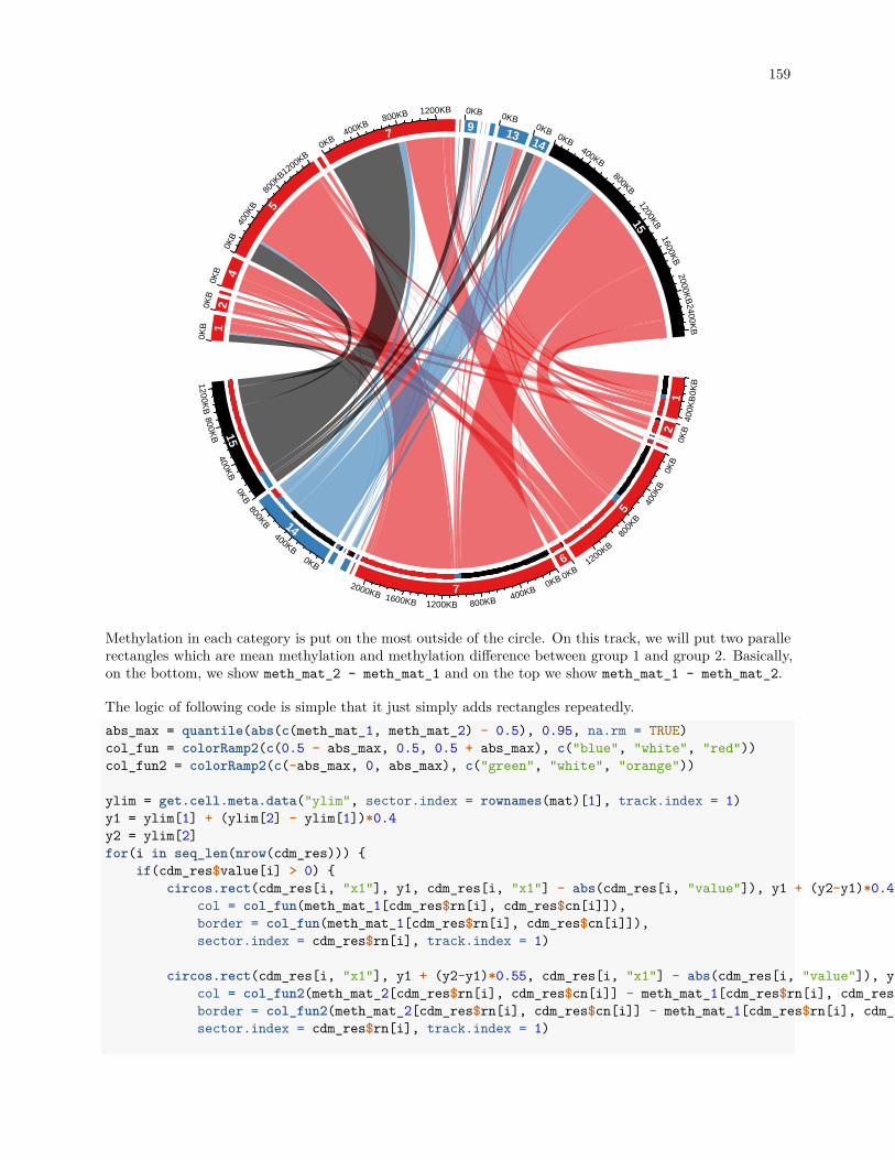
159
1 0KB
400K
B
20K
B
5
0KB
400K
B
800K
B
1200KB
60KB
7 0KB
400KB
800KB1200KB1600KB
2000KB
14
0KB
400KB
800KB
150KB
400KB
800KB
1200KB
1
0KB
20KB
4
0KB
5
0KB
400K
B
800K
B1200KB
70KB
400KB800KB 1200KB
90KB
13
0KB
14
0KB
15
0KB400KB
800KB1200KB
1600KB
2000KB
2400KB
Methylation in each category is put on the most outside of the circle. On this track, we will put two parallerectangles which are mean methylation and methylation difference between group 1 and group 2. Basically,on the bottom, we show meth_mat_2 - meth_mat_1 and on the top we show meth_mat_1 - meth_mat_2.
The logic of following code is simple that it just simply adds rectangles repeatedly.abs_max = quantile(abs(c(meth_mat_1, meth_mat_2) - 0.5), 0.95, na.rm = TRUE)col_fun = colorRamp2(c(0.5 - abs_max, 0.5, 0.5 + abs_max), c("blue", "white", "red"))col_fun2 = colorRamp2(c(-abs_max, 0, abs_max), c("green", "white", "orange"))
ylim = get.cell.meta.data("ylim", sector.index = rownames(mat)[1], track.index = 1)y1 = ylim[1] + (ylim[2] - ylim[1])*0.4y2 = ylim[2]for(i in seq_len(nrow(cdm_res))) {
if(cdm_res$value[i] > 0) {circos.rect(cdm_res[i, "x1"], y1, cdm_res[i, "x1"] - abs(cdm_res[i, "value"]), y1 + (y2-y1)*0.45,
col = col_fun(meth_mat_1[cdm_res$rn[i], cdm_res$cn[i]]),border = col_fun(meth_mat_1[cdm_res$rn[i], cdm_res$cn[i]]),sector.index = cdm_res$rn[i], track.index = 1)
circos.rect(cdm_res[i, "x1"], y1 + (y2-y1)*0.55, cdm_res[i, "x1"] - abs(cdm_res[i, "value"]), y2,col = col_fun2(meth_mat_2[cdm_res$rn[i], cdm_res$cn[i]] - meth_mat_1[cdm_res$rn[i], cdm_res$cn[i]]),border = col_fun2(meth_mat_2[cdm_res$rn[i], cdm_res$cn[i]] - meth_mat_1[cdm_res$rn[i], cdm_res$cn[i]]),sector.index = cdm_res$rn[i], track.index = 1)

160 CHAPTER 15. A COMPLEX EXAMPLE OF CHORD DIAGRAM
circos.rect(cdm_res[i, "x2"], y1, cdm_res[i, "x2"] - abs(cdm_res[i, "value"]), y1 + (y2-y1)*0.45,col = col_fun(meth_mat_2[cdm_res$rn[i], cdm_res$cn[i]]),border = col_fun(meth_mat_2[cdm_res$rn[i], cdm_res$cn[i]]),sector.index = cdm_res$cn[i], track.index = 1)
circos.rect(cdm_res[i, "x2"], y1 + (y2-y1)*0.55, cdm_res[i, "x2"] - abs(cdm_res[i, "value"]), y2,col = col_fun2(meth_mat_1[cdm_res$rn[i], cdm_res$cn[i]] - meth_mat_2[cdm_res$rn[i], cdm_res$cn[i]]),border = col_fun2(meth_mat_1[cdm_res$rn[i], cdm_res$cn[i]] - meth_mat_2[cdm_res$rn[i], cdm_res$cn[i]]),sector.index = cdm_res$cn[i], track.index = 1)
}}circos.clear()
1 0KB
400K
B
20K
B
5
0KB
400K
B
800K
B
1200KB
60KB
7 0KB
400KB
800KB1200KB1600KB
2000KB
14
0KB
400KB
800KB
150KB
400KB
800KB
1200KB
1
0KB
20KB
4
0KB
5
0KB
400K
B
800K
B1200KB
70KB
400KB800KB 1200KB
90KB
13
0KB
14
0KB
15
0KB400KB
800KB1200KB
1600KB
2000KB
2400KB
Legends can be added according to instructions discussed in Section 4.

161

162 CHAPTER 15. A COMPLEX EXAMPLE OF CHORD DIAGRAM

Part IV
Others
163


Chapter 16
Make fun of the package
16.1 A clock
The first example is a clock. The key function here is circos.axis() (Figure 16.1). In the example, thewhole circle only contains one sector in which major tick at 0 is overlapping with major tick at 12.
Later we calculate the positions of the hour hand, the minute hand and the second hand based on currenttime when this Chapter is generated. The hands are drawn by arraws() function in the canvas coordinate.A real-time clock can be found at the Examples section in the help page of circos.axis().circos.par(gap.degree = 0, cell.padding = c(0, 0, 0, 0), start.degree = 90)circos.initialize(factors = "a", xlim = c(0, 12))circos.track(ylim = c(0, 1), bg.border = NA)circos.axis(major.at = 0:12, labels = NULL, direction = "inside",
major.tick.length = uy(2, "mm"))circos.text(1:12, rep(1, 12) - uy(6, "mm"), 1:12, facing = "downward")
current.time = as.POSIXlt(Sys.time())
## Warning in as.POSIXlt.POSIXct(Sys.time()): unknown timezone 'default/## Europe/Berlin'sec = ceiling(current.time$sec)min = current.time$minhour = current.time$hour
sec.degree = 90 - sec/60 * 360arrows(0, 0, cos(sec.degree/180*pi)*0.8, sin(sec.degree/180*pi)*0.8)
min.degree = 90 - min/60 * 360arrows(0, 0, cos(min.degree/180*pi)*0.7, sin(min.degree/180*pi)*0.7, lwd = 2)
hour.degree = 90 - hour/12 * 360 - min/60 * 360/12arrows(0, 0, cos(hour.degree/180*pi)*0.4, sin(hour.degree/180*pi)*0.4, lwd = 2)
circos.clear()
165

166 CHAPTER 16. MAKE FUN OF THE PACKAGE
1
2
3
4
56
7
8
9
10
1112
Figure 16.1: A clock.
16.2 A dartboard
The second example is a dartboard. In Figure 16.2, tracks are assigned with different heights and each cellis initialized with different colors. The most inside green ring and red circle are plotted by draw.sector().
We use circos.trackText() to add labels because we know the global order of the labels.
Now you can project the plot on your door and begin to play!factors = 1:20 # just indicate there are 20 sectorscircos.par(gap.degree = 0, cell.padding = c(0, 0, 0, 0),
start.degree = 360/20/2, track.margin = c(0, 0), clock.wise = FALSE)circos.initialize(factors = factors, xlim = c(0, 1))
circos.track(ylim = c(0, 1), factors = factors, bg.col = "black", track.height = 0.15)circos.trackText(x = rep(0.5, 20), y = rep(0.5, 20),
labels = c(13, 4, 18, 1, 20, 5, 12, 9, 14, 11, 8, 16, 7, 19, 3, 17, 2, 15, 10, 6),cex = 0.8, factors = factors, col = "#EEEEEE", font = 2, facing = "downward")
circos.track(ylim = c(0, 1), factors = factors,bg.col = rep(c("#E41A1C", "#4DAF4A"), 10), bg.border = "#EEEEEE", track.height = 0.05)
circos.track(ylim = c(0, 1), factors = factors,bg.col = rep(c("black", "white"), 10), bg.border = "#EEEEEE", track.height = 0.275)
circos.track(ylim = c(0, 1), factors = factors,bg.col = rep(c("#E41A1C", "#4DAF4A"), 10), bg.border = "#EEEEEE", track.height = 0.05)
circos.track(ylim = c(0, 1), factors = factors,bg.col = rep(c("black", "white"), 10), bg.border = "#EEEEEE", track.height = 0.375)
draw.sector(center = c(0, 0), start.degree = 0, end.degree = 360,rou1 = 0.1, col = "#4DAF4A", border = "#EEEEEE")
draw.sector(center = c(0, 0), start.degree = 0, end.degree = 360,rou1 = 0.05, col = "#E41A1C", border = "#EEEEEE")

16.3. BA-GUA AND TAI-JI 167
13
4
18
1205
12
9
14
11
8
16
7
19 3 17
2
15
10
6
Figure 16.2: A dartboard.
circos.clear()
16.3 Ba-Gua and Tai-Ji
The third example is Ba-Gua. The key functions are circos.rect() and draw.sector() (Figure 16.3).
Bagua was originated several thousands years ago in China. It is the source of almost all ancient Chinesephilosophy. It abstracts the rule of universe into base signs and combination of the two basic signs generatesthe whole system of the universe.
Inside Ba-Gua, these is the Tai-Ji. Tai-Ji refers to the most original state at the creation of the universe.In ancient Chinese philosophy system, at the very beginning, the whole world is a huge mass of air (chaos).Then the lighter air floated up and created sky while heavier sinked down and created ground. The upperworld is called Yang and the bottom world is called Ying. And that is Tai-Ji.
Looking at Tai-Ji, you can see there are two states interacting with each other. The white one and the blackone gradually transformed into each other at the end. And in the center of white and black, the oppositecolor is generated. In real world, Taiji can represent all phenomenon that is of dualism. Such as male andfemale, correct and wrong. However things would change, good thing would become bad thing as time goesby, and bad thing would also turn into good according to how you look at the world.factors = 1:8circos.par(start.degree = 22.5, gap.degree = 6)circos.initialize(factors = factors, xlim = c(0, 1))
# yang yao is __ (a long segment)add_yang_yao = function() {
circos.rect(0,0,1,1, col = "black")}
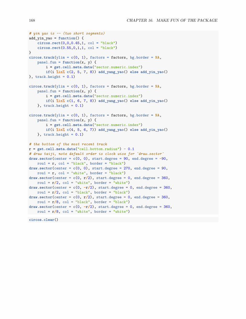
168 CHAPTER 16. MAKE FUN OF THE PACKAGE
# yin yao is -- (two short segments)add_yin_yao = function() {
circos.rect(0,0,0.45,1, col = "black")circos.rect(0.55,0,1,1, col = "black")
}circos.track(ylim = c(0, 1), factors = factors, bg.border = NA,
panel.fun = function(x, y) {i = get.cell.meta.data("sector.numeric.index")if(i %in% c(2, 5, 7, 8)) add_yang_yao() else add_yin_yao()
}, track.height = 0.1)
circos.track(ylim = c(0, 1), factors = factors, bg.border = NA,panel.fun = function(x, y) {
i = get.cell.meta.data("sector.numeric.index")if(i %in% c(1, 6, 7, 8)) add_yang_yao() else add_yin_yao()
}, track.height = 0.1)
circos.track(ylim = c(0, 1), factors = factors, bg.border = NA,panel.fun = function(x, y) {
i = get.cell.meta.data("sector.numeric.index")if(i %in% c(4, 5, 6, 7)) add_yang_yao() else add_yin_yao()
}, track.height = 0.1)
# the bottom of the most recent trackr = get.cell.meta.data("cell.bottom.radius") - 0.1# draw taiji, note default order is clock wise for `draw.sector`draw.sector(center = c(0, 0), start.degree = 90, end.degree = -90,
rou1 = r, col = "black", border = "black")draw.sector(center = c(0, 0), start.degree = 270, end.degree = 90,
rou1 = r, col = "white", border = "black")draw.sector(center = c(0, r/2), start.degree = 0, end.degree = 360,
rou1 = r/2, col = "white", border = "white")draw.sector(center = c(0, -r/2), start.degree = 0, end.degree = 360,
rou1 = r/2, col = "black", border = "black")draw.sector(center = c(0, r/2), start.degree = 0, end.degree = 360,
rou1 = r/8, col = "black", border = "black")draw.sector(center = c(0, -r/2), start.degree = 0, end.degree = 360,
rou1 = r/8, col = "white", border = "white")
circos.clear()

16.3. BA-GUA AND TAI-JI 169
Figure 16.3: Ba-Gua and Tai-Ji.

170 CHAPTER 16. MAKE FUN OF THE PACKAGE

Bibliography
171