Chemical spreadsheet notes - University of … · Web viewKey feature: This chart and the following...
53
MassWWP The Massachusetts Water Watch Partnership Blaisdell House University of Massachusetts Amherst MA 01003 413/545-5532 or 545-5531 [email protected] www.masswwp.org Graphing Water Quality Data With Excel December 2003 Jerry Schoen Massachusetts Water Watch Partnership
Transcript of Chemical spreadsheet notes - University of … · Web viewKey feature: This chart and the following...
MassWWP The Massachusetts Water Watch Partnership
Blaisdell HouseUniversity of Massachusetts
Amherst MA 01003 413/545-5532 or 545-5531
Graphing Water Quality Data With Excel
December 2003
Jerry Schoen Massachusetts Water Watch Partnership
These guidance materials were produced with support from the Massachusetts Environmental Trust.

2

Table of ContentsIntroduction............................................................................4Overview of the Charting process.....................................4
Steps involved in making graphs...................................................................7Dealing with missing data points...................................................................7
Deerfield River pH example....................................................................................8Arrange data conveniently..............................................................................8File Organization..............................................................................................8
One worksheet or several?...................................................................................11Copy records to a separate area..........................................................................11
Creating graphs in Excel..................................................12Create a graph – example:....................................................................................12Step 1: Make a copy of the data..........................................................................12Step 2: Sort / filter the data..................................................................................12Step 3: “Massage” the data..................................................................................13Step 4. Create the “draft” chart...........................................................................13
Chart Gallery......................................................................17Charts for River Data.........................................................18
One site, several dates:.........................................................................................18One site, several dates #2: Value line added (series).....................................18One site, several dates #3: Value line added (drawn in)................................18One site, several dates #4: Value areas added..............................................19One site, several dates #5: Value areas added...............................................20Several dates, several sites: 2-D.........................................................................20Several dates, several sites: 3-D view...............................................................21Several Dates, Several Sites – Multiple Series....................................................21Multi-year Charts: Several Sites, Multiple Dates.................................................22Calculated data - Several Dates, several Sites....................................................23Two Parameters, Two Axes – One Date, Several Sites......................................24One Date, Several Sites. Dissolved Oxygen % Saturation.............................25
Charts for Lake Data.........................................................26One site, several dates – data table included.....................................................26Lake depth profile..................................................................................................26Depth (m)................................................................................................................26One site, multiple dates – multiple series, multiple years.................................27One site, several dates: Value line added (series)............................................29One site, several dates: Value line added (drawn in).......................................29DO Saturation example............................................................................................29
3

Introduction
One of the more frustrating tasks associated with running a water quality monitoring program is translating data you collect (numbers) into a graphical representation of your data that helps a viewer understand the condition of your water body. Spreadsheet software is usually the vehicle of choice for volunteer monitoring programs attempting this. While such software does greatly facilitate the work involved, it can still be a fairly a tedious chore to create, modify or replicate a graph. This handbook is our attempt to help you minimize the work involved. It is intended to assist you in using Microsoft Excel software to create graphs from your data1. The instructions printed here are intended for readers who have a basic understanding of Excel, including use of graphs. However, even beginning users should be able to pick up these concepts after some practice.
The handbook contains several sections.
- Introductory remarks on how to use Excel to create graphs. These remarks aren’t intended to replace Excel Help features or the numerous manuals in print, but we have tried to provide examples and frame questions in ways that are specific to water monitoring.
- A recommended process for “preparing” your data: organizing it in a way that facilitates creation of graphs.
- A collection of sample graphs of various types that are commonly prepared to represent water quality data, with specific instructions on how to make similar graphs for your program. We use river and lake examples, many of which are interchangeable in terms of the concepts represented. These might also be used for coastal monitoring results.
The examples discussed in this document are taken from Excel workbooks Deerfield data and lakecharts. Each workbook contains several worksheets with tables and graphs reflecting different types of data you might want to capture for river or lake sampling, respectively. To get the best use from this guidance document, you’ll probably want to open the Excel files mentioned and refer to them as you read.
Note: we use the terms chart and graph interchangeably, and use them as both nouns and verbs.
Overview of the Charting process
Graphs are a visual way to display numeric data. They come in a variety of formats: lines, bars, pie charts, disconnected points, and sometimes a mix of different styles.
1 Many of the concepts described here will work for other spreadsheet applications (e.g. Lotus, etc.), but we are not familiar with the specific formulae or syntax used by different software companies. Therefore we cannot provide advice in how to translate our examples to other software.
4

Their purpose is to help a viewer “see” the data more clearly – spotting similarities or differences in multiple data points, and noticing trends.
When interpreting any data value, there are several different additional information points needed to make sense of it or to preserve its uniqueness. These include:
- The parameter that the value represents. e.g. temperature, dissolved oxygen (DO), or water clarity.
- Unit of measure (UOM). E.g. milligrams per liter, parts per billion, pH units, etc. - Time: date or time of day sample was taken.- Location: the spot a sample is taken from. This can have 2 or 3 dimensions itself:
a geographic location: e.g. mid-lake, or river mile 3.2 (which itself can be further specified by distance from left bank, right bank, etc.); and depth in the water column (e.g. lake bottom, surface, etc.).
A graph typically depicts the results obtained from a parameter under several different instances of one (or more) dimensions. For instance, you might depict DO data taken from several different sites on the same day. Or you might show DO results from one site on several different dates. Or you might use a 3-D graph to show DO at several sites and on several dates. And in all cases, you will want to label your data by listing such information as parameter name, waterbody name, UOM, etc.
Waterbody DateSample ID Site Temp DO DO Sat Fecal pH
5
6

7

8

9

10

11

12

13

14

15

16

17

Deerfield River 4/19/99 COR-010 15 8.82 87.5 5.6Deerfield River 4/19/99 DER-010 16 9.1 92.2 7.02Deerfield River 4/19/99 DER-015 7.16 7.04
In most cases, a graph will only show one parameter, but there are cases where multiple parameters are shown together, to help the observer see any causal relation between the two. For instance, a graph might show temperature and dissolved oxygen (DO), or pH and alkalinity together.
Graphs can also compare variable data with a constant value. For instance, fecal bacteria results might be compared against the state water quality standard.
18

Before you start: save these files!We recommend you save the sample Excel files in a secure place on your computer, make copies of them, and work only with the copies. That way, if you decide that changes you make are not to your satisfaction, you can go back to the original files and start over again. Once you have modified our examples to create graphs that work better for you, then save them, make copies and work from those as you tinker further.
Steps involved in making graphs.1) Data entry. Your program should have standardized data entry forms for your
data – i.e. forms that you use each time you record data. 2) Convert raw data to final results. This may involve a number of operations, from
averaging replicate readings to tossing out bad data. 3) Arrange data conveniently. This can include copying data from entry sheets to a
summary sheet, transposing columns and rows, or sorting a data set, or filtering it to isolate a few values you want to portray.
4) Select the type of graph you want and create it, using the Excel Chart function.
For the most part, this manual assumes that you have completed step 1and 2, and we therefore offer only a few remarks on these steps. However, here’s one data entry issue we would like you to be aware of:
Dealing with missing data points. For the most part, spreadsheets collect data from a particular location on a chart: e.g. 5th through 12th rows, 2nd through 19th columns. If your program samples some sites or parameters irregularly, we recommend that you still keep a record for each date and site, even if it contains an empty value. This will retain the row-column integrity of your data array, and avoid later problems when graphing. We provide numerous examples below of repeating sequences of dates, site numbers, water depths, etc. If there are missing records, those sequences lose their relationship with one another, and errors result.
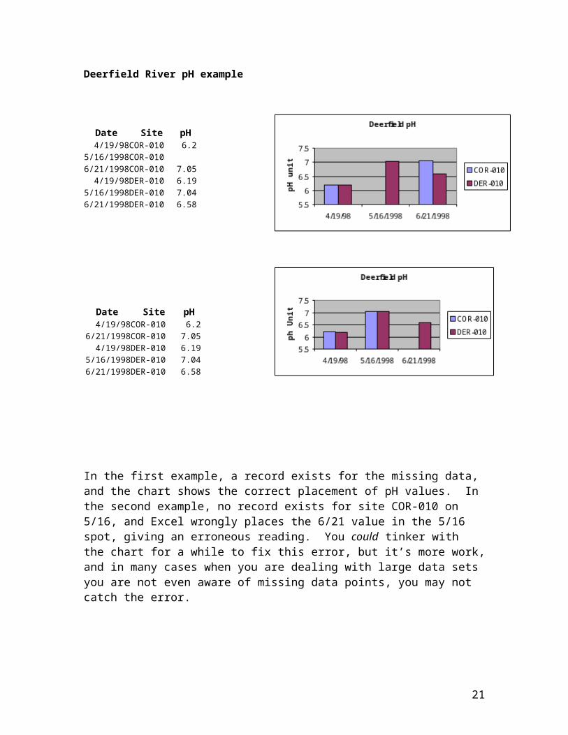
For example, here are two different ways to catalogue pH records for 2 different sites, 3 dates, with identical procedures for graphing the data sets. One site has a missing sample – perhaps that site wasn’t sampled that day, or perhaps bad data were discarded.
19

Deerfield River pH example
Date Site pH4/19/98COR-010 6.2
5/16/1998COR-0106/21/1998COR-010 7.05
4/19/98DER-010 6.195/16/1998DER-010 7.046/21/1998DER-010 6.58
In the first example, a record exists for the missing data, and the chart shows the correct placement of pH values. In the second example, no record exists for site COR-010 on 5/16, and Excel wrongly places the 6/21 value in the 5/16 spot, giving an erroneous reading. You could tinker with the chart for a while to fix this error, but it’s more work, and in many cases when you are dealing with large data sets you are not even aware of missing data points, you may not catch the error.
Arrange data convenientlyFile Organization
However you want to represent your data, it will help to first organize the data in an arrangement that is convenient for graphing. Typically, this means an array of adjacent cells within the row and column spreadsheet architecture. Note that it is not required to arrange the data in adjacent cells, but it usually helps. We provide some examples of graphs generated from non-adjacent data in this handbook.
Date Site pH4/19/98COR-010 6.2
6/21/1998COR-010 7.054/19/98DER-010 6.19
5/16/1998DER-010 7.046/21/1998DER-010 6.58
20
You can either enter your data by hand (i.e. type it in), or cut and paste the appropriate cells from other worksheets you’ve used for data entry or computation. In either case, be sure to check your work for accuracy.
The following examples are taken from worksheets summary and/or chartsummary, which are found in workbooks lakecharts and Deerfield data. There are slightly different versions of summary and chartsummary in the two workbooks – reflecting different types of data you might want to capture for lake or river sampling, respectively. Note also that in both workbooks, chartsummary is a copy of the summary worksheet. We left both in the workbooks to emphasize our point that when you sort, filter, and otherwise manipulate data, it’s wise to do this from a copy of your data set, to avoid corrupting your original data. The examples given in these workbooks show some fields that a group might use to document their sampling program. Feel free to copy these examples and use for your program, adding or changing columns to reflect the indicators you are using.
A (partial) sample data set:
Waterbody Date Sample ID Site depth TP Secchi Lkdpth Temp DO DO DpthOnota Lake 11/2/00 D2 2.7Lake Warner 5/5/2003 2 26.5 1.7 2.5 16 9.9 2.2Lake Warner 6/3/03 2 0.5 22 1.7 2.4 19 8.72 2.1Lake Warner 6/10/2003 2 1.5 2.5 17 9.02 1.5Lake Warner 7/14/2003 2 40 1.9 2.4 26 5.68 2.1Lake Warner 8/11/2003 2 1.5 2.5 24 5.06 2Baker's Pond 6/6/96 1 0.5 17.6 7.43
We recommend that you use a file structure similar to this – one row for each data record, including identifying data (information about the collection such as water body, site number, date, etc.) as well as the actual results (e.g. DO, Secchi, temperature measurements).
One noticeable point about this file structure is that many fields (e.g. water body name, site) are repeated on each line, even though they rarely if ever change for some programs. It may seem unnecessary to repeat “Deerfield River” or “Lake Warner” for each data entry. Or you may always sample just beneath the water surface, so why bother to record depth? Ultimately, your program and/or database manager must decide what’s best for your program. But it is a good idea to remember two principles of database architecture:
- Each data record should be uniquely identified. In this case, each row constitutes a record, and the unique information that identifies it will be some combination of water body name, site name/number, date, time, and/or sample ID code that you give it. The last thing you want is to have a data value and not know which collection it came from. And don’t forget to include year, if you expect your program to be around for more than a year.
- Design your database so growth is easy to accomplish. You may only sample one water body now, but if you decide to sample tributaries next year, or want to compare your data with that from a neighboring program or contribute to a
21

statewide data set, you’ll need to add that identifying information. It will likely be easier to do it now than later.
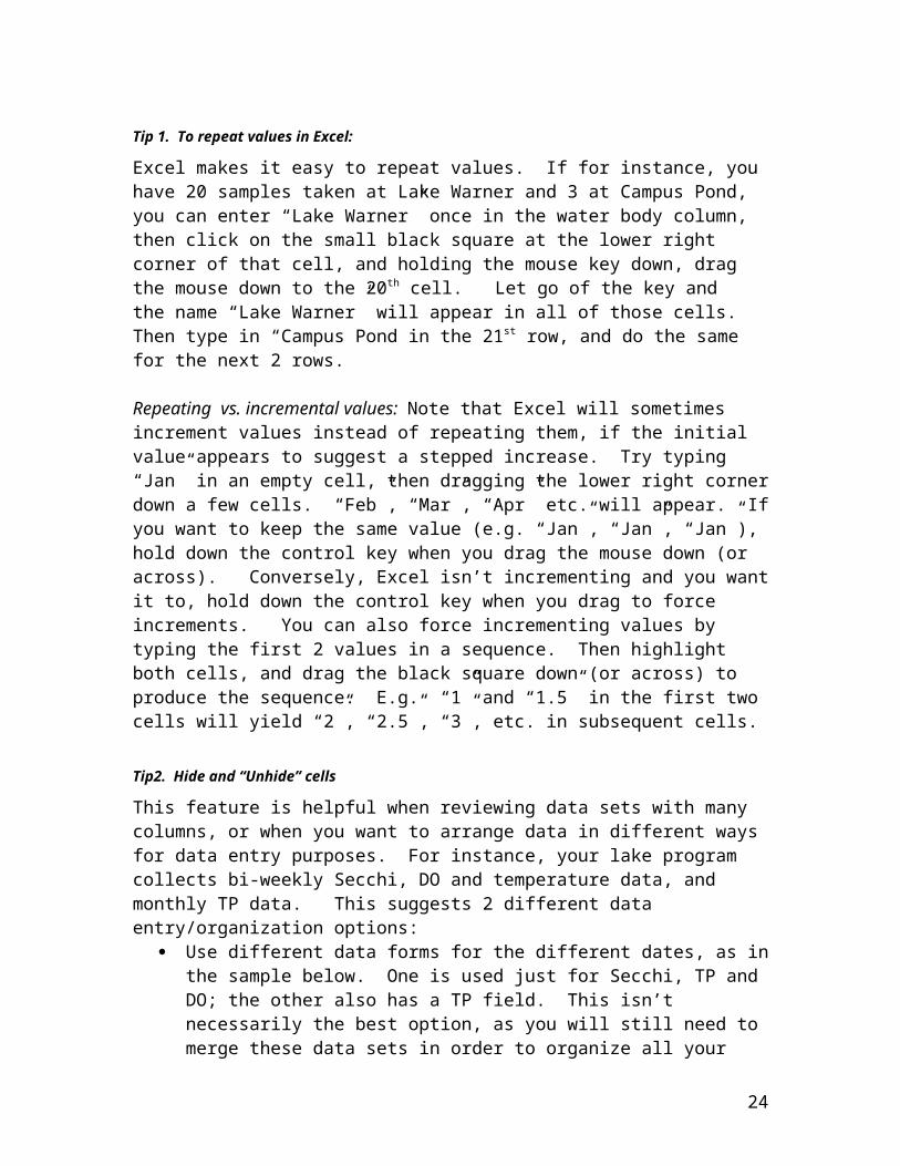
Tip 1. To repeat values in Excel:
Excel makes it easy to repeat values. If for instance, you have 20 samples taken at Lake Warner and 3 at Campus Pond, you can enter “Lake Warner” once in the water body column, then click on the small black square at the lower right corner of that cell, and holding the mouse key down, drag the mouse down to the 20th cell. Let go of the key and the name “Lake Warner” will appear in all of those cells. Then type in “Campus Pond in the 21st row, and do the same for the next 2 rows.
Repeating vs. incremental values: Note that Excel will sometimes increment values instead of repeating them, if the initial value appears to suggest a stepped increase. Try typing “Jan” in an empty cell, then dragging the lower right corner down a few cells. “Feb”, “Mar”, “Apr” etc. will appear. If you want to keep the same value (e.g. “Jan”, “Jan”, “Jan”), hold down the control key when you drag the mouse down (or across). Conversely, Excel isn’t incrementing and you want it to, hold down the control key when you drag to force increments. You can also force incrementing values by typing the first 2 values in a sequence. Then highlight both cells, and drag the black square down (or across) to produce the sequence. E.g. “1” and “1.5” in the first two cells will yield “2”, “2.5”, “3”, etc. in subsequent cells.
Tip2. Hide and “Unhide” cells
This feature is helpful when reviewing data sets with many columns, or when you want to arrange data in different ways for data entry purposes. For instance, your lake program collects bi-weekly Secchi, DO and temperature data, and monthly TP data. This suggests 2 different data entry/organization options:
Use different data forms for the different dates, as in the sample below. One is used just for Secchi, TP and DO; the other also has a TP field. This isn’t necessarily the best option, as you will still need to merge these data sets in order to organize all your data for later graphing, and you might get into some real file management headaches.
Waterbody Date Site Secchi Temp DOLake Warner 5/19/2003 2 1.5 17 9.02Lake Warner 6/17/2003 2 1.5 24 5.06
Waterbody Date Site TP Secchi Temp DOLake Warner 5/5/2003 2 26.5 1.7 16 9.9Lake Warner 6/3/03 2 22 1.7 19 8.72Lake Warner 7/1/2003 2 40 1.9 26 5.68
Use one form that includes all possible parameters, and fill in only the appropriate fields.
22

Waterbody Date Site TP Secchi Temp DOLake Warner 5/5/2003 2 26.5 1.7 16 9.9Lake Warner 5/19/03 2 1.5 17 9.02Lake Warner 6/3/2003 2 22 1.7 19 8.72Lake Warner 6/17/2003 2 1.5 24 5.06Lake Warner 7/1/2003 2 40 1.9 26 5.68
This makes more sense conceptually, but the arrangement may still be prone to errors, as data can easily be entered in the wrong cells. One way to minimize this problem (particularly when entering large amounts of data at one time) is to use the “Hide” function in Excel. On days when you are not entering TP data, hide the TP column by dragging the mouse over the column header, then right-clicking the mouse (or open the “Format” dialogue box), then selecting “Hide”. The column will disappear from view (but the data remains!), making it easier to enter only the data you want. Follow the same steps to reverse the process when you want to view all columns – just drag the mouse over the adjoining columns on either side of the hidden ones and select “Unhide”.
One worksheet or several?Using a simple, uniform row-column format allows you to easily organize data you wish to graph. You can either store your data in one large worksheet by appending data from each collection to it, or you can save data in separate worksheets, according to the needs of your program. For instance, one worksheet for each year’s data; or if you sample different lakes or streams, you may want a separate file for each. As long as the format is the same for each, it’s a simple matter to copy the records you want records from several locations into a single location sheet that will facilitate graphing. Bear in mind that files can get quite large when you start adding a lot of charts. This might create problems when trying to save data to a floppy disk or send email attachments.
Copy records to a separate areaOnce you’re ready to start graphing, we recommend that you copy all the data you plan to work with into a separate area; either a separate worksheet or somewhere else on the current worksheet. For instance, you would copy the 5 Lake Warner records shown above to a separate space to begin graphing. In the sample worksheets and charts we have created, you will notice that there we sometimes create one copy of a data subset for a single chart, and at other times create several charts from a data subset, for reasons given in the following bullet point.
Creating multiple copies of your data set – or of portions of your data set - will help you with graphing problems, but it is not without consequences. The pros and cons of having several copies of your data:
Pros: When you create a graph from sorted data and then rearrange the data (e.g. by resorting or by transposing rows and columns), the graph will automatically redraw itself to reflect the new data order – thereby destroying the original graph. We give examples of this below, in the river section showing graphs of one site over several dates, and graphs of several sites on one date. Also, it’s much easier
23
to work with a graph if you can see the data points right next to it. If you make lots of graphs, this is impossible.
Cons: Multiple data sets leave you prone to data corruption. If you correct a mistake or update a value in one copy of the file, you’ll need to manually correct that value in all other copies as well. Similarly, additions to the data set are not as easily graphed. For instance, if you are distributing monthly reports on your monitoring program, adding each month’s results to a growing graph, you may have to enter the new data in multiple places to update each graph that is based on the data.
Tip 3. Keep headers in view when scrolling.
To keep the top row or rows in view when you scroll down through a large worksheet, place the cursor on the row just below the row or rows you want to remain visible. Open the “Window” tab, then select “Freeze Panes”. You can employ the same tactic to keep columns in view when scrolling left to right.
Creating graphs in Excel
Create a graph – example: Graph Lake Onota Lake Secchi data for site D2, 2000.
Step 1: Make a copy of the data.- Open lakecharts workbook, summary worksheet. In this example, there are
records for several lakes and several dates spanning several years.- Right-click on summary worksheet name tag. Select “Move or copy sheet”. Be
sure to select “Create a copy” option. Accept the book name that’s given, select “summary” in the “before sheet” option – or move it elsewhere, if you prefer.
- Rename the new sheet to whatever you want, (e.g. “chartsummary”).
Step 2: Sort / filter the data.- Open worksheet chartsummary.- Position cursor on any cell in the waterbody column. - Open “Data” icon on toolbar. Select “Filter” option, select “Autofilter”. Arrows
will appear on each column header. - Click the down arrow in the waterbody column, select “Onota Lake”. All other
records will now be hidden from view.- Select “Data” icon again. Select “Sort” option.- Select field to sort on (if it doesn’t say “waterbody”, click the arrow to bring up
the field list, then select). Select “Ascending”.- Select the secondary sort in the same way. Select “Site”.- Select tertiary sort. Select “Date”. Then press “OK”. Sheet will sort itself into
something like this (showing first few relevant records only):
24

Waterbody Date Sample ID time depth Samp# Site TP SecchiOnota Lake 5/24/00 D2 3.2Onota Lake 6/13/00 D2 3.2Onota Lake 6/28/00 D2 3.0Onota Lake 7/11/00 D2 2.4
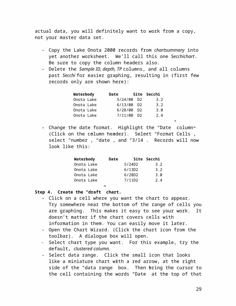
Step 3: “Massage” the data.Beyond sorting and filtering, there are any number of operations you might want to do to facilitate graphing; actions that change the appearance of data, change the order of or remove some fields, etc. Whether or not this step is necessary depends on the shape of your existing data set and what type of chart you want to make. We provide two sample operations here. They illustrate approaches one might take to address a specific graphing problem. We don’t mean to imply these are the only ways to solve these or similar issues. Nor would it be possible to cover all possible issues in a short handbook. One of the examples involves deleting a few fields to make it easier to view your data set. Obviously, if you are taking actions that affect the actual data, you will definitely want to work from a copy, not your master data set.
- Copy the Lake Onota 2000 records from chartsummary into yet another worksheet. We’ll call this one Secchichart. Be sure to copy the column headers also.
- Delete the Sample ID, depth, TP columns, and all columns past Secchi for easier graphing, resulting in (first few records only are shown here):
Waterbody Date Site SecchiOnota Lake 5/24/00 D2 3.2Onota Lake 6/13/00 D2 3.2Onota Lake 6/28/00 D2 3.0Onota Lake 7/11/00 D2 2.4
- Change the date format. Highlight the “Date” column (Click on the column header). Select “Format Cells”, select “number”, “date”, and “3/14”. Records will now look like this:
Waterbody Date Site SecchiOnota Lake 5/24D2 3.2Onota Lake 6/13D2 3.2Onota Lake 6/28D2 3.0Onota Lake 7/11D2 2.4
Step 4. Create the “draft” chart.- Click on a cell where you want the chart to appear. Try somewhere near the
bottom of the range of cells you are graphing. This makes it easy to see your work. It doesn’t matter if the chart covers cells with information in them. You can easily move it later.
- Open the Chart Wizard. (Click the chart icon from the toolbar). A dialogue box will open.
25
- Select chart type you want. For this example, try the default, clustered column.- Select data range. Click the small icon that looks like a miniature chart with a red
arrow, at the right side of the “data range” box. Then bring the cursor to the cell containing the words “Date” at the top of that column. Drag the mouse down to the last date in this range: “11/2”. Then hold down the control key, bring the cursor to the cell containing the word “Secchi” at the top of that column. Holding the control key, drag down to the cell holding the Secchi value for 11/2. (Note: by including the column headings “Date” and “Secchi” in the cell ranges you selected, you have directed Excel to use these as default labels on the chart). Once you’ve selected the cells you want, click the small icon (now with downward-pointing red arrow) on the right side of the “Source Data – data range:” box. The dialogue box gives a preview of what the chart will look like. Don’t worry about appearance yet – we’ll change as necessary in a moment.
- Click on “Series in Columns”, then on “Series in Rows”, to see which looks best. In this case, columns work best, even though the lines appear skinny at first.
- Click on “Series” tab to open that portion of dialogue box. In this case, you only have one series, and everything else is in order: the name of the series, the values to be represented, and the labels for the X axis. Click “Next”.
Tip 4. Graphing Time-sequence data in Excel.
Excel charts that display data over time (e.g. Secchi values for one site, several dates) default to an automatic time-scale category axis. This means that it calculates the number of days (or weeks, months, years) from the first to the last date, and spaces the data points evenly along that axis (usually the X axis). In our experience, this tends to mess up the graph. The following example shows how to fix this.
- If you are not already in the Chart Wizard, (Step 3) Open the “Chart Options” dialogue box.
- Open the “Axes” tab. Under “Category (X) axis”, select the “category” option. In this Secchi example, the graph will look better, as data columns fill out.
- Add/change titles: Open the “Titles” tab. Enter “Onota Lake Water Transparency 2000 – Site D2” (or something similar) in the title box. Type “Sample Date” to identify the X axis, and “Depth (meters)” in the Y axis box. The X and Y labels now appear along the 2 axes. The Y axis is one place to identify the parameter and/or unit of measure. You could also use the legend or the graph title for this information. Alternatively, you don’t always need a legend, particularly when there’s only one series, as in this case. To eliminate the legend, open the “Legend” tab and deselect the “show legend” box.
- Click “Next”, then “Finish” to accept the chart as an object in the current worksheet.
Step 5: Clean up the chart.Once the chart’s created, there are usually a few remaining steps to take to improve the chart appearance or fix problems. Some examples:
26

Tip 5. Getting all the X axis labels to display.
Sometimes the X axis labels don’t all show, or don’t align well with the data points they represent. This is usually due to space limitations. There are 2 ways to fix this:
#1: Reformat the labels.- Right-click the mouse over the labels and select “Format Axis”. - Select “Font”. Reduce size as much as you think appropriate. If this doesn’t do
the job, also try:- Select “Alignment”. Move the text arrow closer to 90 degrees.#2. Resize chart.
If reformatting labels didn’t fix it, try grabbing the side (or bottom) borders of the chart and stretching it, or removing any legend that’s on the side. That tends to widen the display area available for the X axis labels, allowing the missing ones to reappear.
Modify the data set. Let’s remove the last few dates from the chart. Right click on the chart to get a “Source data” option (you may have to do this a few times, moving the cursor around until that option appears). Open this, then click on the “values” icon in the “Series” dialogue box. Select the data range as you did above, only this time grab the Secchi column only, don’t include the “Secchi” heading itself, and drag down only to the value found in the 9/14/00 row. Save this, then click on the “category (X) axis labels and do the same for the date column. Click “OK”, and your chart now omits the late September - November readings.
Change the Y Axis scale. Sometimes you will want to lengthen or shorten the length of the columns, in order to better focus on some aspect of your data. For instance, the chart we’ve just created may look like this:
This display compresses the values, thereby visually reducing the significance of any change in transparency. You can fix this in two ways. One is by simply stretching the chart. Grab the top or bottom, and pull up or down to stretch. This will lengthen the bars and will probably change the numbers on the Y scale as well:
27

You can also manually change the Y axis scale: right-click over the Y axis. Select “Format “Axis”. Enter “1.5” for minimum value and “4” for maximum value. This view dramatizes the difference between values more than either of the previous displays.
Tip 6. Reorienting a graph to display Secchi values.
Let’s the last change the orientation of the graph columns to make it appear more like a Secchi measurement, which records depth from the water surface in a downward direction. - Right-click mouse somewhere over the Y axis, then choose the “Format Axis”
option. Select “Scale” tab, then check the “values in reverse order” box. Check “OK”, and columns will now point down.
28
The above examples are just a few of many things that you can do to change chart appearance. Once you’ve created a chart try fooling around with it by trying different options (different chart types, changing scale or maximum and minimum values on the Y axis, etc.) to get the effect you want. You can easily create copies of the chart and work on these so you don’t lose your work on one you want to keep.
These are the basic steps involved in creating charts. The remainder of this handbook provides samples of charts that might be useful to water monitoring data sets.
Chart Gallery
This gallery provides a number of sample graphs used to report different types of water monitoring data. The charts themselves are found in the indicated Excel files. Information on source data or on graphing techniques can generally be obtained by opening the Excel files and then using the “Source Data” or “Chart Options” menus to locate the feature in question. We provide some information below on key steps that are required to make a particular graph or give it a specific feature.
In general, these charts were created by Compiling a summary worksheet from a variety of different data sets. Copying the entire summary worksheet to a transitional worksheet, called
chartsummary, where data are sorted. Copying a subset of the relevant records (now sorted) from chartsummary into the
worksheet where the chart is located. In some cases, these data were further manipulated by additional sorting, removing or renaming fields, etc. An illustration of this process is found in the Several Dates, Several Sites – Multiple Series example, below.
Using the Chart Wizard to create a graph from this subset of records. In some cases, several charts are made from the same data set.
29
Charts for River Data(Many of these will work for lakes also).
One site, several dates: Chart type: Clustered column Workbook: Deerfield Data Worksheet: Site-date Sort: by site, then by date.Parameter: Dissolved Oxygen
One site, several dates #2: Value line added (series)Chart type: Clustered column Workbook: Deerfield Data Worksheet: Site-date Sort: by site, then by date.Parameter: Dissolved OxygenKey feature: This chart has a “value” line added to indicate (in this case) the MA water quality standard for dissolved oxygen (warm water: 5 parts per million (or mg/l)).To create feature:
- Add a column to the data set. Title it “MA WQ Standard”. Make all values equal to 5.
- Create the chart as above. - Open “Source Data”. Open “Series” tab. “Add” a series. Select the new range
of “5” values that you just created for the “Values:” for this series. Note: You could also just type in “5,5,5,5,5,5” (as many 5s as there are DO data points).
- Open “Chart type” option. Open “Custom Types” tab. Select “Line – Column”.- Right Click on the new series line. Select “Format Data Series:”. Change
“Marker:” to none. Change “Weight:” to 5 (or whatever you wish). Change “Color:” to red (or whatever you wish).
- In this example, the legend entry for series 1 (the DO values) was cleared (right-click on the legend entry for DO, then “clear”), so the legend shows only “MA WQ Standard”. See next example for a different approach.
One site, several dates #3: Value line added (drawn in)Chart type: Clustered column Workbook: Deerfield Data Worksheet: Site-date Sort: by site, then by date.Parameter: Dissolved Oxygen
Same graph as above, except:Key feature: This chart has a “value” line by drawing one inTo create feature:
- Create one site – several dates chart as above. Don’t bother with the 2nd series.
30
- Open the “Draw” menu. Select a line (no arrow), drag it to the place on the chart where 5 mgl/l is represented. Stretch the line to extend evenly along that value.
- Right Click line, select “Format Autoshape”, and format line as in previous example.
- Select a “Callout” from the “Autoshapes” menu. Position it where you want on the chart, enter “MA WQ Standard” text in the box, size the font as necessary, then resize and reposition box and arrow as desired.
Note: this version of a “value” line looks better (because it fills the whole data plot area from left to right), but it can be quite troublesome. Sometimes it will disappear behind the chart. If you have trouble with this, try clicking the “Size with chart” option off and on (“Format Autoshape” menu). Also, if you change the scale of the Y axis, the line will usually reposition itself, so it won’t read 5 mg/l anymore. If you use this version, it’s best to get everything in place then print it immediately before it has a chance to mysteriously change on you.
One site, several dates #4: Value areas addedChart type: Mixed: Clustered column and stacked areaWorkbook: Deerfield Data Worksheet: Site-date Sort: by site, then by date.Parameter: Dissolved Oxygen
Same graph as above, except:Key feature: Uses “Stacked area” chart subtype to denote value ranges. In this example, both the MA WQ standard of 5 parts per million (PPM or mg/l) DO for warm water fisheries and the cold water standard of 6 PPM are indicated.
To create feature: - First, create a row of blank cells above and below the location of the source data
cells.- Create chart like one site – several dates chart above, with these changes:- The first series will contain DO values for site COR-010, 4/19 – 7/18/98.
However, expand the “Source Data” range for this series to include one blank cell each above and below the DO values.
- Similarly, when selecting “Category (X) axis labels” select the dates, along with one empty cell above and below.
- Add a series. For “Name”, type “Warm Water”. For “Values”, type “5,5,5,5,5,5” (note there are 2 more values than there are data points in the DO series).
- Add another series. For name, type “Cold Water”. For Values, type “1,1,1,1,1,1” (same idea as 2nd series).
- Add titles, etc. to finish draft version of chart. It will look like a regular column chart. Click on one of the warm water series columns. Select “Chart type”. Select “Area”, subtype “Stacked Area” (2-D).
- Do the same for the cold water series.
31

- For each of the warm and cold water series, select “Format Data Series”, and choose a color for the “Area” that you think is appropriate for the condition you are depicting.
- Then select callouts from the “Autoshapes” menu to identify the areas, or use text boxes or legends.
Note: this chart is a little tricky to build, but it does solve some of the problems associated with the value lines used above, and it allows you to use color to denote different water quality ranges. It works by creating an area of a given height. We selected 5 for the first area, to match the MA warm water standard of 5 PPM. The next series is added to this, so our given value of 1 brings it up to the cold water standard of 6 PPM. Because these color zones are opaque, you have to turn off Y axis grid lines to make this chart work. (“Chart Options”, “Axes”, “Grid Lines”, “Value (Y) Axis” off). A similar approach is used to display acceptable pH ranges in the next example.
One site, several dates #5: Value areas addedChart type: Mixed: Clustered column and stacked areaWorkbook: Deerfield Data Worksheet: Site-date Sort: by site, then by date.Parameter: pHSimilar to above, except it uses 2 areas to display an upper and lower acceptable limit for pH data. Also obtains the standard values via a slightly different approach.
Several dates, several sites: 2-DChart type: Clustered columnWorkbook: Deerfield Data Worksheet: Site-date Sort: by Date, then by Site.Parameter: Dissolved OxygenKey feature: Shows multiple sites and dates. This chart also uses multiple series. In this example, each series represents the DO values for a specific date.To create:
- Open Chart Wizard. Select chart type cluster column.- Select Values. The source data for this graph are found in the site-date
worksheet, range A45-C74. When obtaining source data for the graph, proceed one series at a time. Start by selecting DO values for the first date (4/19/98), all sites (i.e. C46-C55 in this example).
- Select “Series” tab, then click “Name” box for this series. Click on any cell containing the value “4/19/98”. Accept this.
- Click “Category X axis labels”, and select a range that includes site names for all the sites (e.g. B46-B55).
- Click “Add Series”. Click “Values” for the second series. Select all DO values for the next date (i.e. for 4/26/98). Click “Name”. Select a cell with value “4/26/98”. You don’t need to change the X axis labels.
- Click “Add Series” again, and continue as above until all dates are covered.
32

- Add titles, legends, formatting, etc. as desired.
Several dates, several sites: 3-D view.Chart type: 3-D columnWorkbook: Deerfield Data Worksheet: Site-date Sort: by Date, then by Site.Parameter: Dissolved OxygenKey feature: Uses 3-D to show multiple sites and dates. To create:
- Open Chart Wizard. Select chart type 3-D column.- Select data as in the previous example, adding a series at a time until all dates are
covered.- Click Next. Give a chart title and a Z axis title. No need for X or Y titles here.- Once finished, you can play with the orientation of the chart by selecting “3-D
View” and trying different elevations, rotations, or perspectives.
In our view, the 3-D chart should not be over-used. It starts to look overly busy as more data points are added, and depending on the view, it’s either hard to determine what values are represented, or some values will be hidden from view.
Several Dates, Several Sites – Multiple SeriesChart type: Clustered column Workbook: Deerfield Data Worksheet: Summer 03 fecal Sort: by Site vertically, by Date horizontally.Parameter: Fecal coliformKey feature: Data set is arranged differently, to make graphing easier. Also, method for dealing with extremely high values is employed. To Create: Data is first re-organized to facilitate graphing: one row displays data for each site, several dates.
- Open chartsummary worksheet. Add a column here to make it easier to filter data to reveal only 2003 data.
o Insert a new column just after “Date” column. Name it “Year”. In row 2 (row just below title row), enter this formula: “= year(b2)”. This will yield the year of the date found in cell B2.
o Copy this cell , paste to all cells in this column.o Click on first cell in “Year” column. Open “Data” dialogue box, select
“Autofilter”. Down arrows will appear on all column headings. Click on “Year” column. Drop-down window will display year values. Select “2003”. The data set will now be filtered to show only 2003 samples.
- Select “Data” again. Select “Sort”. For first sort, sort by date ascending. Second sort, by site ascending.
- Copy 1 set of data from the “site” column (i.e. range of cells from “SOR-010” to “WBD-010”).
- Open a new worksheet. Call it “summer 03 fecal”.
33

- Paste site list to this worksheet, 2nd row or lower.- Resort the chartsummary worksheet, this time by site ascending, then date
ascending.- Hide “Temp”, “DO”, and “DOSat” columns. (right click mouse, select “hide”).- Copy 1 set of dates. Copy the dates only – not the site names, fecal values, or
other cells. Copy a set that contains all the dates that were sampled – i.e. the copied cells will include these dates: 6/15/03, 6/29/03, 7/13/03, 7/27/03, 8/10/03 and 8/24/03. Go to “summer 03 fecal” worksheet, click on the cell that is 1 row above and to the right of the cell containing first site name (“COR-010”). Paste special (either via “Edit” icon or by right-clicking mouse): check “transpose” option. You have just created data headings, with the dates listed all in one row.
- Copy each set of (six) fecal values for each site in the same way: go to chartsummary worksheet, copy the fecal values for the first site (COR-010), return to summer 03 fecal, and paste special (transpose) into cell to the right of “COR-010” and below “6/15/03”. Continue until all values for the year are entered. You now have the data arranged so that each row contains site name and fecal values for each biweekly sampling at that site.
- Create graph. Open Chart Wizard, select clustered column chart type. For data range, highlight the entire array of cells, including header site IDs and dates. Select “Series in” columns. The chart is now arrayed in a convenient fashion: each series equals the fecal values for a different date, and site names are displayed sequentially along the bottom of the chart. Enter titles, etc. to suit.
Tip 7. Displaying extremely high values:
Another common scale problem occurs when trying to display widely varying values, as is often the case with fecal coliform and other bacteria. This data set has values ranging from 3 to 1667. If you use a “normal” Y axis scale that tops off somewhere near the higher (i.e. 1667 value), many of the other results will be virtually invisible, and others will seem very small, giving the impression that the water at these sites/dates was cleaner than it really is. You could use a logarithmic Y axis scale, which visually exaggerates low numbers and diminishes high numbers by making giving each order of magnitude (e.g. 0-10, 11 -100, 101 - 1000, etc.) equal height in the column. This can give the wrong impression in the opposite direction (i.e. that there isn’t that much difference between samples. What we did with this graph was to set a low upper limit to the y-axis scale. (We opened the Y Axis dialogue box, opened “scale”, and set maximum to 800. Additionally, we clicked on the column for the high data reading and formatted the “data point” to display value). This cuts off the high value, but notice that the high value is listed atop the bar. This suggests that the pollution levels are literally “off the charts,” and reinforces the idea that this reading is much higher than the others.
Multi-year Charts: Several Sites, Multiple DatesChart type: Clustered column Workbook: Deerfield Data Worksheet: multi-year Sort: by Date, then by Site.Parameter: pHKey feature: Charts data for multiple years.
34

Graphing multi-year data can be a problem because of inconsistencies in dates. E.g. you don’t sample on April 15, May 15, June 15, etc. each year, and you may not collect the same number of samples each month. These present challenges in organizing data to make it easy to graph and compare values from year to year. We offer one approach here, with some more complex examples given the lake chart section below.
To create: This first example is the easiest: simply compare values for 1 April sampling date in 1998 with 1 April sampling date in 1999 - several sites each year. Data are split into 2 series: Series 1 = values for April 19, 1998 at all sites. Series 2 = values for April 19, 1999 all sites. For each series, type in the Series name “April 98” and “April 99”. These will show on the legend.
Calculated data - Several Dates, several Sites.Chart type: Clustered column Workbook: Deerfield Data Worksheet: Summer 03 fecal Sort: by Date, then by Site.Parameter: Fecal coliformKey feature: Statistical summary of data is performed, then graphed. To Create: Data is first re-organized to facilitate graphing: one row displays data for each site, several dates.
- Open chartsummary worksheet. Add a column here to make it easier to filter data to reveal only 2003 data.
o Insert a new column just after “Date” column. Name it “Year”. In row 2 (row just below title row), enter this formula: “= year(b2)”. This will yield the year of the date found in cell B2.
o Copy this cell , paste to all cells in this column.o Click on first cell in “Year” column. Open “Data” dialogue box, select
“Autofilter”. Down arrows will appear on all column headings. Click on “Year” column. Drop-down window will display year values. Select “2003”.
- Select “Data” again. Select “Sort”. For first sort, sort by date ascending. Second sort, by site ascending.
- Copy 1 set of sites (i.e. range of cells from “SOR-010” to “WBD-010”). - Open a new worksheet. Call it “summer 03 fecal”. - Paste site list to this worksheet, 2nd row or lower.- Resort the chartsummary worksheet, this time by site ascending, then date
ascending.- Hide “Temp”, “DO”, and “DOSat” columns. (Right click mouse, select “hide”).- Copy 1 set of dates (i.e. range of cells from “6/15/03” to “8/24/03”. Go to
“summer 03 fecal” worksheet, click on cell 1 row above and to the right of the cell containing first site name (“COR-010”). Paste special (either via “Edit” icon or by right-clicking mouse): check “transpose” option. This will display the dates along the same row.
35

- Copy each set of (six) fecal values for each site in the same way: go to chartsummary worksheet, copy the fecal values for the first site (COR-010), return to summer 03 fecal, and paste special (transpose) into cell to the right of “COR-010” and below “6/15/03”. Continue until all values for the year are entered. You now have the data arranged so that each row contains site name and fecal values for each biweekly sampling at that site.
- Add a column for the geometric mean of each site’s results over the summer: write “Geomean” in the column to the right of the last date (“8/24/03”).
- Place cursor on the cell just below this title. Click the function icon on toolbar (fx). “Paste function” dialogue box opens. Select “statistical function”, then scroll down the menu and select “GEOMEAN”. Click the range selection box (icon with red arrow) for “Number 1”. Then highlight the six cells to the left of the cell you are in (i.e. the range of fecal values for that site). Accept. Select OK. Function closes, and the value is now shown. Alternatively, you could just type in “=geomean(c3.h3)” (or whatever cells the fecal values are found in).
- Copy this cell, paste in the subsequent cells for each site. Then format these cells by highlighting them, select “Format cells”, select “Number”, and set decimals to 0. Note that it doesn’t matter if there are empty cells, or even ones with text (e.g. “NS” for “not sampled”). Excel will calculate geometric mean only on the cells with number values.
- Now create graph: Open chart wizard, select Clustered Column chart type, select the cells for the geometric mean as “Values:”, add labels, titles, etc.
Two Parameters, Two Axes – One Date, Several Sites.Chart types: 3 different custom types: Lines on 2 axes, line/column on 2 axes, 2 columns on 2 axes.Workbook: Deerfield Data Worksheet: Site-dateSort: by Date, then by Site.Parameter: pH and ANCKey feature: Compares 2 different parameters, employs 2 different Y Axes.
To create: We give 3 different examples.
#1: Two lines. - Arrange data by date and site as shown in worksheet Site-date, in the vicinity of
cell AI10. - Open Chart Wizard, select Chart type “lines on 2 axes” (a custom type). - For data range, select site names, pH and ANC values (include headers) all in one
grab.- Enter title, Value Y axis (“pH”), 2nd Value Y axis (“ANC”). Finish; pH and ANC
are each a separate series in this chart.- Chart will now appear as 2 lines, with both a pH and an ANC axis.
#2. Line/column on 2 axes.- Create as above, but for “Chart type” select “Line/column on 2 axes”.
36

#3 Two columns on 2 axes.- Create the line/column 2 axes chart above.- When completed, hold the cursor somewhere on the line. Right-click, select
“Chart type”. Select cluster column. Chart will change this series only to a column, so you have two columns. However, it will look like stacked columns:
- Click on one of the columns. Select “Format Data Series”. Select “Options”. Select “Gap Width”, and increase or decrease the value. It will begin to appear as 2 separate columns, one in front of the other. Fool around with this feature until you get the look you want.
One Date, Several Sites. Dissolved Oxygen % Saturation Chart type: Clustered column Workbook: Deerfield Data Worksheet: DO Saturation Sort: by Date, then by Site.Parameter: Dissolved OxygenKey feature: This chart uses a table and a lookup function to calculate the % saturation of a DO sample. These are found in worksheet Do Saturation. To use this to determine DO from your samples, enter the sampling information (site #, date, DO and water temperature measurements) in the yellow cells. If you need to adjust for elevation or low barometric pressure, check the elevation correction table and replace the default “1” factor (light yellow cells) with the corrected factor. DO saturation will then automatically be calculated. We created a standard clustered column chart to display the values. Our only modification was to adjust the Y axis scale to top out at 100%.
37
Charts for Lake Data
One site, several dates – data table includedChart type: Clustered columnWorkbook: Lakecharts Worksheet: Secchidepth Sort: by Site, by Date.Parameter: Secchi transparencyKey feature: This is the same chart as the one described in the introductory “how to create a graph” section, but it has one added feature: The data number values are displayed in a table below the columns. To Create this feature: Make the chart as described in the introductory section, but under “Chart Options”, select “Data Table”, and click “Show data table”.
Lake depth profileChart type: XY (Scatter), with data points connected by smooth lines.Workbook: Lakecharts Worksheet: depthchart Sort: by Date, then by Depth.Parameter: Dissolved Oxygen. (Temperature example also given)Key feature: This chart displays a profile of data taken from several depths, top to bottom. This is commonly used to display dissolved oxygen or temperature depth profiles. To Create: It’s best to have data arranged in a row-column array like this (first few records only are shown):
Date Depth (m) Temp DO6/6/96 0.5 17.6 7.436/6/96 1 17.4 7.366/6/96 2 17.2 7.356/6/96 3 17.0 7.33
- Filter chartsummary to obtain records only for Baker’s Pond. (Note that chartsummary is a copy of summary worksheet. For safety’s sake, it’s generally good to work from a copy of your data).
- Copy these records to depthchart worksheet.- Delete or hide all columns except Date, Depth, Temp and DO.- Sort data by date, then by depth. - Open Chart Wizard.- Select chart type: XY (Scatter), with data points connected by smooth lines.- Select data range: Build this one series at a time, so select all DO values for the
first date (e.g. “6/6/96”). - For “Name”, click on any cell that has the date value (“6/6/96”).- For “Y Values” select all depth values for one date (e.g. 0.5 – 15).
38

- Add a series. Name it for the 2nd date (e.g. “6/29/96”), select the DO values for that date as “X values”, and select the depth values again (0.5 – 15) for “Y values”. Continue until all data for all dates are added as new series. The X values will change with each series (each new date), but the Y values will always be the same.
- Give the chart a title, enter labels for X axis (“DO (mg/l)”) and Y axis (“Depth (meters)”).
- When Chart Wizard is complete, open “Format Axis” (for Y axis), select “Scale”, and click “Values in reverse order”.
Note: If you also want to create a temperature profile, you can save some steps by copying this chart, opening the “Data Source” option on the new chart, and changing only the X axis values for each series, by selecting temperature values instead of DO. Y axis and dates will remain the same. Change titles, of course. An example of this chart is also shown in the depthchart worksheet.
Note: When creating a chart of this type, be careful of missing entries. For instance, with the Baker’s Pond example suppose you only sampled to 12 meters on September 12. If when you made the chart you set the Y Axis data range to 0.5 – 15 meters as will all other dates, you’ll have 3 extra Y values and the chart will show erroneous readings for those depths. So make sure that the Y range and the X range have the same number of values in them.
One site, multiple dates – multiple series, multiple years.Chart type: Clustered column Workbook: lakechartsWorksheet: Onota charts Sort: by Date, then by Site.Parameter: Secchi transparencyKey feature: Charts data for multiple years.In the Deerfield River example (see above), it was a simple matter to graph results from several sites on 2 separate dates, by creating a different series for each date. Trying to graph one site over different dates isn’t so easy, however. Our first attempt to do so (top of Onota charts worksheet) shows the problems that arise. For one thing, the X axis names will only show one series of dates (either 2000 or 2001), which is misleading, particularly in this example; 2000 sampling started in May, and 2001 sampling started in January. The single set of 2000 dates don’t reveal that. You can select both sets of dates to be included as labels (by placing the 2 sets in adjacent columns, then highlighting both columns when you select the range for “Category (X) labels”. But this creates an ugly display. Second, even if you know the dates for both years, you end up with dates side by side that are very different from one another: e.g. a January date alongside a May date.Two approaches to fixing this:
Approach #1: Average readings for each month, compare monthly averages for each year.To create:
39
- First create another column, “avgmonth”. Use the average function to obtain an average for all readings for each month of the year (but let’s skip those months where there aren’t data for both years). Example (in worksheet Onota charts): type (=average(D2.D3) for the May 2000 average.
- Do this manually for each month of the 2 years. Some will have only 2 values to average, some will have 3 or 4.
- Then make a copy of the data set, including the average dates. - Copy this to another place on the worksheet (e.g. below the first set of #s). Paste
Special, pasting values (not formulae). - Note: make sure your date fields retain their format, otherwise they might take on
a very different look. If they have changed, highlight the date cells, select “Format cells”, select “Date”, and the style you want.
- Delete all rows that do not contain an average value. This is just to make the average values contiguous. Also, delete any rows for which there are not comparable months in both years (i.e. keep only May – October).
- In the column to the right of the averages, type in “May”, “June”, “July” etc. to “October” in each appropriate row. You only need this for the first year.
- Create a chart: Open Chart Wizard, Cluster Column type chart. We’ll build this one series at a time.
- Open “Series” box. For “Values:”, select 2000 Secchi values from the average column.
- For Series “Name :”, type in “2000”. - For Category (X) Axis Labels:”, select the cells that you just typed in month
names for.- Add a series, and repeat above steps to enter 2001 data.- Give titles, remember to change X axis to Category (under “Chart options”), and
Y axis scale to “Values in reverse order” (under “Format Axis”) to for this Secchi chart.
Approach #2: Manually select a subset of dates that provide a meaningful comparison.To create:
- Copy the data set as above to another location on the worksheet (our example goes down to about cell A55).
- For easier viewing and working, delete the “Water body” and “Site” fields (NOT the whole column, just those cell range).
- Working one or 2 dates at a time, find 2001 dates that are close to the 2000 dates, and move the 2001dates (and their Secchi values) to the corresponding 2000 rows. If you end up with extra dates (e.g. 4 August dates in 2000, only 2 in 2001), delete the extras. When complete the data set would look like that shown in Onota charts worksheet, towards the bottom.
- Add a column that describes the 2000-2001 date pairs (e.g. “Early May”, etc.)- Create chart: Clustered Column. For Data Range, Select the range of dates
(actual dates, not the descriptors we just made up) and use the control key to also get the 2000 and 2001 Secchi values. You should have your chart in 2 ranges, as above.
40

- Name the ranges as above, and for X axis labels, select the descriptors just created.
- Finish the chart as above.This approach to making a multi-year chart is less desirable than the first in that it deletes some values, creates imprecision the dates and names selected to describe the sample dates, and is somewhat arbitrary in selection of dates to pair. However, there may be reasons why you don’t want to use averages – for instance, if you are graphing widely variable results that will get lost in an average.
One site, several dates: Value line added (series)Chart type: Clustered column Workbook: LakechartsWorksheet: Bakers DO Sort: by site, then by date.Parameter: Dissolved OxygenKey feature: This chart and the following one are similar to the Deerfield River examples above, in the “Charts for River Data” section. See the description in that section for a discussion of how to make these charts. This one has a “value” line added to indicate (in this case) the MA water quality standard for dissolved oxygen (warm water: 5 parts per million (or mg/l)). These charts will work for lakes when DO is being collected at a single depth, rather collecting DO data along a depth profile.
One site, several dates: Value line added (drawn in)Chart type: Clustered column Workbook: LakechartsWorksheet: Bakers DO Sort: by site, then by date.Parameter: Dissolved OxygenKey feature: Like the previous example, this is a lake version of the Deerfield River examples above, in the “Charts for River Data” section. Note that these last two examples differ also in the Y axis scale. The first chart has a lower limit of 4 Parts Per Million, while the second has a 0 minimum value. The first (created by formatting the Y Axis scale and setting minimum value to 4) has the effect of emphasizing the difference between the highest value and the others.
DO Saturation example.See the DO Saturation example in the River Chart section (Last chart of section). This chart also shows how to obtain DO Saturation values from a table we have created in workbook Deerfield data, worksheet DO Saturation.
41