Cap81 Tut Stencil
6
CAP81.tut_stencil 42 CAP81.tut_stencil 42 17/1/06 6:23:58 pm 17/1/06 6:23:58 pm
-
Upload
grafikeyes -
Category
Documents
-
view
9 -
download
2
description
Cap81 Tut Stencil
Transcript of Cap81 Tut Stencil

CAP81.tut_stencil 42CAP81.tut_stencil 42 17/1/06 6:23:58 pm17/1/06 6:23:58 pm
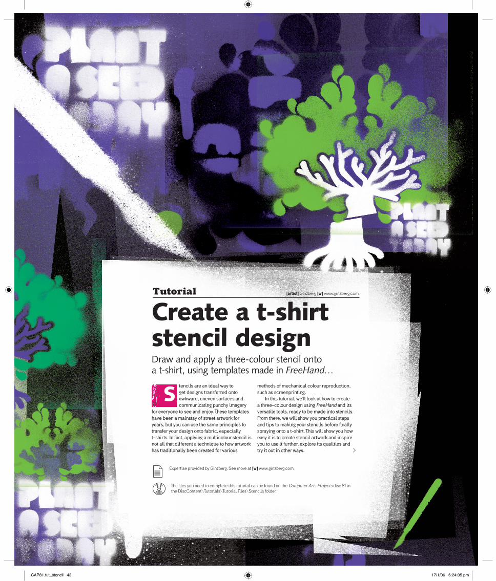
Tutorial [artist] Ginzberg [w] www.ginzberg.com.
Create a t-shirt stencil designDraw and apply a three-colour stencil onto a t-shirt, using templates made in FreeHand…
Stencils are an ideal way to get designs transferred onto awkward, uneven surfaces and communicating punchy imagery
for everyone to see and enjoy. These templates have been a mainstay of street artwork for years, but you can use the same principles to transfer your design onto fabric, especially t-shirts. In fact, applying a multicolour stencil is not all that different a technique to how artwork has traditionally been created for various
methods of mechanical colour reproduction, such as screenprinting.
In this tutorial, we’ll look at how to create a three-colour design using FreeHand and its versatile tools, ready to be made into stencils. From there, we will show you practical steps and tips to making your stencils before fi nally spraying onto a t-shirt. This will show you how easy it is to create stencil artwork and inspire you to use it further, explore its qualities and try it out in other ways.
Expertise provided by Ginzberg. See more at [w] www.ginzberg.com.
The fi les you need to complete this tutorial can be found on the Computer Arts Projects disc 81 in the DiscContent\Tutorials\Tutorial Files\Stencils folder.
CAP81.tut_stencil 43CAP81.tut_stencil 43 17/1/06 6:24:05 pm17/1/06 6:24:05 pm

Tutorial Stencil design
Processes
In this tutorial, we produce a
simple stencil in a fl at colour
style similar to screenprinting.
There are other processes though.
A common technique is a much
more layered effect, using tones
that tend to be more directly
representational. There is also a
much more random, collaged
look that pieces together many
elements and brings it all
together in a more chaotic style.
The main aim is to juxtapose
elements to carry a message and
get it seen.
4Once you’re satisfi ed with the overall silhouette, open the Xtra Operations toolbox
via Window>Toolbars >Xtra Operations. Select all the drawn elements and then click on Union. You will now have a Joined Shape. Now we’ll deal with curves that eat into the shape.
5Draw a circle that matches the incursion’s width: it is worth swapping to Keyline mode to
ensure these shapes match correctly. With your circle selected and in front of the main Brain shape, use the Punch tool to cut into the silhouette. Repeat until you’re satisfi ed.
6Select the fi nished half, and press Control/Command++ to make a duplicate. Select this
shape and fl ip it horizontally via the Transform palette. Move it to the right, using Shift to constrain its movement on the Y axis. Select both halves and use Union to join them into one complete shape.
FreeHand tools
In Freehand, Union & Punch are
two of the most useful tools when
creating bespoke shapes. Using
them on simple geometric forms
you can easily create new shapes,
ready for more advanced editing
and treatments such as Custom
Fill or Paste Inside. Expand
Stroke is a quick way of forming
shapes from simple drawn paths.
Inset Path is a great way of
creating expanded or offset
shapes based on existing shapes.
All are useful when making
stencils, to create volume or
knockout gaps between objects.
Part 2: Getting started in FreeHandUse simple steps to begin drawing elements for your stencil
44
Part 1: Preliminary work Before sitting down at your screen, prepare your materials
1You’re looking to create a punchy image, so it is good to work out your idea on paper before
even touching your mouse. You will often spot any potential problems at this early point. It’s good to give yourself something to aim at before using a computer do the tooling.
2Once you have your idea, gather suitable reference. Google Image Search ([w] http://
images.google.com) is invaluable at this stage. You can easily and quickly gather points of reference that you are looking for, while gathering new views on the subject. Always keep your own photos as reference too.
3Now gather together your materials: anything practical will need some preparation. For this
tutorial, you will need a pack of thin card, a t-shirt (light colours work better), masking tape, a sharp scalpel, a suitable cutting surface, non-permanent spray adhesive and, most importantly, three cans of colour spray paint.
1Create a document and set the page size to A4. Import (Control/Command+R) the image
BrainScan_01.tif from the CD. Position it centrally on the page. This will be on the Foreground layer. In the Layers palette, lock this layer so it doesn’t get moved by accident, then create a new layer.
2Using the Pen Tool, begin to trace the shape of the brain outline. Try to keep the shape fl uid:
using as few points as possible means the curves will fl ow sweeter.
3To help with getting smooth curves and their transitions, you can use basic circle elements.
Once you’re happy with the basic shape, making sure it’s a closed path, you can draw and position basic circle shapes with the Circle tool to achieve a smooth outline.
CAP81.tut_stencil 44CAP81.tut_stencil 44 17/1/06 6:24:08 pm17/1/06 6:24:08 pm
45Tutorial Stencil design
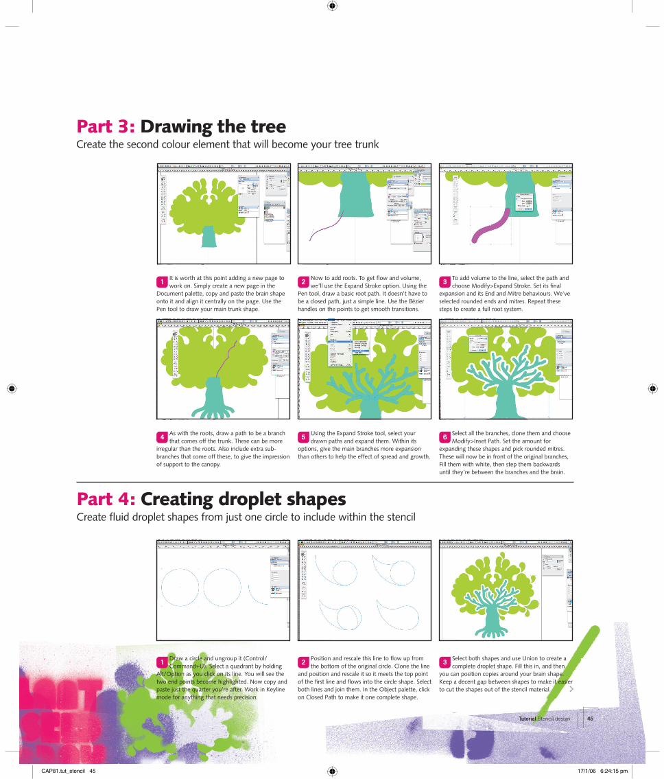
Part 4: Creating droplet shapesCreate fl uid droplet shapes from just one circle to include within the stencil
Part 3: Drawing the treeCreate the second colour element that will become your tree trunk
1It is worth at this point adding a new page to work on. Simply create a new page in the
Document palette, copy and paste the brain shape onto it and align it centrally on the page. Use the Pen tool to draw your main trunk shape.
2Now to add roots. To get fl ow and volume, we’ll use the Expand Stroke option. Using the
Pen tool, draw a basic root path. It doesn’t have to be a closed path, just a simple line. Use the Bézier handles on the points to get smooth transitions.
3To add volume to the line, select the path and choose Modify>Expand Stroke. Set its fi nal
expansion and its End and Mitre behaviours. We’ve selected rounded ends and mitres. Repeat these steps to create a full root system.
1Draw a circle and ungroup it (Control/Command+U). Select a quadrant by holding
Alt/Option as you click on its line. You will see the two end points become highlighted. Now copy and paste just the quarter you’re after. Work in Keyline mode for anything that needs precision.
2Position and rescale this line to fl ow up from the bottom of the original circle. Clone the line
and position and rescale it so it meets the top point of the fi rst line and fl ows into the circle shape. Select both lines and join them. In the Object palette, click on Closed Path to make it one complete shape.
3Select both shapes and use Union to create a complete droplet shape. Fill this in, and then
you can position copies around your brain shape. Keep a decent gap between shapes to make it easier to cut the shapes out of the stencil material.
4As with the roots, draw a path to be a branch that comes off the trunk. These can be more
irregular than the roots. Also include extra sub-branches that come off these, to give the impression of support to the canopy.
5Using the Expand Stroke tool, select your drawn paths and expand them. Within its
options, give the main branches more expansion than others to help the effect of spread and growth.
6Select all the branches, clone them and choose Modify>Inset Path. Set the amount for
expanding these shapes and pick rounded mitres. These will now be in front of the original branches, Fill them with white, then step them backwards until they’re between the branches and the brain.
CAP81.tut_stencil 45CAP81.tut_stencil 45 17/1/06 6:24:15 pm17/1/06 6:24:15 pm
Tutorial Stencil design
Spray paint
For this tutorial, we used acrylic
spray paint, available from good
model shops for around £3 a can.
Acrylic gives you subtler colours
and a better fi nish.
Look around you
It’s impossible to talk about
stencil art without mentioning
Banksy ([w] www.banksy.co.uk).
He is the king of stencil art, able
to use symbolism to give his work
a real edge and voice.
46
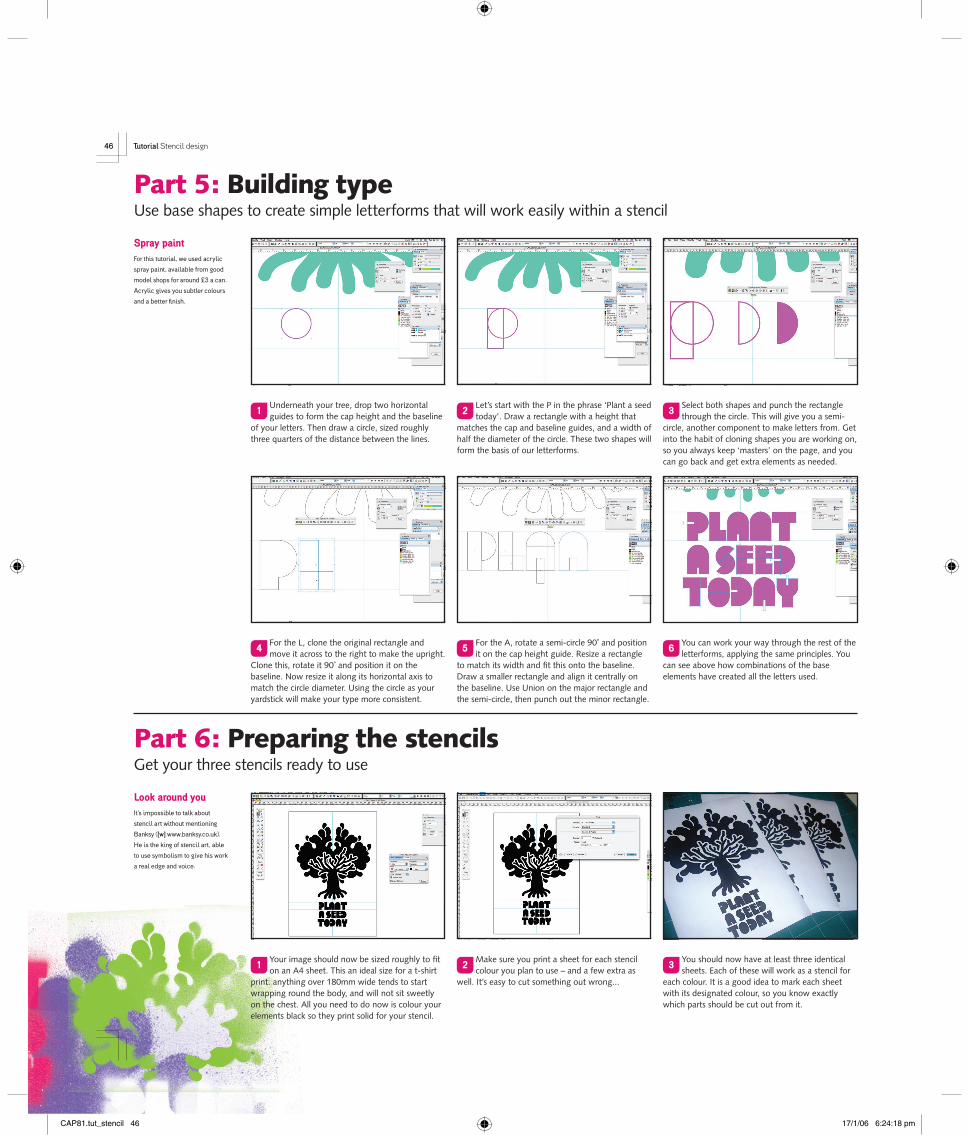
Part 5: Building typeUse base shapes to create simple letterforms that will work easily within a stencil
1Underneath your tree, drop two horizontal guides to form the cap height and the baseline
of your letters. Then draw a circle, sized roughly three quarters of the distance between the lines.
2Let’s start with the P in the phrase ‘Plant a seed today’. Draw a rectangle with a height that
matches the cap and baseline guides, and a width of half the diameter of the circle. These two shapes will form the basis of our letterforms.
3Select both shapes and punch the rectangle through the circle. This will give you a semi-
circle, another component to make letters from. Get into the habit of cloning shapes you are working on, so you always keep ‘masters’ on the page, and you can go back and get extra elements as needed.
1Your image should now be sized roughly to fi t on an A4 sheet. This an ideal size for a t-shirt
print: anything over 180mm wide tends to start wrapping round the body, and will not sit sweetly on the chest. All you need to do now is colour your elements black so they print solid for your stencil.
2Make sure you print a sheet for each stencil colour you plan to use – and a few extra as
well. It’s easy to cut something out wrong...
3You should now have at least three identical sheets. Each of these will work as a stencil for
each colour. It is a good idea to mark each sheet with its designated colour, so you know exactly which parts should be cut out from it.
4For the L, clone the original rectangle and move it across to the right to make the upright.
Clone this, rotate it 90˚ and position it on the baseline. Now resize it along its horizontal axis to match the circle diameter. Using the circle as your yardstick will make your type more consistent.
5For the A, rotate a semi-circle 90˚ and position it on the cap height guide. Resize a rectangle
to match its width and fi t this onto the baseline. Draw a smaller rectangle and align it centrally on the baseline. Use Union on the major rectangle and the semi-circle, then punch out the minor rectangle.
6You can work your way through the rest of the letterforms, applying the same principles. You
can see above how combinations of the base elements have created all the letters used.
Part 6: Preparing the stencilsGet your three stencils ready to use
CAP81.tut_stencil 46CAP81.tut_stencil 46 17/1/06 6:24:18 pm17/1/06 6:24:18 pm
47Tutorial Stencil design
Preparing the stencils continued…
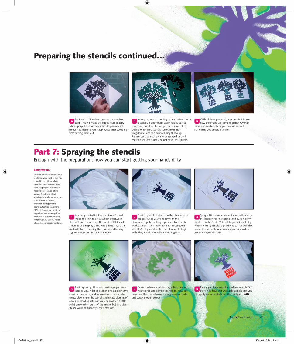
4Back each of the sheets up onto some thin card. This will make the edges more snappy
when sprayed and increases the lifespan of each stencil – something you’ll appreciate after spending time cutting them out.
5Now you can start cutting out each stencil with a scalpel. It’s obviously worth taking care at
this point, but don’t be too precious: some of the quality of sprayed stencils comes from their irregularities and the nuances they throw up. Remember that each area to be sprayed through must be self-contained and not have loose pieces.
6With all three prepared, you can start to see how the image will come together. Overlay
them and double-check you haven’t cut out something you shouldn’t have.
4Begin spraying. How crisp an image you want is up to you. A lot of paint in one area can give
a solid appearance, adding emphasis, but can also create blow under the stencil, and create blurring of edges or bleeding into one area or another. A little paint can weaken areas of the image, but also gives stencil work its distinctive characteristics.
5Once you have a satisfactory effect, peel off your stencil and admire the results. Now put
down another stencil using the registration marks and spray another colour.
6Finally you have your fi nished tee in all its DIY glory. You have got workable stencils that you
can apply on more shirts or other surfaces. ca p
1Lay out your t-shirt. Place a piece of board inside the shirt to act as a barrier between
the front and the reverse. The fabric will let small amounts of the spray paint pass through it, so the card will stop it reaching the reverse and leaving a ghost image on the back of the tee.
2Position your fi rst stencil on the chest area of the tee. Once you’re happy with the
placement, apply masking tape in each corner to work as registration marks for each subsequent stencil. As all your stencils were identical to begin with, they should naturally line up together.
3Spray a little non-permanent spray adhesive on the back of your fi rst stencil and push it down
fi rmly onto the fabric. This will help eliminate lifting when spraying. It’s also a good idea to mask off the rest of the tee with some newspaper, so you don’t get any wayward sprays.
Letterforms
Type can be used in several ways
for stencil work. Think of how type
is used in the military, where
stencilled forms are commonly
used. Keeping the counters (the
negative space inside letters
such as A, B, D and O) but
allowing them to be joined to the
outer silhouette creates
character. By dropping the
counters, the type has a more
DIY feel. You can put hints in to
help with character recognition.
Examples of fonts to look at are
Watertower, AG Stencil, Milton
Glaser, Rodchenko and Container.
Part 7: Spraying the stencilsEnough with the preparation: now you can start getting your hands dirty
CAP81.tut_stencil 47CAP81.tut_stencil 47 17/1/06 6:24:22 pm17/1/06 6:24:22 pm