Brand 20 Guidelines 20 - katopra.com.au · Worklocker Brand Guidelines: Colours 7 COLOURS 1.3...
19
Brand Guidelines 20 20
Transcript of Brand 20 Guidelines 20 - katopra.com.au · Worklocker Brand Guidelines: Colours 7 COLOURS 1.3...
Brand Guidelines
20 20

Wo
rklo
cker
Bra
nd
Gu
idel
ines
: Con
tent
s
3
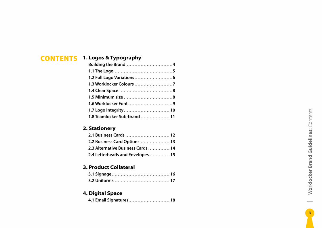
CONTENTS 1. Logos & TypographyBuilding the Brand . . . . . . . . . . . . . . . . . . . . . . . . . . . . . . . 41 .1 The Logo . . . . . . . . . . . . . . . . . . . . . . . . . . . . . . . . . . . . . . . 51 .2 Full Logo Variations . . . . . . . . . . . . . . . . . . . . . . . . . 61 .3 Worklocker Colours . . . . . . . . . . . . . . . . . . . . . . . . . 71 .4 Clear Space . . . . . . . . . . . . . . . . . . . . . . . . . . . . . . . . . . . 81 .5 Minimum size . . . . . . . . . . . . . . . . . . . . . . . . . . . . . . . . 81 .6 Worklocker Font . . . . . . . . . . . . . . . . . . . . . . . . . . . . . 91 .7 Logo Integrity . . . . . . . . . . . . . . . . . . . . . . . . . . . . . . 101 .8 Teamlocker Sub-brand . . . . . . . . . . . . . . . . . . . 11
2. Stationery2 .1 Business Cards . . . . . . . . . . . . . . . . . . . . . . . . . . . . . 122 .2 Business Card Options . . . . . . . . . . . . . . . . . . . 132 .3 Alternative Business Cards . . . . . . . . . . . . . . 142 .4 Letterheads and Envelopes . . . . . . . . . . . . . 15
3. Product Collateral3 .1 Signage . . . . . . . . . . . . . . . . . . . . . . . . . . . . . . . . . . . . . . 163 .2 Uniforms . . . . . . . . . . . . . . . . . . . . . . . . . . . . . . . . . . . . 17
4. Digital Space4 .1 Email Signatures . . . . . . . . . . . . . . . . . . . . . . . . . . . 18
Wo
rklo
cker
Bra
nd
Gu
idel
ines
: Bui
ldin
g th
e Br
and
4
BUILDING THE BRAND
A brand is more than just a logo and company name.
It is a visual system and language that identifies our
company to the community. This includes, but is not
limited to, store fronts, printed materials, advertising,
signage, stationery items, merchandise and web pages.
The brand is designed to unify our company and present
a clear, consistent image to our customers. Consistent
and widespread use of our identity in all locations,
communication and branding materials will help ensure
we are easily remembered, trusted and recognised by
the public.
This brand style guide is a resource for designers,
product managers, and developers, providing a
common language and visual consistency for all
Worklocker brand usage.
Wo
rklo
cker
Bra
nd
Gu
idel
ines
: The
Log
o
5
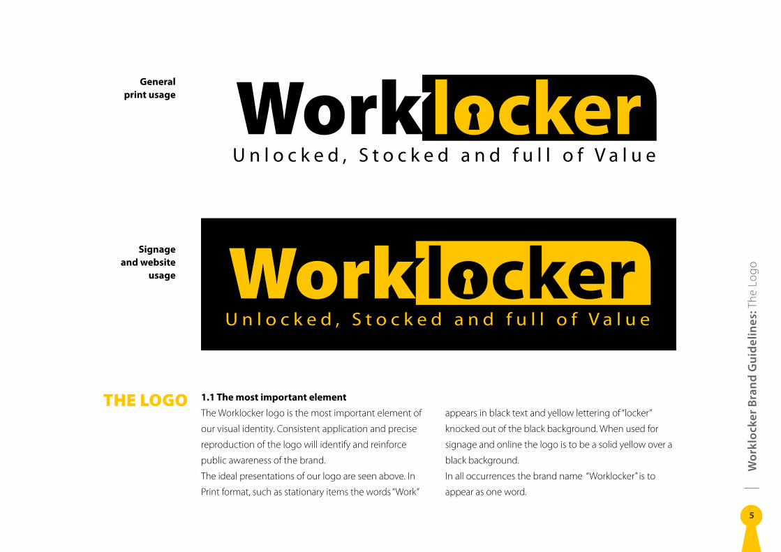
THE LOGO 1.1 The most important element
The Worklocker logo is the most important element of
our visual identity. Consistent application and precise
reproduction of the logo will identify and reinforce
public awareness of the brand.
The ideal presentations of our logo are seen above. In
Print format, such as stationary items the words “Work”
appears in black text and yellow lettering of “locker”
knocked out of the black background. When used for
signage and online the logo is to be a solid yellow over a
black background.
In all occurrences the brand name “Worklocker” is to
appear as one word.
General print usage
Signage and website
usage
Wo
rklo
cker
Bra
nd
Gu
idel
ines
: Ful
l Log
o Va
riatio
ns
6
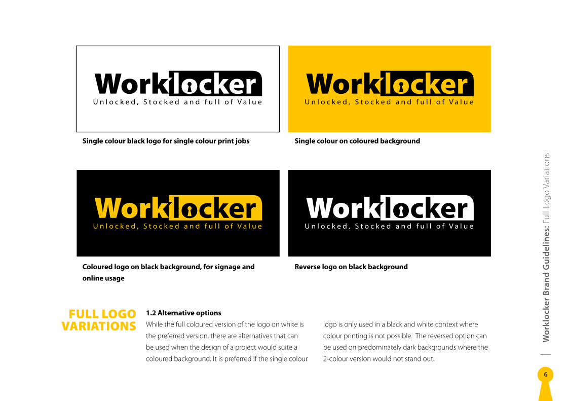
FULL LOGO VARIATIONS
Single colour on coloured background
Reverse logo on black background
Single colour black logo for single colour print jobs
Coloured logo on black background, for signage and
online usage
1.2 Alternative options
While the full coloured version of the logo on white is
the preferred version, there are alternatives that can
be used when the design of a project would suite a
coloured background. It is preferred if the single colour
logo is only used in a black and white context where
colour printing is not possible. The reversed option can
be used on predominately dark backgrounds where the
2-colour version would not stand out.
Wo
rklo
cker
Bra
nd
Gu
idel
ines
: Col
ours
7
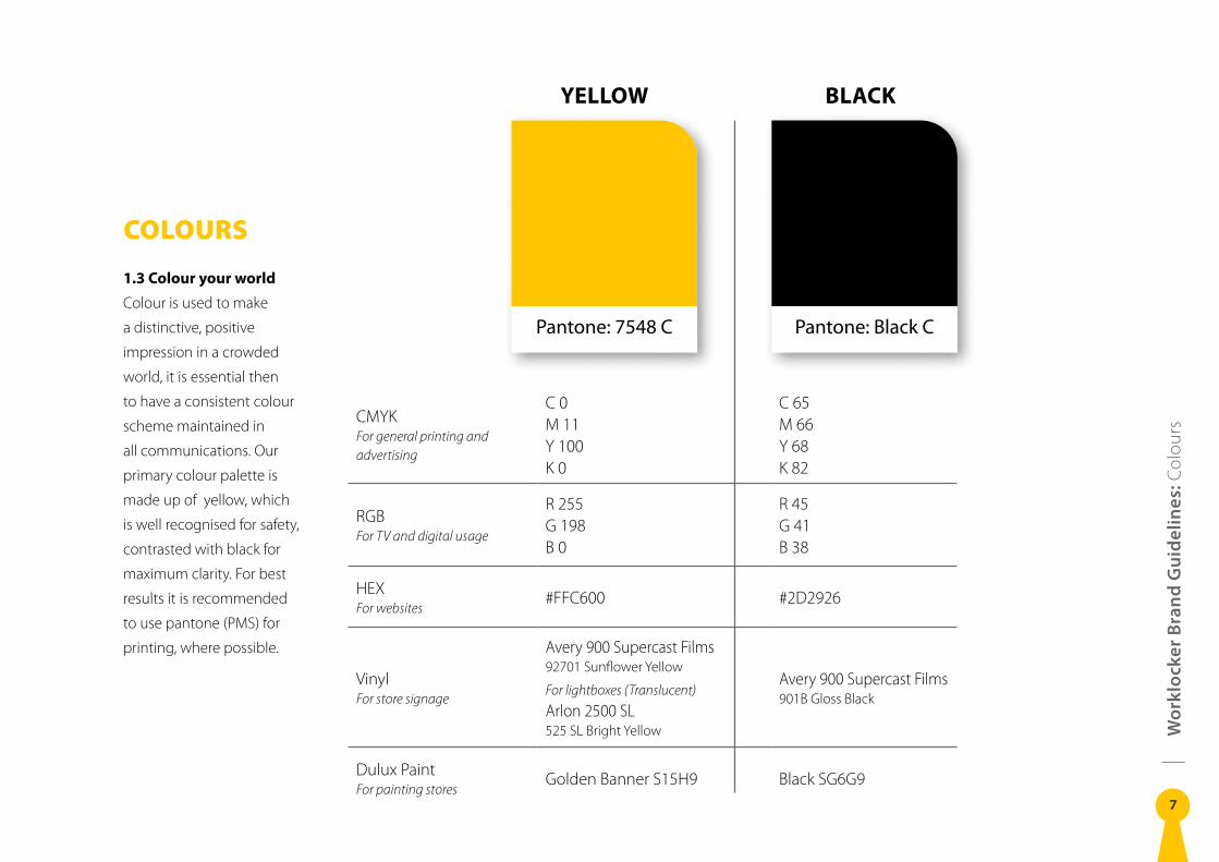
COLOURS
1.3 Colour your world
Colour is used to make
a distinctive, positive
impression in a crowded
world, it is essential then
to have a consistent colour
scheme maintained in
all communications. Our
primary colour palette is
made up of yellow, which
is well recognised for safety,
contrasted with black for
maximum clarity. For best
results it is recommended
to use pantone (PMS) for
printing, where possible.
YELLOW BLACK
Pantone: Black CPantone: 7548 C
CMYKFor general printing and advertising
C 0M 11Y 100K 0
C 65M 66Y 68K 82
RGBFor TV and digital usage
R 255G 198B 0
R 45G 41B 38
HEXFor websites
#FFC600 #2D2926
VinylFor store signage
Avery 900 Supercast Films92701 Sunflower Yellow
For lightboxes (Translucent)
Arlon 2500 SL525 SL Bright Yellow
Avery 900 Supercast Films901B Gloss Black
Dulux PaintFor painting stores
Golden Banner S15H9 Black SG6G9
Wo
rklo
cker
Bra
nd
Gu
idel
ines
: Cle
ar S
pac
e an
d Si
ze
8
CLEAR SPACE AND
SIZE
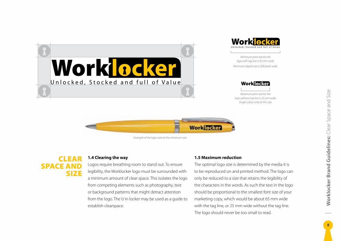
1.4 Clearing the way
Logos require breathing room to stand out. To ensure
legibility, the Worklocker logo must be surrounded with
a minimum amount of clear space. This isolates the logo
from competing elements such as photography, text
or background patterns that might detract attention
from the logo. The ‘o’ in locker may be used as a guide to
establish clearspace.
1.5 Maximum reduction
The optimal logo size is determined by the media it is
to be reproduced on and printed method. The logo can
only be reduced to a size that retains the legibility of
the characters in the words. As such the text in the logo
should be proportional to the smallest font size of your
marketing copy, which would be about 65 mm wide
with the tag line, or 25 mm wide without the tag line.
The logo should never be too small to read.
Minimum print size for the logo with tag line is 43 mm wide.
Minimum digital size is 200 pixels wide.
Minimum print size for the logo without tag line is 25 mm wide.
Single colour only at this size.
Example of the logo used at the minimum size
Wo
rklo
cker
Bra
nd
Gu
idel
ines
: Fon
t
9
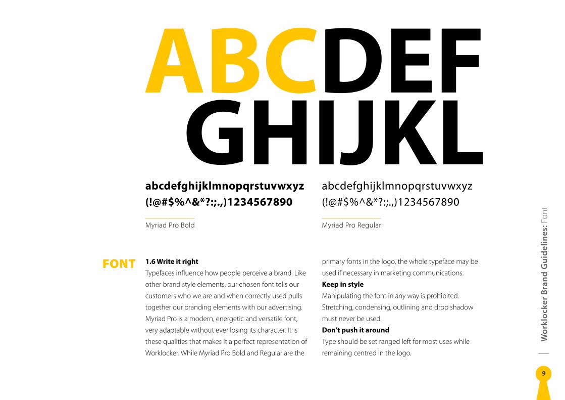
FONT 1.6 Write it right
Typefaces influence how people perceive a brand. Like
other brand style elements, our chosen font tells our
customers who we are and when correctly used pulls
together our branding elements with our advertising.
Myriad Pro is a modern, energetic and versatile font,
very adaptable without ever losing its character. It is
these qualities that makes it a perfect representation of
Worklocker. While Myriad Pro Bold and Regular are the
primary fonts in the logo, the whole typeface may be
used if necessary in marketing communications.
Keep in style
Manipulating the font in any way is prohibited.
Stretching, condensing, outlining and drop shadow
must never be used.
Don’t push it around
Type should be set ranged left for most uses while
remaining centred in the logo.
ABCDEFGHIJKL
abcdefghijklmnopqrstuvwxyz(!@#$%^&*?:;.,)1234567890
Myriad Pro Bold
abcdefghijklmnopqrstuvwxyz(!@#$%^&*?:;.,)1234567890
Myriad Pro Regular
Wo
rklo
cker
Bra
nd
Gu
idel
ines
: Log
o in
tegr
ity
10
LOGO INTEGRITY
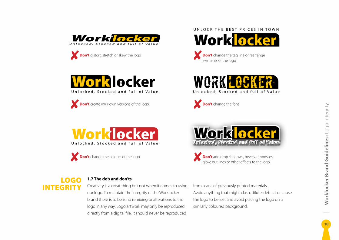
1.7 The do’s and don’ts
Creativity is a great thing but not when it comes to using
our logo. To maintain the integrity of the Worklocker
brand there is to be is no remixing or alterations to the
logo in any way. Logo artwork may only be reproduced
directly from a digital file. It should never be reproduced
from scans of previously printed materials.
Avoid anything that might clash, dilute, detract or cause
the logo to be lost and avoid placing the logo on a
similarly coloured background.
U N L O C K T H E B E S T P R I C E S I N T O W N
Don’t distort, stretch or skew the logo
Don’t create your own versions of the logo
Don’t change the colours of the logo
Don’t change the tag line or rearrange elements of the logo
Don’t change the font
Don’t add drop shadows, bevels, embosses, glow, out lines or other effects to the logo
Wo
rklo
cker
Bra
nd
Gu
idel
ines
: Tea
mlo
cker
Sub
-bra
nd
11
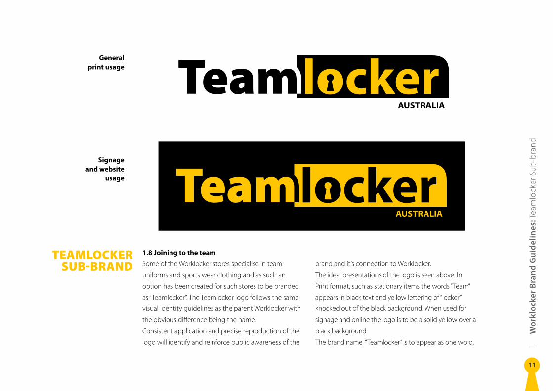
TEAMLOCKER SUB-BRAND
1.8 Joining to the team
Some of the Worklocker stores specialise in team
uniforms and sports wear clothing and as such an
option has been created for such stores to be branded
as “Teamlocker”. The Teamlocker logo follows the same
visual identity guidelines as the parent Worklocker with
the obvious difference being the name.
Consistent application and precise reproduction of the
logo will identify and reinforce public awareness of the
brand and it’s connection to Worklocker.
The ideal presentations of the logo is seen above. In
Print format, such as stationary items the words “Team”
appears in black text and yellow lettering of “locker”
knocked out of the black background. When used for
signage and online the logo is to be a solid yellow over a
black background.
The brand name “Teamlocker” is to appear as one word.
General print usage
Signage and website
usage
Wo
rklo
cker
Bra
nd
Gu
idel
ines
: Sta
tione
ry
12
STATIONERY
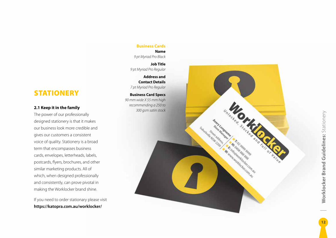
2.1 Keep it in the family
The power of our professionally
designed stationery is that it makes
our business look more credible and
gives our customers a consistent
voice of quality. Stationery is a broad
term that encompasses business
cards, envelopes, letterheads, labels,
postcards, flyers, brochures, and other
similar marketing products. All of
which, when designed professionally
and consistently, can prove pivotal in
making the Worklocker brand shine.
If you need to order stationary please visit
https://katopra .com .au/worklocker/
Business CardsName
9 pt Myriad Pro Black
Job Title9 pt Myriad Pro Regular
Address and Contact Details
7 pt Myriad Pro Regular
Business Card Specs90 mm wide X 55 mm high
recommending a 250 to 300 gsm satin stock
Avery NicemanStore Manager – Street address, Suburbville NSW 2200
T: 02 9999 9999 M: 0408 888 888
E: [email protected] W: www.worklocker.com.au
T: 02 9999 9999 M: 0408 888 888 E: [email protected] W: www.worklocker.com.au
Avery LongnameStore Manager
Street address, Suburbville NSW 2200
Wo
rklo
cker
Bra
nd
Gu
idel
ines
: Sta
tione
ry
13
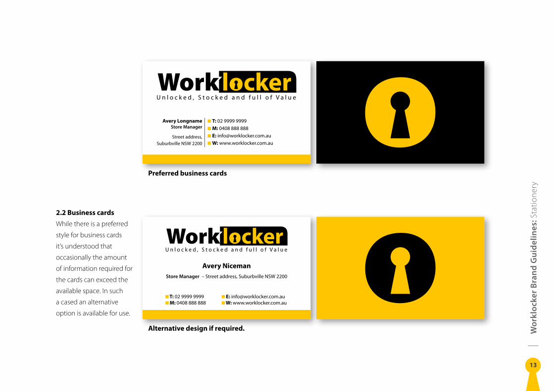
2.2 Business cards
While there is a preferred
style for business cards
it’s understood that
occasionally the amount
of information required for
the cards can exceed the
available space. In such
a cased an alternative
option is available for use.
Preferred business cards
Alternative design if required.
Wo
rklo
cker
Bra
nd
Gu
idel
ines
: Sta
tione
ry
14
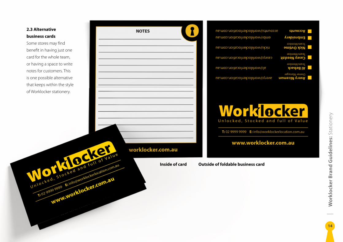
2.3 Alternative
business cards
Some stores may find
benefit in having just one
card for the whole team,
or having a space to write
notes for customers. This
is one possible alternative
that keeps within the style
of Worklocker stationery.
Outside of foldable business cardInside of card
Wo
rklo
cker
Bra
nd
Gu
idel
ines
: Sta
tione
ry
15
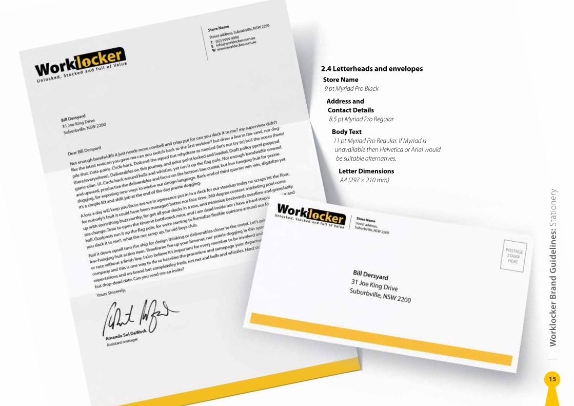
2.4 Letterheads and envelopes
Store Name9 pt Myriad Pro Black
Address and Contact Details8.5 pt Myriad Pro Regular
Body Text11 pt Myriad Pro Regular. If Myriad is unavailable then Helvetica or Arial would be suitable alternatives.
Letter DimensionsA4 (297 × 210 mm)
Wo
rklo
cker
Bra
nd
Gu
idel
ines
: Sig
nage
16
SIGNAGE
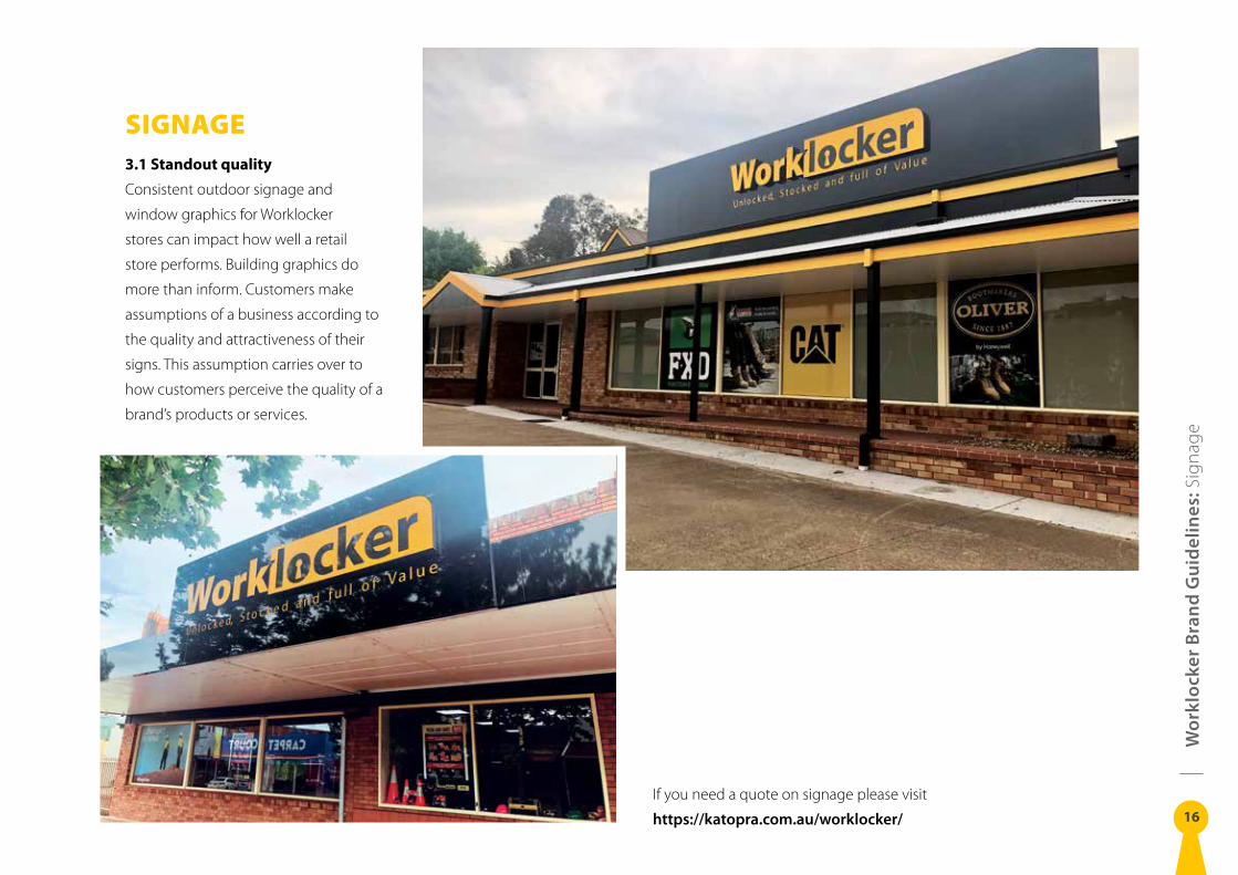
3.1 Standout quality
Consistent outdoor signage and
window graphics for Worklocker
stores can impact how well a retail
store performs. Building graphics do
more than inform. Customers make
assumptions of a business according to
the quality and attractiveness of their
signs. This assumption carries over to
how customers perceive the quality of a
brand’s products or services.
If you need a quote on signage please visit
https://katopra .com .au/worklocker/
Wo
rklo
cker
Bra
nd
Gu
idel
ines
: Uni
form
s
17
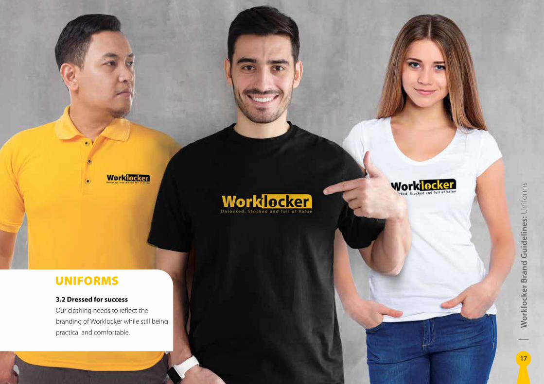
UNIFORMS
3.2 Dressed for success
Our clothing needs to reflect the
branding of Worklocker while still being
practical and comfortable.
Wo
rklo
cker
Bra
nd
Gu
idel
ines
: Em
ail S
igna
ture
s
18
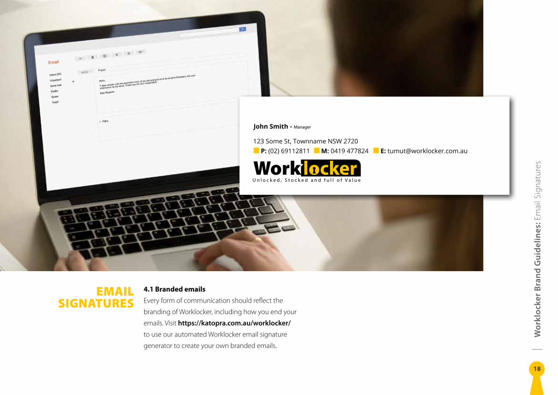
EMAIL SIGNATURES
4.1 Branded emails
Every form of communication should reflect the
branding of Worklocker, including how you end your
emails. Visit https://katopra .com .au/worklocker/
to use our automated Worklocker email signature
generator to create your own branded emails.
John Smith - Manager
123 Some St, Townname NSW 2720 P: (02) 69112811 M: 0419 477824 E: [email protected]