Bio 211 - General Ecology, Fall 2005 SPSS manual 05.pdf · Bio 211 - General Ecology, Fall 2005...
23
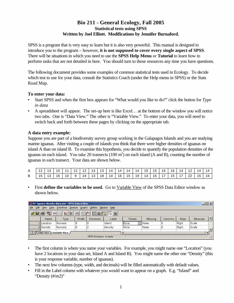
1 Bio 211 - General Ecology, Fall 2005 Statistical tests using SPSS Written by Joel Elliott. Modifications by Jennifer Burnaford. SPSS is a program that is very easy to learn but it is also very powerful. This manual is designed to introduce you to the program – however, it is not supposed to cover every single aspect of SPSS. There will be situations in which you need to use the SPSS Help Menu or Tutorial to learn how to perform tasks that are not detailed in here. You should turn to those resources any time you have questions. The following document provides some examples of common statistical tests used in Ecology. To decide which test to use for your data, consult the Statistics Coach (under the Help menu in SPSS) or the Stats Road Map. To enter your data: • Start SPSS and when the first box appears for “What would you like to do?” click the button for Type in data • A spreadsheet will appear. The set-up here is like Excel… at the bottom of the window you will notice two tabs. One is “Data View.” The other is “Variable View.” To enter your data, you will need to switch back and forth between these pages by clicking on the appropriate tab. A data entry example: Suppose you are part of a biodiversity survey group working in the Galapagos Islands and you are studying marine iguanas. After visiting a couple of islands you think that there were higher densities of iguanas on island A than on island B. To examine this hypothesis, you decide to quantify the population densities of the iguanas on each island. You take 20 transects (100 m 2 ) on each island (A and B), counting the number of iguanas in each transect. Your data are shown below. A 12 13 10 11 12 12 13 13 14 14 14 14 15 15 15 16 14 12 14 14 B 15 13 16 10 9 24 13 18 14 16 15 19 14 16 17 15 17 22 15 16 • First define the variables to be used. Go to Variable View of the SPSS Data Editor window as shown below. • The first column is where you name your variables. For example, you might name one “Location” (you have 2 locations in your data set, Island A and Island B). You might name the other one “Density” (this is your response variable, number of iguanas). • The next few columns (type, width, and decimals) will be filled automatically with default values. • Fill in the Label column with whatever you would want to appear on a graph. E.g. “Island” and “Density (#/m2)”
Transcript of Bio 211 - General Ecology, Fall 2005 SPSS manual 05.pdf · Bio 211 - General Ecology, Fall 2005...
1
Bio 211 - General Ecology, Fall 2005 Statistical tests using SPSS
Written by Joel Elliott. Modifications by Jennifer Burnaford. SPSS is a program that is very easy to learn but it is also very powerful. This manual is designed to introduce you to the program – however, it is not supposed to cover every single aspect of SPSS. There will be situations in which you need to use the SPSS Help Menu or Tutorial to learn how to perform tasks that are not detailed in here. You should turn to those resources any time you have questions. The following document provides some examples of common statistical tests used in Ecology. To decide which test to use for your data, consult the Statistics Coach (under the Help menu in SPSS) or the Stats Road Map. To enter your data: • Start SPSS and when the first box appears for “What would you like to do?” click the button for Type
in data • A spreadsheet will appear. The set-up here is like Excel… at the bottom of the window you will notice
two tabs. One is “Data View.” The other is “Variable View.” To enter your data, you will need to switch back and forth between these pages by clicking on the appropriate tab.
A data entry example: Suppose you are part of a biodiversity survey group working in the Galapagos Islands and you are studying marine iguanas. After visiting a couple of islands you think that there were higher densities of iguanas on island A than on island B. To examine this hypothesis, you decide to quantify the population densities of the iguanas on each island. You take 20 transects (100 m2) on each island (A and B), counting the number of iguanas in each transect. Your data are shown below. A 12 13 10 11 12 12 13 13 14 14 14 14 15 15 15 16 14 12 14 14 B 15 13 16 10 9 24 13 18 14 16 15 19 14 16 17 15 17 22 15 16
• First define the variables to be used. Go to Variable View of the SPSS Data Editor window as
shown below.
• The first column is where you name your variables. For example, you might name one “Location” (you
have 2 locations in your data set, Island A and Island B). You might name the other one “Density” (this is your response variable, number of iguanas).
• The next few columns (type, width, and decimals) will be filled automatically with default values. • Fill in the Label column with whatever you would want to appear on a graph. E.g. “Island” and
“Density (#/m2)”

2
• Next is the Values column. What you will want to do is represent the different locations (Island A or B) using numbers (so Location A will be “1” and Island B will “2”). To do this, you need to assign values to your categorical explanatory variable. In the Values column, double-click on the “…” and a dialog box will appear as below. Type in “1” in the value cell, and “A” in the value label cell. Hit Add. Type in “2” in the value cell, and “B” in the value label cell. Hit Add. The value and the appropriate label in each input box and then they will appear in the larger box below. Hit OK.
• The last column you need to deal with is the Measure column. For continuous variables (e.g. Density)
leave the default option (Scale). For Categorical variables (e.g. Location) choose Nominal. Now switch to Data View. You will see that your columns are now titled… Location and Density. • To make the value labels appear in the spreadsheet pull down the View menu and choose Value
Labels. • You can now enter your data in the columns. Each row is a single observation. Each density measure
is next to a symbol indicating which Island it came from. You must enter the location as a number. So in this case, enter “1” if the observation is from Island A, and “2” if the observation is from Island B. (If you try to enter a letter, the program will make a noise at you). Since you have chosen “View Value Labels” and entered your value labels in the Variable View window, when you type “1” the letter “A” will appear. Oooh. After you’ve entered all the values for Island A, enter the ones from Island B below them. The top of your data table will eventually look like this:
• Once you have the data entered you want to summarize the trends in the data. There a variety of
statistical measures for summarizing your data, and you want to explore your data by making tables and
3
graphs. To help you do this you can use the Statistics Coach found under the Help menu in SPSS, or you can go directly to the Analyze menu and choose the appropriate tests.
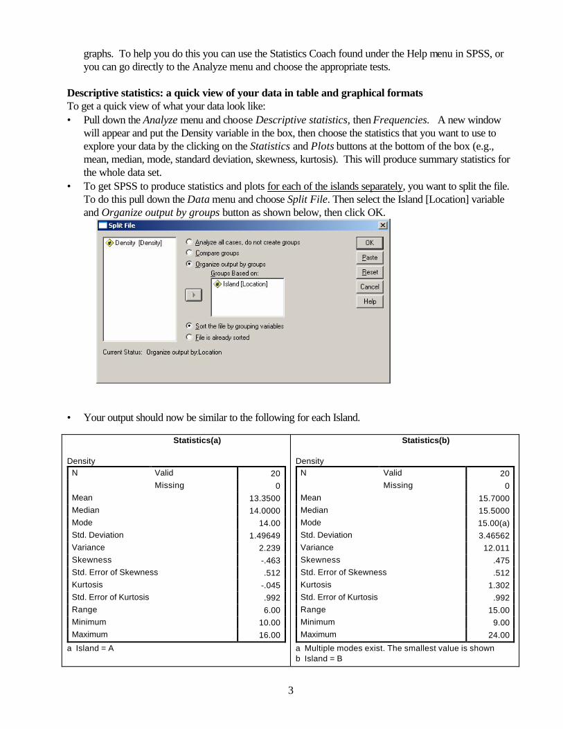
Descriptive statistics: a quick view of your data in table and graphical formats To get a quick view of what your data look like: • Pull down the Analyze menu and choose Descriptive statistics, then Frequencies. A new window
will appear and put the Density variable in the box, then choose the statistics that you want to use to explore your data by the clicking on the Statistics and Plots buttons at the bottom of the box (e.g., mean, median, mode, standard deviation, skewness, kurtosis). This will produce summary statistics for the whole data set.
• To get SPSS to produce statistics and plots for each of the islands separately, you want to split the file. To do this pull down the Data menu and choose Split File. Then select the Island [Location] variable and Organize output by groups button as shown below, then click OK.
• Your output should now be similar to the following for each Island. Statistics(a) Density
Valid 20 N Missing 0
Mean 13.3500 Median 14.0000 Mode 14.00 Std. Deviation 1.49649 Variance 2.239 Skewness -.463 Std. Error of Skewness .512 Kurtosis -.045 Std. Error of Kurtosis .992 Range 6.00 Minimum 10.00 Maximum 16.00
a Island = A
Statistics(b) Density
Valid 20 N Missing 0
Mean 15.7000 Median 15.5000 Mode 15.00(a) Std. Deviation 3.46562 Variance 12.011 Skewness .475 Std. Error of Skewness .512 Kurtosis 1.302 Std. Error of Kurtosis .992 Range 15.00 Minimum 9.00 Maximum 24.00
a Multiple modes exist. The smallest value is shown b Island = B
4
10.00 12.00 14.00 16.00
Density
0
1
2
3
4
5
6
7
Fre
qu
ency
Mean = 13.35Std. Dev. = 1.49649N = 20
Island: A
Histogram
9.00 12.00 15.00 18.00 21.00 24.00
Density
0
2
4
6
8
10
Fre
qu
ency
Mean = 15.70Std. Dev. = 3.46562N = 20
Island: B
Histogram
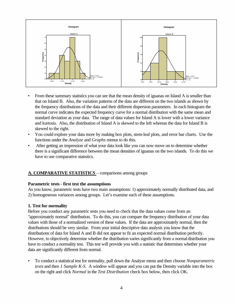
• From these summary statistics you can see that the mean density of iguanas on Island A is smaller than
that on Island B. Also, the variation patterns of the data are different on the two islands as shown by the frequency distributions of the data and their different dispersion parameters. In each histogram the normal curve indicates the expected frequency curve for a normal distribution with the same mean and standard deviation as your data. The range of data values for Island A is lower with a lower variance and kurtosis. Also, the distribution of Island A is skewed to the left whereas the data for Island B is skewed to the right.
• You could explore your data more by making box plots, stem-leaf plots, and error bar charts. Use the functions under the Analyze and Graphs menus to do this.
• After getting an impression of what your data look like you can now move on to determine whether there is a significant difference between the mean densities of iguanas on the two islands. To do this we have to use comparative statistics.
A. COMPARATIVE STATISTICS – comparisons among groups Parametric tests - first test the assumptions As you know, parametric tests have two main assumptions: 1) approximately normally distributed data, and 2) homogeneous variances among groups. Let’s examine each of these assumptions. 1. Test for normality Before you conduct any parametric tests you need to check that the data values come from an "approximately normal" distribution. To do this, you can compare the frequency distribution of your data values with those of a normalized version of these values. If the data are approximately normal, then the distributions should be very similar. From your initial descriptive data analysis you know that the distributions of data for Island A and B did not appear to fit an expected normal distribution perfectly. However, to objectively determine whether the distribution varies significantly from a normal distribution you have to conduct a normality test. This test will provide you with a statistic that determines whether your data are significantly different from normal. • To conduct a statistical test for normality, pull down the Analyze menu and then choose Nonparametric
tests and then 1 Sample K-S. A window will appear and you can put the Density variable into the box on the right and click Normal in the Test Distribution check box below, then click OK.
5
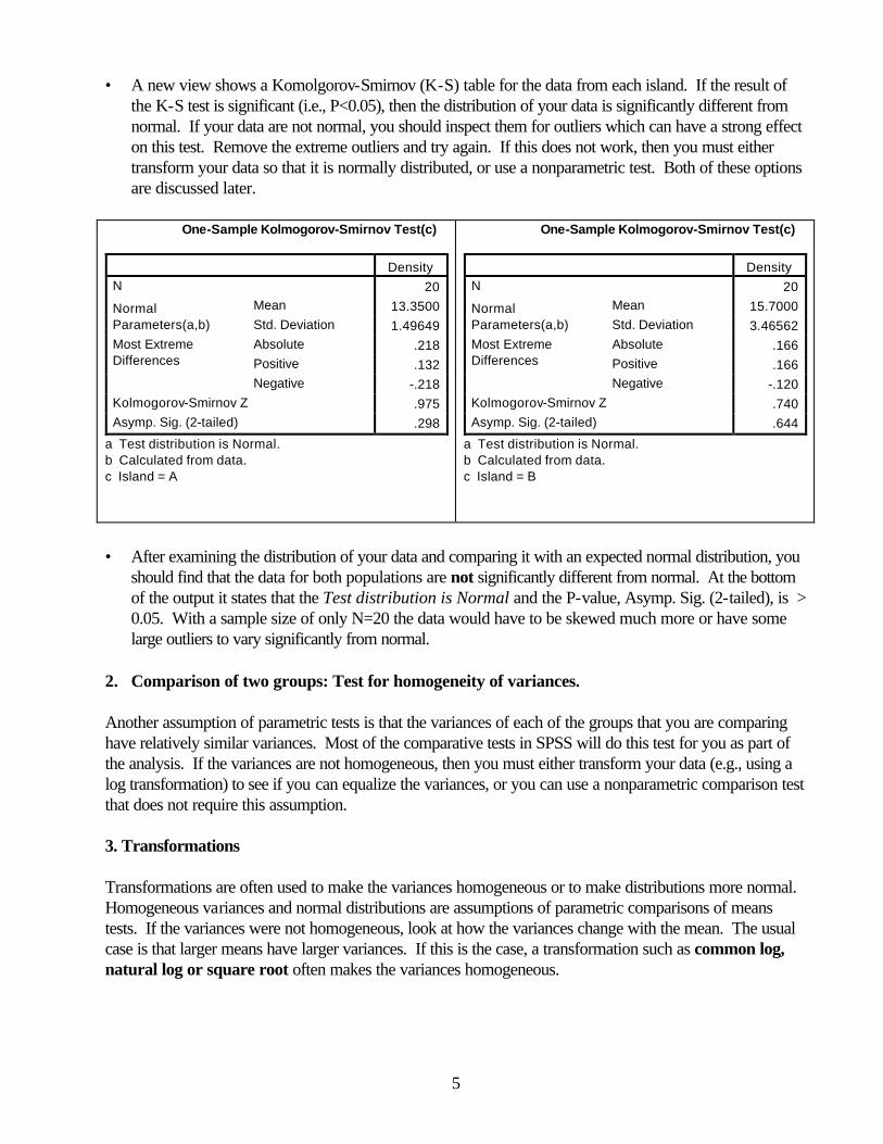
• A new view shows a Komolgorov-Smirnov (K-S) table for the data from each island. If the result of the K-S test is significant (i.e., P<0.05), then the distribution of your data is significantly different from normal. If your data are not normal, you should inspect them for outliers which can have a strong effect on this test. Remove the extreme outliers and try again. If this does not work, then you must either transform your data so that it is normally distributed, or use a nonparametric test. Both of these options are discussed later.
One-Sample Kolmogorov-Smirnov Test(c)
Density N 20
Mean 13.3500 Normal Parameters(a,b) Std. Deviation 1.49649
Absolute .218 Positive .132
Most Extreme Differences
Negative -.218 Kolmogorov-Smirnov Z .975 Asymp. Sig. (2-tailed) .298
a Test distribution is Normal. b Calculated from data. c Island = A
One-Sample Kolmogorov-Smirnov Test(c)
Density N 20
Mean 15.7000 Normal Parameters(a,b) Std. Deviation 3.46562
Absolute .166 Positive .166
Most Extreme Differences
Negative -.120 Kolmogorov-Smirnov Z .740 Asymp. Sig. (2-tailed) .644
a Test distribution is Normal. b Calculated from data. c Island = B
• After examining the distribution of your data and comparing it with an expected normal distribution, you
should find that the data for both populations are not significantly different from normal. At the bottom of the output it states that the Test distribution is Normal and the P-value, Asymp. Sig. (2-tailed), is > 0.05. With a sample size of only N=20 the data would have to be skewed much more or have some large outliers to vary significantly from normal.
2. Comparison of two groups: Test for homogeneity of variances. Another assumption of parametric tests is that the variances of each of the groups that you are comparing have relatively similar variances. Most of the comparative tests in SPSS will do this test for you as part of the analysis. If the variances are not homogeneous, then you must either transform your data (e.g., using a log transformation) to see if you can equalize the variances, or you can use a nonparametric comparison test that does not require this assumption. 3. Transformations Transformations are often used to make the variances homogeneous or to make distributions more normal. Homogeneous variances and normal distributions are assumptions of parametric comparisons of means tests. If the variances were not homogeneous, look at how the variances change with the mean. The usual case is that larger means have larger variances. If this is the case, a transformation such as common log, natural log or square root often makes the variances homogeneous.

6
To transform your data: • Go back to the spreadsheet of your data and pull down the Transform menu and choose Compute. A
new window will pop up. • Create a new column in your spreadsheet for the transformed output by typing a descriptive column
header in the Target Variable box. For this example, you might use Log_Density. • Now you can transform the variable by: 1) using the calculator, 2) choosing functions from the box on
the lower right, or 3) typing the transformation in the Numeric Expression box. • To use the menu… in the Function Group box, click on “Arithmetic”. This will bring up a bunch of
options. Scroll down to your desired function (e.g. LN, SQRT, etc). • For this example choose the LG10(numexpr) function from the box on the lower right (double click on
it) and Density as shown below, then click OK.
• You now have a new column (Log_Density) with the log transformed data. You can use a variety of transformations to try and make the variances of the different groups equal or normalize the data. If your data now meet the assumptions of the parametric test, go on with the parametric comparison of means test using the transformed data. If the transformed data still do not meet the assumption, you can do a nonparametric test instead, such as a Mann-Whitney U test on the original data. This test is described later in this handout. A special case of transformation should also be mentioned here. Whenever your data are percents (e.g., % cover) they will generally not be normally distributed. To make percent data normal, you should do an arcsine-square root transformation of the percent data (percents/100). Both of these functions are in the menu in the dialog box. The composite function to be put into the Numeric Expression box would look like: arcsin(sqrt(percent data/100)).

7
4. Two-sample t-test This test compares the means from two groups, such as the density data for the two different iguana populations. To run a two-sample t-test on the data: • First remove any Split variable commands that you have placed on your data set by pulling down the
Data menu and choose Split File, and then clicking the button for Analyze all cases, do not create groups. Then click OK.
• Then pull down the Analyze menu and choose Compare Means, and then Independent Samples T-test.
• In the dialog box put the Density variable in the Test Variable(s) box and the Location variable in the Grouping Variable box as shown below.
• Then click on the Define Groups button and put in the names of the groups in each box as shown
below. The click Continue and OK.
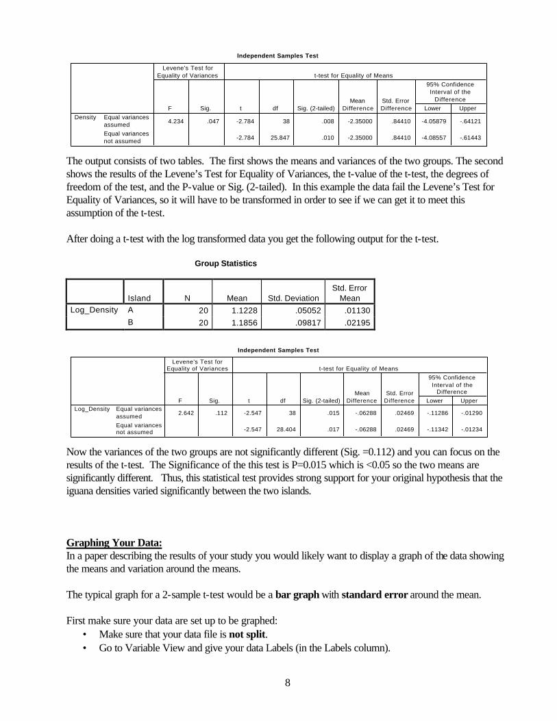
• The following tables will be displayed: Group Statistics
Island N Mean Std. Deviation Std. Error
Mean A 20 13.3500 1.49649 .33462 Density B 20 15.7000 3.46562 .77494
8
Independent Samples Test
4.234 .047 -2.784 38 .008 -2.35000 .84410 -4.05879 -.64121
-2.784 25.847 .010 -2.35000 .84410 -4.08557 -.61443
Equal variancesassumedEqual variancesnot assumed
DensityF Sig.
Levene's Test forEquality of Variances
t df Sig. (2-tailed)Mean
DifferenceStd. ErrorDifference Lower Upper
95% ConfidenceInterval of the
Difference
t-test for Equality of Means
The output consists of two tables. The first shows the means and variances of the two groups. The second shows the results of the Levene’s Test for Equality of Variances, the t-value of the t-test, the degrees of freedom of the test, and the P-value or Sig. (2-tailed). In this example the data fail the Levene’s Test for Equality of Variances, so it will have to be transformed in order to see if we can get it to meet this assumption of the t-test. After doing a t-test with the log transformed data you get the following output for the t-test. Group Statistics
Island N Mean Std. Deviation Std. Error
Mean Log_Density A 20 1.1228 .05052 .01130 B 20 1.1856 .09817 .02195
Independent Samples Test
2.642 .112 -2.547 38 .015 -.06288 .02469 -.11286 -.01290
-2.547 28.404 .017 -.06288 .02469 -.11342 -.01234
Equal variancesassumedEqual variancesnot assumed
Log_DensityF Sig.
Levene's Test forEquality of Variances
t df Sig. (2-tailed)Mean
DifferenceStd. Error
Difference Lower Upper
95% ConfidenceInterval of the
Difference
t-test for Equality of Means
Now the variances of the two groups are not significantly different (Sig. =0.112) and you can focus on the results of the t-test. The Significance of the this test is P=0.015 which is <0.05 so the two means are significantly different. Thus, this statistical test provides strong support for your original hypothesis that the iguana densities varied significantly between the two islands. Graphing Your Data: In a paper describing the results of your study you would likely want to display a graph of the data showing the means and variation around the means. The typical graph for a 2-sample t-test would be a bar graph with standard error around the mean. First make sure your data are set up to be graphed:
• Make sure that your data file is not split. • Go to Variable View and give your data Labels (in the Labels column).

9
• Identify your categorical variable (e.g. site, location, etc.): in the Measure column, click on the cell and select Nominal (the default value is Scale). Leave the response variable as Scale.
Now pull down the Graphs menu and choose Interactive then Bar.
• On the right is a graphic which represents your two axes. You want to define the variables for each axis by putting them into the appropriate cells. The default value for the Y axis (for some unknown reason) is “Count”.
• Grab your categorical variable from the left window and drag to the x axis. • Grab your response variable and drag to the y axis. • At the bottom, check to make sure that under “Bars Represent…” it says “Means” • Choose the “Error Bars” tab. Select “Standard Error of the Mean” • Choose the “Titles” tab. Do not put a title or subtitle.. but DO put in your caption with all the
appropriate information. • Hit OK
To pretty it up:
• Double click on a bar. Choose a light colour or non-solid fill so that you can see the error bars. In the Bar Labels section, unclick the Values box.
• For presentation in a paper, you don’t want any information on the sides – you want info about error bars and sample size in the caption. Double click on any floating information. Unclick the box that says “display key.”
To print the page with the graph and caption, make sure nothing is selected, go to Print (under file or choose the icon) and print the page.
Figure 1. Mean density (number per 100 m2, + 95% C.L.) of iguanas on two small islands in the Galapagos archipelago. A type of graph that you might use if you do a Mann-Whitney U test is the boxplot. This plot shows the median, the interquartile ranges, and any outliers in the data.
• To make a boxplot pull down the Graphs menu and choose Interactive then Boxplot. Follow the instructions above re: data preparation for graphs.
• Put your categorical variable on the x axis and your response variable on the y.
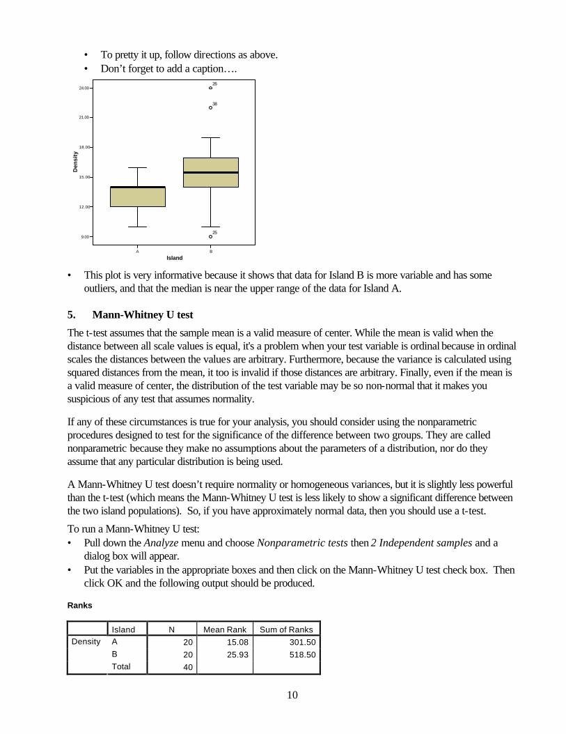
10
• To pretty it up, follow directions as above. • Don’t forget to add a caption….
A B
Island
9.00
12.00
15.00
18.00
21.00
24.00
Den
sity
25
38
26
• This plot is very informative because it shows that data for Island B is more variable and has some
outliers, and that the median is near the upper range of the data for Island A. 5. Mann-Whitney U test
The t-test assumes that the sample mean is a valid measure of center. While the mean is valid when the distance between all scale values is equal, it's a problem when your test variable is ordinal because in ordinal scales the distances between the values are arbitrary. Furthermore, because the variance is calculated using squared distances from the mean, it too is invalid if those distances are arbitrary. Finally, even if the mean is a valid measure of center, the distribution of the test variable may be so non-normal that it makes you suspicious of any test that assumes normality.
If any of these circumstances is true for your analysis, you should consider using the nonparametric procedures designed to test for the significance of the difference between two groups. They are called nonparametric because they make no assumptions about the parameters of a distribution, nor do they assume that any particular distribution is being used.
A Mann-Whitney U test doesn’t require normality or homogeneous variances, but it is slightly less powerful than the t-test (which means the Mann-Whitney U test is less likely to show a significant difference between the two island populations). So, if you have approximately normal data, then you should use a t-test.
To run a Mann-Whitney U test: • Pull down the Analyze menu and choose Nonparametric tests then 2 Independent samples and a
dialog box will appear. • Put the variables in the appropriate boxes and then click on the Mann-Whitney U test check box. Then
click OK and the following output should be produced. Ranks
Island N Mean Rank Sum of Ranks A 20 15.08 301.50 B 20 25.93 518.50
Density
Total 40
11
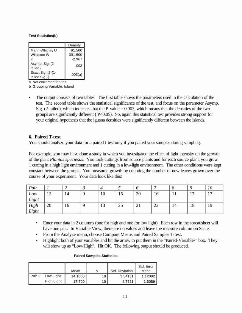
Test Statistics(b) Density Mann-Whitney U 91.500 Wilcoxon W 301.500 Z -2.967 Asymp. Sig. (2-tailed)
.003
Exact Sig. [2*(1-tailed Sig.)]
.003(a)
a Not corrected for ties. b Grouping Variable: Island • The output consists of two tables. The first table shows the parameters used in the calculation of the
test. The second table shows the statistical significance of the test, and focus on the parameter Asymp. Sig. (2-tailed), which indicates that the P-value = 0.003, which means that the densities of the two groups are significantly different ( P<0.05). So, again this statistical test provides strong support for your original hypothesis that the iguana densities were significantly different between the islands.
6. Paired T-test You should analyze your data for a paired t-test only if you paired your samples during sampling. For example, you may have done a study in which you investigated the effect of light intensity on the growth of the plant Plantus speciesus. You took cuttings from source plants and for each source plant, you grew 1 cutting in a high light environment and 1 cutting in a low-light environment. The other conditions were kept constant between the groups. You measured growth by counting the number of new leaves grown over the course of your experiment. Your data look like this: Pair 1 2 3 4 5 6 7 8 9 10 Low Light
12 14 9 10 15 20 16 11 17 17
High Light
20 16 9 13 25 21 22 14 18 19
• Enter your data in 2 columns (one for high and one for low light). Each row in the spreadsheet will
have one pair. In Variable View, there are no values and leave the measure column on Scale. • From the Analyze menu, choose Compare Means and Paired Samples T-test. • Highlight both of your variables and hit the arrow to put them in the “Paired-Variables” box. They
will show up as “Low-High”. Hit OK. The following output should be produced. Paired Samples Statistics
Mean N Std. Deviation Std. Error
Mean Low Light 14.1000 10 3.54181 1.12002 Pair 1 High Light 17.700 10 4.7621 1.5059

12
Paired Samples Correlations
N Correlation Sig. Pair 1 Low Light & High Light 10 .720 .019
Paired Samples Test
Paired Differences 95% Confidence
Interval of the Difference
Mean Std.
Deviation
Std. Error Mean Lower Upper t df
Sig. (2-tailed)
Pair 1
Low Light - High Light
-3.60000
3.30656 1.04563 -5.96537
-1.23463
-3.443 9 .007
• Remember, this analysis tests to see if the mean difference between individuals in a pair is =0. The null
hypothesis is that the difference is not different from zero. • The output consists of 3 tables. The first table shows the summary statistics for the 2 groups. The
second table shows information that you can ignore. The third table, the Paired Samples Test table, is the one you want. It shows the mean difference between individuals in a pair, the variation of the differences around the mean, your t-value, your df, and your p-value (labeled as Sig (2-tailed)). So, in this case, with p=0.007, this statistical test provides strong evidence that there was an effect of light intensity on leaf growth… plants in the high light treatment added more leaves than their counterpart plants in the low light treatment (gasp!).
7. Comparisons of three or more groups: One-way ANOVA and Post-hoc tests
Let’s move on to comparisons of three or more groups of data. To continue the example using iguana population density data, let’s add data from a series of 16 transects from a third Island C. Enter these data into your spreadsheet at the bottom of the column “Density”. Then edit the Value labels in the variable “Location” in the Variable View. Add a third Value (3) and Value label (C). Then type a 3 into the last cell of the “Location” column, then copy the C and paste it into the rest of the cells below.
Density (100 m2) C: 15 13 10 14 12 12 13 13 14 14 11 14 15 12 15 16

13
The appropriate parametric statistical test for continuous data with one independent variable and more than two groups is the One-way analysis of variance (ANOVA). It tests whether there is a significant difference among the means of the groups, and not which means are different from each other. In order to find out which means are significantly different from each other, you have to conduct post-hoc paired comparisons. They are called post-hoc, because you conduct the tests after you have completed an ANOVA and it shows whether there is a significant difference among the means. One of the Post-hoc tests is the Fisher PLSD (Protected Least Sig. Difference) test, which gives you a test of all pairwise combinations. To run the ANOVA test: • Pull down the Analyze menu and choose Compare Means and then One-way ANOVA. • In the dialog box put the Density variable in the Dependent List box and the Location variable in the
Factor box. Click on the Post Hoc button and then click on the LSD check box and then click Continue. Then click on the Options button and click on the Homogeneity of variance test check box and click Continue and then OK.
• A summary table of counts, means, std. dev. and std. errors, etc. will be shown along with a Levene’s
test of homogeneity of variances, and then an ANOVA table.
Descriptives
Density
20 13.3500 1.49649 .33462 12.6496 14.0504 10.00 16.0020 15.7000 3.46562 .77494 14.0780 17.3220 9.00 24.0016 13.3125 1.62147 .40537 12.4485 14.1765 10.00 16.0056 14.1786 2.63616 .35227 13.4726 14.8845 9.00 24.00
ABC
Total
N Mean Std. Deviation Std. Error Lower Bound Upper Bound
95% Confidence Interval forMean
Minimum Maximum
Test of Homogeneity of Variances
Density
3.237 2 53 .047
LeveneStatistic df1 df2 Sig.

14
• Since your variances are not homogeneous (p<0.05), the data do not meet one of the assumptions of the test and you cannot proceed directly to using the results of the ANOVA comparisons of means. You have two main choices of what to do. You can either transform your data to attempt to make the variances homogeneous or you may run a test that does not require homogeneity of variances (a non-parametric test like Welch’s Test for three or more groups).
• First, try transforming the data for each population (try a log transformation), and then run the test again. The following tables are for the transformed data.
Descriptives
Log_Density
20 1.1228 .05052 .01130 1.0991 1.1464 1.00 1.2020 1.1856 .09817 .02195 1.1397 1.2316 .95 1.3816 1.1211 .05472 .01368 1.0919 1.1503 1.00 1.2056 1.1447 .07729 .01033 1.1240 1.1654 .95 1.38
ABC
Total
N Mean Std. Deviation Std. Error Lower Bound Upper Bound
95% Confidence Interval forMean
Minimum Maximum
Test of Homogeneity of Variances
Log_Density
1.902 2 53 .159
LeveneStatistic df1 df2 Sig.
ANOVA
Log_Density
.052 2 .026 4.989 .010
.277 53 .005
.329 55
Between GroupsWithin GroupsTotal
Sum ofSquares df Mean Square F Sig.
• The ANOVA tested whether there were any significant differences in mean density among the three populations. Look at the P-value in the ANOVA table (Sig.). If this P-value is > 0.05, then there are no significant differences among any of the means. If the P-value is < 0.05, then at least one mean is different from the others. In this example, P=0.01 in the ANOVA table, and thus P<0.05, so the mean densities are significantly different.
• Now that you know the means are different, you want to find out which pairs of means are different from each other. e.g., is the density on Island A greater than B and C?
• The Post Hoc tests, Fisher LSD (Least Sig. Difference), allow you to examine all pairwise comparisons of means.
15
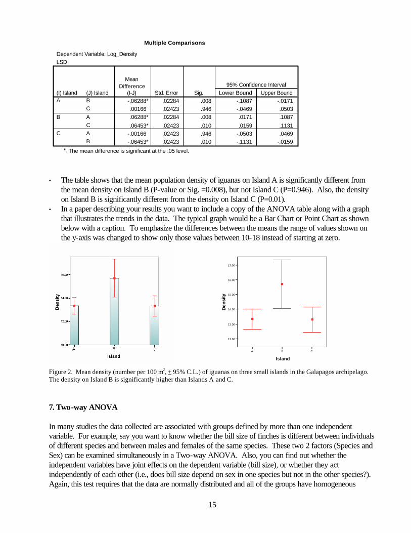
Multiple Comparisons
Dependent Variable: Log_DensityLSD
-.06288* .02284 .008 -.1087 -.0171.00166 .02423 .946 -.0469 .0503.06288* .02284 .008 .0171 .1087
.06453* .02423 .010 .0159 .1131-.00166 .02423 .946 -.0503 .0469-.06453* .02423 .010 -.1131 -.0159
(J) IslandBC
ACAB
(I) IslandA
B
C
MeanDifference
(I-J) Std. Error Sig. Lower Bound Upper Bound95% Confidence Interval
The mean difference is significant at the .05 level.*.
• The table shows that the mean population density of iguanas on Island A is significantly different from
the mean density on Island B (P-value or Sig. =0.008), but not Island C (P=0.946). Also, the density on Island B is significantly different from the density on Island C (P=0.01).
• In a paper describing your results you want to include a copy of the ANOVA table along with a graph that illustrates the trends in the data. The typical graph would be a Bar Chart or Point Chart as shown below with a caption. To emphasize the differences between the means the range of values shown on the y-axis was changed to show only those values between 10-18 instead of starting at zero.
A B C
Island
12.00
13.00
14.00
15.00
16.00
17.00
Den
sity
]
]
]
Figure 2. Mean density (number per 100 m2, + 95% C.L.) of iguanas on three small islands in the Galapagos archipelago. The density on Island B is significantly higher than Islands A and C. 7. Two-way ANOVA In many studies the data collected are associated with groups defined by more than one independent variable. For example, say you want to know whether the bill size of finches is different between individuals of different species and between males and females of the same species. These two 2 factors (Species and Sex) can be examined simultaneously in a Two-way ANOVA. Also, you can find out whether the independent variables have joint effects on the dependent variable (bill size), or whether they act independently of each other (i.e., does bill size depend on sex in one species but not in the other species?). Again, this test requires that the data are normally distributed and all of the groups have homogeneous
16
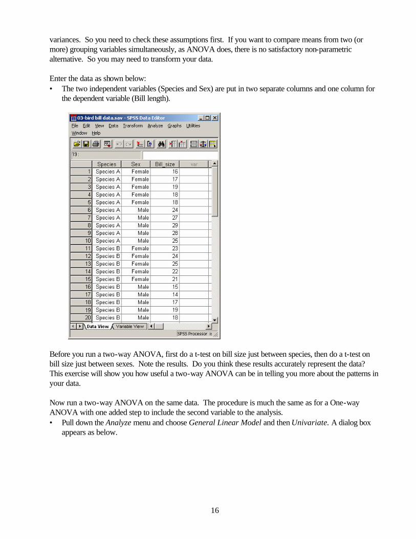
variances. So you need to check these assumptions first. If you want to compare means from two (or more) grouping variables simultaneously, as ANOVA does, there is no satisfactory non-parametric alternative. So you may need to transform your data. Enter the data as shown below: • The two independent variables (Species and Sex) are put in two separate columns and one column for
the dependent variable (Bill length).
Before you run a two-way ANOVA, first do a t-test on bill size just between species, then do a t-test on bill size just between sexes. Note the results. Do you think these results accurately represent the data? This exercise will show you how useful a two-way ANOVA can be in telling you more about the patterns in your data. Now run a two-way ANOVA on the same data. The procedure is much the same as for a One-way ANOVA with one added step to include the second variable to the analysis. • Pull down the Analyze menu and choose General Linear Model and then Univariate. A dialog box
appears as below.

17
• Then put the variables in the boxes as shown above and click Options…and click on the check boxes
for Descriptive Statistics and Homogeneity tests, then click Continue.
• then click OK and SPSS will produce the stats output.
Descriptive Statistics
Dependent Variable: Bill size
17.60 1.140 523.00 1.581 520.30 3.129 1026.60 2.074 516.60 2.074 521.60 5.621 1022.10 4.999 1019.80 3.795 1020.95 4.478 20
SpeciesSpecies ASpecies BTotalSpecies ASpecies BTotalSpecies ASpecies BTotal
SexFemale
Male
Total
Mean Std. Deviation N

18
Levene's Test of Equality of Error Variancesa
Dependent Variable: Bill size
1.193 3 16 .344F df1 df2 Sig.
Tests the null hypothesis that the error variance of thedependent variable is equal across groups.
Design: Intercept+Sex+Species+Sex * Speciesa.
Tests of Between-Subjects Effects
Dependent Variable: Bill size
331.350a 3 110.450 35.629 .0008778.050 1 8778.050 2831.629 .000
8.450 1 8.450 2.726 .11826.450 1 26.450 8.532 .010
296.450 1 296.450 95.629 .00049.600 16 3.100
9159.000 20380.950 19
SourceCorrected ModelInterceptSexSpeciesSex * SpeciesErrorTotalCorrected Total
Type III Sumof Squares df Mean Square F Sig.
R Squared = .870 (Adjusted R Squared = .845)a.
The output consists of Descriptive statistics, Levene’s Test of Equality of Error Variances, and the Two-Way ANOVA table. The means appear to be different among males and females of each group and among species. The ANOVA table shows the statistical significance of the differences among the means for each of the independent variables (main effects) and the interaction. The P-value associated with each independent variable tells you the probability that the means of the different levels of that variable are the same. So, again, if P<0.05, the levels of that variable are different. The P-value of the interaction term tells you the probability that the two variables act independently of each other and that different combinations of the variables have different effects.
In our bill size example, there is a significant difference in bill size between species but not between sexes. There is also a significant species-sex interaction. This indicates that the effect of sex differs between the species. To get a better impression of what the interaction term means, make a Bar Chart with error bars.

19
• If you look at the data, the interaction is apparent. In species A, the males have larger bills but in species B the females have larger bills. So simply looking at sex doesn’t tell us anything (as you saw when you did the t-test) and neither sex has a consistently larger bill. When you did the t-test, you found that species was not significant, but the two-way ANOVA found that species was significant, over and above the interaction. This suggests that species A has larger bills overall, mainly because of the large size of the males of Species A, but not always since it also depends on which sex it is. The take-home message from this analysis is that if there is a significant interaction term, the significance of the main effects cannot be fully accepted because of differences in the trends among different combinations of the variables. If the interaction term is not significant, then the statistical results for the main effects can be fully recognized.
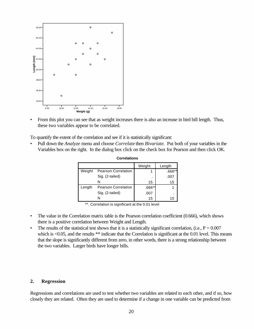
B. Relationships among variables 1. Correlations. If the values of two variables appear to be related to one another, but one is not dependent on the other, they are considered to be correlated. For example, fish weight and egg production are generally correlated, but neither variable is dependent on the other. The correlation coefficient, r, provides a quantitative measurement of how closely two variables are related. It ranges from 0 (no correlation) to 1 or -1 (the two variables are perfectly related, positively or negatively). Let’s examine the correlation between bird weight and bill length, using the data displayed below. Bird # 1 2 3 4 5 6 7 8 9 10 11 12 13 14 15 bird weight (g) 15 13 10 14 12 12 9 17 14 14 11 13 16 12 15 bill length (mm) 43 45 35 41 42 39 39 47 44 48 41 43 42 45 45 Enter the data above in a new spreadsheet and name the columns Weight and Length. To visualize what the correlation represents, make a plot of the data: • Pull down the Graphs menu and choose Scatter… and then choose Simple • Put the variable Length on the Y-axis and Weight on the X-axis and click OK. A graph will appear as
below.
20
8.00 10.00 12.00 14.00 16.00 18.00
Weight (g)
34.00
36.00
38.00
40.00
42.00
44.00
46.00
48.00
Len
gth
(mm
)
• From this plot you can see that as weight increases there is also an increase in bird bill length. Thus,
these two variables appear to be correlated. To quantify the extent of the correlation and see if it is statistically significant: • Pull down the Analyze menu and choose Correlate then Bivariate. Put both of your variables in the
Variables box on the right. In the dialog box click on the check box for Pearson and then click OK.
Correlations
1 .666**. .007
15 15.666** 1.007 .
15 15
Pearson CorrelationSig. (2-tailed)NPearson CorrelationSig. (2-tailed)N
Weight
Length
Weight Length
Correlation is significant at the 0.01 level(2-tailed).
**.
• The value in the Correlation matrix table is the Pearson correlation coefficient (0.666), which shows
there is a positive correlation between Weight and Length. • The results of the statistical test shows that it is a statistically significant correlation, (i.e., P = 0.007
which is <0.05, and the results ** indicate that the Correlation is significant at the 0.01 level. This means that the slope is significantly different from zero, in other words, there is a strong relationship between the two variables. Larger birds have longer bills.
2. Regression Regressions and correlations are used to test whether two variables are related to each other, and if so, how closely they are related. Often they are used to determine if a change in one variable can be predicted from
21
the change in another variable. A simple example is a one-to-one relationship between two variables, such as the relationship between the age and the number of growth rings of a tree. Another example is the relationship between the age and length of a fish.
Age (years) Length (cm) 1 12.2 2 14.3 3 15.7 4 16.1 5 18.8 6 19.0 7 20.4
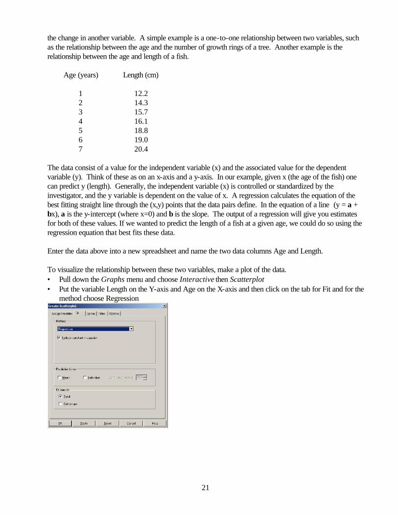
The data consist of a value for the independent variable (x) and the associated value for the dependent variable (y). Think of these as on an x-axis and a y-axis. In our example, given x (the age of the fish) one can predict y (length). Generally, the independent variable (x) is controlled or standardized by the investigator, and the y variable is dependent on the value of x. A regression calculates the equation of the best fitting straight line through the (x,y) points that the data pairs define. In the equation of a line (y = a + bx), a is the y-intercept (where x=0) and b is the slope. The output of a regression will give you estimates for both of these values. If we wanted to predict the length of a fish at a given age, we could do so using the regression equation that best fits these data. Enter the data above into a new spreadsheet and name the two data columns Age and Length. To visualize the relationship between these two variables, make a plot of the data. • Pull down the Graphs menu and choose Interactive then Scatterplot • Put the variable Length on the Y-axis and Age on the X-axis and then click on the tab for Fit and for the
method choose Regression
22
2.00 4.00 6.00
Age (years)
12.00
14.00
16.00
18.00
20.00
Len
gth
(cm
)
W
W
WW
WW
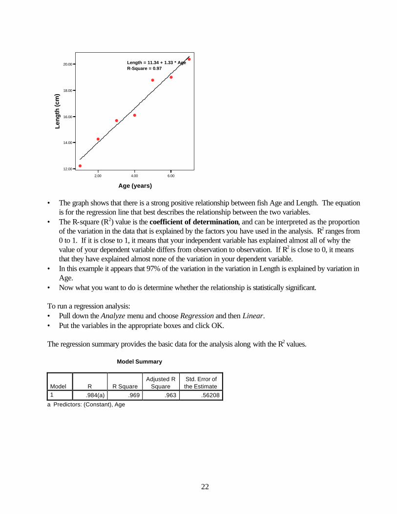
WLength = 11.34 + 1.33 * AgeR-Square = 0.97
• The graph shows that there is a strong positive relationship between fish Age and Length. The equation
is for the regression line that best describes the relationship between the two variables. • The R-square (R2) value is the coefficient of determination, and can be interpreted as the proportion
of the variation in the data that is explained by the factors you have used in the analysis. R2 ranges from 0 to 1. If it is close to 1, it means that your independent variable has explained almost all of why the value of your dependent variable differs from observation to observation. If R2 is close to 0, it means that they have explained almost none of the variation in your dependent variable.
• In this example it appears that 97% of the variation in the variation in Length is explained by variation in Age.
• Now what you want to do is determine whether the relationship is statistically significant. To run a regression analysis: • Pull down the Analyze menu and choose Regression and then Linear. • Put the variables in the appropriate boxes and click OK. The regression summary provides the basic data for the analysis along with the R2 values. Model Summary
Model R R Square Adjusted R
Square Std. Error of the Estimate
1 .984(a) .969 .963 .56208
a Predictors: (Constant), Age
23
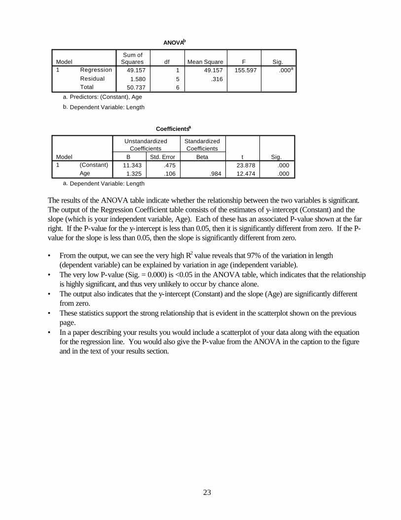
ANOVAb
49.157 1 49.157 155.597 .000a
1.580 5 .31650.737 6
RegressionResidualTotal
Model1
Sum ofSquares df Mean Square F Sig.
Predictors: (Constant), Agea.
Dependent Variable: Lengthb.
Coefficientsa
11.343 .475 23.878 .0001.325 .106 .984 12.474 .000
(Constant)Age
Model1
B Std. Error
UnstandardizedCoefficients
Beta
StandardizedCoefficients
t Sig.
Dependent Variable: Lengtha.
The results of the ANOVA table indicate whether the relationship between the two variables is significant. The output of the Regression Coefficient table consists of the estimates of y-intercept (Constant) and the slope (which is your independent variable, Age). Each of these has an associated P-value shown at the far right. If the P-value for the y-intercept is less than 0.05, then it is significantly different from zero. If the P-value for the slope is less than 0.05, then the slope is significantly different from zero.
• From the output, we can see the very high R2 value reveals that 97% of the variation in length
(dependent variable) can be explained by variation in age (independent variable). • The very low P-value (Sig. = 0.000) is <0.05 in the ANOVA table, which indicates that the relationship
is highly significant, and thus very unlikely to occur by chance alone. • The output also indicates that the y-intercept (Constant) and the slope (Age) are significantly different
from zero. • These statistics support the strong relationship that is evident in the scatterplot shown on the previous
page. • In a paper describing your results you would include a scatterplot of your data along with the equation
for the regression line. You would also give the P-value from the ANOVA in the caption to the figure and in the text of your results section.