Beyond Power Point
23
Lynda Kellam and Jenny Dale present…
-
Upload
uncg-university-libraries -
Category
Education
-
view
887 -
download
0
description
presented spring 2011 by the UNCG Libraries Instructional Tech Team
Transcript of Beyond Power Point

Lynda Kellam and Jenny Dale present…

Keep up to date with different toolsAdd some variety to your
presentationsCollaborate with co-presentersShare your presentations with the
world!


Web-based Create anywhere Stored remotely
Dynamic and visually interestinghttp://www.prezi.com

Web-basedCollaborativehttp://docs.google.com
Interested in learning more about Google applications? Join us next month for Googlicious in Elluminate – Wednesday 3/16 at noon!


Upload slide presentations to slideshare.net

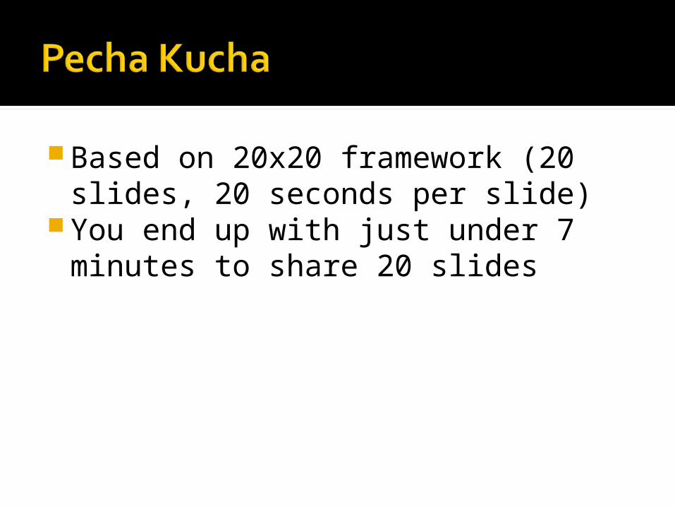
Based on 20x20 framework (20 slides, 20 seconds per slide)
You end up with just under 7 minutes to share 20 slides

10 slides, 20 seconds per slideSlides created by Amy Harris

There is nothing worse when you’re presenting than a wordy slide.
There are two reasons for this. First of all, it is nearly impossible for your audience to read so much text (especially if you’re in a large room)
Secondly, putting entire sentences on your PowerPoint slides encourages you to read directly from the slide, which means you are facing your PowerPoint and not your audience. Your audience is also less likely to pay attention to you talking because they can read what you’re going to say (if they can read it, that is).
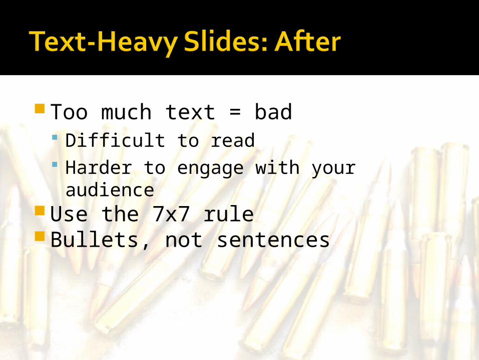
Too much text = bad Difficult to read Harder to engage with your audience
Use the 7x7 ruleBullets, not sentences

Like all things, moderation is keyMake them relevant and interesting
but not overwhelming to your content
If you have to explain your choice of images, maybe you should rethink

Like salt, images are great in moderation
Watermarking is your friendSo is Flickr (advanced searching)Some text + well-chosen images is
ideal
http://www.flickr.com/photos/peacockmodern/4501127980/ [by-nc-nd/2.0]
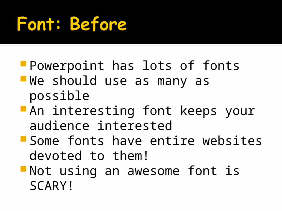
Powerpoint has lots of fontsWe should use as many as possible
An interesting font keeps your audience interested
Some fonts have entire websites devoted to them!
Not using an awesome font is SCARY!

KISSSans serif is easier to read onlineLet the geniuses at Microsoft help
you!Font size should be no less than 24
http://www.flickr.com/photos/lwr/52770741/ [by-nc-sa 2.0]

Animations are awesomePowerPoint has lots of themSo we’re obligated to use them allRIGHT??

Moderation is key (again)Good for revealing one point at a
timeStick with one motif
To incorporate animation, use the animation tab in PPT and choose “Animate” or “Custom Animation”


Keep it simple Complex graphs are more useful on handouts
Source: http://www.someecards.com/2010/11/15/the-simplest-pie-chart

Short, pithy presentationsOften showcase a tool or a projectTypically about 5 minutesFunUse of storytelling techniques
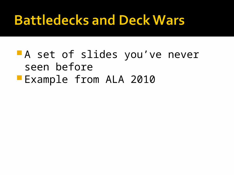
A set of slides you’ve never seen before
Example from ALA 2010

Thanks!