Before and After Photoshop- Double Page Spread
20
Before and After Photoshop Screenshot evidence Double Page Spread
-
Upload
mollie-owen -
Category
Design
-
view
49 -
download
0
Transcript of Before and After Photoshop- Double Page Spread

Before and After Photoshop
Screenshot evidenceDouble Page Spread

• I began my magazine double page spread (DPS) with a 43cm by 27cm rectangular shaped page.
• I then then placed the picture of my model, on a new layer, on the page and free transformed it to move it to the left hand side of the DPS.
• I then used the stamp tool on Photoshop CS3 and copied the background from each edge of the original photo and covered the right hand side of the DPS with the exact same background, colours and effects.
• I also stamped some of the flowers repeatedly over the right hand side o the DPS, so the flowery theme continued over both sides.

• I then added a layer of glowing multi coloured dots, just as I have done on my cover and contents pages, to keep the theme running throughout the entire magazine. These dots consisted of green, blue, orange, red, yellow and white dots.
• In the second screenshot I added a black glow/shadow on a new layer, to make Rosie McCarthy’s name which I planned to place over the top of it in white writing stand out more.

• I then added a ‘Rosie McCarthy’ masthead, on a new layer, so the readers were clear that this was the main article and focus of Quaint’s 23rd issue. I added two further layers to the masthead, one with effects to and the second with a colour overlay to make her name go from an off white/grey colour to a bright white colour instead, just so it stood out more.

• I then added a subtitle next to the ‘Rosie McCarthy’ masthead, on a new layer, saying; ‘Takes UK by storm’ just to give the readers a little taster into what to expect from this up and coming youngster and what they can expect to read in the interview/article on the adjacent page.
• In the second screenshot I added a new layer with a black glow underneath the subtitle (and just above the main image of my model to work as a background for the quote which I intended to put above her head); ‘Takes UK by storm’ to make the white text stand out even more.

• Next I added the quote over the top of the black glow, on a new layer, I previously made using the paintbrush tool. The Quote is in the same font as the all of the text in the whole magazine; ‘Helium SF’. The word ‘ONLY’ I chose to capitalise and underline to emphasise it and its importance.
• In the second screenshot I added a white glow again using the paintbrush tool to the bottom left hand corner of the left hand page.

• Next, I added the page number ‘34’ on a new layer to the bottom left hand corner of the left page, over the top of the white glow.
• Then, I added the name; ‘Quaint Magazine’ on a new layer, next to the page number just so the magazine name was on the cover page, contents page and the double page spread. Again, the font used was ‘Helium SF’.

• I then used a new layer and added a white glow on the top of the right hand page, to act as a background for the black ‘Helium SF’ text I added over the top of it, which you can see in the second screenshot above.

• Again, on a new layer I added a black glow underneath the white one and the introduction of the interview/article text to act as a background for the second paragraph on introductory text, which will be in white ‘Helium SF’ font.

• Next, I began to add the black text boxes, on a new layer, for the body of the interview with artist Rosie McCarthy. I
• The boxes all have the opacity of 40% so the background is still visible, but so its also still dark enough to show and emphasise the text that will be placed on a new layer over the top.
• In the second screenshot, I added the first question the interviewer asked Rosie McCarthy.

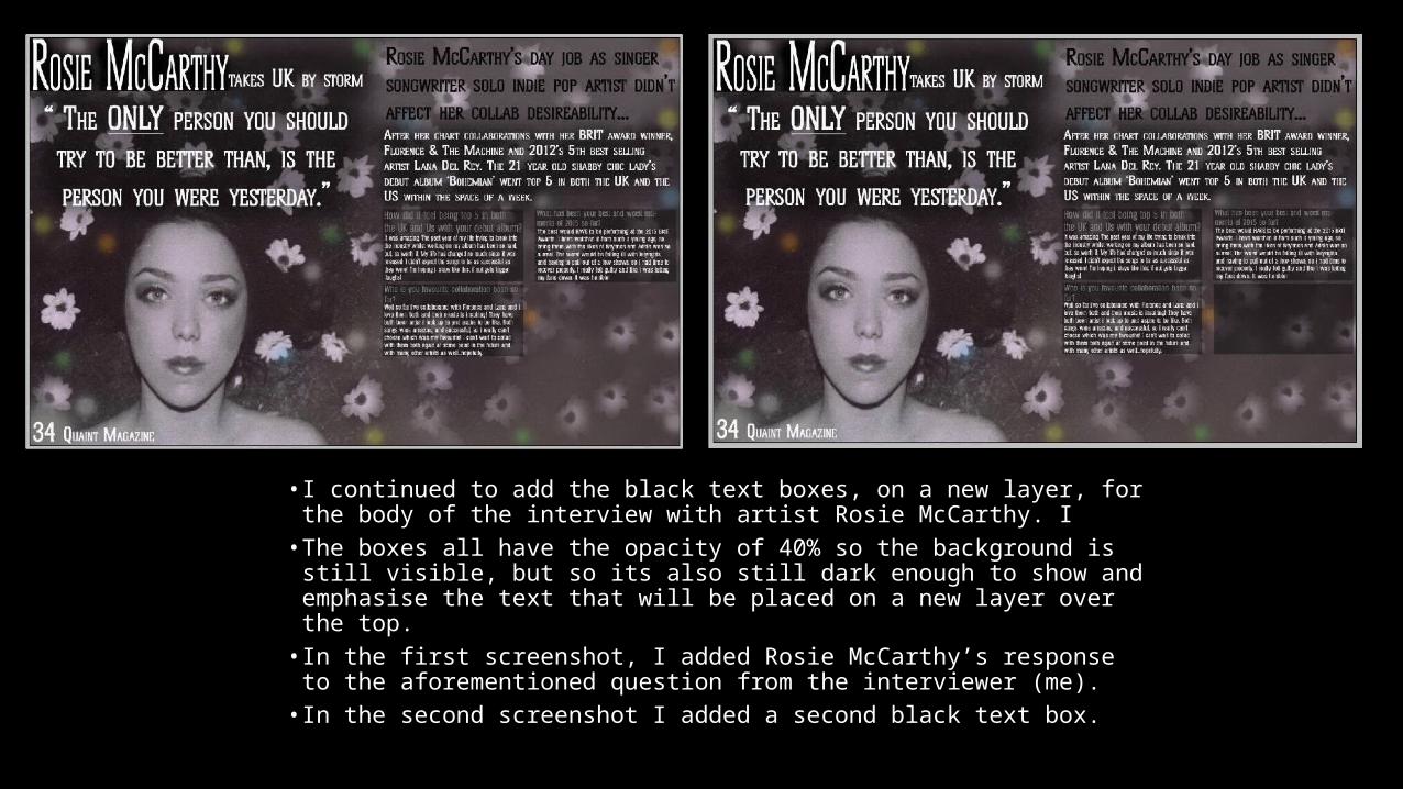
• I continued to add the black text boxes, on a new layer, for the body of the interview with artist Rosie McCarthy. I
• The boxes all have the opacity of 40% so the background is still visible, but so its also still dark enough to show and emphasise the text that will be placed on a new layer over the top.
• In the first screenshot, I added Rosie McCarthy’s response to the aforementioned question from the interviewer (me).
• In the second screenshot I added a second black text box.

• I continued to add the black text boxes, on a new layer, for the body of the interview with artist Rosie McCarthy. I
• The boxes all have the opacity of 40% so the background is still visible, but so its also still dark enough to show and emphasise the text that will be placed on a new layer over the top.
• In the first screenshot, I added a second question from the interviewer (me) which was; ‘What has been your best and worst moments of 2015 so far?’.
• In the second screenshot I added Rosie McCarthy’s response to the interviewers question above.

• I continued to add the black text boxes, on a new layer, for the body of the interview with artist Rosie McCarthy. I
• The boxes all have the opacity of 40% so the background is still visible, but so its also still dark enough to show and emphasise the text that will be placed on a new layer over the top.
• In the first screenshot, I added a third black text box.• In the second screenshot I added a third question from the
interviewer; ‘Who is your favourite collaboration been so far?’.
• I continued to add the black text boxes, on a new layer, for the body of the interview with artist Rosie McCarthy. I
• The boxes all have the opacity of 40% so the background is still visible, but so its also still dark enough to show and emphasise the text that will be placed on a new layer over the top.
• In the first screenshot, I added Rosie McCarthy’s response to the aforementioned question from the interviewer (me).
• In the second screenshot I added a second black text box.

• I continued to add the black text boxes, on a new layer, for the body of the interview with artist Rosie McCarthy. I
• The boxes all have the opacity of 40% so the background is still visible, but so its also still dark enough to show and emphasise the text that will be placed on a new layer over the top.
• In the first screenshot, I added a fourth question from the interviewer (me); ‘What is the best song you’ve heard in 2014/2015?’
• In the second screenshot I added Rosie McCarthy’s response to the question asked above.

• I continued to add the black text boxes, on a new layer, for the body of the interview with artist Rosie McCarthy. I
• The boxes all have the opacity of 40% so the background is still visible, but so its also still dark enough to show and emphasise the text that will be placed on a new layer over the top.
• In the first screenshot, I added a fifth black text box.• In the second screenshot I added a fifth question from the interviewer
(me); ‘What’s next musically for you? Any new material on the cards?’.

• I continued to add the black text boxes, on a new layer, for the body of the interview with artist Rosie McCarthy. I
• The boxes all have the opacity of 40% so the background is still visible, but so its also still dark enough to show and emphasise the text that will be placed on a new layer over the top.
• In the first screenshot, I added Rosie McCarthy’s response to the fifth question from the interviewer (me).
• In the second screenshot I added a second black text box.

• I continued to add the black text boxes on a new layer for the body of the interview with artist Rosie McCarthy. I
• The boxes all have the opacity of 40% so the background is still visible, but so its also still dark enough to show and emphasise the text that will be placed on a new layer over the top.
• In the first screenshot, I added a sixth question from the interviewer (me); Any new albums planned for the near future?’
• In the second screenshot I added Rosie McCarthy’s response to the question; ‘…let’s see where this idle song writing gets me first…’.

• I continued to add the black text boxes, on a new layer, for the body of the interview with artist Rosie McCarthy. I
• The boxes all have the opacity of 40% so the background is still visible, but so its also still dark enough to show and emphasise the text that will be placed on a new layer over the top.
• In the first screenshot, I added a seventh question/statement from the interviewer (me) to ask/say to 21 year old indie-pop artist Rosie McCarthy; ‘Thank-you for the interview Rosie. Enjoy the rest of your day’
• In the second screenshot I added Rosie’s response which was; ‘Thanks for having me! Its been a please and I hope to see you here at Quaint magazine in the near future!
• Again all the text used is ‘Helium SF’.• The questions is font size 18 and the responses in font size 12.

• Next, on a new layer, I made another black glow and put in under the interview on the bottom right hand side of the DPS, to act as a background for the name of the interviewer.• I then added another new layer and added the name of the
interviewer; ‘Interviewed by Mollie Owen’ over the top of the black glow, in a white colour and in the font ‘Helium SF’.