AS question 1 evaluation
8
In what ways does your media use, develop or challenge forms and convention of real media products?
-
Upload
amygolding3 -
Category
Education
-
view
6 -
download
0
Transcript of AS question 1 evaluation

In what ways does your media use, develop or challenge forms
and convention of real media products?
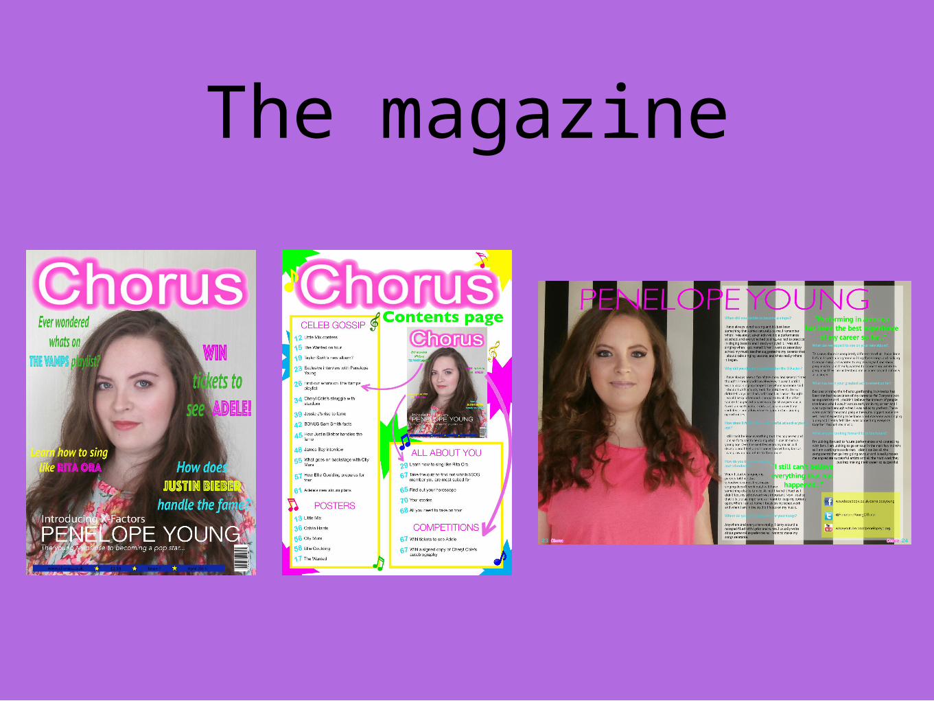
The magazine

Using music magazine conventions in my music
magazine front coverLarge title - The title of a music magazine is typically large and easy to identify. I chose to follow this convention as I wanted readers to be able to see clearly what the magazine is called and to remember it.
Main Image - I followed the convention of having the main image large and easy to see the artists face. I did this to allow the audience to establish a relationship with the artist and get to know who she is. It also gives some expectations on what to expect within the magazine.
Barcode, price, date, issue number - I included these important features to make my magazine look realistic; as well as giving the readers extra information such as the issue number which allows them to keep up-to-date with all the issues released.
What to expect - I included extra information on what is to come within the magazine. This gives the readers an idea on what the magazine features and what it is about. This is more likely to attract readers because if they are interested then they will buy the magazine.
Colour - I followed pop conventions by using bright colours; including pinks, yellows, greens and blues; to attract and appeal to my target audience.
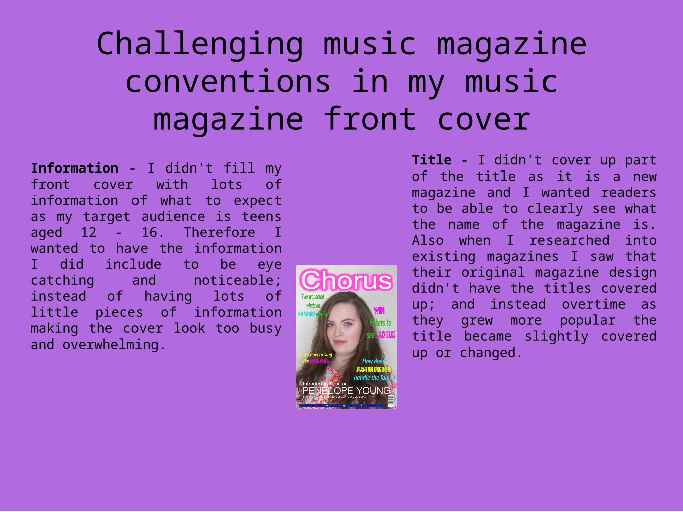
Challenging music magazine conventions in my music magazine
front cover
Information - I didn't fill my front cover with lots of information of what to expect as my target audience is teens aged 12 - 16. Therefore I wanted to have the information I did include to be eye catching and noticeable; instead of having lots of little pieces of information making the cover look too busy and overwhelming.
Title - I didn't cover up part of the title as it is a new magazine and I wanted readers to be able to clearly see what the name of the magazine is. Also when I researched into existing magazines I saw that their original magazine design didn't have the titles covered up; and instead overtime as they grew more popular the title became slightly covered up or changed.

Using music magazine conventions in my music magazine contents page
Title - I included a page title ‘Contents page’ to give the readers a sense of order and direction to the magazine as they can see what is inside and what to expect.
Front cover - I included the front cover, which I had seen in other magazines when researching; because I wanted to relate and connect the two together. I also wanted to show the readers exactly what pages they could find the information from the front cover.
Page numbers - I made the page numbers bold and bright to stand out from the rest of the page. This was to draw attention on what to expect within the magazine and where to find them.
Colour - I kept the same colours as on my front cover to keep the theme and connect them together. I also chose these colours to attract my target audience; and I wanted to keep them engaged throughout the magazine.

Challenging music magazine conventions in my music magazine
contents pageMagazine title - I chose to keep the name of my magazine at the top of the page, as it is a new magazine I wanted to continuously remind the readers what the name is and establish a connection to allow them to remember the title.
Images - I chose not to include images of other artists within the magazine because, when I asked my target audience what they are most interested in on a contents page, they preferred information and what to expect over images of other artists.
Layout - I chose to keep the contents page clean and neat, this was because I wanted the focus to be on the text and what to expect rather than on the look and ‘busyness’ of the page.

Using music magazine conventions in my music magazine double-page
spreadImage - I included an image of the artist to allow readers to connect the article to a face and establish a relationship with the artist.
Quotes - I chose to follow the convention of including quotes from the article in a larger font and different colour. This is to point out interesting parts of the article and to draw the reader in as they would want to find out what the quotes mean.
Contact details - I put in the artists Twitter, FaceBook and Youtube links to allow readers to find out more information about the artist and keep up-to-date with what they are doing.
Title - I put the artists name at the top of the page as readers may not know who she is. It also immediately informs the reader of who the article is about.

Using music magazine conventions in my music magazine double-page
spreadImages - I didn’t include any other images of the artist as I wanted to keep the focus on the article and getting to know the artist.
Title - again I chose to include the title of the magazine at the bottom of the pages next to the page numbers. This was to further remind the readers of what magazine they are reading and to connect them to the magazine.
Extra information - I chose not to include any extra information separate from the article on the page and instead I put her social media links. I also did this because I didn't want to fill the page and make it look messy and packed with information. Instead I kept it clean with all the necessary information needed.