AS MEDIA COURSEWORK EVALUATION
16
EVALUATION ABIGAIL FIRTH
-
Upload
abigailfirth -
Category
Education
-
view
53 -
download
0
Transcript of AS MEDIA COURSEWORK EVALUATION
EVALUATIONABIGAIL FIRTH
DEVELOPING & CHALLENGING
CONVENTIONSFront Cover:
- CONVENTIONS
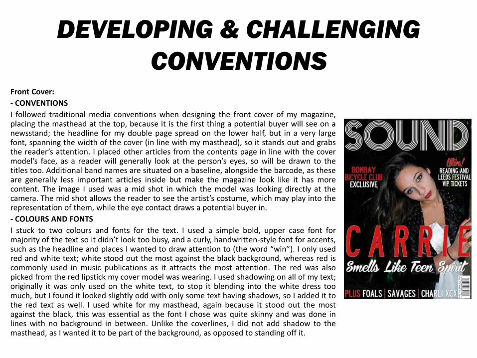
I followed traditional media conventions when designing the front cover of my magazine,placing the masthead at the top, because it is the first thing a potential buyer will see on anewsstand; the headline for my double page spread on the lower half, but in a very largefont, spanning the width of the cover (in line with my masthead), so it stands out and grabsthe reader’s attention. I placed other articles from the contents page in line with the covermodel’s face, as a reader will generally look at the person’s eyes, so will be drawn to thetitles too. Additional band names are situated on a baseline, alongside the barcode, as theseare generally less important articles inside but make the magazine look like it has morecontent. The image I used was a mid shot in which the model was looking directly at thecamera. The mid shot allows the reader to see the artist’s costume, which may play into therepresentation of them, while the eye contact draws a potential buyer in.
- COLOURS AND FONTS
I stuck to two colours and fonts for the text. I used a simple bold, upper case font formajority of the text so it didn’t look too busy, and a curly, handwritten-style font for accents,such as the headline and places I wanted to draw attention to (the word “win”). I only usedred and white text; white stood out the most against the black background, whereas red iscommonly used in music publications as it attracts the most attention. The red was alsopicked from the red lipstick my cover model was wearing. I used shadowing on all of my text;originally it was only used on the white text, to stop it blending into the white dress toomuch, but I found it looked slightly odd with only some text having shadows, so I added it tothe red text as well. I used white for my masthead, again because it stood out the mostagainst the black, this was essential as the font I chose was quite skinny and was done inlines with no background in between. Unlike the coverlines, I did not add shadow to themasthead, as I wanted it to be part of the background, as opposed to standing off it.
DEVELOPING AND CHALLENGING
CONVENTIONS
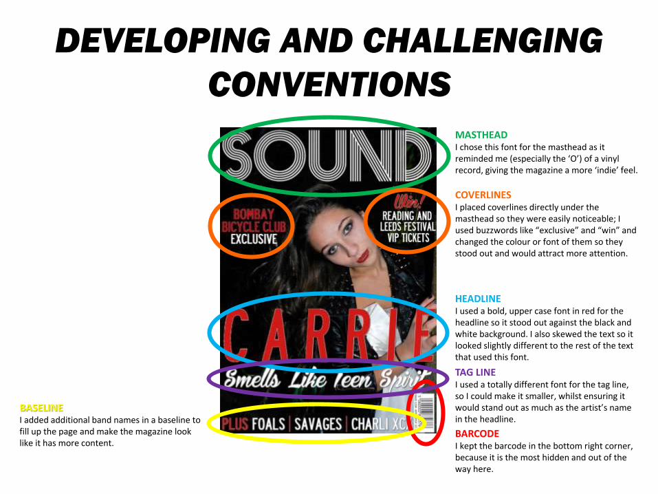
MASTHEADI chose this font for the masthead as it reminded me (especially the ‘O’) of a vinyl record, giving the magazine a more ‘indie’ feel.
HEADLINEI used a bold, upper case font in red for the headline so it stood out against the black and white background. I also skewed the text so it looked slightly different to the rest of the text that used this font.
TAG LINEI used a totally different font for the tag line, so I could make it smaller, whilst ensuring it would stand out as much as the artist’s name in the headline.
BARCODEI kept the barcode in the bottom right corner, because it is the most hidden and out of the way here.
BASELINEI added additional band names in a baseline to fill up the page and make the magazine look like it has more content.
COVERLINESI placed coverlines directly under the masthead so they were easily noticeable; Iused buzzwords like “exclusive” and “win” and changed the colour or font of them so they stood out and would attract more attention.
DEVELOPING & CHALLENGING
CONVENTIONSContents Page:
- CONVENTIONS:
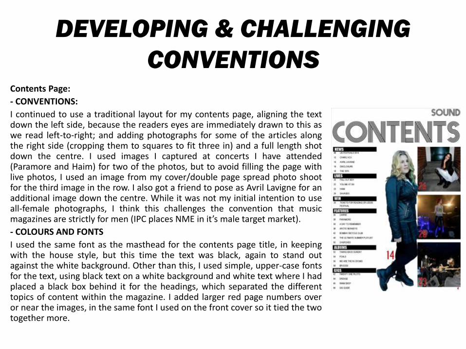
I continued to use a traditional layout for my contents page, aligning the textdown the left side, because the readers eyes are immediately drawn to this aswe read left-to-right; and adding photographs for some of the articles alongthe right side (cropping them to squares to fit three in) and a full length shotdown the centre. I used images I captured at concerts I have attended(Paramore and Haim) for two of the photos, but to avoid filling the page withlive photos, I used an image from my cover/double page spread photo shootfor the third image in the row. I also got a friend to pose as Avril Lavigne for anadditional image down the centre. While it was not my initial intention to useall-female photographs, I think this challenges the convention that musicmagazines are strictly for men (IPC places NME in it’s male target market).
- COLOURS AND FONTS
I used the same font as the masthead for the contents page title, in keepingwith the house style, but this time the text was black, again to stand outagainst the white background. Other than this, I used simple, upper-case fontsfor the text, using black text on a white background and white text where I hadplaced a black box behind it for the headings, which separated the differenttopics of content within the magazine. I added larger red page numbers overor near the images, in the same font I used on the front cover so it tied the twotogether more.
DEVELOPING AND CHALLENGING
CONVENTIONS
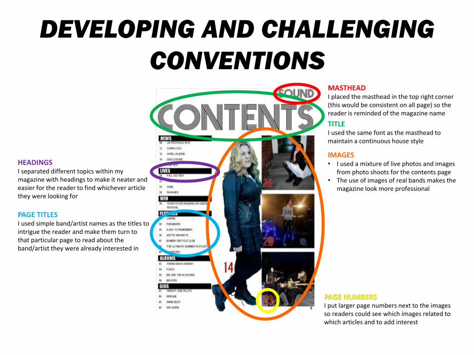
TITLEI used the same font as the masthead to maintain a continuous house style
PAGE TITLESI used simple band/artist names as the titles to intrigue the reader and make them turn to that particular page to read about the band/artist they were already interested in
HEADINGSI separated different topics within my magazine with headings to make it neater and easier for the reader to find whichever article they were looking for
MASTHEADI placed the masthead in the top right corner (this would be consistent on all page) so the reader is reminded of the magazine name
PAGE NUMBERSI put larger page numbers next to the images so readers could see which images related to which articles and to add interest
IMAGES• I used a mixture of live photos and images
from photo shoots for the contents page• The use of images of real bands makes the
magazine look more professional
DEVELOPING & CHALLENGING
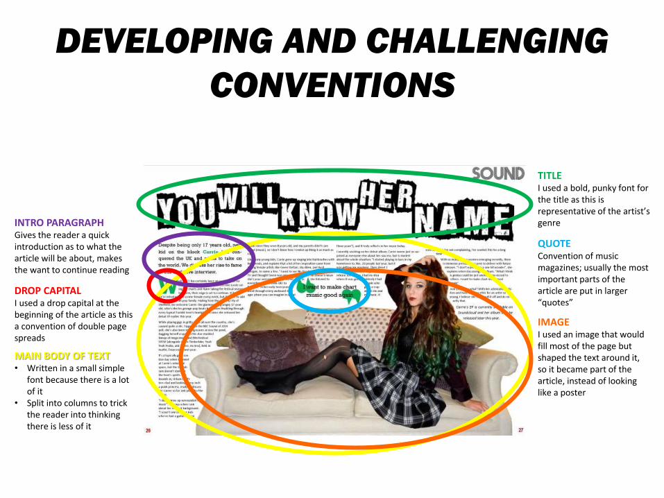
CONVENTIONSDouble Page Spread:
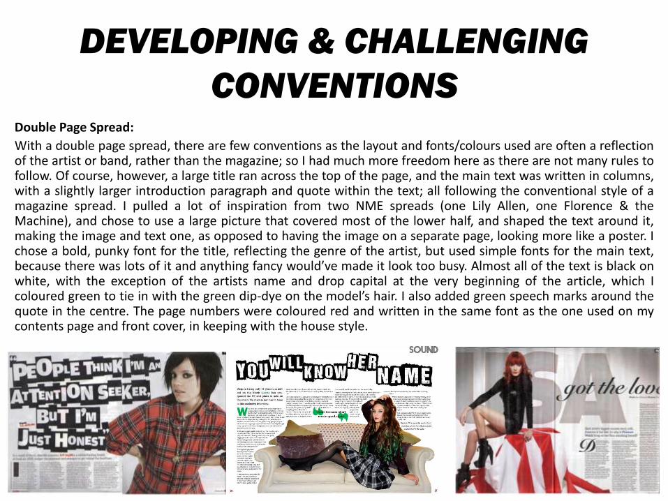
With a double page spread, there are few conventions as the layout and fonts/colours used are often a reflectionof the artist or band, rather than the magazine; so I had much more freedom here as there are not many rules tofollow. Of course, however, a large title ran across the top of the page, and the main text was written in columns,with a slightly larger introduction paragraph and quote within the text; all following the conventional style of amagazine spread. I pulled a lot of inspiration from two NME spreads (one Lily Allen, one Florence & theMachine), and chose to use a large picture that covered most of the lower half, and shaped the text around it,making the image and text one, as opposed to having the image on a separate page, looking more like a poster. Ichose a bold, punky font for the title, reflecting the genre of the artist, but used simple fonts for the main text,because there was lots of it and anything fancy would’ve made it look too busy. Almost all of the text is black onwhite, with the exception of the artists name and drop capital at the very beginning of the article, which Icoloured green to tie in with the green dip-dye on the model’s hair. I also added green speech marks around thequote in the centre. The page numbers were coloured red and written in the same font as the one used on mycontents page and front cover, in keeping with the house style.
DEVELOPING AND CHALLENGING
CONVENTIONS
TITLEI used a bold, punky font for the title as this is representative of the artist’s genre
QUOTEConvention of music magazines; usually the most important parts of the article are put in larger “quotes”
INTRO PARAGRAPHGives the reader a quick introduction as to what the article will be about, makes the want to continue reading
DROP CAPITALI used a drop capital at the beginning of the article as this a convention of double page spreads
MAIN BODY OF TEXT• Written in a small simple
font because there is a lot of it
• Split into columns to trick the reader into thinking there is less of it
IMAGEI used an image that would fill most of the page but shaped the text around it, so it became part of the article, instead of looking like a poster
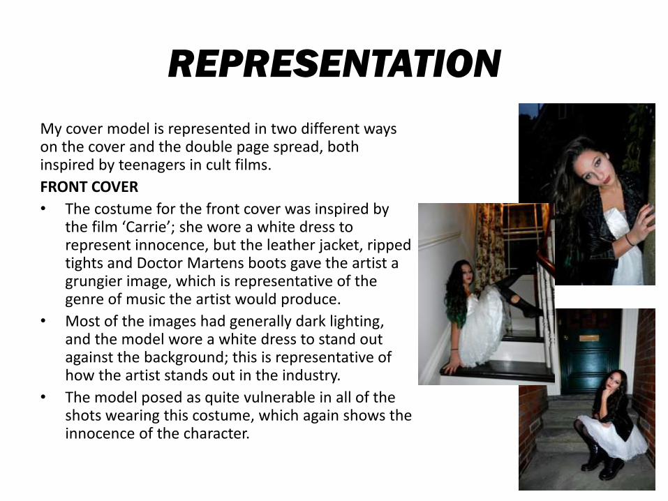
REPRESENTATION
My cover model is represented in two different ways on the cover and the double page spread, both inspired by teenagers in cult films.
FRONT COVER
• The costume for the front cover was inspired by the film ‘Carrie’; she wore a white dress to represent innocence, but the leather jacket, ripped tights and Doctor Martens boots gave the artist a grungier image, which is representative of the genre of music the artist would produce.
• Most of the images had generally dark lighting, and the model wore a white dress to stand out against the background; this is representative of how the artist stands out in the industry.
• The model posed as quite vulnerable in all of the shots wearing this costume, which again shows the innocence of the character.
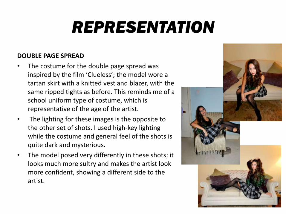
REPRESENTATION
DOUBLE PAGE SPREAD
• The costume for the double page spread was inspired by the film ‘Clueless’; the model wore a tartan skirt with a knitted vest and blazer, with the same ripped tights as before. This reminds me of a school uniform type of costume, which is representative of the age of the artist.
• The lighting for these images is the opposite to the other set of shots. I used high-key lighting while the costume and general feel of the shots is quite dark and mysterious.
• The model posed very differently in these shots; it looks much more sultry and makes the artist look more confident, showing a different side to the artist.
INSTITUTIONS
• I would like to think that my magazine bridges the gap between Kerrang! magazine and NME magazine (Kerrang! focuses mainly on rock/metal, NME focuses on alternative/indie). As a reader of both magazines myself, I understand that it is hard to keep up with both, mainly due to the cost per magazine. I don’t believe there is a well known magazine on newsstands that reaches such a wide range of genres within the rock/alternative genre; NME and Q are very similar in which bands and artists they feature, Billboard and Rolling Stone discuss popular, chart music, mostly, while Rolling Stone also focuses on popular TV and film affairs, Kerrang! stands alone as the only specifically rock/metal magazine. Not to say these are the only music magazines out there, although they are the most popular, but these are the main few I researched when designing my magazine because this is where mine would best fit in.
• I feel the company that would publish my magazine would be IPC. It is the biggest publishing company in the UK and currently prints NME, while this might be thought as a downfall when publishing my magazine, it would actually be smart to choose IPC over a company like Bauer. Bauer print Kerrang! weekly and Q monthly (both of which are two of the highest selling music magazines in the UK), so it would be unlikely that they would even agree to print my magazine, because it merges the two. This means if audiences that usually bought the two separately, now had the option to buy just one, they would lose profit on two high-grossing publications. NME is the only music magazine IPC currently prints, giving them the option to make more money by printing my magazine because they would be able to reach wider audiences.
TARGET AUDIENCE
• The target audience for my magazine would be 15-25 year olds, both male and female, specifically British people. This is because of the British dialect used within the magazine, and the fact that the magazine would only be published in Britain.
• I have targeted people like myself, who are students and would enjoy reading about rock, indie and alternative pop artists on weekly basis.
• I kept the article on my double page spread relatively short, and most of the articles on the contents page are shown to be only a couple of pages long, totalling at around 70 pages. This is because students tend to not have a lot of time on their hands to spend reading magazines, in contrast to the kinds of people other music magazines are targeted at (eg. NME seems to be targeted at quite an executive market).
• While I targeted quite a young audience, I tried to avoid making the style of writing too childish, as this can be quite patronising for this kind of audience.
ATTRACTING AN AUDIENCE
USE OF COLOURS/FONTS
• I used bright, attention-grabbing colours like red and green within my magazine, and white text on a black background/black text on a white background because this what stood out the most.
• I used bold, upper case fonts on all of the pages because not on did this make the biggest statement, but tit is a convention within music magazines. The only fonts that differed from this were the curly fonts used on the front cover and the main text on the double page spread.
USE OF LANGUAGE
• I generally put well known artists and bands on my front cover and contents page because they are easily recognisable to a potential reader; I also added some lesser-known bands/artists so the magazine would appeal to a wider audience and would intrigue readers who have never heard of them before.
• I used ‘buzzwords’ (such as ‘win’ and ‘exclusive’) on my front cover to attract readers, this is again a convention of magazines in general.
TECHNOLOGIES
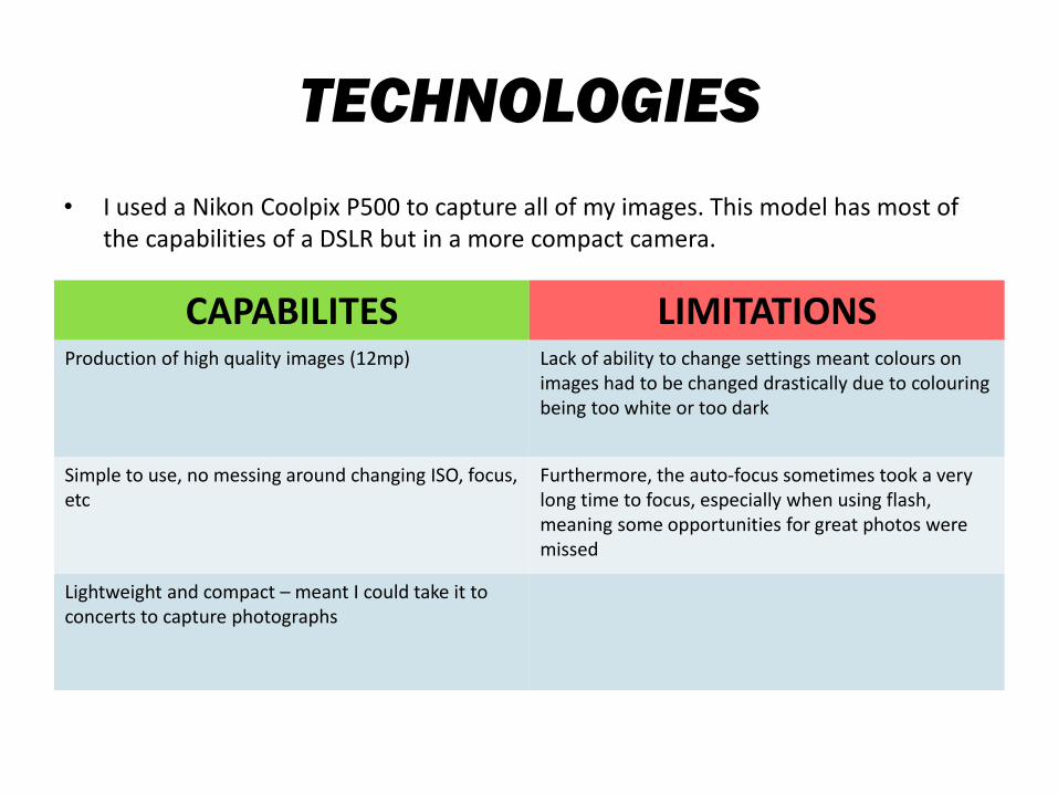
• I used a Nikon Coolpix P500 to capture all of my images. This model has most of the capabilities of a DSLR but in a more compact camera.
CAPABILITES LIMITATIONSProduction of high quality images (12mp) Lack of ability to change settings meant colours on
images had to be changed drastically due to colouringbeing too white or too dark
Simple to use, no messing around changing ISO, focus, etc
Furthermore, the auto-focus sometimes took a very long time to focus, especially when using flash, meaning some opportunities for great photos were missed
Lightweight and compact – meant I could take it to concerts to capture photographs
TECHNOLOGIES
• I used Adobe Photoshop CS3 to edit my images.
- Professional editing software gives the ability to create professional-looking images, even simple images can be changed drastically
- However, was difficult to use, especially to new users
• I used Microsoft Office Publisher to put together my double page spread and to add text to my contents page
- Much less professional but easier to work with text on publisher, rather than Photoshop
- Limited choice of actions when working with images or manipulating text; sometimes refused to do what you wanted it to
• I used the internet for most of my research
- Very easy to find what you are looking for
- Important to not rely on it for results
SKILL IMPROVEMENT
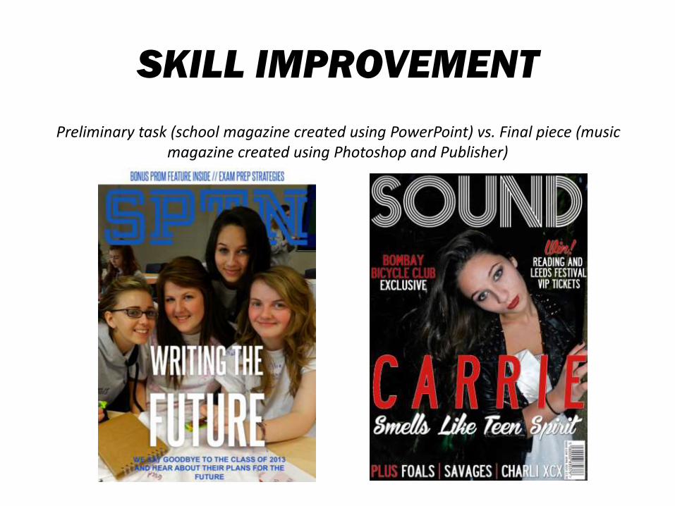
Preliminary task (school magazine created using PowerPoint) vs. Final piece (music magazine created using Photoshop and Publisher)
SKILL IMPROVEMENT
CONVENTIONS AND LAYOUTS
• Personally, I don’t think my knowledge of magazine conventions and layouts has altered much when comparing the preliminary task to the final piece. However there is still a clear difference between the two.
• While the positioning of the masthead and headline are very similar, and I used similar fonts for both pieces, the final piece looks immediately more professional, due to the cover image and the additional coverlines and other fonts (including the masthead).
USE OF TECHNOLOGIES
• At the beginning of the task, I had little to no experience with Photoshop. While it was difficult to use to begin with, when I figured it out it was much less complicated.
• I believe my cover image was quite heavily edited, but not to the point where the model looked nothing like herself; all of which I did not know how to do six months ago.