ars.els-cdn.com · Web viewThe natural gas price trajectories from the Capped Price and Rising...
20
DRAFT Supplementary Material S1. Modeling Assumptions Figure S1 shows the assumed carbon price trajectories for the Capped Price Case (blue) and the Rising Price Case (red) as discussed in the main text. The carbon price is specified through 2080, but shown here through 2050 for convenience (to preserve the scale). Figure S1. Carbon prices in the cases developed in this study. As discussed in the main text and below, carbon prices were chosen in this study such that the Capped Price Case would yield emissions outcomes consistent with a known, publicly available benchmark, namely the AEO 2017 Reference Case, which includes a stylized representation of the CPP (EIA 2017). 1
Transcript of ars.els-cdn.com · Web viewThe natural gas price trajectories from the Capped Price and Rising...

DRAFT
Supplementary Material
S1. Modeling Assumptions
Figure S1 shows the assumed carbon price trajectories for the Capped Price Case (blue) and the Rising
Price Case (red) as discussed in the main text. The carbon price is specified through 2080, but shown
here through 2050 for convenience (to preserve the scale).
Figure S1. Carbon prices in the cases developed in this study. As discussed in the main text and below, carbon
prices were chosen in this study such that the Capped Price Case would yield emissions outcomes consistent with a
known, publicly available benchmark, namely the AEO 2017 Reference Case, which includes a stylized
representation of the CPP (EIA 2017).
Figure S2 shows the power sector CO2 emissions trajectories that follow from the carbon prices
shown in Figure S1. The Capped Price Case yields an emissions trajectory (blue line) that closely matches
the emissions associated with the CPP (orange line), as represented by EIA in the AEO 2017 Reference
Case (EIA 2017). Although the carbon price in the Rising Price Case is the same as the carbon price in the
Capped Price Case prior to 2030, the emissions are lower (red line) during this period due to anticipation
1

DRAFT
of higher prices (the effect of foresight). The Reference Case, which is otherwise identical to the carbon
price cases but does not include a carbon price (black line) is shown for comparison.
Figure S2. Emissions trajectories in the cases developed in this study. The orange line indicates the emissions
associated with the CPP as projected by EIA in the AEO 2017 Reference Case (EIA 2017).
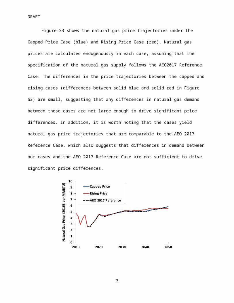
Figure S3 shows the natural gas price trajectories under the Capped Price Case (blue) and Rising
Price Case (red). Natural gas prices are calculated endogenously in each case, assuming that the
specification of the natural gas supply follows the AEO2017 Reference Case. The differences in the price
trajectories between the capped and rising cases (differences between solid blue and solid red in Figure
S3) are small, suggesting that any differences in natural gas demand between these cases are not large
enough to drive significant price differences. In addition, it is worth noting that the cases yield natural
gas price trajectories that are comparable to the AEO 2017 Reference Case, which also suggests that
differences in demand between our cases and the AEO 2017 Reference Case are not sufficient to drive
significant price differences.
2
DRAFT
Figure S3. Natural gas prices at Henry Hub in the cases developed in this study. The natural gas price trajectories
from the Capped Price and Rising Price Cases closely track the natural gas price trajectory from the AEO 2017
Reference Case (EIA 2017), from which the underlying resource assumptions were adopted.
Table S1 compares initial capital cost assumptions for several major technologies in AEO 2017
and Table S2 provides values for fixed O&M, variable O&M, and heat rates for relevant technologies.
Capital costs decline over time as a function of cumulative deployment, so the trajectories of capital
costs are case-specific, although the variability among cases considered in this study is relatively small.
For many mature technologies, the overall cost decline is also small, although for some technologies it
can be significant. For example, in the Capped Price Case, the capital cost for solar PV declines from its
initial value of $2,161 to $1,682 per KW in 2030. These cost trajectories fall within the range of other
recent estimates. For example, in most years this trajectory is between the “Mid” and “High” estimates
provided in the National Renewable Energy Laboratory’s 2016 Annual Technology Baseline.1
1 See NREL (National Renewable Energy Laboratory), 2016 Annual Technology Baseline. Available at: http://nreldev.nrel.gov/analysis/pdfs/2016-ATB-Summary-Final.pdf.
3

DRAFT
Table S1. Initial total overnight capital costs in AEO 2017, which are the costs used in this study. The year
associated with each cost may vary by technology since the first year in which the technology can be deployed
varies due to differences in construction times. Total overnight capital costs include contingency factors (project
contingency factors and technology optimism factors), which are applied to the base overnight capital costs, as
well as learning realized prior to the first year in which endogenous installations are possible. However, the costs
reported here do not include any regional or ambient technology multipliers or the ITC for eligible technologies.
TechnologyTotal Overnight Capital Cost
(AEO 2017 and this study)
(2016 $ per KW)
Coal with CCS 5,511
Advanced NGCC 1,092
Advanced NGCC with CCS 2,136
Advanced Nuclear 5,360
Wind (onshore) 1,860
Solar PV 2,161
Table S2. Fixed O&M, variable O&M and heat rates for selected technologies, following AEO 2017 assumptions.
Technology Fixed O&M Costs Variable O&M Costs Heat Rates (nth of a kind)
(2016 $ per KW per year) (2016 $ per MWh) BTU per KWh
Coal with CCS 80.8 9.5 9,257
Advanced NGCC 9.9 2.0 6,200
Advanced NGCC with CCS 33.2 7.1 7,493
Advanced Nuclear 99.7 2.3 -
Wind (onshore) 46.7 - -
Solar PV 21.7 - -
4

DRAFT
Whereas the capacity factors for solar (for a given region) do not change over time, the capacity
factors for wind (for a given resource class and region) increase as a function of cumulative deployment.
In addition, four wind classes (representing differences in resource quality) are included. When weighted
by deployment, the national average annual capacity factors for new wind and solar PV capacity are
approximately 41 percent and 24 percent, respectively. The equivalent national average capacity values
on peak for wind and solar PV (calculated endogenously by the model) are 12 percent and 48 percent,
respectively, although they vary over time with cumulative deployment and shifts in load patterns.
Regional variability in both quantities for both wind and solar PV is significant.
Deployment of wind is further affected by the way that wind cost heterogeneity is represented.
In addition to representing different wind classes explicitly, each wind class is characterized by a supply
curve that accounts for other differences in natural resource quality (e.g., terrain slope and accessibility),
costs of upgrading distribution and transmission to accommodate resources that may not be near
existing transmission, and other market factors. The capital costs reported in Table S1 indicate the costs
associated with the first step on this supply curve. Additional steps on the curve increase the capital cost
by 10%, 25%, 50% an 100%, respectively. Deployment of wind and solar PV may be further affected by
the costs of transmission, since there is an additional cost imposed whenever new transmission is added
to exchange generation or capacity between adjacent regions (the magnitude of that cost depends on
which regions are being connected). While this transmission cost is not associated with particular
technologies, wind and solar PV are more likely to be built far away from the load that they serve and
thus more likely to motivate the need for additional transmission capacity.
Finally, Table S3 shows the tax credits for wind and solar PV, assuming wind takes the PTC and
solar PV takes the ITC. The tax credits expire in 2020 for wind and revert to 10 percent in the case of
solar PV in 2020, with projects eligible provided that they begin construction by this time. The years in
Table S3 reflect online years, and because projects take several years to build, the credits are assumed
5

DRAFT
to apply to projects that come online several years after 2020. Although this study does not report
results at a regional level, a map of the EMM regions is also provided below in order to provide a sense
of the resolution of the model used in this study.
Table S3. Schedule of tax credits for wind and solar PV, following AEO 2017 Reference Case assumptions.
Online Year Wind (onshore) PTC Solar PV ITC
2016 $ per MWh % of initial capital cost
2018 22.53 30%
2019 22.53 30%
2020 22.53 30%
2021 18.03 30%
2022 13.52 26%
2023 9.01 22%
2024 and thereafter 0 10%
6

DRAFT
Figure S4. Map of EMM regions in NEMS from EIA (EIA 2015).2
2 See http://www.eia.gov/outlooks/archive/aeo15/pdf/0383(2015).pdf.
7

DRAFT
S2. Comparison of Rolling Foresight and Perfect Foresight Approaches
As discussed in the main text, the EMM uses a rolling foresight approach to account for future
expectations when solving for investment in the following year. In this approach, future information in
year t is only used to solve for investment in year t+1, at which point the process repeats. This approach
can be contrasted with a perfect foresight approach, in which the time path of investment is the
outcome of a single inter-temporal optimization. In this approach, all information about future
technology, demand and policy is assumed to be known, and the time path of investment (and other
quantities) is the one that minimizes the net present value (NPV) of all future costs. While perfect
foresight is an idealized assumption about the real world, the approach is often considered appropriate
for normative analysis in which optimality is a desirable benchmark. For this reason, it is useful to know
whether and to what extent the rolling foresight approach approximates perfect foresight.
To examine this question quantitatively, we consider simplified representations of the two
approaches. In both approaches, we assume technology costs and fuel prices are exogenous. We further
assume that the perfect foresight model is discretized into several time periods: 2020, 2025, 2030, 2035,
2040, 2045 and 2050. These time periods are the only ones considered by the perfect foresight model.
In contrast, in the rolling foresight model (with a 30-year rolling foresight window comparable to the
EMM), the set of time periods gets updated as the model propagates forward. As an example, when
solving for investment in 2030, the time periods would be: 2025, 2030, 2035, 2040, 2045, 2050, 2055. In
this example, 2025 is the current period (t), and 2030 is the period from which output is recorded (t+1).
In both of these approaches, one may define Ci as the cost difference between the two most
competitive technologies, where i indexes the absolute year (let i=1 in 2025, i=2 in 2030, etc). Ci could be
either positive or negative. Further assume that one of the technologies is NGCC, and that NGCC is
cheaper than the alternative until 2040, after which it is more expensive. So, the vector of cost
8

DRAFT
differences might be: C1, C2, C3 < 0; C4=0, C5, C6, C7 > 0. A negative value means that NGCC is less costly
than the alternative.3
One may also define Dj as the discount factor for period j, where j is defined from the start of
the respective model for a given approach. So in the perfect foresight model, D1 would be the discount
term applied in year 2025, while under the rolling foresight model solving for investment in 2030, D1
would be the discount term in year 2030. D1 is related to the discount rate (r) by: D1 = 1/(1+r)5, D2 =1/
(1+r)10, D3 = 1/(1+r)15 etc. Note that D3 = D2*D1 and generally Dj+1 = Dj*D1.
With the information above, one may compare the outcomes of the two approaches. Under the
perfect foresight approach, NGCC would be built in 2030 if C2*D2 + C3*D3 + C4*D4 + C5*D5 + C6*D6 < 0. This
condition says that, starting in 2030, the NPV of the cost of NGCC must be less than the NPV cost of its
nearest competitor, where all costs are discounted back to the start of the model in 2020.
Under the rolling foresight approach, NGCC would be built in 2030 if C2*D1 + C3*D2 + C4*D3 +
C5*D4 + C6*D5 + C7*D6 < 0. In this framework, the model makes a decision in 2025 about what gets built
in the next period (in this case 2030), taking into account information through 2055. All costs are
discounted back to the start year, which in this case is 2025. Note that the expression above for perfect
foresight could be re-written as D1*(C2*D1 + C3*D2 + C4*D3 + C5*D4 + C6*D5) < 0. Thus the conditions for
NGCC expansion are equivalent in the two approaches, except for the final term in the rolling foresight
approach (C7*D6).
The inclusion of discounting implies that this final term is likely to be small relative to the total
NPV cost. In addition, this term is positive under the assumptions above, making the rolling foresight
approach less likely to expand NGCC than the perfect foresight approach. Put differently, rolling
foresight, under the assumptions above, yields a more restrictive condition on the expansion of NGCC
3 As discussed earlier, R-NEMS does not include foresight about the evolution of technology capital costs, which could lead to differences with a perfect foresight approach.
9

DRAFT
than perfect foresight. This result makes sense intuitively, because a perfect foresight model that runs
only until 2050 does not account for the world after 2050 when making decisions about 2030, whereas a
rolling foresight model with a 30-year foresight window accounts for the world through 2055 when
making decisions about 2030.4 Under a rapidly escalating carbon price, this additional increment of
foresight in the rolling approach slightly discourages early expansion of NGCC relative to the perfect
foresight approach. Nonetheless, such a conceptual comparison between the approaches suggests that
the rolling foresight approach in the EMM can be viewed as a reasonable approximation to perfect
foresight.
S3. Analytic Model of Anticipation
The role of foresight in the scenarios discussed in this paper can be further illustrated using a stylized
analytic model of the competition between two technologies. In Figure S6, the red line represents an
illustrative emissions-free technology (such as wind or solar PV), with a levelized cost of cef. That is, if the
technology is installed at t=0, then the cost to produce power in each year (accounting for capital and
operating costs) is cef until t=T. In this example, T represents the time at which capital is fully
depreciated, after which the cost is much lower, and therefore negligible in an NPV sense. When
choosing whether to install this technology at t=0, a model (or market actor) with foresight will examine
the NPV cost of the technology
Cost ef=∫0
T
cef ∙ e−rt dt (S1)
In Eq. S1, r is the discount rate, which, in this context, reflects the opportunity cost of capital.
4 Of course, the time periods considered in these two frameworks are illustrative. It is possible for a perfect foresight model to consider a larger or smaller time horizon, and similarly, it is possible for a rolling foresight model to look ahead by more or fewer years.
10

DRAFT
Figure S5. Illustration of cost trajectories for two competing technologies. The red line represents an illustrative
emissions-free technology, whereas the blue curve represents an illustrative emitting technology whose cost
increases with time due to an assumed rising carbon price.
In Figure S5, the blue curve represents an illustrative emitting technology (such as NGCC without
CCS). The time dependence of the cost reflects an assumption that the carbon penalty associated with
producing power from this technology increases due to an increasing carbon price. While the carbon
price might be assumed to increase rapidly (such as at 8 percent annually, as in the scenarios discussed
in this paper), the growth rate of the total cost of this technology (g) would be expected to increase
more gradually, perhaps at 1-2 percent annually. An additional assumption is that at some future time,
t*, the annual costs of producing power from these two technologies cross. Given the time at which
they cross, and the growth rate of the cost of the emitting technology, it is possible to show that the
initial cost of the emitting technology is cef e−g t∗¿¿. In that case, the NPV cost of the emitting technology
at time t=0 is
11

DRAFT
Cost em=∫0
T
cef e−¿∗¿ e¿ ∙e−rt dt¿ (S2)
Given this information about the NPV cost of each technology, it is possible to solve for the value of t*
that equates the NPV costs of the two technologies. The resulting value of t* indicates the number of
years prior to the actual crossover year that a hypothetical actor with foresight would switch from
preferring the carbon emitting technology (which has an initially lower cost) to the emissions-free
technology. In effect, the value of t* indicates the extent to which investment choices are affected by
foresight. In a world without foresight, investment would switch from one technology to the other at
the crossover year and not before.
Setting Eq. S1 equal to Eq. S2 and solving for t* yields the following expression
t ¿= 1gln [( r
r−g )( e−(r−g )T−1e−rT−1 )] (S3)
One can evaluate Eq. S3 for different choices of the parameters, T, g and r. T is the period over which
capital is amortized. We assume this period is 30 years, which is consistent with the assumptions used in
the scenarios discussed in this paper. We assume that g is 1.5 percent, which is consistent with the
growth rate of the cost of NGCC between 2020 and 2040 in the Rising Price Case. We assume that r is 7
percent, which is consistent with typical values assumed for the opportunity cost of capital as well as
with assumptions used in the scenarios discussed in this paper. Using these parameters, we find that t*
is approximately 10 years. This implies that, in our scenarios, and in other scenarios with foresight and
comparable assumptions about other parameters, actors with foresight would be expected to anticipate
the crossover in technology costs by about a decade.
The applicability of this simplified conceptual framework to R-NEMS can be assessed by
examining the deployment of new NGCC capacity and the retirement of existing coal capacity as a
12

DRAFT
function of carbon price in the two scenarios. In panel (a) of Figure S6, it is clear that for any given
carbon price, the number of coal retirements is higher in the Rising Price Case than in the Capped Price
Case. This difference is driven by foresight – for any given instantaneous carbon price, the effective
carbon price used in making decisions about capacity is higher in the Rising Price Case than in the
Capped Price case, because the effective price captures information about the instantaneous price in
future years.
When coal retirements are plotted as a function of the carbon price achieved ten years in the
future (panel c), then the outcomes align more closely across the cases. This result is consistent with the
theoretical framework discussed above, which suggests that the inclusion of foresight allows the model
to anticipate future conditions by approximately ten years. The same observations can be applied to
NGCC capacity additions. In panel (b), the same instantaneous carbon price yields different amounts of
NGCC additions across the two cases, but in panel (d), when additions are plotted as a function of the
effective carbon price (i.e., the instantaneous carbon price ten years in the future), then the results align
more closely.
13

DRAFT
Coal Retirements NGCC Additions
Figure S6. Cumulative coal retirements (panels a and c) and cumulative NGCC capacity (panels b and d) as a
function of either the instantaneous carbon price (panels a and b) or the carbon price ten years in the future
(panels c and d) for the cases developed in this study. In each of the panels, outcomes from the Capped Price Case
are shown as blue circles and outcomes from the Rising Price Case are shown as red squares. In all panels,
cumulative additions or retirements are shown as the difference from a particular carbon price case and an
identical case without a carbon price in order to isolate the effect of the carbon price (i.e., control for additions or
retirements that occur due to load growth or other factors unrelated to the carbon price).
14