AOA Logo Standards Guide
31
Branding and Graphic Standards Guide One of the benefits of being a member of the American Optometric Association is the enhanced image of professionalism that you enjoy. In order to maintain that standard - the instant recognition, credibility and respect – there are certain guidelines that we require when you develop your own communications. These guidelines will help ensure that both you and the Association are represented with the professionalism and dignity deserved, and allow you to leverage the strength of the AOA’s brand identity. Every successful company or organization has one, or a set of, instantly recognizable characteristics associated with them that dictate how customers perceive them – that’s their brand. When you think of Coca-Cola you think refreshment; with Volvo you think safety. Our goal, and the reason for these branding guidelines, is to have people think of you, as part of the AOA brand, as the authority for eye care.
-
Upload
rosemary-laurence -
Category
Documents
-
view
21 -
download
2
Transcript of AOA Logo Standards Guide

Branding and Graphic Standards Guide
One of the benefits of being a member of the American Optometric
Association is the enhanced image of professionalism that you enjoy.
In order to maintain that standard - the instant recognition, credibility
and respect – there are certain guidelines that we require when you
develop your own communications.
These guidelines will help ensure that both you and the Association
are represented with the professionalism and dignity deserved, and
allow you to leverage the strength of the AOA’s brand identity. Every
successful company or organization has one, or a set of, instantly
recognizable characteristics associated with them that dictate how
customers perceive them – that’s their brand. When you think of
Coca-Cola you think refreshment; with Volvo you think safety. Our
goal, and the reason for these branding guidelines, is to have people
think of you, as part of the AOA brand, as the authority for eye care.

Table of Contents
Branding and Graphic Standards Guide
Section 1: Logotype 2
Horizontal/Stacked 2
Clear Area 3
Fonts 4
Section 2: Colors 5
1-Color Version 5
2-Color Version 6
4-Color Version 6
Secondary Color Palette for Background Use 6
Section 3:Committees, Councils, Sections 8
Other Logos 12
Healthy Eyes, Healthy People Logo 13
Section 4:Logo Don’ts 14
Section 5:Logo and Literature 16
Size Specifications 16
Letterhead Specifications 16
Stationery System 17
Grids 23
Brochures 23
Grids with Text 27
Other 29
Power Point 29
Section 6:A Final Word 30
1

Section 1: Logotype
American Optometric Association Logo
LogotypeThe American Optometric Association logo
has been specially designed and should
only be reproduced from master artwork from
the disk provided. The American Optometric
Association logotype must always be
reproduced with the register mark symbol ®.
Horizontal VersionThere are two versions of the AOA logo.
The horizontal version is the standard version
and should be used at all times unless space
restrictions prohibit its use.
Stacked VersionIn the instance where horizontal space is
restricted, the stacked version of the logo
should be used.
2

Section 1: Logotype (continued)
American Optometric Association Logo
Clear AreaTo protect the legibility of the logo, a clear area
should be left around it. No other text or image
should be placed within this area.
3

Section 1: Logotype (continued)
American Optometric Association Logo
FontsThe AOA logo’s font is Optima. This is for
informational purposes only, as the logotype
should never be re-typeset. You should only use
the provided files.
OptimaABCDEFGHIJKLMNOPQRSTUVWXYZabcdefghijklmnopqrstuvwxyz1234567890
Organization TextThere are times when it may be appropriate for a
committee, council, or section to add its name to
the standard AOA logo. See the Committees and
Councils section of this guide (p.8-9) for details on
the use of organizational text. The font to be used
in these instances is 45 Helvetica Neue Light.
To maintain logo integrity it is preferred that you
contact the AOA directly. The AOA will provide you
with a properly configured logo.
Secondary TextThe font recommended to be used as secondary
text is 45 Helvetica Neue Light, 65 Helvetica
Neue Medium and 75 Helvetica Neue Bold.
45 Helvetica Neue Light ABCDEFGHIJKLMNOPQRSTUVWXYZabcdefghijklmnopqrstuvwxyz1234567890
65 Helvetica Neue Medium ABCDEFGHIJKLMNOPQRSTUVWXYZabcdefghijklmnopqrstuvwxyz1234567890
75 Helvetica Neue Bold ABCDEFGHIJKLMNOPQRSTUVWXYZabcdefghijklmnopqrstuvwxyz1234567890
4

Section 2: Colors
American Optometric Association Logo
ColorsThe logo should only appear in colors specified
below; process blue and black, solid black, solid
process blue or reversed out white. Graphic devices,
such as outlines, drop shadows, etc., should not
be used. The logo is designed to work on a white
background or with secondary palette next page.
In the case of black and white printing or a
nonspecified background color, logo should
appear in solid black or reversed out white as below.
1-color versionSometimes the logo must appear in an environment
where the preferred 2-color method is not an option.
In the case of black and white printing see note above.
In the case of 1-color process blue printing the logo
may print all process blue.
5

Section 2: Colors (continued)
American Optometric Association Logo
2-color versionThe preferred method of reproducing the AOA
logo includes 2-color printing using Pantone
process blue and black. These colors make up
our primary color palette and should be used
whenever possible across all printed materials.
4-color versionFor 4-color process printing, use the CMYK
approximations for PMS-Process Blue
(C=100, M=9, Y=6, K=6) and Black
(C=0, M=0, Y=0, K=100).
Secondary Color Palette for Background UseWe recognize the need for more colors in our
materials beyond the AOA’s use of Pantone
process blue and black. With that in mind, we
have created a secondary color palette to be
used in materials as supporting background color
options. See the Grids section of this guide (p. 24-28)
for examples of the use of the Secondary Color
Palette. We have also included the CMYK and RGB
breakdowns next page. Variations of these
colors, pastels, reds/pinks and earth tones
should never be substituted for the secondary
palette options.
PMS 116 PMS 173PMS 144PMS 108 PMS 355PMS 390
PMS 273 PMS 2935PMS 306PMS 2602 PMS CG10
6
PMS Process Blue Black

Section 2: Colors (continued)
American Optometric Association Logo
(CMYK color version)
For 4 color process printing
(RGB color version)
For electronic communications
PMS 116 PMS 173PMS 144PMS 108 PMS 355PMS 390
PMS 273 PMS 2935PMS 306PMS 2602 PMS CG10
C= 0
M= 0
Y= 100
K= 0
C= 0
M= 15
Y= 94
K= 0
C= 0
M= 47
Y= 100
K= 0
C= 0
M= 69
Y= 100
K= 6
C= 18
M= 0
Y= 100
K= 6
C= 100
M= 0
Y= 91
K= 6
C= 72
M= 100
Y= 0
K= 0
C= 100
M= 94
Y= 0
K= 6
C= 76
M= 0
Y= 6
K= 0
C= 100
M= 47
Y= 0
K= 0
C= 0
M= 0
Y= 0
K= 72
PMS 116 PMS 173PMS 144PMS 108 PMS 355PMS 390
PMS 273 PMS 2935PMS 306PMS 2602 PMS CG10
R= 255
G= 255
B= 0
R= 255
G= 217
B= 17
R= 255
G= 135
B= 0
R= 240
G= 74
B= 0
R= 197
G= 220
B= 10
R= 0
G= 130
B= 64
R= 81
G= 0
B= 125
R= 17
G= 12
B= 121
R= 62
G= 182
B= 202
R= 10
G= 85
B= 163
R= 71
G= 71
B= 71
7

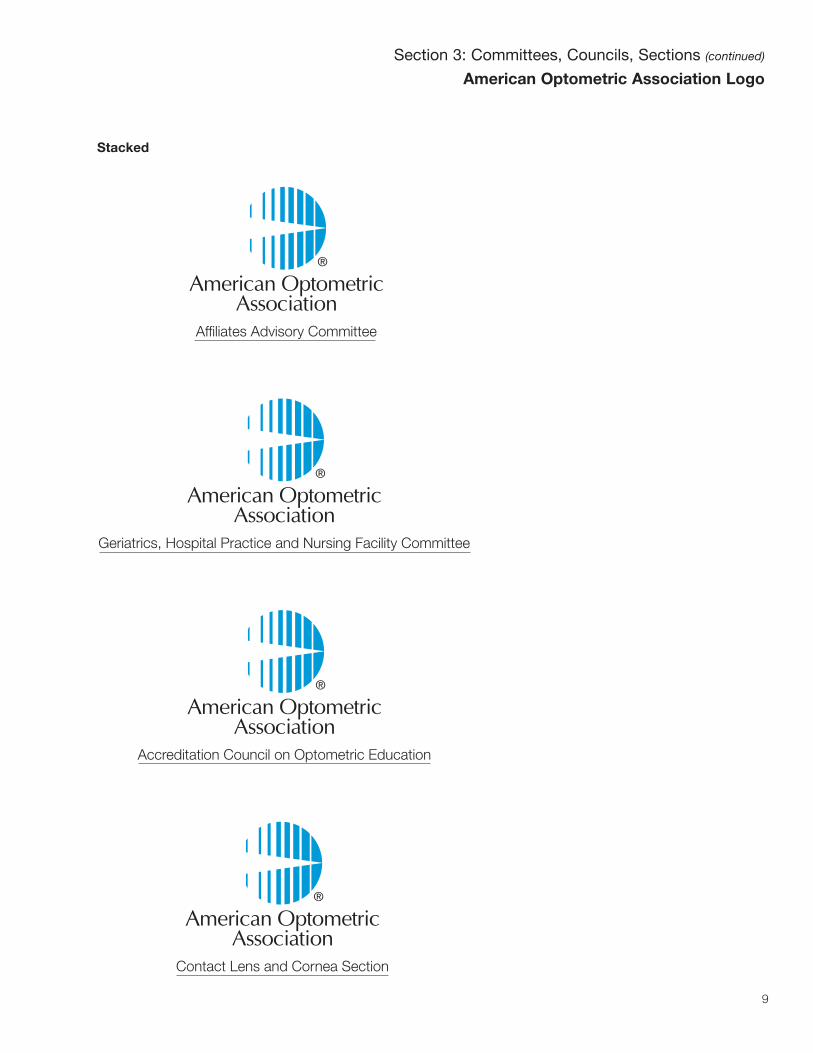
Section 3: Committees, Councils, Sections
American Optometric Association Logo
Committees and Councils
The AOA includes many diverse groups and
committees. These groups, each important in
their own right, are integral to the AOA as a
whole. With that in mind, we have created a
system which gives them their own identity
while still promoting the organization. The font
recommended is 45 Helvetica Neue light,
point size 14.5, rule .5 pt. and should extend
length of name offset by 10%.
Here are some examples:
Horizontal
The preferred version of the logo is shown below.
Affiliates Advisory Committee
Geriatrics, Hospital Practice andNursing Facility Committee
Accreditation Council onOptometric Education
Contact Lens and Cornea Section8
Section 3: Committees, Councils, Sections (continued)
American Optometric Association Logo
Stacked
Affiliates Advisory Committee
Geriatrics, Hospital Practice and Nursing Facility Committee
Accreditation Council on Optometric Education
Contact Lens and Cornea Section
9

Contact Lens and Cornea Section
Low Vision Rehabilitation Section
Paraoptometric Section
Sports Vision Section
243 N. Lindbergh Boulevard St. Louis, Missouri 63141
t. 314 991.4100 f. 314 991.4101 www.aoa.org
John C. Somebody, O.D.
Contact Lens and Cornea Section
Section 3: Committees, Councils, Sections (continued)
American Optometric Association Logo
Sections
In the case of AOA Sections note the color
coding in addition to names.
Contact Lens and Cornea Section
Your Vision and Racquet Sports
10all pictures are for position only and not to be duplicated

Section 3: Committees, Councils, Sections (continued)
American Optometric Association Logo
(CMYK color version)
For 4 color process printing
� (C=50, M=0, Y=45.5, K=3)
� (C=36, M=50, Y=0, K=0)
� (C=0, M=9, Y=56.4, K=0)
� (C=50, M=23.5, Y=0, K=0)
(RGB color version)
For interactive communications
� (R=123, G=195, B=132)
� (R=162, G=111, B=180)
� (R=255, G=232, B=106)
� (R=128, G=159, B=203)
(Black and white version)These Sections symbols are designed to work on
a white background. In the case of black and white
printing, secondary color background, or a nonspecified
background color, logo should appear in solid black
or reversed out white.
� � � �
� � � �
11
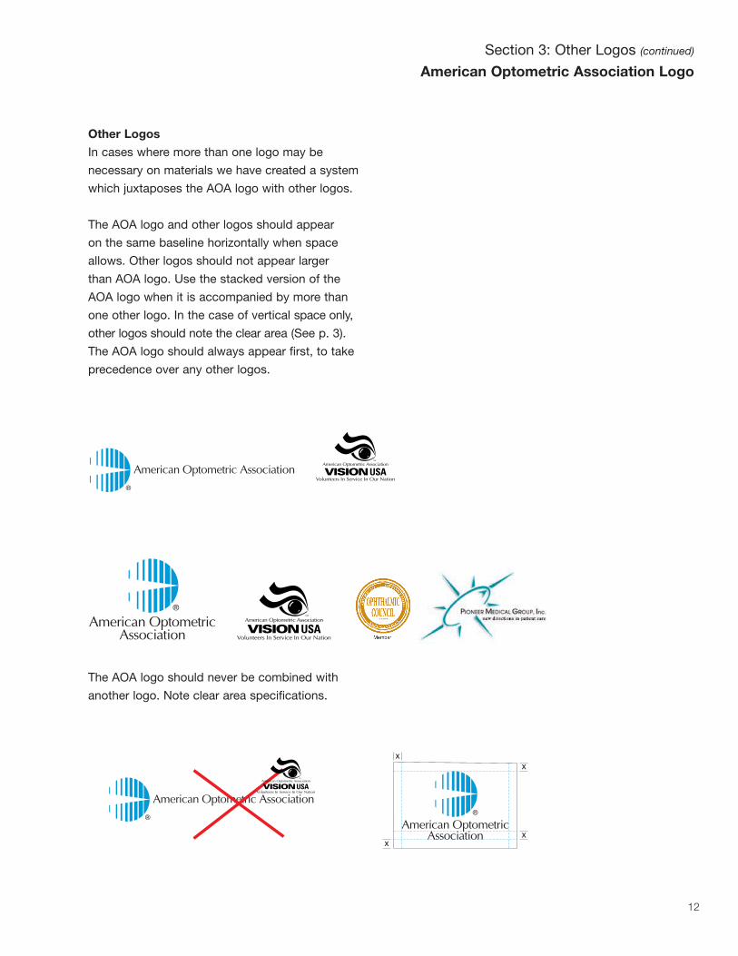
Section 3: Other Logos (continued)
American Optometric Association Logo
Other Logos
In cases where more than one logo may be
necessary on materials we have created a system
which juxtaposes the AOA logo with other logos.
The AOA logo and other logos should appear
on the same baseline horizontally when space
allows. Other logos should not appear larger
than AOA logo. Use the stacked version of the
AOA logo when it is accompanied by more than
one other logo. In the case of vertical space only,
other logos should note the clear area (See p. 3).
The AOA logo should always appear first, to take
precedence over any other logos.
The AOA logo should never be combined with
another logo. Note clear area specifications.
12

Section 3: Other Logos (continued)
American Optometric Association Logo
Healthy Eyes, Healthy People
The “Healthy Eyes, Healthy People” logo reflects
the core beliefs of the AOA. With that in mind,
we have combined our logos. Please note this is a
unique circumstance and this combination should
work as one. Do not alter proportions or spacing,
or add any other elements.
13

Section 4: Logo Don’ts
American Optometric Association Logo
Logo Don’ts
Used correctly, the AOA logo helps to convey
the professionalism of our organization. With
that in mind, here are some examples of ways
NOT to use our logo:
create a read-through configuration for the AOA logo
skew or stretch the AOA logo
rotate or flip the AOA logo
enclose the AOA logo in a different shape or use decorative borders
replace the type on the AOA logo with any alternate type style
change the spatial arrangement of the icon and the logotype
Learn about products
American Optometric Association
14

Section 4: Logo Don’ts (continued)
American Optometric Association Logo
Logo Don’ts
change the proportional relationship of the icon and the logotype
add names or other logos
use as a design element on literature or misc. materials
modify a committee, section or affiliate logo
Your Vision, The Second 50 Years
Low Vision Rehabilitation Section
Healthy Eyes, Healthy People
15all pictures are for position only and not to be duplicated

Section 5: Logo and Literature
American Optometric Association Logo
Size Specifications
For stationery system and miscellaneous
materials smaller than 8.5" x 11".
logo .5" squared
.28" minimum
Letterhead Specifications
When creating letterhead, the AOA logo should
appear in the upper left section of the page,
1" from the top and 1.25" from the left of the page.
Type is 45 Helvetica Neue Light in the case
of the address, 8 pt. over 12 pt. leading.
Web address is medium weight and the t.
and f. are bold. See page 17 for an example.
Lower address is 1" from the bottom and 1.25"
from the left of the page. Type is 56 Helvetica
Neue Italic, light and bold, 8 pt over 12 pt. leading.
Area designated for letter is noted on sample
and measures 6" x 6". Recommended type
is 45 Helvetica Neue Light, 8 pt. over
12 pt. leading.
In the case of affiliations or members, the name
should appear in 65 Helvetica Neue Medium. The AOA
Logo moves to the lower left, 1" from the bottom
and 1.25" from the left of the page, and “affiliated with”
or “member” is added in 8 pt. type, 9.5 leading.
Note these 2 cases are specific and adding copy
to the logo is otherwise incorrect. In the case of other
applications, i.e. business cards, do not alter proportions.
Same specifications in the case of individual letterhead.
These templates have been added to the AOA’s
intranet in an effort to make these standards as
easy as possible to access. 16

243 N. Lindbergh Boulevard
St. Louis, Missouri 63141
t. 314 991.4100 f. 314 991.4101
www.aoa.org
Metropolitan D.C. office • 1505 Prince Street • Alexandria, Virginia • t. 703 739.9200 f. 703 739.9497
1.25" >
< 1
" <
2"
< 3
"
< 1.25"
1.25" >
1"
>
lette
rhea
d sam
ple
Section 5: Logo and Literature (continued)
American Optometric Association Logo
Letterhead
< 1.25"
17

1234 Address Here Blvd.
City Here, Michigan 61234
t. 314 123.4567 f. 314 123.4567
www.aoa.org
1.25" >
< 1
" John C. Somebody, O.D.
1.25" >
1" >
Member
Section 5: Logo and Literature (continued)
American Optometric Association Logo
Letterhead with Individual
18

Section 5: Logo and Literature (continued)
American Optometric Association Logo
Letterhead with Associates
1234 Address Here Blvd.
City Here, Michigan 61234
t. 314 123.4567 f. 314 123.4567
www.aoa.org
1.25" >
< 1
" Michigan Optometric Association
1.25" >
1" >
Affiliated with
19

Section 5: Logo and Literature (continued)
American Optometric Association Logo
Business Card
Business Card Specifications
Type for names
65 Helvetica Neue Medium 7 pt.
Type for address
45 Helvetica Neue Light 7 pt.
“web” 65 Helvetica Neue Medium,
“t. and f.” 75 Helvetica Neue Bold
leading 11.
Type for organization name
Helvetica Neue Medium 10 pt.
243 N. Lindbergh Boulevard St. Louis, Missouri 63141
t. 314 991.4100 f. 314 991.4101 www.aoa.org
John C. Somebody, O.D.
John C. Somebody, O.D.
1234 Address Here Blvd. City Here, Michigan 61234
t. 314 123.4567 f. 314 123.4567 www.aoa.org
Michigan Optometric Association
Affiliated with
.25"
.25"
.5"
.25"
.625
" >
20

Section 5: Logo and Literature (continued)
American Optometric Association Logo
#10 Envelope
243 N. Lindbergh Boulevard
St. Louis, Missouri 63141
www.aoa.org
1/2"
21

Section 5: Logo and Literature (continued)
American Optometric Association Logo
Facsimile - AOA Only
243 N. Lindbergh Boulevard
St. Louis, Missouri 63141
t. 314 991.4100 f. 314 991.4101
www.aoa.org Facsimile
To: From:
CC: Email Address:
Company/Department: Fax Number:
Date: Pages including cover sheet:
Comments:
Metropolitan D.C. office • 1505 Prince Street • Alexandria, Virginia • t. 703 739.9200 f. 703 739.9497
22
Section 6: Logo and Literature (continued)
American Optometric Association Logo
Grids
For brochures and other materials use these
grids to organize graphic and typographic
elements. Cover variations of trifold, letter size
and square are available. Use color palettes as
outlined on pages 6 and 7.
Title Placed Here in Helvetica Neue Medium 16 pt.
.5” .5”
2.5”
><
1.5
”
<
1”
Title Placed Here in Helvetica Neue Medium 16 pt.
.5” .5”
2.5”
><
1.5
”
<
1”
Title Placed Here in Helvetica Neue Medium 14 pt.
.5” .5”
2.5”
><
1.5
”
< 1
”
letter size, 8.5" x 11"
square brochure, 8" x 8"
trifold brochure,
letter size folded in thirds
23

Section 5: Logo and Literature (continued)
American Optometric Association Logo
Grids
All grids are based on four columns with
side margins set to .5", top margins set to 1.5"
and bottom margins set to 2.5". Suggested
imagery is full color, minimal detail and up to
three people.
Typography for trifold cover is 12 pt. over
14 pt. lead. Letter size is 16 pt. and square
is 14 pt. Helvetica Neue Medium.
Title Placed Here in Helvetica Neue Medium 12 pt.
Title Placed Here in Helvetica Neue Medium 12 pt.
.5” .5”
2.5”
><
1.5
”
<
1”
trifold brochure,
letter size folded in thirds
Your Vision and Racquet Sports
Title Placed Here in Helvetica Neue Medium 12 pt.
three quarters and
full bleed designs
24all pictures are for position only and not to be duplicated

Section 5: Logo and Literature (continued)
American Optometric Association Logo
Grids
Title Placed Here in Helvetica Neue Medium 16 pt.
.5” .5”
2.5”
><
1.5
”
<
1”
Title Placed Here in Helvetica Neue Medium 16 pt.
Your Vision, The Second 50 Years
Title Placed Here in Helvetica Neue Medium 16 pt.
letter size, 8.5" x 11"
three quarters and
full bleed designs
25all pictures are for position only and not to be duplicated

Section 5: Logo and Literature (continued)
American Optometric Association Logo
Grids
Title Placed Here in Helvetica Neue Medium 14 pt.
.5” .5”
2.5”
><
1.5
”
< 1
”
Title Placed Here in Helvetica Neue Medium 14 pt.
Protecting Your Eyes for a Lifetime of Good Vision
Title Placed Here in Helvetica Neue Medium 14 pt.
square, 8" x 8"
three quarters and
full bleed designs
26all pictures are for position only and not to be duplicated

Section 5: Logo and Literature (continued)
American Optometric Association Logo
Grids with Text
Type can be placed in the grids with or
without photos. For body copy use 10 point
Helvetica Neue light over 13 point lead.
Subheads 10 point Helvetica Neue Bold.
Title Placed Here in Helvetica Neue Medium 12 pt.
Title Placed Here in Helvetica Neue Medium 12 pt.
.5” .5”
2.5”
><
1.5
”
<
1”
trifold brochure,
letter size folded in thirds
Your Vision and Racquet Sports
Title Placed Here in Helvetica Neue Medium 12 pt.
three quarters and
full bleed designs
27
Text placed in this area should be 9pt. This
is an example of how text can be placed in
this layout. This is an example how text
can be placed in this layout.This is an
example of how text can be placed in this
layout.
Sub Head example
This is an example of how text can be
placed in this layout. This is an example
how text can be placed in this layout.
This is an example of how text can be
placed in this layout. This is an example
of how text can be placed in this layout.
This is an example how text can be
placed in this layout. This is an example
of how type can be placed in this layout.
This is an example of how type can be
placed in this layout. This is an example
how type can be placed in this layout.
This is an example of how type can be
placed in this layout. This is an example
of how type can be placed in this layout.
This is an example how type can be This
is an example of how type can be placed
in this layout. This is an example how
Text placed in this area should be 9pt. This
is an example of how text can be placed in
this layout. This is an example how text can
be placed in this layout.This is an example
of how text can be placed in this layout.
Sub Head example
This is an example of how text can be
placed in this layout. This is an example
how text can be placed in this layout.
This is an example of how text can be
placed in this layout. This is an example
of how text can be placed in this layout.
This is an example how text can be
placed in this layout. This is an example
of how type can be placed in this layout.
This is an example of how type can be
placed in this layout. This is an example
how type can be placed in this layout.
This is an example of how type can be
placed in this layout. This is an example
of how type can be placed in this layout.
This is an example how type can be This
is an example of how type can be placed
in this layout. This is an example how
type can be
Sub Head example
Text placed in this area should be 9pt. This
is an example of how text can be placed in
this layout. This is an example how text can
be placed in this layout.This is an example of
how text can be placed in this layout.
This is an example of how text can be
placed in this layout. This is an example
how text can be placed in this layout. This
all pictures are for position only and not to be duplicated

Title Placed Here in Helvetica Neue Medium 14 pt.
.5” .5”
2.5”
><
1.5
”
< 1
”
Section 5: Logo and Literature (continued)
American Optometric Association Logo
Grids with text
Title Placed Here in Helvetica Neue Medium 14 pt.
Protecting Your Eyes for a Lifetime of Good Vision
Title Placed Here in Helvetica Neue Medium 14 pt.
square, 8" x 8"
three quarters and
full bleed designs
28
Text placed in this area should be
9pt. This is an example of how text
can be placed in this layout. This is
an example how text can be placed
in this layout.This is an example of
how text can be placed in this layout.
Sub Head example
This is an example of how text can
be placed in this layout. This is an
example how text can be placed in
this layout. This is an example of
how text can be placed in this lay-
out. This is an example of how text
can be placed in this layout. This is
an example how text can be placed
in this layout. This is an example of
how type can be placed in this lay-
out. This is an example of how type
can be placed in this layout. This is
an example how type can be placed
in this layout. This is an example of
how type can be placed in this lay-
out. This is an example of how type
can be placed in this layout. This is
an example how type can be
This is an example of how text can
be placed in this layout. This is an
example of how text can be
placed in this layout. This is an
example how text can be placed
in this layout.This is an example of
how text can be placed in this lay-
out. This is an example of how text
can be placed in this layout. This is
an example how text can be
placed in this layout. This is an
example of how text can be placed
in this layout.
Sub Head Example
This is an example of how text can
be placed in this layout. This is an
example how text can be placed
in this layout. This is an example
of how type can be placed in this
layout. This is an example of how
type can be placed in this layout.
This is an example how type can
be placed in this layout. This is an
example of how type can be
placed in this layout. This is an
This is an example of how text can
be placed in this layout. This is an
example of how text can be
placed in this layout. This is an
example how text can be placed
in this layout.
Sub Head Example
This is an example of how text can
be placed in this layout. This is an
example of how text can be
placed in this layout. This is an
example how text can be placed
in this layout. This is an example
of how text can be placed in this
layout. This is an example of how
text can be placed in this layout.
This is an example how text can
be placed in this layout. This is an
example of how type can be
placed in this layout. This is an
example of how type can be
placed in this layout. This is an
example how type can be placed
in this layout. This is an example
of how type can be placed in this
Text placed in this area should be 9pt. This is an example of how text can be
placed in this layout. This is an example how text can be placed in this layout.This
is an example of how text can be placed in this layout.
Sub Head example
This is an example of how text can be placed in this layout. This is an example
how text can be placed in this layout. This is an example of how text can be
placed in this layout. This is an example of how text can be placed in this lay-
out. This is an example how text can be placed in this layout. This is an exam-
ple of how type can be placed in this layout. This is an example of how type
can be placed in this layout. This is an example how type can be placed in this
layout. This is an example of how type can be placed in this layout. This is an
example of how type can be placed in this layout. This is an example how
type can be placed in this layout.
Sub Head Example
This is an example of how text can be placed in this layout. This is an
example of how text can be placed in this layout. This is an example how
text can be placed in this layout.This is an example of how text can be
placed in this layout. This is an example of how text can be placed in this
layout. This is an example how text can be placed in this layout. This is an
example of how text can be placed in this layout. This is an example of how
text can be placed in this layout. This is an example how text can be
placed in this layout. This is an example of how type can be placed in this
layout. This is an example of how This is an example of how type can be
placed in this layout. This is an example how type can be placed in this lay-
all pictures are for position only and not to be duplicated

Section 5: Logo and Literature (continued)
American Optometric Association Logo
Power Point Presentation
Power Point Presentations
Below are two examples of power point layouts
for your use. While it is understood that there will
be a need for customization,
we strongly encourage you to
use the AOA color palette.
Due to the projected nature
of power point presentations,
it is always desirable to use
colors that will provide the
greatest contrast for greater
readability.
29
Title Placed Here• Bulleted copy may be
placed here
• Bulleted copy may be placed here
• Bulleted copy may be placed here
• Bulleted copy may be placed here
• Bulleted copy may be placed here
• Bulleted copy may be placed here
Title Placed Here
• Bulleted copy may be placed here
• Bulleted copy may be placed here
• Bulleted copy may be placed here
• Bulleted copy may be placed here
• Bulleted copy may be placed here
• Bulleted copy may be placed here
Subhead Placed Here

Section 6: A Final Word
American Optometric Association Logo
A Final word
The American Optometric Association depends
on you to hold the AOA’s standards in the
highest regard. With your help we can present
a positive and unified look that will help all of
us in our communication efforts. We strongly
urge you to follow the guidelines outlined here,
and to contact the AOA’s marketing department
with any questions you may have.
30