Analysing Double page spreads
4
Q Lily Allen June 2014 Analysis
-
Upload
hannahcobb98 -
Category
Education
-
view
63 -
download
0
Transcript of Analysing Double page spreads

Q Lily Allen June 2014
Analysis

First OpinionLooking at the double page spread I was very interested in reading into it. The layout and large image are contrasted well and the theme the whole article made me want to read it even more. The main article was over 4 pages and there is, on this page, 2 visible columns. There are two visible pull quotes although one is an image with a small caption. The text used for the large pull quote behind Lily’s head is a completely different font than the body text but is used over each page at least once. There is one drop capital which goes well on this certain page. This drop capital to the body text is huge as I think that the body text is only a 9 maybe 8 point text. The mid shot image is eye catching and works well with the other images on the other pages.
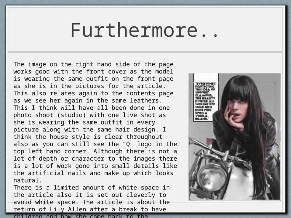
Furthermore..
The image on the right hand side of the page works good with the front cover as the model is wearing the same outfit on the front page as she is in the pictures for the article. This also relates again to the contents page as we see her again in the same leathers. This I think will have all been done in one photo shoot (studio) with one live shot as she is wearing the same outfit in every picture along with the same hair design. I think the house style is clear throughout also as you can still see the “Q” logo in the top left hand corner. Although there is not a lot of depth or character to the images there is a lot of work gone into small details like the artificial nails and make up which looks natural.There is a limited amount of white space in the article also it is set out cleverly to avoid white space. The article is about the return of Lily Allen after a break to have children and how she came back to the limelight. The language was used well to represent a lot of different things that Lily had got up to whilst she was relaxing with her little ones.

All in All
I really like this double page spread, it is set out well and has a certain character to the page. The article is interesting and contrasts well with all the other pages. The double page spread (dps) is reflecting the house style and it is simple but it works brilliantly. The cutaways are the certain parts that I though worked good and complimented the article along with the style of image. I do want to break a few of these conventions in my magazine. Firstly I do not want my model to be looking into the camera in most of my images, this definitely breaks convention. But I want to keep the repetitive sequence of the house style and the small Front cover logos throughout my article.