Airport Monitoring Report 2011-12
556
Airport Monitoring Report 2011–12 Adelaide Brisbane Melbourne Perth Sydney Report
description
A report on Australian's airports from consumer watchdog Australian Competition and Consumer Commission.
Transcript of Airport Monitoring Report 2011-12

AirportMonitoringReport 2011–12Adelaide Brisbane Melbourne Perth Sydney
Report

Airport Monitoring Report 2011-12
Price, financial performance and quality of service monitoring
April 2013

ISBN 978 1 921973 61 1
Australian Competition and Consumer Commission 23 Marcus Clarke Street, Canberra, Australian Capital Territory, 2601
© Commonwealth of Australia 2013
This work is copyright. In addition to any use permitted under the Copyright Act 1968, all material contained within this work is provided under a Creative Commons Attribution 3.0 Australia licence, with the exception of:
• the Commonwealth Coat of Arms • the ACCC and AER logos • any illustration, diagram, photograph or graphic over which the Australian Competition and Consumer Commission does not hold copyright, but which
may be part of or contained within this publication.
The details of the relevant licence conditions are available on the Creative Commons website, as is the full legal code for the CC BY 3.0 AU licence.
Requests and inquiries concerning reproduction and rights should be addressed to the Director, Internal Communication and Publishing Services, ACCC, GPO Box 3131, Canberra ACT 2601, or [email protected].
Important notice
The information in this publication is for general guidance only. It does not constitute legal or other professional advice, and should not be relied on as a statement of the law in any jurisdiction. Because it is intended only as a general guide, it may contain generalisations. You should obtain professional advice if you have any specific concern.
The ACCC has made every reasonable effort to provide current and accurate information, but it does not make any guarantees regarding the accuracy,
currency or completeness of that information.
Parties who wish to re-publish or otherwise use the information in this publication must check this information for currency and accuracy prior to publication. This should be done prior to each publication edition, as ACCC guidance and relevant transitional legislation frequently change. Any queries parties have should be addressed to the Director, Internal Communications and Publishing Services, ACCC, GPO Box 3131, Canberra ACT 2601, or
ACCC 04/13_700
www.accc.gov.au

Airport Monitoring Report 2011-12 Contents
iii
Contents
Glossary v
Key Findings vii
Summary xiii
1 Overview of the monitoring results for aeronautical services 1
1.1 Introduction 2
1.2 Airport terminal configurations 2
1.3 Key observations from the monitoring results for aeronautical services 4
1.4 Price monitoring results 15
1.5 Quality of service monitoring results 46
1.6 Price and quality outcomes for the airports 52
2 Potential aeronautical capacity issues at airports 53
2.1 Introduction 53
2.2 Recent growth in passenger throughput and aeronautical investment 54
2.3 Congestion is emerging at a number of monitored airports 57
2.4 Passenger throughput is forecast to continue to grow over the next 59
two decades
2.5 Inadequate investment and effects on ongoing congestion 60
2.6 Approaches for dealing with congestion in the short-term and long-term 60
2.7 Airports’ incentives for aeronautical investment 64
2.8 Airports’ current investment plans in response to emerging congestion 65
2.9 Different approaches to funding aeronautical investment 68
2.10 The impact of regulatory access arrangements 71
3 Overview of airport car parking and landside services 73
3.1 Introduction 74
3.2 Airport car parking configurations 74
3.3 Airport car parking prices 77
3.4 Airport car parking revenues, costs and profits 80
3.5 Airport car parking availability and quality 86
3.6 Landside access charges and revenues 90
3.7 Observations from the monitoring results for airport car parking and 93
landside access
3.8 Passenger growth, capacity constraints and investment in airport 97
car parking and landside services
4 Adelaide Airport 103
4.1 Overview of aeronautical and car parking monitoring results 104
4.2 Airport overview and major airport investments 105

Contents Airport Monitoring Report 2011-12
iv
4.3 Aeronautical prices monitoring and financial performance results 108
4.4 Aeronautical services quality of service monitoring results 132
4.5 Car parking services monitoring results 154
4.6 Adelaide Airport price and quality of service monitoring beyond 2011-12 164
5 Brisbane Airport 167
5.1 Overview of aeronautical and car parking monitoring results 168
5.2 Airport overview and major airport investments 170
5.3 Aeronautical prices monitoring and financial performance results 173
5.4 Aeronautical services quality of service monitoring results 193
5.5 Car parking services monitoring results 218
6 Melbourne Airport 231
6.1 Overview of aeronautical and car parking monitoring results 232
6.2 Airport overview and major airport investments 234
6.3 Aeronautical prices monitoring and financial performance results 236
6.4 Aeronautical services quality of service monitoring results 253
6.5 Car parking services monitoring results 282
7 Perth Airport 295
7.1 Overview of aeronautical and car parking monitoring results 296
7.2 Airport overview and major airport investments 298
7.3 Aeronautical prices monitoring and financial performance results 301
7.4 Aeronautical services quality of service monitoring results 322
7.5 Car parking services monitoring results 351
8 Sydney Airport 363
8.1 Overview of aeronautical and car parking monitoring results 364
8.2 Airport overview and major airport investments 366
8.3 Aeronautical prices monitoring and financial performance results 370
8.4 Aeronautical services quality of service monitoring results 394
8.5 Car parking services monitoring results 422
Appendices
A1 Regulatory accounts for the monitored airports 437
A2 Indicators and statistics used in the report 458
A3 Airport car parking statistics 489
A4 History of airport regulation in Australia 504
A5 Regulatory framework 509
A6 Services provided by airports 514
A7 Methodology for this report 517

Airport Monitoring Report 2011-12 Glossary
v
Glossary
AASB Australian Accounting Standards Board
ACCC Australian Competition and Consumer Commission
AC&BPS Australian Customs and Border Protection Service
AGAAP Australian Generally Accepted Accounting Principles
AIFRS Australian equivalents to International Financial Reporting Standards
APS Australian Protective Service
Availability Describes the amount of the facility/service made available relative to demands for the facility or service. May include whether facilities or services are available or restricted due to congestion, positioning, maintenance, or repairs, the accessibility or usefulness of the facility/service provided, and the efficiency of the system to allocate usage.
BARA Board of Airline Representatives of Australia
BITRE Bureau of Infrastructure, Transport and Regional Economics
CBD central business district
CCA Competition and Consumer Act 2010
CTFR Counter Terrorism First Response
CPI consumer price index
DAFF Department of Agriculture, Fisheries and Forestry, Biosecurity Biosecurity
DIAC Department of Immigration and Citizenship
DIT Department of Infrastructure and Transport
DTL domestic terminal lease
EBITA earnings before interest, tax and amortisation
EBITDA earnings before interest, tax, depreciation and amortisation
FAC Federal Airports Corporation
FSC full service carrier
GA general aviation
GST goods and services tax
IASB International Accounting Standards Board
LCC low cost carrier
Glossary Airport Monitoring Report 2011-12
vi
LHS left-hand side
LIS Line in the sand
Minister Minister with portfolio responsibility for Transport and Infrastructure
MTOW maximum take-off weight
Peak hour The hour that, on average for each day in the financial year, has the highest number of (arriving/departing/total of both) passengers.
PC Productivity Commission
PFC passenger facilitation charges
PSC passenger services charge
RHS right-hand side
RPT regular public transport
SLA Service level agreements
Standard Describes the physical condition of the facility/service supplied and condition in which it is generally maintained.
SAR state of the art renewal
TPA Trade Practices Act 1974 (renamed the Competition and Consumer Act 2010 on 1 January 2011)
White paper Aviation White Paper: Flight path to the future, Australian Government, 2009
Airport Monitoring Report 2011-12 Key Findings
vii
Key Findings – Airport Monitoring 2011-12
The ACCC’s monitoring role for the major airports
This report presents the results of the ACCC’s monitoring of the quality, prices, costs and profits related to aeronautical and car parking services supplied by Adelaide, Brisbane, Melbourne, Perth and Sydney airports for the 2011-12 financial year.
As confirmed in the recent inquiry into the economic regulation of airport services by the Productivity Commission (PC), the monitored airports have market power. These airports are monitored to provide information to the public and the government about the airport operators' performance. However, monitoring does not restrict the airports from increasing prices or degrading service standards to earn monopoly profits.
In 2011-12, airports continued to be profitable but quality of service was down
Monitored airports earned profits in 2011-12 but despite continued investment in aeronautical assets, overall ratings for quality of service were lower at each of the monitored airports compared with 2010-11.
Sydney, Brisbane and Perth airports reported higher margins in 2011-12 relative to the previous year. Melbourne Airport’s margins were adversely affected by a jump in costs while Adelaide Airport experienced a large drop in passenger numbers and revenue.
The lower overall ratings for quality of service at monitored airports reinforces the need for more investment as demand for airport services grows more quickly than airports’ capacity to accommodate the increase in demand.
In 2011-12, demand for airport services was underpinned by solid growth in passenger numbers
Growth in combined passenger numbers at the monitored airports continued to drive demand for airport services during 2011-12. Passenger numbers at the monitored airports increased 2.5 per cent in 2011-12, the tenth consecutive year of growth in airport patronage.
Total passenger numbers fell at Adelaide Airport, but falls in domestic travel Sydney and Melbourne airports were offset by solid growth in international travel at these airports.
Perth Airport registered the strongest growth among monitored airports driven by substantial growth in domestic travel and strong growth in international travel. Growth in both domestic and international travel contributed to a solid increase in passenger numbers at Brisbane Airport.
Average prices charged by airports and aeronautical revenue higher in 2011-12
Combined revenues from aeronautical services at the monitored airports increased 4.5 per cent in 2011-12. All airports other than Adelaide Airport earned higher aeronautical revenues.

Key Findings Airport Monitoring Report 2011-12
viii
Average aeronautical revenue per passenger (a proxy for average prices) across monitored airports increased around 1.9 per cent.
Aeronautical revenue per passenger increased at Sydney, Melbourne and Brisbane airports but fell at Adelaide and Perth airports.
Sydney Airport remained the airport with the highest aeronautical revenue per passenger at $14.96.
Aeronautical margins also higher in 2011-12
Combined margins on aeronautical services at the five monitored airports increased 2.2 per cent during 2011-12. Margins increased at all airports other than Adelaide and Melbourne airports.
On a per passenger basis, average aeronautical margins across the monitored airports were largely unchanged in 2011-12.
Brisbane and Sydney airports earned higher margins per passenger but Adelaide, Melbourne and Perth airports experiencing lower margins.
Sydney Airport continued to be the airport with the highest aeronautical margin per passenger at $7.33 per passenger.
Overall quality of aeronautical services fell at all airports during 2011-12
The overall ratings for quality of service (that is, quality of service ratings from surveys of airlines, passengers, border agencies as well as objective indicators) fell at each of the monitored airports during 2011-12.
For the first time since 2007-08, none of the airports achieved an overall rating of at least good, that is, all airports were rated satisfactory.
Key quality of service results for Australia’s monitored airports during 2011-12 were:
Sydney Airport continues to be rated lowest overall. Passengers increased their ratings within the satisfactory category, while airlines’ ratings dropped from satisfactory to poor.
Brisbane Airport was rated highest for overall quality of service. Passengers continued to rate Brisbane Airport good while airlines dropped their ratings within the satisfactory category. Airlines’ ratings for runway availability decreased significantly from good in 2010-11 to poor in 2011-12.
Perth Airport continued to be rated second lowest overall. Airlines’ ratings remained unchanged at poor while passengers’ ratings decreased from good to satisfactory.
Car parking revenues higher during 2011-12
The number of car park spaces increased at all airports other than Melbourne Airport in 2011-12. Overall, Melbourne Airport had the largest number of car park spaces (21 924) followed by Perth Airport (15 626) and Sydney Airport (13 116).

Airport Monitoring Report 2011-12 Key Findings
ix
Total revenue earned from the monitored airports’ landside access operations increased by almost 20 per cent to around $28.7 million.
Sydney Airport continues to earn the highest revenue and margin per car park space ($7654 and $5290 respectively) while Perth Airport reported the lowest ($3239 and $2187 respectively).
Sydney Airport reported the largest increase in landside revenues (36.9 per cent) and continued to be the airport with the highest revenues from landside charges ($13.3 million).
Airport investments increased during 2011-12
In 2011-12, monitored airports collectively invested $547.4 million in aeronautical assets - this was 61.7 per cent more than $339.5 million invested in 2010-11.
Congestion emerging at some airports
Strong growth in passenger numbers in recent years has placed increasing pressure on existing aeronautical infrastructure and landside arrangements.
Despite continued investment in aeronautical assets, there are signs of congestion emerging at Australia’s monitored airports. Data published by the Bureau of Infrastructure, Transport and Regional Economics (BITRE) indicates increasing incidence of delays to scheduled domestic flight arrivals and departures at monitored airports. While these data are not direct evidence of capacity constraints at airports, they are indicative of emerging system-wide congestion.
Aeronautical services:
Brisbane Airport: According to Brisbane Airport the current runway system is likely to reach capacity in the next two years. While Brisbane Airport is in the early stages of constructing a new runway, there is conjecture as to how the project will proceed given the differences between the airport and airlines on how its cost should be recovered.
Melbourne Airport: investment is planned for expansion of runway capacity in the next seven years in order to meet the growing demand.
Perth Airport: demand concentration, particularly during ‘fly-in/fly-out’ peak periods, is placing pressure on its infrastructure. A new domestic terminal was completed in March 2013.
Sydney Airport: concerns over capacity issues are reflected in the reduction to poor in this year’s ratings by airlines of availability of airside services, including runways, taxiways and aprons. The current legislated runway management system sets a cap of 80 hourly aircraft movements which places limits on options.
Car parking and landside arrangements:
Evidence of congestion in terminal forecourts and landside services has prompted airports to improve arrangements for dealing with traffic flows, such as establishing new public passenger pick up areas and additional car parking spaces.

Key Findings Airport Monitoring Report 2011-12
x
Investment will be required for additional capacity
Aeronautical services
Forecasts of continued growth in passenger throughput and aircraft movements at monitored airports suggests that existing aeronautical infrastructure will be under increasing pressure in the years ahead.
In 2011-12, the decline in overall ratings for quality of service suggests that demand for aeronautical services, may be growing more quickly than the apparent ability to accommodate the increased demands placed on infrastructure, particularly at Brisbane, Sydney and Perth airports.
Australian airports have typically not used peak-period pricing to efficiently ration excess demand, preferring to ration quantity through slot management schemes. In the short term, dealing with congestion through slot management schemes based on grandfathered landing rights may discourage entry of new airlines.
In the long term, it is apparent that without additional investment in aeronautical capacity Australia’s largest airports will face challenges in the next few years continuing to provide aeronautical services that meet the reasonable expectations of users.
Landside services
In order to facilitate access to landside services and maximise the efficiency of landside infrastructure networks, Australia’s major airports will need to ensure that they engage all relevant stakeholders. While an airport is responsible for planning and developing terminal access roads and car parking facilities within the airport boundaries, local and state governments must work in conjunction with the airports.
The ACCC will continue to report on progress with airport investments and how airports are responding to airside and landside congestion.
Airport Monitoring Report 2011-12 Key Findings
xi
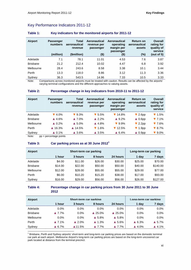
Key Performance Indicators 2011-12
Table 1: Key indicators for the monitored airports for 2011-12
Airport Passenger numbers
(million)
Total aeronautical
revenue
($million)
Aeronautical revenue per
passenger
($)
Aeronautical operating
margin per passenger
($)
Return on aeronautical
assets
(%)
Overall rating for quality of
service (out of 5)
Adelaide 7.1 78.1 11.01 4.53 7.6 3.87
Brisbane 21.2 212.4 10.02 4.47 6.8 3.92
Melbourne 28.4 243.6 8.58 3.38 10.1 3.44
Perth 13.3 118.0 8.86 3.12 11.3 3.36
Sydney 36.3 543.5 14.96 7.33 10.5 3.33 Note: Comparisons across monitored airports must be treated with caution. Results can be affected by the airports’
varying terminal configurations and the different approaches to valuing assets.
Table 2: Percentage change in key indicators from 2 010-11 to 2011-12
Airport Passenger numbers
Total aeronautical
revenue
Aeronautical revenue per
passenger
Aeronautical operating
margin per passenger
Return on aeronautical
assets
Overall rating for quality of
service
Adelaide ▼ 4.0% ▼ 9.3% ▼ 5.5% ▼ 14.8% ▼ 2.6pp ▼ 1.5%
Brisbane ▲ 4.6% ▲ 7.0% ▲ 2.2% ▲ 9.2% ▲ 0.6pp ▼ 7.1%
Melbourne ▲ 0.2% ▲ 5.0% ▲ 4.8% ▼ 9.9% ▼ 2.2pp ▼ 7.6%
Perth ▲ 16.3% ▲ 14.5% ▼ 1.6% ▼ 12.5% ▼ 1.9pp ▼ 8.7%
Sydney ▲ 0.1% ▲ 3.6% ▲ 3.5% ▲ 6.4% ▲ 0.9pp ▼ 9.0% Note: pp = percentage points
Table 3: Car parking prices as at 30 June 2012 1
Airport Short-term car parking Long-term car parking
1 hour 3 hours 8 hours 24 hours 1 day 7 days
Adelaide $4.00 $11.00 $26.00 $30.00 $25.00 $70.00
Brisbane $14.00 $22.00 $50.00 $50.00 $40.00 $140.00
Melbourne $12.00 $28.00 $55.00 $55.00 $29.00 $77.00
Perth $6.00 $10.20 $15.20 $38.00 $17.00 $93.00
Sydney $16.00 $29.00 $56.00 $56.00 $26.00 $127.00
Table 4: Percentage change in car parking prices fr om 30 June 2011 to 30 June 2012
Airport Short -term car parking Long -term car parking
1 hour 3 hours 8 hours 24 hours 1 day 7 days
Adelaide 0.0% 0.0% 0.0% 0.0% 0.0% 0.0%
Brisbane ▲ 7.7% 0.0% ▲ 25.0% ▲ 25.0% 0.0% 0.0%
Melbourne 0.0% 0.0% ▲ 5.8% ▲ 5.8% 0.0% 0.0%
Perth ▲ 7.1% ▲ 2.0% ▲ 1.3% ▲ 5.6% ▲ 6.3% ▲ 5.7%
Sydney ▲ 6.7% ▲11.5% ▲ 7.7% ▲ 7.7% ▲ 4.0% ▲ 4.1%
1 Brisbane, Perth and Sydney airports’ short-term and long-term car parking prices are based on the domestic terminal car park at each airport. Melbourne Airport’s long-term car parking prices are based on the long-term uncovered car park located at distance from the terminal precinct.

Key Findings Airport Monitoring Report 2011-12
xii
Table 5: Key car park indicators for the monitored airports for 2011-12
Airport Total airport car
parking revenue
($million)
Total airport car
parking operating
margin
($million)
Total airport car
parking spaces
Airport car parking
revenue per car park
space
($)
Airport car parking
margin per car park
space
Airport car parking
revenue as % of total
airport revenue
(%)
Adelaide 14.0 9.5 3 002 4 673 3 179 9.7
Brisbane 60.9 37.9 12 862 4 738 2 944 12.5
Melbourne 114.7 86.4 21 924 5 231 3 942 20.0
Perth 50.6 34.2 15 626 3 239 2 187 7.0
Sydney 100.4 69.4 13 116 7 654 5 290 10.0
Table 6: Percentage change in key indicators from 2 010-11 to 2011-12
Airport Total airport car
parking revenue
($million)
Total airport car
parking operating
margin
($million)
Total airport car
parking spaces
Airport car parking
revenue per car park
space
($)
Airport car parking
margin per car park
space
Airport car parking
revenue as % of total
airport revenue
(%)
Adelaide ▼ 4.9% ▼ 10.0% ▲ 0.1% ▼ 5.0% ▼ 10.1% ▲ 0.5pp
Brisbane ▲ 1.4% ▼ 11.8% ▲ 31.7% ▼ 23.0% ▼ 33.0% ▼ 0.6pp
Melbourne ▲ 0.05% ▼ 0.6% ▼ 2.2% ▲ 2.3% ▲ 1.6% ▼ 1.0pp
Perth ▲ 23.2% ▲ 24.3% ▲ 7.4% ▲ 14.7% ▲ 15.8% ▼ 6.9pp
Sydney ▲ 2.5% ▲0.4% ▲ 6.9% ▼ 4.1% ▼ 6.1% ▼ 0.2pp Note: pp = percentage points
Table 7: Investments in tangible aeronautical non-c urrent assets – 2002-03 to 2011-12 ($M)
$M 2002-03 2003-04 2004-05 2005-06 2006-07 2007-08 2008-09 2009-10 2010-11 2011-12
Adelaide 4.4 49.8 135.1 25.3 1.8 3.8 3.1 4.4 38.1 59.9
Brisbane 16.0 8.7 19.9 32.5 92.5 247.6 199.1 150.9 63.2 155.9
Melbourne 22.5 19.7 70.6 42.2 60.6 83.7 161.0 136.7 103.4 155.8
Perth 6.7 7.1 27.6 10.7 15.8 28.4 47.4 45.3 69.7 75.6
Sydney 151.1 49.2 46.3 124.4 161.6 83.9 345.3 227.1 65.0 100.2
Table 8: Investments as proportions of tangible aer onautical non-current assets – 2002-03 to 2011-12 (%)
2002-03
%
2003-04
%
2004-05
%
2005-06
%
2006-07
%
2007-08
%
2008-09
%
2009-10
%
2010-11
%
2011-12
%
Adelaide 3.4 28.3 32.8 6.3 0.5 1.0 0.8 1.2 9.5 13.4
Brisbane 2.8 1.5 2.2 3.5 9.1 19.5 14.2 11.4 4.7 10.8
Melbourne 5.3 4.7 14.9 8.5 11.3 14.1 22.1 16.4 11.5 15.5
Perth 7.7 4.0 14.1 5.9 8.4 13.8 19.4 16.2 20.6 19.0
Sydney 9.2 3.0 2.9 5.6 7.0 3.6 13.5 8.6 2.5 4.0

Airport Monitoring Report 2011-12 Summary
xiii
Summary - Airport Monitoring 2011-12
Prices, revenue, margins and quality of service for aeronautical services
Demand for aeronautical services
In 2011-12 demand for aeronautical services increased at all airports except Adelaide Airport.
Growth in total passenger numbers was relatively flat at Melbourne and Sydney airports increasing by 0.2 per cent and 0.1 per cent respectively. Growth was stronger at Brisbane Airport (4.6 per cent) and Perth Airport (16.3 per cent).
Passenger numbers at Adelaide Airport fell by 4.0 per cent compared with 2010-11. It is likely that a number of factors may have contributed to the drop in passenger numbers at Adelaide Airport, including subdued economic conditions, Tiger Airways ceasing operations at the airport from July 2011 and the Qantas grounding and associated industrial action. 2
Perth and Brisbane airport have experienced strong growth in domestic passenger numbers. Falls in domestic passenger numbers at Sydney and Melbourne airports were off-set by higher numbers of international passengers.
Section 1.4.1 discusses airport throughput levels at monitored airports.
Total and average revenues and prices
All airports other than Adelaide Airport earned higher aeronautical revenues during 2011-12.
In 2011-12, higher average prices at Sydney and Melbourne airports contributed to solid growth in aeronautical revenues of 3.6 per cent and 5.0 per cent respectively despite relatively low growth in passenger numbers.
Higher average prices and an increase in passenger numbers at Brisbane Airport during 2011-12 contributed to a strong increase in aeronautical revenues of 7.0 per cent.
Perth Airport reported a slight fall in aeronautical revenue per passenger (average prices) (-1.6 per cent) but significantly higher total aeronautical revenues (14.5 per cent) due mainly to strong growth in total passenger numbers.
At Adelaide Airport, lower average prices and a fall in passenger numbers resulted in lower aeronautical revenues (-9.3 per cent).
Sections 1.4.2 and 1.4.3 describe total aeronautical revenues and average prices at monitored airports.
2 Tiger Airways re-commenced operations at Adelaide Airport after the end of the 2011-12 financial year.

Summary Airport Monitoring Report 2011-12
xiv
Aeronautical margins
Sydney and Brisbane airports were the only two airports to report higher aeronautical operating margins per passenger during 2011-12.
At Sydney Airport, aeronautical operating margins per passenger increased 6.4 per cent due to higher increases in revenue than costs and comparatively low growth in overall passenger numbers.
At Brisbane Airport, higher aeronautical revenue per passenger coupled with lower aeronautical operating expenses per passenger resulted in an increase in operating aeronautical margins per passenger of 9.2 per cent.
Adelaide, Melbourne and Perth airports experienced falls in aeronautical operating margins per passenger of 14.8 per cent, 9.9 per cent and 12.5 per cent respectively.
At Melbourne Airport, an increase in average aeronautical revenues per passenger of 4.8 per cent was not enough to offset the effects of an increase in aeronautical operating expenses of 17.3 per cent. Higher depreciation and salaries contributed to higher costs at Melbourne Airport.
At Adelaide Airport, aeronautical margins per passenger fell as aeronautical revenues per passenger decreased while operating expenses per passenger increased by 2.4 per cent.
At Perth Airport, aeronautical margins per passenger fell as aeronautical revenues per passenger fell 1.6 per cent while operating expenses associated with the airport’s expansion increased.
Section 1.4.5 presents an analysis of aeronautical margins at monitored airports.
Returns on assets
Sydney and Brisbane airports recorded slightly higher returns on aeronautical assets in 2011-12 relative to 2010-11, consistent with the changes in aeronautical operating margins. Returns fell at the other three monitored airports.
In the 2009-10 and 2010-11 AMRs, the ACCC noted that airports are partially insulated from the effects of economic shocks (such as the global financial crisis and natural disasters) that can reduce demand for air travel.
Section 1.4.6 describes returns on assets at monitored airports.
Quality of services
The overall ratings for quality of service (that is, quality of service ratings based on objective indicators and responses from surveys of airlines, passengers and border agencies) fell at all monitored airports during 2011-12, with each airport receiving an overall rating of satisfactory.
For the first time since 2007-08, none of the airports achieved an overall rating of good (that is, a rating equal to 4.0 or higher).
Adelaide Airport’s rating by passengers and airlines decreased within the satisfactory category. Passengers rated Adelaide Airport lowest along with Sydney Airport while airlines rated it highest for quality of service provided to airlines.

Airport Monitoring Report 2011-12 Summary
xv
Brisbane Airport achieved highest overall rating among monitored airports. Passengers’ rating dropped slightly within the good range while airlines’ ratings decreased but remained satisfactory. Airlines’ rating for runway availability fell significantly in 2011-12 to poor after it was rated good in 2010-11. Brisbane Airport was ranked highest by passengers and second highest by airlines.
Melbourne Airport’s rating by passengers decreased slightly in 2011-12, though remained good. Airlines’ ratings increased within the satisfactory range. Passengers rated Melbourne Airport second among the five monitored airports while airlines ranked it third.
Perth Airports’ average passenger rating decreased from good in 2010-11 to satisfactory in 2011-12. Airlines’ rating for Perth Airport remained poor. Passengers rated Perth Airport third while airlines rated it last for quality of service provided to airlines.
Sydney Airport had the lowest overall rating among monitored airports for 2011-12. Passengers’ rating increased within the satisfactory range in 2011-12. Sydney Airport was the only airport that received an increased passenger rating in 2011-12. Airlines’ rating decreased from satisfactory in 2010-11 to poor in 2011-12. Passengers rated Sydney Airport, along with Adelaide Airport, lowest among monitored airports while airlines rated it second lowest.
Section 1.5 presents an analysis of quality of service outcomes for all monitored airports.
Emerging capacity constraints in aeronautical infrastructure
While in 2011-12 passenger numbers fell at Adelaide Airport and were essentially flat at Melbourne and Sydney airports, the monitored airports as a whole have experienced significant growth in passenger numbers in recent years.
Total passenger throughput at the five monitored airports has increased by 71.1 per cent since 2001-02, with passenger numbers increasing from 62.1 million in 2001-02 to 106.3 million in 2011-12. Aircraft movements have increased by 30.7 per cent over the same time period, increasing from 733 694 in 2001-02 to 958 863 in 2011-12.
It is likely that further investment will be required by the monitored airports over the next few years to ensure that aeronautical capacity is sufficient to accommodate the future needs of users.
Forecasts of continued growth in passenger throughput and aircraft movements at the monitored airports suggests that existing aeronautical infrastructure is likely to be under increasing pressure in the medium to long term. The Bureau of Infrastructure, Transport and Regional Economics (BITRE) has projected that by 2031 total passenger throughput at the five monitored airports will increase by 103.8 per cent, from 106.3 million passengers in 2011-12 to 216.7 million passengers in 2030-31.3 BITRE also projected that by 2030, total aircraft movements at the five monitored airports will increase by 55.5 per cent, from 958 863 movements in 2011-12 to just under 1.5 million movements in 2029-30.4
If unaddressed, congestion issues will have direct impacts on users of the airports, as well as indirect impacts on the economy more broadly. Australia’s major airports are a significant component of the national transport infrastructure, facilitating the movement of people and the supply of goods and services. As a result, the major airports make a considerable contribution to Australia’s overall economic prosperity. Notably, the direct contribution of the air and space
3 Bureau of Infrastructure, Transport and Regional Economics, Research Report 133: Air passenger movements through capital and non-capital city airports to 2030-31, November 2012. 4 Bureau of Infrastructure, Transport and Regional Economics, Research Report 117: Aircraft movements through capital city airports to 2029-30, April 2010.

Summary Airport Monitoring Report 2011-12
xvi
industry to the Australian economy in the year ending 30 June 2012 was approximately $7.1 billion, or approximately 0.5 per cent of Australia’s Gross Domestic Product.5
Despite investment in aeronautical assets over the last 11 years, there is evidence of emerging system-wide congestion at Australia’s monitored airports. According to the BITRE, between November 2003 and January 2013, the proportion of domestic flights that arrived on-time fell, on average, 11.4 per cent while the proportion of domestic flights that departed on-time fell 8.9 per cent across monitored airports. At the same time the number of flights into and out of the monitored airports has increased markedly.6
The government’s pricing principles for Australian monitored airports provide for the use of peak-period pricing to deal with the effects of congestion. It is noted, however, that monitored airports have preferred to ration excess demand through slot management schemes based on grandfathered landing rights. The use of grandfathered quantity rationing systems may have the effect of discouraging efficient new entry.
In the long run, the most efficient way for airports to respond to congestion is to invest in new infrastructure to accommodate the increase in demand. A number of airports have noted the emergence of capacity constraints and the need for additional capacity.
Melbourne Airport has noted that investment to expand runway capacity will be required before the end of the decade in order to meet growing demand. Brisbane Airport has stated that it expects the growth in air travel to start exceeding the capacity of its current runway system between 2013 and 2015. Perth Airport has noted that demand concentration during peak periods is placing pressure on its infrastructure.7
In respect of Sydney Airport, the report to the Australian and NSW governments by the Steering Committee of the Joint Study on aviation capacity in the Sydney region concluded that immediate action is needed to increase Sydney Airport’s capacity to meet growing demand. The Steering Committee concluded that from around 2030, an additional airport will be needed to supplement the capacity of Sydney Airport.8
Section 2.3 discusses evidence of congestion at monitored airports.
Master planning process at Australian airports
To ensure that airports continue to invest in airport infrastructure, the government requires airports to prepare master plans and major development plans, so that airports can indicate the areas where investments will be undertaken. These plans also require public consultation, so that users can express views to the airports and the Government about where investment should be targeted to meet their needs.
Under the Airports Act 1996 (Airports Act), Australian airports are required to establish a 20 year forward-looking master plan, which identifies, for example, development objectives and future aviation requirements. Master plans are updated by the airports every five years and have to be approved by the Minister for Infrastructure and Transport (the Minister). The five monitored airports have master plans in place which are due to be updated over the next two years.
5 ABS, Australian National Accounts, National Income, Expenditure and Product (ABS cat. no. 5206.0, June 2012, Table 45).
6 Bureau of Infrastructure, Transport and Regional Economics, Domestic airline on time performance, December 2003
and December 2012. 7 Perth Airport, Submission to ACCC Airport Monitoring Report, 28 September 2012. See also Brad Geatches, Perth Airport challenges, West Australian Perth, 15 October 2012. 8 Steering Committee, Joint Study on aviation capacity in the Sydney region, March 2012.

Airport Monitoring Report 2011-12 Summary
xvii
The Government stated in its 2009 National Aviation Policy White Paper (the White Paper) that improved planning is one of its policy goals for Australian airports, in order to facilitate better integration and coordination with off-airport planning and to facilitate continued investment in Australia’s airport infrastructure and land transport links.9 Following the release of the White Paper, the Government has increased the requirements for airports to consult and engage with the broader community throughput the planning process.
Airports must also prepare major development plans for major projects
Under the Airports Act, Australian airports are also required to prepare a major development plan for each major individual development at an airport, including aeronautical and non-aeronautical projects. Airports must undertake public consultation on draft major development plans before submitting the plan to the Minister for approval.
Planning for future investment in aeronautical serv ices
The monitored airports have plans to invest in aeronautical assets over the next few years, in order to expand aeronautical capacity.
Brisbane Airport has recently completed the detailed design for the first construction phase of its new parallel runway and has commenced civil works. Brisbane Airport has proposed that construction will be completed by 2020.
In November 2012, Melbourne Airport announced its preferred orientation for a third runway, with its proposal to be outlined in its 2013 master plan.10 Melbourne Airport noted that a third runway will be required from around 2018-22 to meet the growing demand for access to the airport.
Perth Airport has planned a number of projects within the international terminal following opening of a new domestic terminal in March 2013, including an expansion and redesign of the international arrivals area and the departures customs, security screening and lounge areas. It has been reported in the media that Perth Airport has commenced planning for a third runway.11
Sydney Airport, while constrained by legislative requirements from increasing runway capacity, is planning to undertake a number of initiatives, including a proposed reconfiguration of the current domestic and international precincts.12
ACCC to monitor and report on airports’ investment projects
The ACCC intends to track progress by airports in implementing investment plans. Future AMRs will assess and report on the extent to which planned investments are taking place.
Chapter 2 presents an in-depth analysis of emerging capacity constraints on the supply of aeronautical services and future investment needs at monitored airports.
9 Australian Government, National Aviation Policy White Paper, December 2009. 10 Melbourne Airport, Melbourne Airport announces third runway preference, Media Release, 20 November 2012. 11 Examples include; Geoffrey Thomas, Airport had warning of chaos, West Australian, 12 October 2012 and; Brad Geatches, Perth Airport challenges, 15 October 2012 and; Natalie Gerritsen, Perth unlocks keys to terminal, Australian Financial Review, 8 January 2013. 12 Sydney Airport, New Vision To Integrate International , Domestic and Regional Services, 5 December 2011, viewed on 9 January 2013 at; http://www.sydneyairport.com.au/corporate/media-centre/media-releases/media-release-detail.aspx?item=%7B19FE83DF-66A6-49CA-A219-72C3A4A4C7E0%7D&lst=%7BC313C142-0E4E-4269-A2FB-BDEB95B3BC9E%7D.

Summary Airport Monitoring Report 2011-12
xviii
Prices, revenue, margins and capacity for airport c ar parking
The ACCC monitors on-airport car parking prices and revenues, costs and profits associated with on-airport car parking for all monitored airports.
The ACCC also collects information on charges imposed by airports on operators of alternative services to on-airport car parking as well as the amount of revenue received from those operators. Alternatives to on-airport car parking include taxi services, limousine and hire car services, and private and public bus services.
By imposing excessive charges or restrictive terms and conditions for landside access, airports could potentially obstruct competition from alternatives to on-airport car parking. This could have the effect of shifting demand from those alternatives to an airport’s own car parking services, and allow the airport to charge higher prices.
However, it is important to note that, for the reasons outlined at the end of this chapter, care needs to be taken when interpreting the levels of on-airport car parking and landside access prices, revenues, costs and profits, and when making comparisons of performance across the monitored airports and over time.
Because of the many different types of price points available on car parking (that is, different prices per different lengths of car park stays), it is not possible to make reference to an average price for car parking. Instead, car parking revenue, costs and margins per car park space are used as indicators of unit revenue, unit costs and unit margins.
Prices and Revenues
At Brisbane, Melbourne Perth and Sydney airports car park revenues increased in 2011-12 due to a combination of higher car parking charges and increased demand. See Table 3 in the Key Findings for data on car parking prices and revenues.
Perth Airport reported a 23.2 per cent increase in revenues as a result of increases in car park prices in three of the four price points shown in Table 3 in the Key Findings and an increase of 7.4 per cent in the number of car park spaces.
Brisbane and Sydney airports recorded slight increases in revenue (up 1.4 per cent and 2.5 per cent respectively) and large increases in the number of car park spaces (up 31.7 per cent and 6.9 per cent respectively).
Melbourne Airport’s car parking revenues were largely unchanged in 2011-12. Two of the price points were increased and the number of car spaces decreased by 2.2 per cent. In 2011-12, Melbourne Airport earned the highest revenues from car parking ($114.7 million) and the highest proportion of total airport revenue from car parking (20 per cent).
Car parking prices did not change at Adelaide Airport which recorded a fall in car parking revenues of 4.9 per cent.
Section 3.3 describes prices charged for car parking at monitored airports, while section 3.4 discusses revenues earned by airport operators from their car parking businesses.
Margins
Two airports, Adelaide and Brisbane, experienced a fall in margins earned on their car parking operations. Adelaide and Brisbane airports recorded falls in margins, of 10.0 per cent and
Airport Monitoring Report 2011-12 Summary
xix
11.8 per cent respectively, and in margins per car park space of 10.1 per cent and 33.0 per cent respectively.
Sydney Airport reported a rise in total margins of 0.4 per cent but, because of a rise of 6.9 per cent in the number of car park spaces, margins per car park space fell 6.1 per cent. Despite this, Sydney Airport continued to earn the highest margin per car park space with $5 290.
Perth Airport car parking margins increased 24.3 per cent while margin per car park space increased 15.8 per cent.
Melbourne Airport car parking margins were largely unchanged from 2010-11 levels but remained the highest among monitored airports ($86.4 million).
Section 3.4 assesses margins earned on car parking facilities at monitored airports.
Landside services
Recent trends in landside access prices and revenue s
The ability of operators of landside alternatives to on-airport car parking, such as taxis, trains, off-airport car parking, buses and hire cars, to supply these services depends on whether they can have access to airport land, and on the terms and conditions of access.
Airports control access to airport land, and the associated terms and conditions of access, and so have the ability to influence the level of competition between on-airport car parking and other off-airport landside alternatives.
Results of monitoring charges and revenues associated with landside access include:
Three airports, Brisbane, Perth and Sydney, increased some charges while Melbourne and Adelaide airports left all landside access charges unchanged in 2011-12.
Total landside revenue increased at all airports other than Adelaide Airport. Total revenue earned from landside access operations at all airports increased by almost 20 per cent to around $28.7 million in 2011-12.
Revenue at Brisbane, Melbourne and Perth airports increased 9.2 per cent, 6.4 per cent and 10.1 per cent respectively. Sydney Airport’s revenue from landside access was the highest of all five airports at about $13.3 million, increasing by around 36.9 per cent in 2011-12. Sydney Airport accounted for around 46 per cent of the combined land-side revenue earned by monitored airports.
Section 3.6 presents additional information on landside charges and revenues.
Investing in landside services
Projected growth in passenger numbers will also increase demand for landside access at monitored airports. This will create the need for investment in car parking facilities, terminal roads, kerbside management, and other facilities used by landside operators supplying alternatives to on-airport car parking.
An airport’s landside infrastructure can be broadly categorised as that existing within an airport and immediately adjacent to the airport precinct. Landside infrastructure within an airport broadly consists of car parks, taxi holding areas, train platforms and other facilities, pick-up and drop-off areas and roads surrounding the terminals and connecting the airport to the major roads outside of the airport precinct. Beyond the airport boundaries, landside infrastructure consists of road and rail networks used by consumers to access the airport.
Summary Airport Monitoring Report 2011-12
xx
As noted, several major investment projects are underway or have recently been completed by the monitored airports. Looking forward, it will be imperative that the airports liaise with users and governments to develop appropriate landside solutions to address growth. Such engagement with stakeholders will ensure landside developments are fit for purpose, deliver sufficient spare capacity and integrate with wider infrastructure networks.
Section 3.8 analyses possible capacity issues at landside facilities including future investment requirements in section 3.8.1.
Cooperation is necessary
Planning, collaboration and investment in landside facilities, particularly those transportation networks outside of airport borders, will be required to complement significant airside capacity expansion and aeronautical growth at airports.
Establishing efficient landside networks for getting to and from an airport requires input from a number of parties such as airports, landside operators, state governments and the Commonwealth. As airports continue to grow, and the surrounding landside infrastructure becomes increasingly congested, effective cooperation between responsible parties will be important to implement effective landside solutions.
It will be important that the airports liaise with users and governments to develop appropriate landside solutions to address forecast growth, to ensure that they are fit for purpose and deliver sufficient spare capacity.
Section 3.8.2 discusses investment planning processes for landside facilities.
Monitoring investment outcomes
To improve the scope and ability for the ACCC to assess the airport operator’s performance and progress against investment plans, this year’s airport monitoring program was extended to collect details of completed, ongoing and planned investment in landside infrastructure.
By reporting on progress with airport investment, the AMR can provide further observations of how airports are responding to any congestion issues at the landside and whether there are issues outside the airport boundaries that are influencing the efficiency of landside infrastructure networks.
This information, in conjunction with the airports’ own master plans, will assist in assessing the extent to which the airports are meeting the needs of their users.
The ACCC’s role in monitoring aeronautical and car parking services
The ACCC’s monitoring role for the major airports
In a number of inquiries into the economic regulation of airport services, the most recent of which was in 2011, the PC has reiterated that airports monitored by the ACCC have market power. According to the PC “...the market power of Sydney, Melbourne, Brisbane and Perth Airports is sufficient to warrant policy attention”. 13 Airports control access to the key infrastructure necessary for air transportation and for users of airports to access terminals. In many cases, there is a lack of practical alternatives for travelling overseas and the large distances between capital cities. Consequently, the air transportation industry plays a pivotal
13 Productivity Commission, Economic Regulation of Airport Services, Inquiry report No. 57, Canberra, December 2011.

Airport Monitoring Report 2011-12 Summary
xxi
role in the Australian economy in facilitating travel as well as movement of time sensitive goods and services.
Due to concerns that airports could use their position to earn monopoly profits to the detriment of Australians, the Australian Government has directed the ACCC to monitor the quality, prices, costs and profits relating to the supply of aeronautical and car parking services by Australia’s five major airports—Adelaide, Brisbane, Melbourne (Tullamarine), Perth and Sydney (Kingsford Smith) airports.
The government established a price monitoring approach to regulating airports in 2002 following consideration of the recommendations of a PC inquiry. The move from a price regulation regime to a monitoring regime was intended to facilitate investment and innovation, while retaining a constraint on the exercise of market power by the airports in their dealings with airlines and other customers. In responses to subsequent PC inquiries in 2006 and 2011, the government has reiterated its commitment to the continuation of the airports monitoring program.
The ACCC is also required to monitor the quality of service in relation to the provision of prescribed aspects of airport services and facilities by those airports.
Productivity Commission 2011 inquiry into the economic regulation of airport services and the Government’s response
During 2010, the government responded to concerns raised by the ACCC in relation to its 2008-09 AMR. These concerns included that Sydney Airport had potentially increased profits by permitting service-quality standards to fall below that which could be expected in a competitive environment over a sustained period.
The 2011 PC report into the economic regulation of airport services concluded that Brisbane, Melbourne, Perth and Sydney airports retain sufficient market power to be of policy concern.14 The PC recommended that the current monitoring program should continue to operate until at least 2020.
The government agreed in principle with the PC’s recommendations to continue monitoring of airports by the ACCC and that the next review of the monitoring program should be done in 2018.
Limitations of monitoring
Monitoring of itself does not restrict airports from using their monopoly position to increase prices and/or lower service standards.
Monitoring is limited in its scope to undertake a detailed assessment of the performance of airport operators. The results from monitoring do not provide conclusive evidence as to whether airport operators are exercising market power. For example, it is not possible to determine whether airports are earning monopoly rents from information obtained through the monitoring program. A more detailed evaluation of the airports’ performance would be required to make more definitive findings, including a comparison with economically efficient benchmarks. However, such an evaluation is beyond the scope of monitoring. Among other things, within accepted accounting conventions airports have discretion on asset values. This limits the usefulness of data on returns on assets as an indicator of economic performance.
14Productivity Commission, Economic Regulation of Airport Services, Inquiry Report No. 57, Canberra, December 2011.

Summary Airport Monitoring Report 2011-12
xxii
Importantly, monitoring does not directly restrict the airports from increasing prices and/or lowering service standards and does not provide the ACCC with a general power to intervene in the airports’ conduct in setting of terms and conditions of access.
For these reasons, monitoring is not effective in addressing the policy concern that an unconstrained airport presents and is not a substitute for effective regulation.
That said, monitoring allows the performance of airports to be considered based on observations from the monitoring results over time. It is possible for the ACCC to make general observations about whether certain outcomes might be consistent with firms with market power. For example, the ACCC may express concerns about an airport’s performance where prices increase while quality of service is observed to have remained constant or even fallen below satisfactory, over a sustained period of time.
By providing a greater level of transparency to the airports’ performance, monitoring also seeks to address information asymmetries that may exist between airports and its customers.
Analysis and interpretation of monitoring results
Presentation of data and charts in the 2011-12 report
The 2010-11 AMR presented most charts and tables with airport data commencing from 2006-07.
In the current AMR, the time series presented and discussed in the accompanying notes extends from 2001-02 to 2011-12, representing 11 years of data.
The ACCC believes that an appropriate period to assess trends over time is for data to be presented from 2001-02 to 2011-12. The change to presenting data with a longer time series enables analysis of pricing and long term asset values and changes over time. Airport assets are usually long-term investments. Where practicable, long-term time series, such as data covering the period from 2001-02 is presented in both nominal and real terms.
Monitoring prices, profits and quality of aeronautical services
A number of indicators have been developed to monitor prices, profits and quality of aeronautical services.
The ACCC publishes a schedule of prices charged by each airport for the supply of aeronautical services (see chapters 4-8). Airports provide many different types of services with charges levied on different bases - such as on a per passenger basis or by aircraft weight. Further, airports might offer discounts for certain periods or to certain users, or there might be minimum and maximum charges in place which affect some users but not others.
In addition, the price changes for particular airport users might vary depending on the composition of the airport services they utilise, the times at which they use them and so on. For example, the costs to an airline of a domestic flight are likely to be different to those associated with an international one due to differing security and processing requirements. Similarly, changes in price structure by an airport might affect users in different ways—even to the point of effectively lowering the costs for one user while raising them for another.
For these reasons, it is difficult to aggregate all services and prices into a single average price of aeronautical services for monitoring purposes. The lack of a single aggregate price complicates the task of establishing trends over time given and comparing prices across airports.

Airport Monitoring Report 2011-12 Summary
xxiii
Given these complications, the ACCC’s primary measure of average airport prices is aeronautical revenue per passenger. This relies on a consistently defined service definition and provides a measure of the cost to airlines expressed in terms of the most significant charging unit.
Similarly, when measuring net earnings, the ACCC has relied on aeronautical operating margins per passenger as an indicator of unit profits and return on aeronautical assets as an indicator of profitability.
Measures of service quality include survey ratings by airlines, passengers and border agencies as well as objective indicators.
Caveats - monitoring costs and profits
As noted, care should be taken when making comparisons of performance across airports and over time. There are many factors that may influence the price and quality of service monitoring results.
The price, cost and profit data presented in this report is based on accounting data provided by the monitored airports. The main caveats for price monitoring results include:
• difficulties in consistently reporting financial information because of changes in legislation and regulations that can affect how items are reported (including in accounting practices such as the transition to Australian equivalents to International Financial Reporting Standards in 2005–06)
• indicators of profitability based on accounting data in particular are not effective measures of economic performance and only provide guidance on trends in operating performance over time
• airports’ return on assets can be significantly affected by the discretion they have on asset revaluations. This affects the usefulness of analyses of rates of return on assets for assessing economic performance and also complicates comparisons of changes in rates of return over time and across airports.
A change in the definition of aeronautical services and non-aeronautical services in 2007–08 by the Australian Government significantly affected how revenues are reported and reduced the comparability of airports’ revenues with prior years.
As with other multi-product firms, airports incur a range of costs that are common across aeronautical and non-aeronautical services. As there is no economically meaningful way of allocating common costs to individual products and services, allocation of expenses to different types of services requires some discretion by the airport operators, which in turn can influence measures of profitability of services.
Financial indicators can provide useful insights into the operational performance of airports over time. However, they should not be interpreted in isolation as they only provide a partial indication of performance and are not definitive. Trends of operational performance across airports are more reliable if comparable results are present for a range of relevant indicators.
For example, the ACCC employs a number of indicators to measure profitability to account for their respective limitations. Aeronautical operating margin per passenger is used by the ACCC as a measure of unit profits. However, this measure does not make an allowance for risk-adjusted returns on capital associated with the provision of services.
The ACCC also uses return on average assets as an additional measure of profitability, although this measure is likely to vary according to the stage of a given airport’s investment

Summary Airport Monitoring Report 2011-12
xxiv
cycle. In addition, rates of return can also be affected by different asset valuation methodologies employed by airports. Among other things, airports’ upward revaluation of assets might lower measures of return on average assets. This can possibly distort comparisons across airports and over time.
In order to establish asset values to facilitate the monitoring of rates of return a ‘line in the sand’ measure was reported for the first time in the 2007–08 ACCC AMR. The line in the sand approach removes for monitoring purposes the effects of revaluations of aeronautical assets by airports after 30 June 2005. This approach, however, may also be affected to the extent that airport operators had chosen to revalue assets prior to this cut-off date.
Another reason that may make comparisons across airports difficult is the fact that the ACCC’s monitoring role for aeronautical services relates only to those terminals that are owned and operated by the monitored airports. However, some of the airports’ domestic terminals, such as the Qantas and Virgin Australia domestic terminals at Brisbane Airport are leased and operated by those airlines and are not subject to the ACCC’s monitoring. Therefore the revenues, costs, profits and quality of service associated with those terminals are not included in the monitoring results presented in this report.15
Caveats - monitoring quality of service
The provision of airport services can be influenced by different parties and, therefore, interpretation of the quality of service results need to take these different factors into account. Indeed, airport services are commonly the combined responsibility of a number of entities—including airlines, government agencies, the airport operator and sub-lessees of the airport operator.
The quality of service results should not be considered in isolation of other indicators as doing so can result in misinterpretation of the outcomes. The objective measures of quality of service may provide useful context to the understanding of survey results and should therefore be interpreted in conjunction with each other.
15 Note that the rent charged by the Airport operators to Airlines such as Qantas and Virgin for the use of the terminal is included in non-aeronautical revenue.

Airport Monitoring Report 2011-12 Overview of the monitoring results for aeronautica l services
1
1 Overview of the monitoring results for aeronautical services
Key points
Trends in prices, costs and margins for aeronautical services
• With the exception of Adelaide Airport, passenger numbers increased at the monitored airports in 2011-12. Sydney Airport has had the highest passenger throughput in every year since 2001-02, while Perth Airport has had the highest growth in passenger throughput since 2001-02.
• Domestic passenger numbers fell but international passenger numbers increased in 2011-12 at Australia’s two largest airports at Sydney and Melbourne. On the other hand, domestic passenger travel made significant contributions to the strong growth in passenger numbers at Perth and Brisbane airports.
• Aeronautical revenue per passenger (an indicator of average prices) fell at Adelaide and Perth airports but rose at the other monitored airports.
• Sydney Airport remained the airport with the highest aeronautical revenue per passenger at $14.95 per passenger compared with the second highest at Adelaide Airport with $11.01 per passenger.
• Adelaide, Melbourne and Perth airports reported a decrease in aeronautical operating margin per passenger (an indicator of profitability), while Brisbane and Sydney airports reported an increase in aeronautical operating margin per passenger.
• Sydney Airport continued to be the airport with the highest aeronautical margin per passenger at $7.33 per passenger compared with the second highest at Adelaide Airport with $4.53 per passenger.
Trends in quality of service for aeronautical services
• Overall quality of service ratings, based on objective indicators and encompassing the views of airlines, passengers and border agencies, decreased for all monitored airports in 2011-12, though all airports remained rated as satisfactory.
• Sydney Airport recorded the lowest ratings in terms of overall quality of service for the seventh consecutive year.
• Airlines’ ratings, which can provide a more direct indication of the quality that the airport operators provide, decreased at Adelaide, Brisbane and Sydney airports in 2011-12. Airlines’ rating of Melbourne Airport’s quality of service increased, and remained unchanged at Perth Airport.
Price and quality ratings for the airports
• Sydney Airport had the highest aeronautical revenue per passenger and the lowest overall rating for quality of service in 2011-12.
• In contrast, Melbourne Airport had the lowest aeronautical revenue per passenger and was third behind Brisbane and Adelaide airports for overall quality of service.

Overview of the monitoring results for aeronautical services Airport Monitoring Report 2011-12
2
1.1 Introduction
This chapter presents observations on the performance of Adelaide, Brisbane, Melbourne (Tullamarine), Perth and Sydney (Kingsford Smith) airports in relation to the supply of aeronautical services.
For the purposes of the ACCC AMRs, aeronautical services are defined as services provided by airport infrastructure to facilitate air transportation of passengers and freight. Under regulation 7.02 of the Airports Regulations 1997, aeronautical services and facilities are defined as “services and facilities at an airport that are necessary for the operation and maintenance of civil aviation at the airport”. These include services and facilities listed in the tables accompanying the regulations: aircraft-related services and facilities such as runways, taxiways, and passenger-related services and facilities such as public areas in terminals, departure and holding lounges.
Section 2 describes terminal configurations at different airports. Section 1.3 provides some key observations about the performance of each of the monitored airports during 2011-12. Key indicators relating to activity, prices, revenues, costs, margins and investments for aeronautical services are discussed in section 1.4, showing changes in indicators over time in nominal values, as well as inflation-adjusted values. Section 1.5 presents the quality of service results, while section 1.6 compares the airports’ price and quality of service outcomes for the most recent year (2011-12).
More detailed information about the monitoring results for aeronautical services since 2001-02 is provided on an airport-by-airport basis in chapters 4 to 8. Monitoring data going back to 2001-02 is presented in order to provide an analysis of long-term trends. Aeronautical assets, such as terminals and runways, are generally long-lived assets, and long-term analysis can provide an indication of the adequacy of these investments over time.
Appendices A.1 and A.2 of this report provide the individual airports’ regulatory accounts and detailed information on the airports’ indicators and statistics used in this report. For details regarding the approach taken by the ACCC in preparing the measures used in this report, as well as a full list of aeronautical services covered by the monitoring program, see appendices A.4 to A.7.
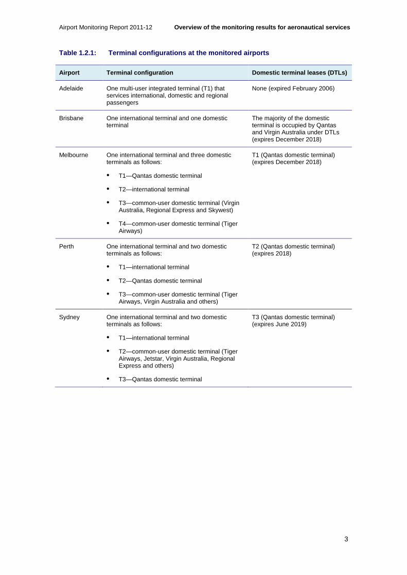
1.2 Airport terminal configurations
The monitored airports have considerably different terminal configurations. Some airports offer a combined terminal for international and domestic passengers, while others have separate terminals.
Importantly, some of the domestic terminals at the monitored airports are leased and operated by airlines under domestic terminal leases (DTLs). Under DTLs, airlines operate their terminals independently of the airports and have greater discretion over the quality of services and facilities offered.16 The existence of DTLs at some of the monitored airports complicates comparisons of monitoring results across airports (see box 1.2.1)
The various terminal configurations offered by the monitored airports and the DTLs that apply are outlined in table 1.2.1.
16 For more detailed information on the implications of domestic terminal leases, see chapter 3 of the ACCC’s Airport Monitoring Report 2008-09.
Airport Monitoring Report 2011-12 Overview of the monitoring results for aeronautica l services
3
Table 1.2.1: Terminal configurations at the monitor ed airports
Airport Terminal configuration Domestic terminal leases (DTLs)
Adelaide One multi-user integrated terminal (T1) that services international, domestic and regional passengers
None (expired February 2006)
Brisbane One international terminal and one domestic terminal
The majority of the domestic terminal is occupied by Qantas and Virgin Australia under DTLs (expires December 2018)
Melbourne One international terminal and three domestic terminals as follows:
• T1—Qantas domestic terminal
• T2—international terminal
• T3—common-user domestic terminal (Virgin Australia, Regional Express and Skywest)
• T4—common-user domestic terminal (Tiger Airways)
T1 (Qantas domestic terminal) (expires December 2018)
Perth One international terminal and two domestic terminals as follows:
• T1—international terminal
• T2—Qantas domestic terminal
• T3—common-user domestic terminal (Tiger Airways, Virgin Australia and others)
T2 (Qantas domestic terminal) (expires 2018)
Sydney One international terminal and two domestic terminals as follows:
• T1—international terminal
• T2—common-user domestic terminal (Tiger Airways, Jetstar, Virgin Australia, Regional Express and others)
• T3—Qantas domestic terminal
T3 (Qantas domestic terminal) (expires June 2019)

Overview of the monitoring results for aeronautical services Airport Monitoring Report 2011-12
4
Box 1.2.1: Domestic Terminal Leases
Comparisons of airports’ revenues, prices, costs, margins and quality of service are complicated by domestic terminal leases (DTLs) at some of the monitored airports.
The direction issued to the ACCC under s.95ZF of the CCA to undertake airport monitoring up to 2011-12 (Direction No 29) relates to aeronautical and car parking services and facilities provided by Sydney Airport Corporation Limited (Sydney Airport), Australia Pacific Airports Corporation Limited (Melbourne Airport), Brisbane Airport Corporation Pty Limited (Brisbane Airport), Perth Airport Pty Ltd (Perth Airport) and Adelaide Airport Limited (Adelaide Airport).
The Airports Regulations 1997 define aeronautical services and facilities to include both aircraft-related and passenger-related services and facilities provided at an airport.17 However, the ACCC’s monitoring program does not include passenger-related services and facilities that are provided within a terminal that is occupied and operated by an airline under a DTL. Therefore, the revenues, prices, costs, margins and quality of service associated with the passenger-related services and facilities provided within these terminals are excluded from the results presented in this report.18
Adelaide Airport is the only monitored airport that does not have any DTLs. Adelaide Airport opened its multi-user terminal in October 2005, with Qantas transferring its domestic operations from the terminal that it occupied and operated under a DTL to the new terminal in February 2006. Therefore, monitoring data collected from Adelaide Airport prior to February 2006 does not include data on passenger-related services and facilities provided within the domestic terminal operations of Qantas. This contributed to Adelaide Airport reporting significant increases in aeronautical revenue, expenses and margins in 2005-06 and 2006-07, as data on passenger-related services and facilities previously provided within the domestic terminal operations of Qantas were included in the monitoring programme for the first time.
1.3 Key observations from the monitoring results fo r aeronautical services
In performing its monitoring role, the ACCC looks at levels and trends across a range of indicators—including prices, costs, margins, returns on assets, investment and quality of service—at the individual airports. However, although observations from monitoring may raise some concerns about an individual airport’s performance, monitoring does not allow a detailed assessment of the airport’s performance to be undertaken and cannot be used to conclusively establish whether an airport has exercised market power to earn monopoly rents. The limitations of monitoring are set out in further detail in the executive summary, while appendix A.7 discusses the ACCC’s monitoring methodology.
For the purposes of the discussion in this section, analysis of quality of service is focused on the quality of service provided to airlines and on the results of the airline survey results, as airline ratings can provide a more direct indicator of the quality of service that the airport operator provides. This is because airports provide services directly to airlines under commercial arrangements and are in a position to make an informed assessment of quality against price.
17 Aeronautical services and facilities have the meaning given by regulation 7.02A of the Airports Regulations 1997. 18 For more detailed information on the implications of domestic terminal leases, see chapter 3 of the ACCC’s Airport Monitoring Report 2008-09.

Airport Monitoring Report 2011-12 Overview of the monitoring results for aeronautica l services
5
Given the complex nature of airports’ bundling of charges, and changes on the basis of how these charges are applied, the ACCC adopts aeronautical revenue per passenger as an indicator of average prices that the airlines pay to airports. Aeronautical operating expenses per passenger are used as an indication of unit costs.
It should be noted that aeronautical revenue and aeronautical operating expenses on a per passenger basis include revenues and costs associated with the provision of government mandated security services. The revenues and costs associated with these services do not reflect decisions made by airport operators. Therefore, where appropriate, the discussion in this chapter and the individual airport chapters (chapters 4-8) also consider aeronautical revenue per passenger and aeronautical operating expenses per passenger excluding security.
Unlike average prices and unit costs, aeronautical operating margin per passenger is discussed including security. This is because government mandated security revenue is set to recover the costs associated with security services and does not affect the overall profitability of the airports.
The following sections outline some observations from the monitoring results for each of the airports.
1.3.1 Observations about Adelaide Airport
In 2011-12, Adelaide Airport was the only monitored airport to report a decrease in passenger numbers, with passenger numbers decreasing by 4.0 per cent to 7.1 million passengers. A number of factors may have contributed to the drop in passenger numbers at Adelaide Airport, including subdued economic conditions, Tiger Airways ceasing operations at the airport from July 201119 and the Qantas grounding and associated industrial action.
Declining passenger numbers impacted on Adelaide Airport’s aeronautical revenue during 2011-12, with total aeronautical revenue decreasing by 9.3 per cent. The impact on aeronautical operating expenses was less pronounced, with total aeronautical operating expenses decreasing by 1.7 per cent.
In 2011-12, Adelaide Airport’s aeronautical operating margin decreased by 18.3 per cent and decreased by 14.8 per cent on a per passenger basis.
As a measure of investment in aeronautical services, Adelaide Airport’s additions as a percentage of tangible non-current assets for aeronautical services have been relatively low since the completion of the new multi-user terminal in 2006. However, Adelaide Airport has begun to increase its additions over the last two years, with additions increasing to 13.4 per cent of tangible non-current aeronautical assets in 2011-12. Adelaide Airport’s additions during 2011-12 have mostly related to the landside infrastructure project, which involved construction of a new car park and landside facilities.
Chart 1.3.1 shows that since the opening of its new multi-user terminal in 2006, quality of service results improved significantly at Adelaide Airport and have on average been rated as satisfactory or above. This is in contrast with the period prior to the opening of the new terminal, when Adelaide Airport recorded poor quality of service results.
19 Tiger Airways re-commenced operations at Adelaide Airport after the end of the 2011-12 financial year.

Overview of the monitoring results for aeronautical services Airport Monitoring Report 2011-12
6
Chart 1.3.1: Airlines’ average ratings for quality of service at Adelaide Airport, 2001-02 to 2011-12
It should be noted that following the release of the 2011-12 AMR, Adelaide Airport will be required to join the second-tier price and quality of service reporting process established by the National Aviation Policy White Paper in December 2009. This is a self-administered scheme, where the airport will be expected to disclose on its website:
• prices of aeronautical services
• prices of car parking services
• various quality of service outcomes
• airport complaint-handling processes and outcomes.
The reasons for this change to the monitoring regime are discussed in more detail in Adelaide Airport’s individual airport chapter (chapter 4).
1.3.2 Observations about Brisbane Airport
In 2011-12 over 21 million passengers travelled through Brisbane Airport, an increase of 4.7 per cent over 2010-11 numbers. International passenger numbers increased 4.9 per cent in 2011-12 while domestic passenger numbers increased 4.6 per cent. In 2011-12, almost 78 per cent of passengers were travelling domestically, while just over 21 per cent were international passengers. Both domestic and international travellers contributed to the increase in passenger numbers at Brisbane Airport in 2011-12. Since 2001-02 domestic and international travellers have contributed roughly equally to the 70.3 per cent growth in passenger numbers. Since 2007-08 domestic passengers travelling through Brisbane Airport have increased by 14.4 per cent compared with 7.5 per cent growth in international passengers.
Since 2001-02, Brisbane Airport’s quality of service indicators have been consistently rated as satisfactory to good. These quality of service trends were repeated during 2011-12.
0
1
2
3
4
5
6
2001
–02
2002
–03
2003
–04
2004
–05
2005
–06
2006
–07
2007
–08
2008
–09
2009
–10
2010
–11
2011
–12
Ave
rag
e ra
ting
International terminal Domestic terminal
Airside services and facilities Management's responsiveness
Excellent
Good
Poor
Very poor
Satisfactory

Airport Monitoring Report 2011-12 Overview of the monitoring results for aeronautica l services
7
In 2011-12, Brisbane Airport increased prices for a number of services, while prices of other services were unchanged, such as landing fees, aircraft parking fees and noise surcharge.
Airlines continue to rate Brisbane Airport’s quality of service as satisfactory or higher but identify runway availability as a problem
Average quality of service ratings for Brisbane Airport have consistently been rated as satisfactory. Individual ratings have ranged from satisfactory to good over the period 2001-02 to 2010-11. However in 2011-12, airlines changed their rating of runway availability which declined from good to poor. Commentary from the airlines on this issue referred to significant delays during peak periods. Some airlines noted that Brisbane Airport was taking measures to address the issue.
Brisbane Airport has completed the detailed design for the first construction phase for a new parallel runway. Civil works have commenced and the new runway is expected to be commissioned in 2020. The ACCC notes the new runway was approved by the state and Australian governments in 2007.
Prior to 2011-12, airlines’ rating of the availability of check-in desks in 2003-04 and airlines’ rating of the standard of aerobridges in 2007-08 were the only occasions when ratings were less than satisfactory across the range of Brisbane Airport’s individual services and facilities.
It is noted that recent media articles have stated that Brisbane Airport has been unable to reach a commercial agreement with airlines regarding the funding of its new parallel runway.20 The construction of this runway is unusual as it is spread over eight or nine years, with about half the cost being involved in preparing the site for the runway.
Chart 1.3.2: Airlines’ average ratings for quality of service at Brisbane Airport, 2001-02 to 2011-12 21
Chart 1.3.2 presents average quality of service indicators for Brisbane Airport as rated by airlines. Of the three average indicators presented, not one increased or decreased between 20 Robyn Ironside, Airlines angry at new toll, Courier Mail, Brisbane, 28 September 2012 and; Steve Creedy, Runway bill irks carriers, The Australian, 5 October 2012. 21Note that average measures for Brisbane Airport’s domestic terminal are not presented due to the unavailability of some individual quality of service indicators.
0
1
2
3
4
5
6
2001
–02
2002
–03
2003
–04
2004
–05
2005
–06
2006
–07
2007
–08
2008
–09
2009
–10
2010
–11
2011
–12
Ave
rag
e ra
ting
International terminal Airside services and facilities Management's responsiveness
Excellent
Good
Poor
Very poor
Satisfactory

Overview of the monitoring results for aeronautical services Airport Monitoring Report 2011-12
8
categories during 2011-12. Airline ratings for the international terminal increased slightly within the satisfactory category, while the rating for management responsiveness decreased slightly within the same category. There was a larger decrease in the rating for airside services and facilities, primarily due to the decline in the airlines’ rating of runway availability.
Brisbane Airport’s average prices and unit margins are higher, but is investing in aeronautical services
Brisbane Airport’s aeronautical revenue per passenger increased by 2.2 per cent in 2011-12, to $10.02 per passenger. This is lower than the 4.7 per cent annual increase in aeronautical revenue per passenger in 2010-11.
In 2011-12, Brisbane Airport’s aeronautical operating margin per passenger was $4.47, representing an increase of 9.2 per cent from 2010-11. This is the smallest annual increase for the operating margin over the period from 2001-02 to 2011-12.
Since 2001-02, Brisbane Airport’s aeronautical operating margin per passenger has increased significantly. Brisbane Airport’s aeronautical operating margin per passenger was negative in 2001-02, however, since 2002-03 aeronautical operating margin per passenger has increased by 397.7 per cent. This increase is equivalent to an average annual increase of 19.5 per cent per annum. When adjusted for inflation, this increase is equivalent to an average annual increase of 14.7 per cent. In 2011-12, Brisbane Airport’s aeronautical operating margin per passenger increase was driven by the operating margin increasing at a faster rate than the number of passengers.
Brisbane Airport increased terminal charges for international and domestic passengers in 2011-12, while aircraft related charges, aircraft parking fees and noise surcharge remained unchanged. Brisbane Airport has advised that price increases were set out in the five-year pricing agreements with airlines to recover the costs of investment. However, and as noted in the 2010-11 AMR, the ACCC is cognisant that in submissions to the PC’s inquiry airlines claimed that, while there are agreements in place with airports, commercial negotiations with some airports tend to be one-sided and dysfunctional.22 The ACCC is not privy to the commercial negotiations between Brisbane Airport and the airlines and, therefore, is unable to determine whether or not the price increases at Brisbane Airport are a reflection of the high quality of services delivered at the airport or whether they are a symptom of an imbalance in the negotiating power between airlines and the airport. That said, the airlines have not raised any specific concerns in their survey responses and the ACCC continues to note the high quality of service results at the airport.
Brisbane Airport has increased its level of investment in aeronautical services in recent years. Between 2006-07 and 2011-12, annual additions as a percentage of tangible non-current assets for aeronautical assets have been over 10.0 per cent on average, with the exception of 2010-11 when addition as a percentage of tangible non-current assets for aeronautical services fell to 4.7 per cent. In 2011-12, additions as a percentage of tangible non-current assets increased to 10.8 per cent.
1.3.3 Observations about Melbourne Airport
Melbourne Airport had the second largest number of passengers among monitored airports pass through its terminals in 2011-12, with 28.4 million passengers. This represented an increase of 0.2 per cent over 2010-11: international passenger numbers increased by 7.6 per cent while domestic passenger numbers fell by 2.0 per cent. In 2011-12, domestic passengers accounted for around three quarters of total passengers travelling through Melbourne Airport. Melbourne Airport stated that the decrease in domestic passengers in
22 Productivity Commission, Economic Regulation of Airport Services, Inquiry report no. 57, Canberra, December 2011.

Airport Monitoring Report 2011-12 Overview of the monitoring results for aeronautica l services
9
2011-12 reflected some of the difficulties experienced by domestic operators during the year.23 In particular, Melbourne Airport pointed to the cessation of services by Tiger Airways at the airport between 2 July 2011 and 10 August 2011, as well as the Qantas grounding and associated industrial issues. That said, international passenger numbers have been growing at a faster rate than domestic passenger numbers over the last ten years: since 2001-02, international passenger numbers have increased 96.8 per cent compared with 67.5 per cent for domestic passenger numbers.
Melbourne Airport had the largest increase in aeronautical revenue per passenger among the monitored airports in 2011-12, increasing by 4.8 per cent to $8.58 per passenger.
The ACCC has observed that since 2001-02, Melbourne Airport’s quality of service ratings have largely remained above satisfactory. Following a decline in the airport’s rating in 2010-11, quality of service ratings by airlines have somewhat improved in 2011-12.
Following a decline in ratings by airlines for quality of service last year, airline ratings have shown improvement in 2011-12
In 2011-12 Melbourne Airport’s quality of service ratings by airlines improved within the satisfactory range, with airlines noting improvements in its international terminal services and facilities, as shown in chart 1.3.3. In particular, airlines noted improvements in baggage processing facilities at the international terminal. However, some airlines continued to state that services at the international and domestic terminal were constrained during peak periods.
Chart 1.3.3: Airlines’ average ratings for quality of service at Melbourne Airport, 2001-02 to 2011-12
On average, from 2001-02 to 2011-12, airlines have generally rated Melbourne Airport’s quality of service as satisfactory. Airline average ratings for the airport’s quality of service, however, experienced a notable decline in 2004-05 and again in 2010-11 but recovered in 2011-12. Services provided at the domestic terminal were the only services that received a poor rating in 2011-12.
23 Melbourne Airport, Melbourne Airport achieves 8 per cent international growth for 2011/12, Media Release, 24 July 2012. See: http://melbourneairport.com.au/News-Events/News-Events-Archive/2012/melbourne-airport-achieves-8-per-cent-international-growth-for-2011-12.html.
0
1
2
3
4
5
6
2001
–02
2002
–03
2003
–04
2004
–05
2005
–06
2006
–07
2007
–08
2008
–09
2009
–10
2010
–11
2011
–12
Ave
rag
e ra
ting
International terminal Domestic terminal
Airside services and facilities Management's responsiveness
Excellent
Good
Poor
Very poor
Satisfactory
Overview of the monitoring results for aeronautical services Airport Monitoring Report 2011-12
10
While Melbourne Airport’s average prices increased in 2011-12, the airport is undertaking investment and is reporting increasing average costs
Melbourne Airport’s aeronautical revenue per passenger (excluding security) has increased in almost every year since 2002-03.
Between 2001-02 and 2002-03, Melbourne Airport reported a 44.5 per cent increase in aeronautical revenue per passenger and a 380.7 per cent increase in aeronautical margin per passenger. This was largely driven by Melbourne Airport increasing aeronautical charges following the removal of price caps on 1 July 2002.
Between 2002-03 and 2011-12, Melbourne Airport’s aeronautical operating margin per passenger increased by 43.1 per cent. When adjusted for inflation, the increase in aeronautical operating margin per passenger since 2002-03 is 12.0 per cent. However, in three of the last four years Melbourne Airport experienced a decline in aeronautical operating margin per passenger, which decreased by 9.9 per cent in 2011-12. The decrease in aeronautical operating margins was driven by an increase in aeronautical operating expenses per passenger (excluding security) of 20.5 per cent, related mainly to salaries and depreciation charges. The increase in salaries was due to an increase in staff levels and in average salaries per staff. Average salaries in 2011-12 were 9.4 per cent higher than the previous year. Melbourne Airport noted that increases in salaries and depreciation charges were driven by activities associated with the airport’s expansion, specifically investing in new aeronautical assets and accommodating passenger growth. Melbourne Airport has noted that staff numbers have moved in both the planning and construction areas during the year, in line with its current and future development requirements. Further, Melbourne Airport has stated that operational staff numbers have moved in line with the need to operate an airport with increasing congestion.
Melbourne Airport continued to invest in aeronautical services in 2011-12 with additions to buildings and plant and machinery assets as well as land improvements. Some of the aeronautical projects completed during 2011-12 include fitting out several departure gates and works in the baggage reclaim area of the international terminal, as well as expanding rooms for Australian Customs and Border Protection Services search and interview functions. Since 2006-07, Melbourne Airport’s additions as a percentage of tangible non-current assets for aeronautical services have remained over 10.0 per cent, with a high of 22.1 per cent in 2008-09. In 2011-12, additions were $155.8 million, or 15.5 per cent of tangible non-current aeronautical assets.
Melbourne Airport has announced that investment to expand runway capacity will be required before the end of the decade in order to meet the growing demand for access to the airport. The proposal is to be outlined in its 2013 draft master plan (chapter 2 provides more detail on the master planning process).24
1.3.4 Observations about Perth Airport
Perth Airport faced the fastest growing demand of the monitored airports in 2011-12, with total passenger numbers increasing by 16.3 per cent to 13.3 million passengers. International passenger numbers increased by 7 per cent in 2011-12 while domestic passenger numbers increased 20 per cent. Perth Airport has experienced an increase in passenger numbers of 86.6 per cent since 2005-06. More than three quarters of the total growth in passenger numbers since 2001-02 has been accounted for by domestic passengers. The share of total passenger numbers accounted for by domestic passengers has increased from 65.4 per cent in 2001-02 to 73.7 per cent in 2011-12.
24 Melbourne Airport, Melbourne Airport announces third runway preference, Media Release, 20 November 2012.

Airport Monitoring Report 2011-12 Overview of the monitoring results for aeronautica l services
11
In previous monitoring reports, the ACCC observed that the evidence about Perth Airport was continuing to show mixed results. Quality of service results were seen to be a concern, although investment was occurring and price changes were moderate.
In 2011-12, the quality of service results for aeronautical services did not show material improvements across the majority of indicators measured. Yet, as occurred in previous years, Perth Airport has invested in terminals and airfield improvements during 2011-12. Although Perth Airport is investing in upgraded or new facilities, these investments do not appear to be having a major impact on average quality of service indicators for aeronautical services. That said, a new domestic terminal that opened in March 2013 is expected to have an impact on service levels.
In 2011-12, Perth Airport implemented upward and downward revision of the prices of a number of services. Overall, however, Perth Airport had a slight fall in aeronautical revenue per passenger among the monitored airports, decreasing by 1.6 per cent to $8.86 per passenger.
Airlines have continued to raise concerns about quality of service levels at Perth Airport
Perth Airport’s average quality of service ratings by airlines remained at poor in 2011-12. These service ratings have been at poor in four out of the last five years. This is despite Perth Airport undertaking substantial investments in aeronautical services. A number of completed investments in 2011-12 including the terminal 3 phase 1 expansion, other terminal enhancements and apron reconfiguration and ground support equipment storage upgrades. Other substantial investments that commenced or were underway during 2011-12 include the new domestic terminal, completed during 2013, and airfield investments planned for completion in 2014.
Chart 1.3.4 presents average quality of service indicators for Perth Airport as rated by airlines. Although none of these quality of service ratings increased between rating categories, there were slight increases within categories for two of the indicators. The ratings for the domestic terminal and management’s responsiveness both increased within their categories, but remained at poor and satisfactory respectively. Airline ratings for the international terminal and airside services and facilities both decreased within the category of poor.

Overview of the monitoring results for aeronautical services Airport Monitoring Report 2011-12
12
Chart 1.3.4: Airlines’ average ratings for quality of service at Perth Airport, 2001-02 to 2011-12
In the 2011-12 survey results, airlines rated 15 of the 28 indicators at the international terminal, domestic terminal and airside services as either poor or very poor. Again in 2011-12, airlines have commented on insufficient numbers (and quality) of aerobridges in both the international and domestic terminals. Ratings for the availability and standard of all aerobridges were poor for 2011-12.
A more detailed discussion of Perth Airport’s quality of service results is available in section 7.4 of this report.
Perth Airport is continuing to invest in aeronautical services
As noted, the ACCC has previously acknowledged that Perth Airport had increased investment in aeronautical services in more recent periods, including a major redevelopment of its airport announced in November 2010. In particular, this redevelopment includes new and expanded passenger terminals, expanded aircraft parking areas and public access infrastructure. Perth Airport noted in 2011-12 that the substantial passenger growth over the past few years has resulted in the ‘customer experience suffering’ due to passenger congestion during peak hours. Perth Airport commented that the investment and redevelopment was intended to address this declining customer experience and standard of quality of service, as well as increasing airport capacity.
The monitoring results for 2011-12 show that Perth Airport is continuing to invest in aeronautical services. In 2011-12, Perth Airport’s additions as a percentage of tangible non-current assets for aeronautical services were 19 per cent, slightly down from the 21 per cent recorded in 2010-11.
As noted, Perth Airport completed a number of major investment projects during 2011-12, including the first stage of the terminal 3 refurbishments, various international terminal refurbishments and a number of airfield improvements. The recently completed new domestic terminal 2 (opened in March 2013) will primarily service regional Western Australia and some limited interstate routes. The new terminal is part of a larger investment plan for the airport which will include a new domestic pier due for completion in 2014.
0
1
2
3
4
5
6
2001
–02
2002
–03
2003
–04
2004
–05
2005
–06
2006
–07
2007
–08
2008
–09
2009
–10
2010
–11
2011
–12
Ave
rag
e ra
ting
International terminal Domestic terminal
Airside services and facilities Management's responsiveness
Excellent
Good
Poor
Very poor
Satisfactory

Airport Monitoring Report 2011-12 Overview of the monitoring results for aeronautica l services
13
Uncertainty about whether investment is addressing airlines’ concerns
The ACCC noted in the 2010-11 AMR that, in general, concerns about an airport’s performance where quality of service may be less than satisfactory over a short period of time may be allayed if the airport is investing to address quality of service concerns.
In the case of Perth Airport, it would appear that investment completed during 2011-12 has not materially improved quality of service ratings and has not as yet addressed all airlines’ concerns. It remains to be seen if these and other investments to be completed during 2012-13 will address airlines’ concerns.
The ACCC has noted in previous monitoring reports that meaningful negotiations with users for significant investment projects often take time. However, the ACCC has also noted that long delays in addressing key users’ concerns would be less likely to occur in an effectively competitive market.
While Perth Airport has previously advised that most of the issues have arisen in response to the unexpected surge in demand for aeronautical services in the last few years, the ACCC notes that it has now been a number of years since Perth Airport first recognised the concerns. That said, Perth Airport may be reasonably expected to be cautious about new investments if it is not certain that current high levels of demand for aeronautical services are sustainable in the long term.
A key question for future monitoring reports will be how Perth Airport responds to the strength of current throughput growth rates. The completion and commissioning of the new domestic terminal in early 2013 is a key part of Perth Airport’s strategy for improving service levels.25
The ACCC intends to closely monitor the extent to which these concerns are addressed by Perth Airport.
Higher margins are a reflection of increased demand rather than higher prices
As noted above, Perth Airport adjusted a number of charges during 2011-12. International, domestic and regional landing charges decreased by 6.1 per cent, while basic aircraft parking charges increased by 5.0 per cent. Passenger related charges generally increased.
However, due to the impact on costs associated with the expansion of aeronautical facilities and the increase in passenger numbers, aeronautical operating margin per passenger decreased during 2011-12 by 12.5 per cent to $3.12. Although total aeronautical operating margin increased by 1.8 per cent in 2011-12, total passengers increased by 16.3 per cent.
Since 2002-03, total aeronautical operating margin has increased by 150.0 per cent, an average annual increase of 10.7 per cent per annum. When adjusted for inflation, the average annual increase is 7.7 per cent per annum. Over the same period, annual passenger numbers increased 147.7 per cent to 13.3 million passengers, equivalent to an average annual increase of 10.6 per cent per annum. As a result, it appears that the increase in total aeronautical operating margins seen at Perth Airport since 2002-03 may have been mainly driven by passenger growth, rather than increasing list prices.
During 2002-03, aeronautical operating margin per passenger increased by 1220.6 per cent, largely driven by higher aeronautical charges following the removal of price caps on 1 July 2002. Since 2002-03, Perth Airport’s aeronautical operating margin per passenger has increased by 0.9 per cent. This represents an annualised increase of 0.1 per cent per annum. When adjusted for inflation, aeronautical operating margin per passenger had decreased by an average of 2.6 per cent per annum. 25 The ACCC notes that Perth Airport has plans to implement a slot management scheme to balance supply and demand during peak periods from the end of March 2013.

Overview of the monitoring results for aeronautical services Airport Monitoring Report 2011-12
14
1.3.5 Observations about Sydney Airport
In 2011-12, Sydney Airport experienced the highest passenger throughput among the monitored airports, with 36.3 million passengers passing through the airport, an increase of 0.1 per cent from 2010-11. The number of domestic passengers fell 1.7 per cent while the number of international passengers increased by 3.6 per cent. Since 2001-02 domestic passengers’ share of total passenger numbers going through Sydney Airport has remained steady at around two thirds. Since 2007-08, international passenger volumes have risen at a slightly higher rate than domestic passenger numbers, 12.3 per cent growth for international passengers compared with 7.9 per cent growth for domestic passengers.
In previous reports, the ACCC noted that airlines consistently identified Sydney Airport as the least responsive of the airports in relation to the delivery and quality of aeronautical services over a long period of time—particularly at the airport’s international terminal. Despite the airport investing in aeronautical services, the ACCC has also observed increases in average prices and profitability. The monitoring results for 2011-12 show a continuation of long-term trends in quality of service, prices and profitability.
In 2011-12 Sydney Airport had the highest total aeronautical revenue per passenger among the monitored airports at $14.96 per passenger.
Sydney Airport’s average ratings by airlines for quality of service fell to poor in 2011-12, following improvements in its airline rating in 2010-11
The average airline rating for Sydney Airport’s quality of service has fluctuated between satisfactory and poor since 2005-06. In 2011-12, airlines decreased their rating for Sydney Airport from satisfactory to poor. In last year’s AMR, the ACCC noted that although higher airline ratings for Sydney Airport were a positive step, airlines still had concerns about particular services and facilities. The results from the latest airlines surveys suggest that Sydney Airport may not have addressed these concerns during 2011-12. More detail on Sydney Airport’s quality of service results in 2011-12 is available in section 8.2 of this report.
Chart 1.3.5: Airlines’ average ratings for quality of service at Sydney Airport, 2001-02 to 2011-12
In particular, as shown in chart 1.3.5, airlines have raised concerns with the quality of service at the international terminal over the long-term and have rated the quality of service they received
0
1
2
3
4
5
6
2001
–02
2002
–03
2003
–04
2004
–05
2005
–06
2006
–07
2007
–08
2008
–09
2009
–10
2010
–11
2011
–12
Ave
rag
e ra
ting
International terminal Domestic terminal
Airside services and facilities Management's responsiveness
Excellent
Good
Poor
Very poor
Satisfactory

Airport Monitoring Report 2011-12 Overview of the monitoring results for aeronautica l services
15
at the international terminal as less than satisfactory in every year since 2002-03, except for 2006-07 and 2010-11.
When examining the ratings for individual services over numerous years, the ACCC has observed that airlines consistently raised concerns about particular services. For example, at the international terminal, airlines rated the standard of baggage processing facilities as less than satisfactory over nine consecutive periods from 2001-02 to 2009-10. Airlines repeatedly noted that the system was unreliable during peak periods. Airlines have again rated the standard of baggage processing facilities as poor in 2011-12, with some airlines stating that the system is ageing and that equipment is out of date.
Over a similar period, airlines raised concerns about inadequate check-in services and aerobridges, a concern that is still being raised by airlines in 2011-12. Sydney Airport has commented that ten new check-in desks were installed in October 2012. Sydney Airport has not reported an increase to the number of aerobridges at the international terminal since it added four aerobridges in 2008-09 to have a total of 34. Nor has it reported an increase in the number of international check-in desks since 2001-02 and the number of desks has remained constant at 192 since 2004-05. By way of contrast, demand for these services in terms of international passenger numbers increased by 45.1 per cent between 2001-02 and 2011-12, and demand in terms of total aircraft movements increased by 22.1 per cent over the same period.
Sydney Airport’s unit margins slightly increased in 2011-12 and the airport continues to invest
Since 2001-02, Sydney Airport’s aeronautical operating margin per passenger has increased by 157.7 per cent. This is mainly due to a decrease in aeronautical operating expenses per passenger of 13.9 per cent between 2001-02 and 2004-05, while aeronautical revenue per passenger increased by 15.7 per cent over the same period. When adjusted for inflation, aeronautical operating margin per passenger has increased by 96.6 per cent since 2001-02. In 2011-12, Sydney Airport’s aeronautical operating margin per passenger increased by 6.4 per cent, driven by an increase in revenues of 3.6 per cent while passenger numbers increased by only 0.1 per cent.
Sydney Airport has increased its level of investment in aeronautical services in recent periods. In particular, between 2006-07 and 2009-10, additions to tangible non-current aeronautical assets averaged around $204.5 million per annum, with a peak of $345.3 million in additions in 2008-09. In 2011-12, Sydney Airport had additions of $100.2 million, representing 4.0 per cent of tangible non-current assets for aeronautical services.
Since 2001-02, Sydney Airport has consistently had the largest volume of passengers among the monitored airports. Over the same period, Sydney Airport has also had the largest aeronautical revenue per passenger (excluding security) and aeronautical operating margin per passenger. It should be noted that despite earning the largest aeronautical operating margin per passenger, Sydney Airport has been consistently rated last among the five monitored airports for overall quality of service since 2006-07.
1.4 Price monitoring results
This section provides an overview of the key indicators relating to prices, revenues, costs and margins for aeronautical services. In particular:
• activity levels (including passenger and aircraft movements) (section 1.4.1)
• revenues (section 1.4.2)

Overview of the monitoring results for aeronautical services Airport Monitoring Report 2011-12
16
• average prices, costs and margins (section 1.4.3 to 1.4.6)
• investment in aeronautical assets (section 1.4.7).
The charts in these sections present data since 2001-02. However, where relevant, analysis of more recent trends is also presented. It should also be noted that in addition to the charts showing data expressed in nominal terms in sections 1.4.2 to 1.4.6, these sections also include charts showing changes in indicators adjusted for inflation over time. Adjusting for inflation provides a more accurate reflection of the real changes in these indicators over time.
As noted in the introduction, comparisons of airports’ revenues, prices, costs, margins and quality of service are complicated by various terminal configurations and DTLs. Notably, Adelaide Airport is the only monitored airport that does not have any DTLs.
1.4.1 Activity levels
Users of airport services and facilities primarily include airlines, passengers and government border agencies. Passengers are a useful measure of activity at the airports as passenger demand for air transportation is likely to be the primary driver of the airports’ capacity needs.
Chart 1.4.1: Volume of passengers, 2001-02 to 2011- 12
Key observations from chart 1.4.1 include:
• With the exception of Adelaide Airport, the monitored airports had an increase in passenger numbers in 2011-12. The total number of passengers passing through the five monitored airports increased by 2.5 per cent from 103.7 million in 2010-11 to 106.3 million in 2011-12. Melbourne and Sydney airports recorded a fall in domestic passenger numbers and higher international passenger numbers. On the other hand, at Perth and Brisbane airports, domestic passenger travel made a significant contribution to total passenger growth at these airports.
• Since 2001-02, total throughput of passengers has increased by 71.1 per cent from 62.1 million. Interestingly, despite the global economic slowdown since 2008-09, the
0
5
10
15
20
25
30
35
40
2001
–02
2002
–03
2003
–04
2004
–05
2005
–06
2006
–07
2007
–08
2008
–09
2009
–10
2010
–11
2011
–12
Num
ber
of p
asse
ng
ers
(mill
ion
)
Adelaide Airport Brisbane Airport Melbourne Airport Perth Airport Sydney Airport

Airport Monitoring Report 2011-12 Overview of the monitoring results for aeronautica l services
17
airports have had continual growth in passenger numbers, leading to a growth in total throughput of 13.0 million (14.0 per cent) since 2008-09.
Chart 1.4.2: Percentage of total passengers through each airport in 2011-12
Key observations from chart 1.4.2 include:
• In terms of passenger numbers, Adelaide Airport is the smallest of the five airports, with 7.1 million passengers passing though the airport in 2011-12, a decrease of 4.0 per cent from 2010-11. Adelaide Airport was the only monitored airport to report a decrease in passengers, which may be partly due to subdued economic conditions, Tiger Airways ceasing operations at the airport from July 201126 and the Qantas grounding and associated industrial action.
− Since 2001-02, passenger throughput at Adelaide Airport has increased by 69.8 per cent from 4.2 million.
• In 2011-12, Brisbane Airport was the second fastest growing airport following Perth Airport. Brisbane Airport had 21.2 million passengers passing through its terminals in 2011-12, an increase of 4.6 per cent.
− Since 2001-02, passenger numbers at Brisbane Airport have increased by 72.1 per cent from 12.3 million.
• Melbourne Airport was the second busiest airport in 2011-12, with 28.4 million passengers (26.7 per cent of the monitored airports’ total passengers) passing through its terminals—an increase of 0.2 per cent compared to 2010-11. International passenger numbers increased by 7.6 per cent in 2011-12, while domestic passenger numbers fell by 2.0 per cent.
− Since 2001-02, passengers through Melbourne Airport have increased by 72.1 per cent from 16.5 million.
26 Tiger Airways re-commenced operations at Adelaide Airport after the end of the 2011-12 financial year.
Adelaide Airport6.7%
Brisbane Airport19.9%
Melbourne Airport26.7%
Perth Airport12.5%
Sydney Airport34.2%

Overview of the monitoring results for aeronautical services Airport Monitoring Report 2011-12
18
• Perth Airport was the fastest growing airport, with passenger numbers increasing by 16.3 per cent to 13.3 million passengers in 2011-12.
− Since 2001-02, passengers at Perth Airport have increased by 175.3 per cent from 4.8 million. The majority of this increase has occurred since 2005-06, with passenger numbers increasing by 86.6 per cent during this period.
• Sydney Airport experienced the highest passenger throughput of the five monitored airports, with 36.3 million passengers passing through the airport in 2011-12. This was an increase of 0.1 per cent from 2010-11. International passenger numbers increased by 3.6 per cent in 2011-12, while domestic passenger numbers fell by 1.7 per cent.
− Since 2001-02, passengers through Sydney Airport have increased by 49.3 per cent from 24.3 million.
Chart 1.4.3: Aircraft movements, 2001-02 to 2011-12
Key observations from chart 1.4.3 include:
• A combined 958 863 aircraft flew to and from the five airports in 2011-12, increasing by 2.4 per cent from 2010-11. The change in aircraft movements at each of the monitored airports in 2011-12 ranged between a fall of 5.4 per cent at Adelaide Airport to a rise of 10.1 per cent at Perth Airport.
− Since 2001-02, total aircraft movements at the five monitored airports has increased by 30.7 per cent from 733 694.
• Adelaide Airport is the smallest of the five airports in terms of aircraft movements, with 94 482 aircraft movements in 2011-12—a decrease of 5.4 per cent from 2010-11. As noted this may be partly due to subdued economic conditions, Tiger Airways ceasing operations at the airport from July 201127 and the Qantas grounding and associated industrial action.
27 Tiger Airways re-commenced operations at Adelaide Airport after the end of the 2011-12 financial year.
0
40
80
120
160
200
240
280
320
2001
–02
2002
–03
2003
–04
2004
–05
2005
–06
2006
–07
2007
–08
2008
–09
2009
–10
2010
–11
2011
–12
Num
ber
of a
ircr
aft m
ove
men
ts (
tho
usan
d)
Adelaide Airport Brisbane Airport Melbourne Airport Perth Airport Sydney Airport
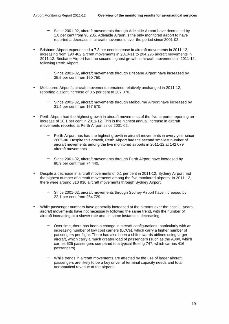
Airport Monitoring Report 2011-12 Overview of the monitoring results for aeronautica l services
19
− Since 2001-02, aircraft movements through Adelaide Airport have decreased by 1.8 per cent from 96 205. Adelaide Airport is the only monitored airport to have reported a decrease in aircraft movements over the period since 2001-02.
• Brisbane Airport experienced a 7.3 per cent increase in aircraft movements in 2011-12, increasing from 190 402 aircraft movements in 2010-11 to 204 296 aircraft movements in 2011-12. Brisbane Airport had the second highest growth in aircraft movements in 2011-12, following Perth Airport.
− Since 2001-02, aircraft movements through Brisbane Airport have increased by 35.5 per cent from 150 750.
• Melbourne Airport’s aircraft movements remained relatively unchanged in 2011-12, reporting a slight increase of 0.5 per cent to 207 070.
− Since 2001-02, aircraft movements through Melbourne Airport have increased by 31.4 per cent from 157 570.
• Perth Airport had the highest growth in aircraft movements of the five airports, reporting an increase of 10.1 per cent in 2011-12. This is the highest annual increase in aircraft movements reported at Perth Airport since 2001-02.
− Perth Airport has had the highest growth in aircraft movements in every year since 2005-06. Despite this growth, Perth Airport had the second smallest number of aircraft movements among the five monitored airports in 2011-12 at 142 079 aircraft movements.
− Since 2001-02, aircraft movements through Perth Airport have increased by 90.9 per cent from 74 440.
• Despite a decrease in aircraft movements of 0.1 per cent in 2011-12, Sydney Airport had the highest number of aircraft movements among the five monitored airports. In 2011-12, there were around 310 936 aircraft movements through Sydney Airport.
− Since 2001-02, aircraft movements through Sydney Airport have increased by 22.1 per cent from 254 729.
• While passenger numbers have generally increased at the airports over the past 11 years, aircraft movements have not necessarily followed the same trend, with the number of aircraft increasing at a slower rate and, in some instances, decreasing.
− Over time, there has been a change in aircraft configurations, particularly with an increasing number of low cost carriers (LCCs), which carry a higher number of passengers per flight. There has also been a shift towards airlines using larger aircraft, which carry a much greater load of passengers (such as the A380, which carries 525 passengers compared to a typical Boeing 747, which carries 416 passengers).
− While trends in aircraft movements are affected by the use of larger aircraft, passengers are likely to be a key driver of terminal capacity needs and total aeronautical revenue at the airports.
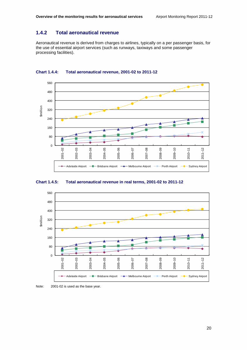
Overview of the monitoring results for aeronautical services Airport Monitoring Report 2011-12
20
1.4.2 Total aeronautical revenue
Aeronautical revenue is derived from charges to airlines, typically on a per passenger basis, for the use of essential airport services (such as runways, taxiways and some passenger processing facilities).
Chart 1.4.4: Total aeronautical revenue, 2001-02 to 2011-12
Chart 1.4.5: Total aeronautical revenue in real ter ms, 2001-02 to 2011-12
Note: 2001-02 is used as the base year.
0
80
160
240
320
400
480
560
2001
–02
2002
–03
2003
–04
2004
–05
2005
–06
2006
–07
2007
–08
2008
–09
2009
–10
2010
–11
2011
–12
$mill
ion
Adelaide Airport Brisbane Airport Melbourne Airport Perth Airport Sydney Airport
0
80
160
240
320
400
480
560
2001
–02
2002
–03
2003
–04
2004
–05
2005
–06
2006
–07
2007
–08
2008
–09
2009
–10
2010
–11
2011
–12
$mill
ion
Adelaide Airport Brisbane Airport Melbourne Airport Perth Airport Sydney Airport

Airport Monitoring Report 2011-12 Overview of the monitoring results for aeronautica l services
21
Key observations from charts 1.4.4 and 1.4.5 include:
• Total aeronautical revenue increased at all monitored airports in 2011-12, except for Adelaide Airport. The five monitored airports reported combined revenue of $1.2 billion from aeronautical services—an increase of 4.5 per cent from $1.1 billion in 2010-11.
− Since 2001-02, increased passenger numbers and charges have led to the airports reporting a combined increase in total aeronautical revenue of $824.2 million (221.9 per cent). When adjusted for inflation since 2001-02, the increase in total aeronautical revenue is $540.8 million (145.6 per cent).
− The monitored airports reported significant increases in aeronautical revenue during 2001-02 and 2002-03. This was partly due to Brisbane, Melbourne and Perth airports increasing prices shortly after price caps were removed on 1 July 2002, Sydney Airport increasing prices due to an approved price notification during 2001 and Adelaide Airport increasing prices shortly after its price cap was removed in October 2001.
• Adelaide Airport’s total aeronautical revenue was the lowest of the monitored airports, decreasing by 9.3 per cent from $86.1 million in 2010-11 to $78.1 million in 2011-12. As noted, this decrease in total aeronautical revenue which may be partly due to subdued economic conditions, Tiger Airways ceasing operations at the airport from July 201128 and the Qantas grounding and associated industrial action.
− Since 2001-02, total aeronautical revenue at Adelaide Airport has increased by 589.1 per cent from $11.3 million. When adjusted for inflation, the increase in total aeronautical revenue since 2001-02 is 425.8 per cent.
− As noted in box 1.2.1, Adelaide Airport reported a significant increase in aeronautical revenue in 2005-06 and 2006-07. Between 2006-07 and 2011-12, Adelaide Airport’s aeronautical revenue has increased by 12.6 per cent. This is the lowest percentage growth in aeronautical revenue among the five monitored airports during these years.
• Brisbane Airport had the second highest percentage increase in total aeronautical revenue among the five monitored airports, reporting an increase of 7.0 per cent from $198.5 million in 2010-11 to $212.4 million in 2011-12.
− Since 2001-02, total aeronautical revenue at Brisbane Airport has increased by 369.4 per cent from $45.3 million. When adjusted for inflation, the increase in total aeronautical revenue since 2001-02 is 258.1 per cent, which represents an average annual increase of 13.6 per cent.
• Melbourne Airport reported the second highest total aeronautical revenue at $243.6 million in 2011-12—an increase of 5.0 per cent from $231.9 million in 2010-11.
− Since 2001-02, total aeronautical revenue at Melbourne Airport has increased by 270.8 per cent from $65.7 million. When adjusted for inflation, the increase in total aeronautical revenue since 2001-02 is 182.9 per cent, which represents an average annual increase of 11.0 per cent.
• Perth Airport reported the largest growth in total aeronautical revenue in 2011-12, increasing by 14.5 per cent from $103.1 million in 2010-11 to $118.0 million in 2011-12.
28 Tiger Airways re-commenced operations at Adelaide Airport after the end of the 2011-12 financial year.

Overview of the monitoring results for aeronautical services Airport Monitoring Report 2011-12
22
− Since 2001-02, total aeronautical revenue at Perth Airport has increased by 473.2 per cent from $20.6 million. When adjusted for inflation, the increase in total aeronautical revenue since 2001-02 was 337.3 per cent, which represents an average annual increase of 15.9 per cent. This is the second highest percentage growth in total aeronautical revenue among the five monitored airports since 2001-02.
• Sydney Airport’s total aeronautical revenue has been significantly higher than the other airports since 2001-02. Over this time, Sydney Airport’s total aeronautical revenue has increased by 137.7 per cent from $228.6 million in 2001-02 to $543.5 million in 2011-12. In 2011-12, total aeronautical revenue increased by 3.6 per cent. When adjusted for inflation, the increase in total aeronautical revenue since 2001-02 is 81.4 per cent, which represents an average annual increase of 6.1 per cent.
Comparison of aeronautical revenue and total airport revenue
Table 1.4.1: Comparison of aeronautical and total a irport revenue at the monitored airports, 2001-02 and 2011-12
Adelaide Brisbane Melbourne Perth Sydney
Revenue 2001-02 ($million)
Aeronautical 11.3 45.3 65.7 20.6 228.6
Total airport 39.6 146.9 196.9 76.1 454.0
Aeronautical as % of total
28.6%
30.8%
33.4%
27.0%
50.4%
Revenue 2011-12 ($million)
Aeronautical 78.1 212.4 243.6 118.0 543.5
Total airport 145.3 486.1 573.3 721.9 1 004.0
Aeronautical as % of total
53.8%
43.7%
42.5%
16.4%
54.1%
Key observations from table 1.4.1 include:
• Aeronautical revenue as a proportion of total airport revenue has increased at all of the monitored airports since 2001-02, except for Perth Airport. The five monitored airports reported total combined revenue of $2.9 billion in 2011-12—an increase of 21.0 per cent from $2.4 billion in 2010-11.
• Adelaide Airport’s total airport revenue has increased in every year since 2001-02, except for 2008-09 and 2011-12. Aeronautical revenue as a proportion of total airport revenue has ranged between 28.6 per cent and 63.1 per cent since 2001-02.
• Brisbane Airport’s total airport revenue has increased in every year since 2001-02, except for 2008-09, when total airport revenue decreased by 2.9 per cent. Aeronautical revenue as a proportion of total airport revenue has ranged between 30.4 per cent and 43.7 per cent since 2001-02.
• Melbourne Airport’s total airport revenue has increased in every year since 2001-02 and by an average of 11.3 per cent per annum. Aeronautical revenue as a proportion of total airport revenue has ranged between 33.4 per cent and 43.5 per cent since 2001-02.

Airport Monitoring Report 2011-12 Overview of the monitoring results for aeronautica l services
23
• Perth Airport’s total airport revenue has increased in every year since 2001-02, except for 2007-08 and 2008-09, when total airport revenue decreased by 29.2 per cent over these years. Aeronautical revenue as a proportion of total airport revenue has ranged between 27.0 per cent and 47.3 per cent between 2001-02 and 2010-11. In 2011-12, aeronautical revenue as a proportion of total airport revenue was at its lowest since 2001-02, at 16.4 per cent. This was due to a 143.7 per cent increase in total airport revenue in 2011-12.
− Perth Airport noted that its 2011-12 total airport revenue included an increase in fair value of non-aeronautical investment property of around $337.5 million as at 30 June 2012. Perth Airport stated that the increase was primarily due to a change in the investment methodology used for deriving fair value of an investment and that the change materially impacts on total airport return measurements. Excluding the revaluation, aeronautical revenue as a proportion of total airport revenue in 2011-12 was 34.3 per cent, unchanged from last year.
• Sydney Airport’s total airport revenue has increased in every year since 2001-02, except for 2009-10, when total airport revenue decreased by 20.1 per cent. Aeronautical revenue as a proportion of total airport revenue has ranged between 39.6 per cent and 54.5 per cent since 2001-02.
1.4.3 Average prices for aeronautical services
Given the complex nature of airports’ bundling of charges, and changes on the basis of how these charges are applied, the ACCC adopts aeronautical revenue per passenger as an indicator of average prices that the airlines pay to airports.
It should be noted that the average prices shown in charts 1.4.6 and 1.4.7 include revenue received to cover the costs for government mandated security and provides an indication of the total average price paid by airlines to airports. However, as discussed below, government mandated security charges do not reflect decisions made by airport operators. Therefore, charts 1.4.8 and 1.4.9 show aeronautical revenue per passenger excluding security as an indication of the average prices charged by the airports, which more closely reflects the airport operators’ decisions.
It should be noted that prior to 2011-12, Perth Airport did not apply passenger charges to large aircraft operating in the general aviation precinct and did not receive passenger numbers from airlines in respect of these aircraft. As a result, care should be taken when making comparisons of aeronautical revenue on a per passenger basis for 2011-12 with earlier years. This is discussed in further detail in section 7.3.

Overview of the monitoring results for aeronautical services Airport Monitoring Report 2011-12
24
Chart 1.4.6: Aeronautical revenue per passenger (av erage prices including security), 2001-02 to 2011-12
Chart 1.4.7: Aeronautical revenue per passenger in real terms (average prices including security), 2001-02 to 2011-12
Note: 2001-02 is used as the base year
Key observations from charts 1.4.6 and 1.4.7 include:
• With the exception of Adelaide and Perth airports, all other monitored airports reported an increase in average prices in 2011-12. Compared to the previous year, changes in the airports’ average prices ranged from a fall of 5.5 per cent at Adelaide Airport to a rise of 4.8 per cent at Melbourne Airport.
− Since 2001-02, average prices increased at all airports by between 59.2 per cent (Sydney Airport) and 305.9 per cent (Adelaide Airport). However, the majority of
$0.00
$2.00
$4.00
$6.00
$8.00
$10.00
$12.00
$14.00
$16.00
2001
–02
2002
–03
2003
–04
2004
–05
2005
–06
2006
–07
2007
–08
2008
–09
2009
–10
2010
–11
2011
–12
Per
pas
sen
ger
Adelaide Airport Brisbane Airport Melbourne Airport Perth Airport Sydney Airport
$0.00
$2.00
$4.00
$6.00
$8.00
$10.00
$12.00
$14.00
$16.00
2001
–02
2002
–03
2003
–04
2004
–05
2005
–06
2006
–07
2007
–08
2008
–09
2009
–10
2010
–11
2011
–12
Per
pas
sen
ger
Adelaide Airport Brisbane Airport Melbourne Airport Perth Airport Sydney Airport

Airport Monitoring Report 2011-12 Overview of the monitoring results for aeronautica l services
25
the increase at Adelaide Airport occurred when it opened its new terminal and DTLs ceased at the airport in 2005-06.
− Since 2001-02, the increase in average prices at the monitored airports when adjusted for inflation ranged between 21.5 per cent (Sydney Airport) and 209.7 per cent (Adelaide Airport).
• Adelaide Airport’s aeronautical revenue per passenger declined for the second consecutive year in 2011-12, decreasing from $11.64 per passenger in 2010-11 to $11.01 per passenger (-5.5 per cent).
− Since 2001-02, Adelaide Airport has had the largest percentage increase in aeronautical revenue per passenger, increasing by 305.9 per cent from $2.71 per passenger. When adjusted for inflation, the increase in aeronautical revenue per passenger since 2001-02 is 209.7 per cent.
− As noted in box 1.2.1, Adelaide Airport reported a significant increase in aeronautical revenue in 2005-06 and 2006-07. Between 2006-07 and 2011-12, Adelaide Airport’s aeronautical revenue per passenger has declined 0.1 per cent. Adelaide Airport is the only monitored airport to report a decline in aeronautical revenue per passenger over these years.
• Brisbane Airport’s aeronautical revenue per passenger increased by 2.2 per cent in 2011-12, from $9.80 per passenger in 2010-11 to $10.02 per passenger.
− Brisbane Airport has experienced the second largest percentage increase in aeronautical revenue per passenger since 2001-02, increasing by 172.8 per cent from $3.67 per passenger. When adjusted for inflation, the increase in aeronautical revenue per passenger since 2001-02 is 108.1 per cent, which represents an average annual increase of 7.6 per cent.
• Melbourne Airport’s aeronautical revenue per passenger was the lowest of the monitored airports at $8.58 per passenger in 2011-12. Melbourne Airport reported the largest percentage growth in aeronautical revenue per passenger in 2011-12, increasing by 4.8 per cent from $8.19 per passenger in 2010-11.
− Since 2001-02, Melbourne Airport’s average prices have increased by 115.4 per cent from $3.98 per passenger. When adjusted for inflation, the increase in aeronautical revenue per passenger since 2001-02 is 64.4 per cent, which represents an average annual increase of 5.1 per cent.
• Perth Airport’s aeronautical revenue per passenger decreased by 1.6 per cent in 2011-12, from $9.00 per passenger in 2010-11 to $8.86 per passenger.
− Since 2001-02, Perth Airport’s average prices have increased by 108.2 per cent from $4.26 per passenger. When adjusted for inflation, the increase in aeronautical revenue per passenger since 2001-02 is 58.8 per cent, which represents an average annual increase of 4.7 per cent.
• In 2011-12, Sydney Airport continued to have the highest aeronautical revenue at $14.96 per passenger, increasing by 3.5 per cent from $14.46 per passenger in 2010-11.
− Since 2001-02, Sydney Airport’s average prices have increased by 59.2 per cent from $9.40 per passenger. When adjusted for inflation, the increase is 21.5 per cent, which represents an average annual increase of 2.0 per cent. This is

Overview of the monitoring results for aeronautical services Airport Monitoring Report 2011-12
26
the lowest percentage increase in average prices among the monitored airports since 2001-02.
Average prices for aeronautical services excluding security costs
Over the years, the government has introduced more stringent security requirements at Australian airports (see discussion in appendix A.6). These include, among other requirements, increased passenger and baggage screening. Importantly, these additional requirements have contributed to the airports’ costs (and associated revenue) through necessary investment in security equipment and additional personnel. Given that government security requirements do not reflect decisions made by airport operators, the ACCC also reports on aeronautical revenue per passenger excluding security to provide some indication of the average prices charged by the airports and that reflect the airport operators’ decisions. It should be noted that the airports aim to set government security revenue at a level to recover the costs of government security requirements so as not to earn margins on security services.
Chart 1.4.8: Aeronautical revenue per passenger exc luding security (average prices excluding security), 2001-02 to 2011-12
$0.00
$2.00
$4.00
$6.00
$8.00
$10.00
$12.00
$14.00
$16.00
2001
–02
2002
–03
2003
–04
2004
–05
2005
–06
2006
–07
2007
–08
2008
–09
2009
–10
2010
–11
2011
–12
Per
pas
sen
ger
Adelaide Airport Brisbane Airport Melbourne Airport Perth Airport Sydney Airport

Airport Monitoring Report 2011-12 Overview of the monitoring results for aeronautica l services
27
Chart 1.4.9: Aeronautical revenue per passenger in real terms and excluding security (average prices excluding security), 2001-02 to 201 1-12
Note: 2001-02 is used as the base year
Key observations from charts 1.4.8 and 1.4.9 include:
• With the exception of Adelaide Airport, all other monitored airports reported an increase in average prices (excluding security) in 2011-12. Compared to the previous year, changes in the airports’ average prices (excluding security) ranged from a decrease of 6.5 per cent at Adelaide Airport to an increase of 5.6 per cent at Melbourne Airport.
− Since 2001-02, average prices (excluding security) increased at all airports by between 54.3 per cent (Sydney Airport) and 326.5 per cent (Adelaide Airport). However, the majority of the increase at Adelaide Airport occurred when it opened its new terminal and DTLs ceased at the airport in 2005-06.
− Since 2001-02, the increase in average prices (excluding security) at the monitored airports when adjusted for inflation ranged between 17.7 per cent (Sydney Airport) and 225.4 per cent (Adelaide Airport).
• Adelaide Airport was the only airport to see a decline in its average price (excluding security) in 2011-12, decreasing from $10.09 per passenger in 2010-11 to $9.44 per passenger (-6.5 per cent).
− Since 2001-02, Adelaide Airport has experienced the largest percentage increase in aeronautical revenue per passenger (excluding security), increasing by 326.5 per cent from $2.21 per passenger. When adjusted for inflation, the increase in aeronautical revenue per passenger (excluding security) since 2001-02 is 225.4 per cent.
− As noted in box 1.2.1, Adelaide Airport reported a significant increase in aeronautical revenue in 2005-06 and 2006-07. For the years from 2006-07 to 2011-12, Adelaide Airport’s aeronautical revenue per passenger (excluding security) declined 0.5 per cent. Adelaide Airport is the only monitored airport to have reported a decline in aeronautical revenue per passenger (excluding security) over these years.
$0.00
$2.00
$4.00
$6.00
$8.00
$10.00
$12.00
$14.00
$16.00
2001
–02
2002
–03
2003
–04
2004
–05
2005
–06
2006
–07
2007
–08
2008
–09
2009
–10
2010
–11
2011
–12
Per
pas
sen
ger
Adelaide Airport Brisbane Airport Melbourne Airport Perth Airport Sydney Airport

Overview of the monitoring results for aeronautical services Airport Monitoring Report 2011-12
28
• Brisbane Airport’s aeronautical revenue per passenger (excluding security) increased by 2.7 per cent in 2011-12, from $8.76 per passenger in 2010-11 to $9.00 per passenger.
− Brisbane Airport has had the second largest percentage increase in aeronautical revenue per passenger (excluding security) since 2001-02, increasing by 206.1 per cent from $2.94 per passenger. When adjusted for inflation, the increase in aeronautical revenue per passenger (excluding security) since 2001-02 is 133.5 per cent, which represents an average annual increase of 8.9 per cent.
• Melbourne Airport had the largest percentage increase in aeronautical revenue per passenger (excluding security) in 2011-12, increasing by 5.6 per cent from $7.17 per passenger in 2010-11 to $7.57 per passenger.
− Since 2001-02, Melbourne Airport’s average prices (excluding security) have increased by 121.7 per cent from $3.41 per passenger. When adjusted for inflation, the increase in aeronautical revenue per passenger (excluding security) since 2001-02 is 69.1 per cent, which represents an average annual increase of 5.4 per cent.
• Perth Airport’s aeronautical revenue per passenger (excluding security) is the lowest of the monitored airports at $7.42 per passenger in 2011-12. Perth Airport had the second smallest percentage growth in aeronautical revenue per passenger (excluding security) in 2011-12, increasing by 0.8 per cent from $7.36 in 2010-11.
− Since 2001-02, Perth Airport’s average prices (excluding security) have increased by 121.4 per cent from $3.35 per passenger. When adjusted for inflation, the increase in aeronautical revenue per passenger (excluding security) since 2001-02 is 68.9 per cent, which represents an average annual increase of 5.4 per cent.
• Sydney Airport continued to report the highest aeronautical revenue per passenger (excluding security) at $12.86 per passenger in 2011-12, increasing by 3.8 per cent from $12.39 per passenger in 2010-11.
− Since 2001-02, Sydney Airport’s average prices have increased by 54.3 per cent from $8.33 per passenger. When adjusted for inflation, this increase is 17.7 per cent, which represents an average annual increase of 1.6 per cent. This is the lowest percentage increase in average prices (excluding security) among the five monitored airports since 2001-02.
1.4.4 Costs of providing aeronautical services
Airports incur costs in providing aeronautical services, such as costs associated with maintaining terminals and runways (aeronautical operating expenses). These costs are recovered from the airports’ aeronautical revenues.
Similarly to average prices, aeronautical operating expenses per passenger (shown in charts 1.4.10 and 1.4.11) includes government mandated security costs and provides an indication of the total unit costs for the airports. However, as government mandated security costs do not reflect decisions made by the airport operators, charts 1.4.12 and 1.4.13 also show aeronautical operating expenses per passenger excluding security as an indication of the unit costs incurred by airports that reflect the airport operators’ decisions.
It should be noted that prior to 2011-12, Perth Airport did not apply passenger charges to large aircraft operating in the general aviation precinct and did not receive passenger numbers from these aircraft. As a result, care should be taken when making comparisons of aeronautical operating expenses on a per passenger basis for 2011-12 with earlier years.
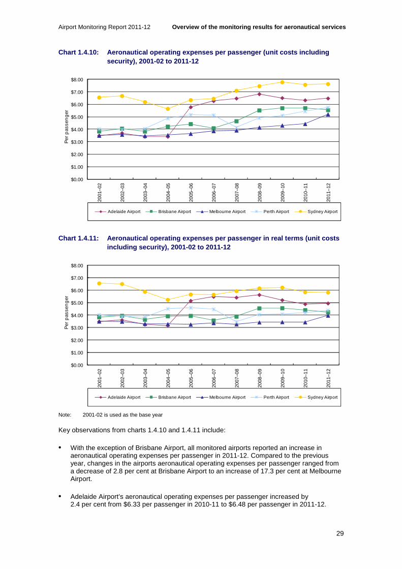
Airport Monitoring Report 2011-12 Overview of the monitoring results for aeronautica l services
29
Chart 1.4.10: Aeronautical operating expenses per p assenger (unit costs including security), 2001-02 to 2011-12
Chart 1.4.11: Aeronautical operating expenses per p assenger in real terms (unit costs including security), 2001-02 to 2011-12
Note: 2001-02 is used as the base year
Key observations from charts 1.4.10 and 1.4.11 include:
• With the exception of Brisbane Airport, all monitored airports reported an increase in aeronautical operating expenses per passenger in 2011-12. Compared to the previous year, changes in the airports aeronautical operating expenses per passenger ranged from a decrease of 2.8 per cent at Brisbane Airport to an increase of 17.3 per cent at Melbourne Airport.
• Adelaide Airport’s aeronautical operating expenses per passenger increased by 2.4 per cent from $6.33 per passenger in 2010-11 to $6.48 per passenger in 2011-12.
$0.00
$1.00
$2.00
$3.00
$4.00
$5.00
$6.00
$7.00
$8.00
2001
–02
2002
–03
2003
–04
2004
–05
2005
–06
2006
–07
2007
–08
2008
–09
2009
–10
2010
–11
2011
–12
Per
pas
sen
ger
Adelaide Airport Brisbane Airport Melbourne Airport Perth Airport Sydney Airport
$0.00
$1.00
$2.00
$3.00
$4.00
$5.00
$6.00
$7.00
$8.00
2001
–02
2002
–03
2003
–04
2004
–05
2005
–06
2006
–07
2007
–08
2008
–09
2009
–10
2010
–11
2011
–12
Per
pas
sen
ger
Adelaide Airport Brisbane Airport Melbourne Airport Perth Airport Sydney Airport

Overview of the monitoring results for aeronautical services Airport Monitoring Report 2011-12
30
− Since 2001-02, Adelaide Airport has experienced the largest percentage increase in aeronautical operating expenses per passenger, increasing by 85.8 per cent from $3.49 per passenger. When adjusted for inflation, the increase in aeronautical operating expenses per passenger since 2001-02 is 41.8 per cent.
− As noted in box 1.2.1, Adelaide Airport experienced a significant increase in aeronautical operating expenses in 2005-06 and 2006-07. Between 2006-07 and 2011-12, Adelaide Airport’s aeronautical operating expenses per passenger increased by 3.3 per cent. Adelaide Airport has experienced the lowest percentage growth in aeronautical operating expenses per passenger over these years among the monitored airports.
• Brisbane Airport was the only monitored airport to report a reduction in aeronautical operating expenses per passenger in 2011-12, decreasing by 2.8 per cent from $5.70 per passenger in 2010-11 to $5.55 per passenger in 2011-12. This change was due to greater passenger growth (4.6 per cent) than growth in aeronautical operating expenses (1.8 per cent).
− Since 2001-02, Brisbane Airport’s aeronautical operating expenses per passenger have increased by 44.4 per cent from $3.84 per passenger. When adjusted for inflation, the increase in aeronautical operating expenses per passenger since 2001-02 is 10.2 per cent, which represents an average annual increase of 1.0 per cent.
• In 2011-12, Melbourne Airport’s aeronautical operating expenses per passenger saw the largest increase of the five airports at 17.3 per cent. This was a result of total aeronautical operating expenses increasing (17.5 per cent) at a faster rate than passenger volumes (0.2 per cent). Higher salaries and depreciation charges were the main contributors to the increase in operating expenses at Melbourne Airport in 2011-12. Average salaries in 2011-12 were 9.4 per cent higher than the previous year. Melbourne Airport noted that increases in these cost categories were driven by activities associated with the airport’s expansion, specifically investing in new aeronautical assets and accommodating passenger growth. Melbourne Airport continued to have the lowest aeronautical operating expenses per passenger at $5.20 per passenger in 2011-12, compared to $4.43 per passenger in 2010-11.
− Since 2001-02, Melbourne Airport’s aeronautical operating expenses per passenger have increased by 48.9 per cent from $3.49 per passenger. When adjusted for inflation, this increase is 13.6 per cent, which represents an average annual increase of 1.3 per cent. This is the second largest percentage increase in aeronautical operating expenses among the monitored airports since 2001-02.
• Perth Airport’s aeronautical operating expenses per passenger increased by 5.6 per cent from $5.44 per passenger in 2010-11 to $5.74 per passenger in 2011-12. This was the second largest increase in aeronautical operating expenses per passenger of the five airports in 2011-12.
− Since 2001-02, Perth Airport’s aeronautical operating expenses per passenger have increased by 42.8 per cent from $4.02 per passenger. It should be noted that some of the decrease in aeronautical operating expenses during 2007-08 was due to the reversal of a technical services fee in that year. Perth Airport accrued the expense in 2006-07 but subsequently reversed the amount in 2007-08, as it was not required to be paid. When adjusted for inflation, the increase in aeronautical operating expenses per passenger since 2001-02 is 8.9 per cent, which represents an average annual increase of 0.9 per cent.

Airport Monitoring Report 2011-12 Overview of the monitoring results for aeronautica l services
31
• Sydney Airport continued to report the highest operating expenses per passenger at $7.63 per passenger in 2011-12, increasing by 0.8 per cent from $7.57 per passenger in 2010-11.
− Since 2001-02, Sydney Airport’s aeronautical operating expenses per passenger have increased by 16.5 per cent from $6.55 per passenger. This is the lowest percentage increase in aeronautical operating expenses per passenger among the five monitored airports since 2001-02.
− When adjusted for inflation, Sydney Airport has had a decrease of 11.1 per cent in aeronautical operating expenses per passenger since 2001-02, which represents an average annual decrease of 1.2 per cent. Sydney Airport is the only monitored airport to report declining aeronautical operating expenses per passenger since 2001-02, when adjusted for inflation.
Aeronautical operating expenses per passenger under the line in the sand approach
The ACCC required airport operators to provide additional information relating to the aeronautical asset base under the line in the sand (LIS) approach for the first time in 2007-08, as discussed in appendix A.7. Under this approach, the value of an airport’s aeronautical asset base for monitoring purposes is the value of tangible non-current aeronautical assets reported to the ACCC at 30 June 2005—plus new investments, less depreciation and disposals.
Under the LIS approach, aeronautical operating expenses were lower for Adelaide, Brisbane and Sydney airports in 2011-12 compared to non-LIS values. However, Melbourne and Perth airports’ values were no different under the LIS approach as they had no revaluations of their aeronautical assets recorded in the regulatory accounts during the relevant periods. Adelaide, Brisbane and Sydney airports’ aeronautical operating expenses per passenger under the LIS approach were $6.41, $5.33 and $7.42 respectively in 2011-12.
However, some of the airports’ increased costs are associated with increased government mandated security requirements. Chart 1.3.8 below shows unit costs less costs associated with government mandated security expenses.
Costs of providing aeronautical services excluding security costs
As noted, additional government mandated security requirements have contributed to the airports’ costs (and associated revenue). Given that government security requirements do not reflect decisions made by airport operators, the ACCC also reports on aeronautical operating expenses per passenger excluding security to provide an indication of the unit costs incurred by airports that reflect the airport operators’ decisions.

Overview of the monitoring results for aeronautical services Airport Monitoring Report 2011-12
32
Chart 1.4.12: Aeronautical operating expenses per p assenger excluding security (unit costs excluding security), 2001-02 to 2011-12
Chart 1.4.13: Aeronautical operating expenses per p assenger in real terms and excluding security (unit costs excluding security), 2001-02 to 2011-12
Note: 2001-02 is used as the base year
Key observations from charts 1.4.12 and 1.4.13 include:
• With the exception of Brisbane Airport, all other monitored airports reported an increase in aeronautical operating expenses per passenger (excluding security) in 2011-12. Compared to 2010-11, changes in the airports aeronautical operating expenses per passenger (excluding security) ranged from a decrease of 3.0 per cent at Brisbane Airport to an increase of 20.5 per cent at Melbourne Airport.
$0.00
$1.00
$2.00
$3.00
$4.00
$5.00
$6.00
$7.00
$8.00
2001–02
2002–03
2003–04
2004–05
2005–06
2006–07
2007–08
2008–09
2009–10
2010–11
2011–12
Per
passen
ger
Adelaide Airport Brisbane Airport Melbourne Airport Perth Airport Sydney Airport
$0.00
$1.00
$2.00
$3.00
$4.00
$5.00
$6.00
$7.00
$8.00
2001
–02
2002
–03
2003
–04
2004
–05
2005
–06
2006
–07
2007
–08
2008
–09
2009
–10
2010
–11
2011
–12
Per
pas
sen
ger
Adelaide Airport Brisbane Airport Melbourne Airport Perth Airport Sydney Airport

Airport Monitoring Report 2011-12 Overview of the monitoring results for aeronautica l services
33
• Adelaide Airport’s aeronautical operating expenses per passenger (excluding security) increased by 4.0 per cent from $4.75 per passenger in 2010-11 to $4.94 per passenger in 2011-12.
− Since 2001-02, Adelaide Airport experienced the largest percentage increase in aeronautical operating expenses per passenger (excluding security), increasing by 65.4 per cent from $2.99 per passenger. When adjusted for inflation, the increase in aeronautical operating expenses per passenger (excluding security) since 2001-02 is 26.2 per cent.
− As noted in box 1.2.1, Adelaide Airport experienced a significant increase in aeronautical operating expenses in 2005-06 and 2006-07. Between 2006-07 and 2011-12, Adelaide Airport’s aeronautical operating expenses per passenger (excluding security) increased by 2.6 per cent. Adelaide Airport has experienced the lowest percentage growth in aeronautical operating expenses per passenger (excluding security) over these years among the monitored airports.
• Brisbane Airport was the only monitored airport to report lower aeronautical operating expenses per passenger (excluding security) in 2011-12, decreasing by 3.0 per cent from $4.67 per passenger in 2010-11 to $4.53 per passenger in 2011-12.
− Since 2001-02, Brisbane Airport’s aeronautical operating expenses per passenger (excluding security) have increased by 40.1 per cent from $3.23 per passenger. When adjusted for inflation, the increase in aeronautical operating expenses per passenger (excluding security) since 2001-02 is 6.9 per cent, which represents an average annual increase of 0.7 per cent.
• In 2011-12, Melbourne Airport’s aeronautical operating expenses per passenger (excluding security) had the largest increase among the monitored airports at 20.5 per cent. As noted, higher salaries and depreciation charges contributed to the increase in aeronautical operating expenses at Melbourne Airport. In 2011-12, Melbourne Airport continued to have the lowest aeronautical operating expenses per passenger among the monitored airports, at $4.17 per passenger, compared to $3.46 per passenger in 2010-11.
− Since 2001-02, Melbourne Airport’s aeronautical operating expenses per passenger (excluding security) have increased by 40.2 per cent from $2.98 per passenger. When adjusted for inflation, the increase in aeronautical operating expenses per passenger (excluding security) since 2001-02 is 6.9 per cent, which represents an average annual increase of 0.7 per cent.
• Perth Airport’s aeronautical operating expenses per passenger (excluding security) increased by 10.1 per cent from $3.84 per passenger in 2010-11 to $4.23 per passenger in 2011-12. This was the second largest increase in aeronautical operating expenses per passenger (excluding security) among the monitored airports.
− Since 2001-02, Perth Airport’s aeronautical operating expenses per passenger (excluding security) have increased by 41.1 per cent from $3.00 per passenger. When adjusted for inflation, the increase is 7.6 per cent, which represents an average annual increase of 0.7 per cent. This is the second largest percentage increase in aeronautical operating expenses per passenger (excluding security) among the five monitored airports since 2001-02.
• Sydney Airport continued to report the highest aeronautical operating expenses per passenger (excluding security) at $5.53 per passenger in 2011-12, increasing by 0.5 per cent from $5.50 per passenger in 2010-11.

Overview of the monitoring results for aeronautical services Airport Monitoring Report 2011-12
34
− Since 2001-02, Sydney Airport’s aeronautical operating expenses per passenger (excluding security) have decreased by 10.5 per cent from $6.18 per passenger. Sydney Airport is the only monitored airport to report a decrease in aeronautical operating expenses per passenger (excluding security) since 2001-02. When adjusted for inflation, the decrease in aeronautical operating expenses per passenger (excluding security) since 2001-02 is 31.7 per cent, which represents an average annual decrease of 3.7 per cent.
Comparison of aeronautical operating expenses and total airport operating expenses
Table 1.4.2: Comparison of aeronautical and total a irport operating expenses at the monitored airports, 2001-02 and 2011-12
Adelaide Brisbane Melbourne Perth Sydney
Expenses 2001-02 ($million)
Aeronautical 14.6 47.3 57.6 19.5 159.4
Total airport 27.5 72.1 92.8 37.7 238.9
Aeronautical as % of total
52.9%
65.6%
62.1%
51.6%
66.7%
Expenses 2011-12 ($million)
Aeronautical 46.0 117.6 147.6 76.5 277.2
Total airport 76.0 198.1 219.3 145.7 384.9
Aeronautical as % of total
60.5%
59.4%
67.3%
52.5%
72.0%
Key observations from table 1.4.2 include:
• Aeronautical operating expenses as a proportion of total airport operating expenses have increased at all monitored airports since 2001-02, except for Brisbane Airport. The five monitored airports reported combined total airport operating expenses of $1.0 billion in 2011-12—an increase of 6.9 per cent from $957.7 million in 2010-11.
• Adelaide Airport’s total airport operating expenses were the smallest of the monitored airports since 2001-02, and have increased in every year since 2001-02, except for 2009-10, when total airport operating expenses decreased by 0.2 per cent. Aeronautical operating expenses as a proportion of total airport operating expenses have ranged between 52.9 per cent and 66.5 per cent since 2001-02.
• Brisbane Airport’s total airport operating expenses have increased in every year since 2001-02 and by an average of 10.6 per cent per annum. Aeronautical operating expenses as a proportion of total airport operating expenses have ranged between 59.4 per cent and 66.0 per cent since 2001-02.
• Melbourne Airport’s total airport operating expenses have increased in every year since 2001-02 and by an average of 9.0 per cent per annum. Aeronautical operating expenses as a proportion of total airport operating expenses have ranged between 56.2 per cent and 67.3 per cent since 2001-02.

Airport Monitoring Report 2011-12 Overview of the monitoring results for aeronautica l services
35
• Perth Airport’s total airport operating expenses increased in every year since 2001-02, except for 2005-06 and 2007-08. Aeronautical operating expenses as a proportion of total airport operating expenses have ranged between 43.6 per cent and 55.9 per cent since 2001-02.
• Since 2001-02, Sydney Airport’s total airport operating expenses have been the largest of the monitored airports, and have increased in every year since 2001-02, except for 2002-03 and 2004-05. Aeronautical operating expenses as a proportion of total airport operating expenses have ranged between 66.7 per cent and 73.1 per cent since 2001-02.
1.4.5 Aeronautical margins
Aeronautical operating margin is calculated as aeronautical revenue minus aeronautical operating expenses, and provides a measure of earnings after depreciation but before interest, tax and amortisation (EBITA). Aeronautical operating margin per passenger provides one indicator of the airports’ profitability. Another indicator—EBITA on average tangible non-current assets—is discussed in section 1.4.6. It should be noted, however, that both of these indicators are based on regulatory accounts prepared under standard accounting practices and, therefore, it is difficult to interpret returns in terms of whether or not prices are generating revenue consistent with the efficient long-run costs of providing the services.
Further, the indicators are influenced by the different approaches airports have taken to valuing their assets and changes in accounting standards and regulations over time. As noted, to facilitate monitoring of returns, an LIS approach to asset values has been used since 2007-08.29 Over the long-term, significant fixed aeronautical assets (such as buildings, plant and machinery) will be fully depreciated and replaced, while the value of the lease on aeronautical land will also be depreciated and become a smaller proportion of the total value of aeronautical assets. Therefore, over the long-term, the LIS approach would be expected to reduce the effect of the different approaches taken by airports in valuing their assets.
Unlike average prices and unit costs above, aeronautical operating margin per passenger has not been presented excluding security. This is because government mandated security revenue is set to recover the costs associated with security charges and does not affect the overall profitability of the airports.
It should be noted that prior to 2011-12, Perth Airport did not apply passenger charges to large aircraft operating in the general aviation precinct and did not receive passenger numbers from airlines in respect of these aircraft. As a result, care should be taken when making comparisons of aeronautical operating margin on a per passenger basis for 2011-12 with earlier years.
29 Under the line in the sand approach, the value of an airports’ aeronautical asset base for monitoring purposes is the value of tangible non-current assets reported to the ACCC at 30 June 2005 (which includes any revaluations by the airports up to this point), plus new investments, less depreciation and disposals.
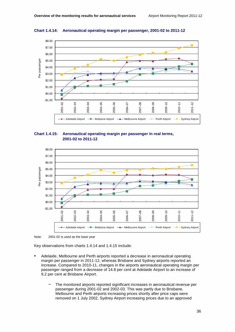
Overview of the monitoring results for aeronautical services Airport Monitoring Report 2011-12
36
Chart 1.4.14: Aeronautical operating margin per pas senger, 2001-02 to 2011-12
Chart 1.4.15: Aeronautical operating margin per pas senger in real terms, 2001-02 to 2011-12
Note: 2001-02 is used as the base year
Key observations from charts 1.4.14 and 1.4.15 include:
• Adelaide, Melbourne and Perth airports reported a decrease in aeronautical operating margin per passenger in 2011-12, whereas Brisbane and Sydney airports reported an increase. Compared to 2010-11, changes in the airports aeronautical operating margin per passenger ranged from a decrease of 14.8 per cent at Adelaide Airport to an increase of 9.2 per cent at Brisbane Airport.
− The monitored airports reported significant increases in aeronautical revenue per passenger during 2001-02 and 2002-03. This was partly due to Brisbane, Melbourne and Perth airports increasing prices shortly after price caps were removed on 1 July 2002, Sydney Airport increasing prices due to an approved
-$1.00
$0.00
$1.00
$2.00
$3.00
$4.00
$5.00
$6.00
$7.00
$8.00
2001
–02
2002
–03
2003
–04
2004
–05
2005
–06
2006
–07
2007
–08
2008
–09
2009
–10
2010
–11
2011
–12
Per
pas
sen
ger
Adelaide Airport Brisbane Airport Melbourne Airport Perth Airport Sydney Airport
-$1.00
$0.00
$1.00
$2.00
$3.00
$4.00
$5.00
$6.00
$7.00
$8.00
2001
–02
2002
–03
2003
–04
2004
–05
2005
–06
2006
–07
2007
–08
2008
–09
2009
–10
2010
–11
2011
–12
Per
pas
sen
ger
Adelaide Airport Brisbane Airport Melbourne Airport Perth Airport Sydney Airport

Airport Monitoring Report 2011-12 Overview of the monitoring results for aeronautica l services
37
price notification during 2001 and Adelaide Airport increasing prices shortly after its price cap was removed in October 2001. This led to significant increases in aeronautical operating margin per passenger in these years.
• In 2011-12, Adelaide Airport continued to have the second highest aeronautical operating margin per passenger at $4.53 per passenger, despite experiencing the largest percentage decrease in operating margin per passenger relative to the previous year. Adelaide Airport’s aeronautical operating margin per passenger decreased by 14.8 per cent in 2011-12, from $5.31 per passenger in 2010-11.
− Adelaide Airport reported a negative operating margin per passenger in 2001-02, with positive values reported since that year. Since 2002-03, Adelaide Airport has had the largest percentage increase in aeronautical operating margin per passenger, increasing by 430.0 per cent from $0.85 per passenger. When adjusted for inflation, the increase in aeronautical operating margin per passenger since 2002-03 is 314.9 per cent.
− As noted in box 1.2.1, Adelaide Airport experienced a significant increase in aeronautical operating margin in 2005-06 and 2006-07. Between 2006-07 and 2011-12, Adelaide Airport’s aeronautical operating margin per passenger has declined by 4.5 per cent.
• Brisbane Airport reported the highest increase in aeronautical operating margin on a per passenger basis in 2011-12, increasing by 9.2 per cent from $4.10 per passenger in 2010-11 to $4.47 per passenger in 2011-12.
− Brisbane Airport reported a negative operating margin per passenger in 2001-02, with positive values reported since that year. Since 2002-03, Brisbane Airport’s aeronautical operating margin per passenger has increased by 337.9 per cent from $1.02 per passenger. When adjusted for inflation, the increase in aeronautical operating margin per passenger since 2002-03 is 242.8 per cent, which represents an average annual increase of 13.1 per cent.
• In 2011-12, Melbourne Airport reported a decrease in its aeronautical operating margin per passenger for the fourth consecutive year. Melbourne Airport’s aeronautical operating margin per passenger decreased by 9.9 per cent in 2011-12, from $3.75 per passenger in 2010-11 to $3.38 per passenger in 2011-12.
− Since 2001-02, Melbourne Airport’s aeronautical operating margin per passenger has increased by 588.0 per cent from $0.49 per passenger. However, the majority of this increase occurred during 2002-03. Since 2002-03, Melbourne Airport’s aeronautical operating margin per passenger has increased by 43.1 per cent from $2.36 per passenger. When adjusted for inflation, the increase in aeronautical operating margin per passenger since 2002-03 is 12.0 per cent, which represents an average annual increase of 1.1 per cent.
• In 2011-12, Perth Airport had the lowest aeronautical operating margin per passenger of the five airports at $3.12 per passenger. This represents a fall in aeronautical operating margin per passenger of 12.5 per cent from $3.56 per passenger in 2010-11.
− Since 2001-02, Perth Airport’s aeronautical operating margin per passenger has increased by 1232.9 per cent from $0.23 per passenger. The majority of this increase occurred during 2002-03. Since 2002-03, Perth Airport’s aeronautical operating margin per passenger has increased by 0.93 per cent from $3.09 per passenger. This is the lowest percentage increase in operating margin since 2002-03 among the monitored airports. When adjusted for inflation, Perth Airport

Overview of the monitoring results for aeronautical services Airport Monitoring Report 2011-12
38
has had a decrease in aeronautical operating margin per passenger since 2002-03 of 21.0 per cent, which represents an average annual decrease of 2.3 per cent.
• Sydney Airport continued to have the highest aeronautical operating margin per passenger at $7.33 per passenger in 2011-12, increasing by 6.4 per cent from $6.89 per passenger in 2010-11.
− Since 2001-02, Sydney Airport’s aeronautical operating margin per passenger has increased by 157.7 per cent from $2.84 per passenger. A large percentage of this increase occurred during 2002-03. Since 2002-03, Sydney Airport’s aeronautical operating margin per passenger has increased by 94.6 per cent from $3.77 per passenger. When adjusted for inflation, the increase in aeronautical operating margin per passenger since 2002-03 is 52.3 per cent, which represents an average annual increase of 4.3 per cent.
Aeronautical operating margin per passenger under the line in the sand approach
• Under the LIS approach, Adelaide, Brisbane and Sydney airports had a higher aeronautical operating margin per passenger as a result of lower aeronautical operating expenses per passenger in 2011-12 (as discussed above).
• Sydney Airport maintained the highest operating margin per passenger ($7.54) compared to the other airports under the LIS approach. Adelaide and Brisbane airports’ aeronautical operating margin per passenger under the LIS approach were $4.60 and $4.70 respectively in 2011-12.
Aeronautical operating margin and total airport operating margin
Table 1.4.3 displays aeronautical operating margins and total airport operating margins, in order to compare the profitability of the airports’ aeronautical operations in the context of the profitability of the total airport. A comparison of the proportion of total airport operating margin provided by aeronautical services across airports provides a measure of the relative profitability of aeronautical services at each monitored airport.
Table 1.4.3: Aeronautical and total airport operati ng margin at the monitored airports, 2001-02 and 2011-12
Adelaide Brisbane Melbourne Perth Sydney
Margin 2001-02 ($million)
Aeronautical (3.2) (2.1) 8.1 1.1 69.2
Total airport 12.1 74.8 104.2 38.4 215.1
Aeronautical as % of total
NA
NA
7.8%
2.9%
32.2%
Margin 2011-12 ($million)
Aeronautical 32.1 94.8 96.0 41.5 266.3
Total airport 69.3 288.0 354.0 576.1 619.1
Aeronautical as % of total
46.4%
32.9%
27.1%
7.2%
43.0%

Airport Monitoring Report 2011-12 Overview of the monitoring results for aeronautica l services
39
Key observations from table 1.4.3 include:
• Aeronautical operating margin as a proportion of total airport operating margin has increased at all of the monitored airports since 2001-02. The five monitored airports reported a combined total airport operating margin of $1.9 billion in 2011-12—an increase of 30.2 per cent from $1.5 billion in 2010-11.
− The monitored airports reported significant increases in aeronautical revenue during 2001-02 and 2002-03. This was partly due to Brisbane, Melbourne and Perth airports increasing prices shortly after price caps were removed on 1 July 2002, Sydney Airport increasing prices due to an approved price notification during 2001 and Adelaide Airport increasing prices shortly after its price cap was removed in October 2001. This led to significant increases in aeronautical operating margin in these years.
• Since 2001-02, Adelaide Airport’s total airport operating margin has been the smallest of the monitored airports, and has increased in most years during this period. Adelaide Airport had a negative aeronautical operating margin in 2001-02 but has not had a negative aeronautical operating margin since that year. Adelaide Airport’s aeronautical operating margin as a proportion of total airport operating margin has ranged between 21.3 per cent and 58.9 per cent since 2002-03.
• Brisbane Airport’s total airport operating margin has increased in every year since 2002-03, except for 2008-09. Brisbane Airport had a negative aeronautical operating margin in 2001-02 and has not had a negative aeronautical operating margin since that year. Aeronautical operating margin as a proportion of total airport operating margin has ranged between 11.3 per cent and 32.9 per cent since 2002-03.
• Melbourne Airport’s total airport operating margin has increased in every year since 2001-02 and by an average of 13.0 per cent per annum. Aeronautical operating margin as a proportion of total airport operating margin was 7.8 per cent in 2001-02 and has ranged between 27.1 per cent and 33.8 per cent since 2002-03.
• Perth Airport’s total airport operating margin has increased in most years since 2001-02. Aeronautical operating margin as a proportion of total airport operating margin was 2.9 per cent in 2001-02 and has ranged between 15.5 per cent and 42.6 per cent in the years from 2002-03 to 2010-11. In 2011-12, aeronautical operating margin as a proportion of total airport operating margin was at its lowest level since 2002-03, at 7.2 per cent. This was due to a 233.6 per cent increase in total airport operating margin during 2011-12.
− Perth Airport noted that its 2011-12 total airport revenue included an increase in fair value of non-aeronautical investment property of around $337.5 million as at 30 June 2012. Perth Airport stated that the increase was primarily due to a change in the investment methodology used for deriving fair value for an investment and that the change materially impacts on total airport return measurements. Excluding the revaluation, aeronautical operating margin as a proportion of total airport operating margin in 2011-12 was 20.9 per cent, slightly down from 23.6 per cent in 2010-11.
• Sydney Airport’s total airport operating margin has increased in every year since 2001-02, except for 2009-10, when total airport operating margin decreased by 32.9 per cent. Aeronautical operating margin as a proportion of total airport operating margin has ranged between 25.6 per cent and 43.0 per cent since 2001-02.

Overview of the monitoring results for aeronautical services Airport Monitoring Report 2011-12
40
1.4.6 Return on assets
EBITA on average tangible non-current assets (return on assets) provides another indicator of the airports’ profitability. As previously noted, however, this indicator is based on regulatory accounts prepared under standard accounting practices and therefore, it is difficult to assess these returns from an economic efficiency perspective. Further, this indicator is influenced by the different approaches airports have taken to valuing their assets and changes in accounting standards and regulations over time. Therefore, care should be taken when comparing returns across airports and over time.
Chart 1.4.16: Return on assets for aeronautical ser vices, 2001-02 to 2011-12
Key observations from chart 1.4.16 include:
• Adelaide Airport reported a 2.6 percentage point decrease in returns on aeronautical assets from 10.2 per cent in 2010-11 to 7.6 per cent in 2011-12.
− Since 2001-02, Adelaide Airport’s return on aeronautical assets has increased by 10.1 percentage points from -2.5 per cent, due to earnings increasing by more than investment in aeronautical assets.
− Since 2006-07, when it opened its new multi-user terminal, Adelaide Airport’s return on aeronautical assets increased from 7.6 per cent to a peak of 10.2 per cent in 2010-11, falling back to 7.6 per cent in 2011-12.
• Brisbane Airport reported increased returns on aeronautical assets for the third consecutive year, increasing by 0.6 percentage points from 6.2 per cent in 2010-11 to 6.8 per cent in 2011-12.
− Since 2001-02, Brisbane Airport’s return on aeronautical assets has increased by 7.2 percentage points from -0.4 per cent, due to earnings increasing by more than net investment in aeronautical assets.
• Melbourne Airport reported decreased returns on aeronautical assets for the fourth consecutive year, decreasing by 2.2 percentage points from 12.3 per cent in 2010-11 to 10.1 per cent in 2011-12. This change was due to earnings decreasing while net investment in aeronautical assets increasing.
-4%
-2%
0%
2%
4%
6%
8%
10%
12%
14%
16%
18%
20%
2001
–02
2002
–03
2003
–04
2004
–05
2005
–06
2006
–07
2007
–08
2008
–09
2009
–10
2010
–11
2011
–12
Adelaide Airport Brisbane Airport Melbourne Airport Perth Airport Sydney Airport

Airport Monitoring Report 2011-12 Overview of the monitoring results for aeronautica l services
41
− Since 2001-02, Melbourne Airport’s return on aeronautical assets has increased by 8.2 percentage points from 1.9 per cent. The majority of this increase occurred in 2002-03, when returns on aeronautical assets increased by 7.5 percentage points, due to a significant increase in aeronautical operating margin in that year.
• Perth Airport reported a 1.9 percentage point decrease in its return on aeronautical assets from 13.2 per cent in 2010-11 to 11.3 per cent in 2011-12. Perth Airport continued to have the highest return on aeronautical assets among the five monitored airports.
− Since 2001-02, Perth Airport’s return on aeronautical assets has increased by 10.0 percentage points from 1.3 per cent. The majority of this increase occurred in 2002-03, when Perth Airport’s returns on aeronautical assets increased by 17.9 percentage points to reach a peak of 19.1 per cent, due to a significant increase in aeronautical operating margin in that year.
• Sydney Airport reported increased returns on aeronautical assets for the third consecutive year, increasing by 0.9 percentage points from 9.6 per cent in 2010-11 to 10.5 per cent in 2011-12.
− Since 2001-02, Sydney Airport’s return on aeronautical assets has increased by 6.2 percentage points from 4.3 per cent, due to earnings increasing by more than investment in aeronautical assets.
Return on assets for aeronautical services under the line in the sand approach
• Under the LIS approach, Adelaide, Brisbane and Sydney airports all had a higher return on aeronautical assets in 2011-12 when compared with the non-LIS values. Melbourne and Perth airports’ values were no different.
• The greatest difference between the LIS values and non-LIS values in 2011-12 was at Brisbane Airport where return on assets under the LIS approach was higher at 9.4 per cent compared to 6.8 per cent for non-LIS (2.6 percentage points). This is because Brisbane Airport’s aeronautical tangible non-current asset base was affected by the LIS approach to a greater extent than the other airports.
Return on assets for total airport services
• With the exception of Perth and Sydney airports, the monitored airports’ returns on total airport assets decreased in 2011-12. Compared to the previous year, the change in the airports’ returns on total airport assets ranged from a decrease of 4.1 percentage points at Adelaide Airport to an increase of 30.3 percentage points at Perth Airport.
• In 2011-12, Perth Airport’s return on total airport assets increased to 50.5 per cent due to the effects of a $377 million revaluation in the fair value of an investment property. Under standard accounting rules, the effects of revaluations of investment properties are reflected in revenues and margins. The other airports’ returns on total airport assets ranged from 10.0 per cent at Brisbane Airport to 17.5 per cent at Sydney Airport.
• Under the LIS approach, the airports (excluding Perth and Melbourne airports) returns on total airport assets ranged from 11.5 per cent at Adelaide Airport to 16.6 per cent at Sydney Airport.

Overview of the monitoring results for aeronautical services Airport Monitoring Report 2011-12
42
Risk and the airports’ returns on aeronautical services
• In the 2009-10 and 2010-11 AMRs, the ACCC noted that airports are partially insulated from the effects of economic shocks (such as the global financial crisis and natural disasters) that can reduce demand for air travel. Although these events and others, such as the collapse of Ansett airlines in 2001, can reduce overall demand for air travel and in some instances, airport services30, the 2010-11 monitoring report presented data that highlighted the relative stability of the airports’ returns on assets compared to the airlines’ return on assets. 31
• Although airports, like airlines, earn revenue partly based on applying charges on a per passenger basis, the airport’s risk is still partially insulated by the airlines. During lower demand periods, airlines can reduce airfares to stimulate demand. By managing passenger numbers this way, airlines are partially protecting the revenue stream of the airports. This also allows the airports to continue to operate without lowering airline charges.
• Data collected by the ACCC for the airport monitoring program over the past 10 years has shown aeronautical revenue continuing to increase for all years including the year of the global financial crisis of 2008-09. Total aeronautical revenue for the monitored airports increased by 6.3 per cent in 2008-09 and by 8.8 per cent the following year. Airports are also partly insulated from the effects of these types of events by long-term pricing agreements with the airlines.
1.4.7 Aeronautical asset values
Aeronautical assets refer to assets held by the airports for the provision of primary airport functions, such as runways and terminal buildings. As noted above, aeronautical asset values are influenced by the different approaches airports have taken to valuing their assets and changes in accounting standards and regulations over time. Therefore, care should be taken when comparing returns across airports and over time.
In 2011-12, the airports collectively invested $547.4 million in aeronautical assets, an increase of 61.2 per cent compared with investments of $339.5 million undertaken in 2010-11.
30 Productivity Commission, Inquiry Report in the Economic Regulation of Airport Services, No. 57, 14 December 2011. 31 ACCC, 2010-11 Airport Monitoring report, pages xi & xii. (The ACCC assessed the standard deviation of the airports’ and airlines’ returns on assets as an indicator of their volatility and risk. An aggregate total with the larger standard deviation means that there is a greater amount of variability of values than compared to the aggregate with a smaller standard of deviation. The smaller value is representative of firms with a more stable income stream and facing less risk).

Airport Monitoring Report 2011-12 Overview of the monitoring results for aeronautica l services
43
Chart 1.4.17: Aeronautical tangible non-current ass ets, 2001-02 to 2011-12
Key observations from chart 1.4.17 include:
• In 2011-12, the five monitored airports held a combined $5.8 billion worth of aeronautical tangible non-current assets—an increase of 4.6 per cent from the previous year. With the exception of Sydney Airport, the monitored airports’ aeronautical tangible non-current asset values increased, ranging from 6.5 per cent at Brisbane Airport to 17.7 per cent at Perth Airport. Sydney Airport’s aeronautical tangible non-current asset value decreased by 1.9 per cent in 2011-12.
• Adelaide Airport reported around $59.9 million in additions to aeronautical assets in 2011-12. These additions were to land improvement, plant and machinery and work in progress. The value of Adelaide Airport’s aeronautical asset base increased by 11.7 per cent in 2011-12, from $399.3 million in 2010-11 to $445.9 million.
− Since 2001-02, Adelaide Airport has increased the value of its aeronautical asset base by 243.1 per cent from $130.0 million. The most significant increase in the value of Adelaide Airport’s aeronautical asset base occurred in 2004-05, when it increased by 134.2 per cent due to investment in its multi-user terminal.
• Brisbane Airport reported $155.9 million in additions to aeronautical assets in 2011-12. The value of Brisbane Airport’s aeronautical asset base increased by 6.5 per cent in 2011-12, from around $1.3 billion in 2010-11 to around $1.4 billion. Brisbane Airport has a significantly higher aeronautical asset value compared to Adelaide ($455.9 million), Melbourne ($1.0 billion) and Perth ($397.8 million) airports.
− Since 2001-02, Brisbane Airport has increased the value of its aeronautical asset base by 150.3 per cent from $574.3 million. The most significant increase in the value of Brisbane Airport’s aeronautical asset base occurred in 2004-05, when the value increased by 57.0 per cent, which was primarily due to the application of a new financial reporting standard.
• Melbourne Airport had around $155.8 million in additions to aeronautical assets in 2011-12. Additions were to buildings, land improvement and plant and machinery. The value of Melbourne Airport’s aeronautical asset base increased by 12.1 per cent in 2011-12, from $898.5 million in 2010-11 to just over $1.0 billion.
0
400
800
1200
1600
2000
2400
2800
2001
–02
2002
–03
2003
–04
2004
–05
2005
–06
2006
–07
2007
–08
2008
–09
2009
–10
2010
–11
2011
–12
$mill
ion
Adelaide Airport Brisbane Airport Melbourne Airport Perth Airport Sydney Airport

Overview of the monitoring results for aeronautical services Airport Monitoring Report 2011-12
44
− Since 2001-02, Melbourne Airport has increased the value of its aeronautical asset base by 136.0 per cent from $426.7 million. The most significant increase occurred in 2008-09, when the value increased by 23.0 per cent, which was due to Melbourne Airport commencing an expansion of the international terminal in January 2008.32
• Perth Airport had $75.6 million of additions to aeronautical assets in 2011-12. Additions were to buildings, plant and machinery, work in progress and other assets. The value of Perth Airport’s aeronautical asset base increased by 17.7 per cent in 2011-12, from $337.9 million in 2010-11 to $397.8 million.
− Since 2001-02, Perth Airport has increased the value of its aeronautical asset base by 357.7 per cent from $86.9 million. The most significant increase in the value of Perth Airport’s aeronautical asset base occurred in 2003-04, when the value increased by 105.3 per cent, which was due to a significant upwards revaluation of aeronautical assets.
− Perth Airport has also been substantially increasing its aeronautical asset base over the last four years. Since 2007-08, Perth Airport has increased the value of its aeronautical asset base by an average of 18.0 per cent per annum due to new investments in terminals and airside improvements.
• Sydney Airport had around $100.2 million in additions to aeronautical assets in 2011-12. Additions were to buildings, land improvements, plant and machinery and other assets. Nevertheless, the value of Sydney Airport’s aeronautical asset base decreased by 1.9 per cent in 2011-12, from around $2.6 billion in 2010-11 to around $2.5 billion.
− Since 2001-02, Sydney Airport has increased the value of its aeronautical asset base by 60.2 per cent from $1.6 billion. The most significant increase in the value of Sydney Airport’s aeronautical asset base occurred in 2005-06, when the value increased by 40.0 per cent, which was primarily due to the application of a new financial reporting standard.
Additions as a percentage of aeronautical assets
The indicator ‘additions as a percentage of tangible non-current assets for aeronautical services’ is used as a measure of investment relative to airport size. As with returns, the different approaches taken by airports in valuing their assets will also affect this measure, although, over time, the LIS approach will also reduce the effects.
32 Australian Pacific Airports Corporation Annual Report 2008, p. 6.

Airport Monitoring Report 2011-12 Overview of the monitoring results for aeronautica l services
45
Chart 1.4.18: Additions as a percentage of tangible non-current assets for aeronautical services, 2001-02 to 2011-12
Key observations from chart 1.4.18 include:
• With the exception of Perth Airport, all other monitored airports reported an increase in additions as a percentage of tangible non-current assets for aeronautical services in 2011-12. However, Perth Airport continued to have the highest additions as a percentage of tangible non-current aeronautical assets.
• Adelaide Airport’s additions as a percentage of tangible aeronautical non-current assets increased to 13.4 per cent in 2011-12, compared to 9.5 per cent in 2010-11. Adelaide Airport undertook significant additions between 2003-04 and 2004-05, related to the construction of the multi-user terminal during this period. As a result, Adelaide Airport’s additions as a percentage of tangible aeronautical non-current assets reached a peak in 2004-05 of 32.8 per cent.
• Between 2001-02 and 2005-06, Brisbane Airport reported additions as a percentage of tangible aeronautical non-current assets ranging between 1.5 per cent and 3.5 per cent. Since 2006-07, Brisbane Airport has had significantly higher additions as a percentage of tangible aeronautical non-current assets—additions during this period averaged 11.6 per cent of Brisbane Airport’s tangible aeronautical non-current assets. In 2011-12 most recent year, Brisbane Airport’s additions as a percentage of tangible aeronautical non-current assets increased to 10.8 per cent, compared to 4.7 per cent in 2010-11.
• Melbourne Airport’s additions as a percentage of tangible aeronautical non-current assets increased to 15.5 per cent in 2011-12, compared to 11.5 per cent in 2010-11. Melbourne Airport’s additions as a percentage of tangible aeronautical non-current assets reached a peak in 2008-09 of 22.1 per cent.
• Between 2001-02 and 2006-07, Perth Airport’s additions averaged 7.1 per cent of its tangible aeronautical non-current assets. Since 2007-08, Perth Airport has had significantly higher additions as a percentage of tangible aeronautical non-current assets—on average additions during this period were equivalent to 17.8 per cent of Perth Airport’s tangible aeronautical non-current assets. In 2011-12, Perth Airport was the only monitored airport to report a decrease in additions as a percentage of tangible aeronautical non-current assets, decreasing slightly from 20.6 per cent in 2010-11 to 19.0 per cent in 2011-12.
0%
5%
10%
15%
20%
25%
30%
35%
40%
2001
–02
2002
–03
2003
–04
2004
–05
2005
–06
2006
–07
2007
–08
2008
–09
2009
–10
2010
–11
2011
–12
Adelaide Airport Brisbane Airport Melbourne Airport Perth Airport Sydney Airport

Overview of the monitoring results for aeronautical services Airport Monitoring Report 2011-12
46
• Sydney Airport’s additions as a percentage of tangible aeronautical non-current assets increased to 4.0 per cent in 2011-12, compared to 2.5 per cent in 2010-11. Sydney Airport’s additions as a percentage of tangible aeronautical non-current assets reached a peak in 2008-09 of 13.5 per cent.
Additions as a percentage of aeronautical assets under the line in the sand (LIS) approach
• Under the LIS approach, additions as a percentage of tangible aeronautical non-current assets for aeronautical services were higher at Adelaide and Brisbane airports and mostly unchanged at Sydney Airport.
• In 2011-12, Adelaide Airport’s additions as a percentage of tangible aeronautical non-current assets were 15.6 per cent under the LIS approach, compared to 13.4 per cent under the non-LIS approach. Brisbane Airport’s additions as a percentage of tangible aeronautical non-current assets were 14.2 per cent under the LIS approach in 2011-12, compared to 10.8 per cent under the non-LIS approach.
• Melbourne and Perth airports’ values were no different under the LIS approach as they had no revaluations of their aeronautical assets recorded in the regulatory accounts during the relevant periods.
• Sydney Airport’s additions as a percentage of tangible aeronautical non-current assets for aeronautical services were mostly unchanged under the LIS approach in 2011-12, decreasing slightly although remaining at around 4.0 per cent.
1.5 Quality of service monitoring results
Information on quality of service was collected for each airport, including quantitative measures of utilisation of services and facilities and results from surveys of airlines, border agencies33 and passengers. The results obtained for each airport were aggregated to give an overall view of the quality of service provided by the airport operators over the past 11 years.
The overall view of quality of service can, however, be broken down into the relevant users’ average ratings to provide an indication of their views of the airports’ quality of service. Importantly, the ACCC notes that overall ratings are not necessarily a direct indicator of the quality of service that the airport operators provide. This is because passengers’ perceptions of the airports’ quality of service can be influenced by the services also provided by airlines and border agencies. Further, analysis of the supply of airport services to border agencies is complicated by the fact that airports have regulatory obligations to provide certain services.
In contrast, airports provide services directly to airlines under commercial arrangements. Airlines are therefore in a position to make an informed assessment of quality against price. As such, airline survey ratings for quality can provide a more direct indication of whether an airport has provided a satisfactory quality of service.
1.5.1 Overall airport ratings for quality of servic e
Chart 1.5.1 shows the overall rating of quality of service for the monitored airports encompassing the views of airlines, passengers, border agencies and objective indicators.
33 The border agencies surveyed are; the Australian Customs and Border Protection Service, the Department of Agriculture, Fisheries and Forestry Biosecurity and the Department of Immigration and Citizenship.
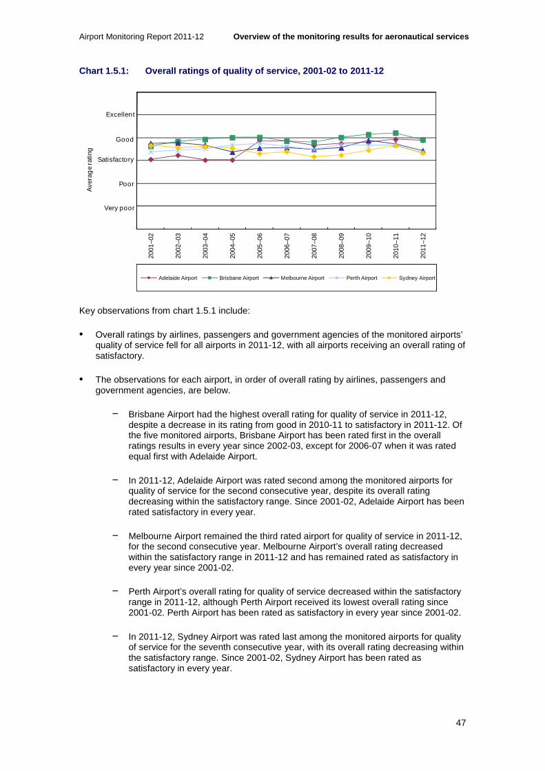
Airport Monitoring Report 2011-12 Overview of the monitoring results for aeronautica l services
47
Chart 1.5.1: Overall ratings of quality of service, 2001-02 to 2011-12
Key observations from chart 1.5.1 include:
• Overall ratings by airlines, passengers and government agencies of the monitored airports’ quality of service fell for all airports in 2011-12, with all airports receiving an overall rating of satisfactory.
• The observations for each airport, in order of overall rating by airlines, passengers and government agencies, are below.
− Brisbane Airport had the highest overall rating for quality of service in 2011-12, despite a decrease in its rating from good in 2010-11 to satisfactory in 2011-12. Of the five monitored airports, Brisbane Airport has been rated first in the overall ratings results in every year since 2002-03, except for 2006-07 when it was rated equal first with Adelaide Airport.
− In 2011-12, Adelaide Airport was rated second among the monitored airports for quality of service for the second consecutive year, despite its overall rating decreasing within the satisfactory range. Since 2001-02, Adelaide Airport has been rated satisfactory in every year.
− Melbourne Airport remained the third rated airport for quality of service in 2011-12, for the second consecutive year. Melbourne Airport’s overall rating decreased within the satisfactory range in 2011-12 and has remained rated as satisfactory in every year since 2001-02.
− Perth Airport’s overall rating for quality of service decreased within the satisfactory range in 2011-12, although Perth Airport received its lowest overall rating since 2001-02. Perth Airport has been rated as satisfactory in every year since 2001-02.
− In 2011-12, Sydney Airport was rated last among the monitored airports for quality of service for the seventh consecutive year, with its overall rating decreasing within the satisfactory range. Since 2001-02, Sydney Airport has been rated as satisfactory in every year.
0
1
2
3
4
5
6
2001
–02
2002
–03
2003
–04
2004
–05
2005
–06
2006
–07
2007
–08
2008
–09
2009
–10
2010
–11
2011
–12
Ave
rag
e ra
ting
Adelaide Airport Brisbane Airport Melbourne Airport Perth Airport Sydney Airport
Excellent
Good
Satisfactory
Poor
Very poor

Overview of the monitoring results for aeronautical services Airport Monitoring Report 2011-12
48
1.5.2 Passengers’ ratings of the airports’ quality of service
The demand for airport services is derived from the demand for airline services, which in turn is driven by passengers. As such, while passengers’ perceptions may be affected by services provided by parties other than airports, they are an important indicator of the quality of service provided at airports.
Chart 1.5.2: Average of passenger survey ratings, 2 001-02 to 2011-12
Key observations from chart 1.5.2 include:
• In 2011-12, passengers rated Brisbane and Melbourne airports as good, while Adelaide, Perth and Sydney airports were rated as satisfactory. With the exception of Sydney Airport, the passenger rating for each airport decreased in 2011-12.
• Interestingly, passengers’ perceptions were, in general, higher than the overall ratings of quality of service for the monitored airports.
• The observations for each airport, in order of average passenger rating for 2011-12, are below.
− Brisbane Airport’s average passenger rating dropped slightly in 2011-12, though remained rated as good. Brisbane Airport was rated first among the five monitored airports in regards to its passenger survey results in 2011-12 as well as in the preceding three years. Passengers have rated Brisbane Airport as good in every year since 2001-02, except for 2007-08, when the average passenger rating decreased to satisfactory.
− Melbourne Airport’s rating by passengers decreased slightly in 2011-12, though remained within the good range. Melbourne Airport was rated second among the five monitored airports in 2011-12. Since 2001-02, passengers have rated Melbourne Airport as good in every year.
− Perth Airports’ average passenger rating decreased from good in 2010-11 to satisfactory in 2011-12. Since 2001-02, this was the only year that passengers did not rate Perth Airport as good.
0
1
2
3
4
5
6
2001
–02
2002
–03
2003
–04
2004
–05
2005
–06
2006
–07
2007
–08
2008
–09
2009
–10
2010
–11
2011
–12
Ave
rag
e ra
ting
Adelaide Airport Brisbane Airport Melbourne Airport Perth Airport Sydney Airport
Excellent
Good
Satisfactory
Poor
Very poor
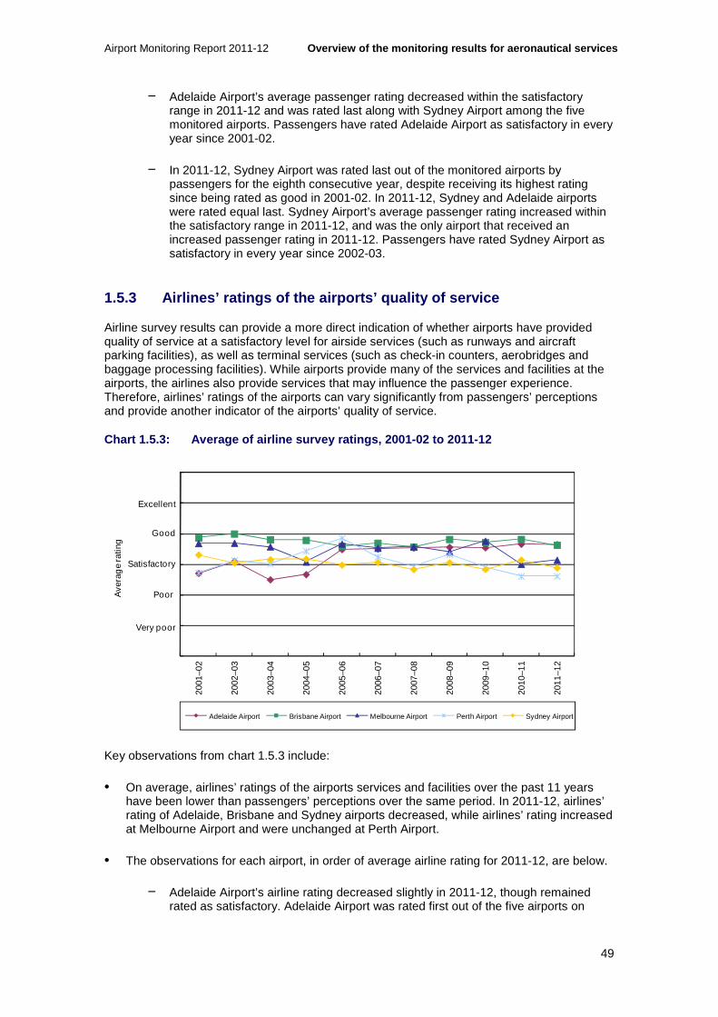
Airport Monitoring Report 2011-12 Overview of the monitoring results for aeronautica l services
49
− Adelaide Airport’s average passenger rating decreased within the satisfactory range in 2011-12 and was rated last along with Sydney Airport among the five monitored airports. Passengers have rated Adelaide Airport as satisfactory in every year since 2001-02.
− In 2011-12, Sydney Airport was rated last out of the monitored airports by passengers for the eighth consecutive year, despite receiving its highest rating since being rated as good in 2001-02. In 2011-12, Sydney and Adelaide airports were rated equal last. Sydney Airport’s average passenger rating increased within the satisfactory range in 2011-12, and was the only airport that received an increased passenger rating in 2011-12. Passengers have rated Sydney Airport as satisfactory in every year since 2002-03.
1.5.3 Airlines’ ratings of the airports’ quality of service
Airline survey results can provide a more direct indication of whether airports have provided quality of service at a satisfactory level for airside services (such as runways and aircraft parking facilities), as well as terminal services (such as check-in counters, aerobridges and baggage processing facilities). While airports provide many of the services and facilities at the airports, the airlines also provide services that may influence the passenger experience. Therefore, airlines’ ratings of the airports can vary significantly from passengers’ perceptions and provide another indicator of the airports’ quality of service.
Chart 1.5.3: Average of airline survey ratings, 200 1-02 to 2011-12
Key observations from chart 1.5.3 include:
• On average, airlines’ ratings of the airports services and facilities over the past 11 years have been lower than passengers’ perceptions over the same period. In 2011-12, airlines’ rating of Adelaide, Brisbane and Sydney airports decreased, while airlines’ rating increased at Melbourne Airport and were unchanged at Perth Airport.
• The observations for each airport, in order of average airline rating for 2011-12, are below.
− Adelaide Airport’s airline rating decreased slightly in 2011-12, though remained rated as satisfactory. Adelaide Airport was rated first out of the five airports on
0
1
2
3
4
5
6
2001
–02
2002
–03
2003
–04
2004
–05
2005
–06
2006
–07
2007
–08
2008
–09
2009
–10
2010
–11
2011
–12
Ave
rag
e ra
ting
Adelaide Airport Brisbane Airport Melbourne Airport Perth Airport Sydney Airport
Excellent
Good
Satisfactory
Poor
Very poor

Overview of the monitoring results for aeronautical services Airport Monitoring Report 2011-12
50
quality of service provided to airlines in 2011-12. Since 2001-02, airlines have rated Adelaide Airport as satisfactory in every period, except for 2002-03 and 2003-04, when airlines rated Adelaide Airport’s quality of service as poor.
− Brisbane Airport’s airline rating decreased within the satisfactory range in 2011-12, leading to a rating of second out of the five airports. Airlines have rated Brisbane Airport as satisfactory in every year since 2001-02, except for 2002-03, when airlines rated Brisbane Airport’s quality of service as good.
− Melbourne Airport was the only airport to receive an increase in its airline rating in 2011-12, increasing within the satisfactory range to be rated third out of the five monitored airports. Since 2001-02, airlines have rated Melbourne Airport as satisfactory in every period.
− Sydney Airport’s airline rating decreased from satisfactory in 2010-11 to poor in 2011-12—giving the airport a rating of fourth in the most recent period. Since 2001-02, airlines have rated Sydney Airport’s quality of service as either satisfactory or poor.
− Perth Airport was rated last by airlines for quality of service, despite its rating remaining unchanged at poor in 2011-12. This is the third consecutive year that airlines have rated Perth Airport’s quality of service as poor and the second consecutive year that airlines have rated Perth Airport last out of the five airports. Since 2001-02, airlines have rated Perth Airport’s quality of service as either satisfactory or poor.
1.5.4 Border agencies’ ratings of the airports’ qua lity of service
Border agencies are surveyed on services and facilities provided by airport operators to allow for government inspection services (such as adequacy of areas for circulation and queuing, signage and desks). However, as noted, the relationship between the border agencies and airports is partly mandated by government and not subject to the same commercial relationship as between airlines and airports.
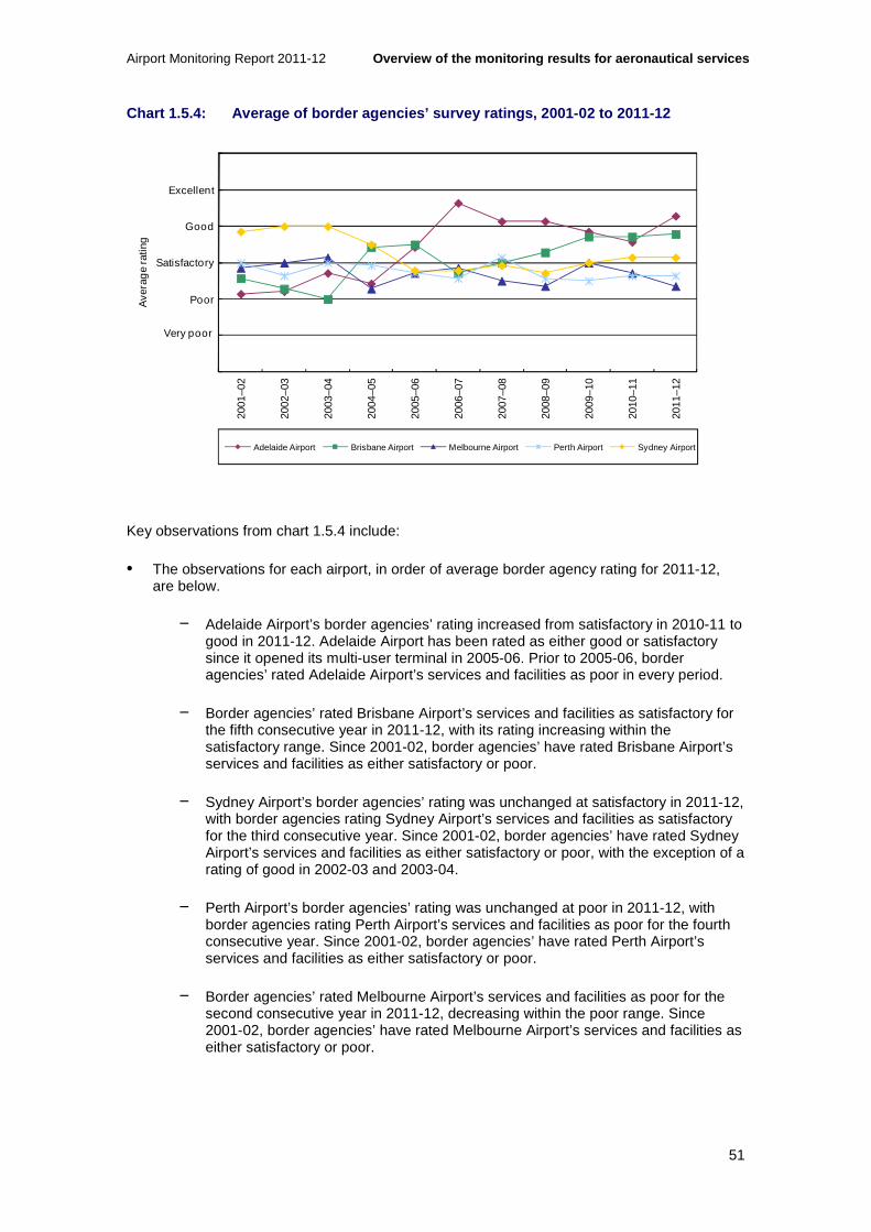
Airport Monitoring Report 2011-12 Overview of the monitoring results for aeronautica l services
51
Chart 1.5.4: Average of border agencies’ survey rat ings, 2001-02 to 2011-12
Key observations from chart 1.5.4 include:
• The observations for each airport, in order of average border agency rating for 2011-12, are below.
− Adelaide Airport’s border agencies’ rating increased from satisfactory in 2010-11 to good in 2011-12. Adelaide Airport has been rated as either good or satisfactory since it opened its multi-user terminal in 2005-06. Prior to 2005-06, border agencies’ rated Adelaide Airport’s services and facilities as poor in every period.
− Border agencies’ rated Brisbane Airport’s services and facilities as satisfactory for the fifth consecutive year in 2011-12, with its rating increasing within the satisfactory range. Since 2001-02, border agencies’ have rated Brisbane Airport’s services and facilities as either satisfactory or poor.
− Sydney Airport’s border agencies’ rating was unchanged at satisfactory in 2011-12, with border agencies rating Sydney Airport’s services and facilities as satisfactory for the third consecutive year. Since 2001-02, border agencies’ have rated Sydney Airport’s services and facilities as either satisfactory or poor, with the exception of a rating of good in 2002-03 and 2003-04.
− Perth Airport’s border agencies’ rating was unchanged at poor in 2011-12, with border agencies rating Perth Airport’s services and facilities as poor for the fourth consecutive year. Since 2001-02, border agencies’ have rated Perth Airport’s services and facilities as either satisfactory or poor.
− Border agencies’ rated Melbourne Airport’s services and facilities as poor for the second consecutive year in 2011-12, decreasing within the poor range. Since 2001-02, border agencies’ have rated Melbourne Airport’s services and facilities as either satisfactory or poor.
0
1
2
3
4
5
6
2001
–02
2002
–03
2003
–04
2004
–05
2005
–06
2006
–07
2007
–08
2008
–09
2009
–10
2010
–11
2011
–12
Ave
rag
e ra
ting
Adelaide Airport Brisbane Airport Melbourne Airport Perth Airport Sydney Airport
Excellent
Good
Satisfactory
Poor
Very poor

Overview of the monitoring results for aeronautical services Airport Monitoring Report 2011-12
52
1.6 Price and quality outcomes for the airports
The chart below provides a summary of the aeronautical revenue per passenger and overall ratings for quality of service for each of the monitored airports in 2011-12.
Chart 1.6.1: Aeronautical revenue per passenger and overall quality of service ratings
Key observations from chart 1.6.1 include:
• Sydney Airport had the highest aeronautical revenue per passenger and the lowest overall rating for quality of service in 2011-12. In contrast, Melbourne Airport had the lowest aeronautical revenue per passenger but was third behind Brisbane and Adelaide airports for overall quality of service. It is noted, however, that all of the monitored airports’ overall ratings for quality of service were within the satisfactory range.
• Users rated Brisbane Airport the highest out of the monitored airports for overall quality of service, however, aeronautical revenue per passenger was third highest out of the five airports. Although Perth Airport had the second lowest overall rating for quality of service, it also had the second lowest aeronautical revenue per passenger.
• Adelaide Airport had the second highest aeronautical revenue per passenger and was rated second in overall quality of service. However, it should be noted that Adelaide Airport is the only monitored airport that does not have any DTLs. Importantly, the revenue from passenger-related services and facilities provided within DTLs at the other monitored airports are excluded from their aeronautical revenue, which results in the aeronautical revenue figure for Adelaide Airport being overstated relative to the other airports.
Adelaide Airport
Brisbane Airport
Melbourne Airport Perth Airport
Sydney Airport
$8.00
$12.00
$16.00
3.00 4.00 5.00Satisfactory Good
HIGHER PRICE
LOWER PRICE
LOWER QUALITY HIGHER QUALITY

Airport Monitoring Report 2011-12 Potential aeronautical capacity issues at airports
53
2 Potential aeronautical capacity issues at airports
Key points
• Notwithstanding the subdued growth in passenger throughput at a number of monitored airports during 2011-12, passenger throughput has grown significantly in recent years, and is expected to continue to grow over the next two decades.
• Despite investment in aeronautical capacity in the last 11 years, there is evidence of congestion emerging at a number of the monitored airports, particularly during peak periods.
• Forecast growth in passenger throughput over the next two decades could place existing aeronautical infrastructure under increasing pressure.
• In the short-term, airports can use price rationing or quantity rationing to allocate scarce capacity and manage congestion more efficiently. However, in the long-term, the airports will be required to expand aeronautical capacity to accommodate future growth and to meet the reasonable expectations of users of airport infrastructure.
• The potential to benefit from scarcity rents provides airports with incentives to inefficiently withhold investment in aeronautical capacity in order to restrict the level of services supplied and continue to charge prices above costs for a sustained period.
• While efficient price rationing was envisaged in the government’s aeronautical pricing principles, a number of monitored airports have instead implemented slot management schemes to manage scarce capacity. Under these schemes, slots are allocated, usually on the basis of existing landing rights, rather than priced so that the airport does not receive scarcity rents from existing slots when capacity is constrained. This reduces incentives for the airport to inefficiently withhold investment in aeronautical capacity.
• To ensure continued investment in airport infrastructure, the Australian Government has legislated planning processes in place, so that airports can indicate the areas where investments will be undertaken.
• The monitored airports are planning investment to increase aeronautical capacity. The monitored airports will be undertaking significant capital expenditure over the next few years that will need to be funded.
• There are various approaches that the airports can take to fund aeronautical investments.
2.1 Introduction
While the monitored airports have undertaken significant investments in aeronautical assets in recent years, they have also experienced significant growth in passenger throughput and aircraft movements. Evidence suggests that congestion is emerging at a number of the monitored airports, particularly during peak periods. Without an expansion of capacity, congestion will become more pronounced over the next two decades as both passenger throughput and aircraft movements are forecast to continue to grow. If congestion issues are not addressed, there will be direct impacts on users of the airports, as well as an indirect impact on the economy more broadly.

Potential aeronautical capacity issues at airports Airport Monitoring Report 2011-12
54
In the short-term, airports can deal with congestion by managing scarce airport slots more efficiently. However, in the long-term, it will be necessary for airports to expand aeronautical capacity in order to accommodate forecast growth. Airports can lack incentives to expand capacity as there is a low risk that users can respond to high prices by switching to an alternative supplier of aeronautical services. This is because airports do not operate in a competitive environment. Airports may have even less incentive to invest in aeronautical capacity if they can increase profits from simply rationing existing scarce capacity.
However, in practice not all approaches for managing scarce capacity result in increased profits for an airport. For example, in Australia a number of the monitored airports have implemented slot management schemes where airport slots are allocated to airlines rather than priced or auctioned by the airport. In these situations, an airport does not benefit from failing to increase capacity as the airport is dealing with capacity constraints by rationing quantity rather than increasing prices. Slot management schemes therefore reduce incentives for an airport to inefficiently withhold investment in additional capacity. In essence, an airport with slot management schemes can only increase revenues by expanding capacity.
To ensure that airports continue to invest in airport infrastructure, the Australian Government requires federally-leased airports to adhere to a legislated planning framework. The planning framework involves 20-year forward-looking master plans, which are required to be updated every five years and identify development objectives and future aviation requirements. The airports are also required to prepare major development plans for significant investments. Both the master planning and major development planning processes require the airports to consult and engage with the broader community throughout the process. These plans must also be approved by the Minister for Infrastructure and Transport before they can be implemented.
Expanding aeronautical capacity will generally involve substantial capital expenditure. As a result, airports will also need to consider the various funding options available to finance these investments. Ownership structures and the potential for competition may influence the approaches taken by airports to funding new investment and the level of risk sharing with users.
2.2 Recent growth in passenger throughput and aeronautical investment
Australia’s major airports are a significant component of the national transport infrastructure, facilitating the movement of people and the supply of goods and services. As a result, the major airports make a considerable contribution to Australia’s overall economic prosperity. Notably, the direct contribution of the air and space transport sector to the Australian economy in the year ending 30 June 2012 was approximately $7.1 billion, or approximately 0.5 per cent of Australia’s Gross Domestic Product.34
Airports also enhance links within and between businesses and improve access to resources and to international capital markets.35 Australia’s airports are also an essential component of the Australian tourism industry, with international visitors almost exclusively passing through an Australian airport to visit the country.
The monitored airports have experienced significant growth in passenger numbers in recent years. This growth is beginning to place increasing pressure on aeronautical infrastructure. Considerable investment in aeronautical infrastructure has already taken place. However, further investment will be required by the monitored airports over the next few years to ensure that aeronautical capacity is sufficient to accommodate the needs of users.
34 ABS, Australian National Accounts, National Income, Expenditure and Product (ABS cat. no. 5206.0, June 2012, Table 45). 35 International Air Transport Association, Aviation economic benefits, IATA Economics briefing no. 08, January 2006.

Airport Monitoring Report 2011-12 Potential aeronautical capacity issues at airports
55
2.2.1 Recent passenger growth
Total passenger throughput at the five monitored airports has increased by 71.1 per cent since 2001-02, with passenger numbers increasing from 62.1 million in 2001-02 to 106.3 million in 2011-12. This represents an average annual increase in passenger throughput of 5.5 per cent per annum. Despite the global economic slowdown since 2008-09, the airports have had continual growth in passenger numbers, with an annualised growth in passenger numbers of 4.5 per cent between 2008-09 and 2011-12.
Growth in passenger throughput during 2011-12 was driven by strong passenger growth at Brisbane and Perth airports. However, domestic passenger numbers decreased at Adelaide, Melbourne and Sydney airports where the cessation of services by Tiger Airways affected domestic travel. Other industrial relations disruptions faced by some airlines also impacted on passenger numbers passing through these airports. On the other hand, international travel recorded solid growth at all airports. The strong Australian dollar favoured outbound international travel while the emergence of low-fare carriers in Asia has boosted inbound international travel.
Growth in aircraft movements is another indicator of how intensively airport services are being utilised. Total aircraft movements at the five monitored airports has increased by 30.7 per cent since 2001-02, from 733 694 movements in 2001-02 to 958 863 movements in 2011-12. This represents an average annual increase in aircraft movements of 2.7 per cent per annum.
2.2.2 Aeronautical investment
Aeronautical investment since 2001-02
Since 2001-02, the five monitored airports have invested a total of $3.9 billion in additions to aeronautical assets.36 The monitored airports’ collective tangible aeronautical asset bases increased from $2.8 billion in 2001-02 to $5.8 billion in 2011-12. A number of the major aeronautical investments completed by the monitored airports since 2001-02 are outlined below.
• Adelaide Airport has invested $328.2 million in aeronautical assets. This included the expansion of its main passenger terminal in 2005, which incorporated all international, domestic and regional services. Adelaide Airport opened its multi-user terminal in October 2005, with Qantas transferring its domestic terminal operation to the new terminal in February 2006.
• Brisbane Airport has invested $1.0 billion in aeronautical assets. This includes a $320 million expansion of its international terminal completed in 2008, which expanded the size of the terminal by around 60 per cent.37 Brisbane Airport also completed an expansion of its Domestic Common User Satellite in March 2011, which increased the number of passenger gate holding lounges from four to nine and added two additional aircraft parking bays.
• Melbourne Airport has invested $885.0 million in aeronautical assets. This has included a five-year, $330 million expansion of the international terminal, which provided additional
36 Nominal value of additions (that is, not taking into account the effects of inflation) between 2001-02 and 2011-12. 37 Brisbane Airport Corporation, Major Projects, viewed on 7 January 2013 at; http://www.bne.com.au/corporate/major-projects and; Brisbane Airport Corporation, Submission to the Productivity Commission’s Inquiry into Economic Regulation of Airport Services, April 2011, pp. i-ii.

Potential aeronautical capacity issues at airports Airport Monitoring Report 2011-12
56
aircraft parking locations, an expansion of departures gates and improvements to outbound passenger processing and passenger lounge facilities.38
• Perth Airport has invested $336.4 million in aeronautical assets as part of a broader expansion plan. Many of these projects have been or will be completed in the next two years.
• Sydney Airport has invested $1.4 billion in aeronautical assets. Some of the major investments at Sydney Airport have included; upgrades to terminal 1, expansions to accommodate the Airbus A380 and security upgrades for baggage screening.39
Aeronautical investment during 2011-12
In 2011-12, the five monitored airports have completed and undertaken a number of aeronautical investment projects and invested a total of $547.4 million in aeronautical assets. A number of the aeronautical investments undertaken by the monitored airports in 2011-12 are outlined below. The individual airport chapters set out a full list of aeronautical investments completed by the monitored airports during 2011-12.
• Adelaide Airport invested $59.9 million in aeronautical assets during 2011-12. This investment included its landside infrastructure project and an upgrade to Adelaide Airport’s baggage handling system, which included new automatic baggage readers that integrate with Qantas’ next-generation check-in facilities.
• Brisbane Airport invested $155.9 million in aeronautical assets during 2011-12. This investment included upgrading the Domestic Common User Satellite, which provided additional gate lounges, aircraft parking bays and food and beverage facilities. An undercover elevated walkway between the domestic terminal car park and the terminal was also completed. During 2011-12, Brisbane Airport commenced construction of additional aircraft bays in both the international and domestic northern apron, as well as in the domestic southern apron.
• Melbourne Airport invested $155.8 million in aeronautical assets during 2011-12. Melbourne Airport completed a number of upgrades to terminal 2 departures and arrivals areas, as well as completing its runway overlay project. During 2011-12, Melbourne Airport continued its expansion of customs search and interview rooms in terminal 2 as well as commencing a refurbishment of terminal 3.
• Perth Airport invested $75.6 million in aeronautical assets during 2011-12. Perth Airport completed phase one of its terminal 3 expansion and an apron reconfiguration, as well as a number of refurbishments and expansions in terminal 1. During 2011-12, Perth Airport continued the construction of its new domestic terminal and improvements to its taxiways. The new domestic terminal was opened in March 2013.
• Sydney Airport invested $100.2 million in aeronautical assets during 2011-12. This investment included additional A380 gates, expansion and upgrades of aircraft parking bays, runway works and a number of improvements to terminal 1, such as an expansion of gate lounges and screening enhancements. Sydney Airport commenced an expansion of its terminal 2 Pier A in May 2012, which will provide additional gates, aerobridges and gate lounges. During 2011-12, Sydney Airport has also commenced a number of airfield safety
38 Melbourne Airport, Terminal 2 expansion, viewed on 8 January 2013 at; http://melbourneairport.com.au/About-Melbourne-Airport/Current-projects/Terminal-2-expansion.html. 39 Sydney Airport Corporation Limited, Economic regulation of airport services submission to the Productivity Commission inquiry, 8 April 2011, p. 32.

Airport Monitoring Report 2011-12 Potential aeronautical capacity issues at airports
57
improvements, as well as stage 2 of its terminal 1 Pier C departures improvements, which will provide an expansion and improvement of gate lounges.
2.3 Congestion is emerging at a number of monitored airports
Measuring capacity at airports is inherently difficult. The number of aircraft that an airport can service at any given time can depend on a number of factors, including number and quality of runways, taxiways and aircraft parking bays, air traffic and flow management systems, staffing levels, weather conditions and aircraft mix.
Similarly, congestion at airports can be caused by many factors. Congestion occurs at an airport when throughput is approaching aeronautical capacity limits—such that the use of the airport by one party imposes costs on other users, in terms of delays. Congestion can be the result of problems in the air and/or on the ground. Any airport is typically a part of a network of other airports. Delays at one airport can have knock-on effects on departures and arrivals at other airports. In brief, attributing causation of congestion to any one factor at any given airport can be fraught with difficulty.
Data published by the Bureau of Infrastructure, Transport and Regional Economics (BITRE) indicates increasing incidence of delayed aircraft movements across the network of monitored airports. Chart 2.3.1 shows that between November 2003 and January 2013, there has been a noticeable downward trend in the proportion of on-time domestic arrivals and departures.40 Over the same period, the number of flights has shown a marked upward trend, indicating that there are a greater number of aircraft attempting to utilise scarce airport capacity across the network.
In the short term on-time performance can be adversely affected by extreme weather events and industrial disputes (see, for example, data for mid 2007 and mid 2008 in chart 2.3.1). These factors however are less relevant to explaining the medium to long-term trends evident in chart 2.3.1. While these data are not direct evidence of capacity constraints, emerging network-wide congestion may be one of the factors contributing to the decline in on-time performances at the monitored airports.
40 Bureau of Infrastructure, Transport and Regional Economics, Domestic airline on time performance, November 2003 to January 2013. See http://www.bitre.gov.au/publications/ongoing/airline_on_time_monthly.aspx; viewed 9 April 2013.

Potential aeronautical capacity issues at airports Airport Monitoring Report 2011-12
58
Chart 2.3.1: Average proportion of on-time domestic arrivals and departures and number of flight arrivals and departures at monitor ed airports— November 2003 to January 2013
Source: Bureau of Infrastructure, Transport and Regional Economics, Domestic airline on time performance, November 2003 and January 2013. See http://www.bitre.gov.au/publications/ongoing/airline_on_time_monthly.aspx; viewed 9 April 2013.
Other evidence available to the ACCC through its airport monitoring program also indicates emergence of possible capacity constraints:
• Melbourne Airport noted that investment to expand runway capacity will be required before the end of the decade in order to meet the growing demand for access to the airport.41 That said, in 2011-12, airlines did not raise any concerns with the current availability of runways, although some airlines commented that check-in services and facilities in the international and domestic terminal are congested during peak periods.
• Brisbane Airport has stated that it expects the growth in air travel to exceed the capacity of its current runway system between 2013 and 2015. Brisbane Airport’s current runway system comprises two runways that are not allowed to operate simultaneously at night due to safety concerns. Media articles have noted that the unavailability of the second runway after dark has been a cause for delays at Brisbane Airport.42 In 2011-12, airlines rated the availability of Brisbane Airport’s runways as poor, with airlines referring to significant delays during peak periods.
• Perth Airport has claimed that it faces challenges meeting demand during peak periods: according to CEO Brad Geatches, the current runway system cannot meet demand during
41 Melbourne Airport, Melbourne Airport announces third runway preference, Media Release, 20 November 2012, viewed on 7 January 2013 at; http://melbourneairport.com.au/News-Events/Listing/Overview/melbourne-airport-announces-third-runway-preference.html. 42 Robyn Ironside, Seatbelts on, your flight is on time again, Courier Mail Brisbane, 31 August 2012 and; Andrew MacDonald, Air schedules in chaos because Brisbane Airport’s two runways can’t operate at same time at night, Courier Mail Brisbane, 5 July 2012.
10,000
12,000
14,000
16,000
18,000
20,000
22,000
24,000
26,000
55%
60%
65%
70%
75%
80%
85%
90%
95%
100%
Nu
mb
er
of
Fli
gh
ts
Pe
rce
nta
ge
On
Tim
e
% Departures "On-Time" % Arrivals "On-Time" Flight Departures Flight Arrivals Linear Trend "On-Time" Arrivals Linear Trend Number of Flight Arrivals
On-time arrivals trend
Number of flight arrivals trend
Airport Monitoring Report 2011-12 Potential aeronautical capacity issues at airports
59
the mid-week morning periods when fly-in/fly-out services have to depart.43 In 2011-12, airlines rated the availability of Perth Airport’s runways as poor, noting that congestion leads to carriers facing delays with inbound and outbound flights, particularly during peak morning periods.
• In respect of Sydney Airport, the Joint Study on aviation capacity in the Sydney region (the Joint Study) report to the Australian and NSW governments concluded that immediate action is needed to increase Sydney Airport’s capacity to meet growing demand. The report concluded that from around 2030, an additional airport will be needed to supplement the capacity of Sydney Airport.44 Commonwealth Bank infrastructure analysts have indicated that Sydney Airport’s capacity may be constrained soon after 2025, which will require new infrastructure in order to handle further growth in volumes.45 On the other hand, according to Sydney Airport a second airport will not be required in Sydney until 2045.46 In 2011-12, airlines rated the availability of Sydney Airport’s runways as poor, with airlines noting congestion for both international and domestic flights and recognising that this is partly due to Sydney Airport’s legislated 80 aircraft movement per hour cap.
2.4 Passenger throughput is forecast to continue to grow over the next two decades
Forecasts of continued growth in passenger throughput and aircraft movements at the monitored airports suggest that existing aeronautical infrastructure will continue to experience capacity constraints.
The BITRE has projected that by 2031, total passenger throughput at the five monitored airports will more than double. Passenger numbers are expected to increase by 103.8 per cent from 106.3 million passengers in 2011-12 to 216.7 million passengers in 2030-31.47
As noted, growth in aircraft movements is another measure that can provide an indication of how intensively airport services are being utilised. BITRE has projected that by 2030, total aircraft movements at the five monitored airports will increase by 55.5 per cent from 958 863 movements in 2011-12 to just under 1.5 million movements in 2029-30. This represents an increase in aircraft movements of 2.5 per cent per annum, which is slightly lower than the 2.7 per cent annual growth rate between 2001-02 and 2011-12.48
As passenger throughput and aircraft movements continue to grow over the next 20 years, the monitored airports will need to develop plans for accommodating this growth, as the effects of capacity constraints are likely to become more pronounced as volumes continue to grow.
43 Brad Geatches, Perth Airport challenges, West Australian Perth, 15 October 2012. 44 Steering Committee, Joint Study on aviation capacity in the Sydney region, March 2012, p. 4. 45 A. Fromyhr & M. Crowe, Global Markets Research: Equities: Sydney Airport, Commonwealth Bank, 7 January 2013. 46 Sydney Airport, Sydney Airport Capacity – The Facts, Fact Sheet, May 2012, viewed on 8 January 2013 at; http://www.sydneyairport.com.au/investors/~/media/files/corporate/about%20us/fact%20sheets/fact_sheet_sydney_airport_capacity_the_facts.pdf. 47This represents an average annual increase in passenger throughput of 3.8 per cent per annum, which is lower than the annualised growth in passengers between 2001-02 and 2011-12 (5.5 per cent). BITRE notes that this is due to slower than expected economic growth in Australia, the maturation of the influence of low-cost carriers on domestic passenger growth, as well as an assumption that there will be real increases in domestic airfares and relative prices of domestic and overseas travel and accommodation. See Bureau of Infrastructure, Transport and Regional Economics, Research Report 133: Air passenger movements through capital and non-capital city airports to 2030-31, November 2012. 48 Bureau of Infrastructure, Transport and Regional Economics, Research Report 117: Aircraft movements through capital city airports to 2029-30, April 2010.

Potential aeronautical capacity issues at airports Airport Monitoring Report 2011-12
60
2.5 Inadequate investment and effects of ongoing congestion
In the long-term, if the major airports are unable to address capacity constraints, this may form a barrier to future growth in aviation. A sustained period of constrained capacity at the major airports could potentially hinder the forecast growth in volumes over the next two decades, as there will be inadequate aeronautical capacity to accommodate additional demand. Persistent capacity constraints will also negatively affect passengers through more frequent delays and higher costs of flying.
Some airlines may also be negatively affected, as capacity constraints will limit the ability of airlines to increase or alter services, as well as causing delays. Persistent capacity constraints could lead to aircraft being placed in holding patterns more often, which will impact airlines through the additional resources required, such as fuel and the opportunity cost of time, aircraft and crews. Capacity constraints may also deter new entry into the market from other airlines, as no new airport slots will be available once existing airport slots are fully allocated. In a situation where airport slots are fully allocated, existing airport slots may be priced at a premium due to their relative scarcity.
Capacity constraints would also impact downstream markets and the economy more broadly. As airports provide the predominant means of access to Australia for overseas passengers, passenger growth that cannot be accommodated will have a significant impact on the Australian economy. For example, the Joint Study estimated that if Sydney’s future aviation demand cannot be met, then by 2060, the impacts across the Australian economy could total $59.5 billion49 in foregone expenditure. These impacts would be more pronounced if the potential impacts of capacity constraints at the other major Australian airports were also included. Persistent capacity constraints will also result in foregone jobs across Australia, including direct employment from the airports and flow-on employment from the activities of the airports.
Airports with market power would be expected to typically set the quantity of aeronautical services provided and prices at their individual profit-maximising levels. For an airport with market power, this would mean a higher price and a smaller quantity of aeronautical services than would be the case in a competitive market. In addition, as noted, the activities of airports also affect downstream markets and the economy more broadly. However, when setting profit-maximising outcomes, firms do not consider external benefits from their services. In the case of airports, consideration is not given to the external benefits of aeronautical services when setting profit-maximising outcomes—as these benefits are not internalised by the airport.50
2.6 Approaches for dealing with congestion in the short-term and long-term
When addressing congestion issues an airport has broadly two alternatives. An airport can either ration demand through prices or quantity allocation, or the airport can invest in aeronautical assets to expand capacity and relieve congestion. The choice between these two options will be driven by the relative cost of each option, with the airport needing to decide
49 This is expressed in 2010 dollars. 50 This is an example of a positive externality, where the optimal social quantity of aeronautical services is higher than the optimal private quantity of aeronautical services provided by the airport. In this situation, the airports would provide a level of aeronautical capacity that is below the optimal social level, that is, the level of aeronautical capacity that would fully realise the external benefits by accommodating all passengers that wish to use the airports.

Airport Monitoring Report 2011-12 Potential aeronautical capacity issues at airports
61
whether it is preferable to expand capacity rather than to displace some traffic load, or vice versa.51
In the short-term, airports can allocate scarce capacity in order to manage congestion more efficiently, such as through prices or quantity rationing. However, in the long-term, airports will be required to expand aeronautical capacity if they are to accommodate future growth.
Dealing with congestion in the short-term by managing scarce airport slots
In the short-term, there are a number of approaches that airports can take to manage scarce aeronautical capacity. One option is quantity rationing, such as through a slot management scheme. Another option is price rationing, such as through peak period pricing or congestion pricing.
All commercial and private aircraft require a time slot to land or take-off at an airport. Slot management schemes have been in place at Sydney Airport since March 1998 and at Brisbane Airport since October 2012. Perth Airport has noted that it plans to have implemented a slot management scheme from the end of March 2013. These schemes are designed with the intention of ensuring that scarce slots can be managed in a non-discriminatory and efficient way.52 Without a slot management scheme at a capacity-constrained airport, congestion would increase and impose costs on airlines (such as through more frequent use of holding patterns), passengers (such as through delays in arrival and departure) and airports (such as through the inefficient use of infrastructure).
Sydney Airport’s slot management scheme is legislatively enforced and provides a cap of 80 aircraft movements per hour. Brisbane Airport has voluntarily introduced a slot management scheme that provides a cap of 50 aircraft movements per hour. Brisbane Airport’s slot management scheme is based on the International Air Transport Association’s (IATA) Worldwide Slot Guidelines53 for level 3 airports and tailored to the specific requirements of Brisbane Airport.54 Perth Airport’s recently introduced slot management scheme was also voluntary, with the intention to more closely balance demand and capacity throughout the day. Perth Airport’s slot management scheme will also based on IATA’s Worldwide Slot Guidelines, and will be tailored to account for the fly-in, fly-out resource sector charter flights and routes regulated by the Western Australia State Government.55 All three of these slot management schemes are administered by Airport Coordination Australia, although the Department of Infrastructure and Transport also oversees the administration of the slot management scheme at Sydney Airport.
In a situation where airport slots are allocated rather than priced—as is the case with the slot management schemes implemented at Sydney and Brisbane airports—there is a redistribution of wealth from passengers to airlines, as airlines ration scarce aircraft seats during peak periods by increasing prices above costs. Further, an allocated slot management scheme, without a secondary slot trading market, can create incentives for wasteful rent-seeking behaviour, with airlines incurring additional transaction costs in trying to obtain premium airport slots.56 A further issue with an allocated slot management scheme is that airlines that 51 Network Economics Consulting Group, Productivity Commission’s draft report on price regulation of airport services: Comments on land valuation and congestion issues, September 2001, p. 27. 52 Department of Infrastructure and Transport, Slot management at Sydney Airport, viewed on 10 January 2013 at; http://www.infrastructure.gov.au/aviation/airport/planning/apr_slots.aspx 53 International Air Transport Association, Worldwide Slot Guidelines 4th Edition, January 2013. 54 Brisbane Airport, Information Sheet: About the Runway Demand Management Scheme for Brisbane Airport, August 2012, viewed on 10 January 2013 at; http://www.bne.com.au/sites/all/files/content/files/BAC_RDMS_FactSheet_March13%20(2).pdf. 55 Perth Airport, Schedule Coordination set to improve throughput at Perth Airport, Media Release, 5 December 2012, viewed on 9 January 2013 at; http://www.perthairport.com.au/aboutus/mediacentre/mediareleases/12-12-05/SCHEDULE_COORDINATION_SET_TO_IMPROVE_THROUGHPUT_AT_PERTH_AIRPORT.aspx. 56 Productivity Commission 2002, Price regulation of airport services, report no. 19, AusInfo Canberra, p. 436.

Potential aeronautical capacity issues at airports Airport Monitoring Report 2011-12
62
inefficiently use premium airport slots may not have incentives to reallocate these slots when the cost of holding onto the slot is low relative to the value of the slot to potential competitors, which can prevent new entrants from entering the market.57
Airports can also implement peak period pricing as a way of managing scarce aeronautical capacity. Peak period pricing is where airports charge higher slot prices during capacity constrained periods. This approach may accompany a reduction in slot prices during off-peak periods, so as to provide incentives for some airlines to fly during off-peak periods and ration demand to those users with the highest valuations of accessing slots during peak periods. In theory, a restructure of prices where slot prices increase in peak periods and decrease in off-peak periods can be revenue neutral if off-peak charges fall towards short-run marginal cost.58 The Australian Government’s aeronautical pricing principles provide guidance to the airports on pricing practices and note that peak period pricing is allowed where necessary to efficiently manage demand and promote efficient investment in, and use of, airport infrastructure.59 The use of quantity rationing based on grand-fathered landing rights may have the effect of restricting entry of new airlines.
Perth Airport has noted that in the short-term, it intends to increase charges for aircraft using airport slots during peak periods, so as to encourage airlines to instead use airport slots in shoulder-periods.60 It is not yet clear if this will be accompanied by a reduction in off-peak charges.
Congestion pricing is similar to peak period pricing in that airports charge higher slot prices during capacity constrained periods. Unlike peak period pricing, which may be part of a restructure of charges encompassing lower charges for off-peak periods, congestion pricing is typically an additional levy that is intended to have the effect of rationing excess demand. Improving the efficiency of capacity utilisation can also potentially reduce future capacity requirements.61 Congestion pricing provides a redistribution of wealth from airlines and passengers to airports as they can ration scarce airport capacity by increasing prices above costs.62
Regardless of whether the airport chooses to implement quantity rationing or price rationing, the most efficient quantity of airport slots provided and the price paid by passengers can be the same in theory.63 The difference between these approaches may be in whether airlines or airports gain from the redistribution of wealth. The airport would gain from the redistribution if it auctioned slots in a slot management scheme or if it implemented congestion pricing, whereas the airlines would gain from the redistribution if slots are allocated and airlines can increase prices to ration scarce aircraft seats. However, in practice, the resulting quantities and prices from these approaches are unlikely to be the same. For example, differences may result due to
57 Ibid. 58 Ibid. 59 Australian Government: The Treasury, Productivity Commission Report – Review of Price Regulation of Airport Services, Media Release, 30 April 2007. 60 Peter Kerr, Miners to be slugged more for FIFO flights, West Australian, Perth, 3 October 2012. 61 Joseph I. Daniel (March 1995), Congestion Pricing and Capacity of Large Hub Airports: A Bottleneck Model with Stochastic Queues, Econometrica, 63 (2), p. 327-370. 62 Congestion pricing can be seen as a form of tax that is added onto a price to account for negative externalities and thus enhance efficiency. The rationale behind this form of taxation is that the consumer or firm causing the externality should pay a tax equal to the marginal damage the externality causes, so that they take account of the damage when deciding how much to consume or produce. In this case, airlines are charged an additional congestion price to access an airport slot during peak periods, so airlines with the highest willingness to pay will gain access. These additional costs will then be passed onto passengers, so that passengers that are unwilling to pay the peak price will shift to flights at other times, other transport modes or not travel at all. (Source: J. Hindricks & G. D. Myles, Intermediate Public Economics, 2006, Massachusetts Institute of Technology). 63 This outcome would likely occur in a situation where there is perfect information and no transaction costs or uncertainty. For more information about the allocation of scarce airport slots, see Appendix H of Productivity Commission 2002, Price regulation of airport services, report no. 19, Canberra.

Airport Monitoring Report 2011-12 Potential aeronautical capacity issues at airports
63
the effects of rules included in slot management schemes, such as providing dedicated grandfathered slots based on existing usage rather than selling slots through an auction.
Box 2.6.1: Air traffic management improvements coul d increase capacity in the short-term
The total number of aircraft movements that can be undertaken at an airport is not a decision solely made by the airport operator, as capacity is also impacted by the particular air traffic management systems at the airport.
There are a number of government agencies that are responsible for managing safety in the Australian aviation industry; the Department of Infrastructure and Transport, Airservices Australia (Airservices), the Australian Transport Safety Bureau (ATSB), the Civil Aviation Safety Authority (CASA), the Australian Maritime Safety Authority (AMSA) and the Bureau of Meteorology (BOM).64
An airport’s maximum safe-handling capacity can be increased by improving the way that air traffic flows are managed. For example, Airservices has implemented a new approach to air traffic management throughout 2012 and 201365, known as Collaborative Decision Making (CDM), which involves the sharing of information and data between airlines, airports, ground handlers and air traffic control, with the intention of improving the utilisation of available airspace and airport capacity.66 This has involved the introduction of a new application called ‘Metron Traffic Flow’, which is aimed at achieving a balance between air traffic demand and available capacity, with ground delays being preferable to airborne delays.67
In the long-term, congestion will need to be managed through investment in aeronautical assets to expand capacity
In the long-term, the relative cost of expanding aeronautical capacity is likely to be lower than costs associated with displacing traffic load, so once existing capacity has been fully utilised in the short-term, there will be scope for airports to expand aeronautical capacity in order to provide additional airport slots for airlines and passengers. In addition to investing in new capacity, some investment will also be required to replace ageing infrastructure to improve the quality of facilities and to allow for more efficient and productive use of existing facilities.
It should be noted that investments in aeronautical assets are largely indivisible in that they can only be undertaken economically in large increments. For example, a runway is indivisible in that it cannot be built only for a few aircraft movements. The indivisibility and irreversibility of aeronautical investments can affect the optimal timing of investment decisions—especially under conditions of uncertainty. For example, a firm might consider the trade-off between the extra returns from ‘early commitment’ against the benefits of increased information gained by waiting.68 In particular, there is likely to be uncertainty around demand forecasts and whether actual growth in volumes will justify an expansion in capacity.
64 The Department of Infrastructure and Transport, Australia’s state aviation safety program, https://www.infrastructure.gov.au/aviation/safety/ssp/index.aspx. 65 ‘Metron Traffic Flow’ was implemented in March 2012 at Perth and Sydney airports, December 2012 at Brisbane Airport and will be implemented during 2013 at Melbourne Airport. 66 Airservices Australia, Collaborative decision making, http://www.airservicesaustralia.com/projects/collaborative-decision-making-cdm 67 Airservices Australia 2012, Air traffic flow management user manual version 3.0. 68 R Pindyck, Irreversibility, uncertainty, and investment, Journal of Economic Literature, 29 (3), September 1991, pp. 1110-1148.

Potential aeronautical capacity issues at airports Airport Monitoring Report 2011-12
64
Airports can expand their aeronautical capacity through the construction or extension of runways, terminals, taxiways and aprons. Because these are significant investments, major expansions in airport infrastructure can lead to large variations in investment over time, reflecting the typically ‘lumpy’ nature of infrastructure investment. For airport infrastructure that is already in place, investment might only be required for maintaining, upgrading or replacing infrastructure.
In some cases, public policy may place limits on airports’ investment plans and decisions. For example, Sydney Airport is bound by legislation to allow no more than 80 aircraft movements per hour, so that once all available airport slots are fully utilised, Sydney Airport will not be able to provide any additional services. Sydney Airport’s legislated slot management scheme also includes a guarantee of access for regional NSW communities, with a number of permanent regional service slots. This constrains Sydney Airport’s potential to service larger aircraft and thus, reduces the amount of passengers that can be accommodated with its scarce airport slots.69 Sydney Airport also operates under a legislated curfew, with the airport being closed between 11pm and 6am (a similar curfew is also in place at Adelaide Airport). In the short-term, Sydney Airport can manage demand for its scarce airport slots, but in the long-term, provision of additional services is problematic unless the Australian Government were to allow additional aircraft movements at Sydney Airport or if a new airport were to be built in the Sydney region.
2.7 Airports’ incentives for aeronautical investmen t
Firms in competitive industries invest in existing and new capacity to ensure that they can adequately cater for current and future demand as failure to do so may mean loss of business and market share. However, firms with market power face weak or no competitive pressures and have few incentives to undertake efficient investment. In response to excess demand, firms with market power typically ration demand by charging higher prices without necessarily investing in new capacity.
Where capacity is fixed, as is the case at a capacity constrained airport in the short-term, an airport with market power can increase prices to the point where the quantity of aeronautical services demanded by users equates to the supply of aeronautical capacity. For a capacity constrained airport, so long as capacity is fully utilised (and not distorted by rent-seeking behaviour), any excessive returns gained from congestion pricing will reflect scarcity rents70, not monopoly rents.71 Although scarcity rents do not create deadweight losses, there remains the potential for a redistribution of wealth from airlines (and possibly passengers) to airports. This occurs because airports set prices above costs in order to ration the limited aeronautical capacity available.
A firm with market power is likely to have weak incentives to undertake efficient investment. Lack of competition may result in an airport under-investing in new technologies to improve productivity and meet the needs of airport users. The potential to benefit from scarcity rents provides airports with incentives to inefficiently withhold investment in aeronautical capacity in order to restrict the level of services supplied and continue to charge prices above costs for a sustained period.
That said, the evidence from airports in Australia suggests that investment has taken place. In a number of major cities there is potential for some level of competition for the major airports in
69 Network Economics Consulting Group, Productivity Commission’s draft report on price regulation of airport services: Comments on land valuation and congestion issues, September 2001, p. 16. 70 At times of excess demand, some airlines would be prepared to pay a premium in order to gain unhindered access to airport facilities. The size of this premium will be dependent on how scarce the capacity is at an airport. That is, the lower the amount of capacity that is available relative to demand, the higher the premium. In this situation, the opportunity cost of a unit of capacity is driven predominantly by the values placed on the foregone usage by others, rather than just the costs associated with the airport infrastructure. The benefits gained by airport operators from increasing prices above costs at these times to ration capacity can be characterised as scarcity rents. 71 Productivity Commission 2002, Price regulation of airport services, report no. 19, Canberra, p. 146.

Airport Monitoring Report 2011-12 Potential aeronautical capacity issues at airports
65
the long-term. For example, Gold Coast Airport and Avalon Airport may provide competitive pressures on Brisbane Airport and Melbourne Airport respectively. There is also continuing debate, and political pressure,72 regarding a second major airport in the Sydney region, which could provide competition with Sydney Airport. However, Sydney Airport has the ‘first right to refusal’ to build and operate any major airport within 100 kilometres of the Sydney CBD.73
Although, efficient price rationing was envisaged in the government’s aeronautical pricing principles74, a number of monitored airports have instead implemented slot management schemes to manage scarce capacity. Under these slot management schemes, landing and take-off time slots are allocated to airlines, rather than priced or auctioned by the airport. In addition, an airport does not gain excessive returns as a result of these slot management schemes as it is dealing with capacity constraints by rationing capacity directly rather than through increased prices. An airport can gain additional returns if it expands capacity and is able to accommodate greater traffic volumes. One of the consequences of slots being allocated rather than priced, is that there are reduced incentives for the airport to inefficiently withhold investment in additional capacity, as the airport can only increase revenues by making more capacity available.
2.8 Airports’ current investment plans in response to emerging congestion
As noted, Australian monitored airports have undertaken significant investment in aeronautical infrastructure over the last 11 years. A key question for this and subsequent Airport Monitoring Reports (AMRs), is how airports are addressing congestion that appears to be emerging at a number of monitored airports.
It is likely that airports will be required to undertake significant investment over the next two decades if they are to accommodate the forecast growth in volumes. Large scale future investments will involve the preparation of plans that outline how and when they will undertake these investments. With the exception of Adelaide Airport, the monitored airports have planned a number of aeronautical investments beyond 2011-12, which may potentially address some of the current aeronautical capacity issues. The ACCC will, in future AMRs, observe progress by the airports in undertaking planned aeronautical investment. This, in conjunction with quality of service results, may assist in understanding the extent to which airports are meeting the reasonable expectations of users.
2.8.1 Aeronautical investment planned by the monito red airports beyond 2011-12
As noted, most of the monitored airports have invested in aeronautical assets in recent years. The monitored airports also have plans to invest in aeronautical assets over the next few years, in order to expand aeronautical capacity. The individual airport chapters set out a full list of aeronautical investments planned by the monitored airports beyond 2011-12.
72 See the Hon. Anthony Albanese, MP, Minister for Infrastructure and Transport, “Sydney Airport struggling to stay on time”, press release 20 February 2013; at http://www.minister.infrastructure.gov.au/aa/releases/2013/February/aa033_2013.aspx. 73 Sydney Airport, Sydney Airport Master Plan 2009, p. 31. 74 The aeronautical pricing principles were initially enunciated in the government’s response to the 2002 inquiry by the Productivity Commission (PC) into the economic regulation of airport services. These principles set out the government’s expectations on the pricing of aeronautical services by major airports. Although the principles provide broad guidance on appropriate outcomes they have not been enacted in legislation. The aeronautical pricing principles were revised in the government’s response to the PC 2006 review of price regulations of airport services and can be found at http://ministers.treasury.gov.au/DisplayDocs.aspx?doc=pressreleases/2007/032.htm&pageID=003&min=phc&Year=&DocType=0.

Potential aeronautical capacity issues at airports Airport Monitoring Report 2011-12
66
• Brisbane Airport has completed the detailed design for the first construction phase of its new parallel runway and has commenced civil works. The airport expects construction to be completed by 2020. The lengthy construction period is due to the need to dredge the site and place around 13 million cubic metres of sand to form the platform for the runway, with settling of the site taking up to four years. Brisbane Airport is also planning to build a new southern terminal, which will initially service closed charter operations to mainly regional destinations.
• In November 2012, Melbourne Airport announced its preferred orientation for a third runway, with its proposal to be outlined in its 2013 master plan.75 Melbourne Airport noted that a third runway will be required from around 2018-2022 to meet the growing demand for access to the airport. Beyond 2011-12, Melbourne Airport is also planning on completing apron works to provide additional aircraft parking, relocating its Ground Service Equipment area and commencing an expansion of its airside road between the existing freight apron area and future freight areas to the south.
• Perth Airport has planned a number of projects within the international terminal, including an expansion and redesign of the international arrivals area and the departures customs, security screening and lounge areas. Perth Airport noted that it has also identified that additional works are required in terminal 3 to address issues such as congestion at key touch points and airline performance requirements within the terminal. Perth Airport is also planning to construct a new domestic pier to be located on the eastern end of terminal 1 and has also noted in the media that it has commenced planning for a third runway and is holding preliminary discussions with users.76
• Sydney Airport is planning to construct additional aprons in the international precinct and to reconfigure several existing aprons. Sydney Airport will also reconfigure aprons in terminal 2 and is investigating options for redeveloping other aprons across the airport. Sydney Airport noted that terminal 2 check-in and baggage handling capacity will be expanded throughout the second half of 2012 and works on terminal 1 check-in capacity will commence throughout 2012 and 2013. In December 2011, Sydney Airport announced its intention to commence stakeholder consultation on a proposed reconfiguration of the current domestic and international precincts to create two alliance-based precincts.77
2.8.2 Airports have legislated requirements to plan for aeronautical investments
To ensure continued investment in airport infrastructure, the Australian Government requires airports to prepare master plans and major development plans, so that airports can indicate the areas where investments will be undertaken. These plans also require public consultation, so that users can express views to the airports and the Australian Government about where investment should be targeted to meet their needs.
75 Melbourne Airport, Melbourne Airport announces third runway preference, Media Release, 20 November 2012, viewed on 7 January 2013 at; http://melbourneairport.com.au/News-Events/Listing/Overview/melbourne-airport-announces-third-runway-preference.html.. 76 Examples include; Geoffrey Thomas, Airport had warning of chaos, West Australian, 12 October 2012 and; Brad Geatches, Perth Airport challenges, 15 October 2012 and; Natalie Gerritsen, Perth unlocks keys to terminal, Australian Financial Review, 8 January 2013. 77 Sydney Airport, New vision to integrate international , domestic and regional services, 5 December 2011, viewed on 9 January 2013 at; http://www.sydneyairport.com.au/corporate/media-centre/media-releases/media-release-detail.aspx?item=%7B19FE83DF-66A6-49CA-A219-72C3A4A4C7E0%7D&lst=%7BC313C142-0E4E-4269-A2FB-BDEB95B3BC9E%7D.

Airport Monitoring Report 2011-12 Potential aeronautical capacity issues at airports
67
Master planning process at Australian airports
Under the Airports Act 1996 (Airports Act), Australian airports are required to establish a 20-year forward-looking master plan, which identifies, for example, development objectives and future aviation requirements. Master plans are updated by the airports every five years and have to be approved by the Minister for Infrastructure and Transport (the Minister).
The government, in its 2009 National Aviation Policy White Paper (the White Paper), stated that improved planning for Australian airports was one of its policy goals. Improved planning would facilitate better integration and coordination with off-airport planning and continued investment in Australia’s airport infrastructure and land transport links.78 Following the release of the White Paper, the government, through amendments to the Airports Act, increased the requirements for airports to consult and engage with the broader community throughout the planning process.
When deciding whether to approve or reject a master plan, the Minister must consider:
• the extent to which the plan achieves the purposes of a master plan, such as establishing the strategic direction for efficient and economic development at the airport over the planning period
• the extent to which carrying out the plan would meet present and future requirements of users of the airport
• the effect that carrying out the plan would be likely to have on the use of land within the airport site and in areas surrounding the airport
• the consultation undertaken in preparing the plan (including the outcome of the consultations)
• the views of the Civil Aviation Safety Authority and Airservices Australia, in so far as they relate to safety aspects and operational aspects of the plan.
In respect of the master plans for the monitored airports, the ACCC has observed the following:
• Adelaide Airport’s current master plan has applied since November 2009, with the next draft master plan to be submitted to the Minister for approval before November 2014.
• Brisbane Airport’s current master plan has applied since September 2009, with the next master plan to be submitted to the Minister for approval before September 2014.
• Melbourne Airport’s current master plan has applied since 2008. A draft master plan was due to be released in March 2013 for public consultation. The master plan is likely to include proposals for projects such as Melbourne Airport’s third runway.
• Perth Airport’s current master plan has applied since 2009, with the next draft master plan to be submitted to the Minister for approval before 2014.
• Sydney Airport’s current master plan has applied since June 2009. In June 2012, the Minister directed Sydney Airport to bring forward its next master plan by almost a year and to prepare it by July 2013. Sydney Airport raised concerns with this change, noting it would significantly curtail the consultation process.79 As a result, Sydney Airport sought a review
78 Australian Government, National Aviation Policy White Paper, December 2009, p. 154. 79 Sydney Airport, Sydney Airport’s new Master Plan Timetable, 15 June 2012, viewed on 9 January 2013 at; http://www.sydneyairport.com.au/corporate/~/media/Files/Corporate/Media%20Centre/Media%20Releases/2012/120615%20Statement%20on%202014%20master%20plan.pdf

Potential aeronautical capacity issues at airports Airport Monitoring Report 2011-12
68
of the Minister’s decision, with the Administrative Appeals Tribunal hearing the case in December 2012.80 Sydney Airport and the government reached an agreement in February 2013 that Sydney Airport’s master plan will have a deadline of 2 December 2013.81
Airports must also prepare major development plans for major projects
Under the Airports Act, Australian airports are also required to prepare a major development plan for each major individual development at an airport, including aeronautical and non-aeronautical projects. Airports must undertake public consultation on draft major development plans before submitting the plan to the Minister for approval.
A major development includes projects such as the construction or extension of runways or terminals and the construction or extension of taxiways, roads or railways, where the construction of these projects costs more than $20 million or significantly increases the capacity of the airport to handle movements of passengers, freight or aircraft. A major development plan must also be prepared for projects that are likely to have a significant environmental or ecological impact, and for projects that are likely to have a significant impact on the local or regional community.
When deciding whether to approve or reject a major development plan, the Minister must consider:
• the extent to which the plan relates to the airport and is consistent with the airport lease and the final master plan for the airport
• the extent to which carrying out the plan would meet the future needs of users of the airport
• the effect that carrying out the plan would be likely to have on the future operating capacity of the airport
• the impact that carrying out the plan would be likely to have on the environment
• the consultations undertaken in preparing the plan (including the outcome of the consultations)
• the views of the Civil Aviation Safety Authority and Airservices Australia, in so far as they relate to safety aspects and operational aspects of the plan
• circumstances related to the impact of the development, if it increases the capacity of either a residential dwelling, a community care facility, an educational facility or a hospital.
The ACCC intends to track progress by airports in implementing investment plans. Future AMRs will assess and report on the extent to which planned investments are taking place.
2.9 Different approaches to funding aeronautical investment
The decision on how to fund an investment can impact on the investment’s viability. There are various approaches that airports can take to fund investments in aeronautical assets. The main approaches that the monitored airports can use for funding investments are through raising
80 Matt O’Sullivan, Sydney Airport appeals Albanese decision, Sydney Morning Herald, 11 December 2012. 81 Simon Benson & Patrick Lion, Airport on fast-track plan for expansion, Daily Telegraph, 6 February 2013.

Airport Monitoring Report 2011-12 Potential aeronautical capacity issues at airports
69
debt or equity contributions, pre-funding, congestion pricing and ‘build, operate and transfer’ arrangements. Airports use combinations of these approaches to fund aeronautical investments.
Airports can raise debt or equity contributions to fund investments—with aeronautical charges increasing only after the new infrastructure is operational. Australian airports compete to source investment funding from either debt or equity markets in Australia or abroad. Those who manage the investment funds of their clients often have a range of options for investing in those funds. The attractiveness of various investments will differ according to assumptions around the future revenues and costs associated with particular assets. The Australian Government also offers all federally-leased airports the protection of a Tripartite Deed, which provides airports greater certainty in securing financing for infrastructure developments. A Tripartite Deed outlines the rights of financiers in the event that an operator of a federally-leased airport goes out of business or loses its operating licence.82 In 2011, the government announced that it would extend existing Tripartite Deeds by another 30 years.83
Pre-funding of airport investments generally refers to financing prior to the construction of the investment or financing by increasing charges on users during the construction phase of the investment.84
For the purposes of this discussion, pre-funding is used to describe the second option. In Australia, for example, Brisbane Airport has announced an increase in aeronautical charges on users during the construction of its new parallel runway, to partially fund the project. Airlines have been in disagreement with Brisbane Airport’s intentions to partially pre-fund this project, as the new runway is not expected to be operational until at least 2020. Brisbane Airport has stated that it needs revenue certainty to commit to an investment of this scale.85 Brisbane Airport noted that it intends to fund 25 per cent of its new runway through higher charges to airlines, with the remaining 75 per cent of funding coming through debt and equity.86
The Australian Airports Association (AAA) noted that without pre-funding, current prices would be held down while new facilities are constructed, perversely accelerating congestion. The AAA also noted that this would result in substantial price increases once the new capacity is commissioned, inefficiently restricting use of the more ample capacity once it is built.87 Qantas raised concerns with pre-funding during the PC’s 2011 inquiry into the economic regulation of airport services. For example, Qantas stated that pre-funding does not provide a guarantee of access to infrastructure in the future, construction involves delays and interruptions which lower quality of service and that pre-funding represents a cross-subsidy from current users to future users.88
Congestion pricing, as discussed previously, involves airports charging airlines higher prices for airport slots during peak periods. The additional revenue that is raised from charging higher prices during peak periods could be used to fund future investment into expanding capacity. The PC noted in its 2011 inquiry into the economic regulation of airport services that there is likely to be little difference in pricing outcomes for airlines between pre-funding for new
82 Anthony Albanese, Securing Future Investment in Our Airports, Media Release, 24 May 2011, viewed on 9 January 2013 at; http://anthonyalbanese.com.au/securing-future-investment-in-our-airports-2. 83 ibid. 84 Productivity Commission 2011, Economic Regulation of Airport Services, report no. 57, Canberra, p. 122. 85 Steve Creedy, Runway bill irks carriers, The Australian, 5 October 2012. 86 Andrew Cleary, ACCC seeks truce in airport dogfight, Australian Financial Review, 5 November 2012. 87 Australian Airports Association, Response to the Productivity Commission Inquiry into the Economic Regulation of Airport Services, April 2011, p. 20. 88 Qantas Group, The Qantas Group Submission: Productivity Commission Inquiry into the Economic Regulation of Airport Services, April 2011, pp. 34-37.
Potential aeronautical capacity issues at airports Airport Monitoring Report 2011-12
70
investment and congestion pricing for existing infrastructure, provided that the revenue from congestion pricing is used to alleviate capacity constraints through additional investment.89
Another alternative, although relatively rare, is a ‘build, operate and transfer’ arrangement. This involves an enterprise undertaking the construction and operation of an airport facility, such as a terminal, for a predetermined number of years after which ownership is transferred to the airport.90 With the exception of Adelaide Airport, the monitored airports have domestic terminals that are operated by airlines (Qantas and Virgin) under long-term domestic terminal leases, which were in place prior to the privatisation of the airports. These arrangements are similar to ‘build, operate and transfer’ arrangements, although the airlines were not involved in the construction of these assets. The domestic terminal leases currently in place are due to expire in 2018-19.
Factors that can influence airports’ choice of funding arrangements
As noted, there are various approaches that airports can take to funding investments. The choices range from the airport completely self-funding an investment to having an investment fully pre-funded by users. These choices carry inherently different risk profiles, with the fully pre-funded investment placing all risk onto current users of the airport, and the fully self-funded investment placing all risk onto the owners of the airport. An airport will likely choose the form of funding arrangements based on the airport’s preferred level of risk tolerance.
An airport’s willingness to bear risk may also be influenced by the ownership structure of the airport and the potential for competition for aeronautical services in the long-term.
With the exception of Sydney Airport, the monitored airports are not publicly-listed companies. Rather, they are private companies, predominantly owned by Australian superannuation funds that invest through fund managers.91 Superannuation funds tend to have a more conservative or cautious approach to risk, with a primary investment goal of capital protection and a preference for stable and predictable returns. Airports have been an attractive investment for superannuation funds, as they provide a fairly stable growth and a moderate to high level of predictable income. The ownership structures of the monitored airports could influence the approach taken when funding new investment, as they have incentives to ensure that risk remains conservative and returns are stable and predictable.
The Department of Infrastructure and Transport regulates the ownership and control at the monitored airports, through the provisions of the Airports Act. The major restrictions on ownership are a 49 per cent limit on foreign ownership, a 5 per cent limit on airline ownership and a 15 per cent limit on cross-ownership (between Sydney and Perth airports, Sydney and Brisbane airports, Sydney and Melbourne airports).
As noted in the Summary, and also observed in the 2009-10 and 2010-11 AMRs, the monitored airports’ level of uncertainty about aeronautical revenue is lower than airlines because they are partially insulated by airlines from shocks to demand. The ACCC also noted that the airports have the incentives and ability to transfer risk to airlines.92 The Board of Airline Representatives of Australia (BARA) has stated that Brisbane Airport is effectively shifting the risk of the capital expenditure related to the new parallel runway to airlines by charging higher prices prior to the runway being commissioned.93
89 Productivity Commission, Economic Regulation of Airport Services, Inquiry report no. 57, Canberra, December 2011, p. 122. 90 International Civil Aviation Organization, Airport Economics Manual, Doc. 9562, 2nd Edition, 2006, p. 7-14. 91 Productivity Commission, Economic Regulation of Airport Services, Inquiry report no. 57, Canberra, December 2011, appendix B. 92 For more information, see chapter 2 of the ACCC’s 2009-10 report and chapter 1 of the ACCC’s 2010-11 report. 93 Steve Creedy, Runway bill irks carriers, The Australian, 5 October 2012.

Airport Monitoring Report 2011-12 Potential aeronautical capacity issues at airports
71
Competitive conditions may also impact the investment decision. The monitored airports do not face close competition with other airports, and therefore are not necessarily sensitive to the possibility that users might switch to an alternative supplier of aeronautical services if investment is inadequate and service quality is below standard. However, there are a number of secondary airports that may provide competitive pressures on major city airports in the long term, for example, Avalon Airport in Victoria and Gold Coast Airport in Queensland.
Owners of airports who currently face little competition, but have potential for increased competition in the future may, for example, favour pre-funding arrangements for significant new investment. In this instance, an airport may seek to increase prices during a period when competitive pressures are weak and earn a return on its investment before competition increases.
2.10 The impact of regulatory access arrangements
Currently, no airport service is subject to access regulation under the National Access Regime. However, the September 2012 High Court decision which included an interpretation of criterion (b) for declaration94 under Part IIIA of the Competition and Consumer Act 2010 (CCA) in The Pilbara Infrastructure Pty Ltd & Anor v Australian Competition Tribunal & Ors case may have implications for monitored airports.95
The PC is currently undertaking an inquiry into the National Access Regime. The PC will provide an assessment of the performance of Part IIIA of the CCA in meeting its rationale and objectives.96 The ACCC has provided a submission to the PC review in which it argues that the interpretation of criterion (b) in the recent High Court decision has the potential for adverse effects in related industries.97
Declaration criterion (b) asks whether it ‘would be uneconomical for anyone to develop another facility to provide the service’. The majority of the High Court in The Pilbara Infrastructure Pty Ltd & Anor v Australian Competition Tribunal & Ors case found that criterion (b) will only be satisfied if it would be unprofitable for anyone to develop another facility to provide the service. This is referred to as the privately profitable test. Prior to this decision, ‘uneconomical to duplicate’ was generally interpreted as a natural monopoly or a net social benefit test.98
In the High Court decision, the majority also found ‘[n]o reason is shown to read ‘anyone’ in criterion (b) as limited in its application’. Rather, ‘anyone’ includes all ‘existing and possible future market participants.’ Prior to this decision, ‘anyone’ was interpreted as anyone other than the incumbent owner of the facility to which access was sought.99
In particular, in 2000, the Australian Competition Tribunal observed in Review of Declaration of Freight Handling Services at Sydney International Airport, that under a privately profitable test the interpretation of ‘uneconomical’ would be ‘closely connected to the question of whether ‘anyone’ should include the owner of the facility providing the service to which access is
94 Declaration of an infrastructure service gives access seekers the right to negotiate access with an infrastructure service provider—it does not provide an automatic right to use that service. Once an infrastructure service has been declared, a provider and access seeker negotiate the terms and conditions of access. Failing agreement, the ACCC can arbitrate and make an access determination. Source: Productivity Commission, Issues Paper: National Access Regime, November 2012. 95 High Court of Australia, The Pilbara Infrastructure Pty Ltd v Australian Competition Tribunal [2012] HCA 36 (14 September 2012). 96 Productivity Commission, Issues Paper: National Access Regime, November 2012. 97 See: http://www.pc.gov.au/__data/assets/pdf_file/0008/121967/sub016-access-regime.pdf. 98 Ibid. 99 Ibid.
Potential aeronautical capacity issues at airports Airport Monitoring Report 2011-12
72
sought.’100 The Tribunal was concerned that ‘economies of scope may allow an incumbent, seeking to deny access to a potential entrant, to develop another facility while raising an insuperable barrier to entry to new players (a defining feature of a bottleneck).101
Because the monitored airports have natural monopoly characteristics, this decision may have implications for the regulatory framework that potentially applies to them. The High Court’s interpretation of criterion (b) for declaration under Part IIIA could alter future decisions on whether aeronautical infrastructure will become declared services.102
100 Australian Competition Tribunal, Re: Review of Declaration of Freight Handling Services at Sydney International Airport (2000) ATPR, 41-754 [205]. 101 Ibid. 102 Pilbara Infrastructure Pty Ltd v Australian Competition Tribunal [2011] FCAFC 58. [87] – the Court considered that the ‘granting of access to override the otherwise legitimate interests of incumbent owners [should be] a distinctly exceptional occurrence’.
Airport Monitoring Report 2011-12 Overview of airport car parking and landside services
73
3 Overview of airport car parking and landside services
Key points
Prices for airport car parking
• Adelaide Airport did not change car parking prices in 2011-12. This is the second consecutive year that Adelaide Airport has kept prices unchanged.
• Brisbane Airport kept most prices in their car parks unchanged, apart from three short-term price points that increased. Melbourne Airport, increased some car park price points for short-term parking, but reduced a number of car park price points for longer term and business parking.
• Sydney Airport increased almost all car parking prices and Perth Airport increased most car parking prices.
Revenues, costs and profits for airport car parking
• All of the monitored airports, except Adelaide, increased car parking revenue in 2011-12, with the largest increase recorded at Perth Airport.
• Operating expenses increased at varying rates across all monitored airports in 2011-12 for car parking services. Brisbane Airport recorded the largest increase and Melbourne the lowest.
• Operating margins were down at Adelaide, Brisbane and Melbourne airports. Perth and Sydney recorded increases in operating margins.
Availability and quality of airport car parking facilities
• Four of the monitored airports increased the number of total car parking spaces during 2011-12, while the number of spaces at Melbourne Airport slightly declined.
− The largest increase occurred at Brisbane Airport following the opening of a new multi-level car park servicing domestic travellers.
• Brisbane, Melbourne and Perth airports received relatively high ratings in terms of the availability of car parking. Sydney Airport was again rated as satisfactory while Adelaide Airport’s rating declined to be below satisfactory.
Landside access charges and revenues
• Brisbane, Perth and Sydney airports increased a small number of landside access charges Melbourne and Adelaide airports left charges unchanged in 2011-12.
• Airports generally earned higher revenues from taxi and private car operations in 2011-12. Melbourne and Brisbane also earned substantial revenues through private bus and off-airport car parking.
− Revenues from private car operations increased significantly at Melbourne, Perth and Sydney airports in 2011-12.

Overview of airport car parking and landside services Airport Monitoring Report 2011-12
74
3.1 Introduction
This chapter presents the results of the ACCC’s monitoring of prices, costs, profits and quality of service relating to the supply of on-airport car parking services at Adelaide, Brisbane, Melbourne (Tullamarine), Perth and Sydney (Kingsford-Smith) airports.
In addition to car parking services, this chapter also presents analysis of the airports’ landside access charges and revenues such as those associated with access by taxis and buses to the airport surrounds.
Landside access is included in this analysis as airports have the ability to impede competition from alternatives to on-airport services through their control of access to airport land and through their charging rates.
Chapter 1 discussed aeronautical services which are typically provided to airlines and/or passengers in combination with airlines and border agencies. However, airport car parking services are provided directly by airports to passengers and other consumers.
This chapter provides an overview on a number of aspects of airport car parking, including:
• car parking configurations at each of the monitored airports (section 3.2)
• airport car parking prices (section 3.3)
• revenues, costs and profits associated with car parking services (section 3.4)
• the availability and quality of car parking facilities (section 3.5)
• landside access charges and revenues (section 3.6)
• observations about the performance of the five monitored airports (section 3.7)
• future growth, capacity and investment in airport car parking and landside services (section 3.8).
Each of the individual airport chapters following this chapter present more detailed information on the monitoring results for airport car parking and landside access. Appendix A.3 provides a full list of car parking charges and supply over the past eleven years for each monitored airport.
3.2 Airport car parking configurations
Australian airports generally provide a range of car parking services – some in close proximity to the terminals for convenience, while other parking facilities are some distance from the terminals. The configuration and range of car parking services varies considerably from airport to airport.
Table 3.2.1 outlines the various car parking configurations offered by the monitored airports to consumers.

Airport Monitoring Report 2011-12 Overview of airport car parking and landside services
75
Table 3.2.1: Airport car parking configurations at the monitored airports
Airport Car parking configurations
Adelaide Two car parks, both servicing international and domestic terminal users
• Short term car park is located in front of the multi-user integrated terminal (within walking distance)
• Long-term car park located at a distance from the multi-user terminal, serviced by a free shuttle bus
• Adelaide Airport opened a new multi-level short-term car park on 6 August 2012 (note that the analysis in this chapter does not include the operations of this new car park)
Brisbane International terminal
• Combined short-term and long-term multi-level car park located in front of the international terminal (within walking distance)
Domestic terminal
• A new combined short-term and long-term car park located near the domestic terminal (within walking distance)
• Long-term car park located within walking distance of the domestic terminal
Melbourne Five car parks servicing both international and domestic terminal users
• Covered short-term car park located within walking distance of the terminal precinct
• Covered long-term multi-level car park located within walking distance of the terminal precinct
• Uncovered long-term car park located at distance from the terminal precinct, serviced by a free shuttle bus
• Business car park (offering daily rates) located within walking distance of the terminal precinct
• Express car park (offering short-term and daily rates) located within walking distance of the terminal precinct

Overview of airport car parking and landside services Airport Monitoring Report 2011-12
76
Perth International terminal
• Short-term car park located opposite the international terminal and within walking distance
• Long-term car park located at two locations. One is next to the international short term car park and is walking distance from the terminal. The other is at a distance from the international terminal and is serviced by a free shuttle bus every 10 minutes
Domestic terminal
• Short-term car park located within walking distance of the two domestic terminals
• Long-term car park located at four separate locations at a distance from the domestic terminal, serviced by a free shuttle bus
• The airport offers ‘FASTtrack’ business parking for domestic terminal users (located within the short term car park and directly in front of both domestic terminals)
• A separate car park for users of the regional terminal is also provided, with the first hour free
Sydney International terminal
• Combined short-term and long-term multi-level car park opposite the international terminal and within walking distance
Domestic terminal
• Combined short-term and long-term car park located opposite the domestic terminals and within walking distance
• A long-term car park located at distance from the domestic terminals, serviced by a free shuttle bus
In addition to car parking services, some monitored airports also provide road access to their terminals by way of free pick-up and drop-off facilities for passengers. These facilities include kerbside access, park and wait areas, or a combination of both.
• Adelaide Airport offers free pick-up and drop-off facilities. However, post-30 June 2012, the pick-up and drop-off point has been moved from the entrance to terminal 1 to the ground level of its new car park. This new pick-up and drop-off point is a short distance from the entrance to terminal 1.103
• Brisbane Airport offers free pick-up and drop-off facilities in front of its terminals. Post-30 June 2012, Brisbane Airport has opened a public park and wait area, which provides 30 minutes free waiting time before short-term parking rates apply.104
• Melbourne Airport offers free pick-up and drop-off facilities in front of its terminals. Melbourne Airport opened a public park and wait area in December 2011, located within its long-term car park. A $2 charge applies for parking between 20 and 40 minutes and a $4 charge applies for parking between 40 and 60 minutes. Normal long-term car parking rates apply after one hour.105
103 Adelaide Airport, Multi-level Car Park FAQ, viewed on 7 February 2013 at; http://www.adelaideairport.com.au/air-travel/to-and-from/parking/multi-level-car-park-faq#k. 104 Brisbane Airport, Changes to Pick-Up Area, viewed on 7 February 2013 at; http://www.bne.com.au/pick-up. 105 Melbourne Airport, Ring & Ride waiting zone, viewed on 7 February 2013 at; http://melbourneairport.com.au/News-Events/Listing/Overview/ring-ride-waiting-zone-.html.

Airport Monitoring Report 2011-12 Overview of airport car parking and landside services
77
• Perth Airport offers free pick-up and drop-off facilities in front of its terminals, as well as 15 minute free parking in its car parks. Perth Airport also offers a public park and wait area, where people can wait in their vehicle for up to 90 minutes. Entry to the car park requires a gold coin donation, with all profits going to children’s charities.106
• Sydney Airport provides free drop-off facilities in front of all its terminals. However, kerbside pick-up is only available outside terminal 3. Sydney Airport offers a public park and wait area within its international terminal car park, which provides 15 minutes free parking. Sydney Airport also offers a public park and wait area close to terminal 2, which provides 10 minutes free parking, with normal rates applying after this time.107
3.3 Airport car parking prices
Nominal car parking rates charged by the monitored airports as at 30 June 2012 for selected price points (or length of car parking stay) are presented in table 3.3.1. Table 3.3.2 provides the percentage change in those nominal car parking prices from the previous year.
The data presented in the two tables provides an indication of the monitored airports’ performance in relation to car parking services. However, there are caveats that need to be considered when assessing car parking prices and changes. In relation to car parking services for instance, if an airport reduces the price of short term car parking for eight hours by 10 per cent and increases the one hour charge by the same amount, it could be suggested that on average prices have not changed. In practice, there may be considerably less demand for eight hour stays in short term car parks than for one hour parking. In this example, given the relative demand levels for the two parking periods, it could be said that consumers overall would be paying higher prices for car parking.
Table 3.3.1: Selected car parking prices as at 30 June 2012
Short-term car parking Long-term car parking
Airport 1 hour 3 hours 8 hours 24 hours 1 day 7 days
Adelaide $4.00 $11.00 $26.00 $30.00 $25.00 $70.00
Brisbane $14.00 $22.00 $50.00 $50.00 $40.00 $140.00
Melbourne $12.00 $28.00 $55.00 $55.00 $29.00 $77.00
Perth $6.00 $10.20 $15.20 $38.00 $17.00 $93.00
Sydney $16.00 $29.00 $56.00 $56.00 $26.00 $127.00
Notes: (1) To provide more reliable observations on changes in overall price levels, it would be useful to report on
an index of prices that takes into account the demand for each price point in each of the airport’s car parking facilities. However, most of the airports have previously advised that the information is not available in the format necessary to develop an index of prices. Therefore, care should be taken in interpreting the levels and differences in the airports’ car parking prices. (2) Brisbane Airport and Sydney Airport short-term car park charges for 24 hours are based on the domestic car park at each airport.
106 Perth Airport, T3 and T4 Domestic Terminals Parking, viewed on 7 February 2013 at; http://www.perthairport.com.au/ToTheAirport/Parking/T3T4parking.aspx. 107 Sydney Airport, Dropping Off and Picking Up, viewed on 7 February 2013 at; http://www.sydneyairport.com.au/go/dropping-off-and-picking-up.

Overview of airport car parking and landside services Airport Monitoring Report 2011-12
78
Table 3.3.2: Percentage change in car parking prices from 30 June 2011 to 30 June 2012
Short-term car parking Long-term car parking
Airport 1 hour 3 hours 8 hours 24 hours 1 day 7 days
Adelaide 0.0% 0.0% 0.0% 0.0% 0.0% 0.0%
Brisbane ▲ 7.7% 0.0% ▲ 25.0% ▲ 25.0% 0.0% 0.0%
Melbourne 0.0% 0.0% ▲ 5.8% ▲ 5.8% 0.0% 0.0%
Perth ▲ 7.1% ▲ 2.0% ▲ 1.3% ▲ 5.6% ▲ 6.3% ▲ 5.7%
Sydney ▲ 6.7% ▲ 11.5% ▲ 7.7% ▲ 7.7% ▲ 4.0% ▲ 4.1%
Key observations from tables 3.3.1 and 3.3.2 include:
Overall price changes
• Adelaide Airport was the only monitored airport that did not change car parking prices in 2011-12. This is the second consecutive year that Adelaide Airport has kept prices unchanged.
• Melbourne Airport increased some of its short-term car park price points in 2011-12, including prices for eight and 24 hours car parking, and reduced a number of price points in the long-term uncovered car park and also in the northern business car park. Brisbane Airport increased prices for one, eight and 24 hours car parking but generally left all other prices unchanged.
• Sydney Airport increased all car parking prices except for the first 30 minutes of car parking at its international multi-level car park. Perth Airport increased most car parking prices in 2011-12, except for price points for less than 30 minutes parking.
Car parking price comparisons between airports
• Adelaide Airport generally charged the lowest prices among monitored airports for the car parking price points displayed in table 3.3.1. Perth Airport had the lowest price for three hour stays at the short-term car park ($10.20 compared to Adelaide’s $11) and for one day stays at their long-term car parking ($17 compared to Adelaide’s $25).
• Sydney Airport had the highest short-term car parking prices for the categories displayed in table 3.3.1. Brisbane Airport’s long-term prices displayed in the same table were the highest among the monitored airports.
Monitored airports
• As noted, Adelaide Airport did not change car parking prices during 2011-12 and generally had the lowest overall prices for parking.

Airport Monitoring Report 2011-12 Overview of airport car parking and landside services
79
• Brisbane Airport had the largest price increases in the price points shown in table 3.3.1 with the price of an eight-hour stay at the domestic short-term car park increasing by 25 per cent to $50. The 24 hour rate at the same car park also increased by 25 per cent to $50.
− Brisbane Airport’s domestic long-term car park price points recorded no increases in 2011-12 for any category. The domestic short-term car park price points had increases for all categories that exceeded stays of four hours.
− Brisbane Airport’s international car park price points remained unchanged for 2011-12.
• Melbourne Airport, increased some car park price points for short-term parking, but reduced a number of car park price points for longer term and business parking.
− Some of Melbourne Airport’s multi-level short and long term car park prices increased towards the end of 2011-12. The price for two hours parking increased by $2 to $22 and the charge for stays between four and 24 hours increased by $3 to $55. Prices for the southern business/express car park were unchanged during 2011-12.
− Most of Melbourne Airport’s long-term uncovered car park prices remained unchanged for up to seven days parking. All price points exceeding seven days had reductions during 2011-12. These reductions for stays longer than eight days ranged from 10.4 per cent for 11 to 12 days and 21.3 per cent for 13 to 14 days.
− Melbourne Airport’s northern business car park opposite terminal 1 decreased all price points by 8.3 per cent during 2011-12. For example, stays of up to one day decreased from $60 in 2010-11 to $55 in 2011-12.
− Although not covered by this monitoring report, a number of prices increased at Melbourne Airport’s car parks after 30 June 2012. In July 2012, the structure of pricing and actual pricing increased at all points for the northern business car park. Some price points increased at the multi-level short term and long term car parks and at the uncovered long term car park. Further details on these price rises can be found in section 6.5.1.
• Perth Airport generally increased prices for the majority of its car parking price points across all car parks. As noted above, there were four price points where reductions or waiving of the fee occurred.
− Perth Airport’s international and domestic short term car parks price points generally increased within a range of 1.3 per cent to 7.1 per cent. The price point for additional days after two days decreased by 16.7 per cent and Perth Airport waived the fee for the short stays up to 10 minutes (previously it was $4).
− The international and domestic long term car parks price points all increased in 2011-12, from a low of 1.9 per cent for two to three days to a high of 6.3 per cent for one day. Price points for the domestic FASTtrack and regional car parking also all increased during 2011-12.
• Sydney Airport’s car parks implemented increases over most price points during 2011-12.
− The international multi-level short term car park increased prices across all price points except for the first 30 minutes of parking which remained unchanged. Price point increases ranged from a low of 6.7 per cent for 31 to 60 minutes to a high of

Overview of airport car parking and landside services Airport Monitoring Report 2011-12
80
11.5 per cent for three hour stays. These same increases and unchanged prices for the first thirty minutes were exactly replicated in the domestic multi-level car park.
− The domestic long term multi level car park prices increased across all price points except for charges for additional days (after seven days of parking) which remained unchanged.
3.4 Airport car parking revenues, costs and profits
Table 3.4.1 presents total revenues, operating expenses and profits for car parking activities in 2011-12 for all monitored airports. The table also presents the percentage change from 2010-11 for each measure.
Table 3.4.1: Airport car parking revenue, operating expenses and operating margins for 2011-12 and changes from 2010-11
Airport Revenue
($million)
Change in revenue
(%)
Operating expenses
($million)
Change in operating expenses
(%)
Operating margin
($million)
Change in operating
margins (%)
Adelaide 14.0 ▼ 4.9 4.5 ▲ 8.0 9.5 ▼ 10.0
Brisbane 60.9 ▲ 1.4 23.1 ▲ 34.7 37.9 ▼ 11.8
Melbourne 114.7 ▲ 0.05 28.3 ▲ 2.0 86.4 ▼ 0.6
Perth 50.6 ▲ 23.2 16.4 ▲ 20.9 34.2 ▲ 24.3
Sydney 100.4 ▲ 2.5 31.0 ▲ 7.5 69.4 ▲ 0.4
Notes: (1) Trends in these indicators can provide some indication about the performance of the monitored airports
and, in some instances, might raise concerns about the performance of particular airports. However, the results from monitoring alone are far from conclusive. Importantly, the indicators are based on regulatory accounts prepared under standard accounting practices and, therefore, it is difficult to interpret the results in terms of whether or not prices are generating revenue consistent with the efficient long-run costs of providing the services. (2) Revenues and operating expenses are not reported separately for public and staff car parking by most of the airports. To assist with comparability, the revenues, operating expenses and operating margins for car parking presented in table 3.4.1, 3.4.2 and chart 3.4.1 include data for both public and staff car parking.
Key observations from table 3.4.1 include:
• Total car parking revenue increased to $340.7 million in 2011-12, up 3.7 per cent from 2010-11. Total car parking operating expenses for all airports increased to $103.3 million, up 12.9 per cent from 2010-11. Total car parking operating margin for all airports increased slightly in 2011-12 to $237.4 million, up 0.1 per cent from 2011-12.
• All monitored airports except Adelaide Airport increased car parking revenue in 2011-12. The largest increase in revenue occurred at Perth Airport, increasing by 23.2 per cent to $50.6 million. Among other monitored airports, Sydney Airport reported the second largest increase in 2011-12 increasing 2.5 per cent to $100.4 million, while Adelaide Airport recorded a drop of 4.9 per cent with revenues of $14.0 million.
• Car parking operating expenses at all monitored airports increased in 2011-12, although at varied rates. Brisbane Airport’s car parking operating expenses recorded the largest increase of 34.7 per cent in 2011-12, increasing to $23.1 million. Perth Airport’s car parking

Airport Monitoring Report 2011-12 Overview of airport car parking and landside services
81
operating expenses increased by 20.9 per cent in 2011-12 to $16.4 million. Melbourne Airport had the lowest increase in car parking operating expenses with 2.0 per cent to $28.3 million.
• Car parking operating margins were down at Adelaide (-10.0 per cent), Brisbane (-11.8 per cent) and Melbourne airports (-0.6 per cent) while Perth (24.3 per cent) and Sydney (0.4 per cent) airports recorded increases in 2011-12.
Key observations on monitored airports
• Adelaide Airport continued to have the lowest revenue from car parking services among monitored airports in 2011-12 and as noted, was the only monitored airport in 2011-12 to record a reduction in car parking revenue. With car parking revenue reducing and car parking operating expenses increasing by 8.0 per cent, the car parking operating margin decreased by 10.0 per cent to $9.5 million or around 13.8 per cent of its total airport operating margin.
• Brisbane Airport also recorded a decrease in its car parking operating margin of 11.8 per cent in 2011-12 to $37.9 million. This is the largest decrease of the three airports that recorded reductions in car parking operating margin for 2011-12. As noted, Brisbane Airport’s increase in car parking operating expenses for 2011-12 was the largest of any monitored airport.
• Melbourne Airport continued to record the largest revenue from car parking services with $114.7 million in 2011-12, but their growth of 0.05 per cent was the lowest of all monitored airports. Melbourne Airport’s car parking operating margin decreased by 0.6 per cent to $86.4 million (24.4 per cent of its total airport operating margin). Melbourne Airport’s car parking operating margin continued to be the largest among monitored airports and to account for the largest share of the total operating margin among the monitored airports.
• Perth Airport recorded the second lowest total car parking revenue among monitored airports for 2011-12 with $50.6 million, representing an increase of 23.2 per cent over 2010-11. This is the largest car parking revenue increase of any monitored airport in 2011-12. Perth Airport’s car parking operating margin for 2011-12 was $34.2 million, up 24.3 per cent from 2010-11 (5.9 per cent of its total airport operating margin). As with Perth Airport’s revenue growth, its car parking operating margin increase was the largest of the monitored airports for 2011-12.
• Sydney Airport’s car parking revenue, operating expenses and operating margin all increased in 2011-12. Its car parking operating margin increased by 0.4 per cent to $69.4 million, representing around 11.2 per cent of its total airport operating margin.
Table 3.4.2 presents the airports’ car parking revenue, operating expenses and operating margins on a per car park space (or unit) basis for 2011-12. The table also presents the percentage change from 2010-11.

Overview of airport car parking and landside services Airport Monitoring Report 2011-12
82
Table 3.4.2: Airport car parking revenue, operating expenses and operating margins per car parking space for 2011-12, and changes from 2010-11
Airport Revenue per car
park space
($)
Change in revenue per car
park space
(%)
Operating expenses
per car park space
($)
Change in operating expenses
per car park space
(%)
Operating margin per
car park space
($)
Change in operating margins per car
park space (%)
Adelaide 4 673 ▼ 5.0 1 495 ▲ 8.0 3 179 ▼ 10.1
Brisbane 4 738 ▼ 23.0 1 794 ▲ 2.3 2 944 ▼ 33.0
Melbourne 5 231 ▲ 2.3 1 290 ▲ 4.2 3 942 ▲ 1.6
Perth 3 239 ▲ 14.7 1 052 ▲ 12.5 2 187 ▲ 15.8
Sydney 7 654 ▼ 4.1 2 365 ▲ 0.6 5 290 ▼ 6.1
Key observations from table 3.4.2 include:
• Revenue per car parking space increased for two of the five monitored airports. Sydney Airport’s revenue per car park space decreased by 4.1 per cent in 2011-12 to $7654 but was still the largest of any monitored airport. Melbourne Airport’s revenue per car park space was $5231 in 2011-12, the second largest of the monitored airports and 31.7 per cent lower than Sydney Airport. Perth Airport experienced the largest increase in revenue per car park space, increasing to $3239 (up 14.7 per cent). Brisbane Airport experienced the largest decrease in 2011-12, with $4738 per car park space, 23.0 per cent lower than 2010-11.
• All airports had increases in operating expenses per car park in 2011-12. The largest occurred at Perth Airport with an increase of 12.5 per cent to $1052. Sydney Airport had the smallest increase of 0.6 per cent, increasing to $2365. Sydney Airport had the highest operating expense per car park space of any of the monitored airports.
• Melbourne and Perth airports increased operating margins per car park space by 1.6 per cent and 15.8 per cent respectively. All other monitored airports had decreases in operating margin per car park space during 2011-12. The largest change in operating margins per car park space occurred at Brisbane Airport which declined to $2944, a decrease of 33.0 per cent. Brisbane Airport’s decline is partly attributed to the 31.7 per cent increase in the number of spaces, from 9767 in 2010-11 to 12 862 in 2011-12. Sydney Airport’s operating margin per car park space declined by 6.1 per cent in 2011-12 to $5290.
Charts 3.4.1 and 3.4.2 display airport car parking operating margins per car parking space from 2001-02 to 2011-12 for all monitored airports.

Airport Monitoring Report 2011-12 Overview of airport car parking and landside services
83
Chart 3.4.1: Operating margins per car parking space, 2001-02 to 2011-12
0
1000
2000
3000
4000
5000
6000
2001–02 2002–03 2003–04 2004–05 2005–06 2006–07 2007–08 2008–09 2009–10 2010–11 2011–12
Op
erat
ing
mar
gin
per
car
par
k sp
ace
($)
Adelaide Airport Brisbane Airport Melbourne Airport Perth Airport Sydney Airport
Chart 3.4.2: Operating margins per car parking space in real terms, 2001-02 to 2011-12
0
1000
2000
3000
4000
5000
6000
2001–02 2002–03 2003–04 2004–05 2005–06 2006–07 2007–08 2008–09 2009–10 2010–11 2011–12
Op
erat
ing
mar
gin
per
car
par
k sp
ace
($)
Adelaide Airport Brisbane Airport Melbourne Airport Perth Airport Sydney Airport
Note: 2001-02 is used as the base year
Key observations from charts 3.4.1 and 3.4.2 include:
• There has been variability in airports’ operating margins per car parking space during the ten years to 2011-12.
• Sydney and Melbourne airports have exhibited the highest growth in operating margins per car parking space since 2001-02. However, when adjusted for inflation, Sydney Airport is the only airport to exhibit growth in operating margins per car parking space since 2001-02.
− Sydney Airport operating margins per car parking space have risen from $3764 in 2001-02 to $5290 in 2011-12, an increase of 40.5 per cent. When adjusted for

Overview of airport car parking and landside services Airport Monitoring Report 2011-12
84
inflation, the increase in operating margins per car parking space since 2001-02 is 7.2 per cent.
− Melbourne Airport margins per car parking space have risen from $3007 in 2001-02 to $3942 in 2011-12, an increase of 31.1 per cent. When adjusted for inflation, operating margins per car parking space are unchanged since 2001-02.
Chart 3.4.3 displays airport car parking revenue as a proportion of total airport revenue from 2007-08 to 2011-12 for all monitored airports.
Chart 3.4.3: Airport car parking revenue as a proportion of total airport revenue, 2007-08 to 2011-12
0
2
4
6
8
10
12
14
16
18
20
22
24
Adelaide Airport Brisbane Airport Melbourne Airport Perth Airport Sydney Airport
Per
cen
t
2007–08 2008–09 2009–10 2010–11 2011–12
Key observations from chart 3.4.3 include:
• In 2011-12 total car parking revenue as a share of total airport revenue remained mostly unchanged from the previous year for all airports excluding Perth Airport.
• Perth Airport’s share of car parking revenue to total airport revenue declined from 13.9 per cent in 2010-11 to 7.0 per cent in 2011-12. This decline was not related to reduced car parking revenues (which increased 23.2 per cent), rather aeronautical revenue at Perth Airport increased by 14.5 per cent in 2011-12.
• Other airports to record changes in the ratio of car parking revenue to total airport revenue include Brisbane Airport which declined 0.6 percentage points in 2011-12 to 12.5 per cent, Melbourne which declined 1.0 percentage point to 20.0 per cent and Adelaide which increased 0.5 percentage points to 9.7 per cent.
• Over the period 2007-08 to 2011-12, shares of car parking revenue to total revenue have been relatively consistent for most airports apart from Perth Airport and to a lesser extent, Sydney Airport.
− Perth Airport’s ratio of car parking revenue to total airport revenue increased from 11.7 per cent in 2007-08 to a high of 17.2 per cent in 2008-09 and dropping to 7.0 per cent for 2011-12.

Airport Monitoring Report 2011-12 Overview of airport car parking and landside services
85
− Sydney Airport’s car parking revenue share has been relatively consistent at around 10 per cent for the last three years, but dropped to a low of 7.8 per cent in 2008-09.
Chart 3.4.4 displays airport car parking operating margins as a proportion of total airport operating margins form 2007-08 to 2011-12 for all monitored airports.
Chart 3.4.4: Car parking operating margins as a proportion of total airport operating margins, 2007-08 to 2011-12
0
5
10
15
20
25
30
Adelaide Airport Brisbane Airport Melbourne Airport Perth Airport Sydney Airport
Per
cen
t
2007–08 2008–09 2009–10 2010–11 2011–12
Key observations from chart 3.4.4 include:
• With the exception of Melbourne Airport, most airports’ car parking margins as a share of total airport margins have exhibited variability since 2007-08.
− The share at Melbourne Airports has remained relatively constant in the five years since 2007-08.
− Melbourne Airport’s share of margins earned from car parking relative to total airport margins has been consistently higher than at other airports.
• Perth Airport is the only airport at which the share of car parking margins to total airport margins has fallen in the five years since 2007-08.
• In 2011-12, the share of car parking margins to total airport margins increased only at Adelaide Airport.

Overview of airport car parking and landside services Airport Monitoring Report 2011-12
86
3.5 Airport car parking availability and quality
Table 3.5.1 presents data on the number of car parking spaces at each monitored airport for the past two years.
Table 3.5.1: Total airport car parking spaces for 2011-12 and changes from 2010-11
Airport Total car parking spaces Change in total car parking spaces (per cent)
At 30 June 2002
At 30 June 2011
At 30 June 2012
June 2002 to June 2012
June 2011 to June 2012
Adelaide 1 190 3 000 3 002 ▲152.3 % ▲0.1 %
Brisbane 4 335 9 767 12 862 ▲196.7 % ▲31.7 %
Melbourne 7 889 22 412 21 924 ▲177.9 % ▼2.2 %
Perth 2 141 14 551 15 626 ▲629.8 % ▲7.4 %
Sydney 7 731 12 271 13 116 ▲69.7 % ▲6.9 %
Key observations from table 3.5.1 include:
• Four of the monitored airports increased the number of total car parking spaces during 2011-12, while the number of spaces at Melbourne Airport slightly declined.
• The largest increase occurred at Brisbane Airport where the number of total car parking spaces, increased by 31.7 per cent to 12 862 spaces following the opening of a new multi-level car park servicing domestic travellers.
• Perth and Sydney airports increased the number of car parking spaces by 7.4 per cent and 6.9 per cent respectively while Adelaide Airport only recorded two additional spaces compared to the previous year.
• Melbourne Airport’s car parking facilities provide the highest number of car parking spaces of all monitored airports, with 21 924 spaces. Perth Airport ranks second in terms of the number of car parking spaces with 15 626.
• Since 2002, Perth Airport has increased the number of car park spaces by 629.8 per cent. The next highest increase in car parking spaces has been at Brisbane Airport (196.7 per cent). Sydney Airport has added proportionately the least number of car park spaces since 2002, increasing the total number of car park spaces by 69.7 per cent.
The ACCC also collects information under the quality of service monitoring requirements that can help indicate if airports are providing an appropriate level of service for car parking.
The information includes passenger survey results for the availability of car parking and ‘time taken to enter’ the car park facility (charts 3.5.1 and 3.5.2).

Airport Monitoring Report 2011-12 Overview of airport car parking and landside services
87
Chart 3.5.1: Overall passenger survey results for airport car parking availability, 2007-08 to 2011-12
0
1
2
3
4
5
6
2007–08 2008–09 2009–10 2010–11 2011–12
Ave
rag
e ra
ting
Adelaide Airport Brisbane Airport Melbourne Airport
Perth Airport Sydney Airport
Very poor
Poor
Satisfactory
Good
Excellent
Key observations from chart 3.5.1 include:
• Passenger ratings of airport car parking availability ranged from good to just below satisfactory across the five monitored airports.
• In 2011-12 Brisbane Airport’s availability of car parking was the only one rated as good among the monitored airports. Melbourne and Perth airports were rated at just under good. Compared to the previous year, Brisbane and Melbourne airports’ ratings improved while Perth Airport’s rating was slightly weaker.
• Consistent with previous years, Sydney Airport was again rated as satisfactory while Adelaide Airport’s rating declined for the fourth consecutive year, to poor in 2011-12.
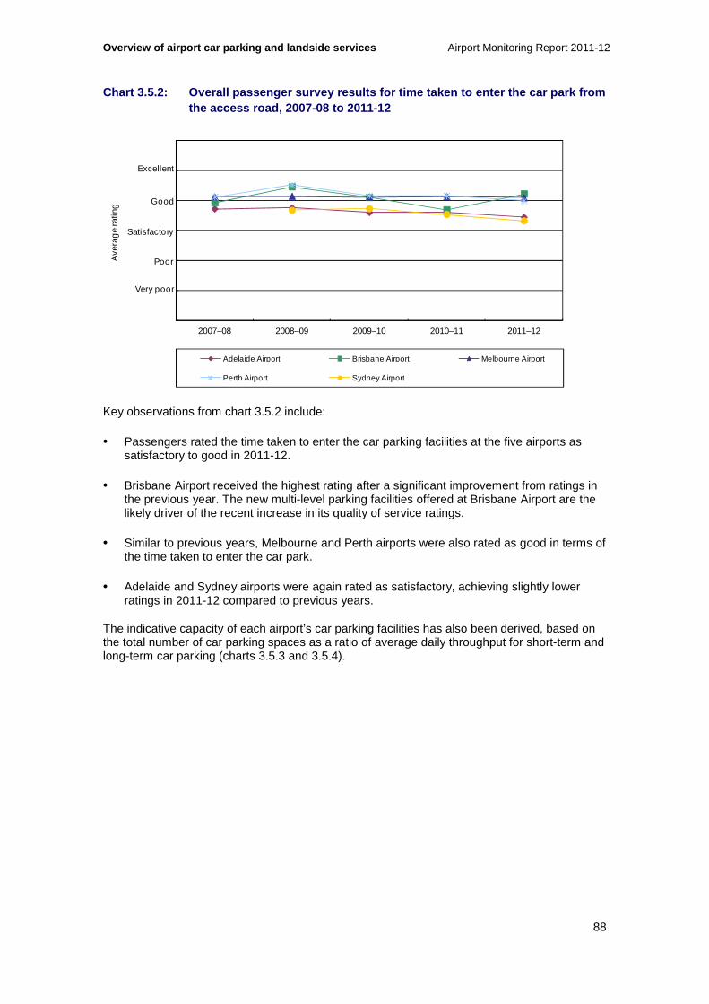
Overview of airport car parking and landside services Airport Monitoring Report 2011-12
88
Chart 3.5.2: Overall passenger survey results for time taken to enter the car park from the access road, 2007-08 to 2011-12
0
1
2
3
4
5
6
2007–08 2008–09 2009–10 2010–11 2011–12
Ave
rag
e ra
ting
Adelaide Airport Brisbane Airport Melbourne Airport
Perth Airport Sydney Airport
Very poor
Poor
Satisfactory
Good
Excellent
Key observations from chart 3.5.2 include:
• Passengers rated the time taken to enter the car parking facilities at the five airports as satisfactory to good in 2011-12.
• Brisbane Airport received the highest rating after a significant improvement from ratings in the previous year. The new multi-level parking facilities offered at Brisbane Airport are the likely driver of the recent increase in its quality of service ratings.
• Similar to previous years, Melbourne and Perth airports were also rated as good in terms of the time taken to enter the car park.
• Adelaide and Sydney airports were again rated as satisfactory, achieving slightly lower ratings in 2011-12 compared to previous years.
The indicative capacity of each airport’s car parking facilities has also been derived, based on the total number of car parking spaces as a ratio of average daily throughput for short-term and long-term car parking (charts 3.5.3 and 3.5.4).
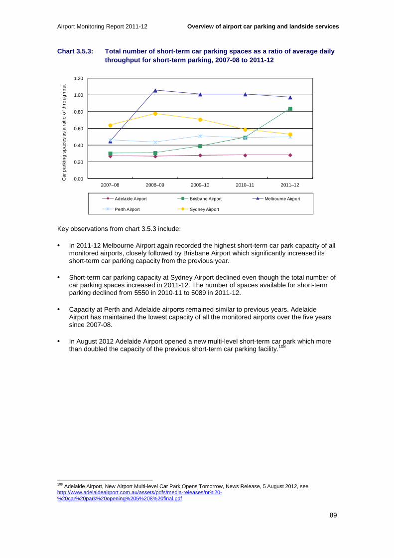
Airport Monitoring Report 2011-12 Overview of airport car parking and landside services
89
Chart 3.5.3: Total number of short-term car parking spaces as a ratio of average daily throughput for short-term parking, 2007-08 to 2011-12
0.00
0.20
0.40
0.60
0.80
1.00
1.20
2007–08 2008–09 2009–10 2010–11 2011–12
Car
par
kin
g s
pac
es a
s a
ratio
of t
hro
ugh
put
Adelaide Airport Brisbane Airport Melbourne Airport
Perth Airport Sydney Airport
Key observations from chart 3.5.3 include:
• In 2011-12 Melbourne Airport again recorded the highest short-term car park capacity of all monitored airports, closely followed by Brisbane Airport which significantly increased its short-term car parking capacity from the previous year.
• Short-term car parking capacity at Sydney Airport declined even though the total number of car parking spaces increased in 2011-12. The number of spaces available for short-term parking declined from 5550 in 2010-11 to 5089 in 2011-12.
• Capacity at Perth and Adelaide airports remained similar to previous years. Adelaide Airport has maintained the lowest capacity of all the monitored airports over the five years since 2007-08.
• In August 2012 Adelaide Airport opened a new multi-level short-term car park which more than doubled the capacity of the previous short-term car parking facility.108
108 Adelaide Airport, New Airport Multi-level Car Park Opens Tomorrow, News Release, 5 August 2012, see http://www.adelaideairport.com.au/assets/pdfs/media-releases/nr%20-%20car%20park%20opening%205%208%20final.pdf

Overview of airport car parking and landside services Airport Monitoring Report 2011-12
90
Chart 3.5.4: Total number of long-term car parking spaces as a ratio of average daily throughput for long-term parking, 2007-08 to 2011-12
0
2
4
6
8
10
12
14
16
18
20
2007–08 2008–09 2009–10 2010–11 2011–12
Car
par
king
spa
ces
as a
ratio
of t
hrou
ghpu
t
Adelaide Airport Brisbane Airport Melbourne Airport Perth Airport Sydney Airport
Key observations from chart 3.5.4 include:
• Perth Airport’s long-term car parking facility had the greatest capacity among the monitored airports again in 2011-12. Long-term parking capacity at Perth Airport has, however, declined from previous years. While the number of long-term car parking spaces has increased in each of the previous five years, the annual throughput of the international and, in particular, the domestic long-term car park has continued to expand.
• The indicative long-term car parking capacity improved at Sydney Airport, which moved up to rank second after Perth in 2011-12.
• While Brisbane and Adelaide airports improved their capacity in 2011-12, they recorded the lowest capacity among the five airports.
3.6 Landside access charges and revenues
In many cases, there are alternatives to on-airport car parking available to consumers as a means of travelling to and from an airport. These include private vehicles, taxis, trains, buses, bicycles and private car operators (such as hire cars and chauffeur-driven cars). Consumers arriving in a private vehicle have the option of using drop-off or pick-up facilities or using on-airport or off-airport car parking facilities. In order for private operators to be able to supply alternatives services, they first require access to airport land and facilities.
As airports control the price, terms and conditions of access to airport land, they have the ability to influence the level of competition between on-airport car parking and other landside alternatives to access the airport. For example, provision of alternative services by private operators could be frustrated if airports levied excessive access fees or influenced alternatives to on-airport car parking through non-price means, such as setting inconvenient locations for pick-up and drop-off points.
Charges and revenues associated with landside access are also collected through the ACCC’s airport monitoring program, providing an indication of the range of alternatives to on-airport car parking and the conditions imposed on the operators of these services. Table 3.6.1 presents

Airport Monitoring Report 2011-12 Overview of airport car parking and landside services
91
information on the range of landside access charges imposed on transport operators at each of the monitored airports at the end of 2010-11 and 2011-12.
Table 3.6.1 Landside access charges as at 30 June 2011 and 30 June 2012, and percentage change in charges between those years109
Airport Operator 2010-11 2011-12 Change (%)
Adelaide
Public bus No charge No charge 0.0 %
Private bus No charge No charge 0.0 %
Off-airport car parking No charge No charge 0.0 %
Taxis $2.00 per pick-up $2.00 per pick-up 0.0 %
Private car operators $2.00 per entry $2.00 per entry 0.0 %
Brisbane
Public bus Monthly fee Monthly fee NA
Off-airport car parking Monthly fee Monthly fee NA
Taxis $3.00 per pick-up $3.00 per pick-up 0.0 %
Train $145 000 corridor lease $149 000 corridor lease ▲ 2.8 %
Private bus and private car operators
Various Various Various
Melbourne
Public bus No charge No charge 0.0 %
Private bus Various Various 0.0 %
Off-airport car parking Various Various 0.0 %
Taxis $1.32 per pick-up $1.32 per pick-up 0.0 %
Private car operators $3.00 per 30 minutes $3.00 per 30 minutes 0.0 %
Perth
Public bus No charge No charge 0.0 %
Private bus No charge No charge 0.0 %
Off-airport car parking No charge No charge 0.0 %
Taxis $2.00 per pick-up $2.00 per pick-up 0.0 %
Private car operators $2.20 per entry $3.00 per entry ▲ 36.4 %
Sydney
Public bus No charge No charge 0.0 %
Private bus Various Various 0.0 %
Off-airport car parking Various Various 0.0 %
Taxis $3.00 per pick-up $3.50 per pick-up ▲ 16.7 %
Private car operators $3.50 per entry $4.50 per entry ▲ 28.6 %
Key observations from table 3.6.1 include:
• At Melbourne and Adelaide airports all landside access charges remained unchanged in 2011-12 while Brisbane, Perth and Sydney airports increased a small number of charges.
• Both Sydney and Perth airports increased the charge imposed on private cars to $4.50 and $3.00 per entry respectively. Sydney Airport also increased the charge on taxis by 16.7 per cent to $3.50 per entry.
109 Table 3.6.1 excludes revenue generated from car rental operations and premium services such as valet parking.

Overview of airport car parking and landside services Airport Monitoring Report 2011-12
92
• Similar to the previous year, Brisbane Airport increased the charge it imposes for train access by 2.8 per cent.
Table 3.6.2 presents information on the monitored airports’ landside access revenue at the end of 2010-11 and 2011-12.
Table 3.6.2 Landside access revenues as at 30 June 2011 and 30 June 2012, and percentage change in revenues between those years
Airport Operator 2010-11 2011-12 Change (%)
Adelaide
Public bus Nil Nil 0.0 %
Private bus Nil Nil 0.0 %
Off-airport car parking Nil Nil 0.0 %
Taxis $253 400 $243 200 ▼ 4.0 %
Private car operators $44 000 $31 000 ▼ 29.5 %
Total $297 400 $274 200 ▼ 7.8 %
Brisbane
Public bus $124 000 $107 000 ▼ 13.7 %
Off-airport car parking $237 000 $331 000 ▲ 39.7 %
Taxis $3.1 million $3.5 million ▲ 11.6 %
Train $145 000 $149 000 ▲ 2.8 %
Private bus and private car operators $1.7 million $1.75 million ▲ 2.7 %
Total $5.3 million $5.8 million ▲ 9.2 %
Melbourne
Public bus Nil Nil 0.0 %
Private bus and off-airport car parking $3.8 million $4.0 million ▲ 5.4 %
Taxi $2.2 million $2.1 million ▼ 4.6 %
Private car operators $607,000 $927,000 ▲ 52.7 %
Total $6.6 million $7.0 million ▲ 6.4 %
Perth
Public bus Nil Nil 0.0 %
Private bus Nil Nil 0.0 %
Off-airport car parking Nil Nil 0.0 %
Taxis $1.9 million $2.0 million ▲ 6.9 %
Private car operators $153,000 $229,000 ▲ 49.7 %
Total $2.1 million $2.3 million ▲ 10.1 %
Sydney
Public bus Nil Nil 0.0 %
Private bus $427 000 $1.7 million ▲ 297.2 %
Off-airport car parking Nil Nil 0.0 %
Taxis $7.9 million $9.5 million ▲ 19.6 %
Private car operators $923 000 $1.7 million ▲ 87.4 %
Other $446 000 $407 000 ▼ 8.7 %
Total $9.7 million $13.3 million ▲ 36.9 %
Key observations from table 3.6.2 include:
• Total revenue earned from landside access operations increased by almost 20 per cent to around $28.7 million in 2011-12.
• Adelaide Airport earned less revenue from both taxi and private car operations compared to the previous year. Adelaide Airport earned by far the least of all five airports in terms of revenue from landside access operations. Overall, revenue from landside access charges decreased by 7.8 per cent to $274 200 in 2011-12.

Airport Monitoring Report 2011-12 Overview of airport car parking and landside services
93
• Brisbane Airport received about $5.8 million in landside access revenue in 2011-12. Revenue increased from most landside access operations, including off-airport car parking which increased by 39.7 per cent to $331 000. Revenue from taxis also increased, by 11.4 per cent, even though charges imposed on taxis remained unchanged from the previous year.
• Melbourne Airport’s revenue from landside access increased by 6.4 per cent to $7.0 million. The largest contributors to total revenue were receipts from private bus and off-airport car parking operators which added around $4.0 million, up by 5.4 per cent from the previous year. Private car operations, however, showed the largest percentage increase in landside access revenue, increasing by over 50 per cent in 2011-12.
• Perth Airport also earned greater revenue from landside access operators in 2011-12, up by 10.1 per cent to $2.3 million. Revenue from private car operations also increased substantially at Perth Airport.
• Sydney Airport’s revenue from landside access was the highest of all five airports at $13.3 million, increasing by 36.9 per cent in 2011-12. Revenue from taxis provided the largest contribution to total landside access revenue, at $9.5 million. As a result of a higher charge and greater taxi volumes, revenue from taxis increased by almost 20 per cent in 2011-12. The increase in private bus revenue partly represents more accurate data collection in 2011-12 and incomplete data collection in prior years.
• While Melbourne, Perth and Sydney airports all earned significantly greater revenue from private car operators in 2011-12, Melbourne Airport did so without increasing charges on operators.
3.7 Observations from the monitoring results for airport car parking and landside access
The ACCC’s airport monitoring program collects a range of information about the performance and conduct of the five monitored airports in Australia’s largest capital cities.
The following sections consolidate the information about airport car parking and landside access services, and provide an assessment of each airport’s performance in the provision of these services in 2011-12.
In addition, the following sections also highlight the major investment projects that have recently been completed, or that are currently underway at each of the monitored airports. Given the recent increase and expected future growth of passenger and aircraft volumes, sufficient planning and investment in car parking facilities, terminal roads, kerbside management, and other facilities used by landside operators will be a key factor in maintaining a competitive environment for car parking and landside access services.
3.7.1 Adelaide Airport
Previous ACCC Airport Monitoring Reports have noted capacity constraints at Adelaide Airport’s car parking facilities. In 2011-12 monitoring results were similar to previous years with little change in capacity, although construction of a new multi-level car park was nearing completion.
Adelaide Airport’s rating in terms of car parking availability fell to poor, with the lowest rating among the five monitored airports. With the smallest car parking capacity of all the monitored

Overview of airport car parking and landside services Airport Monitoring Report 2011-12
94
airports, Adelaide Airport continued to have the lowest revenue from car parking services among the monitored airports in 2011-12.
However, despite continued capacity issues, Adelaide Airport has kept car parking prices relatively stable. For the second year in a row, car parking prices remained unchanged in 2011-12, and have only increased marginally since around 2005-06.
Investment at Adelaide Airport
In 2010-11, Adelaide Airport advised that it had started construction of a new multi-level car park as part of its Landside Infrastructure Project. Stage 1 of this project commenced in 2010-11 and provided an additional multi-lane road access to and from Terminal 1 in preparation for a new drop-off/pick-up zone, and was completed in August 2011. Stages 2 and 3 of the project involved the construction of a 2000-vehicle car park and of a drop-off/pick-up zone.
Adelaide Airport’s new multi-level short-term car park opened on 6 August 2012, more than doubling capacity. Short-term car parking prices increased with the opening of the new facility. At this stage there are no further expansion plans for landside access facilities.
3.7.2 Brisbane Airport
Brisbane Airport opened its new domestic terminal multi-level car park in March 2012, providing more than 5000 additional undercover parking spaces. The number of total car parking spaces increased by 31.7 per cent and ratings for availability and ‘time taken to enter the car park’ both reached relatively high levels compared to the other monitored airports.
Brisbane Airport increased some of its price points at its newly completed short-term domestic car park. Prices at the domestic long-term car park and international car parks were unchanged from the previous year.
Over 2011-12 Brisbane Airport recorded a slight increase in car parking revenue but a decrease in car parking operating margin due to a significant increase in car parking operating expenses (the largest of any monitored airport). Brisbane Airport’s 1.4 per cent increase in car parking revenue is the smallest increase in car parking revenue reported by the airport over the period from 2003-04 to 2011-12. Conversely, car parking operating expenses saw the highest increase since 2004-05 as a result of higher costs associated with investment in car parking services.
Brisbane Airport’s total landside access revenue increased by 9.2 per cent to $5.8 million in 2011-12. This is down from the increase of 22.3 per cent reported last year. The increase in 2011-12 is mostly attributed to an increase in throughput as Brisbane Airport’s only reported price increase was for its Airtrain lease.
Investment at Brisbane Airport
The opening of the new domestic terminal multi-level car park was the major investment project in 2011-12.
Additional projects post 30 June 2012 included a new pick-up waiting area at its domestic terminal which opened in September 2012.
Brisbane Airport has, however, faced some challenges with this upgrade. Since the opening there have been numerous reports in the media claiming that the changes at Brisbane Airport

Airport Monitoring Report 2011-12 Overview of airport car parking and landside services
95
have been ineffective in dealing with issues and have resulted in a number of complaints about increased inconvenience to passengers.
Brisbane Airport subsequently issued a press release on 24 October 2012 acknowledging problems with its new passenger pick-up waiting area and announcing details of an interim solution to address these issues.110 As part of the new arrangements, a 30 minute free parking will be permitted in the pick-up waiting area before standard short-term parking rates apply.
3.7.3 Melbourne Airport
Melbourne Airport’s car parking facilities provide the highest number of car parking spaces of all monitored airports, although the number of car parking spaces fell slightly in 2011-12. Passengers have rated the availability and ‘time taken to enter the car park’ at Melbourne Airport relatively highly, which again recorded the highest short-term car park capacity of all monitored airports.
Melbourne Airport did not increase car parking prices, and reduced some prices at both its long-term uncovered car park and also in the northern business car park. In the period after 30 June 2012, however, a number of prices increased at Melbourne Airport’s car parks.
For the first time since 2001-02, Melbourne Airport reported a decrease in operating margins for airport car parking in 2011-12 as operating expenses increased while revenues remained relatively constant.
Melbourne Airport’s total revenues from landside access services increased by 6.4 per cent to $7.0 million in 2011-12. In 2011-12, the increase in revenues was attributable to increased throughput as the airport did not increase any of its landside access fees.
Investment at Melbourne Airport
Melbourne Airport completed a redevelopment of its forecourt in December 2011. This project involved the construction of an additional lane for passenger pick-up and drop-off. Melbourne Airport also opened a new ramp for accessing the freeway in August 2012, which provides an alternative route for exiting the airport.
• Melbourne Airport has also begun an expansion of its long-term car park, expected to be completed by March 2013. This project will provide an additional 2400 spaces, including public and staff car parking. Melbourne Airport have stated that in its 2013 master plan, it will include a plan to construct a new elevated loop road above its existing road network. This elevated loop road is proposed to cater for more vehicles and reduced travel times.111
3.7.4 Perth Airport
The number of car parking spaces at Perth Airport increased by another 7.4 per cent in 2011-12, following an increase of 26.2 per cent in the previous year. Perth Airport ranks second among the five monitored airports in terms of the number of car parking spaces.
Similar to the previous year, Perth Airport increased prices for the majority of their various car parking price points across all car parks in 2011-12.
110 Brisbane Airport, BAC announces changes to ‘pickup at BNE domestic, 24 October 2012. 111 Melbourne Airport, Getting to and from Melbourne Airport, Fact Sheet, November 2012.

Overview of airport car parking and landside services Airport Monitoring Report 2011-12
96
The largest increase in car parking revenue of all monitored airports occurred at Perth Airport which increased by 23.2 per cent to $50.6 million. Perth Airport’s car parking operating margin for 2011-12 was $34.2 million, up 24.3 per cent from 2010-11. As with revenue growth, Perth Airport’s increase in car parking operating margin was the largest of the monitored airports.
In 2011-12, Perth Airport’s total landside access revenue increased by 10.1 per cent. This was partly due to Perth Airport increasing its fee for private car operators by 36.4 per cent, as well as increased throughput of taxis and private car operators.
In previous Airport Monitoring Reports, the ACCC noted that Perth Airport does not impose access charges on off-airport car parking operators. This increases the potential for competition to on-airport car parking to provide a constraint on an airport’s own car parking prices and reduces the likelihood of economic welfare losses. Notably, however, the ACCC also observed that Perth Airport does not provide a separate kerbside pick-up area for off-airport car parking and private bus operators, so it would not face the same costs of providing landside access as the other monitored airports.
Investment at Perth Airport
Perth Airport in particular has experienced strong passenger growth in recent times. With the exception of 2005-06, Perth Airport has had the highest percentage growth in passenger throughput in every year since 2000-01 among all the monitored airports.
Over this period, Perth Airport gradually increased its short-term and long-term car parking facilities. On top of significant car parking expansions in 2004-05 and 2007-08, in 2010-11 there was sharp rise in parking spaces as a result of the completion of the park-and-ride facility, which provided 3000 new spaces.
In 2011-12, Perth Airport constructed a new intersection, providing alternative access to and from the international terminal. The new intersection was commissioned in April 2012.
Perth Airport is continuing an expansion of its long-term and staff car parking capacity for international terminal users and other precinct users. Stage 3 of this project was completed in December 2012, providing an additional 1760 car parking spaces.
3.7.5 Sydney Airport
In 2011-12, Sydney Airport increased car parking spaces and experienced an increase in car parking throughput, with car parking spaces increasing by 6.9 per cent and annual throughput increasing by 1.2 per cent. The largest increase in annual car parking throughput reported by Sydney Airport occurred in 2010-11, when car parking throughput increased by 17.4 per cent.
Sydney Airport increased all car parking prices except for the first 30 minutes of car parking at its international multi-level car park. Compared to the other airports, Sydney Airport had the highest short term car parking prices for a number of parking durations including one, three, eight and 24 hours.
Sydney Airport’s car parking revenue, operating costs and operating margin all increased in 2011-12. The airport’s operating margin increased by 0.4 per cent to $69.4 million, representing around 29.2 per cent of its total airport operating margin.
Sydney Airport’s revenue per car parking space was the largest of all monitored airports, though decreased by 4.1 per cent in 2011-12 due mainly to the additional spaces made available.
Sydney Airport’s total landside revenues increased by 36.9 per cent in 2011-12, compared with a 4.9 per cent increase in the previous year. The increase in landside revenues was in part

Airport Monitoring Report 2011-12 Overview of airport car parking and landside services
97
driven by an increase in access charges to taxis and private car operators of 16.7 per cent and 28.6 per cent respectively, and an increase in demand for landside services.
Investment at Sydney Airport
Sydney Airport completed an expansion of its long-term domestic car park in April 2012, providing 1387 additional car parking spaces. Other investments at Sydney Airport during 2011-12 include construction of a new slip lane for its 10 minute free vehicle waiting area, provision of additional taxi bays and a new on-line booking system for airport car parking.
In addition Sydney Airport completed a new $47 million multi-storey car park at the international terminal in August 2012, with approximately 2300 spaces.
Future investments planned include plans to construct a new 900 space multi-storey car park at the domestic terminal located on Seventh Street as well as a shuttle bus ‘slip lane’ to facilitate quicker transit times for the shuttle bus between the long-term car park and the domestic terminal.
3.8 Passenger growth, capacity constraints and investment in airport car parking and landside services
Projected growth in passenger numbers will increase demand for landside access at monitored airports. This will create the need for planning and efficient investment in car parking facilities, terminal roads, kerbside management, and other facilities used by landside operators supplying alternatives to on-airport car parking.
There are a number of alternatives to on-airport car parking available to consumers. These include taxis, trains, off-airport car parking, buses, hire cars and even bicycles. These alternatives vary in their levels of substitutability for on-airport car parking.
Access to airport land is required in order to supply an alternative to on-airport car parking. Airports control the price, terms and conditions of access to airport land. Therefore, airports have some control over the cost and convenience of getting to and from an airport, in some cases regardless of the particular transportation mode chosen by a consumer.
As noted, the monitored airports also provide pick-up and drop-off facilities that passengers can use when accessing an airport. With the exception of Sydney Airport, pick-up and drop-off facilities are the main form of access to the monitored airports by passengers using private vehicles.112 As noted in section 3.2, each airport offers different combinations of services for pick-up and drop-off, which can include kerbside access at the front of the terminal, park and wait areas, or a combination of both.
The ACCC’s previous monitoring reports have discussed at length the airports’ incentives and ability to limit, or delay investment in, the supply of car parking and landside access facilities to maintain artificial scarcity. If they did not provide sufficient capacity, airports could limit demand for car parking by charging higher prices for existing car parking facilities. Likewise an airport could also under-invest in forecourt facilities, to maintain a scarcity of supply allowing airports to charge higher prices for existing investment or imposing unfavourable terms on the access of the forecourt.
112 Productivity Commission, Economic Regulation of Airport Services, Inquiry report no. 57, Canberra, December 2011.
Overview of airport car parking and landside services Airport Monitoring Report 2011-12
98
In preparing the 2009-10 Airport Monitoring Report, the ACCC spoke with a number of landside operators providing alternatives to on-airport car parking at the monitored airports. These stakeholders expressed similar concerns to the PC 2011 inquiry.113 For example, providers of alternatives to on-airport car parking expressed dissatisfaction over the cost and convenience of landside access services provided by some monitored airports, in particular, Brisbane and Melbourne.
Providers of alternatives to on-airport parking generally considered that it is appropriate for airports to charge access fees, as these allow the airports to recover the costs of maintaining access roads and kerbside facilities. However, these providers have also expressed concerns over the precise level and basis for charging for access at some airports.
Some providers also raised concerns over the rate at which access charges at some airports have increased in recent years. For example, in its submission to the PC’s 2011 inquiry into airport regulation, Andrews Airport Parking (AAP) noted that the licence fees it pays to Brisbane Airport have increased by 134 per cent in five years. AAP has noted that over that time there was a significant expansion in the number of off-airport parking operators, which would likely allow the airport to collect revenue from more operators to cover costs of kerbside and road maintenance and development.
Landside operators have also raised concerns over the convenience of landside access facilities, and the level of investment undertaken by some of the monitored airports to meet growing demand.
As noted, several major investment projects are underway or have recently been completed by the monitored airports. Looking forward, it will be imperative that the airports liaise with users and governments to develop appropriate landside solutions to address growth. Such engagement with stakeholders will ensure landside developments are fit for purpose, deliver sufficient capacity and integrate with wider infrastructure networks.
3.8.1 Future growth and future landside investment
It was noted in chapter 1 that the Bureau of Infrastructure, Transport and Regional Economics (BITRE) has projected that by 2031, passenger throughput at the monitored airports will have increased by around 104.1 per cent to 217 million passengers per year. BITRE has also projected that by 2030, aircraft movements at the monitored airports will have increased by around 56.4 per cent to 1.5 million movements per year.
Such growth may put pressure on two aspects of landside services and infrastructure:
• Landside infrastructure within an airport, including car parks, taxi holding areas, train platforms and other facilities, pick-up and drop-off areas and roads surrounding the terminals and connecting the airport to the major roads outside of the airport precinct.
• Landside networks, such as road and rail networks, used for travelling to and from an airport.
Some parties have raised some concerns with the current level of landside infrastructure around some Australian airports.
For example, a Joint Study commissioned by the Australian and New South Wales Governments into aviation capacity for the Sydney Region, released in March 2012, highlighted landside concerns and noted that road and rail access to Sydney Airport is approaching gridlock. In particular, the report recommended a range of minor improvements to the short-
113 Productivity Commission, Economic Regulation of Airport Services, Inquiry report no 57, Canberra, December 2011.

Airport Monitoring Report 2011-12 Overview of airport car parking and landside services
99
term parking, pick-up and drop-off and terminal road circulation arrangements around Sydney Airport.
It is important to note that the transportation networks around Sydney will not only be affected by projected growth in passenger numbers, but also by expected growth in trade passing through Sydney Ports. As noted, BITRE has forecast that passenger numbers at Sydney Airport will increase from 36.3 million in 2011-12 to 72.0 million in 2030-31.114 Sydney Ports, which shares some access roads with the airport, has forecast that container movements at the adjacent Port Botany terminals will grow from around 2 million twenty-foot equivalent units (TEUs) in 2011 to 7 million TEUs in 2031.115 This will put additional pressure on the existing transportation networks in the Sydney area, especially roads. Investment and incentives to encourage greater and more efficient use of rail networks may be required to handle this additional throughput at the port and airport.
Future investment in car parking and landside infrastructure
There are a number of investments currently planned by the monitored airports to expand capacity in car parking and other landside facilities. These will contribute to the airports’ ability to service projected growth in passenger numbers in the coming years.
Two examples of major investments planned by the airports are:
• Sydney Airport’s plans to construct a new 900 space multi-storey car park at the domestic terminal located on Seventh Street.
• Melbourne Airport’s expansion of its long-term car park, expected to be completed by March 2013 and provide an additional 2,400 car parking spaces.
Development of landside networks
While each airport is responsible for planning and developing terminal access roads and car parking facilities within the airport boundaries, outside the airport boundaries there is a wider group of stakeholders that needs to be the involved to make efficient investment decisions.
Establishing efficient landside networks for getting to and from an airport requires planning and collaboration between a number of parties such as airports, landside operators, local and state governments and the Australian Government.
To this end the Australian Government has established a number of forums and working groups to facilitate coordination between the airports and the three levels of government. In recognition of landside capacity concerns, Brisbane, Melbourne and Perth Airports in conjunction with their respective state governments have either announced or recently completed road works in or around their airports to improve access and ease congestion.
Other factors impacting on landside management also include security requirements that set out certain rules for the airports in allowing access to roads surrounding the terminal forecourts.
114 Bureau of Infrastructure, Transport and Regional Economics, Air passenger movements through capital and non-capital city airports to 2030-31, Research report no. 133, November 2012. 115 Infrastructure New South Wales, The State Infrastructure Strategy: 2012-2032, October 2012.

Overview of airport car parking and landside services Airport Monitoring Report 2011-12
100
3.8.2 Planning for and supporting future investment
The process an airport must undertake for planning landside infrastructure and systems is lengthy and involves input from a number of parties, including the airports themselves, their users, governments and other stakeholders.
The planning process also involves planning for the long-term, as not only do these projects have long lead times, but the airports are required to consult and submit development plans to the Minster for Infrastructure and Transport for approval.
As noted in the discussion on aeronautical capacity constraints in chapter 2, under the Airports Act 1996 (Airports Act) the airports are required to establish a forward-looking master plan and submit major development plans for the approval of the Minister for Infrastructure and Transport. In recognition of the need to better integrate plans for investment in ground transport and airport access networks with off-airport transport, the Airports Act was amended in 2010 to incorporate additional planning requirements for landside access.
The Airport Act requires that the airports provide details on their ground transport system in their master plans, which are updated every five years. The ground transport systems are required to include information on:
• a road network plan
• facilities for moving people and freight
• linkages between the facilities, the road network and public transport system at and outside the airport
• arrangements with state or local authorities or other bodies responsible for the road network and public transport system
• the capacity of the ground transport system.
These master plans also provide a basis for assessing the performance of airports in meeting targeted investment outcomes.
To some degree, airport development plans are constrained by local planning and development restrictions as well as security requirements.
Cooperation between all parties is necessary
Planning, collaboration and investment in landside facilities, particularly those transportation networks outside of airport borders, will be required to complement significant airside capacity expansion and aeronautical growth at airports.
As noted, establishing efficient landside networks for getting to and from an airport requires input from a number of parties. As airports continue to grow, and the surrounding landside infrastructure becomes increasingly congested, effective cooperation between responsible parties will be important to implement effective landside solutions.
An airport’s landside infrastructure can be broadly categorised as that existing within an airport precinct and that which lies outside of the airport land precinct.
Landside infrastructure within an airport broadly consists of car parks, taxi holding areas, train platforms and other facilities, pick-up and drop-off areas and roads surrounding the terminals and connecting the airport to the major roads outside of the airport precinct. A number of

Airport Monitoring Report 2011-12 Overview of airport car parking and landside services
101
parties – such as airports, landside operators, consumers – are involved in either operating, planning or using landside infrastructure within the airport precinct.
Beyond the airport boundaries, landside infrastructure consists of road and rail networks used by consumers to access the airport. To manage this infrastructure, governments, state transport agencies and airports must work together to promote landside safety and efficiency. Cooperation is necessary and to assist in the effectiveness of the planning process. It will be important that the airports liaise with users and governments to develop appropriate landside solutions to address forecast growth, to ensure they are fit for purpose and deliver sufficient spare capacity.
Joint responsibilities
For example, the airport is responsible for planning and developing terminal access roads and car parking facilities within the airport boundaries. However, outside the airport boundaries, there needs to be the involvement of local and state governments working in conjunction with the airports to ensure that the needs of users are met. To this end the Government has established a number of forums and working groups to facilitate coordination between the airports and the three levels of government. This type of cooperation and engagement will become increasingly important as airport services grow in volume.
In recognition of landside capacity concerns, Brisbane, Melbourne and Perth airports in conjunction with their respective state governments have either announced or recently completed road works in or around their airports to improve access and ease congestion.
Relevantly, however, the issue of a rail link to Melbourne Airport is still subject to considerable conjecture. While the debate over whether Melbourne Airport would benefit from a rail link to the airport and who should build it has been continuing for a long time, the issue does not seem to be closer to resolution. Melbourne Lord Mayor Robert Doyle has published an opinion piece in the local press calling for the construction of a rail link.116 Melbourne Airport has noted the potential benefits of a rail link (once a critical mass of 40 million passengers is reached), but it sees the project as the responsibility of the state government.117 This would appear to be an example of a landside project requiring a coordinated approach by the airport, local and state governments and other stakeholders in order to come to fruition. The debate around this project highlights the imperative of collaboration among relevant stakeholders to promote investment in key landside infrastructure projects.
Monitoring investment outcomes
To increase transparency of airports’ performance and progress against investment plans, this year’s airport monitoring program was extended to collect details of completed, ongoing and planned investment in monitored airports’ landside infrastructure.
By reporting on progress with airport investment, the Airport Monitoring Report (AMR) can provide further observations on how monitored airports are responding to any congestion issues at the landside and whether there are issues outside the airport boundaries that are influencing the efficiency of landside infrastructure networks.
This information, in conjunction with the airport’s own master plans, will assist in better assessing the extent to which the airports are meeting the needs of their users.
116 Robert Doyle Cr “Let's build an airport rail link without delay as it's time to improve Tullamarine”, Herald Sun 6 January 2013. See http://www.heraldsun.com.au/opinion/lets-build-an-airport-rail-link-without-delay-as-its-time-to-improve-tullamarine/story-e6frfhqf-1226548121790; viewed, 9 April 2013. 117 See “Cars, trains, buses ... and planes are on Melbourne Airport chief Chris Woodruff's agenda”, Herald Sun 2 April 2013; at http://www.heraldsun.com.au/business/cars-trains-buses-and-planes-are-on-melbourne-airport-chief-chris-woodruffs-agenda/story-fn7j19iv-1226611241716; viewed 9 April 2013.

Overview of airport car parking and landside services Airport Monitoring Report 2011-12
102

Airport Monitoring Report 2011-12 Adelaide Airport monitoring results
103
4 Adelaide Airport
Key points
• Total passenger numbers at Adelaide Airport decreased by 4.0 per cent in 2011-12 to 7.1 million passengers. This decline was caused by reductions in domestic passenger numbers due mainly to subdued economic conditions, the cessation of services by Tiger Airways, and the Qantas grounding and associated industrial relations issues.
• Reflecting lower passenger numbers, total aeronautical revenue decreased by 9.3 per cent in 2011-12 to $78.1 million.
• Aeronautical revenue per passenger, used by the ACCC as an alternative measure for average prices, decreased in 2011-12 by 5.5 per cent to $11.01 per passenger.
• Total aeronautical operating expenses decreased by 1.7 per cent in 2011-12 to $46.0 million. On a per passenger basis, aeronautical operating expenses increased by 2.4 per cent to $6.48 per passenger.
• Total aeronautical operating margin decreased by 18.3 per cent in 2011-12 to $32.1 million. On a per passenger basis, the decrease was 14.8 per cent to $4.53 per passenger.
• Aeronautical services return on non-current assets decreased by 2.6 percentage points to 7.6 per cent in 2011-12.
• Car parking prices at Adelaide Airport remained unchanged for both short and long-term car parking for the second consecutive year.
• Car parking revenue decreased by 4.9 per cent in 2011-12 to $14.0 million. Car parking revenue per car park space decreased by 5.0 per cent to $4673, which was due to car parking revenue decreasing during the year.
• Total car parking operating margin decreased by 10.0 per cent in 2011-12 to $9.5 million.
• Major investments completed at Adelaide Airport during 2011-12 included stage 1 of the Landside Infrastructure Project, which provided an additional multi-lane road to and from T1 in preparation for a new drop-off/pick-up zone, a new 2000 vehicle car park and a baggage handling system upgrade.
• Additions to aeronautical tangible non-current assets were $59.9 million, equivalent to 13.4 per cent of total tangible aeronautical non-current assets.
• Adelaide Airport’s overall rating for quality of service decreased during 2011-12, but remained within the satisfactory range.
• Other quality of service rating outcomes for Adelaide Airport include:
− Average rating for the international terminal decreased slightly within the good category.
− Average rating for the domestic terminal also decreased in 2011-12, but remained rated as satisfactory.
− Average rating for other airport services increased but remained rated as satisfactory.

Adelaide Airport monitoring results Airport Monitoring Report 2011-12
104
This chapter presents the detailed prices monitoring, financial performance and quality of service monitoring results in relation to the supply of aeronautical services and car parking services at Adelaide Airport. This chapter is structured as follows:
• Overview of aeronautical and car parking monitoring results (section 4.1)
• Airport overview and major airport investments (section 4.2)
• Aeronautical prices monitoring and financial performance results (section 4.3)
• Aeronautical services quality of service monitoring results (section 4.4)
• Car parking services monitoring results (section 4.5).
• Adelaide Airport price and quality of service monitoring beyond 2011-12 (section 4.6)
4.1 Overview of aeronautical and car parking monitoring results
4.1.1 Key aeronautical services indicators for 2011 -12
Table 4.1.1: Adelaide Airport—key aeronautical serv ices indicators
Passenger numbers
(million)
Total aeronautical
revenue
($million)
Aeronautical revenue per
passenger
($)
Total aeronautical
operating margin
($million)
Aeronautical operating
margin per passenger
($)
Aeronautical revenue as a
% of total airport
revenue %
2010-11 7.4 86.1 11.64 39.3 5.31 53.6
2011-12 7.1 78.1 11.01 32.1 4.53 53.8
%change ▼ 4.0% ▼ 9.3% ▼ 5.5% ▼ 18.3% ▼ 14.8% ▲ 0.2pp
Table 4.1.1: Adelaide Airport—key aeronautical serv ices indicators (cont...)
Total tangible
aeronautical non-current
assets
($million)
Rate of return on
tangible aeronautical non-current
assets (%)
Average quality of
service rating for
availability of airport services
Average quality of
service rating for
standard of airport
services
Airline rating for quality of
service
Passenger rating for quality of
service
2010-11 399.3 10.2 4.08 3.73 3.67 3.81
2011-12 445.9 7.6 3.96 3.74 3.66 3.72
%change ▲ 11.7% ▼ 2.6pp ▼ 3.1% ▲ 0.2% ▼ 0.3% ▼ 2.2%

Airport Monitoring Report 2011-12 Adelaide Airport monitoring results
105
4.1.2 Key car parking services indicators for 2011- 12
Table 4.1.2: Adelaide Airport—car parking prices as at 30 June
Short-term car parking Long-term car parking
1 hour 3 hours 8 hours 24 hours 1 day 3 days 7 day s
2010-11 $4.00 $11.00 $26.00 $30.00 $25.00 $50.00 $70.00
2011-12 $4.00 $11.00 $26.00 $30.00 $25.00 $50.00 $70.00
%change 0.0% 0.0% 0.0% 0.0% 0.0% 0.0% 0.0%
Table 4.1.3: Adelaide Airport—key car parking servi ces indicators
Number of car park spaces
(thousand)
Total car parking revenue
($million)
Car parking revenue per
car park space
($)
Total car parking
operating margin
($million)
Car parking operating
margin per car park
space ($)
Car parking revenue as a
% of total airport
revenue %
2010-11 3.0 14.8 4 918 10.6 3 534 9.2
2011-12 3.0 14.0 4 673 9.5 3 179 9.7
%change ▲ 0.1% ▼ 4.9% ▼ 5.0% ▼ 10.0% ▼ 10.1% ▲ 0.5pp
Table 4.1.3: Adelaide Airport—key car parking servi ces indicators (cont...)
Landside access
revenue
($million)
Landside access
revenue as a % of total
airport revenue
%
Passenger rating for
availability of airport
car parking
Passenger rating for
standard of airport car
parking
Passenger rating for
time taken to enter
airport car park
2010-11 0.3 0.2 3.03 3.52 3.60
2011-12 0.3 0.2 2.82 3.14 3.45
%change ▼ 7.8% 0.0pp ▼ 6.9% ▼ 10.8% ▼ 4.2%
4.2 Airport overview and major airport investments
This section presents information about Adelaide Airport, along with activity and investment in 2011-12. This includes: passenger / traffic mix (section 4.2.1); terminal configurations and car parking facilities (section 4.2.2); and major airport investments (section 4.2.3).
4.2.1 Passenger / traffic mix
Around 7.1 million passengers travelled through Adelaide Airport in 2011-12. Domestic passengers (including domestic on-carriage passengers) accounted for 90.7 per cent of total

Adelaide Airport monitoring results Airport Monitoring Report 2011-12
106
passengers, while international passengers (including transit passengers) accounted for 9.3 per cent of total passengers at Adelaide Airport (chart 4.2.1).
Chart 4.2.1: Adelaide Airport passenger mix, 2011-1 2
4.2.2 Terminal configurations and car parking facil ities
Terminal configurations
Adelaide Airport operates a single multi-user integrated terminal (T1) that services international, domestic and regional passengers.
• Adelaide Airport advised that T1 has common outbound check-in, baggage handling and security screening for all passengers. Inbound international passengers are separated and processed separately through border agencies’ mandated procedures. “Swing gates” are used to isolate international areas within the terminal when required, with the whole terminal available to all passengers the rest of the time.
• Adelaide Airport opened its new multi-user terminal in October 2005, with Qantas transferring its domestic operations from the terminal occupied and operated under a domestic terminal lease (DTL) to the new terminal in February 2006. Since February 2006, Adelaide Airport ceased to have a DTL, and all areas of the multi-user integrated terminal have been subject to monitoring and are included in the ACCC’s monitoring results. Therefore, monitoring data from before February 2006 does not include data on passenger-related services and facilities provided within the domestic terminal operations of Qantas. As a result, the analysis in this report will focus on monitoring data since 2006-07, the first full year the domestic terminal operations covering Qantas were included.
90.6%
8.9%0.4%
0.1%
Domestic passengers (including regional passengers)
International passengers (excluding transit passengers)
International transit passengers
Domestic on-carriage

Airport Monitoring Report 2011-12 Adelaide Airport monitoring results
107
Car parking facilities
Adelaide Airport provides two car parking facilities—a short-term car park located in front of its multi-user integrated terminal (T1) and a long-term car park that is serviced by a free shuttle bus provided by the airport.
• In 2010-11, Adelaide Airport advised that it had started construction of a new multi-level car park as part of its landside infrastructure project. Adelaide Airport commented that its existing car parking facilities were frequently operating beyond capacity. In the past, Adelaide Airport advised that it had adjusted its car park prices to encourage more efficient use of the car park by, for example, encouraging long-stay vehicles to use the long-term car park.
• Adelaide Airport’s new multi-level short-term car park opened on 6 August 2012. Adelaide Airport increased its short-term car parking prices to coincide with the opening of its new multi-level short-term car park; however, this is not reflected in the price monitoring data as prices increased post-30 June 2012. For example, Adelaide Airport has increased the price for 1 hour parking from $4.00 to $6.00 and the price for two hours parking from $8.00 to $12.00.118
4.2.3 Major airport investments
Aeronautical services and facilities
Adelaide Airport undertook and completed a number of investment projects in its aeronautical services and facilities in 2011-12, including:
• Stage 1 of the Landside Infrastructure Project, which provided an additional multi-lane road to and from T1 in preparation for a new drop-off/pick-up zone. This was completed in August 2011.
• A baggage handling system upgrade, which included installing new automatic baggage readers to integrate with Qantas’ next-generation check-in facilities. This was completed in July 2011.
• Installation of equipment for international transit screening to comply with new liquids, aerosols and gels screening procedures. This was completed in April 2012.
• Building modifications to incorporate new body scanning equipment for both international departures and international transit screening. This was completed in April 2012.
• General refitting and refurbishment of T1 retail shops and playroom facilities on the level 2 concourse. This was completed in June 2011.
• Stage 2 and 3 of the Landside Infrastructure Project was underway in 2011-12 and involved the construction of a 2000-vehicle car park and of a drop-off/pick-up zone.
Planned investments in aeronautical services and facilities at Adelaide Airport beyond 2011-12 include:
118 Adelaide Airport, Multi-Level Undercover, viewed on 8 February 2013 at; http://www.adelaideairport.com.au/air-travel/to-and-from/parking.

Adelaide Airport monitoring results Airport Monitoring Report 2011-12
108
• A Southern Pier expansion, with design works to be commenced in January 2013, with plans for this to be completed during 2015-16.
• Expansion of T1 and the T1 apron to be commenced in April 2013, with plans for this to be completed during 2015-16.
Car parking and landside access services
Investments in car parking and landside access services undertaken at Adelaide Airport in 2011-12 include:
• Stages 1, 2 and 3 of the Landside Infrastructure Project, as described above. This project includes construction of a new 2000 vehicle car park.
Adelaide Airport has no major plans for investments in car parking and landside access services beyond 2011-12, with the exception of the completion of the Landside Infrastructure Project noted above.
4.3 Aeronautical prices monitoring and financial performance results
This section presents prices monitoring and financial reporting results for aeronautical services and for total airport services, including activity levels (section 4.3.1); prices (section 4.3.2); revenues, costs and profits (section 4.3.3); revenues, costs and profits (section 4.3.4); government mandated security services (section 4.3.5); assets (section 4.3.6); and rates of return on tangible non-current assets (section 4.3.7).

Airport Monitoring Report 2011-12 Adelaide Airport monitoring results
109
4.3.1 Activity
Chart 4.3.1: Adelaide Airport—volume of passengers, tonnes landed and aircraft movements, 2001-02 to 2011-12 119
Key observations from chart 4.3.1 include:
• The number of passengers, tonnes landed and aircraft movements all decreased at Adelaide Airport in 2011-12.
• Passenger numbers decreased by 4.0 per cent from around 7.4 million in 2010-11 to 7.1 million in 2011-12. Passenger numbers had previously increased in every year since 2001-02. Passenger numbers have increased by 69.8 per cent since 2001-02. The largest annual increase in passenger throughput occurred in 2003-04, when passenger numbers increased by 12.0 per cent compared to the previous year.
• During 2011-12, international passenger numbers (including transit passengers) increased by 11.5 per cent to 0.7 million. This rise is partly explained by the introduction of new international services to Adelaide Airport. Domestic passenger numbers (including domestic on-carriage passengers) decreased during 2011-12 by 5.4 per cent to 6.4 million. Reasons for this include subdued economic conditions, the suspension of Tiger Airways by the Civil Aviation Safety Authority and the subsequent decision by this airline not to resume services to Adelaide until after the end of the financial year, and the Qantas grounding and associated industrial relations issues.120
• Tonnes landed at Adelaide Airport decreased by 2.4 per cent from 2.3 million tonnes in 2010-11 to around 2.2 million tonnes in 2011-12. Tonnes landed at Adelaide Airport have increased in most periods since 2001-02, and have increased by 34.9 per cent since 2001-02. The largest annual increase in tonnes landed occurred in 2004-05, when it increased by 10.7 per cent compared to the previous year.
• Aircraft movements decreased by 5.4 per cent from 99 890 movements in 2010-11 to 94 482 movements in 2011-12, the largest annual decrease over the 11 years since 2001-
119 Data in chart 4.3.1 is not comparable to chart 4.2.1 as international transit passengers have been included as international passengers and domestic on-carriage passengers have been included as domestic passengers. 120 Adelaide Airport (2012), Adelaide Airport Annual Report Editorial 2011-12,
http://www.adelaideairport.com.au/corporate-and-community/adelaide-airport-limited
0
15
30
45
60
75
90
105
120
0
1000
2000
3000
4000
5000
6000
7000
8000
2001
–02
2002
–03
2003
–04
2004
–05
2005
–06
2006
–07
2007
–08
2008
–09
2009
–10
2010
–11
2011
–12
Num
ber
of a
ircr
aft m
ove
men
ts (
tho
usan
d)
Domestic Passengers International Passengers Tonnes landed Aircraft movements (RHS)
Num
ber o
f pas
seng
ers
/ to
nne
s la
nded
Adelaide Airport monitoring results Airport Monitoring Report 2011-12
110
02. Aircraft movements in 2011-12 were 1.8 per cent lower than in 2001-02, when they were 96 205. The number of aircraft movements at Adelaide Airport reached a peak of 103 185 movements in 2007-08.
4.3.2 Prices
Table 4.3.1 presents the average aeronautical charges at Adelaide Airport from 2007-08 to 2011-12, as well as the indexed average list prices for that period (with 2007-08 as the base year).121
121 Where a list price changed during the financial year, the average of that charge has been reported in the table.

Airport Monitoring Report 2011-12 Adelaide Airport monitoring results
111
Table 4.3.1: Adelaide Airport—schedule of aeronauti cal charges and indexed average list prices (includ ing GST), 2007-08 to 2011-12
Average list prices
($)
Indexed average list prices
(2007-08 base year = 100)
2007-08 2008-09 2009-10 2010-11 2011-12 2007-08 2008-09 2009-10 2010-11 2011-12
Aircraft-related charges
International passenger air transport aircraft (per passenger)
11.86 11.80 12.10 12.45 12.73 100.0 99.5 102.0 105.0 107.4
International passenger air transport aircraft diversions from other airports (per MTOW)
6.32 9.45 9.69 9.97 10.19 100.0 149.6 153.4 157.8 161.3
Domestic passenger air transport aircraft weighing more than 20 000 kg MTOW (per passenger)
4.53 4.25 4.36 4.49 4.59 100.0 93.9 96.3 99.2 101.4
Domestic passenger air transport aircraft weighing more than 20 000 kg MTOW (per MTOW)
14.82 14.00 14.35 14.76 15.09 100.0 94.5 96.8 99.6 101.8
Domestic passenger air transport aircraft weighing more than 20 000 kg MTOW diversions from other airports (per MTOW)
6.41 7.00 7.18 7.39 7.56 100.0 109.2 112.0 115.3 117.9
Domestic passenger air transport aircraft weighing less than 20 000 kg MTOW (per MTOW)(a)
6.51 7.12 7.89 8.12 8.30 100.0 109.4 121.2 124.7 127.5
Domestic passenger air transport aircraft weighing less than 20 000 kg MTOW (per passenger)(a)(b)
NA 2.50 2.56 2.63 2.69 NA 100.0 102.4 105.2 107.6
Freight aircraft and aircraft not operating air transport services (per MTOW)(a)
6.36 6.41 6.57 6.76 6.91 100.0 100.7 103.2 106.2 108.6
Rotary wing and unpowered aircraft (per MTOW)(a) 3.17 3.21 3.29 3.38 3.46 100.0 101.3 103.9 106.7 109.2
Parking charge for aircraft parked longer than 2 hours in a designated general aviation parking area (per day or part thereof)
14.15 14.22 14.58 15.00 15.34 100.0 100.5 103.1 106.0 108.4

Adelaide Airport monitoring results Airport Monitoring Report 2011-12
112
Average list prices
($)
Indexed average list prices
(2007-08 base year = 100)
2007-08 2008-09 2009-10 2010-11 2011-12 2007-08 2008-09 2009-10 2010-11 2011-12
Passenger-related charges
Passenger facilitation charge–international passengers (per passenger)
8.63 9.01 9.33 8.50 7.02 100.0 104.4 108.1 98.5 81.3
Passenger facilitation charge–domestic passengers (per passenger)
6.23 6.51 6.74 6.15 5.12 100.0 104.4 108.1 98.7 82.1
Passenger facilitation charge–regional passengers (per passenger)
1.46 1.52 1.56 1.44 1.21 100.0 104.1 107.1 98.9 83.4
Government mandated security charges
Security charge for domestic and regional passengers–including passenger security screening and checked bag screening (per passenger)(c)
3.35 3.39 3.69 3.34 3.12 100.0 101.3 110.2 99.7 93.1
Security charge for international passengers–including passenger security screening and checked bag screening (per passenger)(d)
NA 3.69 4.36 5.71 6.13 NA 100.0 118.4 155.0 166.3
Security screening of international transit passengers (per passenger)
4.40 4.74 1.86 1.25 1.25 100.0 107.6 42.3 28.4 28.4
Minimum charges (e)
Minimum charge applicable to domestic passenger air transport aircraft weighing less than 20 000 kg MTOW (incl insurance charge)
37.96 38.16 39.11 40.24 41.15 100.00 100.5 103.0 106.0 108.4
Minimum charge applicable to freight aircraft and aircraft not operating air transport services (incl insurance charge)
37.96 38.16 39.11 40.24 41.15 100.00 100.5 103.0 106.0 108.4
Minimum charge applicable to rotary wing and unpowered aircraft (incl insurance charge)
18.98 19.08 19.56 20.12 20.57 100.00 100.5 103.0 106.0 108.4
Airport Monitoring Report 2011-12 Adelaide Airport monitoring results
113
Notes: NA Not applicable.
(a) Minimum charge applies.
(b) Adelaide Airport advised that this was not a new charge, but that an airline elected to be billed on a per passenger basis for the first time in 2008.
(c) In reports prior to 2009-10, passenger security screening and checked bag screening for domestic and regional passengers were reported separately. For the 2009-10, 2010-11 and 2011-12 reports, these charges have been combined to be reported as a single charge.
(d) New charge introduced in July 2008 due to changes in government regulation.
(e) Minimum charge is the minimum amount charged for landing aircraft in relation to landing charges. It does not include terminal and security charges.

Adelaide Airport monitoring results Airport Monitoring Report 2011-12
114
Key observations from table 4.3.1 include:
• List prices for aircraft-related services and facilities, which accounted for 43.0 per cent of Adelaide Airport’s total aeronautical revenue, all increased in 2011-12. At the same time, all list prices for passenger-related services and facilities, which accounted for 40.8 per cent of Adelaide Airport’s total aeronautical revenue, decreased. Minimum charges all increased in 2011-12.
− During the five year period since 2007-08, Adelaide Airport had in place formal five-year pricing agreements with airlines. Under this agreement, prices for aircraft-related services and facilities are determined using a cost based building block methodology and adjusted by CPI. This agreement expired in 2012.
− Charges for aircraft-related services and facilities all increased by between 2.2 per cent and 2.4 per cent in 2011-12. Since 2007-08, the charge for international passenger air transport aircraft diversions from other airports (per MTOW) has increased by 61.3 per cent, from $6.32 in 2007-08 to $10.19 in 2011-12. Adelaide Airport noted that a large proportion of this increase related to a re-alignment of diversion charges with international passenger charges as, over time, these charges had become relatively low by comparison.
− In relation to passenger-related services and facilities, passenger facilitation charges (PFCs) are covered by a 15-year pricing agreement to recover the cost of capital. The prices are reviewed every five years during the term of the agreement to allow for adjustments for any over- or under-recovery arising from actual traffic volumes being different from forecast volumes. Adelaide Airport advised that the most recent price review resulted in a decrease in PFCs in February 2011 of approximately 25 per cent.
− PFCs all decreased by between 15.7 per cent and 17.4 per cent in 2011-12, which Adelaide Airport noted was partly due to a decrease in PFCs of approximately 25 per cent in February 2011, followed by slight increases in PFCs during 2011-12. Between 2007-08 and 2010-11, these charges had decreased by a total of between 1.1 per cent and 1.5 per cent. As noted above, changes throughout the five year period since 2007-08 were in accordance with the mechanism set out in the 15-year pricing agreement with airlines.
• Government mandated security charges, which accounted for 16.2 per cent of Adelaide Airport’s total aeronautical revenue, increased for international passengers but decreased for domestic and regional passengers in 2011-12.
− The government mandated security charge for international passengers (per passenger) increased by 7.3 per cent from $5.71 in 2010-11 to $6.13 in 2011-12. The security charge for international passengers (per passenger) has increased by 66.3 per cent since 2008-09.
− The security charge for domestic passengers (per passenger) decreased by 6.5 per cent in 2011-12, from $3.34 in 2010-11 to $3.12 in 2011-12. The security charge for domestic passengers (per passenger) has decreased by 6.9 per cent since 2007-08.
− The security charge for screening international transit passengers (per passenger) was unchanged from 2010-11 at $1.25, though this charge has decreased by 71.6 per cent since 2007-08.
• All of the minimum applicable charges increased by around 2.3 per cent in 2011-12, compared to increases of around 2.5 per cent in 2009-10 and 2.9 per cent in 2010-11.
Airport Monitoring Report 2011-12 Adelaide Airport monitoring results
115
4.3.3 Revenues, costs and profits for aeronautical and total airport services
As noted, the ACCC required airport operators to provide additional information relating to the aeronautical asset base under the ‘line in the sand’ (LIS) approach for the first time in 2007-08. Under this approach, the value of an airport’s aeronautical asset base for monitoring purposes is the value of tangible non-current aeronautical assets reported to the ACCC as at 30 June 2005, plus new investments, less depreciation and disposals. This chapter separately reports LIS measures for Adelaide Airport where applicable. The starting line in the sand asset base figures for Adelaide Airport are detailed in the appendices.
Table 4.3.2 outlines the revenues, operating expenses and operating margins for aeronautical services and the total airport from 2001-02 to 2011-12, while table 4.3.3 outlines the revenues, operating expenses and operating margins for aeronautical services under the LIS approach from 2007-08 to 2011-12.

Adelaide Airport monitoring results Airport Monitoring Report 2011-12
116
Table 4.3.2: Adelaide Airport—revenues, operating e xpenses and operating margins for aeronautical serv ices and total airport services, 2001-02 to 2011-12
2001-02 2002-03 2003-04 2004-05 2005-06 2006-07 2007-08 2008-09 2009-10 2010-11 2011-12
Revenue ($million) Aeronautical 11.3 20.2 26.4 29.9 46.2 69.4 77.3 81.2 83.8 86.1 78.1
Total airport 39.6 47.1 56.7 75.1 88.6 123.5 149.4 128.6 149.3 160.7 145.3
Operating expenses ($million)
Aeronautical 14.6 16.4 17.0 18.5 33.6 39.5 43.9 47.3 46.6 46.8 46.0
Total airport 27.5 29.3 31.3 31.6 52.0 61.1 67.5 71 .1 71.0 71.4 76.0
Operating margin ($million)
Aeronautical (3.2) 3.8 9.4 11.4 12.6 29.9 33.4 33.9 37.3 39.3 32.1
Total airport 12.1 17.8 25.4 43.5 36.6 62.4 81.9 57 .5 78.3 89.3 69.3
Operating margin as a % of revenue
Aeronautical (28.6) 18.8 35.7 38.2 27.3 43.0 43.2 41.7 44.5 45.6 41.1
Total airport 30.5 37.8 44.8 57.9 41.3 50.5 54.8 44 .7 52.5 55.6 47.7
Notes: Care should be taken when making comparisons across periods. For example, from 1 July 2002 until 1 July 2007, aeronautical services were defined under direction 27. In 2007-08, some amendments were made to the definition of aeronautical services and these were defined under direction 29. Also, as previously noted, revenues, costs and profits from DTLs are excluded from aeronautical services (but are included total airport). Importantly, DTLs ceased at Adelaide Airport in February 2006.
Table 4.3.3: Adelaide Airport—revenues, operating e xpenses and operating margins for aeronautical serv ices under the line in the sand approach, 2007-08 to 2011-12
2001-02 2002-03 2003-04 2004-05 2005-06 2006-07 2007-08 2008-09 2009-10 2010-11 2011-12
Revenue ($million) Aeronautical under the LIS
NA NA NA NA NA NA 77.3 81.2 83.8 86.1 78.1
Operating expenses ($million) Aeronautical under the LIS
NA NA NA NA NA NA 42.6 45.9 45.7 46.3 45.5
Operating margin ($million) Aeronautical under the LIS
NA NA NA NA NA NA 34.7 35.3 38.1 39.8 32.7
Operating margin as % of
revenue
Aeronautical under the LIS
NA NA NA NA NA NA 44.9 43.5 45.5 46.2 41.8
Airport Monitoring Report 2011-12 Adelaide Airport monitoring results
117
Key observations from table 4.3.2 include:
• Total aeronautical revenue, operating expenses and operating margin for Adelaide Airport all decreased in 2011-12.
• Revenue from aeronautical services decreased by $8.0 million (9.3 per cent) in 2011-12, from $86.1 million in 2010-11. This was the only instance of a decrease in aeronautical revenue since 2001-02. This change is likely to be due to a lower number of passengers travelling through Adelaide Airport during the year, partly caused by subdued economic conditions, Tiger Airways ceasing operations in July 2011 and not recommencing in the financial year, and the Qantas grounding and associated industrial relations issues.
− Since 2001-02, aeronautical revenue has increased by 589.1 per cent. As noted, these figures are impacted by the cessation of DTLs at Adelaide Airport in 2005-06. Since 2006-07, aeronautical revenue has increased by 12.6 per cent, and by an average of 2.4 per cent per year. The largest increase in aeronautical revenue since 2006-07 occurred in 2007-08, when revenue increased by almost $8 million (11.5 per cent).
• Aeronautical operating expenses decreased by $814 000 (1.7 per cent) in 2011-12, from $46.8 million in 2010-11. This was the largest decrease in aeronautical operating expenses since 2001-02.
− Since 2001-02, aeronautical operating expenses have increased by 215.4 per cent. However, since 2006-07, aeronautical operating expenses have increased by 16.4 per cent, and by an average of 3.1 per cent per year. The largest increase in aeronautical operating expenses since 2006-07 occurred in 2007-08, when operating expenses increased by $4.4 million (11.1 per cent).
• As a result of revenue from aeronautical services decreasing at a faster rate than operating expenses, aeronautical operating margin decreased by $7.2 million (18.3 per cent) in 2011-12 to $32.1 million.
− Since 2002-03, Adelaide Airport’s operating margin from aeronautical services has increased by $28.3 million (748.5 per cent). However, since 2006-07, aeronautical operating margin has increased by 7.6 per cent, and by an annual average of 1.5 per cent per annum. The largest increase in aeronautical operating margin since 2006-07 occurred in 2007-08, when aeronautical operating margin increased by $3.6 million (11.9 per cent).
• Operating margin as a percentage of aeronautical revenue has ranged between 41.1 per cent and 45.6 per cent since 2006-07. Operating margin as a percentage of aeronautical revenue was 41.1 per cent in 2011-12, the lowest percentage since 2006-07.
• Total airport revenue decreased by 9.6 per cent from $160.7 million in 2010-11 to $145.3 million in 2011-12, due to aeronautical revenue decreasing by 9.3 per cent and non-aeronautical revenue decreasing by 4.0 per cent.
− Since 2001-02, total airport revenue has increased by 290.5 per cent. However, since 2006-07, total airport revenue has increased by 17.6 per cent. The largest increase in total airport revenue since 2006-07 occurred in 2007-08, when total airport revenue increased by $25.9 million (20.9 per cent).
• Total airport operating expenses increased for the second consecutive year in 2011-12, from $71.4 million in 2010-11 to $76.0 million (6.5 per cent). This was due to an increase in non-aeronautical operating expenses of 22.1 per cent. The increase in non-aeronautical operating expenses is mostly attributable to the rise in depreciation expenses on tangible assets.

Adelaide Airport monitoring results Airport Monitoring Report 2011-12
118
− Since 2001-02, total airport operating expenses have increased by 175.8 per cent. However, since 2006-07, total airport operating expenses have increased by 24.4 per cent. The largest increase in total airport operating expenses since 2006-07 occurred in 2007-08, when total airport operating expenses increased by $6.4 million (10.5 per cent).
• As result of total airport revenue decreasing while total airport operating expenses increased, total airport operating margin decreased by 22.4 per cent from $89.3 million in 2010-11 to $69.3 million in 2011-12.
Key observations from table 4.3.3 include:
• Under the LIS approach, Adelaide Airport’s aeronautical revenue was unchanged from the non-LIS value.
• Adelaide Airport’s aeronautical operating expenses were 1.1 per cent lower under the LIS approach in 2011-12, at $45.5 million, because of lower depreciation expense. Since 2007-08, aeronautical operating expenses have been between 1.0 per cent and 3.1 per cent lower under the LIS approach.
• As a result of lower aeronautical operating expenses under the LIS approach, aeronautical operating margin was 1.6 per cent higher in 2011-12 under the LIS approach, at $32.7 million. Since 2007-08, aeronautical operating margin has been between 1.2 per cent and 4.3 per cent higher under the LIS approach.
Chart 4.3.2: Adelaide Airport—aeronautical services and non-aeronautical services share of total airport revenues, 2001-02 to 2011-12
Key observations from chart 4.3.2 include:
• In 2011-12, aeronautical revenue as a proportion of total airport revenue was largely unchanged, accounting for 53.8 per cent of total airport revenue, compared with 53.6 per cent in 2010-11. Aeronautical revenue as a proportion of total airport revenue reached a peak of 63.1 per cent in 2008-09.
0
10
20
30
40
50
60
70
80
90
100
2001
–02
2002
–03
2003
–04
2004
–05
2005
–06
2006
–07
2007
–08
2008
–09
2009
–10
2010
–11
2011
–12
Per
cen
t
Revenue—aeronautical Revenue—non-aeronautical

Airport Monitoring Report 2011-12 Adelaide Airport monitoring results
119
− Notably, changes in this measure since 2001-02 were partly attributable to changes in non-aeronautical revenue due to changes in the fair value of non-aeronautical investment property.
− Excluding changes in the fair value of non-aeronautical investment property, aeronautical revenue as a proportion of total airport revenue fell marginally to 55.4 per cent in 2011-12, compared to 56.7 per cent in 2010-11. Between 2006-07 and 2011-12, aeronautical revenue as a proportion of total airport revenue, excluding changes in the fair value of non-aeronautical investment property, has ranged from 55.4 per cent to 59.9 per cent.
4.3.4 Average revenues, costs and profits for aeron autical services
Chart 4.3.3: Adelaide Airport—revenues, operating e xpenses and operating margins for aeronautical services on a per passenger basis, 2001-02 to 2011-12
Key observations from chart 4.3.3 include:
• Aeronautical revenue and operating margin on a per passenger basis decreased at Adelaide Airport in 2011-12, while operating expenses per passenger increased.
• Aeronautical revenue per passenger decreased for the second consecutive year, from $11.64 in 2010-11 to $11.01 in 2011-12 (-5.5 per cent). This change was due to aeronautical revenue decreasing at a faster rate than passenger numbers during the period, falling 9.3 per cent and 4.0 per cent respectively. The decrease in revenue and passengers may be partly due to subdued economic conditions, Tiger Airways ceasing operations in July 2011 and not recommencing in the financial year, and the Qantas grounding and associated industrial relations issues.
− Since 2001-02, aeronautical revenue per passenger has increased by 305.9 per cent. As noted, these figures are impacted by monitoring data not being available for the domestic terminal operations of Qantas prior to February 2006. Since 2006-07, aeronautical revenue per passenger has increased to a peak of $11.72 per passenger in 2009-10, before decreasing back to 2006-07 levels in 2011-12.
-$2.00
$0.00
$2.00
$4.00
$6.00
$8.00
$10.00
$12.00
2001
–02
2002
–03
2003
–04
2004
–05
2005
–06
2006
–07
2007
–08
2008
–09
2009
–10
2010
–11
2011
–12
Per
pas
sen
ger
Revenue Expenses Margin

Adelaide Airport monitoring results Airport Monitoring Report 2011-12
120
• Aeronautical operating expenses per passenger increased by 2.4 per cent in 2011-12, from $6.33 in 2010-11 to $6.48 in 2011-12. This change was due to aeronautical operating expenses decreasing at a slower rate than passenger numbers during the period, falling 1.7 per cent and 4.0 per cent respectively.
− Since 2001-02, aeronautical operating expenses per passenger have increased by 85.8 per cent. However, since 2006-07, aeronautical operating expenses per passenger have increased by 3.3 per cent, and by an annual average of 0.6 per cent. The largest increase in aeronautical operating expenses per passenger since 2006-07 occurred in 2008-09, when operating expenses per passenger increased by $0.35 (5.3 per cent).
• As a result of aeronautical revenue per passenger decreasing and operating expenses per passenger increasing during the period, operating margin per passenger decreased by 14.8 per cent from $5.31 in 2010-11 to $4.53 in 2011-12.
− Since 2002-03, aeronautical operating margin per passenger has increased by 430.0 per cent. However, since 2006-07, aeronautical operating margin per passenger has decreased by 4.5 per cent, and by an annual average of -0.9 per cent per annum. Aeronautical operating margin per passenger peaked at $5.31 in 2010-11.
Chart 4.3.4: Adelaide Airport—revenues, operating e xpenses and operating margins for aeronautical services on a per passenger basis under line in the sand approach, 2007-08 to 2011-12
Key observations from chart 4.3.4 include:
• In 2011-12, aeronautical operating expenses per passenger were 1.1 per cent lower under the LIS approach at $6.41 per passenger, compared to $6.48 under the non-LIS approach, because of lower depreciation expense.
• As a result of lower operating expenses under the LIS approach, the aeronautical operating margin per passenger was 1.6 per cent higher in 2011-12, at $4.60 under the LIS approach, compared to $4.53 under the non-LIS approach.
$0.00
$2.00
$4.00
$6.00
$8.00
$10.00
$12.00
2007–08 2008–09 2009–10 2010–11 2011–12
Per
pas
sen
ger
Revenue under the LIS Expenses under the LIS Margin under the LIS

Airport Monitoring Report 2011-12 Adelaide Airport monitoring results
121
4.3.5 Government mandated security services
Government mandated security charges are directly related to the government mandated security levels (see chapter 1). Adelaide Airport commented that security charges represent a pass-through of costs to airlines and, therefore, increases or decreases in revenues or expenses do not have any impact on the long-term profitability of the airport.
Table 4.3.4 outlines the revenues, operating expenses and operating margins for government mandated security services and aeronautical services from 2001-02 to 2011-12.
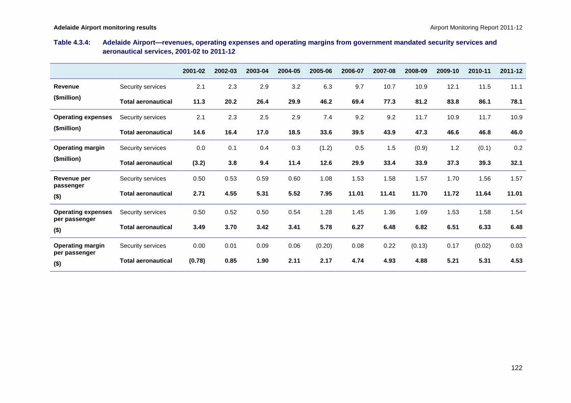
Adelaide Airport monitoring results Airport Monitoring Report 2011-12
122
Table 4.3.4: Adelaide Airport—revenues, operating e xpenses and operating margins from government manda ted security services and aeronautical services, 2001-02 to 2011-12
2001-02 2002-03 2003-04 2004-05 2005-06 2006-07 2007-08 2008-09 2009-10 2010-11 2011-12
Revenue
($million)
Security services 2.1 2.3 2.9 3.2 6.3 9.7 10.7 10.9 12.1 11.5 11.1
Total aeronautical 11.3 20.2 26.4 29.9 46.2 69.4 77.3 81.2 83.8 86.1 78.1
Operating expenses
($million)
Security services 2.1 2.3 2.5 2.9 7.4 9.2 9.2 11.7 10.9 11.7 10.9
Total aeronautical 14.6 16.4 17.0 18.5 33.6 39.5 43 .9 47.3 46.6 46.8 46.0
Operating margin
($million)
Security services 0.0 0.1 0.4 0.3 (1.2) 0.5 1.5 (0.9) 1.2 (0.1) 0.2
Total aeronautical (3.2) 3.8 9.4 11.4 12.6 29.9 33. 4 33.9 37.3 39.3 32.1
Revenue per passenger
($)
Security services 0.50 0.53 0.59 0.60 1.08 1.53 1.58 1.57 1.70 1.56 1.57
Total aeronautical 2.71 4.55 5.31 5.52 7.95 11.01 1 1.41 11.70 11.72 11.64 11.01
Operating expenses per passenger
($)
Security services 0.50 0.52 0.50 0.54 1.28 1.45 1.36 1.69 1.53 1.58 1.54
Total aeronautical 3.49 3.70 3.42 3.41 5.78 6.27 6. 48 6.82 6.51 6.33 6.48
Operating margin per passenger
($)
Security services 0.00 0.01 0.09 0.06 (0.20) 0.08 0.22 (0.13) 0.17 (0.02) 0.03
Total aeronautical (0.78) 0.85 1.90 2.11 2.17 4.74 4.93 4.88 5.21 5.31 4.53

Airport Monitoring Report 2011-12 Adelaide Airport monitoring results
123
Key observations from table 4.3.4 include:
• Total security revenue decreased at Adelaide Airport for the second consecutive year in 2011-12, while total security expenses also decreased.
• Total security revenue decreased by 3.2 per cent from $11.5 million in 2010-11 to $11.1 million in 2011-12.
− Since 2001-02, total security revenue has increased by 434.4 per cent. However, since 2006-07, total security revenue has increased by 15.4 per cent from $9.7 million (equivalent to an average of 2.9 per cent per annum). The largest increase in total security revenue since 2006-07 occurred in 2009-10, when total security revenue increased by $1.3 million (11.7 per cent).
• On a per passenger basis, security revenue was largely unchanged at $1.57 in 2011-12, compared with $1.56 in 2010-11.
− Since 2001-02, security revenue per passenger has increased by 214.8 per cent. However, since 2006-07, security revenue per passenger has increased by 2.4 per cent. The largest increase in security revenue per passenger since 2006-07 occurred in 2009-10, when security revenue per passenger increased by $0.13 (8.3 per cent).
• Total security expenses decreased by 6.5 per cent from $11.7 million in 2010-11 to $10.9 million in 2011-12.
− Since 2001-02, total security expenses have increased by 422.8 per cent. However, since 2006-07, total security expenses have increased by 19.0 per cent from $9.2 million (equivalent to an average annual increase of 3.5 per cent per annum). The largest increase in total security expenses since 2006-07 occurred in 2008-09, when total security expenses increased by $2.5 million (27.6 per cent).
• Security expenses per passenger decreased by 2.6 per cent from $1.58 per passenger in 2010-11 to $1.54 per passenger in 2011-12.
− Since 2001-02, security expenses per passenger have increased by 208.0 per cent. However, since 2006-07, security expenses per passenger have increased by 5.6 per cent. The largest increase in security expenses per passenger since 2006-07 occurred in 2008-09, when security expenses per passenger increased by $0.34 (24.8 per cent).
• Total security margin increased by $396 100 in 2011-12, from a negative margin of $148 000 in 2010-11 to a positive margin of $248 100 in 2011-12.
− It should be noted that security revenue is set to recover the costs associated with the provision of security services and does not affect the overall profitability of the airport.
• Security margin per passenger increased by $0.05 in 2011-12, from a negative margin per passenger of $0.02 in 2010-11 to a positive margin per passenger of $0.03 in 2011-12.

Adelaide Airport monitoring results Airport Monitoring Report 2011-12
124
Chart 4.3.5: Adelaide Airport—government mandated s ecurity services share of total aeronautical services revenue, 2001-02 to 2011-12
Key observations from chart 4.3.5 include:
• Security revenue as a proportion of total aeronautical revenue increased by 0.9 percentage points in 2011-12, from 13.4 per cent in 2010-11 to 14.3 per cent. This change was due to aeronautical revenue decreasing at a faster rate than security revenue during the period, falling 9.3 per cent and 3.2 per cent respectively.
• Security revenue as a proportion of aeronautical revenue reached a peak of 18.4 per cent in 2001-02, and in all subsequent periods security revenue has ranged between 10.8 per cent and 14.5 per cent of total aeronautical revenue.
Chart 4.3.6: Adelaide Airport—aeronautical services revenue, operating expenses and operating margin excluding government mandated security servi ces on a per passenger basis, 2001-02 to 2011-12
0
10
20
30
40
50
60
70
80
90
100
2001
–02
2002
–03
2003
–04
2004
–05
2005
–06
2006
–07
2007
–08
2008
–09
2009
–10
2010
–11
2011
–12
Per
cen
t
Revenue—airport charges Revenue—security charges
-$2.00
$0.00
$2.00
$4.00
$6.00
$8.00
$10.00
$12.00
2001
–02
2002
–03
2003
–04
2004
–05
2005
–06
2006
–07
2007
–08
2008
–09
2009
–10
2010
–11
2011
–12
Per
pas
sen
ger
Revenue Expenses Margin

Airport Monitoring Report 2011-12 Adelaide Airport monitoring results
125
Key observations from chart 4.3.6 include:
• Adelaide Airport’s aeronautical revenue and operating margin per passenger (excluding security) decreased in 2011-12, while operating expenses increased.
• Adelaide Airport’s aeronautical revenue per passenger was 14.3 per cent lower when excluding security in 2011-12, at $9.44 per passenger, compared to $11.01 (including security).
• Adelaide Airport’s aeronautical operating expenses per passenger was 23.7 per cent lower when excluding security in 2011-12, at $4.94 per passenger, compared to $6.48 (including security).
• Adelaide Airport’s aeronautical operating margin per passenger was 0.8 per cent lower when excluding security in 2011-12, at $4.49 per passenger, compared to $4.53 (including security).
4.3.6 Assets for aeronautical and total airport ser vices
Table 4.3.5 outlines Adelaide Airport’s non-current assets for aeronautical services and the total airport from 2001-02 to 2011-12.

Adelaide Airport monitoring results Airport Monitoring Report 2011-12
126
Table 4.3.5: Adelaide Airport—tangible non-current assets for aeronautical services and total airport services, 2001-02 to 2011-12
2001-02 2002-03 2003-04 2004-05 2005-06 2006-07 2007-08 2008-09 2009-10 2010-11 2011-12
Investment property
($million)
Aeronautical 0.0 0.0 0.0 3.7 1.7 0.0 0.0 0.0 0.0 0.0 0.0
Total airport 0.0 0.0 0.0 148.5 158.2 166.4 184.2 1 83.9 195.5 209.0 217.1
Land
($million)
Aeronautical 74.5 74.0 73.3 125.5 124.1 122.8 125.8 124.3 121.8 121.3 119.8
Total airport 116.1 114.9 113.8 125.5 124.1 122.8 1 25.8 124.3 121.8 121.3 119.9
Property, plant and equipment
($million)
Aeronautical 54.9 57.1 102.3 253.2 264.8 253.5 266.5 255.3 247.7 274.5 323.8
Total airport 96.3 96.6 149.7 288.8 317.6 310.1 297 .7 286.5 275.6 303.1 358.1
Intangibles
($million)
Aeronautical 126.2 128.6 118.2 179.4 179.4 179.4 179.4 179.4 179.4 179.4 179.4
Total airport 207.2 207.4 203.6 179.5 179.4 179.4 1 79.4 179.4 179.4 179.4 179.4
Other tangible non-current assets
($millon)
Aeronautical 0.6 0.4 0.0 28.9 9.4 13.1 4.8 4.4 3.9 3.6 2.2
Total airport 2.0 0.7 0.0 40.9 12.4 19.5 9.4 7.9 6. 1 5.7 3.4
Total tangible non-current assets
($million)
Aeronautical 130.0 131.6 175.6 411.3 400.0 389.4 397.1 384.1 373.3 399.3 445.9
Total airport 214.5 212.1 263.4 603.7 612.3 618.9 617.1 602.6 599.0 639.0 698.4
Total non-current assets
($million)
Aeronautical 256.1 260.1 293.8 590.7 579.4 568.8 576.5 563.5 552.7 578.7 625.3
Total airport 421.7 419.5 467.1 783.2 791.7 798.3 796.5 782.0 778.5 818.4 877.8

Airport Monitoring Report 2011-12 Adelaide Airport monitoring results
127
Table 4.3.6: Adelaide Airport—tangible non-current assets for aeronautical services under the line in the sand approach , 2001-02 to 2011-12
2001-02 2002-03 2003-04 2004-05 2005-06 2006-07 2007-08 2008-09 2009-10 2010-11 2011-12
Investment property
($million)
Aeronautical under the LIS
NA NA NA NA NA NA 0.0 0.0 0.0 0.0 0.0
Land
($million)
Aeronautical under the LIS
NA NA NA NA NA NA 82.9 81.9 81.0 80.1 79.2
Property, plant and equipment
($million)
Aeronautical under the LIS
NA NA NA NA NA NA 246.4 236.0 226.9 253.6 303.6
Intangibles
($million)
Aeronautical under the LIS
NA NA NA NA NA NA 179.4 179.4 179.4 179.4 179.4
Other tangible non-current assets
($millon)
Aeronautical under the LIS
NA NA NA NA NA NA 4.8 4.4 3.9 3.6 2.2
Total tangible non-current assets
($million)
Aeronautical under the LIS
NA NA NA NA NA NA 334.1 322.4 311.8 337.2 385.1
Total non-current assets
($million)
Aeronautical under the LIS
NA NA NA NA NA NA 513.5 501.8 491.2 516.7 564.5

Adelaide Airport monitoring results Airport Monitoring Report 2011-12
128
Key observations from table 4.3.5 include:
• Total aeronautical non-current assets at Adelaide Airport increased by 8.0 per cent, from $578.7 million in 2010-11 to $625.3 million in 2011-12. When intangibles (goodwill) are removed, the total value of aeronautical tangible non-current assets increased by 11.7 per cent, from $399.3 million in 2010-11 to $445.9 million in 2011-12.
− The increase in 2011-12 was partly attributable to an increase in property, plant and equipment of 18.0 per cent from $274.5 million in 2010-11 to $323.8 million in 2011-12. This is discussed in further detail in observations for chart 4.3.7.
− The value of land and other non-current assets both decreased in 2011-12 compared with the previous year. Land decreased by 1.2 per cent from $121.3 million in 2010-11 to $120.0 million in 2011-12, while other non-current assets decreased by 37.8 per cent from $3.6 million in 2010-11 to $2.2 million in 2011-12. Intangibles (goodwill) remained unchanged at $179.4 million.
− Since 2001-02, total aeronautical tangible non-current assets have increased by 144.1 per cent. Notably, Adelaide Airport constructed its new multi-user terminal in 2005-06. Adelaide Airport noted that, since then, the asset value of its multi-user terminal has decreased due to depreciation. Since 2005-06, total aeronautical non-current assets have increased by $45.9 million (7.9 per cent).
• Total airport non-current assets increased by 7.3 per cent to $877.8 million in 2011-12. When removing intangibles (goodwill), the value of total airport tangible non-current assets at Adelaide Airport increased by 9.3 per cent, from $639.0 million in 2010-11 to $698.4 million in 2011-12.
− The increase in 2011-12 was partly attributable to an increase in the value of property, plant and equipment of 18.1 per cent from $303.1 million in 2010-11 to $358.1 million in 2011-12. The value of investment property increased by 3.9 per cent, from $209.0 million in 2010-11 to $217.1 million in 2011-12.
− Partly offsetting these increases was a decrease in the value of land by 1.2 per cent from $121.3 million in 2010-11 to $119.9 million in 2011-12, and other non-current assets, which decreased by 41.0 per cent from $5.7 million in 2010-11 to $3.4 million in 2011-12. Intangibles (goodwill) remained unchanged at $179.4 million.
− Since 2001-02, total airport tangible non-current assets have increased by 108.2 per cent. Since 2005-06, when Adelaide Airport constructed its new multi-user terminal, total airport non-current assets have increased by $86.1 million (10.9 per cent).
Key observations from table 4.3.6 include:
• Under the LIS approach, aeronautical non-current assets were 9.7 per cent lower in 2011-12, at $564.5 million when compared to non-LIS aeronautical non-current assets. The value of land under the LIS approach was 33.9 per cent lower, at $79.2 million. The value of property, plant and equipment was 6.6 per cent lower under the LIS approach, at $303.6 million. The value of other non-current assets and intangibles were unchanged under the LIS approach.
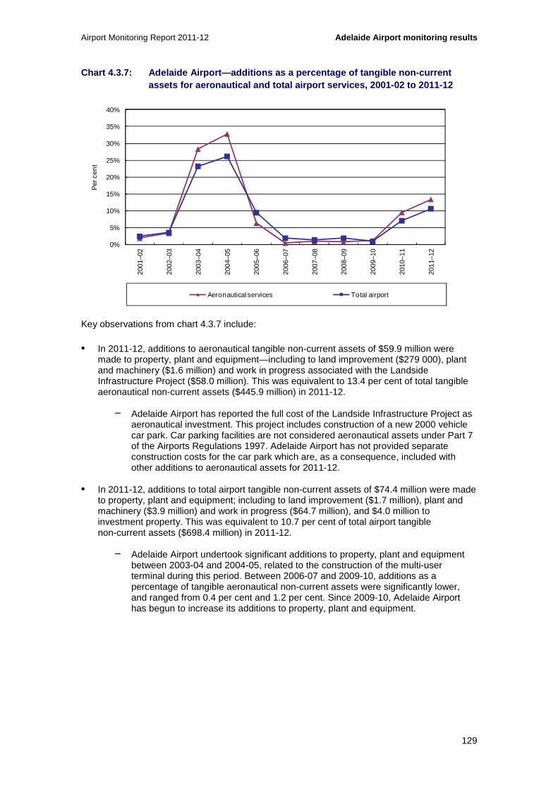
Airport Monitoring Report 2011-12 Adelaide Airport monitoring results
129
Chart 4.3.7: Adelaide Airport—additions as a percen tage of tangible non-current assets for aeronautical and total airport services, 2001-02 to 2011-12
Key observations from chart 4.3.7 include:
• In 2011-12, additions to aeronautical tangible non-current assets of $59.9 million were made to property, plant and equipment—including to land improvement ($279 000), plant and machinery ($1.6 million) and work in progress associated with the Landside Infrastructure Project ($58.0 million). This was equivalent to 13.4 per cent of total tangible aeronautical non-current assets ($445.9 million) in 2011-12.
− Adelaide Airport has reported the full cost of the Landside Infrastructure Project as aeronautical investment. This project includes construction of a new 2000 vehicle car park. Car parking facilities are not considered aeronautical assets under Part 7 of the Airports Regulations 1997. Adelaide Airport has not provided separate construction costs for the car park which are, as a consequence, included with other additions to aeronautical assets for 2011-12.
• In 2011-12, additions to total airport tangible non-current assets of $74.4 million were made to property, plant and equipment; including to land improvement ($1.7 million), plant and machinery ($3.9 million) and work in progress ($64.7 million), and $4.0 million to investment property. This was equivalent to 10.7 per cent of total airport tangible non-current assets ($698.4 million) in 2011-12.
− Adelaide Airport undertook significant additions to property, plant and equipment between 2003-04 and 2004-05, related to the construction of the multi-user terminal during this period. Between 2006-07 and 2009-10, additions as a percentage of tangible aeronautical non-current assets were significantly lower, and ranged from 0.4 per cent and 1.2 per cent. Since 2009-10, Adelaide Airport has begun to increase its additions to property, plant and equipment.
0%
5%
10%
15%
20%
25%
30%
35%
40%
2001
–02
2002
–03
2003
–04
2004
–05
2005
–06
2006
–07
2007
–08
2008
–09
2009
–10
2010
–11
2011
–12
Per
cen
t
Aeronautical services Total airport

Adelaide Airport monitoring results Airport Monitoring Report 2011-12
130
4.3.7 Rates of return on tangible non-current asset s
Chart 4.3.8: Adelaide Airport—rate of return on tan gible non-current assets for aeronautical services and total airport services, 2 001-02 to 2011-12
Key observations from chart 4.3.8 include:
• Earnings before interest, tax and amortisation (EBITA) on average tangible non-current assets for aeronautical services and the total airport decreased in 2011-12.
• EBITA on average tangible non-current assets for aeronautical services decreased from 10.2 per cent in 2010-11 to 7.6 per cent in 2011-12 as a result of an increase in the value of tangible aeronautical non-current assets (11.7 per cent) and a decrease in EBITA (-18.3 per cent).
− Between 2002-03 and 2005-06, the EBITA on average tangible non-current assets for aeronautical services was 4.0 per cent on average, which is significantly lower than the EBITA on average tangible non-current assets of 8.7 per cent on average since 2006-07.
− Adelaide Airport’s EBITA on average tangible non-current assets for aeronautical services increased by 4.5 percentage points in 2006-07 compared to the previous year. This change was due to an increase in EBITA of 181.2 per cent in 2006-07, as a result of monitoring data from the domestic terminal operations of Qantas being included in the monitoring program from this period.
− Adelaide Airport noted that a lowering of the value of aeronautical assets since 2006-07 was owing to the cyclical nature of capital expenditure.
• EBITA on average tangible non-current assets for total airport services decreased from 14.4 per cent in 2010-11 to 10.4 per cent in 2011-12 as a result of an increase in the value of total tangible airport non-current assets (9.3 per cent) and a decrease in EBITA (-22.4 per cent).
− EBITA on average tangible non-current assets for total airport services has been more variable than for aeronautical services over the 11 years since 2011-12. This is partly attributable to the effects of changes in the fair value of non-aeronautical investment property.
-4
-2
0
2
4
6
8
10
12
14
1620
01–0
2
2002
–03
2003
–04
2004
–05
2005
–06
2006
–07
2007
–08
2008
–09
2009
–10
2010
–11
2011
–12
Per
cen
t per
an
num
Aeronautical services Total airport

Airport Monitoring Report 2011-12 Adelaide Airport monitoring results
131
− When including changes in the fair value of non-aeronautical investment property, the differences between EBITA on average tangible non-current assets for total airport services and aeronautical services have ranged between 0.8 percentage points and 4.8 percentage points since 2006-07. When excluding changes in the fair value of non-aeronautical investment property, the difference between EBITA on average tangible non-current assets for total airport services and aeronautical services have ranged between 1.7 percentage points and 2.8 percentage points since 2006-07.
• As noted, where the return is not subject to the LIS approach, the return on assets measure is influenced by the airport operator’s valuation of its assets recorded in its financial accounts.
Chart 4.3.9: Adelaide Airport—rate of return on tan gible non-current assets for aeronautical services under the line in the sand approach and total airport services, 2007-08 to 2011-12
Key observations from chart 4.3.9 include:
• EBITA on average tangible non-current assets for aeronautical services under the LIS approach was 1.4 percentage points higher than under the non-LIS approach in 2011-12, at 9.0 per cent and 7.6 per cent respectively. This difference was due to a higher EBITA and a lower asset base under the LIS approach.
− The asset base is lower under the LIS approach due to the exclusion of the effects of the upward revaluations in land and property and the removal of certain plant and equipment from the asset base.
− Under the LIS approach, the value of land was 33.9 per cent lower in 2011-12 than it was under the non-LIS approach, at $79.2 million and $119.9 million respectively. Under the LIS approach, the value of property, plant and equipment was 6.2 per cent lower in 2011-12 than it was under the non-LIS approach, at $303.6 million and $323.8 million respectively.
• EBITA on average tangible non-current assets for total airport services under the LIS approach was 1.1 percentage points higher than under the non-LIS approach in 2011-12,
0
3
6
9
12
15
18
2007–08 2008–09 2009–10 2010–11 2011–12
Per
cen
t per
an
num
Aeronautical services Total airport

Adelaide Airport monitoring results Airport Monitoring Report 2011-12
132
at 11.5 per cent and 10.4 per cent respectively. This difference was due to a higher EBITA and a lower asset base under the LIS approach.
− The total airport figure includes both aeronautical and non-aeronautical services; however, only aeronautical services are impacted by the LIS approach. Therefore, differences between EBITA on average tangible non-current assets for total airport services under the LIS approach and non-LIS approach are driven by the changes in aeronautical services under the LIS approach.
4.4 Aeronautical services quality of service monitoring results
In this section, the quality of service monitoring results are presented for average ratings (section 4.4.1), international services (section 4.4.2) and domestic services (section 4.4.3). Other airport services are discussed in section 4.4.4.
4.4.1 Average ratings for quality of service
Chart 4.4.1: Adelaide Airport—average quality of se rvice ratings for international and domestic terminal services, and other airport servi ces, 2007-08 to 2011-12
Key observations from chart 4.4.1 include:
• Adelaide Airport’s average quality of service rating for international terminal services decreased in 2011-12, though were rated as good for the second consecutive year.
• The average quality of service rating for domestic terminal services also decreased in 2011-12, though retained the rating of satisfactory which it has had over the five years since 2007-08.
0
1
2
3
4
5
6
2007–08 2008–09 2009–10 2010–11 2011–12
Ave
rag
e ra
ting
Rating of international terminal Rating of domestic terminal Rating of other airport services
Excellent
Good
Poor
Very poor
Satisfactory

Airport Monitoring Report 2011-12 Adelaide Airport monitoring results
133
• Adelaide Airport’s average rating for other airport services has also been rated as satisfactory over the five years since 2007-08, increasing in 2011-12.
Chart 4.4.2: Adelaide Airport—average quality of se rvice ratings for availability and standard of airport services, 2007-08 to 2011-12
Key observations from chart 4.4.2 include:
• The availability of airport services at Adelaide Airport decreased from good in 2010-11 to satisfactory in 2011-12. With the exception of being rated as good in 2010-11, the availability of airport services was rated as satisfactory over the five years since 2007-08.
• Adelaide Airport’s average rating for the standard of airport services was rated as satisfactory over the five years since 2007-08, increasing in 2011-12.
0
1
2
3
4
5
6
2007–08 2008–09 2009–10 2010–11 2011–12
Ave
rag
e ra
ting
Rating of availability Rating of standard
Excellent
Good
Poor
Very poor
Satisfactory

Adelaide Airport monitoring results Airport Monitoring Report 2011-12
134
4.4.2 International services
Chart 4.4.3: Adelaide Airport—check-in (internation al services), 2007-08 to 2011-12
Key observations from chart 4.4.3 include:
• Airlines’ rating of the availability of international check-in desks decreased in 2011-12, though continued to be rated as satisfactory. With the exception of being rated as poor in 2009-10, the availability of international check-in desks was consistently rated as satisfactory by airlines over the five years since 2007-08. Airlines’ rating of the standard of international check-in desks decreased, from good in 2010-11 to satisfactory in 2011-12.
− In commentary to the surveys, airlines noted ongoing issues with check-in desk availability and allocation. Airlines also noted that these issues had been raised with Adelaide Airport through the Airport Operating Committee and that the airport is consulting with airlines to improve this service.
• Further information on check-in services and facilities at Adelaide Airport is outlined in section 4.4.3 (domestic services).
0
1
2
3
4
5
6
2007–08 2008–09 2009–10 2010–11 2011–12
Ave
rag
e ra
ting
Airline surveys— rating of check-in availability
Airline surveys— rating of check-in standard
Excellent
Good
Poor
Very poor
Satisfactory

Airport Monitoring Report 2011-12 Adelaide Airport monitoring results
135
Chart 4.4.4: Adelaide Airport—inbound government in spection (international services), 2007-08 to 2011-12
Key observations from chart 4.4.4 include:
• Border agencies’ rating of the availability and standard of inbound Immigration facilities both increased from good in 2010-11 to excellent in 2011-12. Both measures have been rated as good or above over the five years since 2007-08.
− In commentary to the surveys, border agencies noted that Adelaide Airport meets with them on a weekly basis and that they have a good working relationship. For example, , and Adelaide Airport was heavily involved in the negotiations leading to the Australian Customs and Border Protection Service (AC&BPS) installing new immigration desks and additional Smartgate122 equipment in 2011-12.
• The number of arriving international passengers per inbound Immigration desk (during peak hour) was lower at 25.5 passengers in 2011-12, compared to 39.4 passengers in 2010-11. This change was due to a lower number of international passengers arriving during peak hour, as well as an increase in the number of inbound Immigration desks from 12 in 2010-11 to 13 in 2011-12. Separate international passenger number data was not available in 2007-08.
− Adelaide Airport commented that there was a redevelopment of inbound passenger processing facilities in 2011-12. The airport also noted that, of the 13 inbound Immigration desks available, ten were manned by staff of the border agencies and three were Smartgates.
122 Smartgates are an automated passport / border control system that allows eligible travellers the option of self-process through passport control. For further information see: http://www.customs.gov.au/smartgate/default.asp
0
10
20
30
40
50
60
0
1
2
3
4
5
6
2007–08 2008–09 2009–10 2010–11 2011–12
Num
ber
of p
asse
ng
ers
per
des
k
Ave
rag
e ra
ting
Border agencies survey— rating of inbound Immigration facilities availability
Border agencies survey— rating of inbound Immigration facilities standard
Number of arriving passengers per inbound Immigration desk (during peak hour) (RHS)
Excellent
Good
Poor
Very poor
Satisfactory
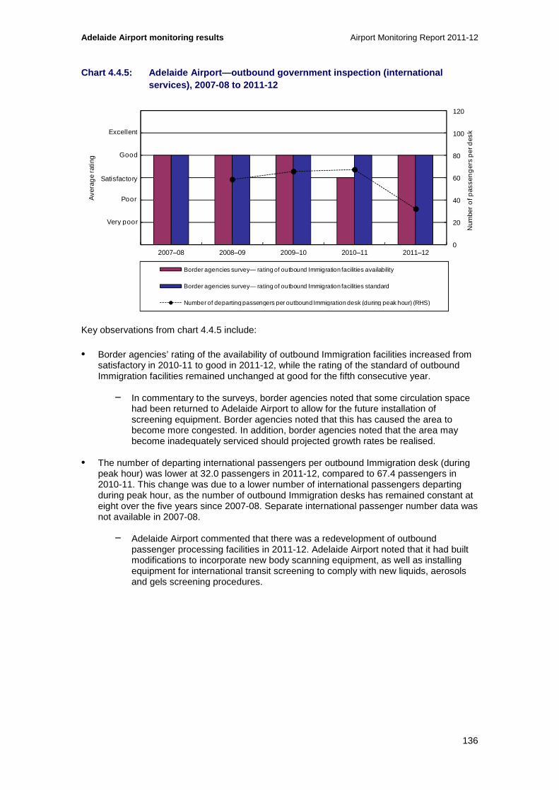
Adelaide Airport monitoring results Airport Monitoring Report 2011-12
136
Chart 4.4.5: Adelaide Airport—outbound government i nspection (international services), 2007-08 to 2011-12
Key observations from chart 4.4.5 include:
• Border agencies’ rating of the availability of outbound Immigration facilities increased from satisfactory in 2010-11 to good in 2011-12, while the rating of the standard of outbound Immigration facilities remained unchanged at good for the fifth consecutive year.
− In commentary to the surveys, border agencies noted that some circulation space had been returned to Adelaide Airport to allow for the future installation of screening equipment. Border agencies noted that this has caused the area to become more congested. In addition, border agencies noted that the area may become inadequately serviced should projected growth rates be realised.
• The number of departing international passengers per outbound Immigration desk (during peak hour) was lower at 32.0 passengers in 2011-12, compared to 67.4 passengers in 2010-11. This change was due to a lower number of international passengers departing during peak hour, as the number of outbound Immigration desks has remained constant at eight over the five years since 2007-08. Separate international passenger number data was not available in 2007-08.
− Adelaide Airport commented that there was a redevelopment of outbound passenger processing facilities in 2011-12. Adelaide Airport noted that it had built modifications to incorporate new body scanning equipment, as well as installing equipment for international transit screening to comply with new liquids, aerosols and gels screening procedures.
0
20
40
60
80
100
120
0
1
2
3
4
5
6
2007–08 2008–09 2009–10 2010–11 2011–12
Num
ber
of p
asse
ng
ers
per
des
k
Ave
rag
e ra
ting
Border agencies survey— rating of outbound Immigration facilities availability
Border agencies survey— rating of outbound Immigration facilities standard
Number of departing passengers per outbound Immigration desk (during peak hour) (RHS)
Excellent
Good
Poor
Very poor
Satisfactory

Airport Monitoring Report 2011-12 Adelaide Airport monitoring results
137
Chart 4.4.6: Adelaide Airport—baggage inspection (i nternational services), 2007-08 to 2011-12
Key observations from chart 4.4.6 include:
• Border agencies’ rating of the availability of inbound baggage inspection facilities remained unchanged at good in 2011-12, while the rating of the standard of international baggage inspection facilities increased from satisfactory in 2010-11 to good in 2011-12. Border agencies have rated both the availability and standard of international baggage inspection facilities as either satisfactory or good over the five years since 2007-08.
− In commentary to the surveys, border agencies noted that Adelaide Airport provided additional trolley signage in the baggage area in 2011-12, which has improved the facilitation of passenger movements. It was also noted that the international baggage hall has only one baggage belt, but areas of concern are mostly forward-looking due to future congestion that would result from the projected growth in passenger numbers and airline arrivals.
• The average number of arriving international passengers per baggage inspection desk (during peak hour) was lower at 22.1 passengers in 2011-12, compared to 33.8 passengers in 2010-11. This change was due to a lower number of international passengers arriving during peak hour, as well as an increase in the number of baggage inspection desks from 14 in 2010-11 to 15 in 2011-12.
0
10
20
30
40
50
60
0
1
2
3
4
5
6
2007–08 2008–09 2009–10 2010–11 2011–12
Num
ber
of p
asse
ng
ers
per
des
k
Ave
rag
e ra
ting
Border agencies survey— rating of inbound baggage inspection facilities availability
Border agencies survey— rating of inbound baggage inspection facilities standard
Number of arriving passengers per baggage inspection desk (during peak hour) (RHS)
Excellent
Good
Poor
Very poor
Satisfactory

Adelaide Airport monitoring results Airport Monitoring Report 2011-12
138
Chart 4.4.7: Adelaide Airport—aerobridges (internat ional services), 2007-08 to 2011-12
Key observations from chart 4.4.7 include:
• Airlines’ rating of the availability of international aerobridge facilities was satisfactory over the five years since 2007-08, improving slightly in 2011-12 compared to the previous period. Airlines’ rating of the standard of international aerobridge facilities also increased in 2011-12, though remained rated as satisfactory.
− In commentary to the surveys, airlines noted that Adelaide Airport had addressed the problems with air-conditioning that were raised in the surveys in 2010-11. However, some airlines noted ongoing issues with the availability of aerobridges due to Adelaide Airport having only four wide body parking bays for international aircraft. It was also noted that there had been a couple of breakdowns in 2011-12 that resulted in flight delays, although generally the facilities were still rated as satisfactory.
• Since 2006-07, 100 per cent of passengers arriving and departing used an aerobridge.
− Adelaide Airport commented that every international flight had access to an aerobridge since the opening of its multi-user terminal (in 2005-06). Adelaide Airport noted that during 2011-12 there was an increase in international services throughout the year.
40%
50%
60%
70%
80%
90%
100%
0
1
2
3
4
5
6
2007–08 2008–09 2009–10 2010–11 2011–12
Per
cen
tag
e of
pas
seng
ers
usin
g an
aer
obrid
ge
Ave
rag
e ra
ting
Airline surveys— rating of aerobridges availability
Airline surveys— rating of aerobridges standard
Percentage of international passengers arriving using an aerobridge (RHS)
Percentage of international passengers departing using an aerobridge (RHS)
Excellent
Good
Poor
Very poor
Satisfactory

Airport Monitoring Report 2011-12 Adelaide Airport monitoring results
139
Chart 4.4.8: Adelaide Airport—security (internation al services), 2007-08 to 2011-12
Key observations from chart 4.4.8 include:
• In 2007-08, international passengers rated the quality of security search process as good. International passenger survey data has not been available from Adelaide Airport from 2008-09 onwards. Adelaide Airport noted that the information was not available due to changes in border agencies’ processes.
• The number of departing international passengers per international security clearance system (during peak hour) was lower at 128.0 passengers in 2011-12, compared to 269.5 passengers in 2010-11. This change was due to a lower number of international passengers departing during peak hour in 2011-12. The number of security clearance systems was constant at two over the five years since 2007-08.
− Adelaide Airport commented that it has upgraded x-ray screening equipment at the transit screening point to include multi-view x-ray and a bottle and liquid scanner, in line with Office of Transport Security requirements. Adelaide Airport also noted that all international passengers pass the central screening, which consists of three security clearance systems.
0
60
120
180
240
300
360
0
1
2
3
4
5
6
2007–08 2008–09 2009–10 2010–11 2011–12
Num
ber
of p
asse
ng
ers
per
sec
urity
cle
aran
ce
syst
em
Ave
rag
e ra
ting
Passenger surveys— rating of quality of security search process
Number of departing passengers per security clearance system (during peak hour)
Very poor
Poor
Satisfactory
Good
Excellent

Adelaide Airport monitoring results Airport Monitoring Report 2011-12
140
Chart 4.4.9: Adelaide Airport—baggage processing (i nternational services), 2007-08 to 2011-12
Key observations from chart 4.4.9 include:
• Airlines’ rating of the availability of international baggage processing facilities was unchanged in 2011-12 and remained rated as satisfactory. Airlines’ rating of the standard of international baggage processing facilities decreased from good in 2010-11 to satisfactory in 2011-12.
− In commentary to the surveys, some airlines noted that while baggage processing facilities for departing passengers are good, the baggage facilities for arriving passengers can be congested at times as there is only one international arrivals baggage belt. Airlines had previously raised this issue in 2010-11. Some airlines also noted that there were some issues regarding the airport communicating baggage facility breakdowns that occurred during the period.
0
1
2
3
4
5
6
2007–08 2008–09 2009–10 2010–11 2011–12
Ave
rag
e ra
ting
Airline surveys— rating of baggage processing facilities availability
Airline surveys— rating of baggage processing facilities standard
Excellent
Good
Poor
Very poor
Satisfactory

Airport Monitoring Report 2011-12 Adelaide Airport monitoring results
141
Chart 4.4.10: Adelaide Airport—baggage trolleys (in ternational services), 2007-08 to 2011-12
Key observations from chart 4.4.10 include:
• In 2007-08, international passengers rated the findability of baggage trolleys as good. However, no international passenger survey data has been available from Adelaide Airport from 2008-09 onwards.
• The number of international passengers per baggage trolley (during peak hour) was lower at 0.9 passengers in 2011-12, compared to 1.5 passengers in 2010-11. This change was due to a lower number of international passengers travelling during peak hour in 2011-12. The number of international passengers per baggage trolley (during peak hour) was lower in the period despite the number of working accessible baggage trolleys decreasing from 670 in 2010-11 to 607 in 2011-12.
− Adelaide Airport noted that trolley numbers will be reviewed in the next financial year due to the construction of the new multi-level car park. Adelaide Airport also noted that baggage trolleys are made available to all passengers at no charge.
0
1
2
3
4
5
6
0
1
2
3
4
5
6
2007–08 2008–09 2009–10 2010–11 2011–12
Num
ber o
f pas
seng
ers
per
bag
gage
trol
ley
Ave
rag
e ra
ting
Passenger surveys— rating of findability of baggage trolleys
Number of passengers per baggage trolley (during peak hour) (RHS)
Excellent
Good
Poor
Very poor
Satisfactory

Adelaide Airport monitoring results Airport Monitoring Report 2011-12
142
Chart 4.4.11: Adelaide Airport—flight information d isplay screens (international services), 2007-08 to 2011-12
Key observations from chart 4.4.11 include:
• In 2007-08, international passengers rated the flight information display screens as satisfactory. However, no international passenger survey data has been available from Adelaide Airport from 2008-09 onwards.
• The number of international passengers per flight information display screen (during peak hour) was lower at 6.3 passengers in 2011-12, compared to 10.8 passengers in 2010-11. The number of international passengers per information point (during peak hour) was also lower in 2011-12, at 117.6 passengers, compared to 253.0 passengers in 2010-11.
• The number of flight information display screens and information points remained unchanged from 2010-11. The lower number of international passengers per flight information display screen and information point in 2011-12 was due to a lower number of international passengers travelling during peak hour in 2011-12.
− Adelaide Airport noted that it has commenced a flight information display screen replacement program at departure gates, which will increase screen sizes.
0
200
400
600
800
1000
1200
0
1
2
3
4
5
6
2007–08 2008–09 2009–10 2010–11 2011–12
Ave
rag
e ra
ting
Passenger surveys— rating of flight information display screens
Passenger surveys— rating of signage and wayfinding
Number of passengers per flight information display screen (during peak hour) (RHS)
Number of passengers per information point (during peak hour) (RHS)
Excellent
Good
Poor
Very poor
Satisfactory
Num
ber o
f pas
seng
ers
per
flig
ht in
form
atio
n sc
reen
/ p
er fl
ight
info
rmat
ion
poin
t

Airport Monitoring Report 2011-12 Adelaide Airport monitoring results
143
4.4.3 Domestic services
Chart 4.4.12: Adelaide Airport—check-in (domestic s ervices), 2007-08 to 2011-12
Key observations from chart 4.4.12 include:
• Airlines’ rating of the availability of domestic check-in desks decreased from good in 2010-11 to satisfactory in 2011-12, while airlines’ rating of the standard of domestic check-in desks remained unchanged at good.
− In commentary to the surveys, some airlines noted that better management from Adelaide Airport has improved these facilities, although airlines raised issues with common user check-in allocation at peak times, as well as ongoing information technology issues.
• The passenger rating of the waiting time associated with domestic check-in desks improved slightly, though remained rated as just below good in 2011-12. The number of departing domestic passengers per domestic check-in desk (during peak hour) was lower at 28.1 passengers in 2011-12, compared to 46.2 passengers in 2010-11. This change was due to the number of check-in desks increasing from 35 desks in 2010-11 to 39 desks in 2011-12, as well as a lower number of domestic passengers travelling during peak hour in 2011-12.
− Adelaide Airport noted in commentary that an increase in regional fly-in/fly-out operations impacted on the number of check-in counters available. Adelaide Airport also stated that the introduction of Qantas baggage drop facilities reduced queue times for Qantas passengers and improved the efficiency of check-in usage. Adelaide Airport also noted that Tiger Airways ceased operations at the airport during 2011-12, but recommenced at the airport in November 2012.
0
10
20
30
40
50
60
0
1
2
3
4
5
6
2007–08 2008–09 2009–10 2010–11 2011–12
Num
ber
of p
asse
ng
ers
per
des
k
Ave
rag
e ra
ting
Airline surveys— rating of check-in availability
Airline surveys— rating of check-in standard
Passenger surveys— rating of check-in waiting time
Number of departing passengers per check-in desk (during peak hour) (RHS)
Excellent
Good
Poor
Very poor
Satisfactory

Adelaide Airport monitoring results Airport Monitoring Report 2011-12
144
Chart 4.4.13: Adelaide Airport—gate lounges (domest ic services), 2007-08 to 2011-12
Key observations from chart 4.4.13 include:
• Passengers’ rating of the quality and availability of seating in the lounge area decreased in 2011-12, though remained rated as satisfactory for the fourth consecutive year. Passengers’ rating of crowding in the gate lounge area also decreased in 2011-12, though remained rated as satisfactory for the third consecutive year.
• The number of gate lounges increased from 14 in 2010-11 to 16 in 2011-12. However, the number of seats and the total gate lounge area remained constant over the same period.
• In 2011-12, the number of departing domestic passengers per seat in gate lounges (during peak hour) was lower at 0.7 passengers, compared to 1.0 passengers in 2010-11. This change was due to a lower number of domestic passengers departing during peak hour in 2011-12, as the number of seats in the gate lounges has remained unchanged over the five years since 2007-08.
• The number of departing domestic passengers per square metre of lounge area (during peak hour) was also lower in 2011-12, from 0.2 passengers in 2010-11 to 0.1 passengers in 2011-12. This change was also due to a lower number of domestic passengers departing during peak hour in 2011-12, as the total lounge area has remained unchanged over the five years since 2007-08.
− Adelaide Airport noted that the total of 16 gate lounges includes two outbound regional gate lounges. Adelaide Airport also noted that it has a regular maintenance program in place to audit and replace seats as required.
0.0
0.3
0.6
0.9
1.2
1.5
1.8
0
1
2
3
4
5
6
2007–08 2008–09 2009–10 2010–11 2011–12
Ave
rag
e ra
ting
Passenger surveys— rating of quality and availability of seating in lounge area
Passenger surveys— rating of crowding in lounge area
Number of departing passengers per seat in gate lounges (during peak hour) (RHS)
Number of departing passengers per square metre of lounge area (during peak hour) (RHS)
Excellent
Good
Poor
Very poor
Satisfactory
Num
ber
of p
asse
ng
ers
per
sea
t / p
er s
q.
met
re

Airport Monitoring Report 2011-12 Adelaide Airport monitoring results
145
Chart 4.4.14: Adelaide Airport—aerobridges (domesti c services), 2007-08 to 2011-12
Key observations from chart 4.4.14 include:
• Airlines’ rating of the availability of domestic aerobridge facilities increased from satisfactory in 2010-11 to good in 2011-12. Airlines’ rating of the standard of aerobridge facilities also increased in 2011-12, though remained rated as satisfactory.
− In commentary to the surveys, airlines noted that Adelaide Airport had addressed the problems with air-conditioning that were raised in the surveys in 2010-11. Some airlines also noted that availability is limited when aircraft arrive off-schedule during peak periods.
• The number of arriving domestic passengers per aerobridge (during peak hour) was lower at 52.2 passengers in 2011-12, compared to 76.6 passengers in 2010-11. The number of departing domestic passengers per aerobridge (during peak hour) was also lower in 2011-12, with 78.1 passengers in 2011-12, compared to 115.6 passengers in 2010-11.
− These are the lowest numbers of arriving and departing domestic passengers per aerobridge (during peak hour) that have been recorded over five years since 2007-08. This is due to a lower number of passengers travelling during peak hour in 2011-12, as the number of aerobridges has remained unchanged from 2010-11 to 2011-12.
− Adelaide Airport commented that during 2011-12 it has upgraded the air conditioning of aerobridges and established a detailed cleaning program. Adelaide Airport also noted that it had performed a full mechanical audit of aerobridges and an arrival audit was introduced.
0
20
40
60
80
100
120
0
1
2
3
4
5
6
2007–08 2008–09 2009–10 2010–11 2011–12
Ave
rag
e ra
ting
Airline surveys— rating of aerobridges availability
Airline surveys— rating of aerobridges standard
Number of arriving passengers per aerobridge (during peak hour) (RHS)
Number of departing passengers per aerobridge (during peak hour) (RHS)
Excellent
Good
Poor
Very poor
Satisfactory
Num
ber
of p
asse
ng
ers
per
aer
obr
idg
e

Adelaide Airport monitoring results Airport Monitoring Report 2011-12
146
Chart 4.4.15: Adelaide Airport—security (domestic s ervices), 2007-08 to 2011-12
Key observations from chart 4.4.15 include:
• Passengers’ rating of the quality of the security clearance search process decreased slightly in 2011-12, though continued to be rated as satisfactory.
• The number of departing domestic passengers per domestic security clearance system (during peak hour) was lower in 2011-12, at 364.7 passengers, compared to 539.3 passengers in 2010-11. This change was due to a lower number of passengers departing during peak hour in 2011-12, as the number of security clearance systems has remained unchanged over the five years since 2007-08.
− Adelaide Airport commented that the total of three security clearance systems comprises three main passenger security points and three in-line x-rays within the baggage handling system. Adelaide Airport also noted that one explosive trace detection machine was added at central screening in 2011-12. This increased the number of machines to three, as per Office of Transport Security requirements.
0
100
200
300
400
500
600
0
1
2
3
4
5
6
2007–08 2008–09 2009–10 2010–11 2011–12 Num
ber o
f pas
seng
ers
per
sec
urity
cle
aran
ce s
yste
m
Ave
rag
e ra
ting
Passenger surveys— rating of quality of security search process
Number of departing passengers per security clearance system (during peak hour) (RHS)
Excellent
Good
Poor
Very poor
Satisfactory

Airport Monitoring Report 2011-12 Adelaide Airport monitoring results
147
Chart 4.4.16 Adelaide Airport—baggage processing (d omestic services), 2007-08 to 2011-12
Key observations from chart 4.4.16 include:
• Airlines’ rating of the availability of domestic baggage facilities remained unchanged at good in 2011-12, for the third consecutive year. However, airlines’ rating of the standard of domestic baggage facilities decreased from good in 2010-11 to satisfactory in 2011-12.
− In commentary to the surveys, airlines noted that availability is good, although some airlines raised issues with Adelaide Airport’s communication of baggage facility breakdowns and damaged bags coming through the system.
• Passengers’ rating of the waiting time associated with domestic baggage reclaim decreased from good in 2010-11 to satisfactory in 2011-12. Passengers’ rating of the waiting time associated with domestic baggage reclaim has fluctuated between good and satisfactory over the five years since 2007-08.
• Passengers have rated the baggage reclaim circulation space as good over the five years since 2007-08.
• Passengers’ rating of the information display for inbound domestic baggage reclaim decreased from good in 2010-11 to satisfactory in 2011-12.
− Adelaide Airport advised that information regarding baggage reclaim information display was not collected as part of the passenger survey in 2007-08 and 2008-09. Adelaide Airport commented that its baggage system maintenance is always conducted out of hours and that the system is always available during the operation of the terminal. Adelaide Airport also noted that it upgraded its baggage handling system in 2011-12, which allowed new automatic baggage readers to integrate with Qantas next-generation check-in facilities.
− The capacity of the inbound baggage handling system at Adelaide Airport has remained unchanged since it increased to 3000 bags per hour in 2008-09 from 2250 bags in 2006-07.123 Since 2007-08, the capacity of the outbound baggage handling system has remained constant at 3000 bags per hour.
123 Adelaide Airport did not provide data for the capacity of the inbound baggage handling system in 2007-08.
0
1
2
3
4
5
6
2007–08 2008–09 2009–10 2010–11 2011–12
Ave
rag
e ra
ting
Airline surveys— rating of baggage processing facilities availability
Airline surveys— rating of baggage processing facilities standard
Passenger surveys— rating of waiting time for inbound baggage reclaim
Passenger surveys— rating of information display for inbound baggage reclaim
Passenger surveys— rating of circulation space for inbound baggage reclaim
Excellent
Good
Poor
Very poor
Satisfactory

Adelaide Airport monitoring results Airport Monitoring Report 2011-12
148
Chart 4.4.17: Adelaide Airport—baggage trolleys (do mestic services), 2007-08 to 2011-12
Key observations from chart 4.4.17 include:
• Passengers’ rating of the findability of baggage trolleys increased from satisfactory in 2010-11 to good in 2011-12.
• The number of domestic passengers per baggage trolley (during peak hour) was lower at 2.7 passengers in 2011-12, compared to 4.0 passengers in 2010-11. This change was due to a lower number of passengers travelling during peak hour in 2011-12. The number of domestic passengers per baggage trolley (during peak hour) was lower despite the number of working accessible baggage trolleys decreasing from 670 in 2010-11 to 607 in 2011-12.
− Adelaide Airport noted that trolley numbers will be reviewed in the next financial year due to the construction of the new multi-level car park. Adelaide Airport also noted that baggage trolleys are made available to all passengers at no charge.
0
1
2
3
4
5
6
0
1
2
3
4
5
6
2007–08 2008–09 2009–10 2010–11 2011–12
Num
ber o
f pas
seng
ers
per
bag
gage
trol
ley
Ave
rag
e ra
ting
Passenger surveys— rating of findability of baggage trolleys
Number of passengers per baggage trolley (during peak hour) (RHS)
Excellent
Good
Poor
Very poor
Satisfactory

Airport Monitoring Report 2011-12 Adelaide Airport monitoring results
149
Chart 4.4.18: Adelaide Airport—flight information d isplay screens (domestic services), 2007-08 to 2011-12
Key observations from chart 4.4.18 include:
• Passengers’ rating of flight information display screens has remained satisfactory since 2007-08. Passengers’ rating of the signage and wayfinding were provided for the first time in 2008-09, and have been rated as satisfactory from then onwards.
• The number of domestic passengers per flight information display screen (during peak hour) was lower at 19.4 passengers in 2011-12, compared to 28.6 passengers in 2010-11. The number of domestic passengers per information point (during peak hour) was also lower over the same period, at 365.0 passengers in 2011-12, compared to 672.5 passengers in 2010-11.
• The number of flight information display screens and information points remained unchanged from 2010-11. The lower number of domestic passengers per flight information display screen and information point was due to a lower number of domestic passengers travelling during peak hour in 2011-12.
− Adelaide Airport noted that it has commenced a flight information display screen replacement program at departure gates, which will increase screen sizes.
21.44 21.94 28.32 28.62 19.41
0
200
400
600
800
1000
0
1
2
3
4
5
6
2007–08 2008–09 2009–10 2010–11 2011–12
Ave
rag
e ra
ting
Passenger surveys— rating of flight information display screens
Passenger surveys— rating of signage and wayfinding
Number of passengers per flight information display screen (during peak hour) (RHS)
Number of passengers per information point (during peak hour) (RHS)
Excellent
Good
Poor
Very poor
Satisfactory
Num
ber o
f pas
seng
ers
per
flig
ht in
form
atio
n sc
reen
/ p
er fl
ight
info
rmat
ion
poin
t

Adelaide Airport monitoring results Airport Monitoring Report 2011-12
150
Chart 4.4.19: Adelaide Airport—washrooms (domestic services), 2007-08 to 2011-12
Key observations from chart 4.4.19 include:
• Passengers’ rating of the standard of washroom facilities decreased in 2011-12, though remained rated as satisfactory. Passengers have rated the standard of washroom facilities as satisfactory over the five years since 2007-08.
− Adelaide Airport commented that the installation of hand dryers in all bathrooms and the removal of paper towels increased the overall cleanliness of washrooms in 2011-12.
4.4.4 Other airport services
Chart 4.4.20: Adelaide Airport—availability of airs ide services and facilities (other airport services), 2007-08 to 2011-12
0
1
2
3
4
5
6
2007–08 2008–09 2009–10 2010–11 2011–12
Ave
rag
e ra
ting
Passenger surveys— rating of standard of washrooms
Excellent
Good
Poor
Very poor
Satisfactory
0
1
2
3
4
5
6
2007–08 2008–09 2009–10 2010–11 2011–12
Ave
rag
e ra
ting
Rating of runway Rating of taxiways
Rating of aprons Rating of aircraft parking facilities and bays
Rating of ground handling services and facilities
Excellent
Good
Poor
Very poor
Satisfactory

Airport Monitoring Report 2011-12 Adelaide Airport monitoring results
151
Key observations from chart 4.4.20 include:
• Airlines’ rating of the availability of taxiways, aprons and ground handling services and facilities all increased in 2011-12 compared to 2010-11. In particular, airlines’ rating of the availability of aprons and ground handling services and facilities increased within the satisfactory range, while airlines’ rating of taxiway availability increased within the good range.
• Airlines’ rating of the availability of aircraft parking facilities and bays decreased from satisfactory in 2010-11 to poor in 2011-12, while airlines’ rating of the availability of runways remained unchanged at good in 2011-12.
− In commentary to the surveys, some airlines offered similar responses as those in response to the surveys in 2010-11, where it was commented that there were insufficient aircraft parking bays when aircraft arrive off-schedule. However, airlines noted that for most airside services and facilities there are no significant issues with availability.
Chart 4.4.21: Adelaide Airport—standard of airside services and facilities (other airport services), 2007-08 to 2011-12
Key observations from chart 4.4.21 include:
• Airlines’ rating of the standard of runways, taxiways and aircraft parking facilities and bays all increased in 2011-12 compared with 2010-11. In particular, airlines’ rating of the standard of runways and taxiways increased within the good range, while airlines’ rating of the standard of aircraft parking facilities and bays increased within the satisfactory range.
• Airlines’ rating of the standard of aprons and ground handling services and facilities both decreased within the satisfactory range in 2011-12.
− In commentary to the surveys, airlines noted that most airside services and facilities are of a good standard. However, some airlines noted in regards to ground handling services and facilities that the covered walkway was of a poor standard, as was the old international terminal.
0
1
2
3
4
5
6
2007–08 2008–09 2009–10 2010–11 2011–12
Ave
rag
e ra
ting
Rating of runway Rating of taxiways
Rating of aprons Rating of aircraft parking facilities and bays
Rating of ground handling services and facilities
Excellent
Good
Poor
Very poor
Satisfactory

Adelaide Airport monitoring results Airport Monitoring Report 2011-12
152
Chart 4.4.22: Adelaide Airport—airport management r esponsiveness (other airport services), 2007-08 to 2011-12
Key observations from chart 4.4.22 include:
• Airlines’ rating of airport management’s approach to addressing quality of service matters increased in 2011-12, though remained rated as satisfactory. Airlines’ rating of airport management’s approach to addressing quality of service matters has remained satisfactory over the four years since 2008-09.
− In commentary to the surveys, airlines noted improvements in airport management over the period and that Adelaide Airport has been more responsive to operational needs.
• Border agencies’ rating of airport management’s approach to concerns increased from satisfactory in 2010-11 to good in 2011-12. With the exception of the satisfactory rating in 2010-11, border agencies’ rating of airport management’s approach to concerns has remained as good over the five years since 2007-08.
− In commentary to the surveys, border agencies noted that airport management are very accessible and that they have a sound relationship with all senior executives. However, border agencies raised an issue with public loudspeaker volumes that has yet to be resolved by Adelaide Airport.
0
1
2
3
4
5
6
2007–08 2008–09 2009–10 2010–11 2011–12
Ave
rag
e ra
ting
Airline surveys— rating of overall system for addressing quality of service concerns
Border agencies survey— rating of management approach to concerns
Excellent
Good
Poor
Very poor
Satisfactory

Airport Monitoring Report 2011-12 Adelaide Airport monitoring results
153
Chart 4.4.23: Adelaide Airport—terminal kerbside (o ther airport services), 2007-08 to 2011-12
Key observations from chart 4.4.23 include:
• Passengers’ rating of kerbside pick-up and drop-off facilities decreased slightly in 2011-12, though remained rated as satisfactory. With the exception of 2007-08, when ratings were not available from the airport, passengers’ rating of kerbside pick-up and drop-off facilities were consistently rated as satisfactory over the five years since 2007-08.
• Passengers’ rating of taxi facilities waiting time was unchanged in 2011-12, retaining its rating of good, held for the five years since 2007-08.
• Passengers’ rating of kerbside space congestion decreased slightly in 2011-12, though was rated as satisfactory for the third consecutive year.
− Adelaide Airport noted that all of these results were influenced by the construction of its new multi-level car park during the period.
0
1
2
3
4
5
6
2007–08 2008–09 2009–10 2010–11 2011–12
Ave
rag
e ra
ting
Passenger surveys— rating of kerbside pick-up and drop-off facilities
Passenger surveys— rating of taxi facilities waiting time
Passenger surveys— rating of kerbside space congestion
Excellent
Good
Poor
Very poor
Satisfactory

Adelaide Airport monitoring results Airport Monitoring Report 2011-12
154
4.5 Car parking services monitoring results
In this section, the monitoring results for car parking Adelaide Airport are presented. This includes prices (section 4.5.1), revenues, costs and profits (section 4.5.2) and quality of car parking (section 4.5.3).
Section 4.5.4 provides details on the various other transport options that are available for travelling to and from the airport.
4.5.1 Prices
Chart 4.5.1: Adelaide Airport—prices at short-term car park, 2007-08 to 2011-12
Key observations from chart 4.5.1 include:
• In 2011-12, Adelaide Airport did not change any of its prices at its short-term car park for the second consecutive year. In August 2012, Adelaide Airport increased a number of prices at its short-term car park, to coincide with the opening of its new multi-level car park.
• The price for one hour short-term car parking has remained unchanged at $4 over the eleven years since 2001-12. Since 2001-02, the price for two hours short-term parking has increased once, in 2009-10, when Adelaide Airport increased the price from $7 to $8 (14.3 per cent).
• Since 2001-02, the price for four hours short-term parking has increased by $5 (55.6 per cent), the price for eight hours short-term parking has increased by $13 (100 per cent) and the price for 24 hours short-term parking has increased by $14 (87.5 per cent).
− Adelaide Airport commented that it had previously increased prices for the short-term car park primarily as a way of managing demand and encouraging long-stay vehicles to use the long-term car park rather than the short-term car park.
0
4
8
12
16
20
24
28
32
36
2001
–02
2002
–03
2003
–04
2004
–05
2005
–06
2006
–07
2007
–08
2008
–09
2009
–10
2010
–11
2011
–12
Do
llars
Short-term car park—1 hour Short-term car park—2 hours Short-term car park—4 hours
Short-term car park—8 hours Short-term car park—24 hours

Airport Monitoring Report 2011-12 Adelaide Airport monitoring results
155
Chart 4.5.2: Adelaide Airport—prices at long-term c ar park, 2007-08 to 2011-12
Key observations from chart 4.5.2 include:
• In 2011-12, Adelaide Airport did not change any of its prices at its long-term car park for the second consecutive year. These prices did not change following the opening of the new multi-level car park in August 2012.
• Since 2001-02, the prices for one, two and three days in long-term parking have increased by 56.3 per cent, 25.0 per cent and 4.2 per cent respectively to $25, $40 and $50 respectively. Since 2001-02, the prices for five and seven days in long-term parking have decreased by 25.0 per cent and 30.0 per cent respectively to be $60 and $70.
• Adelaide Airport opened its long-term car park in March 2006. Between 2001-02 and March 2006, long-term car parking was offered in the short-term car park for $16 per day up until 5 days, after which parking was $10 per additional day.
0
15
30
45
60
75
90
105
2001
–02
2002
–03
2003
–04
2004
–05
2005
–06
2006
–07
2007
–08
2008
–09
2009
–10
2010
–11
2011
–12
Do
llars
Long-term car park—1 day Long-term car park—2 days Long-term car park—3 days
Long-term car park—5 days Long-term car park—7 days

Adelaide Airport monitoring results Airport Monitoring Report 2011-12
156
4.5.2 Revenues, costs and profits
Table 4.5.1 outlines Adelaide Airport’s revenues, operating expenses and operating margins for car parking and the total airport from 2001-02 to 2011-12.
Table 4.5.1: Adelaide Airport—revenues, operating e xpenses and operating margins for car parking and t otal airport services, 2001-02 to 2011-12
2001-02 2002-03 2003-04 2004-05 2005-06 2006-07 2007-08 2008-09 2009-10 2010-11 2011-12
Revenue
($million)
Car parking 5.5 5.8 6.3 6.9 8.1 9.8 11.9 12.5 13.7 14.8 14.0
Total airport 39.9 48.2 58.2 64.8 88.6 123.5 149.4 128.6 149.3 160.7 145.3
Operating expenses
($million)
Car parking 1.7 2.1 2.1 2.0 2.7 4.0 3.9 3.9 3.3 4.2 4.5
Total airport 27.5 29.3 31.3 31.6 52.0 61.1 67.5 71 .1 71.0 71.4 76.0
Operating margin
($million)
Car parking 3.8 3.7 4.2 4.9 5.4 5.8 7.9 8.5 10.4 10.6 9.5
Total airport 12.4 18.9 26.9 33.2 36.6 62.4 81.9 57 .5 78.3 89.3 69.3
Operating margin as a % of revenue
Car parking 69.0 63.3 66.9 70.6 66.1 59.0 66.8 68.5 75.7 71.9 68.0
Total airport 31.0 39.2 46.3 51.2 41.3 50.5 54.8 44 .7 52.5 55.6 47.7
Airport Monitoring Report 2011-12 Adelaide Airport monitoring results
157
Key observations from table 4.5.1 include:
• Car parking revenue decreased by 4.9 per cent from $14.8 million in 2010-11 to $14.0 million in 2011-12. This change is due to a 14.0 per cent decrease in the annual throughput of the short-term car park and a 12.7 per cent decrease in the annual throughput of the long-term car park (discussed in table 4.5.2). Notably, car parking prices remained unchanged in 2011-12 compared to the previous year.
− Since 2001-02, car parking revenue has increased by 154.6 per cent. The largest increase in car parking revenue occurred in 2006-07, when revenue increased by $1.7 million (21.4 per cent).
• Operating expenses for car parking increased by 8.0 per cent from $4.2 million in 2010-11 to $4.5 million in 2011-12.
− Since 2001-02, car parking operating expenses have increased by 162.7 per cent. The largest increase in car parking operating expenses occurred in 2006-07, when expenses increased by $1.3 million (46.6 per cent).
− As a percentage of total airport operating expenses, car parking operating expenses were relatively unchanged at 5.9 per cent in 2011-12, compared to 5.8 per cent in 2010-11.
• As a result of revenue decreasing while operating expenses increased, car parking operating margin decreased by 10.0 per cent from $10.6 million in 2010-11 to $9.5 million in 2011-12.
− Since 2001-02, car parking operating margin has increased by 151.0 per cent. The largest increase in car parking operating margin occurred in 2007-08, when operating margin increased by $2.2 million (37.0 per cent) compared to the previous year.
− As a percentage of total airport operating margin, car parking operating margin increased from 27.0 per cent in 2010-11 to 29.7 per cent in 2011-12.
• Car parking operating margin as a percentage of car parking revenue was 68.0 per cent in 2011-12, while for the total airport the figure was 47.7 per cent. Car parking operating margin as a percentage of car parking revenue has fluctuated between 59.0 per cent and 75.7 per cent since 2001-02, while for the total airport it has fluctuated between 31.0 per cent and 55.6 per cent.

Adelaide Airport monitoring results Airport Monitoring Report 2011-12
158
Chart 4.5.3: Adelaide Airport—airport car parking r evenue share of total airport revenue, 2001-02 to 2011-12
Key observations from chart 4.5.3 include:
• Car parking revenue as a proportion of total airport revenue increased from 9.2 per cent in 2010-11 to 9.7 per cent in 2011-12. This change was due to total airport revenue decreasing at a faster rate than car parking revenue during the period, falling 9.6 per cent and 4.9 per cent respectively.
− Notably, changes in this measure since 2001-02 were partly attributable to changes in non-aeronautical revenue due to increments and decrements in the fair value of non-aeronautical investment property.
− Excluding changes in the fair value of non-aeronautical investment property, car parking revenue as a proportion of total airport revenue increased marginally to 9.9 per cent in 2011-12, compared to 9.7 per cent in 2010-11. Between 2006-07 and 2011-12, car parking revenue as a proportion of total airport revenue, excluding changes in the fair value of non-aeronautical investment property, has ranged from 8.3 per cent to 9.9 per cent.
• The percentage of total airport revenue that is contributed by car parking revenue has declined since 2001-02, when car parking revenue contributed 13.9 per cent of total airport revenue.
− Between 2001-02 and 2003-04, car parking revenue contributed between 11.1 per cent and 13.9 per cent of total airport revenue. Since 2003-04, car parking revenue has contributed between 8.0 per cent and 9.7 per cent of total airport revenue.
0
10
20
30
40
50
60
70
80
90
100
2001
–02
2002
–03
2003
–04
2004
–05
2005
–06
2006
–07
2007
–08
2008
–09
2009
–10
2010
–11
2011
–12
Per
cen
t
Revenue—car parking Revenue—total airport
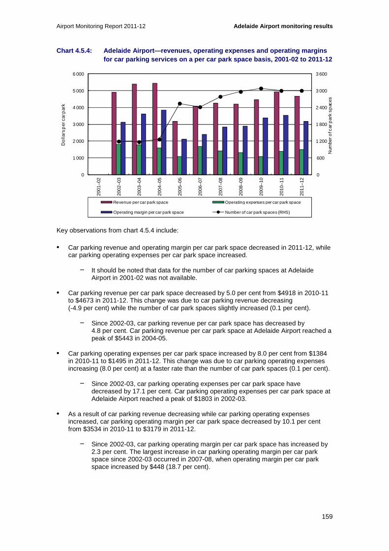
Airport Monitoring Report 2011-12 Adelaide Airport monitoring results
159
Chart 4.5.4: Adelaide Airport—revenues, operating e xpenses and operating margins for car parking services on a per car park space ba sis, 2001-02 to 2011-12
Key observations from chart 4.5.4 include:
• Car parking revenue and operating margin per car park space decreased in 2011-12, while car parking operating expenses per car park space increased.
− It should be noted that data for the number of car parking spaces at Adelaide Airport in 2001-02 was not available.
• Car parking revenue per car park space decreased by 5.0 per cent from $4918 in 2010-11 to $4673 in 2011-12. This change was due to car parking revenue decreasing (-4.9 per cent) while the number of car park spaces slightly increased (0.1 per cent).
− Since 2002-03, car parking revenue per car park space has decreased by 4.8 per cent. Car parking revenue per car park space at Adelaide Airport reached a peak of $5443 in 2004-05.
• Car parking operating expenses per car park space increased by 8.0 per cent from $1384 in 2010-11 to $1495 in 2011-12. This change was due to car parking operating expenses increasing (8.0 per cent) at a faster rate than the number of car park spaces (0.1 per cent).
− Since 2002-03, car parking operating expenses per car park space have decreased by 17.1 per cent. Car parking operating expenses per car park space at Adelaide Airport reached a peak of $1803 in 2002-03.
• As a result of car parking revenue decreasing while car parking operating expenses increased, car parking operating margin per car park space decreased by 10.1 per cent from $3534 in 2010-11 to $3179 in 2011-12.
− Since 2002-03, car parking operating margin per car park space has increased by 2.3 per cent. The largest increase in car parking operating margin per car park space since 2002-03 occurred in 2007-08, when operating margin per car park space increased by $448 (18.7 per cent).
0
600
1 200
1 800
2 400
3 000
3 600
0
1 000
2 000
3 000
4 000
5 000
6 000
2001
–02
2002
–03
2003
–04
2004
–05
2005
–06
2006
–07
2007
–08
2008
–09
2009
–10
2010
–11
2011
–12
Num
ber o
f car
par
k sp
aces
Do
llars
per
car
par
k
Revenue per car park space Operating expenses per car park space
Operating margin per car park space Number of car park spaces (RHS)

Adelaide Airport monitoring results Airport Monitoring Report 2011-12
160
4.5.3 Quality of car parking facilities
Table 4.5.2 outlines the number of car park spaces available and annual throughput of car park facilities at Adelaide Airport from 2001-02 to 2011-12.
Table 4.5.2: Adelaide Airport—number of car park sp aces and average daily throughput, 2001-02 to 2011- 12
2001-02 2002-03 2003-04 2004-05 2005-06 2006-07 2007-08 2008-09 2009-10 2010-11 2011-12
Number of car park spaces
Short-term NA 1 190 1 170 1 265 860 829 829 829 834 830 720
Long-term NA NA NA NA 420 450 764 940 994 1 020 1 132
Staff NA NA NA NA 1 265 1 138 1 197 1 197 1 257 1 150 1 150
Total airport NA 1 190 1 170 1 265 2 545 2 417 2 79 0 2 966 3 085 3 000 3 002
Annual throughput of car park facilities (thousands)
Short-term NA 908 1 056 1 139 1 182 1 117 1 119 1 128 1 085 1 078 927
Long-term NA NA NA NA 19 61 63 78 85 97 85
Total airport NA 908 1 056 1 139 1 201 1 178 1 182 1 206 1 170 1 175 1 012
Average daily throughput of car park facilities
Short-term NA 2 488 2 884 3 121 3 239 3 060 3 058 3 090 2 973 2 954 2 532
Long-term NA NA NA NA 53 167 173 214 232 265 232
Total airport NA 2 488 2 884 3 121 3 292 3 227 3 23 1 3 304 3 205 3 219 2 764
Notes: Adelaide Airport opened its long-term car park in March 2006. Prior to this time, long-term car parking was offered in the short-term car park. As a result, monitoring data for 2005-06 only includes partial data for annual throughput of long-term car parking in 2005-06. Between 2001-02 and March 2006, Adelaide Airport did not distinguish throughput in its car park between short-term and long-term, therefore, all throughput was reported as short-term car parking.

Airport Monitoring Report 2011-12 Adelaide Airport monitoring results
161
Key observations from table 4.5.2 include:
• In 2011-12, the number of short-term car parking spaces decreased by 13.3 per cent from 830 spaces in 2010-11 to 720 spaces, while long-term car parking spaces increased by 11.0 per cent from 1020 spaces in 2010-11 to 1132 spaces. Since 2001-02, the total number of car parking spaces has increased by 152.3 per cent from 1190 spaces in 2001-02 to 3002 spaces in 2011-12.
− Adelaide Airport noted that the development of its new multi-level car park impacted on the number of short-term car parking spaces available in varying degrees throughout 2011-12.
− Adelaide Airport opened its new multi-level car park in August 2012, which provides short-term car parking for more than 2000 public and car rental vehicles. This new short-term car park is more than double the size of the previous short-term car park.
• The number of short-term car parking spaces has decreased by 470 spaces since 2001-02 (-39.5 per cent). The largest decrease in short-term car parking spaces occurred in 2005-06, when the number of short-term car parking spaces decreased by 405 spaces (-32.0 per cent). This decrease in short-term car parking spaces coincided with the opening of the multi-user terminal and long-term car park during 2005-06.
• The number of long-term car parking spaces has increased in every year since the car park opened in March 2006. The largest increase in long-term car parking spaces occurred in 2007-08, when the number of long-term car parking spaces increased by 314 spaces (69.8 per cent).
• The average daily throughput in both the short-term car park and long-term car park decreased in 2011-12.
− The average daily throughput in the short-term car park decreased by 14.3 per cent from 2954 cars per day in 2010-11 to 2532 cars per day in 2011-12. This was due to a reduction in the total annual throughput of the short-term car park by 14.0 per cent to be just under one million cars in 2011-12. This was the first time since 2002-03 that total annual throughput of the short-term car park has been less than one million cars.
− The average daily throughput in the long-term car park decreased by 12.7 per cent from 265 cars per day in 2010-11 to 232 cars per day in 2011-12. This was due to a reduction in the total annual throughput of the long-term car park by 12.4 per cent to 84 777 cars in 2011-12.
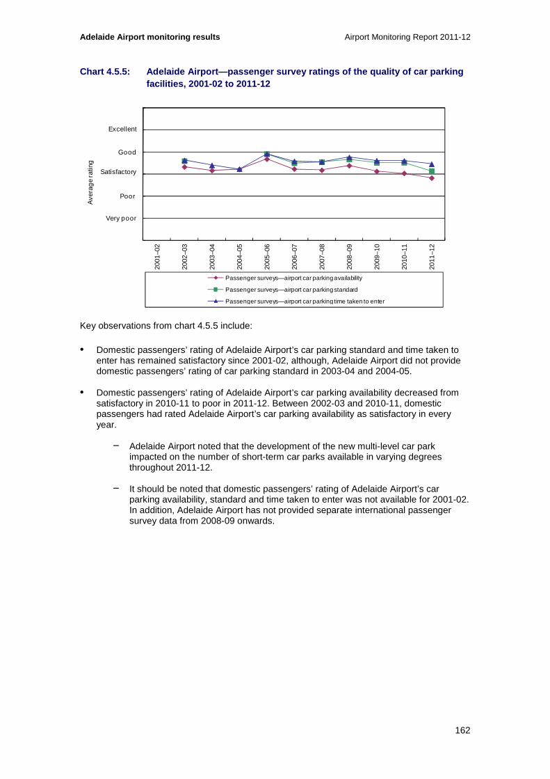
Adelaide Airport monitoring results Airport Monitoring Report 2011-12
162
Chart 4.5.5: Adelaide Airport—passenger survey rati ngs of the quality of car parking facilities, 2001-02 to 2011-12
Key observations from chart 4.5.5 include:
• Domestic passengers’ rating of Adelaide Airport’s car parking standard and time taken to enter has remained satisfactory since 2001-02, although, Adelaide Airport did not provide domestic passengers’ rating of car parking standard in 2003-04 and 2004-05.
• Domestic passengers’ rating of Adelaide Airport’s car parking availability decreased from satisfactory in 2010-11 to poor in 2011-12. Between 2002-03 and 2010-11, domestic passengers had rated Adelaide Airport’s car parking availability as satisfactory in every year.
− Adelaide Airport noted that the development of the new multi-level car park impacted on the number of short-term car parks available in varying degrees throughout 2011-12.
− It should be noted that domestic passengers’ rating of Adelaide Airport’s car parking availability, standard and time taken to enter was not available for 2001-02. In addition, Adelaide Airport has not provided separate international passenger survey data from 2008-09 onwards.
0
1
2
3
4
5
6
2001
–02
2002
–03
2003
–04
2004
–05
2005
–06
2006
–07
2007
–08
2008
–09
2009
–10
2010
–11
2011
–12
Ave
rag
e ra
ting
Passenger surveys—airport car parking availability
Passenger surveys—airport car parking standard
Passenger surveys—airport car parking time taken to enter
Excellent
Good
Satisfactory
Poor
Very poor

Airport Monitoring Report 2011-12 Adelaide Airport monitoring results
163
4.5.4 Other transport options
Table 4.5.3: Adelaide Airport—landside access charg es
Transport option Average list prices
($)
Indexed average list prices
(2009-10 base year = 100)
2009-10 2010-11 2011-12 2009-10 2010-11 2011-12
Public bus None None None NA NA NA
Private bus None None None NA NA NA
Off-airport car parking None None None NA NA NA
Taxis (per pick-up) 2.00 2.00 2.00 100.0 100.0 100.0
Private car (per entry) 2.00 2.00 2.00 100.0 100.0 100.0
Table 4.5.4: Adelaide Airport—revenues from landsid e access charges
Transport option 2009-10 2010-11 2011-12
Public bus Nil Nil Nil
Private bus Nil Nil Nil
Off-airport car parking Nil Nil Nil
Taxis (per pick-up) $233 600 $253 400 $243 200
Private car (per entry) $45 000 $44 000 $31 000
Total $278 600 $297 400 $274 200
The various other transport options to Adelaide Airport that are available, including the levies imposed by the airport on the operators and revenues received for those other transport options, are outlined in tables 4.5.3 and 4.5.4 and below:
• Terminal drop-off and pick-up
− Due to Government security requirements, cars must not be left unattended at any time.
− Adelaide Airport runs a complimentary shuttle bus three times per hour to and from its long-term car park and T1.124
124 Adelaide Airport 2012, To & From: Shuttle Bus, viewed on 5 December 2012, http://www.adelaideairport.com.au/air-travel/to-and-from/shuttle-bus.
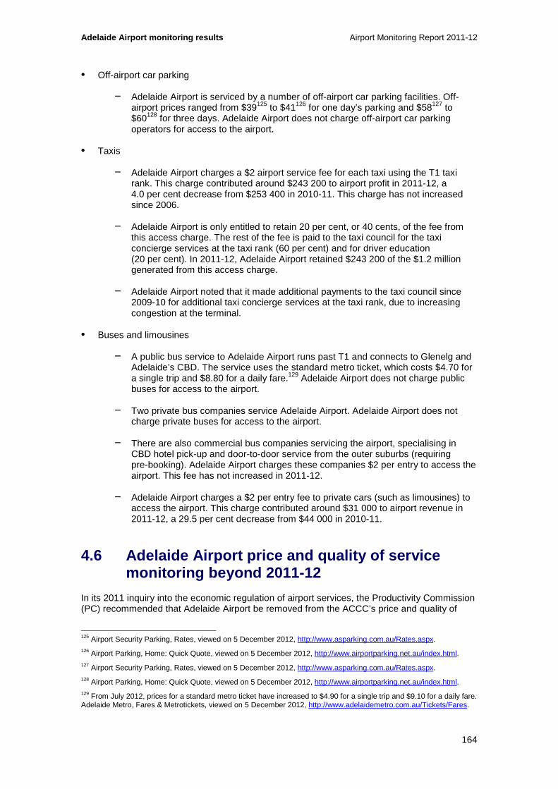
Adelaide Airport monitoring results Airport Monitoring Report 2011-12
164
• Off-airport car parking
− Adelaide Airport is serviced by a number of off-airport car parking facilities. Off-airport prices ranged from $39125 to $41126 for one day’s parking and $58127 to $60128 for three days. Adelaide Airport does not charge off-airport car parking operators for access to the airport.
• Taxis
− Adelaide Airport charges a $2 airport service fee for each taxi using the T1 taxi rank. This charge contributed around $243 200 to airport profit in 2011-12, a 4.0 per cent decrease from $253 400 in 2010-11. This charge has not increased since 2006.
− Adelaide Airport is only entitled to retain 20 per cent, or 40 cents, of the fee from this access charge. The rest of the fee is paid to the taxi council for the taxi concierge services at the taxi rank (60 per cent) and for driver education (20 per cent). In 2011-12, Adelaide Airport retained $243 200 of the $1.2 million generated from this access charge.
− Adelaide Airport noted that it made additional payments to the taxi council since 2009-10 for additional taxi concierge services at the taxi rank, due to increasing congestion at the terminal.
• Buses and limousines
− A public bus service to Adelaide Airport runs past T1 and connects to Glenelg and Adelaide’s CBD. The service uses the standard metro ticket, which costs $4.70 for a single trip and $8.80 for a daily fare.129 Adelaide Airport does not charge public buses for access to the airport.
− Two private bus companies service Adelaide Airport. Adelaide Airport does not charge private buses for access to the airport.
− There are also commercial bus companies servicing the airport, specialising in CBD hotel pick-up and door-to-door service from the outer suburbs (requiring pre-booking). Adelaide Airport charges these companies $2 per entry to access the airport. This fee has not increased in 2011-12.
− Adelaide Airport charges a $2 per entry fee to private cars (such as limousines) to access the airport. This charge contributed around $31 000 to airport revenue in 2011-12, a 29.5 per cent decrease from $44 000 in 2010-11.
4.6 Adelaide Airport price and quality of service monitoring beyond 2011-12
In its 2011 inquiry into the economic regulation of airport services, the Productivity Commission (PC) recommended that Adelaide Airport be removed from the ACCC’s price and quality of
125 Airport Security Parking, Rates, viewed on 5 December 2012, http://www.asparking.com.au/Rates.aspx. 126 Airport Parking, Home: Quick Quote, viewed on 5 December 2012, http://www.airportparking.net.au/index.html. 127 Airport Security Parking, Rates, viewed on 5 December 2012, http://www.asparking.com.au/Rates.aspx. 128 Airport Parking, Home: Quick Quote, viewed on 5 December 2012, http://www.airportparking.net.au/index.html. 129 From July 2012, prices for a standard metro ticket have increased to $4.90 for a single trip and $9.10 for a daily fare. Adelaide Metro, Fares & Metrotickets, viewed on 5 December 2012, http://www.adelaidemetro.com.au/Tickets/Fares.
Airport Monitoring Report 2011-12 Adelaide Airport monitoring results
165
service monitoring at Australia’s major airports. The Australian Government agreed with this recommendation and issued new directions on 12 June 2012, directing that the ACCC monitor the prices, costs and profits related to the supply of aeronautical and car parking services at the four specified airports and excluding Adelaide Airport from the monitoring regime. As a result, this report will be the final ACCC Airport Monitoring Report (AMR) to feature Adelaide Airport under the current regime.
Following this year’s report, Adelaide Airport will be required to join the second-tier price and quality of service reporting process established by the National Aviation Policy White Paper in December 2009. This is a self-administered scheme, where the airport will be expected to disclose on its website:
• prices of aeronautical services
• prices of car parking services
• various quality of service outcomes
• the airport complaint-handling processes and outcomes.
In addition, the Australian Government intends that airports under this scheme will publicly disclose the results of their customer/passenger satisfaction surveys.

Adelaide Airport monitoring results Airport Monitoring Report 2011-12
166

Airport Monitoring Report 2011-12 Brisbane Airport monitoring results
167
5 Brisbane Airport
Key points
• In 2011-12 total passenger numbers at Brisbane Airport increased by 4.6 per cent, to 21.2 million. Domestic passenger numbers increased by 4.6 per cent and international passenger numbers increased by 4.9 per cent.
• Total aeronautical revenue increased by 7.0 per cent to $212.4 million.
• Aeronautical revenue per passenger, used by the ACCC as a proxy for average prices, increased by 2.2 per cent to $10.02.
• Total aeronautical operating expenses increased by 1.8 per cent to $117.6 million. Rises in depreciation, security and general administration costs were partially offset by falls in salaries and wages, services/utilities and property/leasing maintenance costs.
• Total aeronautical operating margin increased by 14.3 per cent to $94.8 million. On a per passenger basis the increase was 9.2 per cent to $4.47.
• Aeronautical services return on non-current assets increased by 0.6 percentage points to 6.8 per cent in 2011-12.
• Car parking prices at Brisbane in 2011-12 were unchanged for long-term car parking at its domestic terminal and also for short and long-term car parking at the international car parking facility. Brisbane Airport increased most prices for short-term car parking at its domestic terminal.
• In 2011-12 car parking revenue increased by 1.4 per cent to $60.9 million while revenue per car park space declined by 23.0 per cent to $4738. This was impacted by the opening of 5000 new car spaces in March 2012.
• Total car parking operating margin decreased by 11.8 per cent in 2011-12 to $37.9 million.
• Major investments completed at Brisbane Airport during 2011-12 included the expansion of the Common User Satellite, the domestic terminal Skywalk and the new domestic terminal multi-level car park.
• In 2011-12, additions to aeronautical tangible non-current assets were $156.9 million which was equivalent to 10.8 per cent of total aeronautical tangible non-current assets.
• Brisbane Airport’s overall rating for quality of service decreased during 2011-12, from good to satisfactory.
• Other quality of service rating outcomes for Brisbane Airport include:
− Average rating for the international terminal decreased within the good category.
− Average rating for the domestic terminal decreased from good to satisfactory.
− Average rating for other airport services remained satisfactory.

Brisbane Airport monitoring results Airport Monitoring Report 2011-12
168
This chapter presents the detailed prices monitoring, financial performance and quality of service monitoring results in relation to the supply of aeronautical services and car parking services at Brisbane Airport. This chapter is structured as follows:
• Overview of aeronautical and car parking monitoring results (section 5.1)
• Airport overview and major airport investments (section 5.2)
• Aeronautical services prices monitoring and financial performance results (section 5.3)
• Aeronautical services quality of service monitoring results (section 5.4)
• Car parking services monitoring results (section 5.5).
5.1 Overview of aeronautical and car parking monitoring results
5.1.1 Key aeronautical services indicators for 2011 -12
Table 5.1.1: Brisbane Airport—key aeronautical serv ices indicators
Passenger numbers
(million)
Total aeronautical
revenue
($million)
Aeronautical revenue per
passenger
($)
Total aeronautical
operating margin
($million)
Aeronautical operating
margin per passenger
($)
Aeronautical revenue as a
% of total airport
revenue (%)
2010-11 20.3 198.5 9.80 83.0 4.10 43.5
2011-12 21.2 212.4 10.02 94.8 4.47 43.7
%change ▲ 4.6% ▲ 7.0% ▲ 2.2% ▲ 14.3% ▲ 9.2% ▲ 0.2pp
Table 5.1.1: Brisbane Airport—key aeronautical serv ices indicators (cont...)
Total tangible
aeronautical non-current
assets
($million)
Rate of return on
tangible aeronautical non-current
assets
(%)
Average quality of
service rating for
availability of airport services
Average quality of
service rating for
standard of airport
services
Airline rating for quality of
service
Passenger rating for quality of
service
2010-11 1 349.5 6.2 4.34 4.02 3.82 4.17
2011-12 1 437.2 6.8 3.89 3.93 3.63 4.16
%change ▲ 6.5% ▲ 0.6pp ▼ 10.4% ▼ 2.4% ▼ 5.0% ▼ 0.3%

Airport Monitoring Report 2011-12 Brisbane Airport monitoring results
169
5.1.2 Key car parking services indicators for 2011- 12
Table 5.1.2: Brisbane Airport—car parking prices as at 30 June 130
Short-term car parking Long-term car parking
Domestic 1 hour 3 hours 8 hours 24 hours 1 day 3 da ys 7 days
2010-11 $13.00 $22.00 $40.00 $40.00 $40.00 $80.00 $140.00
2011-12 $14.00 $22.00 $50.00 $50.00 $40.00 $80.00 $140.00
%change ▲ 7.7% 0.0% ▲ 20.0% ▲ 20.0% 0.0% 0.0% 0.0%
International 1 hour 3 hours 8 hours 24 hours 1 day 3 days 7 days
2010-11 $13.00 $22.00 $30.00 $30.00 $30.00 $70.00 $99.00
2011-12 $13.00 $22.00 $30.00 $30.00 $30.00 $70.00 $99.00
%change 0.0% 0.0% 0.0% 0.0% 0.0% 0.0% 0.0%
Table 5.1.3: Brisbane Airport—key car parking servi ces indicators
Number of car park spaces
(thousand)
Total car parking revenue
($million)
Car parking revenue per
car park space
($)
Total car parking
operating margin
($million)
Car parking operating
margin per car park
space
($)
Car parking revenue as a
% of total airport
revenue
%
2010-11 9.8 60.1 6 151 43.0 4.40 13.2
2011-12 12.9 60.9 4 738 37.9 2.94 12.5
%change ▲ 31.7% ▲ 1.4% ▼ 23.0% ▼ 11.8% ▼ 33.1% ▼ 0.7pp
Table 5.1.3: Brisbane Airport—key car parking servi ces indicators (cont...)
Landside access
revenue
($million)
Landside access
revenue as % of total
airport revenue
(%)
Passenger rating for
availability of airport
car parking
Passenger rating for
standard of airport car
parking
Passenger rating for
time taken to enter
airport car park
2010-11 5.3 1.2% 3.86 3.82 3.70
2011-12 5.8 1.2% 4.02 4.28 4.23
%change ▲ 9.2% 0.0% ▲ 4.0% ▲ 12.1% ▲ 14.3%
130 Parking prices are the drive-up rates. Discounted online rates are also available.

Brisbane Airport monitoring results Airport Monitoring Report 2011-12
170
5.2 Airport overview and major airport investments
This section presents information about Brisbane Airport, along with activity and investment in 2011-12. This includes: passenger/traffic mix (section 5.2.1); terminal configurations and car parking facilities (section 5.2.2); and major airport investments (section 5.2.3).
5.2.1 Passenger / traffic mix
In 2011-12 just over 21 million passengers travelled through Brisbane Airport. Almost 78 per cent of these were travelling domestically, while just over 21 per cent were international passengers (chart 5.2.1).
Chart 5.2.1: Brisbane Airport passenger mix, 2011-1 2
5.2.2 Terminal configurations and car parking facil ities
Terminal configurations
Brisbane Airport has one international terminal and one domestic terminal:
• the international terminal is a common-user terminal used by all airlines flying international to and from Brisbane Airport. This terminal is subject to monitoring and is included in the ACCC’s monitoring results.
• the majority of the domestic terminal is occupied and operated by Qantas and Virgin Australia under domestic terminal leases (DTLs). These areas are not subject to monitoring and therefore data on passenger-related services and facilities provided within these terminals are not included in the ACCC’s monitoring results.
• the common-user area within the domestic terminal is predominantly used by Jetstar and Tiger Airways, and is subject to monitoring and is included in the monitoring results.
77.9%
21.1%
0.9%
0.1%
Domestic passengers
International passengers (excluding transit passengers)
International transit passengers
Domestic on-carriage

Airport Monitoring Report 2011-12 Brisbane Airport monitoring results
171
It should be noted that, as most of the domestic terminal is occupied under DTLs, airline surveys are not available for all quality of service measures of Brisbane Airport’s domestic terminal presented in section 5.4.
Car parking facilities
Brisbane Airport provides three car parking facilities: a new combined short-term and long-term car park, along with the existing long-term car park, both located near its domestic terminal; and a combined short-term and long-term car park located in front of its international terminal.
5.2.3 Major airport investments
Aeronautical services and facilities
Brisbane Airport advised it completed two major aeronautical investment projects in 2011-12:
• Expansion of the Common User Satellite. This upgrade increased the number of passenger gate holding lounges from four to nine, as well as adding two additional aircraft parking bays, bringing the total to seven for the Common User Satellite (and to nine for the Common User area). The airport also added new food and beverage facilities close to the new passenger lounges.
• The domestic terminal Skywalk was completed in March 2012. This is an undercover elevated walkway between the domestic terminal car park (including the new car park) and the terminal. It also provides pedestrian access to the train. The walkway reduces the need for pedestrians to cross the roads across the face of the terminal, with the aim of improving access and safety, as well as reducing congestion.
Brisbane Airport also completed a number of other improvements to both the international and domestic terminals in 2011-12:
• Upgraded seating in the international terminal including in the southern and northern concourses, and level 3 and level 4 lounge areas.
• The number of transfer check-in desks at level 2 of the international terminal was increased from four to six to cater for growing demand of international travellers connecting to domestic flights.
• Bathroom facilities on level 2 in the common user area of the domestic terminal were upgraded to the same standard as in the new Common User Satellite.
• The number of flight information displays was increased in the common user area of the domestic terminal. New flight information displays were also installed in the new multi-level car park and Skywalk. The airport also undertook other measures to improve wayfinding.
• In 2011-12 Brisbane Airport replaced the existing lighting and installed modern and efficient new lighting across the common user area of the domestic terminal.
• Lift access was improved in the domestic terminal.

Brisbane Airport monitoring results Airport Monitoring Report 2011-12
172
Brisbane Airport has advised that it had four major aeronautical investment projects under way in 2011-12:
• At the international northern apron, Brisbane Airport is in the final stages of construction of four narrow-body aircraft bays, which could also be used to park two wide-body aircraft, depending on fleet requirements. Initially these will be used as contingency 'lay-over' bays but will ultimately be used as operational bays to process passengers.
• The airport is also in the final stages of construction of eight narrow-body aircraft bays at the domestic northern apron. These will be able to be used as contingency 'lay-over' bays or remote active bays with passengers carried by bus from the terminal. The airport completed these additional narrow-body remote bays in August 2012.
• Brisbane Airport is expanding the domestic southern apron to cater for rapidly increasing aircraft demand, particularly in regional traffic. The airport has recently received approval to for this expansion and expects it to be completed in 2014.
• Common-user bag-drop facilities have been installed and are being trialled at the domestic terminal common-user terminal check-in area. The trial is being conducted by Brisbane Airport and industry partners including airlines, the baggage handling operator and SITA – a specialist in air transport communications and information technology. If the trial is successful, the airport plans to install additional bag-drop and check-in facilities with the aim of increasing capacity. The airport is investigating further options to increase baggage reclaim capacity in this area.
Brisbane Airport advised it had two major aeronautical investment projects that are planned to commence in 2012-13:
• A new parallel runway (NPR) is needed to address continuing growth in demand, which is expected to exceed the current runway system’s capacity sometime between 2013 and 2015. The airport has completed the detailed design for the first construction phase, and has commenced civil works on the site. The NPR is expected to be completed in 2020.
• Brisbane Airport is considering a new southern terminal to be serviced by the expanded southern apron that is to be constructed. The proposed southern terminal would accommodate growth in resource-related and regional passenger movements. The airport is currently reviewing its Domestic Terminal Development Strategy and expects to finalise this, along with plans for the proposed southern terminal, in 2013.
Car parking and landside access services
Brisbane Airport advised it completed one major car parking investment project in 2011-12:
• A new domestic terminal multi-level car park was completed in March 2012, providing more than 5000 additional undercover parking spaces.
Brisbane Airport advised it had one major landside access investment project under way in 2011-12:
• The passenger pick-up and terminal face roads project includes construction of new roads across the face of the domestic terminal to facilitate better passenger drop-off and pick-up; and construction of a free passenger pick-up area including a walkway to access the Skywalk and terminal. These roads were completed in September 2012.

Airport Monitoring Report 2011-12 Brisbane Airport monitoring results
173
5.3 Aeronautical prices monitoring and financial performance results
In this section prices monitoring and financial reporting results are presented for aeronautical services. This includes: activity levels (section 5.3.1); prices (section 5.3.2); revenues, costs and profits (section 5.3.3); average revenues, costs and profits (section 5.3.4); government mandated security services (section 5.3.5); assets (section 5.3.6); and rates of return on tangible non-current assets (section 5.3.7).
5.3.1 Activity
Chart 5.3.1: Brisbane Airport—volume of passengers, tonnes landed and aircraft movements, 2001-02 to 2011-12 131
Key observations from chart 5.3.1 include:
• The number of passengers, tonnes landed and aircraft movements all increased at Brisbane Airport in 2011-12.
• Passenger numbers increased from around 20.3 million in 2010-11 to 21.2 million in 2011-12 (4.6 per cent). The number of domestic passengers (including domestic on-carriage passengers) increased by 4.6 per cent to 16.5 million in 2011-12, while international passengers (including international transit passengers) rose by 4.9 per cent to 4.7 million.
• Since 2001-02, the number of passengers passing through the airport increased by 72.1 per cent from 12.3 million. The largest increase in passenger throughput occurred in 2003-04, when passenger numbers increased by 16.5 per cent. Domestic passenger
131 Data in chart 5.3.1 is not comparable to chart 5.2.1 as international transit passengers have been included as international passengers and domestic on-carriage passengers have been included as domestic passengers.
0
20
40
60
80
100
120
140
160
180
200
220
0
2 000
4 000
6 000
8 000
10 000
12 000
14 000
16 000
18 000
20 000
22 000
2001
–02
2002
–03
2003
–04
2004
–05
2005
–06
2006
–07
2007
–08
2008
–09
2009
–10
2010
–11
2011
–12
Num
ber
of a
ircr
aft m
ove
men
ts (
tho
usan
d)
Num
ber
of p
asse
ng
ers
/ to
nn
es la
nd
ed (t
ho
usan
d)
Domestic Passengers International Passengers Tonnes landed Aircraft movements (RHS)
Brisbane Airport monitoring results Airport Monitoring Report 2011-12
174
numbers rose by 73.9 per cent over the period, while international passengers were up by 65.8 per cent.
• In 2011-12, tonnes landed at Brisbane Airport increased by 4.2 per cent to 7.5 million tonnes. Tonnes landed increased by 46.9 per cent over the 11 years since 2001-02.
• Aircraft movements increased from 190 402 in 2010-11 to 204 296 movements in 2011-12 (7.3 per cent). Since 2001-02, aircraft movements have increased by 35.5 per cent.
5.3.2 Prices
Table 5.3.1 presents the average aeronautical charges at Brisbane Airport from 2007-08 to 2011-12 as well as the indexed average list prices for that period (with 2007-08 as the base year).132
132 Where a list price changed during the financial year, the average of that charge has been reported in the table.

Airport Monitoring Report 2011-12 Brisbane Airport monitoring results
175
Table 5.3.1: Brisbane Airport—schedule of aeronauti cal charges and indexed average list prices (includ ing GST), 2007-08 to 2011-12
Average list prices
($)
Indexed average list prices
(2007-08 base year = 100)
2007-08 2008-09 2009-10 2010-11 2011-12 2007-08 2008-09 2009-10 2010-11 2011-12
Aircraft-related charges
Domestic landing fees (per passenger) 3.49 3.49 4.59 4.59 4.59 100.0 100.0 131.5 131.5 131.5
Freight landing fees (per MOTW) 12.07 12.07 12.07 12.07 12.07 100.0 100.0 100.0 100.0 100.0
General aviation landing fees (per MTOW) 12.07 12.07 12.07 12.07 12.07 100.0 100.0 100.0 100.0 100.0
Rotary wing landing fees (per MTOW) 6.95 6.95 7.50 7.50 7.50 100.0 100.0 107.9 107.9 107.9
International private charter and non scheduled air service landing fee (per MTOW)
12.07 12.07 12.07 12.07 12.07 100.0 100.0 100.0 100.0 100.0
Aircraft parking fees (per 24 hours or part thereof)—excluding GST
0 to 5 000kg 30.00 30.00 30.00 30.00 30.00 100.0 100.0 100.0 100.0 100.0
5 001 to 20 000kg 50.00 50.00 50.00 50.00 50.00 100.0 100.0 100.0 100.0 100.0
20 001 to 40 000kg 75.00 75.00 75.00 75.00 75.00 100.0 100.0 100.0 100.0 100.0
40 001 to 100 000kg 120.00 120.00 120.00 120.00 120.00 100.0 100.0 100.0 100.0 100.0
100 001 to 250 000kg 275.00 275.00 275.00 275.00 275.00 100.0 100.0 100.0 100.0 100.0
250 001 to 400 000kg 400.00 400.00 400.00 400.00 400.00 100.0 100.0 100.0 100.0 100.0
400 001kg + 530.00 530.00 530.00 530.00 530.00 100.0 100.0 100.0 100.0 100.0
Noise surcharge (applies to all aviation charges) 25% 25% 25% 25% 25% 100.0 100.0 100.0 100.0 100.0
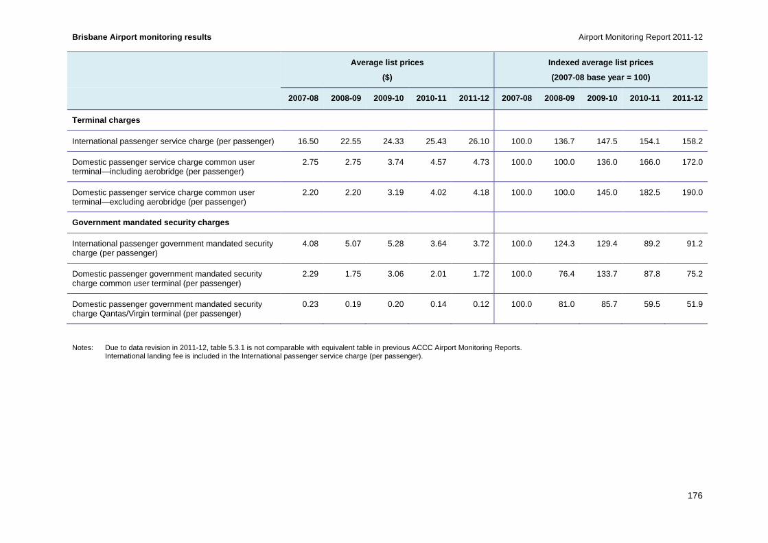
Brisbane Airport monitoring results Airport Monitoring Report 2011-12
176
Average list prices
($)
Indexed average list prices
(2007-08 base year = 100)
2007-08 2008-09 2009-10 2010-11 2011-12 2007-08 2008-09 2009-10 2010-11 2011-12
Terminal charges
International passenger service charge (per passenger) 16.50 22.55 24.33 25.43 26.10 100.0 136.7 147.5 154.1 158.2
Domestic passenger service charge common user terminal—including aerobridge (per passenger)
2.75 2.75 3.74 4.57 4.73 100.0 100.0 136.0 166.0 172.0
Domestic passenger service charge common user terminal—excluding aerobridge (per passenger)
2.20 2.20 3.19 4.02 4.18 100.0 100.0 145.0 182.5 190.0
Government mandated security charges
International passenger government mandated security charge (per passenger)
4.08 5.07 5.28 3.64 3.72 100.0 124.3 129.4 89.2 91.2
Domestic passenger government mandated security charge common user terminal (per passenger)
2.29 1.75 3.06 2.01 1.72 100.0 76.4 133.7 87.8 75.2
Domestic passenger government mandated security charge Qantas/Virgin terminal (per passenger)
0.23 0.19 0.20 0.14 0.12 100.0 81.0 85.7 59.5 51.9
Notes: Due to data revision in 2011-12, table 5.3.1 is not comparable with equivalent table in previous ACCC Airport Monitoring Reports. International landing fee is included in the International passenger service charge (per passenger).

Airport Monitoring Report 2011-12 Brisbane Airport monitoring results
177
Key observations from table 5.3.1 include:
• Landing fees, aircraft parking fees and the noise surcharge remained unchanged in 2011-12 while terminal charges for international and domestic passengers increased. Government mandated security charges increased for international passengers and decreased for domestic passengers.
• Brisbane Airport had in place a formal five-year pricing agreement for aircraft-related services and facilities with the airlines which expired on 30 June 2012. This agreement was commercially negotiated with airlines and set out the approach to establishing and adjusting prices
• Brisbane Airport has advised the ACCC of the following:
− After a long period of negotiations, Brisbane Airport Corporation notified airlines of the charges to apply at Brisbane Airport from 1 September 2012. The majority of airlines are paying published charges. BAC has adopted the same pricing methodology that has been used for the previous 10 years (with airlines agreeing to, and paying, those prices) – in other words the ACCC’s building block methodology, using the ‘line in the sand (historic) asset values’ with price increases as investment is incurred. The principal concern of some of the airlines is that because the runway is a high value project ($1.3 billion) being delivered over a number of years, that the previously accepted methodology should no longer be used. Discussions are continuing with the airlines.
• In 2011-12 domestic landing fees increased by 10.1 per cent to $4.59 per passenger. These fees accounted for 25.3 per cent of total aeronautical revenue in 2011-12.
• In July 2007, Brisbane Airport introduced a 25 per cent noise surcharge on ‘marginally compliant aircraft’ that applies to all aviation charges associated with the use of the runway and taxiway system and aprons by such aircraft. This surcharge was introduced to encourage operators to move away from noisier aircraft at Brisbane Airport. As of 1 September 2010, older noisy jet aircraft were banned from major Australian airports.133
• The international passenger service charge increased from $25.43 per passenger in 2010-11 to $26.10 per passenger in 2011-12 (2.6 per cent). This charge has increased every year over the five years since 2007-08, an increase of 58.2 per cent. In 2011-12 revenue from the international passenger service charge made the largest contribution to total aeronautical revenue at 49.4 per cent.
• Domestic passenger service charges for the common user terminal including an aerobridge increased from $4.57 per passenger in 2010-11 to $4.73 per passenger in 2011-12 (3.6 per cent). Excluding an aerobridge, this charge increased by 4.1 per cent to $4.18 per passenger in 2011-12. Combined, these service charges accounted for 14.2 per cent of total aeronautical revenue in 2011-12.
• International passenger government mandated security charges increased from $3.64 per passenger in 2010-11 to $3.72 in 2011-12 (2.2 per cent). The domestic passenger government mandated security charges decreased by 14.4 per cent (to $1.72 per passenger) for the common user terminal and by 12.8 per cent (to $0.12) for the Qantas/Virgin Australia terminal. Brisbane Airport has previously noted that security charges are set to recover costs; any over- or under-recovery in a period is factored into prices for the following period.
133 A Albanese, Minister for Infrastructure and Transport, Government to ban old, noisy freight jets, media release, 29 March 2010.

Brisbane Airport monitoring results Airport Monitoring Report 2011-12
178
5.3.3 Revenues, costs and profits for aeronautical and total airport services
As noted, the ACCC required airport operators to provide additional information relating to the aeronautical asset base under the ‘line in the sand’ (LIS) approach for the first time in 2007-08. Under this approach, the value of an airport’s aeronautical asset base for monitoring purposes is the value of tangible non-current aeronautical assets reported to the ACCC as at 30 June 2005, plus new investments, less depreciation and disposals. This chapter separately reports LIS measures for Brisbane Airport where applicable. The starting LIS asset base figures for Brisbane Airport are detailed in the appendices.
Table 5.3.2 outlines the revenues, operating expenses and operating margins for aeronautical services and the total airport from 2001-02 to 2011-12, while table 5.3.3 outlines the revenues, operating expenses and operating margins for aeronautical services under the LIS approach from 2007-08 to 2011-12.

Airport Monitoring Report 2011-12 Brisbane Airport monitoring results
179
Table 5.3.2: Brisbane Airport—revenues, operating e xpenses and operating margins for aeronautical serv ices and for total airport services, 2001-02 to 2011-12
2001-02 2002-03 2003-04 2004-05 2005-06 2006-07 2007-08 2008-09 2009-10 2010-11 2011-12
Revenue ($million) Aeronautical 45.3 62.7 71.6 86.3 95.8 106.0 141.6 163.5 180.2 198.5 212.4
Total airport 146.9 169.1 193.0 245.0 315.1 332.6 3 93.4 381.8 423.5 456.5 486.1
Operating expenses ($million) Aeronautical 47.3 50.1 55.1 67.1 72.6 72.9 87.4 105.4 109.8 115.5 117.6
Total airport 72.1 76.4 84.0 101.6 110.1 116.7 138. 4 168.8 175.8 189.4 198.1
Operating margin
($million)
Aeronautical (2.1) 12.6 16.4 19.2 23.2 33.0 54.2 58.1 70.4 83.0 94.8
Total airport 74.8 92.7 109.0 143.4 205.0 215.9 254 .9 213.0 247.9 267.2 288.0
Operating margin as a % of revenue
Aeronautical (4.6) 20.1 23.0 22.3 24.2 31.2 38.3 35.5 39.1 41.8 44.7
Total airport 50.9 54.8 56.5 58.5 65.1 64.9 64.8 55 .8 58.5 58.5 59.3
Table 5.3.3: Brisbane Airport—revenues, operating e xpenses and operating margins for aeronautical serv ices under the LIS approach, 2007-08 to 2011-12
2001-02 2002-03 2003-04 2004-05 2005-06 2006-07 2007-08 2008-09 2009-10 2010-11 2011-12
Revenue ($million) Aeronautical under the LIS
NA NA NA NA NA NA 141.6 163.5 180.2 198.5 212.4
Operating expenses ($million) Aeronautical under the LIS
NA NA NA NA NA NA 82.3 101.8 106.2 110.7 112.9
Operating margin
($million)
Aeronautical under the LIS
NA NA NA NA NA NA 59.2 61.7 74.0 87.9 99.5
Operating margin as a % of revenue
Aeronautical under the LIS
NA NA NA NA NA NA 41.9 37.7 41.1 44.3 46.9

Brisbane Airport monitoring results Airport Monitoring Report 2011-12
180
Key observations from tables 5.3.2 and 5.3.3 include:
• Aeronautical revenue, operating expenses and operating margin all increased at Brisbane Airport in 2011-12.
• Revenue from aeronautical services increased by $13.9 million (7.0 per cent) in 2011-12. Over the past 11 years, aeronautical revenue increased by 369.4 per cent. The largest annual percentage increase over this period was 38.5 per cent ($17.4 million) in 2002-03.
• Total airport revenue increased in 2011-12 by 6.5 per cent. Over the 11 years since 2001-02 revenue rose from $146.9 million to $486.1 million.
• Aeronautical operating expenses increased by $2.0 million (1.8 per cent) in 2011-12. This followed an increase in the previous year of 5.3 per cent. Over the 11 years since 2001-02, aeronautical operating expenses increased by 148.5 per cent.
− Under the LIS approach, aeronautical operating expenses increased by 2.0 per cent, from $110.7 million in 2010-11 to $112.9 million in 2011-12.
− Operating expenses were lower under the LIS approach compared to the non-LIS approach due to lower depreciation expenses. In 2011-12, depreciation of tangible non-current assets was $39.5 million under the LIS approach, which was $4.7 million lower than under the non-LIS approach.
• In 2011-12, operating expenses for the total airport increased by 4.6 per cent to $198.1 million. Since 2001-02, operating expenses for the total airport increased by 174.6 per cent.
• As a result of revenue from aeronautical services increasing at a faster rate than operating expenses, aeronautical operating margin increased by $11.9 million (14.3 per cent) in 2011-12. From 2001-02 to 2011-12, Brisbane Airport’s operating margin from aeronautical services increased from $-2.1 million to $94.8 million.
− Under the LIS approach, the aeronautical operating margin increased by 13.3 per cent, from $87.9 million in 2010-11 to $99.5 million in 2011-12. This was $4.7 million higher than the aeronautical operating margin under the non-LIS approach.

Airport Monitoring Report 2011-12 Brisbane Airport monitoring results
181
Chart 5.3.2: Brisbane Airport—aeronautical services and non-aeronautical services share of total airport revenue, 2001-02 to 2011-12
Key observations from chart 5.3.2 include:
• Aeronautical revenue as a proportion of total airport revenue increased slightly in 2011-12, to 43.7 per cent. This was the highest percentage of the 11 years since 2001-02.
• In contrast, in 2001-02 the proportion of aeronautical revenue to total airport revenue was 30.8 per cent.
0
10
20
30
40
50
60
70
80
90
100
2001
–02
2002
–03
2003
–04
2004
–05
2005
–06
2006
–07
2007
–08
2008
–09
2009
–10
2010
–11
2011
–12
Per
cen
t
Revenue—aeronautical Revenue—non-aeronautical

Brisbane Airport monitoring results Airport Monitoring Report 2011-12
182
5.3.4 Average revenues, costs and profits for aeron autical services
Chart 5.3.3: Brisbane Airport—revenues, operating e xpenses and operating margins for aeronautical services on a per passenger basis, 2001-02 to 2011-12
Key observations from chart 5.3.3 include:
• Aeronautical revenue and operating margin on a per passenger basis increased at Brisbane Airport in 2011-12, while operating expenses per passenger decreased.
• Aeronautical revenue per passenger increased from $9.80 in 2010-11 to $10.02 in 2011-12 (2.2 per cent). Since 2001-02, aeronautical revenue per passenger has increased by 172.8 per cent, from $3.67. Over the same period, passenger numbers increased by 72.1 per cent.
• Operating expenses per passenger for aeronautical services decreased by 2.8 per cent in 2011-12 to $5.55 per passenger, from $5.70 in 2010-11. Operating expenses on a per passenger basis increased by 44.4 per cent over the 11 years since 2001-02.
• Aeronautical operating margin per passenger increased from $4.10 in 2010-11 to $4.47 in 2011-12 (9.2 per cent). In contrast, in 2001-02 aeronautical operating margin per passenger was $-0.17.
-$1.00
$0.00
$1.00
$2.00
$3.00
$4.00
$5.00
$6.00
$7.00
$8.00
$9.00
$10.00
$11.0020
01–0
2
2002
–03
2003
–04
2004
–05
2005
–06
2006
–07
2007
–08
2008
–09
2009
–10
2010
–11
2011
–12
Per
pas
sen
ger
Revenue Expenses Margin

Airport Monitoring Report 2011-12 Brisbane Airport monitoring results
183
Chart 5.3.4: Brisbane Airport—revenues, operating e xpenses and operating margins for aeronautical services under the line in the sand (LIS) approach on a per passenger basis, 2007-08 to 2011-12
Key observations from chart 5.3.4 include:
• Under the LIS approach, aeronautical operating expenses on a per passenger basis decreased in 2011-12, while operating margin per passenger increased.
• Operating expenses for aeronautical services under the LIS approach decreased to $5.33 per passenger in 2011-12, from $5.46 per passenger in 2010-11. This compares to $5.55 per passenger under the non-LIS approach. The difference was due to lower depreciation expenses using LIS.
• Aeronautical operating expenses per passenger have increased by 21.5 per cent over the five-year period since 2007-08.
• As a result of operating expenses decreasing and revenue increasing, aeronautical operating margin per passenger increased from $4.34 in 2010-11 to $4.70 in 2011-12 (8.2 per cent). Under the non-LIS approach the margin was lower at $4.47 as a result of higher depreciation expense.
• Since 2007-08, aeronautical operating margin per passenger increased by 48.9 per cent.
5.3.5 Government mandated security services
Government mandated security charges are directly related to the government mandated security levels. Brisbane Airport advised that no margin is made from these activities, with over- or under-recoveries being taken into consideration when calculating the following year’s security charges.
Table 5.3.4 outlines the revenues, operating expenses and operating margins for government mandated security services and aeronautical services from 2001-02 to 2011-12. It should be noted that the expenses do not include interest or finance costs on leased assets related to mandated security.
$0.00
$1.00
$2.00
$3.00
$4.00
$5.00
$6.00
$7.00
$8.00
$9.00
$10.00
$11.00
2007–08 2008–09 2009–10 2010–11 2011–12
Per
pas
sen
ger
Revenue under the LIS Expenses under the LIS Margin under the LIS

Brisbane Airport monitoring results Airport Monitoring Report 2011-12
184
Table 5.3.4: Brisbane Airport—revenues, operating e xpenses and operating margins from government manda ted security services and aeronautical services, 2001-02 to 2011-12
2001-02 2002-03 2003-04 2004-05 2005-06 2006-07 2007-08 2008-09 2009-10 2010-11 2011-12
Revenue
($million)
Security services 9.0 9.5 12.0 16.6 17.8 17.3 25.7 26.7 24.0 21.0 21.6
Total aeronautical 45.3 62.7 71.6 86.3 95.8 106.0 141.6 163.5 180.2 198.5 212.4
Operating expenses
($million)
Security services 7.5 8.0 10.5 16.2 20.6 17.6 23.0 26.7 20.7 21.0 21.6
Total aeronautical 47.3 50.1 55.1 67.1 72.6 72.9 87 .4 105.4 109.8 115.5 117.6
Operating margin
($million)
Security services 1.5 1.5 1.5 0.3 (2.8) (0.3) 2.7 0.0 3.3 0.0 0.0
Total aeronautical (2.1) 12.6 16.5 19.2 23.2 33.0 5 4.2 58.1 70.4 83.0 94.8
Revenue per passenger
($)
Security services 0.73 0.77 0.83 1.04 1.08 0.97 1.37 1.40 1.25 1.04 1.02
Total aeronautical 3.67 5.08 4.98 5.43 5.83 5.94 7. 54 8.56 9.36 9.80 10.02
Operating expense per passenger
($)
Security services 0.61 0.65 0.73 1.02 1.25 0.99 1.22 1.40 1.08 1.04 1.02
Total aeronautical 3.84 4.06 3.83 4.22 4.42 4.09 4. 65 5.52 5.70 5.70 5.55
Operating margin per passenger
($)
Security services 0.12 0.12 0.11 0.02 (0.17) (0.02) 0.14 0.00 0.17 0.00 0.00
Total aeronautical (0.17) 1.02 1.14 1.21 1.41 1.85 2.88 3.04 3.66 4.10 4.47
Note: Brisbane Airport has advised that it does not aim to earn a profit from government mandated security services. Any positive or negative margin in any one year is negated by making the appropriate decrease or increase to charges (and hence revenue) in the following year.

Airport Monitoring Report 2011-12 Brisbane Airport monitoring results
185
Key observations from table 5.3.4 include:
• Total security revenue increased from $21.0 million in 2010-11 to $21.6 million in 2011-12 (3.0 per cent). Over the 11 years since 2001-02, total security revenue increased by 139.6 per cent. This is primarily due to increased government mandated security measures implemented during this period.
• Since 2007-08 government mandated security charges for international passengers were virtually unchanged, while the charges for domestic passengers decreased (see table 5.3.1). Over this same period total security revenue decreased by 15.8 per cent.
• As a result of passenger volumes increasing at a faster rate (4.7 per cent) than security revenue (3.0 per cent), security revenue on a per passenger basis decreased by 1.6 per cent in 2011-12. Security revenue per passenger increased by 39.2 per cent over the 11 years since 2001-02.
• Total security expenses increased from $21.0 million in 2010-11 to $21.6 million in 2011-12 (2.9 per cent). Over the 11 years since 2001-02, total security expenses increased by 187.8 per cent due to increased security measures implemented during this period.
• Operating security margins were zero in 2011-12, as they were also in 2010-11. Since 2001-12, operating security margins have ranged from $-2.8 million in 2005-06 to $3.3 million in 2009-10. The average margin in the 11 year period since 2001-02 is $0.7 million. On a per passenger basis, the margin has ranged from $-0.17 (2005-06) to $0.17 (2009-10) with an average of $0.04 per passenger.
Chart 5.3.5: Brisbane Airport—government mandated s ecurity services share of total aeronautical services revenue, 2001-02 to 2011-12
Key observations from chart 5.3.5 include:
• Security revenue as a percentage of aeronautical revenue decreased by 0.4 percentage points in 2011-12 to 10.2 per cent, the lowest over the 11 years since 2001-02. Security revenue as a percentage of aeronautical revenue is now 9.8 percentage points lower than in 2001-02 when it was 20.0 per cent.
0
10
20
30
40
50
60
70
80
90
100
2001
–02
2002
–03
2003
–04
2004
–05
2005
–06
2006
–07
2007
–08
2008
–09
2009
–10
2010
–11
2011
–12
Per
cen
t
Revenue—aeronautical (excl. security) Revenue—security

Brisbane Airport monitoring results Airport Monitoring Report 2011-12
186
• Security expenses as a proportion of aeronautical operating expenses increased from 18.2 per cent in 2010-11 to 18.4 per cent in 2011-12. Since 2001-02 the proportion of security expenses to aeronautical operating expenses has increased by 2.5 percentage points.
Chart 5.3.6: Brisbane Airport—aeronautical services revenue, operating expenses and operating margin excluding government mandated security services on a per passenger basis, 2001-02 to 2011-12
Key observations from chart 5.3.6 include:
• Excluding government mandated security services, aeronautical revenue and operating margin on a per passenger basis increased at Brisbane Airport in 2011-12, while operating expenses per passenger decreased.
• Excluding government mandated security services, aeronautical revenue per passenger increased from $8.76 in 2010-11 to $9.00 in 2011-12 (2.7 per cent). Over the 11 years since 2001-02, aeronautical revenue per passenger increased by 206.1 per cent. Over the same period, passenger numbers increased by 72.1 per cent.
• Operating expenses for aeronautical services excluding government mandated security services decreased by 3.0 per cent in 2011-12, from $4.67 per passenger in 2010-11 to $4.53 per passenger. Aeronautical operating expenses per passenger have increased by 40.1 per cent over the reporting period since 2001-02.
• As a result of revenue increasing and operating expenses decreasing (excluding security services), operating margin per passenger increased from $4.10 in 2010-11 to $4.47 in 2011-12 (9.0 per cent). This compares with an aeronautical operating margin per passenger of $-0.29 in 2001-02.
5.3.6 Assets for aeronautical and total airport ser vices
Table 5.3.5 outlines Brisbane Airport’s tangible non-current assets for aeronautical services and the total airport from 2001-02 to 2011-12, while table 5.3.6 outlines Brisbane Airport’s tangible non-current assets for aeronautical services under the LIS approach from 2007-08 to 2011-12.
-$2.00
$0.00
$2.00
$4.00
$6.00
$8.00
$10.00
2001
–02
2002
–03
2003
–04
2004
–05
2005
–06
2006
–07
2007
–08
2008
–09
2009
–10
2010
–11
2011
–12
Per
pas
sen
ger
Revenue Expenses Margin

Airport Monitoring Report 2011-12 Brisbane Airport monitoring results
187
Table 5.3.5: Brisbane Airport—tangible non-current assets for aeronautical services and total airport services, 2001-02 to 2011-12
2001-02 2002-03 2003-04 2004-05 2005-06 2006-07 2007-08 2008-09 2009-10 2010-11 2011-12
Investment property
($million)
Aeronautical 0.0 0.0 0.0 0.0 0.0 0.0 0.0 0.0 0.0 0.0 0.0
Total airport 0.0 0.0 0.0 320.4 413.3 475.3 574.0 6 66.7 705.6 793.4 892.5
Land
($million)
Aeronautical 36.8 42.5 35.1 17.9 17.7 18.2 18.0 18.3 17.9 17.7 18.3
Total airport 188.3 128.1 107.5 60.1 59.5 58.8 58.1 57.5 56.8 56.2 55.2
Property, plant and equipment
($million)
Aeronautical 533.7 528.7 527.1 893.4 900.3 963.9 1 188.0 1 342.2 1 299.9 1 315.5 1 418.9
Total airport 695.9 759.9 788.0 1 102.6 1 094.7 1 2 29.9 1 567.2 1 723.8 1 782.8 1 888.4 2 034.4
Intangibles
($million)
Aeronautical 0.0 28.6 31.5 0.0 0.0 0.0 0.0 0.0 0.0 0.0 0.0
Total airport 639.8 633.0 626.2 823.0 823.0 823.0 8 23.0 823.0 823.0 823.0 823.0
Other tangible non-current assets
($millon)
Aeronautical 3.8 3.5 5.9 (19.4) 2.9 36.6 62.3 41.0 3.9 16.3 0.0
Total airport 10.2 8.8 15.1 (44.3) 7.7 96.7 157.5 1 01.9 9.3 42.6 0.0
Total tangible non-current assets
($million)
Aeronautical 574.3 574.6 568.1 891.9 920.9 1 018.7 1 268.2 1 401.5 1 321.7 1 349.5 1 437.2
Total airport 894.3 896.7 910.6 1 438.8 1 575.1 1 8 60.7 2 356.7 2 549.8 2 554.5 2 780.6 2 982.0
Total non-current assets
($million)
Aeronautical 574.3 603.3 600.0 891.9 920.9 1 018.7 1 268.2 1 401.5 1 321.7 1 349.5 1 437.2
Total airport 1 534.1 1 529.7 1 536.8 2 261.8 2 398.1 2 683.8 3 179.8 3 372.8 3 377.5 3 603.6 3 805.0
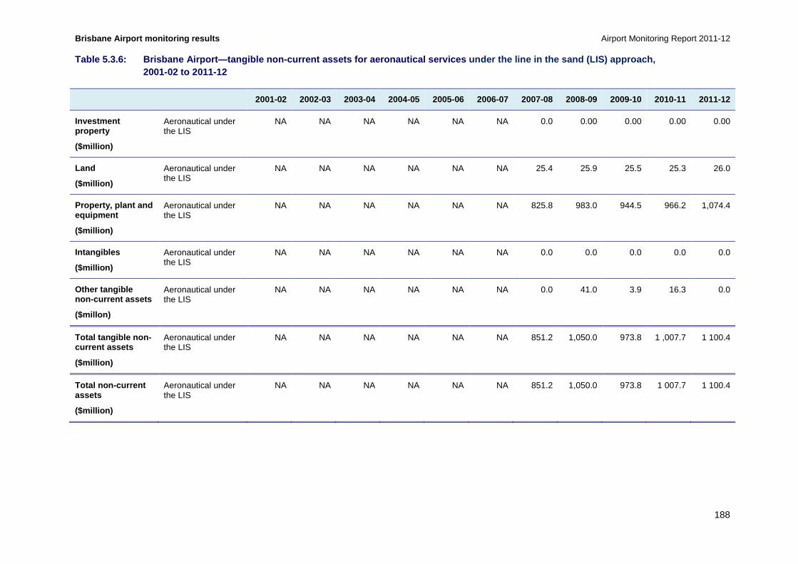
Brisbane Airport monitoring results Airport Monitoring Report 2011-12
188
Table 5.3.6: Brisbane Airport—tangible non-current assets for aeronautical services under the line in the sand (LIS) approach, 2001-02 to 2011-12
2001-02 2002-03 2003-04 2004-05 2005-06 2006-07 2007-08 2008-09 2009-10 2010-11 2011-12
Investment property
($million)
Aeronautical under the LIS
NA NA NA NA NA NA 0.0 0.00 0.00 0.00 0.00
Land
($million)
Aeronautical under the LIS
NA NA NA NA NA NA 25.4 25.9 25.5 25.3 26.0
Property, plant and equipment
($million)
Aeronautical under the LIS
NA NA NA NA NA NA 825.8 983.0 944.5 966.2 1,074.4
Intangibles
($million)
Aeronautical under the LIS
NA NA NA NA NA NA 0.0 0.0 0.0 0.0 0.0
Other tangible non-current assets
($millon)
Aeronautical under the LIS
NA NA NA NA NA NA 0.0 41.0 3.9 16.3 0.0
Total tangible non-current assets
($million)
Aeronautical under the LIS
NA NA NA NA NA NA 851.2 1,050.0 973.8 1 ,007.7 1 100.4
Total non-current assets
($million)
Aeronautical under the LIS
NA NA NA NA NA NA 851.2 1,050.0 973.8 1 007.7 1 100.4

Airport Monitoring Report 2011-12 Brisbane Airport monitoring results
189
Key observations from tables 5.3.5 and 5.3.6 include:
• The total value of aeronautical tangible non-current assets at Brisbane Airport increased by 6.5 per cent, from $1349.5 million in 2010-11 to $1437.2 million in 2011-12. Notably, Brisbane Airport did not report any aeronautical intangible assets in the period. Since 2001-02, the value of aeronautical tangible non-current assets has increased by 150.3 per cent due to the increased investment in airport infrastructure over the period.
• The increase in aeronautical tangible non-current assets in 2011-12 was partly attributable to an increase in property, plant and equipment from $1315.5 million in 2010-11 to $1418.9 million in 2011-12 (7.9 per cent). The value of land increased by 3.4 per cent to $18.3 million. The value of other non-current assets fell from $16.3 million in 2010-11 to zero in 2011-12. Brisbane Airport has advised that this asset was a hedge portfolio which, due to interest and foreign exchange rate changes, moved from being an asset to a liability.
• In 2011-12 depreciation of aeronautical tangible non-current assets totalled $44.2 million. This compares with depreciation of $41.5 million in 2010-11. Since 2001-02, depreciation of aeronautical tangible non-current assets increased by 226.7 per cent, from $19.4 million.
• In 2011-12 Brisbane Airport completed three major construction projects, which would have significantly contributed to the increase in the value of assets. There was an expansion of the Common User Satellite and a pedestrian access bridge to the domestic terminal (Skywalk), both of which are aeronautical assets. There was also a multi-level car park for the domestic terminal which is a non-aeronautical asset.
• The value of total airport tangible non-current assets increased by 7.3 per cent to $2982.0 million in 2011-12. Since 2001-02, the value of total airport tangible non-current assets increased by 233.4 per cent.
• In 2011-12 depreciation of total airport tangible non-current assets was $66.0 million. This compares with depreciation of $59.9 million in 2010-11. Since 2001-02, depreciation of total airport tangible non-current assets increased by 136.1 per cent.
• Under the LIS approach, the value of tangible aeronautical non-current assets increased by 9.2 per cent in 2011-12, to $1100.4 million. The value of land under this approach increased by 2.8 per cent to $26.0 million. The value of property, plant and equipment rose in 2011-12 by 11.2 per cent to $1074.4 million.
• Compared to the non-LIS approach, the value of tangible aeronautical non-current assets under the LIS approach were lower by $336.8 million in 2011-12. This is partly explained by revaluations that were excluded under the LIS approach since 2007-08. In 2011-12 there were revaluations of tangible non-aeronautical non-current assets to the value of $85.4 million.
• From 2007-08 to 20011-12, depreciation expense on aeronautical assets under the LIS approach increased by 66.7 per cent to $39.5 million.

Brisbane Airport monitoring results Airport Monitoring Report 2011-12
190
Chart 5.3.7: Brisbane Airport—additions as a percen tage of tangible non-current assets for aeronautical and total airport services, 2001-02 to 2011-12
Key observations from chart 5.3.7 include:
• Prior to 2006-07, annual additions to assets were mostly less than 5 per cent of both aeronautical and total airport tangible non-current assets. In subsequent years there was a significant increase in additions.
• In 2011-12, additions to aeronautical tangible non-current assets represented around 10.8 per cent of total aeronautical tangible non-current assets. Additions to aeronautical assets include the expansion of the Common User Satellite and an elevated walkway (Skywalk) linking a newly constructed car park to the domestic terminal. Over the period 2001-02 to 2011-12 the peak annual value of additions was 19.5 per cent in 2007-08. Brisbane Airport advised this peak was due to the international terminal expansion.
• Additions to total airport tangible non-current assets as a percentage of total airport tangible non-current assets decreased from a high of 18 per cent in 2007-08 to 7.5 per cent in 2011-12. Impacting on this was a major non-aeronautical project completed in 2011-12: a new multi-level car park.
0%
5%
10%
15%
20%
25%
2001
–02
2002
–03
2003
–04
2004
–05
2005
–06
2006
–07
2007
–08
2008
–09
2009
–10
2010
–11
2011
–12
Per
cen
t
Aeronautical services Total airport

Airport Monitoring Report 2011-12 Brisbane Airport monitoring results
191
5.3.7 Rates of return on tangible non-current asset s
Chart 5.3.8: Brisbane Airport—rate of return (EBITA ) on tangible non-current assets for aeronautical services and total airport service s, 2001-02 to 2011-12
Key observations from chart 5.3.8 include:
• Earnings before interest, tax and amortisation (EBITA) on average tangible non-current assets for aeronautical services increased in 2011-12, while it was virtually unchanged for total airport services.
• EBITA on average tangible non-current assets for aeronautical services increased from 6.2 per cent in 2010-11 to 6.8 per cent in 2011-12 as a result of a relatively greater increase in EBITA (14.3 per cent) than the increase in the value of tangible non-current assets (6.5 per cent) (as shown in table 5.3.5).
• In 2001-02, EBITA on average tangible non-current assets for aeronautical services was -0.4 per cent. From 2001-02 to 2011-12, EBITA on average tangible non-current assets for aeronautical services increased by 7.2 percentage points. This increase can largely be attributed to the significant increase in operating margin, from $-2.1 million in 2001-02 to $94.8 million in 2011-12, while assets rose proportionally less, from $574.3 million to $1473.2 million.
• In 2011-12 EBITA on average tangible non-current assets for total airport services was virtually unchanged at 10.0 per cent. Over the five-years since 2007-08, EBITA on total airport average tangible non-current assets decreased by 2.1 percentage points. EBITA for total airport services increased by 13.0 per cent over the same period, while total airport tangible non-current assets increased by 26.5 per cent.
-2
0
2
4
6
8
10
12
1420
01–0
2
2002
–03
2003
–04
2004
–05
2005
–06
2006
–07
2007
–08
2008
–09
2009
–10
2010
–11
2011
–12
Per
cen
t per
an
num
Aeronautical services Total airport

Brisbane Airport monitoring results Airport Monitoring Report 2011-12
192
Chart 5.3.9: Brisbane Airport—rate of return (EBITA ) on tangible non-current assets for aeronautical services under the line-in-the-sand (LIS) approach and the total airport services, 2007-08 to 2011-12
Key observations from chart 5.3.9 include:
• Under the LIS approach, EBITA on average tangible non-current assets for aeronautical services also increased in 2011-12.
• EBITA on average tangible non-current assets for aeronautical services increased from 8.9 per cent in 2010-11 to 9.4 per cent in 2011-12.
• Since 2007-08, EBITA on average tangible non-current assets for aeronautical services increased by 1.4 percentage points. This increase can largely be attributed to increases in aeronautical revenue and lower expenses (as shown in table 5.3.1).
• Over the five years since 2007-08, EBITA on average tangible non-current assets for the total airport fell by 3.7 percentage points.
• Rates of return on aeronautical tangible non-current assets under LIS approach are higher than under non-LIS approach. The difference is largely explained by the facts that EBITA is higher under the LIS approach because expenses are lower while total assets are lower under LIS approach due to the exclusion of asset revaluations undertaken since 2005-06 (as shown in tables 5.3.1 and 5.3.4).
0
3
6
9
12
15
18
2007–08 2008–09 2009–10 2010–11 2011–12
Per
cen
t per
an
num
Aeronautical services Total airport

Airport Monitoring Report 2011-12 Brisbane Airport monitoring results
193
5.4 Aeronautical services quality of service monitoring results
In this section, the quality of service monitoring results are presented for average ratings (section 5.4.1), international services (section 5.4.2) and domestic services (section 5.4.3). Other airport services are discussed in section 5.4.4.
5.4.1 Average ratings for quality of service
Chart 5.4.1: Brisbane Airport—average quality of se rvice ratings for international and domestic terminal services and other airport servic es, 2007-08 to 2011-12
Key observations from chart 5.4.1 include:
• Over the five-year reporting period, Brisbane Airport’s average quality of service rating for international terminal services increased from satisfactory in 2007-08 to good in each of the subsequent years.
• Brisbane Airport’s average quality of service rating for domestic terminal services was good until 2011-12 when it decreased to satisfactory (or just below good).
• The average quality of service rating for other airport services was satisfactory over the entire five-year period.
0
1
2
3
4
5
6
2007–08 2008–09 2009–10 2010–11 2011–12
Ave
rag
e ra
ting
Rating of international terminal Rating of domestic terminal Rating of other airport services
Excellent
Good
Poor
Very poor
Satisfactory

Brisbane Airport monitoring results Airport Monitoring Report 2011-12
194
Chart 5.4.2: Brisbane Airport—average quality of se rvice ratings for availability and standard of airport services, 2007-08 to 2011-12
Key observations from chart 5.4.2 include:
• Over the five-year reporting period, Brisbane Airport’s average rating for the availability of airport services decreased from good in 2010-11 to satisfactory in 2011-12. Over the five-year period from 2007-08, the average rating for the availability of airport services was either satisfactory or good.
• The average rating for the standard of airport services decreased from good in 2010-11 to satisfactory (or just below good) in 2011-12. Over the five-year period from 2007-08, the standard of airport services was either satisfactory or good.
0
1
2
3
4
5
6
2007–08 2008–09 2009–10 2010–11 2011–12
Ave
rag
e ra
ting
Rating of availability Rating of standard
Excellent
Good
Poor
Very poor
Satisfactory

Airport Monitoring Report 2011-12 Brisbane Airport monitoring results
195
5.4.2 International services
Chart 5.4.3: Brisbane Airport—check-in (internation al services), 2007-08 to 2011-12
Key observations from chart 5.4.3 include:
• Airlines’ rating of international check-in availability remained satisfactory in 2011-12. Airlines’ rating of the standard of international check-in services and facilities increased to good in 2011-12 having been satisfactory in the previous four years.
− Commentary in the surveys of airlines was generally positive about the availability of check-in services and facilities. Airlines noted that Brisbane Airport was mostly accommodating of requests for check-in counters, although some airlines noted that they have to share check-in rows with other carriers. Airlines also commented that while there could be more cleaning of check-in facilities, it was also noted that the airport had already undertaken to look into this.
• Passenger rating of international check-in waiting time increased within the good range in 2011-12. Check-in waiting time has been consistently rated as good by passengers over the last five years.
• The percentage of hours with more than 80 per cent of check-in desks in use decreased to almost zero in 2011-12, having remained below 2 per cent over the last five years. Brisbane Airport reported a decrease in the number of hours during the year when more than 80 per cent of check-in desks were in use from 120 hours in 2010-11 to 18 hours in 2011-12.
• Brisbane Airport noted that two Qantas-Card check-in kiosks were installed in the international terminal during 2011-12 to allow for self-service check-in. The airport also noted that it increased the number of transfer check-in desks at Level 2 of the international terminal from four to six desks to cater for growing demand of international travellers connecting to domestic flights. Further, the airport noted that it’s Duty Coordination Managers use camera footage to monitor queues and, along with the Brisbane Airport
0%
1%
2%
3%
4%
5%
6%
0
1
2
3
4
5
6
2007–08 2008–09 2009–10 2010–11 2011–12
Per
cen
tag
e o
f ho
urs
utili
sed
ove
r 80%
Ave
rag
e ra
ting
Airline surveys— rating of check-in availability
Airline surveys— rating of check-in standard
Passenger surveys— rating of check-in waiting time
Percentage of hours with more than 80 per cent of check-in desks in use (RHS)
Excellent
Good
Poor
Very poor
Satisfactory

Brisbane Airport monitoring results Airport Monitoring Report 2011-12
196
Ambassadors, are available to assist with managing congestion and provide assistance to passengers.134
Chart 5.4.4: Brisbane Airport—inbound government in spection (international services), 2007-08 to 2011-12
Key observations from chart 5.4.4 include:
• Border agencies rated the availability of inbound Immigration facilities as satisfactory in 2011-12, and over the previous four years since 2007-08. Border agencies rated the standard of inbound Immigration facilities as good in 2011-12, having been rated as good since 2008-09.
− Commentary in the surveys of border agencies noted that the lack of depth in front of the primary line remains problematic and contributes to congestion in peak periods, although the border agencies also recognised that this is inherent in the building design and cannot be easily changed. Border agencies also noted that there was a lack of adequate signage near SmartGate to direct passengers to, for example, baggage collection and washroom facilities. Nevertheless, border agencies stated that Immigration facilities remain satisfactory to good and that Brisbane Airport has regular meetings to allow issues to be discussed and addressed.
• Passengers’ rating of waiting time in the inbound Immigration area remained good in 2011-12, although there was a slight decline in the rating from 2010-11. The inbound Immigration area has been consistently rated as good by passengers over the last five years.
• The number of arriving passengers per inbound Immigration desk (during peak hour) was 1.6 per cent lower at around 38.4 passengers in 2011-12 compared to 39 passengers in 2010-11. This was due to a lower number of passengers arriving during peak hour in the period as the number of inbound Immigration desks was unchanged at 32. Over the last
134 Brisbane Airport Ambassadors are a team of volunteers who assist international and domestic passengers and visitors as well as operating the Visitor Information Centre at the domestic terminal.
0
15
30
45
60
75
90
0
1
2
3
4
5
6
2007–08 2008–09 2009–10 2010–11 2011–12
Num
ber
of p
asse
ng
ers
per
des
k
Ave
rag
e ra
ting
Border agencies survey— rating of inbound Immigration facilities availability
Border agencies survey— rating of inbound Immigration facilities standard
Passenger surveys— rating of waiting time in inbound Immigration area
Number of arriving passengers per inbound Immigration desk (during peak hour) (RHS)
Excellent
Good
Poor
Very poor
Satisfactory
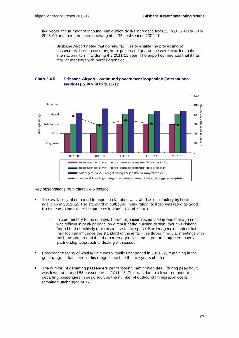
Airport Monitoring Report 2011-12 Brisbane Airport monitoring results
197
five years, the number of inbound Immigration desks increased from 22 in 2007-08 to 30 in 2008-09 and then remained unchanged at 32 desks since 2009-10.
− Brisbane Airport noted that no new facilities to enable the processing of passengers through customs, immigration and quarantine were installed in the international terminal during the 2011-12 year. The airport commented that it has regular meetings with border agencies.
Chart 5.4.5: Brisbane Airport—outbound government i nspection (international services), 2007-08 to 2011-12
Key observations from chart 5.4.5 include:
• The availability of outbound Immigration facilities was rated as satisfactory by border agencies in 2011-12. The standard of outbound Immigration facilities was rated as good. Both these ratings were the same as in 2009-10 and 2010-11.
− In commentary to the surveys, border agencies recognised queue management was difficult in peak periods, as a result of the building design, though Brisbane Airport had effectively maximised use of the space. Border agencies noted that they too can influence the standard of these facilities through regular meetings with Brisbane Airport and that the border agencies and airport management have a ‘partnership’ approach to dealing with issues.
• Passengers’ rating of waiting time was virtually unchanged in 2011-12, remaining in the good range. It has been in this range in each of the five years charted.
• The number of departing passengers per outbound Immigration desk (during peak hour) was lower at around 58 passengers in 2011-12. This was due to a lower number of departing passengers in peak hour, as the number of outbound Immigration desks remained unchanged at 17.
0
20
40
60
80
100
120
0
1
2
3
4
5
6
2007–08 2008–09 2009–10 2010–11 2011–12
Num
ber
of p
asse
ng
ers
per
des
k
Ave
rag
e ra
ting
Border agencies survey— rating of outbound Immigration facilities availability
Border agencies survey— rating of outbound Immigration facilities standard
Passenger surveys— rating of waiting time in outbound Immigration area
Number of departing passengers per outbound Immigration desk (during peak hour) (RHS)
Excellent
Good
Poor
Very poor
Satisfactory
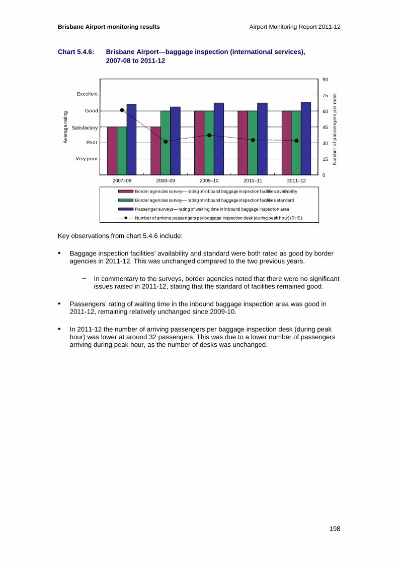
Brisbane Airport monitoring results Airport Monitoring Report 2011-12
198
Chart 5.4.6: Brisbane Airport—baggage inspection (i nternational services), 2007-08 to 2011-12
Key observations from chart 5.4.6 include:
• Baggage inspection facilities’ availability and standard were both rated as good by border agencies in 2011-12. This was unchanged compared to the two previous years.
− In commentary to the surveys, border agencies noted that there were no significant issues raised in 2011-12, stating that the standard of facilities remained good.
• Passengers’ rating of waiting time in the inbound baggage inspection area was good in 2011-12, remaining relatively unchanged since 2009-10.
• In 2011-12 the number of arriving passengers per baggage inspection desk (during peak hour) was lower at around 32 passengers. This was due to a lower number of passengers arriving during peak hour, as the number of desks was unchanged.
0
15
30
45
60
75
90
0
1
2
3
4
5
6
2007–08 2008–09 2009–10 2010–11 2011–12
Num
ber
of p
asse
ng
ers
per
des
k
Ave
rag
e ra
ting
Border agencies survey— rating of inbound baggage inspection facilities availability
Border agencies survey— rating of inbound baggage inspection facilities standard
Passenger surveys— rating of waiting time in inbound baggage inspection area
Number of arriving passengers per baggage inspection desk (during peak hour) (RHS)
Excellent
Good
Poor
Very poor
Satisfactory

Airport Monitoring Report 2011-12 Brisbane Airport monitoring results
199
Chart 5.4.7: Brisbane Airport—gate lounges (interna tional services), 2007-08 to 2011-12
Key observations from chart 5.4.7 include:
• In 2011-12 passengers continued to rate the quality and availability of seating in the international terminal gate lounges as good. Passengers also continued to rate crowding in lounge areas as good.
• The number of departing passengers (during peak hour) per seat in gate lounges was slightly lower in 2011-12. There was also a slightly lower number of departing passengers per square metre of lounge area during peak hour. These changes were due to a lower number of passengers in peak hour, as there was no change in either the number of seats or amount of space in lounge areas.
• Brisbane Airport stated it upgraded and improved seating facilities on levels 3 and 4 in 2011-12. During 2007-08 the number of seats was increased, from 1522 to 1972, and the lounge area was expanded from 8600 square metres to 18 120 square metres. Following these improvements, in 2008-09 passengers’ ratings of quality and availability of seating, and crowding, improved from satisfactory to good. They remained in that range over subsequent years.
0.08 0.06 0.06 0.06 0.05
0.0
0.2
0.4
0.6
0.8
1.0
1.2
0
1
2
3
4
5
6
2007–08 2008–09 2009–10 2010–11 2011–12
Ave
rag
e ra
ting
Passenger surveys— rating of quality and availability of seating in lounge area
Passenger surveys— rating of crowding in lounge area
Number of departing passengers per seat in gate lounges (during peak hour) (RHS)
Number of departing passengers per square metre of lounge area (during peak hour) (RHS)
Excellent
Good
Poor
Very poor
Satisfactory
Num
ber
of p
asse
ng
ers
per
sea
t / p
er s
qua
re m
etre
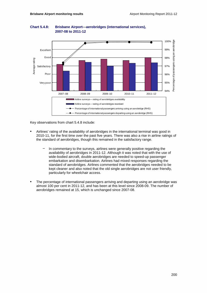
Brisbane Airport monitoring results Airport Monitoring Report 2011-12
200
Chart 5.4.8: Brisbane Airport—aerobridges (internat ional services), 2007-08 to 2011-12
Key observations from chart 5.4.8 include:
• Airlines’ rating of the availability of aerobridges in the international terminal was good in 2010-11, for the first time over the past five years. There was also a rise in airline ratings of the standard of aerobridges, though this remained in the satisfactory range.
− In commentary to the surveys, airlines were generally positive regarding the availability of aerobridges in 2011-12. Although it was noted that with the use of wide-bodied aircraft, double aerobridges are needed to speed-up passenger embarkation and disembarkation. Airlines had mixed responses regarding the standard of aerobridges. Airlines commented that the aerobridges needed to be kept cleaner and also noted that the old single aerobridges are not user friendly, particularly for wheelchair access.
• The percentage of international passengers arriving and departing using an aerobridge was almost 100 per cent in 2011-12, and has been at this level since 2008-09. The number of aerobridges remained at 15, which is unchanged since 2007-08.
94%
95%
96%
97%
98%
99%
100%
0
1
2
3
4
5
6
2007–08 2008–09 2009–10 2010–11 2011–12
Per
cen
tag
e of
pas
seng
ers
usin
g an
aer
obrid
ge
Ave
rag
e ra
ting
Airline surveys— rating of aerobridges availability
Airline surveys— rating of aerobridges standard
Percentage of international passengers arriving using an aerobridge (RHS)
Percentage of international passengers departing using an aerobridge (RHS)
Excellent
Good
Poor
Very poor
Satisfactory

Airport Monitoring Report 2011-12 Brisbane Airport monitoring results
201
Chart 5.4.9: Brisbane Airport—security (internation al services), 2007-08 to 2011-12
Key observations from chart 5.4.9 include:
• Passengers’ rating of the quality of the international terminal security search process remained good in 2011-12, consistent with the previous four years.
• The number of departing passengers per security clearance system (during peak hour) was slightly lower in 2011-12, from about 57 in 2010-11 to 55 passengers. This was a result of a lower number of departing passengers during peak hour, as the number of security clearance systems was unchanged at 18. This number has been relatively stable since the major fall observed in 2008-09.
Chart 5.4.10: Brisbane Airport—baggage processing ( international services), 2007-08 to 2011-12
0
30
60
90
120
150
180
0
1
2
3
4
5
6
2007–08 2008–09 2009–10 2010–11 2011–12
Ave
rag
e ra
ting
Passenger surveys— rating of quality of security search process
Number of departing passengers per security clearance system (during peak hour) (RHS)
Excellent
Good
Poor
Very poor
Satisfactory
Num
ber
of p
asse
ng
ers
per
sea
t / p
er s
qua
re m
etre
200
300
400
500
600
700
800
0
1
2
3
4
5
6
2007–08 2008–09 2009–10 2010–11 2011–12
Num
ber o
f bag
s p
er h
our
Ave
rag
e ra
ting
Airline surveys— rating of baggage processing facilities availability
Airline surveys— rating of baggage processing facilities standard
Passenger surveys— rating of waiting time for inbound baggage reclaim
Passenger surveys— rating of circulation space for inbound baggage reclaim
Average throughput of inbound baggage system (per hour) (RHS)
Average throughput of outbound baggage system (per hour) (RHS)
Excellent
Good
Poor
Very poor
Satisfactory

Brisbane Airport monitoring results Airport Monitoring Report 2011-12
202
Key observations from chart 5.4.10 include:
• Airlines’ rating of the availability of baggage processing facilities in the international terminal remained in the satisfactory range in 2011-12. The standard of the facilities was also rated as satisfactory by airlines. Both these ratings were also in the satisfactory range over the previous four years.
− In commentary to the surveys, airlines noted that issues raised in last year’s survey had been rectified. This included measures to enable any items to be sent down the oversize belts. That said, airlines noted problems with lack of space in the baggage processing area, and significant delays due to lack of bag belt availability.
• Passengers’ rating of waiting time for international inbound baggage reclaim decreased within the good range in 2011-12. Waiting time has been rated as good since 2008-09.
• Passengers’ rating of circulation space for inbound baggage reclaim slightly decreased within the good range. Circulation has been rated in the good range in each of the five years since 2007-08.
• In 2011-12 the average hourly throughput of both the inbound (367 bags per hour) and the outbound (353 bags per hour) international baggage systems rose to be at or close to the highest level over the five years since 2007-08. This was a result of a significant increase in both inbound and outbound luggage. There was a significant decrease in the number of unplanned interruptions to both the inbound and outbound baggage processing facilities in 2011-12, though the number of hours of these interruptions increased.
• Brisbane Airport noted that no new baggage processing facilities were installed in 2011-12.
Chart 5.4.11: Brisbane Airport—baggage trolleys (in ternational services), 2007-08 to 2011-12
0
1
2
3
4
5
6
0
1
2
3
4
5
6
2007–08 2008–09 2009–10 2010–11 2011–12
Num
ber o
f pas
seng
ers
per
bag
gage
trol
ley
Ave
rag
e ra
ting
Passenger surveys— rating of findability of baggage trolleys
Number of passengers per baggage trolley (during peak hour) (RHS)
Excellent
Good
Poor
Very poor
Satisfactory

Airport Monitoring Report 2011-12 Brisbane Airport monitoring results
203
Key observations from chart 5.4.11 include:
• Passengers rated the findability of baggage trolleys in the international terminal as good in 2011-12, the same rating as in the previous four years.
• The number of passengers per baggage trolley was about 1.1 in 2011-12, very similar to the previous three years. The number of baggage trolleys has been largely unchanged at around 2000 over the five years charted; the decrease in 2007-08 was due to a lower number of passengers.
Chart 5.4.12: Brisbane Airport—flight information d isplay screens (international services), 2007-08 to 2011-12
Key observations from chart 5.4.12 include:
• Passengers’ rating of flight information display screens increased within the good range in 2011-12. Passengers’ rating of signage and wayfinding was also good in 2011-12. Both these ratings have consistently been in the good range since 2008-09.
• The number of passengers per flight information display screen (during peak hour) was lower at 5.8 passengers in 2011-12, the lowest over the five years since 2007-08. This was a result of an increase in the number of flight information display screens from 350 to 381 in 2011-12, as well as a slightly lower number of passengers during peak hour.
• Brisbane Airport noted that the increase in the number of screens was partly due to the inclusion of 15 existing screens which were previously excluded from its survey responses, as well as installation of 16 new screens throughout the international terminal.
• The number of passengers per flight information point (during peak hour) was lower with around 202 passengers in 2011-12 compared to 207 passengers in 2010-11. As the
13.476.53 7.35 6.51 5.83
0
60
120
180
240
300
360
0
1
2
3
4
5
6
2007–08 2008–09 2009–10 2010–11 2011–12
Ave
rag
e ra
ting
Passenger surveys— rating of flight information display screens
Passenger surveys— rating of signage and wayfinding
Number of passengers per flight information display screen (during peak hour) (RHS)
Number of passengers per information point (during peak hour) (RHS)
Excellent
Good
Poor
Very poor
Satisfactory
Num
ber o
f pas
seng
ers
per
flig
ht in
form
atio
n sc
reen
/ p
er fl
ight
info
rmat
ion
poin
t

Brisbane Airport monitoring results Airport Monitoring Report 2011-12
204
number of information points was unchanged at 11, the change was due to a lower number of peak hour passenger numbers.
• Brisbane Airport advised the information points were: a visitor information desk, a directory board and nine interactive kiosks.
Chart 5.4.13: Brisbane Airport—washrooms (internati onal services), 2007-08 to 2011-12
The key observation from chart 5.4.13 is:
• The standard of washrooms in the international terminal was rated as good by passengers in 2011-12, a slight increase. Ratings have been in the good range in every year since 2008-09, compared with satisfactory in 2007-08.
0
1
2
3
4
5
6
2007–08 2008–09 2009–10 2010–11 2011–12
Ave
rag
e ra
ting
Passenger surveys— rating of standard of washrooms
Excellent
Good
Poor
Very poor
Satisfactory

Airport Monitoring Report 2011-12 Brisbane Airport monitoring results
205
5.4.3 Domestic services
Chart 5.4.14: Brisbane Airport—check-in (domestic s ervices), 2007-08 to 2011-12
Key observations from chart 5.4.14 include:
• Passenger rating of check-in waiting time in the domestic terminal was good in 2011-12, as it has been each year since 2007-08.
• The number of departing passengers per check-in desk (during peak hour) was around 41, slightly higher compared to 2010-11. The relatively significant increase that occurred in 2010-11 compared with 2009-10 was due to a higher number of passengers during peak hour. The number of check-in desks was unchanged at 16 over the five-year period since 2007-08.
• Brisbane Airport noted that it is trialling common-user bag drop facilities in the domestic terminal (excluding the DTL areas). If successful, it plans to install more of these bag drop facilities, along with additional check-in kiosks, to increase capacity.
0
10
20
30
40
50
60
0
1
2
3
4
5
6
2007–08 2008–09 2009–10 2010–11 2011–12
Num
ber
of p
asse
ng
ers
per
des
k
Ave
rag
e ra
ting
Passenger surveys— rating of check-in waiting time
Number of departing passengers per check-in desk (during peak hour) (RHS)
Excellent
Good
Poor
Very poor
Satisfactory

Brisbane Airport monitoring results Airport Monitoring Report 2011-12
206
Chart 5.4.15: Brisbane Airport—gate lounges (domest ic services), 2007-08 to 2011-12
Key observations from chart 5.4.15 include:
• Passengers’ rating of quality and availability of seating in domestic terminal lounge areas was good in 2011-12, though it has fallen within the good range in each of the last two years. Crowding of lounge areas was rated good in 2011-12, though declined after having recorded a rise within the good rating in each of the previous three years. Both these measures have had good ratings in each of the five years since 2007-08.
• The number of departing passengers (during peak hour) per seat has been largely unchanged since 2007-08. The number of seats increased in 2007-08 (from 427 to 577), then again in 2010-11 (from 577 to 850). In 2010-11 there was also a higher average number of departing passengers during peak hour, from 443 to 664.
• The number of departing passengers per square metre (during peak hour) has also been steady. Lounge area in the domestic terminal increased in 2010-11, from 3522 square metres to 4560 square metres, coinciding with the higher peak departing passenger numbers.
• Brisbane Airport noted that it increased the number of gate lounges in the domestic terminal from four to nine in early 2011.
0.0
0.3
0.6
0.9
1.2
1.5
1.8
0
1
2
3
4
5
6
2007–08 2008–09 2009–10 2010–11 2011–12
Ave
rag
e ra
ting
Passenger surveys— rating of quality and availability of seating in lounge area
Passenger surveys— rating of crowding in lounge area
Number of departing passengers per seat in gate lounges (during peak hour) (RHS)
Number of departing passengers per square metre of lounge area (during peak hour) (RHS)
Excellent
Good
Poor
Very poor
Satisfactory
Num
ber
of p
asse
ng
ers
per
sea
t / p
er s
qua
re m
etre

Airport Monitoring Report 2011-12 Brisbane Airport monitoring results
207
Chart 5.4.16: Brisbane Airport—aerobridges (domesti c services), 2007-08 to 2011-12
Key observations from chart 5.4.16 include:
• After having been higher for two consecutive years, the number of arriving passengers per aerobridge (during peak hour) was lower in 2011-12 at 318 passengers. The number of departing passengers per aerobridge was higher in 2011-12, at 329 passengers. Over the five years since 2007-08 the number of aerobridges remained constant at two.
• Brisbane Airport has noted that in 2011-12 there was a shift from two to three daily peak periods. This has resulted in a slight reduction in the average number of passengers during the peak hour.
• Brisbane Airport also noted that in 2010-11 there was high usage of aerobridges as the satellite terminal and bays, which lack aerobridges, were being expanded. They were in use in 2011-12 with additional gates, hence the drop in the number of passengers using aerobridges from 901 818 to 645 413.
0
60
120
180
240
300
360
2007–08 2008–09 2009–10 2010–11 2011–12
Num
ber
of p
asse
ng
ers
per
aer
obr
idg
e
Number of arriving passengers per aerobridge (during peak hour)
Number of departing passengers per aerobridge (during peak hour)
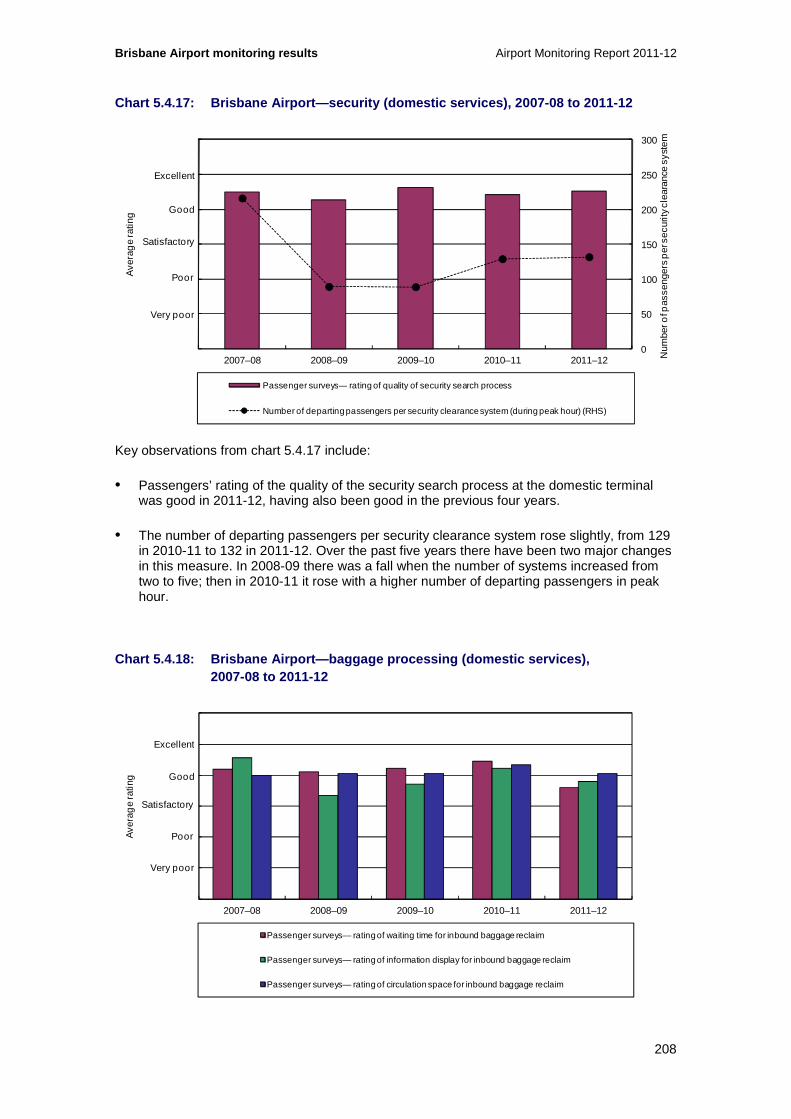
Brisbane Airport monitoring results Airport Monitoring Report 2011-12
208
Chart 5.4.17: Brisbane Airport—security (domestic s ervices), 2007-08 to 2011-12
Key observations from chart 5.4.17 include:
• Passengers’ rating of the quality of the security search process at the domestic terminal was good in 2011-12, having also been good in the previous four years.
• The number of departing passengers per security clearance system rose slightly, from 129 in 2010-11 to 132 in 2011-12. Over the past five years there have been two major changes in this measure. In 2008-09 there was a fall when the number of systems increased from two to five; then in 2010-11 it rose with a higher number of departing passengers in peak hour.
Chart 5.4.18: Brisbane Airport—baggage processing ( domestic services), 2007-08 to 2011-12
0
50
100
150
200
250
300
0
1
2
3
4
5
6
2007–08 2008–09 2009–10 2010–11 2011–12 Num
ber o
f pas
seng
ers
per
sec
urity
cle
aran
ce s
yste
m
Ave
rag
e ra
ting
Passenger surveys— rating of quality of security search process
Number of departing passengers per security clearance system (during peak hour) (RHS)
Excellent
Good
Poor
Very poor
Satisfactory
0
1
2
3
4
5
6
2007–08 2008–09 2009–10 2010–11 2011–12
Ave
rag
e ra
ting
Passenger surveys— rating of waiting time for inbound baggage reclaim
Passenger surveys— rating of information display for inbound baggage reclaim
Passenger surveys— rating of circulation space for inbound baggage reclaim
Excellent
Good
Poor
Very poor
Satisfactory
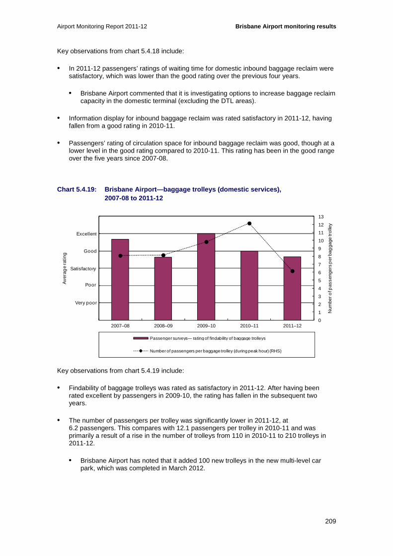
Airport Monitoring Report 2011-12 Brisbane Airport monitoring results
209
Key observations from chart 5.4.18 include:
• In 2011-12 passengers’ ratings of waiting time for domestic inbound baggage reclaim were satisfactory, which was lower than the good rating over the previous four years.
• Brisbane Airport commented that it is investigating options to increase baggage reclaim capacity in the domestic terminal (excluding the DTL areas).
• Information display for inbound baggage reclaim was rated satisfactory in 2011-12, having fallen from a good rating in 2010-11.
• Passengers’ rating of circulation space for inbound baggage reclaim was good, though at a lower level in the good rating compared to 2010-11. This rating has been in the good range over the five years since 2007-08.
Chart 5.4.19: Brisbane Airport—baggage trolleys (do mestic services), 2007-08 to 2011-12
Key observations from chart 5.4.19 include:
• Findability of baggage trolleys was rated as satisfactory in 2011-12. After having been rated excellent by passengers in 2009-10, the rating has fallen in the subsequent two years.
• The number of passengers per trolley was significantly lower in 2011-12, at 6.2 passengers. This compares with 12.1 passengers per trolley in 2010-11 and was primarily a result of a rise in the number of trolleys from 110 in 2010-11 to 210 trolleys in 2011-12.
• Brisbane Airport has noted that it added 100 new trolleys in the new multi-level car park, which was completed in March 2012.
0
1
2
3
4
5
6
7
8
9
10
11
12
13
0
1
2
3
4
5
6
2007–08 2008–09 2009–10 2010–11 2011–12N
umbe
r of p
asse
nger
s p
er b
agga
ge tr
olle
y
Ave
rag
e ra
ting
Passenger surveys— rating of findability of baggage trolleys
Number of passengers per baggage trolley (during peak hour) (RHS)
Excellent
Good
Poor
Very poor
Satisfactory

Brisbane Airport monitoring results Airport Monitoring Report 2011-12
210
Chart 5.4.20: Brisbane Airport—flight information d isplay screens (domestic services), 2007-08 to 2011-12
Key observations from chart 5.4.20 include:
• Passengers’ rating of domestic terminal flight information display screens was good in 2011-12. Signage and wayfinding were also rated good. Both these measures fell to their lowest rating of the past five years.
• In 2011-12 the number of passengers per information display screen (during peak hour) almost halved, at around 12 passengers compared to 23 in 2010-11. This was largely due to an almost doubling of flight information screens, from 57 in 2010-11 to 106 in 2011-12.
• Brisbane Airport noted that 20 new flight information display screens were installed in the multi-level car park, and 12 in the new undercover elevated walkway (Skywalk). Additional screens were also added in the domestic terminal.
• The number of passengers per information point (during peak hour) was lower in 2011-12, after having been higher in each of the previous four years. This was a result of a lower number of passengers during peak hour. Since 2008-09 the domestic terminal has had one information point, a visitor information desk.
18.91 19.06 22.96 23.42 12.20
148
896
1079
1335 1293
0
250
500
750
1000
1250
1500
0
1
2
3
4
5
6
2007–08 2008–09 2009–10 2010–11 2011–12
Ave
rag
e ra
ting
Passenger surveys— rating of flight information display screens
Passenger surveys— rating of signage and wayfinding
Number of passengers per flight information display screen (during peak hour) (RHS)
Number of passengers per information point (during peak hour) (RHS)
Excellent
Good
Poor
Very poor
Satisfactory
Num
ber o
f pas
seng
ers
per
flig
ht in
form
atio
n sc
reen
/ p
er fl
ight
info
rmat
ion
poin
t

Airport Monitoring Report 2011-12 Brisbane Airport monitoring results
211
Chart 5.4.21: Brisbane Airport—washrooms (domestic services), 2007-08 to 2011-12
The key observation from chart 5.4.21 is:
• In 2011-12 passenger rating of the standard of washrooms in the domestic terminal rose to be in the good range, after having been rated as satisfactory in the previous four years.
• Brisbane Airport has noted that it upgraded the washrooms on level 2 of the domestic terminal in 2011-12.
5.4.4 Other airport services
Chart 5.4.22: Brisbane Airport—availability of airs ide services and facilities (other airport services), 2007-08 to 2011-12
0
1
2
3
4
5
6
2007–08 2008–09 2009–10 2010–11 2011–12
Ave
rag
e ra
ting
Passenger surveys— rating of standard of washrooms
Excellent
Good
Poor
Very poor
Satisfactory
0
1
2
3
4
5
6
2007–08 2008–09 2009–10 2010–11 2011–12
Ave
rag
e ra
ting
Rating of runway Rating of taxiways
Rating of aprons Rating of aircraft parking facilities and bays
Rating of ground handling services and facilities
Excellent
Good
Poor
Very poor
Satisfactory

Brisbane Airport monitoring results Airport Monitoring Report 2011-12
212
Key observations from chart 5.4.22 include:
• Airlines’ rating of runway availability was poor in 2011-12, a significant decline from good in 2010-11.
− In commentary to the surveys, the airlines referred to significant delays during peak periods, problems with ATC holding patterns and runway works limiting evening capacity of the airport. Some airlines recognised that Brisbane Airport is taking measures to address the issue. Other comments included that the airport is adopting a slot management system
− Brisbane Airport has noted that it has completed the detailed design for the first construction phase for a new parallel runway and has commenced civil works. The new runway was approved by the state and Australian governments in 2007. Brisbane Airport expects the new runway to be commissioned in 2020.
• Airlines’ rating of the availability of taxiways was satisfactory in 2011-12, having fallen from a good rating in 2010-11.
− In commentary the airlines generally had no issues regarding availability of taxiways.
• Airlines’ rating of the availability of aprons in 2011-12 was good.
− Comments by the airlines were generally good, though one issue was that apron construction was not always fast enough to meet airline requirements.
− Brisbane Airport noted it has commenced expansion of the domestic apron.
• Airlines’ rating of the availability of aircraft parking facilities and bays was satisfactory, though fell from a good rating in the previous year.
− In commentary to the airline surveys, some airlines commented on the growing demand for aircraft parking bays, and the need for Brisbane Airport to respond. For one airline, bays for wide-bodied aircraft were the priority.
− Brisbane Airport has noted that in early 2011 two additional aircraft parking bays were completed in the domestic terminal. Brisbane Airport is in the final stages of constructing additional bays in the international northern apron, which could accommodate two wide-bodied aircraft, and also in the domestic northern apron. In the domestic southern apron Brisbane Airport expects to complete additional bays for commissioning in 2014.
• Airline rating of the availability of ground handling services and facilities was good in 2011-12 and in the previous three years.

Airport Monitoring Report 2011-12 Brisbane Airport monitoring results
213
Chart 5.4.23: Brisbane Airport—standard of airside services and facilities (other airport services), 2007-08 to 2011-12
Key observations from chart 5.4.23 include:
• Airlines’ rating of runway standard was satisfactory in 2011-12, a decrease from good in 2010-11.
− In commentary to the surveys, airlines noted that there were constant maintenance and upgrades being made with further planned improvements.
• Airlines’ rating of the standard of taxiways was satisfactory in 2011-12, having decreased from a rating of good in 2010-11.
− In commentary to the surveys, airlines noted that the planned runway overlay project was to commence in 2013.
• Airlines’ rating of the standard of aprons in 2011-12 was satisfactory.
− Comments by the airlines were generally positive, though some noted the need to re-paint lines and safety barriers. Nevertheless, airlines also noted that the airport was in the process of updating line markings and that this was being done in an efficient manner.
• Airlines’ rating for the standard of aircraft parking facilities and bays was satisfactory; though decreased from a rating of good in the previous year.
− In commentary to the surveys, the airlines generally had no issues regarding the standard of aircraft parking facilities and bays.
• Airlines’ rating of the standard of ground handling services and facilities was satisfactory in 2011-12, having been good in 2010-11.
− In commentary the airlines generally had no issues regarding the standard of ground handling services and facilities.
0
1
2
3
4
5
6
2007–08 2008–09 2009–10 2010–11 2011–12
Ave
rag
e ra
ting
Rating of runway Rating of taxiways
Rating of aprons Rating of aircraft parking facilities and bays
Rating of ground handling services and facilities
Excellent
Good
Poor
Very poor
Satisfactory

Brisbane Airport monitoring results Airport Monitoring Report 2011-12
214
Chart 5.4.24: Brisbane Airport—runway traffic (othe r airport services) 135
Chart 5.4.25: Brisbane Airport—runway traffic conti nued (other airport services)
Notes: Airservices Australia’s measures were devised as a guide to its own performance in handling traffic, though can also provide some indication of airport constraints including runway infrastructure or management. In particular, if demand is consistently close to operationally agreed capacity for the peak hour, it suggests that there is little spare capacity for increased traffic at that time. The measures relate to the busiest peak hour at the airport, averaged across all days in the month specified. The measures and their interpretation are explained in the appendices to this report.
Key observations from charts 5.4.24 and 5.4.25 include:
• Over the period June 2011 to March 2012 the average monthly number of arrivals in the morning peak was 43 per hour, compared with 44 per hour in 2010-11. The lowest average
135 Data for charts 5.4.24 and 5.4.25 are presented for the period June 2011 to March 2012 only due to data unavailability.
0
10
20
30
40
50
60
Demand Actual Arrivals Agreed Rate Peak demand (within the hour)
Min
utes
Jun 2011 Jul 2011 Aug 2011 Sep 2011 Oct 2011
Nov 2011 Dec 2011 Jan 2012 Feb 2012 Mar 2012
0
5
10
15
20
25
30
35
Max pro rata rate (within the hour) Average max system delay Average system delay
Min
utes
Jun 2011 Jul 2011 Aug 2011 Sep 2011 Oct 2011
Nov 2011 Dec 2011 Jan 2012 Feb 2012 Mar 2012

Airport Monitoring Report 2011-12 Brisbane Airport monitoring results
215
number of arrivals was in March 2012, with 33 per hour, while the highest was in August 2012 with 49 per hour.
• In comments accompanying the data, Airservices Australia advised the volume of traffic increased considerably at Brisbane Airport; and that the mix of traffic is different to other major airports.
• The average monthly maximum system delay averaged 13 minutes over the period, up from a monthly average of 12 minutes in 2010-11.
• Airservices Australia noted that during the reporting period there have been runway availability issues and periods of unfavourable weather. Delays can be attributed to the high loads in the peak periods and the traffic mix.
• Airservices Australia has advised that it changed the system used to collect and report statistics, with the new system commissioned in March 2012. Airservices Australia noted that the transition to the new system may have impacted the data for March 2012.
Chart 5.4.26: Brisbane Airport—airport management r esponsiveness (other airport services), 2007-08 to 2011-12
Key observations from chart 5.4.26 include:
• There was a slight fall in the airline rating of the airport’s overall responsiveness to addressing quality of service concerns, which remained in the satisfactory range.
• There was a marked rise within the good range in border agencies’ rating of airport management approach to concerns in 2011-12, to be midway between good and excellent.
− In commentary to the airline survey, most airlines noted that Brisbane Airport provides ready access to management and are responsive when issues are raised. While one airline noted an improvement over the year, another noted consultation could be improved regarding works that affect airlines and passengers.
0
1
2
3
4
5
6
2007–08 2008–09 2009–10 2010–11 2011–12
Ave
rag
e ra
ting
Airline surveys— rating of overall system for addressing quality of service concerns
Border agencies survey— rating of management approach to concerns
Excellent
Good
Poor
Very poor
Satisfactory

Brisbane Airport monitoring results Airport Monitoring Report 2011-12
216
− In commentary to the border agencies survey, it was noted that Brisbane Airport provides ready access to management and are responsive when issues are raised.
• Brisbane Airport noted its managers participate in a number of committees with airlines, border agencies and other stakeholders where it tries to ensure issues regarding quality of service are addressed. Additionally Brisbane Airport have advised that it conducts an annual customer service survey where tenants including airlines, border agencies and other stakeholders, can provide feedback on a range of topics including facilities and services.
Chart 5.4.27: Brisbane Airport—international termin al kerbside (other airport services), 2007-08 to 2011-12
Key observations from chart 5.4.27 include:
• Passenger rating of kerbside pick-up and drop-off facilities at the international terminal returned to good in 2011-12, after recording a satisfactory rating in the previous year.
• Passenger rating of taxi facilities waiting time increased in 2011-12, and retained the good rating of the previous four years.
• Rating of kerbside space congestion by passengers fell in 2011-12, remaining in the satisfactory range.
0
1
2
3
4
5
6
2007–08 2008–09 2009–10 2010–11 2011–12
Ave
rag
e ra
ting
Passenger surveys— rating of kerbside pick-up and drop-off facilities
Passenger surveys— rating of taxi facilities waiting time
Passenger surveys— rating of kerbside space congestion
Excellent
Good
Poor
Very poor
Satisfactory

Airport Monitoring Report 2011-12 Brisbane Airport monitoring results
217
Chart 5.4.28: Brisbane Airport—domestic terminal ke rbside (other airport services), 2007-08 to 2011-12
Key observations from chart 5.4.28 include:
• Passenger rating of domestic terminal taxi facilities declined in 2011-12, moving from good to satisfactory. Passenger rating of both kerbside pick-up and drop-off facilities, and kerbside space congestion fell slightly and remained in the satisfactory range. This continues the steady downward trend evident since 2008-09 when all these measures were in the good range.
• Brisbane Airport noted that in March 2012 it completed an undercover elevated walkway (Skywalk) connecting the domestic car parks and train with the domestic terminal. By going over the road, the walkway separates pedestrians and cars, providing a quicker and safer access to the terminal and improving traffic flow. New roads are being constructed to improve drop-off and pick-up. A free passenger pick-up area with a walkway to Skywalk and to the terminal will also be constructed. Completion was expected by September 2012. Brisbane Airport commented that disruption due to this construction would have had an impact on passenger satisfaction ratings.
0
1
2
3
4
5
6
2007–08 2008–09 2009–10 2010–11 2011–12
Ave
rag
e ra
ting
Passenger surveys— rating of kerbside pick-up and drop-off facilities
Passenger surveys— rating of taxi facilities waiting time
Passenger surveys— rating of kerbside space congestion
Excellent
Good
Poor
Very poor
Satisfactory

Brisbane Airport monitoring results Airport Monitoring Report 2011-12
218
5.5 Car parking services monitoring results
In this section, the monitoring results for car parking at Brisbane Airport are presented. This includes prices (section 5.5.1), revenues, costs and profits (section 5.5.2) and quality of car parking (section 5.5.3). Section 5.5.4 provides details on the various other transport options that are available for travelling to and from the airport.
5.5.1 Prices 136
Chart 5.5.1: Brisbane Airport—prices for short-term parking at international car parking facility, 2001-02 to 2011-12
Key observations from chart 5.5.1 include:
• Brisbane Airport did not increase any of its short-term car parking prices at its international car parking facility in 2011-12.
• Over the 11 years since 2001-02, the price for one hour short-term car parking increased by 116.7 per cent (from $6.00 to $13.00), two hours increased by 100.0 per cent (from $8.00 to 16.00) and three hours by 120.0 per cent (from $10.00 to $22.00).
• The price for four hours increased by 108.3 per cent (from $12.00 in 2001-02 to $25.00 in 2011-12), five hours by 114.3 per cent (from $14.00 to $30.00) and 24 hours by 66.7 per cent (from $18.00 to $30.00).
136 The prices presented are Brisbane Airport’s drive-up rates. Discounted rates are available online.
0
5
10
15
20
25
30
35
2001
–02
2002
–03
2003
–04
2004
–05
2005
–06
2006
–07
2007
–08
2008
–09
2009
–10
2010
–11
2011
–12
Do
llars
Short-term international car park—1 hour Short-term international car park—2 hours
Short-term international car park—3 hours Short-term international car park—4 hours
Short-term international car park—5 hours Short-term international car park—24 hours

Airport Monitoring Report 2011-12 Brisbane Airport monitoring results
219
Chart 5.5.2: Brisbane Airport— prices for short-ter m parking at domestic car parking facility, 2001-02 to 2011-12
Key observations from chart 5.5.2 include:
• Brisbane Airport increased most of its prices for short-term car parking at its domestic terminal in 2011-12. The prices for three hours ($22.00) and four hours ($25.00) were unchanged. The price for one hour increased by 7.7 per cent (to $14.00), for two hours by 6.3 per cent (to $17.00), for both five and 24 hours, prices rose by 25 per cent (to $50.00).
• Since 2001-02, the price for one hour increased by 133.3 per cent, for two hours by 112.5 per cent, three hours by 120.0 per cent and four hours by just over 108.3 per cent. For five hours the price increased by 257.1 per cent, while for 24 hours the rise was 177.8 per cent.
0
5
10
15
20
25
30
35
40
45
50
55
2001
–02
2002
–03
2003
–04
2004
–05
2005
–06
2006
–07
2007
–08
2008
–09
2009
–10
2010
–11
2011
–12
Do
llars
Short-term domestic car park—1 hour Short-term domestic car park—2 hours
Short-term domestic car park—3 hours Short-term domestic car park—4 hours
Short-term domestic car park—5 hours Short-term domestic car park—24 hours
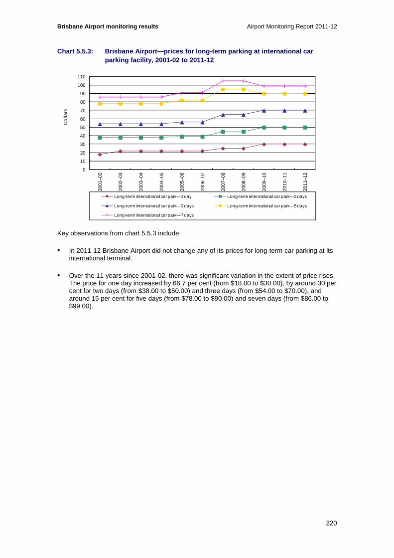
Brisbane Airport monitoring results Airport Monitoring Report 2011-12
220
Chart 5.5.3: Brisbane Airport—prices for long-term parking at international car parking facility, 2001-02 to 2011-12
Key observations from chart 5.5.3 include:
• In 2011-12 Brisbane Airport did not change any of its prices for long-term car parking at its international terminal.
• Over the 11 years since 2001-02, there was significant variation in the extent of price rises. The price for one day increased by 66.7 per cent (from $18.00 to $30.00), by around 30 per cent for two days (from $38.00 to $50.00) and three days (from $54.00 to $70.00), and around 15 per cent for five days (from $78.00 to $90.00) and seven days (from $86.00 to $99.00).
0
10
20
30
40
50
60
70
80
90
100
110
2001
–02
2002
–03
2003
–04
2004
–05
2005
–06
2006
–07
2007
–08
2008
–09
2009
–10
2010
–11
2011
–12
Do
llars
Long-term international car park—1 day Long-term international car park—2 days
Long-term international car park—3 days Long-term international car park—5 days
Long-term international car park—7 days

Airport Monitoring Report 2011-12 Brisbane Airport monitoring results
221
Chart 5.5.4: Brisbane Airport— prices for long-term parking at domestic car parking facility, 2001-02 to 2011-12
Key observations from chart 5.5.4 include:
• In 2011-12 Brisbane Airport did not change any of its prices for long-term car parking at its domestic terminal.
• Since 2001-02, all prices have increased. The most significant increase was for one day, which rose by 81.8 per cent (from $22.00 to $40.00). There were around 55 per cent increases for both two days (from $38.00 to $60.00) and for five days (from $78.00 to $120.00), while the price for three days rose by 48.1 per cent (from $54.00 to $80.00) and for seven days by 62.8 per cent (from $86.00 to $140.00).
5.5.2 Revenues, costs and profits
Table 5.5.1 outlines Brisbane Airport’s revenues, operating expenses and operating margins for car parking and the total airport from 2001-02 to 2011-12.
0
20
40
60
80
100
120
140
160
2001
–02
2002
–03
2003
–04
2004
–05
2005
–06
2006
–07
2007
–08
2008
–09
2009
–10
2010
–11
2011
–12
Do
llars
Long-term domestic car park—1 day Long-term domestic car park—2 days
Long-term domestic car park—3 days Long-term domestic car park—5 days
Long-term domestic car park—7 days
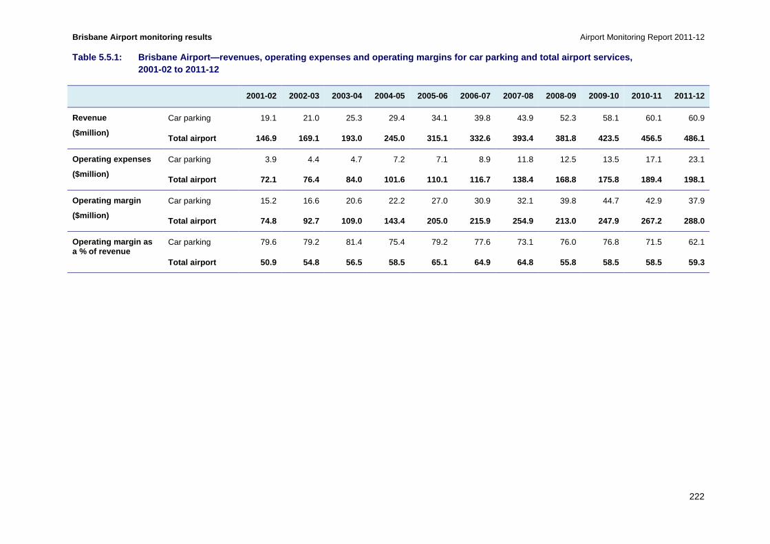
Brisbane Airport monitoring results Airport Monitoring Report 2011-12
222
Table 5.5.1: Brisbane Airport—revenues, operating e xpenses and operating margins for car parking and t otal airport services, 2001-02 to 2011-12
2001-02 2002-03 2003-04 2004-05 2005-06 2006-07 2007-08 2008-09 2009-10 2010-11 2011-12
Revenue
($million)
Car parking 19.1 21.0 25.3 29.4 34.1 39.8 43.9 52.3 58.1 60.1 60.9
Total airport 146.9 169.1 193.0 245.0 315.1 332.6 3 93.4 381.8 423.5 456.5 486.1
Operating expenses
($million)
Car parking 3.9 4.4 4.7 7.2 7.1 8.9 11.8 12.5 13.5 17.1 23.1
Total airport 72.1 76.4 84.0 101.6 110.1 116.7 138. 4 168.8 175.8 189.4 198.1
Operating margin
($million)
Car parking 15.2 16.6 20.6 22.2 27.0 30.9 32.1 39.8 44.7 42.9 37.9
Total airport 74.8 92.7 109.0 143.4 205.0 215.9 254 .9 213.0 247.9 267.2 288.0
Operating margin as a % of revenue
Car parking 79.6 79.2 81.4 75.4 79.2 77.6 73.1 76.0 76.8 71.5 62.1
Total airport 50.9 54.8 56.5 58.5 65.1 64.9 64.8 55 .8 58.5 58.5 59.3

Airport Monitoring Report 2011-12 Brisbane Airport monitoring results
223
Chart 5.5.5: Brisbane Airport—airport car parking r evenue as a proportion of total airport revenue, 2001-02 to 2011-12
Key observations from table 5.5.1 and chart 5.5.5 include:
• Car parking revenue increased by 1.4 per cent in 2011-12 to $60.9 million. As a percentage of total airport revenue, car parking revenue decreased from 13.2 per cent in 2010-11 to 12.5 per cent in 2011-12.
• Since 2001-02, car parking revenue increased by 219.5 per cent, while total airport revenue increased by 230.9 per cent. In contrast, in 2001-02 car parking revenue as a proportion of total airport revenue was 13.0 per cent. During this period Brisbane Airport has invested in three multi-level car parks.
• Operating expenses for car parking increased by 34.7 per cent in 2011-12 to $23.1 million. As a percentage of total airport operating expenses, car parking operating expenses increased from 9.0 per cent in 2010-11 to 11.7 per cent in 2011-12.
• Since 2001-02, car parking operating expenses have increased by 491.7 per cent, while total airport operating expenses have increased by 174.6 per cent. In 2001-02, car parking operating expenses as a percentage of total airport operating expenses were 5.4 per cent.
• With operating expenses increasing by significantly more than revenue, car parking operating margin decreased by 11.8 per cent in 2011-12. Car parking operating margin as a percentage of total airport operating margin was 13.1 per cent in 2011-12, down from 16.1 per cent in 2010-11.
• Over the 11 years since 2011-12, car parking operating margin increased by 149.6 per cent. Over the same period, total airport operating margin increased by 285.3 per cent. In 2001-02, car parking operating margin as a percentage of the total airport operating margin was 20.3 per cent.
0
10
20
30
40
50
60
70
80
90
100
2001
–02
2002
–03
2003
–04
2004
–05
2005
–06
2006
–07
2007
–08
2008
–09
2009
–10
2010
–11
2011
–12
Per
cen
t
Revenue—car parking Revenue—total airport

Brisbane Airport monitoring results Airport Monitoring Report 2011-12
224
Chart 5.5.6: Brisbane Airport—revenues, operating e xpenses and operating margins for car parking services on a per car park basis, 2 001-02 to 2011-12
Key observations from chart 5.5.6 include:
• In 2011-12 car parking revenue and operating margin per car parking space decreased, while operating expenses increased and the number of spaces increased significantly.
• Car parking revenue per car parking space fell in 2011-12 by 23.0 per cent to $4738. Over the 11 years since 2001-02 revenue per car parking space rose by 7.7 per cent.
• Car parking operating expenses per car parking space rose slightly, to $1794 (2.3 per cent). This represents a 99.4 per cent increase from $899.65 in 2001-02.
• Car parking operating margin per car parking space fell significantly in 2011-12 to $2944 (a fall of 33.0 per cent), while over the 11 years since 2001-02 there was a 15.9 per cent decrease.
• The key factor in the changes in 2011-12 was a 31.7 per cent increase in the number of car parking spaces, from 9767 in 2010-11 to 12 862 in 2011-12. As noted above, in 2011-12 Brisbane Airport completed construction of a multi-level car park for the domestic terminal.
5.5.3 Quality of car parking facilities
Table 5.5.2 outlines the number of car park spaces available and annual throughput of car park facilities at Brisbane Airport from 2001-02 to 2011-12.
0
1 000
2 000
3 000
4 000
5 000
6 000
7 000
8 000
9 000
10 000
11 000
12 000
13 000
0
1 000
2 000
3 000
4 000
5 000
6 000
7 000
8 000
2001
–02
2002
–03
2003
–04
2004
–05
2005
–06
2006
–07
2007
–08
2008
–09
2009
–10
2010
–11
2011
–12
Num
ber o
f car
par
k sp
aces
Do
llars
per
car
par
k
Revenue per car park space Operating expenses per car park space
Operating margin per car park space Number of car park spaces (RHS)

Airport Monitoring Report 2011-12 Brisbane Airport monitoring results
225
Table 5.5.2: Brisbane Airport—number of car park sp aces and average daily throughput, 2001-02 to 2011- 12
2001-02 2002-03 2003-04 2004-05 2005-06 2006-07 2007-08 2008-09 2009-10 2010-11 2011-12
Number of car park spaces
International combined short-term and long-term
NA 1000 950 950 950 951 1 740 1 740 1 740 1 740 1 740
Domestic short-term NA 985 938 938 938 842 858 810 976 1 133 1 690
Domestic long-term NA 2 350 1 500 3 600 4 100 4 100 4 148 4 635 4 410 4 410 6 948
Staff NA 2 971 2 277 2 349 2 723 2 723 3 575 2 730 2 484 2 484 2 484
Total 4 335 7 306 5 665 7 837 8 711 8 616 10 321 9 915 9 610 9 767 12 862
Annual throughput of car park facilities (thousands)
International combined short-term and long-term
NA 613 661 753 752 707 607 705 673 662 663
Domestic short-term 1 161 1 157 1 176 1 141 1 156 1 031 960 912 839 758
Domestic long-term NA 143 190 214 315 378 356 362 511 533 533
Total NA 1 916 2 008 2 142 2 208 2 242 1 994 2 028 2 096 2 035 1 954
Average daily throughput of car park facilities
International combined short-term and long-term
NA 1 679 1 806 2 062 2 060 1 937 1 659 1 932 1 845 1 815 1 811
Domestic short-term 3 181 3 162 3 223 3 126 3 168 2 817 2 631 2 498 2 298 2 070
Domestic long-term NA 391 519 585 864 1 036 972 993 1 399 1 462 1 457
Total 5 250 5 250 5 487 5 870 6 049 6 141 5 448 5 557 5 742 5 574 5 338

Brisbane Airport monitoring results Airport Monitoring Report 2011-12
226
Key observations from table 5.5.2 include:
• In 2011-12 there were no changes in the number of international terminal car parking spaces. At the domestic terminal the number of short-term car parking spaces increased by 49.2 per cent, and the number of long-term car parking spaces increased by 57.6 per cent. This was primarily due to the completion of the new multi-level car park.
• Since 2002-03 the number of international car parking spaces has increased from 1000 to 1740 (74.0 per cent). Over the same period the number of domestic short-term car parking spaces rose by 71.6 per cent, from 985 to 1690. The number of domestic long-term car parking spaces increased by 195.7 per cent, from 2350 to 6948 spaces.
• In 2011-12 the international terminal car parking annual throughput increased by 0.1 per cent to 662 953 cars. Throughput at the domestic terminal short-term car park was down by 9.7 per cent, while at the long-term car park it was 0.1 per cent lower than 2010-11.
• In 2011-12 average daily throughput at the international car park increased by 0.2 per cent to 1811 cars per day. Domestic terminal average daily throughput for the short-term car park fell by 9.9 per cent (to 2070 cars) and by 0.3 per cent (to 1457 cars) at the long-term car park.
• Across all airport car parks there was a 4.2 per cent fall in the daily average throughput, to 5338 cars.
Chart 5.5.7: Brisbane Airport—international passeng er survey ratings of the quality of car parking facilities 2001-02 to 2011-12
Key observations from chart 5.5.7 include:
• International passengers’ rating of Brisbane Airport’s car parking availability, standard and time taken to enter has been in, or close to, the good range over the 11 years since 2001-12.
0
1
2
3
4
5
6
2001
–02
2002
–03
2003
–04
2004
–05
2005
–06
2006
–07
2007
–08
2008
–09
2009
–10
2010
–11
2011
–12
Ave
rag
e ra
ting
Passenger surveys—airport car parking availability
Passenger surveys—airport car parking standard
Passenger surveys—airport car parking time taken to enter
Excellent
Good
Poor
Very poor
Satisfactory
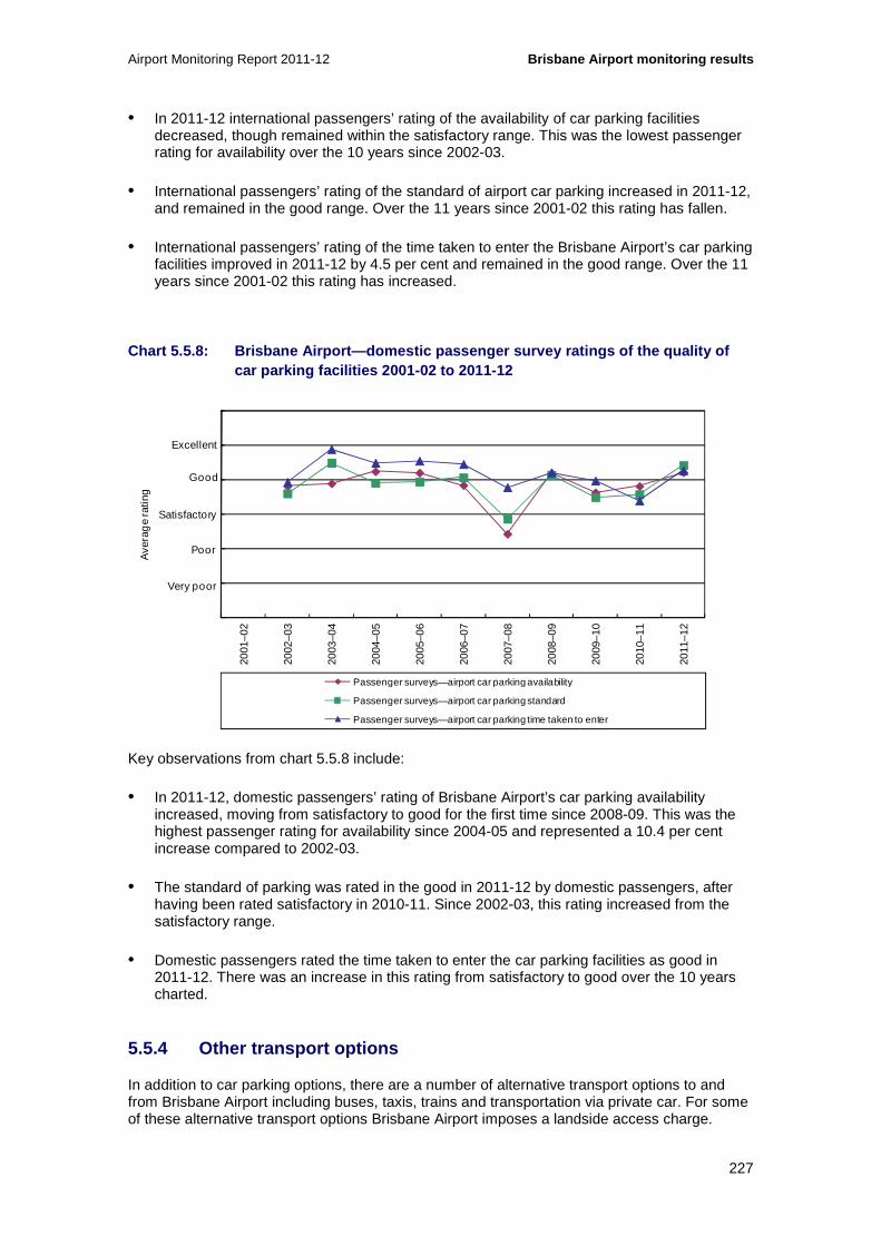
Airport Monitoring Report 2011-12 Brisbane Airport monitoring results
227
• In 2011-12 international passengers’ rating of the availability of car parking facilities decreased, though remained within the satisfactory range. This was the lowest passenger rating for availability over the 10 years since 2002-03.
• International passengers’ rating of the standard of airport car parking increased in 2011-12, and remained in the good range. Over the 11 years since 2001-02 this rating has fallen.
• International passengers’ rating of the time taken to enter the Brisbane Airport’s car parking facilities improved in 2011-12 by 4.5 per cent and remained in the good range. Over the 11 years since 2001-02 this rating has increased.
Chart 5.5.8: Brisbane Airport—domestic passenger su rvey ratings of the quality of car parking facilities 2001-02 to 2011-12
Key observations from chart 5.5.8 include:
• In 2011-12, domestic passengers’ rating of Brisbane Airport’s car parking availability increased, moving from satisfactory to good for the first time since 2008-09. This was the highest passenger rating for availability since 2004-05 and represented a 10.4 per cent increase compared to 2002-03.
• The standard of parking was rated in the good in 2011-12 by domestic passengers, after having been rated satisfactory in 2010-11. Since 2002-03, this rating increased from the satisfactory range.
• Domestic passengers rated the time taken to enter the car parking facilities as good in 2011-12. There was an increase in this rating from satisfactory to good over the 10 years charted.
5.5.4 Other transport options
In addition to car parking options, there are a number of alternative transport options to and from Brisbane Airport including buses, taxis, trains and transportation via private car. For some of these alternative transport options Brisbane Airport imposes a landside access charge.
0
1
2
3
4
5
6
2001
–02
2002
–03
2003
–04
2004
–05
2005
–06
2006
–07
2007
–08
2008
–09
2009
–10
2010
–11
2011
–12
Ave
rag
e ra
ting
Passenger surveys—airport car parking availability
Passenger surveys—airport car parking standard
Passenger surveys—airport car parking time taken to enter
Excellent
Good
Satisfactory
Poor
Very poor
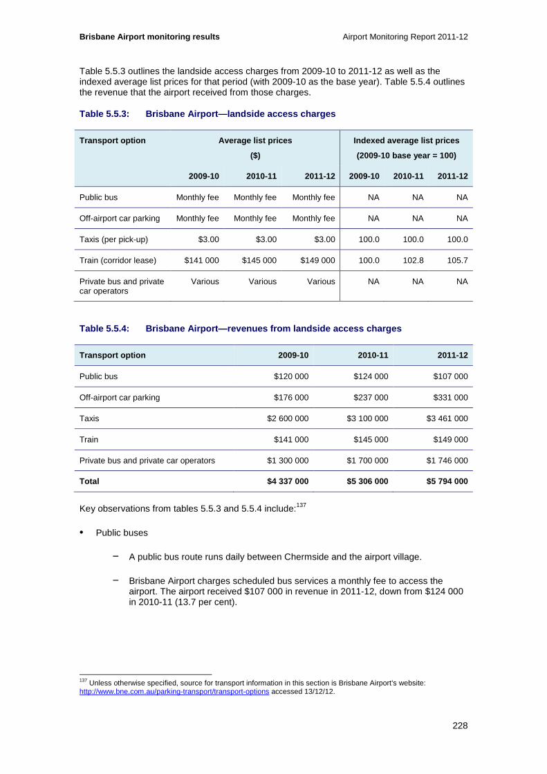
Brisbane Airport monitoring results Airport Monitoring Report 2011-12
228
Table 5.5.3 outlines the landside access charges from 2009-10 to 2011-12 as well as the indexed average list prices for that period (with 2009-10 as the base year). Table 5.5.4 outlines the revenue that the airport received from those charges.
Table 5.5.3: Brisbane Airport—landside access charg es
Transport option Average list prices
($)
Indexed average list prices
(2009-10 base year = 100)
2009-10 2010-11 2011-12 2009-10 2010-11 2011-12
Public bus Monthly fee Monthly fee Monthly fee NA NA NA
Off-airport car parking Monthly fee Monthly fee Monthly fee NA NA NA
Taxis (per pick-up) $3.00 $3.00 $3.00 100.0 100.0 100.0
Train (corridor lease) $141 000 $145 000 $149 000 100.0 102.8 105.7
Private bus and private car operators
Various Various Various NA NA NA
Table 5.5.4: Brisbane Airport—revenues from landsid e access charges
Transport option 2009-10 2010-11 2011-12
Public bus $120 000 $124 000 $107 000
Off-airport car parking $176 000 $237 000 $331 000
Taxis $2 600 000 $3 100 000 $3 461 000
Train $141 000 $145 000 $149 000
Private bus and private car operators $1 300 000 $1 700 000 $1 746 000
Total $4 337 000 $5 306 000 $5 794 000
Key observations from tables 5.5.3 and 5.5.4 include:137
• Public buses
− A public bus route runs daily between Chermside and the airport village.
− Brisbane Airport charges scheduled bus services a monthly fee to access the airport. The airport received $107 000 in revenue in 2011-12, down from $124 000 in 2010-11 (13.7 per cent).
137 Unless otherwise specified, source for transport information in this section is Brisbane Airport’s website: http://www.bne.com.au/parking-transport/transport-options accessed 13/12/12.

Airport Monitoring Report 2011-12 Brisbane Airport monitoring results
229
• Private buses and hire cars
− Brisbane Airport operates a complimentary shuttle bus to and from the Airport Village shopping precinct to the terminals. This bus also runs between the international and domestic terminals at a charge of $5 one-way.
− There are also commercial bus companies servicing the airport, specialising in CBD and hotel pick up, and travel to and from the Gold Coast and the Sunshine Coast.
− Brisbane Airport charges bus and hire car operators a fee to access the airport according to the number of passengers. The fee for 1-4 seats is $4.65, for 5-11 seats the fee is $7.20, for 12-28 seats it is $9.80 and for more than 28 seats the fee is $11.85.
− In 2011-12 Brisbane Airport received $1.7 million revenue from operators of private buses, along with hire car operators, which was similar to 2010-11.
• Train
− Brisbane Airport is serviced by a privately owned and operated train. The service is integrated into the suburban train network, with trains running from Brisbane Airport directly to Brisbane’s CBD and to the Gold Coast. The train also runs between the international and domestic terminals.
− Fares are $15.50 between the airport and the CBD one way, and $29 return. Trips between terminals cost $5 one-way.
− Brisbane Airport received a total of $149 000 in revenue from a corridor lease for the train in 2011-12, up from $145 000 in 2010-11 (2.8 per cent). The airport noted that it does not receive any per ticket or per passenger revenue from the train.
• Off-airport parking
− A number of off-airport car parking facilities service Brisbane Airport. Outdoor parking prices sampled by the ACCC ranged from $16 to $50 for one day’s parking and $34 to $50 for three days.
− Off-airport parking operators are usually charged per vehicle fee by Brisbane Airport for access to the airport. The airport received $331 000 from off-airport operators in 2011-12, an increase of 39.7 per cent from $237 000 in 2009-10.
• Taxis
− Brisbane Airport charges a $3 airport service fee on taxis picking up passengers. It does not charge to drop-off passengers. The fee did not change in 2011-12. The airport received a total of $3.5 million in revenue from taxi charges in 2011-12, an increase of 11.6 per cent from around $3.1 million in 2010-11.
• Terminal drop-off and pick up
− In its 2010-11 Airport Monitoring Report (AMR), the ACCC noted that Brisbane Airport has advised of its plan to change arrangements for passenger drop-off and pick up at the domestic terminal. In October 2012, Brisbane Airport announced that drivers would be allowed to pick up passengers in front of the terminal subject to

Brisbane Airport monitoring results Airport Monitoring Report 2011-12
230
2-minute stopping time and also that it was making available a dedicated passenger pick-up waiting area with 30-minute free parking.138
138 See Brisbane Airport Corporation, “BAC announces changes to ‘pick-up’ at BNE domestic, 24 October 2012; http://www.bne.com.au/news/bac-announces-changes-%E2%80%98pick-up%E2%80%99-bne-domestic.

Airport Monitoring Report 2011-12 Melbourne Airport monitoring results
231
6 Melbourne Airport
Key points
• Total passenger numbers at Melbourne Airport during 2011-12 were relatively flat, increasing by 0.2 per cent from 2010-11 to 28.4 million. A 2.0 per cent fall in domestic passenger numbers was marginally offset by a rise in international passenger numbers which increased by 7.6 per cent.
• Total aeronautical revenue increased by 5.0 per cent in 2011-12 to $243.6 million.
• Aeronautical revenue per passenger, used by the ACCC as an alternative measure for average prices, increased in 2011-12 by 4.8 per cent to $8.58 per passenger.
• Total aeronautical operating expenses increased by 17.5 per cent in 2011-12 to $147.6 million. The increase in total aeronautical operating expenses was mainly driven by increases in salaries and depreciation expenses. Aeronautical operating expenses per passenger increased by 17.3 per cent to $5.20.
• Total aeronautical operating margin decreased by 9.7 per cent in 2011-12 to $96.0 million. On a per passenger basis, the decrease was 9.9 per cent to $3.38.
• Aeronautical services return on non-current assets decreased by 2.2 percentage points to 10.1 per cent in 2011-12.
• Many prices at Melbourne Airport car parks changed. Some prices at the short-term, the uncovered and multi-level long-term car parks increased. Prices at the airport’s business car park decreased. Other prices remained unchanged.
• Car parking revenue was relatively constant in 2011-12, increasing 0.1 per cent to $114.7 million. However, car parking revenue per car park space increased by 2.3 per cent to $5231 per car park space, due mainly to a fall in car parking spaces.
• Total car parking operating margin was also relatively constant in 2011-12, decreasing by 0.6 per cent to $86.4 million.
• Major investments completed at Melbourne Airport during 2011-12 included the fitting out of several departure gates in the international terminal, works on the existing baggage reclaim area of the international terminal and an alternative road exiting the airport precinct, staff car park and long-term car park.
• In 2011-12, additions to aeronautical tangible non-current assets were $155.8 million, equivalent to 15.5 per cent of total tangible aeronautical non-current assets.
• Melbourne Airport’s overall rating for quality of service decreased during 2011-12 within the satisfactory range.
• Other quality of service rating outcomes for Melbourne Airport include:
− Average rating for the international terminal decreased but remained rated as satisfactory.
− Average rating for the domestic terminal also decreased, but also remained rated as satisfactory.
− Average rating for other airport services decreased slightly, but remained rated as satisfactory.

Melbourne Airport monitoring results Airport Monitoring Report 2011-12
232
This chapter presents the detailed prices monitoring, financial performance and quality of service monitoring results in relation to the supply of aeronautical services and car parking services at Melbourne Airport. This chapter is structured as follows:
• Overview of aeronautical and car parking monitoring results (section 6.1)
• Airport overview and major airport investments (section 6.2)
• Aeronautical services prices monitoring and financial performance results (section 6.3)
• Aeronautical services quality of service monitoring results (section 6.4)
• Car parking services monitoring results (section 6.5).
6.1 Overview of aeronautical and car parking monitoring results
6.1.1 Key aeronautical services indicators for 2011 -12
Table 6.1.1: Melbourne Airport—key aeronautical ser vices indicators
Passenger numbers
(million)
Total aeronautical
revenue
($million)
Aeronautical revenue per
passenger
($)
Total aeronautical
operating margin
($million)
Aeronautical operating
margin per passenger
($)
Aeronautical revenue as a
% of total airport
revenue (%)
2010-11 28.3 231.9 8.19 106.3 3.75 42.5
2011-12 28.4 243.6 8.58 96.0 3.38 42.5
%change ▲ 0.2% ▲ 5.0% ▲ 4.8% ▼ 9.7% ▼ 9.9% 0.0pp
Table 6.1.1: Melbourne Airport—key aeronautical ser vices indicators (cont...)
Total tangible
aeronautical non-current
assets
($million)
Rate of return on
tangible aeronautical non-current
assets
(%)
Average quality of
service rating for
availability of airport services
Average quality of
service rating for
standard of airport
services
Airline rating for quality of
service
Passenger rating for quality of
service
2010-11 898.5 12.3 3.82 3.54 3.01 4.10
2011-12 1007.1 10.1 3.36 3.56 3.14 4.06
%change ▲ 12.1% ▼ 2.2pp ▼ 12.0% ▲ 0.5% ▲ 4.4% ▼ 0.8%

Airport Monitoring Report 2011-12 Melbourne Airport monitoring results
233
6.1.2 Key car parking services indicators for 2011- 12
Table 6.1.2: Melbourne Airport—car parking prices a s at 30 June
Short-term car parking Long-term car parking
1 hour 3 hours 8 hours 24 hours 1 day 3 days 7 day s
2010-11 $12.00 $28.00 $52.00 $52.00 $29.00 $69.00 $77.00
2011-12 $12.00 $28.00 $55.00 $55.00 $29.00 $69.00 $77.00
%change 0.0% 0.0% ▲ 5.8% ▲ 5.8% 0.0% 0.0% 0.0%
Table 6.1.3: Melbourne Airport—car parking services indicators
Number of car park spaces
(thousand)
Total car parking revenue
($million)
Car parking revenue per
car park space
($)
Total car parking
operating margin
($million)
Car parking operating
margin per car park
space ($)
Car parking revenue as a
% of total airport
revenue (%)
2010-11 22.4 114.6 5115 86.9 3 878 21.0
2011-12 21.9 114.7 5231 86.4 3 942 20.0
%change ▼ 2.2% ▲ 0.1% ▲ 2.3% ▼ 0.6% ▲ 1.6% ▼ 1.0pp
Table 6.1.3: Melbourne Airport—car parking services indicators (cont...)
Landside access
revenue
($million)
Landside access
revenue as a % of total
airport revenue
(%)
Passenger rating for
availability of airport
car parking
Passenger rating for
standard of airport car
parking
Passenger rating for
time taken to enter
airport car park
2010-11 6.6 1.2 3.88 3.93 4.15
2011-12 7.0 1.2 3.92 3.92 4.10
%change ▲ 6.4% 0.0pp ▲ 1.0% ▼ 0.3% ▼ 1.2%

Melbourne Airport monitoring results Airport Monitoring Report 2011-12
234
6.2 Airport overview and major airport investments
This section presents information about Melbourne Airport, along with activity and investment in 2011-12. This includes: passenger / traffic mix (section 6.2.1); terminal configurations and car parking facilities (section 6.2.2); and major airport investments (section 6.2.3).
6.2.1 Passenger / traffic mix
In 2011-12 over 28 million passengers travelled through the airport. Around 75.6 per cent of passengers were travelling domestically and 24.4 per cent were international passengers including transit passengers (chart 6.2.1).
Chart 6.2.1: Melbourne Airport passenger mix, 2011- 12
6.2.2 Terminal configurations and car parking facil ities
Terminal configurations
Melbourne Airport has one international terminal and three domestic terminals:
• The Qantas domestic terminal (T1) is occupied and operated by Qantas under a domestic terminal lease (DTL), is not subject to monitoring and therefore data on passenger-related services and facilities provided within this terminal are not included in the ACCC’s monitoring results.
• The international terminal (T2) is a common-user terminal used by all international airlines flying to and from Melbourne Airport. This terminal is subject to monitoring and is included in the ACCC’s monitoring results.
• The T3 common-user domestic terminal is currently used by Virgin Blue, Regional Express (REX) and Skywest, is subject to monitoring and is included in the monitoring results
75.5%
23.9%
0.5%
0.1%
Domestic passengers
International passengers (excluding transit passengers)
International transit passengers
Domestic on-carriage

Airport Monitoring Report 2011-12 Melbourne Airport monitoring results
235
• The T4 common-user domestic terminal has been used by Tiger Airways since November 2007.139 This terminal is subject to monitoring and is also included in the ACCC’s monitoring results.
Prior to 2009-10 quality of service monitoring results for the T3 and T4 common-user domestic terminals were combined. In this report, the results have been separated, with the T3 monitoring results presented in section 6.4.3 and the T4 monitoring results presented in section 6.4.4.
Car parking facilities
Melbourne Airport provides combined car parking facilities for domestic and international passengers.
The airport has five car parking facilities, including undercover short-term and multi-level long- term parking opposite the terminals, a long-term car park that is serviced by a shuttle bus, and business and ‘express’ car parks within walking distance of the terminals.
Melbourne Airport also offers a ‘Ring & Ride’ waiting zone service for drivers to temporarily wait for passengers at lower or no cost.
6.2.3 Major airport investments
Aeronautical services and facilities
Melbourne Airport undertook a number of investment projects in its aeronautical services and facilities in 2011-12, including:
• The fit-out of several departure gates in the international terminal (T2).
• Works in the existing baggage reclaim area of T2 and in an expansion area, including the removal of a plant room, which increased the processing area for Australian Customs and Border Protection Service (AC&BPS) and the Department of Agriculture, Fisheries and Forestry, Biosecurity (DAFF Biosecurity) and increased overall circulation space of the area.
• Runway overlays were conducted as part of the regular maintenance cycle.
• An alternative road exiting the airport precinct, allowing users to exit the freight precinct, staff car park and long-term car park. This was completed in July 2012.
• Additional work in expanding rooms for AC&BPS search and interview functions at T2, completed in December 2011.
Planned investments in aeronautical services and facilities at Melbourne Airport beyond 2011-12 include:
• The relocation of ground services equipment to the northern end of the airfield to allow for additional aircraft parking. This was commenced in July 2012 and completed in October 2012.
139 Melbourne Airport, ‘Tiger Airways’ new home opens at Melbourne Airport’, media release, 8 October 2007

Melbourne Airport monitoring results Airport Monitoring Report 2011-12
236
• The expansion of the airside road between the existing freight apron area and future freight areas, scheduled to be completed in May 2013.
• Apron F works including the addition of parking spaces for aircraft at the southern end of the airfield, scheduled to be completed in September 2013.
• Replacement of fittings throughout T3 including floor coverings, seating, lighting and flight information display screens, scheduled to be completed in December 2013.
Car parking and landside access services
Investments in car parking and landside access services undertaken at Melbourne Airport in 2011-12 include:
• A project relocating corporate drivers from the area just outside the terminal to the smaller car parking areas adjacent to the terminal.
• An expansion of the long-term car park to increase public and staff parking by around 2400 spaces, scheduled to be completed in March 2013.
Planned investments in car parking and landside access services at Melbourne Airport beyond 2011-12 include:
• The expansion of Francis Briggs road to improve access for non-passenger vehicles to and from the airport, scheduled to be completed in May 2013.
• A widening of Terminal Drive, the main access road to the airport, to provide additional capacity for making turns to exit the road. This is scheduled to be completed in March 2013.
• Adding two extra lanes to the forecourt area in order to expand access options.
6.3 Aeronautical prices monitoring and financial performance results
This section presents prices monitoring and financial reporting results for aeronautical services and for total airport services, including activity levels (section 6.3.1); prices (section 6.3.2); revenues, costs and profits (sections 6.3.3 and 6.3.4); government mandated security services (section 6.3.5); assets (section 6.3.6) and rates of return on tangible non-current assets (section 6.3.7).

Airport Monitoring Report 2011-12 Melbourne Airport monitoring results
237
6.3.1 Activity
Chart 6.3.1: Melbourne Airport—volume of passengers , tonnes landed and aircraft movements, 2001-02 to 2011-12 140
Key observations from chart 6.3.1 include:
• In 2011-12 the number of passengers, tonnes landed and aircraft movements remained at similar levels to the previous year.
• Passenger numbers remained relatively constant in 2011-12 after increasing by about 7.8 per cent in the previous year and by 6.1 per cent in 2009-10. Passenger numbers increased by 0.2 per cent in 2011-12 to 28.4 million passengers. This was partly due to international passengers (including transit passengers) increasing by 7.6 per cent to 6.9 million passengers and domestic passengers (including domestic on-carriage passengers) decreasing by 2.0 per cent to 21.4 million passengers.
− Melbourne Airport has stated that the decrease in domestic passengers in 2011-12 reflected some of the difficulties experienced by domestic operators during the year.141 In particular, Melbourne Airport pointed to the cessation of services by Tiger Airways at the airport between 2 July 2011 and 10 August 2011, as well as the Qantas grounding and associated industrial issues.
− Over the 11 years to 2011-12 passenger numbers passing through Melbourne Airport increased by 72.1 per cent, from around 16.5 million in 2001-02 to around 28.4 million in 2011-12.
• The volume of tonnes landed at Melbourne Airport in 2011-12 was also similar to that of the previous year. This follows increases of 6.7 per cent and 4.2 per cent for tonnes landed in 2010-11 and 2009-10 respectively. The volume of tonnes landed has steadily increased over time, from around 7.7 million tonnes in 2001-02 to just under 10.8 million tonnes in 2011-12, or around 40.2 per cent.
140 Data in chart 6.3.1 is not comparable to chart 6.2.1 as international transit passengers have been included as international passengers and domestic on-carriage passengers have been included as domestic passengers. 141 Melbourne Airport, Melbourne Airport achieves 8 per cent international growth for 2011/12, Media Release, 24 July 2012. See: http://melbourneairport.com.au/News-Events/News-Events-Archive/2012/melbourne-airport-achieves-8-per-cent-international-growth-for-2011-12.html.
0
30
60
90
120
150
180
210
240
0
4 000
8 000
12 000
16 000
20 000
24 000
28 000
32 00020
01–0
2
2002
–03
2003
–04
2004
–05
2005
–06
2006
–07
2007
–08
2008
–09
2009
–10
2010
–11
2011
–12
Num
ber
of a
ircr
aft m
ove
men
ts (
tho
usan
d)
Num
ber
of p
asse
ng
ers
/ to
nn
es la
nd
ed (t
ho
usan
d)
Domestic Passengers International Passengers Tonnes landed Aircraft movements (RHS)

Melbourne Airport monitoring results Airport Monitoring Report 2011-12
238
• Aircraft movements increased by 0.5 per cent to 207 070 movements in 2011-12 after increasing by 5.2 per cent in the previous year. Since 2001-02, aircraft movements increased by 31.4 per cent, from around 157 570 movements.
6.3.2 Prices
Table 6.3.1 presents the average aeronautical charges at Melbourne Airport from 2007-08 to 2011-12 as well as the indexed average list prices for that period (with 2007-08 as the base year).142
142 Where a list price changed during the financial year, the average of that charge has been reported in the table.

Airport Monitoring Report 2011-12 Melbourne Airport monitoring results
239
Table 6.3.1: Melbourne Airport—schedule of average aeronautical charges and indexed average list price s (including GST), 2007-08 to 2011-12
Average list prices
($)
Indexed average list prices
(2007-08 as base year)
2007-08 2008-09 2009-10 2010-11 2011-12 2007-08 2008-09 2009-10 2010-11 2011-12
Landing charge
T2 international terminal (for passenger aircraft utilising international terminal operated by Melbourne Airport) (per passenger)
13.75 14.36 14.65 15.06 15.59 100.0 104.4 106.5 109.5 113.4
Other (for passenger aircraft not utilising international terminal operated by Melbourne Airport) (per passenger)
3.81 3.81 3.81 3.81 3.81 100.0 100.0 100.0 100.0 100.0
Common user domestic terminals (per passenger) 4.79 5.03 4.92 4.99 5.07 100.0 105.0 102.7 104.2 105.8
International freight (per MTOW) (a) 7.46 7.79 7.95 8.17 8.46 100.0 104.4 106.6 109.5 113.4
Domestic freight (per MTOW) (a) 7.46 7.79 7.95 8.17 8.46 100.0 104.4 106.6 109.5 113.4
General aviation (per MTOW) (a) 13.99 14.61 14.91 15.33 15.87 100.0 104.4 106.6 109.6 113.4
Aircraft parking (per 15 minutes) (b) 32.00 33.42 34.10 35.06 36.29 100.0 104.4 106.6 109.6 113.4
Pre conditioned air (per hour) (c) NA 235.40 218.02 224.77 224.77 NA 100.0 92.6 95.5 95.5
Check-in desks (per hour) 23.41 24.45 24.95 25.65 26.55 100.0 104.4 106.6 109.6 113.4
Government mandated security charges
International terminal passenger screening (includes check baggage screening (per passenger)
5.00 4.58 4.54 4.44 4.15 100.0 91.6 90.8 88.8 83.0
Common user domestic terminals passenger screening (includes check baggage screening) (per passenger)
2.53 2.46 3.06 3.00 2.93 100.0 97.2 120.9 118.6 115.8

Melbourne Airport monitoring results Airport Monitoring Report 2011-12
240
Average list prices
($)
Indexed average list prices
(2007-08 as base year)
2007-08 2008-09 2009-10 2010-11 2011-12 2007-08 2008-09 2009-10 2010-11 2011-12
Airport security charge - passengers (per passenger) NA 0.29 0.27 0.26 0.23 NA 100.0 93.1 89.7 79.3
Airport security charge - freighters and general aviation (per MTOW)
NA 0.29 0.27 0.26 0.23 NA 100.0 93.1 89.7 79.3
Minimum charges
International and domestic freight minimum charge (per landing)
150.00 156.65 159.86 164.35 170.10 100.0 104.4 106.6 109.6 113.4
General aviation minimum charge (per landing) 205.00 214.08 218.47 224.61 232.74 100.0 104.4 106.6 109.6 113.5
Notes: NA Not applicable.
(a) Minimum charge applies.
(b) Applicable after the first three hours of parking from 1 July 2007 (was applicable after the first six hours of parking prior to 1 July 2007).
(c) This charge was introduced in July 2008.
.

Airport Monitoring Report 2011-12 Melbourne Airport monitoring results
241
Key observations from table 6.3.1 include:
• In 2011-12 the majority of Melbourne Airport’s list prices for its aircraft related services and facilities increased. A small number of charges either remained constant or decreased from the previous year. Melbourne Airport has in place formal five-year pricing agreements with airlines for aircraft-related services and facilities.143
• Similar to each of the past four years, international landing charges increased in 2011-12 while domestic landing charges at Melbourne Airport remained constant at $3.81 per passenger. International landing charges increased by around 3.5 per cent to $15.59 per passenger.
• Freight related charges increased by around 3.5 per cent to $8.46 per MTOW for both international and domestic freight services in 2011-12. Charges for aircraft parking, check-in desks and general aviation also increased from the previous year.
• Common user domestic terminal charges increased from $4.99 per passenger to $5.07 per passenger in 2011-12.
• Security related charges decreased from the previous year.
− Domestic terminal passenger screening charges fell from $3.00 per passenger to $2.93 per passenger. This is the lowest charge for domestic screening since 2008-09.
− International passenger and baggage screening charges have declined each year since 2007-08 and were $4.15 per passenger in 2011-12, compared with $4.44 per passenger in 2010-11.
6.3.3 Revenues, costs and profits for aeronautical services and the total airport
As noted, the ACCC required airport operators to provide additional information relating to the aeronautical asset base under the ‘line in the sand’ approach for the first time in 2007-08. Under this approach, the value of an airport’s aeronautical asset base for monitoring purposes is the value of tangible non-current aeronautical assets reported to the ACCC as at 30 June 2005, plus new investments, less depreciation and disposals.
Melbourne Airport advised in its regulatory accounts that a schedule of line in the sand values for aeronautical assets is not required. Melbourne Airport’s total aeronautical asset base used for the regulatory accounts matches the line in the sand aeronautical asset base values required by the ACCC and, for the purposes of its regulatory accounts, Melbourne Airport does not record revaluations of its aeronautical assets. Therefore, line in the sand measures are not separately reported for Melbourne Airport in this report.
Table 6.3.2 outlines the revenues, operating expenses and operating margins for aeronautical services and the total airport from 2001-02 to 2011-12.
143 The prices are determined using a cost based building block methodology, and prices are adjusted by CPI during the term of the agreement. The current agreement for aircraft related services and facilities expired in 2012.

Melbourne Airport monitoring results Airport Monitoring Report 2011-12
242
Table 6.3.2: Melbourne Airport—revenues, operating expenses and operating margins for aeronautical ser vices and total airport services, 2001-02 to 2011-12
2001-02 2002-03 2003-04 2004-05 2005-06 2006-07 2007-08 2008-09 2009-10 2010-11 2011-12
Revenue
($million)
Aeronautical 65.7 100.5 121.1 137.1 144.4 159.6 187.4 197.1 212.0 231.9 243.6
Total airport 196.9 237.2 279.4 315.1 338.9 373.8 4 37.5 462.6 503.0 545.4 573.3
Operating expenses
($million)
Aeronautical 57.6 60.5 66.5 73.5 78.1 86.7 94.9 102.7 113.3 125.6 147.6
Total airport 92.8 104.3 118.3 123.8 136.7 145.4 14 9.2 160.7 175.5 194.5 219.3
Operating margin
($million)
Aeronautical 8.1 40.0 54.5 63.5 66.2 72.9 92.5 94.4 98.7 106.3 96.0
Total airport 104.2 133.0 161.1 191.3 202.2 228.5 2 88.3 302.0 327.5 350.9 354.0
Operating margin as a % of revenue
Aeronautical 12.3 39.8 45.0 46.3 45.8 45.7 49.4 47.9 46.6 45.8 39.4
Total airport 52.9 56.1 57.7 60.7 59.7 61.1 65.9 65 .3 65.1 64.3 61.7

Airport Monitoring Report 2011-12 Melbourne Airport monitoring results
243
Key observations from table 6.3.2 include:
• Total aeronautical revenue and operating expenses increased at Melbourne Airport in 2011-12, while operating margins decreased.
• Revenue from aeronautical services was $243.6 million in 2011-12, increasing by around 5.0 per cent from the previous year. Over the period from 2001-02 to 2011-12 aeronautical revenue increased by an average of 14.0 per cent per year.
• Aeronautical operating expenses increased by around 17.5 per cent to $147.6 million in 2011-12. Aeronautical operating expenses increased by an average of 9.9 per cent per year over the 11 years to 2011-12. Depreciation and amortisation recorded the largest increase, up by 25.6 per cent to $53.8 million, followed by salaries and wages which rose by 19.7 per cent to $21.7 million.
− Melbourne Airport has noted that increases in these cost categories were driven by activities associated with the airport’s expansion, specifically investing in new aeronautical assets and accommodating passenger growth.
− Average salaries increased by around 9.4 per cent during 2011-12. Melbourne Airport noted that this was due to staff numbers moving in both the planning and construction areas during the year, has is in line with its current and future development requirements. Melbourne Airport also noted that changes in operational staff numbers are in line with the need to operate an airport with increasing congestion.
• Melbourne Airport’s operating margin for aeronautical services decreased by around $10.3 million (9.7 per cent) to $96 million in 2011-12. Revenue increased moderately while operating expenses increased at an above average rate. This is the first year since 2001-02 where Melbourne Airport’s operating margin on aeronautical services decreased. Excluding 2011-12, operating margin on aeronautical services increased by an average of $10.9 million each year since 2001-02.
• Melbourne Airport’s operating margin for total airport services increased by 0.9 per cent to $354.0 million in 2011-12, up from $350.9 million in 2010-11.

Melbourne Airport monitoring results Airport Monitoring Report 2011-12
244
Chart 6.3.2: Melbourne Airport—aeronautical service s and non-aeronautical services share of total airport revenue, 2001-02 to 2011-12
Key observations from chart 6.3.2 include:
• Aeronautical revenue as a proportion of total airport revenue remained at around 42.5 per cent in 2011-12.
• Excluding 2001-02, when aeronautical revenue accounted for around 33.4 per cent of total airport revenue, revenue from aeronautical services has averaged around 42.7 per cent of total airport revenue.
0
10
20
30
40
50
60
70
80
90
100
2001
–02
2002
–03
2003
–04
2004
–05
2005
–06
2006
–07
2007
–08
2008
–09
2009
–10
2010
–11
2011
–12
Per
cen
t
Revenue—aeronautical Revenue—non-aeronautical

Airport Monitoring Report 2011-12 Melbourne Airport monitoring results
245
6.3.4 Average revenues, costs and profits for aeron autical services
Chart 6.3.3: Melbourne Airport—revenues, operating expenses and operating margins for aeronautical services on a per passenge r basis, 2001-02 to 2011-12
Key observations from chart 6.3.3 include:
• Aeronautical revenue and operating expenses on a per passenger basis continued to increase at Melbourne Airport in 2011-12, while the operating margin per passenger decreased for the fourth consecutive year.
• Aeronautical revenue per passenger increased by 4.8 per cent to $8.58 per passenger in 2011-12. Notably, passenger numbers remained relatively constant between 2010-11 and 2011-12, while passenger numbers had increased each year by around 5.6 per cent since 2001-02.
− Since 2001-02, aeronautical revenue per passenger has increased by an average of 8.0 per cent per annum. This is partly due to a 53.0 per cent increase in aeronautical revenue during 2002-03 following the removal of price caps at Melbourne Airport on 1 July 2002. Since 2002-03, aeronautical revenue per passenger has increased by an average of 4.2 per cent per annum.
• Operating expenses per passenger for aeronautical services increased by 17.3 per cent to $5.20 per passenger in 2011-12, representing the largest increase in operating expenses over the time period.
− Since 2001-02, aeronautical operating expenses per passenger increased by around 4.1 per cent on average each year.
• Aeronautical operating margin per passenger decreased from $3.75 in 2010-11 to $3.38 in 2011-12 (9.9 per cent), following decreases in operating margin in each of the previous three years. In 2011-12 the main driver behind lower margins was higher operating expenses.
• Over the four year period since 2008-09, aeronautical operating expenses have risen by a greater extent compared to aeronautical revenues: aeronautical operating expenses
$0.00
$1.00
$2.00
$3.00
$4.00
$5.00
$6.00
$7.00
$8.00
$9.0020
01–0
2
2002
–03
2003
–04
2004
–05
2005
–06
2006
–07
2007
–08
2008
–09
2009
–10
2010
–11
2011
–12
Per
pas
sen
ger
Revenue Expenses Margin

Melbourne Airport monitoring results Airport Monitoring Report 2011-12
246
increased by $1.05 per passenger while aeronautical revenue increased by only $0.63 per passenger, leading to declining operating margins in recent years.
6.3.5 Government mandated security services
Government mandated security charges are directly related to the government mandated security levels. Melbourne Airport commented that security charges represent a pass-through of costs to airlines and, therefore, increases or decreases in revenues or expenses do not have any impact on the long-term profitability of the airport.
Table 6.3.3 outlines the revenues, operating expenses and operating margins for government mandated security services and aeronautical services from 2001-02 to 2011-12.

Airport Monitoring Report 2011-12 Melbourne Airport monitoring results
247
Table 6.3.3: Melbourne Airport—revenues, operating expenses and operating margins from government mand ated security services and aeronautical services, 2001-02 to 2011-12
2001-02 2002-03 2003-04 2004-05 2005-06 2006-07 2007-08 2008-09 2009-10 2010-11 2011-12
Revenue
($million)
Security services 9.4 10.3 10.5 13.4 14.7 13.7 20.5 24.2 29.2 28.9 28.8
Total aeronautical 65.7 100.5 121.1 137.1 144.4 159.6 187.4 197.1 212.0 231.9 243.6
Operating expenses
($million)
Security services 8.5 10.3 10.5 13.4 14.6 14.4 21.6 25.2 25.8 27.6 29.2
Total aeronautical 57.6 60.5 66.5 73.5 78.1 86.7 94.9 102.7 113.3 125.6 147.6
Operating margin
($million)
Security services 0.9 (0.0) 0.0 0.0 0.0 (0.6) (1.2) (1.0) 3.4 1.3 (0.4)
Total aeronautical 8.1 40.0 54.5 63.5 66.2 72.9 92.5 94.4 98.7 106.3 96.0
Revenue per passenger
($)
Security services 0.57 0.61 0.55 0.65 0.68 0.61 0.84 0.98 1.11 1.02 1.01
Total aeronautical 3.98 5.94 6.32 6.60 6.74 7.10 7. 73 7.96 8.06 8.19 8.58
Operating expense per passenger
($)
Security services 0.52 0.61 0.55 0.64 0.68 0.64 0.89 1.02 0.98 0.97 1.03
Total aeronautical 3.49 3.57 3.47 3.54 3.65 3.85 3. 91 4.15 4.31 4.43 5.20
Operating margin per passenger
($)
Security services 0.05 (0.00) 0.00 0.00 0.00 (0.03) (0.05) (0.04) 0.13 0.05 (0.01)
Total aeronautical 0.49 2.36 2.85 3.06 3.09 3.24 3. 81 3.81 3.76 3.75 3.38

Melbourne Airport monitoring results Airport Monitoring Report 2011-12
248
Key observations from table 6.3.3 include:
• Total security revenue decreased at Melbourne Airport for the second consecutive year, declining by 0.3 per cent to $28.8 million in 2011-12. Prior to 2010-11, security revenue generally increased each year. On average, over the 11 years since 2001-02, security revenue increased by around 11.8 per cent each year.
• The largest increase in security revenue occurred in 2007-08 when it increased by about 48.9 per cent following significant increases in domestic and international screening charges, of about 37.3 per cent and 47.1 per cent respectively.
• In 2011-12 total security operating expenses increased by around 5.9 per cent from the previous year to $29.2 million. Over the period since 2001-02 security operating expenses increased by around 13.1 per cent each year on average, including an increase of about 50.3 per cent in 2007-08.
• On a per passenger basis, security revenue decreased to $1.01 per passenger (-0.5 per cent) in 2011-12 while security operating expenses increased to $1.03 per passenger (5.7 per cent). Revenue per passenger was down again from a reporting period high of $1.11 per passenger in 2009-10 when revenue per passenger peaked due to a lower number of passengers. Expenses per passenger, however, reached their highest level in 2011-12.
• Security services operating margins have been negative in a number of years, including in 2011-12.
Chart 6.3.4: Melbourne Airport—government mandated security services share of total aeronautical services revenue, 2001-02 to 201 1-12
Key observations from chart 6.3.4 include:
• In 2011-12 security revenue as a proportion of total aeronautical revenue decreased slightly to 11.8 per cent from about 12.5 per cent in 2010-11. While revenue from aeronautical services increased by 5.0 per cent from the previous year, revenue derived from security services declined slightly.
0
10
20
30
40
50
60
70
80
90
100
2001
–02
2002
–03
2003
–04
2004
–05
2005
–06
2006
–07
2007
–08
2008
–09
2009
–10
2010
–11
2011
–12
Per
cen
t
Revenue—aeronautical (excl. security) Revenue—security

Airport Monitoring Report 2011-12 Melbourne Airport monitoring results
249
• As a proportion of aeronautical revenue, security revenue has ranged between around 8.6 per cent and 14.3 per cent over the 11 years since 2001-02.
Chart 6.3.5: Melbourne Airport—aeronautical service s revenue, operating expenses and operating margin excluding government mandated security services on a per passenger basis, 2001-02 to 2011-12
Key observations from chart 6.3.5 include:
• Excluding government mandated security services, aeronautical revenue, operating expenses and operating margin on per passenger basis all increased at Melbourne Airport in 2011-12.
• Excluding government mandated security services, aeronautical revenue increased by about 5.6 per cent from $7.17 per passenger in 2010-11 to $7.57 per passenger in 2011-12.
• Aeronautical operating expenses at Melbourne Airport, excluding security services, increased by around 20.5 per cent from $3.46 per passenger in 2010-11 to $4.17 per passenger in 2011-12.
• As a result of operating expenses increasing by more than revenue, aeronautical operating margin per passenger (excluding security services) decreased from $3.71 in 2010-11 to $3.40 in 2011-12 (a decrease of 8.3 per cent).
• Aeronautical services operating margin per passenger (excluding security services) increased from 2001-02 until reaching their highest level of $3.86 per passenger in 2007-08. In recent years the operating margin for aeronautical services has declined slightly.
6.3.6 Assets for aeronautical services and total ai rport services
Table 6.3.4 outlines Melbourne Airport’s tangible non-current assets for aeronautical services and the total airport from 2001-02 to 2011-12.
-$2.00
$0.00
$2.00
$4.00
$6.00
$8.00
$10.00
2001
–02
2002
–03
2003
–04
2004
–05
2005
–06
2006
–07
2007
–08
2008
–09
2009
–10
2010
–11
2011
–12
Per
pas
sen
ger
Revenue Expenses Margin

Melbourne Airport monitoring results Airport Monitoring Report 2011-12
250
Table 6.3.4: Melbourne Airport—tangible non-current assets for aeronautical services and total airport services, 2001-02 to 2011-12
2001-02 2002-03 2003-04 2004-05 2005-06 2006-07 2007-08 2008-09 2009-10 2010-11 2011-12
Investment property
($million)
Aeronautical 0.0 0.0 0.0 0.0 0.0 0.0 0.0 0.0 0.0 0.0 0.0
Total airport 0.0 0.0 0.0 0.0 0.0 856.8 879.8 858.0 871.1 944.4 993.4
Land
($million)
Aeronautical 50.8 50.3 49.7 49.2 48.7 46.8 46.2 45.7 47.1 46.5 45.9
Total airport 108.7 107.8 106.9 105.7 104.6 59.1 58 .4 57.7 59.0 58.3 57.5
Property, plant and equipment
($million)
Aeronautical 375.9 375.0 370.8 424.4 448.8 489.5 546.7 683.6 785.9 852.0 961.1
Total airport 616.1 630.9 631.4 713.2 757.8 727.2 8 29.1 990.3 1 096.1 1 183.6 1 288.8
Intangibles
($million)
Aeronautical 0.0 0.0 0.0 0.0 0.0 0.0 0.0 0.0 0.0 0.0 0.0
Total airport 600.3 592.1 584.9 576.5 695.4 667.7 6 67.7 667.7 667.7 667.7 667.7
Other tangible non-current assets
($millon)
Aeronautical 0.0 0.0 0.0 0.0 0.0 0.0 0.0 0.0 0.0 0.0 0.0
Total airport 26.0 16.6 0.0 0.0 3.5 1.2 14.4 0.0 0. 0 0.0 7.4
Total tangible non-current assets
($million)
Aeronautical 426.7 425.2 420.5 473.6 497.5 536.2 593.0 729.3 833.0 898.5 1 007.1
Total airport 750.8 755.3 738.3 818.9 865.9 1 644.3 1 781.6 1 906.1 2 026.2 2 186.2 2 347.0
Total non-current assets
($million)
Aeronautical 426.7 425.2 420.5 473.6 497.5 536.2 593.0 729.3 833.0 898.5 1 007.1
Total airport 1 351.1 1 347.3 1 323.3 1 395.4 1 561.3 2 312.0 2 449.3 2 573.8 2 693.9 2 853.9 3 014.7
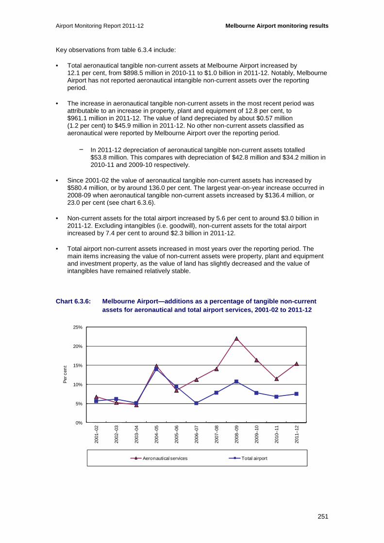
Airport Monitoring Report 2011-12 Melbourne Airport monitoring results
251
Key observations from table 6.3.4 include:
• Total aeronautical tangible non-current assets at Melbourne Airport increased by 12.1 per cent, from $898.5 million in 2010-11 to $1.0 billion in 2011-12. Notably, Melbourne Airport has not reported aeronautical intangible non-current assets over the reporting period.
• The increase in aeronautical tangible non-current assets in the most recent period was attributable to an increase in property, plant and equipment of 12.8 per cent, to $961.1 million in 2011-12. The value of land depreciated by about $0.57 million (1.2 per cent) to $45.9 million in 2011-12. No other non-current assets classified as aeronautical were reported by Melbourne Airport over the reporting period.
− In 2011-12 depreciation of aeronautical tangible non-current assets totalled $53.8 million. This compares with depreciation of $42.8 million and $34.2 million in 2010-11 and 2009-10 respectively.
• Since 2001-02 the value of aeronautical tangible non-current assets has increased by $580.4 million, or by around 136.0 per cent. The largest year-on-year increase occurred in 2008-09 when aeronautical tangible non-current assets increased by $136.4 million, or 23.0 per cent (see chart 6.3.6).
• Non-current assets for the total airport increased by 5.6 per cent to around $3.0 billion in 2011-12. Excluding intangibles (i.e. goodwill), non-current assets for the total airport increased by 7.4 per cent to around $2.3 billion in 2011-12.
• Total airport non-current assets increased in most years over the reporting period. The main items increasing the value of non-current assets were property, plant and equipment and investment property, as the value of land has slightly decreased and the value of intangibles have remained relatively stable.
Chart 6.3.6: Melbourne Airport—additions as a perce ntage of tangible non-current assets for aeronautical and total airport services, 2001-02 to 2011-12
0%
5%
10%
15%
20%
25%
2001
–02
2002
–03
2003
–04
2004
–05
2005
–06
2006
–07
2007
–08
2008
–09
2009
–10
2010
–11
2011
–12
Per
cen
t
Aeronautical services Total airport

Melbourne Airport monitoring results Airport Monitoring Report 2011-12
252
Key observations from chart 6.3.6 include:
• In 2011-12, additions to aeronautical tangible non-current assets represented about 15.5 per cent of total aeronautical tangible non-current assets. Additions to aeronautical assets included buildings ($85.0 million), land improvement ($74.3 million) and plant and machinery ($52.2 million). Work in progress decreased by $54.8 million.
• Additions to total airport tangible non-current assets represented about 7.5 per cent of total airport tangible non-current assets in 2011-12. Additions to total airport assets included buildings ($95.3 million), land improvements ($79.9 million) and plant and machinery ($60.5 million). Work in progress decreased by $58.9 million.
• Since 2001-02, annual additions to aeronautical tangible non-current assets and total airport tangible non-current assets have varied. In 2003-04 additions to aeronautical assets represented about 4.7 per cent of aeronautical tangible non-current assets and additions to total airport assets represented about 5.1 per cent of the total airport tangible non-current assets. In 2008-09, however, additions represented around 22.1 per cent of aeronautical tangible non-current assets and about 10.8 per cent of total airport tangible non-current assets.
• Over the 11 years to 2011-12, new buildings comprised 37.7 per cent of total aeronautical additions, land improvement contributed 32.1 per cent and plant and machinery contributed 25.7 per cent of total additions made to Melbourne Airport’s aeronautical tangible non-current assets.
6.3.7 Rates of return on tangible non-current asset s
Chart 6.3.7: Melbourne Airport—rate of return (EBIT A) on tangible non-current assets for aeronautical services and total airport service s, 2001-02 to 2011-12
Key observations from chart 6.3.7 include:
• Earnings before interest, tax and amortisation (EBITA) on average tangible non-current assets for both aeronautical and total airport services decreased in 2011-12.
• EBITA on average tangible non-current assets for aeronautical services decreased by 2.2 percentage points from 12.3 per cent in 2010-11 to 10.1 per cent in 2011-12.
0
5
10
15
20
25
2001
–02
2002
–03
2003
–04
2004
–05
2005
–06
2006
–07
2007
–08
2008
–09
2009
–10
2010
–11
2011
–12
Per
cen
t per
an
num
Aeronautical services Total airport

Airport Monitoring Report 2011-12 Melbourne Airport monitoring results
253
• Over the 11 years since 2001-02, EBITA on average tangible non-current assets for aeronautical services increased to over 16 per cent in 2007-08, but then declined in each subsequent year. The recent decline in the ratio largely reflects the increase in the value of Melbourne Airport’s aeronautical non-current assets, which have increased by 69.8 per cent compared to a 3.8 per cent increase in EBITA from 2007-08 to 2011-12.
• For total airport services, EBITA on average tangible non-current assets decreased by just over 1.0 percentage point from 16.7 per cent in 2010-11 to 15.6 per cent in 2011-12.
• Over the whole reporting period, EBITA on average tangible non-current assets for total airport services increased to over 24 per cent in 2004-05, but decreased in 2006-07 and averaged around 16.4 per cent over the five years to 2011-12.
6.4 Aeronautical services quality of service monitoring results
This section presents the quality of service monitoring results for Melbourne Airport. Results are presented in terms of the average quality of service as well as for the international and domestic services provided by the airport.
6.4.1 Average ratings for quality of service
Chart 6.4.1: Melbourne Airport—average quality of s ervice ratings for international and domestic terminal services, and other airport s ervices, 2007-08 to 2011-12
Key observations from chart 6.4.1 include:
• Melbourne Airport’s average quality of service ratings for international and domestic terminal services were slightly lower in 2011-12, but remained in the satisfactory range.
• Other airport services were also rated as satisfactory, remaining at a similar level with the previous year.
0
1
2
3
4
5
6
2007–08 2008–09 2009–10 2010–11 2011–12
Ave
rag
e ra
ting
Rating of international terminal Rating of domestic terminal Rating of other airport services
Excellent
Good
Poor
Very poor
Satisfactory

Melbourne Airport monitoring results Airport Monitoring Report 2011-12
254
• Over the five years to 2011-12 the average quality of service for international and domestic terminal services, and other airport services have been rated by airlines, passengers and border agencies as satisfactory.
Chart 6.4.2: Melbourne Airport—average quality of s ervice ratings for availability and standard of airport services, 2007-08 to 2011-12
Key observations from chart 6.4.2 include:
• In 2011-12 the average availability and standard of airport services were again rated as satisfactory, although the availability was rated at a lower level and the standard rated slightly higher compared to the previous year.
• On average, from 2007-08 to 2011-12, airlines, passengers and border agencies rated the availability and standard of Melbourne Airport’s services as satisfactory.
0
1
2
3
4
5
6
2007–08 2008–09 2009–10 2010–11 2011–12
Ave
rag
e ra
ting
Rating of availability Rating of standard
Excellent
Good
Poor
Very poor
Satisfactory

Airport Monitoring Report 2011-12 Melbourne Airport monitoring results
255
6.4.2 International services
Chart 6.4.3: Melbourne Airport—check-in (internatio nal services), 2007-08 to 2011-12
Key observations from chart 6.4.3 include:
• Airlines rated both the availability and standard of international check-in services as satisfactory in 2011-12. Airlines’ rating of the availability of check-in services increased from poor in the previous year. The standard of international check-in facilities was consistently rated as satisfactory by airlines over the last five years, although the average rating in the last two years was lower than the rating observed in 2007-08.
− In commentary to the surveys, airlines noted that check-in facilities were generally available, although a number of airlines raised concerns over congestion in the check-in area. A number of airlines expressed concerns over limited queue space, particularly during peak periods, resulting in overcrowding and congestion. Airlines also commented that the infrastructure is old and inefficient.
• Consistent with the previous four years, passengers rated check-in waiting time at the international terminal as good in 2011-12.
• The percentage of hours with more than 80 per cent of check-in desks in use was lower in 2011-12 as the number of hours where more than 80 per cent of desks where utilised fell from 152 in 2010-11 to 76 in 2011-12.
− Melbourne Airport noted that the number of check-in desks available in the international terminal increased from 92 desks in 2009-10 to 116 desks in 2011-12. The airport noted that the recent upgrade contributed to the reduction in hours when more than 80 per cent of desks were in use.
− Melbourne Airport also commented that airlines influence the quality of check-in services by providing their technology systems, equipment and personnel to staff the check-in desks. The airport also noted that airlines nominated the hours and number of desks for the check-in process.
0%
1%
2%
3%
4%
5%
6%
0
1
2
3
4
5
6
2007–08 2008–09 2009–10 2010–11 2011–12
Per
cen
tag
e o
f ho
urs
utili
sed
ove
r 80%
Ave
rag
e ra
ting
Airline surveys— rating of check-in availability
Airline surveys— rating of check-in standard
Passenger surveys— rating of check-in waiting time
Percentage of hours with more than 80 per cent of check-in desks in use (RHS)
Excellent
Good
Poor
Very poor
Satisfactory

Melbourne Airport monitoring results Airport Monitoring Report 2011-12
256
Chart 6.4.4: Melbourne Airport—inbound government i nspection (international services), 2007-08 to 2011-12
Key observations from chart 6.4.4 include:
• In 2011-12 border agencies continued to rate both the availability and standard of inbound Immigration facilities as poor.
− In commentary to the surveys, border agencies again noted ongoing inadequacies in the configuration of the immigration processing and surrounding areas, resulting in extended passenger queues during peak periods. Border agencies noted that, during the last summer period, Melbourne Airport asked them to cease the Immigration processing of passengers in the baggage retrieval area which was overcrowded and considered a danger to both passengers and staff. Border agencies commented that this added to congestion and queuing issues in the inbound Immigration area.
− Border agencies also noted challenges in the installation of appropriate signage including delays in requests of the airport being fulfilled. However, recent developments aimed at increasing the visibility and use of SmartGate are welcomed and are hoped will help alleviate congestion.
− In addition, border agencies suggested that lighting in the passport control area is generally poor and that the area has an inadequate number of public toilets.
• Passengers’ rating of waiting time in the inbound Immigration area has remained in the good range over the past five years.
• The number of arriving passengers per inbound Immigration desk (during peak hour) was higher at around 29 in 2011-12 compared to around 25 in 2010-11. The overall higher number of passenger arrivals during peak hour has been the driver of this increase as the number of inbound Immigration desks remained unchanged from the previous year at 44 desks.
− Melbourne Airport commented that the use of desks and facilities is the responsibility of border agencies, not the airport, and that appropriate staffing of immigration facilities would help to manage increased passenger arrivals.
0
15
30
45
60
75
90
0
1
2
3
4
5
6
2007–08 2008–09 2009–10 2010–11 2011–12
Num
ber
of p
asse
ng
ers
per
des
k
Ave
rag
e ra
ting
Border agencies survey— rating of inbound Immigration facilities availability
Border agencies survey— rating of inbound Immigration facilities standard
Passenger surveys— rating of waiting time in inbound Immigration area
Number of arriving passengers per inbound Immigration desk (during peak hour) (RHS)
Excellent
Good
Poor
Very poor
Satisfactory

Airport Monitoring Report 2011-12 Melbourne Airport monitoring results
257
− In response to border agencies’ comments regarding overcrowding in the baggage reclaim area, Melbourne Airport noted that it has expanded the baggage reclaim area over the past year. Melbourne Airport also commented that government border agencies are in control of their own processes and resourcing.
Chart 6.4.5: Melbourne Airport—outbound government inspection (international services), 2007-08 to 2011-12
Key observations from chart 6.4.5 include:
• Border agencies’ rated both the availability and standard of outbound Immigration facilities as satisfactory in 2011-12. Over the five years since 2007-08 ratings have varied from poor to good with the opening of the new departures area in March 2010 marking an improvement in service in the area.
− Border agencies noted that the new departures area, including a larger primary line and queuing area had improved the environment. However, continued passenger growth has started to place pressure on the primary line during peak periods.
− Border agencies also noted that there are ongoing issues with air quality in some areas, although it was acknowledged that Melbourne Airport was working towards a long-term solution on these issues. Border agencies also suggested that there were not enough public toilet facilities prior to and after passport control and that cleaning could be undertaken on a more frequent basis. Melbourne Airport acknowledged that there was a period when toilets were shut down during construction however they stated that cleanliness had not been identified as an issue by internal surveys.
• In 2011-12 passengers’ rating of waiting time in the outbound Immigration area decreased but remained in the good range since 2007-08.
• The number of departing passengers per outbound Immigration desk (during peak hour) was higher in 2011-12, at around 48 passengers per desk, compared to 42 in 2010-11. The higher figure was due to a higher number of passenger departures in line with overall passenger growth as the number of outbound Immigration desks remained constant since increasing from 14 desks in 2008-09 to 24 desks in 2009-10.
0
20
40
60
80
100
120
0
1
2
3
4
5
6
2007–08 2008–09 2009–10 2010–11 2011–12
Num
ber
of p
asse
ng
ers
per
des
k
Ave
rag
e ra
ting
Border agencies survey— rating of outbound Immigration facilities availability
Border agencies survey— rating of outbound Immigration facilities standard
Passenger surveys— rating of waiting time in outbound Immigration area
Number of departing passengers per outbound Immigration desk (during peak hour) (RHS)
Excellent
Good
Poor
Very poor
Satisfactory

Melbourne Airport monitoring results Airport Monitoring Report 2011-12
258
− In response to border agencies’ comments on public toilet facilities, Melbourne Airport noted that there was a period when public toilet facilities were shut down during construction and that passenger quality of service ratings are not consistent with border agencies’ comments.
− Melbourne Airport commented that the staffing arrangements of Immigration desks are the responsibility of the government border agencies that operate them, which in turn influences the quality of service provided.
Chart 6.4.6: Melbourne Airport—baggage inspection ( international services), 2007-08 to 2011-12
Key observations from chart 6.4.6 include:
• Over the past five years border agencies have consistently given a poor rating to both the availability and standard of inbound baggage inspection facilities.
− Border agencies again noted limitations in the space and layout of the baggage inspection area at Melbourne Airport’s international terminal, resulting in congestion and poor passenger flow in peak periods. The airport and police have requested that immigration processing activities be ceased at the baggage inspection area due to safety concerns from overcrowding, particularly during peak periods.
− Comments were also made about the small size and inadequacy of benches and search rooms provided for baggage examination activities, inhibiting operations during peak periods. Works have commenced on creating additional examination and passenger interview space and a short solution has delivered some additional space and examination benches. However Melbourne Airport noted that although supplied by the airport, benches are designed by the government agencies.
− Border agencies also suggested the need for an additional Marshall point to assist in the final exit from the hall. This has been raised with the airport but a viable solution has not yet been found.
0
15
30
45
60
75
90
0
1
2
3
4
5
6
2007–08 2008–09 2009–10 2010–11 2011–12
Num
ber
of p
asse
ng
ers
per
des
k
Ave
rag
e ra
ting
Border agencies survey— rating of inbound baggage inspection facilities availability
Border agencies survey— rating of inbound baggage inspection facilities standard
Passenger surveys— rating of waiting time in inbound baggage inspection area
Number of arriving passengers per baggage inspection desk (during peak hour) (RHS)
Excellent
Good
Poor
Very poor
Satisfactory
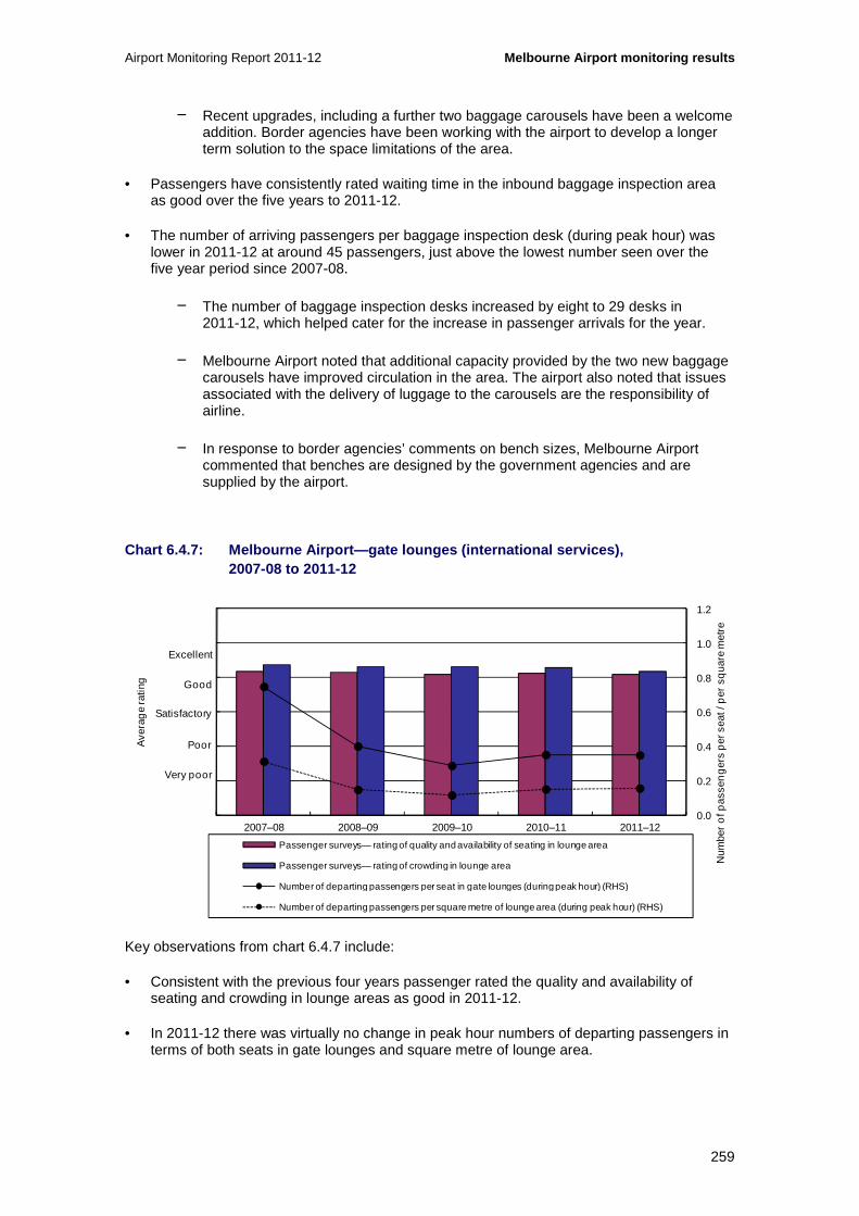
Airport Monitoring Report 2011-12 Melbourne Airport monitoring results
259
− Recent upgrades, including a further two baggage carousels have been a welcome addition. Border agencies have been working with the airport to develop a longer term solution to the space limitations of the area.
• Passengers have consistently rated waiting time in the inbound baggage inspection area as good over the five years to 2011-12.
• The number of arriving passengers per baggage inspection desk (during peak hour) was lower in 2011-12 at around 45 passengers, just above the lowest number seen over the five year period since 2007-08.
− The number of baggage inspection desks increased by eight to 29 desks in 2011-12, which helped cater for the increase in passenger arrivals for the year.
− Melbourne Airport noted that additional capacity provided by the two new baggage carousels have improved circulation in the area. The airport also noted that issues associated with the delivery of luggage to the carousels are the responsibility of airline.
− In response to border agencies’ comments on bench sizes, Melbourne Airport commented that benches are designed by the government agencies and are supplied by the airport.
Chart 6.4.7: Melbourne Airport—gate lounges (intern ational services), 2007-08 to 2011-12
Key observations from chart 6.4.7 include:
• Consistent with the previous four years passenger rated the quality and availability of seating and crowding in lounge areas as good in 2011-12.
• In 2011-12 there was virtually no change in peak hour numbers of departing passengers in terms of both seats in gate lounges and square metre of lounge area.
0.0
0.2
0.4
0.6
0.8
1.0
1.2
0
1
2
3
4
5
6
2007–08 2008–09 2009–10 2010–11 2011–12
Ave
rag
e ra
ting
Passenger surveys— rating of quality and availability of seating in lounge area
Passenger surveys— rating of crowding in lounge area
Number of departing passengers per seat in gate lounges (during peak hour) (RHS)
Number of departing passengers per square metre of lounge area (during peak hour) (RHS)
Excellent
Good
Poor
Very poor
SatisfactoryN
umbe
r o
f pas
sen
ger
s p
er s
eat /
per
sq
uare
met
re

Melbourne Airport monitoring results Airport Monitoring Report 2011-12
260
− Although passenger departures increased in 2011-12, there was also an increase in the number of seats in gate lounges. There were 3316 seats in gate lounges in 2011-12, an increase of 416 seats from the previous year.
− The size of the gate lounge area also increased. Measured in square metres, the lounge area increased by 9.5 per cent from the previous year, representing an increase of over 40 per cent since 2007-08.
Chart 6.4.8: Melbourne Airport—aerobridges (interna tional services), 2007-08 to 2011-12
Key observations from chart 6.4.8 include:
• Airlines rating of the availability and standard and aerobridges increased in 2011-12 to satisfactory.
− The two new aerobridges made available in 2011-12 were a welcome addition. However, one airline noted continued issues around the availability of aerobridges, particularly during peak periods. Another airline commented on the lack of parking options to allow for off schedule operations.
− Airlines again commented on the lack of cleanliness of aerobridges. Comments were also made around the lack of training and standard operating procedures for using aerobridges.
• The percentage of international passengers arriving using an aerobridge remained above 99 per cent, while the percentage departing using an aerobridge was above 98 per cent.
− In 2011-12 there were 15 aerobridges available at Melbourne Airport’s international terminal, an increase from 13 available in the previous year and 11 in 2007-08. Terminal expansion works affected the availability of aerobridges in 2008-09.
94%
95%
96%
97%
98%
99%
100%
0
1
2
3
4
5
6
2007–08 2008–09 2009–10 2010–11 2011–12
Per
cen
tag
e of
pas
seng
ers
usin
g an
aer
obrid
ge
Ave
rag
e ra
ting
Airline surveys— rating of aerobridges availability
Airline surveys— rating of aerobridges standard
Percentage of international passengers arriving using an aerobridge (RHS)
Percentage of international passengers departing using an aerobridge (RHS)
Excellent
Good
Poor
Very poor
Satisfactory

Airport Monitoring Report 2011-12 Melbourne Airport monitoring results
261
Chart 6.4.9: Melbourne Airport—security (internatio nal services), 2007-08 to 2011-12
Key observations from chart 6.4.9 include:
• Passengers rated the quality of security search as good in 2011-12, consistent with the previous four years.
• The number of departing passengers per security clearance system was higher, at around 165 passengers in 2011-12, compared to 145 passengers in 2010-11.
− The higher number of passengers per security clearance system reflects the increase in passenger departures in 2011-12, as the number of systems remained at seven.
Chart 6.4.10: Melbourne Airport—baggage processing (international services), 2007-08 to 2011-12
100
150
200
250
300
350
400
0
1
2
3
4
5
6
2007–08 2008–09 2009–10 2010–11 2011–12
Ave
rag
e ra
ting
Passenger surveys— rating of quality of security search process
Number of departing passengers per security clearance system (during peak hour) (RHS)
Excellent
Good
Poor
Very poor
Satisfactory
Num
ber
of p
asse
ng
ers
per
sec
urity
cle
aran
ce s
yste
m
200
250
300
350
400
450
500
0
1
2
3
4
5
6
2007–08 2008–09 2009–10 2010–11 2011–12
Num
ber o
f bag
s p
er h
our
Ave
rag
e ra
ting
Airline surveys— rating of baggage processing facilities availability
Airline surveys— rating of baggage processing facilities standard
Passenger surveys— rating of waiting time for inbound baggage reclaim
Passenger surveys— rating of circulation space for inbound baggage reclaim
Average throughput of outbound baggage system (per hour) (RHS)
Excellent
Good
Poor
Very poor
Satisfactory

Melbourne Airport monitoring results Airport Monitoring Report 2011-12
262
Key observations from chart 6.4.10 include:
• In 2011-12 airlines’ ratings of the availability and standard of baggage processing facilities have improved from a poor rating in the previous year. The availability of baggage facilities was rated as satisfactory while the standard was rated as good.
− Several airlines noted improvements in baggage facilities with the two new carousels having a positive impact on arriving baggage handling. Two airlines did however note congestion issues around peak periods where multiple airlines are allocated the same carousel.
− Airlines noted that the functionality of departure baggage facilities is generally reliable although the arrivals baggage carousels malfunction at times.
• Passengers rated the waiting time for inbound baggage reclaim as good again in 2011-12. Rating of circulation space was slightly higher, though remained in the satisfactory range.
• The throughput of the outbound baggage system was higher in 2011-12, reaching an average of 416 bags per hour, the highest level over the past five years.
− While capacity has remained constant, the number of bags handled by baggage handling equipment increased by 5 per cent in 2011-12, following steady increases since 2007-08.
− Melbourne Airport noted that airlines and ground handling agents play a key role in the quality of baggage services. The airport also noted a major refurbishment program to all check-in counter drives and conveyors which has led to an increase in planned interruptions to service over the year.
− In response to airline commentary regarding baggage facilities, Melbourne Airport stated that it does not allocate multiple airlines to a single carousel.
Chart 6.4.11: Melbourne Airport—baggage trolleys (i nternational services), 2007-08 to 2011-12
0.0
0.5
1.0
1.5
2.0
2.5
3.0
0
1
2
3
4
5
6
2007–08 2008–09 2009–10 2010–11 2011–12
Num
ber o
f pas
seng
ers
per
bag
gage
trol
ley
Ave
rag
e ra
ting
Passenger surveys— rating of findability of baggage trolleys
Number of passengers per baggage trolley (during peak hour) (RHS)
Excellent
Good
Poor
Very poor
Satisfactory
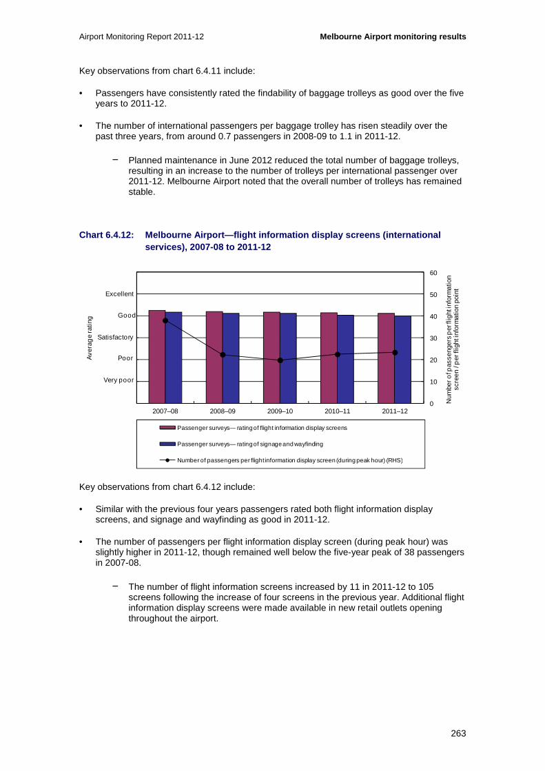
Airport Monitoring Report 2011-12 Melbourne Airport monitoring results
263
Key observations from chart 6.4.11 include:
• Passengers have consistently rated the findability of baggage trolleys as good over the five years to 2011-12.
• The number of international passengers per baggage trolley has risen steadily over the past three years, from around 0.7 passengers in 2008-09 to 1.1 in 2011-12.
− Planned maintenance in June 2012 reduced the total number of baggage trolleys, resulting in an increase to the number of trolleys per international passenger over 2011-12. Melbourne Airport noted that the overall number of trolleys has remained stable.
Chart 6.4.12: Melbourne Airport—flight information display screens (international services), 2007-08 to 2011-12
Key observations from chart 6.4.12 include:
• Similar with the previous four years passengers rated both flight information display screens, and signage and wayfinding as good in 2011-12.
• The number of passengers per flight information display screen (during peak hour) was slightly higher in 2011-12, though remained well below the five-year peak of 38 passengers in 2007-08.
− The number of flight information screens increased by 11 in 2011-12 to 105 screens following the increase of four screens in the previous year. Additional flight information display screens were made available in new retail outlets opening throughout the airport.
0
10
20
30
40
50
60
0
1
2
3
4
5
6
2007–08 2008–09 2009–10 2010–11 2011–12
Ave
rag
e ra
ting
Passenger surveys— rating of flight information display screens
Passenger surveys— rating of signage and wayfinding
Number of passengers per flight information display screen (during peak hour) (RHS)
Excellent
Good
Poor
Very poor
Satisfactory
Num
ber o
f pas
seng
ers
per
flig
ht in
form
atio
n sc
reen
/ p
er fl
ight
info
rmat
ion
poin
t

Melbourne Airport monitoring results Airport Monitoring Report 2011-12
264
Chart 6.4.13: Melbourne Airport—washrooms (internat ional services), 2007-08 to 2011-12
Key observations from chart 6.4.13 include:
• In 2011-12 passengers continued to give a good rating to the standard of washrooms in the international terminal.
6.4.3 Domestic services (T3)
Chart 6.4.14: Melbourne Airport—check-in (T3 domest ic services), 2007-08 to 2011-12
0
1
2
3
4
5
6
2007–08 2008–09 2009–10 2010–11 2011–12
Ave
rag
e ra
ting
Passenger surveys— rating of standard of washrooms
Excellent
Good
Poor
Very poor
Satisfactory
0
10
20
30
40
50
60
0
1
2
3
4
5
6
2007–08 2008–09 2009–10 2010–11 2011–12
Num
ber
of p
asse
ng
ers
per
des
k
Ave
rag
e ra
ting
Airline surveys— rating of check-in availability
Airline surveys— rating of check-in standard
Passenger surveys— rating of check-in waiting time
Number of departing passengers per check-in desk (during peak hour) (RHS)
Excellent
Good
Poor
Very poor
Satisfactory

Airport Monitoring Report 2011-12 Melbourne Airport monitoring results
265
Key observations from chart 6.4.14 include:
• Airlines’ rating of the availability of check-in facilities improved from poor in 2010-11 to satisfactory in 2011-12. The rating of the standard was also higher but remained in the satisfactory range.
− Consistent with comments in the 2010-11 Airport Monitoring Report, one airline commented that the check-in area is constrained during peak periods and that space limitations constrain any future expansion.
• Similar to previous years, passengers rated check-in waiting time as good again in 2011-12.
• The number of departing passengers per check-in desk (during peak hour) was higher in 2011-12, at around 23 passengers compared 19 passengers in the previous year.
− There were 38 check-in desks in the T3 domestic terminal in 2011-12. There have been no additions to the number of check-in desks since 2008-09 when two were added. The number of departing passengers generally varies each year based on airline scheduling. In 2011-12 the number of departing passengers increased by almost 20 per cent after declining by around 10 per cent in the previous year.
− Melbourne Airport noted that airlines manage their own processes for check-in and are responsible for manning check-in services and technology systems, all of which have impact on the quality of service.
Chart 6.4.15: Melbourne Airport—gate lounges (T3 do mestic services), 2007-08 to 2011-12
Key observations from chart 6.4.15 include:
• Passengers have consistently rated gate lounges as good over the past five years, in terms of both the quality and availability as well as crowding.
0.0
0.3
0.6
0.9
1.2
1.5
1.8
0
1
2
3
4
5
6
2007–08 2008–09 2009–10 2010–11 2011–12
Ave
rag
e ra
ting
Passenger surveys— rating of quality and availability of seating in lounge area
Passenger surveys— rating of crowding in lounge area
Number of departing passengers per seat in gate lounges (during peak hour) (RHS)
Number of departing passengers per square metre of lounge area (during peak hour) (RHS)
Excellent
Good
Poor
Very poor
Satisfactory
Num
ber
of p
asse
ng
ers
per
sea
t / p
er s
qua
re

Melbourne Airport monitoring results Airport Monitoring Report 2011-12
266
• The number of departing passengers per seat in gate lounges (during peak hour) was slightly higher, rising from around 0.6 passengers in 2010-11 to 0.7 in 2011-12. Over the same period the number of departing passengers per square metre of lounge area (during peak hour) was also slightly higher.
− The number of seats in gate lounges was unchanged at 1207 seats in 2011-12 after decreasing by 32 in the previous period. The size of the gate lounge area has remained unchanged since 2003-04. The slight rise in passengers per seat and square metre reflect the increase in number of departing passengers.
• Melbourne Airport is in the process of refurbishing the T3 domestic terminal which will provide additional seating facilities when complete.
Chart 6.4.16: Melbourne Airport—aerobridges (T3 dom estic services), 2007-08 to 2011-12
Key observations from chart 6.4.16 include:
• In 2011-12 there was a decline in airlines’ rating of both the availability and standard of aerobridges. The availability was rated as satisfactory in 2011-12, falling from a rating of good in 2010-11.The standard declined from a satisfactory rating in 2010-12 to a poor rating in 2011-12.
− In the airline surveys, one airline commented that aerobridge parking positions are in high demand and that three parking bays do not have an aerobridge.
− One airline noted challenges with the age of the aerobridges including malfunctions and concerns with their reliability. Issues were also raised about inconsistencies between the operating procedures of various aerobridges and the need to staff to be trained to operate a number of different systems.
• The number of arriving passengers per aerobridge (during peak hour) remained relatively stable in 2011-12 while the number of departing passengers per aerobridge (during peak hour) increased from 67 passengers in 2010-11 to 80 in 2011-12.
0
25
50
75
100
125
150
0
1
2
3
4
5
6
2007–08 2008–09 2009–10 2010–11 2011–12
Num
ber o
f pas
seng
ers
per
aer
obr
idge
Ave
rag
e ra
ting
Airline surveys— rating of aerobridges availability
Airline surveys— rating of aerobridges standard
Number of arriving passengers per aerobridge (during peak hour) (RHS)
Number of departing passengers per aerobridge (during peak hour) (RHS)
Excellent
Good
Poor
Very poor
Satisfactory

Airport Monitoring Report 2011-12 Melbourne Airport monitoring results
267
− This change reflects movements in passenger numbers. The number of arriving passengers slightly declined while the number of departing passengers increased. The number of aerobridges at the T3 domestic terminal has not changed, remaining at 11.
Chart 6.4.17: Melbourne Airport—security (T3 domest ic services), 2007-08 to 2011-12
Key observations from chart 6.4.17 include:
• Passengers have rated the quality of security search processes as good over the five years to 2011-12.
• The number of departing passengers per security clearance system (during peak hour) was higher in 2011-12 at around 147 passengers,
− The change in 2011-12 reflects the increase in the number of departing passengers. Over the five-year period movements in the number of departing passengers per security clearance system have generally followed changes in number of passenger departures. One additional security system was introduced in 2010-11 to meet airline demand, providing a total of six security systems available for use in 2011-12.
100
150
200
250
300
350
400
0
1
2
3
4
5
6
2007–08 2008–09 2009–10 2010–11 2011–12
Ave
rag
e ra
ting
Passenger surveys— rating of quality of security search process
Number of departing passengers per security clearance system (during peak hour) (RHS)
Excellent
Good
Poor
Very poor
Satisfactory
Num
ber
of p
asse
ng
ers
per
sec
urity
cle
aran
ce

Melbourne Airport monitoring results Airport Monitoring Report 2011-12
268
Chart 6.4.18: Melbourne Airport—baggage processing (T3 domestic services), 2007-08 to 2011-12
Key observations from chart 6.4.18 include:
• While there was a rise in the airlines’ ratings of the availability and standard of baggage processing facilities in 2011-12, overall they remained below satisfactory.
− Airlines noted space limitations to cater for current requirements as well as congestion problems around baggage facilities in the T3 domestic terminal.
• Similar to previous years, passengers’ ratings of both waiting time and circulation space for inbound baggage reclaim was around satisfactory to good in 2011-12.
• Average throughput of the outbound baggage system continued to decline in 2011-12, to 278 bags per hour.
− The total number of bags handled by baggage handling systems has been in decline since 2008-09 (when this data was first collected). Melbourne Airport noted that baggage handling capacity has remained constant and that the decrease in the amount of baggage handling is a result of increased travel by business passengers and those with carry-on only luggage.
100
150
200
250
300
350
400
0
1
2
3
4
5
6
2007–08 2008–09 2009–10 2010–11 2011–12
Num
ber
of b
ags
per
ho
ur
Ave
rag
e ra
ting
Airline surveys— rating of baggage processing facilities availability
Airline surveys— rating of baggage processing facilities standard
Passenger surveys— rating of waiting time for inbound baggage reclaim
Passenger surveys— rating of circulation space for inbound baggage reclaim
Average throughput of outbound baggage system (per hour) (RHS)
Excellent
Good
Poor
Very poor
Satisfactory

Airport Monitoring Report 2011-12 Melbourne Airport monitoring results
269
Chart 6.4.19: Melbourne Airport—baggage trolleys (T 3 domestic services), 2007-08 to 2011-12
Key observations from chart 6.4.19 include:
• Over the five years to 2011-12 passengers have consistently rated the findability of baggage trolleys as good.
• The number of passengers per baggage trolley was higher in 2011-12, at 13 passengers compared to 11 in 2010-11.
− Planned maintenance in June 2012 reduced the total number of baggage trolleys (data in the chart is based on the number of trolleys as at 30 June), resulting in an increase to the number of passengers per trolley. Melbourne Airport noted that without this maintenance the number of trolleys per passenger would be similar to that of previous years.
0
4
8
12
16
20
24
0
1
2
3
4
5
6
2007–08 2008–09 2009–10 2010–11 2011–12
Num
ber o
f pas
seng
ers
per
bag
gage
trol
ley
Ave
rag
e ra
ting
Passenger surveys— rating of findability of baggage trolleys
Number of passengers per baggage trolley (during peak hour) (RHS)
Excellent
Good
Poor
Very poor
Satisfactory

Melbourne Airport monitoring results Airport Monitoring Report 2011-12
270
Chart 6.4.20: Melbourne Airport—flight information display screens (T3 domestic services), 2007-08 to 2011-12
Key observations from chart 6.4.20 include:
• Passengers rated both flight information display screens, and signage and wayfinding as good in 2011-12, consistent with the ratings of the previous four years.
• The number of passengers per flight information display screen (during peak hour) declined in 2011-12, to the lowest level over the five year period.
− The number of flight information display screens increased by four to 47 screens in 2011-12, however these additions were limited to the expanded Virgin Australia lounge.
• Although Melbourne Airport does not provide any information points in the T3 domestic terminal, the airport claims that passengers have access to a sufficient number of flight information display screens.
0
15
30
45
60
75
90
0
1
2
3
4
5
6
2007–08 2008–09 2009–10 2010–11 2011–12
Ave
rag
e ra
ting
Passenger surveys— rating of flight information display screens
Passenger surveys— rating of signage and wayfinding
Number of passengers per flight information display screen (during peak hour) (RHS)
Excellent
Good
Poor
Very poor
Satisfactory
Num
ber o
f pas
seng
ers
per
flig
ht in
form
atio
n sc
reen
/ p
er fl
ight
info
rmat
ion
poin
t

Airport Monitoring Report 2011-12 Melbourne Airport monitoring results
271
Chart 6.4.21: Melbourne Airport—washrooms (T3 domes tic services), 2007-08 to 2011-12
Key observations from chart 6.4.21 include:
• In 2011-12 passengers rated the standard of washrooms around satisfactory to good, similar to ratings over the previous four years.
6.4.4 Domestic services (T4)
Chart 6.4.22: Melbourne Airport—check-in (T4 domest ic services), 2007-08 to 2011-12
Key observations from chart 6.4.22 include:
• Passengers’ ratings of check-in waiting time at the T4 domestic terminal improved in 2011-12, increasing from satisfactory to good.
0
1
2
3
4
5
6
2007–08 2008–09 2009–10 2010–11 2011–12
Ave
rag
e ra
ting
Passenger surveys— rating of standard of washrooms
Excellent
Good
Poor
Very poor
Satisfactory
0
10
20
30
40
50
60
0
1
2
3
4
5
6
2006–07 2007–08 2008–09 2009–10 2010–11
Num
ber
of p
asse
ng
ers
per
des
k
Ave
rag
e ra
ting
Passenger surveys— rating of check-in waiting time
Number of departing passengers per check-in desk (during peak hour) (RHS)
Excellent
Good
Poor
Very poor
Satisfactory
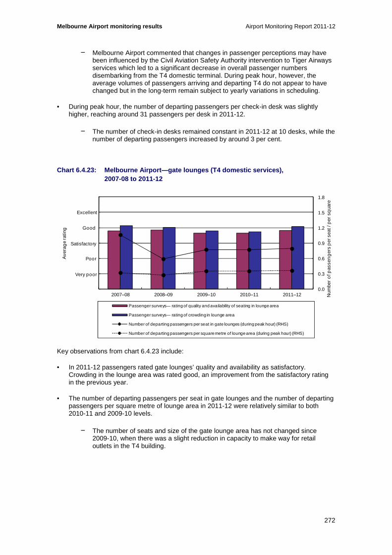
Melbourne Airport monitoring results Airport Monitoring Report 2011-12
272
− Melbourne Airport commented that changes in passenger perceptions may have been influenced by the Civil Aviation Safety Authority intervention to Tiger Airways services which led to a significant decrease in overall passenger numbers disembarking from the T4 domestic terminal. During peak hour, however, the average volumes of passengers arriving and departing T4 do not appear to have changed but in the long-term remain subject to yearly variations in scheduling.
• During peak hour, the number of departing passengers per check-in desk was slightly higher, reaching around 31 passengers per desk in 2011-12.
− The number of check-in desks remained constant in 2011-12 at 10 desks, while the number of departing passengers increased by around 3 per cent.
Chart 6.4.23: Melbourne Airport—gate lounges (T4 do mestic services), 2007-08 to 2011-12
Key observations from chart 6.4.23 include:
• In 2011-12 passengers rated gate lounges’ quality and availability as satisfactory. Crowding in the lounge area was rated good, an improvement from the satisfactory rating in the previous year.
• The number of departing passengers per seat in gate lounges and the number of departing passengers per square metre of lounge area in 2011-12 were relatively similar to both 2010-11 and 2009-10 levels.
− The number of seats and size of the gate lounge area has not changed since 2009-10, when there was a slight reduction in capacity to make way for retail outlets in the T4 building.
0.0
0.3
0.6
0.9
1.2
1.5
1.8
0
1
2
3
4
5
6
2007–08 2008–09 2009–10 2010–11 2011–12
Ave
rag
e ra
ting
Passenger surveys— rating of quality and availability of seating in lounge area
Passenger surveys— rating of crowding in lounge area
Number of departing passengers per seat in gate lounges (during peak hour) (RHS)
Number of departing passengers per square metre of lounge area (during peak hour) (RHS)
Excellent
Good
Poor
Very poor
Satisfactory
Num
ber
of p
asse
ng
ers
per
sea
t / p
er s
qua
re

Airport Monitoring Report 2011-12 Melbourne Airport monitoring results
273
Chart 6.4.24: Melbourne Airport—security (T4 domest ic services), 2007-08 to 2011-12
Key observations from chart 6.4.24 include:
• Passengers rated the quality of security search processes as good over the five years to 2011-12.
• There was a slight rise in the number of departing passengers per security clearance system (during peak hour) to around 153 passengers, compared to around 149 in the previous two years.
− This increase can be attributed to the yearly rise in departing passenger numbers during peak hour as there has been no change in the number of security systems in the T4 domestic terminal over the five years to 2011-12.
100
150
200
250
300
350
400
0
1
2
3
4
5
6
2007–08 2008–09 2009–10 2010–11 2011–12
Ave
rag
e ra
ting
Passenger surveys— rating of quality of security search process
Number of departing passengers per security clearance system (during peak hour) (RHS)
Excellent
Good
Poor
Very poor
Satisfactory
Num
ber
of p
asse
ng
ers
per
sec
urity
cle
aran
ce

Melbourne Airport monitoring results Airport Monitoring Report 2011-12
274
Chart 6.4.25: Melbourne Airport—baggage processing (T4 domestic services), 2007-08 to 2011-12
Key observations from chart 6.4.25 include:
• Passengers rated both waiting time and circulation space for inbound baggage reclaim as good in 2011-12. Ratings for waiting time declined slightly from the previous year while ratings for circulation space were slightly higher, and the highest over the five years since 2007-08.
• The CASA intervention to Tiger Airways services significantly reduced the number of bags processed at T4 in 2011-12. In previous years, the average throughput of the outbound baggage system had decreased from the combined effects of increased capacity of baggage handling equipment in 2009-10 and a reduction in the total number of bags being handled in 2010-11.
0
20
40
60
80
100
120
0
1
2
3
4
5
6
2007–08 2008–09 2009–10 2010–11 2011–12
Bag
s p
er h
our
Ave
rag
e ra
ting
Passenger surveys— rating of waiting time for inbound baggage reclaim
Passenger surveys— rating of circulation space for inbound baggage reclaim
Average throughput of outbound baggage system (per hour) (RHS)
Excellent
Good
Poor
Very poor
Satisfactory
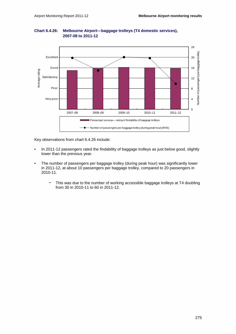
Airport Monitoring Report 2011-12 Melbourne Airport monitoring results
275
Chart 6.4.26: Melbourne Airport—baggage trolleys (T 4 domestic services), 2007-08 to 2011-12
Key observations from chart 6.4.26 include:
• In 2011-12 passengers rated the findability of baggage trolleys as just below good, slightly lower than the previous year.
• The number of passengers per baggage trolley (during peak hour) was significantly lower in 2011-12, at about 10 passengers per baggage trolley, compared to 20 passengers in 2010-11.
− This was due to the number of working accessible baggage trolleys at T4 doubling from 30 in 2010-11 to 60 in 2011-12.
0
4
8
12
16
20
24
0
1
2
3
4
5
6
2007–08 2008–09 2009–10 2010–11 2011–12
Num
ber o
f pas
seng
ers
per
bag
gage
trol
ley
Ave
rag
e ra
ting
Passenger surveys— rating of findability of baggage trolleys
Number of passengers per baggage trolley (during peak hour) (RHS)
Excellent
Good
Poor
Very poor
Satisfactory

Melbourne Airport monitoring results Airport Monitoring Report 2011-12
276
Chart 6.4.27: Melbourne Airport—flight information display screens (T4 domestic services), 2007-08 to 2011-12
Key observations from chart 6.4.27 include:
• Passenger rated flight information display screens in the T4 domestic terminal as good in 2011-12, after having been rated as satisfactory in the previous two years. Signage and wayfinding were rated as just below good, slightly higher than the previous two years.
• In 2011-12 the number of passengers per flight information display screen (during peak hour) remained similar to that of the previous two years.
− As there has been five flight information display screens in operation in T4 over the five years to 2011-12, variations in the number of passengers per screen have been reflective of changes in passenger numbers during per hour.
0
30
60
90
120
150
180
0
1
2
3
4
5
6
2007–08 2008–09 2009–10 2010–11 2011–12
Ave
rag
e ra
ting
Passenger surveys— rating of flight information display screens
Passenger surveys— rating of signage and wayfinding
Number of passengers per flight information display screen (during peak hour) (RHS)
Excellent
Good
Poor
Very poor
Satisfactory
Num
ber o
f pas
seng
ers
per
flig
ht in
form
atio
n sc
reen
/ p
er fl
ight
info
rmat
ion
poin
t

Airport Monitoring Report 2011-12 Melbourne Airport monitoring results
277
Chart 6.4.28: Melbourne Airport—washrooms (T4 domes tic services), 2007-08 to 2011 12
Key observations from chart 6.4.28 include:
• In 2011-12 passengers rated the standard of washroom as satisfactory. The rating was slightly higher than the previous year and generally in line with the previous four years.
6.4.5 Other airport services
Chart 6.4.29: Melbourne Airport—availability of air side services and facilities (other airport services), 2007-08 to 2011-12
0
1
2
3
4
5
6
2007–08 2008–09 2009–10 2010–11 2011–12
Ave
rag
e ra
ting
Passenger surveys— rating of standard of washrooms
Excellent
Good
Poor
Very poor
Satisfactory
0
1
2
3
4
5
6
2007–08 2008–09 2009–10 2010–11 2011–12
Ave
rag
e ra
ting
Rating of runway Rating of taxiways
Rating of aprons Rating of aircraft parking facilities and bays
Rating of ground handling services and facilities
Excellent
Good
Poor
Very poor
Satisfactory

Melbourne Airport monitoring results Airport Monitoring Report 2011-12
278
Key observations from chart 6.4.29 include:
• Airlines generally rated the availability of airside services and facilities as satisfactory in 2011-12. The exception is aircraft parking facilities and bays which were rated as poor both in 2011-12 and in the previous year. Over the five years since 2007-08 ratings of other airside services have generally ranged between satisfactory and good with ratings trending slightly lower in recent years.
− Some airlines commented that various works have restricted access to certain taxiways and aprons. A number of airlines noted issues with aircraft parking facilities and bays including insufficient parking bays, particularly during peak times. Limited parking capacity has led to more aircraft being towed around the airport for parking and ground services, sometimes at additional cost to the airlines. One airline reported that the airport is planning additional capacity to address aircraft parking issues.
− Melbourne Airport noted that as part of the agreement with airlines new apron areas are currently under construction and that further construction is expected in coming years.
Chart 6.4.30: Melbourne Airport—standard of airside services and facilities (other airport services), 2007-08 to 2011-12
Key observations from chart 6.4.30 include:
• Overall, airlines rated the standard of airside services and facilities as satisfactory in 2011-12. There were increases in ratings for runway, aircraft parking bays and facilities, and ground handling services and facilities. Ratings for taxiways and aprons slightly decreased from the previous year.
− One airline commented on congestion with ground services facilities around aprons. Airlines also noted a slab replacement program, due to commence in 2013, which is aimed to improve the quality of both aprons and parking bays.
0
1
2
3
4
5
6
2007–08 2008–09 2009–10 2010–11 2011–12
Ave
rag
e ra
ting
Rating of runway Rating of taxiways
Rating of aprons Rating of aircraft parking facilities and bays
Rating of ground handling services and facilities
Excellent
Good
Poor
Very poor
Satisfactory

Airport Monitoring Report 2011-12 Melbourne Airport monitoring results
279
Chart 6.4.31: Melbourne Airport—runway traffic (oth er airport services) 144
Chart 6.4.32: Melbourne Airport—runway traffic cont inued (other airport services) 145
Note: Airservices Australia’s measures were devised as a guide to its own performance in handling traffic, though can also provide some indication of airport constraints including runway infrastructure or management. In particular, if demand is consistently close to operationally agreed capacity for the peak hour, it suggests that there is little spare capacity for increased traffic at that time. The measures relate to the busiest peak hour at the airport, averaged across all days in the month specified. The measures and their interpretation are explained in the appendices to this report.
144 Note that data for charts 6.4.31 and 6.4.32 are presented for the period June 2011 to March 2012 only. This is due to data unavailability. 145 Ibid
0
10
20
30
40
50
60
Demand Actual Arrivals Agreed Rate Peak demand (within the hour)
Min
utes
Jun 2011 Jul 2011 Aug 2011 Sep 2011 Oct 2011
Nov 2011 Dec 2011 Jan 2012 Feb 2012 Mar 2012
0
5
10
15
20
25
30
35
Max pro rata rate (within the hour) Average max system delay Average system delay
Min
utes
Jun 2011 Jul 2011 Aug 2011 Sep 2011 Oct 2011
Nov 2011 Dec 2011 Jan 2012 Feb 2012 Mar 2012
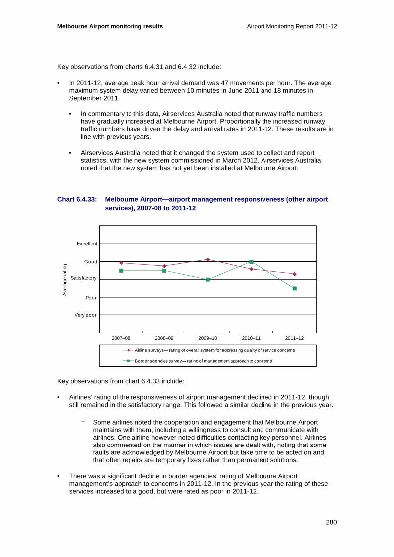
Melbourne Airport monitoring results Airport Monitoring Report 2011-12
280
Key observations from charts 6.4.31 and 6.4.32 include:
• In 2011-12, average peak hour arrival demand was 47 movements per hour. The average maximum system delay varied between 10 minutes in June 2011 and 18 minutes in September 2011.
• In commentary to this data, Airservices Australia noted that runway traffic numbers have gradually increased at Melbourne Airport. Proportionally the increased runway traffic numbers have driven the delay and arrival rates in 2011-12. These results are in line with previous years.
• Airservices Australia noted that it changed the system used to collect and report statistics, with the new system commissioned in March 2012. Airservices Australia noted that the new system has not yet been installed at Melbourne Airport.
Chart 6.4.33: Melbourne Airport—airport management responsiveness (other airport services), 2007-08 to 2011-12
Key observations from chart 6.4.33 include:
• Airlines’ rating of the responsiveness of airport management declined in 2011-12, though still remained in the satisfactory range. This followed a similar decline in the previous year.
− Some airlines noted the cooperation and engagement that Melbourne Airport maintains with them, including a willingness to consult and communicate with airlines. One airline however noted difficulties contacting key personnel. Airlines also commented on the manner in which issues are dealt with, noting that some faults are acknowledged by Melbourne Airport but take time to be acted on and that often repairs are temporary fixes rather than permanent solutions.
• There was a significant decline in border agencies’ rating of Melbourne Airport management’s approach to concerns in 2011-12. In the previous year the rating of these services increased to a good, but were rated as poor in 2011-12.
0
1
2
3
4
5
6
2007–08 2008–09 2009–10 2010–11 2011–12
Ave
rag
e ra
ting
Airline surveys— rating of overall system for addressing quality of service concerns
Border agencies survey— rating of management approach to concerns
Excellent
Good
Poor
Very poor
Satisfactory
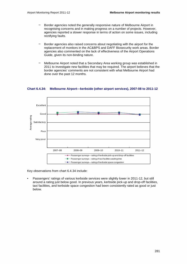
Airport Monitoring Report 2011-12 Melbourne Airport monitoring results
281
− Border agencies noted the generally responsive nature of Melbourne Airport in recognising concerns and in making progress on a number of projects. However, agencies reported a slower response in terms of action on some issues, including rectifying faults.
− Border agencies also raised concerns about negotiating with the airport for the replacement of monitors in the AC&BPS and DAFF Biosecurity work areas. Border agencies also commented on the lack of effectiveness of the Airport Operations Guide, given its non-binding nature.
− Melbourne Airport noted that a Secondary Area working group was established in 2011 to investigate new facilities that may be required. The airport believes that the border agencies’ comments are not consistent with what Melbourne Airport had done over the past 12 months.
Chart 6.4.34: Melbourne Airport—kerbside (other air port services), 2007-08 to 2011-12
Key observations from chart 6.4.34 include:
• Passengers’ ratings of various kerbside services were slightly lower in 2011-12, but still around a rating just below good. In previous years, kerbside pick-up and drop-off facilities, taxi facilities, and kerbside space congestion had been consistently rated as good or just below.
0
1
2
3
4
5
6
2007–08 2008–09 2009–10 2010–11 2011–12
Ave
rag
e ra
ting
Passenger surveys— rating of kerbside pick-up and drop-off facilities
Passenger surveys— rating of taxi facilities waiting time
Passenger surveys— rating of kerbside space congestion
Excellent
Good
Poor
Very poor
Satisfactory

Melbourne Airport monitoring results Airport Monitoring Report 2011-12
282
6.5 Car parking services monitoring results
This section presents monitoring results for car parking services provided at Melbourne Airport. This includes information collected on prices (section 6.5.1); revenues, costs and profits (section 6.5.2) and the quality of airport car parking (section 6.5.3).
Section 6.5.4 provides details on the various other transport options that are available for travelling to and from the airport.
6.5.1 Prices
Chart 6.5.1: Melbourne Airport—prices at short-term car park, 2001-02 to 2011-12
Key observations from chart 6.5.1 include:
• Melbourne Airport increased some of its short-term car park price points in 2011-12. While the price for one hour short-term car parking remained at $12, the price for two hours increased by $2 to $22 on 1 June 2012. Melbourne Airport charged a flat rate of $52 for stays between four and 24 hours in the short-term car park until 1 June 2012 when it increased to $55.146
− Some short-term car parking prices, however, increased further at Melbourne Airport after 30 June 2012. For example, the price for two hours car parking increased by a further $2 to $24 on 1 September 2012.
• Since 2004-05 the movement in short-term prices has varied, but has generally trended upwards. Over the eight years to 2011-12 the price for 20 to 40 minutes increased by $0.50, while the price for four hours more than doubled from $16 to $36.
146 The price for up to 20 minutes car parking increased by one dollar (33.3 per cent) to $4 on 1 June 2012.
0
10
20
30
40
50
60
2001
–02
2002
–03
2003
–04
2004
–05
2005
–06
2006
–07
2007
–08
2008
–09
2009
–10
2010
–11
2011
–12
Do
llars
Short-term car park—1 hour Short-term car park—2 hours Short-term car park—3 hours
Short-term car park—10 hours Short-term car park—24 hours

Airport Monitoring Report 2011-12 Melbourne Airport monitoring results
283
Chart 6.5.2: Melbourne Airport—prices at uncovered long-term car parking facility, 2001-02 to 2011-12
Key observations from chart 6.5.2 include:
• In 2011-12 prices for up to nine days parking at Melbourne Airport’s uncovered long-term parking facility remained largely unchanged and prices for 10 or more days’ parking decreased. Prices for one, three and seven days remained at $29, $69 and $77 respectively. The price for two days parking did however increase by 6.5 per cent from $46 to $49 while the price for 10 days decreased by 12.1 per cent from $124 to $109, and the price for 14 days parking decreased by 21.3 per cent from $164 to $129.
− Some prices have also changed at the airport’s uncovered long-term car park since 30 June 2012. For example, the price for seven days parking increased by 2.6 per cent to $79. The structure of pricing for up to 24 hours parking has also changed, with the charge for one to three hours of parking increasing from $10 to $29.
• Prior to 2011-12, prices increased over time for most parking durations. From 2004-05 levels, prices for one day of parking increased by 70.6 per cent from $17 to $29 and prices for three days increased by 137.9 per cent from $29 to $69.
0
20
40
60
80
100
120
140
160
180
2001
–02
2002
–03
2003
–04
2004
–05
2005
–06
2006
–07
2007
–08
2008
–09
2009
–10
2010
–11
2011
–12
Dol
lars
Uncovered long-term car park—1 day Uncovered long-term car park—3 days
Uncovered long-term car park—7 days Uncovered long-term car park—10 days
Uncovered long-term car park—14 days

Melbourne Airport monitoring results Airport Monitoring Report 2011-12
284
Chart 6.5.3: Melbourne Airport—prices at multi-leve l long-term car park, 2007-08 to 2011-12
Key observations from chart 6.5.3 include:
• Some car parking prices increased at Melbourne Airport’s multi-level long-term car park in 2011-12. The price for one day car parking increased from $52 to $55 on 1 June 2012. This follows increases at all price points in the previous year where the price for three to seven days parking increased from $99 to $139 (40.4 per cent).
− The structure of pricing at the airport’s multi-level long-term car park facility also changed after 30 June 2012. The price for two days parking increased from $99 to $115 and prices for three to seven days parking changed from a flat rate of $139, to prices of $120 for three days, $130 for four days and $140 for five to seven days parking.
• Since Melbourne Airport’s multi-level car park was opened in 2007, changes in price points over the five years to 2011-12 have been varied. While the prices for one to four days have increased by varying degrees, the prices for seven and 10 days parking were $1 less in 2011-12 compared to 2007-08.
• Prices at Melbourne Airport’s multi-level long-term car park have been consistently higher than the airport’s uncovered long-term car park. As at 30 June 2012 the price for one day of parking at the multi-level car park, for example, was $55 compared to $29 at the uncovered car park, and for seven days parking the price at the multi-level car park was $139 compared to $77.
0
20
40
60
80
100
120
140
160
180
200
2007–08 2008–09 2009–10 2010–11 2011–12
Do
llars
Multi-level long-term car park—1 day Multi-level long-term car park—2 days
Multi-level long-term car park—3 days Multi-level long-term car park—7 days
Multi-level long-term car park—10 days

Airport Monitoring Report 2011-12 Melbourne Airport monitoring results
285
Chart 6.5.4: Melbourne Airport—prices at business c ar park, 2004-05 to 2011-12
Key observations from chart 6.5.4 include:
• Prices at Melbourne Airport’s business car park decreased from a flat rate of $60 per day to a flat rate of $55 per day, a fall of about 8.3 per cent.
• Over the eight years since 2004-05 prices have generally increased, although most prices fell in 2008-09 and all prices fell in 2011-12.
− Since 30 June 2012 however, prices have increased and the structure of pricing at the business car park has slightly changed. Prices increased at all price points. The price to park for one day at the business car park increased by about 18.2 per cent to $65 and the price for three and seven days parking increased by about 9.1 per cent to $180 and $420 respectively.
0
100
200
300
400
500
600
700
800
900
2004–05 2005–06 2006–07 2007–08 2008–09 2009–10 2010–11 2011–12
Do
llars
Series7 Series8 Series1 Series2 Series3

Melbourne Airport monitoring results Airport Monitoring Report 2011-12
286
6.5.2 Revenues, costs and profits
Table 6.5.1 outlines Melbourne Airport’s revenues, operating expenses and operating margins for car parking and the total airport from 2001-02 to 2011-12.
Table 6.5.1: Melbourne Airport—Revenues, operating expenses and operating margins for car parking and total airport services, 2001-02 to 2011-12
2001-02 2002-03 2003-04 2004-05 2005-06 2006-07 2007-08 2008-09 2009-10 2010-11 2011-12
Revenue
($million)
Car parking 31.3 36.3 42.9 49.2 59.1 68.7 91.1 94.8 103.9 114.6 114.7
Total airport 196.9 237.2 279.4 315.1 338.9 373.8 4 37.5 462.6 503.0 545.4 573.3
Operating expenses
($million)
Car parking 7.6 12.5 9.2 10.7 12.8 19.3 21.1 20.3 23.0 27.7 28.3
Total airport 92.8 104.3 118.3 123.8 136.7 145.4 14 9.2 160.7 175.5 194.5 219.3
Operating margin
($million)
Car parking 23.7 23.8 33.6 38.6 46.3 49.4 70.0 74.5 80.8 86.9 86.4
Total airport 104.2 133.0 161.1 191.3 202.2 228.5 2 88.3 302.0 327.5 350.9 354.0
Operating margin as a % of revenue
Car parking 75.7 65.6 78.4 78.3 78.3 72.0 76.8 78.6 77.8 75.8 75.3
Total airport 52.9 56.1 57.7 60.7 59.7 61.1 65.9 65 .3 65.1 64.3 61.7

Airport Monitoring Report 2011-12 Melbourne Airport monitoring results
287
Chart 6.5.5: Melbourne Airport—airport car parking revenue as a proportion of total airport revenue, 2001-02 to 2011-12
Key observations from table 6.5.1 and chart 6.5.5 include:
• Car parking revenue remained relatively constant at around $114.7 million in 2011-12. Notably, car parking prices remained mostly unchanged in 2011-12, with some decreases also observed, while throughput of the short-term car park increased (see table 6.5.2). Prior to 2011-12, car parking revenue increased by an average of 15.5 per cent each year between 2001-02 and 2010-11.
• Car parking has consistently been a significant source of revenue for Melbourne Airport. Since 2007-08 car parking revenue has contributed about 20 per cent of total airport revenue. Prior to 2007-08 car parking revenue contributed between 15.3 per cent and 18.4 per cent of total airport revenue.
• Operating expenses for car parking increased by 2.0 per cent to $28.3 million in 2011-12 and have increased by an average of 16.6 per cent each year since 2001-02. Car parking operating expenses made up about 12.9 per cent of total airport expenses in 2011-12.
• Since 2001- 02, the operating margin for car parking had increased in every year until 2011-12, when operating margin decreased by $0.5 million (-0.6 per cent) to $86.4 million. As a percentage of total airport operating margin, car parking operating margin has consistently represented almost a quarter of the airport’s operating margin over the five years to 2011-12.
• Over time, operating margin as a percentage of revenue for car parking has been consistently higher than for the total airport.
0
10
20
30
40
50
60
70
80
90
100
2001
–02
2002
–03
2003
–04
2004
–05
2005
–06
2006
–07
2007
–08
2008
–09
2009
–10
2010
–11
2011
–12
Per
cen
t
Revenue—car parking Revenue—total airport

Melbourne Airport monitoring results Airport Monitoring Report 2011-12
288
Chart 6.5.6: Melbourne Airport—revenues, operating expenses and operating margins for car parking services on a per car park basis, 2001-02 to 2011-12
Key observations from chart 6.5.6 include:
• In 2011-12, car parking revenue, operating expenses and operating margin per car park space all increased.
• Car parking revenue increased by 2.2 per cent from $5115 per car space in 2010-11 to $5225 per car park space in 2011-12. Operating expenses increased by about 4.1 per cent from $1237 per car space in 2010-11 to $1288 per car park space in 2011-12. The increases reflect slight increases in car parking revenue and operating expenses and a slight fall in the total number of car parking spaces from the previous year (see table 6.5.2).
• Both car parking revenue and operating expenses per car park space have varied over the 11 years since 2001-02, but have generally increased over the last four years, reaching their highest levels in 2011-12.
• Car parking operating margin increased by 1.5 per cent from $3878 per car space in 2010-11 to $3936 per car park space in 2011-12. Similar to revenues and operating expenses, operating margin for car parking services has steadily increased over the last four years to its highest level in 2011-12.
6 000
9 000
12 000
15 000
18 000
21 000
24 000
0
1 000
2 000
3 000
4 000
5 000
6 000
2001
–02
2002
–03
2003
–04
2004
–05
2005
–06
2006
–07
2007
–08
2008
–09
2009
–10
2010
–11
2011
–12
Num
ber o
f car
par
k sp
aces
Do
llars
per
car
par
k
Revenue per car park space Operating expenses per car park space
Operating margin per car park space Number of car park spaces (RHS)

Airport Monitoring Report 2011-12 Melbourne Airport monitoring results
289
6.5.3 Quality of car parking facilities
Table 6.5.2 outlines the number of car park spaces available and annual throughput of car park facilities at Melbourne Airport from 2001-02 to 2011-12.
Table 6.5.2: Melbourne Airport—number of car park s paces and average daily throughput, 2001-02 to 2011 -12
2001-02 2002-03 2003-04 2004-05 2005-06 2006-07 2007-08 2008-09 2009-10 2010-11 2011-12
Number of car park spaces
Short-term 3 100 3 088 2 522 3 553 3 744 3 315 3 244 7 698 7 529 7 529 7 441
Long-term 4 789 4 928 5 623 6 859 11 077 11 913 14 592 12 500 12 500 12 500 12 100
Staff NA 1 092 1 300 1 300 1 410 1 676 2 059 2 059 2 383 2 383 2 383
Total 7 889 9 108 9 445 11 712 16 231 16 904 19 89 5 22 257 22 412 22 412 21 924
Annual throughput of car park facilities (thousands)
Short-term 2 378 2 481 2 667 2 719 2 752 2 594 2 644 2 664 2 725 2 723 2 804
Long-term 327 350 413 418 512 539 703 527 521 540 530
Staff NA NA NA NA NA NA NA NA NA NA NA
Total 2 705 2 831 3 080 3 136 3 264 3 133 3 347 3 191 3 246 3 263 3 334
Average daily throughput of car park facilities
Short-term 6514 6 798 7 287 7 448 7 540 7 107 7 224 7 298 7 466 7 460 7 662
Long-term 896 958 1 128 1 144 1 402 1 478 1 921 1 443 1 427 1 480 1 447
Staff NA NA NA NA NA NA NA NA NA NA NA
Total 7 410 7 756 8 416 8 592 8 942 8 585 9 144 8 7 42 8 893 8 940 9 110
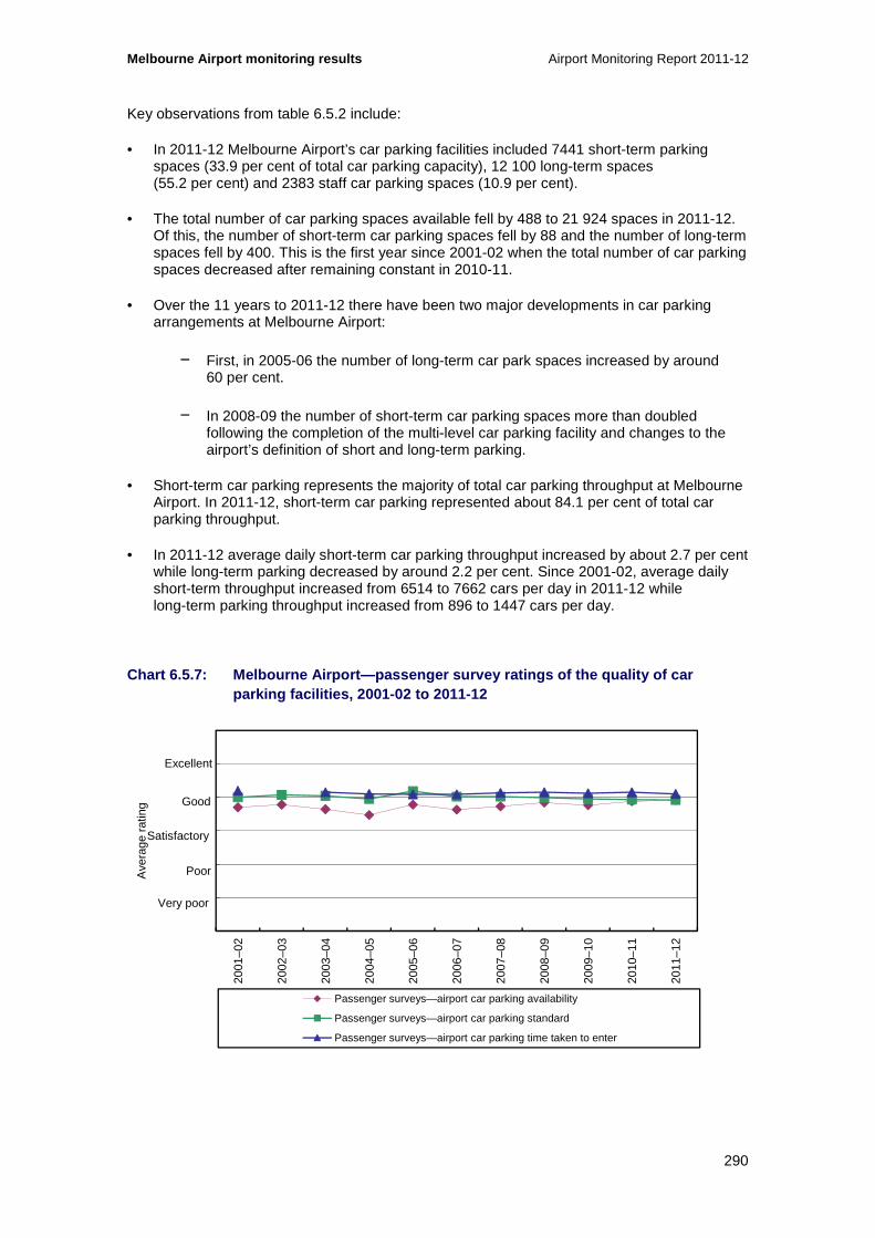
Melbourne Airport monitoring results Airport Monitoring Report 2011-12
290
Key observations from table 6.5.2 include:
• In 2011-12 Melbourne Airport’s car parking facilities included 7441 short-term parking spaces (33.9 per cent of total car parking capacity), 12 100 long-term spaces (55.2 per cent) and 2383 staff car parking spaces (10.9 per cent).
• The total number of car parking spaces available fell by 488 to 21 924 spaces in 2011-12. Of this, the number of short-term car parking spaces fell by 88 and the number of long-term spaces fell by 400. This is the first year since 2001-02 when the total number of car parking spaces decreased after remaining constant in 2010-11.
• Over the 11 years to 2011-12 there have been two major developments in car parking arrangements at Melbourne Airport:
− First, in 2005-06 the number of long-term car park spaces increased by around 60 per cent.
− In 2008-09 the number of short-term car parking spaces more than doubled following the completion of the multi-level car parking facility and changes to the airport’s definition of short and long-term parking.
• Short-term car parking represents the majority of total car parking throughput at Melbourne Airport. In 2011-12, short-term car parking represented about 84.1 per cent of total car parking throughput.
• In 2011-12 average daily short-term car parking throughput increased by about 2.7 per cent while long-term parking decreased by around 2.2 per cent. Since 2001-02, average daily short-term throughput increased from 6514 to 7662 cars per day in 2011-12 while long-term parking throughput increased from 896 to 1447 cars per day.
Chart 6.5.7: Melbourne Airport—passenger survey rat ings of the quality of car parking facilities, 2001-02 to 2011-12
0
1
2
3
4
5
6
2001
–02
2002
–03
2003
–04
2004
–05
2005
–06
2006
–07
2007
–08
2008
–09
2009
–10
2010
–11
2011
–12
Ave
rage
rat
ing
Passenger surveys—airport car parking availability
Passenger surveys—airport car parking standard
Passenger surveys—airport car parking time taken to enter
Excellent
Good
Poor
Very poor
Satisfactory

Airport Monitoring Report 2011-12 Melbourne Airport monitoring results
291
Key observations from chart 6.5.7 include:
• Overall, passengers rated the quality of car parking at Melbourne Airport as satisfactory to good over the period from 2001-02 to 2011-12.
• Passengers’ rating of the availability of car parking spaces marginally increased on average over the period while passengers’ rating of the standard and time taken to enter the airport car park has remained at good or just below good.
• Melbourne Airport reported several upcoming projects designed to increase the availability and standard of car parking:
− Car parking capacity is expected to grow following a project to add around 2400 long-term car parking spaces. Construction of the additional capacity is underway and is expected to be available from March 2013.
− A further car park entrance is planned to ease traffic congestion and travel time to the long-term car park under construction.
− A systems upgrade is envisaged to ease entry to and exit from the car park as well as a potential initiative to introduce bay-finding technology.
6.5.4 Other transport options
In addition to car parking options, there are a number of alternative transport options to and from Melbourne Airport including buses, taxis and private cars such as limousines. For some of these alternative transport options Melbourne Airport imposes a landside access charge.
Table 6.5.3 outlines the landside access charges from 2009-10 to 2011-12 as well as the indexed average list prices for that period (with 2009-10 as the base year). Table 6.5.4 outlines the revenue that the airport received from those charges.
Table 6.5.3: Melbourne Airport—landside access char ges
Transport option Average list prices
($)
Indexed average list prices
(2009-10 as base year)
2009-10 2010-11 2011-12 2009-10 2010-11 2011-12
Public bus No charge No charge No charge NA NA NA
Private bus Various Various Various NA NA NA
Off-airport car parking Various Various Various NA NA NA
Taxis (per pick-up) 1.32 1.32 1.32 100.0 100.0 100.0
Private car (per 30 minutes) 3.00 3.00 3.00 100.0 100.0 100.0

Melbourne Airport monitoring results Airport Monitoring Report 2011-12
292
Table 6.5.4: Melbourne Airport—revenues from landsi de access charges
Transport option 2009-10 2010-11 2011-12
Public bus Nil Nil Nil
Private bus and off-airport car parking $3,171,000 $3,789,000 $3,994,000
Taxi $2,017,000 $2,231,000 $2,128,000
Private car $631,000 $607,000 $927,000
Total $5,819,000 $6,627,000 $7,049,000
Key observations from tables 6.5.3 and 6.5.4 include:
• Public buses
− Melbourne Airport does not impose a charge on public buses entering the airport.
• Private buses and off-airport parking
− Various private buses operate from Melbourne Airport to areas throughout Melbourne and across Victoria including Ballarat, Bendigo, Geelong, Dandenong and metropolitan Melbourne.147
− Melbourne Airport imposes a range of charges, generally charged per vehicle, on a variety of private buses to access the airport. Passenger bus fares from the airport also vary. One provider charges $17 for a one way journey to Melbourne CBD.148
− Melbourne Airport is serviced by a number of off-airport car parking facilities within close proximity to the airport as well as courtesy buses from hotels.
− In 2011-12 the airport received around $3.99 million in revenue from private bus services and off-airport parking facilities. Over three years, revenue from these services has increased by around 26 per cent, from $3.17 million in 2009-10.
• Taxis
− Melbourne Airport charges a $1.32 airport access fee for each taxi pick up. This charge has remained constant since 2008-09. Taxis generally pass on the access charge to passengers through a $2 levy per vehicle leaving the airport.
− The airport received about $2.13 million in revenue from landside access charges on taxis. This is around 4.6 per cent less than the previous year’s revenue of $2.23 million.
• Private car operators
147 Melbourne Airport, see http://melbourneairport.com.au/To-From-the-Airport/Other-Bus-Services/Overview.html 148 Skybus, see http://www.skybus.com.au/

Airport Monitoring Report 2011-12 Melbourne Airport monitoring results
293
− A charge of $3 per 30 minutes is charged to private car operators such as limousines for access to car parking at Melbourne Airport. This charge has been in place since 2010-11.
− In 2011-12 revenue from charges imposes on private cars increased by 52.7 per cent to around $927 000 due to a reduction in revenue leakage.
• Terminal drop-off and pick-up
− In December 2011 Melbourne Airport introduced the ‘Ring & Ride’ waiting zone service which provides an area for drivers to temporarily park and wait before collecting passengers from the airport. The offer provides free parking for up to 20 minutes, charges $2 for between 20 and 40 minutes parking and $4 for parking up to an hour.149
• Future transport options to and from Melbourne Airport are under review as part of Melbourne Airport’s 2013 Master Plan.150 Currently a number of studies and investigations are underway in the development of the Plan, which is expected to include more detail around “plans to improve ground transport access to and from Melbourne Airport, including new airport roads and provision for public transport and a future rail link”.
149 Melbourne Airport, see http://melbourneairport.com.au/News-Events/Listing/Overview/Ring-Ride-waiting-zone-.html 150 Melbourne Airport, see http://melbourneairport.com.au/About-Melbourne-Airport/planning/master-plan/about-the-master-plan.html

Melbourne Airport monitoring results Airport Monitoring Report 2011-12
294

Airport Monitoring Report 2011-12 Perth Airport monitoring results
295
7 Perth Airport
Key points
• Total passenger numbers at Perth Airport during 2011-12 increased by 16.3 per cent from 2010-11 to 13.3 million. Domestic passengers (excluding general aviation passengers) (11.7 per cent) and international passengers (6.9 per cent) contributed to the growth in passenger throughput.
• Aeronautical revenue increased by 14.5 per cent in 2011-12 to $118.0 million.
• Aeronautical revenue per passenger, used by the ACCC as an alternative measure for average prices, decreased in 2011-12 by 1.6 per cent to $8.86. Total aeronautical operating expenses increased by 22.8 per cent to $76.5 million in 2011-12. The main contributors to higher costs were increases in salaries and depreciation of tangible assets.
• Total aeronautical operating margin increased by 1.8 per cent in 2011-12 to $41.5 million. On a per passenger basis, the margin decreased by 12.5 per cent to $3.12.
• Aeronautical services return on non-current assets decreased by 1.9 percentage points to 11.3 per cent in 2011-12.
• Most car parking prices at Perth Airport increased during 2011-12. The majority of short-term car parking prices increased and all long-term parking prices increased for both the domestic and international terminals.
• Car parking revenue increased by 23.2 per cent to $50.6 million while revenue per car park space increased by 14.7 per cent in 2011-12 to $3239.
• Total car parking operating margin increased substantially by 24.3 per cent in 2011-12 to $34.2 million.
• Major investments completed at Perth Airport during 2011-12 included the Terminal 3 phase 1 expansion which was completed in October 2011, the inbound processing refurbishment and expansion completed in September 2011 and Terminal 1 escalator and refurbishments work completed in December 2011.
• In 2011-12, additions to aeronautical tangible non-current assets were $75.6 million, equivalent to 19.0 per cent of total tangible aeronautical non-current assets.
• Perth Airport’s overall rating for quality of service decreased during 2011-12, but remained satisfactory.
• Other quality of service rating outcomes for Perth Airport include:
− Average rating for the international terminal decreased slightly, but remained satisfactory.
− Average rating for the domestic terminal also decreased in 2011-12, but remained satisfactory.
− Average rating for other airport services increased slightly, but remained poor.

Perth Airport monitoring results Airport Monitoring Report 2011-12
296
This chapter presents the detailed prices monitoring, financial performance and quality of service monitoring results in relation to the supply of aeronautical services and car parking services at Perth Airport. This chapter is structured as follows:
• Overview of aeronautical and car parking monitoring results (section 7.1)
• Airport overview and major airport investments (section 7.2)
• Aeronautical services prices monitoring and financial performance results (section 7.3)
• Aeronautical services quality of service monitoring results (section 7.4)
• Car parking services monitoring results (section 7.5).
7.1 Overview of aeronautical and car parking monitoring results
7.1.1 Key aeronautical services indicators for 2011 -12
Table 7.1.1: Perth Airport—key aeronautical service s indicators
Passenger numbers 151
(million)
Total aeronautical
revenue
($million)
Aeronautical revenue per
passenger 152
($)
Total aeronautical
operating margin
($million)
Aeronautical operating
margin per passenger 153
($)
Aeronautical revenue as a
% of total airport
revenue %
2010-11 11.5 103.1 9.0 40.8 3.6 34.8%
2011-12 13.3 118.0 8.9 41.5 3.1 16.4%154
%change ▲ 16.3% ▲ 14.5% ▼ 1.6% ▲ 1.8% ▼ 12.5% ▼ 18.5pp
151 Perth Airport included general aviation (GA) passengers with the 2011-12 passenger numbers. If the GA passenger numbers are excluded, the total number of passengers at Perth Airport during 2011-12 was 12.6 million, representing an increase of 10.3 per cent from 2010-11. Note that general aviation passengers refers to those persons who have travelled on general charter services to specific regional areas in Western Australia from the general aviation precinct. 152 As noted, the total passenger numbers for 2011-12 include GA passengers. If these passengers are excluded from the 2011-12 unit revenue data, the revised value for aeronautical revenue per passenger would be $9.34, representing an increase of 3.8 per cent from 2010-11. 153 As per footnote 3 above, if GA passenger numbers are excluded from the unit margin data, the revised value for aeronautical margin per passenger in 2011-12 was $3.29, representing a decrease of 7.8 per cent from 2010-11. 154 In 2011-12, Perth Airport reported a change in the methodology used for deriving fair value of an investment property asset, which resulted in an increase in total airport revenue of $377 million. If this effect is excluded from total revenue, then the share of aeronautical revenue as a percentage of total airport revenue increases to 34.3 per cent.

Airport Monitoring Report 2011-12 Perth Airport monitoring results
297
Table 7.1.1: Perth Airport—key aeronautical service s indicators (cont...)
Total tangible
aeronautical non-current
assets
($million)
Rate of return on
tangible aeronautical non-current
assets (%)
Average quality of
service rating for
availability of airport services
Average quality of
service rating for
standard of airport
services
Airline rating for quality of
service
Passenger rating for quality of
service
2010-11 337.9 13.2 3.80 3.48 2.61 4.10
2011-12 397.8 11.3 3.32 3.39 2.61 3.98
%change ▲ 17.7% ▼ 14.6% ▼ 13.2% ▼ 2.6% 0.0% ▼ 3.0%
7.1.2 Key car parking services indicators for 2011- 12
Table 7.1.2: Perth Airport—car parking prices as at 30 June
Short-term car parking Long-term car parking
1 hour 3 hours 8 hours 24 hours 1 day 3 days 7 days
2010-11 $5.60 $10.00 $15.00 $36.00 $16.00 $52.00 $88.00
2011-12 $6.00 $10.20 $15.20 $38.00 $17.00 $53.00 $93.00
%change ▲ 7.1% ▲ 2.0% ▲ 1.3% ▲ 5.6% ▲ 6.3% ▲ 1.9% ▲ 5.7%
Table 7.1.3: Perth Airport—car parking services ind ictors
Number of car park spaces
Total car parking revenue
($million)
Car parking revenue per
car park space
($)
Total car parking
operating margin
($million)
Car parking operating
margin per car park
space ($)
Car parking revenue as a
% of total airport
revenue %
2010-11 14 551 $41.1 $2 824 $27.49 $1 889 13.9
2011-12 15 626 $50.6 $3 239 $34.17 $2 187 7.0
%change ▲ 7.4% ▲ 23.2% ▲ 14.7% ▲ 24.3% ▲ 15.8% ▼ 6.9%

Perth Airport monitoring results Airport Monitoring Report 2011-12
298
Table 7.1.3: Perth Airport—car parking services ind icators (cont...)
Landside access
revenue
($million)
Landside access
revenue as a % of total
airport revenue
%
Passenger rating for
availability of airport car
parking
Passenger rating for
standard of airport car
parking
Passenger rating for time taken to enter
airport car park
2010-11 2.1 0.7 4.07 4.03 4.16
2011-12 2.3 0.3 3.93 3.89 4.00
%change ▲ 10.1% ▼ 0.4pp ▼ 3.4% ▼ 3.5% ▼ 3.8%
7.2 Airport overview and major airport investments
This section presents information about Perth Airport, along with activity and investment in 2011-12. This includes: passenger / traffic mix (section 7.2.1); terminal configurations and car parking facilities (section 7.2.2); and major airport investments (section 7.2.3).
7.2.1 Passenger / traffic mix
In 2011-12, around 13.3 million passengers travelled through Perth Airport. Around 68.6 per cent of passengers were travelling domestically and 26.2 per cent were international passengers. The remaining 5.3 per cent of passengers were general aviation (GA) passengers and international transit passengers (chart 7.2.1). It should be noted that prior to 2011-12, Perth Airport did not apply passenger charges to large aircraft operating in the GA precinct and did not receive passenger numbers from these airlines.
Chart 7.2.1: Perth Airport passenger mix, 2011-12
Note: Perth Airport has noted that prior to 2011-12 it did not apply passenger based charges to large aircraft operating in the general aviation precinct and hence did not receive passenger numbers from these airlines. Excluding the GA numbers, the 2011-12 passenger mix would have been: domestic passengers 72.3 per cent; international passengers (excluding transit passengers) 27.6 per cent; and international transit passengers 0.04%.
68.6%
26.2%
0.04%5.1%
Domestic passengers
International passengers (excluding transit passengers)
International transit passengers
General aviation

Airport Monitoring Report 2011-12 Perth Airport monitoring results
299
7.2.2 Terminal configurations and car parking facil ities
Terminal configurations
Perth Airports’ terminal configuration consists of one international terminal and two domestic terminals. Further detail includes:
• The international terminal (T1) is a common-user terminal that is utilised by all airlines flying internationally into and out of Perth. T1 is included in the ACCC’s airport monitoring program and report.
• Qantas occupies and operates Terminal 4 (T4), which prior to 2013 was known as terminal 2. Qantas operates the terminal under a domestic terminal lease (DTL) and therefore data on passenger-related services and facilities provided within this terminal are not included in the monitoring results.
• The other domestic terminal (T3) is a common-use terminal used by all non-Qantas airlines including Tiger Airways, Virgin Australia, Alliance Airlines, SkyWest and Jetstar. This terminal is subject to monitoring and is included in this report.
• Perth Airport has also built a new common-use domestic terminal known as Terminal 2 which opened in early March 2013. Airlines including Alliance, SkyWest and Tiger operate from this terminal. This terminal will be subject to monitoring from 2012-13.
Car parking facilities
Perth Airport offers two types of fee paying car parking facilities, short-term parking and long-term parking and these are located in a number of locations. Details include:
• The domestic terminals (T3 and T4) have both short and long term parking locations. There is one short term car park across from the two domestic terminals. This short term car park is divided between a ‘FastTrack’ and normal short-term car park. The ‘Fast Track’ short-term car park is only available at the T3 and T4 domestic terminals and is directed at the business traveller who is looking for premium convenient and covered parking bays. Parking rates are higher than the normal short-term rates. The other short term car park is located close to the international terminal.
• Perth Airport has long-term car parking at both the domestic and international terminals. The domestic terminal has long-term car parking in four separate locations all serviced by terminal connecting buses. The international terminal has long-term car parking at two locations. One of the locations is next to the international short-term car park and therefore close to the terminal. The other location is serviced by a terminal connecting bus.
Perth Airport opened a new parking facility in October 2011 which allows for motorists who are picking up at the airport to wait until they are advised that the passengers are ready to be collected. Use is via a gold coin with all profits donated to charity.

Perth Airport monitoring results Airport Monitoring Report 2011-12
300
7.2.3 Major airport investments
Aeronautical services and facilities
The following major aeronautical investments were completed by Perth Airport during 2011-12:
• The T3nal 3 phase 1 expansion which was completed on 30 October 2011 and was valued at $21 million.
− This investment involved the extension of the level one departure lounges including the creation of two new passenger arrival/departure gates. Also included in the works were a new exit route with a lift, escalator and stairway, a new airside bussing station and covered passenger walkway.
• Work on the inbound processing refurbishment and expansion was completed on 23 September 2011 and was valued at $3.1 million.
• The T 1 escalator and refurbishments work was completed in December 2011 and was valued at $0.85 million.
− These works included upgrading the arrivals and departures concourses on levels one and two and further work to areas used by Australian Customs and Border Protection Service (AC&BPs). Also four pedestrian escalators were replaced.
• Apron reconfiguration and ground support equipment storage upgrades were completed in October 2011 and were valued at $0.68 million.
The following aeronautical investments were underway at Perth Airport during 2011-12:
• The new domestic terminal building and infrastructure (T3) was commenced on 1 July 2010 and was completed in March 2013. The value of the project is $120 million.
• Airfield improvements commenced 22 December 2010 and were completed in November 2012. The value of this investment is around $63 million. A further $160 million expansion of airfield pavement and taxiway projects is currently underway and programmed for completion in 2014.
− This work includes an expansion program of airfield pavement and taxi way projects and the project will provide expanded aircraft parking and standoff capacity.
The following aeronautical investments are planned for Perth Airport during 2012-13:
• The expansion and redesign of the international arrivals processing areas which is valued at $77 million. Expected completion is 1 December 2013.
• The construction of a new domestic pier to be located on the eastern end of T1. Work is expected to be completed in June 2014 and the investment is valued at $190 million.
• The redesign and upgrade of the international departures area including customs, security screening and lounge areas. The expected completion date is June 2014 and the investment is valued at $110 million.
Airport Monitoring Report 2011-12 Perth Airport monitoring results
301
Car parking and landside access services
Investments in car parking and landside access services undertaken at Perth Airport in 2011-12 include:
• The expansion of the T1 park and ride facility which was completed in June 2012 and valued at around $15 million.
• The completion of the domestic car rental collection area expansion and covered walkway links. This was completed in February 2012 and valued at $1.2 million.
• The completion of improvements to landscaping along Horrie Miller Drive which were completed in October 2011 and valued at $2.3 million.
• The construction of the intersection between Dunreath Drive and the Tonkin Highway that provides an alternative access to the Tonkin Highway. This investment was completed in June 2012 and the value was $3.2 million.
Investments in car parking and landside access services that were underway at Perth Airport in 2011-12 include:
• The expansion of the domestic precinct park and ride facilities which was expected to be completed by August 2012 and was valued at $11.1 million.
• The T1 taxi relocation which involved the building of new taxi and car rental facilities. The date of completion was August 2012 and the investment was valued at $5.4 million.
Planned investments in car parking and landside access services at Perth Airport beyond 2011-12 include:
• The T1 park and ride stage three investment which plans to increase the capacity of the long term and staff car parking. The investments planned to be finished by December 2012 and are valued at $8.6 million.
• The GA refurbishment and expansion of parking facilities that was expected to be completed in March 2013 and valued at $8.5 million.
• The terminal 3 taxi rank and short-term car park reconfiguration which was expected to be completed in January 2013 and valued at $3.5 million.
7.3 Aeronautical prices monitoring and financial performance results
This section presents prices monitoring and financial reporting results for aeronautical services and for total airport services, including activity levels (section 7.3.1); prices (section 7.3.2); revenues, costs and profits (sections 7.3.3 and 7.3.4); government mandated security services (section 7.3.5); assets (section 7.3.6) and rates of return on tangible non-current assets (section 7.3.7).

Perth Airport monitoring results Airport Monitoring Report 2011-12
302
7.3.1 Activity
Chart 7.3.1: Perth Airport—volume of passengers, to nnes landed and aircraft movements, 2001-02 to 2011-12 155
Note: Perth Airport included GA passengers with the 2011-12 passenger numbers. If the GA passenger numbers were excluded, the total number of passengers at Perth Airport during 2011-12 would be 12.6 million, representing an increase of 10.3 per cent from 2010-11.
Key observations from chart 7.3.1 include:
• The number of passengers, tonnes landed and aircraft movements all increased at Perth Airport in 2011-12.
• Passenger numbers increased by 16.3 per cent in 2011-12, increasing to 13.3 million. This is the largest annual increase of any year over the reference period.
− Perth Airport noted that prior to 2011-12, it did not apply passenger charges to large aircraft operating in the GA precinct and did not receive passenger numbers from these airlines. If GA passengers are excluded from the data for 2011-12, passenger numbers would have increased by 10.3 per cent in 2011-12.
− Excluding the impact of GA passenger numbers reported for the first time in 2011-12, the largest annual increase in passengers over the reference period occurred in 2007-08, when passenger numbers increased by 13.5 per cent compared to the previous year.
− Since 2001-02, the total number of passengers passing through the airport has increased by 175.3 per cent.
− During 2011-12, international passenger numbers (including international transit passengers) increased by 7.0 per cent to 3.5 million. Domestic passenger numbers also increased during 2011-12 by 11.7 per cent to 9.1 million (if the GA numbers
155 Data in chart 7.3.1 is not comparable to chart 7.2.1 as international transit passengers have been included as international passengers and domestic on-carriage passengers have been included as domestic passengers.
0
25
50
75
100
125
150
0
2 500
5 000
7 500
10 000
12 500
15 00020
01–0
2
2002
–03
2003
–04
2004
–05
2005
–06
2006
–07
2007
–08
2008
–09
2009
–10
2010
–11
2011
–12
Num
ber
of a
ircr
aft m
ove
men
ts (
tho
usan
d)
Num
ber o
f pas
seng
ers
/ to
nne
s la
nded
(tho
usan
d)
Domestic Passengers International Passengers Tonnes landed Aircraft movements (RHS)

Airport Monitoring Report 2011-12 Perth Airport monitoring results
303
are included, the increase would be 20.0 per cent). Perth Airport has stated that the increase in international passenger numbers has been partly driven by the growth in international airlines now flying to the airport and also increased demand for international flights from domestic passengers. The increase in domestic travel is related to the strength of the resource sector in Western Australia and the use of fly-in, fly-out flights for their workforce.156
• The total tonnes landed at Perth Airport in 2011-12 was 5.4 million, increasing by 11.9 per cent from 2010-11. Since 2001-02, tonnes landed increased by 125.1 per cent. The largest yearly increase occurred in 2006-07, when the tonnes landed increased by 16.5 per cent to 3.6 million.
• The number of aircraft movements increased from 129 066 in 2010-11 to 142 079 in 2011-12, representing an increase of 10.1 per cent. This is the largest yearly increase over the 11 years. Since 2001-02, aircraft movements have increased by 90.9 per cent.
7.3.2 Prices
Table 7.3.1 presents the average aeronautical charges at Perth Airport from 2007-08 to 2011-12 as well as the indexed average list prices for that period (with 2007-08 as the base year).157
156 Perth Airport (2012), Perth Airport Annual Report 2011-12, http://www.perthairport.com.au/AboutUs/Publications.aspx. 157 Where a list price changed during the financial year, the average of that charge has been reported in the table.

Perth Airport monitoring results Airport Monitoring Report 2011-12
304
Table 7.3.1: Perth Airport—schedule of average aero nautical charges and indexed average list prices (i ncluding GST), 2007-08 to 2011-12
Average list prices
($)
Indexed average list prices
(2007-08 base year = 100)
2007-08 2008-09 2009-10 2010-11 2011-12 2007-08 2008-09 2009-10 2010-11 2011-12
Aircraft-related services and facilities
Basic landing charge
International RPT (per passenger)
4.14 4.14 4.14 4.28 4.02 100.0 100.0 100.0 103.4 97.1
Domestic and regional RPT (per passenger)
4.14 4.14 4.14 4.28 4.02 100.0 100.0 100.0 103.4 97.1
Fixed wing (general aviation, freight and other) (per tonne MTOW)
8.03 8.34 8.43 8.71 9.15 100.0 103.8 104.9 108.5 113.9
Rotary wing (per tonne MTOW)
4.01 4.17 4.21 4.36 4.57 100.0 103.8 104.9 108.5 113.9
Minimum landing charge
Fixed wing 36.67 38.07 38.47 39.78 41.77 100.0 103.8 104.9 108.5 113.9
Rotary wing 18.34 19.04 19.24 19.89 20.86 100.0 103.8 104.9 108.5 113.8
Basic aircraft parking charge (general aviation) (per aircraft per day)
31.85 33.06 33.41 34.54 36.27 100.0 103.8 104.9 108.5 113.9
Aircraft storage charge NA NA NA 8.71 9.15 NA NA NA 100 105.0

Airport Monitoring Report 2011-12 Perth Airport monitoring results
305
Average list prices
($)
Indexed average list prices
(2007-08 base year = 100)
2007-08 2008-09 2009-10 2010-11 2011-12 2007-08 2008-09 2009-10 2010-11 2011-12
Passenger-related services and facilities
International terminal charge (per passenger)(a)
8.04 8.04 8.04 8.25 9.08 100.0 100.0 100.0 102.7 112.9
CUTE usage charge (per departing international passenger)(b)
NA NA NA 0.67 0.67 NA NA NA 100.0 100.0
Domestic terminal charge (per passenger)(c)
4.10 4.28 4.28 4.42 6.82 100.0 104.4 104.4 107.8 166.39
Domestic aerobridge charge (per passenger)
0.64 0.67 0.67 0.69 NA 100.0 104.7 104.7 107.8 NA
Government mandated security costs
Counter terrorism first response (d)
RPT services (per passenger) 0.66 0.82 0.99 0.95 1.23 100.0 124.2 150.0 143.9 186.4
Freight and other (aircraft > 20 tonne) (per tonne MTOW)
0.61 0.75 0.90 0.88 1.13 100.0 123.0 147.5 144.3 185.2
International passenger and checked bag screening (per passenger)(e)
NA 7.70 6.30 5.70 5.70 NA 100.0 81.8 74.0 74.0
T3 common-user domestic terminal passenger and checked bag screening (per passenger)(e)
NA 3.38 3.21 3.89 2.76 NA 100.0 94.8 115.0 81.7

Perth Airport monitoring results Airport Monitoring Report 2011-12
306
Notes: NA Not applicable.
(a) International terminal charge includes terminal charge, baggage handling system and check-in counter charge. In reports prior to 2010-11, the charge for baggage handling systems was reported separately. However, in this year’s report, the combined charge has been reported for all years for comparative purposes. The non-PSA price in 2011-12 was $9.98.
(b) New charge introduced on 1 July 2010.
(c) The domestic terminal charge is a step charge based on airline volume through the terminal. The non-PSA price in 2011-12 was $7.50.
(d) This charge encompasses not only services provided by the Australian Federal Police Protective Services (AFPPS) that are billed to the airport, but also other services that the airport provides through contract security firms. These services include control of vehicles to and from the terminals, patrols of the apron and additional security required in the terminal buildings to manage access to restricted areas. The AFPPS notified Perth Airport in May 2006 that it would no longer invoice the airport for its services, with effect from 1 January 2006. Accordingly, from 1 June 2006, Perth Airport reduced this charge to zero until a new charge could be calculated based on the costs of the remaining services and the fact that charges from January to May 2006 had included and allowance for the AFPPS charges. A new reduced charge was reinstated with effect from 1 September 2006 following consultation with the airlines and calculation of these services borne by Perth Airport. A new charge was applied for these services on 1 January 2007.
(e) Separate passenger screening and checked bag screening charges ceased on 31 December 2009 and were replaced by combined passenger and checked bag screening charges. For this year’s report, the combined charge has been reported for all years for comparative purposes.

Airport Monitoring Report 2011-12 Perth Airport monitoring results
307
Key observations from table 7.3.1 include:
• List prices for aircraft-related services increased except international, domestic and regional landing fees, which decreased in 2011-12. Passenger-related charges either increased or remained the same, while government mandated security charges either increased or decreased.
• The basic landing charges for international, domestic and regional regular public transport, which contribute approximately 43.4 per cent to total aeronautical revenue, decreased by 6.1 per cent in 2011-12. The basic landing charge for fixed wing and rotary wing aircraft, both increased by 5.1 per cent. These charges have risen each year since 2007-08.
− Perth Airport noted that the basis of charging for some GA carriers was changed during 2011-12. In particular, for some GA carriers, the basis of charging for basic landing was changed from a per MTOW basis to a per passenger basis. This occurred during September 2011.
− Perth Airport stated that some airlines had noted that Perth Airport’s previous practice of applying a passenger-based airfield charge to airlines operating through terminals 1-4, while charging airlines operating from the GA precinct on the basis of MTOW, was not fair as it resulted in airlines in the GA precinct being cross-subsidised. This was due to airlines in the GA precinct using larger aircraft over time, with some aircraft operating in both T3 and the GA precinct.
• The basic aircraft parking charge for GA aircraft parking at Perth Airport increased from $34.54 per aircraft per day in 2010-11 to $36.27 in 2011-12, representing an increase of 5.0 per cent. Revenues from this charge comprise a small proportion of total aeronautical revenue. In 2011-12, the basic aircraft parking charge contributed 0.2 per cent of total aeronautical revenue.
− International and domestic terminal charges, which contribute around 39.2 per cent of total aeronautical revenue, increased by 10.0 per cent and 54.3 per cent respectively in 2011-12.
− Perth Airport noted that it completed price negotiations with airlines in 2011 and the prices from those agreements took effect from 1 July 2011. Perth Airport offers a lower international terminal charge and lower domestic charge to all airlines who have executed a Prices and Services Agreement (PSA) with Perth Airport. During 2011-12, Perth Airport did not charge any airline the non-PSA price, in order to provide a grace period for all airlines to complete their internal review and execution process for the PSA. As no airline was charged the non-PSA price in 2011-12, the PSA price for 2011-12 is shown in table 7.3.1.
− Perth Airport noted that executed agreements with airlines reflect business volumes equivalent to 97 per cent of passengers. Perth Airport also noted that the increases in charges reflected the substantial capital investments made by the airport during the period while the new agreements were being negotiated.
• Counter terrorism first response (CTFR) charges for RPT services and for freight and other (aircraft over 20 tonnes MTOW) also had substantial increases in 2011-12. CTFR charges for RPT services increased 29.2 per cent, and CTFR charges for freight and other aircraft greater than 20 tonne MTOW increased 29.1 per cent in 2011-12.
• The passenger and checked bag screening charge for international passengers remained unchanged in 2011-12 at $5.70 per passenger. Over the period from 2008-09 to 2011-12, this charge decreased by 26.0 per cent. The passenger and checked bag screening charge for domestic passengers decreased by 28.9 per cent from $3.89 per passenger in 2010-11

Perth Airport monitoring results Airport Monitoring Report 2011-12
308
to $2.76 per passenger in 2011-12. Note that prior to 1 January 2009, checked bag screening and passenger screening were separate charges. From 1 January 2009, the charges were combined into a single charge of $7.70 per international passenger and $3.38 per domestic passenger.
7.3.3 Revenues, costs and profits for aeronautical and total airport services
As noted, the ACCC required airport operators to provide additional information relating to the aeronautical asset base under the ‘line in the sand’ (LIS) approach for the first time in 2007-08. Under this approach, the value of an airport’s aeronautical asset base for monitoring purposes is the value of tangible non-current aeronautical assets reported to the ACCC as at 30 June 2005, plus new investments, less depreciation and disposals.
Perth Airport advised in its regulatory accounts that a schedule of LIS values for aeronautical assets is not required. Perth Airport’s total aeronautical asset base used for the regulatory accounts matches the line in the sand aeronautical asset base values required by the ACCC and, for the purposes of its regulatory accounts, Perth Airport does not record revaluations of its aeronautical assets. Therefore, LIS measures are not separately reported for Perth Airport in this report.
Table 7.3.2 outlines the revenues, operating expenses and operating margins for aeronautical services and the total airport from 2001-02 to 2011-12.

Airport Monitoring Report 2011-12 Perth Airport monitoring results
309
Table 7.3.2: Perth Airport—revenues, operating expe nses and operating margins for aeronautical service s and total airport services, 2001-02 to 2011-12
2001-02 2002-03 2003-04 2004-05 2005-06 2006-07 2007-08 2008-09 2009-10 2010-11 2011-12
Revenue
($million)
Aeronautical 20.6 38.1 44.8 50.9 57.4 65.8 74.5 80.4 88.0 103.1 118.0
Total airport 76.1 94.6 116.5 140.8 172.8 239.9 206 .0 169.9 247.6 296.2 721.9
Operating expenses
($million)
Aeronautical 19.5 21.5 24.5 32.4 36.8 41.5 38.1 47.7 53.5 62.3 76.5
Total airport 37.7 42.8 49.6 74.4 69.6 83.0 68.1 93 .4 105.3 123.4 145.7
Operating margin
($million)
Aeronautical 1.1 16.6 20.3 18.5 20.6 24.3 36.4 32.6 34.5 40.8 41.5
Total airport 38.4 51.8 66.9 66.4 103.3 156.9 138.0 76.5 142.4 172.7 576.1
Operating margin as a % of revenue
Aeronautical 5.5 43.6 45.3 36.4 35.9 37.0 48.9 40.6 39.2 39.6 35.2
Total airport 50.5 54.78 57.5 47.2 59.7 65.4 67.0 4 5.0 57.5 58.3 79.8

Perth Airport monitoring results Airport Monitoring Report 2011-12
310
Key observations from table 7.3.2 include:
• Aeronautical revenue, operating expenses and operating margin for Perth Airport all increased in 2011-12. Total airport revenues, expenses and margins also all increased in 2011-12.
− In 2011-12, Perth Airport reported a change in the methodology used for deriving fair value of an investment property asset, which resulted in an increase in total airport revenue of $377 million. This revaluation also impacted on total airport operating margins.
• Revenue from aeronautical services increased by $14.9 million (14.5 per cent) in 2011-12 to $118.0 million. As noted, Perth Airport increased some list prices during 2011-12 and decreased others, although the main driver of the increase in total aeronautical revenue was passenger growth. Over the period from 2001-02 to 2011-12 aeronautical revenue increased by an average of 19.1 per cent per year. The largest yearly increase occurred in 2002-03 when aeronautical revenue increased by an 85.1 per cent, which was due to Perth Airport increasing its prices following the removal of price caps on 1 July 2002.
• Aeronautical operating expenses increased by $14.2 million (22.7 per cent) in 2011-12. Over the period from 2001-02 to 2011-12, aeronautical operating expenses have increased by an average of 14.7 per cent per year. This is despite a decrease of 8.2 per cent in 2007-08. Perth Airport advised that the decrease in 2007-08 was due to the reversal of a technical services fee ($11.5 million), of which $4.12 million was allocated to aeronautical services. The fee was accrued in 2006-07 but was reversed in 2007-08 as it was not required to be paid.
• In 2011-12, aeronautical operating margin (total revenue minus expenses) increased by 1.7 per cent to $41.5 million. Since 2001-02, aeronautical operating margin has increased by 3570.0 per cent (note that this increase is from a low base). However, the majority of this increase occurred between 2001-02 and 2002-03, where aeronautical operating margin increased by 1368.0 per cent. Between 2002-03 and 2011-12, aeronautical operating margin has increased by an average of 10.7 per cent per annum.
• Revenue from total airport services increased by $425.7 million (143.7 per cent) in 2011-12 to $721.9 million. The result for 2011-12 was impacted by the effects of the changed methodology for calculating the value of an asset. Perth Airport adopted a new methodology for deriving fair value of its investment property assets. This resulted in an asset revaluation gain of its non-aeronautical investment property of $377 million for 2011-12. Over the period from 2001-02 to 2011-12 total airport revenue increased by an average of 25.2 per cent per annum.
− Excluding the gain from the asset revaluation of the non-aeronautical investment property in 2011-12, total airport revenue has increased by an annual average of 16.3 per cent per annum since 2001-02.
• Total airport operating expenses increased by $22.3 million (18.1 per cent) in 2011-12. Over the period from 2001-02 to 2011-12, total airport operating expenses have increased by an average of 14.5 per cent over per annum.
• In 2011-12, total airport operating margin (total revenue minus expenses) increased by 233.6 per cent to $576.1 million, a result also impacted by the change in methodology used to value an asset. Over the period from 2001-02 to 2011-12, total airport operating margin increased by an average of 31.1 per cent per annum.

Airport Monitoring Report 2011-12 Perth Airport monitoring results
311
• Excluding the gain from the asset revaluation of the non-aeronautical investment property in 2011-12, total airport operating margin has increased by an annual average of 17.9 per cent per annum since 2001-02.
Chart 7.3.2: Perth Airport— aeronautical services a nd non-aeronautical services share of total airport revenue, 2001-02 to 2011-12
Key observations from chart 7.3.2 include:
• Aeronautical revenue as a proportion of total airport revenue decreased in 2011-12 to 16.4 per cent, down on the 34.8 per cent share in 2010-11. Aeronautical revenue as a proportion of total airport revenue reached a peak of 47.3 per cent in 2008-09.
• Notably, changes in this measure since 2001-02 have been partly attributable to changes in non-aeronautical revenue due to increments and decrements in the fair value of non-aeronautical investment property.
• Excluding the effects of changes in the fair value of non-aeronautical investment property, aeronautical revenue as a proportion of total airport revenue increased to 34.3 per cent in 2011-12, unchanged from 2010-11. In 2003-04, Perth Airport had negative total airport revenue when excluding the effects of changes in the fair value of non-aeronautical investment property. Between 2004-05 and 2011-12, aeronautical revenue as a proportion of total airport revenue, excluding the effects of changes in the fair value of non-aeronautical investment property, has ranged from 34.3 per cent to 40.7 per cent.
7.3.4 Average revenues, costs and profits for aeron autical services
As noted above, prior to 2011-12, Perth Airport did not apply passenger charges to large aircraft operating in the GA precinct and did not receive passenger numbers from these aircraft. As a result, care should be taken when making comparisons of aeronautical revenues, operating expenses and margins on a per passenger basis between 2011-12 and previous years. As shown in table 7.3.3, if GA passenger numbers were excluded from the data for 2011-12, aeronautical revenues, operating expenses and margins would be around 5.4 per cent larger on a per passenger basis than if the GA passenger numbers were included.
0
10
20
30
40
50
60
70
80
90
100
2001
–02
2002
–03
2003
–04
2004
–05
2005
–06
2006
–07
2007
–08
2008
–09
2009
–10
2010
–11
2011
–12
Per
cen
t
Revenue—aeronautical Revenue—non-aeronautical

Perth Airport monitoring results Airport Monitoring Report 2011-12
312
Table 7.3.3: Perth Airport—revenues, operating expe nses and operating margins for aeronautical services, including and excluding gene ral aviation (GA) passengers, 2011-12
2011-12 (including GA) 2011-12 (excluding GA) %change
Revenue per passenger ($) 8.86 9.34 ▲5.4%
Operating expenses per passenger ($)
5.74 6.05 ▲5.4%
Operating margin per passenger ($)
3.12 3.29 ▲5.4%
The discussion of revenues, operating expenses and operating margins on a per passenger basis in the proceeding sections will be presented on the basis of total passenger numbers, including GA passenger numbers.
Chart 7.3.3: Perth Airport—revenues, operating expe nses and operating margins for aeronautical services on a per passenger basis, 200 1-02 to 2011-12
Note: The passenger numbers used in calculations for chart 7.3.3 include the previously noted GA passenger numbers.
Key observations from chart 7.3.3 include:
• On a per passenger basis, aeronautical revenue and operating margin decreased, while operating expenses increased at Perth Airport in 2011-12.
• Aeronautical revenue per passenger decreased from $9.00 in 2010-11 to $8.86 in 2011-12 (-1.6 per cent). This was due to passenger numbers increasing at a faster rate than aeronautical revenue, resulting from the inclusion of passengers from GA in 2011-12. If GA passenger numbers were excluded from the data for 2011-12, aeronautical revenue per
$0.00
$1.00
$2.00
$3.00
$4.00
$5.00
$6.00
$7.00
$8.00
$9.00
$10.00
2001
–02
2002
–03
2003
–04
2004
–05
2005
–06
2006
–07
2007
–08
2008
–09
2009
–10
2010
–11
2011
–12
Per
pas
sen
ger
Revenue Expenses Margin

Airport Monitoring Report 2011-12 Perth Airport monitoring results
313
passenger would have been $9.34 in 2011-12, an increase of 3.8 per cent compared with 2010-11. Since 2001-02, aeronautical revenue per passenger has increased by 108.2 per cent to $8.86 in 2011-12. On an annual basis, the increase in aeronautical revenue per passenger was around 7.6 per cent.
• Aeronautical operating expenses on a per passenger basis increased from $5.44 in 2010-11 to $5.74 in 2011-12 (5.6 per cent). If GA passenger numbers were excluded from the data for 2011-12, aeronautical operating expense per passenger would have been $6.05 in 2011-12, an increase of 11.3 per cent compared with 2010-11. Since 2001-02, aeronautical operating expenses per passenger have increased by 42.8 per cent. On an annual basis, the average increase in aeronautical operating expense per person from 2001-02 to 2011-12 was around 3.6 per cent.
• Aeronautical operating margin decreased from $3.56 per passenger in 2010-11 to $3.12 in 2011-12 (-12.5 per cent). If GA passenger numbers were excluded from the data for 2011-12, aeronautical operating margin per passenger would have been $3.29 in 2011-12, a decrease of 7.8 per cent compared with 2010-11. Aeronautical operating margin on a per passenger basis increased by 1232.9 per cent between 2001-02 and 2011-12. Excluding 2001-02, when the operating margin was $0.23 per passenger, operating margin for aeronautical services increased by less than 1.0 per cent over the reference period.
7.3.5 Government mandated security services
Government mandated security charges are directly related to the government mandated security levels. Perth Airport commented that security charges represent a pass-through of costs to airlines and, therefore, increases or decreases in revenues or expenses do not have any impact on the long-term profitability of the airport.
Table 7.3.4 outlines the revenues, operating expenses and operating margins for government mandated security services and aeronautical services from 2001-02 to 2011-12.

Perth Airport monitoring results Airport Monitoring Report 2011-12
314
Table 7.3.4: Perth Airport—revenues, operating expe nses and operating margins for government mandated security services and aeronautical services, 2001-02 to 2011-12
2001-02 2002-03 2003-04 2004-05 2005-06 2006-07 2007-08 2008-09 2009-10 2010-11 2011-12
Revenue
($million)
Security services 4.4 6.3 6.6 8.1 9.8 11.2 12.2 13.7 14.8 18.9 19.3
Total aeronautical 20.6 38.1 44.8 51.0 57.4 66.0 7 4.5 80.4 88.0 103.1 118.0
Operating expenses
($million)
Security services 5.0 5.8 7.0 8.6 9.5 9.4 12.2 13.7 14.0 18.3 20.2
Total aeronautical 19.5 21.5 24.5 32.4 36.8 41.5 38 .1 47.7 53.5 62.3 76.5
Operating margin
($million)
Security services (0.6) 0.5 (0.4) (0.5) 0.4 1.8 0.0 (0.0) 0.9 0.6 (0.9)
Total aeronautical 1.1 16.6 20.3 18.5 20.6 24.3 36. 4 32.6 34.5 40.8 41.5
Revenue per passenger
($)
Security services 0.91 1.17 1.09 1.22 1.38 1.38 1.33 1.40 1.42 1.65 1.45
Total aeronautical 4.26 7.09 7.39 7.65 8.04 8.13 8. 11 8.25 8.40 9.00 8.86
Operating expense per passenger
($)
Security services 1.02 1.08 1.15 1.29 1.33 1.16 1.33 1.40 1.33 1.60 1.51
Total aeronautical 4.02 4.00 4.04 4.87 5.16 5.13 4. 15 4.90 5.10 5.44 5.74
Operating margin per passenger
($)
Security services (0.12) 0.09 (0.06) (0.07) 0.05 0.22 0.00 0.00 0.08 0.05 (0.07)
Total aeronautical 0.23 3.09 3.35 2.78 2.88 3.00 3. 97 3.35 3.29 3.56 3.12
Note: The passenger numbers used in calculations for 2011-12 in table 7.3.4 include the previously noted GA passenger numbers.

Airport Monitoring Report 2011-12 Perth Airport monitoring results
315
Key observations from table 7.3.4 include:
• Total security revenue, and operating costs increased in 2011-12, while operating margin, and security measures per passenger decreased.
− It should be noted that the passenger numbers used in per passenger calculations for 2011-12 include the previously noted GA passenger numbers. As noted in table 7.3.3, revenues, operating expenses and operating margins would be 5.4 per cent higher in 2011-12 with the exclusion of GA passenger numbers.
• Security revenue increased from $18.9 million in 2010-11 to $19.3 million in 2011-12 (2.1 per cent). Over the entire reference period, security revenue increased in every period and overall by 338.8 per cent. On an average annual basis, the increase in security revenue was around 4.8 per cent per annum. The increases were partly attributable to higher security recovery and passenger and checked bag screening charges, in conjunction with an increase in passenger throughput of 175.3 per cent over the same period.
• On a per passenger basis, security revenue decreased from $1.65 in 2010-11 to $1.45 in 2011-12 (-12.1 per cent). This was due to passenger numbers increasing at a faster rate than security revenue in 2011-12. Over the entire reference period, security revenue per passenger increased by 59.4 per cent to $1.45 in 2011-12. In 2007-08, there was a 3.8 per cent decrease from $1.38 per passenger in 2006-07 to $1.33 per passenger. This decrease was partly a result of revenue from a CTFR charge having decreased as a proportion of the total security revenue.
• Total security expenses increased from $18.3 million in 2010-11 to $20.2 million in 2011-12 (10.4 per cent). The largest increase occurred in 2010-11 where the increase was 30.9 per cent. Over the reference period, security expenses increased by 306.6 per cent.
• Security expenses as a proportion of aeronautical operating expenses decreased from 29.4 per cent in 2010-11 to 26.4 per cent in 2011-12. The weighted average share of security expenses to total aeronautical operating expenses over the reference period was 27.2 per cent. Security expenses accounted for around 13.8 per cent of total airport operating expenses in 2011-12, down from 14.8 per cent in 2010-11.
• On a per passenger basis, security expenses decreased from $1.60 in 2010-11 to $1.51 in 2011-12 (-5.3 per cent). This was due to passenger numbers increasing at a faster rate than security expenses in 2011-12. Since 2001-02, security expenses per passenger have increased by 47.7 per cent.
• Total operating margins on security services at Perth Airport were $-0.88 million in 2011-12 compared with $0.56 million in 2010-11. The result for 2011-12 represents the largest negative margin on security services since 2001-02. The highest margin of $1.8 million was recorded in 2006-07. From 2001-02 to 2011-12, annual operating margins on security services have averaged $0.16 million per annum.
• On a per passenger basis, operating margins on security services at Perth Airport were $-0.07 in 2011-12. This compares with $0.05 for 2010-11. Since 2001-02, operating margins per passenger on security services have averaged $0.02 per annum.

Perth Airport monitoring results Airport Monitoring Report 2011-12
316
Chart 7.3.4: Perth Airport—government mandated secu rity services share of total aeronautical services revenue, 2001-02 to 2011-12
Key observations from chart 7.3.4 include:
• Non-security aeronautical revenue as a share of total aeronautical revenue increased from 81.7 per cent in 2010-11 to 83.7 per cent in 2011-12. Over the reference period, non-security aeronautical revenue had the largest share of total aeronautical revenue in 2003-04 with 85.3 per cent.
• As a proportion of aeronautical revenue, security revenue decreased from 18.3 per cent in 2010-11 to 16.4 per cent in 2011-12. This measure has shown variability over the reference period. The highest proportion recorded over the reference period occurred in 2010-11 with 18.3 per cent and the lowest occurred in 2003-04 with 14.7 per cent.
• Security revenue accounted for 2.7 per cent of total airport revenue in 2011-12, down from 6.4 per cent in 2010-11 (note that the increase in the value of an investment property reported by Perth Airport had the effect of lowering the proportion of security revenue to total revenue).
0
10
20
30
40
50
60
70
80
90
100
2001
–02
2002
–03
2003
–04
2004
–05
2005
–06
2006
–07
2007
–08
2008
–09
2009
–10
2010
–11
2011
–12
Per
cen
t
Revenue—aeronautical (excl. security) Revenue—security

Airport Monitoring Report 2011-12 Perth Airport monitoring results
317
Chart 7.3.5: Perth Airport— aeronautical services r evenue, operating expenses and operating margin excluding government mandated security services on a per passenger basis, 2001-02 to 2011-12
Note: The passenger numbers used in calculations for 2011-12 in table 7.3.4 include the previously noted GA passenger numbers.
Key observations from chart 7.3.5 include:
• On a per passenger basis and excluding security services revenues and expenses, aeronautical revenue and expenses increased, while operating margin decreased at Perth Airport in 2011-12.
• Aeronautical revenue per passenger (excluding security) increased from $7.36 in 2010-11 to $7.42 in 2011-12 (0.8 per cent). Since 2001-02, aeronautical revenue per passenger (excluding security) has increased by 121.4 per cent. On an average annual basis, the increase in aeronautical revenue per passenger (excluding security) was around 8.3 per cent per annum.
− If GA passenger numbers are excluded from the data for 2011-12, aeronautical revenue per passenger (excluding security) would have been $7.81, an increase of 6.2 per cent compared with 2010-11.
• Aeronautical operating expenses per passenger (excluding security) increased from $3.84 in 2010-11 to $4.23 in 2011-12 (10.1 per cent). Since 2001-02, aeronautical operating expenses per passenger (excluding security) have increased by 41.1 per cent. On an average annual basis, the increase in aeronautical operating expenses per passenger (excluding security) was around 3.5 per cent per annum.
− If GA passenger numbers are excluded from the data for 2011-12, aeronautical operating expenses per passenger (excluding security) would have been $4.46, an increase of 16.0 per cent since 2010-11.
• Operating margin for aeronautical services per passenger (excluding security) decreased from $3.51 per passenger in 2010-11 to $3.19 per passenger in 2011-12 (-9.4 per cent). Aeronautical operating margin per passenger (excluding security) increased by 808.7 per cent over the reference period. Excluding 2001-02 when the aeronautical
$0.00
$2.00
$4.00
$6.00
$8.00
2001
–02
2002
–03
2003
–04
2004
–05
2005
–06
2006
–07
2007
–08
2008
–09
2009
–10
2010
–11
2011
–12
Per
pas
sen
ger
Revenue Expenses Margin

Perth Airport monitoring results Airport Monitoring Report 2011-12
318
operating margin (excluding security) was $0.35 per passenger, aeronautical operating margin per passenger (excluding security) increased over the whole reference period by 6.2 per cent.
− If we exclude GA passenger numbers from the data for 2011-12, the operating margin for aeronautical services per passenger (excluding security) decreased to $3.36, representing a 4.5 per cent decrease since 2010-11.
7.3.6 Assets for aeronautical and total airport ser vices
Table 7.3.5 outlines Perth Airport’s tangible non-current assets for aeronautical services and the total airport from 2001-02 to 2011-12.

Airport Monitoring Report 2011-12 Perth Airport monitoring results
319
Table 7.3.5: Perth Airport— tangible non-current as sets for aeronautical services and total airport se rvices, 2001-02 to 2011-12
2001-02 2002-03 2003-04 2004-05 2005-06 2006-07 2007-08 2008-09 2009-10 2010-11 2011-12
Investment property
($million)
Aeronautical 0.0 0.0 0.0 0.0 0.0 0.0 0.0 0.0 0.0 0.0 0.0
Total airport 0.0 0.0 0.0 0.0 158.4 240.8 290.1 315 .1 381.8 375.0 755.3
Land
($million)
Aeronautical 17.7 17.5 42.0 41.6 17.8 17.6 17.4 17.2 17.0 16.8 16.6
Total airport 97.0 96.8 168.8 166.3 28.5 30.2 31.3 31.0 30.6 33.5 33.2
Property, plant and equipment
($million)
Aeronautical 66.8 66.9 133..6 154.6 161.0 167.9 188.0 227.1 262.7 321.1 381.2
Total airport 109.4 117.5 214.9 247.1 234.0 262.5 3 19.5 401.3 418.0 478.0 608.7
Intangibles
($million)
Aeronautical 0.0 0.0 0.0 0.0 0.0 0.0 0.0 0.0 0.0 0.0 0.0
Total airport 408.9 404.5 400.2 395.8 458.2 454.9 4 53.8 455.1 454.1 453.5 451.4
Other tangible non-current assets
($millon)
Aeronautical 2.4 2.3 2.4 0.2 2.5 3.9 0.0 0.0 0.0 0.0 0.0
Total airport 28.3 30.2 30.3 31.3 7.5 28.1 24.5 8.0 11.4 9.8 20.6
Total tangible non-current assets
($million)
Aeronautical 86.9 86.7 178.0 196.4 181.3 189.3 205.4 244.3 279.7 337.9 397.8
Total airport 234.7 244.5 414.0 444.7 426.4 561.5 665.3 755.4 841.9 896.2 1 417.8
Total non-current assets
($million)
Aeronautical 86.9 86.7 178.0 196.4 181.3 189.3 205.4 244.3 279.7 337.9 397.8
Total airport 643.6 649.0 814.2 840.5 886.5 1 016.4 1 119.2 1 210.5 1 296.0 1 349.7 1 869.3

Perth Airport monitoring results Airport Monitoring Report 2011-12
320
Key observations from table 7.3.5 include:
• The value of aeronautical tangible non-current assets increased by 17.7 per cent from $337.9 million in 2010-11 to $397.8 million in 2011-12.
• The increase in aeronautical non-current assets in 2011-12 was attributable to a $60 million (18.7 per cent) increase in the value of property, plant and equipment. Over the reference period, the value of property, plant and equipment increased by 471.0 per cent $381.2 million in 2011-12.
− In 2011-12, the depreciation of aeronautical tangible non-current assets totalled $14.7 million. This compares with depreciation of $10.8 million in 2010-11.
• Aeronautical land assets decreased by 1.2 per cent in 2011-12, from $16.2 million in 2010-11 to $16.6 million in 2011-12. The value of land decreased by a total of 6.2 per cent over the whole reference period, from $17.7 million in 2001-02 to $16.6 million in 2011-12.
• The value of total non-current airport assets increased by 38.5 per cent in 2011-12, increasing from $1349.5 million in 2010-11 to $1869.3 million. Excluding intangibles (i.e. goodwill), non-current assets for the total airport increased by 58.2 per cent to $1418 million in 2011-12.
• This increase in total assets and total assets excluding intangibles is directly related to the change in fair value of investment property of around $377.5 million (due to a change in the methodology used for deriving fair value). Total airport investment property assets increased in 2011-12 by 101.4 per cent, increasing from $374.9 million in 2010-11 to $755.3 million.
Chart 7.3.6: Perth Airport—additions as a percentag e of tangible non-current assets for aeronautical and total airport services, 2001-0 2 to 2011-12
0
5
10
15
20
25
2001
–02
2002
–03
2003
–04
2004
–05
2005
–06
2006
–07
2007
–08
2008
–09
2009
–10
2010
–11
2011
–12
Per
cen
t
Aeronautical services Total airport

Airport Monitoring Report 2011-12 Perth Airport monitoring results
321
Key observations from chart 7.3.6 include:
• Perth Airport’s aeronautical tangible non-current asset additions as a percentage of aeronautical tangible non-current assets decreased slightly in 2011-12 to 19.0 per cent. Additions to aeronautical assets included buildings ($4.6 million), plant and machinery ($17.5 million), work in progress ($123.8 million) and other assets ($35.7 million).
• Additions to total airport tangible non-current assets represented about 11.6 per cent of total airport tangible non-current assets in 2011-12. Additions to total airport assets included buildings ($6.9 million), plant and machinery ($28.2 million) and work in progress ($16.8 million).
• Since 2001-02, annual additions to aeronautical tangible non-current assets have varied. The smallest proportion of additions to aeronautical assets was 2.3 per cent in 2001-02 and the largest was 20.6 per cent in 2010-11.
• Annual additions to total airport assets have also varied, with the smallest proportion being 4.0 per cent in 2009-10 while the largest was 12.7 per cent in 2008-09.
7.3.7 Rates of return on tangible non-current asset s
Chart 7.3.7: Perth Airport—rate of return (EBITA) o n tangible non-current assets for aeronautical services and total airport services, 2001-02 to 2011-12
Key observations from chart 7.3.7 include:
• Earnings before interest, tax and amortisation (EBITA) on average tangible non-current assets (rate of return) decreased slightly for aeronautical services in 2011-12, but more than doubled for total airport services, as a result of an asset revaluation gain of its non-aeronautical investment property of $377 million for 2011-12.
• For aeronautical services, the rate of return on tangible non-current assets decreased from 13.2 per cent in 2010-11 to 11.3 per cent in 2011-12. The decrease is mostly due to the increase in average tangible non-current assets of 17.7 per cent. The EBITA for aeronautical services increased by 1.8 per cent.
0
5
10
15
20
25
30
35
40
45
50
55
2001
–02
2002
–03
2003
–04
2004
–05
2005
–06
2006
–07
2007
–08
2008
–09
2009
–10
2010
–11
2011
–12
Per
cen
t per
an
num
Aeronautical services Total airport
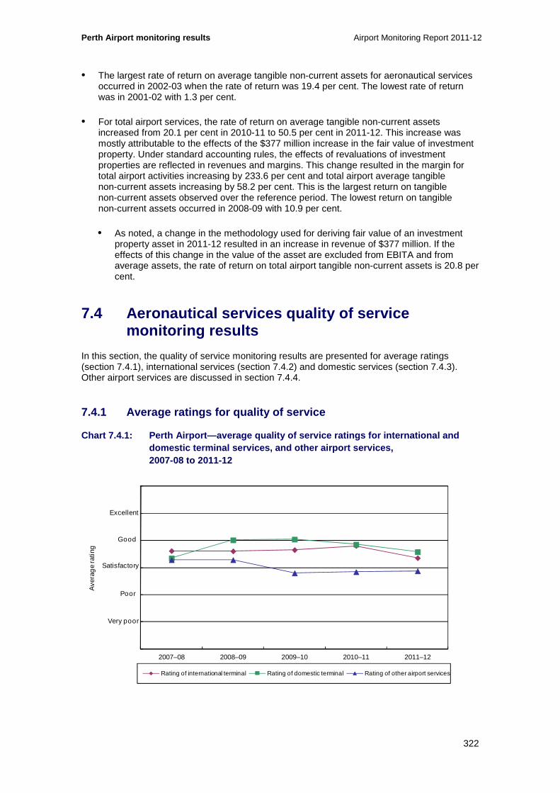
Perth Airport monitoring results Airport Monitoring Report 2011-12
322
• The largest rate of return on average tangible non-current assets for aeronautical services occurred in 2002-03 when the rate of return was 19.4 per cent. The lowest rate of return was in 2001-02 with 1.3 per cent.
• For total airport services, the rate of return on average tangible non-current assets increased from 20.1 per cent in 2010-11 to 50.5 per cent in 2011-12. This increase was mostly attributable to the effects of the $377 million increase in the fair value of investment property. Under standard accounting rules, the effects of revaluations of investment properties are reflected in revenues and margins. This change resulted in the margin for total airport activities increasing by 233.6 per cent and total airport average tangible non-current assets increasing by 58.2 per cent. This is the largest return on tangible non-current assets observed over the reference period. The lowest return on tangible non-current assets occurred in 2008-09 with 10.9 per cent.
• As noted, a change in the methodology used for deriving fair value of an investment property asset in 2011-12 resulted in an increase in revenue of $377 million. If the effects of this change in the value of the asset are excluded from EBITA and from average assets, the rate of return on total airport tangible non-current assets is 20.8 per cent.
7.4 Aeronautical services quality of service monitoring results
In this section, the quality of service monitoring results are presented for average ratings (section 7.4.1), international services (section 7.4.2) and domestic services (section 7.4.3). Other airport services are discussed in section 7.4.4.
7.4.1 Average ratings for quality of service
Chart 7.4.1: Perth Airport—average quality of servi ce ratings for international and domestic terminal services, and other airport servi ces, 2007-08 to 2011-12
0
1
2
3
4
5
6
2007–08 2008–09 2009–10 2010–11 2011–12
Ave
rag
e ra
ting
Rating of international terminal Rating of domestic terminal Rating of other airport services
Excellent
Good
Poor
Very poor
Satisfactory

Airport Monitoring Report 2011-12 Perth Airport monitoring results
323
Key observations from chart 7.4.1 include:
• Perth Airport’s average quality of service rating for international services remained at the satisfactory level in 2011-12. Since 2007-08, the rating has remained satisfactory in all years.
• The average quality of service rating for the domestic terminal also remained at satisfactory in 2011-12. Over the reference period (2007-08 to 2011-12), the domestic terminal has been rated good on two occasions and satisfactory for the other years.
• For the third consecutive year, Perth Airport’s average quality of service rating for other airport services remained poor in 2011-12. Ratings for 2007-08 and 2008-09 were satisfactory.
Chart 7.4.2: Perth Airport—average quality of servi ce ratings for availability and standard of airport services, 2007-08 to 2011-12
Key observations from chart 7.4.2 include:
• Average ratings for availability and standard of airport services have been consistent over the reference period, remaining at satisfactory for all years, although there were decreases within the satisfactory rating for both availability and standard in 2011-12.
0
1
2
3
4
5
6
2007–08 2008–09 2009–10 2010–11 2011–12
Ave
rag
e ra
ting
Rating of availability Rating of standard
Excellent
Good
Poor
Very poor
Satisfactory

Perth Airport monitoring results Airport Monitoring Report 2011-12
324
7.4.2 International services
Chart 7.4.3: Perth Airport—check-in (international services), 2007-08 to 2011-12
Key observations from chart 7.4.3 include:
• Airlines’ rating of international check-in availability decreased in 2011-12, but remained rated as poor. Airlines’ rating of the standard of international check-in facilities decreased from satisfactory in 2010-11 to poor in 2011-12.
− In commentary to the surveys, airlines noted ongoing issues with counter availability during peak periods, commenting that overall there are insufficient check-in counters made available for use by the airlines. Airlines did note however that the airport has plans for new check-in counters to be available in 2013. Airline commentary on the standard of check-in services and facilities was mixed—some airlines noted no issues, while other airlines noted poor design and the area was not user friendly due to poor signage and information for passengers.
• Passengers’ rating of international check-in waiting time decreased in 2011-12, but remained rated as good. International check-in waiting time has been consistently rated as good by passengers over the last five years.
• The percentage of hours with more than 80 per cent of check-in desks in use remained at around zero.
− Perth Airport noted that service level agreements (SLAs) are negotiated directly between the airlines and their ground handling agents which set out the number of staff provided for each flight and the opening and closing times of the counters. Perth Airport noted that it is not involved in this process.
− Perth Airport further noted that the actual SLAs, actual numbers of staff provided on the day, aircraft load factors, seasonal factors and whether the airline has an on-line check in facility and dedicated counters to drop bags, all have a significant
0.0003 0.0000 0.0000 0.00 0.00
0.00
0.10
0.20
0.30
0.40
0.50
0.60
0
1
2
3
4
5
6
2007–08 2008–09 2009–10 2010–11 2011–12
Per
cen
tag
e o
f ho
urs
utili
sed
ove
r 80%
Ave
rag
e ra
ting
Airline surveys— rating of check-in availability
Airline surveys— rating of check-in standard
Passenger surveys— rating of check-in waiting time
Percentage of hours with more than 80 per cent of check-in desks in use (RHS)
Excellent
Good
Poor
Satisfactory
Ver poor

Airport Monitoring Report 2011-12 Perth Airport monitoring results
325
influence on waiting time at check-in and ultimately on the passenger experience.158
Chart 7.4.4: Perth Airport—inbound government inspe ction (international services), 2007-08 to 2011-12
Key observations from chart 7.4.4 include:
• Border agencies’ rating of inbound Immigration facilities availability remained poor in 2011-12. Inbound Immigration facilities availability has been consistently rated as poor by border agencies over the last four years. Border agencies’ rating of the standard of inbound immigration facilities remained unchanged at satisfactory.
− In commentary to the surveys, border agencies raised a number of similar issues to those raised in previous years, such as airport infrastructure is not adequate to cope with the volume of passengers arriving. Border agencies commented that the flow of passengers from the arrivals concourse into the immigration queuing area was hindered by a small lift, narrow staircase and single escalator that is often turned off during high volume times due to safety concerns.
• Passenger rating of waiting time in the inbound Immigration area remained good in 2011-12, although there was a slight decline in the rating from 2010-11. The inbound Immigration area has been consistently rated as good over the last five years.
• The number of arriving passengers per inbound Immigration desk was 6 per cent higher at around 29.3 passengers in 2011-12. The number of arriving passengers was 48 in 2007-08, the average for the years since has been around 26. The higher number of arriving passengers per desk in 2011-12 was due to a higher number of arriving passengers as the number of immigration desks remained the same at 18.
158 Perth Airport has advised that the airport uses a third party provider for check-in desk equipment and that the system that records the number of hours when more than 80 per cent of check-in desks were in use, and the total number of hours when any check-in desks were open malfunctioned during 2011-12. An upgrade to correct the problem was to be ready by August 2012. The data provided by Perth Airport for 2011-12 is the same data as its 2008-09 quality of service monitoring objective measures. Perth Airport does not expect that these figures would have materially changed for the 2011-12 year.
0
10
20
30
40
50
60
0
1
2
3
4
5
6
2007–08 2008–09 2009–10 2010–11 2011–12
Num
ber
of p
asse
ng
ers
per
des
k
Ave
rag
e ra
ting
Border agencies survey— rating of inbound Immigration facilities availability
Border agencies survey— rating of inbound Immigration facilities standard
Passenger surveys— rating of waiting time in inbound Immigration area
Number of arriving passengers per inbound Immigration desk (during peak hour) (RHS)
Excellent
Good
Poor
Very poor
Satisfactory

Perth Airport monitoring results Airport Monitoring Report 2011-12
326
− Perth Airport has commented that the number of inspection desks had been reduced due to the reconfiguration of the inspection area and this work was consistent with the border agencies’ wishes. The airport further noted that the reconfiguration is expected to deliver improved efficiencies by assisting with passenger processing but that these efficiency gains are ultimately dependent on the staffing levels provided by the border agencies.
− In response to border agency surveys, Perth Airport commented that, while the escalator is switched off at times, this is done to prevent the bottom of the escalator being impacted by the queue in the inbound government inspection area. Perth Airport noted that the escalator shut downs are not infrastructure-related but are rather resource-related, with a lack of staffing of available desks by the border agencies during peak periods.
Chart 7.4.5: Perth Airport—outbound government insp ection (international services), 2007-08 to 2011-12
Key observations from chart 7.4.5 include:
• Border agencies’ rating of the availability of outbound Immigration facilities remained at poor in 2011-12. Prior to 2010-11, the rating was satisfactory for three years. Border agencies’ rating of the standard of outbound Immigration facilities during 2011-12 remained at satisfactory, as it has been for the past five years.
− In commentary to the surveys, border agencies noted that space was very limited and the government inspection area gets congested very quickly in peak processing periods. Border agencies further noted that the configuration of outbound Immigration facilities prior to security screening presents a number of problems and is not consistent with other international airports. In relation to the standard of facilities, border agencies commented that the carpets had been recently replaced, while it was also recognised that the new development of the international terminal will mean that the area is subject to change.
• Passengers’ rating of the waiting time in outbound Immigration areas remained at good in 2011-12. Passengers have rated the waiting time in outbound Immigration areas as good
0
20
40
60
80
100
120
0
1
2
3
4
5
6
2007–08 2008–09 2009–10 2010–11 2011–12
Num
ber
of p
asse
ng
ers
per
des
k
Ave
rag
e ra
ting
Border agencies survey— rating of outbound Immigration facilities availability
Border agencies survey— rating of outbound Immigration facilities standard
Passenger surveys— rating of waiting time in outbound Immigration area
Number of departing passengers per outbound Immigration desk (during peak hour) (RHS)
Excellent
Good
Poor
Very poor
Satisfactory
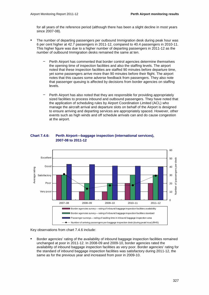
Airport Monitoring Report 2011-12 Perth Airport monitoring results
327
for all years of the reference period (although there has been a slight decline in most years since 2007-08).
• The number of departing passengers per outbound Immigration desk during peak hour was 6 per cent higher at 42.7 passengers in 2011-12, compared to 40.4 passengers in 2010-11. This higher figure was due to a higher number of departing passengers in 2011-12 as the number of outbound Immigration desks remained the same at ten.
− Perth Airport has commented that border control agencies determine themselves the opening time of inspection facilities and also the staffing levels. The airport noted that these inspection facilities are staffed 90 minutes before departure time, yet some passengers arrive more than 90 minutes before their flight. The airport notes that this causes some adverse feedback from passengers. They also note that passenger queuing is affected by decisions from border agencies on staffing levels.
− Perth Airport has also noted that they are responsible for providing appropriately sized facilities to process inbound and outbound passengers. They have noted that the application of scheduling rules by Airport Coordination Limited (ACL) who manage the aircraft arrival and departure slots on behalf of the Airport is designed to ensure arriving and departing services are appropriately spaced. However, other events such as high winds and off schedule arrivals can and do cause congestion at the airport.
Chart 7.4.6: Perth Airport—baggage inspection (inte rnational services), 2007-08 to 2011-12
Key observations from chart 7.4.6 include:
• Border agencies’ rating of the availability of inbound baggage inspection facilities remained unchanged at poor in 2011-12. In 2008-09 and 2009-10, border agencies rated the availability of inbound baggage inspection facilities as very poor. Border agencies’ rating for the standard of inbound baggage inspection facilities was satisfactory during 2011-12, the same as for the previous year and increased from poor in 2009-10.
0
10
20
30
40
50
60
0
1
2
3
4
5
6
2007–08 2008–09 2009–10 2010–11 2011–12
Num
ber
of p
asse
ng
ers
per
des
k
Ave
rag
e ra
ting
Border agencies survey— rating of inbound baggage inspection facilities availability
Border agencies survey— rating of inbound baggage inspection facilities standard
Passenger surveys— rating of waiting time in inbound baggage inspection area
Number of arriving passengers per baggage inspection desk (during peak hour) (RHS)
Excellent
Good
Poor
Very poor
Satisfactory

Perth Airport monitoring results Airport Monitoring Report 2011-12
328
− In commentary to the surveys, border agencies acknowledged upgrades to queuing infrastructure, however border agencies commented that the upgrades had failed to meet the growth in passenger numbers. Other border agency comments noted that the baggage inspection area is in an awkward configuration to the reclaim area which causes major problems with queuing when busy. Further, commentary noted that baggage carousels and storage of trolleys take up a significant proportion of the reclaim area, which exacerbates the problem.
− Border agencies also commented that signage in inbound baggage inspection areas is poor and can be difficult for passengers to see, there is no privacy for passenger inspections and there is no seating provided. The electric exit doors continue to break down and some concern was raised that members of the public were able to walk into the secure area.
− In relation to the standard of facilities, border agencies noted that new baggage benches, flooring and painted walls have improved the current working environment, however the infrastructure remains a concern. Border agencies did acknowledge, however, that discussions with Perth Airport in relation to terminal redevelopment are underway and significant improvements to the terminals are expected once the changes are complete.
• Passengers’ rating of waiting time in inbound baggage inspection areas was just under good in 2011-12. Since 2007-08, passengers have consistently rated the waiting time in inbound baggage inspection areas as good or just under good, although there has been a decline in ratings within the good category.
• The number of arriving passengers per baggage inspection desk during peak hour was 65 per cent higher at 29.3 passengers in 2011-12, compared to 17.8 passengers in 2010-11. This higher figure was partly due to a reduction in the number of baggage inspection desks. During 2011-12, the number of baggage inspection desks decreased from 28 to 18. As noted previously, the average number of arriving passengers was 6.0 per cent higher in 2011-12.
− Perth Airport has noted that the number of outbound inspection desks had been reduced due to the configuration of the inspection area. This redesign was a stage in the development of the inwards processing area and has involved the implementation of a POD design, incorporating x-ray machines and inspection desks.
− Perth Airport further noted that the reconfiguration adopted was consistent with the border agencies’ wishes.
− In response to the border agency surveys on signage, Perth Airport commented that further upgrades to the layout of the Secondary Examination Area (SEA) were completed in December 2012 in consultation with border agencies. Perth Airport noted that it was agreed with border agencies that signage should be kept to a minimum to reduce passenger confusion, as the area has a significant amount of border agency staff.
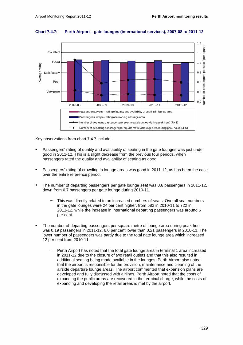
Airport Monitoring Report 2011-12 Perth Airport monitoring results
329
Chart 7.4.7: Perth Airport—gate lounges (internatio nal services), 2007-08 to 2011-12
Key observations from chart 7.4.7 include:
• Passengers’ rating of quality and availability of seating in the gate lounges was just under good in 2011-12. This is a slight decrease from the previous four periods, when passengers rated the quality and availability of seating as good.
• Passengers’ rating of crowding in lounge areas was good in 2011-12, as has been the case over the entire reference period.
• The number of departing passengers per gate lounge seat was 0.6 passengers in 2011-12, down from 0.7 passengers per gate lounge during 2010-11.
− This was directly related to an increased numbers of seats. Overall seat numbers in the gate lounges were 24 per cent higher, from 582 in 2010-11 to 722 in 2011-12, while the increase in international departing passengers was around 6 per cent.
• The number of departing passengers per square metre of lounge area during peak hour was 0.19 passengers in 2011-12, 6.0 per cent lower than 0.21 passengers in 2010-11. The lower number of passengers was partly due to the total gate lounge area which increased 12 per cent from 2010-11.
− Perth Airport has noted that the total gate lounge area in terminal 1 area increased in 2011-12 due to the closure of two retail outlets and that this also resulted in additional seating being made available in the lounges. Perth Airport also noted that the airport is responsible for the provision, maintenance and cleaning of the airside departure lounge areas. The airport commented that expansion plans are developed and fully discussed with airlines. Perth Airport noted that the costs of expanding the public areas are recovered in the terminal charge, while the costs of expanding and developing the retail areas is met by the airport.
0.0
0.3
0.6
0.9
1.2
1.5
1.8
0
1
2
3
4
5
6
2007–08 2008–09 2009–10 2010–11 2011–12
Ave
rag
e ra
ting
Passenger surveys— rating of quality and availability of seating in lounge area
Passenger surveys— rating of crowding in lounge area
Number of departing passengers per seat in gate lounges (during peak hour) (RHS)
Number of departing passengers per square metre of lounge area (during peak hour) (RHS)
Excellent
Good
Poor
Very poor
Satisfactory
Num
ber
of p
asse
ng
ers
per
sea
t / p
er s
qua
re
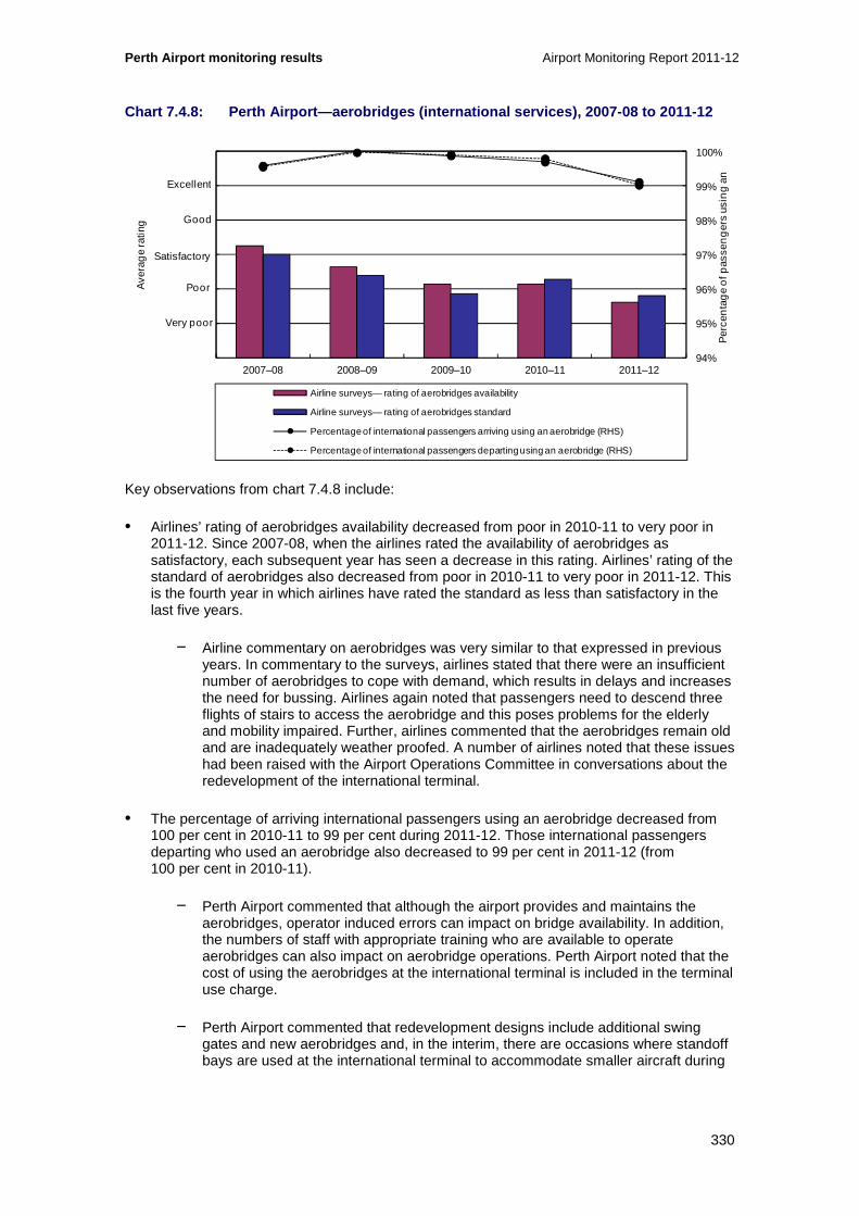
Perth Airport monitoring results Airport Monitoring Report 2011-12
330
Chart 7.4.8: Perth Airport—aerobridges (internation al services), 2007-08 to 2011-12
Key observations from chart 7.4.8 include:
• Airlines’ rating of aerobridges availability decreased from poor in 2010-11 to very poor in 2011-12. Since 2007-08, when the airlines rated the availability of aerobridges as satisfactory, each subsequent year has seen a decrease in this rating. Airlines’ rating of the standard of aerobridges also decreased from poor in 2010-11 to very poor in 2011-12. This is the fourth year in which airlines have rated the standard as less than satisfactory in the last five years.
− Airline commentary on aerobridges was very similar to that expressed in previous years. In commentary to the surveys, airlines stated that there were an insufficient number of aerobridges to cope with demand, which results in delays and increases the need for bussing. Airlines again noted that passengers need to descend three flights of stairs to access the aerobridge and this poses problems for the elderly and mobility impaired. Further, airlines commented that the aerobridges remain old and are inadequately weather proofed. A number of airlines noted that these issues had been raised with the Airport Operations Committee in conversations about the redevelopment of the international terminal.
• The percentage of arriving international passengers using an aerobridge decreased from 100 per cent in 2010-11 to 99 per cent during 2011-12. Those international passengers departing who used an aerobridge also decreased to 99 per cent in 2011-12 (from 100 per cent in 2010-11).
− Perth Airport commented that although the airport provides and maintains the aerobridges, operator induced errors can impact on bridge availability. In addition, the numbers of staff with appropriate training who are available to operate aerobridges can also impact on aerobridge operations. Perth Airport noted that the cost of using the aerobridges at the international terminal is included in the terminal use charge.
− Perth Airport commented that redevelopment designs include additional swing gates and new aerobridges and, in the interim, there are occasions where standoff bays are used at the international terminal to accommodate smaller aircraft during
94%
95%
96%
97%
98%
99%
100%
0
1
2
3
4
5
6
2007–08 2008–09 2009–10 2010–11 2011–12
Ave
rag
e ra
ting
Airline surveys— rating of aerobridges availability
Airline surveys— rating of aerobridges standard
Percentage of international passengers arriving using an aerobridge (RHS)
Percentage of international passengers departing using an aerobridge (RHS)
Excellent
Good
Poor
Very poor
Satisfactory
Per
cen
tag
e o
f pas
sen
ger
s us
ing
an

Airport Monitoring Report 2011-12 Perth Airport monitoring results
331
peak periods. Perth Airport stated that apron buses are equipped with ‘kneel’ technology to enable mobility aids to be easily accommodated on these buses.
− In response to airlines’ comments regarding inadequate weather proofing of aerobridges, Perth Airport commented that water only enters the control cab when there is a prevailing wind forcing rain into the head of the aerobridge or when the airlines or ground handlers leave the door slightly ajar. The airport also commented that there are no known leaks in the aerobridges.
Chart 7.4.9: Perth Airport—security (international services), 2007-08 to 2011-12
Key observations from chart 7.4.9 include:
• Passengers’ rating of quality of security search process remained at good in 2011-12. The quality of security search process has been rated as good by passengers over the whole reference period.
• The number of departing passengers per security clearance system was higher by 6 per cent during 2011-12 to 142 passengers compared to 134.7 in 2010-11. As noted previously, the number of departing passengers increased by 6 per cent in 2011-12 and number of security clearance systems remained unchanged.
0
50
100
150
200
250
300
0
1
2
3
4
5
6
2007–08 2008–09 2009–10 2010–11 2011–12
Ave
rag
e ra
ting
Passenger surveys— rating of quality of security search process
Number of departing passengers per security clearance system (during peak hour) (RHS)
Excellent
Good
Poor
Very poor
Satisfactory
Num
ber
of p
asse
ng
ers
per
sec
urity
cle
aran
ce

Perth Airport monitoring results Airport Monitoring Report 2011-12
332
Chart 7.4.10: Perth Airport—baggage processing (int ernational services), 2007-08 to 2011-12
Key observations from chart 7.4.10 include:
• Airlines’ rating of the availability of baggage processing facilities remained at poor in 2011-12 for the second consecutive year. Airlines’ rating of the standard of baggage processing facilities increased from poor in 2010-11 to satisfactory in 2011-12.
− In commentary to the surveys, airlines noted that there were inadequate facilities at the baggage make-up areas and this was causing congestion and delays. Airlines commented that there were an insufficient number of belts resulting in congestion during the peak periods. Airlines noted that these issues had been raised with Perth Airport through the Airport Operations Committee.
• Passengers’ rating of waiting time for inbound baggage reclaim decreased from good in 2010-11 to just under good in 2011-12. Passengers have consistently rated the waiting time for inbound baggage reclaim as good or just under good for the reference period. Passengers’ rating of circulation space for inbound baggage reclaim also decreased from good in 2010-11 to just under good for 2011-12. Passengers’ rating of information display for inbound baggage reclaim decreased within the good range in 2011-12.
• The average throughput of outbound baggage system per hour increased slightly by 3 per cent in 2011-12 to 188. This increase was driven by the increase in total number of bags which increased by 3 per cent in 2011-12. The total number of hours of operation for baggage handling equipment remained the same as the previous year.
− Perth Airport noted there were no planned interruptions to the inbound baggage systems this year and the inbound baggage belts are provided and maintained by the airport. The airport also noted that the late delivery of baggage onto the reclaim belts by the ground handling agents can significantly affect the passenger experience.
− Perth Airport also noted that there were no planned interruptions to the international terminal’s outbound baggage systems this year.
0
35
70
105
140
175
210
0
1
2
3
4
5
6
2007–08 2008–09 2009–10 2010–11 2011–12
Num
ber o
f bag
s p
er h
our
Ave
rag
e ra
ting
Airline surveys— rating of baggage processing facilities availability
Airline surveys— rating of baggage processing facilities standard
Passenger surveys— rating of waiting time for inbound baggage reclaim
Passenger surveys— rating of circulation space for inbound baggage reclaim
Passenger surveys— rating of information display for inbound baggage reclaim
Average throughput of outbound baggage system (per hour) (RHS)
Excellent
Good
Poor
Very poor
Satisfactory

Airport Monitoring Report 2011-12 Perth Airport monitoring results
333
− Perth Airport commented that although passengers’ rating for circulation space for inbound baggage reclaim decreased, this issue has been addressed by the reconfiguration of the SEA, reducing the need for queuing in the baggage reclaim hall and increasing the available space in the area.
Chart 7.4.11: Perth Airport—baggage trolleys (inter national services), 2007-08 to 2011-12
Key observations from chart 7.4.11 include:
• Passengers’ rating of the findability of baggage trolleys decreased slightly in 2011-12, but remained satisfactory. The findability of baggage trolleys has been rated as satisfactory by passengers for the past three years after decreasing from good in 2007-08 and 2008-09.
• The number of passengers per baggage trolley during peak hour increased by 7.7 per cent to 1.2, up from 1.1 during 2010-11. There was a 2 per cent decrease in the number of baggage trolleys available (as measured by the number as at 30 June), decreasing from 826 in 2010-11 to 812 for 2011-12. Total arriving passengers were six per cent higher in 2011-12.
− Perth Airport noted that baggage trolleys are provided under a managed services agreement between the airport operator and a private contractor and that key performance indicators are defined in the agreement to ensure that an adequate level of service is provided. Perth Airport stated that the contractor advised that about 20 trolleys per year are disposed of due to reasonable wear and tear. Perth Airport noted that, from 1 August 2012, 250 additional trolleys will be made available across both the international and domestic precincts.
0.0
0.5
1.0
1.5
2.0
2.5
3.0
0
1
2
3
4
5
6
2007–08 2008–09 2009–10 2010–11 2011–12
Num
ber o
f pas
seng
ers
per
bag
gage
trol
ley
Ave
rag
e ra
ting
Passenger surveys— rating of findability of baggage trolleys
Number of passengers per baggage trolley (during peak hour) (RHS)
Excellent
Good
Poor
Very poor
Satisfactory

Perth Airport monitoring results Airport Monitoring Report 2011-12
334
Chart 7.4.12: Perth Airport—flight information disp lay screens (international services), 2007-08 to 2011-12
Key observations from chart 7.4.12 include:
• Passengers’ rating of flight information display screens and signage and wayfinding both decreased, but remained at good in 2011-12. Both of these indicators have been rated as good by passengers in all years of the reference period.
• The number of passengers per flight information display screens increased by 7 per cent during 2011-12 to 14 passengers, compared to 13 during 2010-11. This increase was partly due to increased numbers of average arriving and departing passengers during peak hour which both increased by 6 per cent in 2011-12. Total number of flight information display screens decreased by one in 2011-12.
• The number of passengers per information point was 6 per cent higher during 2011-12 at 954 passengers. The number of information points in the international terminal remained at one whereas, as noted above, total passenger numbers were 6 per cent higher.
− Perth Airport has noted that flight information display screens are provided by the airport in all public areas. The airport has consulted airline operators on the number and location of screens and provided additional monitors in areas identified by airlines. They further noted that the reticulation of information is the responsibility of the airport.
− Perth Airport commented that with the reconfiguration and redevelopment of the international departures area, additional flight information display screens will be installed with an increase to screen sizes.
22.84 11.40 14.16 13.06 14.030
300
600
900
1200
1500
1800
0
1
2
3
4
5
6
2007–08 2008–09 2009–10 2010–11 2011–12
Ave
rag
e ra
ting
Passenger surveys— rating of flight information display screens
Passenger surveys— rating of signage and wayfinding
Number of passengers per flight information display screen (during peak hour) (RHS)
Number of passengers per information point (during peak hour) (RHS)
Excellent
Good
Poor
Very poor
Satisfactory
Num
ber o
f pas
seng
ers
per
flig
ht in
form
atio
n sc
reen
/ p
er fl
ight
info
rmat
ion
poin
t

Airport Monitoring Report 2011-12 Perth Airport monitoring results
335
Chart 7.4.13: Perth Airport—washrooms (internationa l services), 2007-08 to 2011-12
Key observations from chart 7.4.13 include:
• Passengers’ rating of the standard of washrooms decreased slightly in 2011-12, but remained at good. Apart from 2007-08 when the rating was satisfactory, the standard of washrooms has been rated as good by passengers for the rest of the reference period.
− Perth Airport noted that a contractor maintains the washrooms in the international terminal. The airport also noted that there were no material infrastructure changes to the washrooms for 2011-12.
0
1
2
3
4
5
6
2007–08 2008–09 2009–10 2010–11 2011–12
Ave
rag
e ra
ting
Passenger surveys— rating of standard of washrooms
Excellent
Good
Poor
Very poor
Satisfactory

Perth Airport monitoring results Airport Monitoring Report 2011-12
336
7.4.3 Domestic services
Chart 7.4.14: Perth Airport—check-in (domestic serv ices), 2007-08 to 2011-12
Key observations from chart 7.4.14 include:
• Airlines’ rating of domestic check-in availability and standard both increased from poor in 2010-11 to satisfactory in 2011-12. The ratings for these two indicators have varied over the years, ranging from poor, to satisfactory and good respectively.
− In commentary to the surveys, airlines continued to note that the counters are outdated. However, similar to previous years, airlines also acknowledged that a lack of infrastructure and available space limits the opportunities to expand this area.
• Passengers have consistently rated check-in waiting time as good for the whole reference period.
• The percentage of hours with more than 80 per cent of check-in desks in use remained unchanged from 2010-11 at 0.4 per cent in 2011-12. The number of check in desks remained the same at 22.
• Perth Airport noted that a SLA negotiated between the airline and ground handling agent sets out the numbers of staff provided for each flight and the opening and closing times of the counters and the airport is not involved in this process. They further note that these SLAs, actual numbers of staff provided on the day, aircraft load factors, seasonal factors, whether the airline has on-line check in facility, all have a significant influence on dwell time at check-in.159
• Perth Airport acknowledges the business need for additional counters and noted the timing of their delivery is jointly identified by the airport and the airline community.
159 Perth Airport noted that the system that records the total number of hours when any check-in desks were open malfunctioned during 2011-12. An upgrade to correct the problem will be ready by August 2012. The data provided for 2011-12 is the same data from its 2008-09 quality of service monitoring objective measures. Perth Airport does not expect that these figures would have materially changed for the 2011-12 year.
0.00
0.50
1.00
1.50
2.00
2.50
3.00
0
1
2
3
4
5
6
2007–08 2008–09 2009–10 2010–11 2011–12
Per
cen
tag
e o
f ho
urs
utili
sed
ove
r 80%
Ave
rag
e ra
ting
Airline surveys— rating of check-in availability
Airline surveys— rating of check-in standard
Passenger surveys— rating of check-in waiting time
Percentage of hours with more than 80 per cent of check-in desks in use (RHS)
Excellent
Good
Poor
Very poor
Satisfactory

Airport Monitoring Report 2011-12 Perth Airport monitoring results
337
Chart 7.4.15: Perth Airport—gate lounges (domestic services), 2007-08 to 2011-12
Key observations from chart 7.4.15 include:
• Passengers’ rating of the quality and availability of seating in lounge areas remained just under good in 2011-12. Passengers’ rating of crowding in lounge areas decreased to just under good in 2011-12. The quality and availability of seating in lounge areas as well as crowding in lounge areas has been rated as good or just under good by passengers over the whole reference period.
• The number of departing passengers per seat in domestic gate lounges decreased by 32.4 per cent during 2011-12 to 0.7 passengers per seat. This decrease is partly due the number of seats in domestic gate lounges which increased by 37 per cent to 823 seats. Total departing passengers decreased by seven per cent during 2011-12.
• The number of departing passengers per square metre of lounge area (during peak hours) was 0.25 passengers per square metre, 18.8 per cent lower than the previous year. The total area of the lounge area in domestic terminals increased by 14 per cent during 2011-12 which contributed to the lower number of departing passengers per square metre of lounge area (during peak hours).
− Perth Airport noted that the T3 area has increased with the completion of the lounge expansion project. The airport noted that it is responsible for the provision, maintenance and cleaning of the airside departure lounge areas.
0.0
0.3
0.6
0.9
1.2
1.5
1.8
0
1
2
3
4
5
6
2007–08 2008–09 2009–10 2010–11 2011–12
Ave
rag
e ra
ting
Passenger surveys— rating of quality and availability of seating in lounge area
Passenger surveys— rating of crowding in lounge area
Number of departing passengers per seat in gate lounges (during peak hour) (RHS)
Number of departing passengers per square metre of lounge area (during peak hour) (RHS)
Excellent
Good
Poor
Very poor
Satisfactory
Num
ber
of p
asse
ng
ers
per
sea
t / p
er s
qua
re
met
re

Perth Airport monitoring results Airport Monitoring Report 2011-12
338
Chart 7.4.16: Perth Airport—aerobridges (domestic s ervices), 2007-08 to 2011-12
Key observations from chart 7.4.16 include:
• Airlines’ rating of the availability of aerobridges remained the same as the previous period, at poor. The availability of aerobridges was rated as poor or very poor by airlines in four of the last five years. Airlines’ rating of the standard of aerobridges decreased from satisfactory in 2010-11 to poor in 2011-12. This is the second year in the last five in which airlines have rated the standard of aerobridges as poor.
− Airline commentary regarding domestic aerobridges is similar to that in previous years. In commentary to the surveys, airlines noted that there is an insufficient number of aerobridges to cope with the overall demand for these services. Airlines also noted that catering for mobility impaired passengers is greatly affected when aircraft are not able to use aerobridges. Further, airlines commented that there have been a number of reliability issues as well as poor weatherproofing leading to boarding delays and a less than desirable passenger experience.
• The number of arriving passengers per aerobridge during peak hour was 42 per cent lower during 2011-12 at 125 passengers per aerobridge (from 217 persons in 2010-11). The number of departing passengers per aerobridge was 140 passengers, 54 per cent lower than 2010-11. Total number of domestic aerobridges increased from two in 2010-11 to four during 2011-12 which accounts for the decrease in both indicators.
− Perth Airport noted the two additional aerobridges were brought online during 2011-12, one in October 2011 and one in November 2011. The airport noted that some airlines request not to use an aerobridge at T3 for operational reasons and that some aircraft operating from the T3 are not capable of using aerobridges. Perth Airport also commented that although the airport provides and maintains the aerobridges, operator induced errors can impact on bridge availability. In addition, the numbers of staff with appropriate training who are available to operate aerobridges can also impact on aerobridge operations.
− Perth Airport commented that some domestic carriers continue to request walk-out and stand-off bays in lieu of aerobridges.
0
60
120
180
240
300
360
0
1
2
3
4
5
6
2007–08 2008–09 2009–10 2010–11 2011–12
Ave
rag
e ra
ting
Airline surveys— rating of aerobridges availability
Airline surveys— rating of aerobridges standard
Number of arriving passengers per aerobridge (during peak hour) (RHS)
Number of departing passengers per aerobridge (during peak hour) (RHS)
Excellent
Good
Poor
Very poor
Satisfactory
Num
ber
of p
asse
ng
ers
per
aer
obr
idg
e

Airport Monitoring Report 2011-12 Perth Airport monitoring results
339
Chart 7.4.17: Perth Airport—security (domestic serv ices), 2007-08 to 2011-12
Key observations from chart 7.4.17 include:
• Passengers’ rating of the quality of security search process remained at good in 2011-12. Passengers have rated the quality of security search process as good over the whole reference period.
• The number of departing passengers per each security clearance system during peak hour was 7.4 per cent lower in 2011-12 at 187 passengers. This fall was due to the previously noted decrease of 7 per cent in total departing passengers. The number of security clearance systems remained unchanged at three during 2011-12.
− Perth Airport noted that they work closely with the airlines to determine the service level at the passenger search points which to some extent influences the numbers of staff required and the costs of the service.
0
60
120
180
240
300
360
0
1
2
3
4
5
6
2007–08 2008–09 2009–10 2010–11 2011–12
Ave
rag
e ra
ting
Passenger surveys— rating of quality of security search process
Number of departing passengers per security clearance system (during peak hour) (RHS)
Excellent
Good
Poor
Very poor
Satisfactory
Num
ber
of p
asse
ng
ers
per
sec
urity
cle
aran
ce
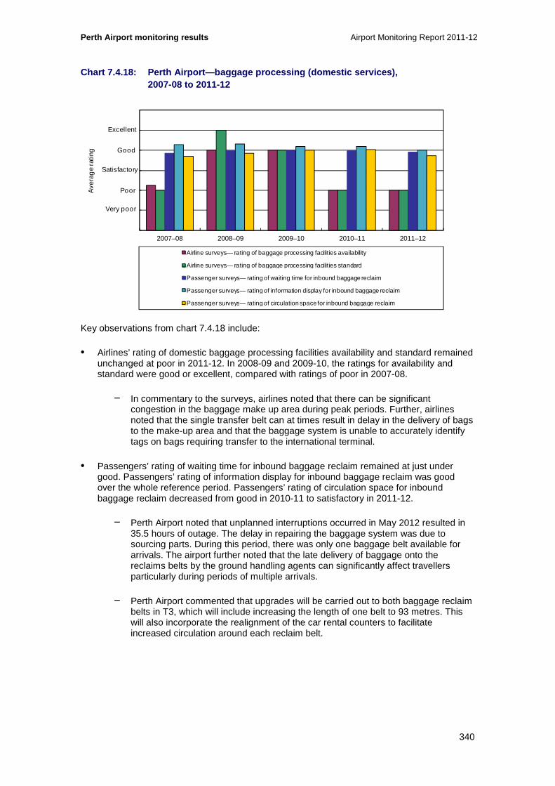
Perth Airport monitoring results Airport Monitoring Report 2011-12
340
Chart 7.4.18: Perth Airport—baggage processing (dom estic services), 2007-08 to 2011-12
Key observations from chart 7.4.18 include:
• Airlines’ rating of domestic baggage processing facilities availability and standard remained unchanged at poor in 2011-12. In 2008-09 and 2009-10, the ratings for availability and standard were good or excellent, compared with ratings of poor in 2007-08.
− In commentary to the surveys, airlines noted that there can be significant congestion in the baggage make up area during peak periods. Further, airlines noted that the single transfer belt can at times result in delay in the delivery of bags to the make-up area and that the baggage system is unable to accurately identify tags on bags requiring transfer to the international terminal.
• Passengers’ rating of waiting time for inbound baggage reclaim remained at just under good. Passengers’ rating of information display for inbound baggage reclaim was good over the whole reference period. Passengers’ rating of circulation space for inbound baggage reclaim decreased from good in 2010-11 to satisfactory in 2011-12.
− Perth Airport noted that unplanned interruptions occurred in May 2012 resulted in 35.5 hours of outage. The delay in repairing the baggage system was due to sourcing parts. During this period, there was only one baggage belt available for arrivals. The airport further noted that the late delivery of baggage onto the reclaims belts by the ground handling agents can significantly affect travellers particularly during periods of multiple arrivals.
− Perth Airport commented that upgrades will be carried out to both baggage reclaim belts in T3, which will include increasing the length of one belt to 93 metres. This will also incorporate the realignment of the car rental counters to facilitate increased circulation around each reclaim belt.
0
1
2
3
4
5
6
2007–08 2008–09 2009–10 2010–11 2011–12
Ave
rag
e ra
ting
Airline surveys— rating of baggage processing facilities availability
Airline surveys— rating of baggage processing facilities standard
Passenger surveys— rating of waiting time for inbound baggage reclaim
Passenger surveys— rating of information display for inbound baggage reclaim
Passenger surveys— rating of circulation space for inbound baggage reclaim
Excellent
Good
Poor
Very poor
Satisfactory

Airport Monitoring Report 2011-12 Perth Airport monitoring results
341
Chart 7.4.19: Perth Airport—baggage trolleys (domes tic services), 2007-08 to 2011-12
Key observations from chart 7.4.19 include:
• Passengers’ rating of the findability of baggage trolleys was satisfactory in 2011-12. This rating has been fairly consistent for the past three years. Prior to 2009-10, passengers rated the findability of baggage trolleys as good.
• The number of passengers per baggage trolley during peak hour was 4.6 per cent higher during 2011-12 to 5.4 passengers per trolley (previously 5.2 persons per trolley). The number of accessible baggage trolleys in the domestic terminal decreased from 201 as at 30 June 2011 to 196 as at 30 June 2012, representing a fall of 2.4 per cent. As noted above, total average number of passengers during peak hour increased 2.0 per cent.
− Perth Airport has noted that baggage trolleys are provided under a managed services agreement between the airport operator and a private contractor and that key performance indicators are defined in the agreement to ensure that an adequate level of service is provided. According to Perth Airport the contractor advised that about 20 trolleys per year are disposed of due to reasonable wear and tear. Perth Airport noted that after the reporting period, its total baggage trolleys increased to 1250, with 1045 in the international precinct and 205 in the domestic precinct.
0
1
2
3
4
5
6
0
1
2
3
4
5
6
2007–08 2008–09 2009–10 2010–11 2011–12
Num
ber o
f pas
seng
ers
per
bag
gage
trol
ley
Ave
rag
e ra
ting
Passenger surveys— rating of findability of baggage trolleys
Number of passengers per baggage trolley (during peak hour) (RHS)
Excellent
Good
Poor
Very poor
Satisfactory

Perth Airport monitoring results Airport Monitoring Report 2011-12
342
Chart 7.4.20: Perth Airport—flight information disp lay screens (domestic services), 2007-08 to 2011-12
Key observations from chart 7.4.20 include:
• Passengers’ rating of flight information display screens remained unchanged at good in 2011-12. Passengers rated flight information display screens as good over the whole reference period. Passengers’ rating of signage and wayfinding were also good in all years over the reference period.
• The number of passengers per flight information display screen decreased to 20.4 during 2011-12, down from 21.7 in 2010-11. This decrease is partly associated with an increase in the number of flight screens. At as at 30 June 2012 there were 52, an increase of eight per cent or four new screens from 30 June 2011. As noted above, average passenger numbers increased by 2.0 per cent in 2011-12.
• The numbers of passengers per information point during peak hours was 2 per cent higher during 2011-12 to 1061, up from 1040 during 2010-11. This rise is associated with the higher numbers of passengers. The number of information points remained unchanged through the years at one.
− Perth Airport has noted the increase in flight screens in T3 due to the expansion of the lounge and the opening of additional gates. The airport consulted with airline operators on the number and location of screens and have provided additional monitors in areas identified by airlines.
36.77 19.72 18.48 21.67 20.400
200
400
600
800
1000
1200
0
1
2
3
4
5
6
2007–08 2008–09 2009–10 2010–11 2011–12
Ave
rag
e ra
ting
Passenger surveys— rating of flight information display screens
Passenger surveys— rating of signage and wayfinding
Number of passengers per flight information display screen (during peak hour) (RHS)
Number of passengers per information point (during peak hour) (RHS)
Excellent
Good
Poor
Very poor
Satisfactory
Num
ber o
f pas
seng
ers
per
flig
ht in
form
atio
n sc
reen
/ p
er fl
ight
info
rmat
ion
poin
t

Airport Monitoring Report 2011-12 Perth Airport monitoring results
343
Chart 7.4.21: Perth Airport—washrooms (domestic ser vices), 2007-08 to 2011-12
Key observations from chart 7.4.21 include:
• Passengers rated the standard of domestic washrooms as good during 2011-12. The standard for domestic washrooms were rated as good by passengers over the whole reference period.
− Perth Airport noted that a contractor maintains the washrooms in the domestic terminals. The airport also noted that there were no material infrastructure changes to the washrooms for 2011-12.
7.4.4 Other airport services
Chart 7.4.22 Perth Airport—availability of airside services and facilities (other airport services), 2007-08 to 2011-12
0
1
2
3
4
5
6
2007–08 2008–09 2009–10 2010–11 2011–12
Ave
rag
e ra
ting
Passenger surveys— rating of standard of washrooms
Excellent
Good
Poor
Very poor
Satisfactory
0
1
2
3
4
5
6
2007–08 2008–09 2009–10 2010–11 2011–12
Ave
rag
e ra
ting
Rating of runway Rating of taxiways
Rating of aprons Rating of aircraft parking facilities and bays
Rating of ground handling services and facilities
Excellent
Good
Poor
Very poor
Satisfactory

Perth Airport monitoring results Airport Monitoring Report 2011-12
344
Key observations from chart 7.4.22 include:
• Airlines’ rating of the availability of runways decreased from satisfactory in 2010-11 to poor in 2011-12. Prior to this, the availability of runways was consistently rated as satisfactory by airlines over the reference period.
− In commentary to the surveys, airlines raised ongoing issues with congestion in relation to the availability of runways, A number of airlines noted that congestion at Perth Airport leads to carriers facing delays with inbound and outbound flights, particularly during peak morning periods. It was noted though that the airport is proposing to introduce a runway slot management scheme that will assist in managing demand. Some airlines also noted that extreme weather conditions created problems with air traffic control and that the absence of a second main runway further exacerbated the problem when aircraft were cleared for takeoff once the weather eased.
− Perth Airport has noted that it has airline support for implementation of a slot management scheme to allocate runway slots from the end of March 2013. The scheme is expected to balance supply and demand in peak periods, leading to fewer delays.
• Airlines’ rating of taxiways increased from poor in 2009-10 and 2010-11 to satisfactory in 2011-12.
− In commentary to the surveys, airlines noted ongoing issues with congestion. In particular, airlines noted that there were ongoing taxiway works at Perth Airport which, along with closure of taxiways, had resulted in delays for arriving and departing aircraft. Airlines also commented that communication between the airport and airlines on these issues has improved over the period.
• Airlines’ ratings of the availability of airport aprons were poor for the third consecutive year in 2011-12.
− In commentary to the surveys, airlines stated that the aircraft parking bays at Perth Airport are very close to each other and that this limits the ability to conduct simultaneous aircraft push backs. Further, airlines noted that there were issues in relation to debris from construction work and that this had been raised with the airport through the Airport Operations Committee.
• Airlines’ rating of aircraft parking facilities and bays availability remained at poor in 2011-12. This rating has been either poor or very poor over the past five years. Airlines’ rating of ground handling services and facilities also remained at poor in 2011-12.
− In commentary to the surveys, airlines stated that there were not enough bays for the amount of airlines that use the airport. Furthermore, airlines commented that there had been an increased number of aircraft being allocated to remote parking bays to accommodate construction works, which had resulted in increased towing. However, airlines also acknowledged that Perth Airport had in place plans to address the shortages, such as the construction of the new domestic terminal which was completed in early March 2013.
• Perth Airport commented that in terms of airfield improvements, more than $40 million had been spent in 2010-11 and 2011-12 with an additional $25 million to be spent in the following three years. It also stated that it is currently midway through a major expansion program of airfield pavement and taxi way projects estimated to cost around $160 million. This project will provide expanded aircraft parking and standoff capacity adjacent to the terminals.

Airport Monitoring Report 2011-12 Perth Airport monitoring results
345
Chart 7.4.23 Perth Airport—standard of airside serv ices and facilities (other airport services), 2007-08 to 2011-12
Key observations from chart 7.4.23 include:
• Airlines’ rating of the standard of runways decreased from satisfactory in 2010-11 to poor in 2011-12. Over the reference period, this is the first time that the standard of runways was rated as poor.
− In commentary to the surveys, airlines noted the runway is a CAT1 and aircraft need to divert in some instances even when that equipped with CAT3 landing. Airlines noted that issues were raised by way of feedback on the ‘method of working plans' produced by the airport.
• Airline’s rating of taxiways increased to satisfactory in 2011-12 (after two years of poor ratings).
− Airline commentary in the surveys was generally positive in relation to the standard of taxiways. Airlines noted that issues raised with the airport through the Airport Operations Committee were handled in a timely and positive manner.
• Airlines’ rating of the standard of aprons decreased to poor in 2011-12 for the second time in the last five years, while rating of the standard of aircraft parking facilities and bays remained at poor for the fifth consecutive year.
− Airline commentary on apron standards in the surveys was mixed. Airlines reported that line marking legibility on the apron is severely affected during bad light and adverse weather, which had resulted in the need to stop aircraft on the taxiway so they can be towed into the bay. It was however acknowledged that the airport was currently reviewing the issue. Airlines also noted that lack of shaded areas meant that some shipments were left in the open. In relation to aircraft parking, airlines commented that contact bay access is extremely limited and the current infrastructure is insufficient to support the demand. Airlines also noted that bay and stand-off allocations were of concern, with no agreed protocol for allocation during peak demand periods. In some instances, multiple aircraft are boarding through the one gate, which results in congestion in the areas as well as the need for additional staff to assist in guiding passengers. Airlines noted that these issues had been
0
1
2
3
4
5
6
2007–08 2008–09 2009–10 2010–11 2011–12
Ave
rag
e ra
ting
Rating of runway Rating of taxiways
Rating of aprons Rating of aircraft parking facilities and bays
Rating of ground handling services and facilities
Excellent
Good
Poor
Very poor
Satisfactory
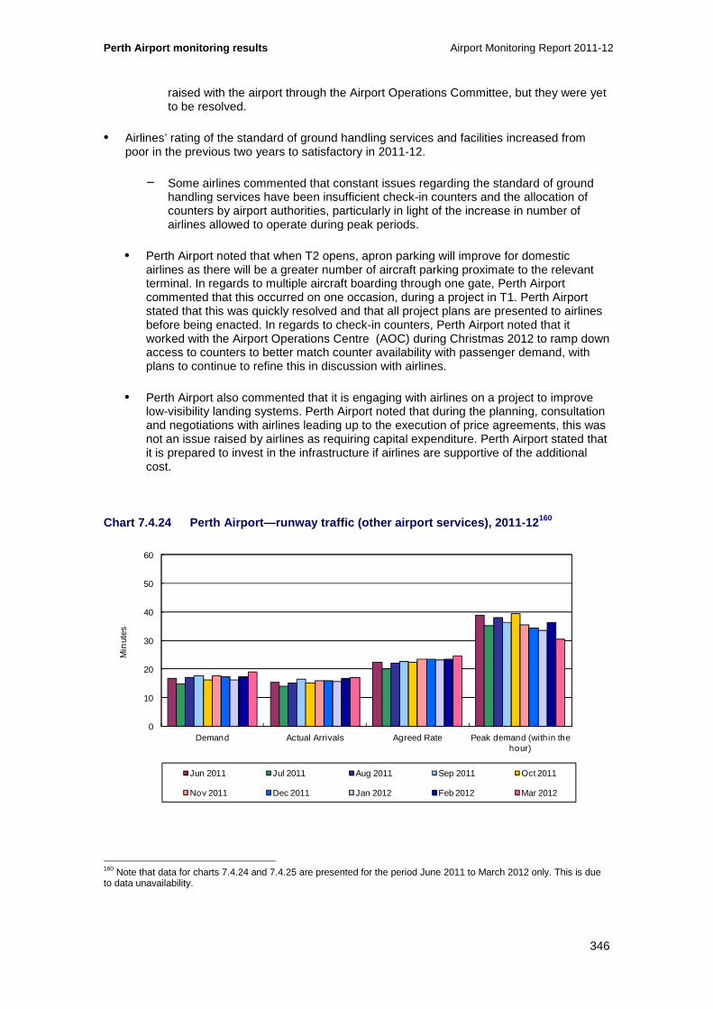
Perth Airport monitoring results Airport Monitoring Report 2011-12
346
raised with the airport through the Airport Operations Committee, but they were yet to be resolved.
• Airlines’ rating of the standard of ground handling services and facilities increased from poor in the previous two years to satisfactory in 2011-12.
− Some airlines commented that constant issues regarding the standard of ground handling services have been insufficient check-in counters and the allocation of counters by airport authorities, particularly in light of the increase in number of airlines allowed to operate during peak periods.
• Perth Airport noted that when T2 opens, apron parking will improve for domestic airlines as there will be a greater number of aircraft parking proximate to the relevant terminal. In regards to multiple aircraft boarding through one gate, Perth Airport commented that this occurred on one occasion, during a project in T1. Perth Airport stated that this was quickly resolved and that all project plans are presented to airlines before being enacted. In regards to check-in counters, Perth Airport noted that it worked with the Airport Operations Centre (AOC) during Christmas 2012 to ramp down access to counters to better match counter availability with passenger demand, with plans to continue to refine this in discussion with airlines.
• Perth Airport also commented that it is engaging with airlines on a project to improve low-visibility landing systems. Perth Airport noted that during the planning, consultation and negotiations with airlines leading up to the execution of price agreements, this was not an issue raised by airlines as requiring capital expenditure. Perth Airport stated that it is prepared to invest in the infrastructure if airlines are supportive of the additional cost.
Chart 7.4.24 Perth Airport—runway traffic (other ai rport services), 2011-12 160
160 Note that data for charts 7.4.24 and 7.4.25 are presented for the period June 2011 to March 2012 only. This is due to data unavailability.
0
10
20
30
40
50
60
Demand Actual Arrivals Agreed Rate Peak demand (within the hour)
Min
utes
Jun 2011 Jul 2011 Aug 2011 Sep 2011 Oct 2011
Nov 2011 Dec 2011 Jan 2012 Feb 2012 Mar 2012

Airport Monitoring Report 2011-12 Perth Airport monitoring results
347
Chart 7.4.25 Perth Airport—runway traffic continued (other airport services), 2007-08 to 2011-12 161
Note: Airservices Australia’s measures were devised as a guide to its own performance in handling traffic, though can also provide some indication of airport constraints including runway infrastructure or management. In particular, if demand is consistently close to operationally agreed capacity for the peak hour, it suggests that there is little spare capacity for increased traffic at that time. The measures relate to the busiest peak hour at the airport, averaged across all days in the month specified. The measures and their interpretation are explained in the appendices to this report.
Key observations from chart 7.4.24 and 7.4.25 include:
• In 2011-12, the average peak hour arrival demand was 36 movements per hour. The average maximum system arrival delay varied between 7 minutes in December 2011 to 11 minutes in August 2011.
• In commentary to this data, Airservices Australia noted that Perth Airport traffic had been increasing for the past few years. The peak periods for Perth Airport can often be driven by departure demand which has a knock-on effect to the arrivals. Delays have increased significantly according to Airservices Australia because of the mix of traffic.
• Airservices Australia has advised that it changed the system used to collect and report statistics, with the new system commissioned in March 2012. Airservices Australia have noted that the transition to the new system may have impacted the data for March 2012.
161 Ibid
0
5
10
15
20
25
30
35
Max pro rata rate (within the hour) Average max system delay Average system delay
Min
utes
Jun 2011 Jul 2011 Aug 2011 Sep 2011 Oct 2011
Nov 2011 Dec 2011 Jan 2012 Feb 2012 Mar 2012

Perth Airport monitoring results Airport Monitoring Report 2011-12
348
Chart 7.4.26 Perth Airport—airport management respo nsiveness (other airport services), 2007-08 to 2011-12
Key observations from chart 7.4.26 include:
• Airlines’ rating of the overall system for addressing quality of service concerns increased in 2011-12, but still remained at satisfactory. The overall system for addressing quality of service concerns was rated as satisfactory on average by airlines over the last five years.
− Airline commentary to airport responsiveness was generally very positive. In commentary to the surveys, airlines commented that interaction between airlines and the airport has improved over the years, duty managers are proactive and accessible and responsiveness has improved over the last 12 months.
• Border agencies’ rating of management approach to concerns was satisfactory for the third consecutive year. Prior to this, border agencies rated the management approach to concerns as good in 2007-08 and 2008-09.
− In commentary to the surveys, border agencies stated that there was a good working relationship between the airport operator and the border agencies and that this had been evident through an ongoing an open dialogue with regards to improving the current conditions. Border agencies noted that recent negotiations to change the queuing to facilitate processes were working well.
0
1
2
3
4
5
6
2007–08 2008–09 2009–10 2010–11 2011–12
Ave
rag
e ra
ting
Airline surveys— rating of overall system for addressing quality of service concerns
Border agencies survey— rating of management approach to concerns
Excellent
Good
Poor
Very poor
Satisfactory
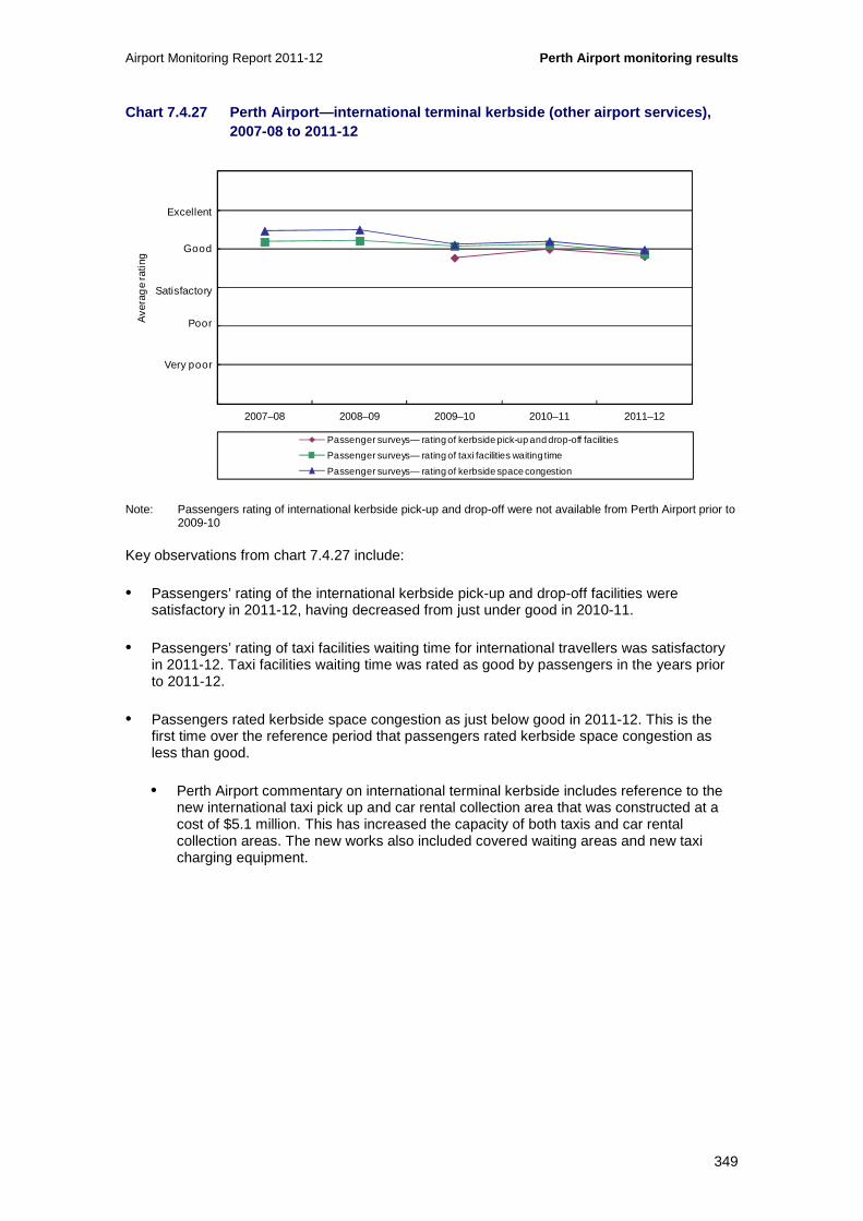
Airport Monitoring Report 2011-12 Perth Airport monitoring results
349
Chart 7.4.27 Perth Airport—international terminal k erbside (other airport services), 2007-08 to 2011-12
Note: Passengers rating of international kerbside pick-up and drop-off were not available from Perth Airport prior to 2009-10
Key observations from chart 7.4.27 include:
• Passengers’ rating of the international kerbside pick-up and drop-off facilities were satisfactory in 2011-12, having decreased from just under good in 2010-11.
• Passengers’ rating of taxi facilities waiting time for international travellers was satisfactory in 2011-12. Taxi facilities waiting time was rated as good by passengers in the years prior to 2011-12.
• Passengers rated kerbside space congestion as just below good in 2011-12. This is the first time over the reference period that passengers rated kerbside space congestion as less than good.
• Perth Airport commentary on international terminal kerbside includes reference to the new international taxi pick up and car rental collection area that was constructed at a cost of $5.1 million. This has increased the capacity of both taxis and car rental collection areas. The new works also included covered waiting areas and new taxi charging equipment.
0
1
2
3
4
5
6
2007–08 2008–09 2009–10 2010–11 2011–12
Ave
rag
e ra
ting
Passenger surveys— rating of kerbside pick-up and drop-off facilities
Passenger surveys— rating of taxi facilities waiting time
Passenger surveys— rating of kerbside space congestion
Excellent
Good
Poor
Very poor
Satisfactory

Perth Airport monitoring results Airport Monitoring Report 2011-12
350
Chart 7.4.28 Perth Airport—domestic terminal kerbsi de (other airport services), 2007-08 to 2011-12
Note: Passengers rating of domestic kerbside pick-up and drop-off were not available from Perth Airport prior to 2009-10
Key observations from chart 7.4.28 include:
• Passengers’ rating of the domestic kerbside pick-up and drop-off facilities was satisfactory in 2011-12, as was the case for the previous two years.
• Passengers rating of taxi facilities waiting time decreased from good in 2010-11 to satisfactory in 2011-12.
• Passengers rated kerbside space congestion as satisfactory in 2011-12 for the third consecutive year.
• Perth Airport commentary notes that key influences from the passenger perception survey measures are the increased growth of domestic passenger activity that is creating congestion on roads surrounding the airport precincts. The airport also noted that present taxi infrastructure was probably insufficient to cater for increased demand levels. Perth Airport noted that refurbishment and expansion of taxi facilities will be undertaken in 2012-13 to increase capacity.
0
1
2
3
4
5
6
2007–08 2008–09 2009–10 2010–11 2011–12
Ave
rag
e ra
ting
Passenger surveys— rating of kerbside pick-up and drop-off facilities
Passenger surveys— rating of taxi facilities waiting time
Passenger surveys— rating of kerbside space congestion
Excellent
Good
Poor
Very poor
Satisfactory

Airport Monitoring Report 2011-12 Perth Airport monitoring results
351
7.5 Car parking services monitoring results
This section presents monitoring results for car parking services provided at Perth Airport. This includes information collected on prices (section 7.5.1); revenues, costs and profits (section 7.5.2) and the quality of airport car parking (section 7.5.3).
Section 7.5.4 provides details on the various other transport options that are available for travelling to and from the airport.
7.5.1 Prices
Chart 7.5.1: Perth Airport—prices at short-term car parks, 2001-02 to 2011-12
Key observations from chart 7.5.1 include:
• Most short term car parking prices at Perth Airport’s international and domestic terminals increased in 2011-12. The largest increase occurred with the short-term one hour rate which increased from $5.60 to $6.00, representing an increase of 7.1 per cent. The short-term 24 hour rate had the second largest increase with prices rising 5.6 per cent in 2011-12. Other increases ranged from 1.3 per cent for eight hour parking to 4.4 per cent for two hour parking. The Fast Track short-term rates (which is only located at T3 and T4), increased by 4.3 per cent to $48 per day in 2011-12.
− Decreases in short term car parking in 2011-12 included the first 10 minutes of parking which decreased from $4 to zero.
• Since 2001-02, the 24 hour rate had the largest increase of any category. The 24 hour rate increased from $14.55 in 2001-02 to $38 in 2011-12, representing an increase of 161.2 per cent. The two hour category experienced the second largest increase over the reference period with 78.4 per cent, increasing from $5.27 in 2001-02 to $9.40 in 2011-12.
• Perth Airport also has regional parking facilities for passengers travelling with Skippers Aviation, Cobham Aviation, Network Aviation Australia and Helicopters Australia. Parking rates at this car park are free for the first hour, $9 for up to one day and $9 per day thereafter.
0
5
10
15
20
25
30
35
40
2001
–02
2002
–03
2003
–04
2004
–05
2005
–06
2006
–07
2007
–08
2008
–09
2009
–10
2010
–11
2011
–12
Do
llars
Short-term car park—1 hour Short-term car park—2 hours Short-term car park—4 hours
Short-term car park—6 hours Short-term car park—24 hours

Perth Airport monitoring results Airport Monitoring Report 2011-12
352
Chart 7.5.2: Perth Airport—prices at long-term car parks, 2001-02 to 2011-12
Key observations from chart 7.5.2 include:
• All long term parking prices for the international and domestic terminals increased in 2011-12.
− The largest change occurred with the price for one day parking, increasing one dollar (6.3 per cent) in 2011-12 to $17. The seven day long term category had the second highest change, increasing 5.7 per cent in 2011-12 to $93.
− Other category increases during 2011-12 include the five day category which increased by 4.3 per cent to $73, the two day category increasing 3.3 per cent to $35 and the three day category increasing 1.9 per cent.
• Since 2001-02, the one day long term rates have had the lowest percentage increase with 16.8 per cent. The seven day category had the largest increase with 143.6 per cent since 2001-02.
• Perth Airport’s actual charging rates are based around three categories, one, two and three day rates and for any additional days, a flat $10 per day is applied. This flat rate per day tariff increased by one dollar from 2010-11.
0
10
20
30
40
50
60
70
80
90
100
2001
–02
2002
–03
2003
–04
2004
–05
2005
–06
2006
–07
2007
–08
2008
–09
2009
–10
2010
–11
2011
–12
Do
llars
Long-term car park—1 day Long-term car park—2 days Long-term car park—3 days
Long-term car park—5 days Long-term car park—7 days

Airport Monitoring Report 2011-12 Perth Airport monitoring results
353
7.5.2 Revenues, costs and profits
Table 7.5.1 outlines Perth Airport’s revenues, operating expenses and operating margins for car parking and the total airport from 2001-02 to 2011-12.
Table 7.5.1: Perth Airport—Revenues, operating expe nses and operating margins for car parking and tota l airport services, 2001-02 to 2011-12
2001-02 2002-03 2003-04 2004-05 2005-06 2006-07 2007-08 2008-09 2009-10 2010-11 2011-12
Revenue
($million)
Car parking 8.2 9.2 10.7 12.9 15.9 18.2 24.1 29.2 33.3 41.1 50.6
Total airport 76.1 94.6 116.5 140.8 172.8 239.9 206 .0 169.9 247.6 296.2 721.9
Operating expenses
($million)
Car parking 1.7 2.5 3.0 3.8 4.8 7.6 6.7 10.5 10.7 13.6 16.4
Total airport 37.7 42.8 49.6 74.4 69.6 83.0 68.1 93 .4 105.3 123.4 145.7
Operating margin
($million)
Car parking 6.5 6.73 7.7 9.1 11.1 10.7 17.4 18.6 22.6 27.5 34.2
Total airport 38.4 51.8 66.9 66.4 103.2 156.9 138.0 76.5 142.4 172.7 576.1
Operating margin as a % of revenue
Car parking 79.1 73.0 72.1 70.5 69.7 58.5 72.0 63.9 67.8 66.9 67.5
Total airport 50.5 54.8 57.5 47.1 59.7 65.4 67.0 45.0 57.5 58.3 79.8

Perth Airport monitoring results Airport Monitoring Report 2011-12
354
Chart 7.5.3: Perth Airport—airport car parking reve nue as a percentage of total airport revenue, 2001-02 to 2011-12
Key observations from table 7.5.1 and chart 7.5.3 include:
• Car parking revenue increased by 23.2 per cent in 2011-12 to $50.6 million while car parking capacity increased by 7.4 per cent.
• As a percentage of total airport revenue, car parking revenue decreased from 13.9 per cent in 2010-11 to 7.0 per cent in 2011-12. The reason for this reduction in car parking’s share of total revenue is that the total airport revenue increased by an extra $377 million due a change reported by Perth Airport in the methodology used for deriving fair value of an investment property asset. If the effects of this change in the way fair value is calculated (i.e. an increase in revenues of $377 million) is excluded, then the car parking revenue share of total airport revenue rises to 14.7 per cent, slightly up from 2010-11.
• Operating expenses for car parking increased 20.9 per cent in 2011-12 to $16.4 million which is slightly higher than the total airport expenses increase of 18.1 per cent. The car park share of total expenses was slightly higher at 11.3 per cent in 2011-12, compared to 11.0 per cent in 2010-11. Car parking costs as a share of total expenses has been around 9.9 to 11.3 per cent of total expenses for the past five years.
• The operating margin for Perth Airport’s car parking activities increased from $27.5 million in 2010-11 to $34.1 million in 2011-12, representing an increase of 24.3 per cent. As well as being the largest operating margin earned by Perth’s car parking activities since 2001- 02, the result for 2011-12 represents the largest annual increase over the reference period. As a percentage of total airport operating margin, car parking operating margin has consistently been over 15.0 per cent of the airport’s operating margin over the four years to 2011-12.
• The share of Perth Airport’s operating margin for car parking of total airport operating margin was 5.9 per cent in 2011-12, down from 15.9 per cent in 2010-11. If the effects of the $377 million revaluation of investment property from the total airport margin are excluded, the car parking margin share increases to 17.2 per cent. Over the past five
0
10
20
30
40
50
60
70
80
90
100
2001
–02
2002
–03
2003
–04
2004
–05
2005
–06
2006
–07
2007
–08
2008
–09
2009
–10
2010
–11
2011
–12
Per
cen
t
Revenue—car parking Revenue—total airport

Airport Monitoring Report 2011-12 Perth Airport monitoring results
355
years, the car parking’s share of total margin has ranged from a low of 12.6 per cent (in 2007-08) to a high of 24.3 per cent (in 2008-09).
• Car parking operating margin as a proportion of total car parking revenue was 67.5 per cent in 2011-12. Over the past 11 years, the lowest operating margin as a percentage of car parking revenue car parking was in 2006-07 when it was 58.5 per cent; the highest was in 2001-02 with 79.1 per cent. In comparison, total airport return on sales was 79.8 per cent in 2011-12. If the asset revaluation amount is excluded, car parking operating margin as a percentage of total car parking revenue was 57.7 per cent. The total airport return on sales has consistently been less than the airport car park returns over the past 11 years.
• Perth Airport’s car parking share of total airport revenue decreased in 2011-12 to around 7.0 per cent of total revenue. Excluding the effects of the asset revaluation, the car parking share of total airport revenue increases to around 14.7 per cent. This is slightly up from 2010-11 when the share was 13.9 per cent.
• Excluding the effects of the asset revaluation, over the past 11 years, car parking’s share of total airport revenue has ranged from a low of 9.2 per cent in 2003-04 and 2004-05 to a high of 17.2 per cent in 2008-09. The average share of car parking revenue to total revenue over the past 11 years has been 10.2 per cent.
Chart 7.5.4: Perth Airport—revenues, operating expe nses and operating margins for car parking services on a per car park space basis, 2003-04 to 2011-12
Key observations from chart 7.5.4 include:
• Revenue per car park space increased by 14.7 per cent in 2011-12 to $3239, up from $2824 in 2010-11. This was largely due to the fact that total car parking revenue increased by more than the number of car park spaces: total car parking revenue increased by 23.2 per cent in 2011-12 whereas total number of car park spaces increased by 7.4 per cent.
0
2 000
4 000
6 000
8 000
10 000
12 000
14 000
16 000
0
500
1 000
1 500
2 000
2 500
3 000
3 500
4 000
4 500
5 000
5 500
6 000
2003
–04
2004
–05
2005
–06
2006
–07
2007
–08
2008
–09
2009
–10
2010
–11
2011
–12
Num
ber o
f car
par
k sp
aces
Do
llars
per
car
par
k
Revenue per car park spaceOperating expenses per car park spaceOperating margin per car park spaceNumber of car park spaces (RHS)

Perth Airport monitoring results Airport Monitoring Report 2011-12
356
• On average, revenue per car park for the past five years has been $2877 per annum. Prior to 2007-08, the number of car park spaces available was lower (see table 7.5.2) resulting in higher revenue per car park space. Total number of car park spaces in 2006-07 was 5112. This increased to 8806 car park spaces in 2007-08. The average revenue per car park for the period 2002-03 to 2006-07 was $5544.
• Car parking operating expenses per car park space were $1052 in 2011-12 representing an increase of 12.5 per cent from 2010-11. Total car park expenses increased by 20.9 per cent in 2011-12. Average operating expenses per car park over the past five years have been $931 per car park space. In the four years prior to this period when there were fewer car park spaces (2003-04 to 2006-07), the average car park operating expenses per car park space was $1730.
• Car parking operating margin per car park increased from $1889 to $2187 in 2011-12, representing an increase of 15.8 per cent from 2010-11. Total car park margin increased by 24.3 per cent in 2011-12. Although the number of car parking spaces increased by 7.4 per cent, total car parking revenue had a larger increase of 23.2 per cent (total operating expenses per car park space increased 12.5 per cent).
7.5.3 Quality of car parking facilities
Table 7.5.2 outlines the number of car park spaces available and annual throughput of car park facilities at Perth Airport from 2001-02 to 2011-12.

Airport Monitoring Report 2011-12 Perth Airport monitoring results
357
Table 7.5.2: Perth Airport—number of car park space s and average daily throughput, 2001-02 to 2011-12
2001-02 2002-03 2003-04 2004-05 2005-06 2006-07 2007-08 2008-09 2009-10 2010-11 2011-12
Number of car park spaces
Domestic short-term 1 064 1 030 1 195 1 645 1 207 1 207 1 377 1 377 1 719 1 719 1 769
Domestic long-term NA NA NA 614 1 542 1 907 3 997 5 670 6 055 7 082 8 485
International short-term 1 077 1 077 1 077 1 077 1 007 1 007 663 663 663 663 663
International long-term NA NA NA NA NA NA 1 778 1 778 1 778 3 792 3 792
Staff NA NA 927 931 991 991 991 1 311 1 311 1 295 917
Total airport 2 141 2 107 3 199 4 267 4 747 5 112 8 806 10 799 11 526 14 551 15 626
Annual throughput of car park facilities (thousands)162
Domestic short-term NA 916 1 003 950 947 997 961 1 019 990 1 054 1 054
Domestic long-term NA NA NA NA 75 87 84 121 173 230 343
International short-term NA 685 641 680 667 666 647 685 715 733 720
International long-term NA NA NA NA NA NA 29 32 48 66 67
Total airport NA 1 602 1 643 1 630 1 689 1 750 1 72 1 1 858 1 926 2 083 2 185
Average daily throughput of car park facilities
Domestic short-term NA 2 511 2 739 2 602 2 595 2 731 2 626 2 792 2 712 2 888 2 879
Domestic long-term NA NA NA NA 205 237 230 333 475 630 938
International short-term NA 1 878 1 750 1 862 1 828 1 825 1 766 1 876 1 959 2 007 1 968
International long-term NA NA NA NA NA NA 80 89 130 181 184
Total airport NA 4 389 4 490 4 464 4 628 4 793 4 70 2 5 089 5 276 5 706 5 970
162 Annual throughput data for staff car parking was unavailable.
Perth Airport monitoring results Airport Monitoring Report 2011-12
358
Key observations from table 7.5.2 include:
• In 2011-12 Perth Airport’s car parking facilities included 2432 short-term parking spaces (15.5 per cent in total of total capacity), 12 277 long-term spaces (78.6 per cent) and 917 staff car parking spaces (5.9 per cent).
• Total numbers of car parking spaces grew by seven per cent in 2011-12 to 15 626. Domestic long-term car park spaces experienced the largest growth, increasing by 19.8 per cent to 8485 in 2011-12, which was due to existing car parks being upgraded and expanded. Domestic short-term car parking spaces increased 2.9 per cent over the same period. International short-term and long-term car parking spaces were unchanged in 2011-12. Staff car parking spaces decreased by 29.2 per cent in 2011-12 to 917.
− Perth Airport noted that the overall availability of staff car parking has increased, however the number of dedicated parking spaces has reduced. Perth Airport stated that this was due to international parking now shared within public long-term car parks.
• The number of domestic short-term car parking spaces has increased by 705 spaces since 2001-02 (66.3 per cent). The largest increase in domestic short-term car parking spaces occurred in 2004-05, when the number of domestic short-term car parking spaces increased by 450 spaces (37.7 per cent).
• The number of domestic long-term car parking spaces has increased by 7871 spaces since 2004-05 (1281.9 per cent). The largest increase in domestic long-term car parking spaces since 2004-05 occurred in 2005-06, when the number of domestic long-term car parking spaces increased by 928 spaces (151.1 per cent). This change was attributable to the conversion of domestic short-term car parking spaces to domestic long-term car parking spaces.
• The number of international short-term car parking spaces has decreased by 414 spaces since 2001-02 (-38.4 per cent). The number of international short-term car parking spaces reached a peak of 1077 spaces between 2001-02 and 2004-05. The number of international short-term car parking spaces decreased by 344 spaces in 2007-08, which was due to Perth Airport providing a split between international short-term and long-term for the first time. In 2007-08, Perth Airport advised that it had also added additional capacity to the international car park, with total international car parking spaces increasing from 1007 spaces in 2006-07 to 2441 spaces in 2007-08.
• The number of international long-term car parking spaces has increased by 2014 spaces since 2007-08 (113.3 per cent), when Perth Airport first provided a split between international short-term and long-term car parking spaces. All of the increase in car parking spaces occurred in 2010-11, when the number of international long-term car parking spaces increased from 1778 spaces to 3792 spaces. In 2010-11, Perth Airport noted that this increase was due to the completion of a new park-and-ride facility.
Average daily car parking throughput
• The average daily throughput in the domestic short-term car park decreased slightly by 0.3 per cent in 2011-12, from 2888 cars per day in 2010-11 to 2879 cars per day. Daily throughput decreased while the number of domestic short-term car parking spaces increased by 2.9 per cent in 2011-12.
− Since 2002-03, the average daily throughput in the domestic short-term car park has increased by 14.6 per cent to 2879 cars per day.

Airport Monitoring Report 2011-12 Perth Airport monitoring results
359
• The average daily throughput in the domestic long-term car park increased by 49.0 per cent in 2011-12, from 630 cars per day in 2010-11 to 938 cars per day.
− Since 2005-06, the average daily throughput in the domestic long-term car park has increased by 356.8 per cent to 938 cars per day.
• The average daily throughput in the international short-term car park decreased by 1.9 per cent in 2011-12, from 2007 cars per day in 2010-11 to 1968 cars per day. Daily throughput decreased despite the number of international short-term car parking spaces remaining unchanged from 2010-11.
− Since 2007-08, the average daily throughput in the international short-term car park has increased by 11.4 per cent to 1968 cars per day.
• The average daily throughput in the international long-term car park increased by 1.7 per cent in 2011-12, from 181 cars per day in 2010-11 to 184 cars per day.
− Since 2007-08, the average daily throughput in the international long-term car park has increased by 129.0 per cent to 184 cars per day.
Chart 7.5.5: Perth Airport—international passenger survey ratings for car parking
Key observations from chart 7.5.5 include:
• International passengers’ ratings of the airport car parking availability remained unchanged and were rated at good for 2011-12. Over the past 11 years, passengers have rated car parking availability as good for all years, apart from 2006-07 and 2007-08 when it was rated as satisfactory. The number of parking spaces Perth Airport provided for the international terminal reduced by 6.5 per cent in 2006-07, but increased 142.4 per cent the following year.
• International passengers’ ratings of the airport car parking standard decreased from good in 2010-11 to satisfactory in 2011-12. This is the first time in the past four years that this rating has dropped below good.
0
1
2
3
4
5
6
2001
–02
2002
–03
2003
–04
2004
–05
2005
–06
2006
–07
2007
–08
2008
–09
2009
–10
2010
–11
2011
–12
Ave
rag
e ra
ting
Passenger surveys—airport car parking availability
Passenger surveys—airport car parking standard
Passenger surveys—airport car parking time taken to enter
Excellent
Good
Poor
Very poor
Satisfactory

Perth Airport monitoring results Airport Monitoring Report 2011-12
360
• Passengers’ ratings of the time taken to enter international car parks remained the same for 2011-12, with a rating of good. Unlike car parking availability and standards, the time taken to enter international car parks has been rated as good for the entire time series.
Chart 7.5.6: Perth Airport—domestic passenger surve y ratings for car parking
Key observations from chart 7.5.6 include:
• Domestic passengers’ ratings of the airport parking availability decreased slightly, although the rating fell from good in 2010-11 to satisfactory in 2011-12. Since 2003-04, domestic passengers have rated availability of car parking mostly at the satisfactory level except for 2008-09 and 2010-11 when the rating was good.
• Domestic passengers’ ratings of the airport car parking standard remained unchanged at satisfactory for 2011-12 (just under good). This rating has remained at satisfactory over the past 9 years.
• Passengers’ ratings of the time taken to enter domestic car parks decreased slightly, although the rating fell from good in 2010-11 to satisfactory in 2011-12. This is the first time since 2003-04 that this rating has decreased below good.
0
1
2
3
4
5
6
2001
–02
2002
–03
2003
–04
2004
–05
2005
–06
2006
–07
2007
–08
2008
–09
2009
–10
2010
–11
2011
–12
Ave
rag
e ra
ting
Passenger surveys—airport car parking availability
Passenger surveys—airport car parking standard
Passenger surveys—airport car parking time taken to enter
Excellent
Good
Satisfactory
Poor
Very poor

Airport Monitoring Report 2011-12 Perth Airport monitoring results
361
7.5.4 Other transport options
Table 7.5.3: Perth Airport—landside access charges
Transport option Average list prices
($)
Indexed average list prices
(2009-10 base year = 100)
2009-10 2010-11 2011-12 2009-10 2010-11 2011-12
Public bus No charge No charge No charge NA NA NA
Private bus No charge No charge No charge NA NA NA
Off-airport car parking No charge No charge No charge NA NA NA
Taxis (per pick-up) 2.00 2.00 2.00 100.0 100 100
Private car (per entry) 2.20 2.20 3.00 100.0 100 136
Table 7.5.4: Perth Airport—revenues from landside a ccess charges
Transport option 2009-10 2010-11 2011-12
Public bus Nil Nil Nil
Private bus Nil Nil Nil
Off-airport car parking Nil Nil Nil
Taxis $1,700,000 $1,901,000 $2,033,000
Private car $60,000 $153,000 $229,000
Total $1,760,000 $2,054,000 $2,262,000
Key observations from tables 7.5.3 and 7.5.4 on other and landside access information for Perth Airport includes:
• Terminal drop-off and pick-up:
− Drop-off and pick-up are available at the international and domestic terminals. For security reasons, vehicles collecting or dropping off passengers must be attended at all times and a two minute maximum set-down time must be observed.
• Taxis
− Perth Airport charges a $2 ground transport charge to taxis departing from terminals 1, 2 and 3. There was no increase in this charge in 2011-12. The airport received a total of $2 million in revenue from taxis in 2011-12, representing an increase of seven per cent from $1.9 million in 2010-11.

Perth Airport monitoring results Airport Monitoring Report 2011-12
362
• Off-airport parking and private bus operators
− A number of off-airport car parking facilities service Perth Airport. A few off-airport prices sampled by the ACCC ranged from $25.65163 to $43164 dollars for one day parking and $76.95 to $81 for three days.
− There are also several private bus operators connecting the airport to Perth’s CBD. Perth Airport Connect is one service and priced at $15 for a one way trip and $25 for a return trip from the domestic terminal to the city. From the international terminal to the city, the one way price was $18 and return trip price $30.165
− Perth Airport does not charge off-airport parking and private bus operators for accessing the airport.
• Private cars, hire cars and valet parking
− Private car operators, such as limousines, are charged a fee of $3.00 for access to the airport. This was an increase of 36.4 per cent from the $2.20 charged in 2010-11. The airport received a total of $229 000 in revenue from private car operators, up 49.7 per cent from the $153 000 earned in 2010-11.
− Perth Airport also charges car rental operators a percentage of the operator’s turnover plus a fixed rental fee for airport space. The revenue stream from this activity was $11.6 million in 2011-12, up 10.0 per cent on the 2010-11 revenue.
− Valet parking is available at Perth Airport. The airport charges valet parking operators a percentage of the operator’s turnover. The revenue received from those operations increased from $1.5 million in 2010-11 to $1.6 million in 2011-12, a rise of 9.4 per cent.
• Public buses
− There are currently three public bus routes connecting the airport to Perth’s CBD. Depending on the number of public transport zones travelled, the fare can range from $2.70 to $11.00 for a one-way trip.166 Travelling to the airport from Perth’s CBD requires a zone 1 and 2 ticket that currently costs $4.00. As noted in table 3.5.3, there is no charge for public bus access to Perth Airport.
163 Skypark, Booking –review rates and pricing, viewed 11 December 2012 http://www.skypark.com.au/default.aspx 164 Airport Security Parking, Domestic Terminal, viewed 11 December 2012 https://www.airportsecurityparking.com.au/ 165 Perth Airport Connect, Prices, viewed 12 December 2012 http://perthairportconnect.com.au/pac/index.php/prices/perth-city 166 Transperth, Tickets and fares, viewed 11 December 2012, http://www.transperth.wa.gov.au/ticketsandfares.aspx

Airport Monitoring Report 2011-12 Sydney Airport monitoring results
363
8 Sydney Airport
Key points
• Total passenger numbers at Sydney Airport during 2011-12 were relatively flat, increasing by 0.1 per cent from 2010-11 to 36.3 million. This increase was due to international passenger growth of 3.6 per cent. Domestic passenger numbers decreased by 1.7 per cent.
• Total aeronautical revenue increased by 3.6 per cent in 2011-12 to $543.5 million.
• Aeronautical revenue per passenger, used by the ACCC as an alternative measure for average prices, increased by 3.5 per cent to $14.96.
• Total aeronautical operating expenses increased by 0.9 per cent to $277.2 million. Falls in depreciation, property maintenance and other costs were the main factors offsetting increases in other cost categories.
• Total aeronautical operating margin increased by 6.5 per cent in 2011-12 to $266.3 million. On a per passenger basis, the increase in margin was 6.4 per cent, increasing to $7.33.
• Aeronautical services return on non-current assets increased by 0.9 percentage points to 10.5 per cent in 2011-12.
• Car parking prices at Sydney Airport generally increased in 2011-12. The short-term car parking prices at both the domestic and international terminals increased apart from two price points at each car park. The long-term car parking prices increased at every price point.
• Car parking revenue increased by 2.5 per cent to $100.4 million while revenue per car park space declined by 4.1 per cent to $7654.
• Total car parking operating margin increased by 0.4 per cent in 2011-12 to $69.4 million.
• Major investments completed at Sydney Airport during 2011-12 included the expansion of the Pier A area of Terminal 2, additional aircraft parking positions at Terminal 1 and improvements to the Pier C departure area of Terminal 1.
• In 2011-12, additions to aeronautical tangible non-current assets were $100.2 million, equivalent to 4.0 per cent of total tangible aeronautical non-current assets.
• Sydney Airport’s overall rating for quality of service decreased during 2011-12, but remained satisfactory.
• Other quality of service rating outcomes for Sydney Airport include:
− Average rating for the international terminal decreased slightly but remained at satisfactory.
− Average rating for the domestic terminal decreased, but remained at satisfactory.
− Average rating for other airport services decreased from satisfactory and dropped to poor.
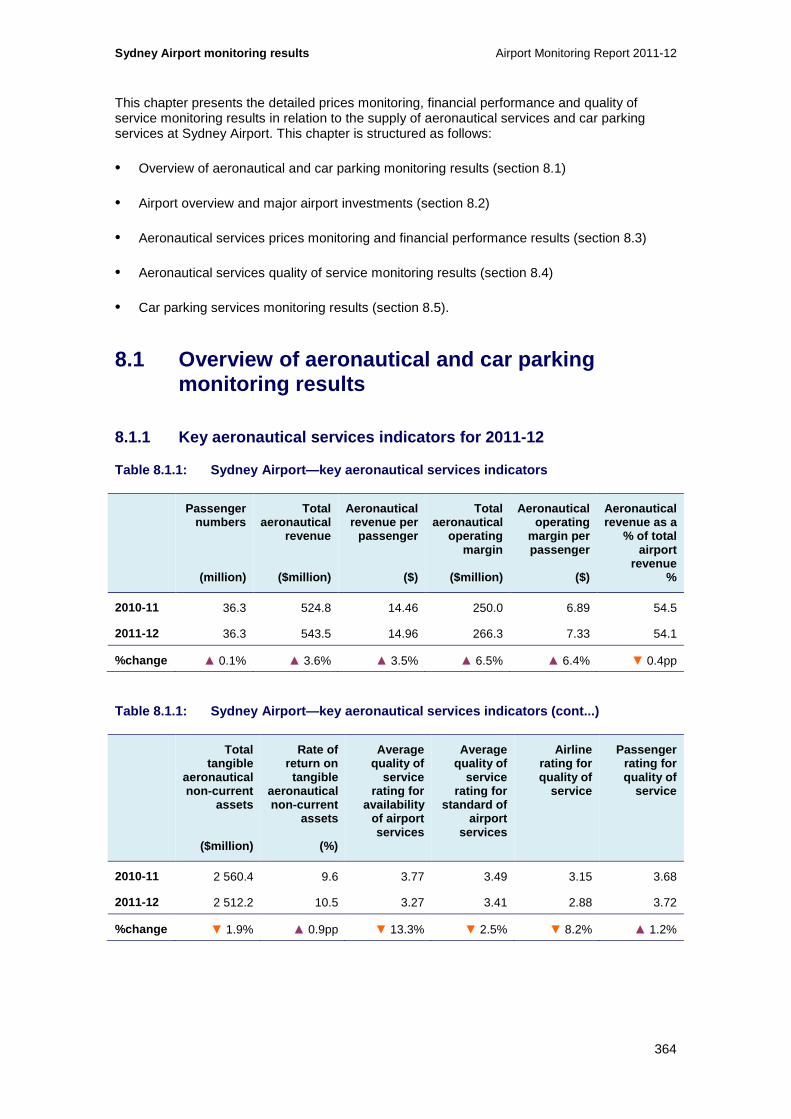
Sydney Airport monitoring results Airport Monitoring Report 2011-12
364
This chapter presents the detailed prices monitoring, financial performance and quality of service monitoring results in relation to the supply of aeronautical services and car parking services at Sydney Airport. This chapter is structured as follows:
• Overview of aeronautical and car parking monitoring results (section 8.1)
• Airport overview and major airport investments (section 8.2)
• Aeronautical services prices monitoring and financial performance results (section 8.3)
• Aeronautical services quality of service monitoring results (section 8.4)
• Car parking services monitoring results (section 8.5).
8.1 Overview of aeronautical and car parking monitoring results
8.1.1 Key aeronautical services indicators for 2011 -12
Table 8.1.1: Sydney Airport—key aeronautical servic es indicators
Passenger numbers
(million)
Total aeronautical
revenue
($million)
Aeronautical revenue per
passenger
($)
Total aeronautical
operating margin
($million)
Aeronautical operating
margin per passenger
($)
Aeronautical revenue as a
% of total airport
revenue %
2010-11 36.3 524.8 14.46 250.0 6.89 54.5
2011-12 36.3 543.5 14.96 266.3 7.33 54.1
%change ▲ 0.1% ▲ 3.6% ▲ 3.5% ▲ 6.5% ▲ 6.4% ▼ 0.4pp
Table 8.1.1: Sydney Airport—key aeronautical servic es indicators (cont...)
Total tangible
aeronautical non-current
assets
($million)
Rate of return on
tangible aeronautical non-current
assets
(%)
Average quality of
service rating for
availability of airport services
Average quality of
service rating for
standard of airport
services
Airline rating for quality of
service
Passenger rating for quality of
service
2010-11 2 560.4 9.6 3.77 3.49 3.15 3.68
2011-12 2 512.2 10.5 3.27 3.41 2.88 3.72
%change ▼ 1.9% ▲ 0.9pp ▼ 13.3% ▼ 2.5% ▼ 8.2% ▲ 1.2%

Airport Monitoring Report 2011-12 Sydney Airport monitoring results
365
8.1.2 Key car parking services indicators for 2011- 12
Table 8.1.2: Sydney Airport—car parking prices as a t 30 June
Short-term car parking Long-term car parking
1 hour 3 hours 8 hours 24 hours 1 day 3 days 7 day s
2010-11 $15.00 $26.00 $52.00 $52.00 $25.00 $62.00 $122.00
2011-12 $16.00 $29.00 $56.00 $56.00 $26.00 $67.00 $127.00
%change ▲ 6.7% ▲ 11.5% ▲ 7.7% ▲ 7.7% ▲ 4.0% ▲ 8.1% ▲ 4.1%
Table 8.1.3: Sydney Airport—car parking services in dicators 167
Number of car park spaces
(thousand)
Total car parking revenue
($million)
Car parking revenue per
car park space
($)
Total car parking
operating margin
($million)
Car parking operating
margin per car park
space ($)
Car parking revenue as a
% of total airport
revenue %
2010-11 12.3 98.0 7 983 69.1 5,632 10.2
2011-12 13.1 100.4 7 654 69.4 5,290 10.0
%change ▲ 6.9% ▲ 2.5% ▼ 4.1% ▲ 0.4% ▼ 6.1% ▼ 0.2pp
Table 8.1.3: Sydney Airport—car parking services in dicators (cont...)
Landside access
revenue
($million)
Landside access
revenue as a % of total
airport revenue
%
Passenger rating for
availability of airport car
parking
Passenger rating for
standard of airport car
parking
Passenger rating for time taken to enter
airport car park
2010-11 9.7 1.0% 3.49 3.56 3.60
2011-12 13.3 1.3% 3.45 3.69 3.75
%change ▲ 36.9% ▲ 0.3pp ▼ 1.1% ▲ 3.7% ▲ 4.1%
167 In October 2011, Sydney Airport commenced online booking for car parking. This online booking service does provide for cheaper parking options than those listed in table 8.1.3. For further information, refer to http://www.sydneyairport.com.au/go/car-parking/domestic/domestic-special-offers.aspx
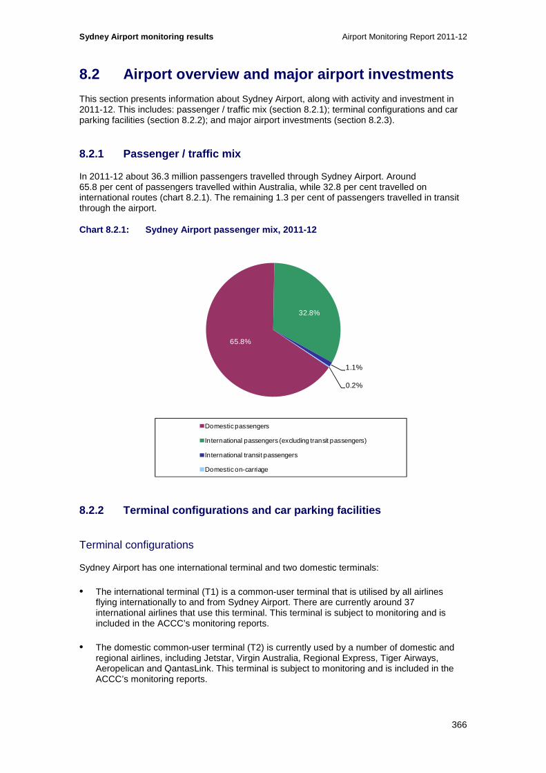
Sydney Airport monitoring results Airport Monitoring Report 2011-12
366
8.2 Airport overview and major airport investments
This section presents information about Sydney Airport, along with activity and investment in 2011-12. This includes: passenger / traffic mix (section 8.2.1); terminal configurations and car parking facilities (section 8.2.2); and major airport investments (section 8.2.3).
8.2.1 Passenger / traffic mix
In 2011-12 about 36.3 million passengers travelled through Sydney Airport. Around 65.8 per cent of passengers travelled within Australia, while 32.8 per cent travelled on international routes (chart 8.2.1). The remaining 1.3 per cent of passengers travelled in transit through the airport.
Chart 8.2.1: Sydney Airport passenger mix, 2011-12
8.2.2 Terminal configurations and car parking facil ities
Terminal configurations
Sydney Airport has one international terminal and two domestic terminals:
• The international terminal (T1) is a common-user terminal that is utilised by all airlines flying internationally to and from Sydney Airport. There are currently around 37 international airlines that use this terminal. This terminal is subject to monitoring and is included in the ACCC’s monitoring reports.
• The domestic common-user terminal (T2) is currently used by a number of domestic and regional airlines, including Jetstar, Virgin Australia, Regional Express, Tiger Airways, Aeropelican and QantasLink. This terminal is subject to monitoring and is included in the ACCC’s monitoring reports.
65.8%
32.8%
1.1%
0.2%
Domestic passengers
International passengers (excluding transit passengers)
International transit passengers
Domestic on-carriage
Airport Monitoring Report 2011-12 Sydney Airport monitoring results
367
• The Qantas domestic terminal (T3) is occupied and operated by Qantas under a domestic terminal lease (DTL). This terminal is not subject to monitoring and therefore data on passenger-related services and facilities provided within this terminal are not included in the monitoring results presented in the ACCC’s monitoring reports.
Car parking facilities
Sydney Airport provides three major car parking facilities:
• For international terminal users (T1), there is a multi-level car park that combines short-term and long-term parking located opposite the terminal.
• For domestic terminal users (T2 and T3), there is a multi-level car park that combines short-term and long-term parking located opposite the terminals.
• Also for domestic terminal users, there is a long-term car park (called the ‘Blu Emu Car Park’) located at a distance from the terminals, which is serviced by a free shuttle bus.
8.2.3 Major airport investments
Aeronautical services and facilities
Sydney Airport completed and undertook a number of investment projects in its aeronautical services and facilities in 2011-12, including:
• The ‘Pier A’ area of the T2 domestic terminal was expanded, including the completion of five additional gates, of which two are suitable for A330 aircraft and the redesign of two aircraft parking bays. This terminal expansion was completed in December 2012. The development also includes a common user bussing lounge and a passenger transfer bussing lounge that will be completed in the first half of 2013.
• Two additional aircraft parking positions, suitable for 747 aircraft, were provided at the international terminal (T1). Construction of further new aircraft parking bays is underway and is expected to be completed in July 2013.
• Improvements to the ‘Pier C’ departures area of T1. This includes larger gate lounge areas and additional seating, as well as improvements to secondary screening facilities, floor finishes and circulation. The first stage of these developments was completed in December 2011 while Stage 2, which includes further improvements, is due to be completed in early 2013.
• The reconfiguration of the T1 Pier C customs and quarantine areas allowing improvements to the method by which passengers are processed. Works included the reconfiguration and improvement of the Pier C secondary Department of Agriculture, Fisheries and Forestry Biosecurity (DAFF Biosecurity) and Australian Customs and Border Protection Service (AC&BPS) screening inspection benches. This was completed in June 2012.
• Enhancements to facilities for transit passengers to improve passenger circulation through screening points at T1, including the new ‘i-Lane’ and Body Scanner security equipment. The majority of these facilities were completed and opened in June 2012.
• Works to reconfigure the electricity supply to the T1 building were completed by the end of 2012, increasing the reliability of power supply.

Sydney Airport monitoring results Airport Monitoring Report 2011-12
368
• The installation of airfield stop bar lights across all taxiways and runway intersections. These new safety enhancements were commissioned in August 2012.
• New baggage make-up carousel at T2 BHS providing for 40 per cent additional capacity. This new baggage area also includes provision for containerised aircraft.
Planned investments in aeronautical services and facilities at Sydney Airport beyond 2011-12 include:168
• Three additional aprons in the international precinct, and reconfiguration of several existing aprons.
• A Code E apron near T1 adjacent to the current international freight facilities. The works are scheduled to commence in first quarter of 2013 and be completed in the last quarter of 2013.
• Two new T1 Code E apron bays (76 and 77) in the South West Sector. The bays will be available for arriving or layover aircraft. Works are scheduled to be constructed on a staged basis with completion targeted for 2013-14.
• Reconfiguration of the existing T1 South West Sector bays 74 and 75 to enable bussed operations for Code E aircraft or, in combination with the proposed new bays 76-77, four Code F layover positions. The works are scheduled to be completed during 2014. It is anticipated that works should have minimum impact on adjacent facilities, with works that may impact operations planned to be undertaken during curfew hours.
• Work on apron areas to cater for the expected increase in larger domestic aircraft over the next few years. The Foxtrot 6 bay was upgraded to an A320/B737 aircraft bay in August 2012 and upgrades to other domestic apron areas are proposed to provide aircraft parking flexibility and accommodate a larger range of domestic and regional aircraft. This project is scheduled to be completed by mid-2013.
• Upgrading the approach lighting of a number of runways to increase the capacity and safety of operations. Works are planned to be staged with construction beginning in early 2013.
• Expansions to check-in counters at the T1 international terminal (including accessible counters for passengers with a disability) which are intended to enable one to two additional airlines access each to the counters. Works have been staged with enhancements to the first counter completed at the end of 2012 and the second scheduled to be completed by mid-2013.
• Security screening facilities at T1 are also planned to be upgraded with construction scheduled to be completed in mid-2013.
• Additional baggage capacity was made available at T2 for outbound baggage handling in December 2012.
• A range of improvements to internal facilities such as bathroom finishes, hydraulic systems and aerobridge controls as well as external features including pavements, lighting and landscaping.
168 It is noted that Sydney Airport are currently constructing a hotel adjacent to T1, although this is not strictly part of what is classified as aeronautical services or facilities.

Airport Monitoring Report 2011-12 Sydney Airport monitoring results
369
• Sydney Airport is also reviewing the status of all aerobridges at T1 and T2 and progressively implementing a maintenance and upgrade program of these facilities.
Car parking and landside access services
Investments in car parking and landside access services undertaken at Sydney Airport in 2011-12 include:
• A new multi-storey car park with approximately 2300 spaces commenced development in August 2011 at the international terminal. This facility was completed in August 2012.
• A new on-line booking system was implemented to offer a greater variety of pre-booking options and price discounting across all Sydney Airport car parks. The system commenced in October 2011 and, according to Sydney Airport, can provide discounts of up to 73 per cent for customers booking 6 hours or more in advance.
• The addition of 1387 spaces at the Domestic long-term car park and increasing capacity by around 32 per cent was completed and made available for use in April 2012. Two bus shelters were also constructed to enhance access to shuttle bus services. There are now 12 bus shelters at Sydney Airport.
• The number of taxi bays at Terminal 2 were increased by 50 per cent to 15 bays and the number of pre-book taxi bays increased from 6 to 20. Both facilities were available for use by the end of 2011.
• Improved roadway signage at the entry to the domestic precinct to facilitate easy wayfinding and improved traffic flow was completed in late 2011. Similar improvements to roadway signage at the international terminal were completed in August 2012.
• A new ‘slip lane’ for customers using the 10 minute free area was implemented increasing the effective throughput of the area and improving traffic flow. An undercover walkway from the terminal to the 10 minute free area was also constructed. This was completed and available for use in December 2011.
• Construction of an awning to the limousine area at T1 to provide protection from inclement weather was completed in February 2012.
• Implementation of a digital parking guidance and signage system in the international multi-storey car park and also in the domestic multi-storey car park. Both were completed in March 2012.
• Development of improved airline crew pick up facilities at T1 to provide protection from inclement weather was completed in June 2012.
• A new back-end car park management system, providing the ability to offer a variety of different products and pricing to different market segments was available from July 2012.
• New car parking equipment has been installed across all three Sydney Airport car parks including 41 new entry gates, 31 exit gates and 13 pay machines. The system promotes improved traffic flow through faster gate cycle times and was completed in August 2012.
Sydney Airport monitoring results Airport Monitoring Report 2011-12
370
Planned investments in car parking and landside access services at Sydney Airport beyond 2011-12 include:
• The construction of a new 965 space multi-storey car park at the domestic terminal located on Seventh Street.
• Installation of a digital parking guidance and signage system in the new domestic terminal car park on Seventh Street which is currently under construction.
• Upgrades to the long-term car park including refurbishment of bus shelters, the transit lounge and signage will be completed by the end of March 2013.
• The T2 Pronto Valet site within the Domestic multi-storey car park will be upgraded by May 2013 with construction of a new lounge area and refurbishment of the vehicle drop-off area.
• A shuttle bus ‘slip lane’ to facilitate quicker transit times for the shuttle bus between the long-term car park and the domestic terminal. This is due to be completed by the end of 2013.
• Realignment of the T1 car park access points to streamline traffic flow and reduce congestion. Planned to commence late 2013.
• Upgrade of the pre-book website so that the placing and managing bookings can be done through mobile devices.
• Resurfacing of the long-term car park.
• Sydney Airport also advised of a number of refurbishment and improvements to existing facilities and services at car parks and other landside assets.
8.3 Aeronautical prices monitoring and financial performance results
This section presents prices monitoring and financial reporting results for aeronautical services and total services at Sydney Airport, including activity levels (section 8.3.1); prices (section 8.3.2); revenues, costs and profits (section 8.3.3); average revenues, costs and profits (section 8.3.4); government mandated security services (section 8.3.5); assets (section 8.3.6); and rates of return on tangible non-current assets (section 8.3.7).

Airport Monitoring Report 2011-12 Sydney Airport monitoring results
371
8.3.1 Activity levels
Chart 8.3.1: Sydney Airport—volume of passengers, t onnes landed and aircraft movements, 2001-02 to 2011-12 169
Key observations from chart 8.3.1 include:
• The number of passengers, tonnes landed and aircraft movements at Sydney Airport in 2011-12 were similar to the previous year.
• Passenger numbers increased slightly from just under 36.3 million in 2010-11 to just over 36.3 million in 2011-12 (0.1 per cent). Passenger numbers generally trended upwards over the 11 years to 2011-12, increasing by an average of around 4.1 per cent each year. From 2001-02 to 2011-12 passenger numbers increased by almost 50 per cent.
• During 2011-12, international passenger numbers (including international transit passengers) increased by 3.6 per cent to 12.3 million. Domestic passenger numbers (including domestic on-carriage passengers) decreased during 2011-12 by 1.7 per cent to 23.9 million. Sydney Airport has stated that the increase in international passenger numbers has been partly driven by the introduction of two new low cost airlines, AirAsia and Scoot. Other reasons behind the increase in international passengers include growth from Chinese, Indian and Indonesian markets and strong Australian outbound travelling.170 Reasons for the decline in the domestic passenger numbers was partly due to the Qantas grounding and associated industrial action.171 The partial ceasing of operations by Tiger Airways also impacted on domestic passenger numbers.
• In 2011-12, tonnes landed at Sydney Airport increased by around 0.4 per cent. Over the reporting period, the volume of tonnes landed increased by an average of around
169 Data in chart 8.3.1 is not comparable to chart 8.2.1 as international transit passengers have been included as international passengers and domestic on-carriage passengers have been included as domestic passengers. 170 Sydney Airport (2012), Results for the half year ended 30 June 2012, ASX release 23 August
http://www.asx.com.au/asx/statistics/announcements.do?by=asxCode&asxCode=Syd&timeframe=Y&year=2012 171 Sydney Airport (2012), Results for the Year Ended 31 December 2011, ASX release, 23 February,
http://www.asx.com.au/asx/statistics/announcements.do?by=asxCode&asxCode=Syd&timeframe=Y&year=2012
0
50
100
150
200
250
300
350
400
0
5 000
10 000
15 000
20 000
25 000
30 000
35 000
40 000
2001
–02
2002
–03
2003
–04
2004
–05
2005
–06
2006
–07
2007
–08
2008
–09
2009
–10
2010
–11
2011
–12
Num
ber
of a
ircr
aft m
ove
men
ts (
tho
usan
d)
Num
ber
of p
asse
ng
ers
/ to
nn
es la
nd
ed (t
ho
usan
d)
Domestic Passengers International Passengers Tonnes landed Aircraft movements (RHS)

Sydney Airport monitoring results Airport Monitoring Report 2011-12
372
2.8 per cent each year, from 12.3 million tonnes in 2001-02 to just over 16.2 million tonnes in 2011-12 (an increase of 31.8 per cent).
• Aircraft movements decreased marginally from 311 147 movements in 2010-11 to 310 936 movements in 2011-12 (-0.1 per cent), following increases in aircraft movements in the preceding two years. Over the reference period, aircraft movements have also trended upwards, increasing by 22.1 per cent from around 254 729 movements in 2001-02.
8.3.2 Prices
Table 8.3.1 presents the average aeronautical charges at Sydney Airport from 2007-08 to 2011-12 as well as the indexed average list prices from 2007-08.
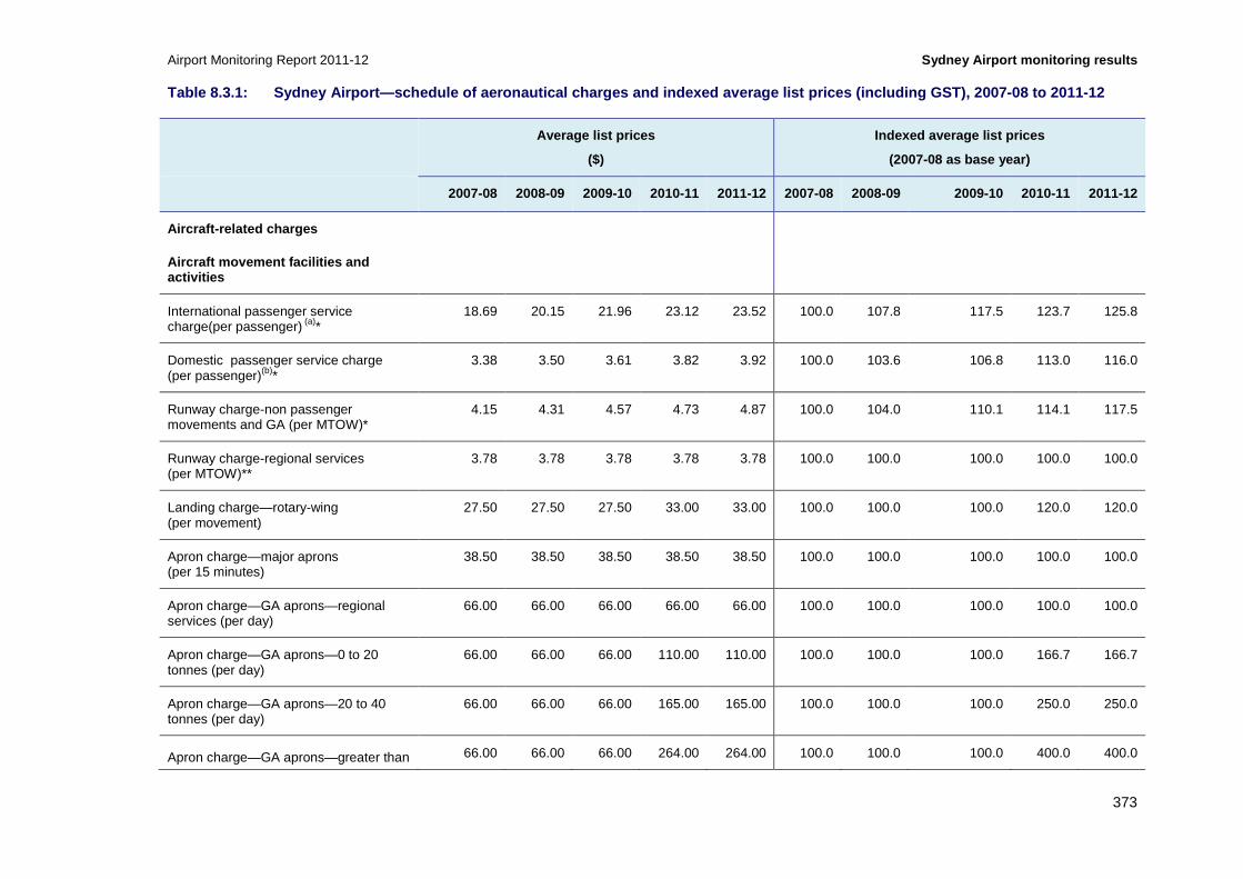
Airport Monitoring Report 2011-12 Sydney Airport monitoring results
373
Table 8.3.1: Sydney Airport—schedule of aeronautica l charges and indexed average list prices (includin g GST), 2007-08 to 2011-12
Average list prices
($)
Indexed average list prices
(2007-08 as base year)
2007-08 2008-09 2009-10 2010-11 2011-12 2007-08 2008-09 2009-10 2010-11 2011-12
Aircraft-related charges
Aircraft movement facilities and activities
International passenger service charge(per passenger) (a)*
18.69 20.15 21.96 23.12 23.52 100.0 107.8 117.5 123.7 125.8
Domestic passenger service charge (per passenger)(b)*
3.38 3.50 3.61 3.82 3.92 100.0 103.6 106.8 113.0 116.0
Runway charge-non passenger movements and GA (per MTOW)*
4.15 4.31 4.57 4.73 4.87 100.0 104.0 110.1 114.1 117.5
Runway charge-regional services (per MTOW)**
3.78 3.78 3.78 3.78 3.78 100.0 100.0 100.0 100.0 100.0
Landing charge—rotary-wing (per movement)
27.50 27.50 27.50 33.00 33.00 100.0 100.0 100.0 120.0 120.0
Apron charge—major aprons (per 15 minutes)
38.50 38.50 38.50 38.50 38.50 100.0 100.0 100.0 100.0 100.0
Apron charge—GA aprons—regional services (per day)
66.00 66.00 66.00 66.00 66.00 100.0 100.0 100.0 100.0 100.0
Apron charge—GA aprons—0 to 20 tonnes (per day)
66.00 66.00 66.00 110.00 110.00 100.0 100.0 100.0 166.7 166.7
Apron charge—GA aprons—20 to 40 tonnes (per day)
66.00 66.00 66.00 165.00 165.00 100.0 100.0 100.0 250.0 250.0
Apron charge—GA aprons—greater than 66.00 66.00 66.00 264.00 264.00 100.0 100.0 100.0 400.0 400.0

Sydney Airport monitoring results Airport Monitoring Report 2011-12
374
Average list prices
($)
Indexed average list prices
(2007-08 as base year)
2007-08 2008-09 2009-10 2010-11 2011-12 2007-08 2008-09 2009-10 2010-11 2011-12
40 tonnes (per day)
Domestic terminal infrastructure charge Commercial agreement NA NA NA NA NA NA NA NA NA
Aircraft refuelling services Commercial agreement
NA NA NA NA NA NA NA NA NA
T3 domestic terminal infrastructure Commercial agreement NA NA NA NA NA NA NA NA NA
Light and emergency aircraft maintenance
Commercial agreement NA NA NA NA NA NA NA NA NA
Passenger processing facilities and activities
International security charges—including passenger screening, checked bag screening and additional security measures (per passenger)(c)
4.54 3.74 4.30 4.85 4.59 100.0 82.3 94.7 106.8 101.0
T2 domestic passenger facilitation charge (per passenger)(d)
7.66 8.15 8.15 8.15 8.15 100.0 106.5 106.5 106.5 106.5
T2 regional passenger facilitation charge (per passenger)(d)
4.95 4.95 4.95 4.95 4.95 100.0 100.0 100.0 100.0 100.0
T2 domestic security charges—including passenger screening, checked bag screening and additional security measures (per passenger)(e)
1.87 1.75 2.01 2.00 1.80 100.0 93.5 107.6 107.1 96.5
T2 regional security charges—including passenger screening and checked bag screening (per passenger)(f)
0.96 0.96 0.96 0.96 0.96 100.0 100.0 100.0 100.0 100.0
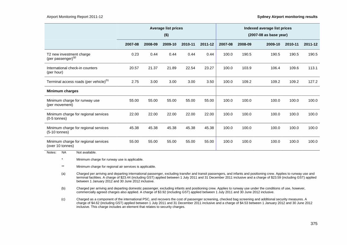
Airport Monitoring Report 2011-12 Sydney Airport monitoring results
375
Average list prices
($)
Indexed average list prices
(2007-08 as base year)
2007-08 2008-09 2009-10 2010-11 2011-12 2007-08 2008-09 2009-10 2010-11 2011-12
T2 new investment charge (per passenger)(g)
0.23 0.44 0.44 0.44 0.44 100.0 190.5 190.5 190.5 190.5
International check-in counters (per hour)
20.57 21.37 21.89 22.54 23.27 100.0 103.9 106.4 109.6 113.1
Terminal access roads (per vehicle)(h) 2.75 3.00 3.00 3.00 3.50 100.0 109.2 109.2 109.2 127.2
Minimum charges
Minimum charge for runway use (per movement)
55.00 55.00 55.00 55.00 55.00 100.0 100.0 100.0 100.0 100.0
Minimum charge for regional services (0-5 tonnes)
22.00 22.00 22.00 22.00 22.00 100.0 100.0 100.0 100.0 100.0
Minimum charge for regional services (5-10 tonnes)
45.38 45.38 45.38 45.38 45.38 100.0 100.0 100.0 100.0 100.0
Minimum charge for regional services (over 10 tonnes)
55.00 55.00 55.00 55.00 55.00 100.0 100.0 100.0 100.0 100.0
Notes: NA Not available.
* Minimum charge for runway use is applicable.
** Minimum charge for regional air services is applicable.
(a) Charged per arriving and departing international passenger, excluding transfer and transit passengers, and infants and positioning crew. Applies to runway use and terminal facilities. A charge of $23.44 (including GST) applied between 1 July 2011 and 31 December 2011 inclusive and a charge of $23.59 (including GST) applied between 1 January 2012 and 30 June 2012 inclusive.
(b) Charged per arriving and departing domestic passenger, excluding infants and positioning crew. Applies to runway use under the conditions of use, however, commercially agreed charges also applied. A charge of $3.92 (including GST) applied between 1 July 2011 and 30 June 2012 inclusive.
(c) Charged as a component of the international PSC, and recovers the cost of passenger screening, checked bag screening and additional security measures. A charge of $4.62 (including GST) applied between 1 July 2011 and 31 December 2011 inclusive and a charge of $4.53 between 1 January 2012 and 30 June 2012 inclusive. This charge includes an element that relates to security charges.

Sydney Airport monitoring results Airport Monitoring Report 2011-12
376
(d) Levied per arriving and departing passenger, excluding infants and positioning crew. This is a scheduled charge—specific arrangements apply under commercial agreements with major users.
(e) Applies to domestic users of Terminal 2 to recover the cost of passenger, checked bag screening and additional security measures. A charge of $1.82 (including GST) applied between 1 July 2011 and 31 December 2011 inclusive and a charge of $1.78 between 1 January 2012 and 30 June 2012 inclusive. This charge includes an element related that relates to security charges—note comments in (d) above.
(f) Applies to regional users of Terminal 2 to partly recover part of the cost of passenger and checked bag screening in Terminal 2. A charge of $0.96 (including GST) applied from 1 July 2011 to 30 June 2012 inclusive.
(g) Levied per arriving and departing domestic passenger in Terminal 2. A charge of $0.44 (including GST) per passenger applied from 1 July 2011 to 30 June 2012 inclusive. This charge was first introduced in January 2008.
(h) Levied on vehicle pick-ups to recover costs associated with the provision of ground access facilities. Charges are: taxis $3.50; charges for other ground access is tiered. Refer to the tables below.
Domestic
Vehicle Type Fee (inc GST)
0-20 minutes 20-40 minutes 40-60 minutes 60+ minutes
Limousine $4.50 $9.00 $18.00 $27.00
Bus (up to 14 seats) $5.00 $10.00 $20.00 $30.00
Bus (15-29 seats) $7.00 $14.00 $28.00 $42.00
0-40 minutes 40-80 minutes 80-120 minutes 120+ minu tes
Coach (30+ seats) $12.00 $24.00 $48.00 $72.00
International
Vehicle Type Fee (inc GST)
0-75 minutes 75-100 minutes 150-225 minutes 225+ minutes
Limousine $4.50 $9.00 $18.00 $27.00
0-30 minutes 30-60 minutes 60-90 minutes 90+ minute s
Bus (up to 14 seats) $5.00 $10.00 $20.00 $30.00
Bus (15-29 seats) $7.00 $14.00 $28.00 $42.00
0-40 minutes 40-80 minutes 80-120 minutes 120+ minu tes
Coach (30+ seats) $12.00 $24.00 $48.00 $72.00

Airport Monitoring Report 2011-12 Sydney Airport monitoring results
377
Key observations from table 8.3.1 include:
• Sydney Airport’s list prices increased for some aircraft-related services while prices for other aircraft services remained unchanged in 2011-12. Most of the passenger-related charges either remained unchanged or declined from the previous year. Sydney Airport advised that aeronautical charges, including increases for additional investment and services, are commercially agreed with the airlines. Sydney Airport also stated that most airlines pay below the list prices.
• In 2011-12 the average international passenger service charge increased by 1.7 per cent, from $23.12 per passenger to $23.52 per passenger.
− Over the five year period from 2007-08 to 2011-12, the international passenger service charge increased by around 25.8 per cent, to $23.52 per passenger. This includes a yearly increase of 5.3 per cent in 2010-11, driven by capacity upgrades at the airport.
− The combined international security charge for passenger screening, checked bag screening and additional security measures decreased from $4.85 per passenger in 2010-11 to $4.59 per passenger in 2011-12 (5.4 per cent).
• For domestic services, the average passenger service charge increased by 2.6 per cent, from $3.82 per passenger in 2010-11 to $3.92 per passenger in 2011-12.
− From 2007-08 to 2011-12 the domestic passenger service charge increased by around 16.0 per cent, to $3.92 per passenger.
− Similar to international security charges, the combined domestic security charge for passenger screening, checked bag screening and additional security measures also decreased, from $2.00 per passenger in 2010-11 to $1.80 per passenger in 2011-12 (9.9 per cent).
• Runway charges for non-passenger movements and general aviation increased by around 3.0 per cent, from $4.73 per MTOW in 2010-11 to $4.87 per MTOW in 2011-12.
• Apron charges did not change in 2011-12. Sydney Airport changed the structure for apron charges in 2010-11, with some charges imposed according to tonnage. Prior to 2010-11, all aircraft parked in general aviation were charged at a flat rate of $66.00 per day regardless of tonnage. For further information, refer to the ACCC’s 2010-11 Airport Monitoring Report (AMR).172
• Aeronautical charges on all regional services, including passenger and checked bag security screening, runway charges and apron charges did not change in 2011-12, and remained constant over the five years since 2007-08.
Aeronautical services to regional air services
Declaration 92 under s. 95X of the Competition and Consumer Act 2010 (the CCA) (previously titled the Trade Practices Act 1974) declares the provision of aeronautical services and facilities
172 ACCC, (2012), Airport Monitoring Report 2010-11, Price, financial performance and quality of service monitoring, March, page 233, http://www.accc.gov.au/content/index.phtml/itemId/1042166

Sydney Airport monitoring results Airport Monitoring Report 2011-12
378
to regional air services by Sydney Airport to be notified services.173 This means that Sydney Airport must notify the ACCC if it intends to increase the price of such services. Direction 32 requires the ACCC to give special consideration to the Australian Government’s policy that the total revenue-weighted percentage increase in prices over the three years from 1 July 2010, or part thereof (including new or restructured prices) paid by operators of regional air services to Sydney Airport should not exceed the total percentage increase in the Consumer Price Index (CPI) over that same period.174
8.3.3 Revenues, costs and profits for aeronautical and total airport services
As noted in chapter 1, the ACCC required airport operators to provide additional information relating to the aeronautical asset base under the line in the sand (LIS) approach for the first time in 2007-08. Under this approach the value of an airport’s aeronautical asset base for monitoring purposes is the value of tangible non-current aeronautical assets reported to the ACCC as at 30 June 2005, plus new investments, less depreciation and disposals. Table 8.3.2 shows the starting LIS asset base figures.
Table 8.3.2 Sydney Airport—starting line in the san d asset base as at 30 June 2005 ($thousand)
Land Property, plant and equipment
Total line in the sand asset base
Sydney Airport 425 632 1 161 777 1 587 409
Sydney Airport noted in its regulatory accounts that similar to the previous year, the value of leasehold land for LIS aeronautical assets includes the value of landfill, a net book value of $160.6 million as at 30 June 2012. However, this value was not included in the asset base provided as at 1 July 2005 (from which the ACCC’s line in the LIS asset base was derived).
As a result the LIS approach for Sydney Airport presents two series to provide consistent accounts over time:
• One LIS series excludes the value of landfill in leasehold land
• The other LIS series includes the value of landfill.
Table 8.3.3 outlines the revenues, operating expenses and operating margins for aeronautical services and the total airport from 2001-02 to 2011-12. Table 8.3.4 shows the revenues, operating expenses and operating margins for aeronautical services under the LIS approach, both excluding and including the value of landfill.
173 The previous declaration (Declaration No.91) took effect on 1 July 2007 for a period of three years. The previous declaration was replaced by a new declaration (Declaration No. 92) which took effect on 1 July 2010. 174 The previous direction (Direction No. 30) took effect on 1 July 2007 for a period of three years. The previous direction was replaced by a new direction (Direction No. 30) which took effect on 1 July 2010.

Airport Monitoring Report 2011-12 Sydney Airport monitoring results
379
Table 8.3.3: Sydney Airport—Revenues, operating exp enses and operating margins for aeronautical servic es and total airport services, 2001-02 to 2011-12
2001-02 2002-03 2003-04 2004-05 2005-06 2006-07 2007-08 2008-09 2009-10 2010-11 2011-12
Revenue ($million)
Aeronautical 228.6 255.4 283.9 313.6 335.1 375.3 430.6 446.4 489.9 524.8 543.5
Total airport 454.0 497.8 545.2 637.7 726.4 851.1 1 029.3 1 127.6 901.5 962.9 1 004.0
Operating expenses
($million)
Aeronautical 159.4 163.3 167.1 162.8 187.7 202.7 235.7 244.4 271.5 274.8 277.2
Total airport 238.9 231.2 234.9 232.1 256.7 284.6 3 25.7 337.7 371.7 379.0 384.9
Operating margin ($million)
Aeronautical 69.2 92.1 116.8 150.7 147.4 172.5 194.9 202.0 218.4 250.0 266.3
Total airport 215.1 266.6 310.3 405.6 469.7 566.4 7 03.6 789.8 529.8 583.8 619.1
Operating margin as a % of revenue
Aeronautical 30.3% 36.1% 41.2% 48.1% 44.0% 46.0% 45.3% 45.3% 44.6% 47.6% 49.0%
Total airport 47.4% 53.6% 56.9% 63.6% 64.7% 66.6% 6 8.4% 70.0% 58.8% 60.6% 61.7%

Sydney Airport monitoring results Airport Monitoring Report 2011-12
380
Table 8.3.4: Sydney Airport—Revenues, operating exp enses and operating margins for aeronautical servic es under the line in the sand (LIS) approach, both excluding and including the value of landfill in leasehold land, 2007-08 to 2011-12
2001-02 2002-03 2003-04 2004-05 2005-06 2006-07 2007-08 2008-09 2009-10 2010-11 2011-12
Revenue
($million)
Excluding landfill NA NA NA NA NA NA 430.6 446.4 489.9 524.8 543.5
Including landfill NA NA NA NA NA NA 430.6 446.4 489.9 524.8 543.5
Operating expenses
($million)
Excluding landfill NA NA NA NA NA NA 226.5 237.3 270.9 271.3 269.5
Including landfill NA NA NA NA NA NA 228.4 239.3 272.9 272.6 271.4
Operating margin
($million)
Excluding landfill NA NA NA NA NA NA 204.1 209.1 219.0 253.5 274.0
Including landfill NA NA NA NA NA NA 202.2 207.1 217.0 252.2 272.1
Operating margin as a % of revenue
Excluding landfill NA NA NA NA NA NA 47.4% 46.8% 44.7% 48.3% 50.4%
Including landfill NA NA NA NA NA NA 46.9% 46.4% 44.3% 48.1% 50.1%

Airport Monitoring Report 2011-12 Sydney Airport monitoring results
381
Key observations from tables 8.3.3 and 8.3.4 include:
• Aeronautical revenue, operating expenses and operating margin for Sydney Airport all increased in 2011-12.
• Revenue from aeronautical services increased by $18.7 million (3.6 per cent) in 2011-12 to around $543.5 million. Over the 11 years since 2001-02, aeronautical revenue increased by an average of around 9.0 per cent per annum.
• Aeronautical operating expenses increased by $2.4 million (0.9 per cent) in 2011-12 to around $277.2 million. This follows an increase of 1.2 per cent in the previous year. Since 2001-02, aeronautical operating expenses experienced an average increase of 5.7 per cent per annum.
• The increase in revenues relative to operating expenses led to an increased operating margin for aeronautical services in 2011-12. Aeronautical operating margin increased by around $16.3 million (6.5 per cent) in 2011-12 to $266.3 million. Since 2001-02 Sydney Airport’s operating margin for aeronautical services increased, on average, by around 14.4 per cent per annum.
• Under the LIS methodology, excluding the value of landfill in leasehold land, operating expenses for aeronautical services were around $269.5 million in 2011-12, or about 3 per cent lower than the non-LIS figure. Depreciation of tangible assets (excluding land) is lower under the LIS approach, resulting in a slightly higher operating margin for Sydney Airport, at $274.0 million.
− Including the value of landfill in leasehold land, operating expenses for aeronautical services were $271.4 million, or 2.1 per cent lower than for the non-LIS figure. Including the value of landfill in leasehold land, aeronautical operating margin was $272.1 million.
• For total airport services, revenue, operating expenses and operating margin all increased in 2011-12. Revenue increased to just over $1.0 billion, operating expenses to $384.9 million and operating margin to $619.1 million.
• Revenue generally increased for the total airport over the 11 years to 2011-12. However, in 2009-10 there was a significant drop in revenue due to the removal of intercompany dividends as a result of accounts being prepared on a consolidated basis, which in turn impacted on the level of total airport operating margin.

Sydney Airport monitoring results Airport Monitoring Report 2011-12
382
Chart 8.3.2: Sydney Airport—aeronautical services a nd non-aeronautical services share of total airport revenue, 2001-02 to 2011-12
Key observations from chart 8.3.2 include:
• Aeronautical revenue as a proportion of total airport revenue has remained steady at just over 54 per cent in each of the previous three years.
• This follows a significant increase in the proportion of aeronautical revenue in 2009-10 when the share of revenue attributed to aeronautical services jumped by nearly 15 percentage points.
− Notably, the large shift in 2009-10 was influenced by a change in Sydney Airport’s reporting. In contrast to previous years, in 2009-10 Sydney Airport reported financial results on a consolidated basis and removed intercompany dividends from its final results. This contributed to almost a 40 per cent fall in non-aeronautical revenue compared with the previous year.
0
10
20
30
40
50
60
70
80
90
100
2001
–02
2002
–03
2003
–04
2004
–05
2005
–06
2006
–07
2007
–08
2008
–09
2009
–10
2010
–11
2011
–12
Per
cen
t
Revenue—aeronautical Revenue—non-aeronautical
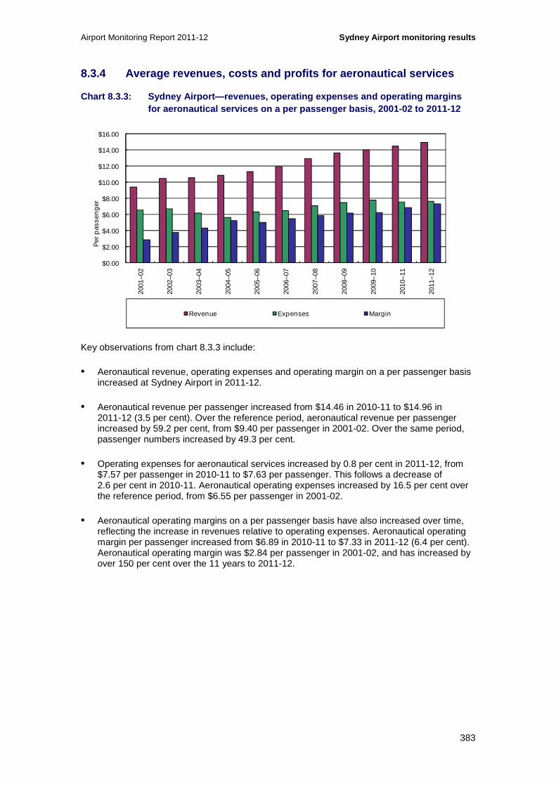
Airport Monitoring Report 2011-12 Sydney Airport monitoring results
383
8.3.4 Average revenues, costs and profits for aeron autical services
Chart 8.3.3: Sydney Airport—revenues, operating exp enses and operating margins for aeronautical services on a per passenger basis, 2001-02 to 2011-12
Key observations from chart 8.3.3 include:
• Aeronautical revenue, operating expenses and operating margin on a per passenger basis increased at Sydney Airport in 2011-12.
• Aeronautical revenue per passenger increased from $14.46 in 2010-11 to $14.96 in 2011-12 (3.5 per cent). Over the reference period, aeronautical revenue per passenger increased by 59.2 per cent, from $9.40 per passenger in 2001-02. Over the same period, passenger numbers increased by 49.3 per cent.
• Operating expenses for aeronautical services increased by 0.8 per cent in 2011-12, from $7.57 per passenger in 2010-11 to $7.63 per passenger. This follows a decrease of 2.6 per cent in 2010-11. Aeronautical operating expenses increased by 16.5 per cent over the reference period, from $6.55 per passenger in 2001-02.
• Aeronautical operating margins on a per passenger basis have also increased over time, reflecting the increase in revenues relative to operating expenses. Aeronautical operating margin per passenger increased from $6.89 in 2010-11 to $7.33 in 2011-12 (6.4 per cent). Aeronautical operating margin was $2.84 per passenger in 2001-02, and has increased by over 150 per cent over the 11 years to 2011-12.
$0.00
$2.00
$4.00
$6.00
$8.00
$10.00
$12.00
$14.00
$16.0020
01–0
2
2002
–03
2003
–04
2004
–05
2005
–06
2006
–07
2007
–08
2008
–09
2009
–10
2010
–11
2011
–12
Per
pas
sen
ger
Revenue Expenses Margin

Sydney Airport monitoring results Airport Monitoring Report 2011-12
384
Chart 8.3.4: Sydney Airport—revenues, operating exp enses and operating margins for aeronautical services under the line in the san d approach on a per passenger basis, 2007-08 to 2011-12
Key observations from chart 8.3.4 include:
• Under the LIS methodology, excluding the value of landfill in leasehold land, operating expenses on a per passenger basis were around $7.42 in 2011-12, or 2.8 per cent lower than under the non-LIS approach (see chart 8.3.3). Lower depreciation expenses accounted for the lower overall aeronautical operating expenses, resulting in a slightly higher aeronautical operating margin at $7.54 per passenger compared to $7.33 per passenger under the non-LIS approach.
− Including the value of landfill in leasehold land, aeronautical operating expenses were around $7.47 per passenger, or 2.1 per cent lower than under the non-LIS approach.
8.3.5 Government mandated security services
Table 8.3.5 outlines the revenues, operating expenses and operating margins for government mandated security services and aeronautical services at Sydney Airport from 2001-02 to 2011-12.
$0.00
$2.00
$4.00
$6.00
$8.00
$10.00
$12.00
$14.00
$16.00
2007–08 2008–09 2009–10 2010–11 2011–12
Per
pas
sen
ger
Revenue under the LIS Expenses under the LIS Margin under the LIS

Airport Monitoring Report 2011-12 Sydney Airport monitoring results
385
Table 8.3.5: Sydney Airport—Revenues, operating exp enses and operating margins from government mandate d security services and total aeronautical services, 2001-02 to 2011-12
2001-02 2002-03 2003-04 2004-05 2005-06 2006-07 2007-08 2008-09 2009-10 2010-11 2011-12
Revenue
($million)
Security services 25.9 38.3 31.5 37.8 47.3 61.6 70.1 73.1 73.7 75.2 76.4
Total aeronautical 228.6 255.4 283.9 313.6 335.1 3 75.3 430.6 446.4 489.9 524.8 543.5
Operating expenses
($million)
Security services 9.1 19.7 22.7 29.4 34.1 61.6 70.1 73.1 73.7 75.2 76.4
Total aeronautical 159.4 163.3 167.1 162.8 187.7 20 2.7 235.7 244.4 271.5 274.8 277.2
Operating margin
($million)
Security services 16.8 18.6 8.8 8.4 13.3 0.0 0.0 0.0 0.0 0.0 0.0
Total aeronautical 69.2 92.1 116.8 150.7 147.4 172. 5 194.9 202.0 218.4 250.0 266.3
Revenue per passenger
($)
Security services 1.07 1.57 1.17 1.31 1.60 1.96 2.11 2.23 2.11 2.07 2.10
Total aeronautical 9.40 10.44 10.52 10.87 11.33 11. 95 12.97 13.63 14.03 14.46 14.96
Operating expense per passenger
($)
Security services 0.37 0.81 0.84 1.02 1.15 1.96 2.11 2.23 2.11 2.07 2.10
Total aeronautical 6.55 6.68 6.19 5.64 6.35 6.46 7. 10 7.46 7.78 7.57 7.63
Operating margin per passenger
($)
Security services 0.69 0.76 0.33 0.29 0.45 0.00 0.00 0.00 0.00 0.00 0.00
Total aeronautical 2.84 3.77 4.33 5.22 4.98 5.49 5. 87 6.17 6.26 6.89 7.33
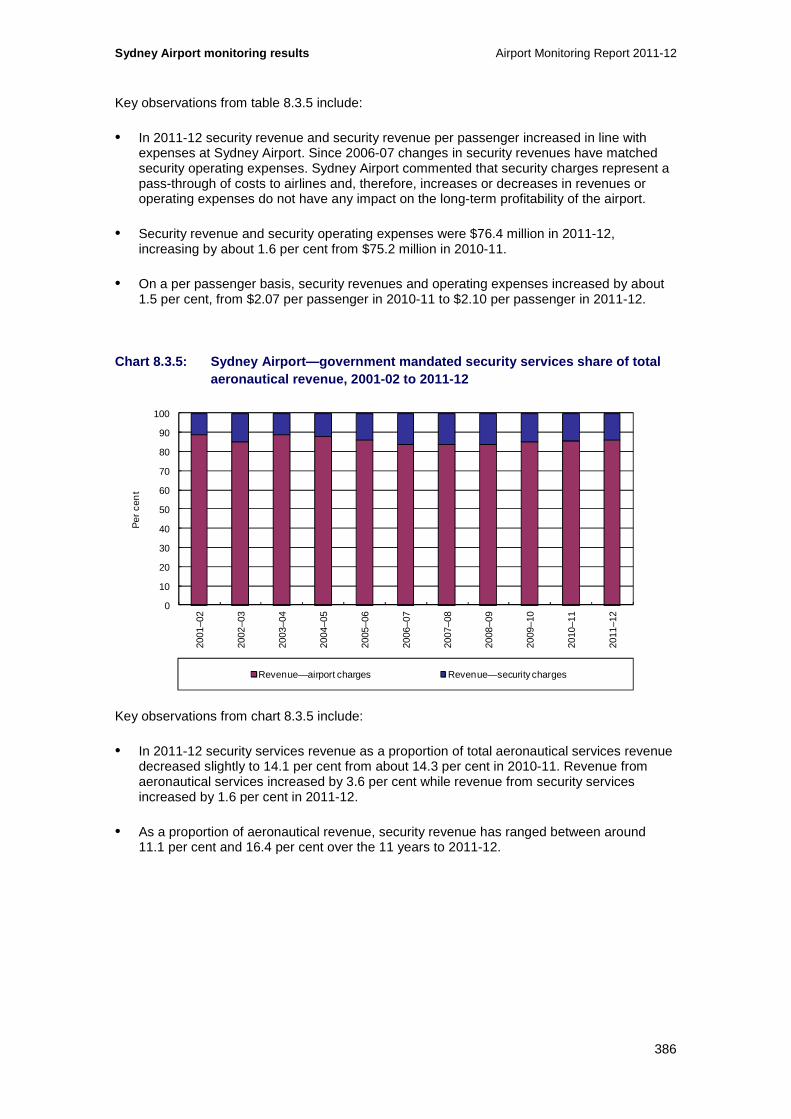
Sydney Airport monitoring results Airport Monitoring Report 2011-12
386
Key observations from table 8.3.5 include:
• In 2011-12 security revenue and security revenue per passenger increased in line with expenses at Sydney Airport. Since 2006-07 changes in security revenues have matched security operating expenses. Sydney Airport commented that security charges represent a pass-through of costs to airlines and, therefore, increases or decreases in revenues or operating expenses do not have any impact on the long-term profitability of the airport.
• Security revenue and security operating expenses were $76.4 million in 2011-12, increasing by about 1.6 per cent from $75.2 million in 2010-11.
• On a per passenger basis, security revenues and operating expenses increased by about 1.5 per cent, from $2.07 per passenger in 2010-11 to $2.10 per passenger in 2011-12.
Chart 8.3.5: Sydney Airport—government mandated sec urity services share of total aeronautical revenue, 2001-02 to 2011-12
Key observations from chart 8.3.5 include:
• In 2011-12 security services revenue as a proportion of total aeronautical services revenue decreased slightly to 14.1 per cent from about 14.3 per cent in 2010-11. Revenue from aeronautical services increased by 3.6 per cent while revenue from security services increased by 1.6 per cent in 2011-12.
• As a proportion of aeronautical revenue, security revenue has ranged between around 11.1 per cent and 16.4 per cent over the 11 years to 2011-12.
0
10
20
30
40
50
60
70
80
90
100
2001
–02
2002
–03
2003
–04
2004
–05
2005
–06
2006
–07
2007
–08
2008
–09
2009
–10
2010
–11
2011
–12
Per
cen
t
Revenue—airport charges Revenue—security charges

Airport Monitoring Report 2011-12 Sydney Airport monitoring results
387
Chart 8.3.6: Sydney Airport—aeronautical services r evenue, operating expenses and operating margin excluding government mandated secu rity services on a per passenger basis, 2001-02 to 2011-12
Key observations from chart 8.3.6 include:
• Excluding government mandated security services, Sydney Airport’s aeronautical revenue on a per passenger basis continued to increase in 2011-12, while operating expenses were just marginally higher than in 2010-11.
• Aeronautical revenue increased by about 3.8 per cent from $12.39 per passenger in 2010-11 to $12.86 per passenger in 2011-12.
• Aeronautical operating expenses, excluding security services, increased by 0.5 per cent from $5.50 per passenger in 2010-11 to $5.53 per passenger in 2011-12.
• As a result of revenue increasing by more than operating expenses (excluding security services), aeronautical operating margin per passenger increased by 6.4 per cent, from $6.89 in 2010-11 to $7.33 in 2011-12.
• Since 2001-02, aeronautical operating margin per passenger (excluding security services) increased in each year except 2005-06.
8.3.6 Assets for aeronautical and total airport ser vices
Table 8.3.6 outlines Sydney Airport’s tangible non-current assets for aeronautical services and the total airport from 2001-02 to 2011-12.
Sydney Airport’s tangible non-current assets for aeronautical services and total airport services under the LIS approach are provided in table 8.3.7.
$0.00
$2.00
$4.00
$6.00
$8.00
$10.00
$12.00
$14.00
2001
–02
2002
–03
2003
–04
2004
–05
2005
–06
2006
–07
2007
–08
2008
–09
2009
–10
2010
–11
2011
–12
Per
pas
sen
ger
Revenue Expenses Margin

Sydney Airport monitoring results Airport Monitoring Report 2011-12
388
Table 8.3.6: Sydney Airport—Tangible non-current as sets for aeronautical services and total airport se rvices, 2001-02 to 2011-12
2001-02 2002-03 2003-04 2004-05 2005-06 2006-07 2007-08 2008-09 2009-10 2010-11 2011-12
Investment property
($million)
Aeronautical 0.0 0.0 0.0 0.0 0.0 0.0 0.0 0.0 0.0 0.0 0.0
Total airport 0.0 0.0 0.0 655.0 995.0 2 477.1 4 128 .1 4 712.9 0.0 0.0 0.0
Land
($million)
Aeronautical 441.7 437.0 432.3 425.6 756.3 771.8 763.2 755.0 747.0 738.8 730.7
Total airport 1 650.3 1 635.7 1 619.7 1 603.2 1 088 .2 1 111.0 1 099.0 1 086.8 1 073.5 1 061.2 1 048.9
Property, plant and equipment
($million)
Aeronautical 1 126.5 1 209.7 1 188.1 1 161.8 1 444.7 1 508.0 1 533.7 1 762.2 1 850.0 1 778.5 1 744.1
Total airport 1 474.6 1 576.7 1 559.1 1 548.8 2 037 .2 2 045.6 2 163.3 2 397.5 2 442.0 2 402.2 2 319.1
Intangibles
($million)
Aeronautical 0.0 0.0 0.0 0.0 0.0 0.0 0.0 0.0 0.0 0.0 0.0
Total airport 0.0 0.0 0.0 0.0 1 437.9 1 422.1 1 406 .3 1 390.5 1 374.7 1 358.9 1 343.1
Other tangible non-current assets
($millon)
Aeronautical 0.0 0.0 0.0 0.0 21.4 26.5 33.9 36.1 44.0 43.1 37.4
Total airport 7.0 48.9 73.7 786.7 651.4 1 983.5 3 3 97.4 3 786.1 3 774.1 4 734.8 5 553.9
Total tangible non-current assets
($million)
Aeronautical 1 568.2 1 646.7 1 620.4 1 587.4 2 222.5 2 306.3 2 330.8 2 553.3 2 641.0 2 560.4 2 512.2
Total airport 3 131.9 3 261.3 3 252.5 4 593.7 4 771.8 7 617.3 10 787.8 11 983.3 7 289.6 8 198.1 9 040.2
Total non-current assets
($million)
Aeronautical 1 568.2 1 646.7 1 620.4 1 587.4 2 222.5 2 306.3 2 330.8 2 553.3 2 641.0 2 560.4 2 512.2
Total airport 3 131.9 3 261.3 3 252.5 4 593.7 6 209.7 9 039.4 12 194.1 13 373.8 8 664.3 9 557.1 10 383.3
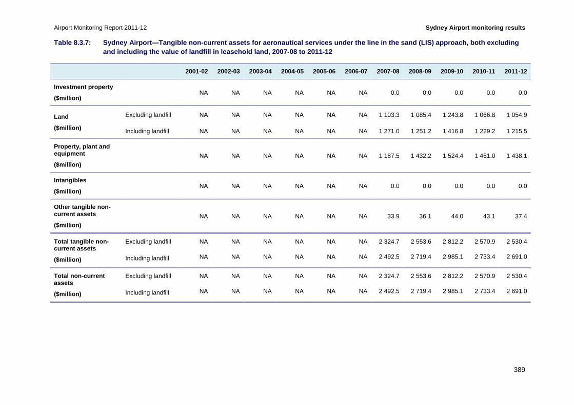
Airport Monitoring Report 2011-12 Sydney Airport monitoring results
389
Table 8.3.7: Sydney Airport—Tangible non-current as sets for aeronautical services under the line in th e sand (LIS) approach, both excluding and including the value of landfill in leasehold land, 2007-08 to 2011-12
2001-02 2002-03 2003-04 2004-05 2005-06 2006-07 2007-08 2008-09 2009-10 2010-11 2011-12
Investment property
($million) NA NA NA NA NA NA 0.0 0.0 0.0 0.0 0.0
Land
($million)
Excluding landfill NA NA NA NA NA NA 1 103.3 1 085.4 1 243.8 1 066.8 1 054.9
Including landfill NA NA NA NA NA NA 1 271.0 1 251.2 1 416.8 1 229.2 1 215.5
Property, plant and equipment
($million) NA NA NA NA NA NA 1 187.5 1 432.2 1 524.4 1 461.0 1 438.1
Intangibles
($million) NA NA NA NA NA NA 0.0 0.0 0.0 0.0 0.0
Other tangible non-current assets
($million) NA NA NA NA NA NA 33.9 36.1 44.0 43.1 37.4
Total tangible non-current assets
($million)
Excluding landfill NA NA NA NA NA NA 2 324.7 2 553.6 2 812.2 2 570.9 2 530.4
Including landfill NA NA NA NA NA NA 2 492.5 2 719.4 2 985.1 2 733.4 2 691.0
Total non-current assets
($million)
Excluding landfill NA NA NA NA NA NA 2 324.7 2 553.6 2 812.2 2 570.9 2 530.4
Including landfill NA NA NA NA NA NA 2 492.5 2 719.4 2 985.1 2 733.4 2 691.0

Sydney Airport monitoring results Airport Monitoring Report 2011-12
390
Key observations from tables 8.3.6 and 8.3.7 include:
• The value of tangible aeronautical non-current assets at Sydney Airport slightly decreased from $2.56 billion in 2010-11 to $2.51 billion in 2011-12 (-1.9 per cent). This follows a similar decline in the value of total aeronautical non-current assets in the previous year.
• In 2011-12 the decrease in the value of tangible aeronautical non-current assets largely reflects the lower value of land and property, plant and equipment, both of which depreciated in value. The value of land fell from $738.9 million in 2010-11 to $730.7 million in 2011-12 (-1.1 per cent) and the value of property, plant and equipment fell from $1.78 billion in the previous year to $1.74 billion (-1.9 per cent).
− Depreciation of fixed assets totalled $142.7 million in 2011-12 and was distributed across buildings, land and plant and machinery. This is similar to depreciation in the previous two years where the expense amounted to $144.7 million in 2010-11 and $147.4 million in 2009-10.
• Since 2001-02 the value of tangible aeronautical non-current assets has increased by around 60.2 per cent, from $1.57 billion to $2.51 billion.
− The largest year on year increase occurred in 2005-06, partly as a result of the AIFRS175 adjustment to include the intangible value of leasehold land as a newly classified land asset and because of plant, property and equipment additions to the aeronautical asset base. There were also significant additions to aeronautical tangible non-current assets in 2008-09 (see chart 8.3.7).
• Under the LIS methodology, excluding the value of landfill in leasehold land, the value of tangible aeronautical non-current assets was $2.5 billion in 2011-12 or around 0.7 per cent higher than in the non-LIS approach. The value of land was around 44.4 per cent higher under the LIS method, at around $1.1 billion. The value of property, plant and equipment was 17.5 per cent lower, at $1.4 billion.
− Including the value of landfill, total aeronautical non-current assets were valued at around $2.7 billion in 2011-12, or 7.1 per cent higher than under the non-LIS approach. Land was valued around 66.3 per cent higher at $1.2 billion.
• Total airport non-current assets increased by 8.6 per cent to $10.4 billion in 2011-12. The value of tangible non-current assets for the total airport increased by 10.3 per cent to $9.0 billion in 2011-12.
175 The Australian Accounting Standards Board implemented a policy of adopting International Accounting Standards Board standards for application in Australia. The Australian equivalents to International Financial Reporting Standards (AIFRS) applied for financial years commencing on or after 1 January 2005. The effect of the transition to AIFRS differed across airports for the financial year 2005-06, but two of the new standards did lead to changes in the value of assets classified as aeronautical at Sydney Airport and some other airports.

Airport Monitoring Report 2011-12 Sydney Airport monitoring results
391
Chart 8.3.7: Sydney Airport—additions as a percenta ge of tangible non-current assets for aeronautical services and total airport services, 2001-02 to 2011-12
Key observations from chart 8.3.7 include:
• In 2011-12, additions to aeronautical tangible non-current assets represented about 4.0 per cent of total aeronautical tangible non-current assets. The major additions to aeronautical assets were land improvement ($63.8 million), buildings ($4.7 million), plant and machinery ($18.0 million) and other assets valued at $13.8 million.
− Over the 11 years since 2001-02, additions to aeronautical tangible non-current assets ranged from a low of 0.8 per cent in 2001-02 to a high of 13.5 per cent of total aeronautical tangible non-current assets in 2008-09. Annual additions to aeronautical tangible non-current assets averaged around 5.5 per cent over the reference period.
• Additions to total airport tangible non-current assets represented about 1.8 per cent of total airport tangible non-current assets in 2011-12. Annual additions to total airport tangible non-current assets included buildings ($39.6 million), land improvements ($84.9 million), plant and machinery ($18.7 million) and other assets ($23.3 million).
• Since 2001-02 annual additions to total airport tangible non-current assets averaged about 2.8 per cent of total airport tangible non-current assets, ranging from a low of 0.8 per cent in 2001-02 to a high of 7.1 per cent in 2002-03.
• Buildings comprised 36.6 per cent of aeronautical additions, land improvement contributed 28.8 per cent and plant and machinery contributed 22.5 per cent of additions to Sydney Airport’s aeronautical tangible non-current assets from 2001-02 to 2011-12.
0
5
10
15
20
2001
–02
2002
–03
2003
–04
2004
–05
2005
–06
2006
–07
2007
–08
2008
–09
2009
–10
2010
–11
2011
–12
Per
cen
t
Aeronautical services Total airport

Sydney Airport monitoring results Airport Monitoring Report 2011-12
392
8.3.7 Rates of return on tangible non-current asset s
Chart 8.3.8: Sydney Airport—rate of return (EBITA) on tangible non-current assets for aeronautical services and total airport services, 2 001-02 to 2011-12
Key observations from chart 8.3.8 include:
• Earnings before interest, tax and amortisation (EBITA) on average tangible non-current assets for both aeronautical and total airport services increased in 2011-12.
• EBITA on average tangible non-current assets for aeronautical services increased by 0.9 percentage points, from 9.6 per cent in 2010-11 to 10.5 per cent in 2011-12. The recent increase in the ratio reflects the slight decrease in the value of Sydney Airport’s non-current assets as well as a 6.5 per cent increase in EBITA from the previous year.
− Over the 11 years since 2001-02, EBITA on average tangible non-current assets for aeronautical services increased to 9.4 per cent in 2004-05, declined in the following year, then remained at around 8 per cent from 2005-06 to 2009-10 before increasing in 2010-11.
• For total airport services, EBITA on average tangible non-current assets increased from 16.4 per cent in 2010-11 to 17.5 per cent in 2011-12.
− From 2001-02, EBITA on average tangible non-current assets for total airport services steadily increased to over 23 per cent in 2008-09, then decreased substantially in 2009-10 after a 32.9 per cent fall in EBITA.
− This decrease reflects the reduction in non-aeronautical revenue after intercompany dividends received were removed after Sydney Airport reported on a consolidated basis. Additionally, results in 2009-10 were also influenced by a lower value of tangible non-current assets as investments in subsidiaries were removed from Sydney Airport’s regulatory accounts.
0
5
10
15
20
2520
01–0
2
2002
–03
2003
–04
2004
–05
2005
–06
2006
–07
2007
–08
2008
–09
2009
–10
2010
–11
2011
–12
Per
cen
t per
an
num
Aeronautical services Total airport

Airport Monitoring Report 2011-12 Sydney Airport monitoring results
393
Chart 8.3.9: Sydney Airport—rate of return (EBITA) on tangible non-current assets for aeronautical services under the line in the sand ap proach and total airport services 2007-08 to 2011-12
Key observations from chart 8.3.9 include:
• The broad trends observed under the non-LIS approach in chart 8.3.8 over the five years to 2011-12 are also present under the LIS approach.
• Under the LIS methodology, excluding the value of landfill in leasehold land, EBITA on average tangible non-current assets for aeronautical and total airport services also increased in 2011-12.
• For aeronautical services, EBITA on average tangible non-current assets was 10.7 per cent, around 0.2 percentage points higher than under the non-LIS approach. Although the asset base under the LIS methodology was 0.6 per cent higher, earnings under this method were about 2.9 per cent higher compared to the non-LIS figure.
− Including the value of landfill in leasehold land, the return on average tangible non-current assets for aeronautical services was slightly lower (10.0 per cent), due to the higher value of assets, particularly land.
• For total airport services, EBITA on average tangible non-current assets was 16.6 per cent, around 0.9 percentage points lower than under the non-LIS approach. The slightly higher overall value of tangible non-current assets under the LIS methodology, equates to a slightly lower return on those assets.
− Including the value of landfill in leasehold land, EBITA on average tangible non-current assets for the total airport was lower again at 15.9 per cent, reflecting the higher asset values, particularly for land.
0
5
10
15
20
25
2007–08 2008–09 2009–10 2010–11 2011–12
Per
cen
t per
an
num
Aeronautical services Total airport

Sydney Airport monitoring results Airport Monitoring Report 2011-12
394
8.4 Aeronautical services quality of service monitoring results
In this section, the quality of service monitoring results are presented for average ratings (section 8.4.1), international services (section 8.4.2) and domestic services (section 8.4.3). Other airport services are discussed in section 8.4.4.
8.4.1 Average ratings for quality of service
Chart 8.4.1: Sydney Airport—average quality of serv ice ratings for international and domestic terminal services, and other airport servi ces, 2007-08 to 2011-12
Key observations from chart 8.4.1 include:
• The average rating for Sydney Airport’s international terminal decreased within the satisfactory range in 2011-12. Over the past five years, Sydney Airport’s international terminal has been rated as satisfactory on average, though some individual services and facilities were rated as less than satisfactory.
• The average rating for the domestic terminal also remained within the satisfactory range in 2011-12. Over the last five years, Sydney Airport’s domestic terminal has been rated as satisfactory on average.
• The average rating for other airport services at Sydney Airport decreased from satisfactory in 2010-11 to just below satisfactory in 2011-12. Over the last five years, other airport services have been rated as poor in three years and satisfactory in the other two years.
0
1
2
3
4
5
6
2007–08 2008–09 2009–10 2010–11 2011–12
Ave
rag
e ra
ting
Rating of international terminal Rating of domestic terminal Rating of other airport services
Excellent
Good
Poor
Very poor
Satisfactory

Airport Monitoring Report 2011-12 Sydney Airport monitoring results
395
Chart 8.4.2: Sydney Airport—average quality of serv ice ratings for availability and standard of airport services, 2007-08 to 2011-12
Key observations from chart 8.4.2 include:
• The average ratings for both the availability and the standard of airport services have remained within the satisfactory range for the last five years, although there was a decrease in both ratings in 2011-12.
8.4.2 International services
Chart 8.4.3: Sydney Airport—check-in (international services), 2007-08 to 2011-12
0
1
2
3
4
5
6
2007–08 2008–09 2009–10 2010–11 2011–12
Ave
rag
e ra
ting
Rating of availability Rating of standard
Excellent
Good
Poor
Very poor
Satisfactory
0
3
6
9
12
15
18
0
1
2
3
4
5
6
2007–08 2008–09 2009–10 2010–11 2011–12
Num
ber
of p
asse
ng
ers
per
des
k
Ave
rag
e ra
ting
Airline surveys— rating of check-in availability
Airline surveys— rating of check-in standard
Passenger surveys— rating of check-in waiting time
Number of departing passengers per check-in desk (during peak hour) (RHS)
Excellent
Good
Poor
Very poor
Satisfactory

Sydney Airport monitoring results Airport Monitoring Report 2011-12
396
Key observations from chart 8.4.3 include:
• Airlines’ rating of international check-in availability decreased in 2011-12, but remained rated as satisfactory. Airlines’ rating of the standard of international check-in facilities also decreased within the satisfactory range in 2011-12.
− In commentary to the surveys, the airlines noted a number of issues with the availability of check-in desks. One airline noted that there was significant pressure on check-in desk availability at the international terminal. The same airline stated that Sydney Airport was attempting to address this issue with additional capacity. Some airlines also noted a lack of queuing space and suggested that the airport needs to build more counters and expand the terminal. Airline comments regarding the standard of check-in facilities included one which stated that the desks are well equipped while two others noted the need for more frequent cleaning of the equipment.
• Passenger ratings of check-in waiting time increased within the satisfactory range in 2011-12 to just below good. Passenger ratings of check-in waiting time have been consistently satisfactory over the last five years.
• The number of departing passengers per check-in desk (during peak hour) was 7 per cent higher at 9.7 passengers in 2011-12 compared to 9.1 passengers in 2010-11.176 The increase was attributable to a higher number of departing passengers during peak hour as the number of check-in desks remained the same at 192.
• Sydney Airport commented that the improved satisfaction rating on the waiting time for passengers was due to improved efficiency and processing of passengers by both the airlines and airport staff. Sydney Airport further stated that the increased use of internet check-in had moderated demand for increased check-in desks over the period.
• Sydney Airport also commented that it expanded the check-in counter capacity in October 2012, adding 10 new desks. Further to this, Sydney Airport noted that it has added additional service desks to existing check-in islands, allowing multiple flights to check in simultaneously. Sydney Airport also stated that it had implemented common use self service kiosks under a trial program with 15 kiosks implemented during 2012. The airport expects further kiosks will be implemented in the future, pending the findings of the trail.
176 The ACCC’s Airport quality of service monitoring guideline and the Airports Act 1996 requires the provision of information concerning both the number of hours of operation with more than 80 per cent of check-in desks staffed and the total number of hours any check-in desks are open. However, Sydney Airport has not provided this information. The appropriate staffing of the airport-supplied check-in counters remains the responsibility of the airlines. For comparison purposes, the ACCC has derived a quantitative criterion of utilisation wherever possible to assist with the analysis. The quantitative criterion of number of passengers per check-in desk was used in the above analysis.

Airport Monitoring Report 2011-12 Sydney Airport monitoring results
397
Chart 8.4.4: Sydney Airport—inbound government insp ection (international services), 2007-08 to 2011-12
Key observations from chart 8.4.4 include:
• Border agencies’ rating of inbound Immigration facilities availability was again satisfactory during 2011-12. Apart from 2007-08 when the border agencies rated these facilities as good, all other years have been rated as satisfactory. Border agencies’ survey rating of the standard of inbound Immigration facilities remained unchanged at satisfactory over the whole reporting period.
− In commentary to the surveys, border agencies noted that there has been no significant change to the immigration arrivals area at Sydney Airport (also commonly known as the Entry Control Points (ECPs) – Pier B and C) compared to the previous period. In particular, border agencies commented that the area is congested during peak periods and there has been no change to the size, layout and standard of the ECPs for many years. Border agencies did note, however, that Sydney Airport had made some minor improvements to the lighting and that the general cleanliness and appearance was satisfactory.
− Other commentary in the border agency surveys noted that, in May 2012, the border agencies requested the airport to consider the strengthening of the arrivals Pier B queuing infrastructure by building a hard wall between the baggage hall and the quarantine counters. The border agencies noted that, while there had been no progress on this as at the time of the survey, the airport was investing in substantial renovations that were expected to occur over time.
− Finally, border agencies noted that air conditioning and toilet facilities in the ECPs continue to be satisfactory with cleaning having improved, although some variation in temperature was noted.
• Passenger ratings of waiting time in the inbound Immigration area increased slightly to be just below good in 2011-12. International check-in waiting time has been consistently rated as satisfactory by passengers over the last five years.
• The number of arriving passengers per inbound Immigration desk was 15 per cent lower at 44.6 passengers in 2011-12 compared to 52.6 passengers in 2010-11. This lower figure
0
15
30
45
60
75
90
0
1
2
3
4
5
6
2007–08 2008–09 2009–10 2010–11 2011–12
Num
ber
of p
asse
ng
ers
per
des
k
Ave
rag
e ra
ting
Border agencies survey— rating of inbound Immigration facilities availability
Border agencies survey— rating of inbound Immigration facilities standard
Passenger surveys— rating of waiting time in inbound Immigration area
Number of arriving passengers per inbound Immigration desk (during peak hour) (RHS)
Excellent
Good
Poor
Very poor
Satisfactory
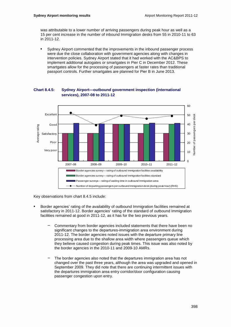
Sydney Airport monitoring results Airport Monitoring Report 2011-12
398
was attributable to a lower number of arriving passengers during peak hour as well as a 15 per cent increase in the number of inbound Immigration desks from 55 in 2010-11 to 63 in 2011-12.
• Sydney Airport commented that the improvements in the inbound passenger process were due the close collaboration with government agencies along with changes in intervention policies. Sydney Airport stated that it had worked with the AC&BPS to implement additional autogates or smartgates in Pier C in December 2012. These smartgates allow for the processing of passengers at faster rates than traditional passport controls. Further smartgates are planned for Pier B in June 2013.
Chart 8.4.5: Sydney Airport—outbound government ins pection (international services), 2007-08 to 2011-12
Key observations from chart 8.4.5 include:
• Border agencies’ rating of the availability of outbound Immigration facilities remained at satisfactory in 2011-12. Border agencies’ rating of the standard of outbound Immigration facilities remained at good in 2011-12, as it has for the two previous years.
− Commentary from border agencies included statements that there have been no significant changes to the departures-immigration area environment during 2011-12. The border agencies noted issues with the departure primary line processing area due to the shallow area width where passengers queue which they believe caused congestion during peak times. This issue was also noted by the border agencies in the 2010-11 and 2009-10 AMRs.
− The border agencies also noted that the departures immigration area has not changed over the past three years, although the area was upgraded and opened in September 2009. They did note that there are continuing intermittent issues with the departures immigration area entry corridor/door configuration causing passenger congestion upon entry.
0
10
20
30
40
50
60
0
1
2
3
4
5
6
2007–08 2008–09 2009–10 2010–11 2011–12
Num
ber
of p
asse
ng
ers
per
des
k
Ave
rag
e ra
ting
Border agencies survey— rating of outbound Immigration facilities availability
Border agencies survey— rating of outbound Immigration facilities standard
Passenger surveys— rating of waiting time in outbound Immigration area
Number of departing passengers per outbound Immigration desk (during peak hour) (RHS)
Excellent
Good
Poor
Very poor
Satisfactory

Airport Monitoring Report 2011-12 Sydney Airport monitoring results
399
• Passenger ratings of waiting time in the outbound Immigration area remained at good in 2011-12. The waiting time in the outbound Immigration area has been consistently rated as good by passengers over the last five years.
• The number of departing passengers per outbound immigration desk during peak hour was 6 per cent higher at 49 passengers in 2011-12 compared to 46 passengers in 2010-11. This higher figure was attributable to a higher number of departing passengers during peak hour as the number of outbound Immigration desks remained unchanged.
• Sydney Airport commented that reduced staffing for outbound border agencies saw a decrease in waiting time satisfaction for outbound immigration. Sydney Airport stated that it is now assisting AC&BPS by providing demand-based passenger flow information to assist in resource allocation.
• Sydney Airport also commented that it recognised the issue of space constrained border agency processing areas. The Airport stated that it is now working closely with AC&BPS to further increase capacity and improve the customer experience in these key processing areas.
Chart 8.4.6: Sydney Airport—baggage inspection (int ernational services), 2007-08 to 2011-12
Key observations from chart 8.4.6 include:
• Border agencies’ rating of the availability of inbound baggage inspection facilities remained at satisfactory in 2011-12. Border agencies’ rating of the standard of inbound baggage inspection facilities also remained satisfactory in 2011-12.
− In commentary to the surveys, border agencies stated that the availability and standard of baggage inspection facilities at Sydney Airport remain the same as that reported in the previous year. Border agencies noted the re-design works on Pier C SEA which commenced in February and were completed in June 2012. They believe these works have improved the standard and adequacy of the facilities and the benefits of this work should be reflected in the survey results for 2012-13. However, during 2011-12, the border agencies said that Pier C SEA passenger
0
15
30
45
60
75
90
0
1
2
3
4
5
6
2007–08 2008–09 2009–10 2010–11 2011–12
Num
ber
of p
asse
ng
ers
per
des
k
Ave
rag
e ra
ting
Border agencies survey— rating of inbound baggage inspection facilities availability
Border agencies survey— rating of inbound baggage inspection facilities standard
Passenger surveys— rating of waiting time in inbound baggage inspection area
Number of arriving passengers per baggage inspection desk (during peak hour) (RHS)
Excellent
Good
Poor
Very poor
Satisfactory

Sydney Airport monitoring results Airport Monitoring Report 2011-12
400
queuing footprint was not adequate to cater for the volume of passengers during the peak processing period. They note that the Pier B SEA continued to provide an orderly queuing system for passengers and good border agency auxiliary facilities.
− The agencies noted that lighting and thermal comfort in the baggage reclaim areas and SEAs remain adequate. Other commentary included that competing commercial, regulatory and way finding signage in the baggage reclaim area can be confusing and some rationalisation is still required for passenger flows.
• Passenger ratings of waiting time in the inbound baggage inspection area remained at satisfactory in 2011-12. The waiting time in the inbound baggage inspection area has been rated as satisfactory by passengers over the last four years. Passenger ratings of these services were not available from Sydney Airport in 2007-08.
• The number of arriving passengers per baggage inspection desk during peak hour was 57 per cent higher at 49.3 passengers in 2011-12 compared to 31.5 passengers in 2010-11. The higher figure was primarily attributable to a 61 per cent reduction in the number of baggage inspection desks from 92 desks in 2010-11 to 57 desks in 2011-12.
• Sydney Airport commented there was only one significant unplanned interruption to the inbound baggage system which was due to a power failure. The airport noted that this interruption resulted in operational disruption and some delays. Sydney Airport has undertaken electrical system upgrade work to mitigate against this occurring again.
• Sydney Airport further commented that it had collaborated closely with AC&BPS and the DAFF Biosecurity when the latter requested changes to the inspection area when desks were replaced with additional queuing area. This work was completed in June 2012.
Chart 8.4.7: Sydney Airport—gate lounges (internati onal services), 2007-08 to 2011-12
0.0
0.2
0.4
0.6
0.8
1.0
1.2
0
1
2
3
4
5
6
2007–08 2008–09 2009–10 2010–11 2011–12
Ave
rag
e ra
ting
Passenger surveys— rating of quality and availability of seating in lounge area
Passenger surveys— rating of crowding in lounge area
Number of departing passengers per seat in gate lounges (during peak hour) (RHS)
Number of departing passengers per square metre of lounge area (during peak hour) (RHS)
Excellent
Good
Poor
Very poor
Satisfactory
Num
ber
of p
asse
ng
ers
per
sea
t / p
er s
qua
re m
etre

Airport Monitoring Report 2011-12 Sydney Airport monitoring results
401
Key observations from chart 8.4.7 include:
• Passenger ratings for quality and availability of seating in the gate lounges increased slightly but remained at satisfactory in 2011-12. Passenger ratings of crowding in lounge areas remained unchanged in 2011-12 at satisfactory.
• The number of departing passengers per gate lounge seat decreased by 13 per cent in 2011-12 to 0.35. The average number of departing passengers during peak hour increased by 6.4 per cent in 2011-12 while the number of seats in gate lounges as at 30 June increased 23 per cent compared with 2010-11.
• The number of departing passengers per square metre of lounge area during peak hour remained the same in 2010-11 at 18. As mentioned above, average departing passenger numbers increased by 6.4 per cent while total gate lounge area as at 30 June increased by 5 per cent.
• Sydney Airport commented that additional gate lounge and common area seating was installed in T1 Pier C in 2011 and 2012, with further seating planned to be installed in 2013.
Chart 8.4.8: Sydney Airport—aerobridges (internatio nal services), 2007-08 to 2011-12
Key observations from chart 8.4.8 include:
• Airlines’ rating of the availability of aerobridges decreased from satisfactory in 2010-11 to poor in 2011-12. The availability of aerobridges has been rated as poor on average by airlines in four of the last five years. Airlines’ rating of the standard of aerobridges also decreased from satisfactory in 2010-11 to poor in 2011-12. The standard of aerobridges has been rated as poor on average by airlines in three of the last five years.
− In commentary to the surveys, airlines noted delays in waiting for aerobridges. Airlines commented that the number of aerobridges suitable for A380 planes was insufficient and the airport needs to be aware of A380 growth. A number of airlines commented on the lack of dual headed bridges, noting that this causes operational issues and reduces turnaround times.
94%
95%
96%
97%
98%
99%
100%
0
1
2
3
4
5
6
2007–08 2008–09 2009–10 2010–11 2011–12
Ave
rag
e ra
ting
Airline surveys— rating of aerobridges availability
Airline surveys— rating of aerobridges standard
Percentage of international passengers arriving using an aerobridge (RHS)
Percentage of international passengers departing using an aerobridge (RHS)
Excellent
Good
Poor
Very poor
Satisfactory
Per
cen
tag
e o
f pas
sen
ger
s us
ing
an
aer
obr
idg
e
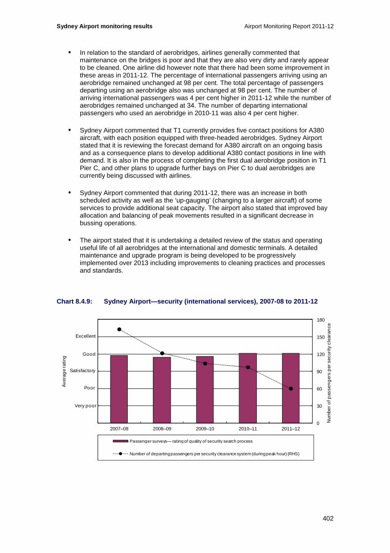
Sydney Airport monitoring results Airport Monitoring Report 2011-12
402
• In relation to the standard of aerobridges, airlines generally commented that maintenance on the bridges is poor and that they are also very dirty and rarely appear to be cleaned. One airline did however note that there had been some improvement in these areas in 2011-12. The percentage of international passengers arriving using an aerobridge remained unchanged at 98 per cent. The total percentage of passengers departing using an aerobridge also was unchanged at 98 per cent. The number of arriving international passengers was 4 per cent higher in 2011-12 while the number of aerobridges remained unchanged at 34. The number of departing international passengers who used an aerobridge in 2010-11 was also 4 per cent higher.
• Sydney Airport commented that T1 currently provides five contact positions for A380 aircraft, with each position equipped with three-headed aerobridges. Sydney Airport stated that it is reviewing the forecast demand for A380 aircraft on an ongoing basis and as a consequence plans to develop additional A380 contact positions in line with demand. It is also in the process of completing the first dual aerobridge position in T1 Pier C, and other plans to upgrade further bays on Pier C to dual aerobridges are currently being discussed with airlines.
• Sydney Airport commented that during 2011-12, there was an increase in both scheduled activity as well as the ‘up-gauging’ (changing to a larger aircraft) of some services to provide additional seat capacity. The airport also stated that improved bay allocation and balancing of peak movements resulted in a significant decrease in bussing operations.
• The airport stated that it is undertaking a detailed review of the status and operating useful life of all aerobridges at the international and domestic terminals. A detailed maintenance and upgrade program is being developed to be progressively implemented over 2013 including improvements to cleaning practices and processes and standards.
Chart 8.4.9: Sydney Airport—security (international services), 2007-08 to 2011-12
0
30
60
90
120
150
180
0
1
2
3
4
5
6
2007–08 2008–09 2009–10 2010–11 2011–12
Ave
rag
e ra
ting
Passenger surveys— rating of quality of security search process
Number of departing passengers per security clearance system (during peak hour) (RHS)
Excellent
Good
Poor
Very poor
Satisfactory
Num
ber
of p
asse
ng
ers
per
sec
urity
cle
aran
ce

Airport Monitoring Report 2011-12 Sydney Airport monitoring results
403
Key observations from chart 8.4.9 include:
• Passenger ratings of the quality of the security search process remained at good in 2011-12. Prior to 2010-11, the passenger ratings for the security process were satisfactory for all years.
• The number of departing passengers per security clearance system decreased by 38 per cent in 2011-12 to 60. Over the last five years, the number of departing passengers per security clearance system has declined by 63 per cent.
− The average number of departing passengers during peak hour was 6 per cent higher in 2011-12 at 1860 passengers. The lower number of departing passengers per security system was attributable to the increase in the number of security clearance systems. The number of security clearance systems in the international terminal increased by 72 per cent in 2011-12 to 31.
• Sydney Airport advised that it has expanded and upgraded both transit screening points including the installation of new body scanning and i-Lane x-ray detection technology. Sydney Airport also advised that it had undertaken design for the expansion and upgrade of the security screening hall at Departures level, including the installation of new body scanner and i-Lane x-ray technology. During 2012, the airport upgraded Gate Lounge 54 at Pier C to a Gate Hold Room to allow secondary screening of US bound passengers.
Chart 8.4.10: Sydney Airport—baggage processing (in ternational services), 2007-08 to 2011-12
Key observations from chart 8.4.10 include:
• Airlines’ rating of the availability of international baggage processing facilities decreased from satisfactory in 2010-11 to poor in 2011-12. Airlines’ rating of the standard of international baggage processing facilities also decreased from satisfactory in 2010-11 to poor in 2011-12. The standard of international baggage processing facilities has been rated as poor on average by airlines in four of the last five years.
800
850
900
950
1000
1050
1100
0
1
2
3
4
5
6
2007–08 2008–09 2009–10 2010–11 2011–12
Num
ber o
f bag
s p
er h
our
Ave
rag
e ra
ting
Airline surveys— rating of baggage processing facilities availability
Airline surveys— rating of baggage processing facilities standard
Passenger surveys— rating of information display for inbound baggage reclaim
Passenger surveys— rating of waiting time for inbound baggage reclaim
Passenger surveys— rating of circulation space for inbound baggage reclaim
Average throughput of outbound baggage system (per hour) (RHS)
Excellent
Good
Poor
Very poor
Satisfactory

Sydney Airport monitoring results Airport Monitoring Report 2011-12
404
• In commentary to the surveys, airlines noted that peak times place significant pressure on the baggage processing facilities and result in luggage incorrectly being processed (such as not scanning correctly) and missing flights. Other commentary included that the international belt is not reliable with outages experienced regularly. Airlines also commented that the equipment was aging and out of date. One airline commented that while there had been some system issues, it had improved compared to earlier years.
• Passenger ratings of the circulation space for inbound baggage was rated as good and their rating of information display for inbound baggage was also good. All passenger ratings were unchanged in 2011-12 and all categories have been rated as good for the past four years.
• The average throughput of outbound baggage system per hour increased by 1 per cent in 2011-12 to 1020 bags per hour. The total number of bags processed increased by 4 per cent and the total number of hours that the baggage equipment was in use increased by 3 per cent during 2011-12.
• As noted above, Sydney Airport commented in response to its results that there was one significant unplanned interruption to the system due to a power failure. The Airport noted that the availability of the systems were high and had improved over the period, and that the most common cause of both system unavailability and incorrect scanning was incorrect presentation of baggage at check-in. Sydney Airport added that availability for T1 had improved in 2011-12.
• With regard to peak periods, Sydney Airport stated that it does not have an adverse effect on the correct scanning of bags. Sydney Airport stated that it has been working with airline check-in staff to improve standards and processes, including preparation of a training video.
Chart 8.4.11: Sydney Airport—baggage trolleys (inte rnational services), 2007-08 to 2011-12
0.0
0.3
0.6
0.9
1.2
1.5
1.8
0
1
2
3
4
5
6
2007–08 2008–09 2009–10 2010–11 2011–12
Num
ber o
f pas
seng
ers
per
bag
gage
trol
ley
Ave
rag
e ra
ting
Passenger surveys— rating of findability of baggage trolleys
Number of passengers per baggage trolley (during peak hour) (RHS)
Excellent
Good
Poor
Very poor
Satisfactory

Airport Monitoring Report 2011-12 Sydney Airport monitoring results
405
Key observations from chart 8.4.11 include:
• Passengers rated the findability of baggage trolleys as satisfactory in 2011-12, as was the case over the last five years. The number of passengers per baggage trolley increased by 2 per cent in 2011-12. The small increase in passengers per baggage trolley in 2011-12 was partly due to slightly reduced numbers of trolleys (4573 in 2010-11 compared to 4510 in 2011-12) and 1 per cent increase in the average number of arriving and departing passengers per peak hour.
• Sydney Airport commented that the reduced numbers of trolleys was due to theft and damage. The number of trolleys is monitored regularly in conjunction with the contractor and the airport is reviewing the trolley holding points as part of the new multi-story car park development.
Chart 8.4.12: Sydney Airport—flight information dis play screens (international services), 2007-08 to 2011-12
Key observations from chart 8.4.12 include:
• Passenger ratings of flight information display screens in 2011-12 remained almost unchanged at good. Passenger ratings of signage and wayfinding were also mostly unchanged at satisfactory. The latter has been rated as satisfactory for the past five years.
• The number of passengers per flight information display screens decreased slightly in 2011-12 by around 0.5 percent to 5.6 passengers. This decrease was largely attributed to the increase in flight information display screens which increased by 1.2 per cent in 2011-12. The total average number of arriving and departing passengers during peak hour was 0.6 per cent higher in 2011-12.
• The number of passengers per information point decreased by 20 per cent during 2011-12 to 934 passengers. This decrease was due to the number of information points increasing by one during 2011-12 to 5 in number.
22.84 11.40 14.16 13.06 14.03
0
300
600
900
1200
1500
1800
0
1
2
3
4
5
6
2007–08 2008–09 2009–10 2010–11 2011–12
Ave
rag
e ra
ting
Passenger surveys— rating of flight information display screens
Passenger surveys— rating of signage and wayfinding
Number of passengers per flight information display screen (during peak hour) (RHS)
Number of passengers per information point (during peak hour) (RHS)
Excellent
Good
Poor
Very poor
Satisfactory
Num
ber o
f pas
seng
ers
per
flig
ht in
form
atio
n sc
reen
/ p
er fl
ight
info
rmat
ion
poin
t
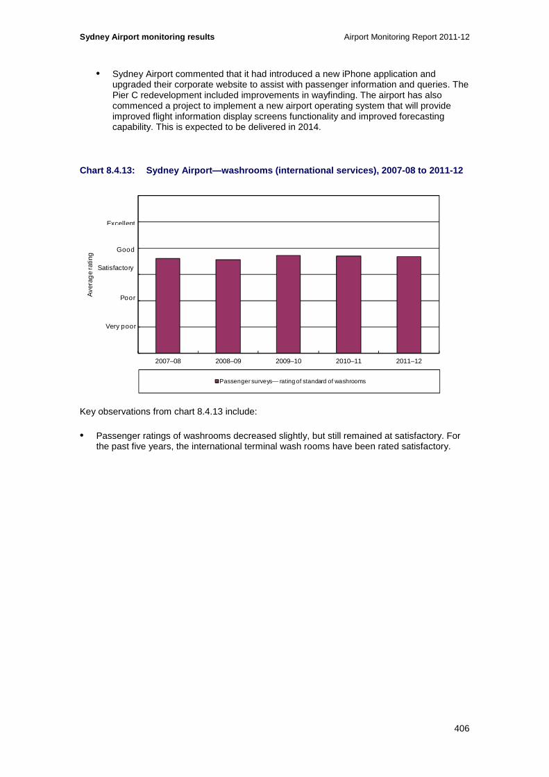
Sydney Airport monitoring results Airport Monitoring Report 2011-12
406
• Sydney Airport commented that it had introduced a new iPhone application and upgraded their corporate website to assist with passenger information and queries. The Pier C redevelopment included improvements in wayfinding. The airport has also commenced a project to implement a new airport operating system that will provide improved flight information display screens functionality and improved forecasting capability. This is expected to be delivered in 2014.
Chart 8.4.13: Sydney Airport—washrooms (internation al services), 2007-08 to 2011-12
Key observations from chart 8.4.13 include:
• Passenger ratings of washrooms decreased slightly, but still remained at satisfactory. For the past five years, the international terminal wash rooms have been rated satisfactory.
0
1
2
3
4
5
6
2007–08 2008–09 2009–10 2010–11 2011–12
Ave
rag
e ra
ting
Passenger surveys— rating of standard of washrooms
Excellent
Good
Poor
Very poor
Satisfactory

Airport Monitoring Report 2011-12 Sydney Airport monitoring results
407
8.4.3 Domestic services
Chart 8.4.14: Sydney Airport—check-in (domestic ser vices), 2007-08 to 2011-12 \
Key observations from chart 8.4.14 include:
• Airlines’ rating of domestic check-in availability decreased in 2011-12 but remained rated as satisfactory. This rating has been satisfactory for four of the past five years. Airlines’ rating of the standard of domestic check-in facilities decreased from good in 2010-11 to satisfactory in 2011-12.
− In commentary to the surveys, airlines continued to note that more check-in capacity is required in the domestic terminal (airlines have made similar comments in previous years’ surveys). There was further comment on the lack of gate availability and that the size of the check-in area on the main concourse was inadequate. Airlines noted that check-in desks and gate furniture were old and in poor condition, and that the airport’s current practice of replacing old and damaged facilities with old but less damaged stock is of concern. One airline did however comment that the standard of IT infrastructure and the support that is provided in the domestic terminal is acceptable.
• Passenger ratings of check-in waiting time increased by 6 per cent during 2011-12 to just under good. This rating has been consistent over the last 5 years.
• The number of departing passengers per check-in desk increased slightly during 2011-12 by 2 per cent to 40.8 passengers. The increase in departing passengers per check-in desk was due to an increase in passenger numbers by 2 per cent. The number of check-in desks remained constant at 44 during 2011-12. Sydney Airport advised that 11 additional check-in desks were installed after the reference period in December 2012.
• Sydney Airport commented that increased airline activity and capacity was offset by higher uptake in technology based passenger processing and this resulted in improvements in passenger waiting time.
0
10
20
30
40
50
60
0
1
2
3
4
5
6
2007–08 2008–09 2009–10 2010–11 2011–12
Num
ber
of p
asse
nger
s p
er d
esk
Ave
rage
ratin
g
Airline surveys— rating of check-in availability
Airline surveys— rating of check-in standard
Passenger surveys— rating of check-in waiting time
Number of departing passengers per check-in desk (during peak hour) (RHS)
Excellent
Good
Poor
Very poor
Satisfactory
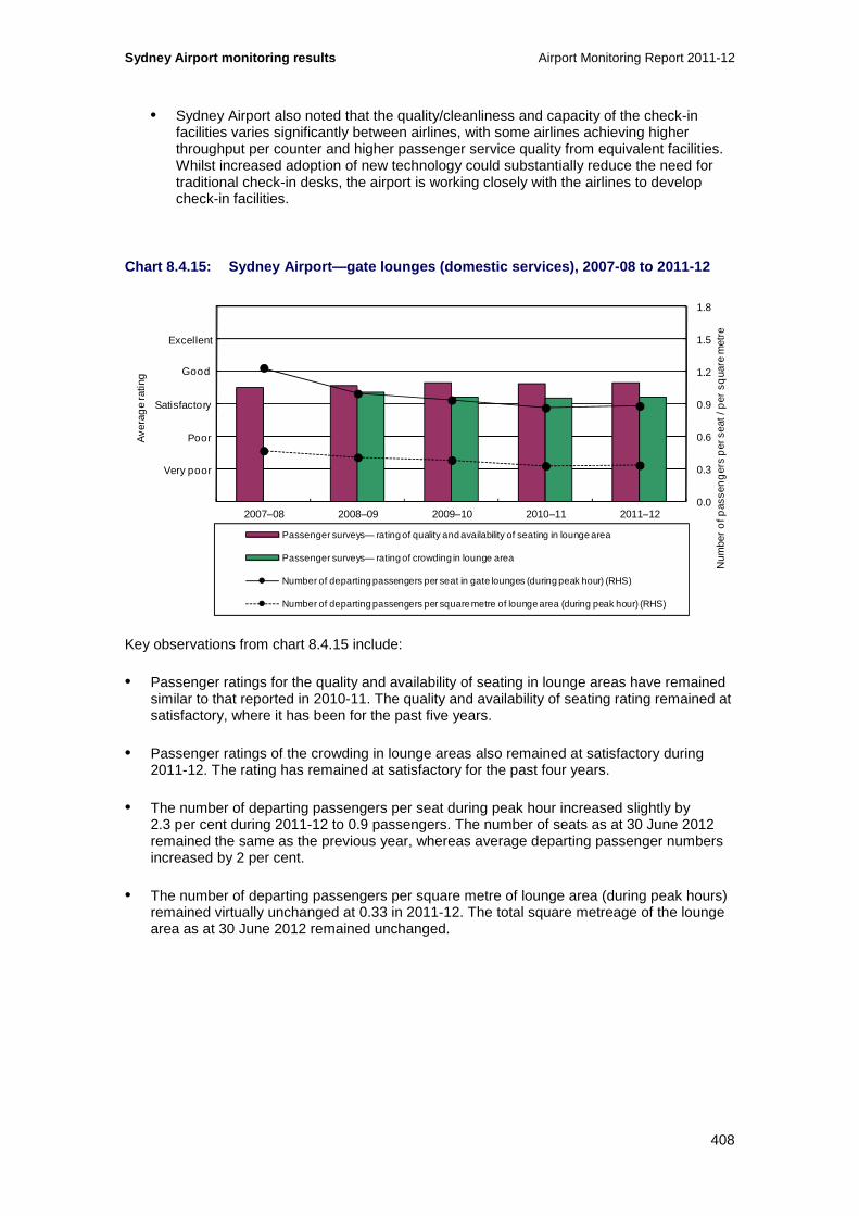
Sydney Airport monitoring results Airport Monitoring Report 2011-12
408
• Sydney Airport also noted that the quality/cleanliness and capacity of the check-in facilities varies significantly between airlines, with some airlines achieving higher throughput per counter and higher passenger service quality from equivalent facilities. Whilst increased adoption of new technology could substantially reduce the need for traditional check-in desks, the airport is working closely with the airlines to develop check-in facilities.
Chart 8.4.15: Sydney Airport—gate lounges (domestic services), 2007-08 to 2011-12
Key observations from chart 8.4.15 include:
• Passenger ratings for the quality and availability of seating in lounge areas have remained similar to that reported in 2010-11. The quality and availability of seating rating remained at satisfactory, where it has been for the past five years.
• Passenger ratings of the crowding in lounge areas also remained at satisfactory during 2011-12. The rating has remained at satisfactory for the past four years.
• The number of departing passengers per seat during peak hour increased slightly by 2.3 per cent during 2011-12 to 0.9 passengers. The number of seats as at 30 June 2012 remained the same as the previous year, whereas average departing passenger numbers increased by 2 per cent.
• The number of departing passengers per square metre of lounge area (during peak hours) remained virtually unchanged at 0.33 in 2011-12. The total square metreage of the lounge area as at 30 June 2012 remained unchanged.
0.0
0.3
0.6
0.9
1.2
1.5
1.8
0
1
2
3
4
5
6
2007–08 2008–09 2009–10 2010–11 2011–12
Ave
rag
e ra
ting
Passenger surveys— rating of quality and availability of seating in lounge area
Passenger surveys— rating of crowding in lounge area
Number of departing passengers per seat in gate lounges (during peak hour) (RHS)
Number of departing passengers per square metre of lounge area (during peak hour) (RHS)
Excellent
Good
Poor
Very poor
Satisfactory
Num
ber
of p
asse
ng
ers
per
sea
t / p
er s
qua
re m
etre

Airport Monitoring Report 2011-12 Sydney Airport monitoring results
409
Chart 8.4.16: Sydney Airport—aerobridges (domestic services), 2007-08 to 2011-12
Key observations from chart 8.4.16 include:
• Airlines’ rating of the availability of aerobridges at the domestic terminal decreased from satisfactory in 2010-11 to poor in 2011-12. Airlines’ rating of the standard of aerobridges increased in 2011-12, but still remained rated as poor for the second consecutive year.
− In commentary to the surveys, airlines noted that the aerobridges are old and could do with an upgrade. In particular, comments included that the aerobridges often require maintenance and this impacts on airline operations.
• The number of arriving passengers per aerobridge during peak hour decreased by 4.2 per cent during 2011-12 to 109 (from 115 passengers in 2010-11). The number of departing passengers per aerobridge had a small increase of 2 per cent 2011-12 to 112 passengers. The total number of aerobridges remained unchanged at 16 in 2011-12. Total arriving passenger numbers during peak hour decreased by 5 per cent in whereas total departing passengers during peak hour increased by 2 per cent.
• Commentary from Sydney Airport included that the use of aerobridges is influenced by the type of aircraft (smaller aircraft are incompatible) and airline preference. Non-aerobridge operations are quicker for most domestic aircraft according to the airport. Sydney Airport also commented that Pier A at T2 has been expanded to accommodate five additional gates which will increase capacity by 28 per cent. The Airport further noted that this expansion caused some disruption to the apron areas around T2 and reduced the speed at which aerobridge gates could be accessed at times. In regard to availability, the airport believed this was affected by the high incidence of operator error. Sydney Airport expects the new capacity to significantly improve availability from early 2013.
• Sydney Airport also noted that it is currently planning to undertake works on selected T2 aerobridges in 2013. The airport also stated that it had increased maintenance coverage of all aerobridges and has set up training program for all operators.
0
30
60
90
120
150
180
0
1
2
3
4
5
6
2007–08 2008–09 2009–10 2010–11 2011–12
Ave
rag
e ra
ting
Airline surveys— rating of aerobridges availability
Airline surveys— rating of aerobridges standard
Number of arriving passengers per aerobridge (during peak hour) (RHS)
Number of departing passengers per aerobridge (during peak hour) (RHS)
Excellent
Good
Poor
Very poor
Satisfactory
Num
ber
of p
asse
ng
ers
per
aer
obr
idg
e

Sydney Airport monitoring results Airport Monitoring Report 2011-12
410
Chart 8.4.17: Sydney Airport—security (domestic ser vices), 2007-08 to 2011-12
Key observations from chart 8.4.17 include:
• Passenger ratings of the quality of security search process increased to good in 2011-12. The rating was satisfactory for the four years prior to 2011-12.
• The number of departing passengers per each security clearance system during peak hour decreased in 2011-12 by 32 per cent to 120 passengers. Although total numbers of departing passengers increased two per cent in 2011-12, the number of security clearance systems increased 50 per cent to 15.
• Sydney Airport advised that it had introduced new customer service training for security staff.
100
150
200
250
300
350
400
0
1
2
3
4
5
6
2007–08 2008–09 2009–10 2010–11 2011–12
Ave
rag
e ra
ting
Passenger surveys— rating of quality of security search process
Number of departing passengers per security clearance system (during peak hour) (RHS)
Excellent
Good
Poor
Very poor
Satisfactory
Num
ber
of p
asse
ng
ers
per
sec
urity
cle
aran
ce s
yste
m

Airport Monitoring Report 2011-12 Sydney Airport monitoring results
411
Chart 8.4.18: Sydney Airport—baggage processing (do mestic services), 2007-08 to 2011-12
Key observations from chart 8.4.18 include:
• Airlines’ rating of the availability of domestic baggage facilities remained unchanged at satisfactory in 2011-12. Airlines’ rating of the standard of domestic baggage facilities decreased from satisfactory in 2010-11 to poor in 2011-12. The standard of domestic baggage facilities has been rated as poor on average by airlines in three of the last five years.
− In commentary to the surveys, airlines noted that the baggage handling systems and baggage make-up areas needed improvement. In particular, airlines commented that the reliability of the system needed to be improved. Other comments noted the lack of space in the baggage make-up area to adequately accommodate containers during peak periods and there were issues with congestion and backlog of items during these times. One airline noted that it had no issues with availability of baggage systems in the domestic terminal.
• Passenger ratings of waiting time for inbound baggage reclaim remained at satisfactory in 2011-12. Over the past five years this rating has remained at satisfactory. Passenger ratings of information display for inbound baggage also remained at satisfactory during 2011-12. Passenger ratings of circulation space for inbound baggage also remained unchanged at satisfactory.
• Sydney Airport commented that the airport had installed a new outbound baggage make-up carousel in the former valet car park area that was operational in December 2012 (after the reference period). Further work includes replacing the existing make-up carousel with a new carousel in the first quarter of 2013.
• Sydney Airport also commented that the availability of the baggage system at T2 remained steady when compared to previous years. Further, the Airport reports that the T2 departures availability was around the mid 98 per cent availability while reclaim availability was 99.5 per cent.
0
1
2
3
4
5
6
2007–08 2008–09 2009–10 2010–11 2011–12
Ave
rag
e ra
ting
Airline surveys— rating of baggage processing facilities availability
Airline surveys— rating of baggage processing facilities standard
Passenger surveys— rating of waiting time for inbound baggage reclaim
Passenger surveys— rating of information display for inbound baggage reclaim
Passenger surveys— rating of circulation space for inbound baggage reclaim
Excellent
Good
Poor
Very poor
Satisfactory

Sydney Airport monitoring results Airport Monitoring Report 2011-12
412
Chart 8.4.19: Sydney Airport—baggage trolleys (dome stic services), 2007-08 to 2011-12
Key observations from chart 8.4.19 include:
• Passenger ratings of the findability of baggage trolleys were satisfactory during 2011-12. This rating has been fairly consistent for the past five years, remaining at satisfactory in all years.
• The number of passengers per baggage trolley during peak hours decreased slightly by 3 per cent to 8 in 2011-12 (previously was 8.4 in 2010-11). The number of accessible baggage trolleys in the domestic terminal increased from 430 to 436 (1.4 per cent) while the average number of departing passengers during peak hour increased by two per cent.
• Sydney Airport commented that there were no issues with domestic baggage trolleys during the year.
0
2
4
6
8
10
12
0
1
2
3
4
5
6
2007–08 2008–09 2009–10 2010–11 2011–12
Num
ber o
f pas
seng
ers
per
bag
gage
trol
ley
Ave
rag
e ra
ting
Passenger surveys— rating of findability of baggage trolleys
Number of passengers per baggage trolley (during peak hour) (RHS)
Excellent
Good
Poor
Very poor
Satisfactory

Airport Monitoring Report 2011-12 Sydney Airport monitoring results
413
Chart 8.4.20: Sydney Airport—flight information dis play screens (domestic services), 2007-08 to 2011-12
Key observations from chart 8.4.20 include:
• Passenger ratings of the flight information display screens increased from just below good to good in 2011-12. This rating has consistently been at just below good to good for the past five years. Passenger ratings of signage and wayfinding also increased from just below good to good in 2011-12. This rating has also remained around just below good or good over the past five years.
• The number of passengers per information point during peak hours decreased during 2011-12 to 3546, down from 3597 during 2010-11 (decrease of 1.5 per cent). This decrease is directly attributed to declines in the average number of arriving and departing passengers during peak hour from 3597 in 2010-11 to 3546 in 2011-12 (representing a drop of 1.4 per cent). The number of information points remained unchanged at one.
0
800
1600
2400
3200
4000
4800
0
1
2
3
4
5
6
2007–08 2008–09 2009–10 2010–11 2011–12
Ave
rag
e ra
ting
Passenger surveys— flight information display screens
Passenger surveys— signage and wayfinding
Number of passengers per information point (during peak hour) (RHS)
Excellent
Good
Poor
Very poor
Satisfactory
Num
ber o
f pas
seng
ers
per
flig
ht in
form
atio
n sc
reen
/ p
er fl
ight
in
form
atio
n p
oint

Sydney Airport monitoring results Airport Monitoring Report 2011-12
414
Chart 8.4.21: Sydney Airport—washrooms (domestic se rvices), 2007-08 to 2011-12
Key observations from chart 8.4.21 include:
• Passenger ratings of the domestic washrooms remained at good during 2011-12. They gave the same rating for each year of the reporting period.
• Sydney Airport advised that a new contractor commenced in October 2011.
8.4.4 Other airport services
Chart 8.4.22 Sydney Airport—availability of airside services and facilities (other airport services), 2007-08 to 2011-12
0
1
2
3
4
5
6
2007–08 2008–09 2009–10 2010–11 2011–12
Ave
rag
e ra
ting
Passenger surveys— rating of standard of washrooms
Excellent
Good
Poor
Very poor
Satisfactory
0
1
2
3
4
5
6
2007–08 2008–09 2009–10 2010–11 2011–12
Ave
rag
e ra
ting
Rating of runway Rating of taxiways
Rating of aprons Rating of aircraft parking facilities and bays
Rating of ground handling services and facilities
Excellent
Good
Poor
Very poor
Satisfactory

Airport Monitoring Report 2011-12 Sydney Airport monitoring results
415
Key observations from chart 8.4.22 include:
• Airlines’ rating of the availability of airside services and facilities, including runways, taxiways, aprons and aircraft parking all decreased in 2011-12.
• Airlines’ rating of the availability of runways decreased from satisfactory in 2010-11 to poor in 2011-12. The availability of runways has been rated as poor on average by airlines in four of the last five years.
− The airline commentary to the availability of runways noted the 80 movement per hour cap has had a significant impact on the ability of the infrastructure to be fully utilised. Other airlines have noted how the cap is a hindrance to efficiency and poses considerable economic expense to airlines operating out of Sydney. Other airlines noted the congestion for both international and domestic flights and the resultant regular ‘holding’ that occurs at Sydney Airport. One airline noted that Sydney Airport lacks CAT 11 lighting which restricts its options during fog operations.
• The availability of taxiways was rated as satisfactory on average over the last five years, although the rating decreased slightly within the satisfactory range in 2011-12.
− Airline commentary on taxiways included several commenting on the heavy congestion that occurs frequently at Sydney Airport. Other comments include increased holding patterns on the ground for aircraft which increases company expenditure due to wasted fuel burn costs.
• The airline ratings of apron availability decreased from satisfactory to poor in 2011-12. The only time aprons have rated above poor was in 2010-11 when it was satisfactory.
− Airline commentary on apron availability included that apron capacity is constrained, aprons are heavily congested and there is a lack of storage areas or policing of correct storage by Sydney Airport.
• The airline rating of aircraft parking facilities and bays decreased since 2010-11, but remained at poor in 2011-12.
− Airline commentary about airline parking facilities availability centred around issues such as a shortage of gates or bays, particularly at peak times (as was commented in the 2010-11 AMR). Airlines commented that the shortage forces aircraft to be towed more often and incur more airport fees. Some airlines have expressed frustration with the amount of gate and bay changes to accommodate other airlines during peak hour.
• The airline rating for ground handling services and facilities remained at satisfactory in 2011-12.
− Airlines comments on availability of handling services and facilities noted the competitive environment which allows choice for the airlines for all carriers. Other airlines noted the improvement to these services. Airline comments on the standard of these services were mixed. While some had no particular issues, others saw areas for improvement including baggage handling systems and baggage make-up areas. One airline noted how Sydney Airport had increased additional storage space for equipment and unit load devices (ULD’s).
• Sydney Airport commented with regard to runway availability that there was no material change to the availability of runways or taxiways during 2011-12. It noted that there

Sydney Airport monitoring results Airport Monitoring Report 2011-12
416
may have been perceived availability issues due to construction works in the vicinity of T2, Pier A. Further, Sydney Airport advised that it had completed planning and design works for 34L and 16R CAT II facilities during 2012, which will be progressively installed during 2013. The airport believe this will improve runway and taxiway availability during adverse weather conditions.
• With regards to congestion, Sydney Airport noted that congestion was generally caused by off-schedule movements and around 10 per cent of off-schedule movements related to Sydney Airport infrastructure or capacity. The other 90 percent of congestion issues relate issues including weather, late passengers and the implementation of operating restrictions on Sydney Airport such as noise sharing, cap and curfew.
• Sydney Airport commented that additional apron capacity met the increased demand from airlines. Sydney Airport is also working with Airport Coordination Australia and the airlines to ensure apron capacity is appropriate for future demand. Further to this, Sydney Airport stated that it had increased apron capacity for domestic operations during 2012 with the completion of Bay 83, and the completion of Bay 41, 42, 43, 44 and 45. Several existing domestic bays were also ungraded to cater for larger aircraft including, F6, Bay 39 and Bay 40.
• In relation to ground handling services, Sydney Airport commented that it has been consulting with ground handling organisations with the intention of implementing ground handling licences with associated airside rules for staff. Sydney Airport claims that the ground handling licences will help ensure minimum standards are maintained on the operating aprons including storage of equipment and appropriate levels of equipment.
Chart 8.4.23: Sydney Airport—standard of airside se rvices and facilities (other airport services), 2007-08 to 2011-12
Key observations from chart 8.4.23 include:
• The airline rating of the standard of runways decreased slightly, but remained at satisfactory in 2011-12.
0
1
2
3
4
5
6
2007–08 2008–09 2009–10 2010–11 2011–12
Ave
rag
e ra
ting
Rating of runway Rating of taxiways
Rating of aprons Rating of aircraft parking facilities and bays
Rating of ground handling services and facilities
Excellent
Good
Poor
Very poor
Satisfactory

Airport Monitoring Report 2011-12 Sydney Airport monitoring results
417
− Airline commentary on the standard of runways included that CAT II/II is still not available, limitations due to the curfew and the long term operating plan for noise sharing. Another airline stated that ongoing issues with fog disruptions and lack of CAT II/II equipment causes severe disruptions and cost implications to airlines. One airline noted that the standard of the runway is high.
• Airline ratings of taxiway standards decreased slightly but also remained at satisfactory in 2011-12.
− Airline commentary on the standard of taxiway noted the good improvement with the installation of ‘a stop bar system’ while another noted the good standard of taxiways. Another airline noted the taxiway layout around T2 is restrictive for code D and E aircraft.
• The airline ratings of the standard of aprons decreased during 2011-12, but remained at the satisfactory level.
− Airline commentary on the standard of aprons ranged from one airline commenting that the standard of aprons was good while another suggested that blast fences be installed so that the aircraft could utilise more of the aprons.
• The rating of aircraft parking facilities and bays decreased slightly, but remained at poor in 2011-12
− Airline commentary on the standard of aircraft parking included the cramped space around the aircraft which possibly increases the risk of accidents. Another comments included frustrations with the amount of gate and bay changes to accommodate other airlines.
• Airline ratings of ground handling services and facilities in 2011-12 were satisfactory.
− Airline commentary on the standard of ground handling services and facilities was mixed. One airline commented that there were no particular issues, another suggested that key areas for improvement are baggage handling systems and baggage mark-up areas.
• Sydney Airport commented that the standard of runways, taxiways and aprons from their perspective has increased over the period. Sydney Airport has invested in larger aprons, improved runway and taxiway lighting and runway re-sheets and stop bars. Further to this, the airport stated that there had been no significant failures during the period. Sydney Airport has commented that the ability to operate low visibility departures will be further enhanced through planned works during 2013 to upgrade to Cat II for arriving flights in low visibility conditions. Sydney Airport also noted that it completed major runway upgrading works including asphalt re-sheet to two runways.
• Sydney Airport noted with regard to the standard of taxiways that it had improved with the installation of stop bars and also there were no pavement failures that had impacted on the operation of the runways.

Sydney Airport monitoring results Airport Monitoring Report 2011-12
418
Chart 8.4.24: Sydney Airport—runway traffic (other airport services) 177
Chart 8.4.25 Sydney Airport—runway traffic continue d (other airport services) 178
Note: Airservices Australia’s measures were devised as a guide to its own performance in handling air traffic, but they can also give some indication of airport constraints and, therefore, provide some indication of the adequacy of runway infrastructure or management. In particular, if demand is consistently close to operationally agreed capacity for the peak hour, it suggests that there is little spare capacity for increased traffic at that time. The measures relate to the busiest peak hour at the airport, averaged across all days in the month specified. The measures and their interpretation are explained in detail in the appendices to this report.
177 Note that data for charts 8.4.24 and 8.4.25 are presented for the period June 2011 to March 2012 only. This is due to data unavailability. 178 Note that data for chart 8.4.24 is presented for the period June 2011 to March 2012 only. This is due to data unavailability.
0
10
20
30
40
50
60
70
80
Demand Actual Arrivals Agreed Rate Peak demand (within the hour)
Min
utes
Jun 2011 Jul 2011 Aug 2011 Sep 2011 Oct 2011
Nov 2011 Dec 2011 Jan 2012 Feb 2012 Mar 2012
0
10
20
30
40
50
60
Max pro rata rate (within the hour) Average max system delay Average system delay
Min
utes
Jun 2011 Jul 2011 Aug 2011 Sep 2011 Oct 2011
Nov 2011 Dec 2011 Jan 2012 Feb 2012 Mar 2012
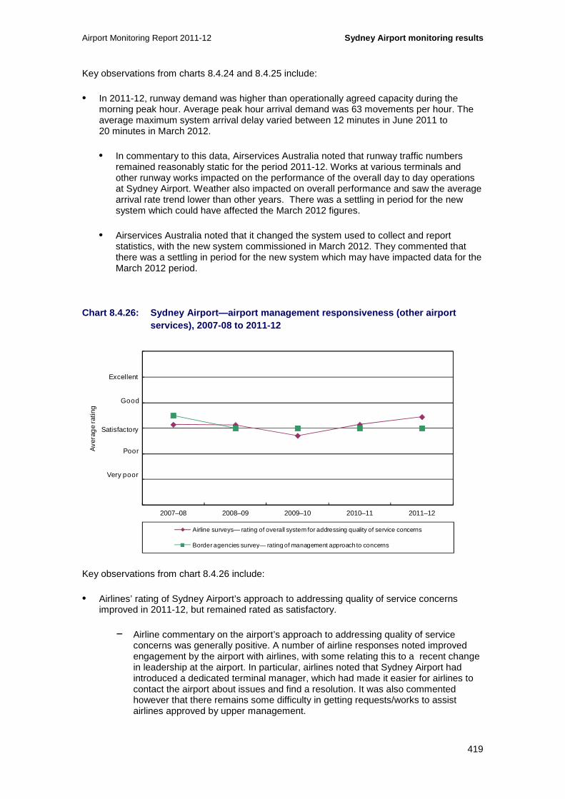
Airport Monitoring Report 2011-12 Sydney Airport monitoring results
419
Key observations from charts 8.4.24 and 8.4.25 include:
• In 2011-12, runway demand was higher than operationally agreed capacity during the morning peak hour. Average peak hour arrival demand was 63 movements per hour. The average maximum system arrival delay varied between 12 minutes in June 2011 to 20 minutes in March 2012.
• In commentary to this data, Airservices Australia noted that runway traffic numbers remained reasonably static for the period 2011-12. Works at various terminals and other runway works impacted on the performance of the overall day to day operations at Sydney Airport. Weather also impacted on overall performance and saw the average arrival rate trend lower than other years. There was a settling in period for the new system which could have affected the March 2012 figures.
• Airservices Australia noted that it changed the system used to collect and report statistics, with the new system commissioned in March 2012. They commented that there was a settling in period for the new system which may have impacted data for the March 2012 period.
Chart 8.4.26: Sydney Airport—airport management res ponsiveness (other airport services), 2007-08 to 2011-12
Key observations from chart 8.4.26 include:
• Airlines’ rating of Sydney Airport’s approach to addressing quality of service concerns improved in 2011-12, but remained rated as satisfactory.
− Airline commentary on the airport’s approach to addressing quality of service concerns was generally positive. A number of airline responses noted improved engagement by the airport with airlines, with some relating this to a recent change in leadership at the airport. In particular, airlines noted that Sydney Airport had introduced a dedicated terminal manager, which had made it easier for airlines to contact the airport about issues and find a resolution. It was also commented however that there remains some difficulty in getting requests/works to assist airlines approved by upper management.
0
1
2
3
4
5
6
2007–08 2008–09 2009–10 2010–11 2011–12
Ave
rag
e ra
ting
Airline surveys— rating of overall system for addressing quality of service concerns
Border agencies survey— rating of management approach to concerns
Excellent
Good
Poor
Very poor
Satisfactory

Sydney Airport monitoring results Airport Monitoring Report 2011-12
420
• Border agencies’ rating of Sydney Airport’s approach to concerns remained satisfactory, the same rating given by border agencies for the past five years.
− In commentary to the surveys, border agencies noted that there had been significant changes in personnel at Sydney Airport in 2011-12, including in senior management roles. Border agencies commented that the new personnel had a strong focus on engaging with airport stakeholders and working collaboratively to address airport facilities issues. Further commentary noted that access to Sydney Airport management was straight forward and that the airport held regular Airport Facilitation Committee meetings. That said, border agencies noted that there continued to be some extended response times for maintenance issues. Also, border agencies commented that there remained a few issues requiring resolution—in particular, the border agencies have made some requests to the airport about accommodation issues that the airport has agreed to consider but has not yet taken any action on.
• Sydney Airport commented that it has a comprehensive consultation process for airlines to decide on their investment priorities. It believes that comments from the airlines are factually incorrect, and in fact reflects airline operational requests that are not subsequently prioritised by the airlines in the consultation forum.
Chart 8.4.27: Sydney Airport—international terminal kerbside (other airport services), 2007-08 to 2011-12
Note: Passengers rating of international kerbside pick-up and drop-off were not available from Sydney Airport prior to 2009-10
Key observations from chart 8.4.27 include:
• Passenger ratings of the terminal kerbside pick-up and drop-off facilities remained virtually unchanged in 2011-12 at satisfactory. This rating has been at the satisfactory level for the past five years.
• Passenger ratings of taxi facilities waiting time slightly improved in 2011-12 but remained at satisfactory. Passenger ratings of kerbside space congestion in 2011-12 were satisfactory.
0
1
2
3
4
5
6
2007–08 2008–09 2009–10 2010–11 2011–12
Ave
rag
e ra
ting
Passenger surveys— rating of kerbside pick-up and drop-off facilities
Passenger surveys— rating of taxi facilities waiting time
Passenger surveys— rating of kerbside space congestion
Excellent
Good
Poor
Very poor
Satisfactory

Airport Monitoring Report 2011-12 Sydney Airport monitoring results
421
• Sydney Airport commented that investments over the past 18 months to improve the taxi facilities—including the increase in the number of bays available at kerbside and improving passenger facilitation—have contributed to increased passenger satisfaction levels.
Chart 8.4.28: Sydney Airport—domestic terminal kerb side (other airport services), 2007-08 to 2011-12
Note: Passengers rating of domestic kerbside pick-up and drop-off were not available from Sydney Airport prior to 2009-10
Key observations from chart 8.4.28 include:
• The passenger ratings of the domestic kerbside pick-up and drop-off facilities were satisfactory in 2011-12, as was the case for the previous five years.
• Passenger ratings for taxi facilities waiting time remained at satisfactory in 2011-12, which has remained unchanged for the past four years.
• Passenger ratings of kerbside space congestion increased by 17 per cent in 2011-12, but remained at satisfactory.
• Sydney Airport commented that additional taxi bays at the front of the terminal were constructed during 2011-12.
0
1
2
3
4
5
6
2007–08 2008–09 2009–10 2010–11 2011–12
Ave
rag
e ra
ting
Passenger surveys— rating of kerbside pick-up and drop-off facilities
Passenger surveys— rating of taxi facilities waiting time
Passenger surveys— rating of kerbside space congestion
Excellent
Good
Poor
Very poor
Satisfactory

Sydney Airport monitoring results Airport Monitoring Report 2011-12
422
8.5 Car parking services monitoring results
In this section, the monitoring results for car parking Sydney Airport are presented. This includes prices (section 8.5.1), revenues, costs and profits (section 8.5.2) and quality of car parking (section 8.5.3). Section 8.5.4 provides details on the various other transport options that are available for travelling to and from the airport.
8.5.1 Prices
Sydney Airport has noted that in July 2011 it introduced specials for customers who book airport parking online at rates which are at a discount to its ‘drive-up’ rates.179 The following charts show changes in the airport’s drive-up rates to the end of 30 June 2012.
Chart 8.5.1: Sydney Airport—prices at short-term in ternational car park, 2001-02 to 2011-12
Key observations from chart 8.5.1 include:
• In 2011-12, Sydney Airport increased short-term car parking prices at its international terminal at every price point180 (the 0 to 15 minutes category remained free and the 15-30 minutes remained at $7). This change in prices occurred on 1 May 2012. From 2008-09 onwards, the price for short-term car parking was the same at the international and domestic terminals.
• Since 2001-02, the price for one drive up hour short-term car parking has increased by $5 (45.5 per cent). Since 2001-02, prices for two and three hours have increased by $7 (43.8 per cent) to $20 and $23 respectively and $11 (61.1 per cent) respectively since 2001-02 to $23 and $29 in 2011-12.
179 Sydney Airport has stated that as they have different car parking price points and options for customers due to discounts offered online, an average rate is more appropriate representation of car parking prices at Sydney Airport. The ACCC analysis on the other hand uses drive up rates when assessing airport car parking. 180 Note that the discussion on car parking prices is for drive up prices only.
0
10
20
30
40
50
60
2001
–02
2002
–03
2003
–04
2004
–05
2005
–06
2006
–07
2007
–08
2008
–09
2009
–10
2010
–11
2011
–12
Do
llars
Short-term international car park—1 hour Short-term international car park—2 hours
Short-term international car park—3 hours Short-term international car park—4 hours
Short-term international car park—24 hours

Airport Monitoring Report 2011-12 Sydney Airport monitoring results
423
• The drive up price for four hours short-term car parking has increased by $36 (180 per cent) since 2001-02, which is mostly due to an increase in price of $22 (78.6 per cent), effected in 2008-09.
− In 2008-09, Sydney Airport changed from a flat rate of $41 between five and 24 hours in the international car park to a flat rate of $50 between three and 24 hours, to coincide with the opening of its new multi-storey car park.
• Since 2008-09, the rate for car parking between three and 24 hours has increased by $6 (12.0 per cent). The rate for car parking between five and 24 hours has increased by $22 (64.7 per cent) since 2001-02.
• It is noted that, from 2009-10 onwards, Sydney Airport also provided a 15 minute free parking pick-up area within its short-term international car park. Fifteen minutes parking was previously charged at $7. Sydney Airport estimated that around 29 per cent of vehicles at the international terminal use the free parking pick-up area.
Chart 8.5.2: Sydney Airport—prices at short-term do mestic car park, 2001-02 to 2011-12
Key observations from chart 8.5.2 include:
• In 2011-12, Sydney Airport increased short-term car parking prices at its domestic terminal at every price point, except for 0-10 minutes which remained free and 0-30 minutes which remained at $7. This change in prices occurred on 1 February 2012. From 2008-09 onwards, the price for short-term car parking was the same at the international and domestic terminals.
− In August 2012, Sydney Airport changed its pricing structure at its short-term domestic car park from hourly-charging to calendar-charging after 24 hours.181
181 Sydney Airport commented that this change affected about 1 per cent of vehicles utilising the car park.
0
10
20
30
40
50
60
2001
–02
2002
–03
2003
–04
2004
–05
2005
–06
2006
–07
2007
–08
2008
–09
2009
–10
2010
–11
2011
–12
Do
llars
Short-term domestic car park—1 hour Short-term domestic car park—2 hours
Short-term domestic car park—3 hours Short-term domestic car park—4 hours
Short-term domestic car park—24 hours

Sydney Airport monitoring results Airport Monitoring Report 2011-12
424
• Since 2001-02, the price for one hour short-term car parking has increased by $5 (45.5 per cent). Prices for two and three hours have increased by $7 (43.8 per cent) and $11 (61.1 per cent) respectively since 2001-02, to be $23 and $29 in 2011-12.
• The price for four hours short-term car parking has increased by $36 (180.0 per cent) since 2001-02, which is mostly due to an increase in price of $14 (56.0 per cent) in 2005-06.
− In 2005-06, Sydney Airport changed from a flat rate of $37 between five and 24 hours in the domestic car park to a flat rate of $39 between three and 24 hours.
• The drive up rate for car parking between three and 24 hours has increased by $17 (43.6 per cent) since 2005-06. The rate for car parking between five and 24 hours has increased by $22 (64.7 per cent) since 2001-02.
• It is noted that Sydney Airport also provides a pick-up area in the domestic terminal where drivers may leave their car parked for ten minutes for free, after which charges revert to the short-term car parking rates. There are 52 spaces available in this pick-up area. Sydney Airport estimated that around 46 per cent of vehicles at the domestic terminal use the free parking pick-up area.
Chart 8.5.3: Sydney Airport—prices at long-term car parks, 2001-02 to 2011-12
Key observations from chart 8.5.3 include:
• In 2011-12, Sydney Airport increased long-term car parking prices at every price point.
• Since 2001-02, the price for one day parking in long-term car parking has decreased by $8 (-23.5 per cent) to $26 in 2011-12. Since 2001-02, the prices for three and four days in long-term car parking have increased by 42.6 per cent and 36.7 per cent respectively to $67 and $82 in 2011-12. Since 2001-02, the prices for five and seven days in long-term car parking have increased by 32.9 per cent and 28.3 per cent to $97 and $122 respectively in 2011-12.
0
20
40
60
80
100
120
140
2001
–02
2002
–03
2003
–04
2004
–05
2005
–06
2006
–07
2007
–08
2008
–09
2009
–10
2010
–11
2011
–12
Do
llars
Long-term car park—1 day Long-term car park—3 days Long-term car park—4 days
Long-term car park—5 days Long-term car park—7 days
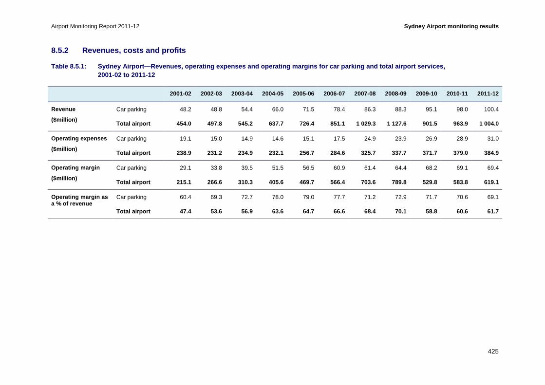
Airport Monitoring Report 2011-12 Sydney Airport monitoring results
425
8.5.2 Revenues, costs and profits
Table 8.5.1: Sydney Airport—Revenues, operating exp enses and operating margins for car parking and tot al airport services, 2001-02 to 2011-12
2001-02 2002-03 2003-04 2004-05 2005-06 2006-07 2007-08 2008-09 2009-10 2010-11 2011-12
Revenue
($million)
Car parking 48.2 48.8 54.4 66.0 71.5 78.4 86.3 88.3 95.1 98.0 100.4
Total airport 454.0 497.8 545.2 637.7 726.4 851.1 1 029.3 1 127.6 901.5 963.9 1 004.0
Operating expenses
($million)
Car parking 19.1 15.0 14.9 14.6 15.1 17.5 24.9 23.9 26.9 28.9 31.0
Total airport 238.9 231.2 234.9 232.1 256.7 284.6 3 25.7 337.7 371.7 379.0 384.9
Operating margin
($million)
Car parking 29.1 33.8 39.5 51.5 56.5 60.9 61.4 64.4 68.2 69.1 69.4
Total airport 215.1 266.6 310.3 405.6 469.7 566.4 7 03.6 789.8 529.8 583.8 619.1
Operating margin as a % of revenue
Car parking 60.4 69.3 72.7 78.0 79.0 77.7 71.2 72.9 71.7 70.6 69.1
Total airport 47.4 53.6 56.9 63.6 64.7 66.6 68.4 70 .1 58.8 60.6 61.7

Sydney Airport monitoring results Airport Monitoring Report 2011-12
426
Key observations from table 8.5.1 include:
• In 2011-12, car parking revenue increased by 2.5 per cent to $100.4 million.
− Since 2001-02, car parking revenue has increased by 108.3 per cent. The largest increase in car parking revenue occurred in 2004-05, when revenue increased by $11.7 million (21.5 per cent).
• Operating expenses for car parking increased by 7.5 per cent in 2011-12 to $31.0 million. As a percentage of total airport operating expenses, car parking operating expenses increased from 7.6 per cent in 2010-11 to 8.1 per cent in 2011-12.
− Since 2001-02, car parking operating expenses have increased by 62.5 per cent. The largest increase in car parking operating expenses occurred in 2007-08, when expenses increased by $7.4 million (42.3 per cent).
• Sydney Airport’s car parking operating margin increased by 0.4 per cent to $69.4 million in 2011-12. This increase was less than the increase in car parking revenue (2.5 per cent), due to operating expenses increasing at a faster rate (7.5 per cent). As a percentage of total airport operating margin, car parking operating margin decreased from 11.8 per cent in 2010-11 to 11.2 per cent in 2011-12.
− Since 2001-02, car parking operating margin has increased by 138.4 per cent. The largest increase in car parking operating margin occurred in 2004-05, when operating margin increased by $12.0 million (30.3 per cent).
• In 2011-12, car parking operating margin as a percentage of car parking revenue was 69.1 per cent, while total airport operating margin as a percentage of total airport revenue was 61.7 per cent. Since 2001-02, car parking operating margin as a percentage of car parking revenue has fluctuated between 60.4 per cent and 79.0 per cent. Over the same period, total airport operating margin as a percentage of total airport revenue has fluctuated between 47.4 per cent and 70.1 per cent.

Airport Monitoring Report 2011-12 Sydney Airport monitoring results
427
Chart 8.5.4: Sydney Airport—airport car parking rev enue as a percentage of total airport revenue, 2001-02 to 2011-12
Key observations from chart 8.5.4 include:
• Car parking revenue as a percentage of total airport revenue decreased from 10.2 per cent in 2010-11 to 10.0 per cent in 2011-12. This change was due to total airport revenue increasing at a faster rate than car parking revenue during the period, increasing 4.3 per cent and 2.5 per cent respectively.
• Since 2001-02, car parking revenue as a percentage of total airport revenue has decreased by 0.6 percentage points from 10.6 per cent. Car parking revenue as a percentage of total airport revenue has fluctuated between 7.8 per cent and 10.6 per cent since 2001-02.
0
10
20
30
40
50
60
70
80
90
100
2001
–02
2002
–03
2003
–04
2004
–05
2005
–06
2006
–07
2007
–08
2008
–09
2009
–10
2010
–11
2011
–12
Per
cen
t
Revenue—car parking Revenue—total airport

Sydney Airport monitoring results Airport Monitoring Report 2011-12
428
Chart 8.5.5: Sydney Airport—revenues, operating exp enses and operating margins for car parking services on a per car park basis, 2 001-02 to 2011-12
Key observations from chart 8.5.5 include:
• In 2011-12, car parking revenue and operating margin per car park space decreased, while car parking operating expenses per car park space increased.
− Sydney Airport noted that the construction of a new multi-storey car park impacted on the number of short-term international car parking spaces available during 2011-12. This new multi-storey car park was opened in August 2012 and provides an additional 2300 car park spaces.
− Sydney Airport also noted that short-term domestic car parking spaces were impacted by the construction of additional taxi bays at the front of Terminal 2, the reconfiguration of the entry to the free pick-up area and the relocation and expansion of the pre-booked taxi area.
• Car parking revenue per car park space decreased by 4.1 per cent from $7983 in 2010-11 to $7654 in 2011-12. This change was partly due to car park spaces increasing at a faster rate (6.9 per cent) than car parking revenue (2.5 per cent).182
− Since 2001-02, car parking revenue per car park space increased by 22.8 per cent to $7654. The largest increase in car parking revenue per car park space occurred in 2003-04, when it increased by $960 (17.8 per cent).
• Car parking operating expenses per car park space increased by 0.6 per cent from $2351 in 2010-11 to $2365 in 2011-12. This change was partly due to car parking operating expenses increasing (7.5 per cent) at a faster rate than the number of car park spaces (6.9 per cent).
− Since 2001-02, car parking operating expenses per car park space have decreased by 4.2 per cent to $2365. The largest increase in car parking operating
182 Sydney Airport commented that the reduction in car parking revenue per space was also partly due to the take up of online booking for car parking which is at a discount to drive-up rates.
6 000
7 000
8 000
9 000
10 000
11 000
12 000
13 000
14 000
0
1 000
2 000
3 000
4 000
5 000
6 000
7 000
8 000
2001
–02
2002
–03
2003
–04
2004
–05
2005
–06
2006
–07
2007
–08
2008
–09
2009
–10
2010
–11
2011
–12
Num
ber o
f car
par
k sp
aces
Do
llars
per
car
par
k
Revenue per car park space Operating expenses per car park space
Operating margin per car park space Number of car park spaces (RHS)

Airport Monitoring Report 2011-12 Sydney Airport monitoring results
429
expenses per car park space occurred in 2007-08, when operating expenses per car park space increased by $685 (42.6 per cent).
• As a result of car parking revenue decreasing while car parking operating expenses increased, car parking operating margin per car park space decreased by 6.1 per cent from $5632 in 2010-11 to $5290 in 2011-12.
− Since 2001-02, car parking operating margin per car park space has increased by 40.5 per cent to $5290. The largest increase in car parking operating margin per car park space occurred in 2003-04, when operating margin per car park space increased by $881 (23.6 per cent).

Sydney Airport monitoring results Airport Monitoring Report 2011-12
430
8.5.3 Quality of car parking facilities
Table 8.5.2: Sydney Airport—number of car park spac es and average daily throughput, 2001-02 to 2011-12
2001-02 2002-03 2003-04 2004-05 2005-06 2006-07 2007-08 2008-09 2009-10 2010-11 2011-12
Number of car park spaces
Domestic short-term 3 039 2 678 2 700 3 045 3 420 3 662 3 662 3 688 3 458 3 244 3 207
International short-term 2 000 2 000 1 700 1 560 1 817 1 374 1 356 2 234 2 170 2 306 1 882
Long-term 2 692 2 688 2 688 4 361 4 593 4 577 4 577 4 577 4 194 4 307 5 694
Staff NA 1 698 1 485 1 202 1 256 1 256 1 256 1 911 2 326 2 414 2 333
Total airport 7 731 9 064 8 573 10 168 11 086 10 86 9 10 851 12 410 12 148 12 271 13 116
Annual throughput of car park facilities (thousands)
Domestic short-term 1 004 1 094 1 123 1 165 1 156 1 195 1 203 1 128 1 146 1 561 1 513
International short-term 1 540 1 478 1 603 1 659 1 629 1 626 1 665 1 648 1 761 1 888 1 983
Long-term 81 90 142 169 169 180 218 212 229 232 228
Total airport 2 624 2 662 2 869 2 993 2 954 3 001 3 085 2 988 3 136 3 680 3 724
Average daily throughput of car park facilities
Domestic short-term 2 750 2 997 3 069 3 191 3 168 3 273 3 286 3 091 3 139 4 278 4 133
International short-term 4 219 4 048 4 381 4 546 4 463 4 455 4 549 4 515 4 824 5 171 5 418
Long-term 221 247 389 464 462 494 594 581 628 634 624
Total airport 7 190 7 292 7 838 8 201 8 094 8 222 8 429 8 187 8 591 10 083 10 176

Airport Monitoring Report 2011-12 Sydney Airport monitoring results
431
Key observations from table 8.5.2 include:
• Since 2001-02, the total number of car parking spaces has increased by 5385 spaces to 13 116 spaces (69.7 per cent). In 2011-12, the number of domestic short-term car parking spaces decreased by 1.1 per cent to 3207 spaces, while international short-term car parking spaces decreased by 18.4 per cent to 1882 spaces. Sydney Airport’s long-term car parking spaces increased by 32.2 per cent in 2011-12 to 5694 spaces.
− Sydney Airport noted that the construction of its new multi-storey car park impacted on the number of short-term international car parking spaces available during 2011-12. This new multi-storey car park was opened in August 2012 and provided an additional 2300 car park spaces.
− Sydney Airport also noted that short-term domestic car parking spaces were impacted by the construction of additional taxi bays at the front of Terminal 2, the reconfiguration of the entry to the free pick-up area and the relocation and expansion of the pre-booked taxi area.
• The number of domestic short-term car parking spaces has increased by 168 spaces since 2001-02 (5.5 per cent). The largest increase in domestic short-term car parking spaces occurred in 2005-06, when the number of domestic short-term car parking spaces increased by 375 spaces (12.3 per cent).
• The number of international short-term car parking spaces has decreased by 118 spaces since 2001-02 (5.9 per cent). The largest increase in the number of international short-term car parking spaces occurred in 2008-09, with an increase of 878 spaces (64.7 per cent). This was due to the opening of a new multi-storey short-term car park.
• The number of long-term car parking spaces has increased by 3006 spaces since 2002-03 (111.8 per cent). The largest increase in long-term car parking spaces occurred in 2004-05, when the number of long-term car parking spaces increased by 1673 spaces (62.2 per cent).
Average daily car parking throughput
• The average daily throughput in the domestic short-term car park decreased by 3.4 per cent from 4278 cars per day in 2010-11 to 4133 cars per day in 2011-12. This change was partly due to the number of domestic short-term car park spaces decreasing by 1.1 per cent in 2011-12. As noted above, short-term domestic car park spaces were impacted by the construction of additional taxi bays at the front of Terminal 2, the reconfiguration of the entry to the free pick-up area and the relocation and expansion of the pre-booked taxi area.
− Since 2001-02, the average daily throughput in the domestic short-term car park has increased by 50.3 per cent to 4133 cars per day.
• The average daily throughput in the international short-term car park increased by 4.8 per cent from 5171 cars per day in 2010-11 to 5418 cars per day in 2011-12. Daily throughput increased despite the number of international short-term car park spaces decreasing by 18.4 per cent. As noted above, construction of the new multi-storey car park impacted on the availability of international short-term car park spaces during 2011-12.
− Since 2001-02, the average daily throughput in the international short-term car park has increased by 28.4 per cent to 5418 cars per day.

Sydney Airport monitoring results Airport Monitoring Report 2011-12
432
• The average daily throughput in the long-term car park decreased by 1.6 per cent from 634 cars per day in 2010-11 to 624 cars per day in 2011-12. Daily throughput decreased despite the number of long-term international car park spaces increasing by 32.2 per cent in 2011-12.
− Since 2001-02, the average daily throughput in the long-term car park has increased by 182.6 per cent to 624 cars per day.
Chart 8.5.6: Sydney Airport—international passenger survey ratings of the quality of car parking facilities, 2001-02 to 2011-12
Key observations from chart 8.5.6 include:
• International passengers’ rating of Sydney Airport’s car parking availability decreased slightly in 2011-12, though remained rated as satisfactory for the fourth consecutive year. Sydney Airport did not provide international passenger survey results for availability prior to 2008-09.
• International passengers’ rating of Sydney Airport’s car parking standard increased within the satisfactory range in 2011-12 and has remained rated as satisfactory since 2002-03. Sydney Airport did not provide international passenger survey results for standard in 2001-02.
• International passengers’ rating of the time taken to enter Sydney Airport’s international car parks increased slightly in 2011-12, though remained rated as satisfactory for the fourth consecutive year. Sydney Airport did not provide international passenger survey results for time taken to enter between 2002-03 and 2008-09, however, international passengers rated the time taken to enter as good in 2001-02.
0
1
2
3
4
5
6
2001
–02
2002
–03
2003
–04
2004
–05
2005
–06
2006
–07
2007
–08
2008
–09
2009
–10
2010
–11
2011
–12
Ave
rag
e ra
ting
Passenger surveys—airport car parking availability
Passenger surveys—airport car parking standard
Passenger surveys—airport car parking time taken to enter
Excellent
Good
Poor
Very poor
Satisfactory

Airport Monitoring Report 2011-12 Sydney Airport monitoring results
433
Chart 8.5.7: Sydney Airport—domestic passenger surv ey ratings of the quality of car parking facilities, 2001-02 to 2011-12
Key observations from chart 8.5.7 include:
• Domestic passengers’ rating of Sydney Airport’s car parking availability decreased marginally in 2011-12, though remained rated as satisfactory for the fourth consecutive year. Sydney Airport did not provide domestic passenger survey results for availability prior to 2008-09.
• Domestic passengers’ rating of Sydney Airport’s car parking standard increased within the satisfactory range in 2011-12 and has remained rated as satisfactory since 2006-07. Sydney Airport did not provide domestic passenger survey results for standard prior to 2003-04.
• Domestic passengers’ rating of the time taken to enter Sydney Airport’s domestic car park decreased from satisfactory in 2010-11 to poor in 2011-12. Sydney Airport did not provide domestic passenger survey results for time taken to enter prior to 2008-09.
− As noted above, Sydney Airport commented that domestic passengers’ rating was impacted by the construction of additional taxi bays at the front of Terminal 2, the reconfiguration of the entry to the free pick-up area and the relocation and expansion of the pre-booked taxi area.
0
1
2
3
4
5
6
2001
–02
2002
–03
2003
–04
2004
–05
2005
–06
2006
–07
2007
–08
2008
–09
2009
–10
2010
–11
2011
–12
Ave
rag
e ra
ting
Passenger surveys—airport car parking availability
Passenger surveys—airport car parking standard
Passenger surveys—airport car parking time taken to enter
Excellent
Good
Satisfactory
Poor
Very poor

Sydney Airport monitoring results Airport Monitoring Report 2011-12
434
8.5.4 Other transport options
Table 8.5.3: Sydney Airport—landside access charges , 2009-10 to 2011-12
Transport option Average list prices
($)
Indexed average list prices
(2009-10 as base year)
2009-10 2010-11 2011-12 2009-10 2010-11 2011-12
Public bus None None None NA NA NA
Private bus Various Various Various NA NA NA
Off-airport car parking Various Various Various NA NA NA
Taxis (per pick-up) 3.00 3.00 3.50 100.0 100.0 116.7
Private car (per entry) 3.50 3.50 4.50 100.0 100.0 128.6
Table 8.5.4: Sydney Airport—revenues from landside access charges, 2009-10 to 2011-12
Transport option 2009-10 2010-11 2011-12
Public bus Nil Nil Nil
Private bus and off-airport car parking $438 000 $427 000 $1 696 000
Taxis (per pick-up) $7 723 000 $7 931 000 $9 483 000
Private car (per entry) $767 000 $923 000 $1 730 000
Other $342 000 $446 000 $407 000
Total $9 270 000 $9 727 000 $13 316 000
Key observations from tables 8.5.3 and 8.5.4 include:
• Terminal drop-off and pick-up
− Sydney Airport is designated a no-stopping area. There are free drop-off areas on the departures level at both the international and domestic terminals.183
− There are no kerbside pick-up facilities at the international and domestic terminals. However, the airport does provide 15 minutes free parking in a designated pick-up area in its international car park. The airport also provides a pick-up area at the domestic terminal that includes a free 10 minute parking period, after which charges revert to the standard short-term parking rates. Designated disabled parking spots are available in both the international and domestic terminal car parks.
183 Sydney Airport noted that the free drop off area is available for private vehicles as well as taxis, limousines, buses and coaches.
Airport Monitoring Report 2011-12 Sydney Airport monitoring results
435
• Off-airport parking and private bus operators
− A number of off-airport car parking facilities offer services to Sydney Airport. Most of these facilities charge a flat fee for the first three days of parking. Off-airport prices sampled by the ACCC ranged from $30184 to $50185 for one day car parking and from $50186 to $78187 for three days car parking.
− In 2011-12, off-airport car parking and private bus operators were charged on the basis of length of stay. Sydney Airport received a total of $1.7 million in revenue from off-airport parking and private bus operators in 2011-12, an increase of 297.2 per cent from $427 000 in 2010-11.
− Sydney Airport noted that it has invested in a new tracking system that provides more accurate data of movements, which has meant that data from previous periods is incomplete and has not tracked all movements. Sydney Airport has stated that this explains the 155 per cent increase in the volume of private buses accessing the airport in 2011-12, and that in reality volumes would not have increased so dramatically.
• Taxis
− Sydney Airport applied a $3.50 airport charge on each taxi picking up passengers from any of Sydney Airport’s taxi ranks in 2011-12. The charge increased from $3 per taxi in 2010-11. The airport received a total of just under $9.5 million in revenue from taxis in 2011-12, an increase of 19.6 per cent from just over $7.9 million in 2010-11.
− This change was due to the increase in the airport charge on each taxi pick-up, as well as an increase in the volume of taxis by 2.5 per cent, from 2.9 million taxis in 2010-11 to just under 3.0 million taxis in 2011-12.
• Trains
− CityRail operates rail services to Sydney Airport using privately owned and operated train stations. Sydney Airport is not the private owner and operator of these train stations. The service costs around $15.40 (domestic terminals) and $16.20 (international terminal) for a single trip and between $30.80 and $32.40 for a return trip to or from any of the city stations or Kings Cross.188 A transfer between the two terminals is offered at $5.189 Sydney Airport noted that it does not set the fares or receive any revenue from the train fares.
− Sydney Airport has previously noted that there used to be four stations in NSW where passengers were required to pay a surcharge to catch the train. However, following an agreement reached between the train operator and the NSW Government, the surcharge was removed from two of those stations (Green Square and Mascot) in March 2011. The airport commented that, since the removal
184 Park and Jet, viewed 18 December 2012, http://parkandjet.com.au.tmp.anchor.net.au/information/rates/. 185 Sydney Airport Security Parking, viewed 18 December 2012, http://www.airport-parking.com.au/ 186 Ibid. 187 Park & Fly, viewed 18 December 2012, http://www.parknfly.com.au/default.aspx\ 188 AirportLink, Price, viewed 18 December 2012, http://www.airportlink.com.au/price.php 189 AirportLink, Terminal Transfer, viewed 18 December 2012, http://www.airportlink.com.au/terminal-transfers.php
Sydney Airport monitoring results Airport Monitoring Report 2011-12
436
of the surcharge, rail patronage through those two stations increased by around 100 per cent. Sydney Airport noted that there are now only two stations in NSW where a surcharge is required to be paid—at Sydney Airport’s domestic and international terminals. Sydney Airport notes that it has advocated for the reduction or removal of the rail surcharge to encourage the increased use of public transport.
• Public buses
− A public bus service to the airport runs between Bondi Junction and Burwood with stops at the international and domestic terminals, approximately every 20 minutes seven days a week.190 It should be noted that the government-run Airport Express bus ceased operation in May 2003 after the rail link to the airport was opened. Sydney Airport noted that it does not set the fares or receive any revenue from bus fares. Sydney Airport also noted that it has advocated for the addition of more buses and additional bus routes to and through the airport to encourage the increased usage of public transport.
− There are also a number of privately-owned bus companies providing transport to and from the airport, the majority being charter services rather than scheduled services.
• Hire cars (i.e. rental vehicles) and private cars (i.e. limousines)
− Sydney Airport reports that hire car operators were charged various fees on a commercially agreed basis, with the airport receiving total revenue of $8.3 million from hire car operators in 2011-12. This compares to revenue of just over $7.5 million in 2010-11.
− Sydney Airport charged private car operators (such as limousines) $4.50 per 20 minutes to access the domestic terminals and $4.50 per 75 minutes to access the international terminal. This charge increased from $3.50 in 2010-11. In 2011-12, the airport received a total of $1.7 million from private car operators, an increase of 87.4 per cent from $923 000 in 2010-11. This change was due to the increased charge for private car operators, as well as an increase in the volume of private car operators using the airport facilities.
− Sydney Airport noted that it has invested in a new tracking system that provides more accurate data of movements, which has meant that data from previous periods is incomplete and has not tracked all movements. Sydney Airport has stated that this explains the 35 per cent increase in the volume of private cars accessing the airport in 2011-12, and that in reality volumes would not have increased so dramatically.
− Sydney Airport also noted that, in June 2011, the airport increased the number of spaces available for private car operators at the international terminal from 36 to 58 spaces.
190 Sydney Buses, Timetables and route maps: Bus 400, viewed 18 December 2012, http://www.sydneybuses.info/routes/timetables-route-maps

Airport Monitoring Report 2011-12 Appendix 1: Regulatory accounts
437
A1 Regulatory accounts
This section presents the 2011-12 accounts—including the income statements, balance sheets and cash flow statements—for the five monitored airports: Adelaide, Brisbane, Melbourne, Perth and Sydney airports. In addition, the income statements and balance sheets under the ‘line in the sand’ (LIS) approach are presented for Adelaide, Brisbane and Sydney airports. Melbourne and Perth airports are not affected by the line in the sand approach. Under this approach, the value of an airport’s aeronautical asset base for monitoring purposes is the value of tangible non-current aeronautical assets reported to the ACCC as at 30 June 2005 plus new investments, less depreciation and disposals. For more information regarding this approach, see appendices 4 and 7.
A1.1 Regulatory accounts for Adelaide Airport Table A1.1.1: Adelaide Airport—income statement fo r the year ended 30 June 2012
Description
Un-audited financial
statements
Aeronautical services
Non-aeronautical services
$’000 $’000 $’000
Revenue
Aeronautical revenue 78 132 78 132
Non-aeronautical revenue 62 986 62 986
Increment in fair value of investment property
4 153 4 153
Total revenue 145 271 78 132 67 139
Expenditure
Salaries and wages 11 929 7 933 3 996
Depreciation/amortisation of land 1 414 1 414
Depreciation (excl. land) 14 437 9 015 5 422
Services and utilities 32 804 17 231 15 573
Property/leasing maintenance 4 186 3 208 978
Consultants and advisors 4 836 2 963 1 873
General administration 6 325 4 235 2 090
Other costs 56 56
Total expenditure 75 987 45 999 29 988
Operating profit/(loss) 69 284 32 133 37 151
Abnormal items
Earnings before interest and tax (EBIT) 69 284
Interest (66 479)
Earnings before tax (EBT) 2 805
Tax charge (872)
Profit/(loss) after tax 1 933
Dividends paid (10 000)
Retained earnings (8 067)
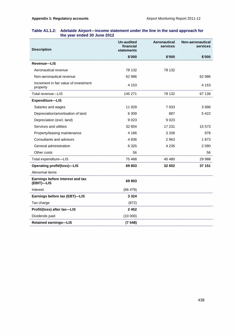
Appendix 1: Regulatory accounts Airport Monitoring Report 2011-12
438
Table A1.1.2: Adelaide Airport—income statement und er the line in the sand approach for the year ended 30 June 2012
Description
Un-audited financial
statements
Aeronautical services
Non-aeronautical services
$’000 $’000 $’000
Revenue—LIS
Aeronautical revenue 78 132 78 132
Non-aeronautical revenue 62 986 62 986
Increment in fair value of investment property 4 153 4 153
Total revenue—LIS 145 271 78 132 67 139
Expenditure—LIS
Salaries and wages 11 929 7 933 3 996
Depreciation/amortisation of land 6 309 887 5 422
Depreciation (excl. land) 9 023 9 023
Services and utilities 32 804 17 231 15 573
Property/leasing maintenance 4 186 3 208 978
Consultants and advisors 4 836 2 963 1 873
General administration 6 325 4 235 2 090
Other costs 56 56
Total expenditure—LIS 75 468 45 480 29 988
Operating profit/(loss)—LIS 69 803 32 652 37 151
Abnormal items
Earnings before interest and tax (EBIT)—LIS 69 803
Interest (66 479)
Earnings before tax (EBT)—LIS 3 324
Tax charge (872)
Profit/(loss) after tax—LIS 2 452
Dividends paid (10 000)
Retained earnings—LIS (7 548)

Airport Monitoring Report 2011-12 Appendix 1: Regulatory accounts
439
Table A1.1.3: Adelaide Airport—balance sheet for t he year ended 30 June 2012
Description Un-audited financial
statements
Aeronautical services
Non-aeronautical services
$’000 $’000 $’000
Current assets
Cash 74 102
Receivables 7 905 7 905
Accrued revenue
Other 10 744 7 123 3 621
Total current assets 92 751 15 028 3 621
Non-current assets
Receivables 3 368 2 233 1 135
Property, plant and equipment 358 068 323 788 34 280
Investment property 217 130 217 130
Land/pre-payment/pre-paid rent 119 849 119 849
Goodwill 179 410 179 410
Total non-current assets 877 825 625 280 252 545
Total assets 970 576 640 308 256 166
Current liabilities
Creditors 18 141
Borrowings 5
Other 425
Total current liabilities 18 571
Non-current liabilities
Borrowings 822 057
Provisions
Deferred tax liability 87 963
Other 2 861
Total non-current liabilities 912 881
Total liabilities 931 452
Net assets 39 124
Shareholders’ equity
Share capital 1 905
Reserves 4 199
Accumulated profits/(losses) 33 020
Total shareholders equity/(deficiency) 39 124
Accumulated profit at start of year 41 087
Movements
Profit/(loss) for the year 1 933
Other (dividends paid) (10 000)
Accumulated profit at end of year 33 020

Appendix 1: Regulatory accounts Airport Monitoring Report 2011-12
440
Table A1.1.4: Adelaide Airport—balance sheet under the line in the sand approach for the year ended 30 June 2012
Description Un-audited
financial Aeronautical
services Non-aeronautical
services $’000 $’000 $’000
Current assets—LIS
Cash 74 102
Receivables 7 905 7 905
Other 10 744 7 123 3 621
Total current assets—LIS 92 751 15 028 3 621
Non-current assets—LIS
Receivables 3 368 2 233 1 135
Property, plant and equipment 337 908 303 628 34 280
Investment property 217 130 217 130
Land 79 200 79 200
Goodwill 179 410 179 410
Total non-current assets—LIS 817 016 564 471 252 545
Total assets—LIS 909 767 579 499 256 166
Current liabilities—LIS
Creditors 18 141
Borrowings 5
Other 425
Total current liabilities—LIS 18 571
Non-current liabilities—LIS
Borrowings 822 057
Deferred tax liability 87 963
Other 2 861
Total non-current liabilities—LIS 912 881
Total liabilities—LIS 931 452
Net assets—LIS (21 685)
Shareholders’ equity—LIS
Share capital 1 905
Reserves 4 199
Accumulated profits/(losses) (27 789)
Total shareholders (deficiency)—LIS (21 685)
Accumulated (loss) at start of year—LIS (20 982)
Movements—LIS
Profit/(loss) for the year 2 452
Dividends (10 000)
Other 741
Accumulated (loss) at end of year—LIS (27 789)

Airport Monitoring Report 2011-12 Appendix 1: Regulatory accounts
441
Table A1.1.5: Adelaide Airport—cash flow statement for the year ended 30 June 2012
Description
Un-audited financial
statements
$’000
Cash flows from operating activities
Inflows
Receipts from customers 155 215
Interest received 3 725
Outflows
Payments to suppliers and employees (72 686)
Interest paid (74 863)
Income tax paid
Net cash flow from operating activities 11 391
Cash flows from investing activities
Inflows
Proceeds from sale of property, plant and equipment (4)
Other
Outflows
Acquisition of property, plant and equipment (69 116)
Other
Net cash flow from investing activities (69 120)
Cash flows from financing activities
Inflows
Proceeds from borrowings
Loans from associated entities 66 579
Other
Outflows
Repayment of borrowings
Dividends paid (10 000)
Loans to associated entities (402)
Other
Net cash flows from financing activities 56 177
Net increase/(decrease) in cash held (1 552)
Cash at beginning of the reporting period 75 654
Cash at end of the reporting period 74 102
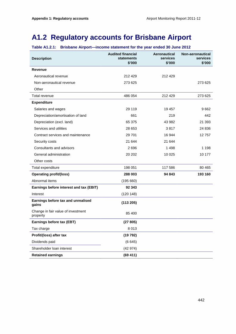
Appendix 1: Regulatory accounts Airport Monitoring Report 2011-12
442
A1.2 Regulatory accounts for Brisbane Airport Table A1.2.1: Brisbane Airport—income statement fo r the year ended 30 June 2012
Description Audited financial
statements Aeronautical
services Non-aeronautical
services $’000 $’000 $’000
Revenue
Aeronautical revenue 212 429 212 429
Non-aeronautical revenue 273 625 273 625
Other
Total revenue 486 054 212 429 273 625
Expenditure
Salaries and wages 29 119 19 457 9 662
Depreciation/amortisation of land 661 219 442
Depreciation (excl. land) 65 375 43 982 21 393
Services and utilities 28 653 3 817 24 836
Contract services and maintenance 29 701 16 944 12 757
Security costs 21 644 21 644
Consultants and advisors 2 696 1 498 1 198
General administration 20 202 10 025 10 177
Other costs
Total expenditure 198 051 117 586 80 465
Operating profit/(loss) 288 003 94 843 193 160
Abnormal items (195 660)
Earnings before interest and tax (EBIT) 92 343
Interest (120 148)
Earnings before tax and unrealised gains (113 205)
Change in fair value of investment property 85 400
Earnings before tax (EBT) (27 805)
Tax charge 8 013
Profit/(loss) after tax (19 792)
Dividends paid (6 645)
Shareholder loan interest (42 974)
Retained earnings (69 411)

Airport Monitoring Report 2011-12 Appendix 1: Regulatory accounts
443
Table A1.2.2: Brisbane Airport—income statement und er the line in the sand approach for the year ended 30 June 2012
Description Audited financial
statements Aeronautical
services Non-aeronautical
services
$’000 $’000 $’000
Revenue—LIS
Aeronautical revenue 212 429
Non-aeronautical revenue
Other
Total revenue—LIS 212 429
Expenditure—LIS
Salaries and wages 19 457
Depreciation/amortisation of land 166
Depreciation (excl. land) 39 345
Services and utilities 3 817
Contract services and maintenance 16 944
Security costs 21 644
Consultants and advisors 1 498
General administration 10 025
Other costs
Total expenditure—LIS 112 896
Operating profit/(loss)—LIS 99 533
Abnormal items
Earnings before interest and tax (EBIT)—LIS
Interest
Earnings before tax and unrealised gains—LIS
Change in fair value of investment property
Earnings before tax (EBT)—LIS
Tax charge
Profit/(loss) after tax—LIS
Dividends paid
Retained earnings—LIS
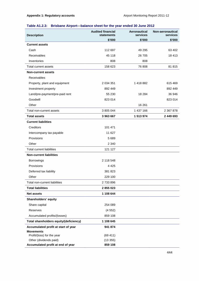
Appendix 1: Regulatory accounts Airport Monitoring Report 2011-12
444
Table A1.2.3: Brisbane Airport—balance sheet for t he year ended 30 June 2012
Description Audited financial
statements Aeronautical
services Non-aeronautical
services
$’000 $’000 $’000
Current assets
Cash 112 697 49 295 63 402
Receivables 45 118 26 705 18 413
Inventories 808 808
Total current assets 158 623 76 808 81 815
Non-current assets
Receivables
Property, plant and equipment 2 034 351 1 418 882 615 469
Investment property 892 449 892 449
Land/pre-payment/pre-paid rent 55 230 18 284 36 946
Goodwill 823 014 823 014
Other 16 261
Total non-current assets 3 805 044 1 437 166 2 367 878
Total assets 3 963 667 1 513 974 2 449 693
Current liabilities
Creditors 101 471
Intercompany tax payable 11 627
Provisions 5 689
Other 2 340
Total current liabilities 121 127
Non-current liabilities
Borrowings 2 118 548
Provisions 4 425
Deferred tax liability 381 823
Other 229 100
Total non-current liabilities 2 733 896
Total liabilities 2 855 023
Net assets 1 108 644
Shareholders’ equity
Share capital 254 089
Reserves (4 552)
Accumulated profits/(losses) 859 108
Total shareholders equity/(deficiency) 1 108 645
Accumulated profit at start of year 941 874
Movements Profit/(loss) for the year (69 411)
Other (dividends paid) (13 355)
Accumulated profit at end of year 859 108

Airport Monitoring Report 2011-12 Appendix 1: Regulatory accounts
445
Table A1.2.4: Brisbane Airport—balance sheet under the line in the sand approach for the year ended 30 June 2012
Description Audited financial
statements Aeronautical
services Non-aeronautical
services
$’000 $’000 $’000
Current assets—LIS
Cash 49 295
Receivables 26 705
Inventories 808
Total current assets—LIS 76 808
Non-current assets—LIS
Receivables
Property, plant and equipment 1 074 416
Investment property
Land/pre-payment/pre-paid rent 26 004
Goodwill
Other
Total non-current assets—LIS 1 100 420
Total assets—LIS 1 177 228
Current liabilities—LIS
Creditors
Borrowings
Other
Total current liabilities—LIS
Non-current liabilities—LIS
Borrowings
Provisions
Deferred tax liability
Total non-current liabilities—LIS
Total liabilities—LIS
Net assets—LIS
Shareholders’ equity—LIS
Share capital
Reserves
Accumulated profits/(losses)
Total shareholders (deficiency)—LIS
Accumulated profit at start of year—LIS
Movements—LIS
Profit/(loss) for the year
Other
Accumulated profit at end of year—LIS
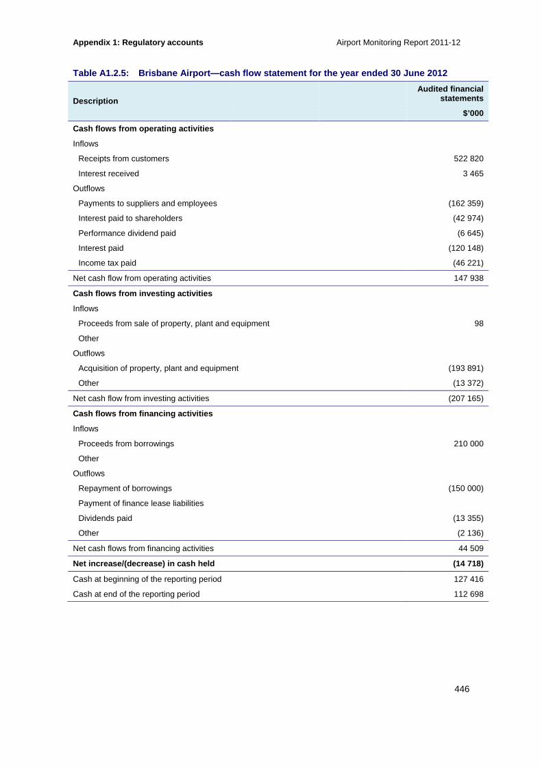
Appendix 1: Regulatory accounts Airport Monitoring Report 2011-12
446
Table A1.2.5: Brisbane Airport—cash flow statement for the year ended 30 June 2012
Description Audited financial
statements
$’000
Cash flows from operating activities
Inflows
Receipts from customers 522 820
Interest received 3 465
Outflows
Payments to suppliers and employees (162 359)
Interest paid to shareholders (42 974)
Performance dividend paid (6 645)
Interest paid (120 148)
Income tax paid (46 221)
Net cash flow from operating activities 147 938
Cash flows from investing activities
Inflows
Proceeds from sale of property, plant and equipment 98
Other
Outflows
Acquisition of property, plant and equipment (193 891)
Other (13 372)
Net cash flow from investing activities (207 165)
Cash flows from financing activities
Inflows
Proceeds from borrowings 210 000
Other
Outflows
Repayment of borrowings (150 000)
Payment of finance lease liabilities
Dividends paid (13 355)
Other (2 136)
Net cash flows from financing activities 44 509
Net increase/(decrease) in cash held (14 718)
Cash at beginning of the reporting period 127 416
Cash at end of the reporting period 112 698

Airport Monitoring Report 2011-12 Appendix 1: Regulatory accounts
447
A1.3 Regulatory accounts for Melbourne Airport Table A1.3.1: Melbourne Airport—income statement f or the year ended 30 June 2012
Description
Audited financial statements
Aeronautical services
Non-aeronautical services
$’000 $’000 $’000
Revenue
Aeronautical revenue 243 593 243 593
Non-aeronautical revenue 329 128 329 128
Other (interest revenue not allocated) 545
Total revenue 573 266 243 593 329 128
Expenditure
Salaries and wages 31 181 21 736 9 445
Depreciation/amortisation of land 709 571 138
Depreciation (excl. land) 71 235 53 204 18 031
Services and utilities 51 657 18 757 32 900
Property/leasing maintenance 15 935 11 427 4 508
Security costs 28 719 28 712 7
General administration 19 856 13 166 6 690
Other costs
Total expenditure 219 292 147 573 71 719
Operating profit/(loss) 353 974 96 020 257 409
Change in fair value of investment property 17 259
Earnings before interest and tax (EBIT) 371 233
Interest (132,661)
Earnings before tax (EBT) 238 572
Tax charge (71 668)
Profit/(loss) after tax 166 904
Dividends paid (138 814)
Retained earnings 28 090
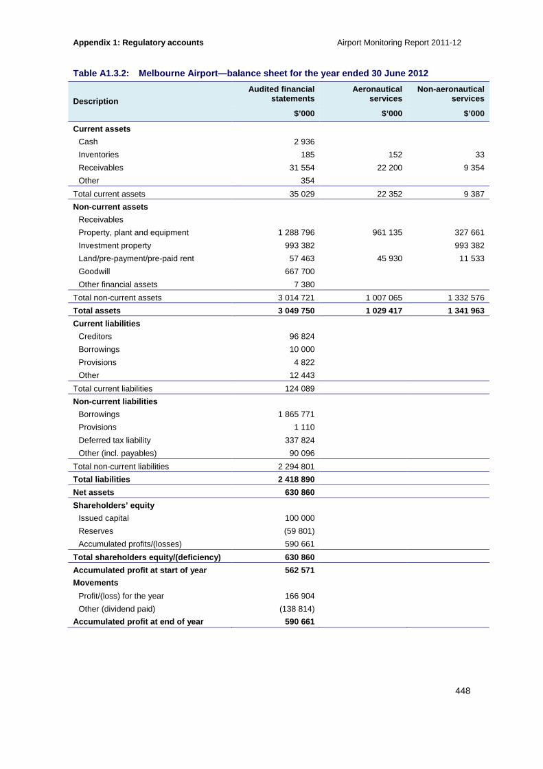
Appendix 1: Regulatory accounts Airport Monitoring Report 2011-12
448
Table A1.3.2: Melbourne Airport—balance sheet for the year ended 30 June 2012
Description Audited financial
statements Aeronautical
services Non-aeronautical
services
$’000 $’000 $’000
Current assets
Cash 2 936
Inventories 185 152 33
Receivables 31 554 22 200 9 354
Other 354
Total current assets 35 029 22 352 9 387
Non-current assets
Receivables
Property, plant and equipment 1 288 796 961 135 327 661
Investment property 993 382 993 382
Land/pre-payment/pre-paid rent 57 463 45 930 11 533
Goodwill 667 700
Other financial assets 7 380
Total non-current assets 3 014 721 1 007 065 1 332 576
Total assets 3 049 750 1 029 417 1 341 963
Current liabilities
Creditors 96 824
Borrowings 10 000
Provisions 4 822
Other 12 443
Total current liabilities 124 089
Non-current liabilities
Borrowings 1 865 771
Provisions 1 110
Deferred tax liability 337 824
Other (incl. payables) 90 096
Total non-current liabilities 2 294 801
Total liabilities 2 418 890
Net assets 630 860
Shareholders’ equity
Issued capital 100 000
Reserves (59 801)
Accumulated profits/(losses) 590 661
Total shareholders equity/(deficiency) 630 860
Accumulated profit at start of year 562 571
Movements
Profit/(loss) for the year 166 904
Other (dividend paid) (138 814)
Accumulated profit at end of year 590 661

Airport Monitoring Report 2011-12 Appendix 1: Regulatory accounts
449
Table A1.3.3: Melbourne Airport—cash flow statemen t for the year ended 30 June 2012
Description Audited financial
statements
$’000
Cash flows from operating activities
Inflows
Receipts from customers 635 647
Interest and bill discounts received 545
Outflows
Payments to suppliers and employees (200 256)
Interest and other costs of finance paid (128 036)
Income tax paid (51 436)
Net cash flow from operating activities 256 464
Cash flows from investing activities
Inflows
Proceeds from sale of property, plant and equipment 80
Other
Outflows
Acquisition of property, plant and equipment (173 382)
Payment for investment property (31 478)
Net cash flow from investing activities (204 780)
Cash flows from financing activities
Inflows
Proceeds from borrowings 994 231
Other
Outflows
Repayment of borrowings (891 000)
Dividends paid (138 814)
Other (3 800)
Net cash flows from financing activities (39 383)
Net increase/(decrease) in cash held (12 301)
Cash at beginning of the reporting period (9 365)
Cash at end of the reporting period (2 936)
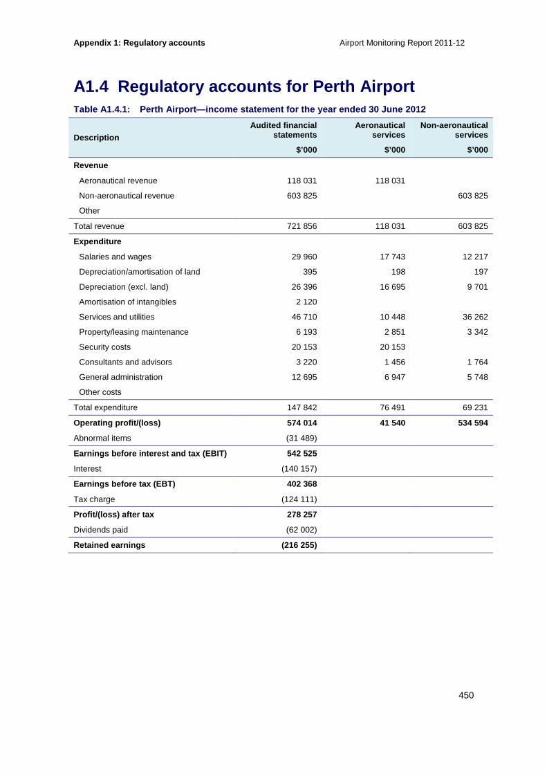
Appendix 1: Regulatory accounts Airport Monitoring Report 2011-12
450
A1.4 Regulatory accounts for Perth Airport Table A1.4.1: Perth Airport—income statement for t he year ended 30 June 2012
Description
Audited financial statements
Aeronautical services
Non-aeronautical services
$’000 $’000 $’000
Revenue
Aeronautical revenue 118 031 118 031
Non-aeronautical revenue 603 825 603 825
Other
Total revenue 721 856 118 031 603 825
Expenditure
Salaries and wages 29 960 17 743 12 217
Depreciation/amortisation of land 395 198 197
Depreciation (excl. land) 26 396 16 695 9 701
Amortisation of intangibles 2 120
Services and utilities 46 710 10 448 36 262
Property/leasing maintenance 6 193 2 851 3 342
Security costs 20 153 20 153
Consultants and advisors 3 220 1 456 1 764
General administration 12 695 6 947 5 748
Other costs
Total expenditure 147 842 76 491 69 231
Operating profit/(loss) 574 014 41 540 534 594
Abnormal items (31 489)
Earnings before interest and tax (EBIT) 542 525
Interest (140 157)
Earnings before tax (EBT) 402 368
Tax charge (124 111)
Profit/(loss) after tax 278 257
Dividends paid (62 002)
Retained earnings (216 255)

Airport Monitoring Report 2011-12 Appendix 1: Regulatory accounts
451
Table A1.4.2: Perth Airport—balance sheet for the year ended 30 June 2012
Description Audited financial
statements Aeronautical
services Non-aeronautical
services
$’000 $’000 $’000
Current assets
Cash 75 002
Receivables 44 946 16 297 28 649
Accrued revenue 4 758 4 758
Other 13 870 464 13 406
Total current assets 138 576 16 761 46 813
Non-current assets
Property, plant and equipment 608 702 381 182 227 520
Investment property 755 282 755 282
Land/pre-payment/pre-paid rent 33 209 16 607 16 602
Goodwill 443 598
Deferred tax assets 20 631
Intangibles 7 826
Total non-current assets 1 869 248 397 789 999 404
Total assets 2 007 824 414 550 1 046 217
Current liabilities
Creditors 41 045
Provisions 4 609
Other 1 822
Total current liabilities 47 476
Non-current liabilities
Borrowings 1 162 241
Provisions 355
Deferred tax liability 325 857
Other
Total non-current liabilities 1 488 453
Total liabilities 1 535 929
Net assets 471 895
Shareholders’ equity
Share capital 161 865
Reserves (50 229)
Accumulated profits/(losses) 360 259
Total shareholders equity/(deficiency) 471 895
Accumulated profit at start of year 112 515
Movements
Profit/(loss) for the year 278 258
Dividend paid (62 002)
Accumulated profit at end of year 328 771

Appendix 1: Regulatory accounts Airport Monitoring Report 2011-12
452
Table A1.4.3: Perth Airport—cash flow statement fo r the year ended 30 June 2012
Description Audited financial
statements
$’000
Cash flows from operating activities
Inflows
Receipts from customers 325 057
Interest received 4 184
Outflows
Payments to suppliers and employees (103 239)
Income tax paid (12 628)
Net cash flow from operating activities 213 374
Cash flows from investing activities
Inflows
Proceeds from sale of property, plant and equipment 13
Other
Outflows
Acquisition of property, plant and equipment (164 695)
Other (91)
Net cash flow from investing activities (164 773)
Cash flows from financing activities
Inflows
Proceeds from borrowings 779 100
Other 8 400
Outflows
Repayment of borrowings (603 500)
Interest paid (151 976)
Dividends paid (62 002)
Other
Net cash flows from financing activities (29 978)
Net increase/(decrease) in cash held 18 623
Cash at beginning of the reporting period 56 379
Cash at end of the reporting period 75 002

Airport Monitoring Report 2011-12 Appendix 1: Regulatory accounts
453
A1.5 Regulatory accounts for Sydney Airport Table A1.5.1: Sydney Airport—income statement for the year ended 30 June 2012
Description
Audited financial statements
Aeronautical services
Non-aeronautical services
$’000 $’000 $’000
Revenue
Aeronautical revenue 543 468 543 468
Non-aeronautical revenue 460 505 460 505
Other 26 26
Total revenue 1 003 999 543 468 460 531
Expenditure
Salaries and wages 41 348 27 754 13 594
Depreciation/amortisation of land (incl freehold land) 12 240 8 132 4 191
Depreciation of tangibles (excl land) 187 953 134 609 53 261
Amortisation of intangibles 15 801 15 801
Services and utilities 47 074 26 076 20 998
Property/leasing maintenance 19 611 15 460 4 151
Security costs 57 036 56 394 642
Other costs 19 616 8 768 10 848
Loss on disposal of fixed assets 27 27
Total expenditure 400 706 277 193 123 513
Operating profit/(loss) 603 293 266 275 337 018
Abnormal items
Earnings before interest and tax (EBIT) 603 293
Net finance costs (1 133 294)
Earnings before tax (EBT) (530 001)
Income tax benefit 147 200
Profit/(loss) after tax (382 801)
Dividends paid
Retained earnings (382 801)

Appendix 1: Regulatory accounts Airport Monitoring Report 2011-12
454
Table A1.5.2: Sydney Airport—income statement under the line in the sand approach for the year ended 30 June 2012 (excluding landfill in leasehold land)
Description Audited financial
statements Aeronautical
services Non-aeronautical
services
$’000 $’000 $’000
Revenue—LIS
Aeronautical revenue 543 468 543 468
Non-aeronautical revenue 460 505 460 505
Increment in fair value of investment property 26 26
Total revenue—LIS 1 003 999 543 468 460 531
Expenditure—LIS
Salaries and wages 41 348 27 754 13 594
Depreciation/amortisation of land (incl freehold land) 19 072 11 840 7 232
Depreciation 177 794 123 176 54 618
Amortisation of intangibles (excl land)
Services and utilities 47 074 26 076 20 998
Property/leasing maintenance 19 611 15 460 4 151
Security costs 57 036 56 394 642
Other costs 19 616 8 768 10 848
Loss on disposal of fixed assets 27 27
Total expenditure—LIS 381 578 269 468 112 110
Operating profit/(loss)—LIS 622 421 274 000 348 421
Abnormal items
Earnings before interest and tax (EBIT)—LIS 622 421
Net finance costs (1 133 294)
Earnings before tax (EBT)—LIS (510 873)
Income tax benefit 147 200
Profit/(loss) after tax—LIS (363 673)
Dividends paid
Retained earnings—LIS (363 673)
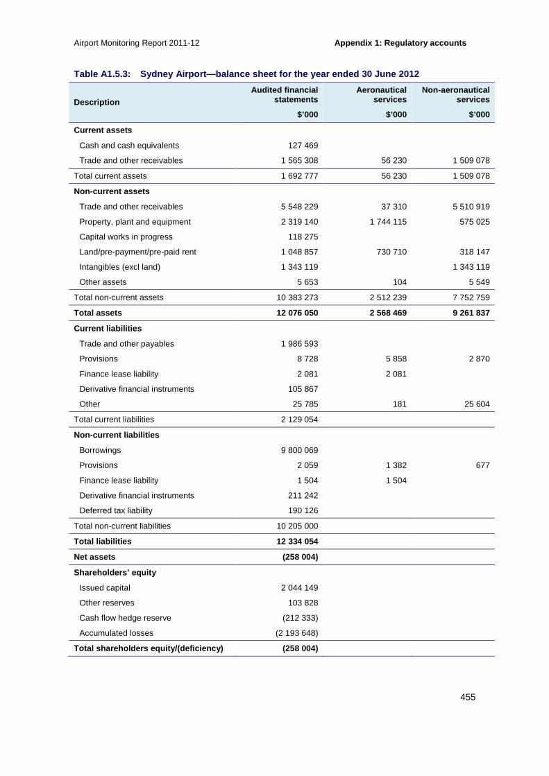
Airport Monitoring Report 2011-12 Appendix 1: Regulatory accounts
455
Table A1.5.3: Sydney Airport—balance sheet for the year ended 30 June 2012
Description Audited financial
statements Aeronautical
services Non-aeronautical
services
$’000 $’000 $’000
Current assets
Cash and cash equivalents 127 469
Trade and other receivables 1 565 308 56 230 1 509 078
Total current assets 1 692 777 56 230 1 509 078
Non-current assets
Trade and other receivables 5 548 229 37 310 5 510 919
Property, plant and equipment 2 319 140 1 744 115 575 025
Capital works in progress 118 275
Land/pre-payment/pre-paid rent 1 048 857 730 710 318 147
Intangibles (excl land) 1 343 119 1 343 119
Other assets 5 653 104 5 549
Total non-current assets 10 383 273 2 512 239 7 752 759
Total assets 12 076 050 2 568 469 9 261 837
Current liabilities
Trade and other payables 1 986 593
Provisions 8 728 5 858 2 870
Finance lease liability 2 081 2 081
Derivative financial instruments 105 867
Other 25 785 181 25 604
Total current liabilities 2 129 054
Non-current liabilities
Borrowings 9 800 069
Provisions 2 059 1 382 677
Finance lease liability 1 504 1 504
Derivative financial instruments 211 242
Deferred tax liability 190 126
Total non-current liabilities 10 205 000
Total liabilities 12 334 054
Net assets (258 004)
Shareholders’ equity
Issued capital 2 044 149
Other reserves 103 828
Cash flow hedge reserve (212 333)
Accumulated losses (2 193 648)
Total shareholders equity/(deficiency) (258 004)

Appendix 1: Regulatory accounts Airport Monitoring Report 2011-12
456
Table A1.5.4: Sydney Airport—balance sheet under th e line in the sand approach for the year ended 30 June 2012 (excluding landfill in leas ehold land)
Description Audited financial
statements Aeronautical
services Non-aeronautical
services
$’000 $’000 $’000
Current assets—LIS
Cash and cash equivalents 127 469
Trade and other receivables 1 565 308 56 230 1 509 078
Total current assets—LIS 1 692 777 56 230 1 509 078
Non-current assets—LIS
Trade and other receivables 5 548 229 37 310 5 510 919
Property, plant and equipment (excl freehold land) 1 961 370 1 438 095 523 275
Capital works in progress 118 275
Land/pre-payment/pre-paid rent (incl freehold) 1 615 861 1 054 928 560 933
Intangibles
Other assets 5 653 104 5 549
Total non-current assets—LIS 9 249 388 2 530 437 6 600 676
Total assets—LIS 10 942 165 2 586 667 8 109 754
Current liabilities—LIS
Trade and other payables 1 986 593
Provisions 8 728 5 858 2 870
Finance lease liability 2 081 2 081
Derivative financial instruments 105 867
Other 25 785 181 25 604
Total current liabilities—LIS 2 129 054
Non-current liabilities—LIS
Borrowings 9 800 069
Provisions 2 059 1 382 677
Finance lease liability 1 504 1 504
Derivative financial instruments 211 242
Deferred tax liability 190 126
Total non-current liabilities—LIS 10 205 000
Total liabilities—LIS 12 334 054
Net assets—LIS (1 391 889)

Airport Monitoring Report 2011-12 Appendix 1: Regulatory accounts
457
Table A1.5.5: Sydney Airport—cash flow statement f or the year ended 30 June 2012
Description Audited financial
statements
$’000
Cash flows from operating activities
Inflows
Receipts from customers 1 124 216
Interest received 7 988
Outflows
Payments to suppliers and employees (304 114)
Borrowing costs paid (583 478)
Swap interest received/(paid) (64 196)
Net cash flow from operating activities 180 416
Cash flows from investing activities
Inflows
Proceeds from sale of property, plant and equipment 26
Other
Outflows
Acquisition of property, plant and equipment (193 159)
Capitalised borrowing costs (7 329)
Net cash flow from investing activities (200 462)
Cash flows from financing activities
Inflows
Proceeds from borrowings 1 456 000
Loans from other entities in wholly owned group (650 000)
Outflows
Repayment of borrowings (618 000)
Advances to other entities in wholly owned group (140 610)
Debt establishment costs and other recurring finance costs (29 929)
Finance lease payments (2 340)
Net cash flows from financing activities 15 121
Net increase/(decrease) in cash held (4 925)
Cash at beginning of the reporting period 132 394
Cash at end of the reporting period 127 469

Appendix 2: Indicators and statistics used in the r eport Airport Monitoring Report 2011-12
458
A2 Indicators and statistics used in the report
The following section provides details on the indicators of airport quality of service (A2.1), the quality of service statistics (A2.2), detailed airport facilities data (A2.3) and the individual airports’ operational statistics (A2.4).
A2.1 Indicators of airport quality of service This section outlines the information provided by the airports relating to the base data and passenger perception surveys for the quality of service indicators used in this report. In addition, the information collected from airline user surveys and the resulting indicators are presented.
A2.1.1 Base data for the indicators provided by th e airports
Table A2.1.1: Quality of service base data provide d by the airports and the resulting objective indicators
Facility Base data provided by airports Objective indicator
Aerobridges usage • Number of aerobridges on 30 June in the financial year
• Total number of passengers who used aerobridges for embarkation (arrival) in the financial year
• Total number of passengers who embarked (arrived) in international aircraft in the financial year
• Total number of passengers who embarked (arrived) in the financial year
• Number of arriving international aircraft that used aerobridges in the financial year
• Total number of passengers who used aerobridges for disembarkation (departure) in the financial year
• Total number of passengers who disembarked (departed) in international aircraft in the financial year
• Percentage of passengers arriving using an aerobridge
• Percentage of passengers departing using an aerobridge
Aircraft parking facilities and bays
• Number of aircraft parking bays on 30 June in the financial year
• No direct objective indicator
Check-in services and facilities
• Number of check-in desks on 30 June in the financial year
• Number of hours during the financial year when more than 80 per cent of check-in desks were in use
• Percentage of hours with more than 80 per cent of check-in desks in use

Airport Monitoring Report 2011-12 Appendix 2: Indicators and statistics used in the r eport
459
Facility Base data provided by airports Objective indicator
• Total number of hours during the financial year when any check-in desk was open
Facilities to enable the processing of passengers through customs, immigration and quarantine
• Number of inbound Immigration desks on 30 June in the financial year
• Number of baggage inspection desks on 30 June in the financial year
• Number of outbound Immigration desks on 30 June in the financial year
• Number of arriving passengers per inbound Immigration desk (during peak hour)
• Number of arriving passengers per baggage inspection desk (during peak hour)
• Number of departing passengers per outbound Immigration desk (during peak hour)
Security inspection • Number of security clearance systems, including equipment required to process passengers and baggage, on 30 June in the financial year
• Number of departing passengers per security clearance system (during peak hour)
Gate lounges and seating in gate lounges
• Number of gate lounges on 30 June in the financial year
• Number of seats in gate lounges on 30 June in the financial year
• Total gate lounge area (in square metres) on 30 June in the financial year
• Number of departing passengers per seat in gate lounges (during peak hour)
• Number of departing passengers per square metre of lounge area (during peak hour)
Inbound baggage systems, including reclaiming services and facilities
• Capacity of baggage handling system (in bags per hour) on 30 June in the financial year
• Total number of bags handled by baggage handling system in the financial year
• Total number of hours during the financial year for which baggage handling system was in use
• Total number of planned interruptions to inbound baggage system in the financial year
• Total number of hours of planned interruptions to inbound baggage system in the financial year
• Number of unplanned interruptions to inbound baggage system in the financial year
• Total number of hours of unplanned interruptions to inbound baggage system in the financial year
• Average throughput of inbound baggage system (during peak hour)
Outbound baggage system • Capacity of baggage handling equipment (in bags per hour) on 30 June in the financial year
• Average throughput of outbound baggage system (during peak hour)

Appendix 2: Indicators and statistics used in the r eport Airport Monitoring Report 2011-12
460
Facility Base data provided by airports Objective indicator
• Total number of bags handled by baggage handling equipment in the financial year
• Total number of hours during the financial year for which baggage handling equipment was in use
• Number of planned interruptions to baggage handling equipment in the financial year
• Total number of hours of planned interruption to baggage handling equipment in the financial year
• Number of unplanned interruptions to baggage handling equipment in the financial year
• Total number of hours of unplanned interruption to baggage handling equipment in the financial year
Baggage trolleys • Number of working accessible baggage trolleys on 30 June in the financial year
• Number of passengers per baggage trolley (during peak hour)
Flight information, general signage and public-address systems
• Number of flight information display screens on 30 June in the financial year
• Number of information points on 30 June in the financial year
• Number of passengers per flight information display screen (during peak hour)
• Number of passengers per information point (during peak hour)
Peak hour(*) • Time of peak hour for arriving passengers
• Time of peak hour for departing passengers
• Average number of arriving passengers during peak hour in the financial year
• Average number of departing passengers during peak hour in the financial year
• Used in various objective indicators
Car parking services and facilities
• Number of days short-term car park is open in the financial year
• Number of short-term car parking spaces available to the public (including disabled parking) on 30 June in the financial year
• Total annual throughput of short-term car park in the financial year
• Number of days long-term car park is open in the financial year
• Used in conjunction with car parking financial data and analysis

Airport Monitoring Report 2011-12 Appendix 2: Indicators and statistics used in the r eport
461
Facility Base data provided by airports Objective indicator
• Number of long-term car parking spaces available to the public (including disabled parking) on 30 June in the financial year
• Total annual throughput of long-term car park in the financial year
• Number of car parking spaces for staff of airport clients on 30 June in the financial year
Note: *Peak hour means:
(a) for a matter relating exclusively to arriving passengers or inbound baggage—the hour that, on average for each day in the financial year, has the highest number of arriving passengers
(b) for a matter relating exclusively to departing passengers or outbound baggage—the hour that, on average for each day in the financial year, has the highest number of departing passengers
(c) in any other case—the hour that, on average for each day in the financial year, has the highest total number of passenger movements (including both arriving and departing passengers).
A2.1.2 Passenger perception surveys Table A2.1.2: Information provided by airports’ pa ssenger perception surveys
Service Measure
Check-in services and facilities • Check-in waiting time
• Average waiting time per passenger during average peak hour(*)
Facilities to enable the processing of passengers through customs, immigration and quarantine
• Waiting time in inbound Immigration area
• Waiting time in inbound baggage inspection area
• Waiting time in outbound Immigration area
Security inspection • Quality of security search process
Gate lounges and seating other than in gate lounges • Quality and availability of seating in lounge area
• Crowding in lounge area
Baggage make-up, handling and reclaiming services and facilities
• Waiting time for inbound baggage arrival
• Information display regarding inbound baggage location
• Circulation space for baggage pick-up
Baggage trolleys • Findability of baggage trolleys
Flight information, general signage and public-address system
• Flight Information Display screens
• Signage and wayfinding
Public areas in terminals and public amenities • Standard of washrooms
Airport car parking • Standard of car park facilities
• Availability of car parking spaces
• Time taken to enter car park

Appendix 2: Indicators and statistics used in the r eport Airport Monitoring Report 2011-12
462
Service Measure
Airport access • Congestion at kerbside taxi drop-off and pick-up
• Facilities for kerbside taxi drop-off and pick-up
• Standard of facilities for taxis
Note: *Peak hour means:
(a) for a matter relating exclusively to arriving passengers or inbound baggage—the hour that, on average for each day in the financial year, has the highest number of arriving passengers
(b) for a matter relating exclusively to departing passengers or outbound baggage—the hour that, on average for each day in the financial year, has the highest number of departing passengers
(c) in any other case—the hour that, on average for each day in the financial year, has the highest total number of passenger movements (including both arriving and departing passengers).
A2.1.3 Airline user surveys Table A2.1.3: Information collected from airline u ser surveys and the resulting indicators
Facility Airline satisfaction indicator
Airside
Runways • Standard(a)
• Availability(b)
Taxiways • Standard
• Availability
Aprons • Standard
• Availability
Aircraft parking facilities and bays • Standard
• Availability
Ground handling services and facilities • Standard
• Availability
International terminal
Aerobridges • Standard
• Availability
Check-in services and facilities(c) • Standard
• Availability
Baggage processing facilities • Standard
• Availability
Domestic terminal
Aerobridges • Standard
• Availability
Check-in services and facilities • Standard
• Availability
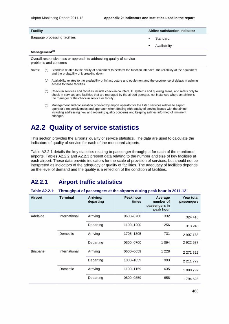
Airport Monitoring Report 2011-12 Appendix 2: Indicators and statistics used in the r eport
463
Facility Airline satisfaction indicator
Baggage processing facilities • Standard
• Availability
Management (d)
Overall responsiveness or approach to addressing quality of service problems and concerns
Notes: (a) Standard relates to the ability of equipment to perform the function intended, the reliability of the equipment and the probability of it breaking down.
(b) Availability relates to the availability of infrastructure and equipment and the occurrence of delays in gaining access to those facilities.
(c) Check-in services and facilities include check-in counters, IT systems and queuing areas, and refers only to check-in services and facilities that are managed by the airport operator, not instances where an airline is the manager of the check-in service or facility.
(d) Management and consultation provided by airport operator for the listed services relates to airport operator’s responsiveness and approach when dealing with quality of service issues with the airline, including addressing new and recurring quality concerns and keeping airlines informed of imminent changes.
A2.2 Quality of service statistics This section provides the airports’ quality of service statistics. The data are used to calculate the indicators of quality of service for each of the monitored airports.
Table A2.2.1 details the key statistics relating to passenger throughput for each of the monitored airports. Tables A2.2.2 and A2.2.3 present data relating to the number and size of key facilities at each airport. These data provide indicators for the scale of provision of services, but should not be interpreted as indicators of the adequacy or quality of facilities. The adequacy of facilities depends on the level of demand and the quality is a reflection of the condition of facilities.
A2.2.1 Airport traffic statistics Table A2.2.1: Throughput of passengers at the airp orts during peak hour in 2011-12
Airport Terminal Arriving/ departing
Peak hour times
Average number of
passengers in peak hour
Year total passengers
Adelaide International Arriving 0600–0700 332 324 416
Departing 1100–1200 256 313 243
Domestic Arriving 1705–1805 731 2 907 188
Departing 0600–0700 1 094 2 922 587
Brisbane International Arriving 0600–0659 1 228 2 271 322
Departing 1000–1059 993 2 211 772
Domestic Arriving 1100–1159 635 1 800 797
Departing 0800–0859 658 1 794 528

Appendix 2: Indicators and statistics used in the r eport Airport Monitoring Report 2011-12
464
Melbourne International Arriving 0800–0859 1 293 3 431 080
Departing 1100–1159 1 154 3 391767
Domestic (T3) Arriving 1900–1959 850 3 667 085
Departing 0800–0859 880 3 655 952
Domestic (T4) Arriving 1500–1559 285 553 637
Departing 1600–1659 306 557 224
Perth International Arriving 0000–0100 527 1 767 996
Departing 0700–0800 427 1 724 164
Domestic Arriving 1900-2000 500 1 514 698
Departing 0600-0700 561 1 510 405
Sydney International Arriving 0700–0800 2 809 6 645 428
Departing 1100–1200 1 860 6 331 183
Domestic Arriving 1700–1800 1 751 7 804 323
Departing 1500–1900 1 795 6 875 306*
Note: *Number of domestic passengers who used aerobridges for departure in the year.
A2.2.2 Basic airport facilities data
Comparing airside facilities across airports
Table A2.2.2: Airside facilities at the airports i n 2011-12
Airport Terminal Number of aircraft parking bays
Number of aerobridges
Adelaide International/domestic(a) 27 14
Brisbane International 17 15
Domestic 9 2
Melbourne International 27 15
Domestic T3 20 11
Domestic T4 5 0
Perth International 9 5
Domestic 33 4
Sydney International 45 34
Domestic(b) 49 16
Note: (a) Adelaide Airport advised aerobridges are available for all international and domestic departures and arrivals with the use of ‘swing gates’ to isolate international operations. The balance of the time, the whole terminal is available for domestic and regional operations.
(b) The number of aircraft parking bays included parking bays at the domestic and other terminal.

Airport Monitoring Report 2009-10 Appendix 2: Indicators and statistics used in the r eport
465
Comparing terminal facilities across airports
Table A2.2.3: Availability of terminal facilities at the airports (for terminal owned and operated by the airports) in 2011-12
Airport Terminal Number of check-in
desks
Number of security
clearance systems
Number of seats in gate
lounges
Area of gate lounges (square metres)
Number of outbound
bags handled
Number of baggage
trolleys
Number of flight
information display
screens
Number of information
points
Adelaide International 39
2 1 620 9 890 2 315 569 670 94 5
Domestic 6
Brisbane International 92 18 1 972 18 120 2 842 104 2 000 381 11
Domestic 16 5 850 4 560 866 764 210 106 1
Melbourne International 116 7 3 316 7 438 3 647 879 2 217 105 1
Domestic 38 6 1 207 3 195 2 031 339 132 47 0
Perth International 39 3 722 2 195 1 574 849 812 68 1
Domestic 22 3 823 2 269 1 129 826 196 52 1
Sydney International 192 31 5 381 10 172 7 093 063 4 510 833 5
Domestic 44 15 2 037 5 380 3 965 923 436 208 1
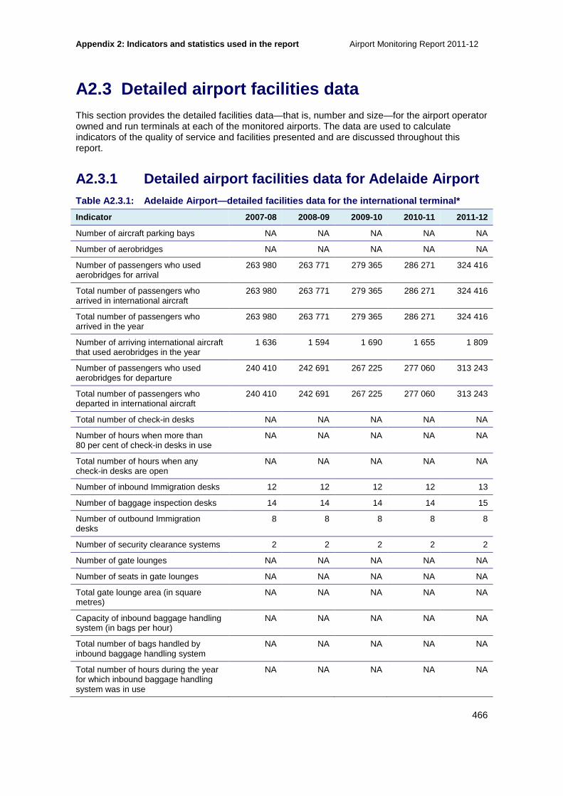
Appendix 2: Indicators and statistics used in the r eport Airport Monitoring Report 2011-12
466
A2.3 Detailed airport facilities data This section provides the detailed facilities data—that is, number and size—for the airport operator owned and run terminals at each of the monitored airports. The data are used to calculate indicators of the quality of service and facilities presented and are discussed throughout this report.
A2.3.1 Detailed airport facilities data for Adelai de Airport Table A2.3.1: Adelaide Airport—detailed facilities data for the international terminal*
Indicator 2007-08 2008-09 2009-10 2010-11 2011-12
Number of aircraft parking bays NA NA NA NA NA
Number of aerobridges NA NA NA NA NA
Number of passengers who used aerobridges for arrival
263 980 263 771 279 365 286 271 324 416
Total number of passengers who arrived in international aircraft
263 980 263 771 279 365 286 271 324 416
Total number of passengers who arrived in the year
263 980 263 771 279 365 286 271 324 416
Number of arriving international aircraft that used aerobridges in the year
1 636 1 594 1 690 1 655 1 809
Number of passengers who used aerobridges for departure
240 410 242 691 267 225 277 060 313 243
Total number of passengers who departed in international aircraft
240 410 242 691 267 225 277 060 313 243
Total number of check-in desks NA NA NA NA NA
Number of hours when more than 80 per cent of check-in desks in use
NA NA NA NA NA
Total number of hours when any check-in desks are open
NA NA NA NA NA
Number of inbound Immigration desks 12 12 12 12 13
Number of baggage inspection desks 14 14 14 14 15
Number of outbound Immigration desks
8 8 8 8 8
Number of security clearance systems 2 2 2 2 2
Number of gate lounges NA NA NA NA NA
Number of seats in gate lounges NA NA NA NA NA
Total gate lounge area (in square metres)
NA NA NA NA NA
Capacity of inbound baggage handling system (in bags per hour)
NA NA NA NA NA
Total number of bags handled by inbound baggage handling system
NA NA NA NA NA
Total number of hours during the year for which inbound baggage handling system was in use
NA NA NA NA NA

Airport Monitoring Report 2011-12 Appendix 2: Indicators and statistics used in the r eport
467
Indicator 2007-08 2008-09 2009-10 2010-11 2011-12
Total number of planned interruptions to inbound baggage system
NA NA NA NA NA
Total number of hours of planned interruptions to inbound baggage system in the year
NA NA NA NA NA
Number of unplanned interruptions to inbound baggage system in the year
NA NA NA NA NA
Total number of hours of unplanned interruptions to inbound baggage system in the year
NA NA NA NA NA
Capacity of outbound baggage handling equipment (in bags per hour)
NA NA NA NA NA
Total number of bags handled by outbound baggage handling equipment
NA NA NA NA NA
Total number of hours during the year for which outbound baggage handling equipment was in use
NA NA NA NA NA
Number of planned interruptions to outbound baggage handling equipment
NA NA NA NA NA
Total number of hours of planned interruptions to outbound baggage handling equipment
NA NA NA NA NA
Number of unplanned interruptions to outbound baggage handling equipment
NA NA NA NA NA
Total number of hours of unplanned interruptions to outbound baggage handling equipment
NA NA NA NA NA
Number of working accessible baggage trolleys
NA NA NA NA NA
Number of flight information display screens
NA NA NA NA NA
Number of information points NA NA NA NA NA
Time of peak hour for arriving passengers
1900-2000 0700-0800 0715-0740 0600-0700 0600-0700
Time of peak hour for departing passengers
0600-0700 1100-1200 0850-0940 1100-1200 1100-1200
Number of arriving passengers during peak hour
910 369 462 473 332
Number of departing passengers during peak hour
1 105 468 526 539 256
Note: *Adelaide Airport opened a multi-user integrated terminal (T1) in 2005-06. International operations transferred to the new terminal in October 2005, regional operations in December 2005 and domestic operations in February 2006. T1 has common check-in and baggage handling for international, domestic and regional passenger services. International passengers are processed separately through the border agency mandated procedures.

Appendix 2: Indicators and statistics used in the r eport Airport Monitoring Report 2011-12
468
Table A2.3.2: Adelaide Airport—detailed facilities data for the domestic terminal
Indicator 2007-08 2008-09 2009-10 2010-11 2011-12
Number of aircraft parking bays 27 27 27 27 27
Number of aerobridges 14 14 14 14 14
Number of passengers who used aerobridges for arrival
NA NA NA NA 2 907 188
Total number of passengers who arrived in domestic aircraft
NA NA NA NA NA
Total number of passengers who arrived in the year
2 830 073 2 926 101 3 017 684 3 104 691 2 907 188
Number of arriving domestic aircraft that used aerobridges in the year
NA NA NA NA 22 565
Number of passengers who used aerobridges for departure
NA NA NA NA 2 922 587
Total number of passengers who departed in domestic aircraft
NA NA NA NA 2 922 587
Total number of check-in desks 46 46 46 35 39
Number of hours when more than 80 per cent of check-in desks in use
1 512 NA 312 390 1 404
Total number of hours when any check-in desks are open
6 205 6 205 6 205 6 570 6 588
Number of security clearance systems 3 3 3 3 6
Number of gate lounges NA 16 16 16 16
Number of seats in gate lounges 1 620 1 620 1 620 1 620 1 620
Total gate lounge area (in square metres)
9 890 9 890 9 890 9 890 9 890
Capacity of inbound baggage handling system (in bags per hour)
0 3 000 3 000 3 000 3 000
Total number of bags handled by inbound baggage handling system
0 NA NA NA NA
Total number of hours during the year for which inbound baggage handling system was in use
6 205 6 935 6 935 6 935 6 954
Total number of planned interruptions to inbound baggage system
2 1 4 0 0
Total number of hours of planned interruptions to inbound baggage system in the year
6 2 6 0 0
Number of unplanned interruptions to inbound baggage system in the year
8 6 2 0 0
Total number of hours of unplanned interruptions to inbound baggage system in the year
0 2 3 0 0
Capacity of outbound baggage handling equipment (in bags per hour)
3 000 3 000 3 000 3 000 3 000
Total number of bags handled by outbound baggage handling equipment
0 2 441 824 2 515 343 2 442 246 2 315 569
Total number of hours during the year 6 205 6 935 6 935 6 935 6 954

Airport Monitoring Report 2011-12 Appendix 2: Indicators and statistics used in the r eport
469
Indicator 2007-08 2008-09 2009-10 2010-11 2011-12
for which outbound baggage handling equipment was in use
Number of planned interruptions to outbound baggage handling equipment
4 6 3 0 0
Total number of hours of planned interruptions to outbound baggage handling equipment
0 8 3 0 0
Number of unplanned interruptions to outbound baggage handling equipment
68 37 4 2 8
Total number of hours of unplanned interruptions to outbound baggage handling equipment
NA 27 7 3 5
Number of working accessible baggage trolleys
680 620 670 670 670
Number of flight information display screens
94 94 94 94 94
Number of information points 3 3 3 4 5
Time of peak hour for arriving passengers
1900-2000 1900-2000 1805-1905 1805-1905 1705-1805
Time of peak hour for departing passengers
0600-0700 0600-0700 0605-0705 0605-0705 0600-0700
Number of arriving passengers during peak hour
910 931 1 061 1 072 731
Number of departing passengers during peak hour
1 105 1131 1 601 1 618 1 094
A2.3.2 Detailed airport facilities data for Brisba ne Airport Table A2.3.3: Brisbane Airport—detailed facilities data for the international terminal
Indicator 2007-08 2008-09 2009-10 2010-11 2011-12
Number of aircraft parking bays 17 17 17 17 17
Number of aerobridges 15 15 15 15 15
Number of passengers who used aerobridges for arrival
2 256 833 2 231 922 2 224 354 2 317 376 2 457 421
Total number of passengers who arrived in international aircraft
2 316 808 2 236 627 2 227 313 2 319 977 2 460 493
Total number of passengers who arrived in the year
2 316 808 2 236 627 2 227 313 2 319 977 2 271 322
Number of arriving international aircraft that used aerobridges in the year
12 365 13 349 13 393 13 503 13 630
Number of passengers who used aerobridges for departure
2 287 409 2 271,252 2 260 002 2 294 736 2 409 292
Total number of passengers who departed in international aircraft
2 352 711 2 276 624 2 262 699 2 296 229 2 211 772
Total number of check-in desks 63 90 90 90 92

Appendix 2: Indicators and statistics used in the r eport Airport Monitoring Report 2011-12
470
Indicator 2007-08 2008-09 2009-10 2010-11 2011-12
Number of hours when more than 80 per cent of check-in desks in use
138 107 98 120 18
Total number of hours when any check-in desks are open
7 412 7 620 7 945 8 080 8 198
Number of inbound Immigration desks 22 30 32 32 32
Number of baggage inspection desks 28 38 38 38 38
Number of outbound Immigration desks
20 19 17 17 17
Number of security clearance systems 10 18 18 18 18
Number of gate lounges NA 16 16 16 16
Number of seats in gate lounges 1 972 1 972 1 972 1 972 1 972
Total gate lounge area (in square metres)
18 120 18 120 18 120 18 120 18 120
Capacity of inbound baggage handling system (in bags per hour)
9 000 9 000 9 000 9 000 9 000
Total number of bags handled by inbound baggage handling system
1 943 214 1 870 023 2 054 007 1 987 661 2 410 526
Total number of hours during the year for which inbound baggage handling system was in use
5 903 6 570 6 570 6 570 6 570
Total number of planned interruptions to inbound baggage system
0 0 0 0 48
Total number of hours of planned interruptions to inbound baggage system in the year
0 0 0 0 288
Number of unplanned interruptions to inbound baggage system in the year
2 861 1 188 549 362 47
Total number of hours of unplanned interruptions to inbound baggage system in the year
9 10 12 7 23
Capacity of outbound baggage handling equipment (in bags per hour)
6 000 6 000 6 000 6 000 6 000
Total number of bags handled by outbound baggage handling equipment
2 519 393 2 580 644 2 626 858 2 362 391 2 842 104
Total number of hours during the year for which outbound baggage handling equipment was in use
7 099 8 434 8 030 8 030 8 030
Number of planned interruptions to outbound baggage handling equipment
0 0 48 121 48
Total number of hours of planned interruptions to outbound baggage handling equipment
0 0 96 80 288
Number of unplanned interruptions to outbound baggage handling equipment
11 444 4 380 5 302 3 641 1 047
Total number of hours of unplanned interruptions to outbound baggage handling equipment
181 146 156 188 523
Number of working accessible 2 000 2 000 2 008 2 005 2 000

Airport Monitoring Report 2011-12 Appendix 2: Indicators and statistics used in the r eport
471
Indicator 2007-08 2008-09 2009-10 2010-11 2011-12
baggage trolleys
Number of flight information display screens
240 350 350 350 381
Number of information points 10 11 11 11 11
Time of peak hour for arriving passengers
0600-0659 0600-0659 0700-0759 0600-0659 0600-0659
Time of peak hour for departing passengers
0900-0959 0900-0959 0800-0859 0900-0959 1000-1059
Number of arriving passengers during peak hour
1 710 1 195 1 421 1 248 1 228
Number of departing passengers during peak hour
1 523 1 090 1 151 1 032 993
Table A2.3.4: Brisbane Airport—detailed facilities data for the domestic terminal
Indicator 2007-08 2008-09 2009-10 2010-11 2011-12
Number of aircraft parking bays 9 7 7 9 9
Number of aerobridges 2 2 2 2 2
Number of passengers who used aerobridges for arrival
NA 836 513 883 841 901 818 645 413
Total number of passengers who arrived in domestic aircraft
NA NA NA NA NA
Total number of passengers who arrived in the year
1 034 470 1 143 914 1 197 683 1 529 996 1 800 797
Number of arriving domestic aircraft that used aerobridges in the year
NA NA NA NA 8 475
Number of passengers who used aerobridges for departure
NA 1 119 896 1 189 829 898 714 641 962
Total number of passengers who departed in domestic aircraft
NA NA NA NA 1 794 528
Total number of check-in desks 16 16 16 16 16
Number of hours when more than 80 per cent of check-in desks in use
NA NA NA NA NA
Total number of hours when any check-in desks are open
NA NA NA NA NA
Number of security clearance systems 2 5 5 5 5
Number of gate lounges NA 5 5 10 10
Number of seats in gate lounges 577 577 577 850 850
Total gate lounge area (in square metres)
3 522 3 522 3 522 4 560 4 560
Capacity of inbound baggage handling system (in bags per hour)
1 700 1 700 1 700 1 700 1 700
Total number of bags handled by inbound baggage handling system
NA NA NA NA NA
Total number of hours during the year for which inbound baggage handling system was in use
NA 6 388 6 388 6 388 6 388

Appendix 2: Indicators and statistics used in the r eport Airport Monitoring Report 2011-12
472
Indicator 2007-08 2008-09 2009-10 2010-11 2011-12
Total number of planned interruptions to inbound baggage system
0 0 0 0 48
Total number of hours of planned interruptions to inbound baggage system in the year
0 0 0 0 288
Number of unplanned interruptions to inbound baggage system in the year
NA 3 21 2 11
Total number of hours of unplanned interruptions to inbound baggage system in the year
NA 0 5 1 5
Capacity of outbound baggage handling equipment (in bags per hour)
3 000 3 000 3 000 1 620 1 620
Total number of bags handled by outbound baggage handling equipment
864 916 778 436 720 173 767 340 866 764
Total number of hours during the year for which outbound baggage handling equipment was in use
7 099 5 658 5 778 6 205 6 205
Number of planned interruptions to outbound baggage handling equipment
0 0 48 12 48
Total number of hours of planned interruptions to outbound baggage handling equipment
0 0 96 10 288
Number of unplanned interruptions to outbound baggage handling equipment
2 861 3 650 268 182 154
Total number of hours of unplanned interruptions to outbound baggage handling equipment
68 122 15 4 77
Number of working accessible baggage trolleys
450 450 450 110 210
Number of flight information display screens
47 47 47 57 106
Number of information points 6 1 1 1 1
Time of peak hour for arriving passengers
0600-0659 1100-1159 1100-1159 0800-0859 1100-1159
Time of peak hour for departing passengers
1400-1459 1100-1159 1100-1159 0900-0959 0800-0859
Number of arriving passengers during peak hour
457 451 636 691 635
Number of departing passengers during peak hour
432 445 443 644 658
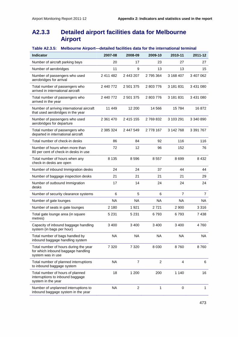
Airport Monitoring Report 2011-12 Appendix 2: Indicators and statistics used in the r eport
473
A2.3.3 Detailed airport facilities data for Melbou rne Airport
Table A2.3.5: Melbourne Airport—detailed facilitie s data for the international terminal
Indicator 2007-08 2008-09 2009-10 2010-11 2011-12
Number of aircraft parking bays 20 17 23 27 27
Number of aerobridges 11 9 13 13 15
Number of passengers who used aerobridges for arrival
2 411 482 2 443 207 2 795 364 3 168 407 3 407 062
Total number of passengers who arrived in international aircraft
2 440 772 2 501 375 2 803 776 3 181 831 3 431 080
Total number of passengers who arrived in the year
2 440 772 2 501 375 2 803 776 3 181 831 3 431 080
Number of arriving international aircraft that used aerobridges in the year
11 449 12 200 14 566 15 784 16 872
Number of passengers who used aerobridges for departure
2 361 470 2 415 155 2 769 832 3 103 291 3 340 890
Total number of passengers who departed in international aircraft
2 385 324 2 447 549 2 778 167 3 142 768 3 391 767
Total number of check-in desks 86 84 92 116 116
Number of hours when more than 80 per cent of check-in desks in use
72 12 96 152 76
Total number of hours when any check-in desks are open
8 135 8 596 8 557 8 699 8 432
Number of inbound Immigration desks 24 24 37 44 44
Number of baggage inspection desks 21 21 21 21 29
Number of outbound Immigration desks
17 14 24 24 24
Number of security clearance systems 6 5 6 7 7
Number of gate lounges NA NA NA NA NA
Number of seats in gate lounges 2 180 1 921 2 721 2 900 3 316
Total gate lounge area (in square metres)
5 231 5 231 6 793 6 793 7 438
Capacity of inbound baggage handling system (in bags per hour)
3 400 3 400 3 400 3 400 4 760
Total number of bags handled by inbound baggage handling system
NA NA NA NA NA
Total number of hours during the year for which inbound baggage handling system was in use
7 320 7 320 8 030 8 760 8 760
Total number of planned interruptions to inbound baggage system
NA 7 2 4 6
Total number of hours of planned interruptions to inbound baggage system in the year
18 1 200 200 1 140 16
Number of unplanned interruptions to inbound baggage system in the year
NA 2 1 0 1

Appendix 2: Indicators and statistics used in the r eport Airport Monitoring Report 2011-12
474
Indicator 2007-08 2008-09 2009-10 2010-11 2011-12
Total number of hours of unplanned interruptions to inbound baggage system in the year
4 1 1 0 6
Capacity of outbound baggage handling equipment (in bags per hour)
3 060 3 060 3 960 3 960 3 960
Total number of bags handled by outbound baggage handling equipment
2 782 132 2 888 655 3 061 052 3 471 240 3 647 879
Total number of hours during the year for which outbound baggage handling equipment was in use
7 686 7 686 8 760 8 760 8 760
Number of planned interruptions to outbound baggage handling equipment
NA 0 3 3 154
Total number of hours of planned interruptions to outbound baggage handling equipment
214 0 84 70 1 769
Number of unplanned interruptions to outbound baggage handling equipment
NA 19 25 62 18
Total number of hours of unplanned interruptions to outbound baggage handling equipment
53 26 32 145 58
Number of working accessible baggage trolleys
2 750 2 570 2 570 2 570 2 217
Number of flight information display screens
76 76 90 94 105
Number of information points 1 1 1 1 1
Time of peak hour for arriving passengers
1002-1101 0800-0900 0800-0900 0800-0900 0800-0859
Time of peak hour for departing passengers
0029-0128 0000-0100 0000-0100 1100-1200 1100-1159
Number of arriving passengers during peak hour
1 258 928 997 1 094 1 293
Number of departing passengers during peak hour
1 629 768 780 1 016 1 154
Table A2.3.6: Melbourne Airport—detailed facilitie s data for the domestic terminal (T3)
Indicator 2007-08 2008-09 2009-10 2010-11 2011-12
Number of aircraft parking bays 20 20 20 20 20
Number of aerobridges 11 11 11 11 11
Number of passengers who used aerobridges for arrival
NA 3 340 031 3 340 089 3 340 089 3 304 603
Total number of passengers who arrived in domestic aircraft
NA NA NA NA NA
Total number of passengers who arrived in the year
3 715 174 3 630 353 3 475 267 3 495 484 3 667 085
Number of arriving domestic aircraft that used aerobridges in the year
NA NA NA NA 47 171

Airport Monitoring Report 2011-12 Appendix 2: Indicators and statistics used in the r eport
475
Indicator 2007-08 2008-09 2009-10 2010-11 2011-12
Number of passengers who used aerobridges for departure
NA 3 590 993 3 181 947 3 174 246 3 294 573
Total number of passengers who departed in domestic aircraft
NA NA NA NA 3 655 952
Total number of check-in desks 36 38 38 38 38
Number of hours when more than 80 per cent of check-in desks in use
NA NA NA NA NA
Total number of hours when any check-in desks are open
NA NA NA NA NA
Number of security clearance systems 6 6 5 6 6
Number of gate lounges NA NA NA NA NA
Number of seats in gate lounges 1 142 1 239 1 239 1 207 1 207
Total gate lounge area (in square metres)
3 195 3 195 3 195 3 195 3 195
Capacity of inbound baggage handling system (in bags per hour)
2 040 2 040 2 040 2 040 2 040
Total number of bags handled by inbound baggage handling system
NA NA NA NA NA
Total number of hours during the year for which inbound baggage handling system was in use
6 954 6 954 7 300 7 300 7 300
Total number of planned interruptions to inbound baggage system
NA 0 0 0 6
Total number of hours of planned interruptions to inbound baggage system in the year
7 0 0 0 23
Number of unplanned interruptions to inbound baggage system in the year
NA 1 1 1 2
Total number of hours of unplanned interruptions to inbound baggage system in the year
5 0 4 4 6
Capacity of outbound baggage handling equipment (in bags per hour)
3 060 3 060 3 060 3 060 3 060
Total number of bags handled by outbound baggage handling equipment
NA 2 392 643 2 094 680 2 084 237 2 031 339
Total number of hours during the year for which outbound baggage handling equipment was in use
6 222 6 222 6 205 7 300 7 300
Number of planned interruptions to outbound baggage handling equipment
NA 0 0 0 23
Total number of hours of planned interruptions to outbound baggage handling equipment
124 0 0 0 55
Number of unplanned interruptions to outbound baggage handling equipment
NA 4 4 3 6
Total number of hours of unplanned interruptions to outbound baggage handling equipment
5 5 5 4 12

Appendix 2: Indicators and statistics used in the r eport Airport Monitoring Report 2011-12
476
Indicator 2007-08 2008-09 2009-10 2010-11 2011-12
Number of working accessible baggage trolleys
150 150 150 150 132
Number of flight information display screens
40 40 43 43 47
Number of information points 0 0 0 0 0
Time of peak hour for arriving passengers
1901-2000 1900-2000 1800-1900 1100-1200 1900-1959
Time of peak hour for departing passengers
1525-1624 0700-0800 0700-0800 1200-1300 0800-0859
Number of arriving passengers during peak hour
1 426 759 861 857 850
Number of departing passengers during peak hour
1 283 778 814 736 880
Table A2.3.7: Melbourne Airport—detailed facilitie s data for the domestic terminal (T4)
Indicator 2007-08 2008-09 2009-10 2010-11 2011-12
Number of aircraft parking bays 4 5 5 5 5
Number of aerobridges NA 0 0 0 0
Number of passengers who used aerobridges for arrival
NA 0 0 0 0
Total number of passengers who arrived in domestic aircraft
NA NA NA NA NA
Total number of passengers who arrived in the year
337 003 641 130 974 644 1 095 762 553 637
Number of arriving domestic aircraft that used aerobridges in the year
NA NA NA NA NA
Number of passengers who used aerobridges for departure
NA 0 0 0 0
Total number of passengers who departed in domestic aircraft
NA NA NA NA 557 224
Total number of check-in desks 10 10 10 10 10
Number of hours when more than 80 per cent of check-in desks in use
NA NA NA NA NA
Total number of hours when any check-in desks are open
NA NA NA NA NA
Number of security clearance systems 2 2 2 2 2
Number of gate lounges NA NA NA NA NA
Number of seats in gate lounges 269 416 388 388 388
Total gate lounge area (in square metres)
900 900 855 855 855
Capacity of inbound baggage handling system (in bags per hour)
680 680 680 680 680
Total number of bags handled by inbound baggage handling system
NA NA NA NA NA
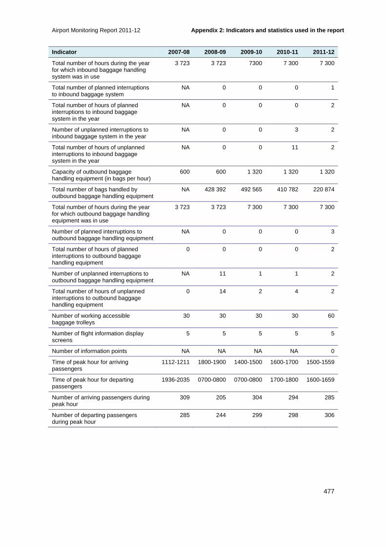
Airport Monitoring Report 2011-12 Appendix 2: Indicators and statistics used in the r eport
477
Indicator 2007-08 2008-09 2009-10 2010-11 2011-12
Total number of hours during the year for which inbound baggage handling system was in use
3 723 3 723 7300 7 300 7 300
Total number of planned interruptions to inbound baggage system
NA 0 0 0 1
Total number of hours of planned interruptions to inbound baggage system in the year
NA 0 0 0 2
Number of unplanned interruptions to inbound baggage system in the year
NA 0 0 3 2
Total number of hours of unplanned interruptions to inbound baggage system in the year
NA 0 0 11 2
Capacity of outbound baggage handling equipment (in bags per hour)
600 600 1 320 1 320 1 320
Total number of bags handled by outbound baggage handling equipment
NA 428 392 492 565 410 782 220 874
Total number of hours during the year for which outbound baggage handling equipment was in use
3 723 3 723 7 300 7 300 7 300
Number of planned interruptions to outbound baggage handling equipment
NA 0 0 0 3
Total number of hours of planned interruptions to outbound baggage handling equipment
0 0 0 0 2
Number of unplanned interruptions to outbound baggage handling equipment
NA 11 1 1 2
Total number of hours of unplanned interruptions to outbound baggage handling equipment
0 14 2 4 2
Number of working accessible baggage trolleys
30 30 30 30 60
Number of flight information display screens
5 5 5 5 5
Number of information points NA NA NA NA 0
Time of peak hour for arriving passengers
1112-1211 1800-1900 1400-1500 1600-1700 1500-1559
Time of peak hour for departing passengers
1936-2035 0700-0800 0700-0800 1700-1800 1600-1659
Number of arriving passengers during peak hour
309 205 304 294 285
Number of departing passengers during peak hour
285 244 299 298 306

Appendix 2: Indicators and statistics used in the r eport Airport Monitoring Report 2011-12
478
A2.3.4 Detailed airport facilities data for Perth Airport Table A2.3.8: Perth Airport—detailed facilities da ta for the international terminal
Indicator 2007-08 2008-09 2009-10 2010-11 2011-12
Number of aircraft parking bays 9 9 9 9 9
Number of aerobridges 5 5 5 5 5
Number of passengers who used aerobridges for arrival
1 287 489 1 346 336 1 509 780 1 652 788 1 752 432
Total number of passengers who arrived in international aircraft
1 292 729 1 346 151 1 511 513 1 657 722 1 767 996
Total number of passengers who arrived in the year
1 292 235 1 346 643 1 511 513 1 657 722 1 767 996
Number of arriving international aircraft that used aerobridges in the year
6 339 7 388 8 725 9 427 9 742
Number of passengers who used aerobridges for departure
1 215 002 1 274 669 1 485 575 1 607 148 1 707 384
Total number of passengers who departed in international aircraft
1 220 403 1 274 953 1 486 838 1 610 326 1 724 164
Total number of check-in desks 39 39 39 39 39
Number of hours when more than 80 per cent of check-in desks in use
2 1 1 1 1
Total number of hours when any check-in desks are open
8 213 112 211 112 211 112 211 112 211
Number of inbound Immigration desks 18 18 18 18 18
Number of baggage inspection desks 28 28 28 28 18
Number of outbound Immigration desks
10 10 10 10 10
Number of security clearance systems 3 3 3 3 3
Number of gate lounges NA 1 1 1 1
Number of seats in gate lounges 531 678 689 582 722
Total gate lounge area (in square metres)
1 952 1 952 1 952 1 952 2 195
Capacity of inbound baggage handling system (in bags per hour)
962 962 962 962 962
Total number of bags handled by inbound baggage handling system
NA NA N/A NA NA
Total number of hours during the year for which inbound baggage handling system was in use
4 460 4 058 3 741 4 058 4 827
Total number of planned interruptions to inbound baggage system
36 36 36 0 0
Total number of hours of planned interruptions to inbound baggage system in the year
72 72 72 0 0
Number of unplanned interruptions to inbound baggage system in the year
5 5 8 3 5

Airport Monitoring Report 2011-12 Appendix 2: Indicators and statistics used in the r eport
479
Indicator 2007-08 2008-09 2009-10 2010-11 2011-12
Total number of hours of unplanned interruptions to inbound baggage system in the year
6 29 41 1 1
Capacity of outbound baggage handling equipment (in bags per hour)
2 400 2 400 2 400 2 400 2 400
Total number of bags handled by outbound baggage handling equipment
1 225 586 1 272 232 1 388 642 1 529 894 1 574 849
Total number of hours during the year for which outbound baggage handling equipment was in use
7 300 7 300 8 030 8 395 8 395
Number of planned interruptions to outbound baggage handling equipment
2 6 0 0 0
Total number of hours of planned interruptions to outbound baggage handling equipment
4 9 0 0 0
Number of unplanned interruptions to outbound baggage handling equipment
4 3 3 2 2
Total number of hours of unplanned interruptions to outbound baggage handling equipment
6 10 7 3 3
Number of working accessible baggage trolleys
935 903 866 826 812
Number of flight information display screens
68 67 67 69 68
Number of information points 1 1 1 1 1
Time of peak hour for arriving passengers
0200-0259 1500-1559 1400-1459 1400-1500 0000-0100
Time of peak hour for departing passengers
1500-1569 1600-1659 1500-1569 1600-1700 0700-0800
Number of arriving passengers during peak hour
870 381 491 497 527
Number of departing passengers during peak hour
683 383 458 404 427
Table A2.3.9: Perth Airport—detailed facilities da ta for the domestic terminal
Indicator 2007-08 2008-09 2009-10 2010-11 2011-12
Number of aircraft parking bays 30 32 32 32 33
Number of aerobridges 2 2 2 2 4
Number of passengers who used aerobridges for arrival
NA 499 405 560 247 535 509 955 813
Total number of passengers who arrived in domestic aircraft
NA NA NA NA NA
Total number of passengers who arrived in the year
887 142 1 159 782 1 231 366 1 393 585 1 514 698
Number of arriving domestic aircraft that used aerobridges in the year
NA NA NA NA 9 259

Appendix 2: Indicators and statistics used in the r eport Airport Monitoring Report 2011-12
480
Indicator 2007-08 2008-09 2009-10 2010-11 2011-12
Number of passengers who used aerobridges for departure
NA 482 242 530 568 513 994 929 767
Total number of passengers who departed in domestic aircraft
NA NA NA NA 1 510 405
Total number of check-in desks 18 22 22 22 22
Number of hours when more than 80 per cent of check-in desks in use
144 185 185 185 185
Total number of hours when any check-in desks are open
7 066 44 495 44 495 44 495 44 495
Number of security clearance systems 2 3 3 3 3
Number of gate lounges NA 1 1 1 1
Number of seats in gate lounges 441 747 697 601 823
Total gate lounge area (in square metres)
1 475 2 135 1 572 1 990 2 269
Capacity of inbound baggage handling system (in bags per hour)
720 720 720 720 720
Total number of bags handled by inbound baggage handling system
NA NA NA NA NA
Total number of hours during the year for which inbound baggage handling system was in use
2 901 1 676 1 825 3 541 3 170
Total number of planned interruptions to inbound baggage system
8 3 0 0 0
Total number of hours of planned interruptions to inbound baggage system in the year
16 4 0 0 0
Number of unplanned interruptions to inbound baggage system in the year
1 2 0 0 3
Total number of hours of unplanned interruptions to inbound baggage system in the year
3 1 0 0 36
Capacity of outbound baggage handling equipment (in bags per hour)
1 200 1 200 1 200 1 200 1 200
Total number of bags handled by outbound baggage handling equipment
878 507 912 235 995 400 1 056 498 1 129 826
Total number of hours during the year for which outbound baggage handling equipment was in use
878 507 7 117 7 300 7 300 7 300
Number of planned interruptions to outbound baggage handling equipment
6 3 3 0 0
Total number of hours of planned interruptions to outbound baggage handling equipment
36 7 5 0 0
Number of unplanned interruptions to outbound baggage handling equipment
5 4 4 10 9
Total number of hours of unplanned interruptions to outbound baggage handling equipment
6 9 9 7 59

Airport Monitoring Report 2011-12 Appendix 2: Indicators and statistics used in the r eport
481
Indicator 2007-08 2008-09 2009-10 2010-11 2011-12
Number of working accessible baggage trolleys
255 239 220 201 196
Number of flight information display screens
31 43 48 48 52
Number of information points 1 1 1 1 1
Time of peak hour for arriving passengers
2200-2259 1900-1959 1900-1959 1900-2000 1900-2000
Time of peak hour for departing passengers
0600-0659 0600-0659 0600-0659 0600-0700 0600-0700
Number of arriving passengers during peak hour
526 344 389 434 500
Number of departing passengers during peak hour
614 504 498 606 561
A2.3.5 Detailed airport facilities data for Sydney Airport Table A2.3.10: Sydney Airport—detailed facilities d ata for the international terminal
Indicator 2007-08 2008-09 2009-10 2010-11 2011-12
Number of aircraft parking bays 44 44 44 44 45
Number of aerobridges 30 34 34 34 34
Number of passengers who used aerobridges for arrival
5 927 249 5 886 299 6 010 801 6 281 218 6 535 580
Total number of passengers who arrived in international aircraft
6 148 181 5 890 874 6 185 775 6 382 334 6 645 428
Total number of passengers who arrived in the year
6 148 181 5 890 874 6 185 775 6 382 334 6 645 428
Number of arriving international aircraft that used aerobridges in the year
27 381 31 658 33 008 29 640 30 740
Number of passengers who used aerobridges for departure
5 616 605 5 553 724 5 717 427 5 952 701 6 175 075
Total number of passengers who departed in international aircraft
5 840 567 5 555 324 5 912 336 6 092 209 6 331 183
Total number of check-in desks 192 192 192 192 192
Number of hours when more than 80 per cent of check-in desks in use
NA NA NA NA NA
Total number of hours when any check-in desks are open
620 587 624 300 659 316 630 066 687 232
Number of inbound Immigration desks 64 64 55 55 63
Number of baggage inspection desks 46 46 92 92 57
Number of outbound Immigration desks
50 50 38 38 38
Number of security clearance systems 16 16 18 18 20
Number of gate lounges NA 25 25 29 29
Number of seats in gate lounges 4 259 4 362 4 362 4 362 5 381
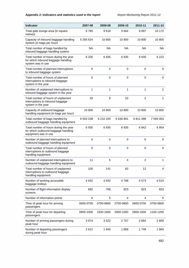
Appendix 2: Indicators and statistics used in the r eport Airport Monitoring Report 2011-12
482
Indicator 2007-08 2008-09 2009-10 2010-11 2011-12
Total gate lounge area (in square metres)
6 785 9 618 9 664 9 697 10 172
Capacity of inbound baggage handling system (in bags per hour)
5 265 624 10 800 10 800 10 800 10 800
Total number of bags handled by inbound baggage handling system
NA NA NA NA NA
Total number of hours during the year for which inbound baggage handling system was in use
6 205 6 935 6 935 6 935 6 222
Total number of planned interruptions to inbound baggage system
0 0 0 0 0
Total number of hours of planned interruptions to inbound baggage system in the year
0 0 0 0 0
Number of unplanned interruptions to inbound baggage system in the year
1 1 1 1 2
Total number of hours of unplanned interruptions to inbound baggage system in the year
33 8 22 2 1
Capacity of outbound baggage handling equipment (in bags per hour)
10 800 10 800 10 800 10 800 10 800
Total number of bags handled by outbound baggage handling equipment
6 553 238 6 210 100 6 636 891 6 811 498 7 093 063
Total number of hours during the year for which outbound baggage handling equipment was in use
6 935 6 935 6 935 6 942 6 954
Number of planned interruptions to outbound baggage handling equipment
0 0 0 0 0
Total number of hours of planned interruptions to outbound baggage handling equipment
0 0 0 0 0
Number of unplanned interruptions to outbound baggage handling equipment
11 5 4 2 1
Total number of hours of unplanned interruptions to outbound baggage handling equipment
100 141 82 12 4
Number of working accessible baggage trolleys
4 932 4 932 4 788 4 573 4 510
Number of flight information display screens
682 766 823 823 833
Number of information points 6 5 4 4 5
Time of peak hour for arriving passengers
0600-0700 0700-0800 0700-0800 0600-0700 0700-0800
Time of peak hour for departing passengers
0900-1000 1500-1600 0900-1000 0900-1000 1100-1200
Number of arriving passengers during peak hour
3 874 3 522 2 757 2 894 2 809
Number of departing passengers during peak hour
2 612 1 945 1 868 1 748 1 860

Airport Monitoring Report 2011-12 Appendix 2: Indicators and statistics used in the r eport
483
Table A2.3.11: Sydney Airport—detailed facilities d ata for the domestic terminal
Indicator 2007-08 2008-09 2009-10 2010-11 2011-12
Number of aircraft parking bays 31 32 39 47(a) 49
Number of aerobridges 16 16 16 16 16
Number of passengers who used aerobridges for arrival
NA 6 303 685 6 440 586 NA(b) 7 146 512
Total number of passengers who arrived in domestic aircraft
NA NA NA NA NA
Total number of passengers who arrived in the year
5 963 310 6 310 868 6 826 156 7 713 943 7 804 323
Number of arriving domestic aircraft that used aerobridges in the year
NA NA NA NA 50 288
Number of passengers who used aerobridges for departure
NA 6 306 487 6 440 586 NA(b) 6 875 306
Total number of passengers who departed in domestic aircraft
NA NA NA 7 253184(c) NA
Total number of check-in desks 44 44 44 44 44
Number of hours when more than 80 per cent of check-in desks in use
NA NA NA NA NA
Total number of hours when any check-in desks are open
211 198 228 487 255 484 259 311 266 085
Number of security clearance systems
9 9 9 10 10
Number of gate lounges NA 22 22 22 22
Number of seats in gate lounges 1 689 2 037 2 037 2 037 2 037
Total gate lounge area (in square metres)
4 457 4 998 5 015 5 380 5 380
Capacity of inbound baggage handling system (in bags per hour)
4 462 947 3 600 3 600 3 600 3 600
Total number of bags handled by inbound baggage handling system
NA NA NA NA NA
Total number of hours during the year for which inbound baggage handling system was in use
6 205 6 935 6 935 6 205(d) 6 222
Total number of planned interruptions to inbound baggage system
0 0 0 0 0
Total number of hours of planned interruptions to inbound baggage system in the year
0 0 0 0 0
Number of unplanned interruptions to inbound baggage system in the year
0 1 1 1 0
Total number of hours of unplanned interruptions to inbound baggage system in the year
1 8 6 1 0
Capacity of outbound baggage handling equipment (in bags per hour)
3 600 3 600 3 600 3 600 3 600

Appendix 2: Indicators and statistics used in the r eport Airport Monitoring Report 2011-12
484
Indicator 2007-08 2008-09 2009-10 2010-11 2011-12
Total number of bags handled by outbound baggage handling equipment
4 405 078 3 976 685 3 695 991 3 969 540 3 965 923
Total number of hours during the year for which outbound baggage handling equipment was in use
6 935 6 935 6 935 6 858 6 594
Number of planned interruptions to outbound baggage handling equipment
0 0 0 0 0
Total number of hours of planned interruptions to outbound baggage handling equipment
0 0 0 0 0
Number of unplanned interruptions to outbound baggage handling equipment
6 2 3 3 2
Total number of hours of unplanned interruptions to outbound baggage handling equipment
59 64 68 10 8
Number of working accessible baggage trolleys
500 500 500 430 436
Number of flight information display screens
307 273 233 213 208
Number of information points 1 1 1 1 1
Time of peak hour for arriving passengers
1800-1900 1800-1900 1800-1900 1700-1800 1700-1800
Time of peak hour for departing passengers
1500-1600 1900-2000 1800-1900 0800-0900 1500-1900
Number of arriving passengers during peak hour
2 622 2070 1 955 1 836 1 751
Number of departing passengers during peak hour
2 083 2029 1 906 1 761 1 795
Notes (a) The number of aircraft parking bays included parking bays at the domestic and other terminal.
(b)These figures were originally reported in the 2010-11 report, however, in 2011-12, Sydney Airport advised that it was not possible to provide an accurate figure for this and, therefore, that no figure should be recorded.
(c) Sydney Airport advised this figure in 2011-12 noting that it was omitted from its 2010-11 accounts
(d) Sydney Airport revised this figure in 2011-12
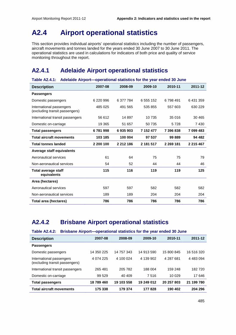
Airport Monitoring Report 2011-12 Appendix 2: Indicators and statistics used in the r eport
485
A2.4 Airport operational statistics This section provides individual airports’ operational statistics including the number of passengers, aircraft movements and tonnes landed for the years ended 30 June 2007 to 30 June 2011. The operational statistics are used in calculations for indicators of both price and quality of service monitoring throughout the report.
A2.4.1 Adelaide Airport operational statistics Table A2.4.1: Adelaide Airport—operational statist ics for the year ended 30 June
Description 2007-08 2008-09 2009-10 2010-11 2011-12
Passengers
Domestic passengers 6 220 996 6 377 784 6 555 152 6 798 491 6 431 359
International passengers (excluding transit passengers)
485 025 491 565 535 855 557 603 630 229
International transit passengers 56 612 14 897 10 735 35 016 30 465
Domestic on-carriage 19 365 51 657 50 735 5 728 7 430
Total passengers 6 781 998 6 935 903 7 152 477 7 39 6 838 7 099 483
Total aircraft movements 103 185 100 004 97 537 99 889 94 482
Total tonnes landed 2 200 100 2 212 186 2 181 517 2 269 181 2 215 467
Average staff equivalents
Aeronautical services 61 64 75 75 79
Non-aeronautical services 54 52 44 44 46
Total average staff equivalents
115 116 119 119 125
Area (hectares)
Aeronautical services 597 597 582 582 582
Non-aeronautical services 189 189 204 204 204
Total area (hectares) 786 786 786 786 786
A2.4.2 Brisbane Airport operational statistics Table A2.4.2: Brisbane Airport—operational statist ics for the year ended 30 June
Description 2007-08 2008-09 2009-10 2010-11 2011-12
Passengers
Domestic passengers 14 350 225 14 757 343 14 913 590 15 800 845 16 516 320
International passengers (excluding transit passengers)
4 074 225 4 100 024 4 139 902 4 287 681 4 483 094
International transit passengers 265 481 205 782 188 004 159 248 182 720
Domestic on-carriage 99 529 40 409 7 516 10 029 17 646
Total passengers 18 789 460 19 103 558 19 249 012 2 0 257 803 21 199 780
Total aircraft movements 175 338 179 374 177 828 19 0 402 204 296
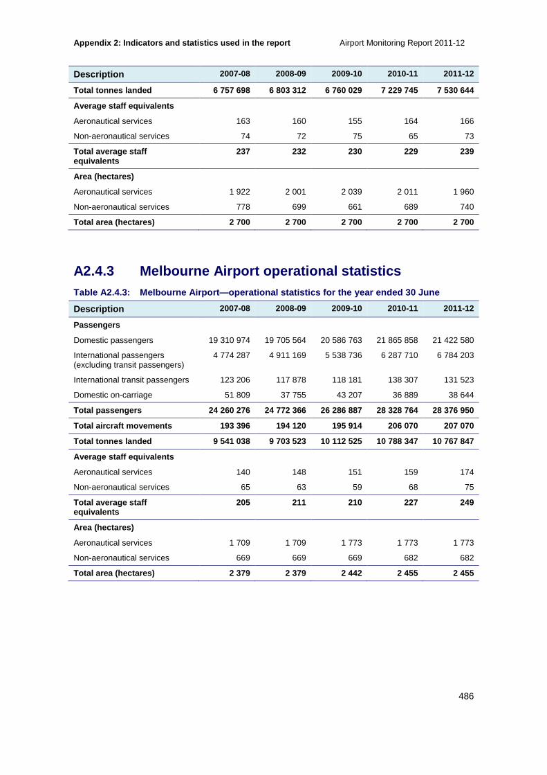
Appendix 2: Indicators and statistics used in the r eport Airport Monitoring Report 2011-12
486
Description 2007-08 2008-09 2009-10 2010-11 2011-12
Total tonnes landed 6 757 698 6 803 312 6 760 029 7 229 745 7 530 644
Average staff equivalents
Aeronautical services 163 160 155 164 166
Non-aeronautical services 74 72 75 65 73
Total average staff equivalents
237 232 230 229 239
Area (hectares)
Aeronautical services 1 922 2 001 2 039 2 011 1 960
Non-aeronautical services 778 699 661 689 740
Total area (hectares) 2 700 2 700 2 700 2 700 2 700
A2.4.3 Melbourne Airport operational statistics Table A2.4.3: Melbourne Airport—operational statis tics for the year ended 30 June
Description 2007-08 2008-09 2009-10 2010-11 2011-12
Passengers
Domestic passengers 19 310 974 19 705 564 20 586 763 21 865 858 21 422 580
International passengers (excluding transit passengers)
4 774 287 4 911 169 5 538 736 6 287 710 6 784 203
International transit passengers 123 206 117 878 118 181 138 307 131 523
Domestic on-carriage 51 809 37 755 43 207 36 889 38 644
Total passengers 24 260 276 24 772 366 26 286 887 2 8 328 764 28 376 950
Total aircraft movements 193 396 194 120 195 914 20 6 070 207 070
Total tonnes landed 9 541 038 9 703 523 10 112 525 10 788 347 10 767 847
Average staff equivalents
Aeronautical services 140 148 151 159 174
Non-aeronautical services 65 63 59 68 75
Total average staff equivalents
205 211 210 227 249
Area (hectares)
Aeronautical services 1 709 1 709 1 773 1 773 1 773
Non-aeronautical services 669 669 669 682 682
Total area (hectares) 2 379 2 379 2 442 2 455 2 455
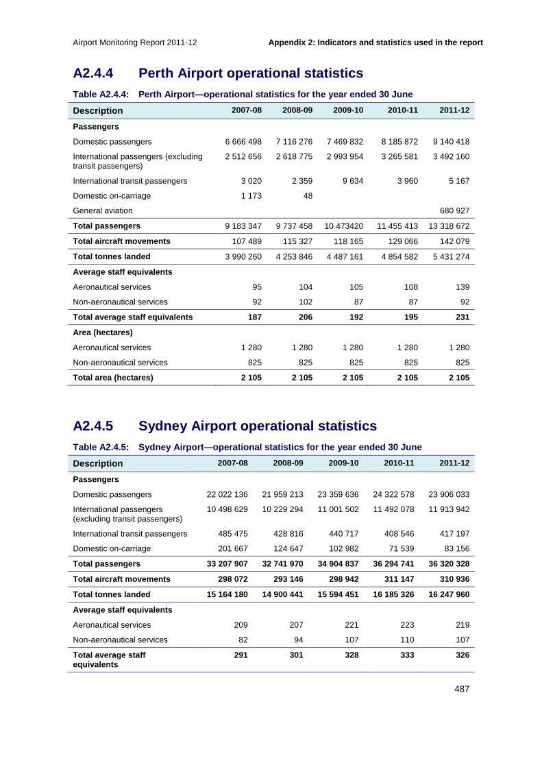
Airport Monitoring Report 2011-12 Appendix 2: Indicators and statistics used in the r eport
487
A2.4.4 Perth Airport operational statistics Table A2.4.4: Perth Airport—operational statistics for the year ended 30 June
Description 2007-08 2008-09 2009-10 2010-11 2011-12
Passengers
Domestic passengers 6 666 498 7 116 276 7 469 832 8 185 872 9 140 418
International passengers (excluding transit passengers)
2 512 656 2 618 775 2 993 954 3 265 581 3 492 160
International transit passengers 3 020 2 359 9 634 3 960 5 167
Domestic on-carriage 1 173 48
General aviation 680 927
Total passengers 9 183 347 9 737 458 10 473420 11 455 413 13 318 672
Total aircraft movements 107 489 115 327 118 165 129 066 142 079
Total tonnes landed 3 990 260 4 253 846 4 487 161 4 854 582 5 431 274
Average staff equivalents
Aeronautical services 95 104 105 108 139
Non-aeronautical services 92 102 87 87 92
Total average staff equivalents 187 206 192 195 231
Area (hectares)
Aeronautical services 1 280 1 280 1 280 1 280 1 280
Non-aeronautical services 825 825 825 825 825
Total area (hectares) 2 105 2 105 2 105 2 105 2 105
A2.4.5 Sydney Airport operational statistics Table A2.4.5: Sydney Airport—operational statistic s for the year ended 30 June
Description 2007-08 2008-09 2009-10 2010-11 2011-12
Passengers
Domestic passengers 22 022 136 21 959 213 23 359 636 24 322 578 23 906 033
International passengers (excluding transit passengers)
10 498 629 10 229 294 11 001 502 11 492 078 11 913 942
International transit passengers 485 475 428 816 440 717 408 546 417 197
Domestic on-carriage 201 667 124 647 102 982 71 539 83 156
Total passengers 33 207 907 32 741 970 34 904 837 3 6 294 741 36 320 328
Total aircraft movements 298 072 293 146 298 942 31 1 147 310 936
Total tonnes landed 15 164 180 14 900 441 15 594 45 1 16 185 326 16 247 960
Average staff equivalents
Aeronautical services 209 207 221 223 219
Non-aeronautical services 82 94 107 110 107
Total average staff equivalents
291 301 328 333 326

Appendix 2: Indicators and statistics used in the r eport Airport Monitoring Report 2011-12
488
Description 2007-08 2008-09 2009-10 2010-11 2011-12
Area (hectares)
Aeronautical services 671 671 671 671 671
Non-aeronautical services 236 236 236 236 236
Total area (hectares) 907 907 907 907 907

Airport Monitoring Report 2011-12 Appendix 3: Airport car parking statistics
489
A3 Airport car parking statistics
This section compares car parking prices over time (A3.1), and objective measures such as throughput and number of car park spaces available at each airport’s car parking facilities (A3.2).
A3.1 Comparison of car parking prices over time The below sections provide car parking prices for the various car parking facility configurations at each of the monitored airports from 2006-07 to 2010-11.
A3.1.1 Adelaide Airport car parking prices Table A3.1.1: Adelaide Airport—short-term car park ing prices
Price point Charge per unit $(incl. GST) as at 30 June
2007-08 2008-09 2009-10 2010-11 2011-12
1 hour 4.00 4.00 4.00 4.00 4.00
2 hours 7.00 7.00 8.00 8.00 8.00
3 hours 9.00 9.00 11.00 11.00 11.00
4 hours 12.00 12.00 14.00 14.00 14.00
5 hours 14.00 14.00 17.00 17.00 17.00
6 hours 16.00 16.00 20.00 20.00 20.00
7 hours 18.00 18.00 23.00 23.00 23.00
8 hours 20.00 20.00 26.00 26.00 26.00
9 hours 22.00 22.00 30.00 30.00 30.00
10 hours 24.00 24.00 30.00 30.00 30.00
11 hours 30.00 30.00 30.00 30.00 30.00
12 hours 30.00 30.00 30.00 30.00 30.00
24 hours 30.00 30.00 30.00 30.00 30.00
Table A3.1.2: Adelaide Airport—long-term car parki ng prices
Price point Charge per unit $(incl. GST) as at 30 June
2007-08 2008-09 2009-10 2010-11 2011-12
1 day 20.00 20.00 25.00 25.00 25.00
2 days 35.00 35.00 40.00 40.00 40.00
3 days 45.00 45.00 50.00 50.00 50.00
4 days 55.00 55.00 55.00 55.00 55.00
5 days 60.00 60.00 60.00 60.00 60.00
6 days 65.00 65.00 65.00 65.00 65.00
7 days 70.00 70.00 70.00 70.00 70.00

Appendix 3: Airport car parking statistics Airport Monitoring Report 2011-12
490
A3.1.2 Brisbane Airport car parking prices Table A3.1.3: Brisbane Airport—short-term internat ional car parking prices
Price point Charge per unit $(incl. GST) as at 30 June
2007-08 2008-09 2009-10 2010-11 2011-12
15 minutes* N/A N/A N/A 2.00 2.00
20 minutes* 2.00 2.00 2.00 N/A N/A
30 minutes 6.00 6.00 6.00 6.00 6.00
1 hour 10.00 10.00 13.00 13.00 13.00
2 hours 12.00 12.00 16.00 16.00 16.00
3 hours 14.00 14.00 20.00 22.00 22.00
4 hours 16.00 16.00 22.00 25.00 25.00
5 hours 18.00 18.00 30.00 30.00 30.00
6 hours 25.00 25.00 30.00 30.00 30.00
15 hours 25.00 25.00 30.00 30.00 30.00
Note: *Brisbane Airport amended its car parking price structure in 2010-11.
Table A3.1.4: Brisbane Airport—short-term domestic car parking prices
Price point Charge per unit $(incl. GST) as at 30 June
2007-08 2008-09 2009-10 2010-11 2011-12
15 minutes* N/A N/A N/A 2.00 2.00
20 minutes* 2.00 2.00 2.00 N/A N/A
30 minutes 6.00 6.00 6.00 6.00 6.00
1 hour 10.00 10.00 13.00 13.00 14.00
2 hours 12.00 12.00 16.00 16.00 17.00
3 hours 14.00 14.00 20.00 22.00 22.00
4 hours 16.00 16.00 22.00 25.00 25.00
5 hours 18.00 18.00 50.00 40.00 50.00
6 hours 45.00 45.00 50.00 40.00 50.00
15 hours 45.00 45.00 50.00 40.00 50.00
Note: *Brisbane Airport amended its car parking price structure in 2010-11.
Table A3.1.5: Brisbane Airport—long-term internati onal car parking prices
Price point Charge per unit $(incl. GST) as at 30 June
2007-08 2008-09 2009-10 2010-11 2011-12
1 day 25.00 25.00 30.00 30.00 30.00
2 days 45.00 45.00 50.00 50.00 50.00
3 days 65.00 65.00 70.00 70.00 70.00
4 days 85.00 85.00 80.00 80.00 80.00
5 days 95.00 95.00 90.00 90.00 90.00
6 days 105.00 105.00 95.00 95.00 95.00
7 days 105.00 105.00 99.00 99.00 99.00

Airport Monitoring Report 2011-12 Appendix 3: Airport car parking statistics
491
Table A3.1.6: Brisbane Airport—long-term domestic car parking prices
Price point Charge per unit $(incl. GST) as at 30 June
2007-08 2008-09 2009-10 2010-11 2011-12
1 day 25.00 25.00 35.00 40.00 40.00
2 days 45.00 45.00 55.00 60.00 60.00
3 days 65.00 65.00 75.00 80.00 80.00
4 days 85.00 85.00 95.00 100.00 100.00
5 days 95.00 95.00 115.00 120.00 120.00
6 days 105.00 105.00 130.00 130.00 130.00
7 days 105.00 105.00 140.00 140.00 140.00
A3.1.3 Melbourne Airport car parking prices Table A3.1.7: Melbourne Airport—short-term car par king prices
Price point Charge per unit $(incl. GST) as at 30 June
2007-08 2008-09 2009-10 2010-11 2011-12
0–20 minutes 3.00 3.00 3.00 3.00 3.00
20–40 minutes 6.00 6.00 6.00 6.00 6.00
40–60 minutes 12.00 12.00 12.00 12.00 12.00
2 hours 18.00 18.00 20.00 20.00 20.00
3 hours 20.00 20.00 25.00 28.00 28.00
4 hours 30.00 35.00 36.00 36.00 36.00
10 hours 40.00 40.00 50.00 52.00 52.00
24 hours 45.00 45.00 50.00 52.00 52.00
Table A3.1.8: Melbourne Airport—long-term (uncover ed) car parking prices
Price point Charge per unit $(incl. GST) as at 30 June
2007-08 2008-09 2009-10 2010-11 2011-12
0–20 minutes 10.00 Free
20–40 minutes 10.00 2.00
40–60 minutes 10.00 4.00
2 hours 10.00 15.00
3 hours 10.00 22.00
1 day 25.00 25.00 29.00 29.00 29.00
2 days 40.00 45.00 46.00 46.00 46.00
3 days 50.00 65.00 69.00 69.00 69.00
4 days 60.00 66.00 69.00 69.00 69.00
5 days 65.00 67.00 69.00 69.00 69.00
6 days 65.00 68.00 69.00 69.00 69.00
7 days 69.00 69.00 77.00 77.00 77.00
8 days 85.00 89.00 89.00 89.00 89.00
9 days 99.00 99.00 99.00 99.00 99.00

Appendix 3: Airport car parking statistics Airport Monitoring Report 2011-12
492
Price point Charge per unit $(incl. GST) as at 30 June
2007-08 2008-09 2009-10 2010-11 2011-12
10 days 105.00 105.00 114.00 124.00 109.00
11 days 110.00 110.00 124.00 134.00 119.00
12 days 115.00 115.00 134.00 144.00 129.00
13 days 120.00 120.00 144.00 154.00 129.00
14 days 125.00 125.00 154.00 164.00 129.00
Additional days 5.00 5.00 10.00 10.00 10.00
Table A3.1.9: Melbourne Airport—long-term multi-le vel car parking prices
Price point Charge per unit $(incl. GST) as at 30 June
2007-08 2008-09 2009-10 2010-11 2011-12
0–20 minutes 3.00 3.00 3.00 3.00 3.00
20–40 minutes 6.00 6.00 6.00 6.00 6.00
40–60 minutes 12.00 12.00 12.00 12.00 12.00
2 hours 18.00 18.00 18.00 20.00 20.00
3 hours 20.00 20.00 24.00 28.00 28.00
4 hours 30.00 35.00 36.00 36.00 36.00
10 hours 40.00 49.00 49.00 52.00 52.00
1 day 45.00 49.00 50.00 52.00 52.00
2 days 90.00 90.00 95.00 99.00 99.00
3 days 95.00 95.00 99.00 139.00 139.00
4 days 100.00 99.00 99.00 139.00 139.00
5 days 110.00 99.00 99.00 139.00 139.00
6 days 120.00 99.00 99.00 139.00 139.00
7 days 140.00 99.00 99.00 139.00 139.00
8 days 160.00 109.00 113.00 159.00 159.00
9 days 180.00 119.00 127.00 179.00 179.00
10 days 200.00 129.00 141.00 199.00 199.00
11 days 220.00 139.00 155.00 219.00 219.00
12 days 240.00 149.00 169.00 239.00 239.00
13 days 260.00 159.00 183.00 259.00 259.00
14 days 280.00 169.00 197.00 279.00 279.00
Additional days 20.00 10.00 14.00 20.00 20.00

Airport Monitoring Report 2011-12 Appendix 3: Airport car parking statistics
493
Table A3.1.10: Melbourne Airport—Southern Business car parking prices
Price point Charge per unit $(incl. GST) as at 30 June
2007-08 2008-09 2009-10 2010-11 2011-12
0–20 minutes 3.00 3.00 3.00 3.00 3.00
20–40 minutes 6.00 6.00 6.00 6.00 6.00
40–60 minutes 12.00 12.00 12.00 12.00 12.00
2 hours 18.00 18.00 20.00 20.00 20.00
3 hours 20.00 20.00 25.00 28.00 28.00
4 hours 30.00 35.00 36.00 36.00 36.00
10 hours 40.00 49.00 50.00 52.00 52.00
1 day 45.00 49.00 50.00 52.00 52.00
2 days 90.00 98.00 100.00 110.00 110.00
3 days 135.00 127.00 150.00 165.00 165.00
4 days 180.00 162.00 200.00 220.00 220.00
5 days 225.00 197.00 250.00 275.00 275.00
6 days 270.00 232.00 300.00 330.00 330.00
7 days 315.00 267.00 350.00 385.00 385.00
8 days 360.00 302.00 400.00 440.00 440.00
9 days 405.00 337.00 450.00 495.00 495.00
10 days 450.00 372.00 500.00 550.00 550.00
Additional days 45.00 35.00 50.00 55.00 55.00
Weekend special 49.00 49.00 49.00 85.00 NA
Table A3.1.11: Melbourne Airport—Northern Business car parking prices
Price point Charge per unit $(incl. GST) as at 30 June
2007-08 2008-09 2009-10 2010-11 2011-12
0–20 minutes NA NA NA 60.00 55.00
20–40 minutes NA NA NA 60.00 55.00
40–60 minutes NA NA NA 60.00 55.00
2 hours NA NA NA 60.00 55.00
3 hours NA NA NA 60.00 55.00
4 hours NA NA NA 60.00 55.00
10 hours NA NA NA 60.00 55.00
1 day NA NA NA 60.00 55.00
2 days NA NA NA 120.00 110.00
3 days NA NA NA 180.00 165.00
4 days NA NA NA 240.00 220.00
5 days NA NA NA 300.00 275.00
6 days NA NA NA 360.00 330.00
7 days NA NA NA 420.00 385.00

Appendix 3: Airport car parking statistics Airport Monitoring Report 2011-12
494
Price point Charge per unit $(incl. GST) as at 30 June
2007-08 2008-09 2009-10 2010-11 2011-12
8 days NA NA NA 480.00 440.00
9 days NA NA NA 540.00 495.00
10 days NA NA NA 600.00 550.00
Additional days* NA NA NA 60.00 55.00
Weekend special NA NA NA 85.00 NA
Note In previous years the Northern and Southern Business car parking prices were reported in the same table.
*The additional day rate applied after 14 day stay
A3.1.4 Perth Airport car parking prices Table A3.1.12: Perth Airport—short-term car parking prices
Price point Charge per unit $(incl. GST) as at 30 June
2007-08 2008-09 2009-10 2010-11 2011-12
First 5 minutes* Free 3.80 3.90 4.00 NA
First 10 Minutes* NA NA NA NA Free
30 minutes 3.70 3.80 3.90 4.00 4.00
30 minutes–1 hour 5.20 5.40 5.40 5.60 6.00
2 hours 7.00 7.40 7.80 9.00 9.40
3 hours 8.00 8.40 8.80 10.00 10.20
4 hours 9.00 9.40 9.80 11.00 11.20
5 hours 10.00 10.40 10.80 12.00 12.20
6 hours 11.00 11.40 11.80 13.00 13.20
24 hours 25.00 26.00 35.00 36.00 38.00
Note: *Perth Airport amended its car parking price structure in 2011-12.
Table A3.1.13: Perth Airport—long-term car parking prices
Price point Charge per unit $(incl. GST) as at 30 June
2007-08 2008-09 2009-10 2010-11 2011-12
30 minutes NA 3.80 3.90 4.00 17.00
1 hour NA 5.40 5.40 5.60 17.00
2 hours NA 7.40 7.80 9.00 17.00
3 hours NA 8.40 8.80 10.00 17.00
4 hours NA 9.40 9.80 11.00 17.00
5 hours NA 10.40 10.80 12.00 17.00
6 hours NA 11.40 11.80 13.00 17.00
1 day 17.00 17.00 16.00 16.00 17.00
2 days 34.00 34.00 32.00 34.00 35.00
3 days 51.00 51.00 48.00 52.00 53.00

Airport Monitoring Report 2011-12 Appendix 3: Airport car parking statistics
495
Price point Charge per unit $(incl. GST) as at 30 June
2007-08 2008-09 2009-10 2010-11 2011-12
4 days 56.00 58.00 56.00 61.00 63.00
5 days 61.00 65.00 64.00 70.00 73.00
6 days 66.00 72.00 72.00 79.00 83.00
7 days 71.00 79.00 80.00 88.00 93.00
Additional Days NA NA NA NA 10.00
A3.1.5 Sydney Airport car parking prices Table A3.1.14: Sydney Airport—short-term internatio nal car parking prices
Price point Charge per unit $(incl. GST) as at 30 June
2007-08 2008-09 2009-10 2010-11 2011-12
First 30 minutes 7.00 7.00 7.00 7.00 7.00
31–60 minutes 14.00 15.00 15.00 15.00 16.00
2 hours 20.00 20.00 21.00 21.00 23.00
3 hours 24.00 25.00 26.00 26.00 29.00
4 hours 28.00 50.00 52.00 52.00 56.00
5 hours 31.00 50.00 52.00 52.00 56.00
5–24 hours 41.00 50.00 52.00 52.00 56.00
Table A3.1.15: Sydney Airport—short-term domestic c ar parking prices
Price point Charge per unit $(incl. GST) as at 30 June
2007-08 2008-09 2009-10 2010-11 2011-12
First 30 minutes 7.00 7.00 7.00 7.00 7.00
31–60 minutes 14.00 15.00 15.00 15.00 6.00
2 hours 20.00 20.00 21.00 21.00 23.00
3 hours 24.00 25.00 26.00 26.00 29.00
4 hours 46.00 50.00 52.00 52.00 56.00
5 hours 46.00 50.00 52.00 52.00 56.00
5–24 hours 46.00 50.00 52.00 52.00 56.00
Table A3.1.16: Sydney Airport—long-term car parking prices
Price point Charge per unit $(incl. GST) as at 30 June
2007-08 2008-09 2009-10 2010-11 2011-12
1 day 24.00 25.00 25.00 25.00 26.00
2 days 35.00 44.00 45.00 45.00 49.00
3 days 49.00 50.00 62.00 62.00 67.00
4 days 64.00 66.00 77.00 77.00 82.00
5 days 79.00 82.00 92.00 92.00 97.00

Appendix 3: Airport car parking statistics Airport Monitoring Report 2011-12
496
Price point Charge per unit $(incl. GST) as at 30 June
2007-08 2008-09 2009-10 2010-11 2011-12
6 days 94.00 98.00 107.00 107.00 112.00
7 days 109.00 110.00 122.00 122.00 127.00
Additional days 11.00 12.00 15.00 15.00 15.00
A3.2 Car parking price changes within 2011-12 This section presents the price changes made within the 2011-12 period – that is, price changes that occurred between 1 July 2011 and 30 June 2012 – for Melbourne airport. Note that Adelaide, Brisbane, Perth and Sydney airports did not report price changes to car parking within the 2011-12 period.
A3.2.1 Melbourne Airport car parking price changes within 2011-12
Table A3.2.1: Melbourne Airport – short-term car p arking price changes within 2011-12
Price point Charge per unit $(incl. GST)
1 Jul 2011 to 31 Aug 2011
1 Sep 2011 to 31 May 2012 1 Jun 2012 to 30 Jun 2012
0–20 minutes 3.00 3.00 4.00
20–40 minutes 6.00 6.00 8.00
40–60 minutes 12.00 12.00 12.00
2 hours 20.00 20.00 22.00
3 hours 28.00 28.00 28.00
4 hours 36.00 36.00 36.00
10 hours 52.00 52.00 55.00
1 day 52.00 52.00 55.00
2 days 110.00 110.00 110.00
3 days 165.00 165.00 165.00
4 days 220.00 220.00 220.00
5 days 275.00 275.00 275.00
6 days 330.00 330.00 330.00
7 days 385.00 385.00 385.00
8 days 440.00 440.00 440.00
9 days 495.00 495.00 495.00
10 days 550.00 550.00 550.00
Additional days 55.00 55.00 55.00

Airport Monitoring Report 2011-12 Appendix 3: Airport car parking statistics
497
Table A3.2.2: Melbourne Airport—long-term (uncover ed) car parking price changes within 2011-12
Price point Charge per unit $(incl. GST)
1 Jul 2011 to 31 Aug 2011
1 Sep 2011 to 31 May 2012 1 Jun 2012 to 30 Jun 2012
0–20 minutes 10.00 10.00 0.00
20–40 minutes 10.00 10.00 2.00
40–60 minutes 10.00 10.00 4.00
2 hours 10.00 10.00 15.00
3 hours 10.00 10.00 22.00
4 hours 29.00 29.00 29.00
10 hours 29.00 29.00 29.00
1 day 29.00 29.00 29.00
2 days 46.00 46.00 49.00
3 days 69.00 69.00 69.00
4 days 69.00 69.00 69.00
5 days 69.00 69.00 69.00
6 days 69.00 69.00 77.00
7 days 77.00 77.00 77.00
8 days 89.00 89.00 99.00
9 days 99.00 99.00 99.00
10 days 124.00 124.00 109.00
11 days 134.00 134.00 119.00
12 days 144.00 144.00 129.00
13 days 154.00 154.00 129.00
14 days 164.00 164.00 129.00
Additional days 10.00 10.00 10.00
Table A3.2.3: Melbourne Airport—long-term multi-le vel car parking price changes within 2011-12
Price point Charge per unit $(incl. GST)
1 Jul 2011 to 31 Aug 2011
1 Sep 2011 to 31 May 2012 1 Jun 2012 to 30 Jun 2012
0–20 minutes 3.00 3.00 4.00
20–40 minutes 6.00 6.00 8.00
40–60 minutes 12.00 12.00 12.00
2 hours 20.00 20.00 22.00
3 hours 28.00 28.00 28.00
4 hours 36.00 36.00 36.00
10 hours 52.00 52.00 55.00
1 day 52.00 52.00 55.00
2 days 99.00 99.00 99.00
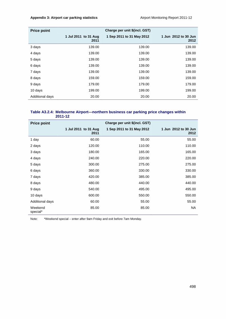
Appendix 3: Airport car parking statistics Airport Monitoring Report 2011-12
498
Price point Charge per unit $(incl. GST)
1 Jul 2011 to 31 Aug 2011
1 Sep 2011 to 31 May 2012 1 Jun 2012 to 30 Jun 2012
3 days 139.00 139.00 139.00
4 days 139.00 139.00 139.00
5 days 139.00 139.00 139.00
6 days 139.00 139.00 139.00
7 days 139.00 139.00 139.00
8 days 159.00 159.00 159.00
9 days 179.00 179.00 179.00
10 days 199.00 199.00 199.00
Additional days 20.00 20.00 20.00
Table A3.2.4: Melbourne Airport—northern business c ar parking price changes within 2011-12
Price point Charge per unit $(incl. GST)
1 Jul 2011 to 31 Aug 2011
1 Sep 2011 to 31 May 2012 1 Jun 2012 to 30 Jun 2012
1 day 60.00 55.00 55.00
2 days 120.00 110.00 110.00
3 days 180.00 165.00 165.00
4 days 240.00 220.00 220.00
5 days 300.00 275.00 275.00
6 days 360.00 330.00 330.00
7 days 420.00 385.00 385.00
8 days 480.00 440.00 440.00
9 days 540.00 495.00 495.00
10 days 600.00 550.00 550.00
Additional days 60.00 55.00 55.00
Weekend special*
85.00 85.00 NA
Note: *Weekend special – enter after 9am Friday and exit before 7am Monday.

Airport Monitoring Report 2011-12 Appendix 3: Airport car parking statistics
499
Table A3.2.5: Melbourne Airport—southern business/T 4 express car parking price changes within 2011-12
Price point Charge per unit $(incl. GST)
1 Jul 2011 to 31 Aug 2011
1 Sep 2011 to 31 May 2012 1 Jun 2012 to 30 Jun 2012
0–20 minutes 3.00 3.00 4.00
20–40 minutes 6.00 6.00 8.00
40–60 minutes 12.00 12.00 12.00
2 hours 20.00 20.00 22.00
3 hours 28.00 28.00 28.00
4 hours 36.00 36.00 36.00
10 hours 52.00 52.00 55.00
1 day 52.00 52.00 55.00
2 days 110.00 110.00 110.00
3 days 165.00 165.00 165.00
4 days 220.00 220.00 220.00
5 days 275.00 275.00 275.00
6 days 330.00 330.00 330.00
7 days 385.00 385.00 385.00
8 days 440.00 440.00 440.00
9 days 495.00 495.00 495.00
10 days 550.00 550.00 550.00
Additional days 55.00 55.00 55.00
Weekend special
85.00 85.00 NA
Note: *Weekend special – enter after 9am Friday and exit before 7am Monday.

Appendix 3: Airport car parking statistics Airport Monitoring Report 2011-12
500
A3.3 Comparison data on the airports’ car parking facilities
This section provides comparison data on the airports’ availability of car parking facilities (A3.3.1), and the availability of car parking facilities over time at each of the individual airports (A3.3.2). These data are used to calculate indicators for airport car parking quality of service throughout this report.
A3.3.1 Comparison of the availability of car parki ng facilities across the airports
Table A3.3.1: Availability of car parking faciliti es at the monitored airports in 2011-12
Airport Number of short-term car parking spaces
Number of long-term car parking spaces
Number of staff car parking spaces
Adelaide 720 1132 1 150
Brisbane 1 740 (combined short- and long-term international) 2484
1 690 6 948
Melbourne 7 469 12 100 2 383
Perth 2 432 12 277 917
Sydney 5 089 5 694 2 333
A3.3.2 Availability of car parking facilities over time for monitored airports
Table A3.3.2: Adelaide Airport—availability of car parking facilities
Facility 2007-08 2008-09 2009-10 2010-11 2011-12
Short-term car parking
Number of days car park is open 366 365 365 365 366
Number of spaces available as at 30 June
829 829 834 830 720
Total annual throughput 1 119 355 1 127 820 1 085 019 1 078 163 926 874
Long-term car parking
Number of days car park is open 366 365 365 365 366
Number of spaces available as at 30 June
764 940 994 1 020 1 132
Total annual throughput 63 187 77 987 84 704 96 796 84 777
Staff car parking
Number of spaces available as at 30 June
1 197 1 197 1 257 1 150 1 150
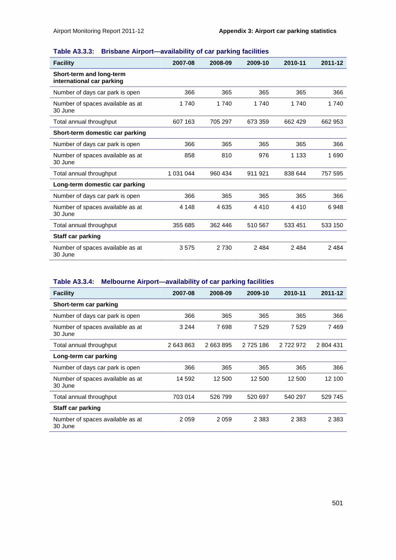
Airport Monitoring Report 2011-12 Appendix 3: Airport car parking statistics
501
Table A3.3.3: Brisbane Airport—availability of car parking facilities
Facility 2007-08 2008-09 2009-10 2010-11 2011-12
Short-term and long-term international car parking
Number of days car park is open 366 365 365 365 366
Number of spaces available as at 30 June
1 740 1 740 1 740 1 740 1 740
Total annual throughput 607 163 705 297 673 359 662 429 662 953
Short-term domestic car parking
Number of days car park is open 366 365 365 365 366
Number of spaces available as at 30 June
858 810 976 1 133 1 690
Total annual throughput 1 031 044 960 434 911 921 838 644 757 595
Long-term domestic car parking
Number of days car park is open 366 365 365 365 366
Number of spaces available as at 30 June
4 148 4 635 4 410 4 410 6 948
Total annual throughput 355 685 362 446 510 567 533 451 533 150
Staff car parking
Number of spaces available as at 30 June
3 575 2 730 2 484 2 484 2 484
Table A3.3.4: Melbourne Airport—availability of ca r parking facilities
Facility 2007-08 2008-09 2009-10 2010-11 2011-12
Short-term car parking
Number of days car park is open 366 365 365 365 366
Number of spaces available as at 30 June
3 244 7 698 7 529 7 529 7 469
Total annual throughput 2 643 863 2 663 895 2 725 186 2 722 972 2 804 431
Long-term car parking
Number of days car park is open 366 365 365 365 366
Number of spaces available as at 30 June
14 592 12 500 12 500 12 500 12 100
Total annual throughput 703 014 526 799 520 697 540 297 529 745
Staff car parking
Number of spaces available as at 30 June
2 059 2 059 2 383 2 383 2 383

Appendix 3: Airport car parking statistics Airport Monitoring Report 2011-12
502
Table A3.3.5: Perth Airport—availability of car pa rking facilities
Facility 2007-08 2008-09 2009-10 2010-11 2011-12
Short-term domestic car parking
Number of days car park is open 366 365 365 365 366
Number of spaces available as at 30 June
1 377 1 377 1 719 1 719 1 769
Total annual throughput 961 000 1 018 974 989 774 1 054 114 1 053 575
Short-term international car parking
Number of days car park is open 366 365 365 365 366
Number of spaces available as at 30 June
663 663 663 663 663
Total annual throughput 646 508 684 636 714 963 732 594 720 463
Long-term domestic car parking
Number of days car park is open 366 365 365 365 366
Number of spaces available as at 30 June
3 997 5 670 6 055 7 082 8 485
Total annual throughput 84 078 121 445 173 418 229 819 343 466
Long-term international car parking
Number of days car park is open 366 365 365 365 366
Number of spaces available as at 30 June
1 778 1 778 1 778 3 792 3 792
Total annual throughput 29 406 32 462 47 520 66 009 67 338
Staff car parking
Number of spaces available as at 30 June
991 1 311 1 311 1 295 917
Table A3.3.6: Sydney Airport—availability of car p arking facilities
Facility 2007-08 2008-09 2009-10 2010-11 2011-12
Short-term international car parking
Number of days car park is open 366 365 365 365 366
Number of spaces available as at 30 June
1 356 2 234 2 170 2 306* 1882
Total annual throughput 1 664 928 1 647 830 1 760 870 1 887 542* 1 983 140
Short-term domestic car parking
Number of days car park is open 366 365 365 365 366
Number of spaces available as at 30 June
3 662 3 688 3 458 3 244* 3 207
Total annual throughput 1 202 510 1 128 293 1 145 641 1 561 362* 1 512 858
Long-term car parking
Number of days car park is open 366 365 365 365 366
Number of spaces available as at 30 June
4 577 4 577 4 194 4 307 5 694

Airport Monitoring Report 2011-12 Appendix 3: Airport car parking statistics
503
Facility 2007-08 2008-09 2009-10 2010-11 2011-12
Total annual throughput 217 520 212 106 229 256 231 552 228 370
Staff car parking
Number of spaces available as at 30 June
1 256 1 911 2 326 2 414 2 333
Note: *Updated by Sydney Airport in 2011-12 as valet parking is now allocated to the related car park.

Appendix 4: History of airport regulation in Austra lia Airport Monitoring Report 2011-12
504
A4 History of airport regulation in Australia
The Australian Government established the Federal Airports Corporation (FAC) in the 1980s to operate airports on a commercial basis (section A4.1). Beginning in the 1990s, ownership of the FAC operated airports was shifted to the private sector.
The newly privatised airports were subject to a transitory regulatory framework of prices oversight (section A4.2). The Government announced a change in the regulatory arrangements for the airports, which included price and quality of service monitoring, following the Productivity Commission’s (PC’s) inquiry into the price regulation of airport services in 2002 (section A4.3).
In 2006, the PC conducted a review of the price regulation of airport services. Following this review, the Government announced a further six year period of price and quality of service monitoring for airports (section A4.4).
In 2009, the Government released the National Aviation Policy White Paper, which resulted in the introduction of a self-administered price and quality of service monitoring regime for ‘second-tier' airports (section A4.5).
In 2011, the PC conducted an inquiry into the economic regulation of airport services, where it found, among other things, that there was no evidence of systemic misuse of market power by the monitored airports. The Government agreed in principle with the PC’s recommendations and announced that the current monitoring regime would continue to operate, with some enhancements, until 2020 (section A4.6).
A4.1 Government ownership of airports
The Government was originally responsible for developing and operating airport infrastructure in Australia. In the mid-1980s, following the findings of the Bosch inquiry regarding cost-recovery arrangements at airports, the Government decided to establish the FAC to manage and develop airports on a more commercial basis.191
The FAC was required to achieve a reasonable rate of return on its assets and pay a reasonable dividend to the Government. Nevertheless, the FAC was still subject to a degree of regulatory oversight by the Government. The economic rationale for maintaining regulatory oversight by the Government was that any airport operator may possess significant market power and may use this power to restrict an airport’s capacity, increase landing fees and earn monopoly profits.192
The FAC was required to notify the relevant Minister prior to imposing or varying an aeronautical charge until 1991, when the Government declared the FAC’s aeronautical charges under s. 21 of the Prices Surveillance Act 1983. The declaration required the FAC to instead notify the Prices Surveillance Authority (PSA) prior to raising its aeronautical charges.
191 Bosch H, Chairman AGPS, Aviations Cost Recovery Report of the Independent Inquiry 1984, AGPS, Canberra. 192 Industry Commission, Intrastate Aviation, report no. 25, Canberra, 1992, p. 91.

Airport Monitoring Report 2011-12 Appendix 4: History of airport regulation in Austra lia
505
A4.2 Privatisation
In 1995, the Government decided to sell leases for all 22 FAC airports. The stated rationale was to improve the efficiency of airport investment and operations in the interests of users and the general community, and to facilitate innovative management.193
The sale was completed in two phases, ’phase one’ in 1997 and ’phase two’ in 1998. Phase one included Brisbane, Melbourne and Perth airports, while phase two included Adelaide, Darwin and Canberra airports. Sydney Airport was corporatised in 1998, but not sold until 2002.
Although the move to privatisation was intended to improve efficiency, the Government was concerned that the airports might be in a position to exercise their market power in relation to the supply of aeronautical services. Accordingly, the privatisation of phase one and phase two airports was accompanied by a transitional regulatory framework, designed to constrain the potential for the newly privatised airports to exercise their market power for aeronautical services. The Government stated that it would determine the subsequent, ongoing regulatory framework after a detailed review.
The transitional regulatory framework was in the form of a price regulatory regime administered by the ACCC (under Part VIIA of the then Trade Practices Act 1974) and consisted of:
• price notification for aeronautical services
• a Consumer Price Index (CPI) minus X price cap on aeronautical services
• prices monitoring of certain aeronautical related services
• cost pass-through provisions for necessary new investment and Government mandated security services.
The airports subject to price regulation were also subject to quality of service monitoring to ensure that airport assets were not allowed to run down at the expense of service standards.
A4.3 Productivity Commission inquiry into the price regulation of airport services (2002)
In December 2000, the Government referred the review of the regulatory arrangements for airports to the PC, which was concluded in 2002.
The Government accepted the PC’s recommendation that price notification and price caps under the PSA be discontinued for all airports, with the exception of regional air services at Sydney Airport.194 Additionally, the PC recommended that the ACCC monitor prices at Adelaide, Brisbane, Canberra, Darwin, Melbourne, Perth and Sydney airports for a five-year period, and that a review of price regulation of airport services be conducted at the end of that period to ascertain the need for future regulation.
The Government also supported the PC’s recommendation that quality of service monitoring be continued at all price monitored airports, with some modifications. In particular, the PC noted
193 Turbulent Times: Australian Airline Issues 2003, Research Paper No. 10, Department of the Parliamentary Library, Australia, May 2003 [www.aph.gov.au/LIBRARY/Pubs/RP/2002-03/03RP10.htm]. 194 Productivity Commission, Price regulation of airport services, report no. 19, Canberra, January 2002.
Appendix 4: History of airport regulation in Austra lia Airport Monitoring Report 2011-12
506
that the quality of service monitoring framework had a greater emphasis on airport users’ survey results rather than on the objective indicators and recommended that objective indicators be incorporated into the framework.
A4.4 Productivity Commission review of price regulation of airport services (2006)
In 2006, the PC conducted a review of the price regulation of airport services, as foreshadowed by the Government in response to the PC’s inquiry in 2002.
In its response to the PC’s recommendations, the Government announced that the airport price and quality of service monitoring would continue for a further six year period and that, following this period, an independent review of the regulatory regime would be undertaken to ascertain the need for future regulation (see section A4.6).
The Government supported the PC’s recommendation that the monitoring regime apply only to Adelaide, Brisbane, Melbourne, Perth and Sydney airports. Canberra and Darwin airports were excluded because the PC perceived these airports to have lower market power than the other price monitored airports.
The Government also supported the PC’s recommendation to implement a ‘line in the sand’ (LIS) approach to valuing the airports’ asset bases for the purposes of monitoring. The LIS approach was intended to establish meaningful asset values to facilitate the monitoring of the airports’ rates of return.195 Under this LIS approach, the value of an airport’s asset base for price monitoring purposes is:
• the value of tangible non-current aeronautical assets reported to the ACCC as at 30 June 2005, adjusted as necessary to reflect the proposed service coverage of the new regime;
• plus new investment;
• less depreciation and disposals.
A4.5 National Aviation Policy White Paper (2009)
On 16 December 2009, the Government released its National Aviation Policy White Paper. The paper outlined the policy settings and long-term approach the Government had taken to achieving its objectives for the aviation industry. The document included a number of proposals related to the monitoring of Australian airports.
The report concluded that the existing economic regulatory regime for Adelaide, Brisbane, Melbourne, Perth and Sydney airports, including price and quality of service monitoring and car park monitoring conducted by the ACCC, was to continue until at least 2013, with a full review by the PC in 2012.196
The Government announced the introduction of a self-administered price and quality of service monitoring regime for ‘second-tier' airports, which would initially apply to Canberra, Darwin, Gold Coast and Hobart airports. The Government encouraged Cairns Airport to also participate in the scheme, although it was not required to by legislation.
195 Productivity Commission, Review of price regulation of airports services, report no. 40, December 2006, p. 77. 196 In December 2010, the Government brought forward the PC’s inquiry into the economic regulation of airport services, scheduled for 2012 as part of its response to the ACCC’s 2008-09 Airport Monitoring Report (see section A4.6 for more information on the PC’s 2011 inquiry).

Airport Monitoring Report 2011-12 Appendix 4: History of airport regulation in Austra lia
507
Under the self-administered scheme, participating airports would be expected to disclose on their website:
• prices of aeronautical services
• prices of car parking services
• various quality of service outcomes
• complaint-handling processes and outcomes.
The Government intended that these airports would also publicly disclose results of their customer/passenger satisfaction surveys. The Government stated that it encouraged other airports not covered by the self-administered scheme to conduct customer/passenger satisfaction surveys and publicly disclose the results on their websites.
A4.6 Productivity Commission inquiry into the economic regulation of airport services (2011)
In December 2010, the Government brought forward the PC’s review of the economic regulation of airport services, scheduled for 2012. The review was intended to examine the effectiveness and efficiency of the price and quality of service monitoring regime for airports and determine whether new arrangements were required.
The PC’s inquiry report was submitted to the Government on 14 December 2011. In its inquiry report, the PC found that there had been a number of positive outcomes under the existing price monitoring regime, including strong investment in new aeronautical assets, a generally good level of service provision, and reasonable aeronautical charges, revenues and profits compared to international benchmarks. The PC found no evidence of a systemic misuse of market power by the airports, when considered alongside investment outcomes and international benchmarks.
Nevertheless, the PC also found that Brisbane, Melbourne, Perth and Sydney airports retain sufficient market power to be of policy concern. The PC also noted that, while some technological innovations and changing industry practices had likely reduced airports’ market power over some aeronautical services, the benefits from refining the current monitoring coverage were unlikely to outweigh the costs.197
The PC therefore recommended the continuation of the existing price and quality of service monitoring arrangements with some amendments to the regime. In particular, the PC made a number of recommendations in relation to the quality of service monitoring program.
The Government tabled its response on 30 March 2012 and agreed in principle with the PC’s recommendations to continue monitoring and improve the operation of the regime. The Government scheduled the next review of the economic regulation of airport services for 2018.
In response to one of the PC’s recommendations, the Government asked the ACCC to conduct a review of quality of service monitoring, to be completed in June 2013. The Government has specifically asked the ACCC to:
• review and update the objective criteria
• explore means of standardising passenger surveys across airports 197 Productivity Commission, Inquiry into the economic regulation of airport services, report no. 57, December 2011.

Appendix 4: History of airport regulation in Austra lia Airport Monitoring Report 2011-12
508
• consider whether surveys of government agencies (such as border agencies) and airlines should continue to be conducted and used in quality of service monitoring.
The Government also agreed in principle with the PC’s recommendations that the ACCC take steps to make as much of its underlying methodology publicly available as possible and focus on trends over time at a given airport.
The Government issued new directions pursuant to s. 95ZF (Part VIIA) of the CCA, on 12 June 2012, directing the ACCC to monitor the prices, costs and profits related to the supply of aeronautical services and car parking services at the four specified airports, removing Adelaide Airport from the monitoring regime. The Government has stated that these arrangements will continue until 2020.

Airport Monitoring Report 2011-12 Appendix 5: Regulatory framework
509
A5 Regulatory framework
The ACCC’s regulatory role relating to the monitored airports began in 1997. Previously, the ACCC’s role was specified in the Prices Surveillance Act and involved administering price caps, assessing price notifications, price monitoring and quality of service monitoring.
The ACCC’s current regulatory role involves monitoring the performance of the airports under directions pursuant to the Competition and Consumer Act 2010 (CCA) as well as the Airports Act and associated regulations. More specifically, the monitored airports are currently subject to:
• prices, costs and profits monitoring under directions made under the CCA198
• financial accounts reporting under Part 7 of the Airports Act
• quality of service monitoring under Part 7 of the Airports Act.
In addition, Declaration 92 under s. 95X of the CCA requires Sydney Airport to notify the ACCC if it intends to increase the prices of its aeronautical services and facilities provided to regional air services. Declaration 92 ceases on 30 June 2013.
A5.1 Prices, costs and profits monitoring
This section sets out in more detail the ACCC’s role for prices, costs and profits monitoring for aeronautical and car parking services (section A5.1.1) and financial accounts reporting (section A5.1.2). Quality of service monitoring is set out in section A5.2.
A5.1.1 Aeronautical and car parking services monito ring
The ACCC is required to monitor the prices, costs and profits relating to the supply of two separate classifications of services by the monitored airports—aeronautical services and car parking services. The following directions apply to the 2012-13 Airport Monitoring Report and subsequent reports. The following directions differ to the Directions that apply to the 2011-12 report in that they have removed Adelaide Airport from the monitoring regime.
A direction made pursuant to s. 95ZF of Part VIIA of the CCA, and issued on 12 June 2012, directs the ACCC to monitor the prices, costs and profits related to the supply of aeronautical services and facilities by Brisbane, Melbourne, Perth and Sydney Airports. This direction took effect on 1 July 2012 and replaced Direction 29, issued on 28 June 2007.
A direction made pursuant to s. 95ZF of Part VIIA of the CCA, issued on 12 June 2012, directs the ACCC to monitor the prices, costs and profits relating to the supply of car parking by Brisbane, Melbourne, Perth and Sydney airports. This direction took effect on 1 July 2012 and replaced Direction 31, issued on 7 April 2008.
In performing its price, costs and profits monitoring function, the ACCC must also, under subs. 95G(7) of the CCA, have particular regard to the following matters:
• the need to maintain investment and employment, including the influence of profitability on investment and employment
198 On 1 January 2011, the Trade Practices Act 1974 was renamed the Competition and Consumer Act 2010 (CCA).
Appendix 5: Regulatory framework Airport Monitoring Report 2011-12
510
• the need to discourage a person who is in a position to substantially influence a market for goods or services from taking advantage of that power in setting prices
• the need to discourage cost increases arising from increases in wages and changes in conditions of employment inconsistent with principles established by relevant industrial tribunals.
Finally, it is noted that Direction 32 under s. 95ZH of the CCA applies to an exercise of powers and performance of functions by the ACCC in relation to Declaration 92 and the direction of 12 June 2012. Under Direction 32, the ACCC must give special consideration to the Government’s policy that that the total revenue-weighted percentage increase in prices over the three years from 1 July 2010, or part thereof, paid by operators of regional air services at Sydney Airport should not exceed the total percentage increase in the Consumer Price Index over the same period. Direction 32 ceases on 30 June 2013.
A5.1.2 Financial accounts
Under Part 7 of the Airports Act and Part 8 of the Airports Regulations 1997, the ACCC collects annual regulatory accounting statements, including an income statement, balance sheet and statement of cash flows, from the four monitored airports, which the ACCC may publish as part of the prices, costs and profits monitoring results.
In particular, regulation 7.03 of the Airports Regulations, under subs. 141(2) of the Airports Act, stipulates that a specified airport must prepare a financial report, which includes an income statement, balance sheet and cash flow statement. These statements must separately show the financial details in relation to the provision and use of aeronautical and non-aeronautical services.
Under regulation 7.06 of the Airports Regulations, airports must lodge these accounts with the ACCC within 90 days of the end of the relevant accounting period.
A5.2 Quality of service monitoring
Part 8 of the Airports Act provides for the ACCC to monitor the quality of services and facilities at the specified airports and contains provisions relating to the quality of service monitoring and reporting. More specifically, Part VIII provides for:
• quality of service aspects to be specified in regulations
• the ACCC to monitor and evaluate the quality of the aspects of airport services and facilities, against criteria determined by the ACCC in writing
• records to be kept and retained in relation to quality of service matters
• information to be provided to the ACCC by airport operators and other relevant parties, including airlines, relevant to quality of service matters
• the ACCC to publish reports relating to the monitoring or evaluation of the quality of aspects of airport services and facilities.
Regulation 8.01A of the Airports Regulations specifies the particular aspects of airport services and facilities for which the ACCC is to monitor and evaluate quality of service.

Airport Monitoring Report 2011-12 Appendix 5: Regulatory framework
511
For passenger-related services and facilities, these aspects include:
Access
• Airport access facilities (taxi facilities, kerbside space for pick-up and drop-off)
• Car parking service facilities
• Baggage trolleys
Departure
• Check-in services and facilities
• Security inspection
• Outbound baggage system
Arrival
• Baggage make-up, handling and reclaiming services and facilities (arrival)
Departure and Arrival
• Facilities to enable the processing of passengers through customs, immigration and biosecurity (quarantine)
Information and signage
• Flight information, general signage and public-address systems
Terminal facilities
• Public areas in terminals and public amenities (washrooms and garbage bins), lifts, escalators and moving walkways
• Gate lounges and seating other than in gate lounges
For aircraft-related services and facilities, the aspects required to be monitored and evaluated by the ACCC include:
• Ground handling services and facilities
• Aerobridge usage
• Runway, taxiways and aprons
• Aircraft parking facilities and bays
• Airside freight handling, storage areas and cargo facilities
Schedule 2 of the Airports Regulations splits each of the required aspects into a variety measures for which the airports must keep data.

Appendix 5: Regulatory framework Airport Monitoring Report 2011-12
512
Regulation 8.03 of the Airports Regulations requires the specified airports to give the ACCC copies of the quality of service records for a financial year within one month after the end of that financial year.
The Government has asked the ACCC to conduct a review of quality of service monitoring, to be completed in June 2013. The Government has specifically asked the ACCC to:
• review and update the objective criteria
• explore means of standardising passenger surveys across airports
• consider whether surveys of government agencies (such as border agencies) and airlines should continue to be conducted and used in quality of service monitoring.
Recommendations arising from the quality of service review by the ACCC may result in amendments to the Airports Regulations. Previous amendments to the Airports Regulations are discussed in section A5.3.
A5.3 Amendments to the Airports Regulations 1997
On 1 July 2007, the Airports Act and Airports Regulations were amended in response to the PC’s review of price regulation of airport services and the Department of Transport and Regional Services review of the Airports Act in 2005. These amendments apply to the 2007 08 monitoring report and subsequent reports.
The amendments were intended to refine the scope of monitoring. In particular, there was a change in the definition of ‘aeronautical services and facilities’. This change aligned the definition of aeronautical services and facilities contained in both Direction 27199 and the Airports Regulations. The amended definition of ‘aeronautical services and facilities’ incorporated some services and facilities that were excluded from monitoring because of an exclusion clause in the previous direction (direction no. 27) that covered certain leases and licences.
Further amendments to the Airports Regulations to clarify the meaning of ‘peak hour’, were implemented by the Government on 30 June 2009.
The Airports Regulations were amended in August 2012 to remove Adelaide Airport from the quality of service monitoring regime.
In addition, as noted, the ACCC is currently undertaking a review of quality of service monitoring, as requested by the Government in its response to the PC’s inquiry into the economic regulation of airports. The ACCC intends to release its final quality of service monitoring guideline in June 2013. This process may result in amendments to the Airports Regulations.
199 Direction 27 of 26 June 2002 was replaced by Direction no. 29 on 1 July 2007 and a further Direction on 12 June 2012.

Airport Monitoring Report 2011-12 Appendix 5: Regulatory framework
513
A5.4 Monitoring guidelines
A5.4.1 Airport prices monitoring and financial repo rting guideline
The ACCC published a revised version of its Airport prices monitoring and financial reporting guideline in June 2009. The purpose of the guideline is to specify the ACCC’s price monitoring and financial reporting information requirements for airport operators. The guideline details that the information collected should allow the ACCC to gain reliable data relating to:
• the financial performance of the airport as a distinct reporting entity
• aeronautical and non-aeronautical services for each airport.
A5.4.2 Airport quality of service monitoring guidel ine
The ACCC published an Airport quality of service monitoring guideline in October 2008. The ACCC’s approach to its quality of service monitoring role is outlined in the guideline. In particular, the guideline highlights:
• regulatory requirements under the Airports Act and Government policy
• objectives of quality of service monitoring
• quality of service monitoring program – including the facilities and services to be monitored and the responsibility for quality of service standards
• process used in determining the quality of service criteria and the coverage of the criteria
• analysis and interpretation of the data
• reporting on quality of service monitoring.
As noted, the ACCC is currently conducting a review of the quality of service monitoring for airports. In December 2012, the ACCC issued a discussion paper in November 2012 calling for submissions and comments on the proposed review of the quality of service guideline. Following submissions from interested parties, the ACCC released a draft revised guideline for quality of service monitoring. The outcome of this review will be reflected in updates to the ACCC’s current airport quality of service monitoring guideline.200
200 ACCC (2008), Airport quality of service monitoring guideline, October http://transition.accc.gov.au/content/index.phtml/itemId/671400

Appendix 6: Services provided by airports Airport Monitoring Report 2011-12
514
A6 Services provided by airports
Services and facilities provided by airports are categorised as aeronautical (section A6.1) or non-aeronautical (section A6.2).
A6.1 Aeronautical services
The ACCC’s direction to monitor the prices, costs and profits related to the supply of aeronautical services and facilities by the monitored airports, refers to Part 7 of the Airports Regulations, which defines aeronautical services as those services and facilities at an airport that are necessary for the operation and maintenance of civil aviation at the airport. The definition further categorises aeronautical services as aircraft-related or passenger-related as outlined below.
Importantly, aeronautical services and facilities do not include services or facilities relating to the provision of a high-quality service to certain passengers, or that are unnecessary for the efficient operation of civil aviation.
A6.1.1 Aircraft-related services and facilities
Aircraft-related aeronautical services and facilities provided by airports include:
• runways, taxiways, aprons, airside roads and airside grounds
• airfield and airside lighting
• aircraft parking sites
• ground handling (including equipment storage and refuelling)
• aircraft refuelling (including a system of fixed storage tanks, pipelines and hydrant distribution equipment known as a Joint User Hydrant Installation)
• airside freight handling and staging areas essential for aircraft loading and unloading
• navigation on an airfield (including nose-in guidance systems and other visual navigation aids)
• airside safety and security services and facilities (including rescue and fire-fighting services and perimeter fencing)
• environmental hazard control
• services and facilities to ensure compliance with environmental laws
• sites and buildings used for light or emergency aircraft maintenance.

Airport Monitoring Report 2011-12 Appendix 6: Services provided by airports
515
A6.1.2 Passenger-related services and facilities
Passenger-related aeronautical services and facilities provided by airports include:
• public areas in terminals, public amenities, lifts, escalators and moving walkways
• necessary departure and holding lounges, and related facilities
• aerobridges and buses used in airside areas
• flight information and public-address systems
• facilities to enable the processing of passengers through customs, immigration and biosecurity (quarantine)
• check-in counters and related facilities (including any associated queuing areas)
• terminal access roads and facilities in landside areas (including lighting and covered walkways)
• security systems and services (including closed circuit surveillance systems) (see section A6.1.4)
• baggage make-up, handling and reclaiming facilities
• space and facilities, whether in landside or airside areas, that are necessary for the efficient handling of arriving and departing aircraft (for example, airline crew-rooms and airline operations centres).
A6.1.3 Basis of charging for aeronautical services
The basis of charging for aeronautical services is substantially different among airports. For example, airports levy charges on a number of bases, such as the number of passengers, maximum take-off weight (MTOW) and time.
While some airports levy charges for access to each aeronautical service component, other airports bundle services. For example, Sydney Airport bundles its charges for international aircraft movements and access to its international terminal for passenger services. Melbourne Airport’s aeronautical services contract bundles aircraft movement facilities and activities with passenger processing facilities and activities charges, while Perth Airport separates landing charges from terminal access charges.
Landing charges vary depending on the type of aircraft (such as rotary or fixed-wing), weight category and type of flight in terms of international, domestic or regional. All the price monitored airports set minimum charges for some types of aircraft, weight category and/or type of flight. Adelaide Airport allows airlines a choice of charging basis—either MTOW or per passenger for domestic landings. In 2007 08, Brisbane Airport changed its basis of charging for domestic landing from a per MTOW basis to a per passenger basis. In 2011-12, Perth Airport changed its basis of charging for general aviation landing from a per MTOW basis to a per passenger basis. Brisbane and Perth airports levy separate charges for use of aerobridge facilities at their domestic terminals, while other airports levy a single charge for these services.
Charges for aircraft parking and access to aprons are set on the basis of a fixed charge per unit of time. Brisbane Airport sets different parking rates based on aircraft size—for example,

Appendix 6: Services provided by airports Airport Monitoring Report 2011-12
516
aircraft parking fees are applied by aircraft weight (ranging from 0 to 5000 kg to 400 000 kg plus). Sydney Airport sets different rates for access to major and general aviation aprons.
Charges for access to terminals are generally levied on the basis of the number of passengers per aircraft and type of flight (for example, international or domestic). Airports also levy other aeronautical charges—for example, Adelaide Airport levies an insurance recovery charge, which is on an MTOW basis depending on weight category.
For security services, charges are generally levied based on the number of international or domestic passengers. Melbourne and Perth airports levy an APS security charge for freight services on an MTOW basis. For Brisbane Airport, security charges are separate for the international, domestic and Qantas/Virgin terminal users. There is also a degree of bundling of charges for security services. For example, Melbourne Airport levies charges for common user passenger and baggage screening, as well as international passenger and baggage screening.
A6.1.4 Additional security systems and services
The Aviation Transport Security Act 2004 and the Aviation Transport Security Regulations 2005 were enacted to strengthen Australia’s aviation security systems. This included a requirement that domestic checked bags be screened at major airports, commencing 1 January 2006.
In September 2007, the Aviation Transport Security Regulations were amended to require those airports which provide international air services to establish a liquids, aerosols and gels screening point at the airport. In November 2012, the Aviation Transport Security Act and Aviation Transport Security Regulations were amended to support the upcoming introduction of body scanning equipment at Australian international airports.
Additional security measures in the legislation and regulations have partly contributed to increases in the airports’ costs (and associated revenues) as a result of the necessary investment in security equipment and personnel. This includes the equipment installed to ensure airports are capable of screening both international and domestic passengers as well as checked baggage. Melbourne Airport also identified investment in other security equipment such as the installation of overt and covert closed-circuit television security cameras to enhance the coverage of airport facilities.
A6.2 Non-aeronautical services
For the purposes of the ACCC’s monitoring role under the direction of 12 June 2012 , non-aeronautical services and facilities are those supplied by an airport operator that do not fall within the Part 7 (of the Airports Regulations) definitions of aeronautical services and facilities. For example, services and facilities such as retail outlets, hotels, corporate parks and factory outlets are classified as non-aeronautical. The ACCC’s monitoring role does not extend to these services and facilities.
Car parking is a non-aeronautical service and is monitored by the ACCC under a separate direction made pursuant to s. 95ZF of Part VIIA of the CCA, issued on 12 June 2012. This directs the ACCC to monitor the prices, costs and profits relating to the supply of car parking by Brisbane, Melbourne, Perth and Sydney airports. This direction took effect on 1 July 2012 and replaced Direction 31, issued on 7 April 2008.

Airport Monitoring Report 2011-12 Appendix 7: Methodology in this report
517
A7 Methodology in this report
This appendix sets out the methodology used by the ACCC in preparing the measures used in this report for price, costs and profits monitoring, financial reporting and quality of service monitoring.
A7.1 Prices, costs and profits
The information presented in chapters 4 to 8 of this report cover the annual financial performance of the airports.
Monitoring primarily provides information about the performance of the airports to stakeholders (such as governments and users of the services) that would not otherwise be available. Monitoring also provides some information about the level and trends in the airports’ prices, costs and profits. More importantly, however, the monitoring results only provide for indirect indicators of economic efficiency and do not provide sufficient information to conclusively establish whether or not the airports are exercising their market power to earn monopoly rents.
Importantly, in order to more conclusively determine whether or not the airports have earned monopoly rents, the ACCC would seek to assess the airports’ economic returns against a benchmark of their efficient long-run costs. This is consistent with common regulatory practice and would include determining an economic value for assets, including land. However, it was not possible for the ACCC to assess the data provided by airports for consistency with these economic concepts as the monitoring information is based on accounting data and, importantly, is reliant upon the airports’ own valuation of their assets. Further, the airports’ valuations of their assets may be based on the present value of expected future net cash flows that in turn reflect the airports’ market power in setting prices. Therefore, monitoring information cannot provide a reliable indicator of the airports’ efficient long-run costs or economic returns, which is required to assess economic rents.
It should also be noted that comparisons of airports’ revenues, prices, costs and profits are complicated by the various terminal configurations and domestic terminal leases (DTLs) at the monitored airports. Importantly, passenger-related services and facilities provided within terminals at the monitored airports that are operated by airlines under DTLs are not included in the ACCC’s monitoring. Therefore, the revenues, prices, costs and profits associated with the passenger-related services and facilities provided within these terminals are excluded from the results presented in this report.
A7.1.1 Aeronautical and total airport measures
The ACCC uses aeronautical revenue per passenger as an indicator of the airports’ average prices, and operating margins and returns on aeronautical assets as an indicator of the airports’ profitability. The ACCC observes both levels and trends of these indicators. Trends can provide some indication about the performance of the monitored airports and, in some instances, might raise concerns about the performance of particular airports.
The ACCC is not required to monitor non-aeronautical services.201 As a result, the ACCC does not report on the prices, costs and profits related to the supply of non-aeronautical services. However, the ACCC reports on total airport revenue, costs and profits for a number of reasons. These include the difficulties that exist in allocating costs and revenues between aeronautical and non-aeronautical services and the complementary between airport services.
201 As noted above car parking is the exception. This is under a separate direction made pursuant to s. 95ZF of Part VIIA of the CCA, issued on 12 June 2012.

Appendix 7: Methodology in this report Airport Monitoring Report 2011-12
518
In addition, under a previous direction (Direction 27), some aeronautical services were included by some airports as non-aeronautical in their regulatory accounts. For example, Brisbane, Perth and Sydney airports included the revenue they derived from aircraft refuelling as non-aeronautical, while Direction 29, effective 1 July 2007, and its replacement Direction, effective 1 July 2012, require aircraft refuelling to be included as aeronautical. This demonstrates the complexities in comparing data across airports and over time.
The ACCC also reports on aeronautical revenues, operating expenses and margins excluding security charges. This is because Government security requirements do not reflect decisions made by airport operators and excluding these amounts provides a better indication of the charges imposed by the airports.
Prices
Ideally the ACCC would use a direct measure of prices in the form of a price index. However, in most cases it is not possible for the ACCC to compile such an index. For example, the price of using an airport cannot simply be measured by adding up the different charges in place at a given point in time because charges can be levied on different bases—such as on a per passenger basis or by aircraft weight. Also, airports might offer discounts for certain periods or to certain users, or there might be minimum and maximum charges in place which affect some users but not others.
In addition, the price changes for particular airport users might vary depending on the composition of the airport services they utilise, the times at which they use them and so on. For example, the costs to an airline of a domestic flight are likely to be different to those associated with an international one due to differing security and processing requirements. Similarly, changes in price structure by an airport might affect users in different ways—even to the point of effectively lowering the costs for one user while raising them for another.
Given the above complications, the ACCC’s primary measure of the change in ‘average’ airport prices is aeronautical revenue per passenger. This relies on a consistently defined service definition and provides a measure of the cost to airlines expressed in terms of the most significant charging unit. The ACCC has reported on changes in aeronautical revenue per passenger since 2001-02 in the individual airport chapters (chapters 4 to 8). As noted, the ACCC also reports on aeronautical revenue per passenger excluding security revenues, as this provides a better indication of the average prices charged by the airports, which more closely reflects the airport operators’ decisions.
The regulatory accounts for individual airports are included in appendix A1. The schedules of charges for each airport are included in the individual airport chapters (chapters 4 to 8). Where possible, the ACCC has reported on the percentage change in list prices for aeronautical services, with 2001-02 taken as the base year.
The measure of aeronautical revenue at Adelaide Airport prior to 2006-07 excluded lease revenue from the terminal operated by Qantas under a DTL because Adelaide Airport classified this as non-aeronautical. With the commencement of operations at the new terminal during 2005-06, Adelaide Airport introduced a passenger facilitation charge, which meant that the measure of aeronautical revenues now included revenue from all terminal operations. Comparisons between the results of Adelaide Airport and those of the other airports should also recognise that the passenger facilitation charge replaced the DTL charges in 2005-06. Other airports typically classify DTL charges as non-aeronautical.
Under the arrangements that applied until 30 June 2007, aircraft refuelling was classified as an aeronautical service under direction 27202, while it was not included within the definition of aeronautical services under the Airports Act. In addition, clause (3) of direction 27 provided an
202 ACCC, Airport quality of service monitoring guideline, October 2008, Canberra, p.3.
Airport Monitoring Report 2011-12 Appendix 7: Methodology in this report
519
exemption for the provision of services that, on the date the airport lease was granted, were the subject of a contract, lease, licence or authority given under the common seal of the Federal Airports Corporation.
Prior to 2007, Brisbane, Perth and Sydney airports relied on the clause (3) exemption and did not provide separate information regarding aircraft refuelling. Such revenues and reported aircraft refuelling were included by Brisbane, Perth and Sydney airports as non-aeronautical revenues and costs.
As a result, aeronautical revenue for Brisbane, Perth and Sydney airports is understated in 2006 07. For 2007 08, the definition of aeronautical services contained in the Airports Regulations was amended to specifically include aircraft refuelling. As a result, all airports are now required to include aircraft refuelling in aeronautical revenue.
Costs and profits
This report uses a number of measures to provide a general assessment of profitability. The use and interpretation of these measures are discussed below.
Operating margins
Aeronautical operating margin per passenger is defined as aeronautical revenue per passenger less aeronautical operating expenses per passenger (more specifically, aeronautical expenses excluding interest, tax and amortisation expenses, but including depreciation, divided by total passengers).
Total airport operating margin was also calculated and is defined as total airport revenue less operating expenses (more specifically, total expenditure excluding interest, tax and amortisation expenses but including depreciation).
The ACCC has reported on changes in aeronautical operating expenses per passenger and aeronautical operating margin per passenger since 2001 02 in the individual airport chapters (chapters 4 to 8). As noted, the ACCC also reports on aeronautical expenses per passenger excluding security expenses, as this provides a better indication of the unit costs that more closely reflect the airport operators’ decisions. Aeronautical operating margin is not discussed excluding security because government mandated security revenue is set to recover the costs associated with security services and does not affect the overall profitability of the airports.
Operating margins provide a measure of airport operating performance, as distinct from financial performance. In this respect, it can provide a consistent approach to revealing trends in operating performance over time.
However, using operating margin as a measure of profitability does not take into account the full capital cost associated with the provision of services as it makes no allowance for a return on capital. Since it also includes non-cash items such as depreciation operating margin does not provide a measure of net cash flow from airport operations either.
Rates of return
Most analyses of profitability focus on rate of return measures. The advantage of rate of return indicators is that they adjust for the amount of capital invested in providing the services and, thereby, in generating profits for the airport owners.
A number of factors are relevant to understanding what measure of return (or profit) is being used and what constitutes the base to which that return is compared. Two common types of rate of return measures are return on assets and return on equity. Within these two broad

Appendix 7: Methodology in this report Airport Monitoring Report 2011-12
520
groupings are a number of alternative measures. For example, the returns may be pre- or post-tax, or they may include or exclude interest expenses and/or depreciation and amortisation. In this report, the ACCC has used a return on assets measure, as outlined below.
Return on equity
Return on equity (calculated as profit after tax divided by total shareholder equity) is an indicator of the rate of return that an entity is providing to shareholders. However, the ACCC considers this measure currently to be of limited value in relation to the price monitored airports because of the shareholder arrangements in place at the majority of Australian airports compared to publicly listed companies.
Shareholders at Australian airports are, generally speaking, also significant debt-holders. This means that some of the reported interest expense accrues to shareholders as interest income, rather than as dividends or capital growth, as would be the case if it took the form of equity.
The results generated from the return on equity measure at the price monitored airports appear to show that shareholders earned significant negative returns on their investment, or held negative levels of equity, while continuing to trade. The low base of shareholder equity at some of these airports results in extreme and variable rates of return on equity. However, the airports have generally been earning positive profits before interest, tax, depreciation and amortisation (EBITDA).
Return on assets
Earnings before interest, tax and amortisation (EBITA) on the average value (of opening and closing balances) of tangible non-current assets is an indicator of the rate of return earned from all assets. The ratio provides a measure of the efficiency with which an entity uses its assets to produce operating profit before interest and tax. Given the limitations in using a return on equity measure for the price monitored airports, the ACCC considers that a return on assets measure is a more useful indicator of an airport’s rate of return and operating performance.
EBITA on average tangible non-current assets is not affected by management decisions regarding capital structure, which can significantly affect interest expenses and tax payable and, hence, post-tax returns. Financing decisions do not reflect the operating profitability of providing airport services. Therefore, measures of EBITA on average tangible non-current assets allow for a more comparable basis for contrasting operating performance across airports.
Only tangible non-current assets are used in this measure, to limit the extent to which airport owners’ expectations of growth in value (as reflected in goodwill or lease premiums) obscure changes in the profitability of providing services. In particular, lease premiums paid could reflect the expectation of future price and profit increases that take advantage of the airports’ monopoly power.
That said, notwithstanding the advantages in this measure of profitability, it has the limitation of being affected by the airport operator’s valuation of its assets. A number of airports have effected upward revaluations of their assets, thereby lowering the measure of return on assets. While such revaluations may be in accordance with relevant accounting standards, such standards allow a variety of accounting treatments. A line in the sand (LIS) measure, which was introduced in 2007-08 to reduce the effect of such revaluations, is discussed below.
Finally, in preparing this report the ACCC has not attempted to evaluate the appropriateness of airport asset valuations, which would be necessary if prices were regulated. Asset valuation in the context of regulated prices is often a complex and contentious issue. However, this report does provide details of asset values reported by the airports over time.

Airport Monitoring Report 2011-12 Appendix 7: Methodology in this report
521
‘Line in the sand’ aeronautical asset base
The ACCC required airport operators to provide information regarding the aeronautical asset base under the LIS approach for the first time in 2007-08. Under this approach, the value of an airport’s aeronautical asset base is the value of tangible non-current assets as at 30 June 2005, adjusted for depreciation, additions (or new investment) and disposals for subsequent reporting periods. This information was required in addition to the airport operators’ regulatory accounts based on Australian International Financial Reporting Standards (AIFRS) (which include any revaluations to the assets recorded since 30 June 2005).
The ACCC’s requirement for airport operators to provide this additional information put into effect the Government’s response to the PC’s review of price regulation of airport services in 2006. It was noted by the PC that some airports revalued assets for a range of non-price reasons. However, the PC recognised that the intention of revaluations is ‘to provide a justification for higher charges at some stage in the future’. As such, the PC stated that it was inappropriate to base increases in aeronautical charges on asset revaluations. The PC proposed that a ‘line in the sand’ be established for future monitoring purposes to help eliminate the effect of revaluations by airports.
The LIS approach removes the effect of revaluations of aeronautical assets by airports for monitoring purposes. For example, after 30 June 2005, an upward revaluation of a tangible non-current aeronautical asset would be recognised in the regulatory accounts prepared under AIFRS but not in the LIS asset base. As a result, to the extent that subsequent revaluations took place, the LIS asset base will be lower. There is also a flow-on effect of a lower value of depreciation and, therefore, lower operating expenses.
Where applicable, the ACCC has provided details of the LIS values in the prices monitoring section of this report and comments regarding its effects. Airports have reported LIS values since 2007-08. Accordingly there are only five periods of data available for comparison with ‘non-LIS’ data. It should also be noted that airport revaluations that occurred prior to the 30 June 2005 cut-off date remain in the LIS asset base. This means that the LIS asset values do not represent a reliable basis for assessing the returns of the monitored airports over the long-term.
A7.1.2 Airport car parking
The ACCC reports on nominal airport car parking prices, as well as the airports’ car parking revenue, costs and profits. In addition, the ACCC reports on changes in the supply of airport car parking, and the quality of airport car parking services. Car parking is monitored by the ACCC under a direction made pursuant to s. 95ZF of Part VIIA of the CCA, issued on 12 June 2012. This directs the ACCC to monitor the prices, costs and profits relating to the supply of car parking by Brisbane, Melbourne, Perth and Sydney airports. This direction took effect on 1 July 2012 and replaced Direction 31, issued on 7 April 2008.
It should be noted that comparisons of airport car parking prices, revenues, costs and profits are complicated by differences in the car parking configurations at different airports. Importantly, highlighting differences across airports will only be robust if comparisons are on a ‘like-with-like’ basis as far as practicable. In addition, the basic tracking of various price points for car parking may not provide a reliable indicator of changes in overall price levels. For example, an airport could lower the price for, say, four hours in a short-term car park and increase the price for two hours by the same amount. This might give the impression that, on average, prices have not changed. However, if significantly more customers use the two hour service then, overall, users would be paying higher prices for car parking.
The ACCC observes levels and trends of these indicators, as trends can provide some indication about the performance of the monitored airports and, in some instances, might raise concerns about the performance of particular airports.
Appendix 7: Methodology in this report Airport Monitoring Report 2011-12
522
However, the results from monitoring are far from conclusive. Importantly, the indicators are based on regulatory accounts prepared under standard accounting practices. Consequently it is difficult to interpret the results in terms of whether or not prices are generating revenue consistent with the efficient long-run costs of providing the services.
Landside access charges and revenues
The ACCC is only required to monitor aeronautical and car parking services. However, the ACCC also collects information on landside access charges and revenues. This is because airports control access to airport land. Airport land is a bottleneck facility that is essential to the supply of services in downstream markets, such as operators of alternatives to on-airport car parking that require landside access to drop-off and/or pick-up airport users at the terminals.
Importantly, airports have the ability to potentially obstruct competition from alternatives to on-airport car parking by imposing excessive charges or restrictive terms and conditions for landside access. In particular, excessive charges or restrictive terms and conditions can have the effect of shifting demand from those alternatives to an airport’s own car parking services, and allow the airport to profitably sustain higher prices.
Therefore, as a complement to the on-airport car parking information the ACCC collects information about the charges imposed on operators of alternatives as well as the amount of revenue received from those operators.
The ACCC observes levels and trends in the access charges imposed by the airports and the associated revenues. Observations made from trends can provide some indication about the performance of the monitored airports and, in some instances, might raise concerns about a particular airport’s performance.
A7.2 Quality of service
The results for quality of service monitoring are presented in this report on a service-by-service basis. Quality of service monitoring is a complement to prices monitoring. It assists the assessment of airports’ performance in a prices monitoring environment. In addition, it improves the transparency of airport performance with the aim of discouraging operators from deteriorating standards for services that are associated with significant market power.203 Quality of service monitoring primarily provides information about the performance of the airports to stakeholders (such as governments and users of the services) that would not otherwise be available. Quality of service monitoring also provides some information about the level and trends in the airports’ quality of service.
The ACCC has tried to cover the range of facilities subject to price monitoring in its quality of service monitoring. Broadly the facilities and services monitored for quality include:
• airside facilities such as runways, taxiways and aprons
• terminal facilities such as international departure lounges and baggage systems
• car parking
• taxi facilities and kerbside pick-up and drop-off points.
However, domestic terminals owned and/or operated by airlines are not within the scope of the monitoring program. 203 ACCC, Airport quality of service monitoring guideline, October 2008, Canberra, p.3.

Airport Monitoring Report 2011-12 Appendix 7: Methodology in this report
523
Given the diverse responsibility for delivery and quality of airport services, the ACCC is aware that, in some cases, the results from the monitoring program may require qualification and further investigation. The ACCC is conscious that interpretation of the criteria used to measure quality of service may be complex and will take this into account in its analysis. Further, where there is the possibility of mitigating circumstances (whether favourable or otherwise) influencing the results of monitoring, the ACCC welcomes—and in some instances will seek—comments and additional information from airport operators, particularly where falling levels of service are apparent over a number of periods. These discussions can be an important input into the ACCC’s monitoring of airport quality and are reflected in the published reports.
It should also be noted that the ACCC is currently undertaking a review of quality of service monitoring, as requested by the Government in its response to the PC’s 2011 inquiry into the economic regulation of airports. The Government has specifically asked the ACCC to:
• review and update the objective criteria
• explore means of standardising passenger surveys across airports
• consider whether surveys of government agencies (such as border agencies) and airlines should continue to be conducted and used in quality of service monitoring.
A7.2.1 Issues concerning interpretation of results
In assessing the quality of service for airports, it should be noted that a variety of factors outside the immediate control of the airport operator are likely to influence the quality of service results. For example, the staffing and provision of IT equipment for check-in services by airlines and the staffing of Government inspection services by the on-airport Government border agencies may affect the quality results obtained for related services. Airservices Australia, airlines and other service providers might also affect to quality outcomes such as delays in aircraft departure. It should also be noted that terminals at the monitored airports that are operated by airlines under DTLs are not included in the ACCC’s quality of service monitoring.
In addition, investment in terminal infrastructure is ‘lumpy’ and there may be a lag between an increase in passenger and flight numbers and an increase in the capacity of the terminal infrastructure. Such a lag could highlight capacity constraints in the results of some quality of service indicators and therefore identify areas for increased investment.
Amendments to the Airports Regulations on 30 June 2009 clarified the meaning of ‘peak hour’ for 2008 09 and onwards. This led to some airports changing peak hour selection from previous years. For these airports, this change in peak hour affected the number of arriving and departing passengers during peak hour, as well as those quality of service objective measures that draw on a peak hour measure. In this report, when explaining changes in passengers per peak hour from 2007 08 to 2008 09, the ACCC has sought to separately disclose any effect that is due to a change in definition.
A7.2.2 Sources of information
The quality of service analysis in this report draws on information from a number of different sources, including:
• airport operators
• passengers
• airlines
Appendix 7: Methodology in this report Airport Monitoring Report 2011-12
524
• Airservices Australia
• the Australian Customs and Border Protection Service (AC&BPS), the Department of Agriculture, Fisheries and Forestry Biosecurity (DAFF Biosecurity), and the Department of Immigration and Citizenship.
Airport operators
Airport operators provide the ACCC with a range of objective data related to the number or size of various facilities. These include the number of passengers at peak hours (which can vary across airports), the number of aerobridges and the size of gate lounges. The ACCC has converted these numbers and sizes to indicators of quality of service, such as the number of passengers per square metre of lounge area during peak hour.
The derived objective indicators are shown in charts in the body of the report for each airport for the 2007-08 to 2011-12 reporting period. The data on which these objective indicators are based are detailed in appendix A2.
Measures relating to the size of facilities are generally presented as at the end of the relevant financial year, whereas measures of throughput—such as numbers of passengers or bags—relate to the whole financial year, unless otherwise specified, such as daily or during peak hour.
Passenger perception surveys
The passenger perception surveys arranged by each airport differ in their coverage and detail; however, these surveys must provide information consistent with that specified in the Airports Regulations and quality of service guideline. The areas covered include passenger check-in, security clearance, Government inspection, gate lounges, washrooms, baggage processing and trolleys, signage and wayfinding, car parking and airport access for arriving and departing passengers.
Surveys at most airports ask respondents to rate their level of satisfaction with the facilities on a scale from 1 to 5 (table A7.2.1).
Table A7.2.1: Ratings of satisfaction for airport f acilities and services
1 2 3 4 5
Very poor Poor Satisfactory Good Excellent
The average ratings for each indicator in the passenger perception surveys are shown for each airport. The average ratings for domestic terminals and international terminals are presented over time where possible. The ACCC is also aware that passengers’ perceptions are not necessarily a direct indicator of the quality of service that the airport operators provide. This is because passengers’ perceptions of the airports’ quality of service can be influenced by the services also provided by airlines and border agencies.
Airline surveys
The ACCC conducts a survey of airlines to gain information on their perception of the quality of facilities they used at the monitored airports. The facilities and services covered by the survey include:

Airport Monitoring Report 2011-12 Appendix 7: Methodology in this report
525
• terminal facilities—including aerobridges, check-in and baggage processing
• airside facilities—including runways, taxiways, aprons, aircraft gates and ground equipment sites.
Airlines are asked to rate two aspects of these facilities:
• availability—that is, the availability of infrastructure and equipment and the occurrence of delays in gaining access to those facilities
• standard—that is, the ability of equipment to perform the function intended, the reliability of the equipment and the probability of it breaking down.
The airlines were also asked to rate the airport operator’s responsiveness or approach to addressing problems and concerns with the above facilities. Full details of the questions are contained in appendix A2.
The scale used for airline ratings is the same as that of the passenger perceptions surveys and shown in table A7.2.1 above. Ratings given by airlines were averaged (with equal weights) to give an average rating for each facility at each airport. In addition, airlines are given the opportunity to provide an explanation of their ratings for the availability and standard of each facility that they rate.
The ACCC recognises the potential incentive for airlines to deliberately under-report quality for the airports and, therefore, attempts to verify the airlines’ responses whenever possible. In particular, if an airline gives an airport a rating of below ‘satisfactory’, the ACCC seeks comments and additional information from the airline. Further, the ACCC provides the relevant airport operator with an opportunity to respond to non-confidential commentary by the airlines.
Under the ACCC monitoring regime, airlines are not required to provide survey information for the domestic facilities they operate under DTLs.
Interpretation of airline surveys
The ACCC interprets the airline survey ratings as generally accounting for the airlines’ willingness to pay for a given level of service and the airports’ costs to some extent.
Each airline survey response is reviewed and submitted by its head office, which suggests survey ratings reflect negotiations of, for example, capital investment plans and any service level agreements, as well as the airline’s quality preferences and budgetary constraints. In other words, it is assumed that the airline’s rate of substitution between price and quality will be reflected in the survey results.
For example, it is expected that if an airport reduces the quality of its service but commensurately lowers prices (as could be the case in a competitive market), there would be no change in the rating given by the airlines.
On the other hand, if an airport increases its prices while the quality of its service is kept constant or decreases, it is expected that the airlines would rate the airport’s service quality as lower than previously.
It is important to note that, in the Airport Monitoring Report, the ACCC treats the identity of the airlines as confidential and does not attribute the information provided from airline surveys to specific airlines. For example, the survey results are aggregated for each service and the report does not identify individual airlines. If the report refers to specific commentary or information that may reveal the identity of a particular airline, the ACCC will provide the airline with an opportunity to review the relevant section to ascertain whether it wants to claim confidentiality over the information before the report is published.

Appendix 7: Methodology in this report Airport Monitoring Report 2011-12
526
Border agency surveys
From the 2007-08 monitoring report onwards, the AC&BPS has coordinated a Government survey that encompasses the views of the AC&BPS, the Department of Immigration and Citizenship and DAFF Biosecurity to provide a wider perspective of Government inspection services. The survey of the three border agencies seeks ratings of facilities provided by the airports in the following areas:
Arrivals
• Immigration—adequacy of areas for circulation and queuing, signage, lighting, desks and passenger facilities (for example, seating and toilets)
• Baggage inspection or examination area—adequacy of space to avoid congestion, signage, provision for passenger privacy, appropriate access and security, and passenger and inspection facilities
Departures
• Immigration—adequacy of circulation space to avoid congestion, signage and appropriate provision of desks.
For each area, the agencies were asked to rate:
• adequacy—the amount of space and facilities made available for its operations, covering the amount of space provided and the likelihood of congestion and delays in passenger processing
• standard and condition in which areas are generally maintained.
The border agencies were also asked to rate the airport operator’s responsiveness or approach to addressing problems and concerns with the above facilities. Results from the survey are included in the quality of service section of the chapter for each airport (chapters 4 to 8).
It should be noted that the relationship between the border agencies and airports is partly mandated by Government and therefore different to the commercial relationship between airlines and airports.
Airservices Australia
Airservices Australia provides air traffic control and airport rescue and fire-fighting services at major airports in Australia.
Airservices Australia provides certain data to indicate the adequacy of airport runways to handle the traffic. Airservices Australia currently records a number of measures regarding peak hour arrival performance on a monthly basis at Brisbane, Melbourne, Perth and Sydney airports.
Airservices Australia’s aircraft traffic measures
Airservices Australia’s measures relate to the busiest peak hour at each of the four airports, averaged across all days in the month or year specified. Airservices Australia reports the following traffic measures:
• Demand—counts the number of aircraft that, once airborne, have an estimated time of arrival within the measured period (morning peak hour).

Airport Monitoring Report 2011-12 Appendix 7: Methodology in this report
527
• Actual arrivals—counts the actual number of aircraft that land during the measured period. This is always close to ‘demand’ since demand refers to aircraft already airborne, which generally land at the destination airport close to the estimated time of arrival.
• Agreed rate or the operationally agreed capacity (OAC)—is derived from modelling and expert consensus. It indicates the maximum number of aircraft that can land at the airport within the measured period. This varies for several different runway modes and depends on weather conditions.
• Peak demand (within the hour)—demand for that part of the hour where demand equals or exceeds the agreed OAC, expressed as a pro rata hourly rate.
• Maximum pro rata rate (within the hour)—the highest arrival rate achieved for that part of the measured period where demand equalled or exceeded the agreed OAC, expressed as a pro rata hourly rate.
• Average maximum system delay—the maximum delay experienced by a flight during the measured period. The maximum delay for a monthly period is not the maximum delay experienced by an individual flight during the whole month, but an average of the maximum delays for all the daily peak hours in the month.
• Average system delay—the average of all airborne delay experienced by those aircraft that land during the measured period. This is the difference between the estimated time of landing after the aircraft becomes airborne and the actual time of arrival. ‘System delay’ covers all reasons for delays such as airspace limitations, weather, arrival clustering, air traffic control, air crew operations and airport infrastructure limitations. It does not reflect delays at the airport from which the aircraft departed. The data currently collected does not apportion the reasons for delays.
Interpretation of Airservices Australia’s measures
Airservices Australia’s measures were devised as a guide to its own performance in handling air traffic, but they give some indication of airport constraints and therefore the adequacy of runway infrastructure or management. In particular, if demand is consistently close to OAC for the peak hour, there may be little spare capacity for increased traffic at that time.
When high demand (relative to OAC) is combined with consistently long system delays, it indicates capacity constraints. However, when the peak demand is limited to a short period, it would not necessarily point to the need to expand the infrastructure as other measures to spread the demand more evenly could be more appropriate.
The full extent of capacity constraints cannot be observed from this data because the agreed arrival rate has already been limited by constraints such as airport infrastructure. Potential demand in excess of capacity that might, for example, indicate the need for new infrastructure may therefore not be observed from this data. Airlines may not attempt or may not be permitted to schedule extra aircraft when capacity is clearly limited.
The ACCC incorporates Airservices Australia data in the quality of service section of the results chapter for each airport, to produce charts displaying runway traffic.
2011-12 Data from Airservices Australia
Airservices Australia have advised the ACCC that due to a change in systems and processes for collecting and reporting data, data that was previously provided to the ACCC for will not be available beyond March 2012. No agreement has been reached with Airservices for the provision of alternative data.

Appendix 7: Methodology in this report Airport Monitoring Report 2011-12
528
A7.3 Limitations of monitoring
Monitoring does not directly restrict the airports from increasing prices and/or lowering service-quality. In particular, it does not provide the ACCC with a general power to intervene in the airports’ setting of terms and conditions of access to the airports’ infrastructure.
Instead, monitoring primarily provides information about the performance of the airports to stakeholders (such as governments and users of the services) that would not otherwise be available. It provides some information about the level and trends in the airports’ prices, profits and quality of service. However, for the reasons outlined below, monitoring is limited in scope and does not allow a detailed assessment of the airports’ performance to be undertaken and cannot be used to establish whether or not an airport has exercised market power to earn monopoly profits.
Monitoring information cannot be used to assess the appropriateness of the level of prices and profits
In undertaking an assessment of the level of prices and profits, it is common regulatory practice to undertake an assessment of the firm’s economic returns against a benchmark of their efficient long-run costs for providing services. This involves a rigorous public process to determine an economic value of the firm’s asset base—referred to as the regulatory asset base (RAB)—and to determine an efficient benchmark for the firm’s return on capital—referred to as the weighted average cost of capital (WACC). Once a benchmark for efficient long-run costs and the revenues required to recover those costs has been established, the regulated firm’s performance in subsequent years can be assessed.
In the case of airports, however, the benchmark for sufficient long run costs has not been set. Instead, the airports’ asset values under monitoring are based on their accounting values rather than their economic value. Importantly, the accounting value of assets may include revaluation that have been undertaken at the airports’ discretion and that can distort assessments of airports’ performance. For example, in some years, some airports have effected upwards revaluations of their assets, which lower their apparent return on assets. Consequently, the airports’ asset values under monitoring do not provide a reliable indicator of the airports’ RAB, which is needed to make a meaningful assessment of whether the airports are earning monopoly rents.
In an attempt to partially address the issues associated with the airports revaluing their assets, a ‘line in the sand’ for asset valuations was introduced in 2007 08. This meant that asset values were not to be further revalued for monitoring purposes. As noted, the line in the sand asset values are derived from the airports’ assets as at 30 June 2005 and exclude revaluations for monitoring purposes since that time. However, those airport revaluations that occurred prior to the 30 June 2005 cut-off date remain in the line in the sand asset base. This means that the line in the sand asset values do not represent a reliable basis for assessing the returns of the monitored airports in the long-term.
Judgement about the airports’ performance cannot be made based on trends in the airports’ prices, profits and quality of service alone
An airport that is already pricing at or near monopoly levels would only be expected to report gradual increases in prices and profitability over time.
Also, increasing profitability by increasing prices whilst lowering or holding quality of services constant over a sustained period of time might raise cause for concern about an airport’s performance. However, increasing profitability may be attributable to any one or a combination of outcomes, including (1) lower unit costs due to increased efficiency in operations or

Airport Monitoring Report 2011-12 Appendix 7: Methodology in this report
529
economies of scale, (2) lower unit costs due to delaying or withholding investment to update or maintain facilities, or (3) increasing prices by more than unit costs. Importantly, not all of these situations would in isolation necessarily raise concerns about the exercise of market power, but monitoring cannot clearly distinguish between them.
Monitoring does not provide meaningful comparisons of the prices, profits and quality of service across airports
Because the airports have taken different approaches to valuing their assets, it is not meaningful to compare profitability between the airports based on reported return on assets. There are also some other specific reasons that make comparisons difficult.
For example, the ACCC’s monitoring role for aeronautical services relates only to those terminals that are owned and operated by the airports. However, some of the airports’ domestic terminals, such as the Qantas domestic terminals at Melbourne, Perth and Sydney airports, as well as the Qantas and Virgin Australia domestic terminals at Brisbane Airport are leased and operated by those airlines and are not subject to the ACCC’s monitoring. Therefore, the revenues, prices, costs, profits and quality of service associated with those terminals are not included in the monitoring results presented in this report.
In the case of airport car parking, the range of services provided by the airports varies significantly with some parking provided in close proximity to the airport terminals for convenience, as well as some at a distance from the terminals. Comparisons of airport car parking prices, revenues, costs and profits are therefore complicated by these various car parking configurations. Importantly, highlighting differences across the airports will only be robust if comparisons are on a ‘like-with-like’ basis as far as is practicable.
A7.4 Consultation
The ACCC provides the monitored airports with the opportunity to provide comments in their quality of service and price monitoring submissions for the Airport Monitoring Report. This process allows the airports to provide explanations as to why ratings or objective data have changed in the period. In addition, the monitored airports are given an opportunity to comment on their respective sections to ensure accuracy of the data presented in chapters 4 to 8. Where appropriate, the ACCC has incorporated these comments into the report, particularly where these comments provide a possible explanation for changes in ratings.