A Real-Time Reporting Tool: From Awesome Audit to Pleasingly Plotted
35
From Awesome Audit to Pleasingly Plotted Janet Joy, Director Innovation & Evaluation, VCH Carmen Dyck, Quality Improvement Advisor, VCH Tanya Dunne, Falls Prevention Regional Lead, VCH A Real-Time Reporting Tool
-
Upload
bcpsqc -
Category
Healthcare
-
view
221 -
download
0
Transcript of A Real-Time Reporting Tool: From Awesome Audit to Pleasingly Plotted
From Awesome Audit to Pleasingly Plotted
Janet Joy, Director Innovation & Evaluation, VCH Carmen Dyck, Quality Improvement Advisor, VCH Tanya Dunne, Falls Prevention Regional Lead, VCH
A Real-Time Reporting Tool
None of the presenters have any affiliation (financial or otherwise) with a commercial organization related to this work.
2

3
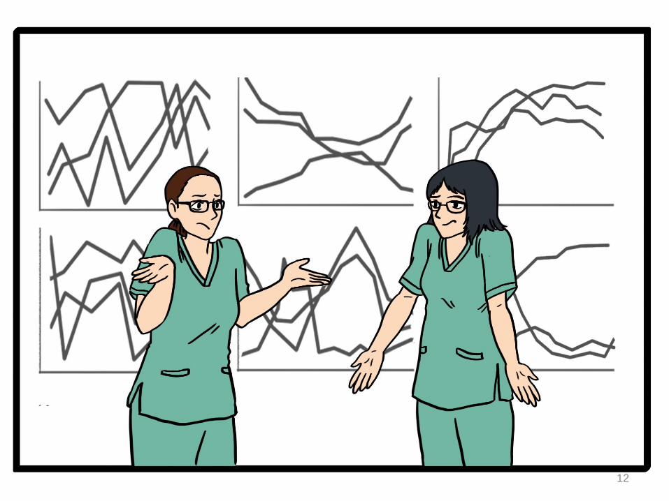
It started with a roar for different data…
3 regional forums
2 focus groups
17 discussion groups
5 formal interviews
+ scads of conversations and site visits
4
Our Aims
Simplify data collection
Enable users to customize their reports for real-time data exploration.
Designing data displays that engage the heart by keeping the focus on patients
Embed the purpose of the work in the data reports.
Make a nifty tool for the Falls Prevention Team.
5
Our Approach
Design for Communication User-centered Design
6
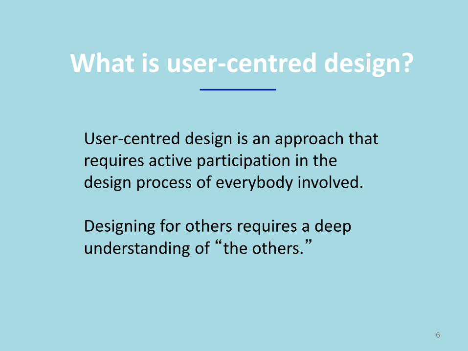
What is user-centred design?
User-centred design is an approach that requires active participation in the design process of everybody involved. Designing for others requires a deep understanding of “the others.”
7
Why focus on design?

Attention Who will stop and look at the results?
Comprehension What are the data showing?
Credibility Do I believe what the data are showing?
Attitude Is this initiative worth spending my time on?
Recognition Does this report reflect my work?
Decision-making What should I do as a result of this info?
8
Design Affects our Thinking
9
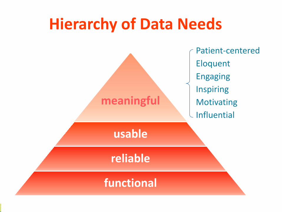
Patient-centered
Eloquent
Engaging
Inspiring
Motivating
Influential
Hierarchy of Data Needs
meaningful
usable
reliable
functional
10

11
12
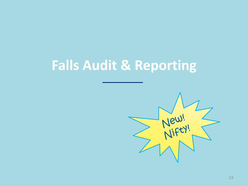
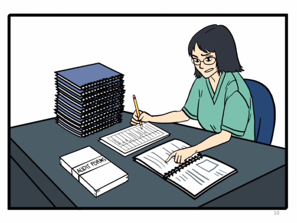
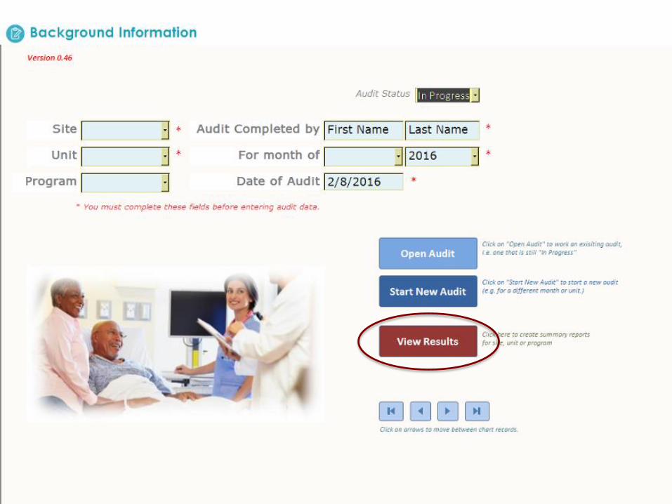
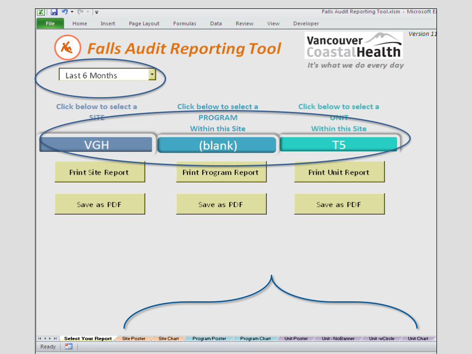
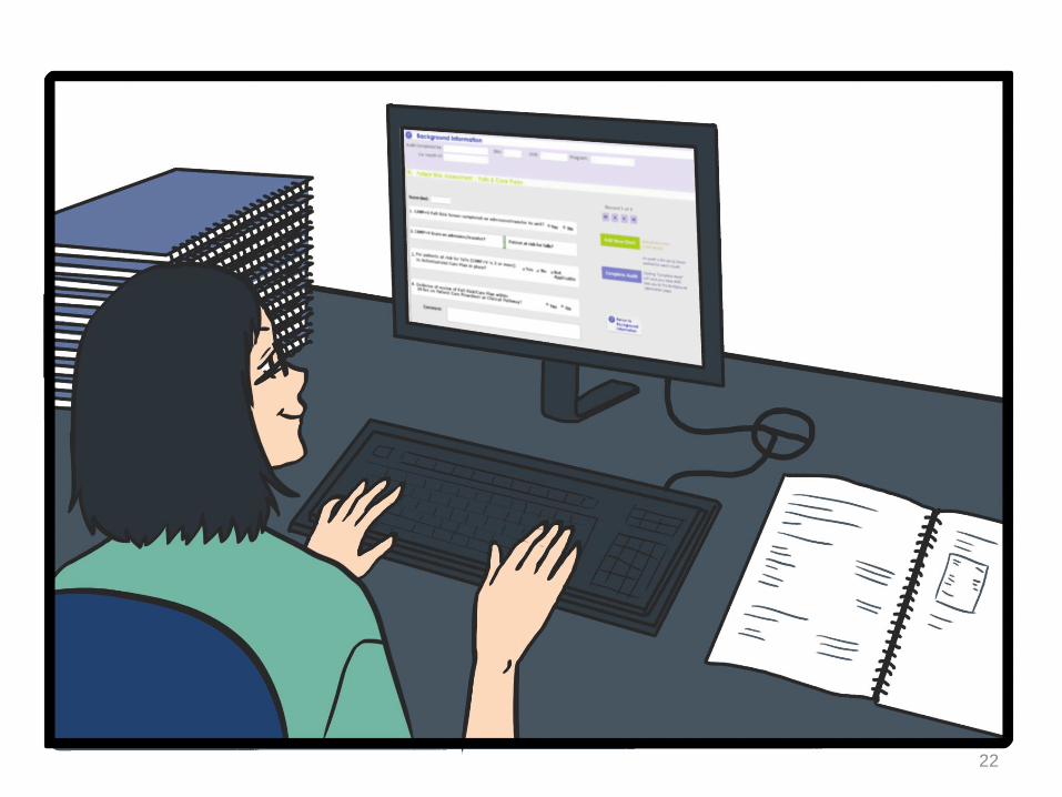
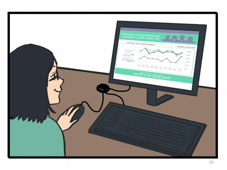
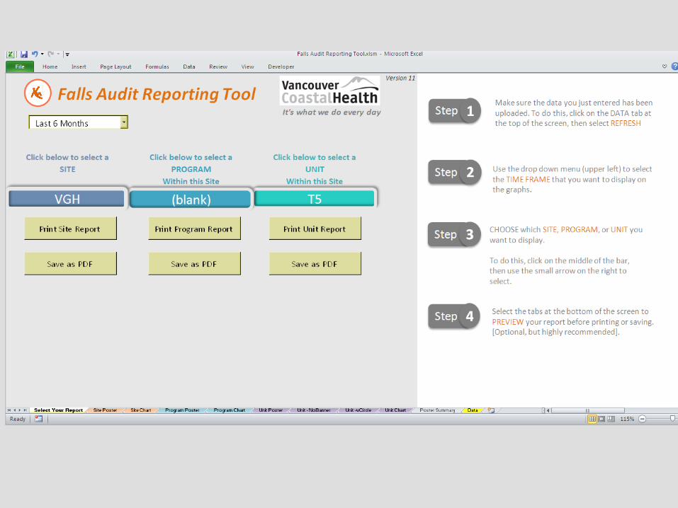
Falls Audit & Reporting
13
14
15
16
17
18
19
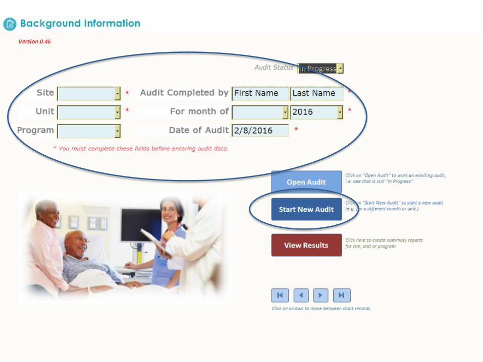
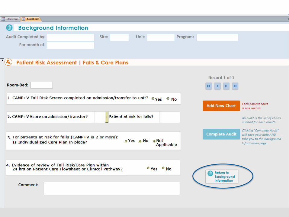
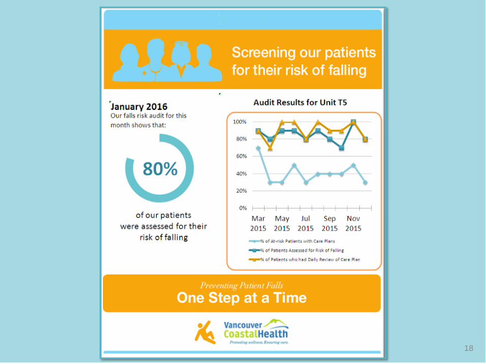
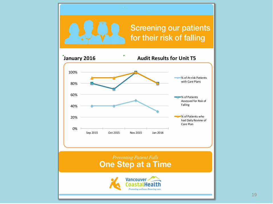
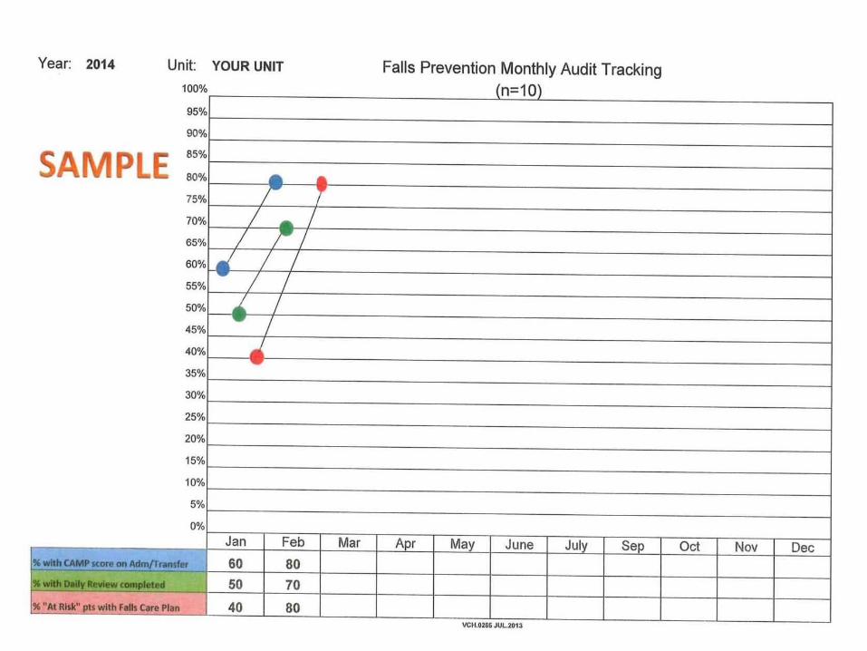
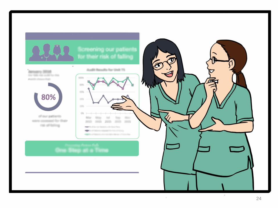
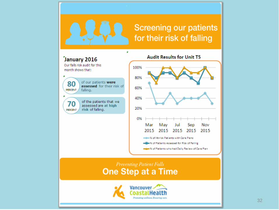
Audit Results for Unit T5January 2016
0%
20%
40%
60%
80%
100%
Sep 2015 Oct 2015 Nov 2015 Jan 2016
% of At-risk Patientswith Care Plans
% of PatientsAssessed for Risk ofFalling
% of Patients whohad Daily Review ofCare Plan
20
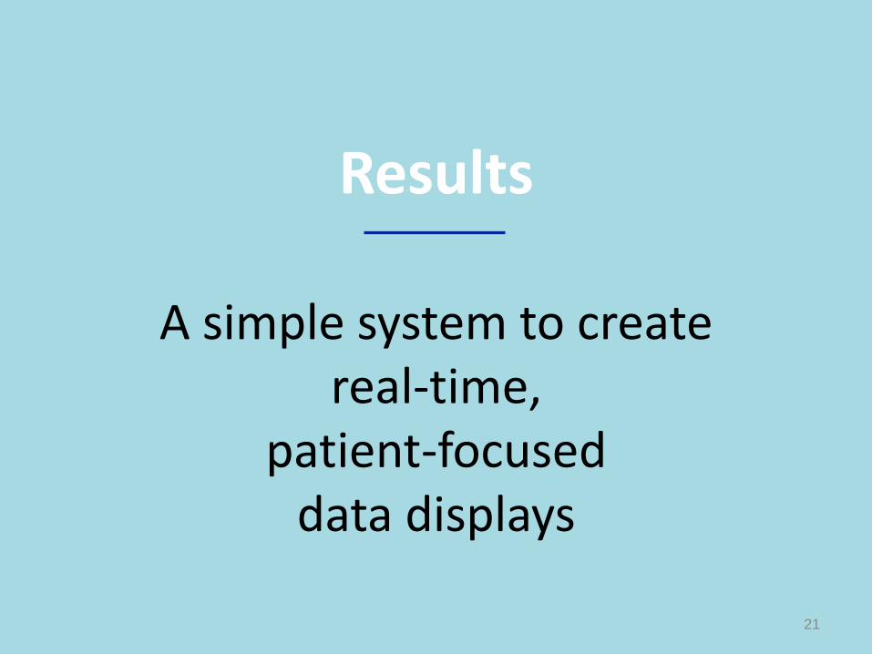
Results
A simple system to create real-time,
patient-focused data displays
21
22
23
24
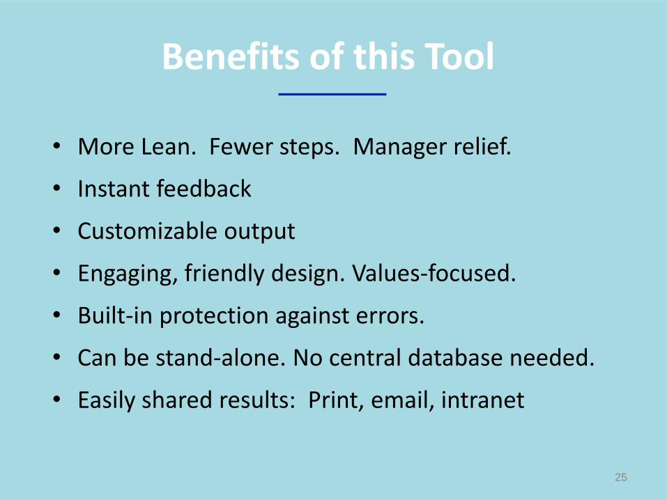
• More Lean. Fewer steps. Manager relief.
• Instant feedback
• Customizable output
• Engaging, friendly design. Values-focused.
• Built-in protection against errors.
• Can be stand-alone. No central database needed.
• Easily shared results: Print, email, intranet
25
Benefits of this Tool

• Designers and data managers use different software.
• Multidisciplinary collaboration – We go farther together, but it can be a winding road.
• Skepticism of this approach and thinking that it’s too difficult
• You need to see design in action before you can appreciate it.
26
Challenges
Emily Carr University of Art + Design Jonathan Aitken, Jorge Frascara,
Ghazal Rhavar, Colette Cartier
VGH Falls Prevention Team Joan Chocholik, Leanna Ritchie, Megan Fekete,
Marilyn Shamatutu, Doris Bohl
VCH Quality & Patient Safety Chandima Panditha, Leslie Forrester
VCH Decision Support Dan Piecuch (now at Hootsuite)
27
Our Project Team
Contact Information
Janet Joy [email protected]
Carmen Dyck [email protected]
Tanya Dunne [email protected]
28

29
Bonus Slides
30
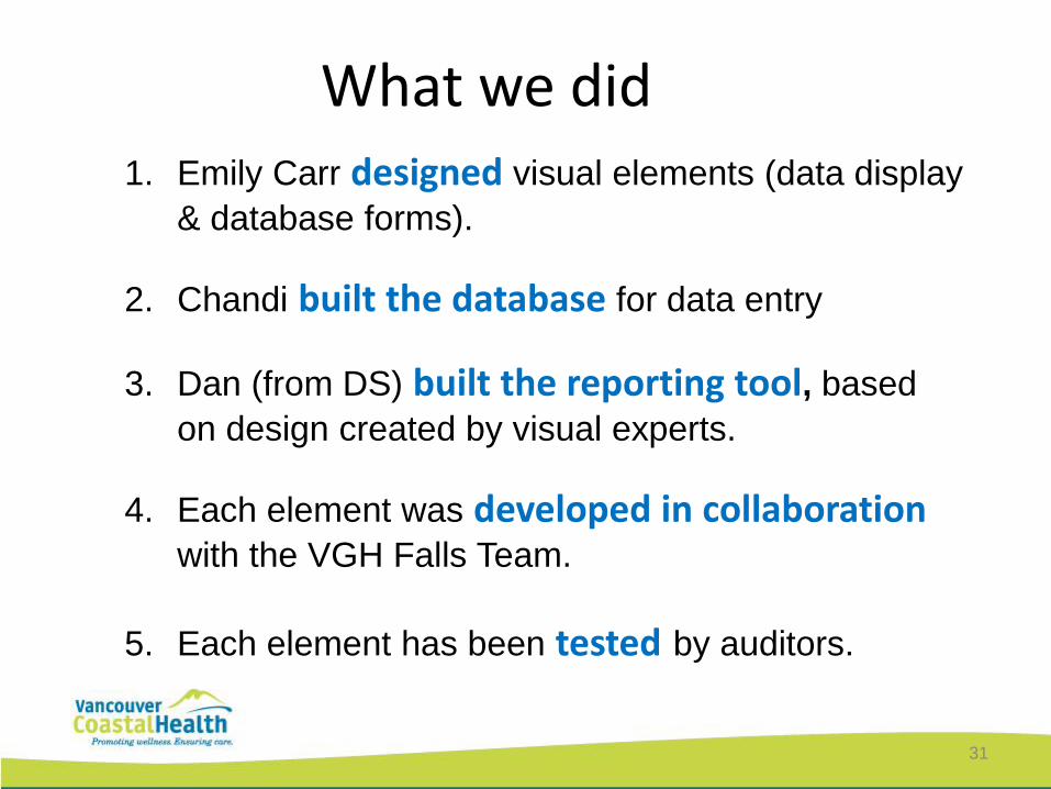
What we did
31
1. Emily Carr designed visual elements (data display
& database forms).
2. Chandi built the database for data entry
3. Dan (from DS) built the reporting tool, based
on design created by visual experts.
4. Each element was developed in collaboration with the VGH Falls Team.
5. Each element has been tested by auditors.
32

34
35
Janet Joy [email protected]
Carmen Dyck [email protected]
Tanya Dunne [email protected]
This picture was created entirely in Excel by Tatsuo Horiuchi