9.1 Scatter Plots - Hackettstown School District · 374 Chapter 9 Data Analysis and Displays 9.1...
6
372 Chapter 9 Data Analysis and Displays Scatter Plots 9.1 How can you construct and interpret a scatter plot? Work with a partner. The weights x (in ounces) and circumferences C (in inches) of several sports balls are shown. Basketball 21 oz 30 in. 21 oz 30 in. Racquetball 1.4 oz 7 in. Racquetball 1.4 oz 7 in. Water Polo 15 oz 27 in. Softball 7 oz 12 in. a. Choose a scale for the horizontal axis and the vertical axis of the coordinate plane shown. b. Write the weight x and circumference C of each ball as an ordered pair. Then plot the ordered pairs in the coordinate plane. c. Describe the relationship between weight and circumference. Are any of the points close together? d. In general, do you think you can describe this relationship as positive or negative ? linear or nonlinear? Explain. e. A bowling ball has a weight of 225 ounces and a circumference of 27 inches. Describe the location of the ordered pair that represents this data point in the coordinate plane. How does this point compare to the others? Explain your reasoning. ACTIVITY: Constructing a Scatter Plot 1 1 Weight (ounces) Circumference (inches) x C Golf 1.6 oz 5.3 in. Golf 1.6 oz 5.3 in. Volleyball 10 oz 26 in. 10 oz 26 in. COMMON CORE Data Analysis In this lesson, you will ● construct and interpret scatter plots. ● describe patterns in scatter plots. Learning Standard 8.SP.1 Baseball 5 oz 9 in. Baseball 5 oz 9 in. Soccer V 16 oz 28 in. Tennis 2 oz 8 in. Tennis 2 oz 8 in.
Transcript of 9.1 Scatter Plots - Hackettstown School District · 374 Chapter 9 Data Analysis and Displays 9.1...
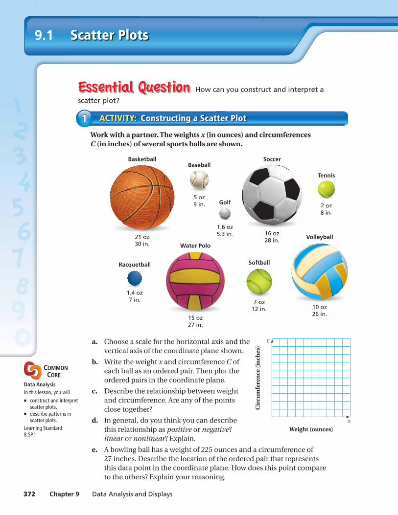
372 Chapter 9 Data Analysis and Displays
Scatter Plots9.1
How can you construct and interpret a
scatter plot?
Work with a partner. The weights x (in ounces) and circumferences C (in inches) of several sports balls are shown.
Basketball
21 oz30 in.21 oz30 in.
Racquetball
1.4 oz7 in.
Racquetball
1.4 oz7 in.
Water Polo
15 oz27 in.
Softball
7 oz12 in.
a. Choose a scale for the horizontal axis and the vertical axis of the coordinate plane shown.
b. Write the weight x and circumference C of each ball as an ordered pair. Then plot the ordered pairs in the coordinate plane.
c. Describe the relationship between weight and circumference. Are any of the points close together?
d. In general, do you think you can describe this relationship as positive or negative? linear or nonlinear? Explain.
e. A bowling ball has a weight of 225 ounces and a circumference of 27 inches. Describe the location of the ordered pair that represents this data point in the coordinate plane. How does this point compare to the others? Explain your reasoning.
ACTIVITY: Constructing a Scatter Plot11
Weight (ounces)
Cir
cum
fere
nce
(in
ches
)
x
C
Golf
1.6 oz5.3 in.
Golf
1.6 oz5.3 in. Volleyball
10 oz26 in.10 oz26 in.
COMMON CORE
Data AnalysisIn this lesson, you will● construct and interpret
scatter plots.● describe patterns in
scatter plots.Learning Standard8.SP.1
Baseball
5 oz9 in.
Baseball
5 oz9 in.
Soccer
V16 oz28 in.
Tennis
2 oz8 in.
Tennis
2 oz8 in.

Section 9.1 Scatter Plots 373
Work with a partner. The table shows the number of absences and the fi nal grade for each student in a sample.
a. Write the ordered pairs from the table. Then plot them in a coordinate plane.
b. Describe the relationship between absences and fi nal grade. How is this relationship similar to the relationship between weight and circumference in Activity 1? How is it different?
c. MODELING A student has been absent 6 days. Use the data to predict the student’s fi nal grade. Explain how you found your answer.
ACTIVITY: Constructing a Scatter Plot22
Use what you learned about scatter plots to complete Exercise 7 on page 376.
4. How would you defi ne the term scatter plot?
5. IN YOUR OWN WORDS How can you construct and interpret a scatter plot?
Recognize Usefulness of ToolsHow do you know when a scatter plot is a useful tool for making a prediction?
Math Practice
Absences Final Grade
0 95
3 88
2 90
5 83
7 79
9 70
4 85
1 94
10 65
8 75
Work with a partner. Match the data sets with the most appropriate scatter plot. Explain your reasoning.
a. month of birth and birth weight for infants at a day care
b. quiz score and test score of each student in a class
c. age and value of laptop computers
i. ii. iii.
ACTIVITY: Identifying Scatter Plots33
x
y
x
y
x
y

374 Chapter 9 Data Analysis and Displays
Lesson9.1Lesson Tutorials
Scatter Plot
A scatter plot is a graph that shows the relationship between two data sets. The two sets of data are graphed as ordered pairs in a coordinate plane.
Key Vocabularyscatter plot, p. 374
EXAMPLE Interpreting a Scatter Plot11The scatter plot at the left shows the amounts of fat (in grams) and the numbers of calories in 12 restaurant sandwiches.
a. How many calories are in the sandwich that contains 17 grams of fat?
Draw a horizontal line from the point that has an x-value of 17. It crosses the y-axis at 400.
So, the sandwich has 400 calories.
b. How many grams of fat are in the sandwich that contains 600 calories?
Draw a vertical line from the point that has a y-value of 600. It crosses the x-axis at 30.
So, the sandwich has 30 grams of fat.
c. What tends to happen to the number of calories as the number of grams of fat increases?
Looking at the graph, the plotted points go up from left to right.
So, as the number of grams of fat increases, the number of calories increases.
1. WHAT IF? A sandwich has 650 calories. Based on the scatter plot in Example 1, how many grams of fat would you expect the sandwich to have? Explain your reasoning.
Exercises 8 and 9
10 20 300 4015 25 355 45 x
300
350
400
450
500
550
600
650
700
750
800
0
y
Fat (grams)
Cal
ori
es
Restaurant Sandwiches
Restaurant Sandwiches
10 20 300 4015 25 355 45 x
300
350
400
450
500
550
600
650
700
750
800
0
y
Fat (grams)
Cal
ori
es

Section 9.1 Scatter Plots 375
A scatter plot can show that a relationship exists between two data sets.
EXAMPLE Identifying Relationships22Describe the relationship between the data. Identify any outliers, gaps, or clusters.
a. television size and price b. age and number of pets owned
20 40 600 30 50 7010 x
500
1000
1500
2000
2500
3000
3500
0
y
Television size (inches)
Pric
e (d
olla
rs)
Television Size and Price
20 40 600 30 50 7010 x
1
2
3
4
5
6
7
0
y
Person’s age (years)
Nu
mb
er o
f p
ets
ow
ned
Age and Pets Owned
The points appear to lie close to a line. As x increases, y increases.
The points show no pattern.
So, the scatter plot shows a positive linear relationship. There is an outlier at (70, 2250), a cluster of data under $500, and a gap in the data from $500 to $1500.
So, the scatter plot shows no relationship. There are no obvious outliers, gaps, or clusters in the data.
2. Make a scatter plot of the data and describe the relationship between the data. Identify any outliers, gaps, or clusters.Exercises 10– 12
Study Time (min), x 30 20 60 90 45 10 30 75 120 80
Test Score, y 80 74 92 97 85 62 83 90 70 91
Positive Linear Negative Linear NonlinearRelationship Relationship Relationship No Relationship
y
xO
O x
y
O x
y
O
y
xO
The points lie close to a line. As x increases, y increases.
The points lie close to a line. As x increases, y decreases.
The points lie in the shape of a curve.
The points show no pattern.

376 Chapter 9 Data Analysis and Displays
Exercises9.1
1. VOCABULARY What type of data do you need to make a scatter plot? Explain.
2. REASONING How can you identify an outlier in a scatter plot?
LOGIC Describe the relationship you would expect between the data. Explain.
3. shoe size of a student and the student’s IQ
4. time since a train’s departure and the distance to its destination
5. height of a bouncing ball and the time since it was dropped
6. number of toppings on a pizza and the price of the pizza
9+(-6)=3
3+(-3)=
4+(-9)=
9+(-1)=
7. JEANS The table shows the average price (in dollars) of jeans sold at different stores and the number of pairs of jeans sold at each store in one month.
a. Write the ordered pairs from the table and plot them in a coordinate plane.
b. Describe the relationship between the two data sets.
8. SUVS The scatter plot shows the numbers of sport utility vehicles sold in a city from 2009 to 2014.
a. In what year were 1000 SUVs sold?
b. About how many SUVs were sold in 2013?
c. Describe the relationship shown by the data.
9. EARNINGS The scatter plot shows the total earnings (wages and tips) of a food server during one day.
a. About how many hours must the server work to earn $70?
b. About how much did the server earn for 5 hours of work?
c. Describe the relationship shown by the data.
Help with Homework
11
2011 20132009 x
200
400
600
800
1000
1200
0
y
Year
Nu
mb
er s
old
SUV Sales
2 4 60 3 51 x
10
20
30
40
50
60
70
80
0
y
Hours worked
Earn
ing
s (d
olla
rs)
Earnings of a Food Serverver
Average Price 22 40 28 35 46
Number Sold 152 94 134 110 81

Section 9.1 Scatter Plots 377
Describe the relationship between the data. Identify any outliers, gaps, or clusters.
10.
10 20 300 15 25 355 40 x
10
20
30
40
0
15
25
35
45
5
y 11.
10 20 300 15 25 355 40 x
10
20
30
40
0
15
25
35
45
5
y 12.
10 20 300 15 25 355 40 x
10
20
30
40
0
15
25
35
45
5
y
13. HONEY The table shows the average price per pound for honey in the United States from 2009 to 2012. What type of relationship do the data show?
14. TEST SCORES The scatter plot shows the numbers of minutes spent studying and the test scores for a science class. (a) What type of relationship do the data show? (b) Interpret the relationship.
15. OPEN-ENDED Describe a set of real-life data that has a negative linear relationship.
16. PROBLEM SOLVING The table shows the memory capacities (in gigabytes) and prices (in dollars) of 7-inch tablet computers at a store. (a) Make a scatter plot of the data. Then describe the relationship between the data. (b) Identify any outliers, gaps, or clusters. Explain why you think they exist.
Memory (GB), x 8 16 4 32 4 16 4 8 16 8 16 8
Price (dollars), y 200 230 120 250 100 200 90 160 150 180 220 150
17. Sales of sunglasses and beach towels at a store show a positive linear relationship in the summer. Does this mean that the sales of one item cause the sales of the other item to increase? Explain.
22
Year, x 2009 2010 2011 2012
Average Price per Pound, y
$4.65 $4.85 $5.15 $5.53
30 60 900 45 7515
70
80
90
100
0
Study time (minutes)
Test
sco
res
Study Time and Test Scores
Use a graph to solve the equation. Check your solution. (Section 5.4)
18. 5x = 2x + 6 19. 7x + 3 = 9x − 13 20. 2
— 3
x = − 1
— 3
x − 4
21. MULTIPLE CHOICE When graphing a proportional relationship represented by y = mx, which point is not on the graph? (Section 4.3)
○A (0, 0) ○B (0, m) ○C (1, m) ○D (2, 2m)
x