7 quality tools
92
1 7 QC TOOLS
description
histogram, ishikawa, pareto
Transcript of 7 quality tools

1
7 QC TOOLS

2
Quality
A subjective term for which each person has his or her own definition. In technical usage, quality can have two meanings:
1. The characteristics of a product or service that bear on its ability to satisfy stated or implied needs.
2. A product or service free from deficiencies.
Note: ISO 9000 : 2000 version defines Quality as “Degree to which a set of inherent characteristics fulfils
requirements.

3
Can also be termed as ‘A measure of excellence’
Quality

4
Quality - an essential and distinguishing attribute of something.
Attribute - an abstraction belonging to or characteristic of an entity
Appearance, visual aspect - outward or visible aspect of a thing
Attractiveness, attraction - the quality of arousing interest; being attractive or something that attracts;
Uncloudedness, clarity, clearness - the quality of clear water;
Ease, easiness, simplicity - freedom from difficulty or hardship or effort.
Suitability, suitableness - the quality of having the properties that are right for a specific purpose.
Excellence - the quality of excelling.
Characteristic - a distinguishing quality
Simpleness, simplicity - the quality of being simple or uncompounded
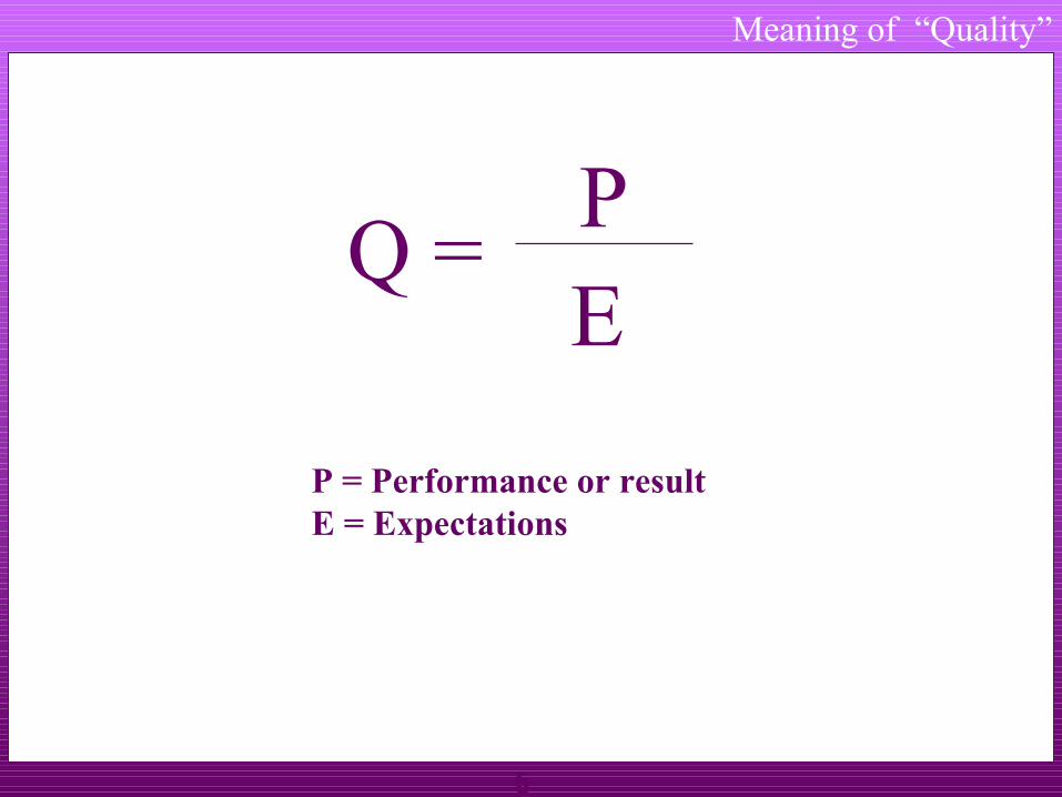
Meaning of “Quality”
5
Meaning of “Quality”
Q = PE
P = Performance or resultE = Expectations
6
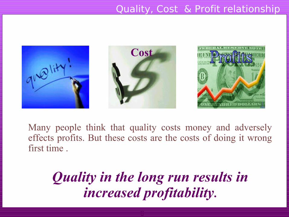
Many people think that quality costs money and adversely effects profits. But these costs are the costs of doing it wrong first time .
Quality in the long run results in increased profitability.
Quality, Cost & Profit relationship
Cost

7
Cost
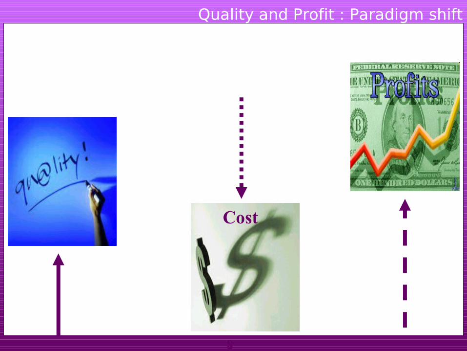
Quality and Profit : Traditional thinking
8
Quality and Profit : Paradigm shift
Cost

9
1.Higher production due to improved cycle time and reduced errors and defects
2.Increased use of machine and resources.
3.Improved material use from reduced scrap and rejects
4.Increased use of personnel resources
5.Lower level of asset investments required to support operations.
6.Lower service and support costs for eliminated waste, rework and non value added activities.
QU
AL
ITY
Higher productivity Increased profitability
due to :
•Larger sales
•Lower production costs
•Faster turnover
Quality and Profit

10
Quality and Profit
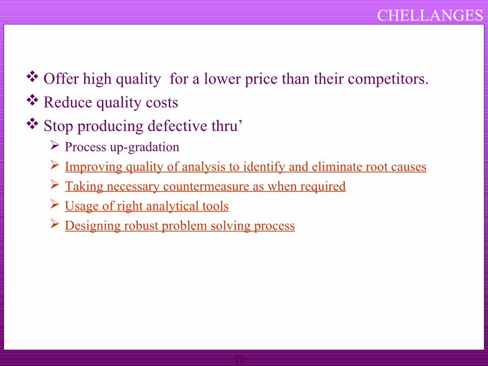
If the organization does not offer high quality product or service , it will soon go out of business . But just having high quality will not be enough , because your competitors will also have the high quality. To win , companies will need to offer high quality for a lower price than their competitors.This requires organizations to identify and reduce their quality costs
HighQuality
Lowerprice
C2A2C
11
Offer high quality for a lower price than their competitors. Reduce quality costs Stop producing defective thru’
Process up-gradation Improving quality of analysis to identify and eliminate root causes Taking necessary countermeasure as when required Usage of right analytical tools Designing robust problem solving process
CHELLANGES

12
PROBLEM SOLVING PROCESS
Evaluating solution(6)
Implementing solution
(5)
Selecting & planning solution
(4)
Generating potential solutions
(3)
Analysing problem causes
(2)
Identifying & selecting problem
(1)
PROBLEM SOLVING PROCESS
13
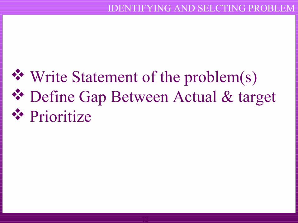
IDENTIFYING AND SELCTING PROBLEM
Write Statement of the problem(s) Define Gap Between Actual & target Prioritize

14
ANALYSIS PROBLEM AND CAUSES
Collect Data Sort symptoms & Causes (effects) Brain Storm Fishbone - cause & effect analysis Prioritize
15
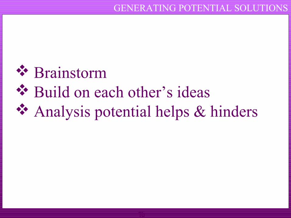
GENERATING POTENTIAL SOLUTIONS
Brainstorm Build on each other’s ideas Analysis potential helps & hinders
16
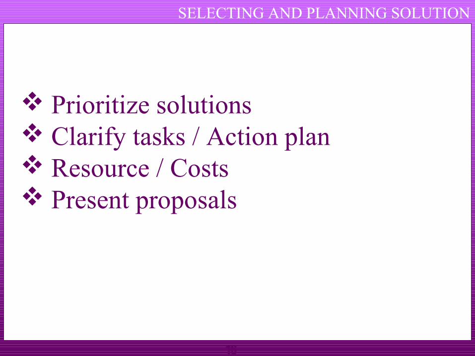
SELECTING AND PLANNING SOLUTION
Prioritize solutions Clarify tasks / Action plan Resource / Costs Present proposals
17
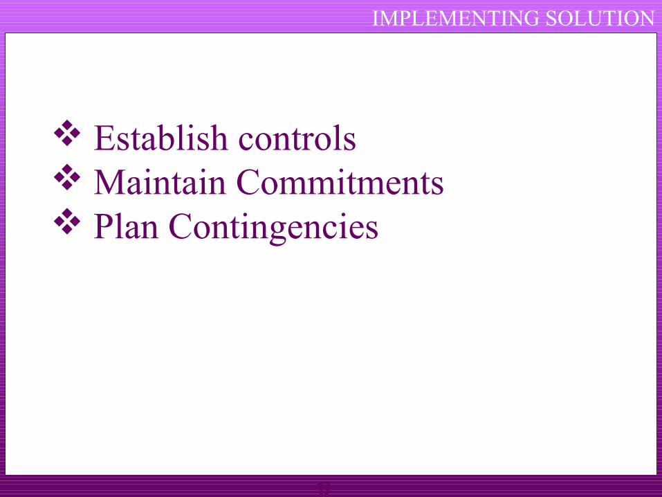
IMPLEMENTING SOLUTION
Establish controls Maintain Commitments Plan Contingencies
18
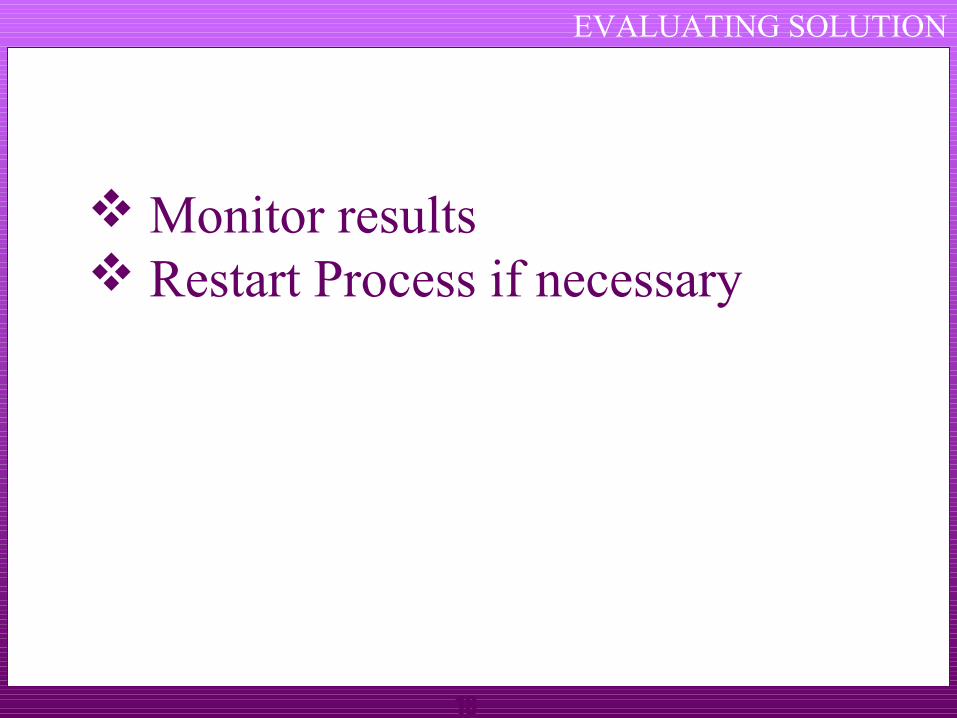
EVALUATING SOLUTION
Monitor results Restart Process if necessary

19
7 QC TOOLS
Used to identify,analyze and resolve problemsSimple but very powerful tools to solve day to
day work related problemsFind solutions in a systematic mannerWidely used by Quality Circle members world
over

20
Check sheets
Histograms
Pareto charts
Cause & effect diagram (Ishikawa diagram)
Scatter plot
Defect concentration diagram
Control charts
7 QC TOOLS
21
12
23
43
27
9
0
50
1160-170 170-180 180-190 190-200 200-210
Histogram for distribution of Center Distance (mm)
HISTOGRAM

22
HISTOGRAM A HISTORY OF PROCESS OUT PUT
024
810121416
6Fre
qu
ency
47 48 49 50 51 52 53 54kg
Distribution
23
Based on “80/20” rule (or ABC analysis)
Pareto(V.Pareto,an Italian economist) discovered this universal law-80% of anything is attributed to 20% of its causes 80% of the wealth is held by 20% of the population.
• 80% of our income goes into 20% of our needs.• 80% of road accidents occur on 20% of the road.• 80% of the absenteeism in a company is due to 20% of workmen
“Significant few & in-significant many”
PARETO CHART

24
PARETO CHART
Pareto analysis begins by ranking problems from highest to lowest in order to fix priority
The cumulative number of problems is plotted on the vertical axis of the graph against the cause/phenomenon
Pareto by Causes e.g. Man,Machine,Method etc
Pareto by Phenomenon e.g.Quality,Cost,Delivery
Tells about the relative sizes of problems indicates an important message about biggest few problems, if corrected, a large % of total problems will be solved

25
63.8
81.4
96.2 100.0
0
500
1000
1500
2000
2500
3000N
o o
f p
eic
es
0.0
10.0
20.0
30.0
40.0
50.0
60.0
70.0
80.0
90.0
100.0
Cu
m.
Perc
en
tag
e
DEFECT QTY 2064.0 567.0 480.0 122.0
CUM % 63.8 81.4 96.2 100.0
SHORT SHOT SILVER SINK MARK FLASH
PARETO ANALYSIS

26
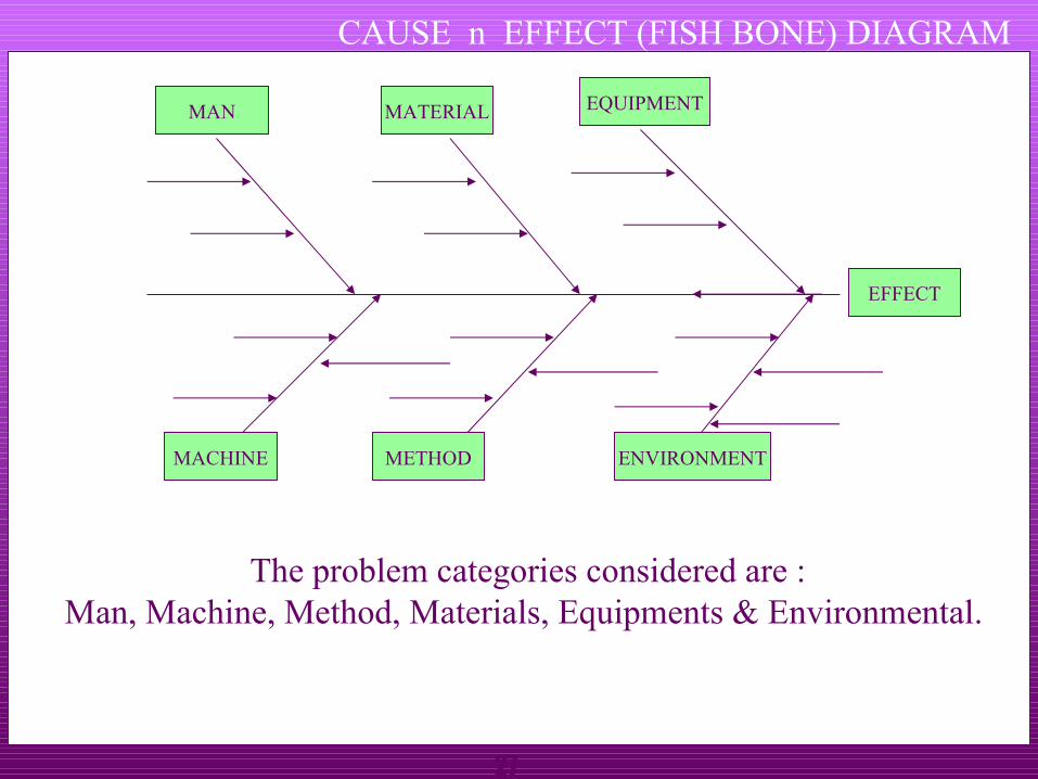
CAUSE n EFFECT (FISH BONE) DIAGRAM
This diagram (resembles skeleton of a fish) helps to separate out causes from effects and to see problem in its totality
It’s a systematic arrangement of all possible causes,generated thru’ brain storming
This can be used to :
Assist individual / group to see full picture.
Serve as a recording device for ideas generated.
Reveal undetected relationships between causes.
Discover the origin/root cause of a problem
Create a document or a map of a problem which can be posted in the work area.
27
The problem categories considered are :Man, Machine, Method, Materials, Equipments & Environmental.
EFFECT
MACHINE METHOD ENVIRONMENT
MAN MATERIAL EQUIPMENT
CAUSE n EFFECT (FISH BONE) DIAGRAM

28
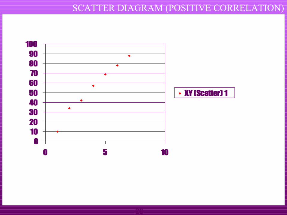
SCATTER DIAGRAM
The scatter diagram is used for identifying the relationships and performing preliminary analysis of relationship between any two quality characteristics. Clustering of points indicate that the two characteristics may be related e.g.
Increasing in component weight with increase in hold time during plastic injection molding ( + ve co-relation)Increase in toughness components with decreasing injection pressure (-ve co-relation) during molding
29
SCATTER DIAGRAM (POSITIVE CORRELATION)
0102030405060708090
100
0 5 10
XY (Scatter) 1

30
SCATTER DIAGRAM (NEGATIVE CORERLATION)
0
10
20
30
40
50
60
70
80
0 5 10
XY (Scatter) 1

31
SCATTER DIAGRAM (NO CORERLATION)
0
10
20
30
40
50
60
70
80
0 5 10
XY (Scatter) 1
32
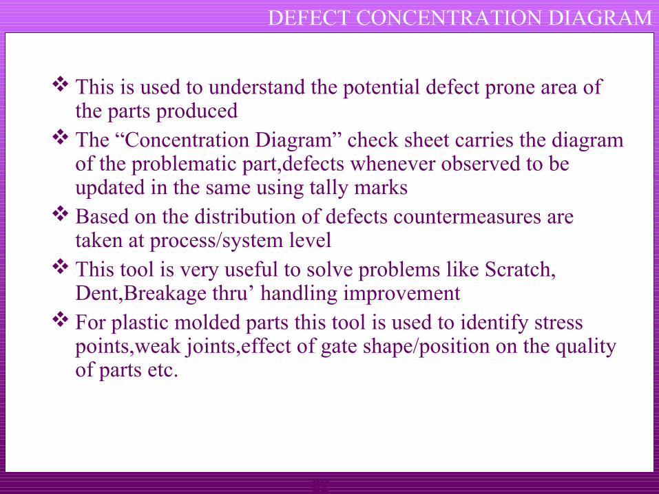
DEFECT CONCENTRATION DIAGRAM
This is used to understand the potential defect prone area of the parts produced
The “Concentration Diagram” check sheet carries the diagram of the problematic part,defects whenever observed to be updated in the same using tally marks
Based on the distribution of defects countermeasures are taken at process/system level
This tool is very useful to solve problems like Scratch, Dent,Breakage thru’ handling improvement
For plastic molded parts this tool is used to identify stress points,weak joints,effect of gate shape/position on the quality of parts etc.
33
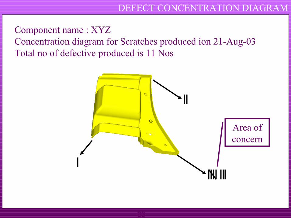
DEFECT CONCENTRATION DIAGRAM
Component name : XYZConcentration diagram for Scratches produced ion 21-Aug-03Total no of defective produced is 11 Nos
Area of concern
34
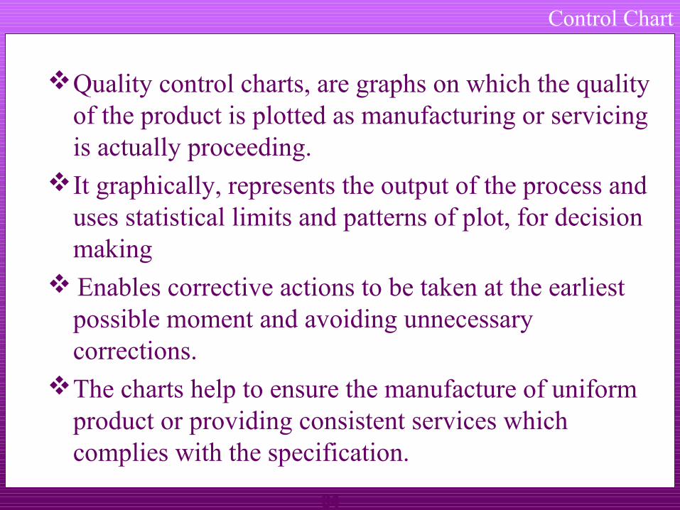
Control Chart
Quality control charts, are graphs on which the quality of the product is plotted as manufacturing or servicing is actually proceeding.
It graphically, represents the output of the process and uses statistical limits and patterns of plot, for decision making
Enables corrective actions to be taken at the earliest possible moment and avoiding unnecessary corrections.
The charts help to ensure the manufacture of uniform product or providing consistent services which complies with the specification.
35
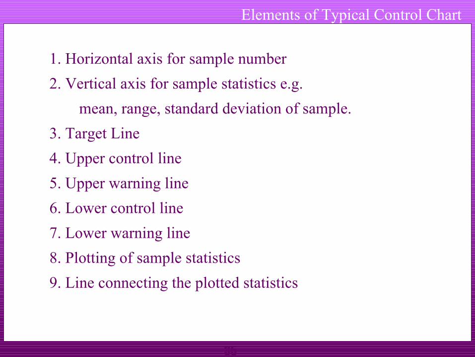
Elements of Typical Control Chart
1. Horizontal axis for sample number
2. Vertical axis for sample statistics e.g.
mean, range, standard deviation of sample.
3. Target Line
4. Upper control line
5. Upper warning line
6. Lower control line
7. Lower warning line
8. Plotting of sample statistics
9. Line connecting the plotted statistics

36
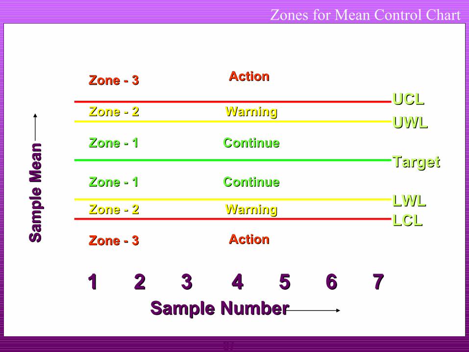
Interpreting Control Chart
The control chart gets divided in three zones.
Zone - 1 If the plotted point falls in this zone, do not make any adjustment, continue with the process.
Zone - 2 If the plotted point falls in this zone then special cause may be present. Be careful watch for plotting of another sample(s).
Zone - 3 If the plotted point falls in this zone then special cause has crept into the system, and corrective action is required.
37
Zones for Mean Control Chart
11 22 33 44 55 66 77Sample NumberSample Number
UCLUCL
TargetTarget
LCLLCL
UWLUWL
LWLLWL
Zone - 3Zone - 3
Sam
ple
Me a
nS
amp
le M
e an
Zone - 2Zone - 2
Zone - 3Zone - 3
Zone - 2Zone - 2
Zone - 1Zone - 1
ActionAction
ActionAction
WarningWarning
WarningWarning
ContinueContinue
ContinueContinueZone - 1Zone - 1

38
UCL
1 2 3 4 5 6 7 8
Sample Number
Sta
tistic
s
UWL
LCL
Target
LWL
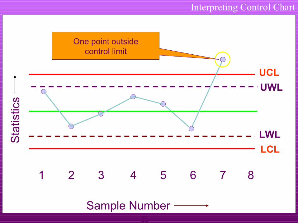
Interpreting Control Chart
Point outside the Control limit
39
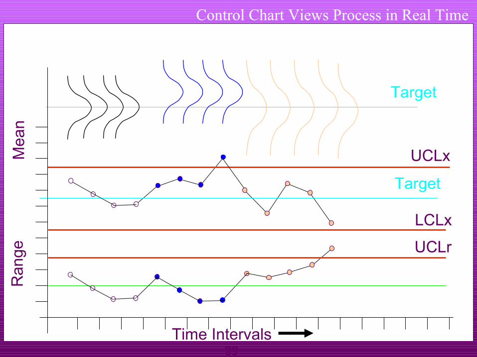
Control Chart Views Process in Real Time
Time Intervals
Ran
geM
ean
LCLx
Output of the process in real time
Target
Target
UCLx
UCLr
40
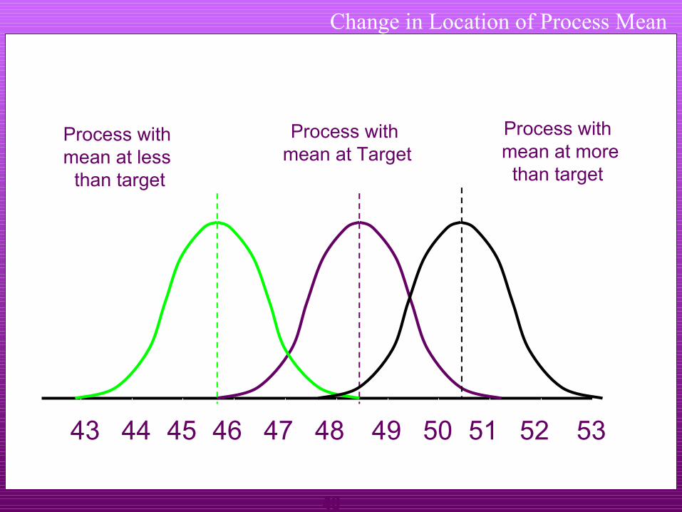
Change in Location of Process Mean
43 48 49 50 51 52 5344 45 46 47
Process with mean at Target
Process with mean at more
than target
Process with mean at less
than target
41
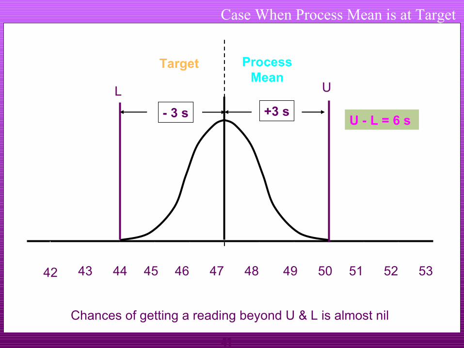
Case When Process Mean is at Target
43 48 49 50 51 52 5344 45 46 47
Target ProcessMean
Chances of getting a reading beyond U & L is almost nil
42
UL
- 3 s +3 sU - L = 6 s

42
Case - Small Shift of the Process Mean
43 48 49 50 51 52 5344 45 46 47
Target
ProcessMean
Chances of getting a reading outside U is small
Small shift in process
42
Shaded area shows the
probability of getting
a reading beyond U
UL
U-L = 6 s
43
ProcessMean
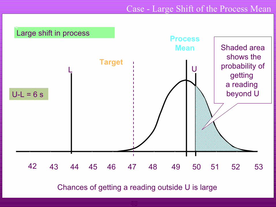
Case - Large Shift of the Process Mean
43 48 49 50 51 52 5344 45 46 47
Target
Chances of getting a reading outside U is large
Large shift in process
42
Shaded area shows the
probability of getting
a reading beyond U
UL
U-L = 6 s
44
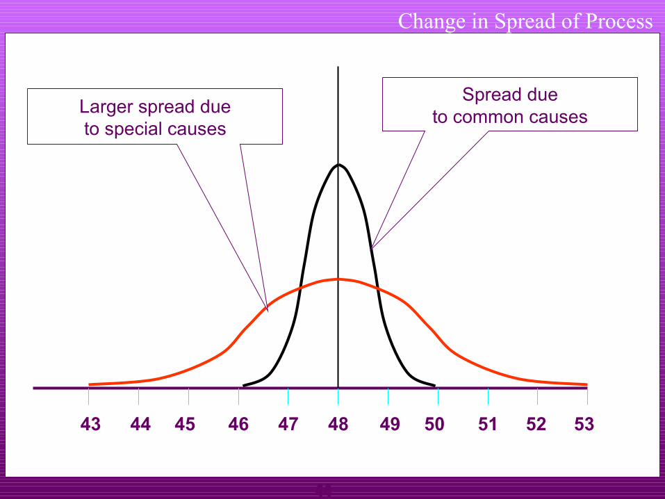
Change in Spread of Process
43 48 49 50 51 52 5344 45 46 47
Larger spread dueto special causes
Spread dueto common causes

45
Special cause & Common cause
Special Special / / Assignable cause : Causes due to negligence in following work instructions, problem in machines etc.This types of causes are avoidable and cannot be neglected.
Common cause : Causes which are unavoidable and in-evitable in a process.It is not practical to eliminate the Chance cause technically and economically.

46
Most Commonly Used Variable Control Charts
To track the accuracy of the process
- Mean control chart or x-bar chart
To track the precision of the process
- Range control chart

47
Control ChartPART NAME :GLASS RUN PART NO : MODEL : Page
THICKNESS SPECS : MIN 1.10 TO 1.50 MAX REASON : PROCESS CAPABILITY STUDYAUDIT DATE 25/9/01
1 2 3 4 5 6 7 8 9 10 11 12 13 14 15 16 17 18 19 20 n d2 A2 D41 1.50 1.50 1.50 1.50 1.50 1.50 1.50 1.50 1.50 1.50 1.60 1.50 1.60 1.50 1.60 1.55 1.60 1.55 1.50 1.50 1 1.123 2.66 3.27
2 1.50 1.50 1.50 1.53 1.50 1.50 1.50 1.50 1.50 1.55 1.60 1.55 1.55 1.60 1.55 1.45 1.60 1.50 1.50 1.48 2 1.128 1.88 3.27
3 1.60 1.48 1.50 1.50 1.48 1.50 1.50 1.50 1.50 1.55 1.50 1.55 1.50 1.55 1.50 1.50 1.50 1.55 1.60 1.55 3 1.693 1.02 2.57
4 1.50 1.48 1.52 1.50 1.53 1.50 1.50 1.50 1.45 1.50 1.50 1.50 1.50 1.50 1.50 1.50 1.50 1.60 1.60 1.50 4 2.059 0.73 2.29
5 1.50 1.50 1.60 1.50 1.50 1.50 1.55 1.55 1.45 1.55 1.55 1.50 1.50 1.50 1.50 1.50 1.45 1.50 1.55 1.55 5 2.326 0.58 2.11SUM X SUM X1+..+Xn 30.37
X 1.52 1.49 1.52 1.51 1.50 1.50 1.51 1.51 1.48 1.53 1.55 1.52 1.53 1.53 1.53 1.50 1.53 1.54 1.55 1.52 X SUM X1+..+Xn/n1.519R 0.10 0.02 0.10 0.03 0.05 0.00 0.05 0.05 0.05 0.05 0.10 0.05 0.10 0.10 0.10 0.10 0.15 0.10 0.10 0.07 R SUM R1+..+Rn/n0.074
SIGMA R/d2 0.0323 SIGMA 3 * R/d2 0.0956 SIGMA 6 * R/d2 0.190
Cp = 2.11 Cpk=
MIN OF -0.20Cpu OR Cpl 4.41
Cpk =USL 1.500LSL 1.100
FOR XUCL = X + A2.R 1.561LCL = X - A2.R 1.476
FOR R (D3 = 0)UCL = D4.R 0.155LCL = D3.R 0.000
PROCESS STATAUSCONTROLLEDNOT CONTROLLED
XYZ Ltd
O
-0.050.000.050.100.150.200.25
1 2 3 4 5 6 7 8 9 10 11 12 13 14 15 16 17 18 19 20
R -
CH
AR
T
R UCL LCL CL
1.4001.4201.4401.4601.4801.5001.5201.5401.5601.5801.600
1 2 3 4 5 6 7 8 9 10 11 12 13 14 15 16 17 18 19 20
X -
CH
AR
T
X UCL LCL CL
How to draw?
48
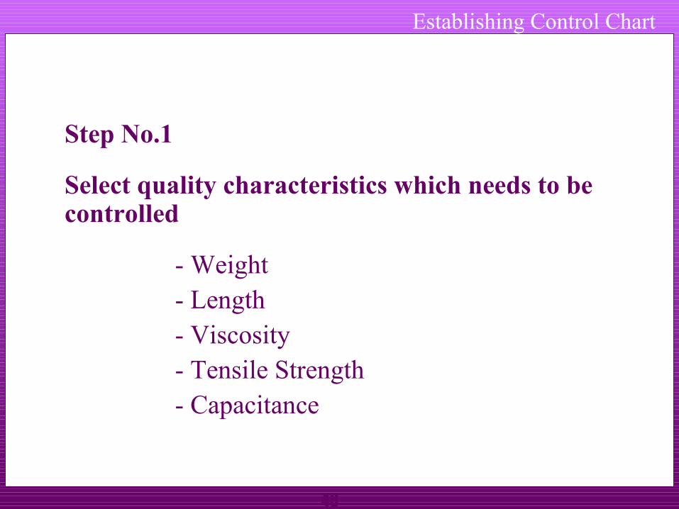
Establishing Control Chart
Step No.1
Select quality characteristics which needs to be controlled
- Weight- Length- Viscosity- Tensile Strength- Capacitance

49
Establishing Control Chart
Step No.2
Decide the number of units, n to be taken in a sample.
The minimum sample size should be 2. As the sample size increases then the sensitivity i.e. the quickness with which the chart gives an indication of shift of the process increases. However, with the increase of the sample size cost of inspection also increases.
Generally, n can be 4 or 5.
50
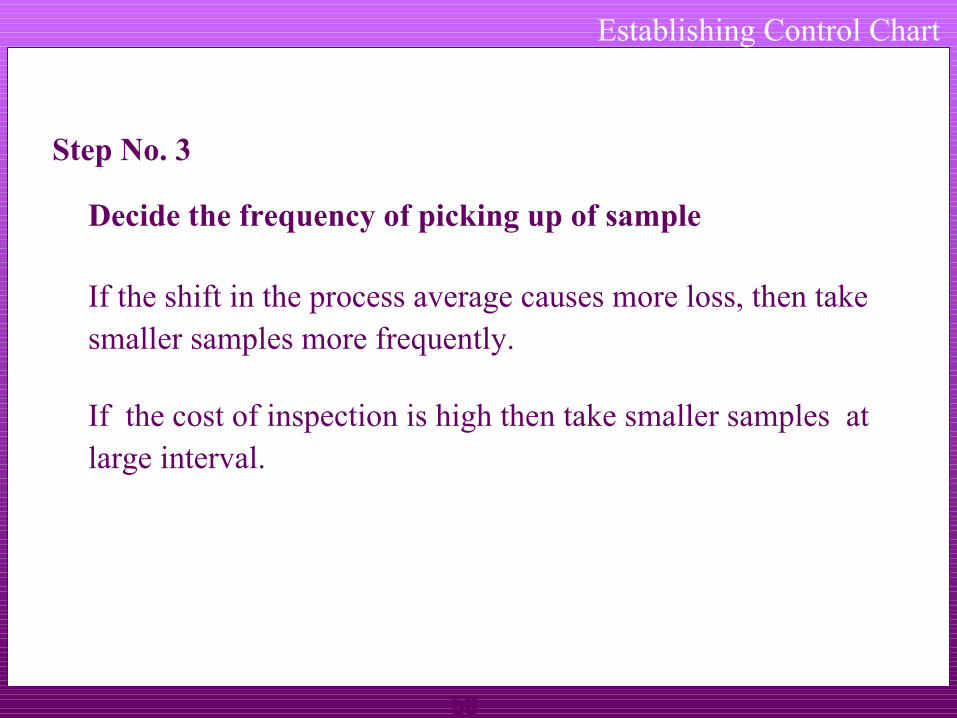
Establishing Control Chart
Step No. 3
Decide the frequency of picking up of sample
If the shift in the process average causes more loss, then take smaller samples more frequently.
If the cost of inspection is high then take smaller samples at large interval.
51
Establishing Control Chart
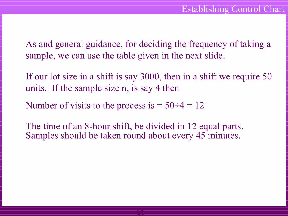
As and general guidance, for deciding the frequency of taking a sample, we can use the table given in the next slide.
If our lot size in a shift is say 3000, then in a shift we require 50 units. If the sample size n, is say 4 then
Number of visits to the process is = 50÷4 = 12
The time of an 8-hour shift, be divided in 12 equal parts. Samples should be taken round about every 45 minutes.
52
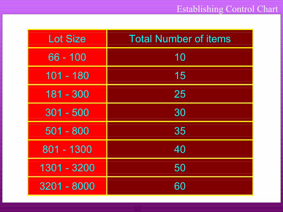
Establishing Control Chart
Lot Size Total Number of items
66 - 100 10
101 - 180 15
181 - 300 25
301 - 500 30
501 - 800 35
801 - 1300 40
1301 - 3200 50
3201 - 8000 60

53
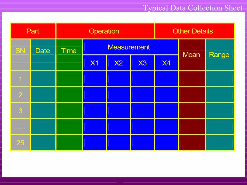
Establishing Control Chart
Step No. 4
Collect data on a special control chart datacollection sheet. ( Minimum 100 observations)
The data collection sheet has following main portions:1. General details for part, department etc.2. Columns for date and time sample taken3. Columns for measurements of sample4. Column for mean of sample5. Column for range of sample
54
Typical Data Collection Sheet
Part Operation Other Details
Measurement SN
Date
Time
X1 X2 X3 X4 Mean Range
1
2
3
…..
25
55
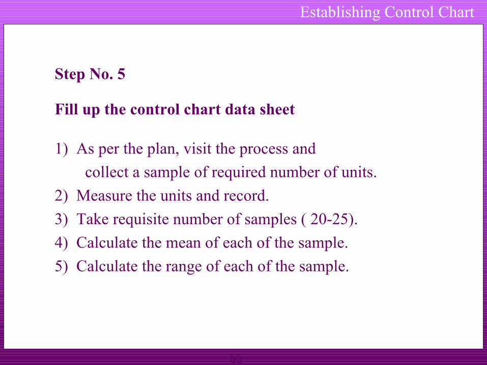
Establishing Control Chart
Step No. 5
Fill up the control chart data sheet
1) As per the plan, visit the process and
collect a sample of required number of units.
2) Measure the units and record.
3) Take requisite number of samples ( 20-25).
4) Calculate the mean of each of the sample.
5) Calculate the range of each of the sample.
56
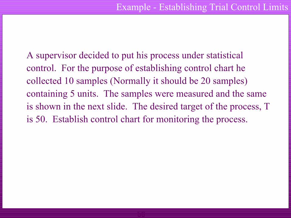
Example - Establishing Trial Control Limits
A supervisor decided to put his process under statistical control. For the purpose of establishing control chart he collected 10 samples (Normally it should be 20 samples) containing 5 units. The samples were measured and the same is shown in the next slide. The desired target of the process, T is 50. Establish control chart for monitoring the process.
57
Example - Data Collection
Subgroup Reading Subgroup No. X1 X2 X3 X4 X5
Mean of subgroup
Range of subgroup
1 47 45 48 52 51
2 48 52 47 50 50
3 49 48 52 50 49
4 49 50 52 50 49
5 51 50 53 50 48
6 50 50 49 51 47
7 51 48 50 50 54
8 50 48 50 50 52
9 48 48 49 50 51
10 49 50 50 52 51
58
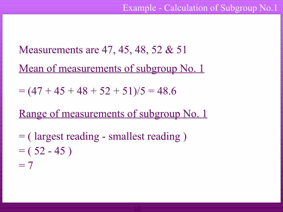
Example - Calculation of Subgroup No.1
Measurements are 47, 45, 48, 52 & 51
Mean of measurements of subgroup No. 1
= (47 + 45 + 48 + 52 + 51)/5 = 48.6
Range of measurements of subgroup No. 1
= ( largest reading - smallest reading )= ( 52 - 45 )= 7
59
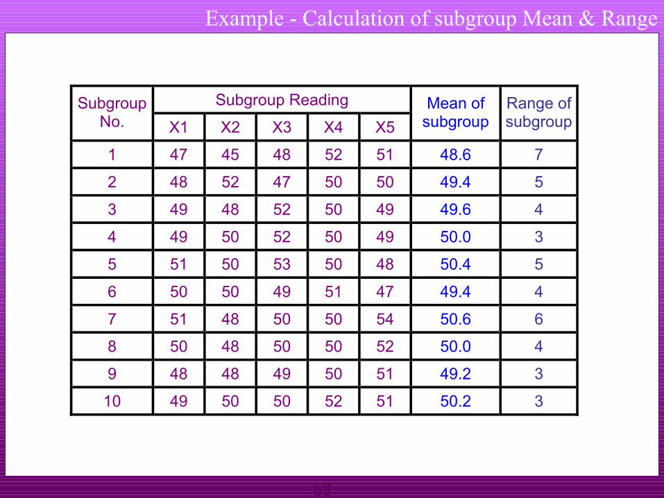
Example - Calculation of subgroup Mean & Range
Subgroup Reading Subgroup No. X1 X2 X3 X4 X5
Mean of subgroup
Range of subgroup
1 47 45 48 52 51 48.6 7
2 48 52 47 50 50 49.4 5
3 49 48 52 50 49 49.6 4
4 49 50 52 50 49 50.0 3
5 51 50 53 50 48 50.4 5
6 50 50 49 51 47 49.4 4
7 51 48 50 50 54 50.6 6
8 50 48 50 50 52 50.0 4
9 48 48 49 50 51 49.2 3
10 49 50 50 52 51 50.2 3

60
Establishing Control Chart
Calculate Mean Range, R
R = Sum of ranges of subgroups
Total number of subgroups
In our case
R = (7 + 5 +4 3 + 5 + 4 + 6 + 4 + 3 + 3 )
Total number of subgroups
61
Establishing Control Chart
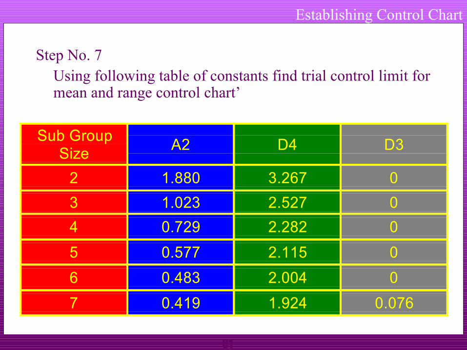
Step No. 7Using following table of constants find trial control limit for mean and range control chart’
Sub GroupSize
A2 D4 D3
2 1.880 3.267 0
3 1.023 2.527 0
4 0.729 2.282 0
5 0.577 2.115 0
6 0.483 2.004 0
7 0.419 1.924 0.076

62
Establishing Control Chart
Step No. 8
Calculate Trial control Limits with target value, T
Trial control limits for mean control chartUpper Control Limit, UCLx = T + A2 x R
Lower Control Limit, LCLx = T - A2 x R
Trial control limits for range control chartUpper Control Limit, UCLr = D4 x R
Lower Control Limit, LCLr = D3 x R
63
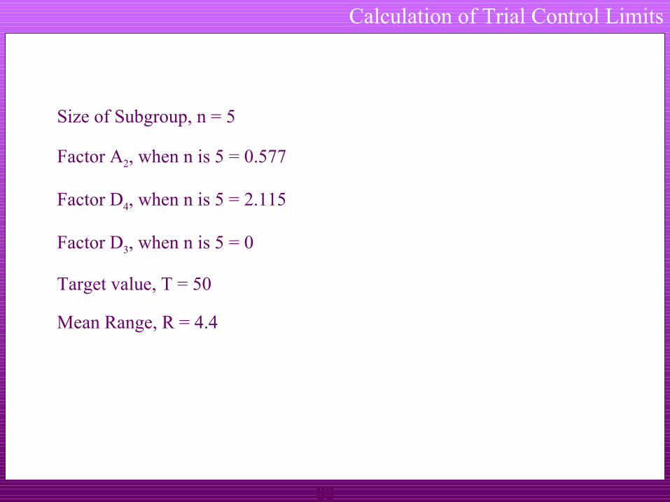
Calculation of Trial Control Limits
Size of Subgroup, n = 5
Factor A2, when n is 5 = 0.577
Factor D4, when n is 5 = 2.115
Factor D3, when n is 5 = 0
Target value, T = 50
Mean Range, R = 4.4
64
Establishing Control Chart
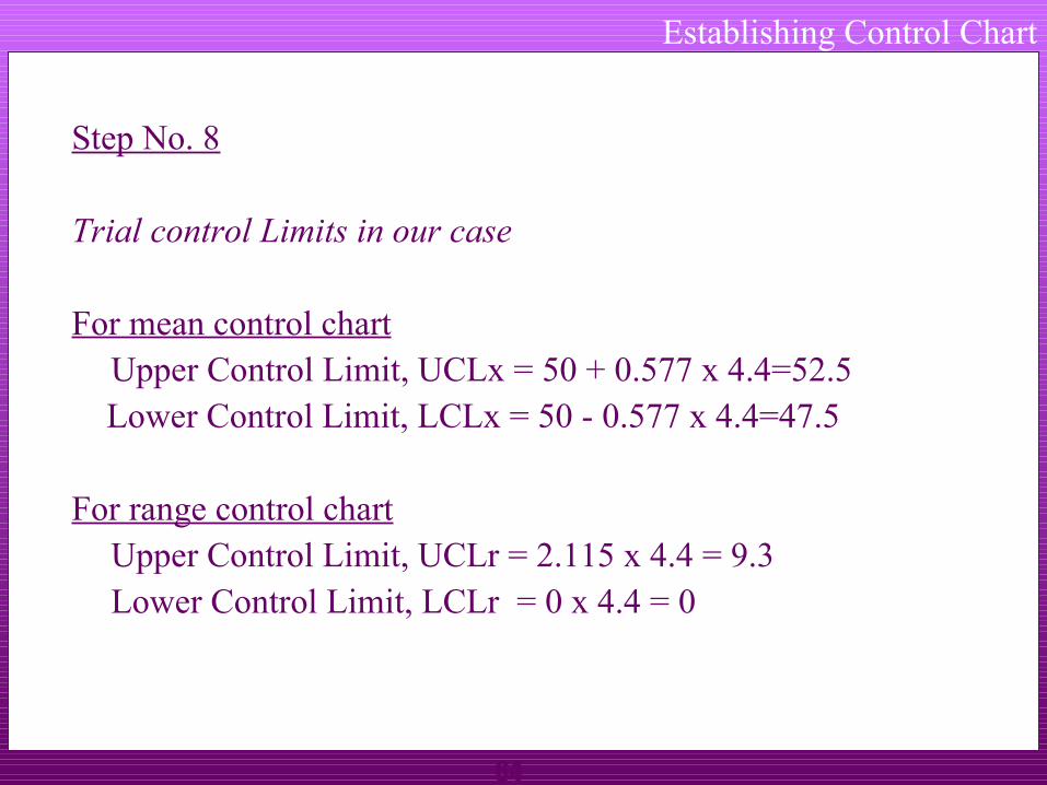
Step No. 8
Trial control Limits in our case
For mean control chartUpper Control Limit, UCLx = 50 + 0.577 x 4.4=52.5
Lower Control Limit, LCLx = 50 - 0.577 x 4.4=47.5
For range control chartUpper Control Limit, UCLr = 2.115 x 4.4 = 9.3Lower Control Limit, LCLr = 0 x 4.4 = 0
65
Establishing Control Chart
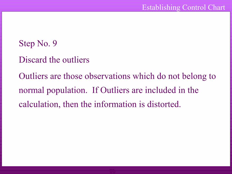
Step No. 9
Discard the outliers
Outliers are those observations which do not belong to
normal population. If Outliers are included in the
calculation, then the information is distorted.
66
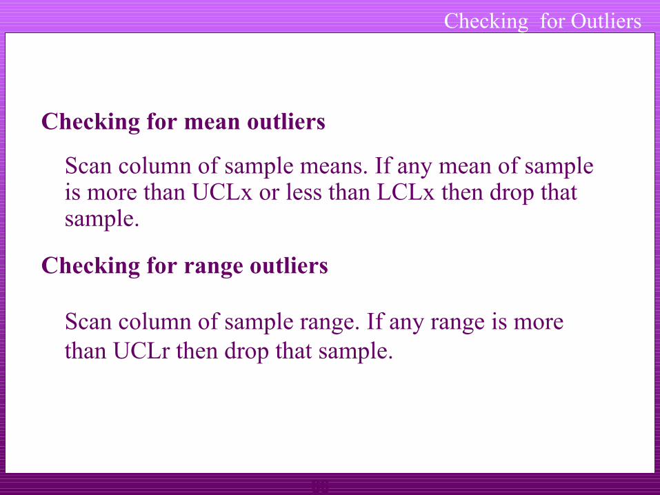
Checking for Outliers
Checking for mean outliers
Scan column of sample means. If any mean of sample is more than UCLx or less than LCLx then drop that sample.
Checking for range outliers
Scan column of sample range. If any range is more than UCLr then drop that sample.

67
If any sample(s) is dropped then recalculate the trial control limits using remaining sample(s).
Continue this exercise till there is no further droppings. When there is no further dropping trial control limits becomes control limits for control chart.
In all we can drop up to 25% of the samples
Checking for Outliers

68
Checking for Outliers
In our case
- None of the subgroup mean is more than 52.5
- None of the subgroup mean is less than 47.5
- None of the range is more than 9.3
- None of the range is less than 0
Hence there is no revision of trial control limits is required. These limits can be used for maintaining the control charts.
69
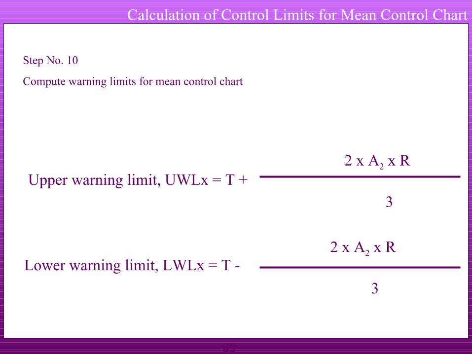
Calculation of Control Limits for Mean Control Chart
Step No. 10
Compute warning limits for mean control chart
Upper warning limit, UWLx = T +2 x A2 x R
3
Lower warning limit, LWLx = T -2 x A2 x R
3
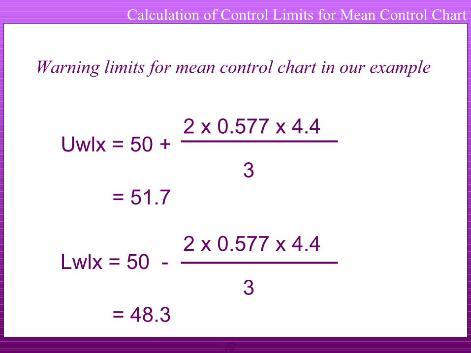
70
Calculation of Control Limits for Mean Control Chart
Warning limits for mean control chart in our example
Uwlx = 50 +2 x 0.577 x 4.4
3= 51.7
Lwlx = 50 -2 x 0.577 x 4.4
3= 48.3

71
1 2 3 4 5 6 7
Sample Number
Mea
n
UCLx UCLx
LCLxLCLx
UWLx UWLx
LWLx LWLx
TargetTarget
Action and Warning Limits for Mean Control chart
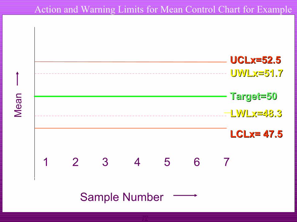
72
Action and Warning Limits for Mean Control Chart for Example
1 2 3 4 5 6 7
Sample Number
Me
an
UCLx=52.5 UCLx=52.5
LCLx= 47.5LCLx= 47.5
UWLx=51.7 UWLx=51.7
LWLx=48.3 LWLx=48.3
Target=50Target=50

73
Sample size, n
D4 D3 DWLR DWUR
2 3.27 0 0.04 2.81
3 2.57 0 0.18 2.17
4 2.28 0 0.29 1.93
5 2.11 0 0.37 1.81
6 2.00 0 0.42 1.72
7 1.92 0.08 0.46 1.66
Constants for Range Control chart

74
Calculation of Control Limits for Range Control Chart
Step No. 11
Compute warning limits for range control chart
Upper Warning Limit, UWLr = DWUR x R
Lower Warning Limit, LWLr = DWLR x R

75
Calculation of Warning Limits for Range Control Chart
In our case
Size of sub group, n = 5
Mean range R = 4.4
DWUR when n is 5 = 1.81
DWLR when n is 5 = 0.37

76
Calculation of Warning Limits for Range Control Chart
In our case warning limits for range control chart
Upper Warning Limit, UWLr = DWUR x R
= 1.81 x 4.4
= 8
Lower Warning Limit, LWLr = DWLR x R
= 0.37 x 4.4
= 1.6
77
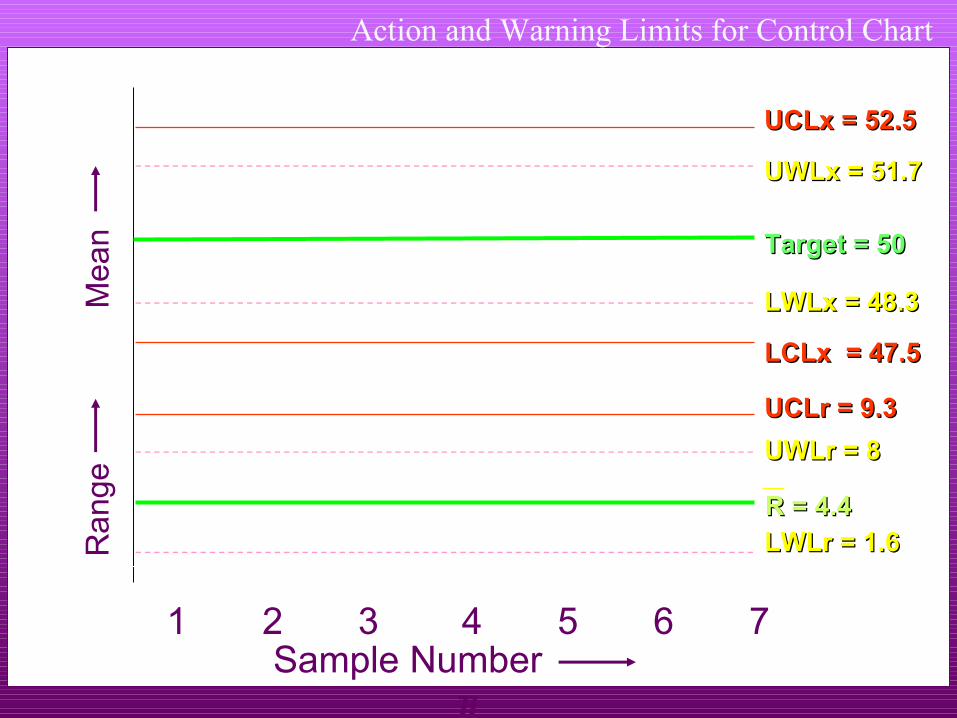
Action and Warning Limits for Control Chart
1 2 3 4 5 6 7
Mea
nUCLx = 52.5 UCLx = 52.5
LCLx = 47.5LCLx = 47.5
UCLr = 9.3UCLr = 9.3
Ra
nge
UWLr = 8UWLr = 8
LWLr = 1.6LWLr = 1.6
Target = 50Target = 50
R = 4.4R = 4.4
Sample Number
LWLx = 48.3 LWLx = 48.3
UWLx = 51.7 UWLx = 51.7
78
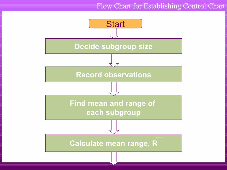
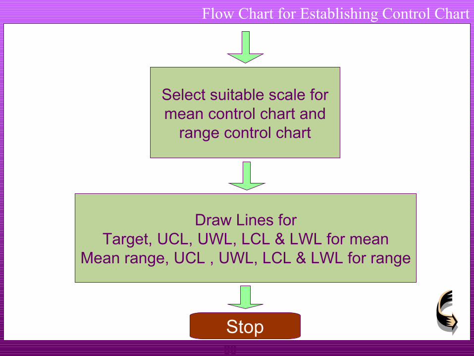
Flow Chart for Establishing Control Chart
Decide subgroup size
Record observations
Find mean and range of each subgroup
Calculate mean range, R
Start

79
Is any sub-group mean or range
out side the controllimit ?
Drop thatGroup
UCLx = T + A2 x RLCLx = T - A2 x R
UCLr = D4 x RLCLr = D3 x R
Yes
No
Flow Chart for Establishing Control Chart
80
Select suitable scale formean control chart and
range control chart
Draw Lines forTarget, UCL, UWL, LCL & LWL for mean
Mean range, UCL , UWL, LCL & LWL for range
Stop
Flow Chart for Establishing Control Chart

81
Summary of Effect of Process Shift
When there is no shift in the process nearly all the
observations fall within -3 s and + 3 s.
When there is small shift in the mean of process some
observations fall outside original -3 s and +3 s zone.
Chances of an observation falling outside original -3
s and + 3 s zone increases with the increase in the shift
of process mean.
82
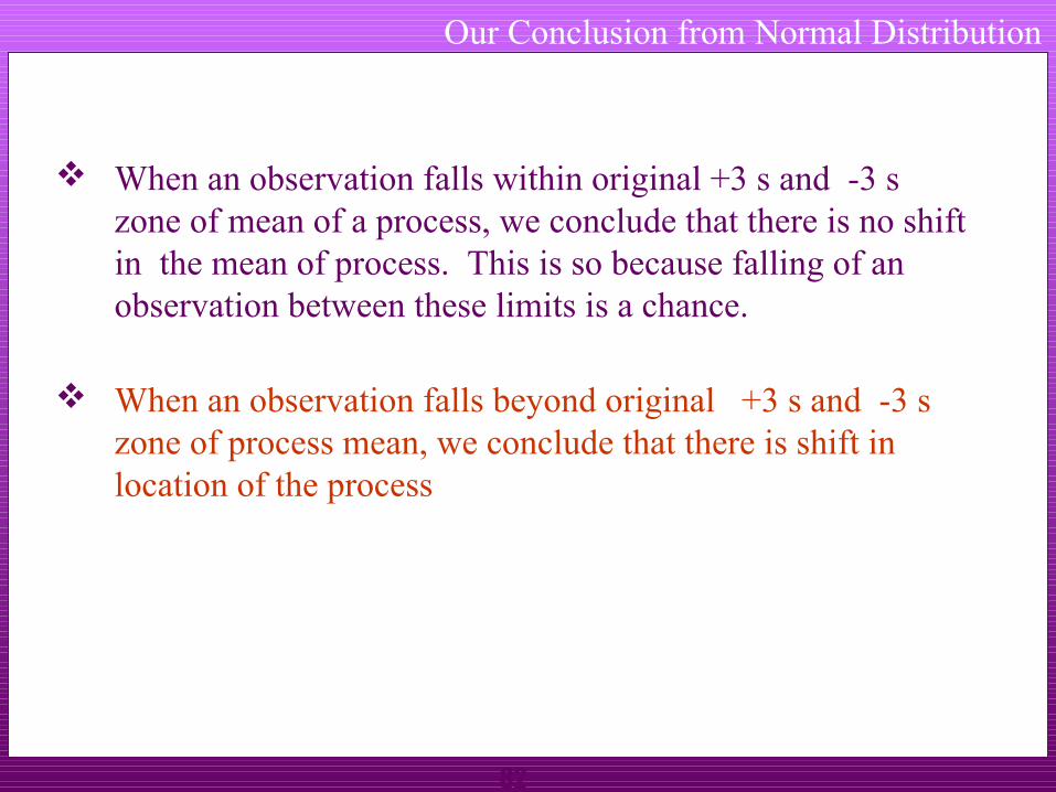
Our Conclusion from Normal Distribution
When an observation falls within original +3 s and -3 s zone of mean of a process, we conclude that there is no shift in the mean of process. This is so because falling of an observation between these limits is a chance.
When an observation falls beyond original +3 s and -3 s zone of process mean, we conclude that there is shift in location of the process
83
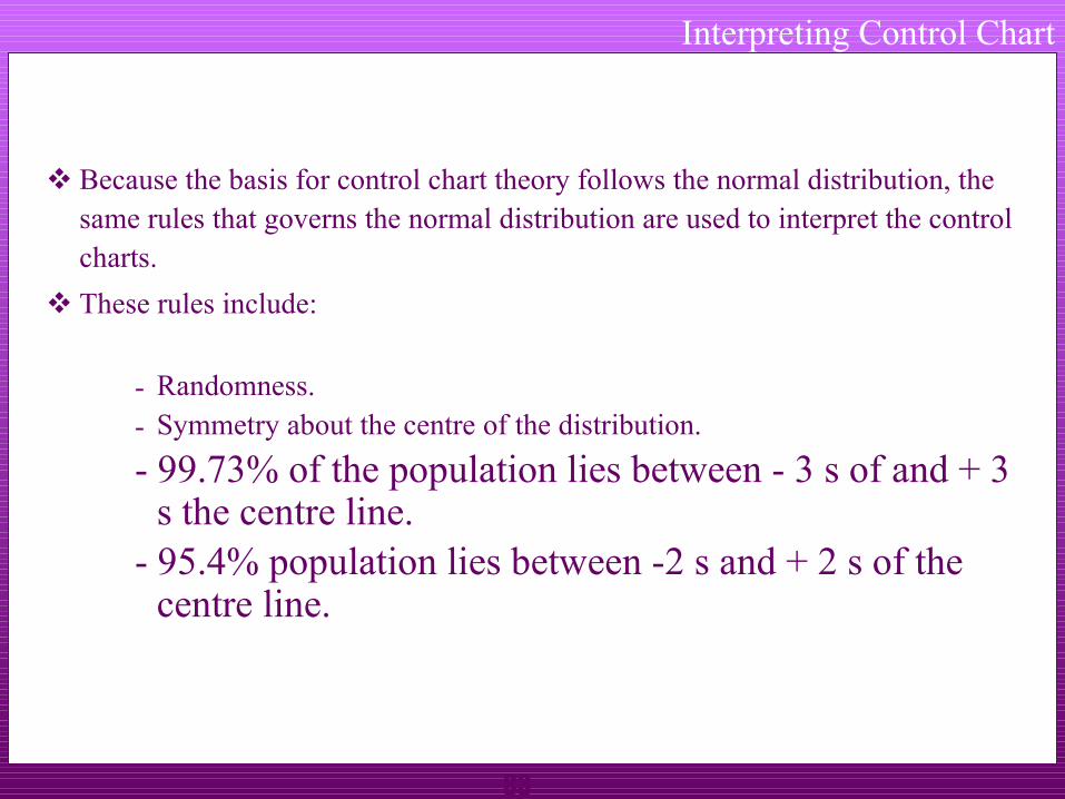
Interpreting Control Chart
Because the basis for control chart theory follows the normal distribution, the same rules that governs the normal distribution are used to interpret the control charts.
These rules include:
- Randomness.- Symmetry about the centre of the distribution.
- 99.73% of the population lies between - 3 s of and + 3 s the centre line.
- 95.4% population lies between -2 s and + 2 s of the centre line.
84
Interpreting Control Chart
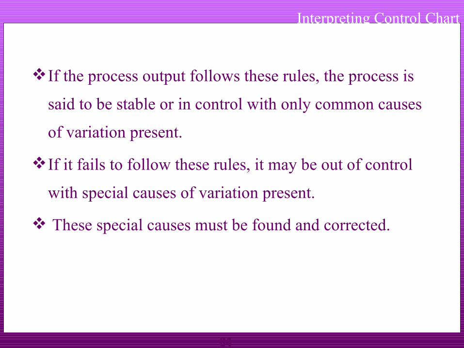
If the process output follows these rules, the process is
said to be stable or in control with only common causes
of variation present.
If it fails to follow these rules, it may be out of control
with special causes of variation present.
These special causes must be found and corrected.
85
Interpreting Control Chart
UCL
1 2 3 4 5 6 7 8
Sample Number
Sta
tistic
s
UWL
LCL
LWL
One point outsidecontrol limit

86
Interpreting Control Chart
UCLUCL
1 2 3 4 5 6 7 8Sample Number
Sta
tistic
s
UWLUWL
LCLLCL
LWLLWL
Two points out of three consecutive points between warning limit and corresponding control limit

87
Interpreting Control Chart
UCL
1 2 3 4 5 6 7 8Sample Number
Sta
tistic
s
UWL
LCL
LWL
Two consecutive points between warning limit and corresponding control limit
88
Interpreting Control Chart
UCLUCL
1 2 3 4 5 6 7 8
UWLUWL
LCLLCL
LWLLWL
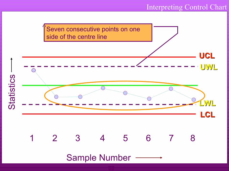
Seven consecutive points on one side of the centre line
Sample Number
Sta
tistic
s
89
Interpreting Control Chart
UCL
1 2 3 4 5 6 7 8
Sample Number
Sta
tistic
s
UWL
LCL
LWL
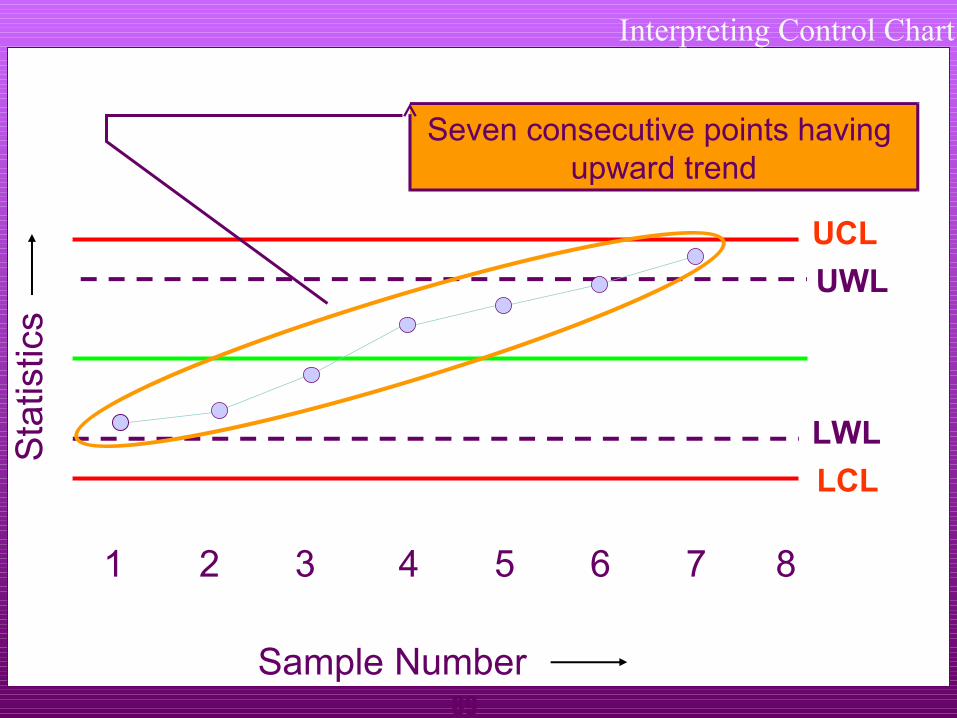
Seven consecutive points having upward trend

90
Interpreting Control Chart
UCLUCL
1 2 3 4 5 6 7 8
Sample Number
Sta
tistic
s
UWL
LCLLCL
LWL
Seven consecutive points having downward trend

91
Learning
Concept and definition of “Quality” Importance of improving Quality as a tool for cost
reduction Importance of proper analysis of Quality problems Usage of 7 QC tools to ensure “Defect free production”

92
Thank You


![7 Quality Control Tools (SQC Model) [MARCH 2009]](https://static.fdocuments.in/doc/165x107/554b6c20b4c905030a8b4e68/7-quality-control-tools-sqc-model-march-2009.jpg)