#1NLab17 - The Apparent Chaos: Bold Design that Works
56
Experience Lab 2017 | 11.08 – 11.10 2017 BY DESIGN Bold Design that Works The Apparent Chaos
-
Upload
one-north-interactive -
Category
Design
-
view
43 -
download
1
Transcript of #1NLab17 - The Apparent Chaos: Bold Design that Works

Experience Lab 2017 | 11.08 – 11.10 2017
BY DESIGN
Bold Design that Works
The Apparent Chaos
Experience Lab 2017 | 11.08 – 11.10 2017
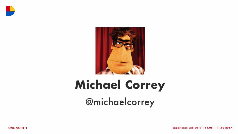
Michael Correy@michaelcorrey
Experience Lab 2017 | 11.08 – 11.10 2017
D
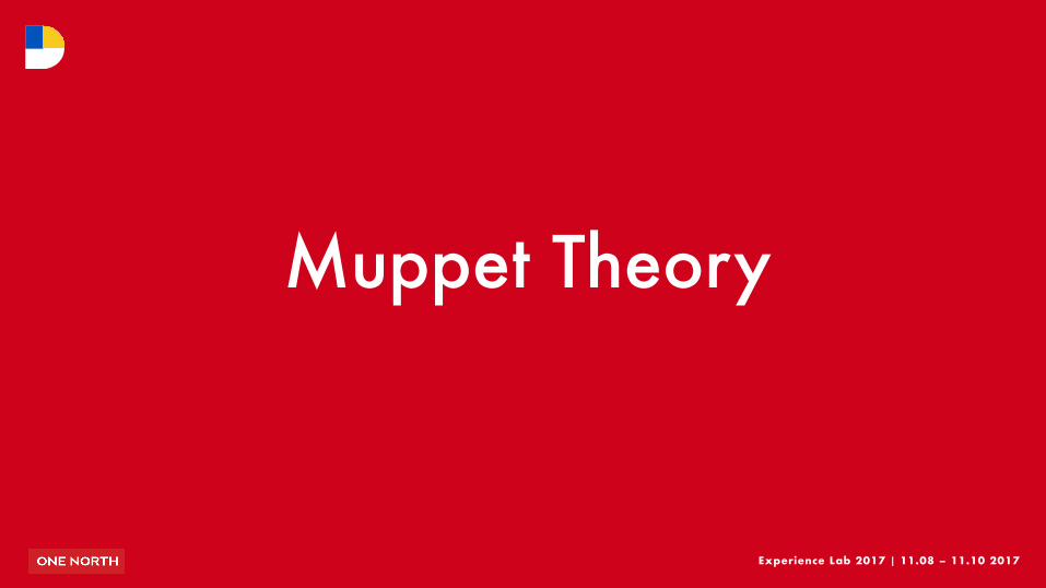
Muppet Theory
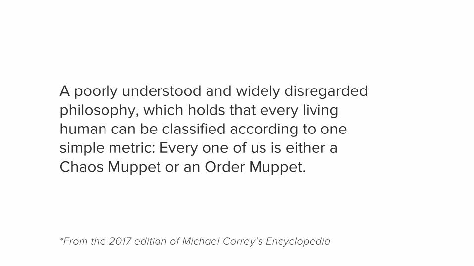
A poorly understood and widely disregarded philosophy, which holds that every living human can be classified according to one simple metric: Every one of us is either a Chaos Muppet or an Order Muppet.
*From the 2017 edition of Michael Correy’s Encyclopedia
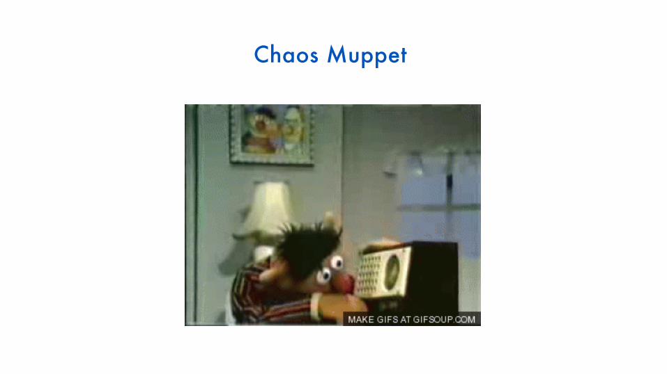
Chaos Muppet
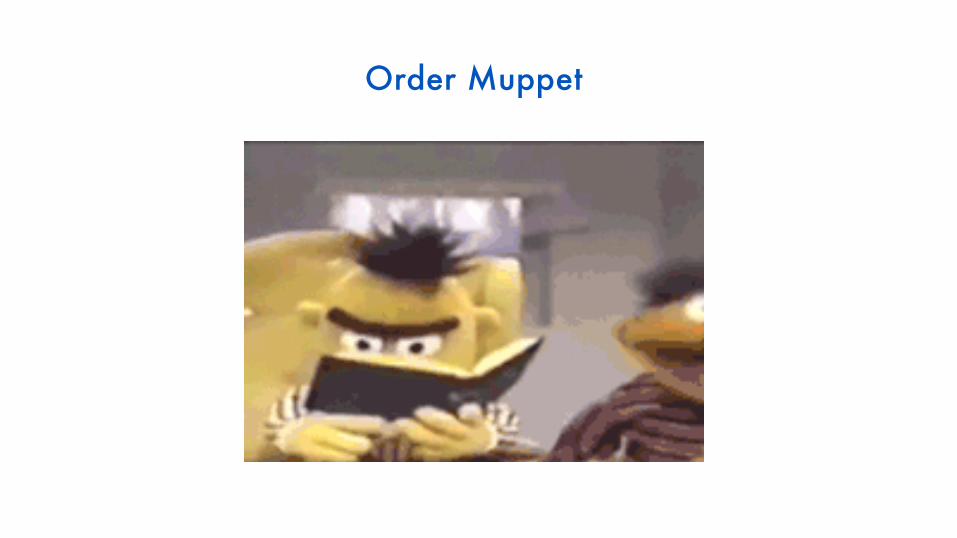
Order Muppet
In digital design, we like to think you can and should be a little of both.

Experience Lab 2017 | 11.08 – 11.10 2017
D
What is Apparent Chaos?
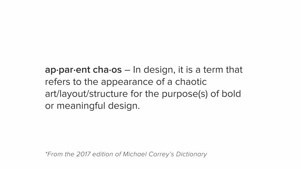
ap·par·ent cha·os – In design, it is a term that refers to the appearance of a chaotic art/layout/structure for the purpose(s) of bold or meaningful design.
*From the 2017 edition of Michael Correy’s Dictionary
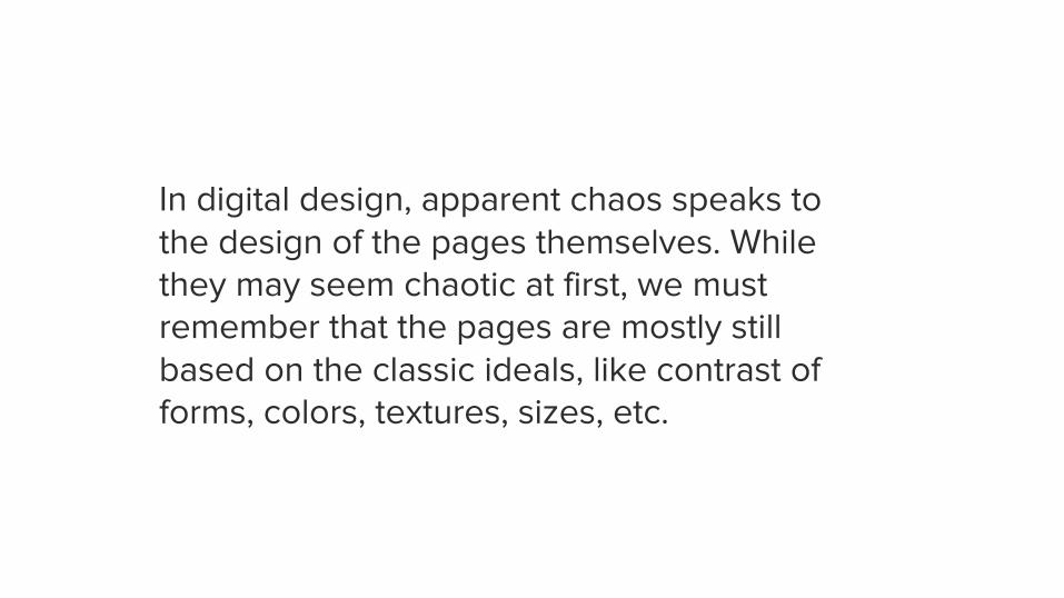
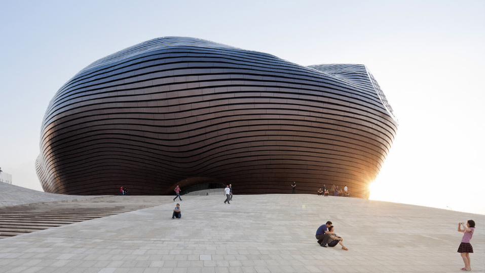
In digital design, apparent chaos speaks to the design of the pages themselves. While they may seem chaotic at first, we must remember that the pages are mostly still based on the classic ideals, like contrast of forms, colors, textures, sizes, etc.
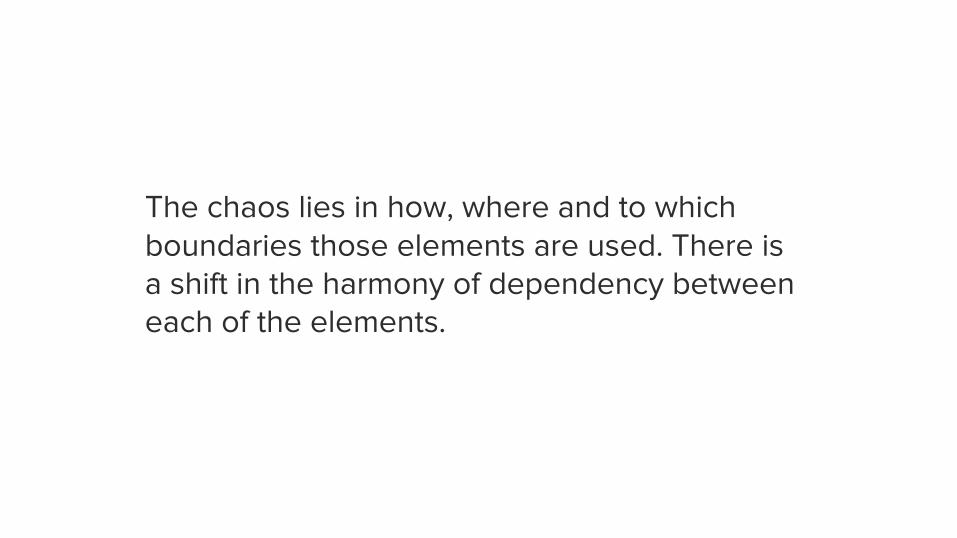
The chaos lies in how, where and to which boundaries those elements are used. There is a shift in the harmony of dependency between each of the elements.


Experience Lab 2017 | 11.08 – 11.10 2017
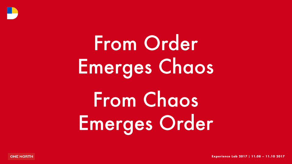
DFrom Order
Emerges Chaos
From Chaos Emerges Order
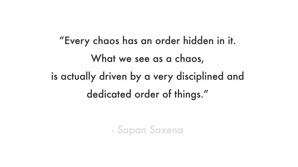
“Every chaos has an order hidden in it.
What we see as a chaos,
is actually driven by a very disciplined and
dedicated order of things.”
- Sapan Saxena


Experience Lab 2017 | 11.08 – 11.10 2017
D
3 Areas of Apparent Chaos
Experience Lab 2017 | 11.08 – 11.10 2017
D
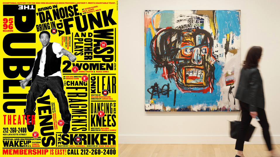
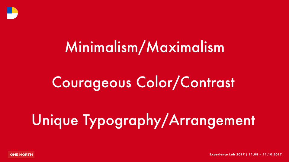
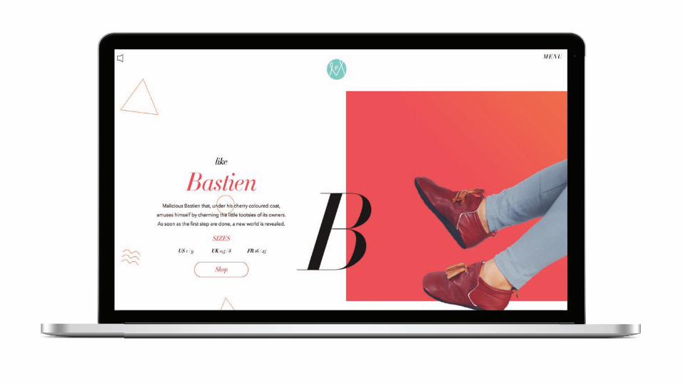
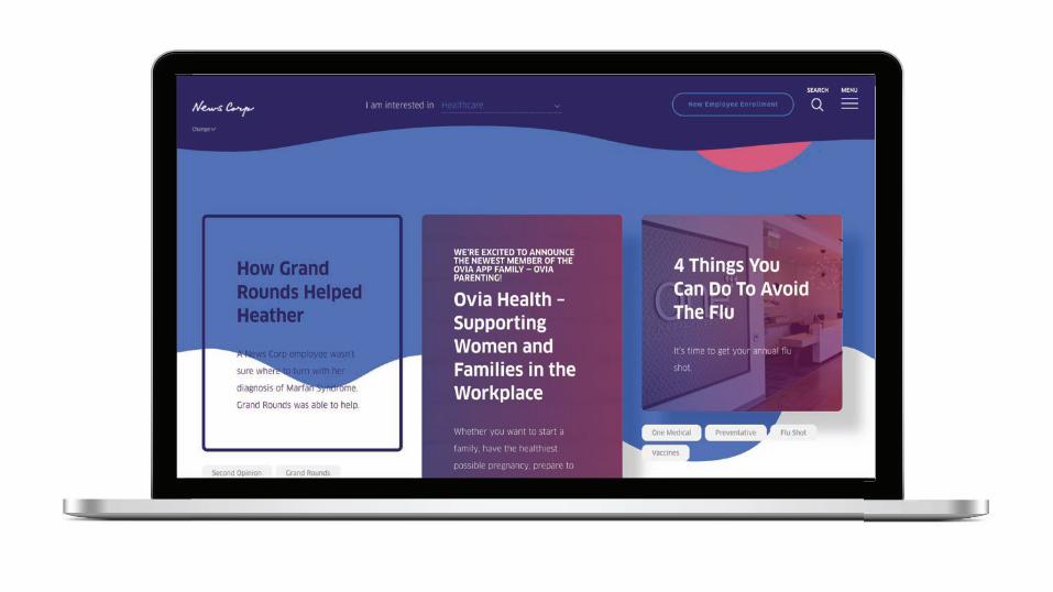
Minimalism/Maximalism
Courageous Color/Contrast
Unique Typography/Arrangement
Experience Lab 2017 | 11.08 – 11.10 2017
D
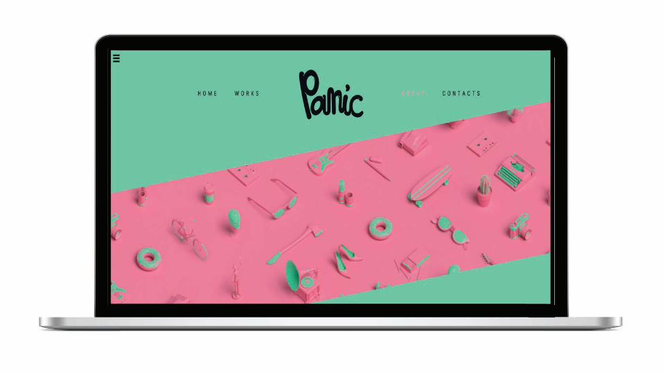
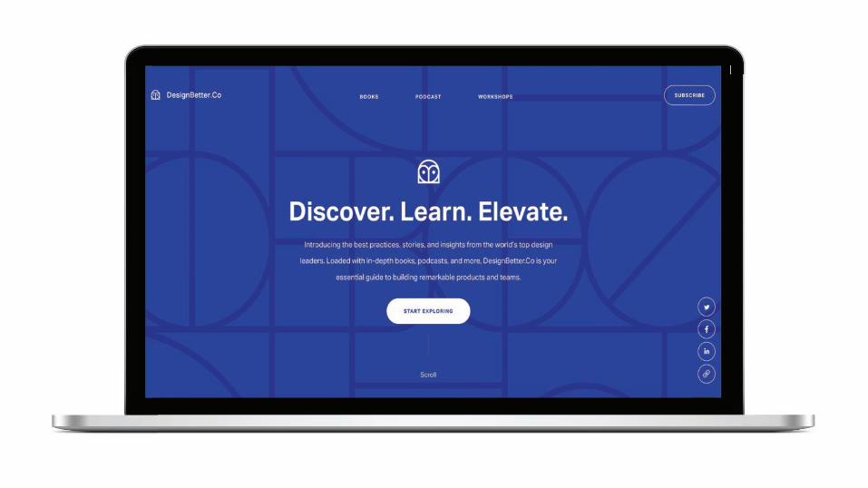
Minimalism/Maximalism

Experience Lab 2017 | 11.08 – 11.10 2017
Notes on…! Minimalism has been popular for a long time.
! Use of negative space
! Less content up front helps to enhance exploration.
! Maximalism helps offer as many opportunities to delight and differentiate, as more detailed and complex compositions are created.
! Multiple little details can drive the user’s eye.
! Floating or decorative icons, underscores, geometric figures and fragments add an interesting note to the page and act as balancers, separators or pointers to content.
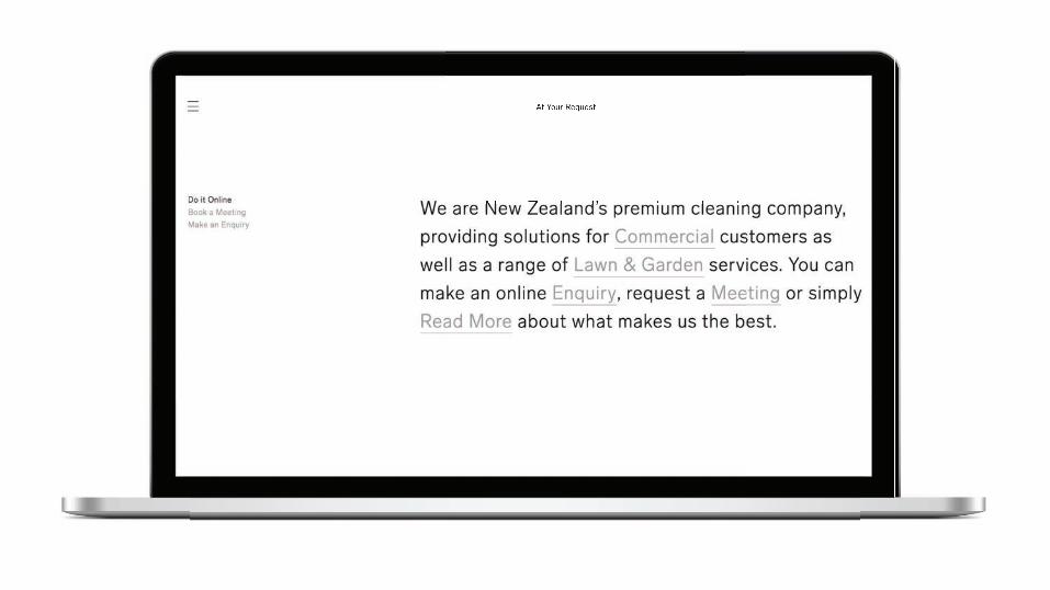
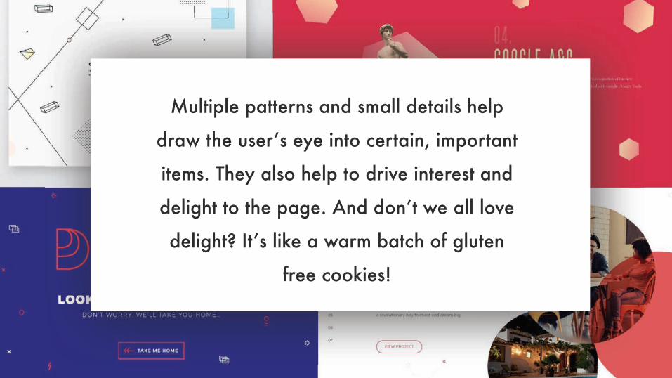
Multiple patterns and small details help
draw the user’s eye into certain, important
items. They also help to drive interest and
delight to the page. And don’t we all love
delight? It’s like a warm batch of gluten
free cookies!


Experience Lab 2017 | 11.08 – 11.10 2017
D
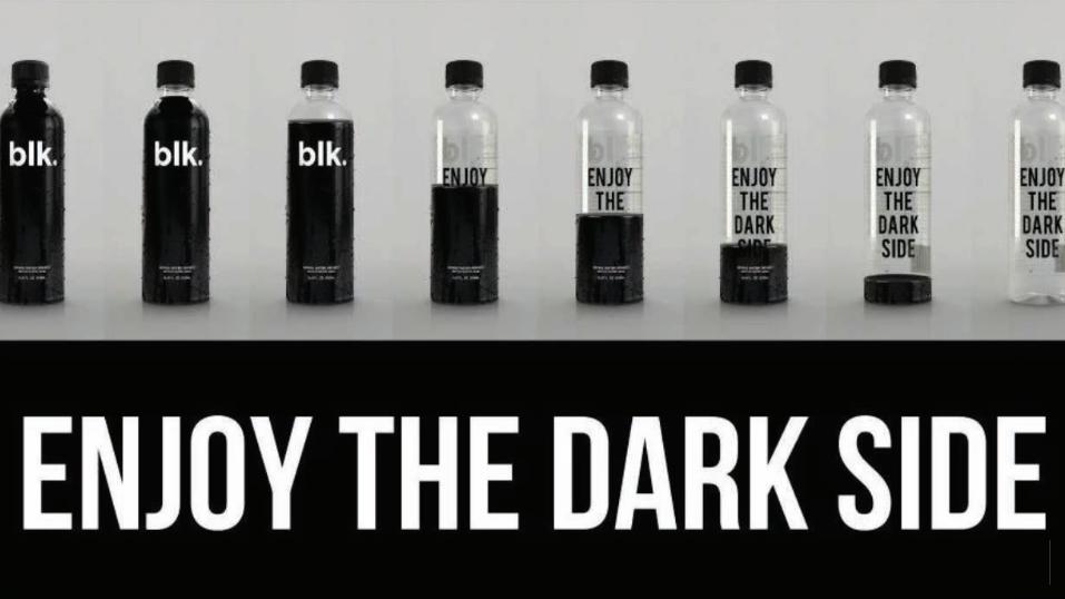
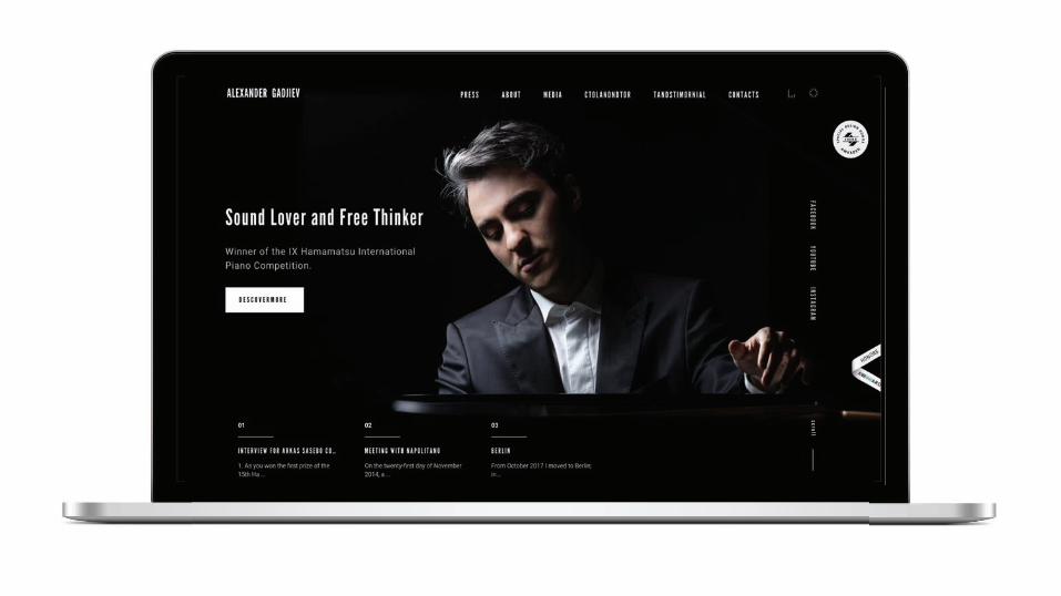
Courageous Color/Contrast
Experience Lab 2017 | 11.08 – 11.10 2017
Notes on…! Courageous Color may seem too hip or “it doesn’t feel like our
brand could pull it off.”
! Used strategically, certain colors can boost digital presence.
! Bright and new/fresh colors help generate more positive emotions than dark or neutral colors.
! Contrast in colors can be used as a detail, to draw attention and guide/engage the user.
! Courageous color and contrast can uniquely separate your brand fromcompetitors as original, confident and, most importantly, memorable.
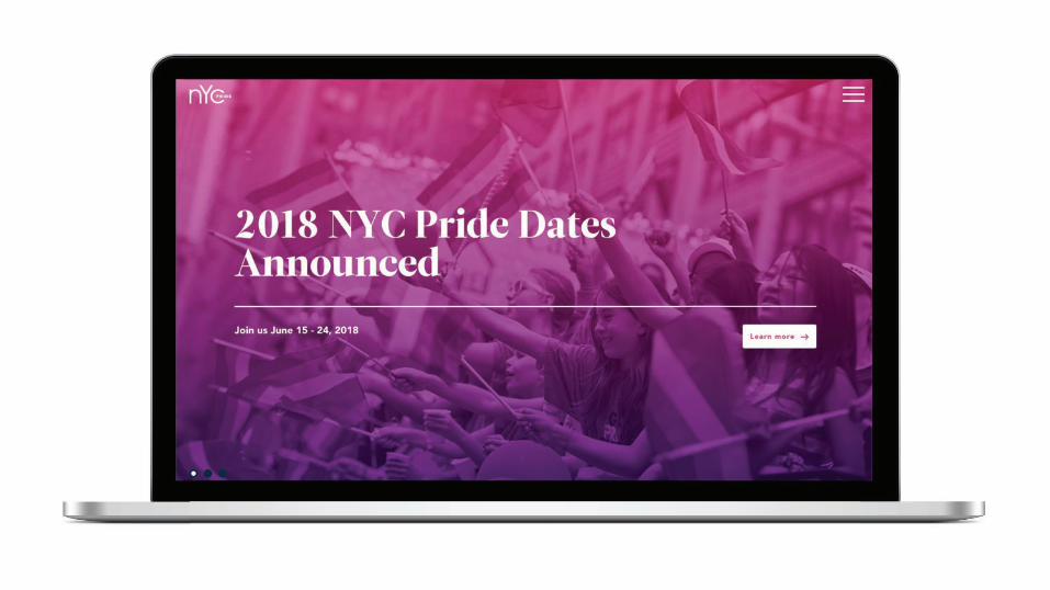
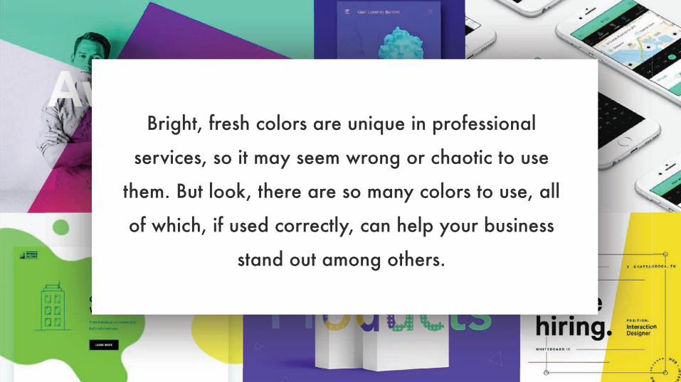
Bright, fresh colors are unique in professional
services, so it may seem wrong or chaotic to use
them. But look, there are so many colors to use, all
of which, if used correctly, can help your business
stand out among others.


Experience Lab 2017 | 11.08 – 11.10 2017
D
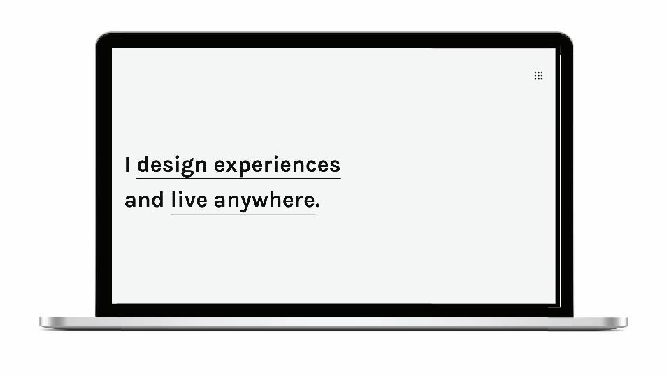
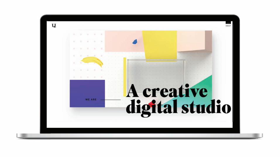
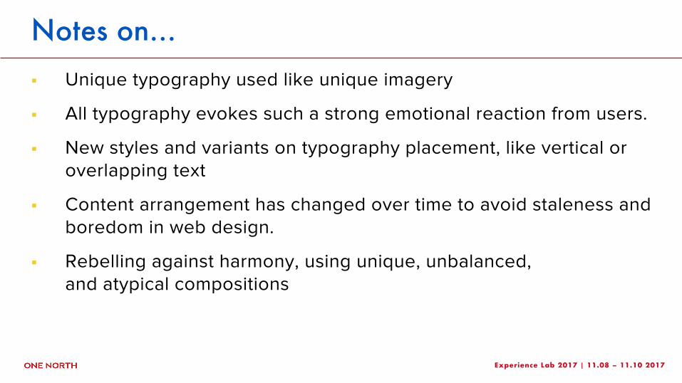
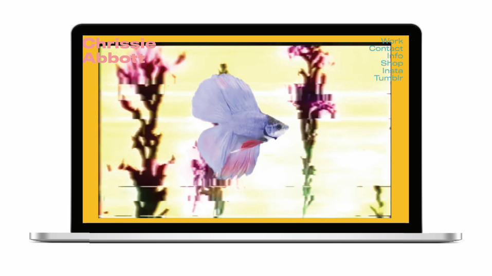
Unique Typography/Arrangement
Experience Lab 2017 | 11.08 – 11.10 2017
Notes on…! Unique typography used like unique imagery
! All typography evokes such a strong emotional reaction from users.
! New styles and variants on typography placement, like vertical oroverlapping text
! Content arrangement has changed over time to avoid staleness and boredom in web design.
! Rebelling against harmony, using unique, unbalanced, and atypical compositions
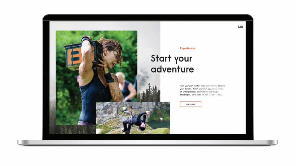
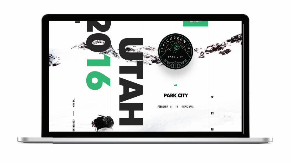
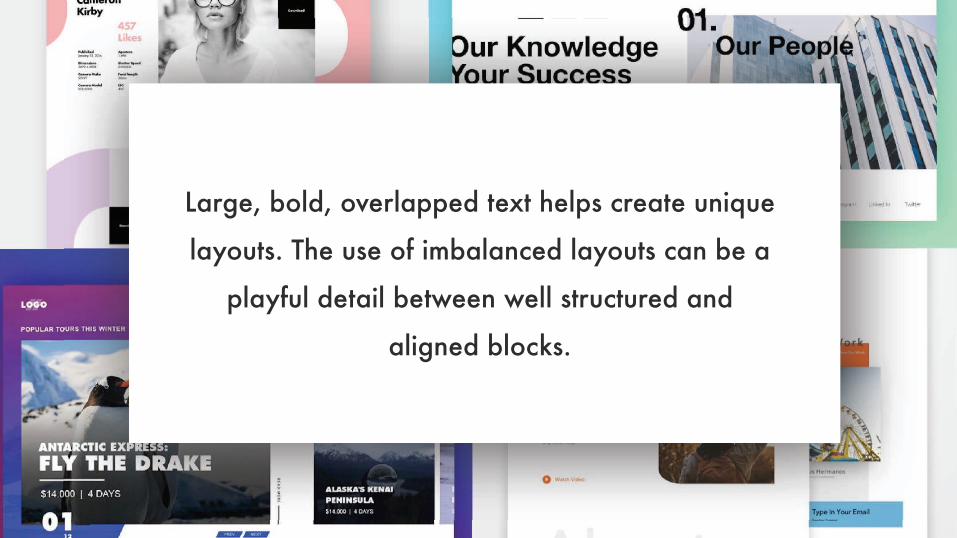
Large, bold, overlapped text helps create unique
layouts. The use of imbalanced layouts can be a
playful detail between well structured and
aligned blocks.

Experience Lab 2017 | 11.08 – 11.10 2017
D
Bold Design … Gone Wrong


Experience Lab 2017 | 11.08 – 11.10 2017
D
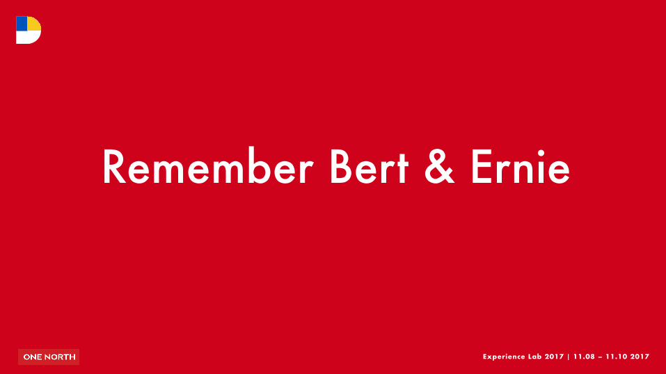
Remember Bert & Ernie

A website may seem chaotic from the outside, but it can be done with purpose and intent.
In the sea of sameness, we all want our sites to not only have order and function, but also to be original and memorable.
So be bold, take calculated risks and always remember the old rule of thumb:
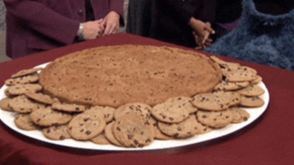
Too many Order Muppets means no cookies for anyone.
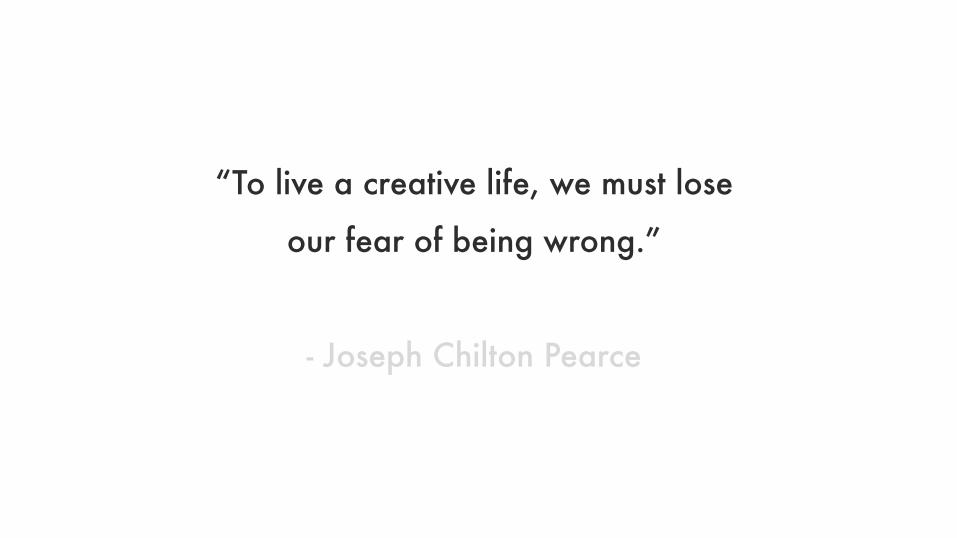
“To live a creative life, we must lose
our fear of being wrong.”
- Joseph Chilton Pearce
Experience Lab 2017 | 11.08 – 11.10 2017
BY DESIGN
Bold Design that Works
The Apparent Chaos