
100112 tj brand_guidelines_r4ra1_cs6
38
Global Brand Guidelines Draft R3V3 | November 2012
Transcript of 100112 tj brand_guidelines_r4ra1_cs6

Global BrandGuidelines
Draft R3V3 | November 2012
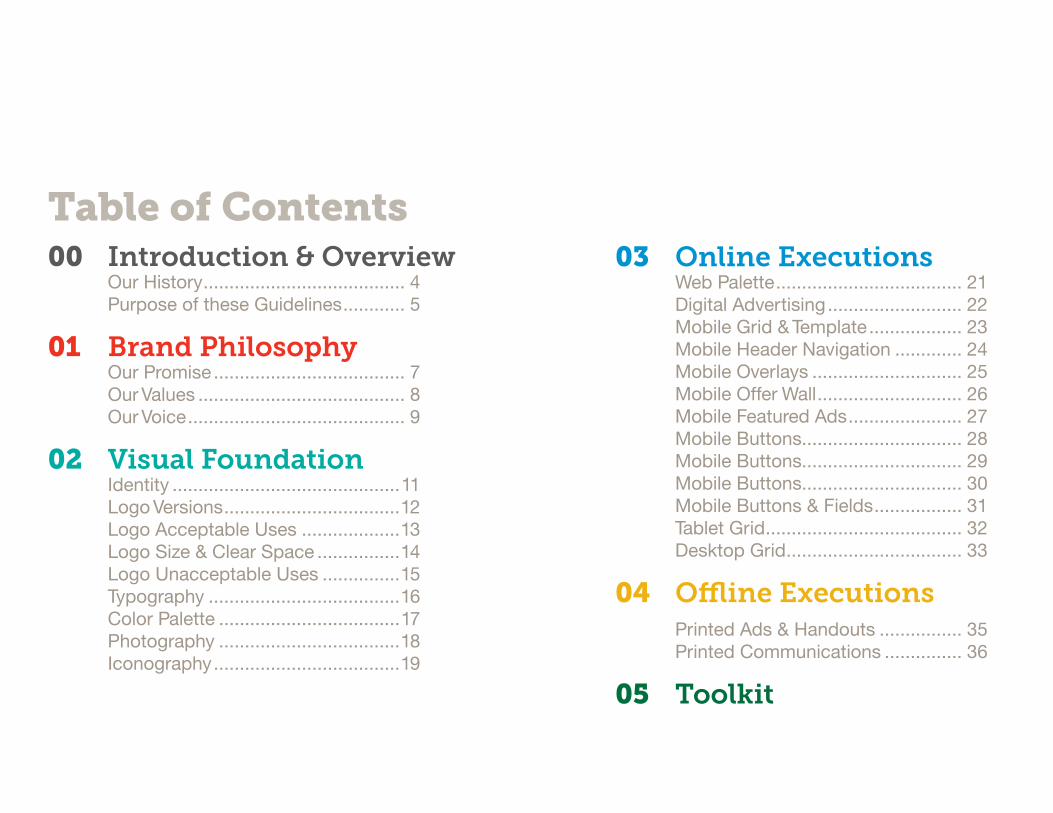
Table of Contents00 Introduction & Overview OurHistory....................................... 4 PurposeoftheseGuidelines............ 5
01 Brand Philosophy OurPromise..................................... 7 OurValues........................................ 8 OurVoice.......................................... 9
02 Visual Foundation Identity............................................11 LogoVersions..................................12 LogoAcceptableUses...................13 LogoSize&ClearSpace................14 LogoUnacceptableUses...............15 Typography.....................................16 ColorPalette...................................17 Photography...................................18 Iconography....................................19
03 Online Executions WebPalette.................................... 21 DigitalAdvertising.......................... 22 MobileGrid&Template.................. 23 MobileHeaderNavigation............. 24 MobileOverlays............................. 25 MobileOfferWall............................ 26 MobileFeaturedAds...................... 27 MobileButtons............................... 28 MobileButtons............................... 29 MobileButtons............................... 30 MobileButtons&Fields................. 31 TabletGrid...................................... 32 DesktopGrid.................................. 33
04 Offline Executions PrintedAds&Handouts................ 35 PrintedCommunications............... 36
05 Toolkit

00 Introduction & Overview History
Purpose of these Guidelines

Rio voluptatio totatem abo. Icte porum eaquaepudae des et etur sant at.Tiis et, explab ium ex essed qui doloreri sed utet volupitae que cus dolorep elentis inis mo ea et que mos eatecae prateca erovidi cillend amusand animus andaerum et di tem fugias ea de pedit omnist, nem re dolest venihiliqui seriatiis veniscia il eos autatquam nimus, a sam eaquidem inihitatio offictas dolorem et lam etur, nos que eaquatq uianis dolla dolupta epelibus.
Ecte preprore eossi cusam alitissi que veliqui dolupta simagnimus et aut aut ipsaepe rferion re volor sum idem autaect emporendel idemporionse dolesti onsequae ipicab inctur?Nequiandel etur? Luptas vendae eos et dipsus voloris torrovidunt laborem oditate ssitatur assequa ssimet ipsam inctio blaceaqui quatur re landi re pra dellibus nobis aut apiciisit officium, offici dolor asi optur? Oratur, quis dentem rehenita cori ut quam duciae nos acea eserro quidita tiumqua tibust recatior aut ratem con pelenitat auda dolupiciis simolor empore magnit eius evendam experi aut as et hiliquunt essimagnient fugiae dolore nus.
®
00
In
tro
du
ctio
n &
Ov
erv
iew
© 2012 Tapjoy | Draft R3V6
4®
Our HistoryTapjoy was founded in 2007...

00
In
tro
du
ctio
n &
Ov
erv
iew
The identity of Tapjoy is more than just a logo set upon a red background. It’s the satisfaction that our users receive when they discover new apps or earn rewards through our platform. Its the strong relationships that are built with our partners through our successful business model. Tapjoy is comprised of an intricate system of elements and principles that help define us as the premier app distributor in the marketplace.
This brand center serves as an educational tool that can inform you about the Tapjoy brand and how to apply it across various communication channels - print, web, environmental spaces, language, etc. It defines proper use of the logo, colors, language, interface tools, and other elements. By applying these rules, it will ensure that the Tapjoy identity is distinct and unique across all forms of communication.
If you have any questions or suggestions regarding this brand center, please email us at [email protected].
© 2012 Tapjoy | Draft R3V6
5®
Purpose of these GuidelinesThese guidelines give an overview of our identity and visual system as well as guidance for using its elements correctly when producing material for Tapjoy. The key components of the visual system are introduced with examples to illustrate how these elements can be used. A consistent use of design elements will help build a unified Tapjoy brand experience. For additional questions or to obtain artwork, contact [brand]@tapjoy.com
01 Brand Philosophy Our Promise
Our Values
Our Voice

01
Bra
nd
Ph
ilo
sop
hy
Tapjoy is a mobile value exchange that connects consumers, developers, and advertisers through relevant content and precision technology. Tapjoy is advancing the way consumers experience mobile by giving them a new way to discover relevant apps and content, providing consumers with opportunities to earn virtual currency by using their favorite apps or interacting with new ones, granting access to an ever-expanding world of fresh,
customized content, and creating a social environment where consumers can make recommendations to friends and compete for glory. And because Tapjoy knows the mobile marketplace better than anyone else, it provides developers and advertisers with a direct channel to gain the exposure they want and the cutting-edge tools they need to drive results. Inventive, engaging, and designed to increase relevance for consumers, developers, and advertisers, Tapjoy unlocks mobile joy.
Rewarding App Discovery™
© 2012 Tapjoy | Draft R3V6
7®
Our PromiseOur brand platform is comprised of three main components—the brand promise, value attributes, and voice attributes. Together, these cornerstones capture and define our nature, what differentiates us, and how we present ourselves to our internal and external audiences. The brand platform is also the foundation that guides our decision-making for the visual design as outlined in the following pages.

Value attribute It means… Proof points
Discovery The brand is curious. It fosters a sense of exploration and empowerment by helping consumers connect with what they want and need.
• Allows customers to interact with their discoveries in a tangible way.
• Provides consumers with recommendations based on their interests and enables them to see what others like.
Community The brand is approachable. It embraces its connection with customers—and the connections customers make with each other. It is honest and acts with integrity.
• Enables consumers to share content, connect with friends, and post and read reviews.
• Creates an avenue for app developers and advertisers to reach consumers.
Ingenuity The brand is inventive. It uses innovative technology to help customers find precisely what matters to them—whether that’s a new app or the right audience.
• Provides targeted app recommendations and ads.
• Provides developers and advertisers access to the right consumers.
01
Bra
nd
Ph
ilo
sop
hy
© 2012 Tapjoy | Draft R3V6
8®
Our ValuesOur value attributes establish the behavior of the Tapjoy brand and capture key tenets of our organization.

Voice attribute It means… It sounds… But not…
Bright The brand is inventive and forward-looking. The tone is smart, but not technical or brainy.
• Knowledgeable• Sharp• Imaginative
• Academic• Technical• Cutting
Candid The brand is honest and unbiased. The tone is refreshingly transparent.
• Bold• Straightforward• Open
• Rude• Thoughtless• Coarse
Spirited The brand is exciting, enthusiastic, and dynamic. It evokes a sense of energy and momentum.
• Vibrant• Curious• Amusing
• Juvenile• Silly• Dry
01
Bra
nd
Ph
ilo
sop
hy
© 2012 Tapjoy | Draft R3V6
9®
Our VoiceOur voice attributes establish the personality of the Tapjoy brand and describe the tone and manner in which the brand promise is brought to life.

02 Visual Foundation Identity
Typography
Palette
Iconography
Illustration
Photography

10˚ 26˚
02
Vis
ual
Fo
un
dat
ion
© 2012 Tapjoy | Draft R3V6
11®
IdentityThe spirited and approachable nature of Tapjoy has been captured in a logotype that speaks of connections and a seamless experience.

Isolated The Tapjoy logo in color is our primary mark, use this version where possible to build a consistent and recognizable brand.
App IconThe Tapjoy app icon logo should only be used in color. Use this version consistently in places where content pertains specifically to mobile content.
Lock-UpWhen Applicable, the tagline can be used in tandem with the logo to reinforce our message.
®®
®
02
Vis
ual
Fo
un
dat
ion
© 2012 Tapjoy | Draft R3V6
12®
Logo VersionsThe Tapjoy logo is the key identifier for our brand and acts as the anchor for all layouts. The logo can be used locked-up with the tagline as demonstrated below. The versions shown here are the approved color renderings of the logotype.
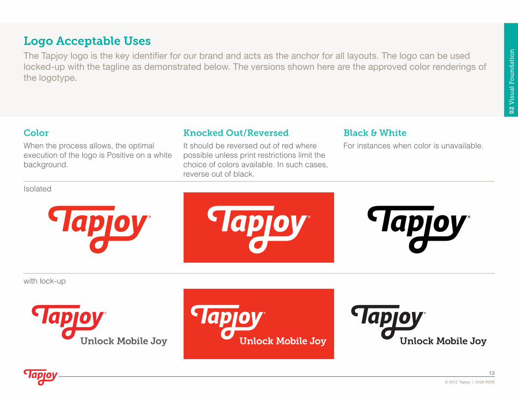
Color When the process allows, the optimal execution of the logo is Positive on a white background.
Black & WhiteFor instances when color is unavailable.
® ®
® ®
with lock-up
Isolated
Knocked Out/ReversedIt should be reversed out of red where possible unless print restrictions limit the choice of colors available. In such cases, reverse out of black.
®
®
02
Vis
ual
Fo
un
dat
ion
© 2012 Tapjoy | Draft R3V6
13®
Logo Acceptable UsesThe Tapjoy logo is the key identifier for our brand and acts as the anchor for all layouts. The logo can be used locked-up with the tagline as demonstrated below. The versions shown here are the approved color renderings of the logotype.

Isolated App IconLock-Up
Minimum Screen
Minimum Screen
Minimum Screen
Minimum Print Minimum Print Minimum Print
Clear Space Clear Space
®
®
®x.5x
.5x
.5x
.625"
45px
®
®
x.5x
.5x
.5x
.5x
®
Clear Space
®x
.5x
1.0".625"
57px80px
®
®
02
Vis
ual
Fo
un
dat
ion
© 2012 Tapjoy | Draft R3V6
14®
Logo Size & Clear SpaceTo ensure the logo’s visibility in all applications, surround it with sufficient clear space—free of type, graphics, and other elements that might cause visual clutter. The minimum “breathing room” is proportionate to half the height of the logotype “T” on all sides. Please use the listed guidelines as the minimum allowable size for the Tapjoy logo in print and web.

Incorrect use of Color/Texture Incorrect Clear Space/OrientationIncorrect use of Effects
®
02
Vis
ual
Fo
un
dat
ion
© 2012 Tapjoy | Draft R3V6
15®
Logo Unacceptable UsesIts imperative that the Tapjoy logo maintains its integrity and is not compromised in any way. Here are examples how the logo should not be displayed. Use this as reference and if you still have any questions in specific circumstances, please email us at [email protected].

®
®
ABCDEFGHIJKLMNOPQRSTUVWXYZ abcdefghijklmnopqrstuvwxyz1234567890%!+&#®
ABCDEFGHIJKLMNOPQRSTUVWXYZ abcdefghijklmnopqrstuvwxyz1234567890%!+&#®
ABCDEFGHIJKLMNOPQRSTUVWXYZ abcdefghijklmnopqrstuvwxyz1234567890%!+&#®
ABCDEFGHIJKLMNOPQRSTUVWXYZ abcdefghijklmnopqrstuvwxyz1234567890%!+&#®
ABCDEFGHIJKLMNOPQRSTUVWXYZ abcdefghijklmnopqrstuvwxyz1234567890%!+&#®ABCDEFGHIJKLMNOPQRSTUVWXYZ abcdefghijklmnopqrstuvwxyz1234567890%!+&#®
ABCDEFGHIJKLMNOPQRSTUVWXYZ abcdefghijklmnopqrstuvwxyz1234567890%!+&#®
ABCDEFGHIJKLMNOPQRSTUVWXYZ abcdefghijklmnopqrstuvwxyz1234567890%!+&#®
MUSEO SLAB Acceptable Styles/Weights:
HELVETICAAcceptable Styles/Weights:
300
500
700
900
Regular
Italic
Bold
Bold Italic
02
Vis
ual
Fo
un
dat
ion
© 2012 Tapjoy | Draft R3V6
16®
TypographyThe principal typeface families for Tapjoy are Museo Slab and Gill Sans. Use Museo Slab for headlines, titles, call-outs and captions to draw attention to copy content. Gill Sans is used for general body copy, word processing, email or searchable text in digital applications. Use Helvetica wherever Gill Sans is not available.

TAPJOY RED (Primary)
PANTONE 1795 RGB 233, 41, 46
CMYK 0, 96, 90, 2 HEX E9292E
WARM GREY 5 RGB 174, 167, 159
CMYK 11, 13, 14, 26 HEX AEA79F
PROCESS BLUE RGB 0, 147, 208
CMYK 100, 10, 0, 10 HEX 0085CF
TAPJOY TEAL (Secondary)
PANTONE 3275 RGB 174, 167, 159
CMYK 94, 0, 47, 0 HEX 0088CE
WARM GREY 8 RGB 139, 129, 0
CMYK 16, 23, 23, 44 HEX 8B8178
GREEN MIX RGB 0, 111, 62
CMYK 100, 10, 91, 36 HEX 006F3E
TAPJOY YELLOW (Tertiary)
PANTONE 124 RGB 233, 41, 46
CMYK 0, 96, 90, 2 HEX E9292E
Acceptable Accent Colors
Neutral Accent Colors
02
Vis
ual
Fo
un
dat
ion
© 2012 Tapjoy | Draft R3V6
17®
Color PaletteOur proprietary color palette emphasizes the bright energy of the Tapjoy brand. The palette is divided into primary, secondary and tertiary categories that define how the colors are used in applications. Each color is accompanied by its Pantone®, CMYK, RGB, and Hexadecimal values to facilitate accurate reproduction across different types of media.

Background Device or model(s) should not be overwhelmed by a busy or distracting background. The device is the "Hero".
DeviceThe device(s) should be current with the fast moving and diverse platforms that our brand supports.
Unacceptable
Acceptable
ExpressionThe Expression of the model(s) should reflect the playful and optimistic nature of the Tapjoy brand.
02
Vis
ual
Fo
un
dat
ion
© 2012 Tapjoy | Draft R3V6
18®
PhotographyPhotographic images are a great visual tool to establish an emotional connection with audiences. Use color imagery on a white background and ensure that it complements the color palette. Look for portrait photographs that are studio lit, capture candid and expressive personalities and the diversity of our audiences. Portraiture must contain a mobile device and preferably have the ability to be altered for use in both mid shot and close up crops.

Devices Device icons should not be exclusive to any one platform or device and represent the vast product ecosystem that Tapjoy supports.
Mobile Phones:
Tablets:
Laptop:
App CategoriesThe Emerging App ecosystem categorization system.
Action/Adventure Strategy Puzzle
Arcade Word/Number Card
1st Person Shooter Music Board
Quiz Casino Sports
Racing
ActionsAbstract concepts and actions should be represented consistently to "train" the audience/user of our unique visual nomenclature.
Download Purchase Time Increment
Install Social Action Direct Response
CPV Video Transaction Incentive
Virtual Currency
S1
02
Vis
ual
Fo
un
dat
ion
© 2012 Tapjoy | Draft R3V6
19®
IconographyThe icons can be used in all types of Tapjoy communications and act as a quick read on recurring, and key Tapjoy material. They can be designed in any of the secondary or tertiary colors. When developing any new Tapjoy icon, keep the same consistent line weight, geometry, scale and simplicity as the ones shown here.An integral aspect of succinct communication for our platform are icons. Icons should be suggestive of the functionality with which they are associated. The best icon will suggest to the user the primary purpose of the

03 Online Executions Advertising
Web
Mobile
Social Media

Primary R G B HEX
233 41 46 E9292E
Supportive R G B HEX
255 134 0 FF8600
255 192 0 FFC000
127 25 25 7F1919
250 210 211 FAD2D3
Neutral R G B HEX
91 91 91 5B5B5B
140 140 140 8C8C8C
165 165 165 A5A5A5
206 206 206 CECECE
229 229 229 E5E5E5
244 244 244 F4F4F4
03
On
lin
e E
xec
uti
on
s
© 2012 Tapjoy | Draft R3V6
21®
Web PaletteRed and white are the primary colors that represent the Tapjoy brand. Those colors are supported by orange tones that make up the call-to-action buttons and two tones of red. Also included is a range of neutral gray colors that can help complement the primary and supportive colors without competing with them.

03
On
lin
e E
xec
uti
on
s
© 2012 Tapjoy | Draft R3V6
22®
Digital AdvertisingOur brand platform is comprised of three main components—the brand promise, value attributes, and voice attributes. Together, these cornerstones capture and define our nature, what differentiates us, and how we present ourselves to our internal and external audiences. The brand platform is also the foundation that guides our decision-making for the visual design as outlined in the following pages.

Mobile Grid Use this grid reference to maintain a structure within your design.
Toolbox Asset:mobile-grid.psd
Mobile TemplateRed banner Bordertop1pxFAD2D3Borderbottom1px7F1919GradientcolorCC0000&E9292E
Header banner Bordertop1pxF4F4F4ColorE5E5E5Dropshadow:25%opacity,Y=1px,Blur=2px
Header TextMuseoSlab(500weight)20ptFontcolor5B5B5B
Subhead Text MuseoSlab(500weight)18ptFontcolor5B5B5B
Body text Helvetica14ptFontcolor8C8C8CHyperlinksFontcolorE9292E
Footnote text Helvetica12ptFontcolor8C8C8CHyperlinksFontcolorE9292E
Background Color:F4F4F4
Toolbox Asset: mobile-template.psd
03
On
lin
e E
xec
uti
on
s0
4 O
nli
ne
Ex
ecu
tio
ns
© 2012 Tapjoy | Draft R3V6
23®®®
© 2012 Tapjoy | Draft R3V3
23®
Mobile Grid & TemplateUse this grid reference to maintain a structure within your design. This is the standard template for the mobile interfaces of Tapjoy.

Left Process Arrow50px(W)X30px(H)CornerRadius5pxback-btn.psd
Right Process Arrow50px(W)X30px(H)CornerRadius5pxforward-btn.psd
Unclickable Process Arrow50px(W)X30px(H)CornerRadius5pxinactive-forward-btn.psd
Call-to-Action Process Arrow50px(W)X30px(H)CornerRadius5pxforward-orange-btn.psd
Elements ExecutionRed bannerBordertop1pxFAD2D3Borderbottom1px7F1919GradientcolorCC0000&E9292E
Header bannerBordertop1pxF4F4F4ColorE5E5E5Dropshadow:25%opacity,Y=1px,Blur=2px
03
On
lin
e E
xec
uti
on
s
© 2012 Tapjoy | Draft R3V6
24®
Mobile Header NavigationButtons in the header can be placed on the sides of the header title. The provided buttons should be used for reference when creating any new header buttons.

Modal Window
Close button 20pxX20pxDropShadow:25%Opacity,X=0,Y=1,Blur=2
Modal window 290pxX171px ColorFFFFFFDropShadow:75%Opacity,X=0,Y=1,Blur=2
HeaderMuseoSlab50018ptFontcolor5B5B5B
Body text Helvetica12ptFontcolorA5A5A5
Transparent overlay 65%OpacityColor000000
Walk-Thru Tutorial
Close button 60% Opacity Color FFFFFF
Transparent overlay 95%OpacityColor2d2d2d
HeaderMuseoSlab(500weight)18ptFontcolorFFFFFF
Body text Helvetica12ptFontcolorFFFFFF
03
On
lin
e E
xec
uti
on
s
© 2012 Tapjoy | Draft R3V6
25®
Mobile OverlaysThese are designed to reveal more information about specific content on a page. The benefit to these is that they inform the user without taking him/her away from the page. This is ideal when the intent is to have him/her perform an action on the page. An example is the sign-up pages where a user may click on a hyperlink to learn about the benefits of signing up through a modal window overlay and once they close it, they can still proceed to sign-up.

App title HelveticaBold15ptColorFFFFFFDropShadow:Color=000000,Distance=4
Description Helvetica12ptColorFFFFFFDropShadow:Color=000000,Distance=4
Offer title Helvetica15ptColor000000
Offer description Helvetica12ptColor252525
03
On
lin
e E
xec
uti
on
s
© 2012 Tapjoy | Draft R3V6
26®
Mobile Offer WallThis provides the basic properties of the Tapjoy offer wall on the mobile platform.

Featured Ad (Portrait)
Numeric textHelveticaBold36pt Dropshadow:Color=904c00,Distance=1
Reward value textHelvetica24pt Dropshadow:Color=904c00,Distance=1
Orange bannerColorgradient:FF8600&FFC000
Transparent overlay70%OpacityColor000000
App titleHelveticaBold24ptDropshadow:Color=000000,Distance=1,Size=3
Body textHelvetica24ptFontcolor00000075%OpacityDropShadow:Distance=1
Featured Ad (Landscape)
03
On
lin
e E
xec
uti
on
s
© 2012 Tapjoy | Draft R3V6
27®
Mobile Featured AdsThese ads appear in-app and encourage users to earn virtual rewards by partaking in an offer from Tapjoy.

Standard ButtonsThese are the standard buttons used in our interface. They are created in a neutral gray color so that they aren’t overly distracting but are still designed to be actionable.
Large Tab
Small Dropdown
Option ButtonsThese buttons allow the user to select a specific value. They are created with a neutral gray color so that they aren’t overly distracting but are still designed to be actionable.
03
On
lin
e E
xec
uti
on
s
© 2012 Tapjoy | Draft R3V6
28®
ACTIVE Size: 290pxX36pxCorner Radius:5px
INACTIVE
ACTIVE Size: 290pxX36pxCorner Radius:5px
INACTIVE
ACTIVE Size: 136pxX36pxCorner Radius:5px
INACTIVE
ACTIVE Size: 290pxX36pxCorner Radius:5px
Mobile ButtonsThese are the standard buttons used in our interface. They are created in a neutral gray color so that they aren’t overly distracting but are still designed to be actionable.

Call-to-Action ButtonsThese buttons are designed to direct the user to perform a specific action. The color orange has proven to have high conversion rates for online buttons and is why it is used in the call-to-action button.
Large Large
Small Small
Irreversible Action ButtonsThese buttons are designed for irreversible user actions. They are created with a red gradient to help visually inform the user that he/she should take caution before pressing the button. An example where this button may be used is where a user wants to delete their account.
03
On
lin
e E
xec
uti
on
s0
4 O
nli
ne
Ex
ecu
tio
ns
© 2012 Tapjoy | Draft R3V6
29®®®
© 2012 Tapjoy | Draft R3V3
29®
Size: 290pxX36pxCorner Radius:5px
Size: 290pxX36pxCorner Radius:5px
Size: 136pxX36pxCorner Radius:5px
Size: 136pxX36pxCorner Radius:5px
Mobile ButtonsThese are the standard buttons used in our interface. They are created in a neutral gray color so that they aren’t overly distracting but are still designed to be actionable.

Menu ButtonsThese buttons can be either displayed individually or as a grouped set. They are designed with an arrow to instruct the user that he/she will be taken to a subpage with more content where the user may have to partake in more actions.
Group Group
Individual Individual
Toggle ButtonsThese buttons provide the user the option to modify one or multiple settings.
03
On
lin
e E
xec
uti
on
s0
4 O
nli
ne
Ex
ecu
tio
ns
© 2012 Tapjoy | Draft R3V6
30®®®
© 2012 Tapjoy | Draft R3V3
30®
Size: 290pxX136pxCorner Radius:5px
Size: 290pxX136pxCorner Radius:5px
Size: 136pxX44pxCorner Radius:5px
Size: 136pxX46pxCorner Radius:5px
Mobile ButtonsThese are the standard buttons used in our interface. They are created in a neutral gray color so that they aren’t overly distracting but are still designed to be actionable.
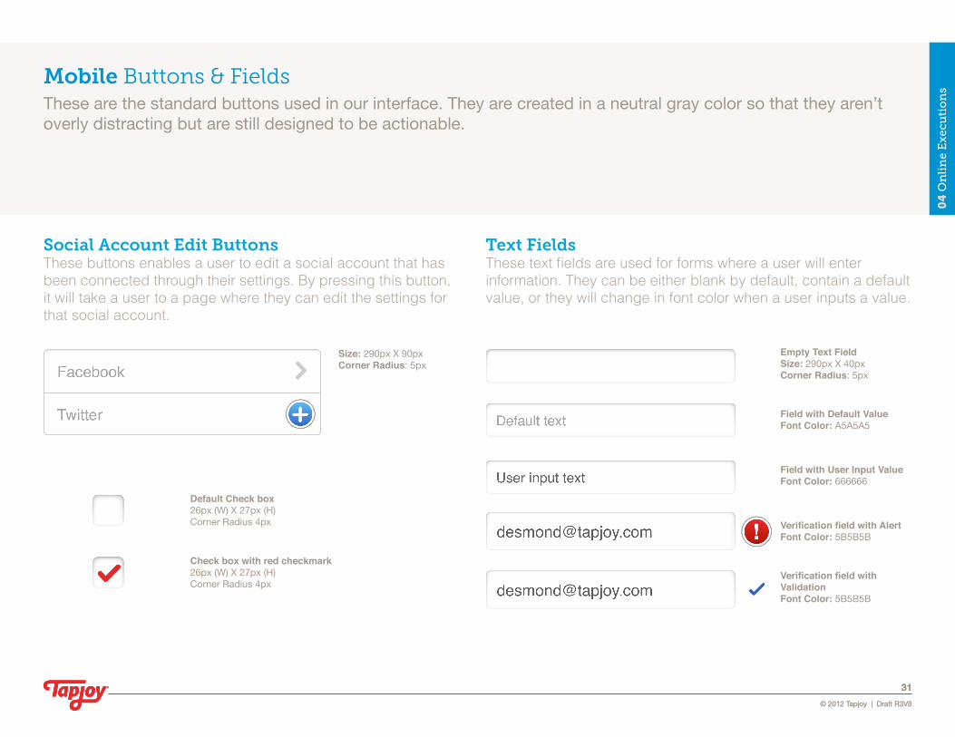
Social Account Edit ButtonsThese buttons enables a user to edit a social account that has been connected through their settings. By pressing this button, it will take a user to a page where they can edit the settings for that social account.
Text FieldsThese text fields are used for forms where a user will enter information. They can be either blank by default, contain a default value, or they will change in font color when a user inputs a value.
03
On
lin
e E
xec
uti
on
s0
4 O
nli
ne
Ex
ecu
tio
ns
© 2012 Tapjoy | Draft R3V6
31®®®
© 2012 Tapjoy | Draft R3V3
31®
Size: 290pxX90pxCorner Radius:5px
Empty Text Field Size: 290pxX40pxCorner Radius:5px
Field with Default Value Font Color:A5A5A5
Field with User Input Value Font Color:666666
Verification field with Alert Font Color:5B5B5B
Verification field with Validation Font Color:5B5B5B
Default Check box26px(W)X27px(H)CornerRadius4px
Check box with red checkmark26px(W)X27px(H)CornerRadius4px
Mobile Buttons & FieldsThese are the standard buttons used in our interface. They are created in a neutral gray color so that they aren’t overly distracting but are still designed to be actionable.

Portrait Use this grid reference to maintain a structure within your design.
Toolbox Asset:tablet-grid.psd
03
On
lin
e E
xec
uti
on
s
© 2012 Tapjoy | Draft R3V6
32®
Tablet GridUse this grid reference to maintain a structure within your design for a tablet portrait orientation.

Portrait Use this grid reference to maintain a structure within your design.
Toolbox Asset:desktop-grid.psd
03
On
lin
e E
xec
uti
on
s
© 2012 Tapjoy | Draft R3V6
33®
Desktop GridThe desktop interface for Tapjoy references the same interface templates and grids from the tablet interface section and the same UI tools from the mobile interface section.

04 Offline Executions Print
Presentation
Environmental
®
For more information go to advertisers.tapjoy.com
®
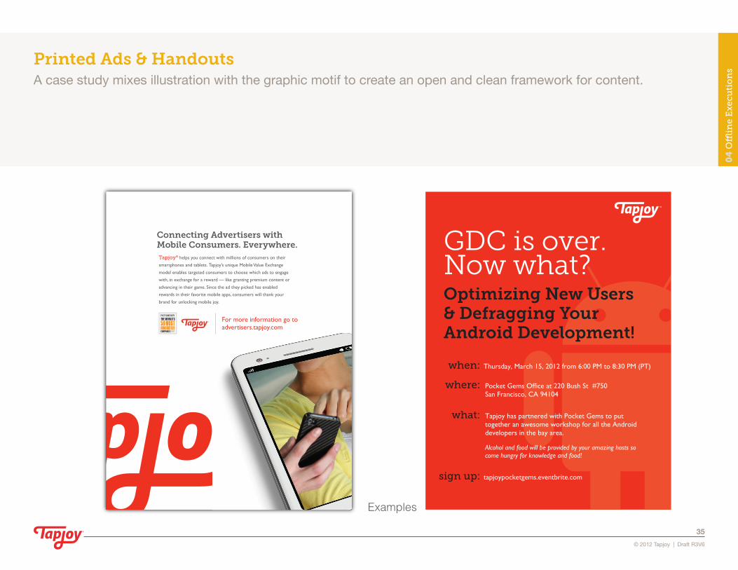
Connecting Advertisers withMobile Consumers. Everywhere.Tapjoy® helps you connect with millions of consumers on their
smartphones and tablets. Tapjoy’s unique Mobile Value Exchange
model enables targeted consumers to choose which ads to engage
with, in exchange for a reward — like granting premium content or
advancing in their game. Since the ad they picked has enabled
rewards in their favorite mobile apps, consumers will thank your
brand for unlocking mobile joy.
GDC is over.Now what?
when: Thursday, March 15, 2012 from 6:00 PM to 8:30 PM (PT)
sign up: tapjoypocketgems.eventbrite.com
where: Pocket Gems Office at 220 Bush St #750San Francisco, CA 94104
what: Tapjoy has partnered with Pocket Gems to put together an awesome workshop for all the Android developers in the bay area.
Alcohol and food will be provided by your amazing hosts so come hungry for knowledge and food!
Optimizing New Users & Defragging Your Android Development!
Examples
04
Offl
ine
Ex
ecu
tio
ns
© 2012 Tapjoy | Draft R3V6
35®
Printed Ads & HandoutsA case study mixes illustration with the graphic motif to create an open and clean framework for content.
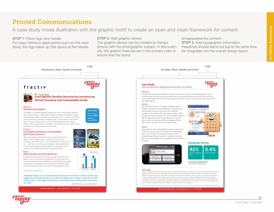
LogoDevelopers: Basic header and footer
developers.tapjoy.com | [email protected] | 415-766-6900
Lane Splitter is an Android application developed by fractiv in which players attempt to ride a virtual motorcycle at high speeds through ever changing traffic without crashing. Though the game initially monetized only through banner ads, it received a considerable bump in revenue by introducing “unlockable” goods – new characters or other virtual goods that users could purchase or unlock for free through Tapjoy. This revenue increase, while successful, was not sustainable, so fractiv again turned to Tapjoy for help generating a more stable, long-term revenue stream.
“Integrating Tapjoy is one of the best development decisions we’ve made. It continues to drive deep engagement and increased revenue on our title Lane Splitter, and we expect it will do the same for our future titles. I would highly recommend it to any developer who is looking to build more value in their apps.”
– Sam McGrath , CO-FOUNDER FRACTIV
ObjectiveMonetize Lane Splitter
After users purchase unlockables, they gain permanent access to the content. This is an effective way to monetize users once, but by introducing “consumable” goods — items that deplete over time or with use — developers can monetize users repeatedly. Tapjoy advised fractiv to introduce consumables (helmets, magnets, etc.) along with a virtual currency, coins, which could be used to purchase these items.
SolutionLane Splitter Introduces Consumablesand Virtual Currency
Immediately it became apparent that there was high demand from Lane Splitter’s users for these new consumable items. The application’s total revenue increased 203% and its ARPDAU* increased 97% with the number of transactions increasing 60%. In the end, Tapjoy provided Lane Splitter with a proven business model that continues to drive significant revenue.
*Average Revenue Per Daily Active User
Result203% Increase in Overall Revenue
With UnlockablesWith Consumables
Lane Splitter Doubles Revenue by IntroducingVirtual Currency and Consumable Goods
Case Study
• Total revenue increased 203%
• ARPDAU* increased 97%
Key Points
Total Revenue
203%Increase
ARPDAU*
97%Increase
LogoAd Sales: Basic header and footer
advertisers.tapjoy.com | [email protected] | 415.766.6900
Campaign Details
Secondary EngagementsVisit brand’s Facebook page
92%Video Completion Rate
0.4%Click-Thru Rate
Case StudySnack Food Brand Uses Tapjoy Videos to Re-introduce Iconic Mascot
Objective
In Summer 2011, a famous snack CPG brand wanted to create viral buzz around a new Facebook page for its iconic
monocle’d mascot. The brand wanted a cost-effective way to increase brand awareness and consumer buzz around the
mascot through mobile video and social media strategy. The brand also wanted to test how well its videos would perform
with mobile audiences.
Solution
The snack brand launched an ad campaign using Tapjoy Videos to
distribute a :30 second commercial featuring the monocle’d mascot.
Tapjoy awarded consumers virtual rewards for watching the
commercial to its completion. Afterwards, they were shown a Thank
You page where they could click to “like” the brand mascot’s Facebook
page. The video was promoted across all Tapjoy users in the US in
order to reach a massive audience. With an average age of 28, the
Tapjoy audience was right in the brand’s target sweet spot.
Results
Tapjoy helped the snack brand significantly increase awareness of its
brand and mascot, by driving tens of thousands of completed video
views in just one month. The campaign also drove up “Likes” on
Facebook. Because the brand only paid for completed video views,
there was no wasted budget and users engaged with the commercial in
its entirety.
About TapjoyTapjoy is a mobile advertising and monetization platform whose unique Mobile Value Exchange model allows users to select personalized advertisements with which to
engage for virtual currency or premium content. Tapjoy helps unlock mobile joy by empowering more than 500 million mobile users who choose to watch videos,
subscribe to services, install applications and participate in other types of advertisements in exchange for virtual currency they can use in their favorite apps. Tapjoy’s
turnkey in-app advertising platform helps developers acquire cost-effective, high-value new users and monetize their applications, while its powerful advertising
marketplace lets brand advertisers reach a global mobile audience spanning more than 10,000 applications. Tapjoy is backed by top-tier investors including J.P.Morgan
Asset Management, Rho Ventures, North Bridge Venture Partners, InterWest Partners and D.E. Shaw Ventures. Headquartered in San Francisco, the company also has
offices in New York, Los Angeles, Chicago, London and Tokyo. For more information, please visit info.tapjoy.com.
© 2012 Tapjoy, Inc. All Rights Reserved. Tapjoy and the Tapjoy logo are trademarks or registered trademarks of Tapjoy, Inc. All third party logos and trademarks mentioned are the property of their respective owners.
04
Offl
ine
Ex
ecu
tio
ns
STEP 1: Place logo and headerFor copy-intensive applications such as this case study, the logo takes up little space at the header.
STEP 2: Add graphic deviceThe graphic device can be created to interact directly with the photographic subject. In this exam-ple, the graphic lines are set in the primary color to ensure that the brand
encapsulates the content.STEP 3: Add typographic information Headlines should stand out but at the same time,be integrated into the overall design layout.
© 2012 Tapjoy | Draft R3V6
36®
Printed CommunicationsA case study mixes illustration with the graphic motif to create an open and clean framework for content.

05 Toolkit Logos
Fonts
Templates
ASE File
®