1 image evaluation for music magazine
7
Image evaluation for music magazine Arooj Aftab
-
Upload
aroojaftab96 -
Category
Business
-
view
39 -
download
1
Transcript of 1 image evaluation for music magazine
Image evaluation for music magazine
Arooj Aftab
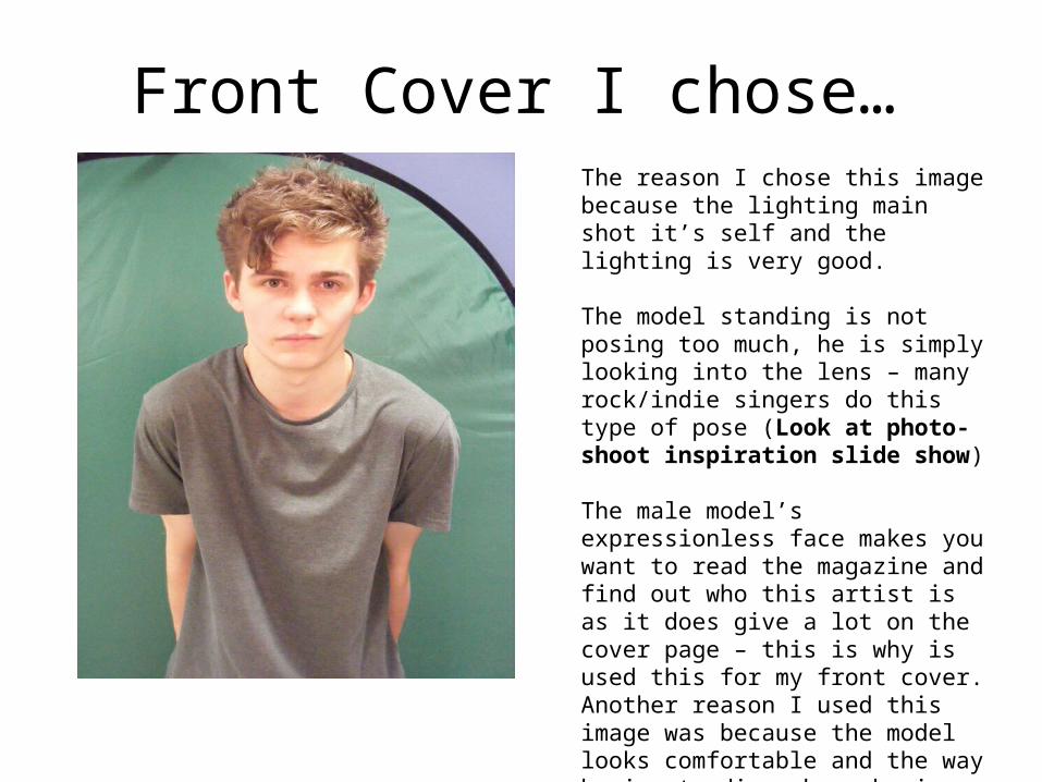
Front Cover I chose…The reason I chose this image because the lighting main shot it’s self and the lighting is very good.
The model standing is not posing too much, he is simply looking into the lens – many rock/indie singers do this type of pose (Look at photo-shoot inspiration slide show)
The male model’s expressionless face makes you want to read the magazine and find out who this artist is as it does give a lot on the cover page – this is why is used this for my front cover. Another reason I used this image was because the model looks comfortable and the way he is standing shows he is relaxed and calm. I used this on the front cover as the model himself may attract people to buy the magazine
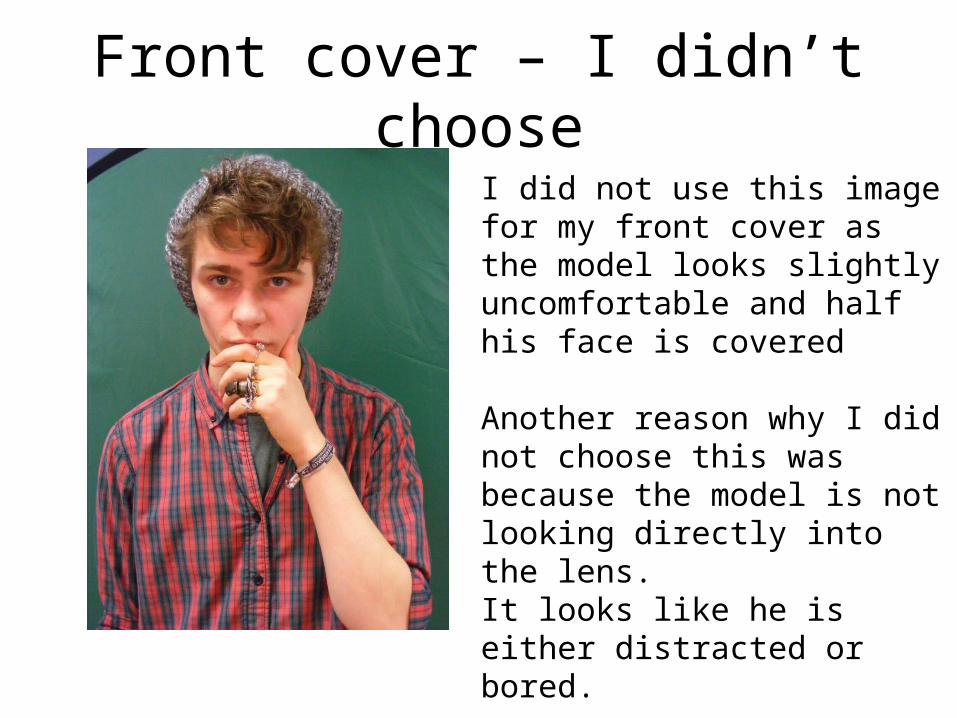
Front cover – I didn’t chooseI did not use this image for my front cover as the model looks slightly uncomfortable and half his face is covered
Another reason why I did not choose this was because the model is not looking directly into the lens.It looks like he is either distracted or bored.
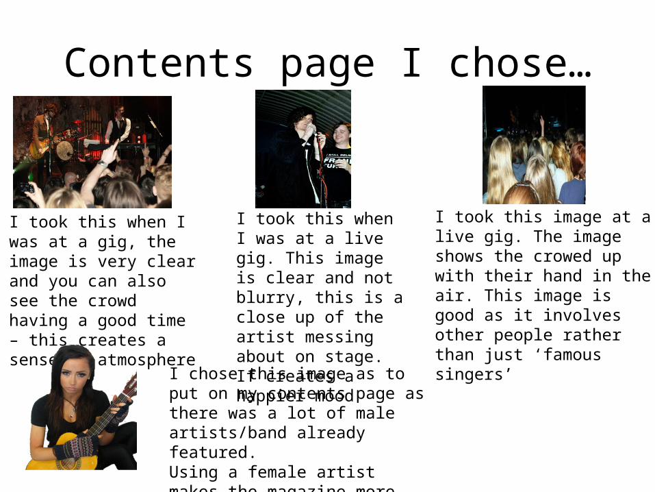
Contents page I chose…
I took this when I was at a gig, the image is very clear and you can also see the crowd having a good time – this creates a sense of atmosphere
I took this when I was at a live gig. This image is clear and not blurry, this is a close up of the artist messing about on stage. If creates a happier mood
I took this image at a live gig. The image shows the crowed up with their hand in the air. This image is good as it involves other people rather than just ‘famous singers’
I chose this image as to put on my contents page as there was a lot of male artists/band already featured. Using a female artist makes the magazine more diverse
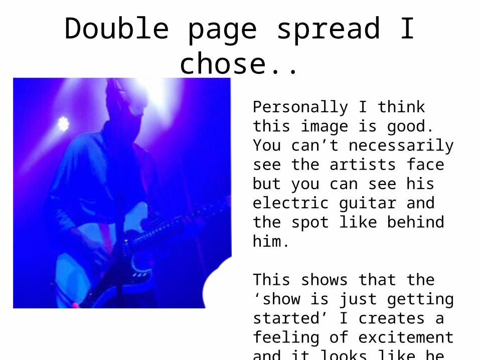
Double page spread I chose..
Personally I think this image is good. You can’t necessarily see the artists face but you can see his electric guitar and the spot like behind him.
This shows that the ‘show is just getting started’ I creates a feeling of excitement and it looks like he owns the stage as the light directly points at him
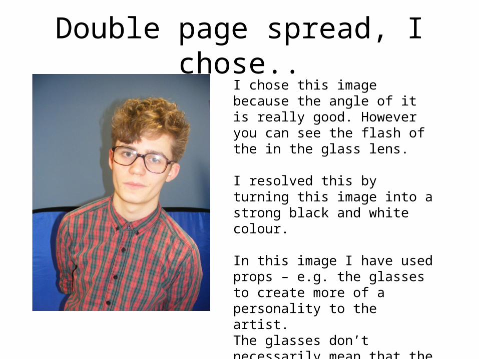
Double page spread, I chose..I chose this image because the angle of it is really good. However you can see the flash of the in the glass lens.
I resolved this by turning this image into a strong black and white colour.
In this image I have used props – e.g. the glasses to create more of a personality to the artist.The glasses don’t necessarily mean that the artists is geeky but could show that he wars them as a fashion statement – to stand out from the crowed
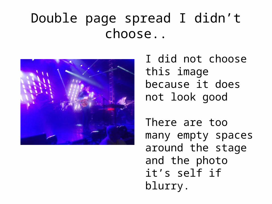
Double page spread I didn’t choose..
I did not choose this image because it does not look good
There are too many empty spaces around the stage and the photo it’s self if blurry.
This does not look professional