1 Graphics HRP223 – 2011 November 28, 2011 Copyright © 1999-2011 Leland Stanford Junior...
191
1 Graphics HRP223 – 2011 November 28, 2011 Copyright © 1999-2011 Leland Stanford Junior University. All rights reserved. Warning: This presentation is protected by copyright law and international treaties. Unauthorized reproduction of this presentation, or any portion of it, may result in severe civil and criminal penalties and will be prosecuted to maximum extent possible under the law.
-
Upload
robyn-allen -
Category
Documents
-
view
215 -
download
1
Transcript of 1 Graphics HRP223 – 2011 November 28, 2011 Copyright © 1999-2011 Leland Stanford Junior...

1
Graphics
HRP223 – 2011November 28, 2011
Copyright © 1999-2011 Leland Stanford Junior University. All rights reserved.Warning: This presentation is protected by copyright law and international treaties. Unauthorized reproduction of this presentation, or any portion of it, may result in severe civil and criminal penalties and will be prosecuted to maximum extent possible under the law.

2
Robbins
• Creating More Effective Graphics by Naomi Robbins is a wonderful book showing the right and wrong ways to visualize scientific data. Read it when you have an afternoon off. It is an ideal read on a transcontinental flight.

3
How I do graphics
• Exploratory stuff– Use the quick and dirty graphics built into EG
• Production quality graphics– Write SAS or R code to make better looking
graphics– Edit in Adobe Illustrator

4
Visualization Tools
• This is a excellent book that covers how to visualize stuff using many tools (including R). It has a great introduction to Adobe Illustrator.

5
Why Do Data Visualization?
• Well designed pictures will show you the details and the whole pattern in your data.
• Numeric descriptions can easily hide important information.
• Some patterns are hard to detect in tables.– Whenever data is reported over time or locations,
you need art.
YOU CAN LEARN A LOT BY JUST LOOKING.-Yogi Berra

6
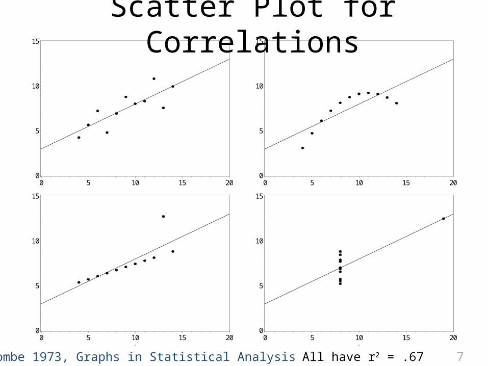
Fisher’s Plot Data Reported in Cleveland
Based on code written by Robert Allison at SAS Institute
Year 1 Year 2
7
0
5
10
15
0 5 10 15 200
5
10
15
0 5 10 15 20
0
5
10
15
0 5 10 15 200
5
10
15
0 5 10 15 20
Scatter Plot for Correlations
All have r2 = .67Anscombe 1973, Graphs in Statistical Analysis

8
Bad Things
• First, I want to talk about bad graphics that I frequently see.– 3d– Pie– Donuts– Stacked graphics

9
General
• 3D graphics
– Don’t, Don’t, Don’tWhile the SAS implementation of 3D graphics is relatively good, don’t use 3D effects, unless you are measuring something in 3D. Even then, don’t.
10
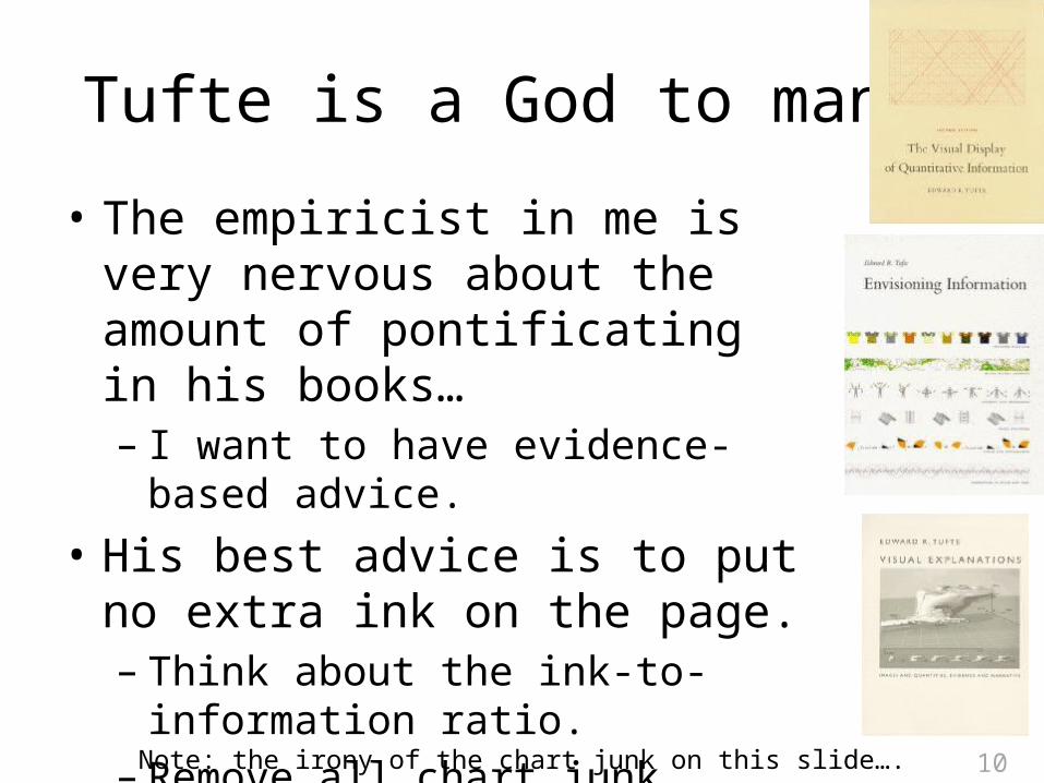
Tufte is a God to many.
• The empiricist in me is very nervous about the amount of pontificating in his books…– I want to have evidence-based advice.
• His best advice is to put no extra ink on the page.– Think about the ink-to-information ratio.– Remove all chart junk.
Note: the irony of the chart junk on this slide….

11
Example Bar ChartSerum Samples in Each Trimester
You can remove ink rather than adding .

12
Ink-to-Information Ratio
• How much ink for seven numbers?
Based on Soukup & Davidson, 2002 Visual Data Mining

13
Cleveland
• If you want to know how to do scientific visualization, you must read William Cleveland’s work.– He attempted to quantify what makes a good graphic good.
• His early work on graphics is one of the reasons why R/S-plus is taking over the statistical world.

14
Pie is bad.
• Work by Cleveland (and experimental psychologists) suggests that:– people are bad at judging the relative magnitude of angles – if you twist the rotation of the pie you can cause people to
systematically misjudge the size of the angles– a 3rd dimension makes judgment worse
• If you get a glossy handout with a 3D pie, assume someone is lying to you.
• Don’t use them.

15
Don’t Explode!
• This exploded 3D pie (brought to you by Excel) is nearly useless for judging amounts.
Total
tweakedtwistedwrecked

16
Forbidden Donut….
• Donut plots have the same problems as pies (if not worse) ….

17
Stacking is Bad
• Cleveland also quantified the fact that people are bad at judging the relative height of stacked data.

18
Wow, a cinnamon roll plot!
• Good luck making rapid judgments using this stacked 3D pie.

19
What is a good graphic?
• Don’t make your audience think unnecessarily!– The point of the graphic should stand out instantly.– Plot the quantity (inference) that you want people to
notice.• Show the central tendency and the variability.• Minimize the amount of ink on the page.• Be sure colorblind people can understand it.
– Use a black and white photocopier and make sure you can distinguish all groups.

20
What is wrong with this?
Female Male125
130
135
140
145
150
155
160
165
170
Weight in Framingham Dataset
What is the point that the reader should learn from this?
How is the variability represented?What are the error bars?Can you interpret a 1 SD error bars?
How many people are included?Ink to information … How many numbers are depicted?
Never contrast black on blue.

21
What is wrong with this?
What is the point of this graphic?
How are the two sexes represented?
What data is this?

22

23
What is wrong with this?
Lovely white space
What is the point?
How are the sexes represented?
How many people?
Where is the mean?
What data is this?

24
Easy But Awful Boxplots

25
What is the point of this graphic?
How are the two sexes represented?

26
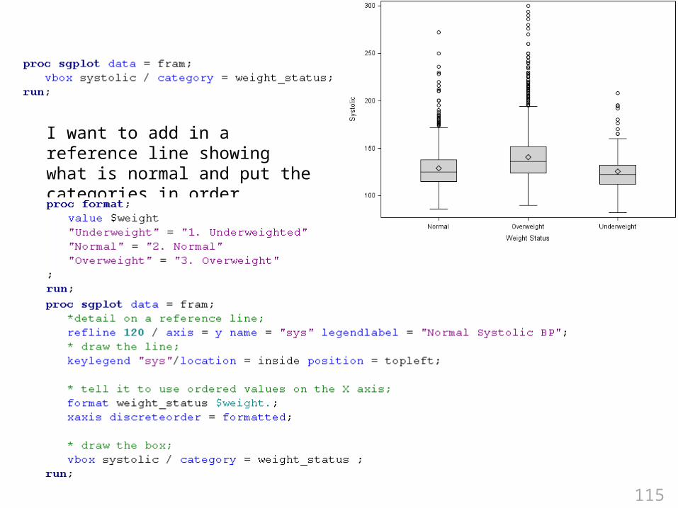
Code for a Good Boxplot

27
SAS's Framingham Heart Data
What is the point of this graphic?

28

29
When you test for the difference in the mean SAS gives you a great plot.

30
Avoid Thinking
• Put labels on the graphic directly instead of using a key.
• If you want people to compare the difference between two lines, plot the difference, not the two lines.

31
Bivariate Comparisons with Lines
• People are extremely bad at judging the distance between two curves. Never ask people to judge up and down (vertical) distances between curves.
Based on: Robbins Creating More Effective Graphs, 2005
The distance between the two curves is the same at all points.

32
Plot Types
• Univariate (one variable)– Categorical variables
• Bar charts• Dot plots• Waffle plots
– Continuous variables• Histogram• Box plot• Violin plots

33
Bar Charts
• The ink-to-information ratio is lousy.• A one dimensional quantity is being
“expanded” into two dimensions. – Doubling of the amount corresponds to how much
of an increase in area?

34
SAS Bar Charts
• SAS makes the reader do extra work by rotating the axis labels in ActiveX images.
• They pointlessly include variable labels by default.

35
How to do it?
Notice you can Edit the data and apply filters.
You can right click on variables and apply user-defined formats off the
Properties dialog.

36
First create the format.
In the Data windowpane of the Bar Chart GUI, right click on the variable and change the format to the User Defined format you had created.

37
The GUI is Solid
• My only complaints are that the rotate grouping values text does not work (position in this example) and the summary statistics do not show up when you request ActiveX images.

38
.PNG format
ActiveX image format

39
Saving the Graphic for Publication
• The easiest way to get publication quality graphics is to set the output type to be RTF.

40
Default Output and Graphics
• The default graphic format in EG is ActiveX. These images can be edited (even on the web) but they only display with Internet Explorer. I have set my graphics to display as ActiveX images. Tweak this with Tools> Options… > Graph.

41

42
Types of Images
• The default formats of the images are determined by the ODS destinations you are using:– LISTING: pgn visible in the Windows Image Fax Viewer– HTML: png, gif, jpg contained in web pages and visible in
Internet Explorer, Firefox or Opera– LATEX: PostScrpt, epsi, gif, jpeg, pgn are visible in GhostView– PCL or PS: contained in Postscript file are visible in GhostView– PDF: contained in pdf, which is visible with Adobe Reader– RTF: visible in MS Word
• RTF graphics are done at 300 dpi by default

43
What is ODS?
• The Output Delivery System (ODS) controls the type and appearance (aka the style) of SAS output.
Different appearance templates
Different output destinations/types.

44
You can browse the ODS appearance templates from the Style Manager on the Tools menu.

45
I Typically Use HTML
This says the images should show tooltips with extra statistical details when you hover the mouse over parts of the graphic. (I can’t image these.)
This is the appearance template. For optimal results use:Analysis: colorDefault : overdistinguishes symbols for color or B&WJournal or journal2, etc: black and whiteStatistical or statistical2, etc: color
Include image_dpi = 300 to set the resolution to be higher than the default 100 dots per inch. Try 300 for final images pasting into MS Office.

46
ods graphics on;
• This turns on the ODS statistical graphics.• Behind the scenes this combines your data
with a pre-specified description of what to plot and the aesthetics of the appearance.
Your data
Graphtemplate
Styletemplate
What Where?
ColorsFonts

47
Useful ods graphics options
• ods graphics on /
• ods graphics / reset;
• ods graphics off;
Width = 8inHeight = 11inImagefmt = jpgimagename = thingyimagefmt = staticmap ;
Make a series of graphics
called thingy1,
thingy2, etc.
If you set only width or height, it will use a 4:3 aspect ratio.
Reset the graphic counter back to 1
Use pop-up tooltips with
details.
If you want to disable ods graphics
for a procedure

48

49
ODS SGraphics
• Compared to the competition, for the last 10 years SAS graphics have been between poor and pathetic.– Graphics procedures rendered with okay quality,
at best .– No “what you see is what you get” editing.– Many plots were nearly impossible to render.– Custom graphics required extensive programming.
• SAS 9.x has attempted to solve this problem.

50
Old vs. New Procedures
• The old (commonly used) graphics procedures were gchart, gplot.
• Now most analysis procedures have built in high quality graphics that can be invoked with an ODS graphics on statement.– Early on in the class I told you to tweak the EG
options to include “ODS graphics on” with every run.
• There are also new “easy to use” statistical graphics (sg) procedures.

51
New Graphics Statistical Graphics Procs
• proc sgPlot– general plotting procedure that replaces gplot
• proc sgScatter– lots of tools for scatterplots and scatter matrices
• proc sgPanel– quick and easy trellis/lattice/matrix/panel of plots
• Proc sgRender– used with proc template to make totally custom plots– It replaces proc greplay

52
Plot Types
• Univariate (one variable)– Categorical variables
• Bar charts• Dot plots• Waffle plots
– Continuous variables• Histogram• Box plot• Violin plots• Quantile and QQ plots

53
You can get an okay looking graphic using sgpanel.
Categorical variables

54
I was able to get exactly the graphic I wanted using R.
Categorical variables
55
If you want to use R
• Download R for Mac or PC cran.cnr.berkeley.edu/bin/macosx/ cran.cnr.berkeley.edu/bin/windows/base

56
If you use a PC, also get PERL and Tinn-R
• PERL is a text manipulation language that is used by a couple of key R packages. It ships with Mac OS X. PC users can get ActivePerl (what I use) or Strawberry Perl for Windows.
www.perl.org/get.html • Tinn-R is a text editor that knows the R
language.sourceforge.net/projects/tinn-r/

57
R Help
• R help files are user hostile. To learn about the options for dotchart type:
?dotchart• Use: rseek.org

58
Browse
• To see why people use R for graphics look here:addictedtor.free.fr/graphiques/thumbs.php

59
Additional Libraries
• If you see sample code that includes require() or library(), you will need to do a onetime download of the additional package. If you are using Vista, run R as the administrator (by right clicking on the R icon instead of just double clicking ) to install and update packages.
60
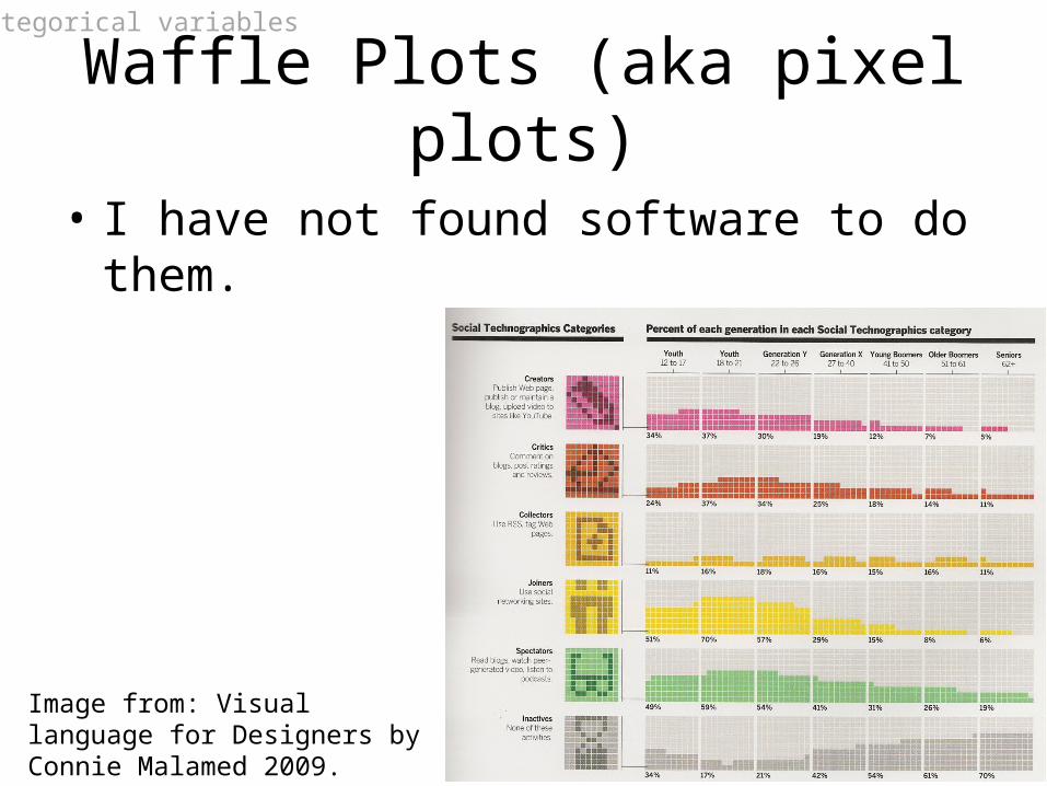
Waffle Plots (aka pixel plots)
• I have not found software to do them.
Image from: Visual language for Designers by Connie Malamed 2009.
Categorical variables

61
Continuous Outcomes
• The Distribution Analysis menu option can do basic plots.
Continuous variables
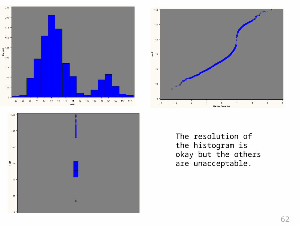
62
The resolution of the histogram is okay but the others are unacceptable.

63
Use sgplot for high resolution plots.
Continuous variables

64
Continuous variables

65
Violin
• A violin plot mirrors the shape of the histogram (density). They can be done in R.
05
01
00
15
0
Continuous variables

66
Grouped Categorical Variables
• To graph categorical data in SAS you need to get Michael Friendly’s Visualizing Categorical Data. Unfortunately, his macros are copyrighted with the book… So I will show you the R versions.– Fourfold plots– Mosaic plots– Association plots
Grouped categorical variables

67
Fourfold Plots
• They draw 4 slices of pie with the area corresponding to the number of people in each cell of a 2x2 table and they have confidence bands such that if the confidence bounds overlap on adjacent pie pieces, they are not statistically significantly different.
Grouped categorical variables
45% male vs. 30% female admission

68
More males were admitted than females.
There is clear evidence of sexist policies in admissions!
Row: Male
Co
l: A
dm
itte
d
Row: Female
Co
l: R
eje
cte
d
1198
557
1493
1278
Grouped categorical variables

69
Department A admitted more females than males and every other department had no bias!
The joy of Simpsons paradox.
Sex: Male
Ad
mit
?:
Ye
s
Sex: Female
Ad
mit
?:
No
Department: A
512
89
313
19
Sex: Male
Ad
mit
?:
Ye
s
Sex: Female
Ad
mit
?:
No
Department: B
353
17
207
8
Sex: Male
Ad
mit
?:
Ye
s
Sex: Female
Ad
mit
?:
No
Department: C
120
202
205
391
Sex: Male
Ad
mit
?:
Ye
s
Sex: Female
Ad
mit
?:
No
Department: D
138
131
279
244
Sex: Male
Ad
mit
?:
Ye
s
Sex: Female
Ad
mit
?:
No
Department: E
53
94
138
299
Sex: Male
Ad
mit
?:
Ye
s
Sex: Female
Ad
mit
?:
No
Department: F
22
24
351
317
Grouped categorical variables

70
Mosaic Plots
• So you have an contingency table and you want to know if there is as an association. You do a chi-square test and it says there are associations between the rows and columns. What next?
Grouped categorical variables

71
Some basic voodoo in R shows which combinations are over (in blue) or under represented (in red).
Grouped categorical variables

72
I prefer the simpler association plots.
Green Hazel Blue Brown
Blo
nd
Re
dB
row
nB
lack
Relation between hair and eye color
Grouped categorical variables

73
Grouped Continuous Variables
• You can use the Distribution Analysis to get basic grouped plots.
• For better looking plots you need to write sgplot and/or sgpanel code.
Grouped continuous variables

74
Request distinct graphics by subgroups.
Grouped continuous variables

75
Grouped continuous variables

76
Actually this took a bit of voodoo.
Grouped continuous variables

77
1st
2nd
Grouped continuous variables

78
Double click here.
Put details on the histogram tweaks here.
I use/tweak nrow ncol and endpoints often.endpoints = 2 to 10 by 0.5midpoints = 5.6 5.8 6.0 6.2 6.4
Grouped continuous variables

79
Grouped continuous variables

80
Grouped continuous variables

81
Side by Side Violin Plots
A B C
50
10
01
50
Grouped continuous variables

82
Scatter PlotGrouped continuous variables

83
Jittered Plot

84
Jitter vs. Sunflowers
In R you can also do sunflower plots.
Grouped continuous variables

85
Ordinary Least Squares Regression
• People typically plot a regression line to show a relationship between two continuous variables.
Grouped continuous variables

86
Bisquare• Figure out what is an odd value and then put a weight on it to
devalue it. There are many robust regression algorithms around. R and S-Plus software have them well implemented.
0 1 2 3 4 5 6 7 8
V1
0
5
10
15
20
V3
0 1 2 3 4 5 6 7 8
V1
0
5
10
15
20
V3
Grouped continuous variables

87
Loess and Splines
• Loess is a technique essentially creates a rolling window and gets a weighted average across the values visible inside the window.
• Splines are curved lines that allow different amounts of stiffness to the curves.
Grouped continuous variables

88
Smooth = 25Smooth = 50
Smooth = 99

89
Tweaking Specialized Plots
• Most analysis procedures now have customized high resolution graphics. Most are automatically produced if you type ods graphics on.
• Proc Freq
– I wanted a deviation plot for a 2x2 (or really any sized table) showing which cell is driving a significant chi-square. They only give you a plot for a one-way table.
– The ORPlot is very nice.
Grouped continuous variables

90
Specifying the plot name is optional in proc freq.
Turn on editable
graphics with ods listing sge= on.

91
Deviance Plot

92
ODS Graphics Editor with EG
• If you want to do extensive tweaking to a graphic, you can use the WYSIWYG ODS Graphics editor. Unfortunately it only works with ODS graphics procedures and you need to rerun the code in SAS to invoke it.

93
Move code from EG to SAS
1. Use the query builder to put your data in a permanent SAS library (not the work library).
2. Right click on the graphic node which is run on data in a permanent library and choose Open… Open Last Submitted Code.
3. Copy the code beginning with the SQL that makes the data.
4. Start SAS and paste the code into the program editor.

94
Move all your code to SAS• Because the ODS graphics editor is not in EG
(yet), you can export the entire set of code for the project and then rerun it in SAS.

95
ODS Graphics Editor with EG(2)
• After exporting all your EG project, open the code in SAS and add these lines at the top of the program:
ods rtf file = "c:\blah\somefile.rtf";ods listing sge = on;
• Then open the graphic of interest.

96

97
WYSIWYG Editing
• Right click and/or double click to set properties for objects in the plot.
The tool is optimized for some of the ODS style templates but you can use custom colors.

98
• Right click on things to set properties. – Colors, text details, fonts– Point and click annotation– Symbols, arrows, text, circles

99
WYSIWYG Editing
• While the Statistical graphics editor is a much needed improvement, it is incomplete. You can only use a few, style templates (for setting default colors and such) and you can not use custom style templates. This means that you can not do critical tasks like manually set the color for different values in scatter plots.

100
Too Many Graphics
• If the ods graphics on statement gives you too many graphics, you can specify which graphics you want by including code designed for the procedure. Typically it looks like this: plot(only) = (table names). This design is poorly implemented because you need to know where to put the plot statement and what the table names are. Does it go on the proc line (like phreg), the tables line (like proc freq), or some other line? Also the table names specified with a plot statement do not always match the ODS table names.

101
• Usually you can use an ODS exclude statement or an ODS select statement to pick the correct things to print. Using the plots(only) = syntax is more efficient.

102
Proc phreg has a lot of new features but nothing major in the graphics. With phreg, if you specify ods graphics on you do not automatically get any plots. Here I request survival and cumulative hazard plots including the global confidence limits option (cl).
Once again the option names are not consistent with the table names.

103
Proc lifetest can show the number at risk but the implementation is weak. It labels the groups with numbers even if the strata are character strings. You have to manually edit them and this affords ample opportunity for mistakes.I don’t see a way to change the censoring symbol in the legend.
This shows the number of people at risk after 20, 40 etc days.

104
Splitting a Grid
• Some procedures produce a grid of plots. You can get access to the individual plots by specifying plots(unpack). Then you can use plots(only)=tableName to get just the right parts.
• ODS select or exclude statements will not work.

105
plots(GlobalOptionsGoHere). The global options apply to all graphics in this procedure.

106
Beyond the Basic Univariate plots
• There are 4 SG procedures that allow you to build up complex univariate plots and do multivariate (trellis/lattice) plots.

107
New Graphics Statistical Graphics Procs
• proc sgPlot– general plotting procedure that replaces gplot
• proc sgScatter– lots of tools for scatterplots and scatter matrices
• proc sgPanel– quick and easy trellis/lattice/matrix/panel of plots
• Proc sgRender– used with proc template to make totally custom plots– It replaces proc greplay

108
proc sgPlot
• Basic plots– scatter, series, band, needle
• Fits curves and generates confidence bounds– loess, regression, penalized b-splines, ellipse
• Distributions– boxplots, histograms, normal curves, kernel
density• Categorization
– dot plots, bar charts, line chartsFrom Heath 2007. SAS/Graph procedures for creating statistical graphics

109
onLineDoc helps (some)
• onlineDoc for sgplot needs a LOT more hyperlinks and examples. Find these pages:
• The SGPLOT Procedure: Overview• The SGPLOT Procedure: Examples• The SGPLOT Procedure: Procedure Syntax

110
As you add more requests to the plot, it resizes and shifts things to make room. It draws them in the order you request them. It reads the requests from the first listed to the bottom. Change the order if you want to have an item appear layered on top of, or behind, another thing.
Some colors are not set yet in the enhanced editor. Use the menu Tools>Options>Enhanced Editor… then click User Defined Keywords to add the coloring.

111
How is that made?proc format library = work;
value $smoked"Non-smoker" = "None "missing = "Missing"other = "Not none"
;run;
data fram;set sashelp.heart;smokin = put(smoking_Status, $smoked.);
run;

112
How is that made?
proc sgplot data = fram;histogram cholesterol;density cholesterol / type = kernal;density cholesterol / type = normal;keylegend /
location=inside position=topright across=1;run;
Layers of features are added to the graphic in the order listed.

113
How is that made?
proc sgplot data = fram tmplout= "c:\blah\plate.sas";histogram cholesterol;density cholesterol / type = kernal;density cholesterol / type = normal;keylegend /
location=inside position=topright across=1;run;
The statistical graphics language template can be saved and studied.

114
proc template;define statgraph sgplot;begingraph;layout overlay; Histogram Cholesterol / primary=true binaxis=false LegendLabel="Cholesterol"; ; DensityPlot Cholesterol / Lineattrs=GraphFit kernel() LegendLabel="Kernel" NAME="DENSITY"; ; DensityPlot Cholesterol / Lineattrs=GraphFit2 normal() LegendLabel="Normal" NAME="DENSITY1"; ; DiscreteLegend "DENSITY" "DENSITY1" / Location=Inside across=1 halign=right valign=top;endlayout;endgraph;end;run;
proc sgrender data = fram template = sgplot;run;
This was saved in plate.sas.
Render a graphic with the template and dataset specified.
Note the name of this template.
115
I want to add in a reference line showing what is normal and put the categories in order.

116

117

118
Grids
• You can produce lattices full of graphics with proc gpanel.

119

120
Spaghetti Plots
Data from Singer and Willett: www.ats.ucla.edu/stat/examples/alda.htm

121
Customizing graphics
• You can tweak the graphics that ship with SAS by modifying their graph template or you can create truly custom graphics by making your own statistical graph template.
Your data
Graphtemplate
Styletemplate

122
If you do not want to explain what Kernel density estimation is…
remove the lines.

123
Finding the template
• Add before the procedure that draws the graphic add ods trace on; and include ods trace off; afterwards. This prints the names of all the templates used by the procedure in the log. product.procedure.Graphis.TemplateName

124
Looking at a Template
• You can ask proc template to display the template with the source statement:
proc template;source stat.ttest.graphics.summary2;
run;
• Remember to type this before you start editing:
ods path(prepend) work.template (update);

125
Don’t Panic
This is a complete template except for the
proc template statement here and a run statement at the
bottom.
Copy this into an editor window and add proc
template.

126
After adding proc template and commenting out the Kernel statements rerun the code.

127
Oops. Unknown key words…
• You can fix the color coding on the template code easily.

128
Fixed (permanently)
All your subsequent plots will have no density line.

129
Details on that new template.
• You can ask SAS to list, into the log, all the locations where the graphics templates are stored by using the command ods path show:
Your new template is stored here.
The untouchable
original is here but it is “masked” by the 1st one.

130
Want a temporary template?
• You can request that your templates go into work instead of SASUSER with the command:ods path (prepend) work.template (update);
• When you quit SAS the template will be deleted along with everything else in work.

131
Note the dynamic variablesproc template;define statgraph Stat.Ttest.Graphics.Summary2; notes "Comparative histograms with normal/kernel densities and boxplots, (two-sample)"; dynamic _Y1 _Y2 _Y _VARNAME _XLAB _SHORTXLAB _CLASS1 _CLASS2 _CLASSNAME _LOGNORMAL _OBSVAR; BeginGraph; entrytitle "Distribution of " _VARNAME; layout lattice / rows=3 columns=1 columndatarange=unionall rowweights=(.4 .4 .2) shrinkfonts=true; columnaxes; columnaxis / display=(ticks tickvalues label) label=_XLAB shortlabel=_SHORTXLAB griddisplay=auto_on; endcolumnaxes; layout overlay / xaxisopts=(display=none); histogram _Y1 / binaxis=false primary=true; if ((NOT EXISTS(_LOGNORMAL)) AND (NOT(EXISTS(_PAIRED) AND EXISTS(_RATIO)))) densityplot _Y1 / normal () name="Normal" legendlabel="Normal" lineattrs= GRAPHFIT; endif; *densityplot _Y1 / kernel () name="Kernel" legendlabel="Kernel" lineattrs=GRAPHFIT2;
Dynamic variables allow the same template to work with lots of datasets

132
dynamic
• You can see what things/variables are being passed to a template by a procedure by printing it in a title:
proc template;define statgraph Stat.Ttest.Graphics.Summary2; notes "Comparative histograms with normal/kernel densities and boxplots, (two-sample)"; dynamic _Y1 _Y2 _Y _VARNAME _XLAB _SHORTXLAB _CLASS1 _CLASS2 _CLASSNAME _LOGNORMAL _OBSVAR; BeginGraph; entrytitle "Does _Y1 exist? " eval(exists(_Y1)) " It is the value: " _Y1; entrytitle2 "Does _VARNAME exist? " eval(exists(_VARNAME)) " It is the value: " _VARNAME; *entrytitle "Distribution of " _VARNAME;
This resolves to 1 or 0 depending on if the variable is used.

133
entrytitle "Does _Y1 exist? " eval(exists(_Y1)) " It is the value: " _Y1;

134
Setting dynamic Variables
• You can set the values of dynamic variables when you call them:
proc sgrender data = blah template= thing;dynamic _var1Label= 'Dude';
run;

135
SGPlot vs Template
• You can replicate everything done with proc sgplot using the template language but don’t reinvent the wheel if you don’t need to.
• You will want to use proc template to build custom graphics that use many panels.
• Proc sgplot uses statements that start like reg but template uses names like regressionplot. – Similar but not identical names… boo.

136

137

138
layout gridded = ticks do not have to alignlayout lattice = ticks must align

139

140

141
Styles
• You can also tweak the style (aesthetics/ appearance) of your graphics.
Your data
Styletemplate
Graphtemplate

142
What styles?
You can use the GUI to look at the details of the styles or you can explore them with code:
proc template;source styles.statistical;
run;
• This template includes sections for:fonts IndexTitle
GraphFonts IndexProcNameTable SystemFooter
Header GraphColorsData GraphColor GraphBackground
GraphGridlines

143
Fonts SysTitleAndFooterContainer ListItem TwoColorRamp GraphMissing
GraphFonts TitleAndNoteContainer Paragraph TwoColorAltRamp GraphControlLImits
color_list TitlesAndFooters List ThreeColorRamp GraphRunText
Color BylineContainer List2 ThreeColorAltRamp GraphStars
GraphColors SystemTitle List3 GraphOutlier
Html SstemFooter Graph GraphFit—GraphFit2
Text PageNo GraphWalls GraphConfidence—2 GraphClipping
Container ExtendedPage GraphAxisLines GraphPrediction Layoutcontainer
Index Byline GrapGridLines GraphPredictionLiimits
Document Parskip GraphOutliens GraphError
Body Continued GraphBox
Frame ProcTitle GraphBorderLines GraphBoxMedian
Contents ProcTitleFixed GraphReference GraphBoxMean
Pages Output GraphTitleText GraphBoxWhisker
Date Table GraphFootnoteText GraphHistogram
BodyDate Batch GraphDataText GraphEllipse
IndexItem Note GraphLabelText BraphBand
ContentFolder noteBanner GraphValueText GraphContour
ByContentFolder UserText GraphUnicodeText GraphBlock
IndexProcName PrePge GraphBackground
ContentProcLabel NoteContentFixed GraphFloor GraphAltBlock
PagesProcLabel WarnBanner GraphLegendBackgrond GraphAnnoLine
IndexTitle WarnContentFxed GraphHeaderBackground GraphAnnotext
ContentsTitle ErrorBaner DropShadowStyle GraphAnnoShape
PagesTitle ErrorContentFixed GraphDataDefault GraphSelection
FatalBaner GraphData1—GraphData12 GraphConnectLine
There are a LOT of different parts of a template that can be tweaked.

144
Your Own Style Template
• You can customize a style template based on another:
proc template;define style myStyle;
parent = styles.Statistical;style graphdata1 from graphdata1/ color = colors('docbg'); style graphdata2 from graphdata1/ color = violet; style graphdata3 from graphdata1/ color = turquoise; style GraphFonts from GraphFonts /
'GraphDataFont' = ("<sans-serif>, <MTsans-serif>", 9pt); end;
run;
Make the graphic element match the background of
graphic (invisible camouflage)
Change the appearance of the font used for labeling data elements.
Use everything in the statistical template except
tweaks listed below.

145
To get a list of known colors
proc registry liststartat="COLORNAMES";
run;

146
About the colors
• You can pick colors by names or specifying details
12th item in grouped data
Contrast around 12th item in grouped data (typically
confidence bounds)

147
About those colors
• The weird color names are colors in RGB hexadecimal format prefixed with "cx"
• Go play at kuler.adobe.com/#create/fromacolor

148
Using the style template
• Once the style is created you can apply it to an ODS destination (pipeline) with code like:
ods listing style= myStyle;* stuff goes here;ods listing close;
• or something like this:ods html style= myStyle;ods graphics on / width = 11in height = 11in; proc sgrender data=whatWhen template=blockplot1; run; ods html close;
149
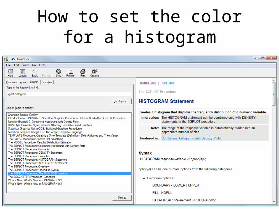
How to set the color for a histogram

150
proc sgplot data = fram;histogram weight / fillattrs = (color = coral);
run;

151
You can also tweak the style template

152
Tweaking the Style Template
proc template;define style myStyle;
parent = styles.Statistical;style GraphDataDefault / color=coral;
end;run;
ods html style = myStyle;proc sgplot data = fram;
histogram weight ;run;ods html close;

153
vbar Version
proc sgplot data = fram;vbar weight / group = sex;
run;

154
proc sgplot data = fram;vbar weight / group = sex;xaxis fitpolicy = thin ;
run;

155
proc template;define style myStyle;parent = styles.Statistical;
style graphdata1 from graphdata1 / contrastColor=pink color = pink;
style graphdata2 from graphdata1 / contrastColor=blue color = blue;
end;run;
ods html style = myStyle;proc sgplot data = fram;
vbar weight / group = sex;xaxis fitpolicy = thin ;
run;ods html close;

156
What is the Current color?
proc template;source styles.default;
run;
kuler.adobe.com/#

157
Setting Colors … The Hard Wayproc template;
define statgraph TABLENAME;begingraph;
entrytitle '';layout overlay ;
histogram v / fillattrs = (color = black) outlineattrs =
(color=orange) ;endlayout;
endgraph;end;
run;proc sgrender data = blah template = TABLENAME; run;

158
Footnotes
• In the template use:entryfotnote halign=left textattrs=graphvaluetext "TEXT";
• or use the %modtmplt macrotitle;footnote "halign=left textattrs=graphvaluetext 'blah' ";%modtmplt(template=NAME, step=t, options titles noquotes)
• Use the template then delete temp version:%modtmplt(template= NAME, step=d)
Search online doc for modtmplt and look at this: http://support.sas.com/rnd/app/papers/modtmplt.pdf.

159
proc sgplot data = fram;scatter x = height y = weight;
run;
proc sgplot data = fram;reg x = height y =
weight;run;
160
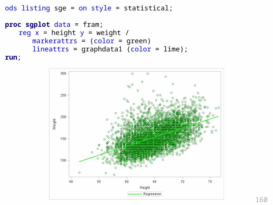
ods listing sge = on style = statistical;
proc sgplot data = fram;reg x = height y = weight /
markerattrs = (color = green) lineattrs = graphdata1 (color = lime);
run;

161
ods listing style = statistical;
proc sgplot data = fram;reg x = height y = weight / group = sex ;
run;

162
proc template;define style sexE;parent = styles.Statistical;style graphdata1 /
contrastColor=pink markersymbol = "star";
style graphdata2 / contrastColor=blue markersymbol = "plus";
end;run;
ods listing sge = on style = sexE;
proc sgplot data = fram;scatter x = height y = weight / group = sex ;reg x = height y = weight / group = sex ;
run;

163

164
The syntax for proc template vs. proc sgplot
• The following slides marked with:
show the syntax that I have written into enhanced editor keyboard macros for sgplot and template.
• So, after downloading and installing the keyboard macros use the title on the following slides and it will auto-complete with useful syntax.
keyboard macro

165
proc template scatterproc template;
define statgraph TABLENAME;begingraph;
entrytitle '';layout overlay /
xaxisopts = (offsetmin=.05 offsetmax=.05 label=' ')yaxisopts = (offsetmin=.05 offsetmax=.05 label=' '
linearopts = (tickvaluesequence = (start = end =
increment = ) viewmin = ));scatterplot y = x = /
datalabel = LABELVARIABLEmarkerattrs = (symbol = circlefilled color =
black size = 3px);endlayout;
endgraph;end;
run;
proc sgrender data = template = TABLENAME;run;
Required
Instead of title statement
Based on code in Statistical Graphics in SAS by Warren F. Kuhfeld
For a single panel
keyboard macros

166
proc template;define statgraph classscatter;
begingraph;entrytitle 'Weight by Height';layout overlay /
xaxisopts = (offsetmin=.05 offsetmax=.05 label='Class Height')yaxisopts = (offsetmin=.05 offsetmax=.05 label='Class weight'
linearopts = (tickvaluesequence = (start = 50 end = 150
increment = 25) viewmin = 50));scatterplot y = weight x = height /
datalabel = namemarkerattrs = (symbol = circlefilled
color = black
size = 3px
);endlayout;
endgraph;end;
run;
proc sgrender data = sashelp.class template = classscatter;run;
Edge of plot to fist tick
Force to include the lower tick
Tick range to consider

167
proc sgplot scatterproc sgplot data = ;
title "";scatter y = x = / datalabel =
markerattrs = (symbol = circlefilled color = black size = 3px);xaxis offsetmin = .05 offsetmax = .05 label = "";yaxis offsetmin = .05 offsetmax = .05 label = "" values = ( to by );
run;
keyboard macros

168
Using proc sgplot scatterproc sgplot data = sashelp.class;
title "Weight by Height";scatter y = weight x = height / datalabel = name
markerattrs = (symbol=circlefilled color=black size =3px);regressionplot y = weight x = height xaxis offsetmin = .05 offsetmax = .05 label = "Height";yaxis offsetmin = .05 offsetmax = .05 label = "Weight" values = (50 to 150 by 25);
run;

169
Proc template regproc template;
define statgraph TABLENAME;begingraph;
entrytitle '';layout overlay;
scatterplot y = x = ;regressionplot y = x = / degree =
3;endlayout;
endgraph;end;
run;
proc sgrender data = template = TABLENAME;run;
keyboard macros

170
Proc sgplot regproc sgplot data = ;
title "";reg y = x = / datalabel =
markerattrs = (symbol = circlefilled color = black size = 3px);xaxis offsetmin = .05 offsetmax = .05 label = "";yaxis offsetmin = .05 offsetmax = .05 label = "" values = ( to by );
run;
keyboard macros

171
Proc template loessproc template;
define statgraph TABLENAME;begingraph;
entrytitle '';layout overlay;
scatterplot y = x = ;loessplot y = x =;
endlayout;endgraph;
end;run;
proc sgrender data = template = TABLENAME;run;
keyboard macros

172
proc sgplot loessproc sgplot data = ;
title "";loess y = x = / datalabel =
markerattrs = (symbol = circlefilled color = black size = 3px);xaxis offsetmin = .05 offsetmax = .05 label = "";yaxis offsetmin = .05 offsetmax = .05 label = "" values = ( to by );
run;
keyboard macros

173
proc loess proc loess global
ods graphics on;
* Locally optimal;proc loess data =;
model = ;run;
* Globally optimal fit;proc loess data= ;
model = / select = AICC(global);run;
keyboard macros

174
Proc template bsplineproc template;
define statgraph TABLENAME;begingraph;
entrytitle '';layout overlay;
scatterplot y = x = ;pbsplineplot y = x =;
endlayout;endgraph;
end;run;
proc sgrender data = template = TABLENAME;run;
keyboard macros

175
proc sgplot bsplineproc sgplot data = ;
title "";pbspline y = x = / datalabel =
markerattrs = (symbol = circlefilled color = black size = 3px);xaxis offsetmin = .05 offsetmax = .05 label = "";yaxis offsetmin = .05 offsetmax = .05 label = "" values = ( to by );
run;
keyboard macros

176
proc transregFor model informaiton on bsplines
* Global optimum;proc transreg data =; model identity(OUTCOME) = pbspline(PREDICTOR);run;
* Local optimum;proc transreg data = ; model identity(OUTCOME) = pbspline(PREDICTOR / sbc lambda = 2 10000 range);run;
keyboard macros

177
Proc template reg groupproc template;
define statgraph TABLENAME;begingraph;
entrytitle '';layout overlay;
scatterplot y = x = / group =;regressionplot y = x = / group = degree = 3 name
="thingy";discretelegend = "thingy" / title = "";
endlayout;endgraph;
end;run;
proc sgrender data = template = TABLENAME;run;
keyboard macros

178
Proc sgplot reg groupproc sgplot data = ;
title "";reg y = x = / group =
datalabel = markerattrs = (symbol =
circlefilled color = black size = 3px);xaxis offsetmin = .05 offsetmax = .05 label = "";yaxis offsetmin = .05 offsetmax = .05 label = "" values = ( to by );
run;
keyboard macros

179
Proc template barchartproc template;
define statgraph TABLENAME;begingraph;
entrytitle '';layout overlay ;
barchart y = x = / stat = mean /*freq pct sum */orient= horizontal;
endlayout;endgraph;
end;run;
proc sgrender data = template = TABLENAME;run;

180
proc sgplot hbarproc sgplot data = ;
title "";hbar GROUP / response = RESPONSE stat = mean /*freq mean sum */
numstd = 2 limitstat = /* clm stddev stderr */;
run;

181
proc template histogramproc template;
define statgraph TABLENAME;begingraph;
entrytitle '';layout overlay ;
histogram VARIABLE / endlabels = true;
endlayout;endgraph;
end;run;
proc sgrender data = template = TABLENAME;run;

182
Proc sgplot histogram
proc sgplot data = ;title "";histogram VARIABLE;
run;

183
proc template densityproc template;
define statgraph TABLENAME;begingraph;
entrytitle '';layout overlay ;
histogram VARIABLE / endlabels = true;densityplot VARIABLE / kernel(); /* normal() */
endlayout;endgraph;
end;run;
proc sgrender data = template = TABLENAME;run;

184
proc template fringeproc template;
define statgraph TABLENAME;begingraph;
entrytitle '';layout overlay ;
histogram / endlabels = true;densityplot / kernel(); /* normal() */fringeplot ;
endlayout;endgraph;
end;run;
proc sgrender data = template = TABLENAME;run;

185
proc template boxplotproc template;
define statgraph TABLENAME;begingraph;
entrytitle '';layout overlay ;
vbox y = x = / orient = horizontal;endlayout;
endgraph;end;
run;
proc sgrender data = template = TABLENAME;run;

186
proc sgplot boxplotproc sgplot data = noautolegend;
title "";boxplot OUTCOME / category = GROUP;
run;

187
proc template seriesproc template;
define statgraph TABLENAME;begingraph;
entrytitle '';layout overlay ;
seriesplot y = OUTCOME x = DATEVAR / group = GROUPVAR name = 'thingy';
discretelegend 'thingy' / title = "SOMETHING";endlayout;
endgraph;end;
run;
proc sgrender data = template = TABLENAME;run;

188
proc template dotproc means data = noprint nway;
var OUTCOME;class THEGROUP;output out = tmp mean = OUTCOME lclm = lower uclm = upper;
run;proc template;
define statgraph dotplot;begingraph;
entrytitle '';layout overlay / yaxisopts = (type = discrete griddisplay = on reverse = true);
scatterplot y = THEGROUP x = OUTCOME / xerrorlower = lower xerrorupper = upper
markerattrs = (symbol = circlefilled) name = 'thingy'
legendlabel = "mean and 95% Confidence Limits";discretelegend 'thingy' / title = "whatever";
endlayout;endgraph;
end;run;
proc sgrender data = tmp template = dotplot; run;

189
proc template needleproc template;
define statgraph TABLENAME;begingraph;
entrytitle '';layout overlay;
needleplot y = x = ;endlayout;
endgraph;end;
run;
proc sgrender data = template = TABLENAME;run;

190
proc template stepproc template;
define statgraph TABLENAME;begingraph;
entrytitle '';layout overlay;
stepplot y = x = / display = (markers) markersize = (size = 3px);
endlayout;endgraph;
end;run;
proc sgrender data = template = TABLENAME;run;

191
proc template blockproc template;
define statgraph TABLENAME;begingraph;
entrytitle '';layout overlay;
blockplot x = DATE block = THEBLOCK / filltype=multicolor datatransparency=.3 valuevalign=top labelposition=top display=(fill values label) blockindex = IDNUMBER;
endlayout;endgraph;
end;run;
proc sgrender data = template = TABLENAME;run;