![[COMPLETO] Werner Tobler, Hans - La Revolución Mexicana. Transformación Social y Cambio Político, 1876-1940](https://static.fdocuments.in/doc/165x107/577cc14f1a28aba71192b746/completo-werner-tobler-hans-la-revolucion-mexicana-transformacion-social.jpg)
1 Exploring Geography Cartographically Waldo Tobler Professor Emeritus of Geography University of...
113
1 Exploring Geography Cartographically Waldo Tobler Professor Emeritus of Geography University of California Santa Barbara, CA 93106-4060 http://www.geog.ucsb.edu/ ~tobler
-
Upload
ambrose-moore -
Category
Documents
-
view
223 -
download
0
Transcript of 1 Exploring Geography Cartographically Waldo Tobler Professor Emeritus of Geography University of...
1
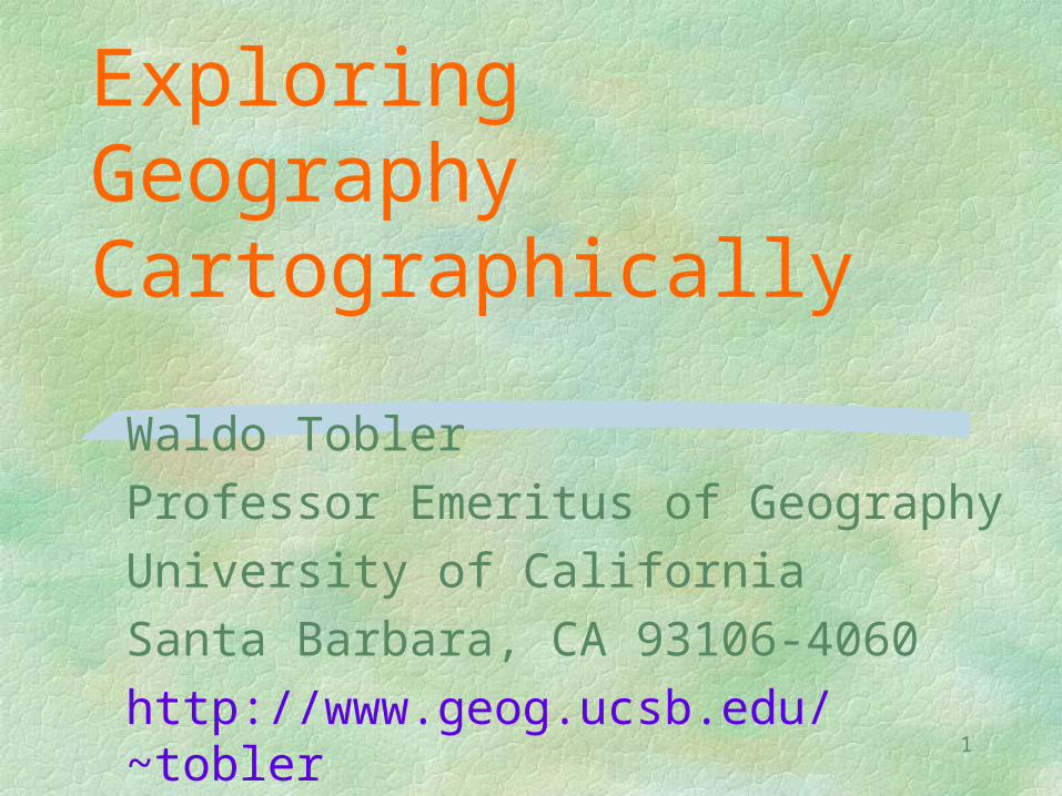
Exploring Geography Cartographically
Waldo Tobler
Professor Emeritus of Geography
University of California
Santa Barbara, CA 93106-4060
http://www.geog.ucsb.edu/~tobler
2
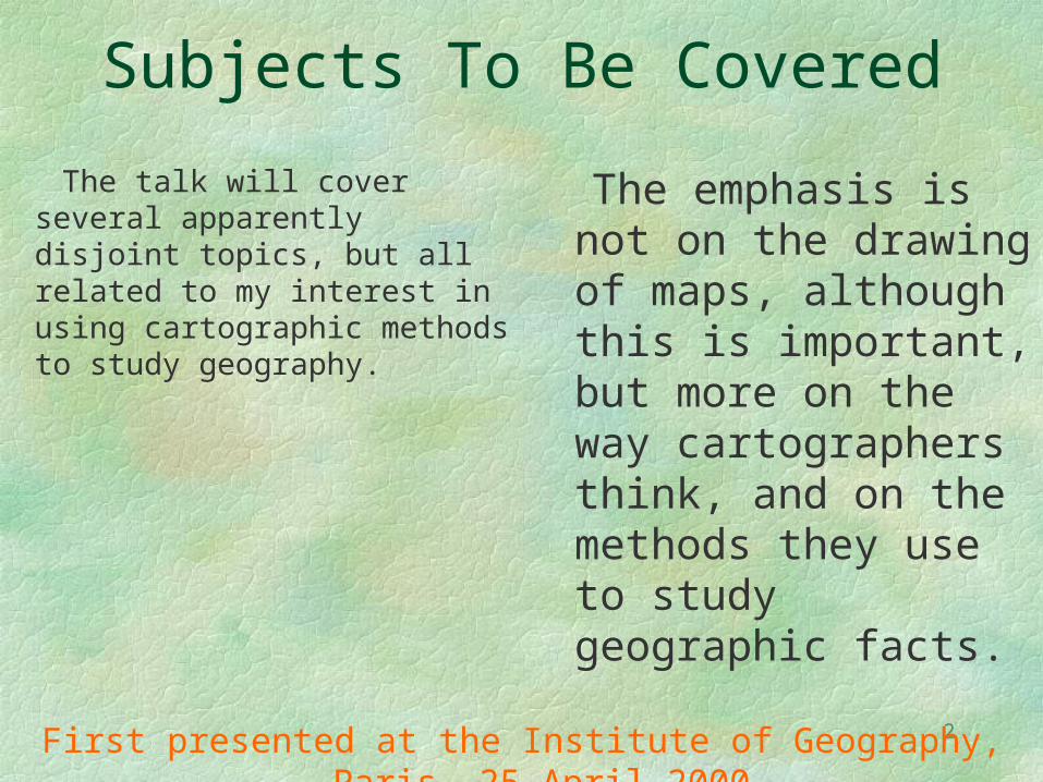
Subjects To Be Covered
The talk will cover several apparently disjoint topics, but all related to my interest in using cartographic methods to study geography.
The emphasis is not on the drawing of maps, although this is important, but more on the way cartographers think, and on the methods they use to study geographic facts.
First presented at the Institute of Geography, Paris, 25 April 2000
3
To begin I stress
Location Location Location
4
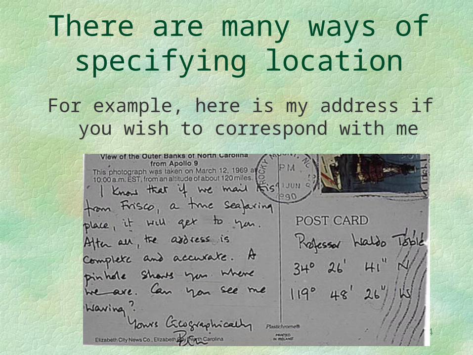
There are many ways of specifying location
For example, here is my address if you wish to correspond with me
5
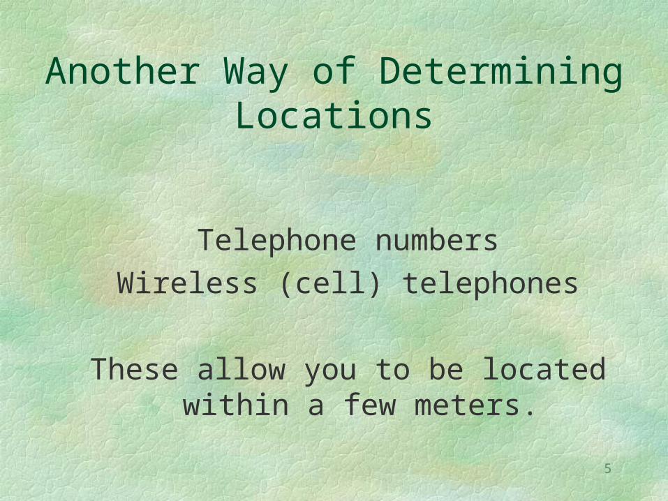
Another Way of Determining Locations
Telephone numbersWireless (cell) telephones
These allow you to be located within a few meters.
6
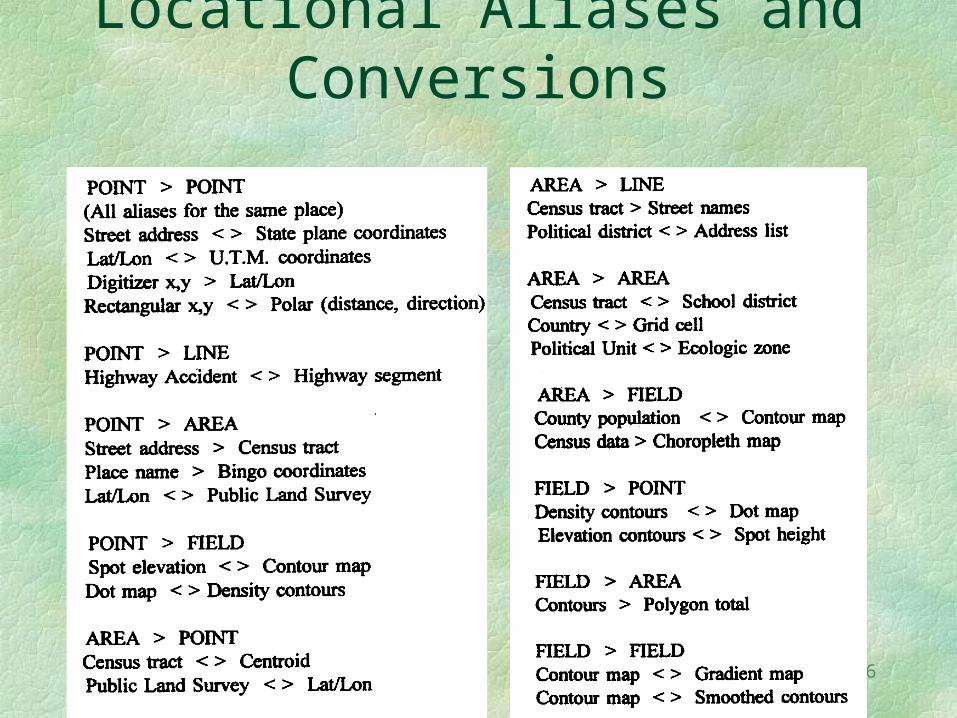
Common Geographic Locational Aliases and
Conversions
7
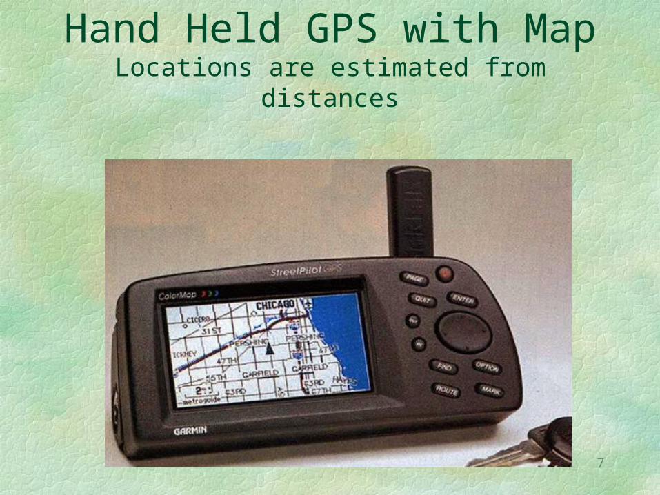
Hand Held GPS with MapLocations are estimated from distances
8
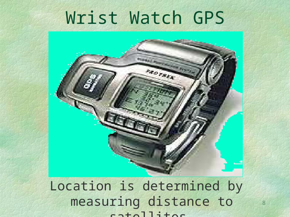
Wrist Watch GPS
Location is determined by measuring distance to satellites.
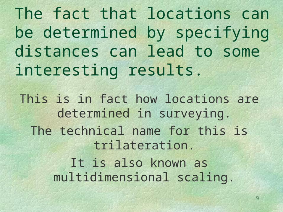
9
The fact that locations can be determined by specifying distances can lead to some interesting results.
This is in fact how locations are determined in surveying.
The technical name for this is trilateration.
It is also known as multidimensional scaling.
10
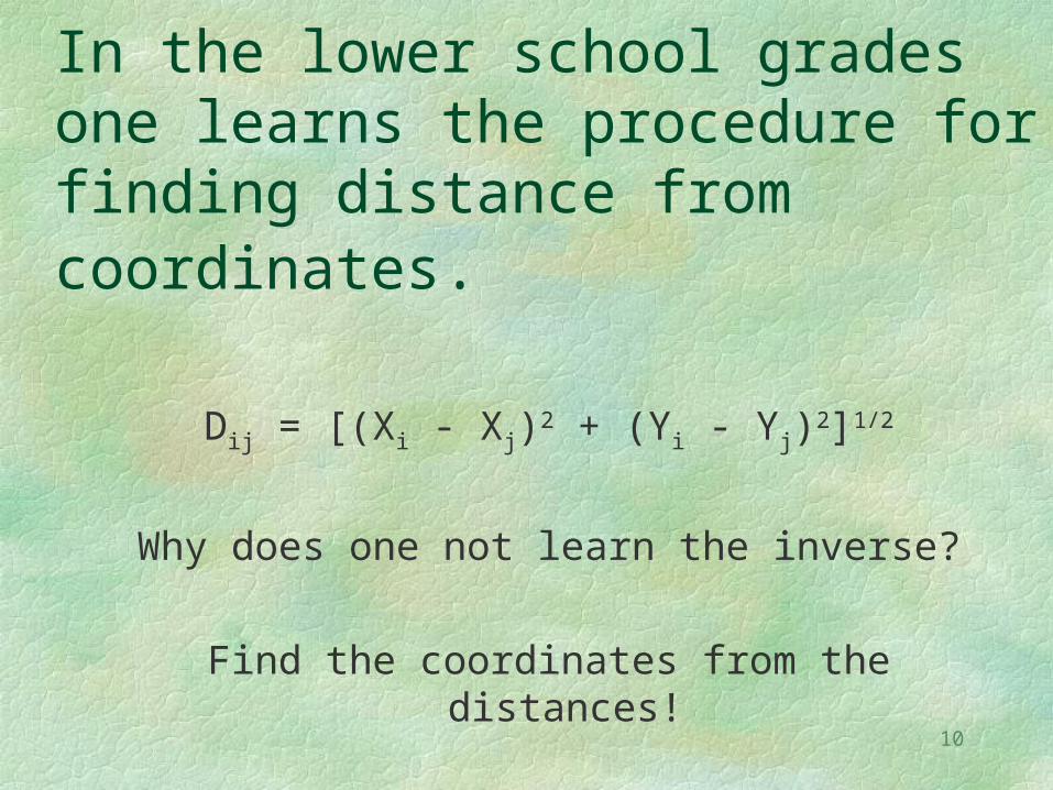
In the lower school grades one learns the procedure for finding distance from coordinates.
Dij = [(Xi - Xj)2 + (Yi - Yj)2]1/2
Why does one not learn the inverse?
Find the coordinates from the distances!
11
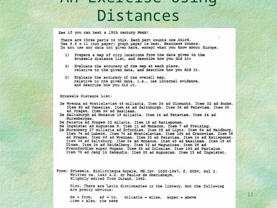
An Exercise Using Distances
12
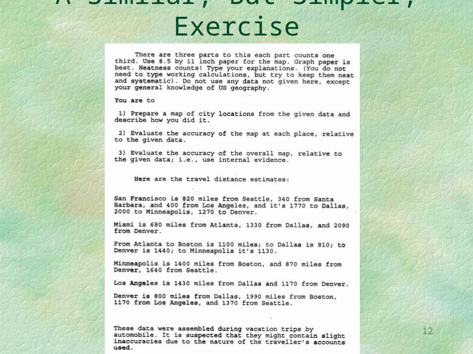
A Similar, But Simpler, Exercise

13
Solution Procedure
Guess!
Then improve the guess.
This leads to an iterative procedure.
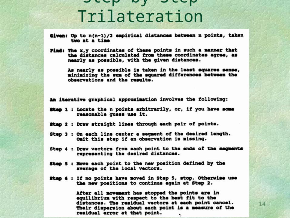
14
Step by Step Trilateration
15
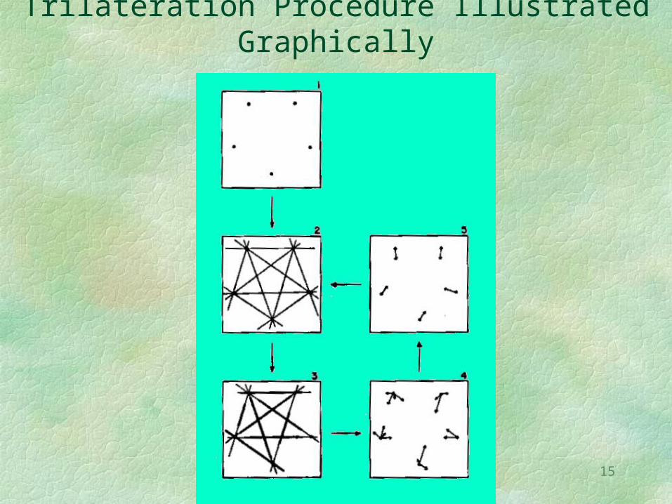
Trilateration Procedure Illustrated Graphically
16
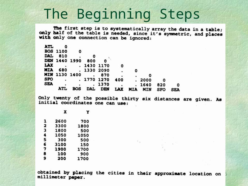
The Beginning Steps
17
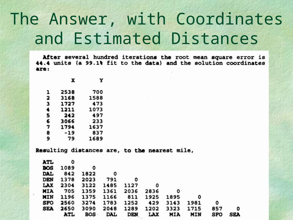
The Answer, with Coordinates and Estimated Distances
18
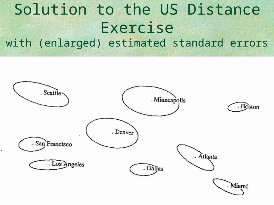
Solution to the US Distance Exercise
with (enlarged) estimated standard errors
19
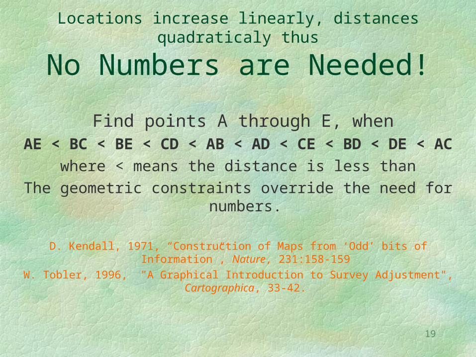
Locations increase linearly, distances quadraticaly thus
No Numbers are Needed!
Find points A through E, when AE < BC < BE < CD < AB < AD < CE < BD < DE < AC
where < means the distance is less thanThe geometric constraints override the need for numbers.
D. Kendall, 1971, “Construction of Maps from ‘Odd’ bits of Information”, Nature, 231:158-159
W. Tobler, 1996, "A Graphical Introduction to Survey Adjustment", Cartographica, 33-42.
20
I will now give you another example where locations are estimated from distances
21
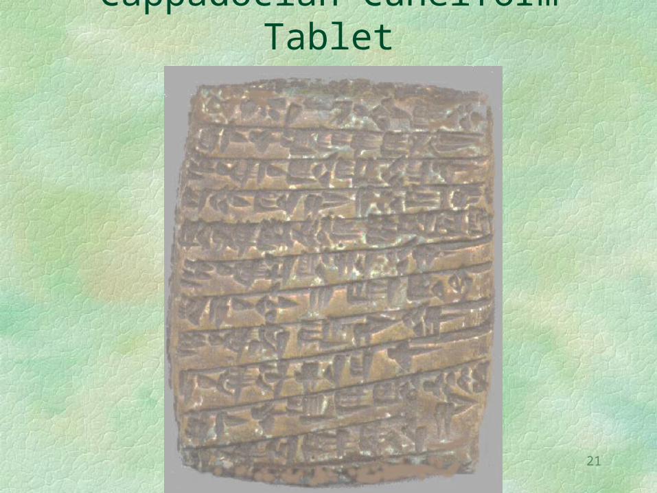
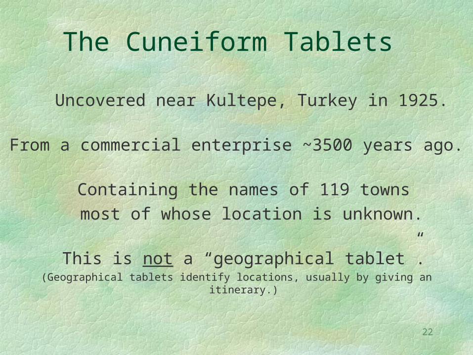
Cappadocian Cuneiform Tablet
22
The Cuneiform Tablets
Uncovered near Kultepe, Turkey in 1925.
From a commercial enterprise ~3500 years ago.
Containing the names of 119 towns most of whose location is unknown.
This is not a “geographical tablet”.(Geographical tablets identify locations, usually by giving an itinerary.)
23
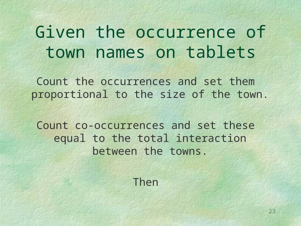
Given the occurrence of town names on tablets
Count the occurrences and set them proportional to the size of the town.
Count co-occurrences and set these equal to the total interaction between the
towns.
Then
24
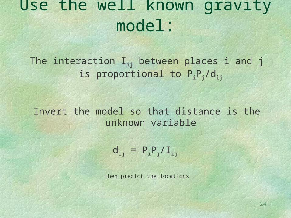
Use the well known gravity model:
The interaction Iij between places i and j is proportional to PiPj/dij
Invert the model so that distance is the unknown variable
dij = PiPj/Iij
then predict the locations
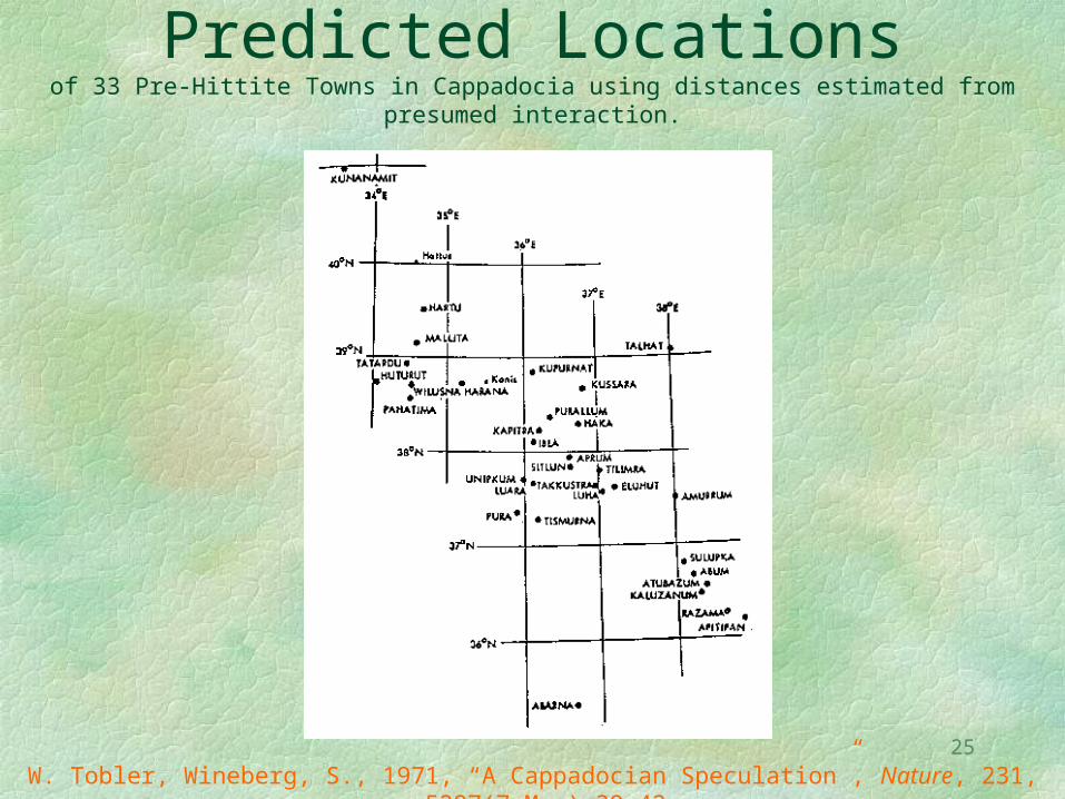
25
Predicted Locationsof 33 Pre-Hittite Towns in Cappadocia using distances estimated from presumed
interaction.
W. Tobler, Wineberg, S., 1971, “A Cappadocian Speculation”, Nature, 231, 5297(7 May):39-42.
26
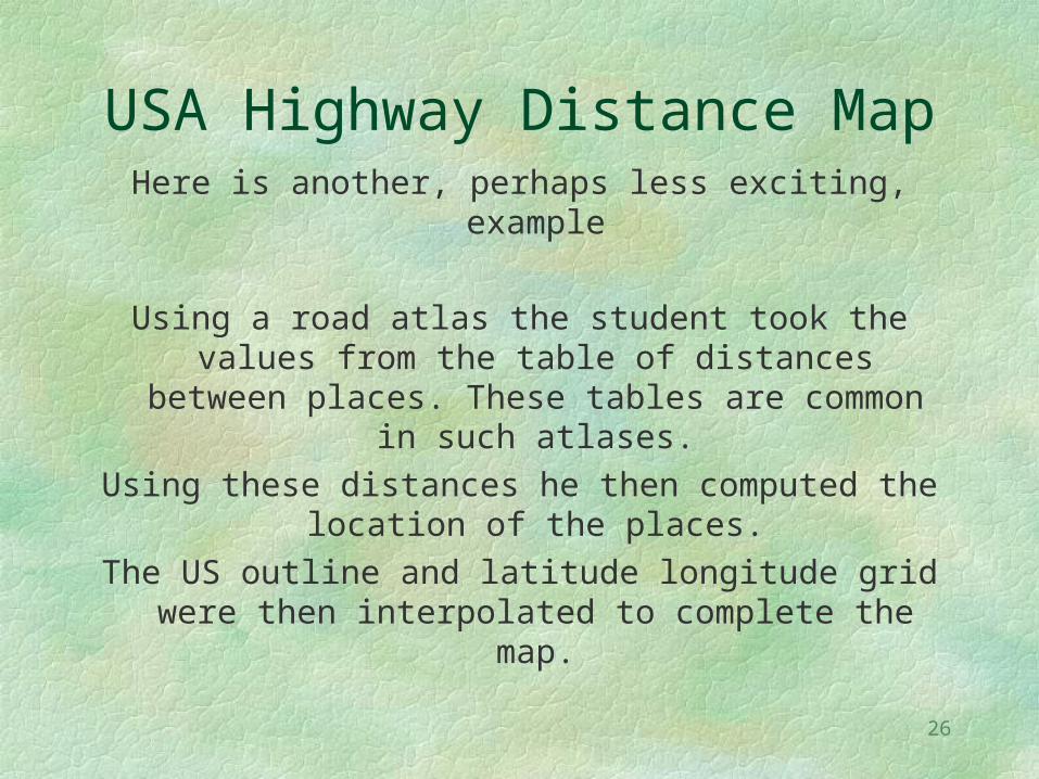
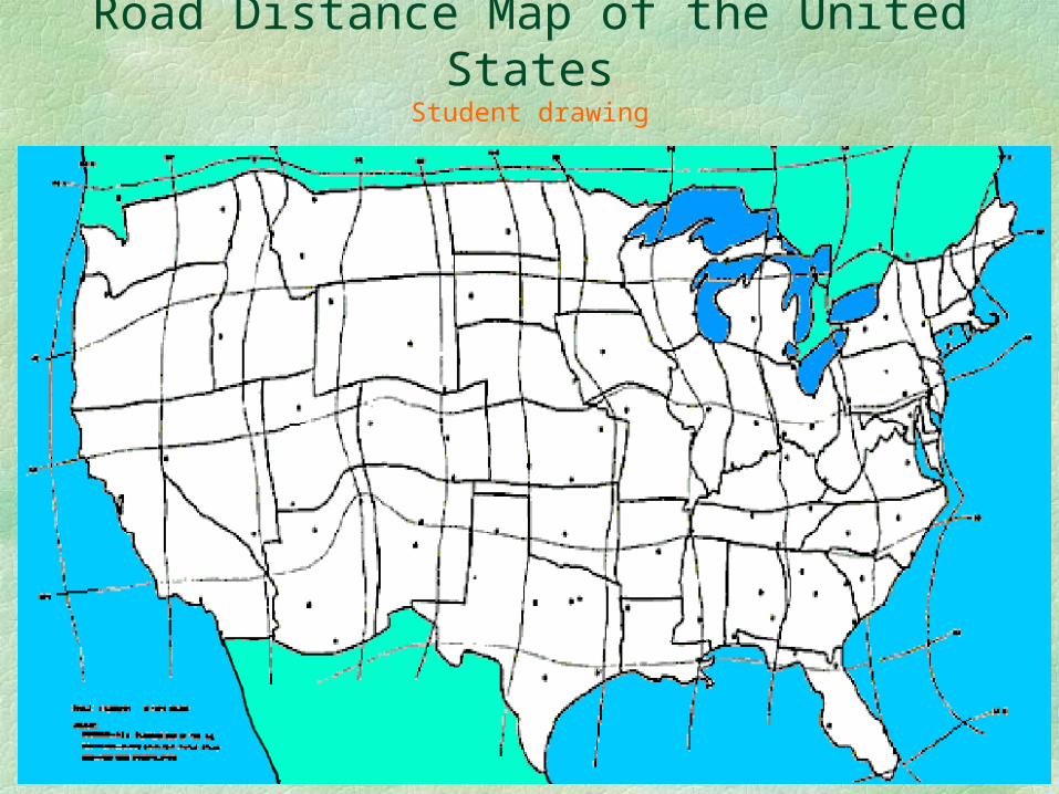
USA Highway Distance MapHere is another, perhaps less exciting,
example
Using a road atlas the student took the values from the table of distances between places. These tables are common in such atlases.
Using these distances he then computed the location of the places.
The US outline and latitude longitude grid were then interpolated to complete the map.
27
Road Distance Map of the United States
Student drawing
28
This “distorted” map can be evaluated by the methods of
Tissot
The road system introduces distance distortions, as is obvious,
but there are also areal and angular distortions and these can be measured.
In other words, cartographic theory can be used to evaluate several impacts of a road.
M. A. Tissot, 1881, Mémoire sur la représentation des surfaces…, Paris, Gauthier Villars
29
All maps are of course distorted to some extent
And this brings me to the subject of map projections.
30
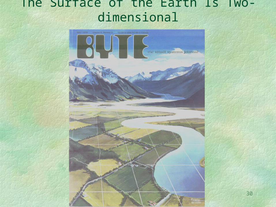
The Surface of the Earth Is Two-dimensional
31
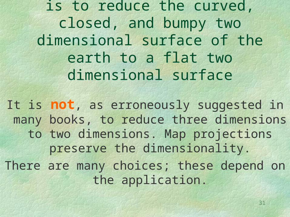
The Map Projection Problem is to reduce the curved, closed, and bumpy two dimensional surface
of the earth to a flat two dimensional surface
It is not, as erroneously suggested in many books, to reduce three dimensions to two dimensions. Map projections preserve the
dimensionality.There are many choices; these depend on
the application.
32
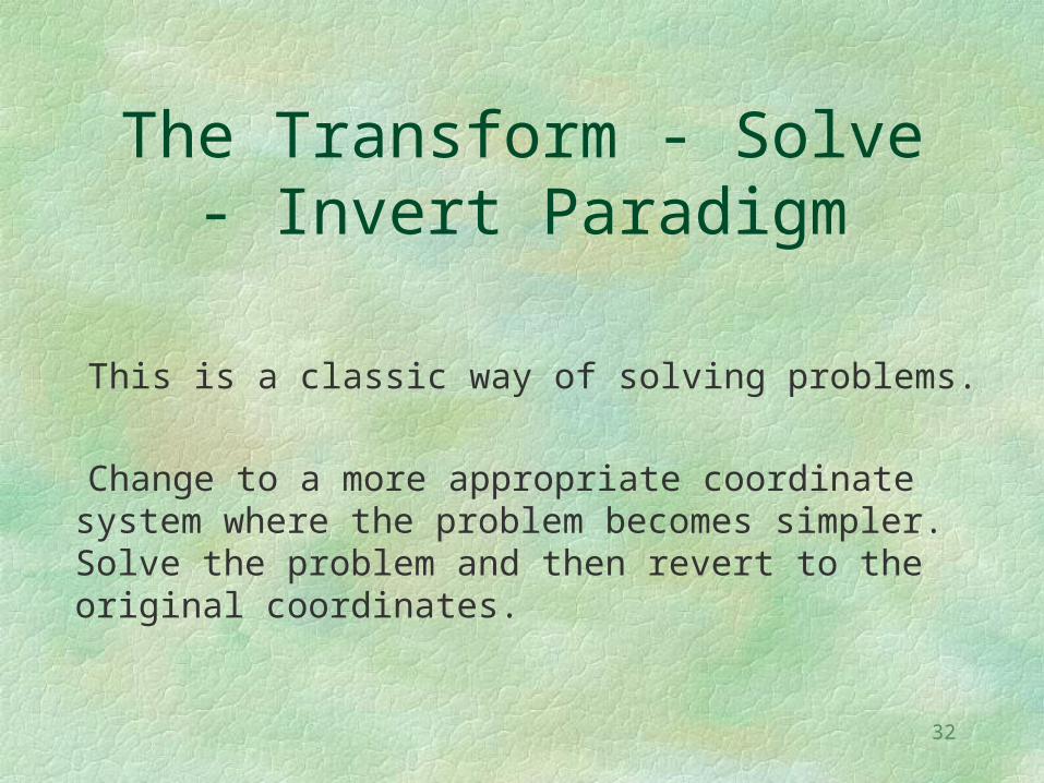
The Transform - Solve - Invert Paradigm
This is a classic way of solving problems.
Change to a more appropriate coordinate system where the problem becomes simpler. Solve the problem and then revert to the original coordinates.
33
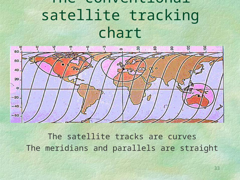
The conventional satellite tracking chart
The satellite tracks are curvesThe meridians and parallels are straight
34
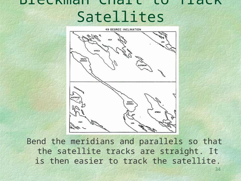
Breckman Chart to Track Satellites
Bend the meridians and parallels so that the satellite tracks are straight. It is then easier to track the satellite.
35
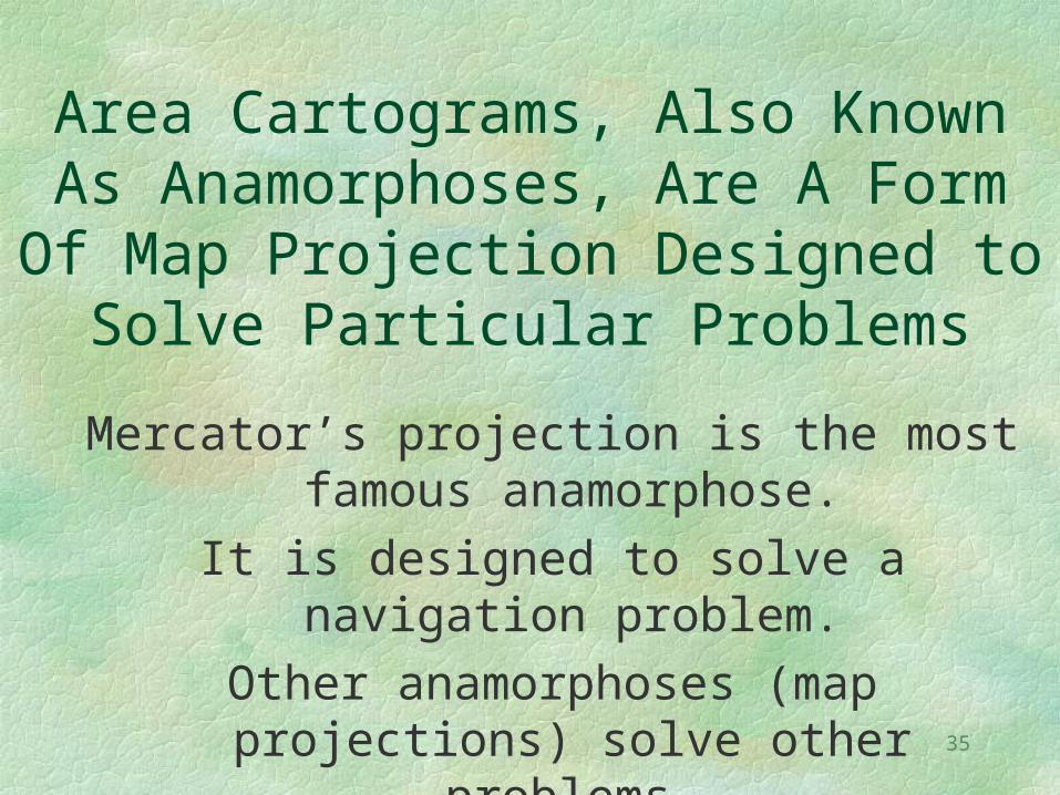
Area Cartograms, Also Known As Anamorphoses, Are A Form Of Map
Projection Designed to Solve Particular Problems
Mercator’s projection is the most famous anamorphose.
It is designed to solve a navigation problem.
Other anamorphoses (map projections) solve other problems.
36
37
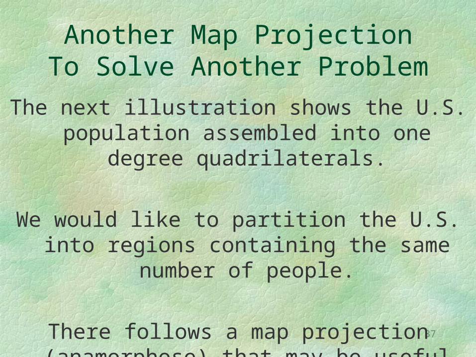
Another Map Projection To Solve Another Problem
The next illustration shows the U.S. population assembled into one degree
quadrilaterals.
We would like to partition the U.S. into regions containing the same number of
people.
There follows a map projection (anamorphose) that may be useful for
this problem.
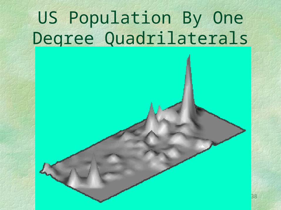
38
US Population By One Degree Quadrilaterals
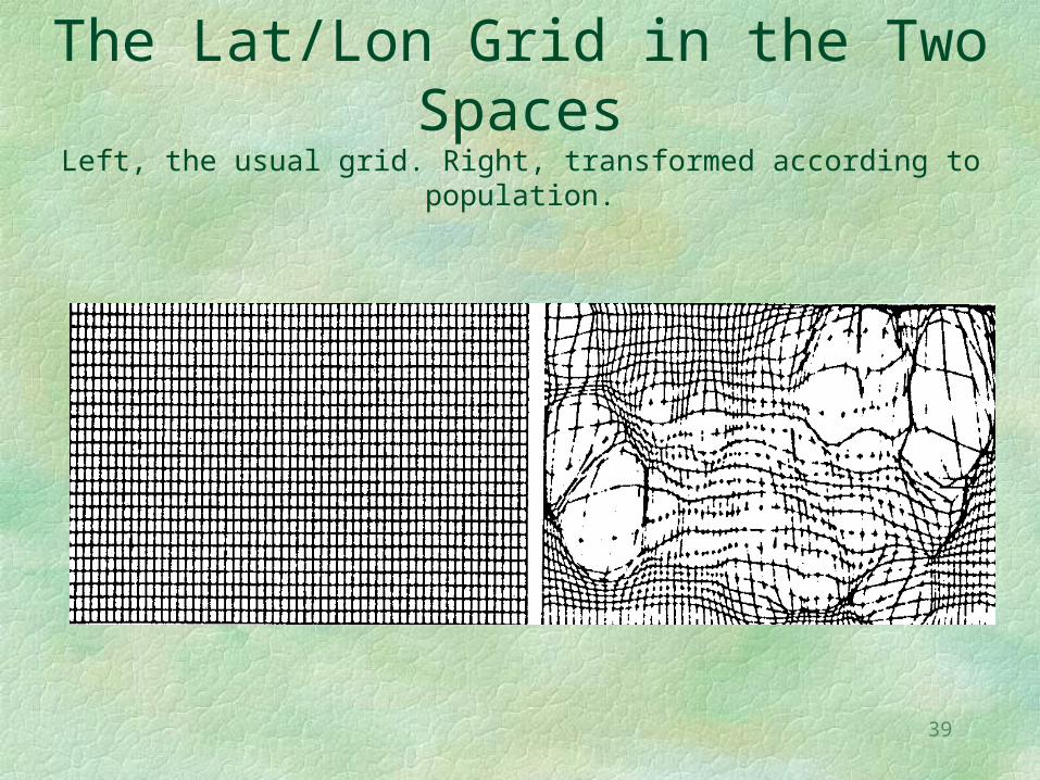
39
The Lat/Lon Grid in the Two Spaces
Left, the usual grid. Right, transformed according to population.
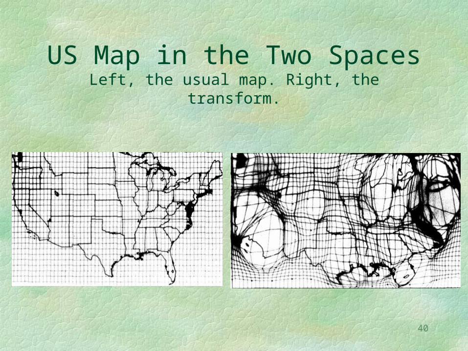
40
US Map in the Two SpacesLeft, the usual map. Right, the transform.
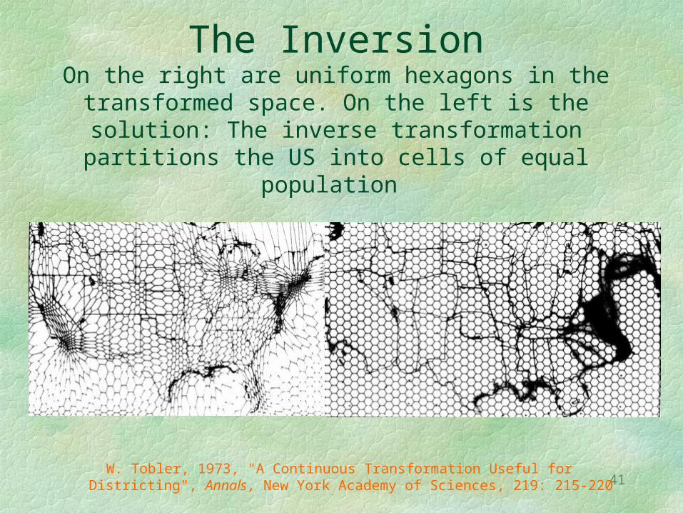
41
The InversionOn the right are uniform hexagons in the
transformed space. On the left is the solution: The inverse transformation partitions the US into
cells of equal population
W. Tobler, 1973, "A Continuous Transformation Useful for Districting", Annals, New York Academy of Sciences, 219: 215-220
42
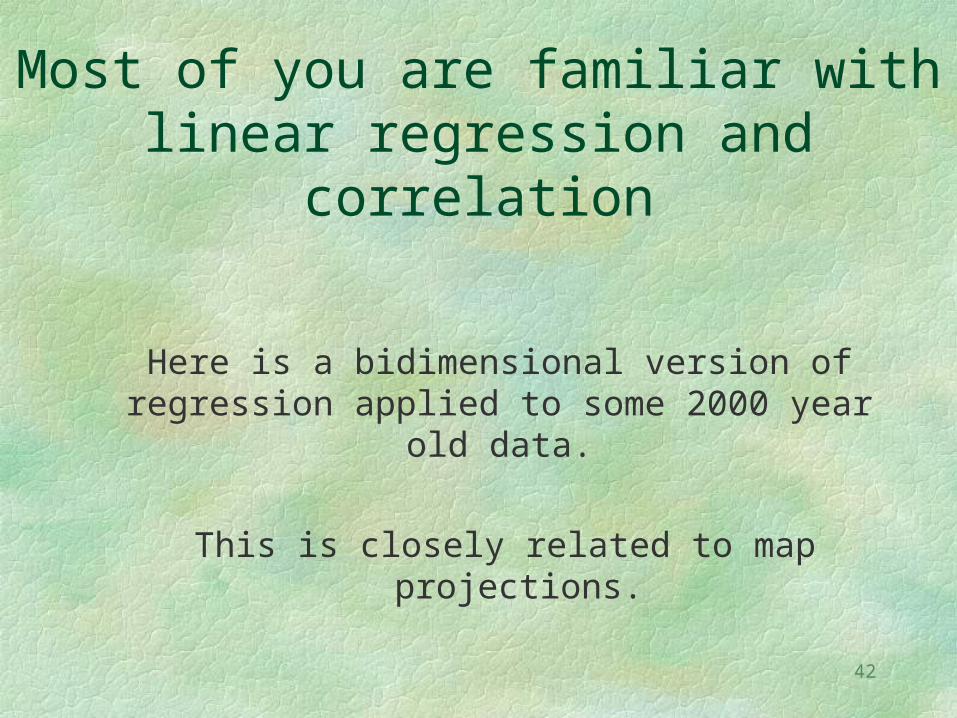
Most of you are familiar with linear regression and correlation
Here is a bidimensional version of regression applied to some 2000 year old
data.
This is closely related to map projections.
43
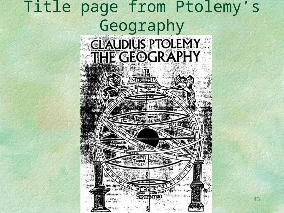
Title page from Ptolemy’s Geography
44
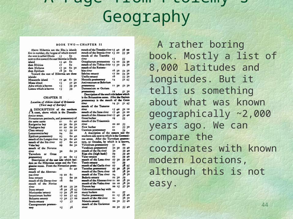
A Page from Ptolemy’s Geography
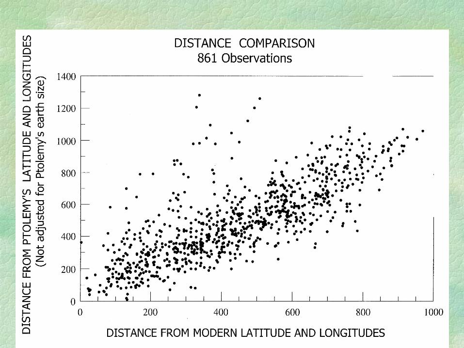
A rather boring book. Mostly a list of 8,000 latitudes and longitudes. But it tells us something about what was known geographically ~2,000 years ago. We can compare the coordinates with known modern locations, although this is not easy.
45
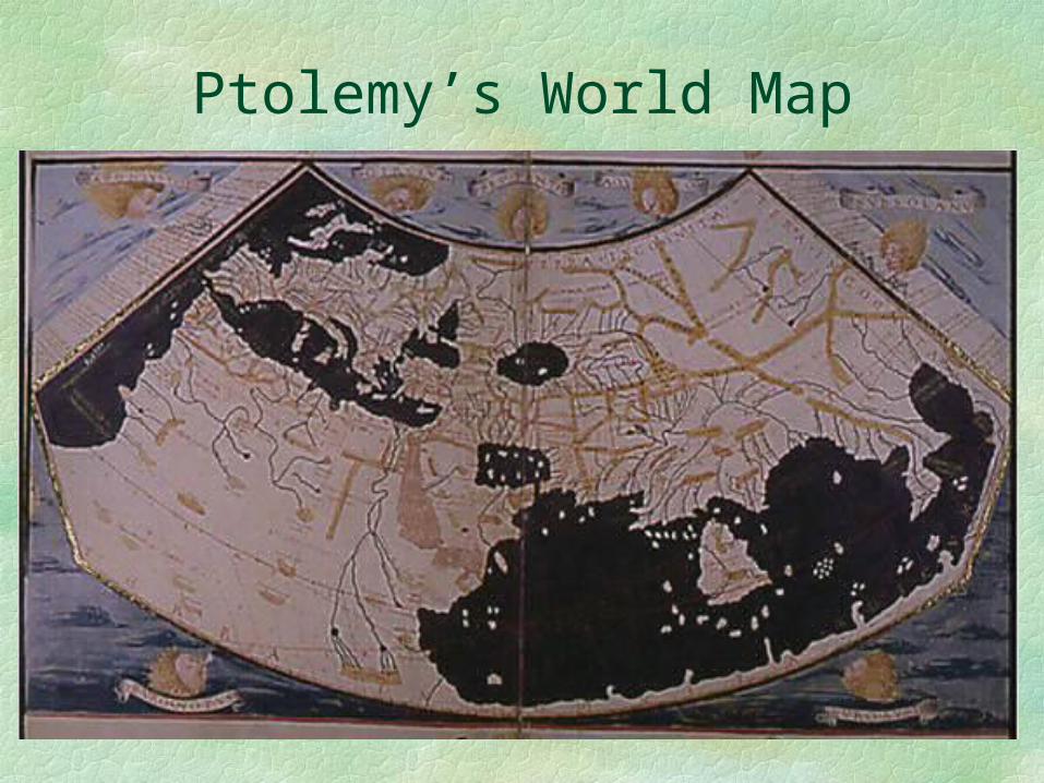
Ptolemy’s World Map
46
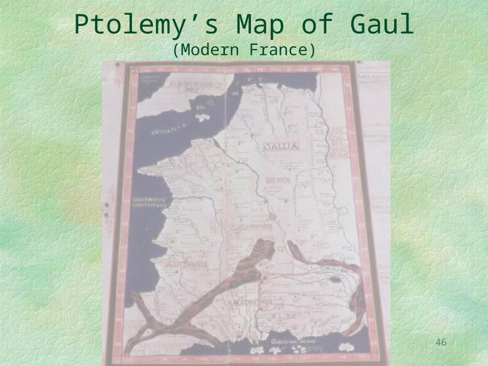
Ptolemy’s Map of Gaul(Modern France)
47
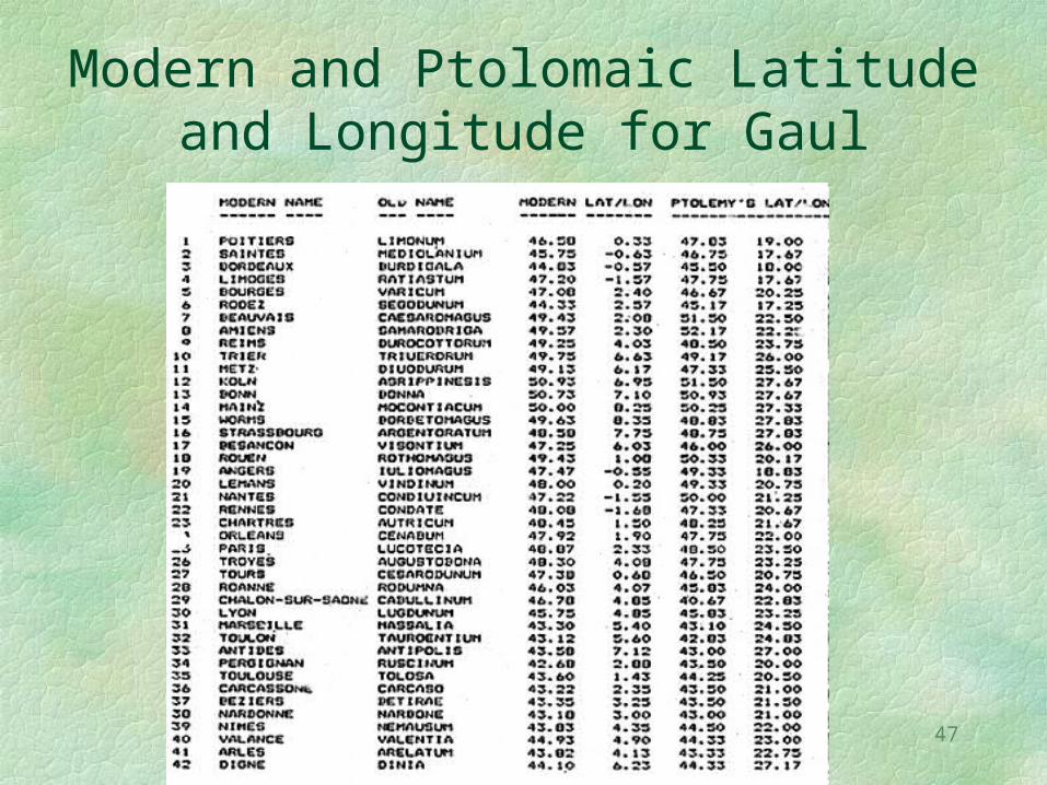
Modern and Ptolomaic Latitude and Longitude for Gaul
48
The data in the foregoing table were assembled by a student and some of you may be more familiar with the the ancient names than I.
Observe that we will be comparing two sets of vectors (pairs of coordinates), not single variables.
That is why we need a bidimensional regression.
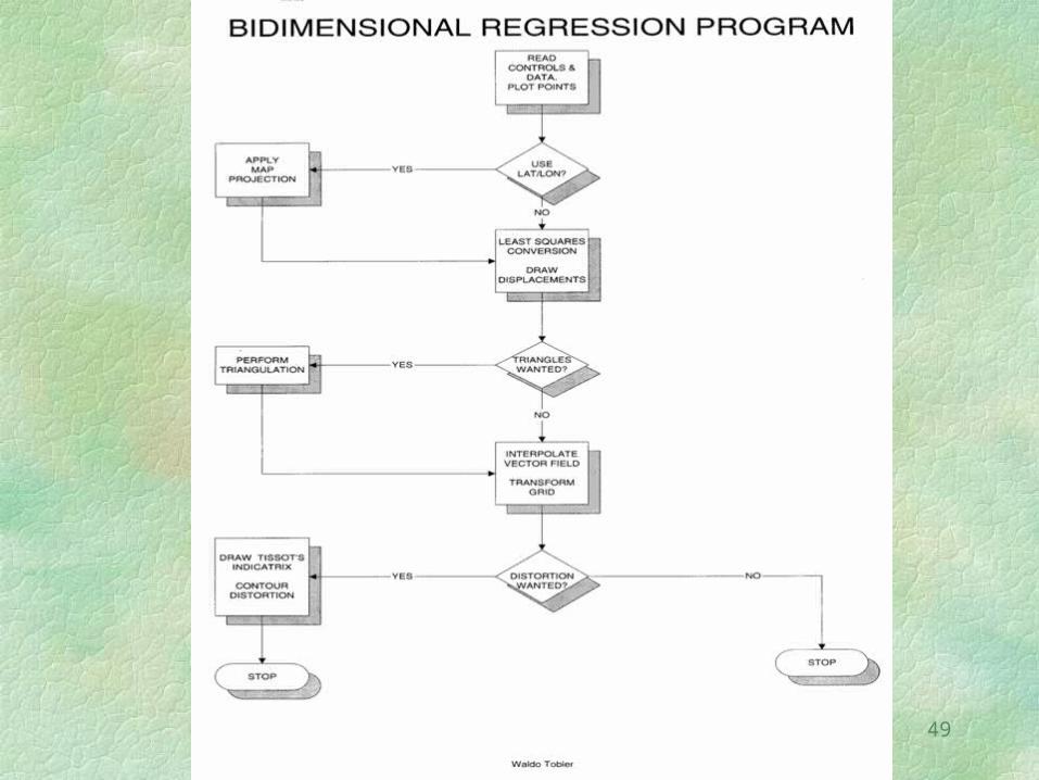
W. Tobler, 1994, “Bidimensional Regression”, Geog. Analysis, 26:186-212
49
50
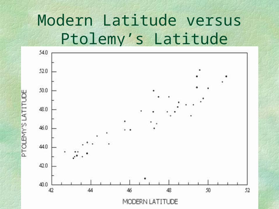
Modern Latitude versus Ptolemy’s Latitude
51
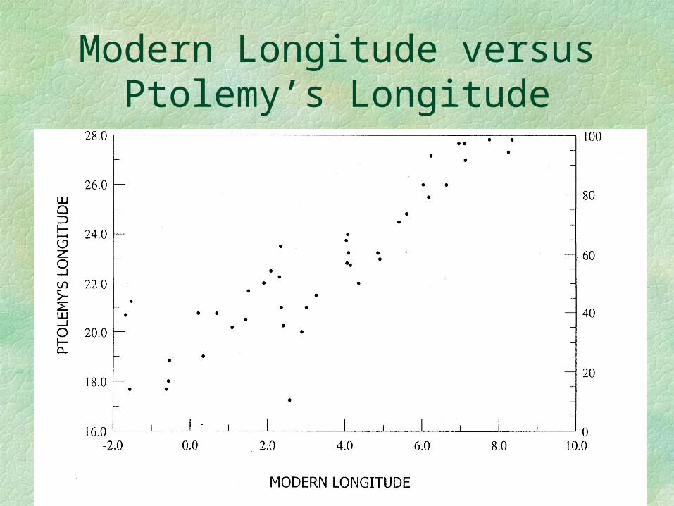
Modern Longitude versus Ptolemy’s Longitude
52
53
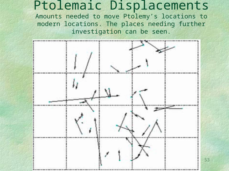
Ptolemaic DisplacementsAmounts needed to move Ptolemy’s locations to modern locations. The places needing further investigation can be
seen.
54
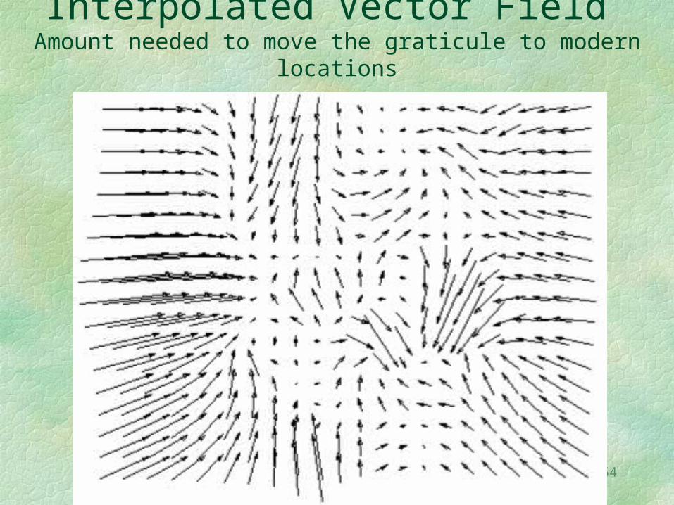
Interpolated Vector Field Amount needed to move the graticule to modern
locations
55
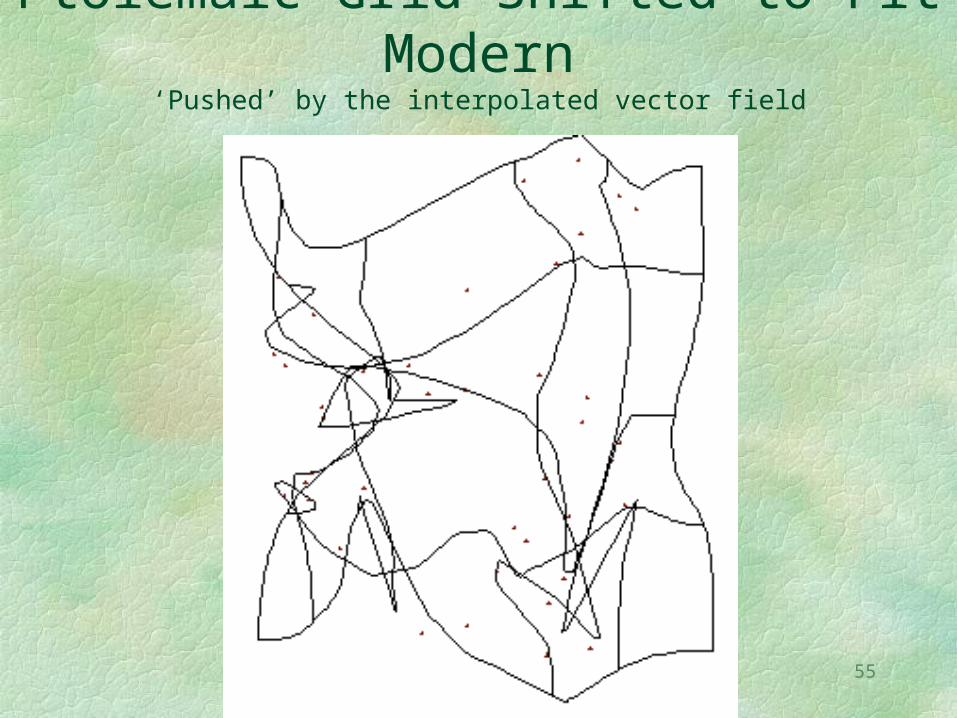
Ptolemaic Grid Shifted to Fit Modern
‘Pushed’ by the interpolated vector field
56
There are many applications of vectors (pairs of coordinates) in
geography
The pairs of coordinates could, for example, be considered vectors showing coordinates of were where people moved (changed addresses) during some period of time, so that the same technique can be applied to this situation. Or they could be displacements from a “mental map”, or differences between a satellite image and a map, thus requiring “rubber sheeting”.
57
Geographical Interpolation
Sometimes one has numerical observations given at point locations.
The objective is often to produce a contour map.
There is a large literature on interpolation from point data.
We mention only Kriging, inverse distance, splining, and so on.
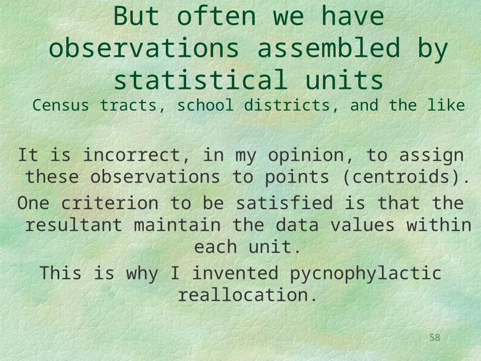
58
But often we have observations assembled by statistical units
Census tracts, school districts, and the like
It is incorrect, in my opinion, to assign these observations to points (centroids).
One criterion to be satisfied is that the resultant maintain the data values within
each unit.This is why I invented pycnophylactic
reallocation.
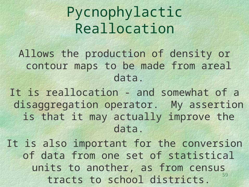
59
Pycnophylactic Reallocation
Allows the production of density or contour maps to be made from areal data.
It is reallocation - and somewhat of a disaggregation operator. My assertion is
that it may actually improve the data.It is also important for the conversion of
data from one set of statistical units to another, as from census tracts to school
districts.
60
Population Density by County
Observe the discontinuities at the county boundaries.
We would like a smooth map of population density.
The usual interpolation procedure will not work unless we use centroids and this fiction could allow people to be moved from one county to another.
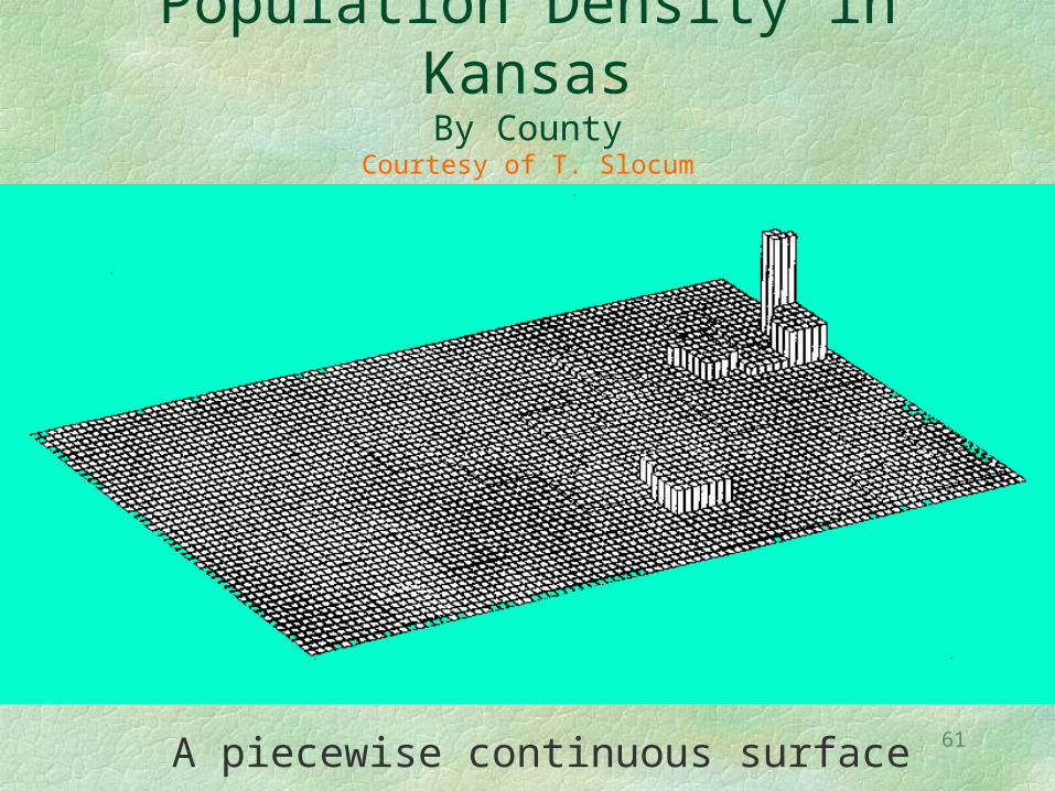
61
Population Density in KansasBy County
Courtesy of T. Slocum
A piecewise continuous surface
62
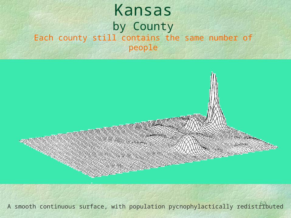
Population Density in Kansasby County
Each county still contains the same number of people
A smooth continuous surface, with population pycnophylactically redistributed
63
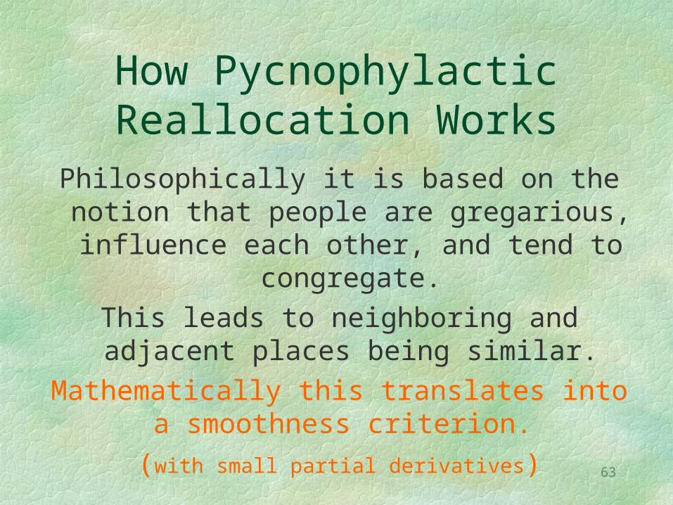
How Pycnophylactic Reallocation Works
Philosophically it is based on the notion that people are gregarious, influence each other, and tend to congregate.
This leads to neighboring and adjacent places being similar.
Mathematically this translates into a smoothness criterion.
(with small partial derivatives)
64
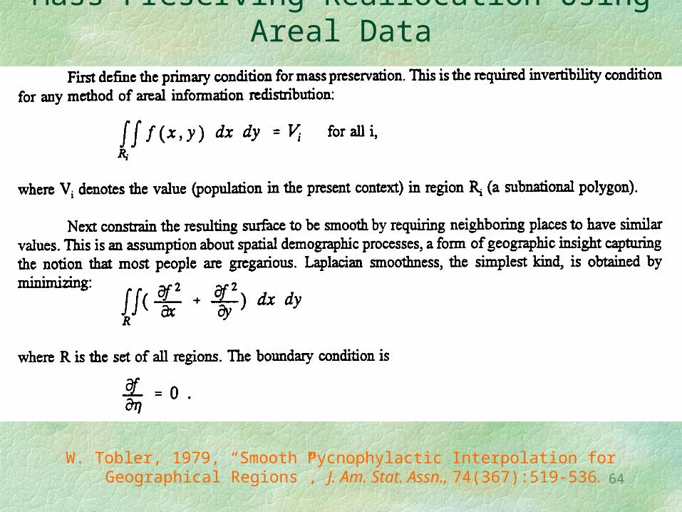
Mass Preserving Reallocation Using Areal Data
W. Tobler, 1979, “Smooth Pycnophylactic Interpolation for Geographical Regions”, J. Am. Stat. Assn., 74(367):519-536.
65
What the Mathematics Means
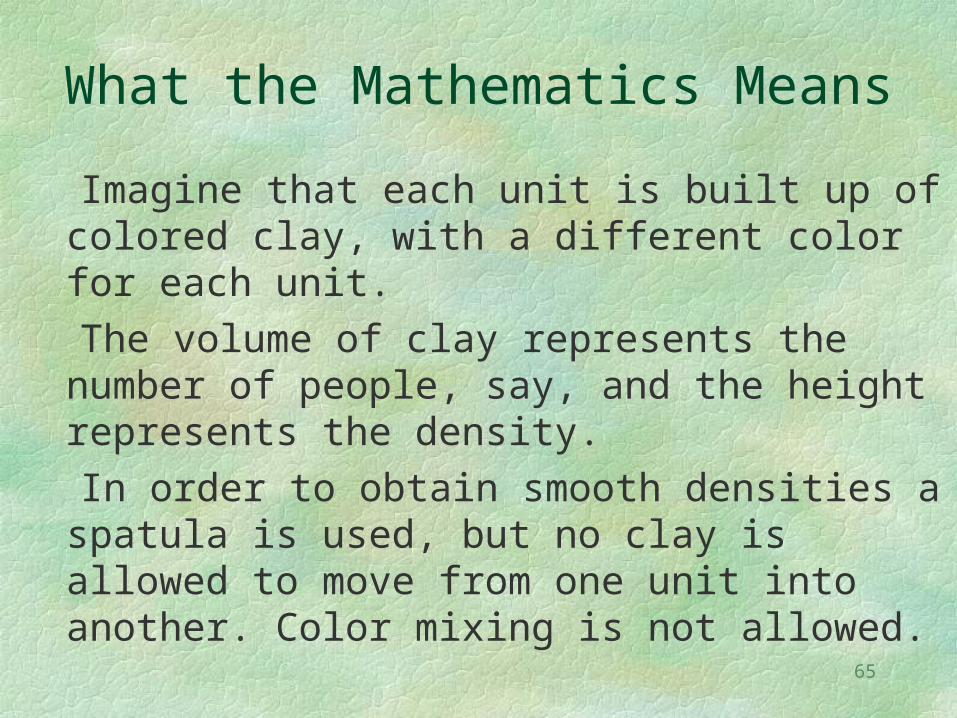
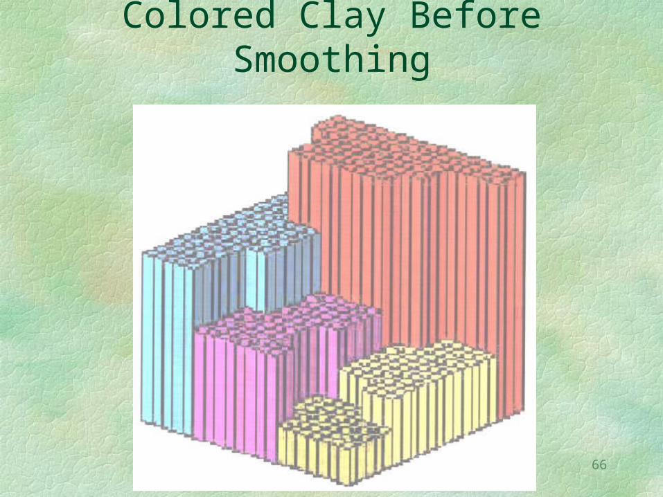
Imagine that each unit is built up of colored clay, with a different color for each unit.
The volume of clay represents the number of people, say, and the height represents the density.
In order to obtain smooth densities a spatula is used, but no clay is allowed to move from one unit into another. Color mixing is not allowed.
66
Colored Clay Before Smoothing
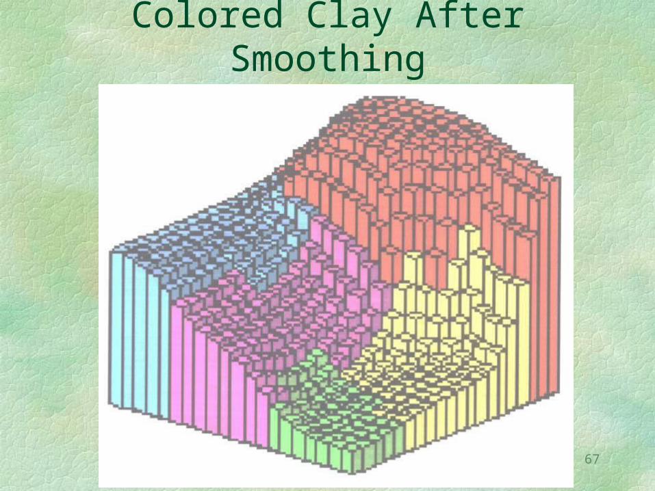
67
Colored Clay After Smoothing
68
Another Advantage of Mass-Preserving Reallocation
A frequent problem is the reassignment of observations from one set of collection units to a different set, when the two sets are not nested nor compatible. For example converting the number of children observed by census tract to a count by school district. Boundaries also change over time, requiring reallocation of information.
The density values obtained using the smooth pycnophylactic method allow an estimate to be made rather simply. A “cookie cutter” can cut the continuous clay surface into the new zones with subsequent addition to get the count.
69
The next important topic is
Movement Movement Movement
This is because most change in geography is due to movement.
Movement of people, ideas, money, or materiel.
70
The Table is an Important Form of Geographic Movement Data
Especially when the rows and columns refer to known geographic locations.
The tables are then “square”, having the same number of rows as columns.
Such tables can be decomposed into two parts, a symmetric part and a skew symmetric part.
For the statisticians in the audience the total variance can also be partitioned into these two parts.
71
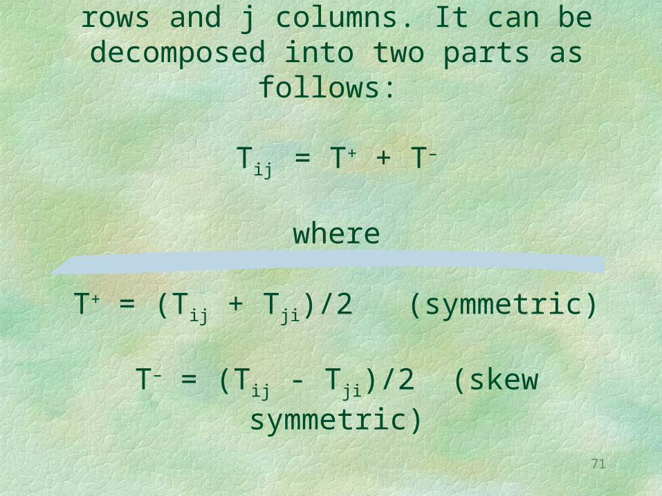
Let T represent the table, with i rows and j columns. It can be decomposed
into two parts as follows:
Tij = T+ + T–
where
T+ = (Tij + Tji)/2 (symmetric)
T– = (Tij - Tji)/2 (skew symmetric)
72
Both Parts Can Be Used
When geographic locations are not known the symmetric part can be used to estimate the positions using trilateration (a.k.a. multidimensional scaling).
The skew symmetric (asymmetric) part can be used to infer movement.
73
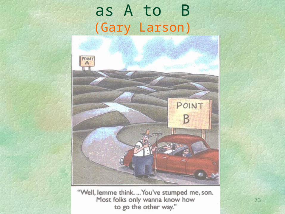
From B to A is Not the Same as A to B
(Gary Larson)
74
Movement is generally not symmetric.
This gives rise to asymmetries which can be exploited.
As one example consider this table of mail delivery times.
Asymmetries Are a Fact of Geography
75
Table of Mail Delivery TimesObserve the asymmetry
76
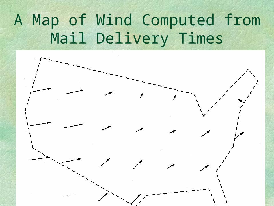
A Map of Wind Computed from Mail Delivery Times
77
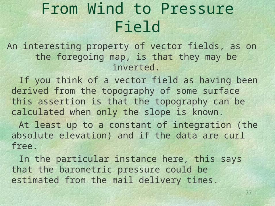
From Wind to Pressure FieldAn interesting property of vector fields, as on the
foregoing map, is that they may be inverted. If you think of a vector field as having been
derived from the topography of some surface this assertion is that the topography can be calculated when only the slope is known.
At least up to a constant of integration (the absolute elevation) and if the data are curl free.
In the particular instance here, this says that the barometric pressure could be estimated from the mail delivery times.

78
In the United States the Currency Indicates Where It
Was Issued
For bills this is the Federal Reserve District.Coins contain a mint abbreviation.
You can check your wallet to estimate your interaction with the rest of the country.

79
Dollar Bill(Federal Reserve Note)
Issued by the 8th (St. Louis) Federal Reserve District.(H is the 8th letter of the alphabet)
80
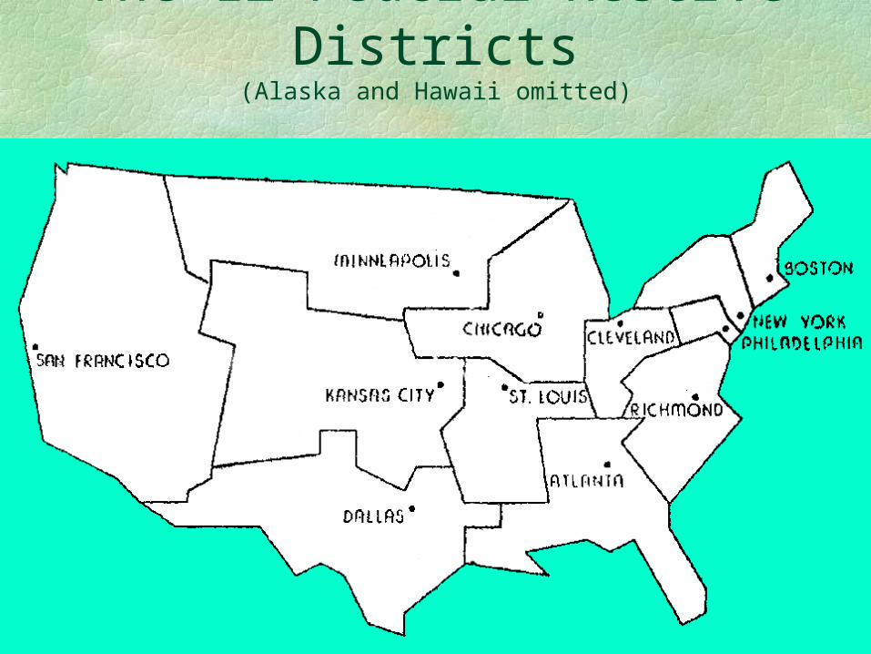
The 12 Federal Reserve Districts
(Alaska and Hawaii omitted)
81
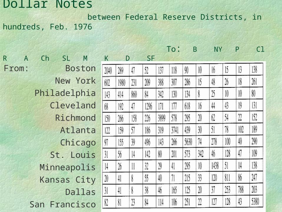
Movement of One Dollar Notes between Federal Reserve Districts, in hundreds, Feb. 1976
To: B NY P Cl R A Ch SL M K D SF
From: BostonNew York
PhiladelphiaClevelandRichmond
AtlantaChicagoSt. Louis
MinneapolisKansas City
DallasSan Francisco
82
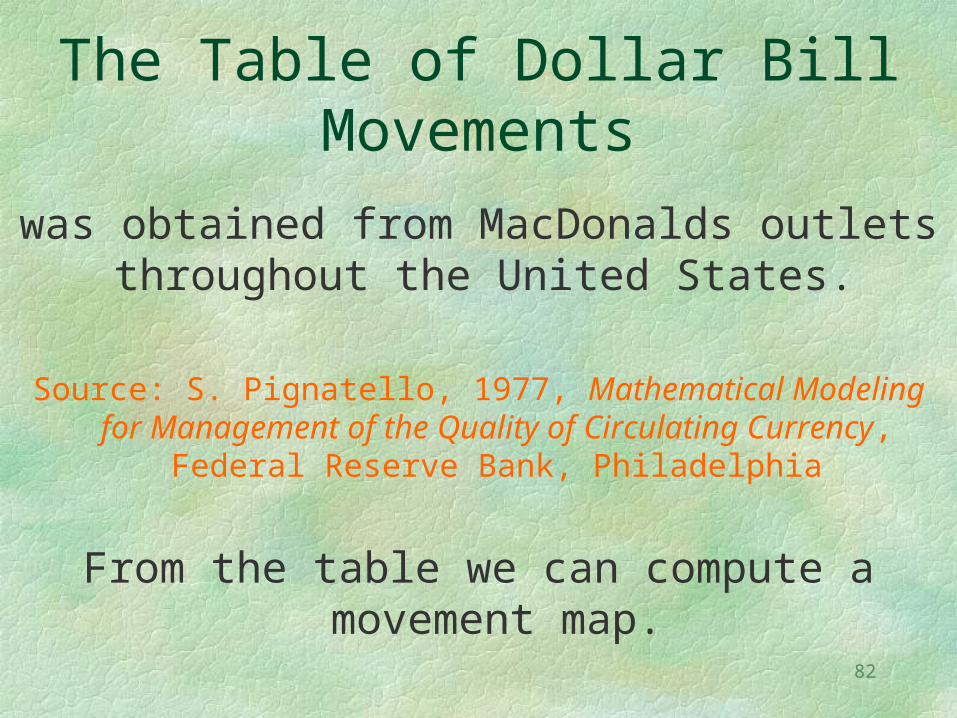
The Table of Dollar Bill Movements
was obtained from MacDonalds outlets throughout the United States.
Source: S. Pignatello, 1977, Mathematical Modeling for Management of the Quality of Circulating Currency,
Federal Reserve Bank, Philadelphia
From the table we can compute a movement map.
83
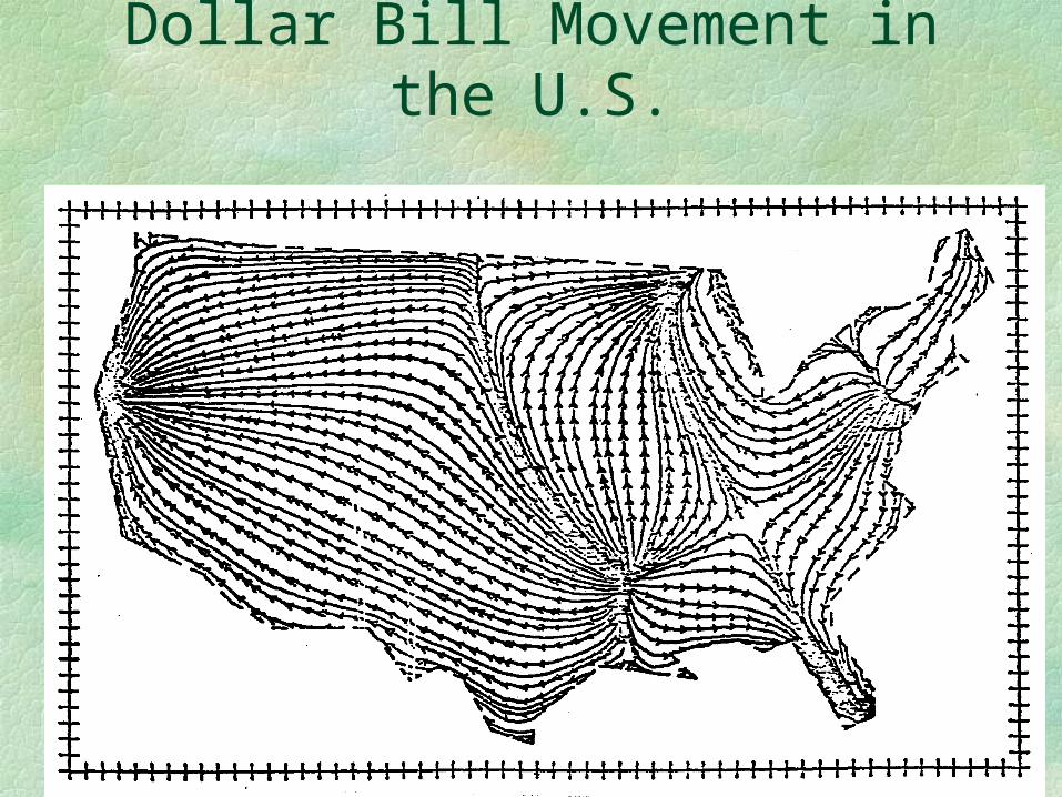
Dollar Bill Movement in the U.S.
84
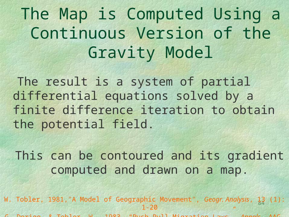
The Map is Computed Using a Continuous Version of the
Gravity Model
The result is a system of partial differential equations solved by a finite difference iteration to obtain the potential field.
This can be contoured and its gradient computed and drawn on a map.
W. Tobler, 1981,"A Model of Geographic Movement", Geogr. Analysis, 13 (1): 1‑20
G. Dorigo, & Tobler, W., 1983, “Push Pull Migration Laws”, Annals, AAG, 73(1):1-17.
85
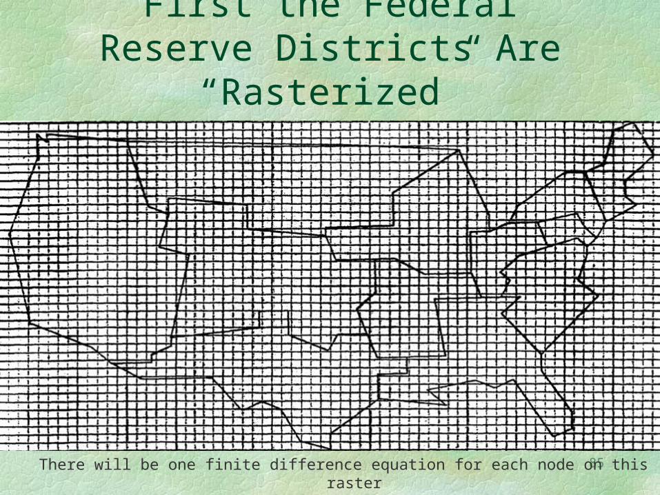
First the Federal Reserve Districts Are “Rasterized”
There will be one finite difference equation for each node on this raster
86
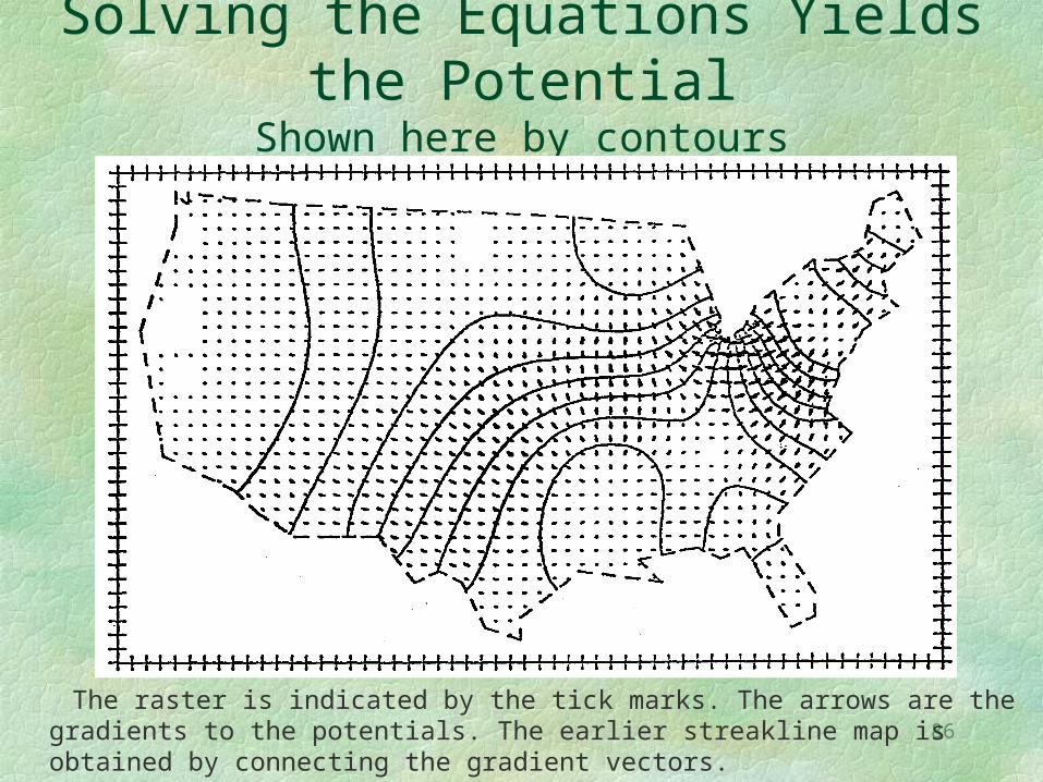
Solving the Equations Yields the Potential
Shown here by contours
The raster is indicated by the tick marks. The arrows are the gradients to the potentials. The earlier streakline map is obtained by connecting the gradient vectors.
87
Average resolution is here defined by (Area of domain/ Number of units)1/2.
The resolution level is important because it tells one the size of pattern which can be detected.
Population movement in the United States
Is recorded in migration tables using census collection units and published at several levels of resolution. The tables are of course asymmetric.
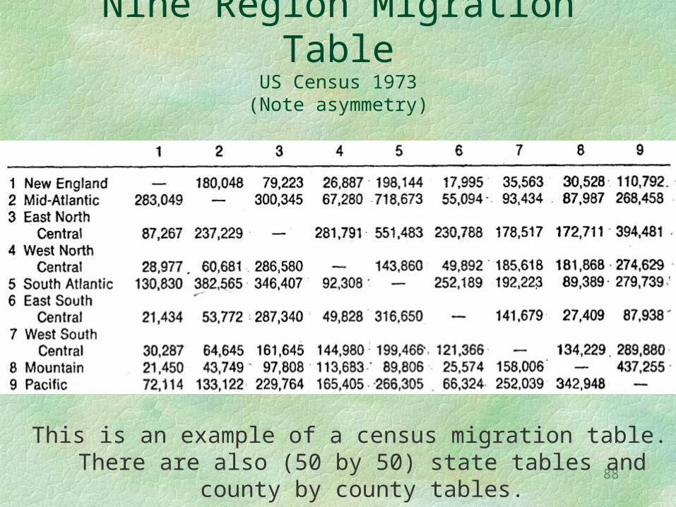
88
Nine Region Migration TableUS Census 1973
(Note asymmetry)
This is an example of a census migration table. There are also (50 by 50) state tables and county by county
tables.
89
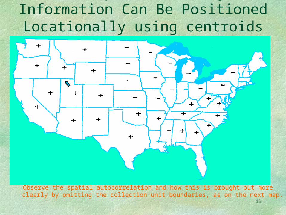
The Population Change Information Can Be Positioned Locationally using
centroids
Observe the spatial autocorrelation and how this is brought out more clearly by omitting the collection unit boundaries, as on the next map.
90
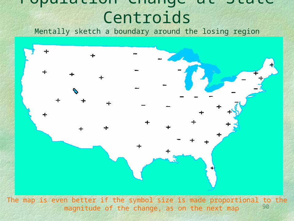
Population Change at State Centroids
Mentally sketch a boundary around the losing region
The map is even better if the symbol size is made proportional to the magnitude of the change, as on the next map
91
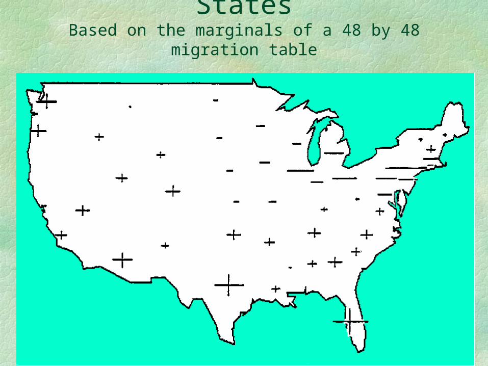
Gaining and Losing StatesBased on the marginals of a 48 by 48 migration
table
92
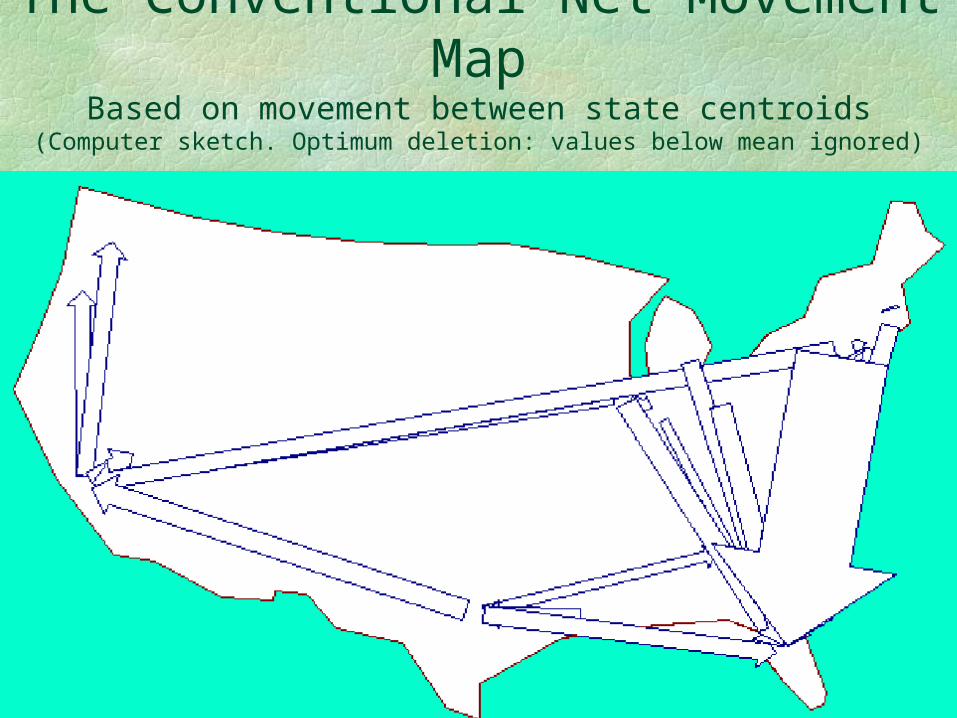
The Conventional Net Movement Map
Based on movement between state centroids(Computer sketch. Optimum deletion: values below mean ignored)
93
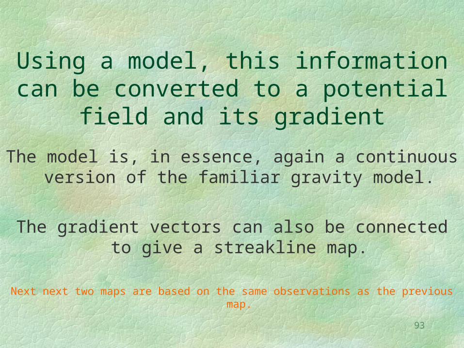
Using a model, this information can be converted to a potential field and its
gradient
The model is, in essence, again a continuous version of the familiar gravity model.
The gradient vectors can also be connected to give a streakline map.
Next next two maps are based on the same observations as the previous map.
94
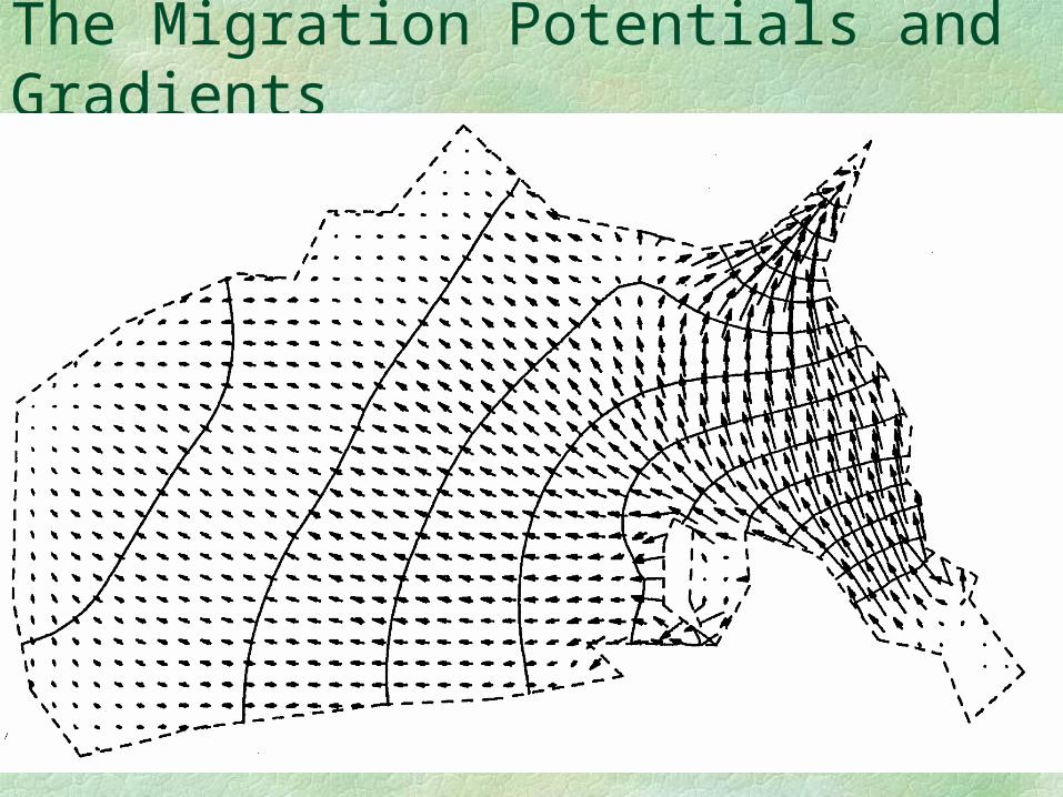
The Migration Potentials and Gradients
95
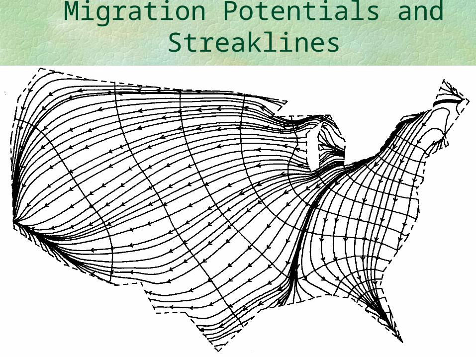
Migration Potentials and Streaklines
96
Recall that tens of millions of people are moving in the five year interval
The model, and map, thus illustrate aggregate movement, and not the tracks of
single individuals.
On the other hand it is generally true that people living to the East of Detroit move to Florida,
Minnesotans to the Northwest, and the rest to the Southwest.
97
That these migration maps resemble maps of wind or ocean currents is not surprising given that we in fact speak
of migration flows and backwaters, and use many such hydrodynamic terms when discussing movement
phenomena.
98
By the insertion of arbitrary areal boundaries, and by measuring the amount of flux across these boundaries, one can obtain information not contained in the original data, i.e., make a prediction.
It’s like using a cookie cutter pressed into the continuous flow model to look at an arbitrary piece and computing the flow across its borders.
The next map is an example, using state boundaries.The US Census Bureau does not provide this information. The model is used to make the prediction
99
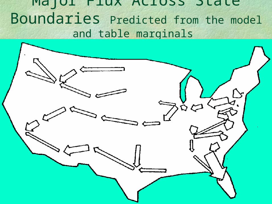
Major Flux Across State Boundaries Predicted from the model and
table marginals
100
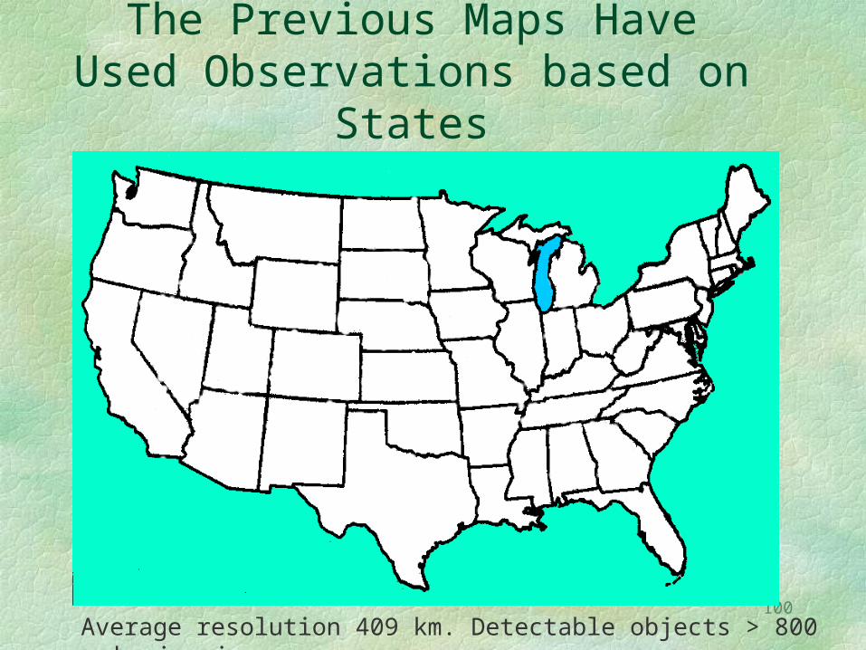
The Previous Maps Have Used Observations based on States
Patterns within urban areas could not be seen.
Average resolution 409 km. Detectable objects > 800 km in size.
101
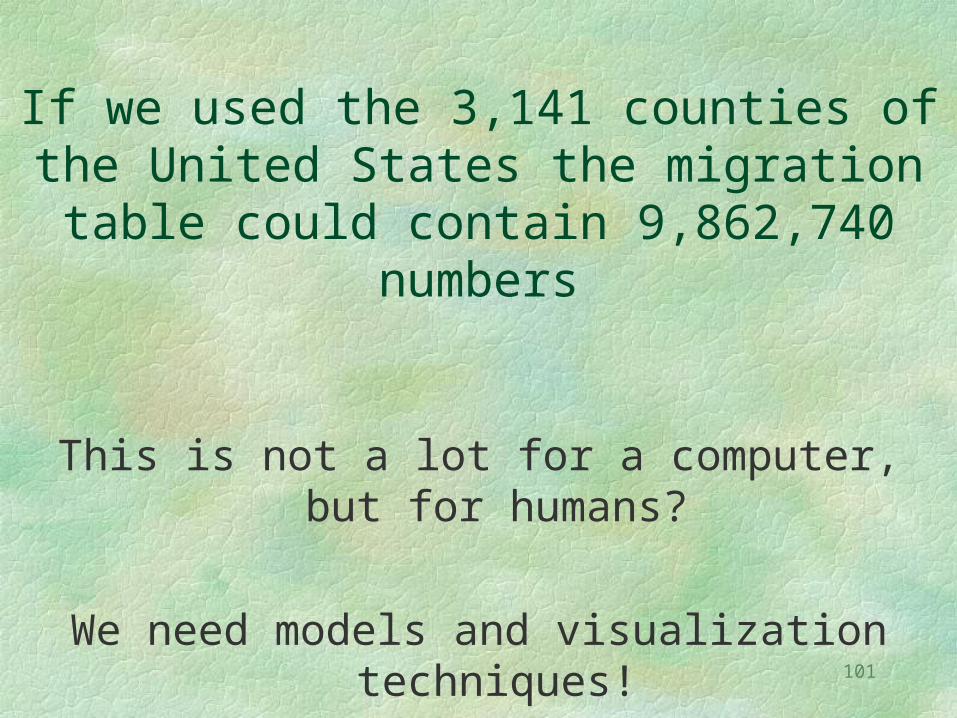
If we used the 3,141 counties of the United States the migration table could contain 9,862,740 numbers
This is not a lot for a computer, but for humans?
We need models and visualization techniques!

102
County Units
Average resolution ~55 km. Patterns >110 km detectable.Still not sufficient to see movement within cities.
103
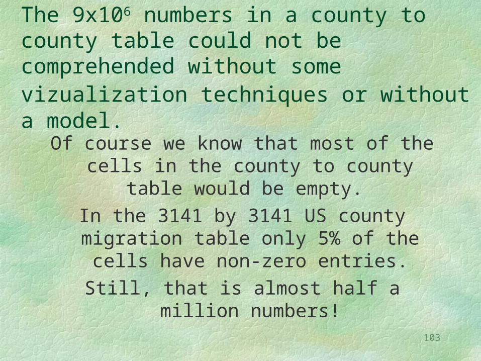
The 9x10⁶ numbers in a county to county table could not be comprehended without some vizualization techniques or without a model.
Of course we know that most of the cells in the county to county table would be
empty. In the 3141 by 3141 US county
migration table only 5% of the cells have non-zero entries.
Still, that is almost half a million numbers!
104
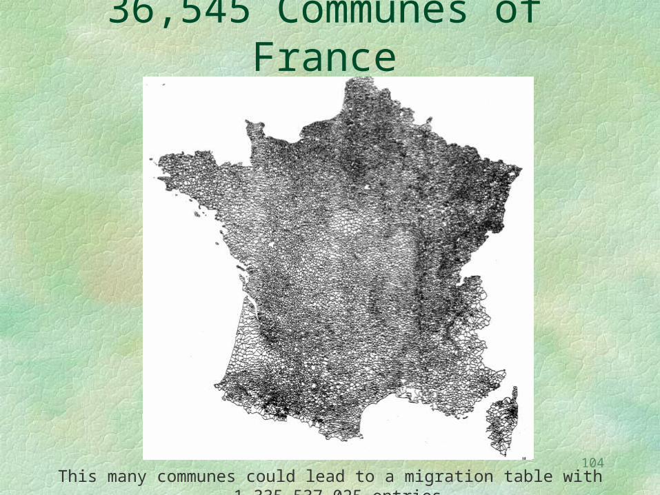
36,545 Communes of France
This many communes could lead to a migration table with 1,335,537,025 entries.
105
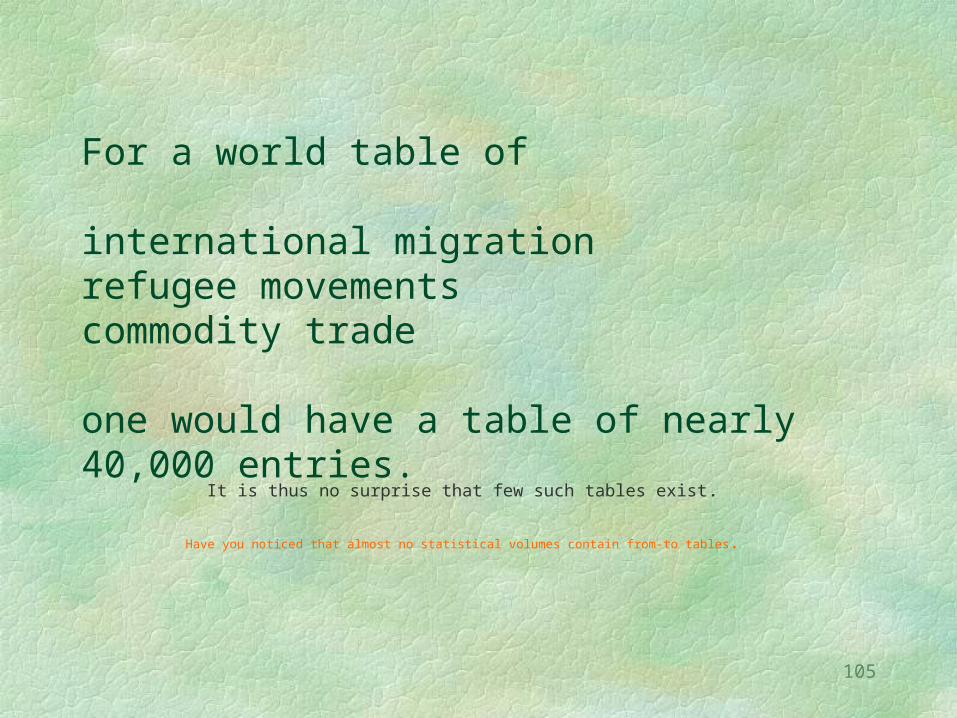
For a world table of international migration refugee movementscommodity trade one would have a table of nearly 40,000 entries.
It is thus no surprise that few such tables exist.
Have you noticed that almost no statistical volumes contain from-to tables.
106
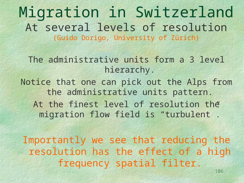
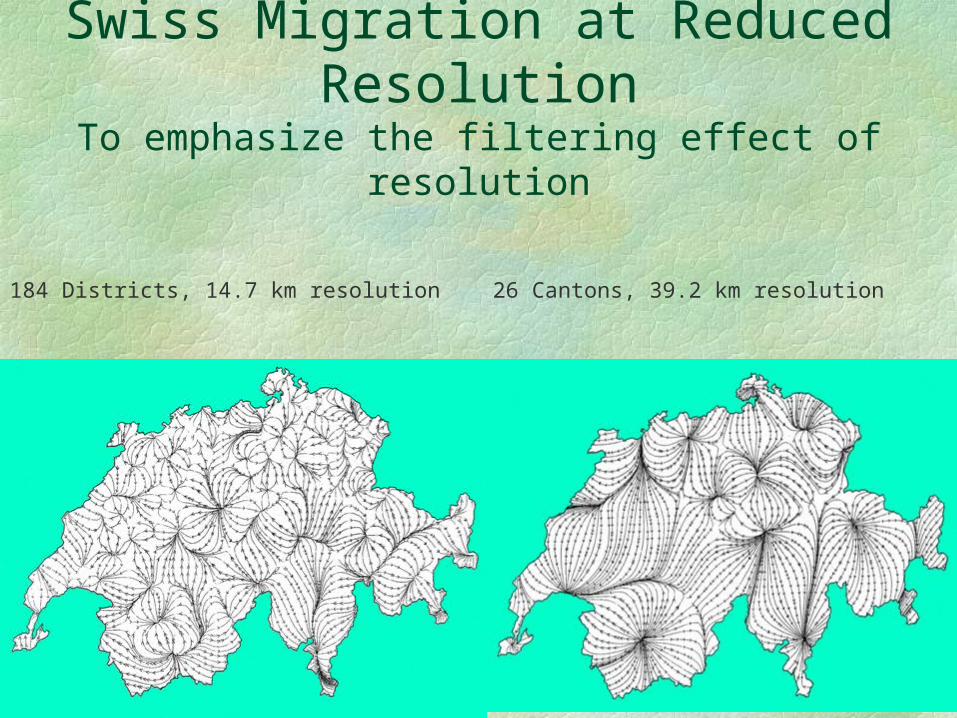
Migration in SwitzerlandAt several levels of resolution
(Guido Dorigo, University of Zürich)
The administrative units form a 3 level hierarchy.Notice that one can pick out the Alps from the
administrative units pattern.At the finest level of resolution the migration
flow field is “turbulent”.
Importantly we see that reducing the resolution has the effect of a high
frequency spatial filter.
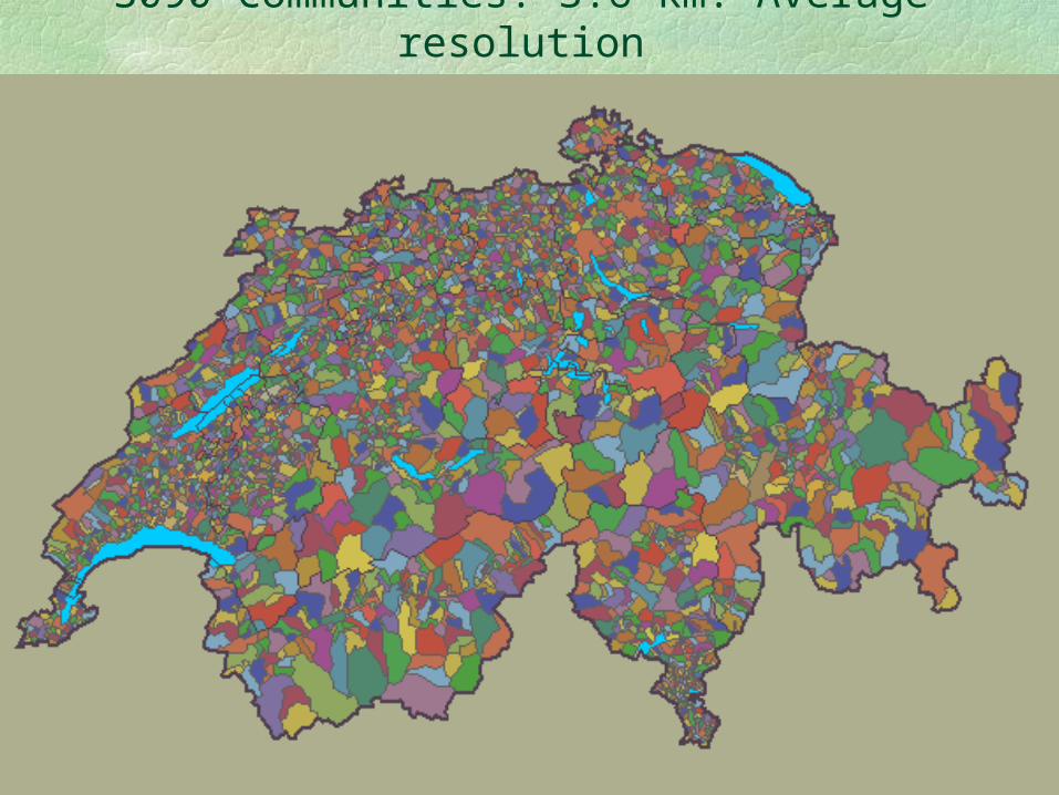
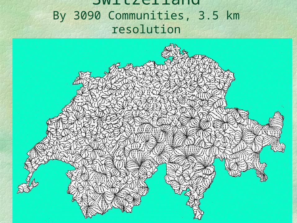
107
3090 Communities. 3.6 km. Average resolution
108
Net Migration In SwitzerlandBy 3090 Communities, 3.5 km resolution
109
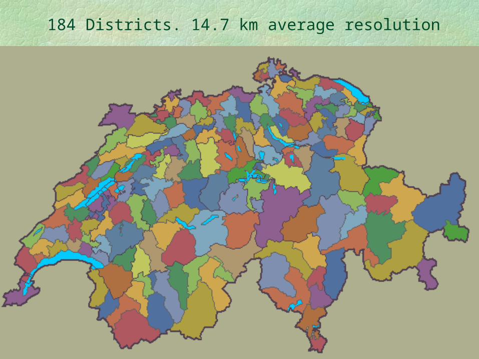
184 Districts. 14.7 km average resolution
110
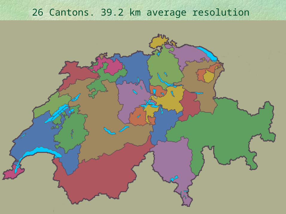
26 Cantons. 39.2 km average resolution
111
Swiss Migration at Reduced Resolution
To emphasize the filtering effect of resolution
184 Districts, 14.7 km resolution 26 Cantons, 39.2 km resolution
112
In this presentation I have emphasized
Location and Movement
As represented by various kinds of cartographic
modeling.
113
I appreciate your attention and thank you.


![Spatial Statistics and Spatial Knowledge Discovery First law of geography [Tobler]: Everything is related to everything, but nearby things are more related.](https://static.fdocuments.in/doc/165x107/56649daa5503460f94a98596/spatial-statistics-and-spatial-knowledge-discovery-first-law-of-geography-tobler.jpg)