© Matt Shanks - 2021
22
© Matt Shanks - 2021
Transcript of © Matt Shanks - 2021
© Matt Shanks - 2021
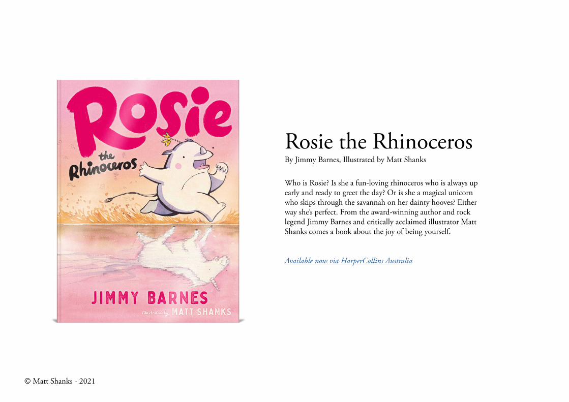
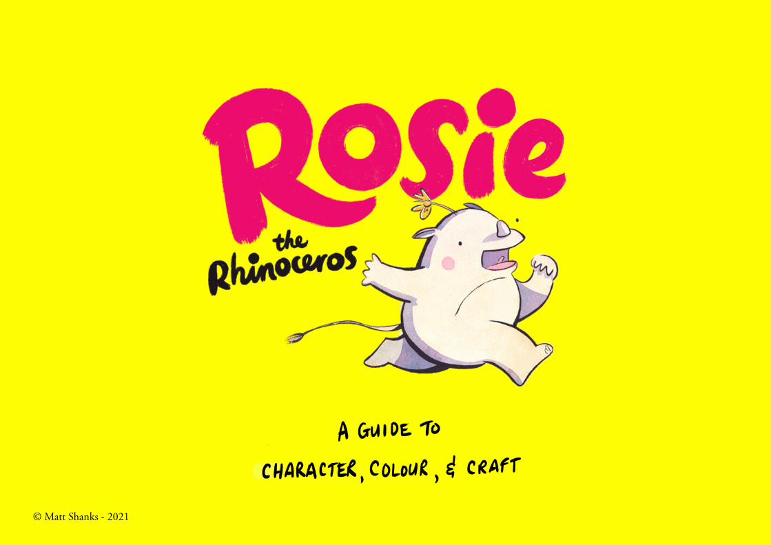
Rosie the RhinocerosBy Jimmy Barnes, Illustrated by Matt Shanks
Who is Rosie? Is she a fun-loving rhinoceros who is always up early and ready to greet the day? Or is she a magical unicorn who skips through the savannah on her dainty hooves? Either way she’s perfect. From the award-winning author and rock legend Jimmy Barnes and critically acclaimed illustrator Matt Shanks comes a book about the joy of being yourself.
© Matt Shanks - 2021
Available now via HarperCollins Australia
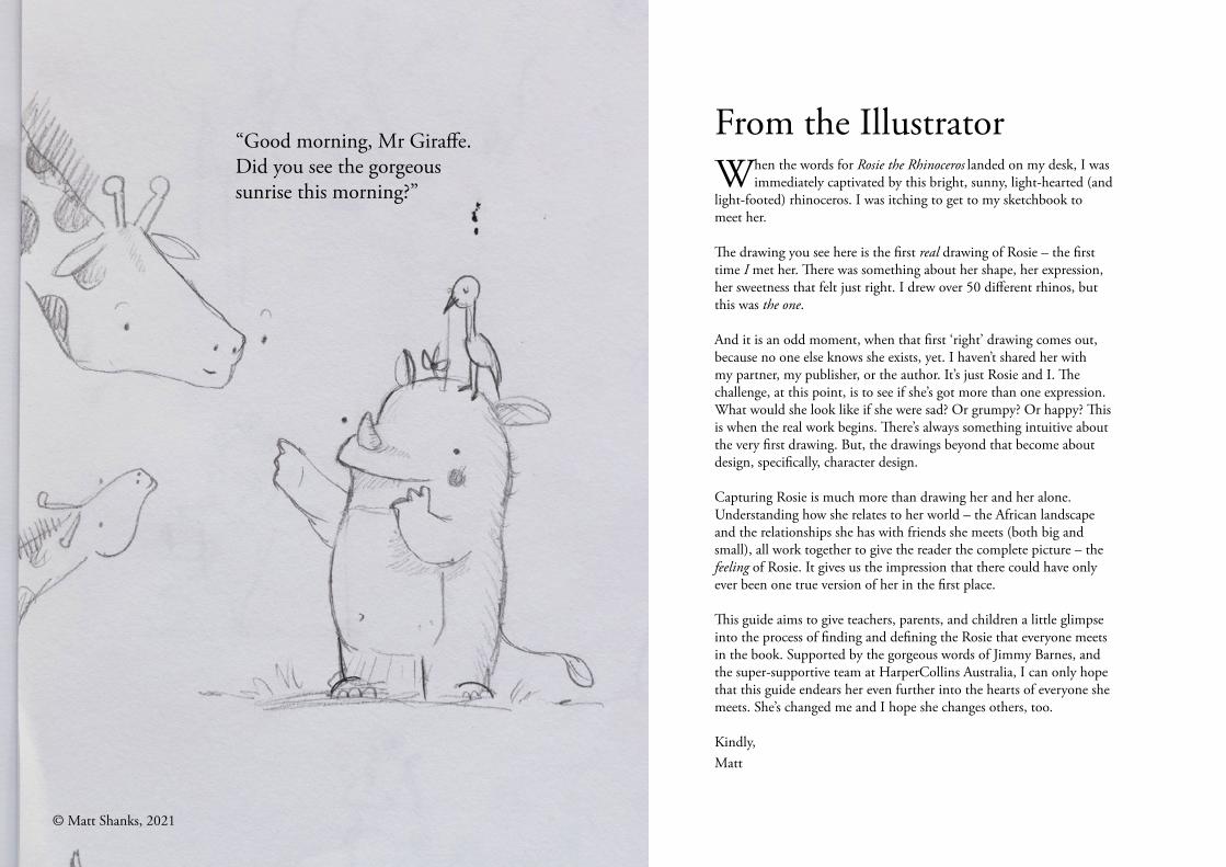
From the IllustratorWhen the words for Rosie the Rhinoceros landed on my desk, I was
immediately captivated by this bright, sunny, light-hearted (and light-footed) rhinoceros. I was itching to get to my sketchbook to meet her.
The drawing you see here is the first real drawing of Rosie – the first time I met her. There was something about her shape, her expression, her sweetness that felt just right. I drew over 50 different rhinos, but this was the one.
And it is an odd moment, when that first ‘right’ drawing comes out, because no one else knows she exists, yet. I haven’t shared her with my partner, my publisher, or the author. It’s just Rosie and I. The challenge, at this point, is to see if she’s got more than one expression. What would she look like if she were sad? Or grumpy? Or happy? This is when the real work begins. There’s always something intuitive about the very first drawing. But, the drawings beyond that become about design, specifically, character design.
Capturing Rosie is much more than drawing her and her alone. Understanding how she relates to her world – the African landscape and the relationships she has with friends she meets (both big and small), all work together to give the reader the complete picture – the feeling of Rosie. It gives us the impression that there could have only ever been one true version of her in the first place.
This guide aims to give teachers, parents, and children a little glimpse into the process of finding and defining the Rosie that everyone meets in the book. Supported by the gorgeous words of Jimmy Barnes, and the super-supportive team at HarperCollins Australia, I can only hope that this guide endears her even further into the hearts of everyone she meets. She’s changed me and I hope she changes others, too.
Kindly,Matt
“Good morning, Mr Giraffe. Did you see the gorgeous sunrise this morning?”
© Matt Shanks, 2021
1. Character Design
© Matt Shanks, 2021
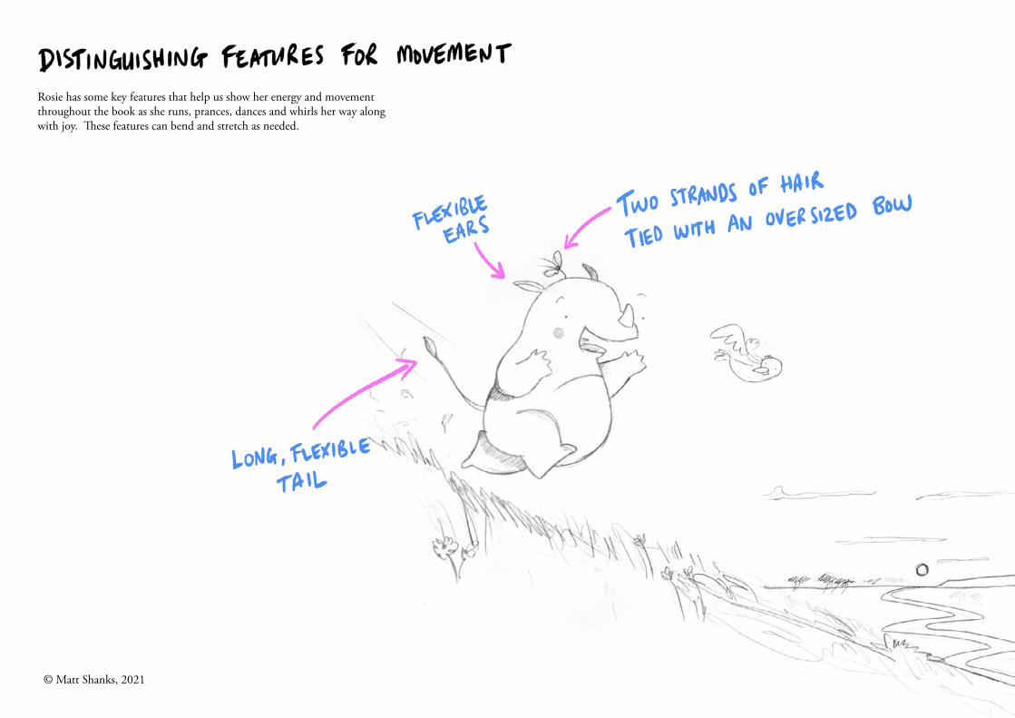
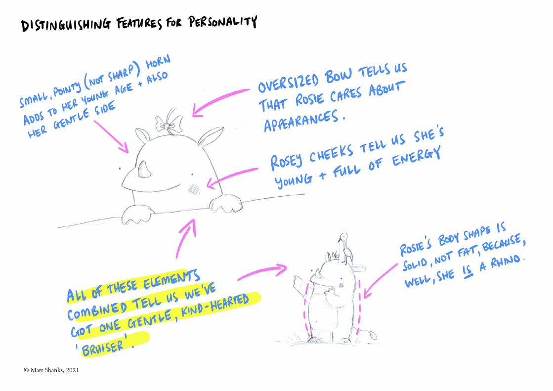
Rosie has some key features that help us show her energy and movement throughout the book as she runs, prances, dances and whirls her way along with joy. These features can bend and stretch as needed.
© Matt Shanks, 2021
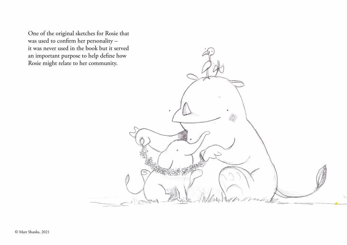
One of the original sketches for Rosie that was used to confirm her personality – it was never used in the book but it served an important purpose to help define how Rosie might relate to her community.
© Matt Shanks, 2021
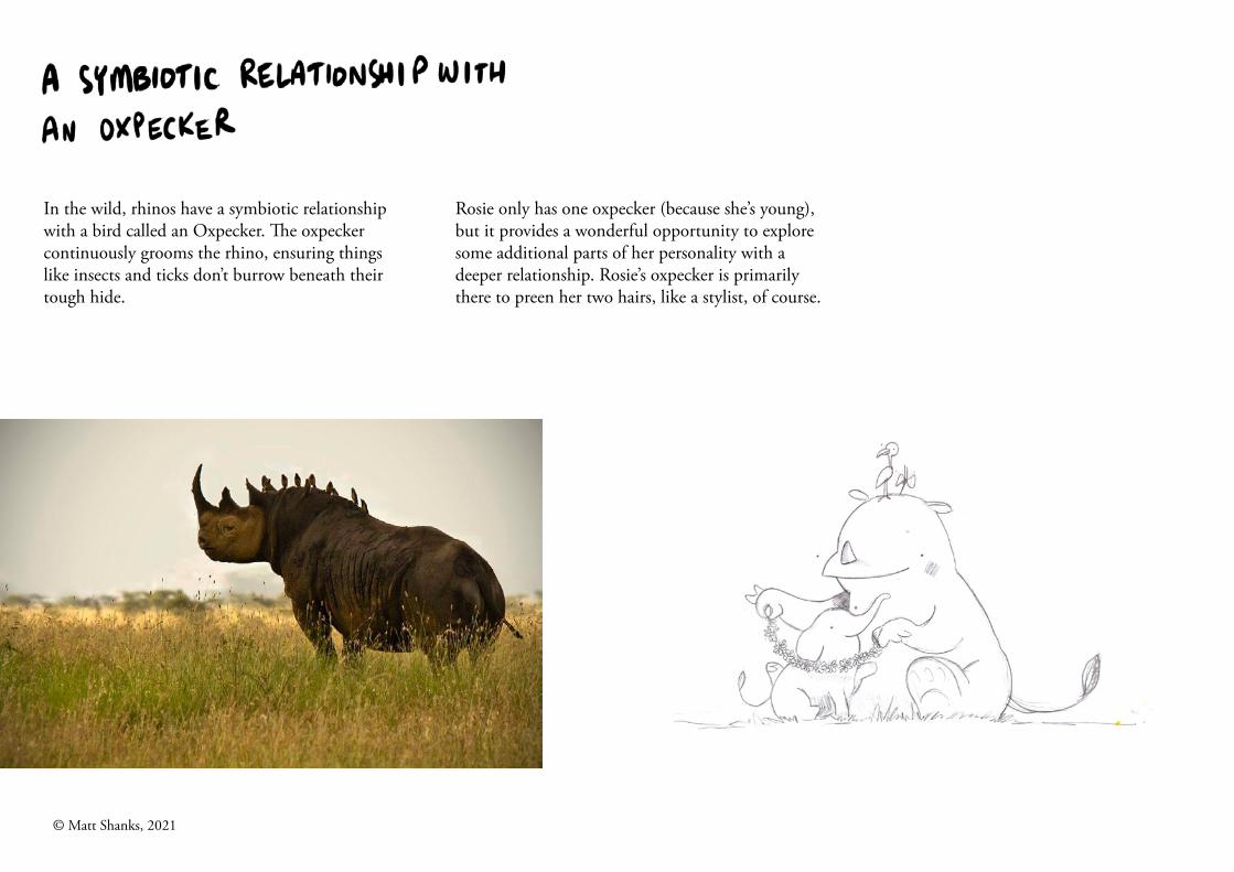
In the wild, rhinos have a symbiotic relationshipwith a bird called an Oxpecker. The oxpeckercontinuously grooms the rhino, ensuring things like insects and ticks don’t burrow beneath their tough hide.
Rosie only has one oxpecker (because she’s young),but it provides a wonderful opportunity to exploresome additional parts of her personality with adeeper relationship. Rosie’s oxpecker is primarilythere to preen her two hairs, like a stylist, of course.
© Matt Shanks, 2021
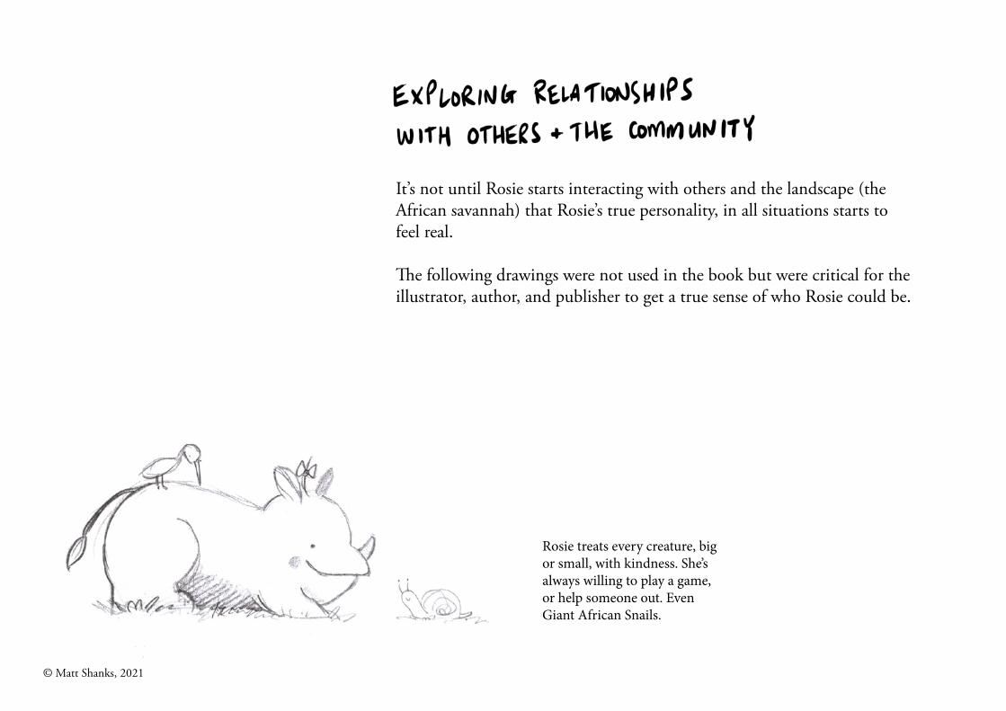
It’s not until Rosie starts interacting with others and the landscape (the African savannah) that Rosie’s true personality, in all situations starts to feel real.
The following drawings were not used in the book but were critical for the illustrator, author, and publisher to get a true sense of who Rosie could be.
Rosie treats every creature, bigor small, with kindness. She’salways willing to play a game,or help someone out. EvenGiant African Snails.
© Matt Shanks, 2021
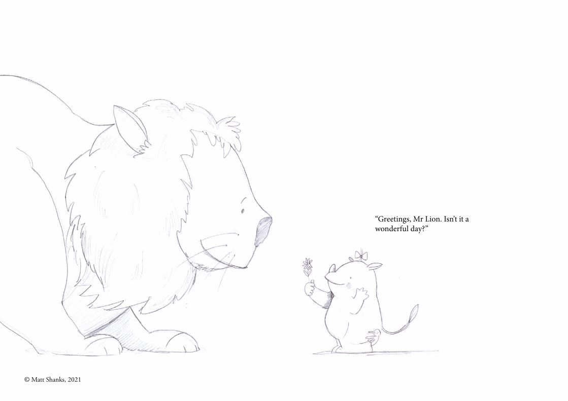
“Greetings, Mr Lion. Isn’t it awonderful day?”
© Matt Shanks, 2021
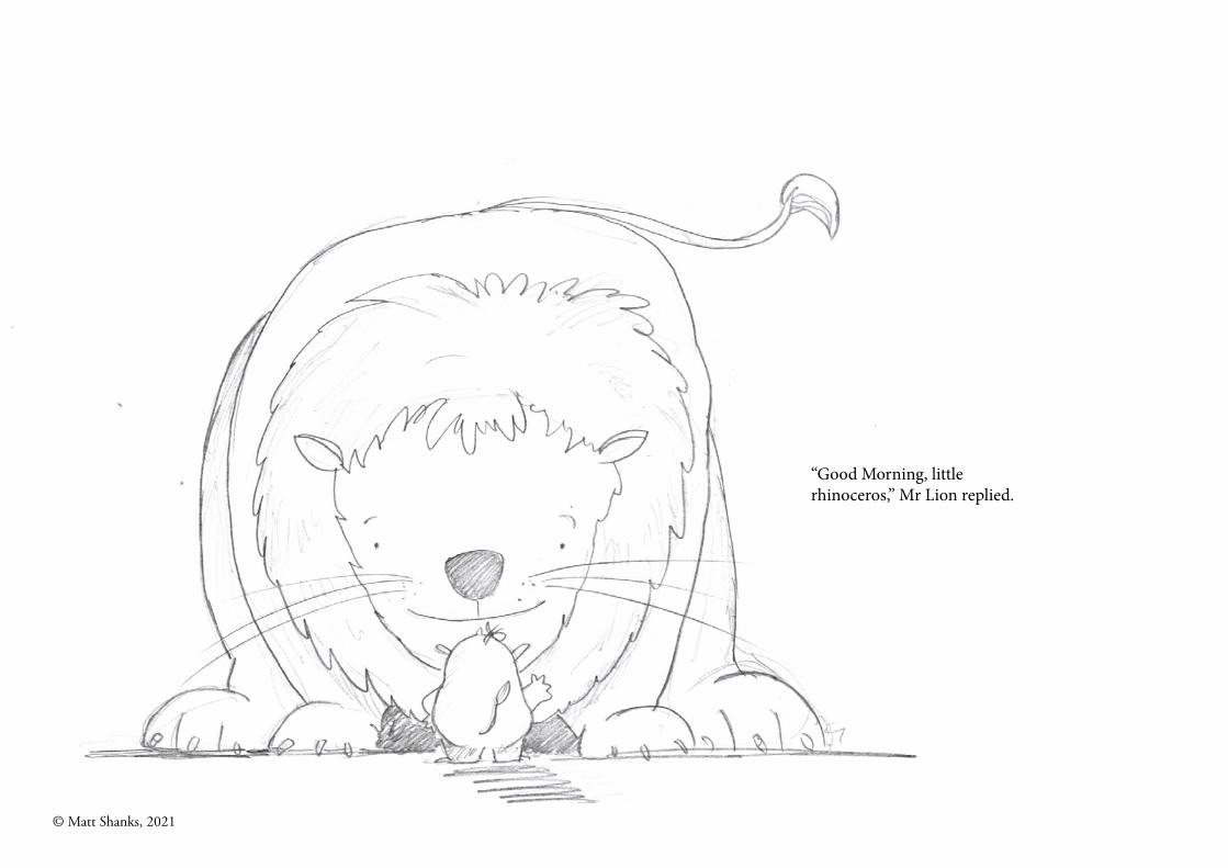
“Good Morning, littlerhinoceros,” Mr Lion replied.
© Matt Shanks, 2021
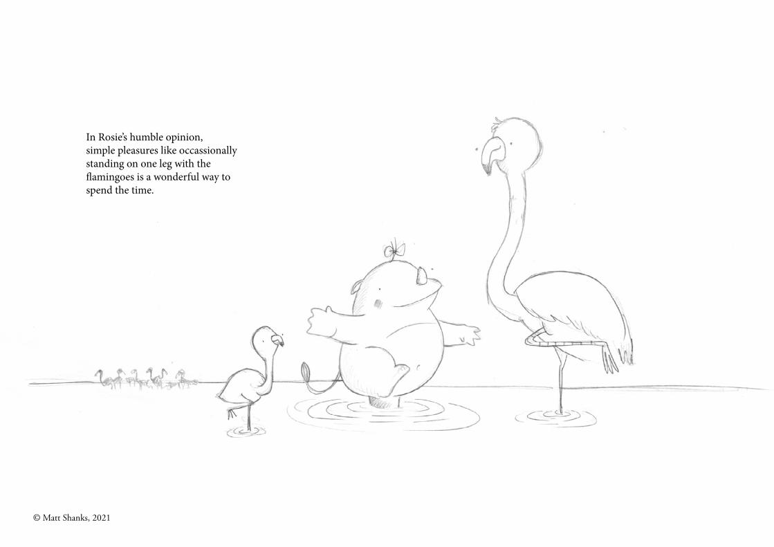
In Rosie’s humble opinion, simple pleasures like occassionally standing on one leg with the flamingoes is a wonderful way to spend the time.
© Matt Shanks, 2021
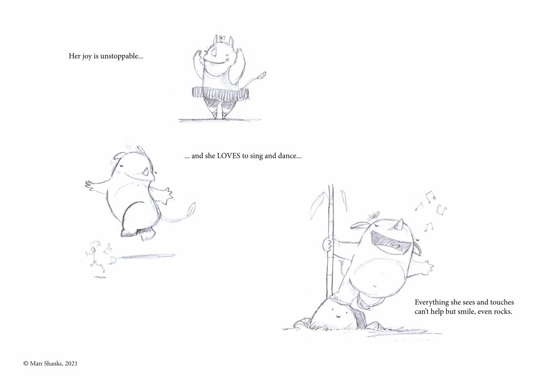
Her joy is unstoppable...
... and she LOVES to sing and dance...
Everything she sees and touches can’t help but smile, even rocks.
© Matt Shanks, 2021
2. Colour
© Matt Shanks, 2021
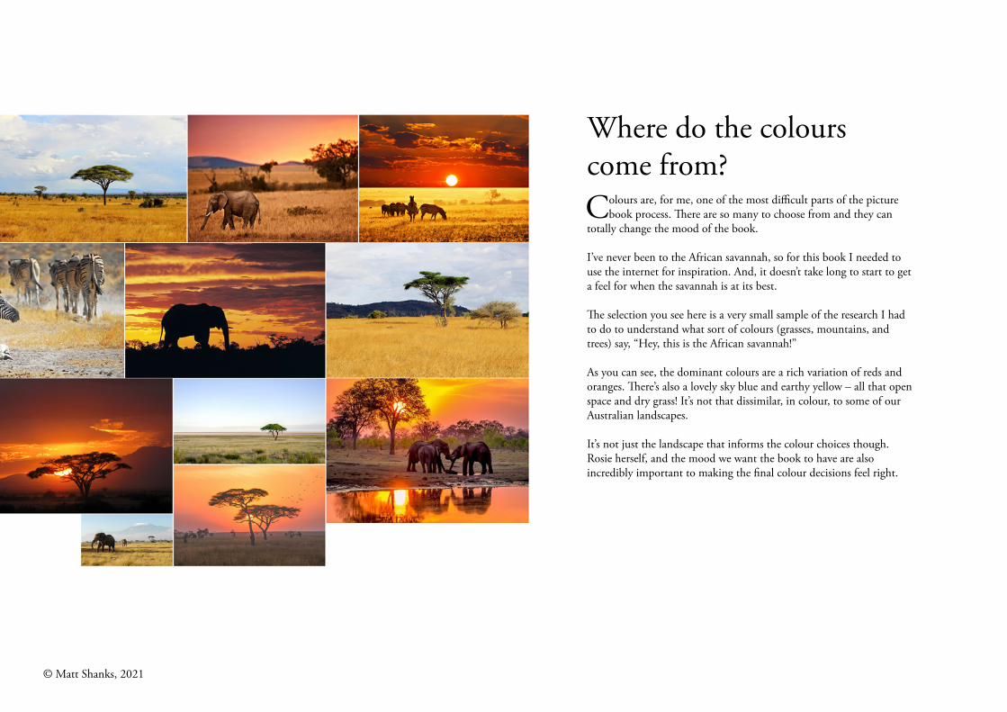
Where do the colours come from?Colours are, for me, one of the most difficult parts of the picture
book process. There are so many to choose from and they can totally change the mood of the book.
I’ve never been to the African savannah, so for this book I needed to use the internet for inspiration. And, it doesn’t take long to start to get a feel for when the savannah is at its best.
The selection you see here is a very small sample of the research I had to do to understand what sort of colours (grasses, mountains, and trees) say, “Hey, this is the African savannah!”
As you can see, the dominant colours are a rich variation of reds and oranges. There’s also a lovely sky blue and earthy yellow – all that open space and dry grass! It’s not that dissimilar, in colour, to some of our Australian landscapes.
It’s not just the landscape that informs the colour choices though. Rosie herself, and the mood we want the book to have are also incredibly important to making the final colour decisions feel right.
© Matt Shanks, 2021
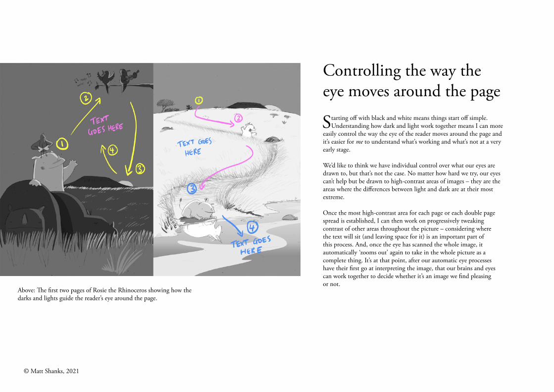
Controlling the way the eye moves around the page
Starting off with black and white means things start off simple. Understanding how dark and light work together means I can more
easily control the way the eye of the reader moves around the page and it’s easier for me to understand what’s working and what’s not at a very early stage.
We’d like to think we have individual control over what our eyes are drawn to, but that’s not the case. No matter how hard we try, our eyes can’t help but be drawn to high-contrast areas of images – they are the areas where the differences between light and dark are at their most extreme.
Once the most high-contrast area for each page or each double page spread is established, I can then work on progressively tweaking contrast of other areas throughout the picture – considering where the text will sit (and leaving space for it) is an important part of this process. And, once the eye has scanned the whole image, it automatically ‘zooms out’ again to take in the whole picture as a complete thing. It’s at that point, after our automatic eye processes have their first go at interpreting the image, that our brains and eyes can work together to decide whether it’s an image we find pleasing or not.
Above: The first two pages of Rosie the Rhinoceros showing how the darks and lights guide the reader’s eye around the page.
© Matt Shanks, 2021
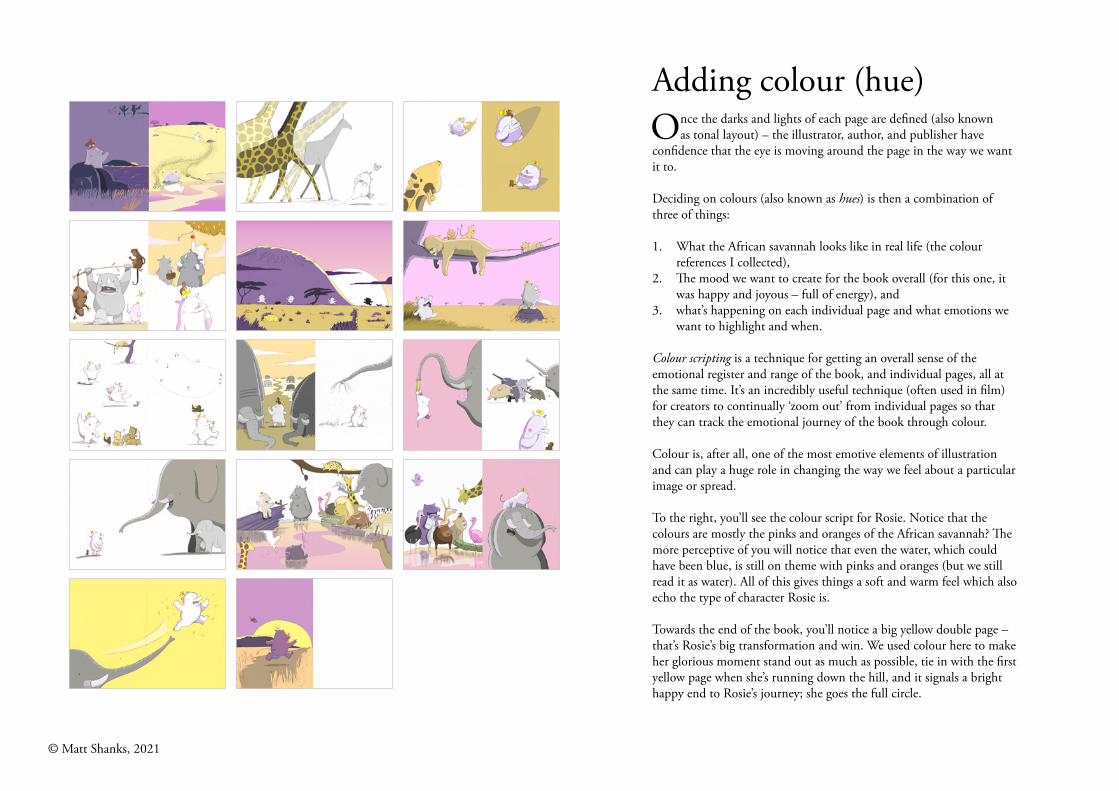
Adding colour (hue)Once the darks and lights of each page are defined (also known
as tonal layout) – the illustrator, author, and publisher have confidence that the eye is moving around the page in the way we want it to.
Deciding on colours (also known as hues) is then a combination of three of things:
1. What the African savannah looks like in real life (the colour references I collected),
2. The mood we want to create for the book overall (for this one, it was happy and joyous – full of energy), and
3. what’s happening on each individual page and what emotions we want to highlight and when.
Colour scripting is a technique for getting an overall sense of the emotional register and range of the book, and individual pages, all at the same time. It’s an incredibly useful technique (often used in film) for creators to continually ‘zoom out’ from individual pages so that they can track the emotional journey of the book through colour.
Colour is, after all, one of the most emotive elements of illustration and can play a huge role in changing the way we feel about a particular image or spread.
To the right, you’ll see the colour script for Rosie. Notice that the colours are mostly the pinks and oranges of the African savannah? The more perceptive of you will notice that even the water, which could have been blue, is still on theme with pinks and oranges (but we still read it as water). All of this gives things a soft and warm feel which also echo the type of character Rosie is.
Towards the end of the book, you’ll notice a big yellow double page – that’s Rosie’s big transformation and win. We used colour here to make her glorious moment stand out as much as possible, tie in with the first yellow page when she’s running down the hill, and it signals a bright happy end to Rosie’s journey; she goes the full circle.
© Matt Shanks, 2021
3. Craft
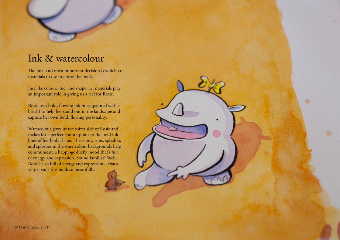
Ink & watercolourThe final and most important decision is which art materials to use to create the book.
Just like colour, line, and shape, art materials play an important role in giving us a feel for Rosie.
Rosie uses bold, flowing ink lines (painted with a brush) to help her stand out in the landscape and capture her own bold, flowing personality.
Watercolour gives us the softer side of Rosie and makes for a perfect counterpoint to the bold ink lines of her body shape. The stains, runs, splashes, and sploshes in the watercolour backgrounds help communicate a happy-go-lucky mood that’s full of energy and expression. Sound familiar? Well, Rosie’s also full of energy and expression – that’s why it suits this book so beautifully.
© Matt Shanks, 2021
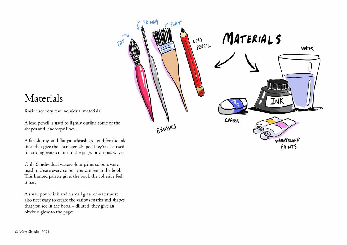
MaterialsRosie uses very few individual materials.
A lead pencil is used to lightly outline some of the shapes and landscape lines.
A fat, skinny, and flat paintbrush are used for the ink lines that give the characters shape. They’re also used for adding watercolour to the pages in various ways.
Only 6 individual watercolour paint colours were used to create every colour you can see in the book. This limited palette gives the book the cohesive feel it has.
A small pot of ink and a small glass of water were also necessary to create the various marks and shapes that you see in the book – diluted, they give an obvious glow to the pages.
© Matt Shanks, 2021
MaterialsRosie uses very few individual materials.
A lead pencil is used to lightly outline some of the shapes and landscape lines.
A fat, skinny, and flat paintbrush are used for the ink lines that give our characters shape as well as for adding watercolour to the pages in various ways.
Only 6 individual watercolour paint colours were used to create every colour you can see in the book. This limited palette gives the book the cohesive feel it has.
A small pot of ink and a small glass of water were also necessary to create the various marks and shapes that you see in the book.
© Matt Shanks, 2021
© Matt Shanks - 2021
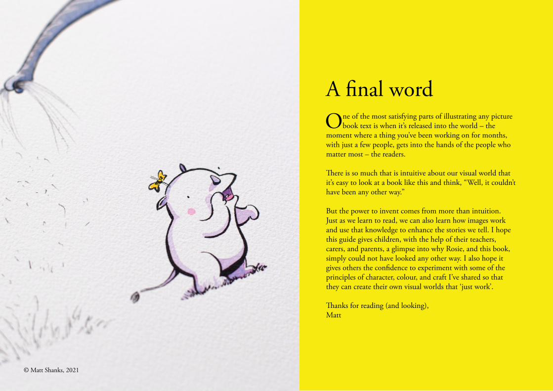
A final wordOne of the most satisfying parts of illustrating any picture
book text is when it’s released into the world – the moment where a thing you’ve been working on for months, with just a few people, gets into the hands of the people who matter most – the readers.
There is so much that is intuitive about our visual world that it’s easy to look at a book like this and think, “Well, it couldn’t have been any other way.”
But the power to invent comes from more than intuition. Just as we learn to read, we can also learn how images work and use that knowledge to enhance the stories we tell. I hope this guide gives children, with the help of their teachers, carers, and parents, a glimpse into why Rosie, and this book, simply could not have looked any other way. I also hope it gives others the confidence to experiment with some of the principles of character, colour, and craft I’ve shared so that they can create their own visual worlds that ‘just work’.
Thanks for reading (and looking),Matt
© Matt Shanks, 2021


![1737 - micromatic.com · 1737-l long shanks 1737-s short shanks 1738-l long shanks 1738-s short shanks 1066.8 [42.0] 76.2 [3.0] 990.6 [39.0] (13) spaces 76.2 [3.0] apart ref. 38.1](https://static.fdocuments.in/doc/165x107/5f8352f9a944be5a795c3526/1737-1737-l-long-shanks-1737-s-short-shanks-1738-l-long-shanks-1738-s-short-shanks.jpg)