“ Excellence Through People and Partnerships” Quilt. Community Quilt “The Community Quilt...
12
COMMUNITY MOBILIZATION UNIT 40 College Street Toronto, Ontario M5G 2J3 “ Excellence Through People and Partnerships”
-
Upload
nguyencong -
Category
Documents
-
view
213 -
download
0
Transcript of “ Excellence Through People and Partnerships” Quilt. Community Quilt “The Community Quilt...

COMMUNITY MOBILIZATION UNIT 40 College Street Toronto, Ontario
M5G 2J3
“ Excellence Through People and Partnerships”

The tile is a representation of the diversity of the LGBT community and the vibrance of the people who are a part of it. Aside from the diversity that most initially see, in terms of gender, race and sexual orientation, I wanted the piece to give a sense of family, camaraderie, diversity and most of all community. The characters depict a snapshot of that very diversity in terms of gender, age, family composition, and race.
The tile illustrates a gay male couple and their child in the upper left hand corner, a South Asian woman just off center, a uniformed officer embracing a civilian man from the community, and an older Black woman just above them. In the background there is the LGBT flag of pride and diversity, and at the bottom left there are the street signs “CHURCH” giving reference to the historically significant Church and Wellesley village. I used a signpost as a symbol of beginning; a beacon from which the community grows. From behind these signs a tree is seen also representing the health, strength and continued growth of the LGBT community. Artist James Bailey a 19 year old youth of Jamaican descent, grew up in a family of singers, artists and dancers in Mississauga, Ontario. James attended the Q.E. Arts Program at Queen Elizabeth Senior Public School, and was a part of the first graduating class from the Arts Program. Through high-school, James attended Cawthra Park Secondary School’s Visual Arts Program and was one of a number of youth to participate in the AGO’s most popular installations, “In Your Face”, in 2006, and in “THE MOVEMENT presents RUN THE ROM” in 2007. Currently, James is in his second year of the Fashion Program at Fanshawe College in London, Ontario.

On the tile, I depicted the unity of many different people by creating a line of people at the bottom. These people are of many different colors which is showing that no matter how different the people of Jane and Finch are, we will always stand together. At the top, I wrote peace, love, and unity which is what the people should live by daily. Also at the very bot-tom of the tile I wrote united we stand to signify the strength and solidarity we could all obtain if we worked together to stop senseless violence. Around the area of the tile, I drew a dove which is a symbol of peace and strength. I also drew a vine of flowers to show how we are all connected through something. Lastly, I drew two hearts to symbolize the love we should all have for each other. - Artist Jewel Rigault
Afghani artist- Sediq Danish The message on the tile is "Celebrating Diversity by igniting the light of Unity, Love & Hope"
Special thanks to Inspector Cory Bockus as she brought forward the idea for the
Community Quilt.
Community Quilt
“The Community Quilt reflects the unique and valuable contributions of our many communities. By joining
these images together, we reveal the strength and beauty of Toronto.”
Inspector Cory Bockus

Lenny Dass received his B.Sc. from York University in 1989. He holds a Quality Assurance Certificate from Ryerson Polytechnical University and is currently completing a Human Resources Management certificate. In 2004, Artist Lenny Dass began his studies at the Academy of Realist Art in Toronto. He is currently completing the penultimate project to fulfill the ARA curriculum. He teaches at the Academy and works on various commissions. His works adorn the walls of private collections throughout Canada. Lenny is a senior member of the American Society for Quality and holds a Certified Software Quality Engineer certification. He has collaborated on several publications and is a co-author of the book Analytical Instrument Validation. Currently, he is a Senior Validation Specialist in the Information Technology department at a local pharmaceutical company. The tile is the crest for the 11 Division CPLC as created by the CPLC members. The train represents The Junction. There is a gate to High Park where the oak leaves represent the many old trees that are found in 11 Division. The blue signifies the Humber River and the waterfront.
The Franco-Ontarian flag is proudly displayed at the centre of the tile. The green portion represents the summer months of Ontario, while the white portion represents the winter months. The fleur-de-lys is representative of the Franco-Ontarians’ sense of belonging to the francophonie as a whole, while the trillium is representative of their sense of belonging to the province of Ontario. Surrounding the Franco-Ontarian flag is the multitude of faces which make up the diverse French speaking community of Toronto. The faces are connected by a green ribbon which is symbolic of the French language uniting the community together. Artist Frantisek Kodras is a professional artisan who has long been involved with the accurate recreation of native arts and crafts. He uses all manner of native techniques, and works with both natural and man-made materials, charac-teristic of the 19th century Plains Indian art.
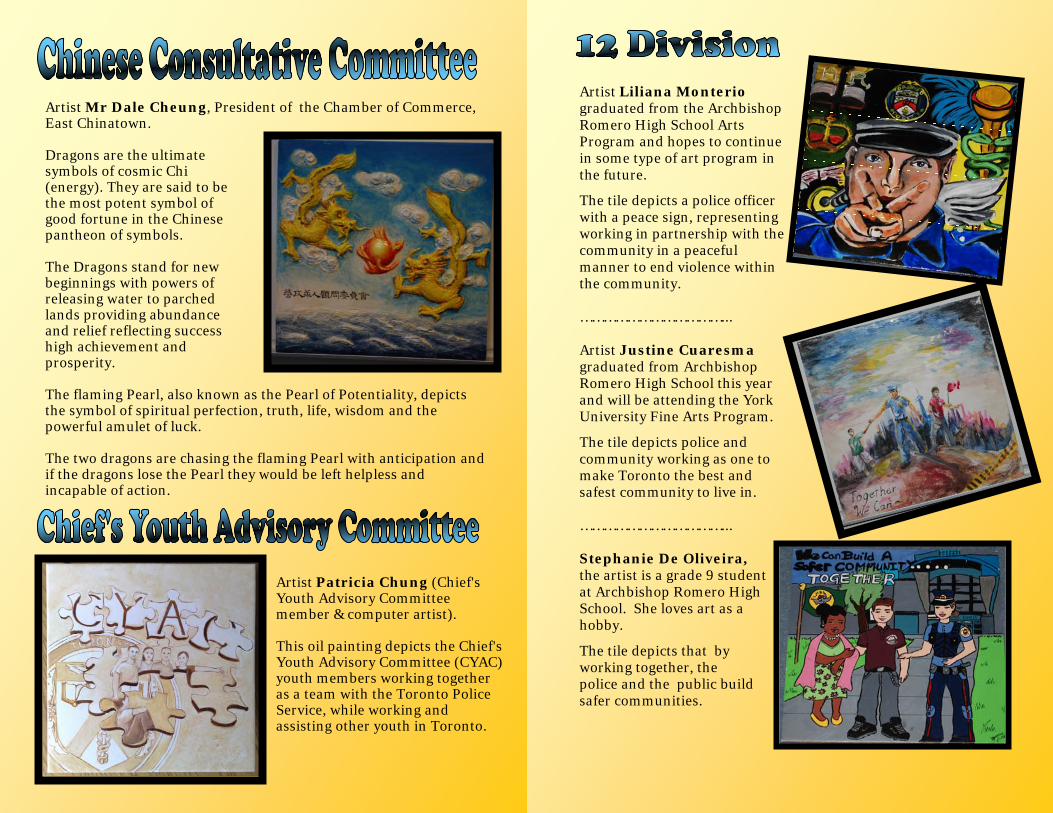
Artist Mr Dale Cheung, President of the Chamber of Commerce, East Chinatown.
Dragons are the ultimate symbols of cosmic Chi (energy). They are said to be the most potent symbol of good fortune in the Chinese pantheon of symbols. The Dragons stand for new beginnings with powers of releasing water to parched lands providing abundance and relief reflecting success high achievement and prosperity. The flaming Pearl, also known as the Pearl of Potentiality, depicts the symbol of spiritual perfection, truth, life, wisdom and the powerful amulet of luck. The two dragons are chasing the flaming Pearl with anticipation and if the dragons lose the Pearl they would be left helpless and incapable of action.
Artist Patricia Chung (Chief's Youth Advisory Committee member & computer artist). This oil painting depicts the Chief's Youth Advisory Committee (CYAC) youth members working together as a team with the Toronto Police Service, while working and assisting other youth in Toronto.
Artist Liliana Monterio graduated from the Archbishop Romero High School Arts Program and hopes to continue in some type of art program in the future.
The tile depicts a police officer with a peace sign, representing working in partnership with the community in a peaceful manner to end violence within the community. ………………………………... Artist Justine Cuaresma graduated from Archbishop Romero High School this year and will be attending the York University Fine Arts Program.
The tile depicts police and community working as one to make Toronto the best and safest community to live in. ………………………………... Stephanie De Oliveira, the artist is a grade 9 student at Archbishop Romero High School. She loves art as a hobby.
The tile depicts that by working together, the police and the public build safer communities.
The 13 Division tile was prepared by artist Joshua Barndt who runs an 'Art Starts' community art program at Oakwood Library that is funded through the "Safer and Vital Communities Grant" from the Ministry of Community Safety and Correctional Services. 13 Division was instrumental in 'Art Starts' receiving the grant. The youth involved in the program are between 6 to 13 years of age. They participated together in developing the concept for the tile based on a theme of 'unity and strength in diversity' conceived at the June meeting of the 13 Division CPLC. Joshua Barndt, describes the concept this way: "In terms of imagery, it will have the words "Diversity", "Peace" and "Respect". It will also have two symbols, a leaf (which relates to the importance of respecting ecology and loving green spaces), and two hands holding each other (reflecting the need for our community to get along and respect each other)."
Artist - Mrs. Kum Hee Yang
This painting is based on a quilt made by Mrs. Bok Sil Shin. Mrs. Shin set out to make a quilt reflecting the history of Canada and displaying the beauty of multicultural Canada by including individuals from notable Canadian figures to members of the public.
Mrs. Yang, took a liking to Mrs. Shin’s quilt and painted a portion of the quilt. Although Canada is made up of immigrants from different time periods and different parts of the world, Mrs. Yang believes that everyone belongs to Canada and everyone is writing a Canadian history in her/his own way.
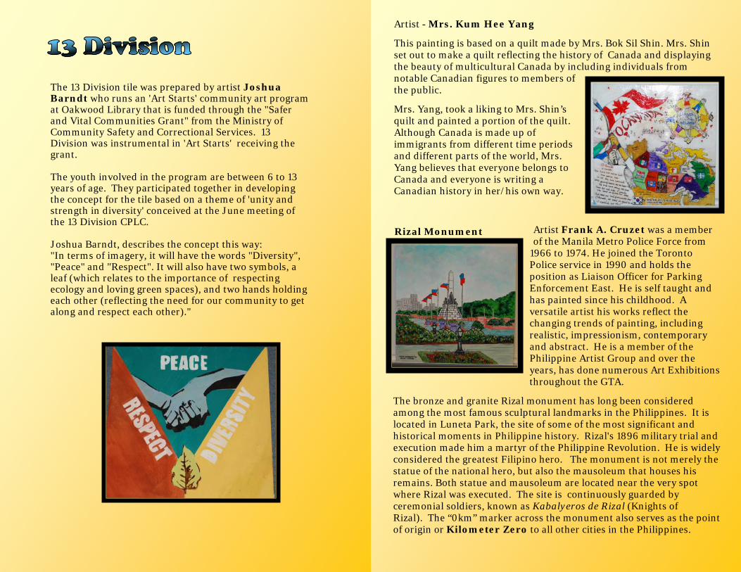
Artist Frank A. Cruzet was a member of the Manila Metro Police Force from
1966 to 1974. He joined the Toronto Police service in 1990 and holds the position as Liaison Officer for Parking Enforcement East. He is self taught and has painted since his childhood. A versatile artist his works reflect the changing trends of painting, including realistic, impressionism, contemporary and abstract. He is a member of the Philippine Artist Group and over the years, has done numerous Art Exhibitions throughout the GTA.
The bronze and granite Rizal monument has long been considered among the most famous sculptural landmarks in the Philippines. It is located in Luneta Park, the site of some of the most significant and historical moments in Philippine history. Rizal's 1896 military trial and execution made him a martyr of the Philippine Revolution. He is widely considered the greatest Filipino hero. The monument is not merely the statue of the national hero, but also the mausoleum that houses his remains. Both statue and mausoleum are located near the very spot where Rizal was executed. The site is continuously guarded by ceremonial soldiers, known as Kabalyeros de Rizal (Knights of Rizal). The “0km” marker across the monument also serves as the point of origin or Kilometer Zero to all other cities in the Philippines.
Rizal Monument

"Map Of Vietnam" Artist Tam Nguyen has been drawing since she was a child. In 1981, she left Vietnam and arrived in the United States settling in a refugee camp. There, she received the first place award for an art competition and continued to excel in her studies. Eventually, Tam moved to Canada and enrolled in The Ontario College of Art & Design. She graduated and made a living through her art work. When asked Tam’s words about herself now are, “Lost track of my inspiration.”
“Áo Dài” The Traditional Clothing of North, Central and South Regions of Vietnam. In this tile, each girl wears “Áo Dài” the traditional dresses representing the North, Central and South regions of Vietnam. Each region has a slightly different style and comes in many different colours. These dresses are worn on special occasions such as Tết and weddings.
Artist John Walker The tile is a depiction of the waterfront in 22 Division.
Artist Lhakpa Negi, was a Youth in Policing student at the 14 Division CRU office. The tile depicts the CNE Princess Gates with the CN Tower and Rogers Centre in the background, and the TPS Mounted Unit and an officer on a bicycle in the foreground.

The community tiles for 23 Division were a cooperative effort between Mr. David Lui and his daughter Ms. Vivian Lui. Mr. Lui is a graphic designer and caricature artist educated in Hong Kong. He has worked at Humber College for 30 years in promotional design and instructional graphics. For the past 10 years he has also been the photographer for various Humber College events. His photographic and design work appear on the Humber College website and in their publications. Ms. Vivian Lui is a Toronto-based artist. She received her post secondary education from York University/Sheridan College with a degree in design. Ms. Lui has worked as a Faculty Liaison at the University of Guelph-Humber and is currently an elementary school teacher. An advocate of arts education, Ms. Lui has done mural work with inner-city students from the Toronto District School Board. Her paintings have been exhibited in various art shows: the Art Gallery of Peel, Arts Etobicoke, the Neilson Park Creative Centre and in public venues such as the El Mocambo in downtown Toronto.
Artist Mrs. Young Ouk Oh came to Canada in 1987 with her three children. After her retirement, Mrs. Oh learned about KCWA Family and Social Services’ painting class. Although she had never learned painting before, in her sixties, she gained the courage to join and today, her paintings have exhibited twice already.
Mrs. Oh’s children are all married now with children of their own, and she had the opportunity to paint her grandchildren. Mrs. Oh is a firm believer that children need a lot of love and care in order for them to grow mentally, emotionally, and physically healthy.
“Our Korean Children”
Artist Mrs. Hae Sun Lee came to Canada in 1988. She came with a Canadian dream but settling in Canada was not easy so she searched for ways to make her life more meaningful. While running a small business and raising her children, she registered at Concordia University to pursue her dream as an artist. Like many other immigrants, she missed her hometown, especially the sunset over the ocean. Therefore, she always looked for ways to paint themes of Korea. Her mother
taught her to be proud of the spirit of Korea, which has made her overcome challenges with amazing endurance and spiritual strength. Taekwondo is a martial art that expresses this Korean spirit. Through this painting, she wanted to represent Korea’s spirit and to facilitate reflection on what it means to live in Canada with a Korean heritage.
“ Tae Kwon Do: Korean Martial Art”

Fahim Hamid Ali, is a self taught artist who emerged on the Art scene about 16 years ago. He is a profound believer in communi-cating with his audience through a realistic style which others find easy to relate to. Fahim generally works in mixed media on paper and canvas and is also very much at ease with the wash painting technique with liquid oil paints flowing like water, seldom uses a brush, instead uses his fingers to paint. Fahim is not confined to any one specific technique and also uses defined strokes and accidental textures in his work. His play with colours makes the end result a visual pleasure. His work is not restricted to any single subject but ranges from People, Wild Life, Land-scapes and historic events. Islamic Calligraphy, Egyptian and Hindu Mythology are a passion with him and the diversity has enabled him to carve a niche for himself in the art world as a versatile artist who is equally at home with different subjects using different mediums. The tile is truly symbolic of the partnership and close ties shared by the Muslim Consultative Committee and the Toronto Police Service. The green and gold used are the two prominent colours in Islam. The motto "Building Partnerships" enfolds the crescent and the emblem of Toronto Police characterizing the affiliation between the two. The dome represents a mosque, overseeing the proactive cooperation to build trust, understanding and shared knowledge to maintain harmony and safety in all communities. Finally, the arch of the dome is decorated by an Arabic verse, "Bismillah-ir-Rahman-ir-Raheem" which means "I begin in the name of Allah, the most beneficent, the most merciful." This verse is used by Muslims across the world before they start anything in their daily lives.
Artist Danny Diep is 19 years old, and grew up in the Jane/ Finch neighbourhood. He was a 2008 recipient of the 31 Division CPLC Bursary Award and is currently attending Humber College, where he is studying Architectural Technology.
The tile depicts the positive aspects of community life in the Jane Finch neighbourhoods. The large amount of green space,
31 Division Police Station, Humber River Regional Hospital and high rise apartment buildings are depicted at the top of the tile.
Jo Orsatti is the Forensic Artist for the Toronto Police Service. She was born and raised in Toronto. At the age of 5, Jo could be found drawing under her dining room table, and continued to draw and paint through high school and university. She stumbled into photography and the world of retouching and restoration.
Jo met Police Artist Bette Clark at the Toronto Police Service where she was working as a photo technician and found a place where she could create art that speaks for itself. Continuing with her strong beliefs in Bette’s pioneered methods, Jo has been assisting police officers with investigations. She has worked with many interesting witnesses and victims to draw faces that words cannot describe.
"This painting represents the great diversity and large senior community in 32 Division.”

Artist Andrew Cyrus is 10 years old, and is in grade 6. He likes to draw Manga/Anime. “I like to paint and draw because it says more than words. In my painting I’m showing Don Mills, the police division and the neighborhoods in the police division. I liked painting the trees in the first dialogue. The prettiest was the cherry blossoms. The sign was a challenge.”
"I started my research into the history of the Don Mills community when I heard about the Community Wall Tiles for each division. Don Mills was Canada's first planned community by developer E.P. Taylor in March 1953. The centre of the Don Mills community was located at Don Mills Rd. and Lawrence Ave E. The community has four neighbourhood quadrants. Each quadrant contains a school, a church and a park, as well as ranch-style homes. This was my inspiration for creating my design for 33 Division's Community Wall tile." Denise Desayeux
Community partner Kingsley Wozencroft from Involve Youth takes full credit for the inspiration and completion of the tile artwork.
The tile was a great opportunity for genuine youth engagement in 41 Division. The CPLC members have been working with and encouraging youth to become members of their committee.
The main target groups are those youth who may not naturally engage with or identify positively with the Toronto Police Service. Kingsley also called upon the Scarborough Arts Council and their Executive Director Tim Whalley for some creative consultation and supplies assistance. Artist, Sandra Ramroop Participants Rehana Robin, Shauna-Kay Levy, Michael Francis
“Building a safe community through trust, diversity and leadership”
This painting depicts the number 54 in the midst of park scene that is intended to bear resemblance to Thompson Creek and Flemingdon Park. The 5 was used as a way to show “who” and “how” the police serve the community. The top part of the 5 is all officers, the middle – civilians and the bottom – more officers. The people are arranged this way to depict a sense of security, stability, and harmony found in 54 Division. Also, the multiculturalism demonstrates how diversity is an important strength that 54 Division values. The 4 was used as a way to depict some visually significant landmarks in the area. Major landmarks included are the Ontario Science Centre, Don Valley Parkway and Flemingdon Park. In addition, there are many examples of places where 54 Division is working with the community to improve people’s lives. Examples of this include the involvement in East York Collegiate Institute’s hockey team and the assisting of the Marc Garneau Collegiate Institute’s automotive department.
This part of the painting was intended to show how 54 Division has established trust within the community.
The area which 54 Division encompasses is a very multi-cultural and multi-faceted community. Some of the many flags that represent the cultural heritage of the area are prominent in the painting. The Greek flag is the largest representation as the Greek Community is a very visible cultural group in the area. Other flags such as China, Jamaica, and Poland sit near in harmony with each other representing the diversity of the community at large.
Finally, the one officer on the bike is meant to symbolize the leadership role that police have in our community. Through taking the lead on the path in the painting and in our community by working with people outside of law enforcement, 54 Division has been a great example. By employing a diverse workforce, earning trust and demonstrating leadership, 54 Division is an essential part of the community. Artist: Elsa Nielsen

Artists Shadman Shababa and Princie Reza are also the same artistic youth who were part of the Thorncliffe Neighbourhood Office Youth Centre Mural Project. Their artistic talents are truly an asset to the organization. 53 Division is mid town at the intersection of Yonge and Eglinton, at the heart of the city. The popular Toronto Street Festival’s main display was at Yonge and Eglinton because they were the only two streets that passed through all of the former municipalities that are now a part of the amalgamated City of Toronto. You can see the map of 53 Division. Each quadrant or zone has landmarks and unique features that represent the divisions neighbourhoods. On the right side the students painted some of the popular community outreach events in 53 Division; The Mentorship Program, Kids and Cops Basketball, Kids and Cops Hockey, Wii and Math.
Artist Simone Lai, a student from Albert Campbell Collegiate Institute, created this CPLC tile. The picture on the tile depicts the flags and people that represent all the different countries of origin that are the cultural make up of the 42 Division Community.
Dragon: Chinese people often use the term "Descendants of the Dragon" as a sign of ethnic identity, as part of a trend started in the 1970s when different Asian nationalities were looking for animal symbols for representations. As one of the Chinese Communities in Toronto, we would like to use "dragon" as a symbol to represent the Chinese people in 42 Division. Artist Simon Ip, is a former Police Inspector of Royal Hong Kong Police, where he served for 11 years before immigrating to Canada with his family in 992. He focused his career as a designer to store interior companies, mainly in store fixtures, interiors and graphic design. He is currently running his own company to serve high-end retail stores in North America, and enjoying life in Canada. Chinese Community Liaison Committee (CCLC

Artist Gladys Gottschalk, a 50 year resident of 43 Division painted her depiction of the Scarborough Civic Centre which was designed by architect Raymond Moriyama for the former Borough of Scarborough. It was officially opened by former Mayor Albert Campbell and Queen Elizabeth II in 1973.
This tile depicts the Gooderham Building (commonly referred to as the Flatiron Building) which was built in 1892, with the diversity of the people living within 51 Division today.
Michael O'Regan, the artist of the 51 Division tile passed away shortly after designing the tile.
The image has become the new logo for 51 Division CPLC. A banner with this logo has been made for use at all 51 Division community events.
Mr. O’Regan attended a community function and was able to view the banner on the afternoon prior to his heart attack. The banner was also on display at his funeral.
Artist Darren Cottrelle is an Ojibwa/Mohawk from Aam-jiwnaang First Nation. Darren has been practicing his art since the age of eight, and he practices exclusively in Native art portraits. Darren has a natural talent and has never taken any formal art training or schooling. The tile is entitled “Unity Circle.” The people joining hands of all shapes and sizes signify peace in the world. The four colours Red, White, Yellow and Black represent the four colours of man.
52 Division’s tile showcases a collage of photos demonstrating many of the community events where the CPLC members volunteer. From the Kids Posse Program, the Drug Marshal's Program, Police Week, the Contact School Fundraising Gala which gives students a bursary to further their education, to the Town Halls, the CPLC members are very active in the 52 Division neighbourhood. The tile has been designed by one of 52 Division’s CPLC members Rose Bayer who is the owner of Stanford Design & Communications. One of her staff, Doug Purdie, Graphic Designer captured with photos many of the activities with the 52 Division CPLC logo as the centrepiece.