


Languages
Pages
Legal


virtual techdaysINDIA │ 28-30 September 2011
Numbers, Charts and Decisions with SSRS
Nauzad [email protected] | @nauzadk
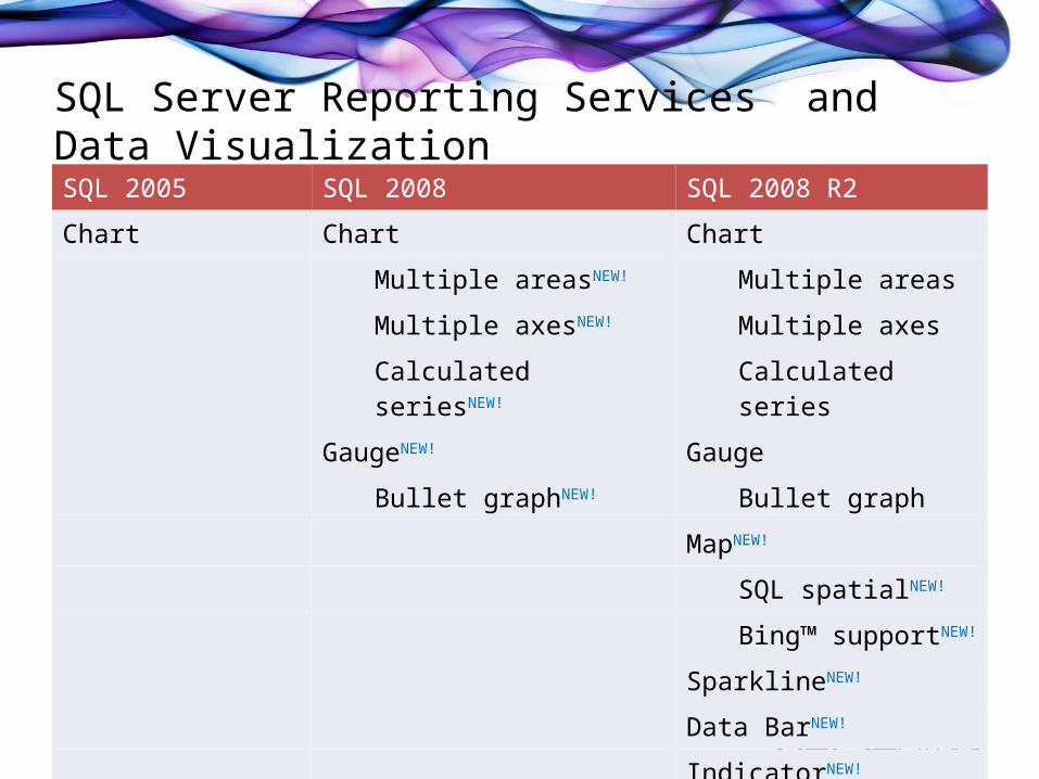
SQL Server Reporting Services and Data VisualizationSQL 2005 SQL 2008 SQL 2008 R2
Chart Chart Chart
Multiple areasNEW! Multiple areas
Multiple axesNEW! Multiple axes
Calculated seriesNEW! Calculated series
GaugeNEW! Gauge
Bullet graphNEW! Bullet graph
MapNEW!
SQL spatialNEW!
Bing™ supportNEW!
SparklineNEW!
Data BarNEW!
IndicatorNEW!

Building ReportsMany types of visualizations

Data Bars• Data Bars
– Used to depict a single value in a cell.
– Use Data bars to display numeric values when the relative values in multiple rows are more important than the values themselves.
– Use Stacked Data Bars to display multiple values in the same cell.
– Min and Max are automatically determined, but are configurable.
Data Bars
Sparklines

virtual techdaysINDIA │ 28-30 September 2011
DEMO – Data Bars

Sparklines• Sparklines
– Data intense, word-sized graphics.– No axis, no data points, no labels.– Automatic axis alignment. All
charts have the same data points, regardless of source data.
– Can be converted into full charts to support additional small multiple scenarios.
– Used to crunch a lot of numerical information in a small space.
– Use sparklines when trend is more important then absolute numerical values.
– Use sparklines when it would be useful to provide historical values which would otherwise clutter up the report.
Data Bars
Sparklines

virtual techdaysINDIA │ 28-30 September 2011
DEMO – Sparklines

Indicators• Icons used to depict the
status against a value, goal or a trend.
• Choose from pre-configured sets, or build your own!
• Automatic support for comparing each member of a group against siblings.
• Don’t always rely on color.
Indicators

virtual techdaysINDIA │ 28-30 September 2011
DEMO – Indicators

Maps• Maps contains one or more… – Point Layers (Cities, Customers)– Line Layers (Routes, Roads)– Polygon Layers (Countries, States)– Tile Layers (based on Bing™ Maps)
• Support for ESRI shape files and SQL spatial• Show analytical data using size and color– Built-in distribution formulas
• Wizard for building common scenarios

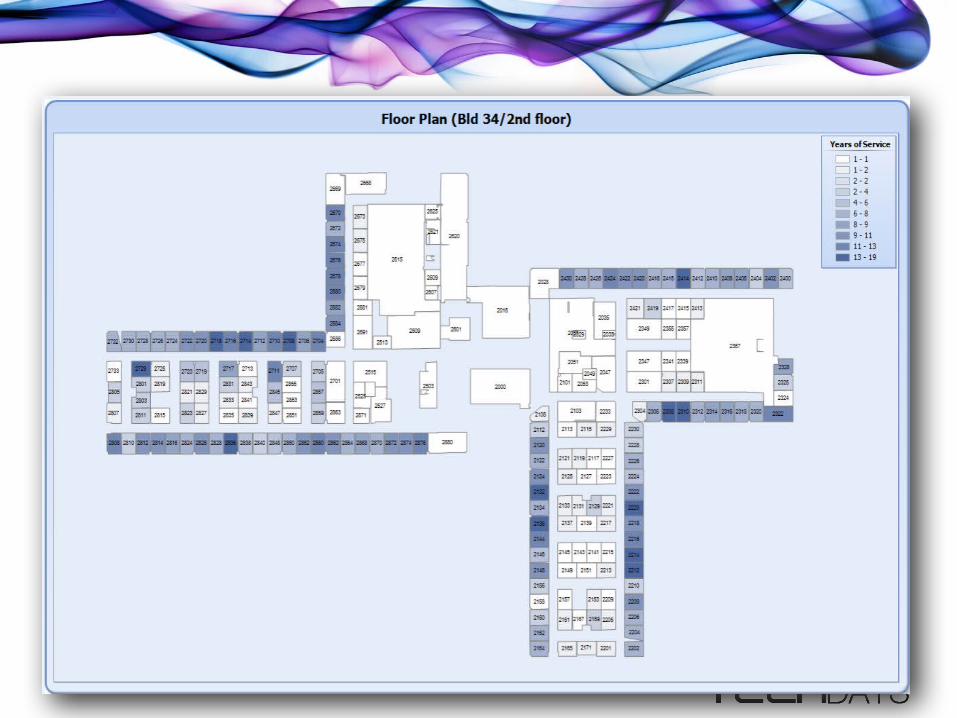
Map Components (Example 1)
Polygon Layer
Color Rule
Bubble w/size Rule
Map LegendsAnalytical Data
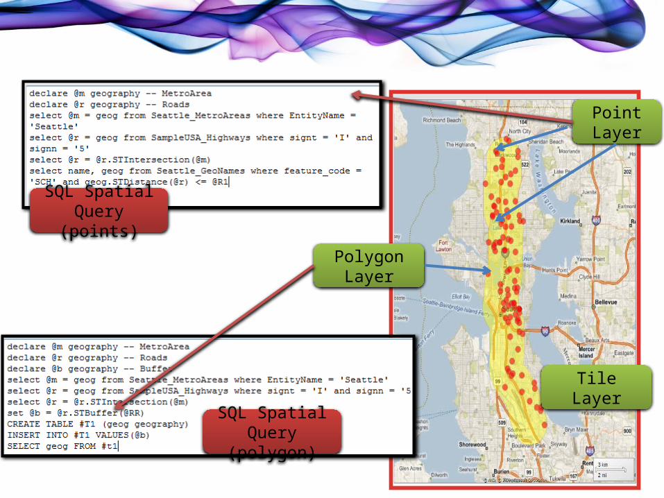
Map Components (Example 2)
Tile Layer
Point Layer
SQL Spatial Query (points)
Polygon Layer
SQL Spatial Query (polygon)
Map Example

virtual techdaysINDIA │ 28-30 September 2011
DEMO – Maps
Charting and Visualization Tips
• Use the right visualization mode• Use scatter charts when there is too much data to be plotted• Use Pie/Donut charts when the data points are relatively
sparse. • Retrieve the data in the format that makes it most conducive
for charting• Do you need missing data points on x-axis?

Power of Expressions
• Can be used to – Create drill-down graphs– Create custom labels or data points– Create Custom legends– Create data tables to accompany charts

References• Get more out of SSRS Charts – Robert Brucknor
– http://msdn.microsoft.com/en-us/library/aa964128(v=sql.90).aspx#moressrscharts_topic4
• Sparkline theory and practice – Edmond Tufte– http://www.edwardtufte.com/bboard/q-and-a-fetch-msg?msg_id=0001OR
• Building win-loss sparklines in SSRS – Sean Boon– http://
blogs.msdn.com/b/seanboon/archive/2009/11/16/building-win-loss-sparklines-in-sql-server-reporting-services-2008-r2.aspx
Top Related