


Languages
Pages
Legal

Using Data to Guide Quality Improvement –Pareto Charts and Histograms
Fred Dominguez, Yulya Ghazaryan, Carl Bolano, Jamie Middleton
March 24, 2016
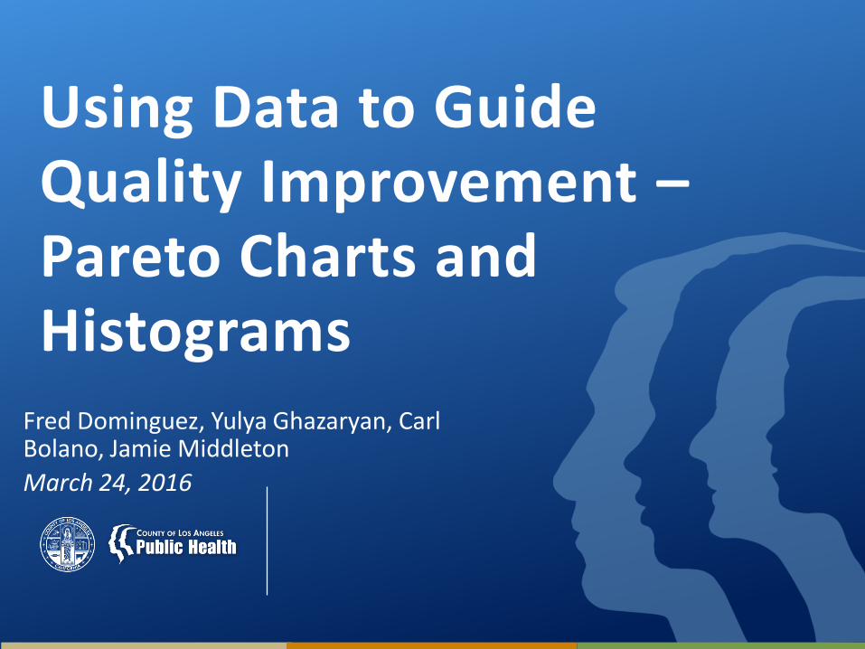
Seven Basic Tools of Quality
• Cause-and-effect diagram (aka "fishbone" or Ishikawa diagram)
• Check sheet
• Control chart
• Histogram
• Pareto chart• Scatter diagram
• Stratification (aka flow chart or run chart)
Tague, NR The Quality Toolbox, Second Edition, ASQ Quality Press, 2005, pg 15
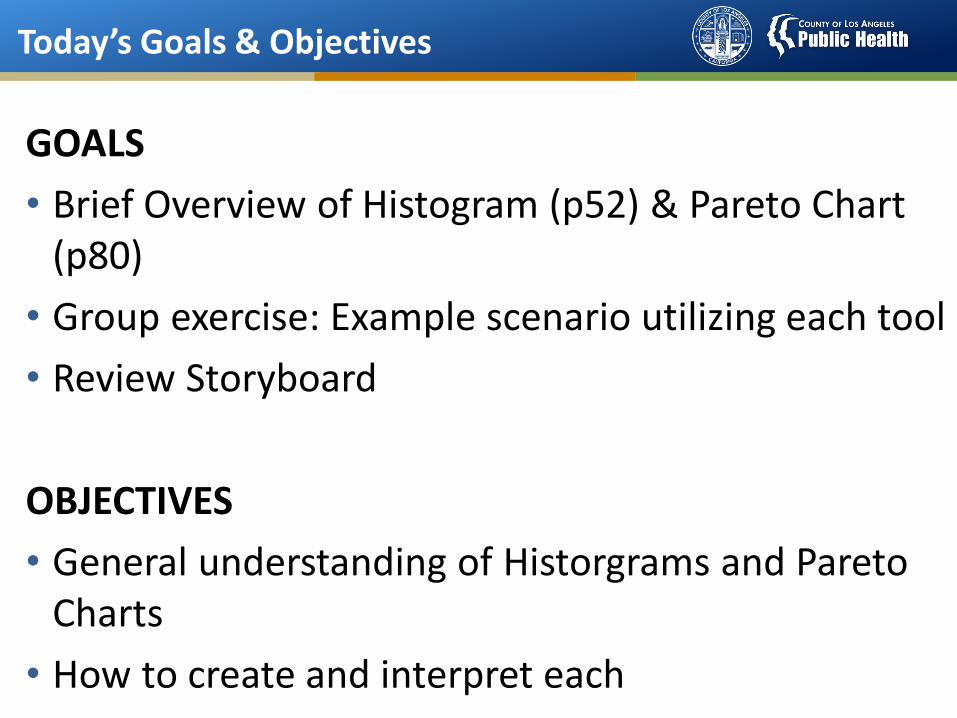
Today’s Goals & Objectives
GOALS
• Brief Overview of Histogram (p52) & Pareto Chart (p80)
• Group exercise: Example scenario utilizing each tool
• Review Storyboard
OBJECTIVES
• General understanding of Historgrams and Pareto Charts
• How to create and interpret each

HISTOGRAM
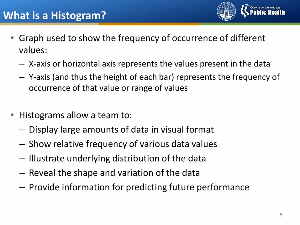
What is a Histogram?
• Graph used to show the frequency of occurrence of different values:
– X-axis or horizontal axis represents the values present in the data
– Y-axis (and thus the height of each bar) represents the frequency of occurrence of that value or range of values
• Histograms allow a team to:
– Display large amounts of data in visual format
– Show relative frequency of various data values
– Illustrate underlying distribution of the data
– Reveal the shape and variation of the data
– Provide information for predicting future performance
5
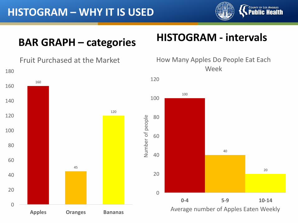
HISTOGRAM – WHY IT IS USED
HISTOGRAM - intervals
160
45
120
0
20
40
60
80
100
120
140
160
180
Apples Oranges Bananas
Fruit Purchased at the Market
100
40
20
0
20
40
60
80
100
120
0-4 5-9 10-14
Nu
mb
er o
f p
eop
le
Average number of Apples Eaten Weekly
How Many Apples Do People Eat Each Week
BAR GRAPH – categories
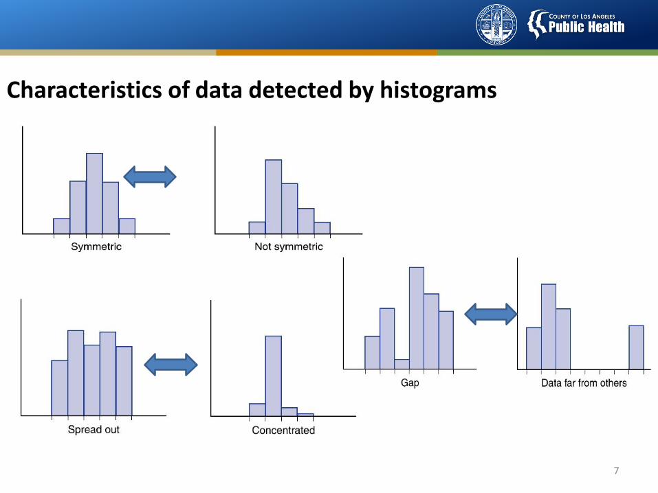
Characteristics of data detected by histograms
7
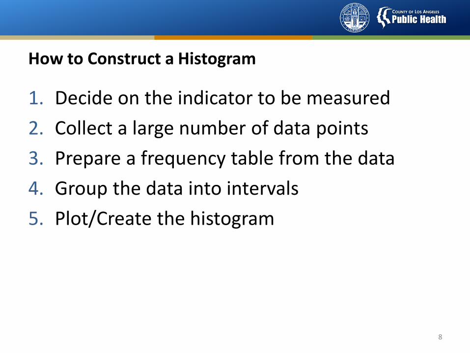
How to Construct a Histogram
1. Decide on the indicator to be measured
2. Collect a large number of data points
3. Prepare a frequency table from the data
4. Group the data into intervals
5. Plot/Create the histogram
8
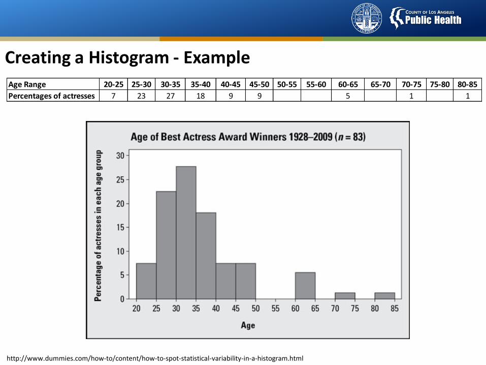
Creating a Histogram - Example
http://www.dummies.com/how-to/content/how-to-spot-statistical-variability-in-a-histogram.html
Age Range 20-25 25-30 30-35 35-40 40-45 45-50 50-55 55-60 60-65 65-70 70-75 75-80 80-85
Percentages of actresses 7 23 27 18 9 9 5 1 1
HISTOGRAM VIDEO
• https://www.youtube.com/watch?v=jFqRECGWAcM
ParetoCharts
What is a Pareto Chart?
• A Pareto chart helps a team focus on problems that offer the greatest potential for improvement, by showing different problems' relative frequency or size in a descending bar graph, which highlights the problems' cumulative impact.
• Teams can then focus on problem causes that could have the greatest impact if solved or improved.
• The Pareto principle: 20% of sources cause 80% of problems.
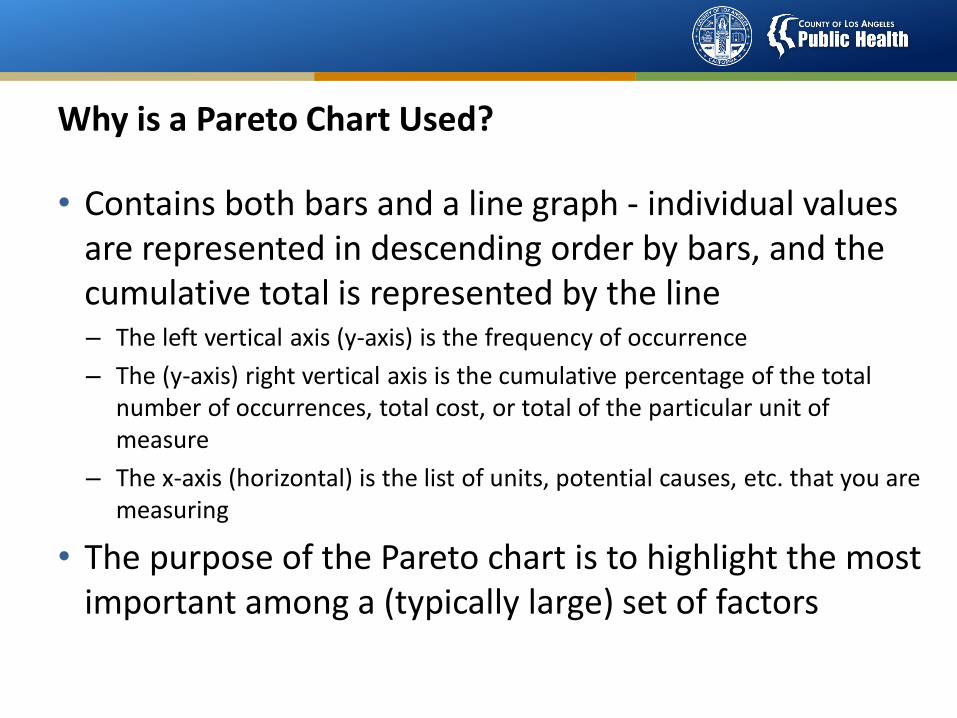
Why is a Pareto Chart Used?
• Contains both bars and a line graph - individual values are represented in descending order by bars, and the cumulative total is represented by the line– The left vertical axis (y-axis) is the frequency of occurrence
– The (y-axis) right vertical axis is the cumulative percentage of the total number of occurrences, total cost, or total of the particular unit of measure
– The x-axis (horizontal) is the list of units, potential causes, etc. that you are measuring
• The purpose of the Pareto chart is to highlight the most important among a (typically large) set of factors
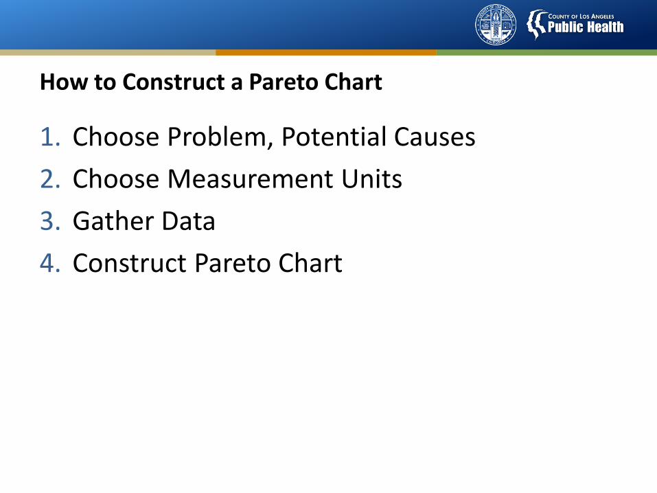
How to Construct a Pareto Chart
1. Choose Problem, Potential Causes
2. Choose Measurement Units
3. Gather Data
4. Construct Pareto Chart
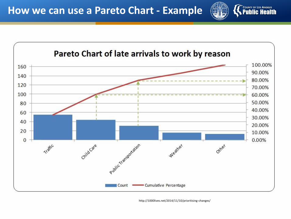
How we can use a Pareto Chart - Example
http://1000lives.net/2014/11/10/prioritising-changes/
Self Assessment Questions
Most common purpose(s) for using a histogram is/are:
A. Show distribution
B. how often each different value in a set of data occurs
C. which factors are more significant
D. look for a relationship
E. A & B
F. A & D
G. All the above

Self Assessment Questions
Most common purpose(s) for using a histogram is/are:
A. Show distribution
B. how often each different value in a set of data occurs
C. which factors are more significant
D. look for a relationship
E. A & B
F. A & D
G. All the above
Self Assessment Questions
Most common purpose(s) for using a Pareto chart is/are:
A. problems' cumulative impact
B. contains an ordered bar chart
C. contains a line graph
D. summarizes where opportunity lies
E. A & B
F. A, B, &C
G. All the above
Self Assessment Questions
Most common purpose(s) for using a Pareto chart is/are:
A. problems' cumulative impact
B. contains an ordered bar chart
C. contains a line graph
D. summarizes where opportunity lies
E. A & B
F. A, B, &C
G. All the above

GROUP
EXERCISES
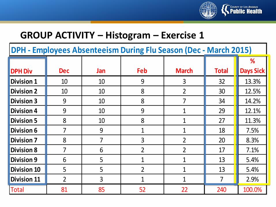
DPH Div Dec Jan Feb March Total
%
Days Sick
Division 1 10 10 9 3 32 13.3%
Division 2 10 10 8 2 30 12.5%
Division 3 9 10 8 7 34 14.2%
Division 4 9 10 9 1 29 12.1%
Division 5 8 10 8 1 27 11.3%
Division 6 7 9 1 1 18 7.5%
Division 7 8 7 3 2 20 8.3%
Division 8 7 6 2 2 17 7.1%
Division 9 6 5 1 1 13 5.4%
Division 10 5 5 2 1 13 5.4%
Division 11 2 3 1 1 7 2.9%
Total 81 85 52 22 240 100.0%
DPH - Employees Absenteeism During Flu Season (Dec - March 2015)
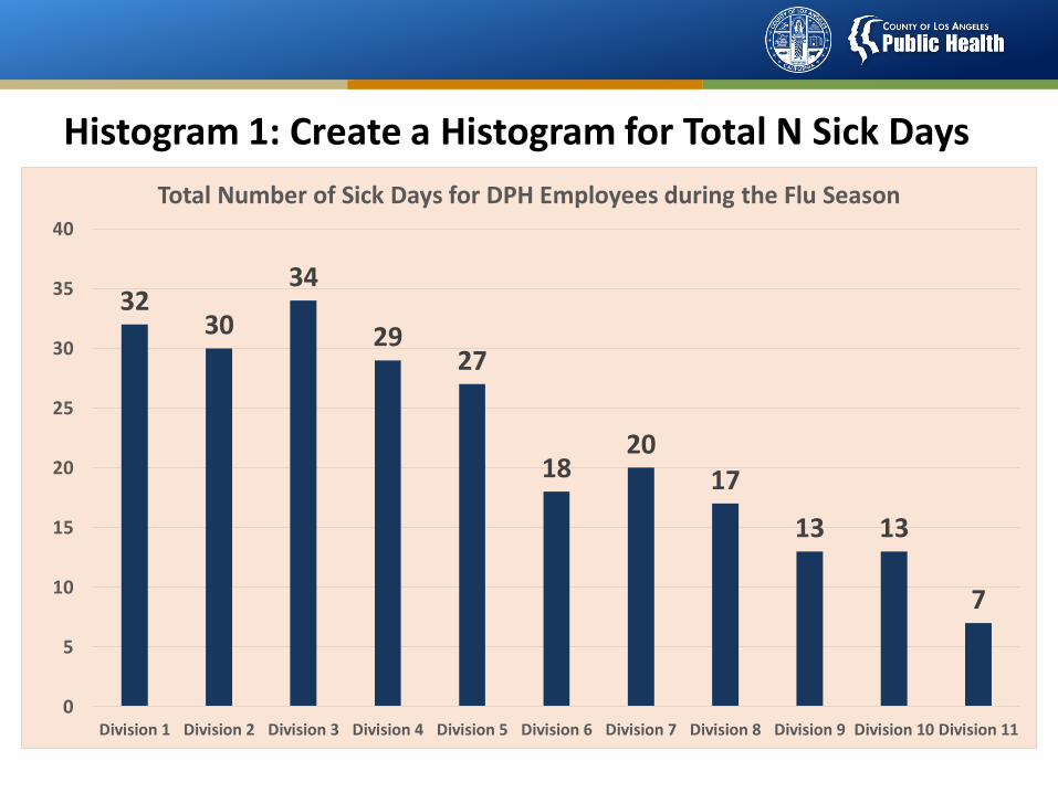
Histogram 1: Create a Histogram for Total N Sick Days
3230
34
2927
1820
17
13 13
7
0
5
10
15
20
25
30
35
40
Division 1 Division 2 Division 3 Division 4 Division 5 Division 6 Division 7 Division 8 Division 9 Division 10 Division 11
Total Number of Sick Days for DPH Employees during the Flu Season
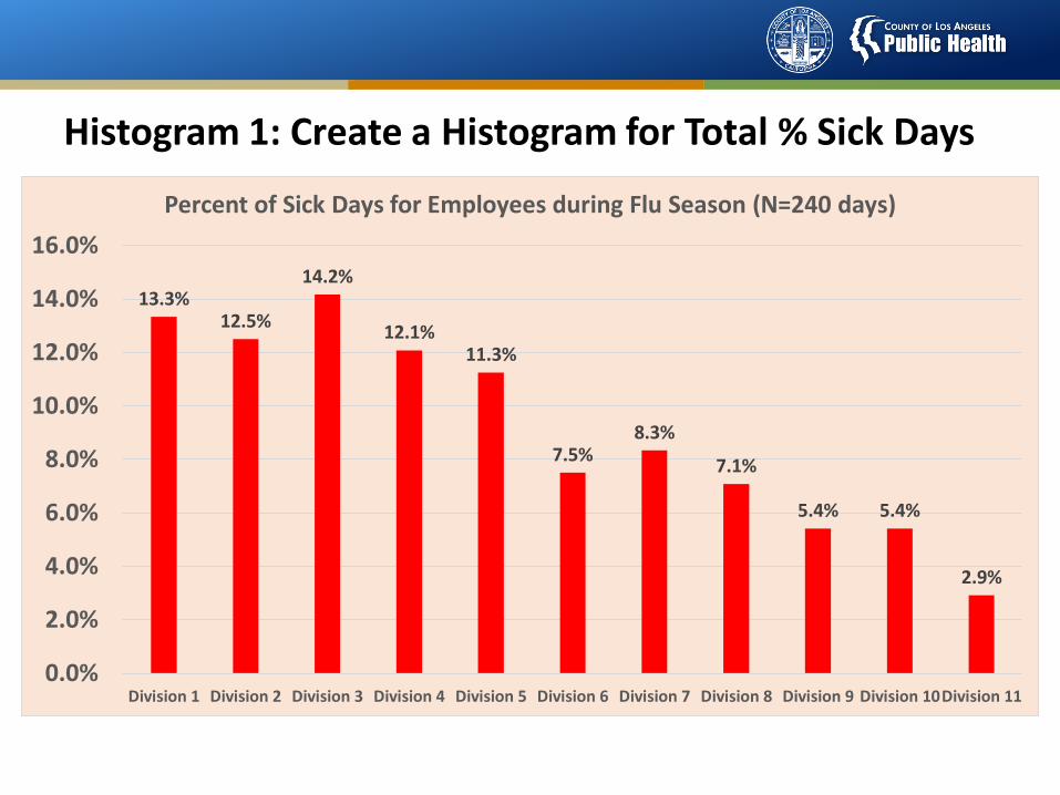
Histogram 1: Create a Histogram for Total % Sick Days
13.3%12.5%
14.2%
12.1%11.3%
7.5%8.3%
7.1%
5.4% 5.4%
2.9%
0.0%
2.0%
4.0%
6.0%
8.0%
10.0%
12.0%
14.0%
16.0%
Division 1 Division 2 Division 3 Division 4 Division 5 Division 6 Division 7 Division 8 Division 9 Division 10Division 11
Percent of Sick Days for Employees during Flu Season (N=240 days)
2: Pareto Chart – Hypothetical Problem Description
Scenario: (Hypothetical)Problem: Based on the recent internal departmental time sheet data analysis, DPH Employee absenteeism during the Flu Season has significantly increased during the period from December 2014 to March 2015. Most of the time employees were out sick due to a widespread flu. As a requirement, all DPH employees are mandated to have their Flu Vaccinations by Dec 1, 2014 and report statistics of employees who received and declined flu vaccinations to the Nurse Administration.
Task:Based on information provided to you, please review some basic (hypothetical) stats of DPH Employee Flu Vaccination Status as of Dec 1, 2014 for DPH 11 Divisions and create Pareto Charts in order to identify the where the problem is.
Exercise 2: Pareto Chart
Group Exercise 1:Task: Create a Pareto Chart for the Percent of Employees who Declined Flu Vaccine. Where is the problem?
Group Exercise 2: Task: Create a Pareto Chart for the Percent of Employees who Received Flu Vaccine. Where is the problem?
Group Exercise 3: Task: Create a Pareto Chart for the reasons for declining flu vaccination.
Where is the Problem? How can you affect it?
STORY BOARDReduction in Percentage of Clients with Cycle Times Greater than 2 Hours in a Family Planning Clinic
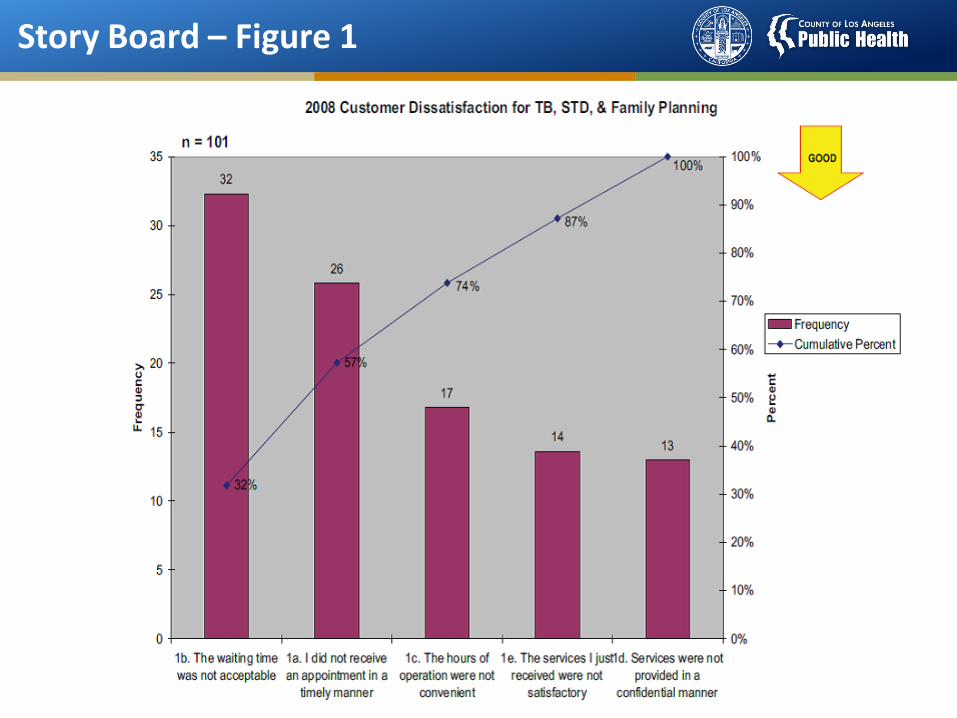
Story Board – Figure 1
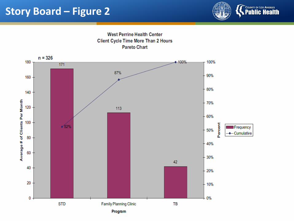
Story Board – Figure 2
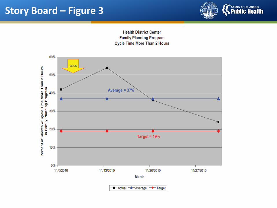
Story Board – Figure 3
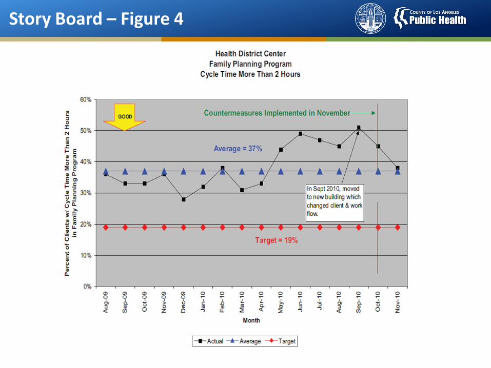
Story Board – Figure 4
Top Related