


Languages
Pages
Legal


The Art of Interface Design
CS6540/5540 HCI Fall 2010
Anne Morgan Spalter Rich Riesenfeld
Brown University University of Utah
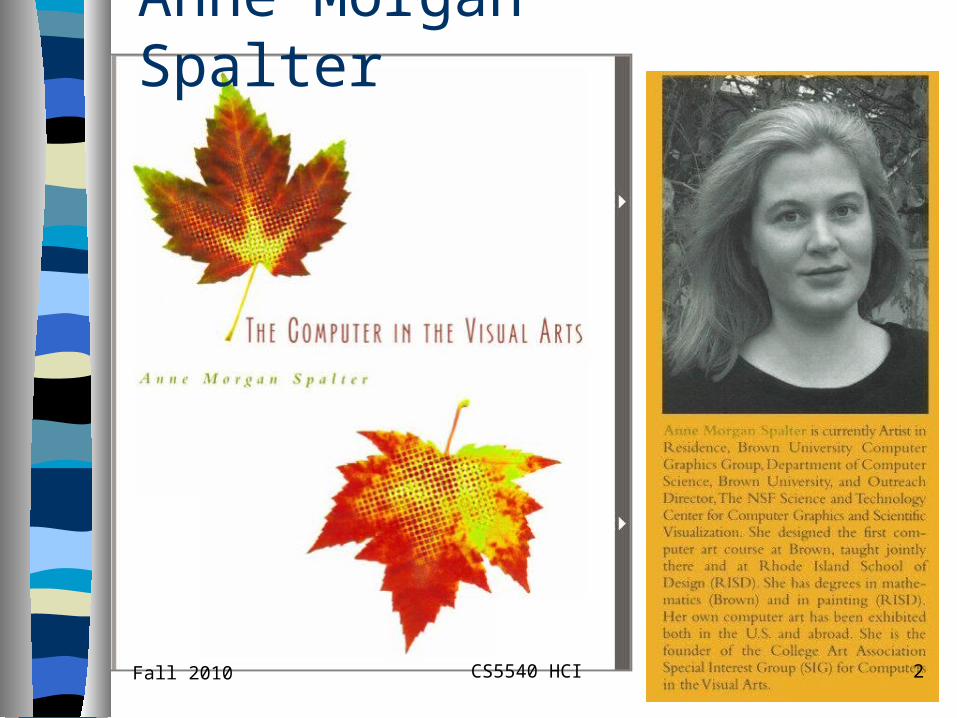
Anne Morgan Spalter
Fall 2010 2CS5540 HCI

Inter-related Components of Interface Design Task analysis and user testing Software engineering Functional analysis Aesthetic appeal Etc.
Fall 2010 3CS5540 HCI

Looking Good—Then & Now - 1
Some issues same as traditional design– Overall composition (leading the eye,
creating balance, etc.)– Use of shape/form
• Affordance: buttons, sliders, levers, arrows, etc
– Use of color (not having too many different colors, using color to code features, etc.)
Fall 2010 4CS5540 HCI

Looking Good—Then & Now - 2
Graphic Arts and Design– People study years to learn this formally– There are many full-time jobs performing
just this function– Characteristics
• Challenging task• Important factor for success of project• Takes significant project time to do well
Fall 2010 5CS5540 HCI

Looking Good—Then & Now - 3
Some issues unique to digital media– Interaction
• Principles not fully established yet– Animation
• Content may change over time• Motion is tricky
– Integration of different (multi-) media• E.g., text, image, sound elements• Gives rise to more complex design issues
Fall 2010 6CS5540 HCI
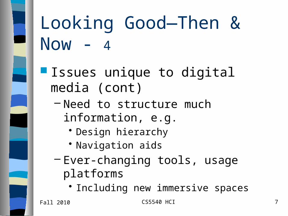
Looking Good—Then & Now - 4
Issues unique to digital media (cont)– Need to structure much information, e.g.
• Design hierarchy• Navigation aids
– Ever-changing tools, usage platforms• Including new immersive spaces
Fall 2010 7CS5540 HCI

These and other issues present new aesthetic design challenges
Aligning elements Grouping elements appropriately for
dialog boxes or screen design Designing clear, associative icons
Some Traditional Design -1
Concerns in Digital Media
Fall 2010 8CS5540 HCI

Some Traditional Design Concerns in Digital Media 2 Using type of screen Use of color
– Do not over-use it– Consistent, thematic use– Tasteful, aesthetic balance– Appropriate to target audience
• Business/professional group• Young children, etc …
Fall 2010 9CS5540 HCI

Some Traditional Design Concerns in Digital Media 3
Appropriate and consistent style
Traditional design strategies, e.g., using– small multiples
– layering
– narrative
– metaphor
Fall 2010 10CS5540 HCI

Some Traditional Design Concerns in Digital Media 4 Clean designs
– Reducing clutter and visual noise At RISD designers take a full year of
typography, e.g.– Stuff is not trivial– Painfully bad designs by unskilled
purveyors abound!
Fall 2010 11CS5540 HCI

Colors, Fonts, Elements - 1
Contrasting colors, use primaries and complements
Design a sensible look, a scheme, a design, that is appropriate to the task– Children, how would you do this– Physicians, how would this look
Uncluttered, coherent, structured
Fall 2010 12CS5540 HCI

Colors, Fonts, Elements - 2
Use hierarchy, urls, top-down expansions, hypertext, etc
Fonts– Clean, no serifs– Drop shadowed can give some relief,
3D effect gives life Good composition
– Symmetry gets tedious– Make presentation interesting
Fall 2010 13CS5540 HCI

Colors, Fonts, Elements - 3 Avoid “cheap licks,” for professional,
serious interfaces– Spins, fly-ins, etc– Noise effects gets distracting, annoying
All of these devices should be considered like spices– Highly effective when used sparingly
and appropriately– Who wants to read a style with a “!” at
the end of each sentence.
Fall 2010 14CS5540 HCI

An Example 1
I asked a student to recreate some of our java color applets in Director (as shockwave files), and– Told him to make them look the same as
the original ones He decided to add a bit of his own
design to them– Results were disappointing
An Example -1
Fall 2010 15CS5540 HCI

An Example 2
It is interesting because– Functionality is exactly the same
– Only aesthetics changed
– Much less pleasurable to use new the
applets• (Student flunks out…)
An Example -2
Fall 2010 16CS5540 HCI

Older, Java version Not perfect but
– Nice feeling– Important because the concept being taught is pretty simple
Fall 2010 17CS5540 HCI

Revised (Student) Version
Fall 2010 18CS5540 HCI

Two Up Comparison
Original
Rev
ised
Fall 2010 19CS5540 HCI

What Changed? 1
Important aesthetic differences – Variations subtle– Change pleasure of using applet
New version too big– Poor use of screen real estate – Program hogs up too much screen
What Changed? 1
Fall 2010 20CS5540 HCI

Two Up Comparison
Original
Rev
ised
Fall 2010 21CS5540 HCI

What Changed? 2
Color use– greenish background color behind
printer– Unpleasant, distracting background– Totally irrelevant color choice
Also, too much black– Lost nice use of gray in the original
What Changed? 2
Fall 2010 22CS5540 HCI

Two Up Comparison
Original
Rev
ised
Fall 2010 23CS5540 HCI

What Changed? 3
Printer doesn’t look realistic or diagrammatic—– just like a bad 3D model,
Ink bottles not properly anti-aliased
What Changed? 3
Fall 2010 24CS5540 HCI

Two Up Comparison
Original
Rev
ised
Fall 2010 25CS5540 HCI

What Changed? 4
Many problems with perspective – Ink bottle position– Printer position– paper position– “Case” for sliders
Gradient banding is annoying
What Changed? 4
Fall 2010 26CS5540 HCI

Two Up Comparison
Original
Rev
ised
Fall 2010 27CS5540 HCI

What Changed? 5
Sliders – Look like binders not sliders– Application of gradient makes the colors too black– Unattractive font for CMY letters– Different treatment of slider case and printer
• inconsistent style is distracting
Undesirable effects of black outline on paper – Makes it separate from printer– Seems to be floating above it
What Changed? 5
Fall 2010 28CS5540 HCI

Two Up Comparison
Original
Rev
ised
Fall 2010 29CS5540 HCI

And Another New Version 1And Another New Version 1
Fall 2010 30CS5540 HCI

And Another New Version 2And Another New Version 2
Fall 2010 31CS5540 HCI

What’s Wrong? 1
This one looked better because –Used more of the original design–Original was a nice one
Now his two applets do not look alike–Bad choice for a series of related
applets–Violates consistency
What’s Wrong? 1
Fall 2010 32CS5540 HCI

What’s Wrong? 2
Lights are lit up differently– Subtle but makes a big difference
Purple around the edge of the monitor – Bad choice for color apple– Contrasting color affects color perception– Alters how we see the subject matter
What’s Wrong? 2
Fall 2010 33CS5540 HCI

And Another New Version 1And Another New Version 1
Fall 2010 34CS5540 HCI

And Another New Version 2And Another New Version 2
Fall 2010 35CS5540 HCI

Principle of 3 in Arts
3 is Ubiquitous in Arts Std play has 3 acts Musical composition
– Variations of ABC format– A,B,C are major elements
• Theme• Development• Recapitulation
Fall 2010 CS5540 HCI 36

Principle of 3 in Arts
Western Music widely uses 3 chord progression– IV, V, I – II, V, I
Fall 2010 CS5540 HCI 37

Principle of 3 in Arts
Photography – Foreground
• may use depth of field to de-emphasize (blur)
– Subject • must be in focus
– Background (may use depth of field)
Fall 2010 CS5540 HCI 38
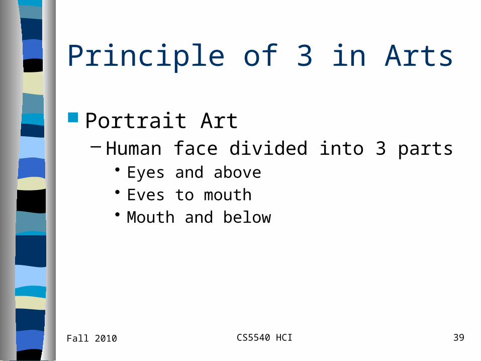
Principle of 3 in Arts
Portrait Art– Human face divided into 3 parts
• Eyes and above• Eves to mouth• Mouth and below
Fall 2010 CS5540 HCI 39

Principle of 3 in Arts
Golden Ratio in Architecture Golden Triangle
– In religiously inspirit art corners of triangle often express Holy Trinity• Father, Son, Holy Ghost
– Ex: Mona Lisa
Fall 2010 CS5540 HCI 40

Principle of 3
Public speaking: 3 parts of a speech– Tell them what you are going to say– Tell them what you want to say– Tell them what you have said
Fall 2010 CS5540 HCI 41

Principle of 3 in Arts
See notes section for email text
Fall 2010 CS5540 HCI 42

TV Shows
Law and Order– Formulaic 3 part format– Usually opens with a crime scene, or very
soon after opening– Story develops– Conclusion
• Heralded with theme music
Fall 2010 CS5540 HCI 43

Principle of 3 in Web Design
Most common portal has 3 panels– Panels are often full height, partial width– Main panel is often in center and wider– Lesser panels are left and right– Works well in many situations– Not too exciting for layout
Many good webpages do not use 3 parts
Fall 2010 CS5540 HCI 44

Conclusions

Everything Must Work Together 1
If you do not understand the client’s needs, it doesn’t matter how beautiful the interface looks.
An aesthetically good interface must work with good overall design
UI work often done in teams with programmers, cognitive scientists, artistic designers, and business people
Fall 2010 46CS5540 HCI

Everything Must Work Together 2
Design the aesthetics, like everything else in the interface
Give aethestics time and thought Be tasteful in design Seek compatible help on aesthetics,
if not your strength
Fall 2010 47CS5540 HCI

Resources
Information Design: Edward Tufte’s book Multimedia Design: Designing Visual
Interface (Mullet/Sano), Design Multimedia (Lopuck)
Web Design: Lisa Weinman’s and David Siegel’s books
Fall 2010 48CS5540 HCI

Resources
Magazines: Print, How To (these are graphic design magazines that now address many digital design issues)
Information Visualization (Ware) [some “science of graphic design”]
Fall 2010 49CS5540 HCI

Some Take-away Points
Restraint (less is more):– 2 fonts– 5-7 lines per slide– few colors– Sans Serif works best
• Arial is a standard performer
Fall 2010 CS5540 HCI 50

Summary Points - 2
Restraint (less is more):– Avoid clutter
• Underscore is last resort• Drop periods on abbrev’s, etc
– Symmetry is tedious– Use “opposite” (in color space) contrasting
colors
Fall 2010 CS5540 HCI 51

Summary Points - 3
Restraint (less is more):– Leave open space
• Avoid dense clutter• Go for pleasing layout
– Light text on dark background is easier on eyes
Fall 2010 CS5540 HCI 52

Summary Points - 4
Restraint (less is more):– Avoid clichés: embellish sparingly
• Create and use your own templates– Avoid standard templates
• Motion & sound are tricky– Eye is an unforgiving differential operator (!)
• Develop an overall style befitting of objective
Fall 2010 CS5540 HCI 53

Summary Points - 5
Restraint (less is more):– Be fastidious
• Spell check• Consistency check every element• Keep all titles in same spot, eg
– Never simply read aloud what is written in presentation
– Use good mapping/affordance
Fall 2010 CS5540 HCI 54

The End
UI Aesthetics

Fall 2010 CS5540 HCI 56

Fall 2010 57CS5540 HCI
Top Related