

Languages
Pages
Legal

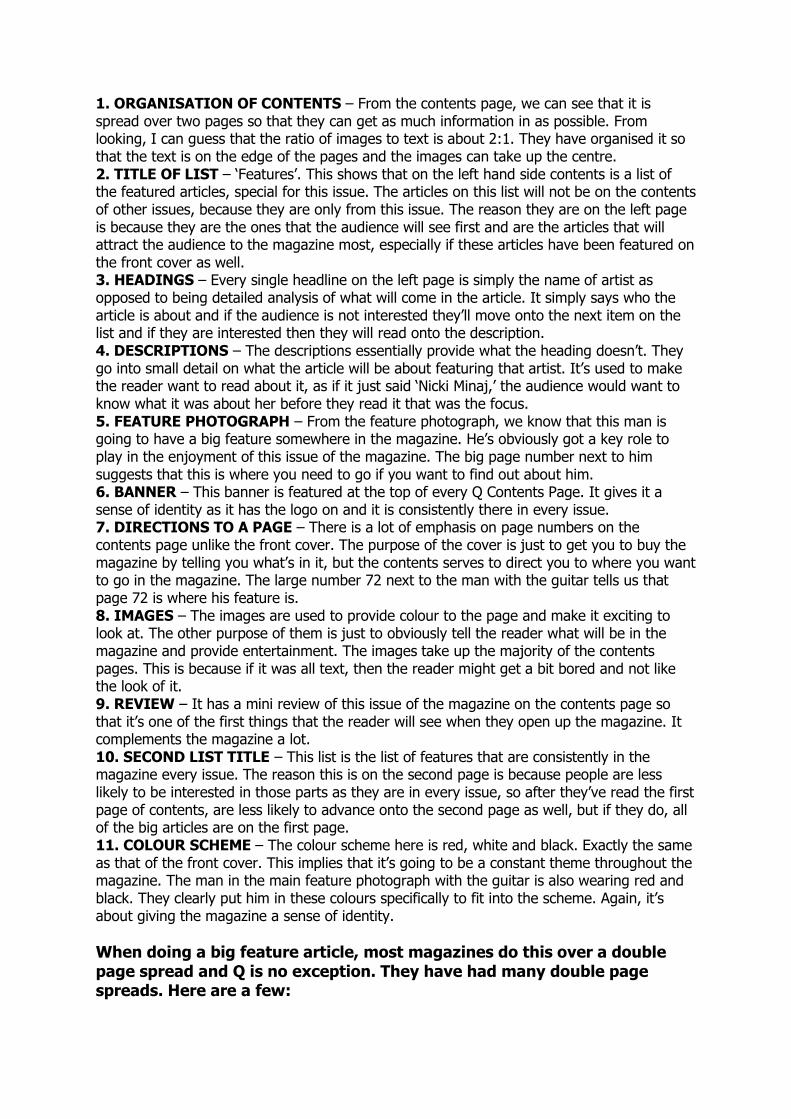
TEXTUAL ANALYSIS For my Foundation Portfolio, I am going to be making a front cover, contents page and double page spread for a magazine. So, one good way to prepare myself for this is by looking at ones that are already out there to see what they use to make their magazine as good as possible. I will focus on the same three magazines that I looked at for my Market Research. These were Q, Kerrang! and Mixmag. I will start by looking at Q. Four of their most recent front covers look like this:
We can see that there are many similarities between the covers. For example, the colour
scheme. In each of the four covers here, the main colour scheme is reds, blacks and whites.
This shows the consistency between the magazines and gives Q a sense of identity. Having
a regular colour scheme will make the Q readers think about the magazine subconsciously
whenever they see a mix of the three colours. The mixture of calmer, lighter colours (red &
white) as well as the harsher, darker black makes Q more accessible for a wide range of
people and would make more people want to buy the magazine.
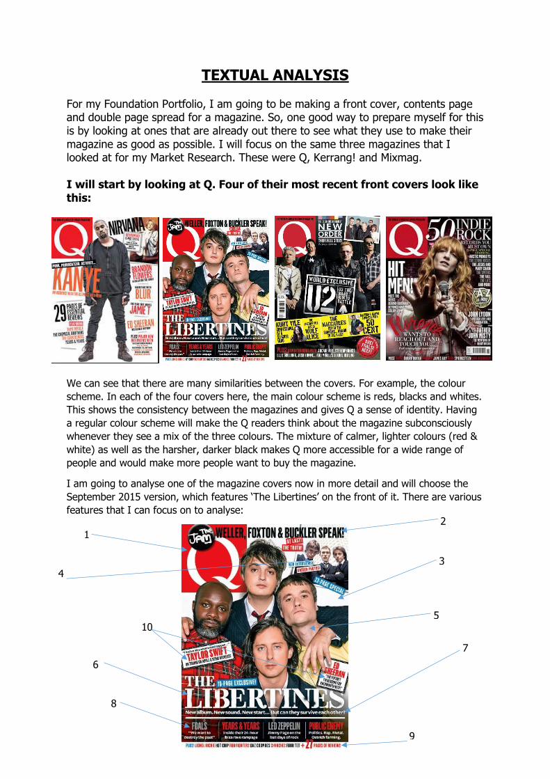
I am going to analyse one of the magazine covers now in more detail and will choose the
September 2015 version, which features ‘The Libertines’ on the front of it. There are various
features that I can focus on to analyse:
1
2
3
4
5
6
7
8
9
10
1. MASTHEAD – In every issue of Q Magazine, the logo is featured in the top left hand corner of the cover. The consistency gives the magazine identity, because you know it’s Q Magazine as soon as you see the red and white logo. It embeds an image in the mind of the reader of what Q Magazine looks like. 2. SECONDARY LEAD – We can see it says ‘Weller, Foxton & Buckler speak!’ which gives the reader the impression that they should already have pragmatic/pre-existing knowledge of who these three people are. This is a good selling technique, because if the reader does know who they are, they will want to read on to find out what they have said. And if the reader does not know who they are, they will want to read on into the magazine to find out. But also, its primary purpose is simply to inform the reader of what will be inside the magazine and hopefully make them want to buy it. 3. COLOUR SCHEME – The main colour scheme of this magazine is red, white and black, similar to the other issues featured above. The red and white are Q’s colours as they are the only two colours on the logo, but the black opens the magazine up for a wider range of readers, for instance the gothic/rock fans because black is a colour often associated with these genres. Another reason for the use of black could be because it is a colour which goes well with white, so it really balances out the mood and feeling of the magazine. The people in the feature article photo are also wearing colours that fit this colour scheme. 4. SECONDARY LEAD PHOTO – The people in the secondary lead photograph also wear black to fit with the colour scheme. The point of the secondary lead is obviously to show the reader what else is in the magazine, but it also serves the purpose of providing something for different audiences. For instance, if the reader had no interest in the lead article, they may be tempted to buy it if they like what they see in the secondary lead photograph. 5. FEATURE ARTICLE PHOTO – The feature article photograph aims to convince the audience to buy the magazine. The idea is that if they like what they see on the feature article photograph, it will make them want to buy the issue. Here, the people in the photo are looking straight down the camera to give the effect that they are looking directly at the reader and making eye contact with them. The fact it’s a medium close up tells us that we are going to be getting to know these people in a personal way. 6. HEADLINE – The headline ‘The Libertines’ serves the purpose of letting the reader know what’s inside the magazine. Usually the headline refers to the biggest story in that issue of the magazine. The idea of putting this on the front in big, bold writing is to convince an audience to buy the magazine. If someone is a fan of The Libertines, then advertising it this obviously on the very front of the magazine will hopefully convince an audience to buy it. 7. ANCHORAGE – The anchorage line is used to support the headline. As the headline is so large, there isn’t room to write much detail, so they just use the two words ‘The Libertines’. The anchorage is there so that people can see what about The Libertines is in the magazine, because just those two words are very vague and could be absolutely anything to do with them. The anchorage leaves it on a bit of a cliffhanger, which makes the audience want to read the article and find out the answer to the question the anchorage leaves us open with, ‘But can they survive each other?’ 8. MENU STRIP – The menu strip’s primary purpose is to inform the reader of what is in the magazine. However, there is a connotation to the menu strip as well. This is that if the feature article or the secondary lead don’t appeal to the reader and there was nothing else on the front of the magazine to suggest there was other things in there too, what reason have they got to buy it? The idea is that the strip can work together with the feature article and the secondary lead to hopefully provide something that will appeal to all ranges of audience. 9. SELLING LINE – The selling line is also to tell the reader of other articles that might appeal to them. But usually in the selling line, it’s slightly smaller articles. For example, we know that because ‘The Libertines’ is the feature article photo and appears large on the front cover, it will be a larger article in the magazine than ‘Chvrches’ for instance, who are
mentioned on the selling line. The only thing to suggest that there is something to do with Chvrches in the magazine is the one word ‘Chvrches’ on the selling line. There’s no anchorage or photo, just that one word. But these one words could appeal to a variety of different people who the feature article, secondary lead and menu strip don’t appeal to, persuading them to make the purchase. 10. KICKER – The two kickers feature the names of two big artists in the current music world, Taylor Swift and Ed Sheeran. This provides a complete contrast to the feature article ‘The Libertines’, because they are a much older group. This shows that there’s something for everyone as it focuses on the old and the new in the music industry. 11. WHITE SPACE USE – There is a very limited amount of white space left on the page because the magazine is making a very big thing of the feature article, therefore there isn’t much room left for much else
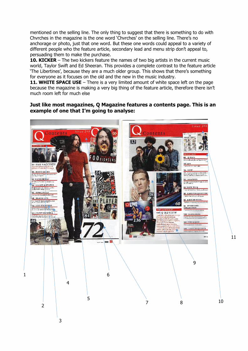
Just like most magazines, Q Magazine features a contents page. This is an example of one that I’m going to analyse:
1
2
4
5
6
7 8 10
9
3
11
1. ORGANISATION OF CONTENTS – From the contents page, we can see that it is spread over two pages so that they can get as much information in as possible. From looking, I can guess that the ratio of images to text is about 2:1. They have organised it so that the text is on the edge of the pages and the images can take up the centre. 2. TITLE OF LIST – ‘Features’. This shows that on the left hand side contents is a list of the featured articles, special for this issue. The articles on this list will not be on the contents of other issues, because they are only from this issue. The reason they are on the left page is because they are the ones that the audience will see first and are the articles that will attract the audience to the magazine most, especially if these articles have been featured on the front cover as well. 3. HEADINGS – Every single headline on the left page is simply the name of artist as opposed to being detailed analysis of what will come in the article. It simply says who the article is about and if the audience is not interested they’ll move onto the next item on the list and if they are interested then they will read onto the description. 4. DESCRIPTIONS – The descriptions essentially provide what the heading doesn’t. They go into small detail on what the article will be about featuring that artist. It’s used to make the reader want to read about it, as if it just said ‘Nicki Minaj,’ the audience would want to know what it was about her before they read it that was the focus. 5. FEATURE PHOTOGRAPH – From the feature photograph, we know that this man is going to have a big feature somewhere in the magazine. He’s obviously got a key role to play in the enjoyment of this issue of the magazine. The big page number next to him suggests that this is where you need to go if you want to find out about him. 6. BANNER – This banner is featured at the top of every Q Contents Page. It gives it a sense of identity as it has the logo on and it is consistently there in every issue. 7. DIRECTIONS TO A PAGE – There is a lot of emphasis on page numbers on the contents page unlike the front cover. The purpose of the cover is just to get you to buy the magazine by telling you what’s in it, but the contents serves to direct you to where you want to go in the magazine. The large number 72 next to the man with the guitar tells us that page 72 is where his feature is. 8. IMAGES – The images are used to provide colour to the page and make it exciting to look at. The other purpose of them is just to obviously tell the reader what will be in the magazine and provide entertainment. The images take up the majority of the contents pages. This is because if it was all text, then the reader might get a bit bored and not like the look of it. 9. REVIEW – It has a mini review of this issue of the magazine on the contents page so that it’s one of the first things that the reader will see when they open up the magazine. It complements the magazine a lot. 10. SECOND LIST TITLE – This list is the list of features that are consistently in the magazine every issue. The reason this is on the second page is because people are less likely to be interested in those parts as they are in every issue, so after they’ve read the first page of contents, are less likely to advance onto the second page as well, but if they do, all of the big articles are on the first page. 11. COLOUR SCHEME – The colour scheme here is red, white and black. Exactly the same as that of the front cover. This implies that it’s going to be a constant theme throughout the magazine. The man in the main feature photograph with the guitar is also wearing red and black. They clearly put him in these colours specifically to fit into the scheme. Again, it’s about giving the magazine a sense of identity.
When doing a big feature article, most magazines do this over a double page spread and Q is no exception. They have had many double page spreads. Here are a few:
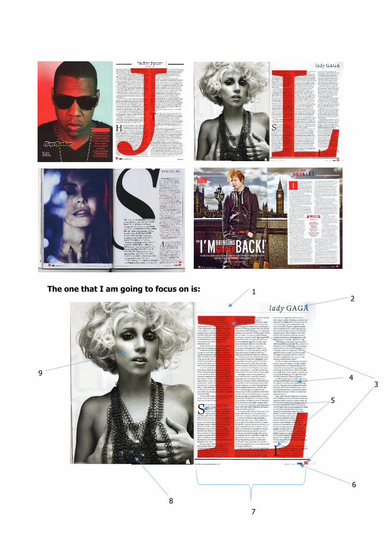
The one that I am going to focus on is:
9
1 2
7
6
5
4 3
8
1. WHITE SPACE – On this spread, there is a very small amount of white space left over. On the side of the page with the text on, the only large amount of white space is at the very top of the page besides the headline. This white space leaves a gap and puts more emphasis on the headline ‘lady GAGA’. 2. HEADLINE – The headline is very simple as it’s just the two words. Essentially if we want to find out any more about the article, we actually have to read it. There’s no subheading or anchorage so therefore, the only way to find out what’s in the article is to read it. It’s a way of drawing in the reader. 3. GRAPHIC ART – The large ‘L’ behind the text actually has quite a large effect. First of all, it prevents the text page from having very much white space as it fills the gaps. Another effect is that it keeps up the consistency of the colour scheme. I’ve found out already in my research that Q likes having the three-colour colour scheme and the red ‘L’ here adds the third colour to this page of the article. There is also a very small ‘Q’ logo in the bottom corner of the article. This is so that they have made the magazine’s mark on the page and then nobody can steal it. It also adds a small amount of red colour to the corner of the page. 4. TEXT – Obviously the text is the maid part of the article. This is the part that the reader comes here for. They want to know about Lady Gaga, so they have to read it. The text also is black, which is a default colour but is also one of the colours in Q’s main colour scheme. 5. LETTER FORM – At the beginning of two of the paragraphs, instead of a regular letter, a large letter is used. What this does is it makes the text less boring to look at, because the reader sees there’s a bit of variety and subconsciously it makes the reader think that there’s not as much to read, which makes them more likely to want to read the article. 6. PAGE NUMBER – At the bottom of each page is the page number. This makes it easier for the reader to navigate their way through the magazine and know where they need to go to the page they want. If there was no page number, then the contents page wouldn’t be able to direct them to where each feature was. 7. COLUMNS – The purpose of having the text organised into columns is that it looks a lot tidier. It makes the reader want to read it more than it would do if it was all just in one great big large block. 8. COLOUR SCHEME – In this spread, Q continues to use its regular colour scheme of red, black and white. The image of Lady Gaga is all black and white as she’s wearing black and the background is white. The text is also black as well as the background and the large ‘L’ is red. This all shows a continued colour scheme throughout the magazine. 9. MAIN FEATURE PHOTOGRAPH – This photo is used to show who the article is about. She’s looking straight down the camera to give the effect of her looking directly at the reader. Like I’ve already said, the image is black and white to fit in with the colour scheme used regularly throughout the magazine. This photo is a medium close up which suggests that we’re going to be getting to know this person within the article because the photo is quite up close and personal.
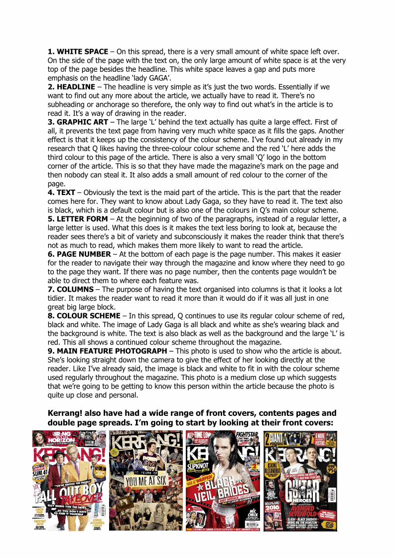
Kerrang! also have had a wide range of front covers, contents pages and double page spreads. I’m going to start by looking at their front covers:
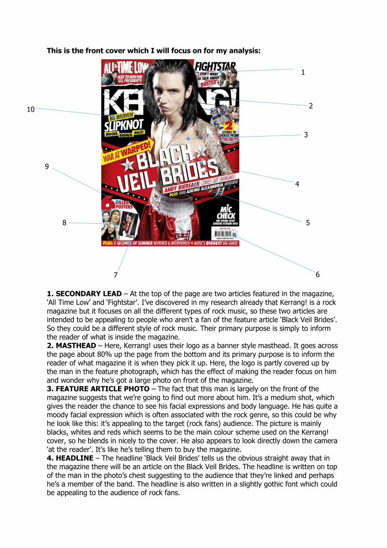
This is the front cover which I will focus on for my analysis:
1. SECONDARY LEAD – At the top of the page are two articles featured in the magazine, ‘All Time Low’ and ‘Fightstar’. I’ve discovered in my research already that Kerrang! is a rock magazine but it focuses on all the different types of rock music, so these two articles are intended to be appealing to people who aren’t a fan of the feature article ‘Black Veil Brides’. So they could be a different style of rock music. Their primary purpose is simply to inform the reader of what is inside the magazine. 2. MASTHEAD – Here, Kerrang! uses their logo as a banner style masthead. It goes across the page about 80% up the page from the bottom and its primary purpose is to inform the reader of what magazine it is when they pick it up. Here, the logo is partly covered up by the man in the feature photograph, which has the effect of making the reader focus on him and wonder why he’s got a large photo on front of the magazine. 3. FEATURE ARTICLE PHOTO – The fact that this man is largely on the front of the magazine suggests that we’re going to find out more about him. It’s a medium shot, which gives the reader the chance to see his facial expressions and body language. He has quite a moody facial expression which is often associated with the rock genre, so this could be why he look like this: it’s appealing to the target (rock fans) audience. The picture is mainly blacks, whites and reds which seems to be the main colour scheme used on the Kerrang! cover, so he blends in nicely to the cover. He also appears to look directly down the camera ‘at the reader’. It’s like he’s telling them to buy the magazine. 4. HEADLINE – The headline ‘Black Veil Brides’ tells us the obvious straight away that in the magazine there will be an article on the Black Veil Brides. The headline is written on top of the man in the photo’s chest suggesting to the audience that they’re linked and perhaps he’s a member of the band. The headline is also written in a slightly gothic font which could be appealing to the audience of rock fans.
1
10
9
8
7 6
5
4
3
2
5. ANCHORAGE – The anchorage is intended to tell the audience a bit more about the feature article. Since the headline is just the three words, it doesn’t really have much chance to tell the reader anything about what the article will be about. The anchorage says ‘Andy Biersack comes out swinging’. This tells us a few things. It tells us that ‘Andy Biersack’ is somehow associated with the Black Veil Brides and also suggests that maybe Andy Biersack is the man in the photo. However, it still fails to tell the reader much about the article itself, leading them onto reading about it themselves hopefully. 6. BARCODE/DATE/PRICE – The barcode is an essential part of the magazine as it has to be scanned when the magazine is purchased. The date is used to inform the reader of when the magazine was released and tell them when the next one is out. It could also be to help the reader if they looked back on it in the future to find out when it was from. The price is also on there. This is so that the reader knows how much their purchase will cost. However, all of this is just very small in the corner of the magazine because it’s not intended to make the reader want to buy the magazine. It’s just there because it has to be. 7. SELLING LINE – The selling line’s purpose is to inform the reader about a couple of other features in the magazine issue. If the lead or secondary articles don’t attract the reader, then the hope is that something on the selling line will. Because the selling line is only a few words, if they see something on it they like, the selling line won’t say much about it and so this could make the reader buy it so they can find out more by reading inside. The word ‘Plus’ suggests that there’s all this as well as more. 8. ADVERT – It’s not an advert as such but telling the reader that there are posters inside could attract a certain audience. I the reader likes posters, then they would maybe be attracted to this. Even though, we know it just means that six of the pages will have a large photo on, it creates the illusion for the audience of six amazing, large posters that would make your bedroom wall look cool and stand out. 9. SPECIALIST LEXIS – There is a lot of specialist lexis used on this cover. Words that wouldn’t be used on the front of a pop music magazine for example. Words like ‘killer, swinging, warped, bigger, badder, Slipknot and Kerrang’. These words are used on the front of this magazine, because they’re words that are only usually used in the harsh music industry, for example rock, heavy metal, screamer. They wouldn’t be associated with R’n’B or Pop and if they were on the front of a pop magazine, it may put the reader off. But here, it brings in just the audience that they are after. 10. KICKER – It uses the words ‘Big Interview’ to suggest that there’s something special about it. It could be that the interview is physically big, so it’s really long and we find out a lot of information. Or it could be ‘big’ because there’s some shocks and surprises revealed in the interview. Either way, it’s a technique of attracting the reader and certainly makes the interview seem like it’s going to be special. 11. COLOUR SCHEME – We see that the main colours used here are black and red. The black is often associated with darkness, bad things and mystery. Whereas red can be linked with anger, blood, rage, evil. All these things can be linked with the rock genre, because it’s often described as ‘not for the faint hearted’. There is also a bit of white and yellow used on the cover. This could just be because they stand out very well on black or red backgrounds or there could be a deeper meaning, for instance that it suggests not everything is dark and scary like the red and black would seem to suggest. 12. WHITE SPACE – There is quite a bit of empty black or red space in the cover. This could be so that the reader is drawn completely towards the feature article photograph. They don’t want too many distractions from the bit that they really want you to see. It could also be linked to the fact that the man in the photo, Biersack, is wearing boxing gloves and looking ready for a fight. It could very loosely imply that nobody wants to come near him because they fear him. Again, this could attract the rock audience, because of the fighting and fear.
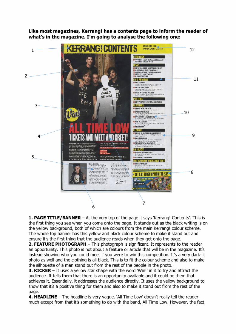
Like most magazines, Kerrang! has a contents page to inform the reader of what’s in the magazine. I’m going to analyse the following one:
1. PAGE TITLE/BANNER – At the very top of the page it says ‘Kerrang! Contents’. This is the first thing you see when you come onto the page. It stands out as the black writing is on the yellow background, both of which are colours from the main Kerrang! colour scheme. The whole top banner has this yellow and black colour scheme to make it stand out and ensure it’s the first thing that the audience reads when they get onto the page. 2. FEATURE PHOTOGRAPH – This photograph is significant. It represents to the reader an opportunity. This photo is not about a feature or article that will be in the magazine. It’s instead showing who you could meet if you were to win this competition. It’s a very dark-lit photo as well and the clothing is all black. This is to fit the colour scheme and also to make the silhouette of a man stand out from the rest of the people in the photo. 3. KICKER – It uses a yellow star shape with the word ‘Win!’ in it to try and attract the audience. It tells them that there is an opportunity available and it could be them that achieves it. Essentially, it addresses the audience directly. It uses the yellow background to show that it’s a positive thing for them and also to make it stand out from the rest of the page. 4. HEADLINE – The headline is very vague. ‘All Time Low’ doesn’t really tell the reader much except from that it’s something to do with the band, All Time Low. However, the fact
12 1
3
2
4
5
10
11
9
8
6 7
that it’s written right near the ‘Win!’ kicker suggests that they’re related and the competition is something to do with All Time Low. This would attract fans of the band to read more and find out just exactly what it is that they can win. 5. READER ADDRESS – Here, the reader is addressed by the editor of the magazine. The editor uses this space to inform the reader about what the magazine contains and try and excite the reader about the magazine and make them want to buy it and find these articles. The editor writes in a mixture of the first and second person, using words such as ‘you,’ ‘my’. These make the reader feel like they’re having a personal one-on-one conversation with the editor. 6. SECONDARY PHOTOGRAPH – This photograph links in with the editor’s note to the reader. The editor makes a reference to Andy Biersack and also references the photo, telling the reader that that’s who it is. Again, here the clothes and hair of the person in the photograph fits in with the general colour scheme of the magazine. 7. ANCHORAGE – Anchorage here is used to tell the reader a bit more about the opportunity on offer for them with this competition. ‘Tickets and meet and greet!’ tells the reader what they could win and this would certainly appeal to a particular target audience. Any All Time Low fans would be thrilled at the opportunity to meet their heroes and so the anchorage makes the reader want to find out more and draws them in. 8. ADVERT – The aim of this advert is to make as much money as possible for Kerrang! They are offering a special deal here with a subscription to the magazine. They do this because it ensures that if they buy it, they are tied down and the reader has to have every issue. They don’t have to go through the stage of deciding whether they want it or not, because it’s already been ordered, so there’s no changing their mind. This is one way that Kerrang! use to boost their circulation numbers, similarly to most other magazines. Here, the colours yellow and blue are used to make it look exciting and make the reader feel as if they’re getting a really good deal. It also stands out on the page from the main text. 9. DESCRIPTION – Each article listed on the right hand side of the page as being in the magazine has a little description underneath it. This does a similar function to the anchorage on the headline: it tells the reader more than they already know from the headline and draws them in. It uses one sentence to elaborate on the title of the article and inform the reader of just what they’re in for if they go to read the article. 10. ARTICLE HEADLINES – The headlines are for people who don’t like too much text. It gives them an idea of what the focus of each article is. If the reader likes this, they’ll read the description, they maybe the article. If not they’ll move on down to the next headline. 11. TITLE OF MAGAZINE SECTIONS – There are titles for each section of the magazine, such as ‘News’, ‘Posters’, ‘Features’ and ‘Albums’. These give a general idea of what the headlines in those sections are linked to. For example, if the reader isn’t interested in posters, then they will not bother reading the headlines in that section and will move onto the next title down the list, in this case ‘Features’. 12. MAGAZINE INFO – This issue number and date is to inform the reader of when it was out, so that if they look back on it in the future, they know whether it was before or after another issue of the magazine. It’s only very small though, because it’s not intended to entertain the reader or convince them to read on further. It makes it simple for the reader to organise their magazines into chronological order. 13. COLOUR SCHEME – The same four colours as the front cover are the main colour scheme: black, red, white and yellow. But, in the contents page, it is mainly dominated by the yellow and black, unlike the cover which was red and black. I think this could be because yellow is a more stand-out colour and it will draw the reader to the parts which they really want them to see. The black is still used to appeal to the fans of the rock genre.
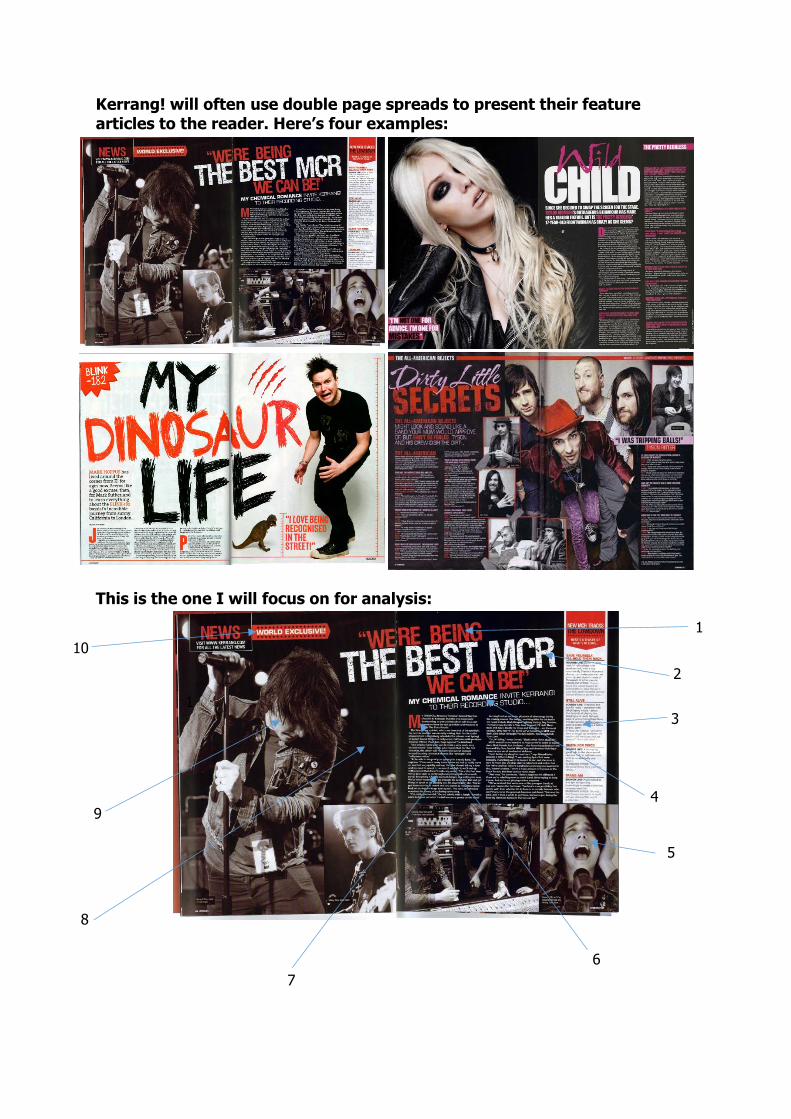
Kerrang! will often use double page spreads to present their feature articles to the reader. Here’s four examples:
This is the one I will focus on for analysis:
1
7
6
5
3
2
1
10
9
8
4
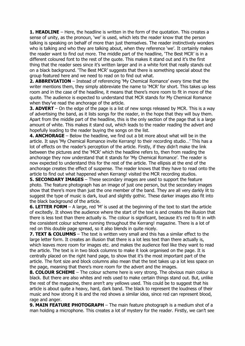
1. HEADLINE – Here, the headline is written in the form of the quotation. This creates a sense of unity, as the pronoun, ‘we’ is used, which lets the reader know that the person talking is speaking on behalf of more than just themselves. The reader instinctively wonders who is talking and who they are talking about, when they reference ‘we’. It certainly makes the reader want to find out more. The middle part of the headline, ‘The Best MCR’ is in a different coloured font to the rest of the quote. This makes it stand out and it’s the first thing that the reader sees since it’s written larger and in a white font that really stands out on a black background. ‘The Best MCR’ suggests that there is something special about the group featured here and we need to read on to find out what. 2. ABBREVIATION – Instead of referencing ‘My Chemical Romance’ every time that the writer mentions them, they simply abbreviate the name to ‘MCR’ for short. This takes up less room and in the case of the headline, it means that there’s more room to fit in more of the quote. The audience is expected to understand that MCR stands for My Chemical Romance when they’ve read the anchorage of the article. 3. ADVERT – On the edge of the page is a list of new songs released by MCR. This is a way of advertising the band, as it lists songs for the reader, in the hope that they will buy them. Apart from the middle part of the headline, this is the only section of the page that is a large amount of white. This makes it stand out, which leads to the reader reading the advert and hopefully leading to the reader buying the songs on the list. 4. ANCHORAGE – Below the headline, we find out a bit more about what will be in the article. It says ‘My Chemical Romance invite Kerrang! to their recording studio…’ This has a lot of effects on the reader’s perception of the article. Firstly, if they didn’t make the link between the pictures and the ‘MCR’ which the headline refers to, then from reading the anchorage they now understand that it stands for ‘My Chemical Romance’. The reader is now expected to understand this for the rest of the article. The ellipsis at the end of the anchorage creates the effect of suspense. The reader knows that they have to read onto the article to find out what happened when Kerrang! visited the MCR recording studios. 5. SECONDARY IMAGES – These secondary images are used to support the feature photo. The feature photograph has an image of just one person, but the secondary images show that there’s more than just the one member of the band. They are all very darkly lit to suggest the type of music is dark, loud and slightly gothic. These darker images also fit into the black background of the article. 6. LETTER FORM – A large, red ‘M’ is used at the beginning of the text to start the article of excitedly. It shows the audience where the start of the text is and creates the illusion that there is less text than there actually is. The colour is significant, because it’s red to fit in with the consistent colour scheme running throughout the Kerrang! magazine. There is a lot of red on this double page spread, so it also blends in quite nicely. 7. TEXT & COLUMNS – The text is written very small and this has a similar effect to the large letter form. It creates an illusion that there is a lot less text than there actually is, which leaves more room for images etc. and makes the audience feel like they want to read the article. The text is in two block columns to make it look organised on the page. It is centrally placed on the right hand page, to show that it’s the most important part of the article. The font size and block columns also mean that the text takes up a lot less space on the page, meaning that there’s more room for the advert and the images. 8. COLOUR SCHEME – The colour scheme here is very strong. The obvious main colour is black. But there are also whites and reds used to make certain things stand out. But, unlike the rest of the magazine, there aren’t any yellows used. This could be to suggest that his article is about quite a heavy, hard, dark band. The black to represent the loudness of their music and how strong it is and the red shows a similar idea, since red can represent blood, rage and anger. 9. MAIN FEATURE PHOTOGRAPH – The main feature photograph is a medium shot of a man holding a microphone. This creates a lot of mystery for the reader. Firstly, we can’t see
his face because his hair is very long and he is looking down. The reader is therefore made to wonder who this man is and what he’s done to get into this article. The black/dark colour also creates this mystery, but it all makes the reader realise that if they read on they will find some answers. The mystery fits in very well with the genre of music MCR represent. If this man was wearing bright yellow clothes, short hair and smiling a big cheesy grin at the camera, it wouldn’t reflect the rock genre, but the mystery, long hair and darkness does reflect this type of music very well. They’re all things associated with rock. 10. KICKER – At the top of the page it says ‘World Exclusive’. This has the impression of making the reader feel special. It makes the reader feel as if they’re the first ones to read it and get this information, making them want to read on. It tells the reader that the information in this article has never been revealed by anyone before Kerrang! now. It also says a lot about Kerrang! as a magazine. It gives the impression that they’re quite high up and important to be able to get such inside information that no one else anywhere in the world knows.
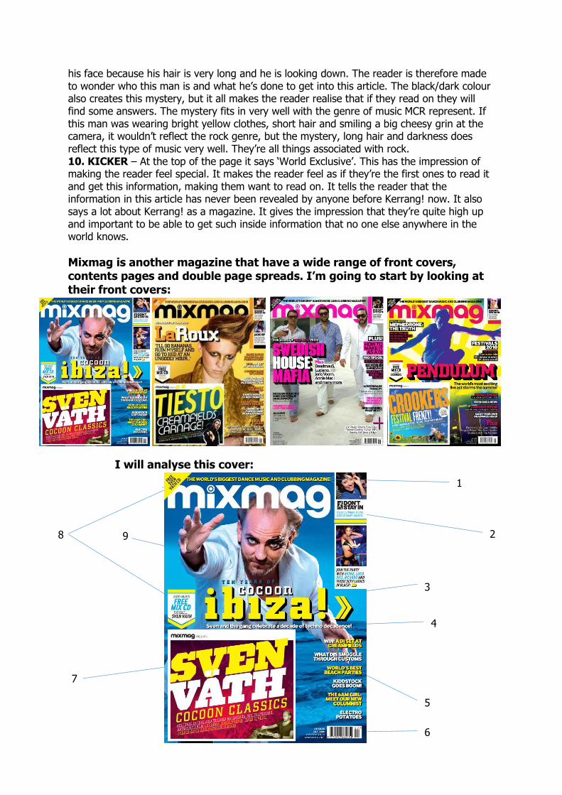
Mixmag is another magazine that have a wide range of front covers, contents pages and double page spreads. I’m going to start by looking at their front covers:
I will analyse this cover:
2
3
4
5
6
7
8 9
1
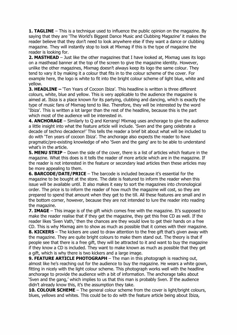
1. TAGLINE – This is a technique used to influence the public opinion on the magazine. By saying that they are ‘The World’s Biggest Dance Music and Clubbing Magazine’ it makes the reader believe that they don’t need to look anywhere else if they want a dance or clubbing magazine. They will instantly stop to look at Mixmag if this is the type of magazine the reader is looking for. 2. MASTHEAD – Just like the other magazines that I have looked at, Mixmag uses its logo on a masthead banner at the top of the screen to give the magazine identity. However, unlike the other magazines, Mixmag doesn’t always keep its logo the same colour. They tend to vary it by making it a colour that fits in to the colour scheme of the cover. For example here, the logo is white to fit into the bright colour scheme of light blue, white and yellow. 3. HEADLINE – ‘Ten Years of Cocoon Ibiza’. This headline is written is three different colours, white, blue and yellow. This is very applicable to the audience the magazine is aimed at. Ibiza is a place known for its partying, clubbing and dancing, which is exactly the type of music fans of Mixmag tend to like. Therefore, they will be interested by the word ‘Ibiza’. This is written a lot larger than the rest of the headline, because this is the part which most of the audience will be interested in. 4. ANCHORAGE – Similarly to Q and Kerrang! Mixmag uses anchorage to give the audience a little insight into what the feature article will include. ‘Sven and the gang celebrate a decade of techno decadence!’ This tells the reader a brief bit about what will be included to do with ‘Ten years of cocoon Ibiza’. The anchorage also expects the reader to have pragmatic/pre-existing knowledge of who ‘Sven and the gang’ are to be able to understand what’s in the article. 5. MENU STRIP – Down the side of the cover, there is a list of articles which feature in the magazine. What this does is it tells the reader of more article which are in the magazine. If the reader is not interested in the feature or secondary lead articles then these articles may be more appealing to them. 6. BARCODE/DATE/PRICE – The barcode is included because it’s essential for the magazine to be bought at the store. The date is featured to inform the reader when this issue will be available until. It also makes it easy to sort the magazines into chronological order. The price is to inform the reader of how much the magazine will cost, so they are prepared to spend that amount when they get to the till. All these features are small and in the bottom corner, however, because they are not intended to lure the reader into reading the magazine. 7. IMAGE – This image is of the gift which comes free with the magazine. It’s supposed to make the reader realise that if they get the magazine, they get this free CD as well. If the reader likes ‘Sven Vath,’ then the chances are they would love to get their hands on a free CD. This is why Mixmag aim to show as much as possible that it comes with their magazine. 8. KICKERS – The kickers are used to draw attention to the free gift that’s given away with the magazine. They are quite bright colours to make them stand out. The theory is that if people see that there is a free gift, they will be attracted to it and want to buy the magazine if they know a CD is included. They want to make known as much as possible that they get a gift, which is why there is two kickers and a large image. 9. FEATURE ARTICLE PHOTOGRAPH – The man in this photograph is reaching out, almost like he’s reaching out for the audience to buy the magazine. He wears a white gown, fitting in nicely with the light colour scheme. This photograph works well with the headline anchorage to provide the audience with a bit of information. The anchorage talks about ‘Sven and the gang,’ which implies to us that this man is probably Sven. If the audience didn’t already know this, it’s the assumption they take. 10. COLOUR SCHEME – The general colour scheme from the cover is light/bright colours, blues, yellows and whites. This could be to do with the feature article being about Ibiza,
where the British stereotype is that it’s always bright and sunny. The colour scheme fits in with this idea of brightness and positive weather.
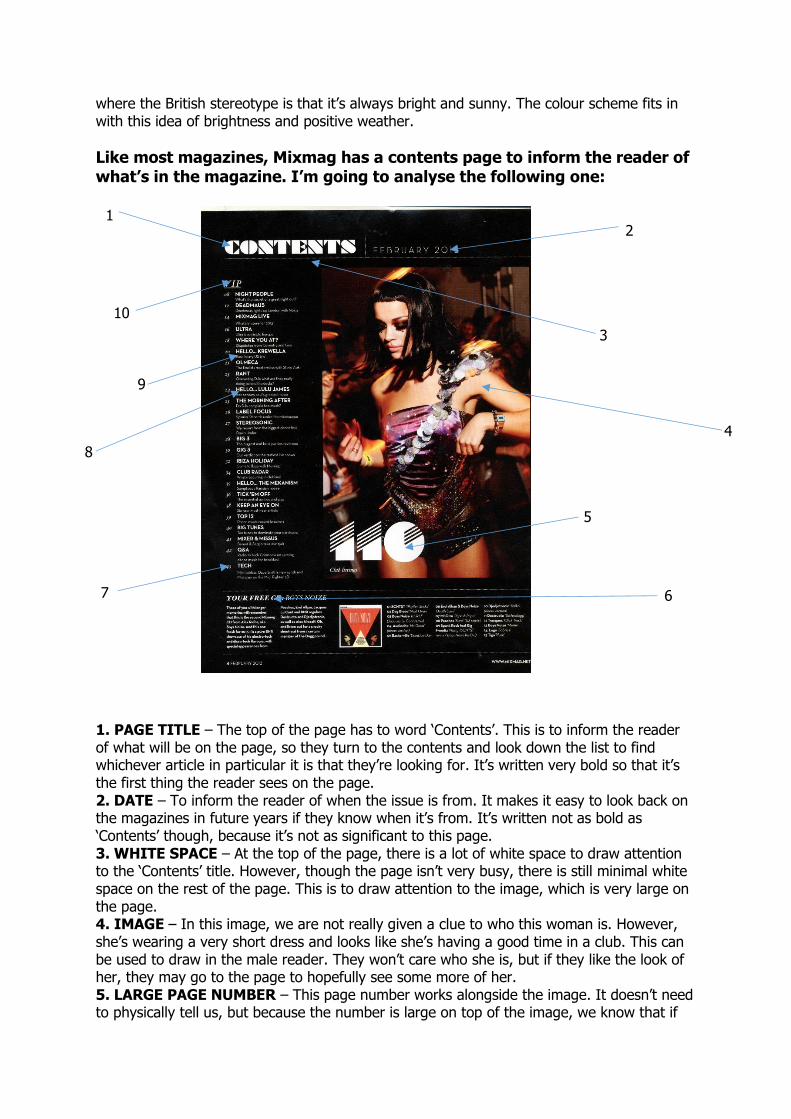
Like most magazines, Mixmag has a contents page to inform the reader of what’s in the magazine. I’m going to analyse the following one:
1. PAGE TITLE – The top of the page has to word ‘Contents’. This is to inform the reader of what will be on the page, so they turn to the contents and look down the list to find whichever article in particular it is that they’re looking for. It’s written very bold so that it’s the first thing the reader sees on the page. 2. DATE – To inform the reader of when the issue is from. It makes it easy to look back on the magazines in future years if they know when it’s from. It’s written not as bold as ‘Contents’ though, because it’s not as significant to this page. 3. WHITE SPACE – At the top of the page, there is a lot of white space to draw attention to the ‘Contents’ title. However, though the page isn’t very busy, there is still minimal white space on the rest of the page. This is to draw attention to the image, which is very large on the page. 4. IMAGE – In this image, we are not really given a clue to who this woman is. However, she’s wearing a very short dress and looks like she’s having a good time in a club. This can be used to draw in the male reader. They won’t care who she is, but if they like the look of her, they may go to the page to hopefully see some more of her. 5. LARGE PAGE NUMBER – This page number works alongside the image. It doesn’t need to physically tell us, but because the number is large on top of the image, we know that if
1
7 6
4
5
3
2
10
9
8
we want to see the article about this woman, the reader has to turn to page 110. It’s very large because it wants the reader to go there, as it’s considered a good article. Or it could just be because the Mixmag editors know their readers well and know what the male audience would like to see, hence making this page stand out. 6. INFORMATION – Here, information is given out about a free gift that is given away in this issue of the magazine. It tells the reader some background information about the CD that they’ve been given, so that they know what to expect when they put it into the CD player. 7. PAGE NUMBER – The contents list is very neatly organised. Down the left, separated from the main listing is the page numbers, which give information about where to turn to if you’re interested in a certain article. They are all listed in chronological order of where they are in the magazine. It also makes it simple for the reader to navigate to the article that they want to read about. 8. HEADLINES – Each article listed in the contents has a vague headline. This gives the reader a basic insight into what will be in the article. It also helps the reader to take a basic skim-read down the contents page so they can quickly find the article that they want, rather than having to read through every single word on the page. 9. DESCRIPTION – The description provides the reader with information about the article listed by the headline. The description provides brief further information about what the article will include. It is a lot more helpful than the headline, because often the purpose of a headline is just to be catchy, but this actually provides the reader will information rather than just use a few catchy words to draw you in. 10. LIST TITLE – Here, the magazine uses the title ‘VIP’ to make the reader feel special. It makes the reader feel as if they have been specially chosen to read the magazine. It makes them feel like they have special rights to read it that perhaps other people wouldn’t have, since they don’t read Mixmag. Mixmag is aimed to target people who enjoy clubbing and often people in clubs are given VIP invitations, so this is similarly giving the reader a VIP invitation to read all these articles in the issue of the magazine. 11. COLOUR SCHEME – The clear colour scheme here is black and white, which is contrary to the scheme of the four front covers I found from Mixmag, as they were very bright colours. This suggests that unlike the other two magazines I looked at, it doesn’t use a constant colour scheme throughout each issue of the magazine. However, here the reason a black and white scheme was used could be so that the image of the woman stands out, as this is a lot brighter. They are drawing focus to her, in the hope that men are attracted and go to that page.
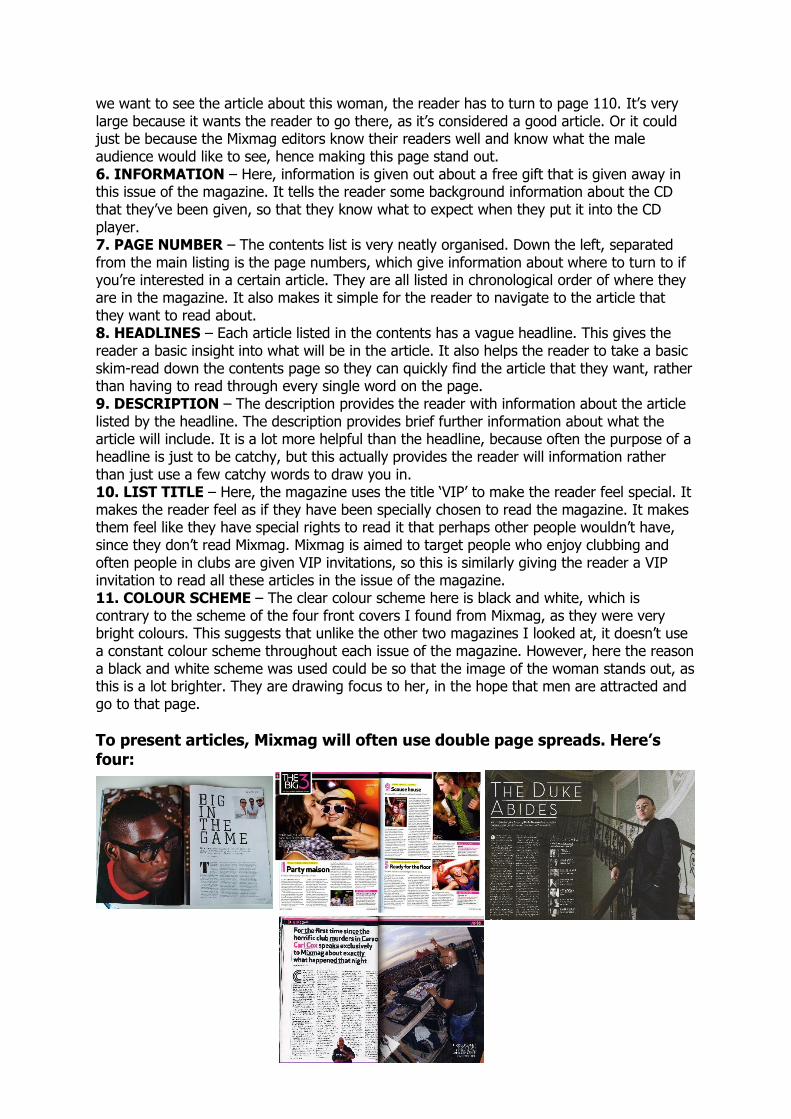
To present articles, Mixmag will often use double page spreads. Here’s four:
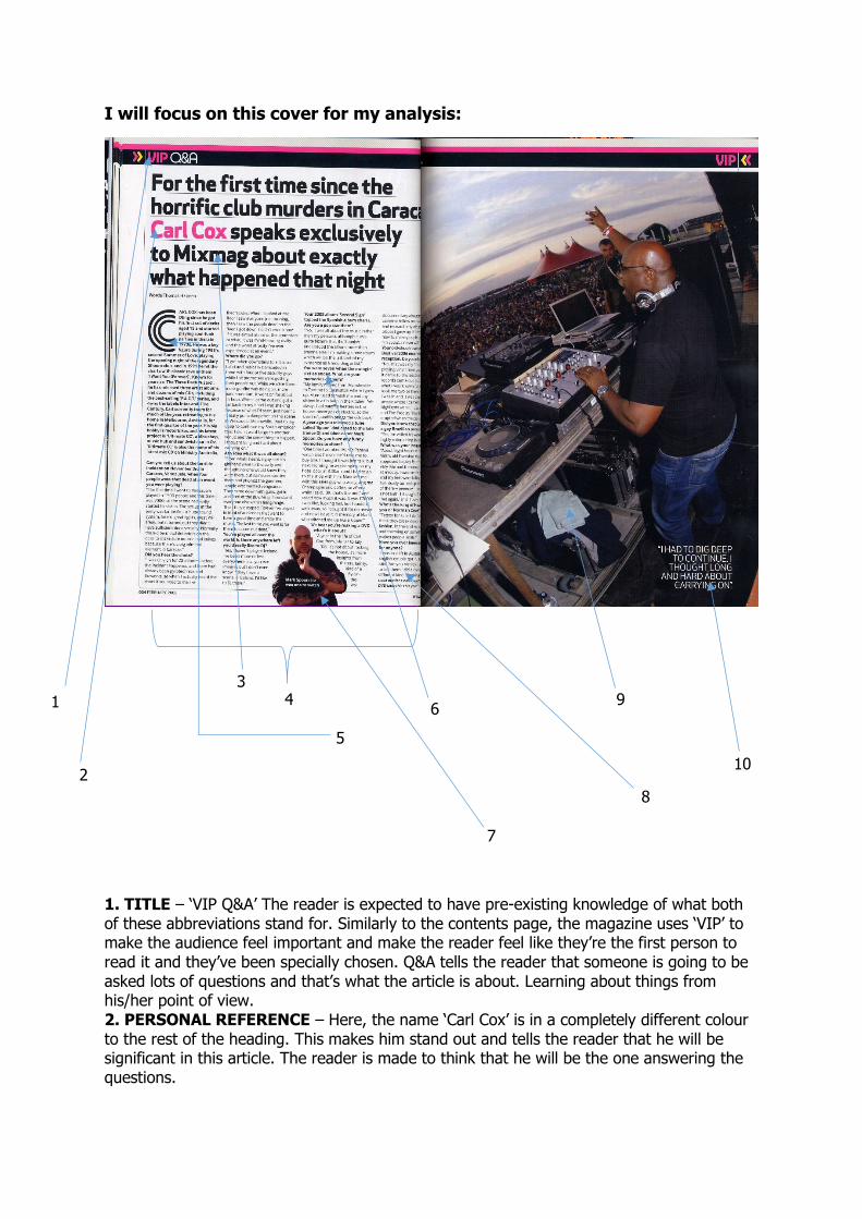
I will focus on this cover for my analysis:
1. TITLE – ‘VIP Q&A’ The reader is expected to have pre-existing knowledge of what both of these abbreviations stand for. Similarly to the contents page, the magazine uses ‘VIP’ to make the audience feel important and make the reader feel like they’re the first person to read it and they’ve been specially chosen. Q&A tells the reader that someone is going to be asked lots of questions and that’s what the article is about. Learning about things from his/her point of view. 2. PERSONAL REFERENCE – Here, the name ‘Carl Cox’ is in a completely different colour to the rest of the heading. This makes him stand out and tells the reader that he will be significant in this article. The reader is made to think that he will be the one answering the questions.
2
1
3 4
5
6
7
9
8
10
3. MIXMAG – Also in the heading, Mixmag makes a reference to itself. It says ‘Carl Cox speaks exclusively to Mixmag’ which suggests to the audience that Mixmag is the only place that you can read this interview with Carl Cox. 4. COLUMNS – The columns are used to arrange the text into a tidy view for the reader. They make it easier for the reader to read as they are very tidy and give the illusion of less text since it’s separated into four columns rather than all in one very large block. It’s also very simple for the reader to navigate round. 5. LETTER FORM – A large letter ‘C’ is used at the beginning of the main bulk of text in the article. This shows the reader clearly where the article begins so that they don’t need to look around. It stands out on the page so is one of the first things that the reader’s eyes are drawn to. 6. QUESTIONS – As it’s a question and answer page, there are direct questions being asked to Carl Cox. Mixmag uses bold writing to make these clearly separated from the answers and the rest of the text. These questions are written in the second person, telling the reader they are being directly asked to Carl. Another reason they are in bold is so that the reader can read through the questions and decided which ones they want to hear the answers to, because not all of them will interest everybody. 7. SECONDARY IMAGE – There is another smaller image of Carl Cox towards the bottom of the left page. One major reasoning for his being here is that the main picture of him is of his back and we don’t actually see his face, hence why the secondary image is of his front. It’s also a medium shot, which tells the audience he’s going to be the main person in this article as it’s just him in the shot and all distractions have been removed. The picture is focused on him, just as the article is. 8. ANSWERS – The answers to the questions are written differently to the questions themselves. They are not bold, because they are supposed to be clearly separated from the questions themselves. It makes it easier for the reader to establish the difference between the two. There’s a clear divide. The fact that the answers are written in regular, non-bold text also tells the reader that it’s the main bulk of text; it’s the main bit of the article. 9. IMAGE – The image is used to show us who the focus of the lead article will be on. We know he is Carl Cox, from the heading, and the fact he’s DJing tells the reader about what he’s done to earn himself this interview. He’s surrounded by a large crowd, implying that he has a lot of fans/followers, intriguing the reader into finding out more about him. 10. QUOTE – A quote is featured from the article. It doesn’t say who said it, but it’s written on the main photograph, suggesting to the audience that it was this man who said the quote. It will make the reader want to read into the article and see where he said it and what context it was in and why he said it.