


Languages
Pages
Legal

Titus Salt School – Front cover By looking at my recent research on codes and conventions of magazines I have tried to follow a similar style
Masthead – the tile of the magazine is clear Main picture -
dominates the page, it shows a smart happy student ready for school, relating to the overall topic
Selling line – this draws attention to the reader and encourages them to read inside to find out how to win the prize
Coverlines – these surround the main image and is giving information on what information is covered inside the magazine
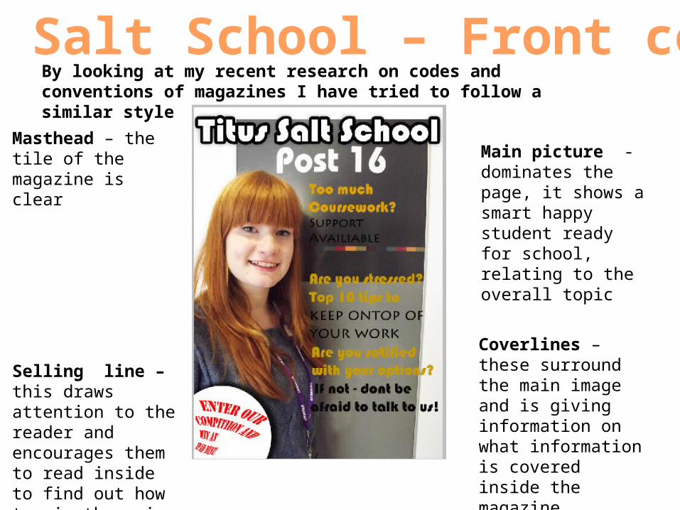
Titus Salt School- Contents School logo – this shows where the magazine is from/where it is associated from. To make it recognised
Page numbers and list of contents – this is so the reader knows what’s inside the magazine and it is easier for them to navigate through the magazine
Main images – this would attracts the readers attention and it also shows what is available in the school
Masthead – the title of the page to show what the page is

• My magazine is aimed at sixth form students and I tried following my recent research on codes and conventions. I chose to target sixth form students because I felt there would be a lot more to talk about. E.g. university, previous GCSE resits, jobs and helping the school, I also thought to target this at sixth forms because they would be under stress with subjects and exams and the magazine talks about how to over come that
Target Audience
Top Related