


Languages
Pages
Legal


Creating a Transit Service Index: Creating a Frequency Based Quality of Service Index
Using the General Data Feed Specification
by Andrew Keller
Bachelor of Arts in History University of St. Thomas, St. Paul, MN
Director, Metropolitan Transportation Support Initiative Academic Advisor: P.S. Sriraj
and Research Assistant Professor for the
Urban Transportation Center of the
University of Illinois at Chicago
Abstra culty
ct submitted for the approval of the faof the
College of Urban Planning and Policy
Universit illment at the
y of Illinois at Ch go in partial fulficaof the requirements for the degree
of Master of Urban Planning in Transportation

Abstract
An Abstract submitted for the approval of the faculty of the College of Urban Planning and Policy at the University of Illinois at Chicago in
partial fulfillment of the requirements for the degree of Master of Urban Planning in Transportation
Creating a Transit Service Index: Creating a Frequency Based Quality
of Service Index Using the General Data Feed Specification
by Andrew Keller March 2012
This research explores the creation of a transit supply index (TSI) based on the frequency of transit service. The index is created using data supplied by transit agencies through the General Transit Feed Specification (GTFS). The GTFS data tables can be queried and filtered to examine the number of planned stops for an individual transit stop based on route, time of day, day of the week and direction. The frequency score can be analyzed using GIS software to apply these frequencies to the service areas surrounding each transit stop. These frequency scores are applied to an underlying geographic zone (census tract, traffic analysis zone) and weighted by the proportion of service coverage offered with the zone of study. The resulting scores can be used to measure against standard benchmarks of coverage contained in the Transit Capacity and Quality of Service Manual, be used in conjunction with a demand index, or used as a basis for comparison of service level. The TSI can be calculated for individual transit agencies, but can also be used for areas with multiple transit agencies and overlapping service coverage areas. The paper will describe the methodology to create the index and examine the sources consulted when creating this measurement. The paper will examine applications for the TSI using northeastern Illinois as its study area. The paper will also describe the challenges in creating the index while exploring its limitations as a level of service tool.
2

a le o
T b f Contents
1. Abstract..................................................................................................................2
2. Table of Contents……………………………………………………………………3
3. Introduction………………………………………………………………………......4
4. Sources…………………………………………………………………………………..4
a. Framework…………………………………………………………………….….5
b. Transit Capacity and Quality of Service Manual……………….….5
c. General Transit Feed Specification………………………………… ….6
5. Methodology…………………………………………………………………………6
a. Basic Framework……………………………………………………………...7
b. Service Buffers………………………………………………………………....9
c. Overlapping Buffers…………………………………………………………10
6. Analysis……………………………………………………………………………….12
a. Map of Chicago Region TSI for Morning Peak Period………….12
b. Comparison by County……………………………………………………..13
7. Conclusions………………………………………………………………………….14
d………………………………………………………………………….16 8. Works Cite
9. Appendix
3
Introduction
This master's project explores the creation of a transit supply index (TSI) based on the
frequency of transit service. The index is created using data supplied by transit agencies
through the General Transit Feed Specification (GTFS). The paper will describe the
methodology and sources consulted to create this index and perform analysis using
northeastern Illinois as its study area. The paper will also describe the challenges in
reating the index while exploring its limitations as a level of service tool. c
The goal for this project is to create a supply index using GTFS data that can be duplicated
for any transit area with data available in the same format. The geographic areas used for
this study are traffic analysis zones provided by the Chicago Metropolitan Agency for
Planning. The service area of the Regional Transportation Authority (RTA) of northeastern
Illinois serves as the model for this project, but the methods used can be applied to any
ransit agency which supplies transit data to the GTFS data exchange. t
This paper discusses some of the possible uses for GTFS data in measuring level of service
for transit. The goal is to replicate measures of level of service using the tables provided by
GTFS feeds. The first part of this paper will contain a brief literature review of the sources
consulted for level of service measurements with a description and explanation of the
methods used for this project. The next section will apply these methods to the RTA's
ervice area, while the last section will included a detailed description of the methodology. s
Sources
This project is based on three main sources, which formed the framework for the index and
the set of standards to measure the results. The following section describes the relevant
sections of the sources and their contribution to the methodology of this project.
4
The Transit Supply Index is based on a methodology created for an assignment I completed
while studying at the University of Illinois at Chicago. The assignment is to create a level of

service index based on frequency of service at CTA rail stations. The frequency score
represents the product of transit trips per week and percentage of population served, or
net persons served (NPS). The score is based on block level data, aggregated to the level of
the census tract, and then graded based on scores relative to other tracts. Frequency
scores for stations are based on manual counts, and coverage area is defined as block
centroids within a half mile of a station. The assignment's methodology and scoring system
are based on literature from the Transit Capacity and Quality of Service Manual, Part 5:
Quality of Service. (TRB, 2003)
Figure 1: Formula for average NPS
S
ource: (Kawamura, 2011)
Transit Capacity and Quality of Service Manual (TCQSM) The guidelines for availability
of service are based on frequencies and coverage area as recommended by the TCQSM.
The manual measures quality of service from the passengers perspective and assigns letter
grades based on average headways during the peak period of transit, usually between 8‐9
am. The grades shouldn't be read as an assessment of the transit agency, and not all
communities should expect "A" level service. For smaller communities a LOS grade "C"
may be an appropriate threshold for minimum service levels. For large transit agencies,
ten‐minute headways may not provide enough transit supply to meet demand, leading to
vehicle crowding and a lower overall quality of service, despite "A" level service based on
eadways. (TRB, 2003) h
The grades are based on the attractiveness of transit to passengers based on the average
time between transit vehicles along a route. Figure 1 shows the grading scale, along with
comments describing the perception of this level of service to a passenger.
5
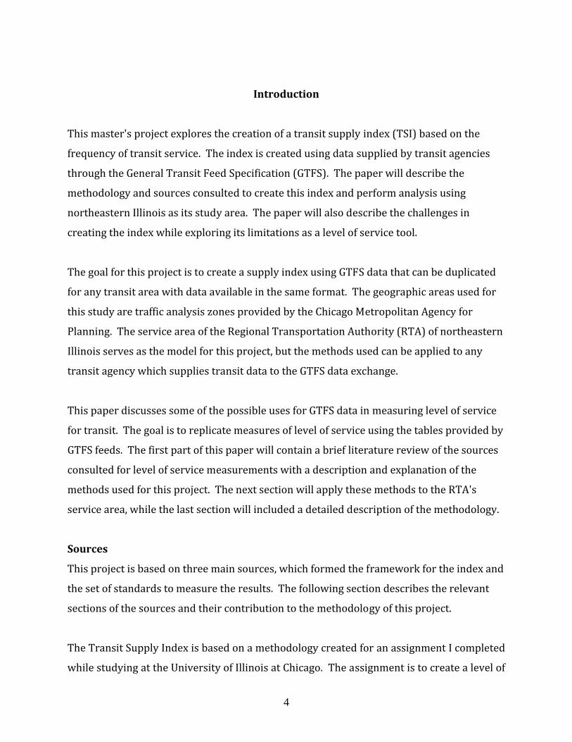
Figure 2: Service Frequency Level of Service Measurements (TRB, 2003)
The TCQSM contains suggestions on service coverage areas based on transit service type
and street design surrounding a transit stop. The literature suggests a quarter‐mile buffer
around bus stops and a half‐mile buffer around rail stations. These buffers are based on
willingness to travel studies that have found that these buffers tend to represent 75 to 80
percent of all pedestrians willing to walk to a transit stop. While this buffer is widely used
and accepted, the manual is aware of its limitations and has suggestions for creating buffers
that more accurately represent the catchment area for a transit stop. An aerial buffer
cannot take into account the impact of street design on the actual walking distances
required to access a transit stop. One alternative suggestion is to alter the size of the aerial
buffer based the level of street interconnectivity using the network connectivity index, as
easured by the ratio of intersections to street segments. m
General Transit Feed Specification (GTFS) The main source of data is the General
Transit Feed Specification (GTFS), which contains data tables with station location, routes,
trips along routes, and stop times for trips at transit stations. The GTFS tables are updated
to reflect current service. The data is presented as a series of text (txt) files, each table
containing a unique set of data, with one mutual column shared with another table,
allowing tables to be joined for analysis. The data tables can be used to analyze service
oth spatially and non‐spatially. b
Methodology
6
The TSI is created to best approximate the measures and methodology described by the
sources, but some modifications and interpretations were made to accommodate for a
. multi‐modal measure and the utilization of GTFS data to calculate station level frequency
For smaller transit agencies, route frequency can be manually counted and transit stops
manually placed into a Geographic Information Systems (GIS) shapefile, but for large
transit agencies there are too many routes, trips and transit stops. To enable automatic
frequency the GTFS data tables are utilized to measure station frequencies and spatial data
o project transit stops in GIS. t
GTFS data are an open source resource with data provided by the transit service boards for
use in such applications as Google Transit. This data is updated on a regular basis and
provides accurate station data that can be projected for GIS‐based analysis. GTFS data is
available from the transit agencies website individually or through the GTFS data
exchange.1 For this project the data was downloaded from the agency website’s
development pages. The data is in the form of a series of text files (txt), each with a
different set of data points. For this analysis, the text files were imported to a Microsoft
Access database, where the data can be sorted, filtered, and joined to created dbf files for
se in ArcGIS. u
Basic Framework The TSI is constructed using Microsoft Access and ArcGIS. The
geographic regions are traffic analysis zones (TAZ) provided by the Chicago Metropolitan
Agency for Planning (CMAP). Creating the TSI is a three‐step process. The first step
involves using Microsoft access to sort and join text files for use in ArcGIS. Next, data is
projected in ArcGIS and a coverage zone based on station buffers and frequencies is
created. The coverage area is joined to a geographic zone and a score based on percentage
of coverage and frequency is created. The process is repeated for each route in each zone,
1http://pacebus.com/sub/about/data_services.asp, http://metrarail.com/metra/en/home/about_metra/obtaining_records_from_metra.html, http://data.cityofchicago.org/Transportation/CTA‐Views/gzmt‐5k8a
7
and all routes within the same zones have their scores summed to create a total TSI score
or all routes with service for that zone. f
GTFS data are a series of text tables with a different series of data contained in each table.
The tables can be joined based on matching columns allowing the data to be manipulated
using a database management program such as Microsoft Access. In Access, the txt tables
are joined and queried to create a single database file (dbf). The GTFS contains data for
each transit trip occurring at every stop over a period of a week by stop, route, direction,
day of the week and time of day. Using the query tool, Access filters and joins all records.
The data is filtered to contain records for a particular day saving only records relevant for
the day of the week, time period and direction. The remaining records are exported as a
bf for analysis using ArcGIS. d
ArcGIS is used to project station locations to create a service buffer based on route and
frequency for each transit stop. The dbf contains a record for each stop occurring along a
route at a particular station. Using a statistical summary tool in GIS, all records for
matching routes and transit stops are summarized creating a frequency count by route for
each transit stop. These records are then projected using the latitude and longitude data
from the GTFS tables. After the data is projected, a buffer is placed around each transit stop
ased on route and frequency. b
8
This establishes a service coverage area which can be applied to a geographic zone based
on frequency and percentage of coverage within that zone. The service coverage layer and
the geographic zone are joined using a union tool, and a new record is created for each
portion a route's coverage that occurs within each individual geographic zone. The area of
the coverage area within the zone is divided by the area of the zone, to create a weight field.
The frequency of service for the route is multiplied by the weight field, to create a weighted
frequency score for the portion of the route within each individual zone. The weighted
frequency scores for each route in a zone are totaled to create the TSI for each zone. This
figure represents the average frequency of transit service available for each geographic
zone.

Figure 3: Sample Calculation of the TSI
Route Buses Service Buffer Area Total Zone Area Percentage of Coverage TSI Headway (minutes)1 24 0.5 1 50% 12 202 12 1 1 100% 123 48 0.5 1 50% 24 10
Total 84 2 1 200% 48 5
Example Score for Time Period Between 6-10 amCoverage ScoreFrequency
20
Issues, Modifications, and Versions While the general framework for the TSI is designed
to be as straightforward and simple as possible a number of issues arise when translating
the guidelines of the Transit Capacity and Quality of Service Manual guidelines to a regional
scoring system. Three main questions emerged to adapt the TCQSM standards to a regional
model, scored by geographic zone. These questions involve the correct size for service
buffers, how to score areas with overlapping buffers, and how to measure transit vehicle
requencies. f
Service Buffers The goal for service coverage measures is to create a service buffer for the
areas surrounding a station that best represents an area that matches the actual area of
usage for transit users. However, a regional model also demands a level of simplification in
order to limit the number of calculations required to measure large areas. For the models
presented in this analysis a quarter‐mile Euclidean buffer is placed around each bus stop
and a half‐mile Euclidean buffer is placed around rail stations. These buffers are based on
studies that have concluded that 75 to 80 percent of bus users walk an average of a quarter
mile, or about 5 minutes, for bus stops. Rail passengers are willing to walk roughly twice
hat amount for an average of a half mile. (Transportation Research Board, 2003) t
For many reasons the Euclidean buffer does not serve as the most accurate measure for
service coverage. The physical layout of the space surrounding a transit station plays a
large role how far pedestrians are willing to walk and how much ground can be covered
within the time they are willing to walk. A GIS‐based network analyzer could simulate a
more accurate 5‐minute walking buffer based on actual street distance walked compared
9

to a Euclidean‐based distance estimate. While this level of accuracy would be ideal, it is not
practical for a transit region with a large number of stations, as each network simulation is
data intensive. Network analyst tools tend to be extensions and not available to all GIS
sers. u
The TCQSM recommends a less data‐intensive approximation using data on the number of
street segments and intersections. The more connected the street pattern the higher the
proportion of street segments to intersections, the greater the interconnectivity of the
pattern. Based on this ratio, TCQSM suggests maintaining the quarter‐mile buffer for grid
patterns, while reducing the buffer to less than one‐eighth of a mile for cul‐de‐sac streets.
The city of Chicago, for example, has a predominately grid‐based layout while many of the
suburbs feature cul‐de‐sacs. The adjustments suggested in the TCQSM would not change
the coverage for Chicago, but would significantly reduce the coverage areas for many
uburban transit stops. s
As shown in the Figures 2, the TCQSM recommends no change for streets with grid
patterns, while shrinking the buffer more than one half its radius. Figure 3 shows the ratio
hresholds for altering buffers based on intersections to street segments. t
Figure 4: Street Connectivity Factor (Transportation Research Board, 2003)
Figure 5: Network Connectivity Index (Transportation Research Board, 2003)
10

Overlapping Buffers The Transit Capacity and Quality of Service Manual recommends
both buffer sizes for coverage by area and frequency, but does not combine the two. One
issue that arises is overlapping service buffers. Transit stops, buses in particular, are often
located in close proximity to each other, and a quarter‐mile buffer around each station
along a route will lead to overlaps. When the overlapping service buffers are joined to the
underlying geographic zone, the route frequency for that area will be counted for both
stops, leading to double counting and overestimation of service.
These overlaps occur largely along CTA bus routes, Pace bus routes, and along loop area
CTA rail stations. Accommodating for buffers requires consideration for service from the
user's perspective. Along many CTA bus routes a stop exists on nearly each block corner. A
user may fall into the buffer zone for more than one bus stop. If this bus stop is along the
same route, and has the same number of stops, the overlap zone would count the access to
four trips for each stop under each buffer for a total score of eight trips. But this would not
truly be the case. The user could not get on the same bus twice at two different stops.
However, if a user had access to buses from different routes, those should be counted
umulatively since this does offer the passenger a unique opportunity. c
To eliminate double counting, all buffers are based on route and frequency. All areas that
are under a service area with the same route and frequency are merged into one
continuous buffer rather than a series of overlapping buffers. While this is effective if
routes have identical frequencies, many routes have variations in station frequencies along
routes. Buses often short cut routes to allow for higher frequency in higher demand areas,
rail has trunk and branch lines, and many transit routes have areas where vehicles run
xpress. e
This creates a different overlap problem. In this scenario a user along the same route has
access to six trips at one transit stop, and access to eight trips at another stop along the
same route. The overlapping buffers allot a total of fourteen rides to the user. For this
model I assigned the higher of the two frequencies to the area under the shared buffer
11

zone. The model assumes a passenger has the choice to use the stop with higher frequency
and assigns that value to the overlap portions, eliminating the other record.
Analysis by TSI
Figure 6: Transit Service for the RTA Service Area during Morning Peak
12
The TSI can be used in a variety of ways to measure frequency based on time of day, day of
the week, and direction and can be joined to any underlying series of geographic zones. As
an example, the six‐county area of northeastern Illinois representing the service area of the
Regional Transportation Authority (RTA) serves as the test area for the TSI. The version of
the TSI prepared for the analysis is frequency of all transit vehicle trips occurring during
the am peak between 6‐10 am. The data is analyzed at the level of the traffic analysis zone
(TAZ) as provided by the Chicago Metropolitan Agency for Planning (CMAP). The analysis
looks at the total number of TAZ within each county and the grades assigned to each TAZ
ithin the county. w
Comparison by County The accompanying map and tables describe the availability of
transit for residents of northeastern Illinois. The score allocated to each TAZ represents
the average wait time between transit vehicles travelling in the direction of peak flow for
the morning peak period of travel (6‐10 am). Based on the thresholds for availability from
the Transit Capacity and Quality of Service Manual, transit is more attractive to passengers
as the wait time between vehicles decrease. The highest grade “A” represents headways
less than 10 minutes. At this level of service, the passenger is comfortable arriving at a
transit stop without consulting a schedule. At the lower end of service, grade “F” service
has headways greater than one hour and service is considered attractive to no one.
Looking at the two tables, it’s clear that Cook County has both the greatest number and the
greatest percentage of grade “A” service compared to the other counties, while Lake County
has the second highest level of service. Over 90 percent of both Will and McHenry counties
have a level of service “F”, meaning that the average wait times are greater than an hour
between transit trips.
13

Figure 7: Total Number of TAZ with Grades for Each County
Level of Service TotalCook DuPage Kane Lake McHenry Will
A 471 34 8 21 0 3 537B 53 9 2 11 2 4 81C 66 15 9 12 0 2 104D 60 22 14 15 6 5 122E 29 18 10 6 1 3 67F 173 126 102 110 95 171 777Total 852 224 145 175 104 188 1,688
Level of Service Based on Headways Total by CountyCounty
Figure 8: Total Number of TAZ with Grades for Each County
Level of Service TotalCook DuPage Kane Lake McHenry Will
A 55 15 6 12 0 2 32B 6 4 1 6 2 2C 8 7 6 7 0 1D 7 10 10 9 6 3E 3 8 7 3 1 2F 20 56 70 63 91 91 46
Level of Service Based on Headways Percentage by CountyCounty
5674
While this analysis can be useful on its own, the numbers would be more meaningful if
analyzed in conjunction with a demand index, or against minimum coverage thresholds.
The score would also have more meaning if connected to a measure of accessibility which
would more accurately rate the attractiveness of transit based on both frequency and
ccess. a
Conclusions
The strength of the TSI is its ability to be calculated from public sources in a matter that is
automated and allows for frequent updates, for both accurate up to date measurements of
service, or as a regular process of analysis that can be used to track historical trends in
level of service. It can be easily adapted to different geographic zones and the ability to
weight coverage based on percentage of a zone. This is useful for lower‐density areas with
14
larger zones where a centroid‐based coverage zone would lack accuracy. While the process
of creating the TSI for a large, multi‐modal transit region such as the Chicago metropolitan
region can be data intensive and convoluted, the process should be much simpler for
smaller transit regions, making this analysis more accessible to smaller transit agencies, or
ther interested parties, who may or may not be transit analysts. o
Because the TSI can be measured in average headways, it creates a metric that can be
understood by both transit experts and non‐experts, which allows the TSI to be a tool for
people outside of the transportation field. For example, retailers may want to consult the
TSI score for areas where they are considering opening a new store. An area with a higher
level of service may be more attractive than one with a lower level of service. Government
agencies may seek to build service centers in areas with high mid‐day frequency of transit,
as many seniors and other transit dependent populations would be use public
ransportation during the mid‐day off peak hours. t
Calculating the TSI at the census tract level can be a useful measure for parties interested in
transit equity issues. Comparing the TSI score of census tracts in a community could give a
sense of fairness in transit service. It could also be used by communities to set minimum
thresholds to ensure they are meeting their minimum standards for service.
The TSI should be calculated at the smallest level of geography that is allowed by the
dataset that will be matched to a TSI score. For example, if analysis is being conducted for
census tracts and the data is also available at the block level, create the TSI at the block
level, then aggregate to the level of the census tract. The TSI gives coverage in terms of
percentage of a zone and assumes an even distribution of population within the zone, when
most zones have uneven concentrations of population throughout the zone. By assessing
TSI at the block level first, the variances in population density will more accurately be
eflected. r
While the TSI is a useful tool that can be used to calculate quality of service based on
frequencies, it is not a complete tool, and further exploration could yield a more complete
15
TSI taking into account accessibility by route and station, and creating a full day score that
takes into account time of day, giving larger weight to trips during periods of high demand.
The TSI assumes that all transit trips are created equal, counting a trip on a commuter rail
trip the same as a bus trip, despite the wide difference in destinations reached and the time
required to reach them. While passengers value frequency of transit trips, there are other
issues that are important to passengers. A transit trip is only useful to a passenger if it can
take them to his or her destination. A measure for accessibility at the stop level would
easily integrate with the TSI to form an accessibility and availability index that would more
ccurately measure attractiveness to passengers. a
The TSI does not take into account the size of the transit vehicle, which can be an issue in
areas where demand can exceed supply. For an area where capacity is an issue, a train
running every ten minutes is a more attractive option than a bus. An alternative version of
the TSI is the Transit Capacity Index (TCI) which weights frequency by transit vehicle
capacity. While this index may be of use for planning agencies, it should not be used as a
replacement for the TSI, as it would imply greater frequency of transit trips for larger
apacity vehicles, and overstate their attractiveness. c
The morning and evening peak periods represent the time of day with the highest demand,
but other passengers rely of transit during other periods of day. An improved TSI would
look at transit supply to create a full day score. The score could be as simple as counting all
transit trips in all directions for a 24‐hour period, or could utilize a scoring system based
on periods of time of day (early morning, morning peak, mid‐day, afternoon peak, evening,
night) weighted to peak periods more heavily than the non‐peak periods. late
WORKS CITED Transportation Research Board, Transit Capacity and Quality of Service Manual, Federal
Transit Administration, Washington D.C., 2003 awamura, Kazuya, “Level of Service Measure” University of Illinois at Chicago, Chicago IL,
2011 K
16
Top Related