


Languages
Pages
Legal


Effective Visual Design and Communication Practices for Research
Posters: Exemplars Based on the Theory and Practice of Multimedia
Learning and Rhetoric
Rhianna K. Pedwell1, James A. Hardy1, and Susan L. Rowland1,2*
1. The School of Chemistry and Molecular Biosciences, The University of Queensland, Australia
2. Institute for Teaching and Learning Innovation, The University of Queensland, Australia
*Corresponding author: [email protected]
Keywords: curriculum design development and implementation, teaching and learning
techniques methods and approaches, using multimedia in the classroom, communication,
rhetoric
Running Title: Effective Research Poster Design
1

Abstract
Evidence shows that science graduates often do not have the communication skills they need to
meet workplace standards and expectations. One common mode of science communication is
the poster. In a review of the literature we show that poster design is historically problematic,
and that the guidance provided to students as they create posters for assessment is frequently
inconsistent. To address this inconsistency we provide some guiding design principles for
posters that are grounded in communication theory and the fundamentals of rhetoric. We also
present three non-discipline-specific example posters with accompanying notes that explain
why the posters are examples of poor, average, and excellent poster design. The subject matter
for the posters is a fabricated set of experiments on a topic that could not actually be the
subject of research. Instructors may use these resources with their students, secure in the
knowledge that they do not and will never represent an answer set to an extant assessment
item.
Introduction
For a scientist, the ability to communicate science is crucial [1]. Recently a proliferation of
science communication training opportunities has appeared in the USA, the UK, and beyond [2-
4]. These opportunities are usually for professional science communicators, however
“communication” has now become well accepted as a desired component of tertiary science
education. Indeed, communication skills now feature as a core competency or key learning
outcome in tertiary science curriculum statements from the Australian and American science
2
communities [1, 5, 6]. Despite these statements, Australian Bachelor of Science (BSc) students
do not develop their communication skills to the appropriate level before going into the
workplace [7] and employers consistently state that they are seeking STEM graduates with
better communication skills [8]. There is evidence that communication skills are not being
taught “explicitly” in the Australian tertiary science curriculum and that, instead, educators rely
on “implicit” learning through doing [1, 7]. This tacit-knowledge approach to communication
teaching in science education may contribute to the poor communication outcomes for
graduates.
For those students who do become professional research scientists, whether in academia,
industry, or another field, skills in formal science communication are vital. This includes skills in
preparing technical documents, conference abstracts, journal papers, oral presentations, and
conference posters. In an undergraduate context, the poster is a key communication format
that allows students to practice skills related to the core learning outcome or core competency
of Communication.
In this paper we offer resources, including described exemplars and marking rubrics that can be
used to teach undergraduate science students about posters. To frame these resources we
provide a short history of the poster presentation and a short review of the use of posters in
undergraduate science education. We complement this with a discussion of communication
theory and rhetoric as they relate to posters and offer design principles that are situated in
these theories and the current literature on poster production.
3
The take-home for tertiary science educators is a resource, based on established communication
and rhetoric theory, which they can use to teach learners about posters as a form of science
communication.
The History of the Poster and its Design
Reports place the earliest poster sessions at scientific conferences in Europe and America during
the early 1970s [9-12]. It is unclear exactly how the research poster format developed, but it
may have evolved from in-person or visual displays of physiology experiments called
“Demonstrations” [13]. Certainly, once it appeared at conferences, the informal, flexible poster
format quickly gained popularity [11, 14]; conference delegates at the International Congress of
Biochemistry in 1973 voted it “a great success”, while attendees at the 1974
Biochemistry/Biophysics Meeting emphasised “the establishment of a real one-to-one
communication with truly interested colleagues” [9]. As the poster became a popular medium
for communicating research, however, reports of ineffective and inconsistent poster design
began to appear in the literature [13, 14]. Thirty years ago, when the poster first emerged as a
communication medium, researchers were constrained by the available technology (which
included hand-drawn material, photographs, and rub-on letter sets) and not all poster authors
used the medium successfully. Saffran [13], for example, reported text-heavy posters and poorly
designed graphics at conferences but he speculated that developing technology would have a
positive impact on poster design. As any attendee at a conference knows, however, technology
does not always produce communication improvements, and in 2005 Fagan and Burgess [15]
4

reported on astrophysics conference posters where the majority of authors dedicated 50% or
more of the space to text.
Why do posters continue to exhibit poor formatting and style? Posters, unlike peer-reviewed
journal articles, do not go through a rigorous review process [15, 16], there are discipline-
specific formatting requirements [15], and in some case a poster presenter may not get quality
production advice from a mentor [14]. Poster presenters are frequently more junior scientists,
and they may feel that including more content on a poster establishes their credibility [16].
Doumont has observed that junior scientists can be caught up in poor communication practices
at conferences, saying “these young people logically regard current practice as the norm and
consequently strive to emulate it in their attempt to fit in.” (p. 10) [17]. We suggest that the
poster assessment items given to undergraduates shape young scientists’ views of “the norm” in
science communication. We also suggest that strong, consistent guidance and the use of
appropriate exemplar posters can help students understand how to present a better poster.
Posters as Assessment in Undergraduate Science Courses
In order to understand how posters are used in undergraduate science education question we
reviewed the literature in the area. We found several published examples of posters-as-
assessment from chemistry classrooms [12, 18-26], with only a handful of other disciplines
represented. These include biochemistry [27, 28], biological disciplines [29-34], and others [10,
35-37]. The earliest published example we found is from the mid-1980s [26], coinciding with the
rise in popularity of the poster session in professional settings as described above.
5

For most of these studies the authors provided students with guidance around how to produce
their poster. In many cases the authors did not publish the details of how they guided the
students – instead they stated that they instructed students on how to make a poster and told
them “what to include”. Some authors described more explicit guidance on the written and
visual aspects of posters [12, 18, 24, 28, 34]. Authors also commonly mentioned providing
examples [19, 24, 28, 29, 33, 36], giving instruction on using technology to make a poster [12,
23], and providing students with the marking criteria [10, 20, 30, 32]. It was rare to find an
example where no explicit instruction was reported [26, 37].
This review indicates that posters have been used as assessment tasks for almost as long as
posters have been used in professional settings. It also shows that there are variations in the
amount and type of scaffolding given to students. Interestingly, this inconsistency mirrors the
production of posters for the professional conference setting, as we have already seen.
There are many extant resources available to guide poster design (see references in Table 1),
and we used these when designing the exemplars presented in this paper. We did, however
observe some contradictions in these resources, and as a rule, they draw heuristically on
practice to establish their case for authority. This provenance and experience is very valuable to
educators and scientists and we do not discount it in any way. It is, however, also the cause of
the contradictory nature of the advice, since every discipline has slightly different norms.
We feel it will be helpful to situate poster design more firmly in communication theory, which
has a single norm that should be generally and consistently applicable to educators and
students in science.
6

The Poster as a Communication Genre and Implications for Design
There are set conventions associated with genres that define how and what to communicate
[38]. The journal paper is an example of a science genre that has these set conventions but
posters are a far more flexible genre than a journal paper. Part of the looseness of the poster
format comes from its “hybrid” and “multimodal” genre status; it combines visual, spoken, and
written elements in a format that must communicate with equal effectiveness whether the
“spoken” element is present or not [16, 39, 40]. MacIntosh-Murray [16] identifies further duality
in the role - the poster must attract with artistic flair, yet present a comprehensive science
message. It must also do this on a single plane for an audience with mixed knowledge and
motivation [16, 41].
We propose a simple three-part framework for principles of best practice in poster design that
are based on the theories of rhetoric and the findings around multimedia learning. The
framework is inspired by Doumont’s three laws for professional communication [42], however
our principles are more specific to the poster genre, and each focuses on one communication
mode – written, visual, spoken – and the interaction that exists between them [15]. We discuss
the key concepts from the theories of multimedia learning and of rhetoric, then list the
principles.
Multimedia learning as an overarching design principle
A poster is a multimedia communication mode, because it incorporates and “integrates”, the
images and words of a multimedia presentation [43-45]. The “multimedia principle” states that
7

words along with pictures make for more effective communication than words alone [43, 44].
Posters are meant to be primarily visual, but words – both spoken and written – are still
important for conveying the message. To ensure these elements combine in the most effective
way, four useful concepts from multimedia learning should be honoured – these are coherence,
signalling, redundancy, and contiguity. It is important to note that each of these design
principles is supported by experimental evidence that addresses the learning outcomes of
audiences when these principles are and are not applied [43, 45].
(i) Coherence: The concept of “coherence” stipulates that “excess” information should be
eliminated in a multimedia presentation. This concept is also encapsulated in Doumont’s
second law for professional communication; “maximise the signal-to-noise-ratio”, where
“noise” is “anything that could distract the audience” [42] (p .293). Mayer states, however,
that if “extraneous” information cannot be removed, it is important to guide the audience
by organising the information, a method known as “signalling” [43].
(ii) Signalling: Signalling helps to direct an audience’s attention. On slides, signalling can be
achieved through the “assertion-evidence” format [44], where the title of the slide
describes the main idea and the body is dedicated to evidence. This approach, as well as
other signalling devices like arrows, colours, and font sizes, can also be used on panels of a
poster.
(iii) Redundancy: The “redundancy” principle, is specific to a multimedia presentation, like a
video, and the use of narration and text [43, 46]. This principle states that it is beneficial to
include the same information in multiple “complementary” formats [44, 47]. This is a more
sophisticated technique than simple repetition, which is undesirable. Instead, is means that
8

one should include the same information in multiple ways to reach as much of the audience
as possible.
(iv) Contiguity: The contiguity principle applies spatially and temporally. In poster design the
contiguity principle stipulates that (i) relevant text should be close to the graphics of
interest and (ii) relevant ideas should be explained sequentially, rather than at separate
times.
Rhetoric as an overarching design principle
The second body of theory that we draw from to support our principles for poster design is
rhetoric. First established as a formal theory by Aristotle in the 4th century BC, the fundamentals
of rhetorical persuasion are still in practice today. Aristotle’s rhetorical triangle (Figure 1) forms
an ideal underlying framework for poster design and delivery, as it focuses on (i) the interaction
between the communicator, the audience, and the content and (ii) the three “appeals” of ethos,
pathos, and logos [48].
(i) Ethos: First, let us consider the poster presenter, who is the “communicator”. They must
demonstrate their ethos to an audience, where ethos is conceptualised as “authority” [49],
qualification and credibility. In posters, ethos can be established in many ways, such as
those that Gross [49] identifies in formal science writing; referencing past achievements,
citing affiliations with research bodies, and referring to the work of others to contextualise
one’s own work. All can be incorporated into a poster, but a student, or any researcher,
should take care not to fall into the trap of presenting all their work [16] in an attempt to
create ethos. Roskelly [48] also describes how the communicator can adopt a “character”,
9

or a certain way of presenting themselves to the audience. A well-designed poster and a
professional-looking presenter can both contribute to establishing ethos – these are more
likely to attract undivided attention and project authority than one or both that appear less
prepared or less organised.
(ii) Pathos: A fundamental approach in effective communication is to consider one’s audience.
Woolsey [41] suggests there are three types of people in an audience for a conference
poster session: those who know the presenter and their work personally, those who do
research in the same field as the presenter (the “target” audience), and those with research
interests that lie elsewhere. In a poster presentation, one of the major aims of the
presenter is to capture the attention of the audience. A presenter can use pathos to achieve
this, although the deliberate use of emotion in a formal science communication seems
contrary to the nature of the discipline. Gross [49] argues that removal of emotion in formal
communication is actually a method for highlighting audience-desired reason and
objectivity. Certainly such objectivity will be evident in the interpretation of the results on
the poster, however the delivery of the content, and the content itself, can use emotion as
a tool for securing attention.
(iii) Logos: Finally, there is the content or the “subject” to consider, and how it can be enhanced
with logos. Considering the subject means thinking about what content to include and what
evidence to use in making an argument about a core message or finding. This aligns to the
principle of “coherence” discussed earlier. Logic is inherent in science, but when it comes to
rhetoric and communication, this refers not just to the logic of the scientific method, but
also to ensuring the content is presented in a structured way that the audience can make
10

sense of, and understand; this relates back to the “signalling” principle we described
previously.
A Three-Part Model for Poster Presentations
We have selected aspects from the aforementioned work of professional communicators,
multimedia learning theory, and rhetoric to create a framework for poster design and delivery.
This framework echoes Doumont’s first law for professional communication – “adapt to your
audience” [42]. For posters we can re-phrase this as adapt your design and delivery for audience
comprehension.
The principles we propose for best practice poster design are:
(i) Concentrate the depth and volume of content on one message
(ii) Streamline visuals and design for clarity
(iii) Plan for interaction between all elements
(i) Concentrate the depth and volume of content on one message: Effective posters include
only the amount of content that explains and explores the key message. The written
content is therefore concise, but the scope of the poster is also constrained to one focus.
The key message may be explored from more than one angle, and more than one data set
may support the conclusions. The core concepts from the theory described above are
coherence, redundancy, pathos, and logos.
(ii) Streamline visuals and design for clarity: The second principle focuses on visual
communication and the design of the poster, rather than the content. We align this
11

principle to the “audience” elements of the rhetorical triangle. Effective posters take
advantage of the visual format; they are engaging and attract an audience. They are also
easy to read, and messages in the graphics included are unambiguous. We recommend
reviewing the “aesthetics” section of Tables 1 –3 for some direction on how to achieve
visual clarity. The core concepts from the theory described above are coherence, signalling,
contiguity, and logos.
(iii) Plan for interaction between all elements: Our last principle encapsulates the interaction
between the spoken, written, and visual elements of a poster presentation. This interaction
is one “essential characteristic of posters” [15] (p. 40). A poster designer should consider
how to communicate their message when they are and are not standing with the poster.
This principle asks designers to consider the poster as a whole, and take care in designing a
poster where each type of communication mode works in synergy with the others.
Applicable theoretical concepts include signalling, redundancy, contiguity, pathos, and
ethos.
Poster Resource Design
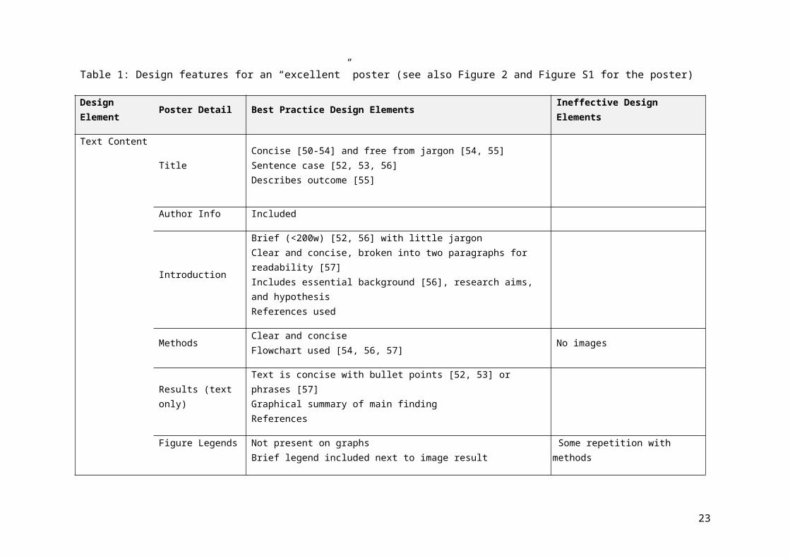
To develop the three exemplar posters (Figure 2, Figure 3, and Supplementary material) we
used the principles laid out above and also accessed both published and unpublished resources
on poster design and presentation. To create the high-quality poster we used the principles of
design described above. To create the less effective posters we variously drew on the resources
cited in Table 1 and (i) deliberately followed “bad” advice, (ii) did the opposite of the “good”
advice, and (iii) discarded the framework described above. Much of the detailed formatting
12

advice from the earlier resources (~1980-1990s) was out-dated, due to rapid changes in
technology. The information on the website resources, in general, was still current.
When planning these exemplar posters we had initially thought to use pre-existing science
posters as the focus of critique. We reconsidered, however, after evaluating the risks around (i)
causing personal offence, and (ii) alienating some students and educators by using discipline-
specific material. Our solution was to create our own posters with an invented storyline and
data.
The “experiments” reported in these resources relate to the use of dog flatulence to kill mutant
zombie sheep. The contemporary theme of the zombies and the light-hearted humour woven
throughout the mock scientific study is designed to appeal to and engage students. This takes
the focus from theory-heavy content in one discipline and shifts it onto best practices for poster
design. It also means that when students and educators consider the quality of the posters they
are not drawn to critiquing the experimental methods or the study itself.
Educators can use these posters as examples of poor, acceptable, and excellent practice without
the risk of revealing the answers to a current assessment item. Since the posters are built
around a fanciful and unique subject it will also be immediately obvious if students copy
material from these resources and submit it as their own for assessment.
The first (Figure 2 and Figure S1) is an example of an ideal poster, one that follows almost every
best-practice design principle or advice. The second example (Figure 3 and Figure S2) is
passable, but it has several flaws that can be considered typical of professionally made science
posters. The final poster (Figure 4 and Figure S3) is the example of what can go wrong when
13

every design principle is ignored. It is exaggerated, and it is unlikely such a poster exists. The
different ineffective design elements have, however, been observed in actual posters. We have
included all three posters as supplementary material so that educators can download the files
for their own use.
We elaborate on the design elements of each poster in Tables 1–3. The list of elements has been
categorized into what we see as the three broad considerations in poster design: text content,
graphics content, and aesthetics. The “best practice” or “ineffective” design elements for each
poster are detailed and the publications that address these elements are referenced.
Using the Resources
Educators are able to use the three posters and the accompanying Tables 1–3 as teaching tools
to exemplify best practices for poster design, and to show where common design errors can add
up to an ineffective poster. The posters are deliberately non-discipline specific and use a
contemporary theme, so they are appealing and engaging for students of any field. We envision
educators using the resources to prompt discussion around poster design, in the context of the
poster as assessment. Tables 1–3 give a detailed breakdown of what has and has not been
designed well for each poster. Educators may find use in these as marking criteria for students,
or as marking rubrics. The three principles for poster design are better suited for use as guiding
points by students or by experienced researchers. We realise, however, that not everyone will
agree with these principles, or the other design practices we have used. We welcome feedback
14
from the community, particularly from those with expertise and experience in communication,
visual design, and education.
Acknowledgements
We thank Kay Colthorpe and Louise Kuchel for helpful conversations. The University of
Queensland Technology Enhanced Learning Grants Scheme provided financial support for this
project. The authors do not have any conflicts of interest to declare.
15

Table 1: Design features for an “excellent” poster (see also Figure 2 and Figure S1 for the poster)
Design Element Poster Detail Best Practice Design Elements Ineffective Design Elements
Text Content
TitleConcise [50-54] and free from jargon [54, 55]Sentence case [52, 53, 56]Describes outcome [55]
Author Info Included
Introduction
Brief (<200w) [52, 56] with little jargonClear and concise, broken into two paragraphs for readability [57]Includes essential background [56], research aims, and hypothesisReferences used
MethodsClear and conciseFlowchart used [54, 56, 57]
No images
Results (text only)Text is concise with bullet points [52, 53] or phrases [57]Graphical summary of main findingReferences
Figure LegendsNot present on graphsBrief legend included next to image result
Some repetition with methods
Table Legends Brief
ConclusionBrief (<150w)Restates major finding [56]Describes limitations of current work and suggests future directions
References Includes essential references [51]
16

Acknowledgements Included/brief [56]
HeadingsDescribe content of following section [55] (quasi A/E)[54]In a different colour and all-caps, numbered [50, 51, 55]
Graphic Content
DiagramsUsed to graphically present methodsUsed to summarise major finding
Table Methods - Clear (little content, formatting)
Graphs
Large [50, 57]Chart junk/extraneous detail removed [46, 55]No key (graph 1) – data points labelled [55] on one cluster [55, 56]Axis labels same as body text (size) [55]Title describes what graph depicts [54, 56] (quasi A/E)No legends [55]No background colour so lines and columns stand out from page [55, 57]
Graph 2 includes key
Images/logosLogo small and at bottom [56]Images in banner relate to contentResults images large and of high quality [54], labelling clear
AestheticsFont Type
One sans serif and one serif font used consistently on all elements [51, 52]Sans serif font used for headings and serif for text [51, 55, 57]Body text left-justified [55, 57]
Font SizeMinimum 24 pt used [50, 52, 55, 57]Font size “hierarchy” consistent for body, headings, labels etc. [51-54]Title in large font, headings larger than body text
Colour Scheme Cool tones [57] that relate to content [51, 52]
Poster background White; all elements clear and stand out [52, 54-56]
17

Layout (flow)
All elements alignedAmple white space and margins usedPoster flow clear from headings [55] and column layout [51, 52, 54, 55, 57]Use of “arena” [56] or “golden rectangle” [57]Results are the largest section [56]
Overall AssessmentMainly visual with clear graphics and good flow; little text used [55]“high signal to noise ratio” [42]
18
Table 2: Design features for an “average” poster (See also Figure 3 and Figure S2 for the poster)
Design Element
Poster Detail Best Practice Design Elements Ineffective Design Elements
Text Content
Title Concise and free from jargonTitle caseDescribes aim and not outcomes
Author Info Included
Introduction
Too long (>350w) and not clear or concise with some jargonToo much background/detail on aim/methodsBlock of textFormatting errors (Latin names)
Methods ReferencesToo detailedNo images OR flowchartFormatting errors (Latin names)
Results (text only) References are included elsewhere and not linked to text Too much detail/whole sentences and paragraphs
Figure Legends Brief legend included under graphs/with image Some repetition with methods
Table Legends Brief
Conclusion
Brief (<150w)Restates major findingDescribes limitations of current work and suggests future directions
References Includes essential references
19

Acknowledgements
Included/brief
HeadingsFollow IMRADIn a different colour and all-caps
Graphic Content
Diagrams None
Table Methods - Clear (little content, formatting)
Graphs
LargeChart junk/extraneous detail removedAxis labels same as body text (size)Lines/columns stand out from page
Both graphs use keyData labels potentially unclear without other textIncludes detailed legendWhite background awkward against poster background
Images/logos Results images large and of high quality, labelling clearLogo large, in bannerImages in banner small/look out of place
Aesthetics
Font TypeOne sans serif and one serif font used consistently on all elementsSans serif font used for headings, serif for text
Body text justified
Font Size Title in large font, headings larger than body text
Colour Scheme Cool tones that relate to content
Poster background Blue (which is ok) A paler colour would help the text stand out more
Layout (flow)All elements alignedHeadingsUse of “arena” or “golden rectangle”
Overall Assessment
Graphics used are clear but some “chart junk” usedVisual flow is clunky, looks cluttered and text-heavy
20

21

Table 3: Design features for a “horrible” poster (see also Figure 4 and Figure S3 for the poster)
Design Element
Poster Detail Ineffective Design Elements1
Text Content
TitleLengthy with some jargonSpelling errorsAll uppercase
Author Info Included in this case, but a truly ineffective poster would have incorrect or missing details
Introduction
Too long (>350w), not clear or concise with some jargonToo much background/detail on aim/methodsBlock of textFormatting errors (Latin names)
Methods
No referencesExcessive detail//no detailNo images OR flowchartFormatting errors (Latin names)
Results (text only)Excessive detailWhole paragraphs/sentences
Figure LegendsBrief (image) with detail inadequate to understand resultToo much detail with graph//describes Excel axes
Table Legends InadequateConclusion Long (~250w) and too detailed - restates all results and describes limitations and future directions too thoroughlyReferences NoneAcknowledgements NoneHeadings Follow IMRAD
Graphic Content
Diagrams None
TableOffice defaults usedToo largeToo detailed/presentation of results
Graphs Chart junk/extraneous detail included with 3-D image [55] and key usedColour scheme terrible
22
Axes unlabelledFont used too smallLengthy figure legend (see above)
Images/logosNoneResults images too small and of low quality
Aesthetics
Font Type
Two types of sans serif font used for headings and body text but serif font used for results table (5 inconsistent fonts)“Designer” font used for titleBody text justified/justification inconsistent
Font SizeSize hierarchy not consistentTitle in larger font and headings not obviously larger than body of text
Colour Scheme There is no obvious scheme
Poster backgroundBrown, dark, makes everything hard to readBackground to text boxes and elements looks awkward against background
Layout (flow)
Elements not alignedLittle white space/no marginReading flow changes from left-right to top-bottom (unintuitive)Sections are not arranged in logical flow (conclusions before some results)Methods is the largest section
Overall Assessment Ineffective graphics and presentation, cluttered and text-heavy, no visual flow or layout1. This poster was deliberately designed to combine all the different types of ineffective design – its only redeeming feature is that the graph included is large.
23

References
1. Colthorpe, K., Rowland, S. and Leach, J. (2013) Good practice guide (Science): Threshold learning outcome 4: Communication. Office for Learning and Teaching, Sydney, Australia.
2. GradSciComm Resources: http://compassblogs.org/gradscicomm-list/ (accessed June 2016).
3. Postgraduate qualifications in science communication: http://sciencecentres.org.uk/resources/postgrad_courses.html (accessed Jun 2016).
4. Science communication in the United Kingdom: https://en.wikiversity.org/wiki/Science_communication_in_the_United_Kingdom (accessed June 2016).
5. Jones, S., Yates, B. and Kelder, J.-A. (2011) Learning and teaching academic standards statement September 2011. Australian Learning and Teaching Council, Canberra, Australia.
6. AAAS (2009) Vision and change in undergraduate biology education: a call to action, American Association for the Advancement of Science, Washington, D. C..
7. Mercer-Mapstone, L. and Kuchel, L. (2015) Teaching scientists to communicate: evidence-based assessment for undergraduate science education. Int. J. Sci Educ. 37, 1613-1638.
8. Deloitte Access Economics (2014) Australia's STEM workforce: a survey of employers, Office of the Chief Scientist, Canberra, Australia.
9. Editorial (1975) Poster Sessions. Biochem. Educ., 3, 35.10. Hess, G. R. and Brooks, E. N. (1998) The class poster conference as a teaching tool. J.
Nat. Res. Life Sci. Educ. 27, 155-158.11. Maugh, T. H. (1974) Poster sessions: a new look at scientific meetings. Science 184,
1361-1361.12. Widanski, B., Thompson, J. A., Foran-Mulcahy, K., Abafo, A. (2016) Providing students
with interdisciplinary support to improve their organic chemistry posters. J. Chem. Educ. 93, 93-97.
13. Saffran, M. (1987) The poster and other forms of scientific communication. Biochem. Educ. 15, 28-30.
14. Dubois, B. L. (1985) Poster sessions at biomedical meetings: design and presentation. ESP J. 4, 37-48.
15. Fagan, A. and S. Burgess, S. (2005) Genre conventions in astrophysics poster presentations. P. Commun. Astron., pp. 40-46.
16. MacIntosh-Murray, A. (2007) Poster presentations as a genre in knowledge communication: a case study of forms, norms, and values. Sci. Commun. 28, 347-376.
17. Doumont, J.-l. (2011) Communication skills for researchers: don't settle for status quo. OPN Optics Photon. News 22, 10-11.
18. Logan, J. L, Quinones, R. and Sunderland, D. P. (2014) Poster presentations: turning a lab of the week into a culminating experience. J. Chem. Educ. 92, 96-101.
19. Squier, C., Renaud, J. and Larsen, S. C. (2006) Integration of a communicating science module into an advanced chemistry laboratory course. J. Chem. Educ. 83, 1029.
24

20. Wimpfheimer, T. (2004) Peer-evaluated poster sessions: an alternative method to grading general chemistry laboratory work. J. Chem. Educ. 81, 1775.
21. Dunstan, M. and Bassinger, P. (1997) An innovative model: undergraduate poster sessions by health professional majors as a method for communicating chemistry in context. J. Chem. Educ. 74, 1067.
22. Menke, J. L. (2014) Implementation of online poster sessions in online and face-to-face classrooms as a unique assessment tool. J. Chem. Educ. 91, 414-416.
23. Meyer, G. M. (2003) Scientific communication for chemistry majors: a new course. J. Chem. Educ. 80, 1174.
24. Kerr, W., Murray, R., Moore, B. and Nonhebel, D. (2000) An integrated communication skills package for undergraduate chemists. J. Chem. Educ. 77, 191.
25. Huddle, P. A. (2000) A poster session in organic chemistry that markedly enhanced student learning. J. Chem. Educ. 77, 1154.
26. Kennedy, J. H. (1985) Poster presentations for evaluating laboratory coursework. J. Chem. Educ. 62, 1104.
27. Sisak, M. E. (1997) Poster sessions as a learning technique. J. Chem. Educ. 74, 1065.28. Fernandes, P., Rodrigues, S. P. and Lindsey, G. (2005) Critical analysis on the use of
poster display as an alternative evaluation method in basic biochemistry. Biochem. Mol. Biol. Educ. 33, 281-283.
29. Dorner, M. (2015) Position posters: an alternative take on science posters. Am. Biol. Teach. 77, 69-72.
30. H. L. Billington (1997) Poster presentations and peer assessment: novel forms of evaluation and assessment. J. Biol. Educ. 31, 218-220.
31. Mulnix, A. B. (2003) Investigations of protein structure and function using the scientific literature: an assignment for an undergraduate cell physiology course. Cell Biol. Educ. 2, 248-255.
32. Walton, K. L. and Baker, J. C. (2009) Group projects as a method of promoting student scientific communication and collaboration in a public health microbiology course. Bioscene: J. Coll. Biol. Teach. 35, 16-22.
33. Watson, F. L. and Lom, B. (2008) More than a picture: helping undergraduates learn to communicate through scientific images. CBE-Life Sci. Educ. 7, 27-35.
34. Mulnix, A. and Penhale, S. J. (1997) Modeling the activities of scientists: a literature review & poster presentation assignment. Am. Biol. Teach 482-487.
35. Quardokus, K., Lasher-Trapp, S., and Riggs, E. M. (2012) A successful introduction of authentic research early in an undergraduate atmospheric science program. B. Am. Met. Soc. 93, 1641-1649.
36. Deutch, C. E. (2011) Using class poster sessions to teach intermediary metabolism. Am. Biol. Teach. 73, 177-178.
37. Mills, P. A., Sweeney, W. V., DeMeo, S., Marino, R. and Clarkson, S. (2000) Using poster sessions as an alternative to written examinations - the poster exam. J. Chem. Educ. 77, 1158-1161.
38. Bullock, R. and Weinberg, F. (2009) The Norton field guide to writing: with handbook, vol. 2nd, W.W. Norton & Co, New York.
39. D’Angelo, L. (2010) Creating a framework for the analysis of academic posters. Language Studies Working Papers 2, 38-50.
25

40. D’Angelo, L. (2012) From posters to e-posters: the evolution of a genre. Language Studies Working Papers 4, 46-54.
41. Woolsey, J. D. (1989) Combating poster fatigue: how to use visual grammar and analysis to effect better visual communications. Trends Neurosci. 12, 325-332.
42. Doumont, J. –I. (2002) The three laws of professional communication. Professional Communication, IEEE Transactions on 45, 291-296.
43. Mayer, R. E. (2009) Multimedia learning, vol. 2nd, Cambridge University Press, Cambridge (UK)
44. Garner, J. and Alley, M. (2013) How the design of presentation slides affects audience comprehension: a case for the assertion–evidence approach. Int. J. Eng. Educ. 29, 1564-1579.
45. Principles for multimedia learning with Richard E. Mayer: http://hilt.harvard.edu/blog/principles-multimedia-learning-richard-e-mayer (accessed May 2016).
46. Mayer, R. E. (2005) The Cambridge handbook of multimedia learning, Cambridge University Press, Cambridge (UK)
47. Doumont, J. –L. (2009) Trees, maps, and theorems: effective communication for rational minds, Principiæ, Kraainem, Belgium.
48. Roskelly, H. (2008) What do students need to know about rhetoric? AP English Language and Composition, The College Board, Washington D.C. (USA)
49. Gross, A. G. (2006) Starring the text: the place of rhetoric in science studies, Southern Illinois University Press, Carbondale.
50. Erren, T. C. and Bourne, P. E. (2007) Ten simple rules for a good poster presentation. PLoS Comput. Biol. 3, e102.
51. Block, S. M. (1996) Do's and don'ts of poster presentation. Biophys. J. 71, 3527.52. The scientist's guide to poster design: http://www.kmeverson.org/academic-poster-
design.html (accessed June 2016)53. Seduction in the poster session: https://chroniclevitae.com/news/379-seduction-in-
the-poster-session (accessed June 2016) 54. Patience, P., Boffito, D. C. and Patience, G. S. (2015) Communicate science papers,
presentations, and posters effectively, Academic Press, Elsevier Science.55. Creating effective poster presentations: http://www.ncsu.edu/project/posters
(accessed March 2016)56. Designing conference posters: http://colinpurrington.com/tips/poster-design
(accessed March 2016)57. Matthews, D. L. (1990) The scientific poster: guidelines for effective visual
communication. Technical Communication, Third Quarter, NEFC NOAA 37, 225-232.
26
Top Related