


Languages
Pages
Legal

Interaction Design Basics
Overview
Design involves achieving goals within constraints tradeoffs and limitations
Design process has several stages and is iterative
Interaction starts with getting to know users and their context
Scenarios (rich design stories) System Navigation Iteration and prototyping
Introduction
HCI is focused on understanding and design - doing things and making things
Interaction design not just design of interactive system, but about
interaction itself how it affects the way people work
not just devices and programs, but manuals, tutorials, online help systems
What is design?
Design is achieving goals within constraints Goals
What is the purpose of the design? Who is it for? Why do they want it?
Constraints materials standards cost and time health and safety issues
Tradeoffs involve choosing which goals and constraints can be
relaxed so others can be met

Golden rule of design
understand your materials raw materials are the same, but designs
produced may be different for HCI
obvious materials are human and computer understand computers
limitations, capacities, tools, platforms understand people
psychological, social aspects, human error

Human error
Human error often taken to mean operator error error is inherent in design or installation of
human interface Bad interfaces
slow or error-prone to use cost money and lives
People do make mistakes – human nature Design to reduce mistakes or minimize
consequences
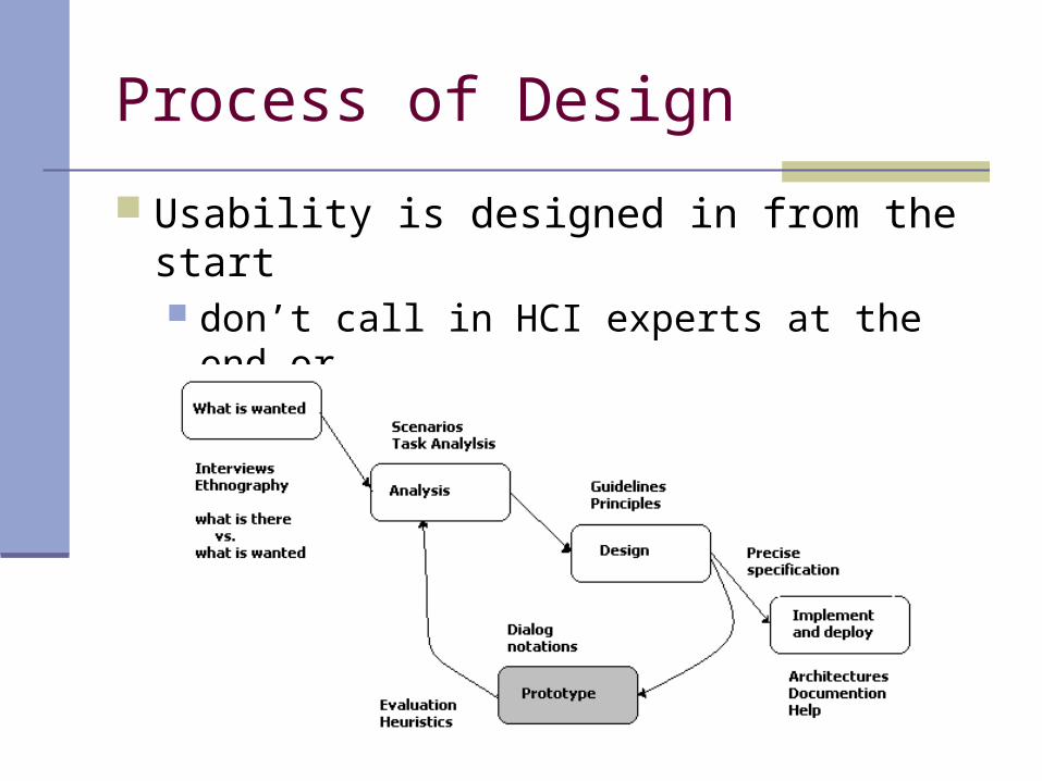
Process of Design
Usability is designed in from the start don’t call in HCI experts at the end or view usability as equivalent to testing
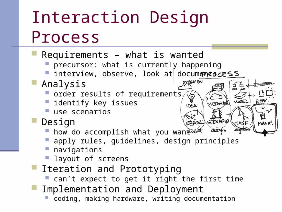
Interaction Design Process
Requirements – what is wanted precursor: what is currently happening interview, observe, look at documents
Analysis order results of requirements identify key issues use scenarios
Design how do accomplish what you want apply rules, guidelines, design principles navigations layout of screens
Iteration and Prototyping can’t expect to get it right the first time
Implementation and Deployment coding, making hardware, writing documentation

User Focus
Know thy user Rarely one user System may impact more than person
immediately using it Stakeholders – everyone affected directly or
indirectly by a system

Get to know user
Who are they? young or old? novice or experienced? harder if we are producing generic software think of several specific users
Know they are probably not like you most developers male but women have better empathetic skills
Talk to them interview, open-ended discussions bring them into design process (design
ownership)
Get to know user
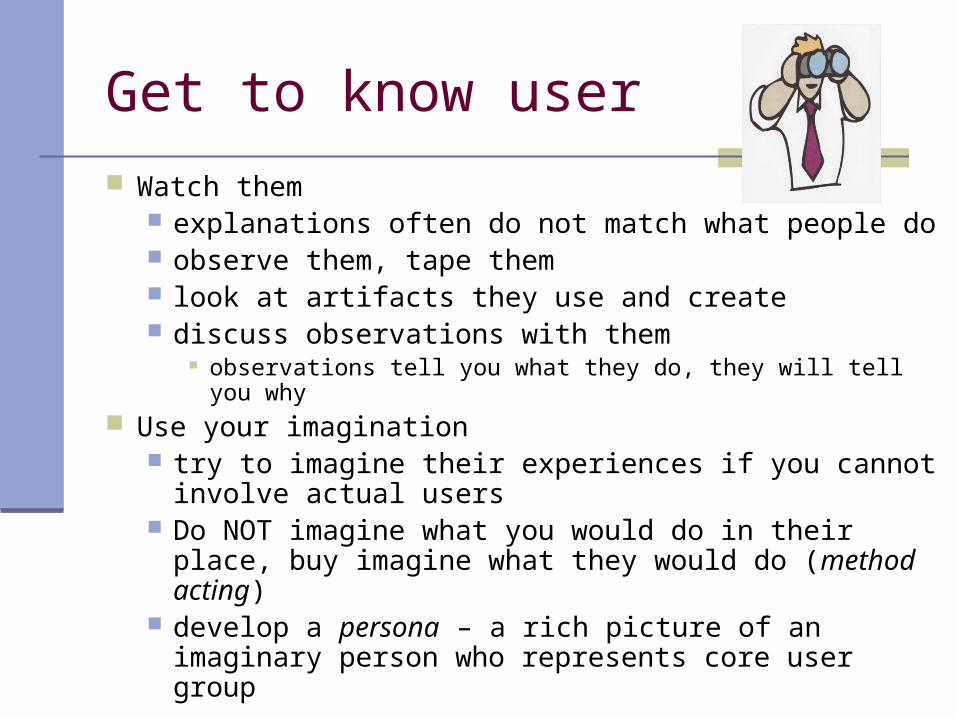
Watch them explanations often do not match what people do observe them, tape them look at artifacts they use and create discuss observations with them
observations tell you what they do, they will tell you why Use your imagination
try to imagine their experiences if you cannot involve actual users
Do NOT imagine what you would do in their place, buy imagine what they would do (method acting)
develop a persona – a rich picture of an imaginary person who represents core user group

Scenarios
Scenarios – design stories of interaction simplest design representation flexible and powerful detailed to make events seem real augmented with storyboards (sketches,
simulated screen shots, etc.)
Scenarios
Used to: communicate with others (designers, clients,
users) validate other models express dynamics (describe behavior)
Are linear Advantage: Time is linear Disadvantage: No alternative paths, so miss
unintended things a person may do
Design
Object of design is not just computer system or device, but socio-technical intervention as a whole, but for now focus on system:
Most tangible outputs of design Widgets Screens or windows Navigation within application environment
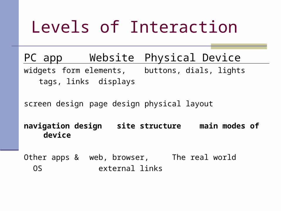
Levels of Interaction
PC app Website Physical Devicewidgets form elements, buttons, dials,
lights
tags, links displays
screen design page design physical layout
navigation designsite structure main modes of device
Other apps & web, browser, The real world
OS external links
Navigation Design
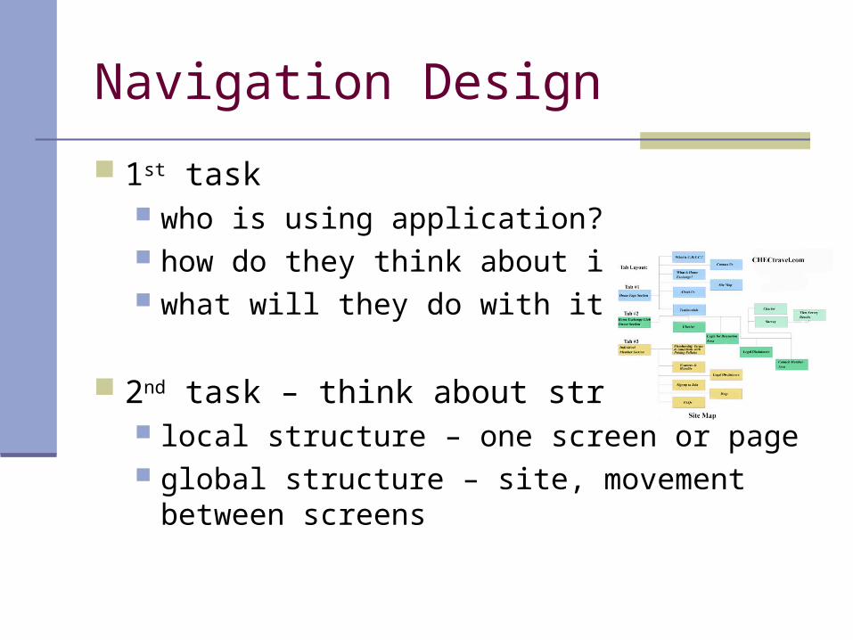
1st task who is using application? how do they think about it? what will they do with it?
2nd task – think about structure local structure – one screen or page global structure – site, movement between
screens

Local Structure
Much interaction is goal-seeking behavior users know what they are after users know a partial model of system ideal world users would take shortest path to
achieve goal, pressing right buttons and links in order
real world, users meander through system and make assessments at each point if they are getting closer to goal
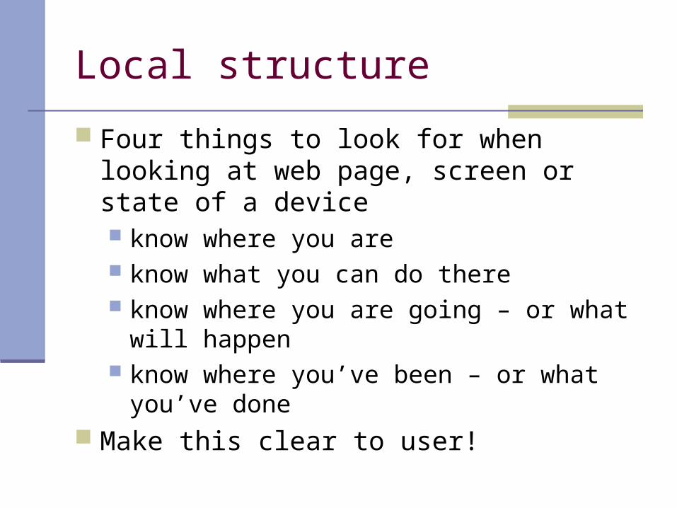
Local structure
Four things to look for when looking at web page, screen or state of a device know where you are know what you can do there know where you are going – or what will
happen know where you’ve been – or what you’ve done
Make this clear to user!

Local Structure
Make things clear to the user where you are
show bread crumbs, path of titles, progress bars, etc. what you can do
what can be pressed or clicked, gray out things that can’t be done or get rid of entirely
use standards for links where you are going or what will happen
tool tips for icons, ‘back’ mechanism to return in case you go somewhere you didn’t mean to
modes for different contexts should be clear what you’ve done or where you’ve been
confirmation feedback history, and back button

Global Structure
Way various screens, pages or device states link to one another
Create a hierarchical chart shows functional boundaries may be organized by roles, user type, etc. Deep hierarchies difficult to navigate, better to
have broad top-level categories 7+ 2 doesn’t apply for menus, it applies to
memory, not visual search menu breadth can be quite large if they are
organized
Global Structure - Dialog
Dialog – refers to pattern of interactions between user and a system
Should be flow of screens and commands that is not about hierarchy
Use a Network Diagram to show principal states or screens linked with arrows
show what leads to what show what happens when include branches and loops - take into account
different paths through system and loops that return to same screen
more task oriented than hierarchy

More Global
Each thing we design sits among other devices and applications
Implications style issues – conform to platform standards functional issues
example: PC app must interact with files, read standard formats, etc.
navigation issues – support linkages between apps
Screen Design and Layout
How to put the different elements that make up interactive applications together
Basic Principles at the screen level reflect other areas of interaction Ask – what is the user doing? Think – what information is required? what
order are things likely to be needed? Design - form follows function: let the required
interactions drive the layout

Tools for layout
Number of visual tools allow grouping and structure
indentation, group spatially, use line separators, boxes order within groups
date, alphabetic, natural order set up order of tab key moves between fields
decoration boxes, separating lines, font style, text or background
color can emphasize groupings alignment
text at the left, numbers at right or by decimal point multiple columns – ‘leaders’ or alternate colors of rows
white space – can create more complex structures, can create resting areas

User action and Control
Entering information forms-based interfaces and dialog boxes alignment still important labels just above or to the left and in smaller font
Knowing what to do some elements passive, some active buttons and menus need to be recognizable
Affordances things may suggest by their shape and other attributes
what you can do with them use when designing novel interaction elements depend on background and culture of user

Appropriate Appearance
Presenting information know the purpose for which it is being used
alphabetic, date – most recent? complex numerical data – consider scatter graphs,
histograms or 3D surfaces, outlines, etc. allow user to choose among representations
Aesthetics and utility pretty interface not necessarily a good interface beauty and utility may be at odds
example diversity of controls can help operator keep track of which controls refer to which subsystem
careful application of aesthetics often aid comprehensibility

Appropriate Appearance
Making a mess of color and 3D Color should not be relied upon to convey information,
but instead reinforce 3D pie chart useless
Localization/internationalization process of making software suitable for different
languages and cultures many toolkits have resources for doing this easily text left-to-right or top-to-bottom more difficult icons and images are meaningful in restricted cultural
context Example:
Iteration and Prototyping
First design will NOT be perfect Formative evaluation – intended to improve
design expert checks against guidelines (the knowing
where you are stuff) involves real users
Redesign, reevaluate, …

Prototyping
Iteration and prototyping universally accepted “best practice” approach for interaction design
pitfall – finds local maxima

Prototyping
Two things to improve prototyping methods understand what is wrong and how to improve it choose a good starting point
Good designers might guess a good initial design based on experience and judgment
Another approach – have several initial ideas and drop them one by one as they are developed further
Top Related