


Languages
Pages
Legal


Rochester Institute of Technology Rochester Institute of Technology
RIT Scholar Works RIT Scholar Works
Theses
8-2018
Heaven & Earth Heaven & Earth
Nelson Caliguia Jr. [email protected]
Follow this and additional works at: https://scholarworks.rit.edu/theses
Recommended Citation Recommended Citation Caliguia, Nelson Jr., "Heaven & Earth" (2018). Thesis. Rochester Institute of Technology. Accessed from
This Thesis is brought to you for free and open access by RIT Scholar Works. It has been accepted for inclusion in Theses by an authorized administrator of RIT Scholar Works. For more information, please contact [email protected].
Heaven & Earth
by Nelson Caliguia Jr.
SUBMITTED IN PARTIAL FULFILLMENT OF THE REQUIREMENTS FOR THE DEGREE OF
MASTER OF FINE ARTS IN FILM AND ANIMATION
THESIS
IMAGING ARTS/COMPUTER ANIMATION
COLLEGE OF ART AND DESIGN
SCHOOL OF FILM AND ANIMATION
ROCHESTER INSTITUTE OF TECHNOLOGY
ROCHESTER, NEW YORK
August 2018
________________________
Peter Murphey, Chair
Assistant Professor
School of Film and Animation
________________________
Brian Larson
Associate Professor
School of Film and Animation
________________________
Tom Gasek
Associate Professor
School of Film and Animation

TABLE OF CONTENTS
Abstract ............................................................................................................................ i
Acknowledgments ............................................................................................................ ii
Introduction ..................................................................................................................... 1
Preproduction .................................................................................................................. 2
Story Development....................................................................................................... 2
Storyboard and Animatic .............................................................................................. 4
Style Development ..................................................................................................... 11
Character Design ....................................................................................................... 13
Background Design .................................................................................................... 18
Production ..................................................................................................................... 22
Animation ................................................................................................................... 22
Compositing ............................................................................................................... 28
Audio and Music ........................................................................................................ 30
Reception and Evaluation ............................................................................................. 31
Critiques and Recognition .......................................................................................... 31
Reflection on Personal Learnings .............................................................................. 32
Strengths and Weaknesses of the Project ................................................................. 35
Conclusion .................................................................................................................... 36
Works Cited ................................................................................................................... 40
Appendix A: Original proposal ....................................................................................... 41
Appendix B: Pre-production Artworks............................................................................ 48
Appendix C: Production Stills ........................................................................................ 50

i
ABSTRACT
Heaven & Earth is a graduate animated thesis film with a runtime of four minutes
and 58 seconds. This animated short film is a playful take on the eternal struggle
between humans and the heavenly forces that dictate weather conditions. Heaven &
Earth combines elements from both Philippine folk art and classic American cartoons,
exploring a stylistic hybrid borne out of influences that I have genuine affinity for.
This animated short is in full color, and was produced using digital 2D animation.
It was entirely animated in TVPaint, while the backgrounds were drawn and painted in
Photoshop. For compositing and editing, I used Adobe Premiere and Adobe After
Effects. In terms of audio, it has no dialogue – it is mainly driven by music and sound
effects. For the sound design and musical score, fellow Filipino Arnel Barbarona was in
charge, infusing the music and sound with a distinct folksy style.
This paper outlines the whole process of making this animated short film, from
story, pre-production, production, post-production, reception and evaluation.

ii
ACKNOWLEDGMENTS
First off, I want to thank the Philippine-American Educational Foundation for selecting
me among the many applicants for the Fulbright scholarship, enabling me to partake in
this renowned program. This once-in-a-lifetime opportunity has opened a new world for
me and has helped me grow both as an artist and as a person. I want to specifically
thank Dr. Esmeralda Cunanan, the former executive director of PAEF, for her kindness
and guidance.
I also want to recognize the brethren at the Locale of Rochester for taking me
under their wing. As members of the Iglesia ni Cristo (Church of Christ), they have truly
made me feel at home in Rochester. They have offered their helping hand multiple times
when I was in the States and I cannot imagine myself finishing the MFA program without
them by my side.
I want to give appreciation to my thesis adviser, Peter Murphey, for his
unwavering patience and guidance for me. His kind and supportive approach to
mentoring has helped me push through with my thesis project despite my own doubts
and fears. In addition, I also want to thank my thesis committee members, Brian Larson
and Tom Gasek for their wisdom and helpful advice. I also want to recognize the entire
SOFA community for making me feel welcome and at home – thereby creating a
peaceful space for me to work freely on my projects.
Many thanks also go this list of people that helped me finish my program: Jeff
Cox from Rochester Institute of Technology's International Student Office, Kristen Van
Vleck of International Institute of Education, Bro. Dante Amisola of De La Salle – Lipa,

iii
Claus Von Peters and the Saguiafin family. I will always be thankful to these people.
I would like to thank my family here in the Philippines, especially my father, who
was willing to take a sizeable loan to help me finish my studies in the USA. I cannot
describe how grateful I am that he is always there to help me move closer towards my
dreams.

Caliguia
1
INTRODUCTION
In this day and age of cultural flux, it has become unrealistic to assume that we can
keep our cultural identity isolated and unchanged – and even if we could, it is
questionable that we should want to. As an animation artist, it has been my intention to
capture things that are uniquely Filipino in my work without having to discard the foreign
influences that helped me shape my artistic vision. Heaven & Earth has been the result
of my desire to strike a balance between these seemingly contradictory forces.
Growing up, I enjoyed local comics and picture books that delved into the world
of aswangs, duendes and tikbalangs – frightening and whimsical creatures that
populate Philippine lower mythology. As a teenager, I witnessed the meteoric rise of
Japanese animation in popular culture, discovering that a lot of beloved works from this
genre gained inspiration from national folklore. Among the Japanese animators, my
favorite is Hayao Miyazaki, an auteur who frequently uses nature as a theme in his
films. Collectively, these experiences and influences have molded my preference for
mythological themes and motifs.
Prior to my thesis film, I experienced a frustrating disappointment with a film I
made during an animation workshop. I believe this previous film fell short because I was
trying to be something that I am not: I was trying to be clever with my dialogue and
aiming for self-aware humor. I was also attempting to mimic American-style banter,
which ended up sounding tone-deaf instead. I became painfully aware that this was far
from being my strength. Additionally, the said project exposed my lack of solid animation
skills – particularly my insufficient understanding of timing and spacing. In hindsight, I'd

Caliguia
2
like to think this was a positive experience, because it inspired me to read more
books and study more intently in order to address my weaknesses.
Taking into consideration my leanings, one of the big adjustments I made was to
omit dialogue. I have always loved films with no dialogue like Crac! by Frederic Back,
Father and Daughter by Michael Dudok de Wit, and Anna and Bella by Borge Ring. The
film that I consider to be my most successful project is Mutya, which was also dialogue-
free. The absence of narration and dialogue is ideal for pure visual storytelling – the
kind of filmmaking that inspires me the most.
I've always had an affinity for a loose, modernist line style. I love the works of
cartoonists such as Ronald Searle, Quentin Blake and Sergio Aragones – artists who
have delighted people all over the world with their energetic and unique penmanship.
My fascination with their line style inspired me to infuse this aesthetic approach into my
animation design. Regarding the story, I wanted to continue pursuing my interest in
folktales, mythology, and nature. I also want the designs to reflect some influence from
folk arts from the Philippines, particularly textile patterns. All in all, I wanted my thesis
film to have a sense of cultural identity but, at the same time, be simple and relatable
enough that it could become universal.
PRE-PRODUCTION
Story Development
The initial idea for my thesis was actually a carryover concept from my 30-
Second Film class. It began as a simple idea involving a pair of young cloud gods that
Caliguia
3
are having a contest of some sort. The idea was very basic, but I liked the visual
imagery that it was inspiring in my mind. I decided to use this as one of my story pitches
during Thesis Preparation Seminar of Spring semester 2017. I was also considering
another idea about forest sprites playing stringed musical instruments. As the thesis
preparation seminar progressed, I decided to combine elements from these two story
concepts.
The new concept that I developed through this hybrid sited the two cloud gods in
a musical showdown which featured them controlling the weather through music. It
started out with the cloud god as the protagonist, who created rain and thunder with the
instrument he played. It was the story of a character trying to find his worth in a world
that does not like him and the subsequent weather that he brings. The story's tone was
very different at this point – it was a straightforward fairy tale with strong influences from
the archetypal Ugly Duckling story. There were more characters, plot points, and
location changes with this initial iteration. In short, my thesis premise at this time looked
more like a half-hour television special rather than a short film.
Right from the start, I was focused on creating a strong contrast between the two
main characters. The sun goddess who can control sunny weather had a different
personality in the beginning. I thought that it would be appropriate to give her a sunny
personality because of her powers and the storm god, being associated with rain, would
have gloomy makeup. However, my classmates pointed out to me that these
characterizations were making my story feel a lot like Pixar's Inside Out.
Even though my proposal was approved by the thesis committee, I felt an urge to

Caliguia
4
continue making changes to my story concept. During the summer of 2017, I decided to
focus on transforming my thesis story's graphic presentation. I re-watched one of my
favorite Yuri Norstein films titled The Fox and the Hare and I was reminded of the
interesting use of graphic borders in that film. I was inspired by how that helped create a
unique storytelling experience. In connection to this, I started to think about the
presentation of the world in my film and considered using Filipino folk textiles as
inspiration. I began to see many story possibilities contained in movement that went
back and forth between graphic borders.
During this time, I was also watching Looney Tunes shorts directed by Chuck
Jones. I have always admired Chuck Jones' impeccable humor and timing. His flair for
both exaggeration and clever use of limited animation has long been a source of
inspiration for me. I was also an admirer of the layout artist Maurice Noble – a longtime
collaborator of Jones – whose decidedly graphic approach seemed like a perfect fit for
what I was intending to do with the backgrounds.
With my mind primed by these influences, I approached the fall semester of 2017
with the intent of making significant changes to my story. I further developed the story
from this point on through thumbnails, storyboards and animatic reels.
Storyboard and Animatic
The first semester of my thesis year was mainly focused on the challenges that
confronted me during the storyboard and animatic phase. This was a psychic challenge

Caliguia
5
for me because I was intimidated with the task of telling a story through film, knowing
that I did a really poor job the last time. I frequently questioned myself during this period.
I was also pre-occupied with the challenge of figuring out how to finance my final year
without the Fulbright scholarship. Part of my solution was to take in as much teaching
assistant work as I could. Because of this, the initial weeks of thesis pre-production
were slow.
At one point, I even toyed with the idea of creating a story about a couple
struggling to conceive a child and use this as a subplot to put side by side with the story
of the two gods. My thesis adviser, Peter Murphey, advised me to avoid this kind of
thinking because it is easy to think of new ideas, but it is hard to commit to an idea until
completion. In hindsight, I'm glad that I followed his advice because I was able to avoid
too many complications in the story line.
I decided to push through with my initial story but, at the same time, deliberately
simplified it and focused on its essence. I began to approach the storyboarding process
with a more uninhibited method that I used in some of my earlier films– quickly
scribbling thumbnails in an almost “stream-of-consciousness” fashion. I used this
approach in my attempt to focus on the overall gist of the story and to avoid getting
bogged down by specific details. At this point, the drawings were extremely rough – I
think I was the only one who really understood them. I think of this method as similar to
straight-ahead animation, wherein you organically move through your ideas, focusing
exclusively on the flow and momentum.

Caliguia
6
Despite the crudeness of these early thumbnails, a lot of the visual ideas here were used in the film.
Even during these early attempts, I was already consciously thinking about visual
language, especially on how these principles were reflected on the graphic borders. I
also wanted to show the conflict as simple as possible through the partitioning of the
frame between the two gods. As Nancy Beiman noted in her book, Prepare to Board!,
“Good characters make... simple conflicts interesting” (52). I knew that the conflict was
very simple, so I needed to give flavor to the characters through contrasting
personalities.
Through these rough thumbnails, I was already indicating the camera’s
movements, even though the drawings were very rough. I wanted to show the
relationship between the gods and humans in the clearest way possible. Thinking of the
many location shifts that were included in my original proposal, I was trying to find a
visually efficient way to address this complication. The simplest solution that I could

Caliguia
7
think of was to place the frame of the gods on top of the frame of the humans. I think it
is fair to say that this layout of the two main frames together became the anchor of the
entire film. In the book, Exploring Storyboarding, there is a passage about the subliminal
effect of placement in composition:
Framing objects at the top of the frame often carries more psychological weight
than if a character is composed at the bottom of the screen; that is because the
top carries more power and influence than the bottom (Tumminello 89).
This visual relationship between the humans and the gods is the crux of the story,
hence the title, Heaven & Earth. As a visual storyteller, it is one of my duties to figure out
a way to picture these elements in the most economical way possible.
Another crucial area that needed to be figured out was the stylistic interpretation
of space. Initially, I was only concerned about using graphic borders and a straight-on
camera angle. Along the way, I had trouble figuring out the flow of the story in this
setting – some of the people who were reviewing my animatic were having trouble
following the story. The location changes in the story were particularly difficult to portray
because I needed to make the camera movements consistent.
The first version of the ending featured the two gods unexpectedly beautifying the
borders of the frames after their big musical showdown. Ironically, the villagers that they
are trying to impress have already left the location, fearing for their lives. The two gods
then started to patch their relationship up and work together to create beautiful music. I
showed this version to the people around me in the grad lab and received helpful

Caliguia
8
critique, particularly regarding the ending. A lot of them thought that the two gods should
not patch things up that easily after a big fight. Most people also did not like the idea
that they accidentally made their surroundings beautiful. They thought these solutions
were too sudden and convenient.
Looking back into my earliest version of the animatic, I realize that the pacing
dragged and did not match the story's simple concept. In hindsight, it would have been
more effective to have explored many other dramatically different scenarios, instead of
immediately locking in on and developing this first rendition. This approach would have
given me more ideas to choose from and would have been more efficient than
constantly fixing and revising my first idea.
Using the upcoming animatic night at SOFA (School of Film and Animation) as a
deadline, I started working on tying down my storyboard sketches. I was already
exporting the files into Adobe Premiere at this point, assembling my rough storyboards
together and adding sample music. Knowing that my animatic was clearer after making
my drawings tighter, I hoped to get positive feedback. However, I started to feel
demoralized because people still did not understand the new animatic. I took note of
these new comments and took all under consideration. However, I started to remember
moments during my previous film production where I became so bogged down by other
people's opinions that I couldn’t hear my own thoughts anymore. Due to my fear of
getting completely demoralized on animatic night, I decided to hold back and just figure
things out on my own.
In exchange for not attending animatic night, I set up a meeting with my thesis

Caliguia
9
committee to get their thoughts about the matter. I got some interesting comments from
Brian Larson and Tom Gasek with regard to story and design. The suggestion of
keeping the sense of space as consistent as possible kept popping up. When the storm
god was thrown out of the frame, it was suggested that he should burst through the
borders and be relegated to a new frame in order to make this scene feel cohesive. I
also got the idea of depicting a specific “container” for the story, so I needed to be more
specific on how I portrayed this imagery. Brian suggested using a quilt so that each
frame had its own separate location that the characters could move in and out of. Tom
Gasek suggested that I insert some close-ups of the villagers in order to show their
reactions to the weather up close. He also made comments about the performances,
particularly the gods' reactions to the villagers – acknowledging their presence. During
this time, I was in the middle of creating a new ending wherein the two gods had a
longer time to reconcile. There was even the idea of a little girl being left behind to
witness the transformation of the borders because the of the gods' collaboration. The
ending was not clear yet at this point – there were even comments that the borders
were hoarding the spotlight when I placed excessive emphasis on its transformation.
Concept art suggesting my initial idea about the transformation of the borders.

Caliguia
10
After this critique session, I was still trying to process all the new information, but
unfortunately, time was already ticking. I haven’t even figured out how to approach the
animation production at this point. I decided to abandon storyboarding for a while and
try my luck with animating.
During the winter break of 2017, I went back to my storyboards and gave myself
an ultimatum on figuring out the ending once and for all. Not finishing on May 1st and
being forced to extend was not an option for me.
I took inspiration from the ending of the original Duck Dodgers short, in which
Dodgers and Marvin the Martian destroy the planet X. In the end, Dodgers was standing
on top of what little has remained of the planet – claiming an empty victory. I was
inspired by this humorous ending, concluding that maybe having a happy ending for my
thesis was not necessary. Instead, I made the gods' conflict escalate and the borders
crash on them as a result. In the meantime, the escaping villagers move into a new
frame which they assume to be paradise, only to discover that they will have to contend
with a new set of gods.
As I made these changes, I created a monitoring sheet for the shots. For the very
first time, I had a grasp on how many shots I needed to finish. To be honest, at this
point, I did not even have a completely finalized scene, which meant I had a deadline rut
that I needed to dig myself out of. So, I accepted my fate that from this point onward, it
was about crunching the numbers and completing shots one by one. I intuitively knew
that if I was constantly second guessing myself, I would never finish this film.

Caliguia
11
Style Development
While I was figuring out the storyline of my thesis during Thesis Preparation
Seminar, I was pursuing an independent study with a painting professor of mine, Emily
Glass. In this class, I used traditional oil painting to create concept art pieces for my
thesis.
I was focusing on making inspirational images – whether or not I would be able to
directly use these images was unimportant. Aside from developing concept art for my
thesis project, I was also training myself in using traditional media in my design process.
These paintings were my initial foray into visualizing my thesis.
During the summer of 2017, I realized that I needed to simplify my designs even
further because using my oil paintings directly as sources of inspiration would be
impractical. I was also very fascinated with Ronald Searle's art at this time and was
thinking of adapting some of his brilliant linework into my animation in order to achieve a
certain kind of energy. The visual style of this film jumped pretty quickly from painterly
and classical to modern and highly graphic. This was another decision, partly motivated
by practical reasons, which turned out to have very positive aesthetic results.

Caliguia
12
Oil paintings that I created to explore the potential look of the film.
Right from the beginning, I already wanted to use a stylized interpretation of
space. In contrast to the naturalistic depth that I was trying to achieve in my oil
paintings, I wanted to use a graphically flat approach – a style that is almost
hieroglyphic. I was starting to do research about the textile patterns from the Philippines
that I could incorporate into my designs. Since I was already thinking of the border
designs early on, I was starting to become keenly aware of the picture plane and its
constraints. In her book Exploring Storyboarding (Design Concepts), Wendy
Tumminello, an Instructor at the Art Institute of Washington, has written a seemingly
straightforward textbook that I have discovered to be surprisingly insightful. I frequently
referenced this book during production in my attempt to continue learning about the
basics of visual storytelling. Tumminello reminds us to use the border as a visual cue
that affects the overall story and design:

Caliguia
13
Unlike a typical frame, the border of the film frame is part of the shot. Artists
create not only the illusion of movement within the frame by the placement of
characters and objects, but also meaning (88).
Since I was planning to tone down the use of detailed and naturalistic
gradations, I decided to prominently feature the line as a design element. This approach
is similar to the Cartoon Modern style, a highly graphic style of animation that embraces
modern art influences wherein lines are typically featured prominently. This style gained
prominence in the United States during the 1950s. In Exploring Storyboarding,
Tumminello eloquently described the role of the line in design and storytelling:
The most basic element of design is the line; it can be horizontal, vertical, curved,
bold, implied, or diagonal. Lines can be roads, fences, body motion, or an
endless list of objects. They can lead the eye, evoke movement, or divide a
space into separate units (79).
I had to be deliberate on how I was using this design element in the characters
and background. I eventually concluded that I would use the line to unify the visual
elements.
Character Design
Character designing, my favorite aspect of animation, has been described as the

Caliguia
14
equivalent to casting in live action filmmaking, but I think it is much more than that.
Since animation is a highly visual medium that is predominantly character-driven (there
are exceptions, of course), I think it is really the equivalent of giving birth to a character
– particularly in a medium wherein it is emphasized to “show, not tell.”
With character designing, there is a necessity to explore many iterations,
searching for the best possible representation of the character you have written. In
Prepare to Board! by Nancy Beiman, it is mentioned that settling too soon is a bad habit
that must be corrected:
The most common mistake made by beginning designers is to assume that their
first character design is also the final one. In some instances, the artist goes
directly to cleanup without investigating the character's construction or the
actions it must perform in the film (Beiman 219).
I have often been guilty of this error and I know that I still need to push myself
further with my design development. On top of my growing awareness for silhouette
design, which is about having a strong shape design that could stand on its own
regardless of the details, I also found a need to strengthen my awareness for character
construction.
The process of designing the characters started during my oil painting
independent study since I was primarily portraying characters in my paintings. During
this phase, both of the main characters were primarily composed of cool colors because
I was assuming that they were composed of clouds. I also started differentiating them

Caliguia
15
through their proportions and silhouettes. Even though the silhouette technique is highly
useful in designing, a potential drawback is that you become so infatuated with the still
silhouettes that you forget that these designs need to exist within the context of
movement. It is important to remember that these silhouettes should be capable of
moving organically, have a sense of elasticity, and convincingly shift weight.
As I began to consider that these characters were not going to be made of clouds
anymore, the design of the sun goddess drastically changed. In order to make her
better fit her role in the story, I added some sharp corners, endowing her with the shape
of an axe – signifying she is capable of violence. At the same time, I still made her
feminine enough to strike a contrast with the male storm god. I also made the sun
goddess taller than the storm god, to symbolize her dominance.
Caliguia
16
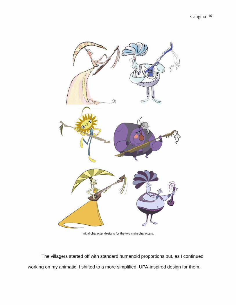
Initial character designs for the two main characters.
The villagers started off with standard humanoid proportions but, as I continued
working on my animatic, I shifted to a more simplified, UPA-inspired design for them.
Caliguia
17
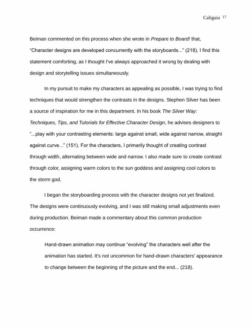
Beiman commented on this process when she wrote in Prepare to Board! that,
“Character designs are developed concurrently with the storyboards...” (218). I find this
statement comforting, as I thought I've always approached it wrong by dealing with
design and storytelling issues simultaneously.
In my pursuit to make my characters as appealing as possible, I was trying to find
techniques that would strengthen the contrasts in the designs. Stephen Silver has been
a source of inspiration for me in this department. In his book The Silver Way:
Techniques, Tips, and Tutorials for Effective Character Design, he advises designers to
“...play with your contrasting elements: large against small, wide against narrow, straight
against curve...” (151). For the characters, I primarily thought of creating contrast
through width, alternating between wide and narrow. I also made sure to create contrast
through color, assigning warm colors to the sun goddess and assigning cool colors to
the storm god.
I began the storyboarding process with the character designs not yet finalized.
The designs were continuously evolving, and I was still making small adjustments even
during production. Beiman made a commentary about this common production
occurrence:
Hand-drawn animation may continue “evolving” the characters well after the
animation has started. It's not uncommon for hand-drawn characters' appearance
to change between the beginning of the picture and the end... (218).

Caliguia
18
Also, since the facial details needed to be readable at Full Shot (the most used
shot type in my thesis), I needed to make the eyes bigger when I was already animating
so that it would be clear even from a certain distance. In addition, there were some
clothing patterns that were easy to do in a few drawings, but became very difficult to do
when animating on ones. As a designer, I learned how critical it was to anticipate the
realities of a production as part of the design process.
Background Design
The background design process began very early, when I started to scribble and
indicate background details on my rough storyboards. In the beginning, I did not even
know how to layout the main frames together, as it was not yet clear to me how to
properly juxtapose them. I had drawn the preliminary version of the graphic borders
using TVPaint but, at this time, I was more concerned with resolving storytelling issues
with my animatic.
Looking back, I think I underestimated the challenge of dealing with an expansive
world and the planning that this undertaking requires. There was confusion during the
storyboarding phase about whether to use graphic borders independently without
context, or to use a bigger “container” to put everything in like a mural, quilt, or a piece
of ethnic clothing. In my initial attempts at border designing, the issue of arbitrary
variation became apparent. During the thesis committee meeting of the Fall semester of
2017, the committee members had commented that the backgrounds do not provide
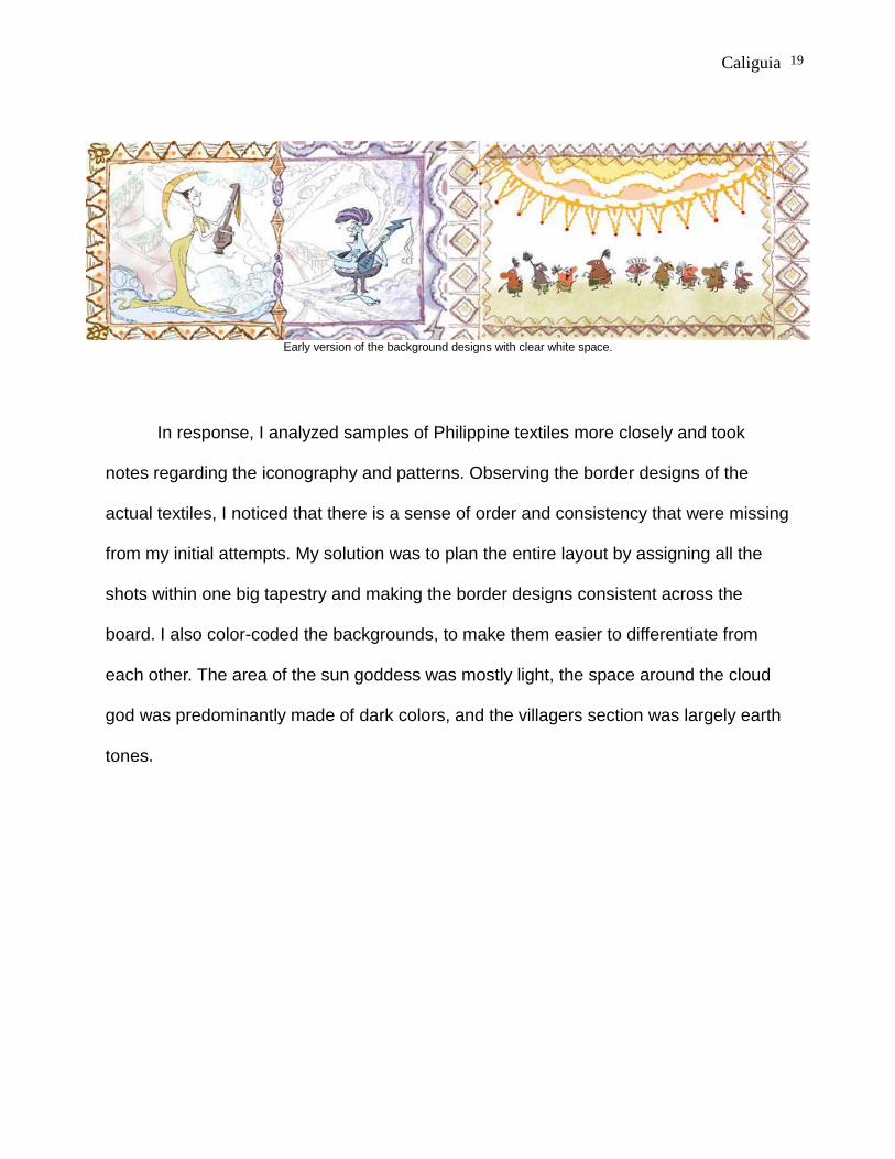
proper context because these early versions had clear white backgrounds.
Caliguia
19
Early version of the background designs with clear white space.
In response, I analyzed samples of Philippine textiles more closely and took
notes regarding the iconography and patterns. Observing the border designs of the
actual textiles, I noticed that there is a sense of order and consistency that were missing
from my initial attempts. My solution was to plan the entire layout by assigning all the
shots within one big tapestry and making the border designs consistent across the
board. I also color-coded the backgrounds, to make them easier to differentiate from
each other. The area of the sun goddess was mostly light, the space around the cloud
god was predominantly made of dark colors, and the villagers section was largely earth
tones.

Caliguia
20
A compilation of Philippine textile samples with my notes underneath.
In my earlier version, the border that partitioned the two separate areas of the
gods was too distracting. To resolve this problem, I designed a much simpler middle
border to avoid attracting too much attention, but made it react accordingly whenever
the gods were playing their music. I desaturated the colors of the background designs in
order to make the brighter colors of the characters pop-out.
It is interesting to note that for the longest time, the gods did not have a platform
to stand on – they were just floating mid-air throughout the majority of thesis production.
These elements in the background were only added within the last three weeks of
production. This important adjustment was actually my thesis adviser, Peter Murphey's
idea.
Another important decision that I made at this point in the process was to use a
Caliguia
21
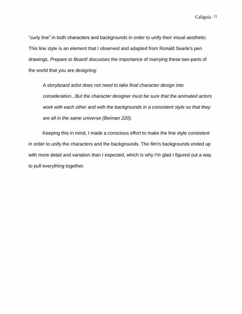
“curly line” in both characters and backgrounds in order to unify their visual aesthetic.
This line style is an element that I observed and adapted from Ronald Searle's pen
drawings. Prepare to Board! discusses the importance of marrying these two-parts of
the world that you are designing:
A storyboard artist does not need to take final character design into
consideration...But the character designer must be sure that the animated actors
work with each other and with the backgrounds in a consistent style so that they
are all in the same universe (Beiman 220).
Keeping this in mind, I made a conscious effort to make the line style consistent
in order to unify the characters and the backgrounds. The film's backgrounds ended up
with more detail and variation than I expected, which is why I'm glad I figured out a way
to pull everything together.

Caliguia
22
A comparison between an early concept art (top) and a still from the film (bottom).
PRODUCTION
Animation
Looking back into this project, I realize that the most important personal
milestone for me within it was the animation. I don't think I have ever spent so much
energy animating on a project before. Remembering the countless hours that I applied
to this effort, I have frequently reflected on whether I could have been more efficient with
my approach. Nevertheless, I am happy that I confronted the challenge in its entirety,

Caliguia
23
and I am now more confident as an animator moving forward.
Since my thesis year no longer required me to enroll on various courses, I had
more time to animate for this project. This afforded me the opportunity to work slowly in
the beginning -- striving to improve the flow and timing of my work. The fact that I faced
the tediousness of frame-by-frame 2D animation allowed me to deepen my
understanding of the principles of animation. I fulfilled my personal commitment to
animate more and, if anything else, I consider that a modicum of success that I can hold
on to.
During the entire animation process, the book that I mainly referenced was Eric
Goldberg's, Character Animation Crash Course! As I read through this book, the old
adage “You don't know what you don't know” kept echoing in my mind. I have frequently
skimmed through this book before, but it is a different experience to actively apply the
ideas contained in it as you read them. This book has been a source of illumination for
me, especially in the animation style that I was aiming for. As I gained more and more
appreciation for the lessons in the book, the more I feel regretful that I did not take it
seriously sooner. Some of my most important learnings from this book includes:
techniques on how to improve poses and expressions, incorporating a sense of
plasticity to the forms, the importance of changing shape in the middle of an action, and
animating on ones if necessary to achieve texture in the timing.
Through study and practice, I gained a better understanding of timing charts – a
topic I've always wanted to learn more about. Prior to thesis production, I only
understood this subject matter superficially. The proverbial examples of easing-in and

Caliguia
24
easing-out were the only aspects I knew something about. As I went along, I learned
about the other types of timing charts and their usages: the role of even spacing, the
definition of “thirds”, indicating “favors” in a chart, mixing-up techniques, and even
having multiple charts working simultaneously. I used timing charts inconsistently and
inaccurately as I worked, stumbling along these concepts as I animated. I don't profess
to now be an expert on this subject – far from it – but being a little less ignorant is still a
step forward. The mere fact that I was using charts more often instead of just constantly
improvising has changed my work habits.
One of the important things that I learned is improving my initial animation
workflow. Due to the demands of my timeframe, I studied how to employ “partials” – an
animation term used to describe incomplete, shorthand sketches. Using partials
enabled me to initially focus on the overall flow and energy of my animation instead of
the specific details. This animation technique of rapidly creating a general impression
through a series of shorthand sketches is sometimes called a “scribble pass”. I found
this method useful because I was spending as little energy as possible to each
individual sketch (which I knew would be changed and revised anyway), giving me more
time to improve the overall timing. Goldberg has expounded upon this working method
when he encouraged animators to work from general to specific:
Work roughly, with attention to basic construction but not final detail when keying
out a scene. Animate in a straight-ahead fashion from beginning to end of the
scene even though you're posing – this way you'll find various peaks and
resolutions that come “organically” as you're drawing (56).

Caliguia
25
Shorthand versions of my characters using simple visual analogies.
Looking back, I remember just how often I went back and forth between pose-to-
pose animation and straight-ahead. When starting a shot, I usually drew a couple of
storytelling poses first then I almost immediately switch to working straight-ahead. This
spontaneous method has helped my animation since my work can sometimes be stiff
and rigid. In Goldberg’s book, it is noted that, “Practically any movement will benefit
from a little anticipation, drag, and overlap...” (Goldberg 57). I have taken this to heart
and tried to apply these concepts even in the small movements.
Despite the diverse creative tasks involved in making an animated film, I still view
myself mainly as a draftsman who specializes in cartoons. Drawing is still my main skill.
However, there were moments during the thesis production when I seriously questioned
my abilities. In all honesty, that doubt still lingers until now. Handled maturely, I believe
this can be a positive experience because doubt creates questions, and questions
encourages you to seek out answers. Doubt only means that my knowledge and
awareness are increasing and therefore, I am becoming more conscious of my specific
shortcomings.

Caliguia
26
In relation to this, one of the areas I want to improve on is my sketching habits. I
have observed that I have a tendency to “think on paper” when I'm drawing – doodling
and scribbling even though I don't have a clear goal yet. This is a bad habit I developed
partly because of the unlimited editing power of the software that I use. You can always
“undo” a command and start fresh without cost. It is extremely efficient to use a
computer but I realized it can limit my potential if I treat it as a crutch.
In order to address this issue, I started reading Force: The Key to Capturing Life
Through Drawing by Michael Mattesi. One of the topics that stood out to me is when
Mattesi advised artists to draw “One line per energy or idea” (3). This is a simple
drawing tip that promotes discipline and clarity of thinking. In contrast, Matessi also
describes the danger of mindless sketching when he said that “Uncertainty takes us
from one place to another through thousands of minuscule thoughts...” (3). In order to
avoid the unsightly build-up of “mindless” lines, I should always remember to be
intentional when drawing. To explain even further, Matessi mentioned that a line
“...starts somewhere, does something, and goes somewhere” (3). This kind of
mindfulness is what I aim to develop as a draftsman moving forward.
One of the notable areas that I improved on is adding a sense of looseness in my
animation drawings. To achieve this, the first step for me was letting go of the notion
that being on-model on every single drawing was a top priority. For the longest time, I
was placing consistent-looking drawings on a pedestal. Little did I know that I was
getting overly fixated on surface execution when I should have been putting more work
on the foundation first– the portrayal of energy and life.
An important tip that I got from Character Animation Crash Course! is that

Caliguia
27
”Everything you draw or conceive should have a sense of 'give' to it – that all of a
character's body parts affect each other...all have an inherent elasticity” (Goldberg 55).
This concept encouraged me to push my drawings and make the forms as pliable as I
could make them. A related advice from Goldberg is to "Go for the feeling first, anatomy
second!!” (54). Collectively, these ideas have inspired me to add vitality and energy to
my sketches.
A model sheet featuring the sun goddess in various poses.
Since my thesis did not have any dialogue, I had to tell the story as clearly as
possible through the visuals. I had to make sure my film communicated mainly through
the designs, compositions and, most importantly, the gestures of the characters. I knew
that the principles of simplicity and exaggeration should be prioritized when creating
poses. Using speed to cut into the essence, I aimed to emphasize emotion and clarity.
Edward Sorel, a master caricaturist and illustrator, described gesture drawing perfectly
when he quipped that “a love of gesture is what makes sane people become illustrators”
(qtd. in Parks 60). I can definitely relate with this idea, as I have discovered that

Caliguia
28
pursuing gesture drawing can be an exciting challenge.
Another notable lesson that I learned from Eric Goldberg is the sculptural
application of details. The idea behind this concept is the organic placement of details in
order to convincingly create the illusion of three-dimensional mass. In Character
Animation Crash Course!, animators are advised to, “know your character's construction
thoroughly...show different angles, head tilts, shifts of weight and posture” (Goldberg
32). Following this advice, I developed the habit of sketching even the obscured parts of
a drawing to gain a better sense of its volume.
I also experimented with distortions and “eccentric drawings”, especially on fast
actions. Once again, I used Goldberg as a guide to learn about smears, double images,
swish lines and other gimmicks that add flavor to the animation. However, Eric also
warns that “... the use of animation gimmicks is like the use of oregano in cooking – a
little adds zest and spice; too much overpowers!” (182).
Compositing
As I've discussed earlier, it took me quite a while to figure out the overall context
for the story's location. In turn, this also delayed the compositing phase. For many
months, I was just using placeholders for the borders and backgrounds. The process of
assembling the shot assets within the final background designs did not start until the
very last month of production. I was half-improvising at this point, creating the
animations for the middle border simultaneously as I were assembling the finalized
assets in After Effects.

Caliguia
29
I initially had more plans for the compositing phase, particularly on how the
borders would be animated. I experimented with Adobe Illustrator for a while, and briefly
delved with a workflow wherein I tried to animate vector graphics through After Effects.
Due to the highly graphic style of the border designs, I initially thought that working with
vectors would be more effective. While this idea sounded good initially, I failed to take
into consideration the learning curve I will experience as I deal with new software.
Considering the complexity of my initial plans for vector animation, I decided that it
would be more practical to abandon this approach.
A comparison of the background layout during the animatic stage (top) and the final version (bottom).
The improved alignment of the borders and frames provided clarity to the compositing stage.

Caliguia
30
As I finalized my workflow, I pre-composed the individual shots before placing
them all together in the large layout that I made in Photoshop. I used this workflow to
avoid dealing with too many layers while applying camera movements. I did some
frame-by-frame masking with the backgrounds, moving back and forth depending on the
movement of the middle partition. It is also interesting to note that the borders also
needed different versions, particularly when various parts of it gets broken.
Audio and Music
Right from the beginning – despite the various changes that the story concept
went through – I knew that music would be an important part of the film. Since the two
main characters play musical instruments and the film itself is dialogue-less, the music
and the visuals must work together seamlessly.
I initially planned to have a greater range of collaboration with my musician, Arnel
Barbarona. However, my plan did not go smoothly because I became engrossed with
figuring out the parts that needed my attention like story, design and animation. Months
went by and our communication went cold.
In the middle of the production, I sent an updated animatic file to Arnel hoping to
get some feedback about timing and rhythm. Unfortunately, Arnel responded only
intermittently to my messages at this point. Aside from composing folk music, Arnel is
also a successful live-action filmmaker who frequently gets invited into film festivals. I
think his busyness may have affected his responsiveness to my messages.
Caliguia
31
Thankfully, during the final month of production, Arnel started to seriously
respond to my messages. At this point, I had finalized the timing for most of the film, so
Arnel ended up creating audio work for a pre-timed film. This was in contrast to my
original intention of having his music influence the film's rhythm early on. Nevertheless, I
am still happy with how the music turned-out because it has the unique folksy sound I
was looking for. I also commend him because he was able to submit the deliverables
when it mattered the most.
An additional challenge to our collaboration was that the time zones of New York
State and the Philippines, where Arnel was located, are in reverse. This meant that after
a long day of animating, I would communicate with him late at night to provide my
feedback. It is amusing to look back on how much I had to rush in the final weeks of
production, particularly on cleaning-up, compositing, editing, and audio.
I also experienced some issues with how the vocalizations were handled initially.
Since the film required some minor voice acting, I requested Arnel to supply them. One
of the early previews that he submitted featured excessive vocalizations (in my opinion).
I asked him if he could remove eighty percent of it and just retain the most important
ones. What I got after that was a version that removed almost all vocalizations. It went
from too much to too little. Fortunately, he gave me the individual tracks of the audio
separately, so I calibrated it myself while editing the final version.
RECEPTION AND EVALUATION
Critiques and Recognition
During the SOFA screenings, I received mixed reactions for my film. Despite

Caliguia
32
being able to push myself in terms of character animation, I still received a critique
regarding the animation cycles that were evident in my film. This limited animation
technique was particularly obvious in the animation of the villagers, wherein I used a lot
of loops because I did not want to be bogged down by animating complex movement for
a group of characters. I admit that this approach is one of the compromises that I
embraced in order for me to hit the deadline.
Considering the individual effort that I’ve given to this short film, I expected more
appreciation at the SOFA screenings. To be honest, I was a bit disappointed that I only
got lukewarm reception from the audience. I realize now that I was asking too much and
that I shouldn’t be too quick to ask for gratification. There is a necessity to develop a
healthy attitude and accept each project as an opportunity to learn and develop. Over
the years, I learned that there is a difference between public and private success.
Heaven & Earth is a project that I consider to be in the latter category -- knowing that I
gave it my personal best despite the circumstances.
On the other hand, I received praise for the comedic timing of the villagers when
they were shown frantically escaping from the gods. I also received praise for my
stylized backgrounds. My animation for the climactic fight scene of the two gods was
also positively mentioned. RIT SOFA faculty recognized the short when it became part
of the Honor Show for 2018. Heaven & Earth also achieved its first festival selection
when it was accepted by the Paris International Animation Film Festival this July of
2018.

Caliguia
33
Reflection on Personal Learnings
When I was handling my own independent projects in the Philippines, I had
steady production support because I frequently collaborated with freelance animators.
Funded by grants from the government, I worked primarily as a director and manager.
The big advantage here is that it gave me a chance to focus on pre-production and
management, giving me the leverage to deal with films projects with longer durations
and more complex storylines. Looking back to those opportunities, I realize just how
fortunate I was to be placed in that situation.
In contrast, when I was working on my thesis film, I gained a different kind of
satisfaction by owning up completely to the animation workload on my own. With my
past projects, I frequently dealt with a flexible time-frame – a situation that had its
benefits but could also make me lax and complacent. Comparing that experience to my
thesis production, I am reminded of the benefits of having hard deadlines that force you
to be single-minded and focused. Out of necessity, I learned time management
techniques during thesis production using digital tools like Google Calendar and tomato
timer (tomato-timer.com). I used these tools in tandem so that I can use the Pomodoro
Technique for time management.
While working on my thesis, I also wanted to inform my practice with as much
theory as I can. One of the things that I learned is to take advantage of the “time
pockets” scattered throughout the day. One way I dealt with time proactively was
reading animation books during my bus rides. A single bus ride to RIT from my place
was usually twenty-five to thirty minutes long. It was enough time to read a chapter or

Caliguia
34
two and take a few notes. I usually wrote the most important tips on sticky notes which I
placed on the sides of the Cintiq screen that I frequently worked on. In 15 Secrets
Successful People Know About Time Management, Kevin Kruse made a statement
about the value of every single moment:
Hold your hand to your chest and feel your heart. Beat, beat, beat. Become
conscious of your breathing. In. Out. In. Out. You will never get those beats back.
You will never get those breaths back (17).
Continuing in this line of thought, I also learned how to plan my week because I
observed that not all my work days will be filled with energy. Despite having enough
sleep, my body's energy naturally dips as the week winds down. In order to deal with
this, I placed the most important tasks in front of the week when my energy is at its
highest. I then dealt with less important tasks on the tail end of the week. As Kruse
points out, “Highly successful people theme days on their calendar...” (160). Keeping
this in mind, I also gave myself a “buffer day” each week to get some extra sleep and
rest. This buffer day is important because it prepares my mind and body for the high-
energy days.
Knowing that I am already behind schedule, I needed to constructively
compromise and make hard decisions regarding what can and can't be done. This is
one of the areas that my thesis adviser, Peter Murphey, helped me a lot in figuring-out.
He has provided me plenty of advice on how I could deal with the workload and prepare
for the May 1st deadline imposed by RIT's School of Film and Animation.
After working on my thesis, I realize just how important muscle memory is for 2D

Caliguia
35
animators. The process requires that that we develop good drawing habits because we
are constantly making decisions – big and small. These drawing decisions may seem
insignificant at first but have a big effect in the long run. For example, I have a habit of
scribbling and “feeling out” a pose when animating – a habit that seems harmless if
done in just one drawing but wastes a lot of time and effort if multiplied throughout an
entire production. This is why the concept of mindful and intentional drawing is a
practice that I need to adapt. As a resolution, I am regularly working again on my
sketchbook so that I can retrain myself in drawing. My goal is to develop good drawing
habits or, at the very least, minimize bad drawing habits that waste effort and time.
Strengths and Weaknesses of the Project
I am glad that I was able to push myself as an animator through this project. On
top of animating, I was able to own up to the challenge of doing almost all of the clean-
up and inbetweening on my own. I initially wanted to delegate more clean-up and
inbetweening work but after assigning two shots to students, I knew that it will not work
out. My time would just end up being wasted on correcting and supervising others.
However, I think this situation was a blessing in disguise – by animating more, I gained
a new perspective about drawing characters in a state of motion. The concepts of
plasticity, momentum, and drag became ingrained into my memory through daily
practice.
Aside from the animation, I think one the strengths of the project is the overall
Caliguia
36
visual presentation. I've always wanted to create a film that deals with a world inspired
by Philippine textile designs. The fact that I experimented with this idea, albeit
imperfectly, is a good source of insight for me as an artist.
A lot of the challenges I faced were related to scaling-down my concept so that I
can realistically hit the deadline. The fact that I was frequently behind schedule made
me focus almost exclusively on compromising just for the sake of not failing. Due to
certain realities surrounding the production of my thesis, I concentrated on completing
and not perfecting. I don't think there is anything inherently wrong with this, I just wished
that I did a better job at balancing the artistic values with production realities. Hopefully
through this experience, I will be smarter with my compromises in the future. Right from
the beginning, the aim should be excellence through simplicity.
CONCLUSION
Among the lessons learned in creating Heaven & Earth, I see the value in making
more detailed model sheets and design guides, particularly on how the characters
looked like in mid-action. I also believe that the opening shot of the film may still be
improved by using a 3D camera and some 3D assets to add depth to the introduction of
the tapestry, to make it more dynamic. These are elements I wish to include in my future
projects.
Finally, I would like to reflect on my intention to combine Filipino folk art
influences with the aesthetic of classic American cartoons. Despite the flaws of my film,

Caliguia
37
I was able to strike a good balance between these two main sources of inspiration. I
believe the reason why it worked was that the influences were segregated between the
characters and the backgrounds: the characters were more based on American cartoon
styles while the background art reflected the influence of Philippine folk textiles. The
marriage of these two visual elements succeeded because I was not being a strict purist
regarding my references, but I still aimed to retain the essence of my influences.
Though seemingly contradictory, the uniquely Filipino elements worked with the foreign
influences that embody my artistic vision. In the end, I used my gut feeling as guide in
making artistic decisions, and I aim to include more Filipino-ness in future works, as it is
an integral part of me, a fiber of my being.
I have a lingering suspicion that some of my classmates and professors during
graduate school found it peculiar that I was placing so much importance on Filipino
cultural identity. This notion might be lost on some, especially among people from
countries that already have well-defined cultures. I believe they do not really know how
it feels to be an artist belonging to a country that has an ambiguous identity. This
concept overlaps with the fact that the Philippines is a “developing nation” -- a term that
has connotations pertaining to both economic and cultural aspects. After all, poverty
manifests itself in many ways -- cultural currency included. As a Filipino artist, I feel
compelled to do my part to counteract this negative perception.
As a result of interacting with people with different points of view, I oftentimes
reflect on why I should promote the Filipino identity in my art. Am I being as honest as I
could be about this topic? Am I just using this to set myself apart from the crowd? Am I
using this as a form of self-aggrandizement? And if I am as honest as I could be about

Caliguia
38
it, I should also ask myself: is this a goal I am willing to fight for in the long-term? These
are blunt questions that I need to deal with if I really want to get to the heart of the
matter.
I believe that I am partly motivated by the need to offset the prevalent “colonial
mentality” among Filipinos – the belief that anything foreign is inherently superior to
anything that is local. Amid the glut of cultural importations in the Philippines, I often
wonder if there is anything uniquely local that is worthy of esteem and continued
support. The national folktales and mythologies are some of the elements that I consider
to be worthy of upholding and promoting. However, too many local artists are too quick
to look for inspiration elsewhere. I believe that this tendency is one of the culprits why a
lot of creative work from the Philippines feels derivative. Maximo Ramos has made a
statement about this phenomena, using Filipinos’ musical output as an example:
Dissatisfaction has often been expressed with the fact that although the Filipinos
have been known as a music-loving people ever since Pigafetta praised their
musical ability at the beginning of the sixteenth century, they have produced no
substantial music of their own. Their music...are too closely reminiscent of
Spanish music of the nineteenth century, and the songs that the children and
youth sing or play are almost invariably those from Broadway and Hollywood
(193).
On the other hand, even though I am critical of the prevalent “colonial mentality”
among my fellow Filipinos, I am far from being immune to it. I myself am a big fan of
foreign movies -- particularly Disney and Marvel films. I am also an avid enthusiast of

Caliguia
39
Japanese pop culture. My personal library is composed mainly of Western books. Deep
inside, I take pride that I received my graduate education in the States instead of just
gaining my master's degree from a local university. This only affirms that I need to
continue pursuing my goal -- so that the next generation of young Filipinos could learn
from past shortcomings.
At this point, I want to reiterate that my intention as an artist is to create bridges
and treat the various sources of my influences as collaborative agents instead of
competing forces. I want to study the past and cultural heritage of my country so that I
can feel rooted in my own nation. At the same time, I also want to acknowledge the
foreign influences that have already seeped deeply into my own identity. The challenge
for me now is figuring-out how to bridge the gap between these two schools of thought.
Most of my film projects up to this point have been in the service of pushing this theme
forward – with each project achieving varying results. Hopefully, I would still have a
couple of decades ahead of me to continue honing my craft and strengthening my
artistic vision.

Caliguia
40
WORKS CITED
Beiman, Nancy. Prepare to Board! Second Edition, Taylor & Francis, 2013. Burlington,
MA.
Goldberg, Eric. Character animation crash course! Silman-James Press, 2008. Los
Angeles, CA.
Kruse, Kevin. 15 Secrets Successful People Know About Time Management. Second
Edition, The Kruse Group, 2018. Philadelphia, PA.
Mattesi, Michael D. Force: the key to capturing life through drawing. Second Edition,
Elsevier Inc., 2006. Burlington, MA.
Parks, John A. “Humor, Wisdom, and Line.” The Drawing Magazine, vol. 10, no.38,
2013, p.60.
Ramos, Maximo. The Creatures of Philippine Lower Mythology. Phoenix Publishing
House, 1990. Quezon City, Philippines
Silver, Stephen. The Silver Way: Techniques, Tips, and Tutorials for Effective Character
Design. Design Studio Press, 2017. Los Angeles, CA.
Tumminello, Wendy. Exploring Storyboarding. Thomson/Delmar Learning, 2005. Clifton
Park, NY.
Wells, Paul. The Fundamentals of Animation. AVA Publishing SA, 2006. Switzerland.

Caliguia
41
APPENDIX A: ORIGINAL PROPOSAL
______________________________________________________________________
Logline:
A young cloud deity whose purpose is to create rain struggles to find his place in
a world that celebrates perfect sunny weather.
Treatment:
The story starts with a decorative page that looks straight out of a picture-book
for children, complete with fanciful border designs. In the middle of the page, stylized
graphical clouds pop into existence one by one according to a specific rhythm. More
visual layers are introduced until a paper-tole-kind-of-a-world becomes recognizable. It
is a whimsical world filled with tribal textures and patterns.
There is an island beneath the skies that are inhabited by people (designed
according to the graphic visuals of everything else). Sumarang, a dark cloud deity,
enters the scene nervously and starts playing a stringed instrument in front of the
human populace. Sumarang looks like a child (who has a humanoid appearance and
looks around 12 years old), but in terms of scale, he looks like a giant compared to the
earth-dwellers. As Sumarang plays his music, it is apparent that he is off-key and
clumsy. His music-playing directly influences the weather and the earth dwellers are
soon dealing with rain and thunder. Despite how it looks, Sumarang has no malice in
what he is doing. There is an air of innocence to him – he looks equally helpless about
the inconvenience he creates. He looks eager to please the islanders, but he ends up

Caliguia
42
annoying everybody.
While Sumarang clumsily continues to play his music, another cloud deity named
Binhi swoops-in riding a cloud like a hovercraft, cheerfully playing a stringed instrument
(Just like Sumarang, she also has the same stringed instrument which she creates
music with. In contrast, Sumarang is chubby, sluggish, and gloomy, while Binhi is limber,
slim, and cheerful). As Binhi plays her stringed instrument, the clouds part and the sun
fills the world with warm light. It seems that the light beams are magically helping the
island's horticulture to prosper. The earth-dwellers show their appreciation by throwing
flowers to a wooden monument they made for Binhi. The cheerful deity is visibly
pleased. Sumarang is also pleased (thinking that he is also being applauded) and starts
to bow. Binhi sees this and starts to roll her eyes.
During the night while everybody is sleeping, Sumarang is loudly snoring while
Binhi is awkwardly covering her ears with clouds. Sumarang then sneezes while
sleeping, creating a small thunderbolt that ricochets across the place, finally hitting
Binhi's monument and damaging it. As far as Binhi is concerned, this is the last straw,
as she decides to get rid of him. She uses her stringed instrument to push away the
cloud that Sumarang is sleeping on, and doing it carefully so that it doesn't disturb his
sleep. Seeing an island in the distance, Binhi decides to push Sumarang towards that
direction and leaves him.
The next day, Sumarang wakes up and slowly realizes that he is in the middle of
nowhere. He looks around and he realizes that he is within a desert island. It is a place
that dry and barren. Unknown to Sumarang, there are people hiding around the area

Caliguia
43
that starts to observe the cloud deity with curiosity. Sumarang looks around nervously
and starts sobbing, which creates a storm within the place.
The people that were observing him got affected by the violent weather and a
small child among them gets carried away by the flood. Sumarang hears the child's cry
for help and as the child starts to drown, Sumarang starts strumming his stringed
instrument in a way that affects the weather to calm down (This is the first time he
accomplished this, and he is surprised). After the weather calms down, he picks up the
child and brings her to the islanders. Appearing lifeless, the villagers try to resuscitate
the child. Sumarang looks very guilty of what happened, and he starts to move away
from the islanders. In the midst of the silence, Sumarang hears a faint cough, and sees
that the little child is still alive. The young child who survived approaches Sumarang
slowly (some of the villagers try to stop her but she persists) and offers a flower to
Sumarang as sign of friendship. Sumarang happily accepts.
Back on her side, Binhi continues to create sunny weather, but as time passes by
(this could be shown by graphical icons of sun and moon switching back and forth in the
background – in harmony with the paper tole inspired graphics), the crops are starting to
dry up because of drought. The people are starting to complain, but Binhi does not have
any other ability up her sleeve. She just continues to do what she does best: bring out
the sunshine.
On Semarang’s side, it seems that he has become popular and loved in his new
home. As a rain bringer placed on a desert island, he found his purpose. His music is
also starting to get polished -- his better use of the stringed instrument has enabled him

Caliguia
44
to make gentler rain instead of violent ones. He helps the villagers by filling-up their jars
with rain water. Some of the children and happily playing on the puddles of water.
In the middle of his bliss, a man from the other island arrives on the desert island
by riding a boat. He is asking for help, because their island is suffering from severe
drought. Sumarang defiantly turns his back, still hurt about his past rejection. While
hearing the man's plea, he witnesses something that makes him change his mind: the
child whom he saved is now offering shelter to another child in the middle of the rain.
Meanwhile, Binhi's island is now barren and the inhabitants are angry. Binhi’s
usual cheerfulness is gone, as she sits on top of her cloud like a scolded child. Binhi
witnesses the islanders tear down her monument, which makes her weep. In this
moment, Sumarang arrives playing his music, producing gentle rain. Binhi looks up to
him with a miserable expression but Sumarang approaches her in a gentle manner.
Binhi challenges Sumarang in a musical showdown but as the two played together, their
musical battle ends in a twist: they gradually develop harmony with each other. After
realizing this, Sumarang and Binhi started “jamming” together which produces a good
mixture of different clouds in the sky. This new development of weather jays created a
good balance between the two extremes. The islanders witnesses this and they start to
dance to celebrate.
After a while, Binhi and Sumarang learn to work in tandem. In the end, they look
five years older compared to how they looked initially. They have learned to switch back
and forth between locations, hopping from island to island, so that everybody gets
variation in weather. Binhi's monument has been restored, but now her image stands
Caliguia
45
alongside the image of Sumarang.
Rationale:
I am primarily pursuing this project so that I could I further develop my skill in
animation production design. I believe designing is where I am strongest at when it
comes to the animation pipeline, and my aim is to use my MFA thesis project to put that
skill on display in the best possible manner.
I also want to this project to incorporate elements from Filipino culture into my
film, particularly the textiles, indigenous designs and folk music. I believe that nationality
should play a part in directing one's artistic vision, and I want to use this project to
further that belief.
In terms of artistic influences, I want to pay tribute to some of the old American
cartoons that I used to watch as a kid (particularly Silly Symphonies and Fleisher's) that
primarily dealt with fairy tales and anthropomorphic characters. In my own way, I hope
to relive that by-gone animation era by pursuing a project like this.
Style:
Like I mentioned in the rationale, I want to pay tribute to the old American
cartoons, while at the same time incorporating elements from Filipino culture. With
these intentions in mind, it will be a balancing act for me so that I come up with
something cohesive in the end.
Overall, I want the imagery to look like a picture-book that came to life.

Caliguia
46
Regarding the specifics, I am planning to incorporate a loose, energetic line for my
designs, and combine textures on top of them. My primary influences for the character
designs would be Ronald Searle and Mary Blair. For the backgrounds, I reference Yuri
Norstein’s work as an inspiration, particularly in how he achieves a stylized, textured
feel to his work.
Budget:
Categories and Items Cost
Workstation
Laptop $1,000.00
External Hard Drive $100.00
Wacom Intuos $1,000.00
Pre-production
Books and Tutorials $100.00
Drawing and Painting Materials $50.00
Software
TVPaint (Student Edition) $285.00
Adobe Cloud Student Edition (1 year subscription) $239.00
Sound

Caliguia
47
Musical composer and sound effects $300.00
Promotion
Blu-rays / DVDs $30.00
DVD Covers $30.00
Shipping $100.00
Festival Fees $300.00
1 year website hosting (carbonmade.com) $144.00
Other
Online back-up service $50.00
GRAND TOTAL $3,728.00

Caliguia
48
APPENDIX B: PRE-PRODUCTION ARTWORKS
______________________________________________________________________
Early Poster Design

Caliguia
49
Model Sheet of the Storm god
The Finalized Design of the Villagers

Caliguia
50
APPENDIX C: PRODUCTION STILLS
______________________________________________________________________
Top Related