


Languages
Pages
Legal

#HamburgerWars
Mike Ryan @ryaninteractive

#HamburgerWarsWhat is a hamburger menu?
A menu using a three line icon.
Kindle

#HamburgerWarsWhy are people using them?
Rdio
● Space is scarce on mobile● Minimal navigation gives a clean look.

#HamburgerWarsWhy are people using them?
Rdio
● Space is scarce on mobile● Minimal navigation gives a clean look.● In a responsive design you can have
consistent navigation and reuse code.● It’s on a lot of apps. Users that don’t
know what it means yet will learn.

#HamburgerWarsWhat I have seen in usability tests
● Most participants did not notice or use the hamburger menu.
● Many failed tasks when the hamburger menu was required. (see chart)
Six Usability Tests (December 2013 – June 2014, 138 Ps)
71/75 Failed

#HamburgerWarsWorkarounds

#HamburgerWars
1. The 3-line icon doesn’t have a clear metaphor & is used inconsistently.
Why shouldn’t you use a hamburger menu?

#HamburgerWars
Feedly: Menu & All Music: Reorder Various: Scroll Instagram: List
Chrome: Options GoodReads: List GMaps: Schedule View LinkedIn: Search
Photos: Reorder Pintrest: Filter Amazon: Menu & List Stocks: Reorder
Inconsistent use
The three line icon is used for many things.

#HamburgerWarsInconsistent use
Google Material Guidelines (Hamburger Overload Edition)
https://www.google.com/design/icons/

#HamburgerWarsTesting the hamburger icon
Exis Web A/B tests
http://exisweb.net/mobile-menu-icons http://exisweb.net/mobile-menu-abtest http://exisweb.net/menu-eats-hamburger
1. February 2014 - 20K users.
2. February 2014 - 50K users.
3. March 2014 - 250K users.Won by 20%

#HamburgerWars
1. Many users don’t know what to expect. The 3-line icon doesn’t have a clear metaphor & is used inconsistently.
2. Moving your navigation under an icon has consequences:
a. Users have to memorize what is in your menu.
b. It provides poor wayfinding.
c. Its location is separated from content weakening the mental connection.
Why shouldn’t you use a hamburger menu?

#HamburgerWars
Open the menu and scan down.
Glance up.
iBooks
Hamburger menus require you to recall what is in them. Visible navigation requires a glance, and retains context.
Hamburger Menus: Recall Over Recognition

#HamburgerWarsNavigation removed from content
Menu is integrated with content Menu is
separated from content
Twitter MyDisneyExperience
When menus are integrated with content, they are mentally connected.

#HamburgerWars
1. Many users don’t know what to expect. The 3-line icon doesn’t have a clear metaphor & is used inconsistently.
2. Moving your navigation under an icon has consequences:
a. Users have to memorize what is in your menu.
b. It provides poor wayfinding.
c. Its location is separated from content weakening the mental connection.
3. It encourages us to include everything from desktop in responsive designs. This can create giant and cumbersome menus on mobile.
Why shouldn’t you use a hamburger menu?

#HamburgerWarsVertical menus are infinite.
Three and a half screen lengths on an iPhone 5.

#HamburgerWarsEffects of switching to a tab menu
Redbooth (January 2015)
Switched to a tab menu● Number of sessions doubled● Daily users increased 65%
https://redbooth.com/blog/hamburger-menu-iphone-app?utm_campaign=iOS_Dev_Weekly_Issue_181&utm_medium=email&utm_source=iOS%2BDev%2BWeekly
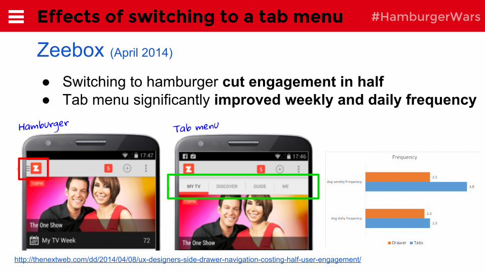
#HamburgerWarsEffects of switching to a tab menu
Zeebox (April 2014)
http://thenextweb.com/dd/2014/04/08/ux-designers-side-drawer-navigation-costing-half-user-engagement/
● Switching to hamburger cut engagement in half● Tab menu significantly improved weekly and daily frequency
Hamburger Tab menu

#HamburgerWarsSome are removing it after testing
http://www.engadget.com/2013/09/18/facebook-ios-app-update/
2010 September 2013 February 2014
July 2014
(removed from iPad, May 2015)
May 2015

#HamburgerWars
http://www.comscore.com/Insights/Market-Rankings/comScore-Reports-March-2015-US-Smartphone-Subscriber-Market-Share
Most of the top apps use horizontal menus.
Top 15 Smartphone Apps (March 2015)
● 9/15 use a Horizontal Nav● 6/15 use a Hamburger (5/6 are Google)

#HamburgerWars
1. Consider a horizontal menu for your most important tasksA tab bar is less than 10% of your total height.
2. Trim content on mobile
3. If you are going to use a hamburger menu, label it and make it stand out.
Recommendations
#HamburgerWarsQuestions?
Thanks!
Mike Ryan@ryaninteractive
Top Related