


Languages
Pages
Legal

Lesson 2 GIMP – Brightness and Contrast February 28, 2012
David Whisnant
1
GIMP – Brightness and Contrast
Exposure
When you shoot a picture the lighting is not always ideal, so pictures sometimes may be under-
or overexposed.
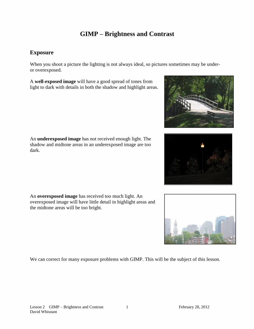
A well-exposed image will have a good spread of tones from
light to dark with details in both the shadow and highlight areas.
An underexposed image has not received enough light. The
shadow and midtone areas in an underexposed image are too
dark.
An overexposed image has received too much light. An
overexposed image will have little detail in highlight areas and
the midtone areas will be too bright.
We can correct for many exposure problems with GIMP. This will be the subject of this lesson.
Lesson 2 GIMP – Brightness and Contrast February 28, 2012
David Whisnant
2
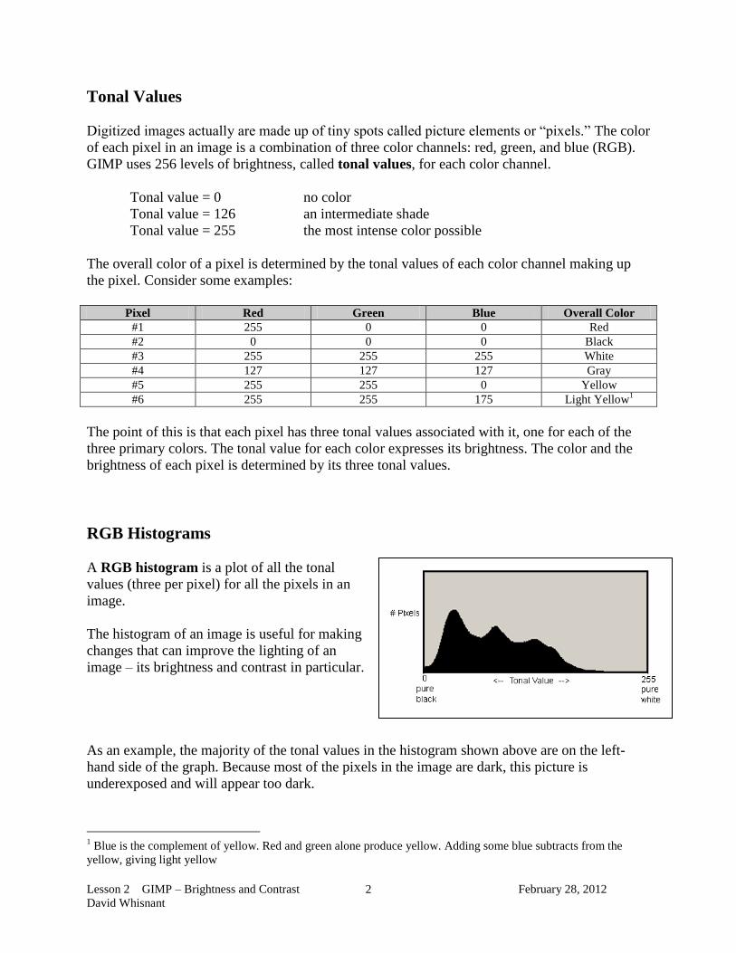
Tonal Values
Digitized images actually are made up of tiny spots called picture elements or “pixels.” The color
of each pixel in an image is a combination of three color channels: red, green, and blue (RGB).
GIMP uses 256 levels of brightness, called tonal values, for each color channel.
Tonal value = 0 no color
Tonal value = 126 an intermediate shade
Tonal value = 255 the most intense color possible
The overall color of a pixel is determined by the tonal values of each color channel making up
the pixel. Consider some examples:
Pixel Red Green Blue Overall Color
#1 255 0 0 Red
#2 0 0 0 Black
#3 255 255 255 White
#4 127 127 127 Gray
#5 255 255 0 Yellow
#6 255 255 175 Light Yellow1
The point of this is that each pixel has three tonal values associated with it, one for each of the
three primary colors. The tonal value for each color expresses its brightness. The color and the
brightness of each pixel is determined by its three tonal values.
RGB Histograms
A RGB histogram is a plot of all the tonal
values (three per pixel) for all the pixels in an
image.
The histogram of an image is useful for making
changes that can improve the lighting of an
image – its brightness and contrast in particular.
As an example, the majority of the tonal values in the histogram shown above are on the left-
hand side of the graph. Because most of the pixels in the image are dark, this picture is
underexposed and will appear too dark.
1 Blue is the complement of yellow. Red and green alone produce yellow. Adding some blue subtracts from the
yellow, giving light yellow

Lesson 2 GIMP – Brightness and Contrast February 28, 2012
David Whisnant
3
Consider the pictures below and their corresponding RGB histograms
Note that almost all the tonal values are
piled up to the left in the histogram. This
picture is underexposed, leaving almost
all the pixels with colors of low
brightness.
This picture, on the other hand, has most
of the tonal values on the right-hand side
of the histogram. This picture is
overexposed, leaving almost all the
pixels with too much brightness.
This flat picture has all its tonal values
piled up in the center – no really dark
pixels and no really bright ones.
In this histogram, on the other hand, the
bulk of the tonal values are either on the
right or the left side. All the pixels are
either dark or bright, with few in
between. This is characteristic of a high
contrast image

Lesson 2 GIMP – Brightness and Contrast February 28, 2012
David Whisnant
4
There are two reasons why we care about histograms.
A small change in viewing angle can have a major effect on the brightness of the
thumbnail image shown on the LCD screen of a digital camera, so it frequently is
difficult to judge whether a picture is properly exposed. Most digital cameras will display
a histogram along with a picture, which will help you determine if the exposure was
acceptable.
The Colors, Levels menu choice in GIMP allows you to adjust tonal values in an image.
Adjusting their tonal values is the best way to adjust the overall brightness and contrast of
an image.
The Levels Control
Open Computers.jpg and save it as Computers.xcf.
In GIMP, selecting Colors, Levels will display the RGB histogram of
the image.
The top portion of the Levels window displays the RGB
historgram. The small slider Input controls below the
histogram allow you to adjust which pixels in the image have
tonal values of 0 (pure black), 255 (very bright), or 127
(middle tone).
Lesson 2 GIMP – Brightness and Contrast February 28, 2012
David Whisnant
5
That the “Computers” image is
flat is apparent from both its
appearance and its histogram – all
the tonal values are piled up in the
center of the histogram. There are
no deep blacks or bright colors in
the image.
First, move the right input control
until it meets the right side of the
set of pixels shown in the graph.
This will stretch the right side of the
histogram so that the brightest
values (currently 178) become as
bright as possible (255), which will
brighten the upper range of the
image.
Now, move the left input control
until it meets the left side of the set
of pixels shown in the graph.
This will stretch the left side of the
histogram so that the darkest values
(currently 43) become pitch black
possible (0), which will darken the
lower range of the image.
Click on OK to make these changes permanent.
If you look at the histogram of the adjusted image, you
will see that the tonal values now are spread over the
entire range A wide range of tonal values is
characteristic of a well-exposed image.
You also may notice that the plot of tonal values is no
longer solid, but is made up of dark and light bands.
When GIMP stretches the plot of tonal values out so
that its ends are at 0 and 255, it creates some “holes” – tonal values that no pixels in the image
have. The “holes” are spread out evenly over the entire range, so they are not apparent to our
eyes.
Lesson 2 GIMP – Brightness and Contrast February 28, 2012
David Whisnant
6
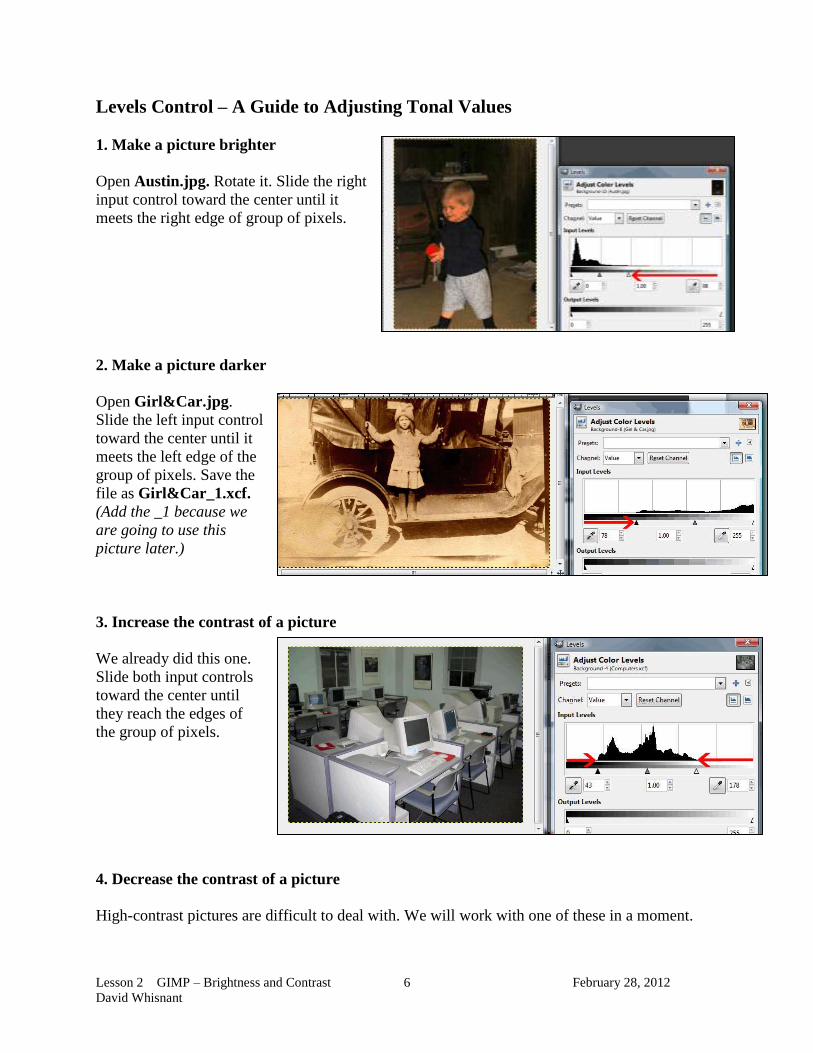
Levels Control – A Guide to Adjusting Tonal Values
1. Make a picture brighter
Open Austin.jpg. Rotate it. Slide the right
input control toward the center until it
meets the right edge of group of pixels.
2. Make a picture darker
Open Girl&Car.jpg.
Slide the left input control
toward the center until it
meets the left edge of the
group of pixels. Save the
file as Girl&Car_1.xcf.
(Add the _1 because we
are going to use this
picture later.)
3. Increase the contrast of a picture
We already did this one.
Slide both input controls
toward the center until
they reach the edges of
the group of pixels.
4. Decrease the contrast of a picture
High-contrast pictures are difficult to deal with. We will work with one of these in a moment.

Lesson 2 GIMP – Brightness and Contrast February 28, 2012
David Whisnant
7
Using the Logarithmic Display for Histograms
Open B&B.jpg and use
Levels to look at its
histogram. You will see that
the graph is very low,
making the histogram hard
to see.
You can emphasize the display of a histogram by clicking on the Logarithmic Display icon (red
arrow in the picture above.
You will see that this displays
the histogram so that its height
is raised. This does not change
the image – only the way the
histogram is displayed.
This display shows that the
picture is somewhat too light.
You can darken it by moving
the left slider over to meet the
curve.
High-Contrast Images
Some images, high-contrast ones for
example, are more difficult to deal
with.
Open Church.jpg and save it as
Church.xcf.
This is a high-contrast image with a
lot of dark pixels, a lot of bright
pixels, but few in between.

Lesson 2 GIMP – Brightness and Contrast February 28, 2012
David Whisnant
8
We can improve this image by
moving the mid-tone slider to the
left. This lightens the shadows
without having a major effect on the
sky and church steeple.
Click on OK.
Increasing the Contrast
The mid-tone adjustment we have made on the picture of the church has left
the image slightly flat. It would be nice to put a small amount of contrast
back in the picture. You can do this with Colors, Brightness-Contrast.
Pull the Contrast slider a little bit
to the right to add a small amount
of contrast.
Click on OK.
Save the file as church.xcf and
close it.

Lesson 2 GIMP – Brightness and Contrast February 28, 2012
David Whisnant
9
Using Your Eyes
Although you usually can slide the
right and left Levels sliders to meet
the edges of the histogram and be
done with it, you always need to
watch what this is doing to the
image. There are times when the
sliders should go somewhere else
other than the histogram edges.
As an example, open
TracyArmsCliff.jpg. This image is
obviously overexposed and needs
darkening.
Try moving the left slide all the
way over to the left edge of the
histogram. I think you will find
that the image is too dark and
high-contrast.
I found that the picture looks
better if you move the slider over
to the left, but not all the way to
the histogram edge.
The moral to the story is:
Use the Levels sliders but watch what they do to the image. In the end your eyes will tell you
what to do!
Lesson 2 GIMP – Brightness and Contrast February 28, 2012
David Whisnant
10
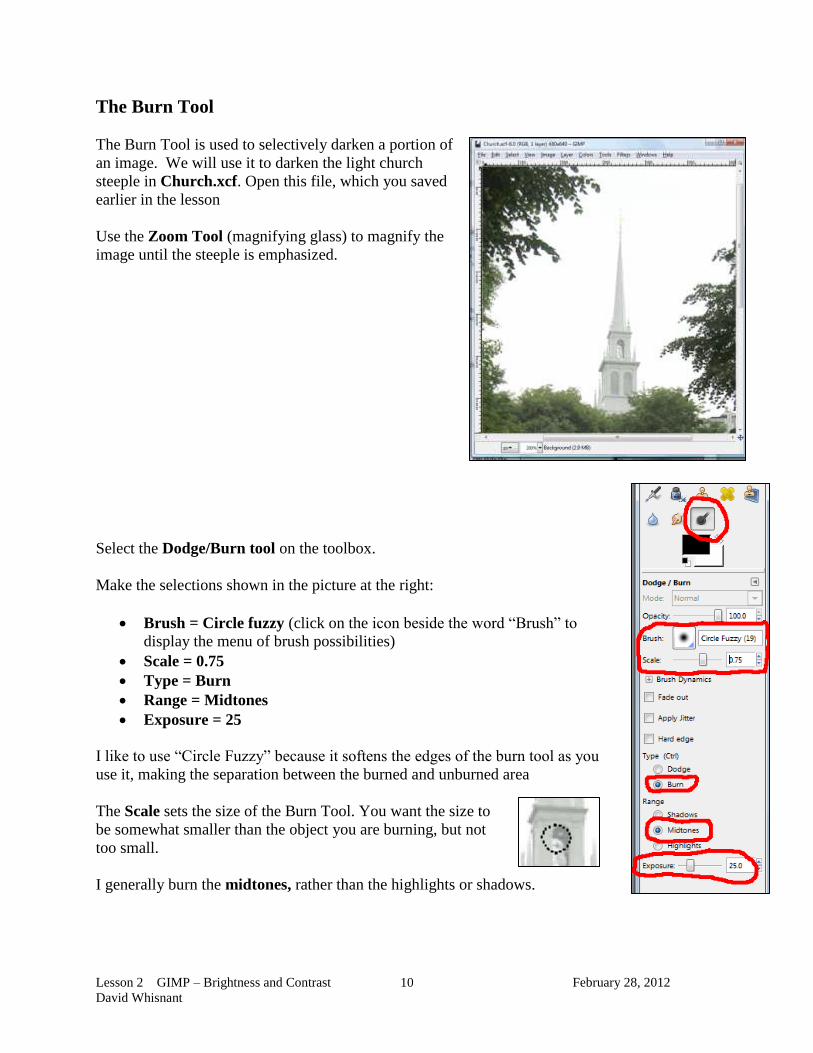
The Burn Tool
The Burn Tool is used to selectively darken a portion of
an image. We will use it to darken the light church
steeple in Church.xcf. Open this file, which you saved
earlier in the lesson
Use the Zoom Tool (magnifying glass) to magnify the
image until the steeple is emphasized.
Select the Dodge/Burn tool on the toolbox.
Make the selections shown in the picture at the right:
Brush = Circle fuzzy (click on the icon beside the word “Brush” to
display the menu of brush possibilities)
Scale = 0.75
Type = Burn
Range = Midtones
Exposure = 25
I like to use “Circle Fuzzy” because it softens the edges of the burn tool as you
use it, making the separation between the burned and unburned area
The Scale sets the size of the Burn Tool. You want the size to
be somewhat smaller than the object you are burning, but not
too small.
I generally burn the midtones, rather than the highlights or shadows.

Lesson 2 GIMP – Brightness and Contrast February 28, 2012
David Whisnant
11
Set the Exposure to a small value, 25% or less. The Burn Tool is a subtle tool, usually used to
darken the midtones of a relatively small section of an image. Generally we use a low exposure
(around 25% or less) for the tool so it does not darken an area too much at once.
With the Burn Tool active, the cursor will look like a dotted circle when moved over the image.
Hold the left mouse button down and sweep the cursor over the steeple. You should see that the
steeple gradually becomes darker. This will take quite a few passes.
Save the image as Church.xcf.
The Dodge Tool
The Dodge Tool works like the Burn Tool except it lightens sections of
the image rather than darkening them.
Open Santa.jpg. Use Levels to improve the brightness of the photo.
Use the Dodge Tool to lighten Santa’s beard and robe. You will want
to increase the Scale of the tool to make it larger.
Lesson 2 GIMP – Brightness and Contrast February 28, 2012
David Whisnant
12
Practice Problems (for later)
Improve the following images and then make the improvements. Use techniques from all the
GIMP lessons you have worked with so far.
1. Open JoyceAustin.jpg.
Rotate the image
Look at the bricks, wood paneling and metal side of the fireplace.
o How could you improve the picture by changing its orientation and cropping it?
o Make these improvements.
Use the Levels control to improve the brightness and contrast of the image
2. Open Harbor.jpg. Improve it with the Levels control.
3. Open Spires.jpg.
From the RGB histogram, is this picture under- or overexposed?
Try moving the midtone slider to darken the midtones slightly.
4. NorthChurch.jpg
5. Ship.jpg
6. SteveDelena.jpg
7. Ketchikan.jpg
8. Appian.jpg
9. Calais.jpg
Top Related