![Crowdsourcing Program Preconditions via a Classification Gameejw/papers/... · crowdsourcing [24]. As such, Binary Fission is an existence proof for crowdsourcing precondition mining.](https://static.fdocuments.in/doc/165x107/5e334d5ee6aa090e314489b6/crowdsourcing-program-preconditions-via-a-classification-game-ejwpapers-crowdsourcing.jpg)


Languages
Pages
Legal

A PROOF OF CONCEPT FOR CROWDSOURCING COLOR PERCEPTION
EXPERIMENTS
A Thesis
presented to
the Faculty of California Polytechnic State University
San Luis Obispo
In Partial Fulfillment
of the Requirements for the Degree
Master of Science in Computer Science
by
Ryan McLeod
June 2014

c© 2014
Ryan McLeod
ALL RIGHTS RESERVED
ii

COMMITTEE MEMBERSHIP
TITLE: A Proof of Concept for Crowdsourcing
Color Perception Experiments
AUTHOR: Ryan McLeod
DATE SUBMITTED: June 2014
COMMITTEE CHAIR: Associate Professor John Bellardo,
Ph.D. Department of Computer Science
COMMITTEE MEMBER: Professor Franz Kurfess,
Ph.D. Department of Computer Science
COMMITTEE MEMBER: Assoc iate Professor Brian Lawler,
Department of Graphic Communications
iii

ABSTRACT
A Proof of Concept for Crowdsourcing Color Perception Experiments
Ryan McLeod
Accurately quantifying the human perception of color is an unsolved prob-
lem. There are dozens of numerical systems for quantifying colors and how we
as humans perceive them, but as a whole, they are far from perfect. The ability
to accurately measure color for reproduction and verification is critical to indus-
tries that work with textiles, paints, food and beverages, displays, and media
compression algorithms. Because the science of color deals with the body, mind,
and the subjective study of perception, building models of color requires largely
empirical data over pure analytical science. Much of this data is extremely dated,
from small and/or homogeneous data sets, and is hard to compare. While these
studies have somewhat advanced our understanding of color adequately, mak-
ing significant, further progress without improved datasets has proven difficult
if not impossible. I propose new methods of crowdsourcing color experiments
through color-accurate mobile devices to help develop a massive, global set of
color perception data to aid in creating a more accurate model of human color
perception.
iv
ACKNOWLEDGMENTS
Thanks to:
• Dr. Bellardo, for inspiring this project through his iOS class and for be-
lieving in me when everyone else thought I was just putting crayons up my
nose.
• Gary Hughes, for his time, kindness, and statistics.
• Steve Upton, for his clarifications and metaphors.
• Mark Meyer, for his explanations, images, and encouragement.
• Jeff Yurek, for the permission to use some of his great graphics.
• The Cal Poly Computer Science Department.
• All of the libraries that let me excessively borrow Mr. Kuehni’s book.
• My family for encouraging me to pursue the Master’s program.
• Everyone who has let me wave my arms and explain color to them, has
inspired me, and has pushed me to keep on researching and learning.
v

TABLE OF CONTENTS
List of Tables viii
List of Figures ix
1 Introduction 1
1.1 Problematic Perception . . . . . . . . . . . . . . . . . . . . . . . . 4
1.2 Limited Data . . . . . . . . . . . . . . . . . . . . . . . . . . . . . 5
1.3 Crowdsourcing Solution . . . . . . . . . . . . . . . . . . . . . . . 8
2 Background 12
2.1 Color . . . . . . . . . . . . . . . . . . . . . . . . . . . . . . . . . . 12
2.2 Modeling and Ordering Color . . . . . . . . . . . . . . . . . . . . 13
2.3 Perceptual Uniformity . . . . . . . . . . . . . . . . . . . . . . . . 15
2.4 Established color spaces . . . . . . . . . . . . . . . . . . . . . . . 16
2.4.1 RGB . . . . . . . . . . . . . . . . . . . . . . . . . . . . . . 17
2.4.2 HSV & HSL . . . . . . . . . . . . . . . . . . . . . . . . . . 18
2.4.3 CIE XYZ . . . . . . . . . . . . . . . . . . . . . . . . . . . 19
2.4.4 CIE Lab . . . . . . . . . . . . . . . . . . . . . . . . . . . . 23
2.5 Color Atlases . . . . . . . . . . . . . . . . . . . . . . . . . . . . . 26
2.5.1 Munsell . . . . . . . . . . . . . . . . . . . . . . . . . . . . 26
2.5.2 Optical Society of America Uniform Color Scales (OSA-UCS) 27
2.6 Color Distance . . . . . . . . . . . . . . . . . . . . . . . . . . . . 28
2.6.1 The Curent State of The Art: CIEDE2000 . . . . . . . . . 29
3 A New Way to Test 32
3.1 We Require Additional Data . . . . . . . . . . . . . . . . . . . . . 32
vi
3.1.1 CIE Guidelines for Coordinated Research . . . . . . . . . . 33
3.1.2 Established Experimental Methods . . . . . . . . . . . . . 35
3.2 The Proof of Concept . . . . . . . . . . . . . . . . . . . . . . . . . 39
3.2.1 Experiment Specifics . . . . . . . . . . . . . . . . . . . . . 41
3.2.2 Paired Comparisons . . . . . . . . . . . . . . . . . . . . . 44
3.2.3 Following the CIE Guidelines . . . . . . . . . . . . . . . . 46
3.3 Pilot Study . . . . . . . . . . . . . . . . . . . . . . . . . . . . . . 48
3.3.1 App details . . . . . . . . . . . . . . . . . . . . . . . . . . 49
3.3.2 The Colors Chosen . . . . . . . . . . . . . . . . . . . . . . 50
3.3.3 Statistical Verification . . . . . . . . . . . . . . . . . . . . 50
3.4 Future Work . . . . . . . . . . . . . . . . . . . . . . . . . . . . . . 53
3.4.1 Crowdsourcing . . . . . . . . . . . . . . . . . . . . . . . . 53
3.4.2 Mobile as a Platform . . . . . . . . . . . . . . . . . . . . . 56
4 Conclusion 61
Bibliography 64
vii

LIST OF TABLES
3.1 Colors used in pilot study . . . . . . . . . . . . . . . . . . . . . . 51
3.2 Expected/Average Rank, and Standard Deviation/Error of Ranksper Color (row totals) . . . . . . . . . . . . . . . . . . . . . . . . 52
viii

LIST OF FIGURES
1.1 CIE 1931 xy Color Space Diagram [7] . . . . . . . . . . . . . . . . 3
1.2 How Humans Perceive Colors [25] . . . . . . . . . . . . . . . . . . 4
1.3 sRGB gamut drawn inside the CIE 1931 chromaticity diagram [7] 10
2.1 An example of the Helmholtz-Kohlrausch Effect where increasedchroma appears to affect luminance . . . . . . . . . . . . . . . . . 14
2.2 An example of chromatic crispening. The center colors are thesame, while the surrounds chroma values differ. . . . . . . . . . . 15
2.3 RGB space [25] . . . . . . . . . . . . . . . . . . . . . . . . . . . . 18
2.4 Spectral Power Distribution of the D65 Illuminant (modeled afterdaylight) [25] . . . . . . . . . . . . . . . . . . . . . . . . . . . . . 19
2.5 Cross section of the original device used during the Wright andGuild experiments [41] . . . . . . . . . . . . . . . . . . . . . . . . 20
2.6 The XYZ color matching functions that resulted from the Wrightand Guild experiments [7] . . . . . . . . . . . . . . . . . . . . . . 21
2.7 The three matching functions, each represented on their own axes,connected, and then projected onto an equilateral triangular plane[25] . . . . . . . . . . . . . . . . . . . . . . . . . . . . . . . . . . . 21
2.8 The 1931 CIE Chromaticity Diagram [25] . . . . . . . . . . . . . . 22
2.9 Ellipses from MacAdam’s solitary participant, Perley G. NuttingJr. plotted on the CIE 1931 chromaticity diagram (ellipses tentimes actual size). [7] . . . . . . . . . . . . . . . . . . . . . . . . . 24
2.10 The Munsell Color Order System [7] . . . . . . . . . . . . . . . . 27
3.1 A screenshot of the proof-of-concept app . . . . . . . . . . . . . . 41
ix
3.2 An example of generating the paired comparisons tests for a testsession using 3 comparison colors (reds) and 1 reference color (purple) 43
3.3 Pointer’s gamut compared with the iPhone 5’s [6] . . . . . . . . . 58
x

CHAPTER 1
Introduction
Color is neither an objective nor absolute attribute of anything in our world;
it is always a personal and subjective experience. While color experiences are
generally coupled to real-world stimuli, it is important to remember that they can
be affected by other stimuli in context such as motion, form, ambient light, and
can even arise without stimulus entirely through dreams and memory recollection
[20, p. 52]. Ultimately color is just one end result of the body and brain processing
visual stimuli. All this makes quantifying the psychophysical phenomenon of color
challenging but not impossible.
Aristotle and Newton were among the first to try to classify, understand, and
order color. Many others have come up various other ways of classifying and
ordering color, either by rough means of categories such as “reds” and “orange
reds,” by more qualitative means by which colors are divided by chroma, satu-
ration, or lightness, and finally in more quantified scales using the same kinds
of divisions mentioned prior. The holy grail of color science is a model of color
which allows continuous (as opposed to discrete) measurement of colors and is
perceptually uniform —that is to say if the model is represented in space, chang-
1
ing a color within that space through any of its dimensions will have its changes
uniformly reflected by human perception. At the moment, creating a percep-
tually uniform space that attempts to mirror human perception, requires ample
empirical data.
Currently the most perceptually uniform space in the color science field is
the standarized International Commission on Illumination (CIE) Lab 1976 space
—derived from the CIE 1931 space which was built from data collected in 1920.
The current standard for measuring distances between colors in this space is
the CIEDE 2000 formula. While the newest Lab space and distance formulas
are still largely based on data collected nearly a century ago, they have been
modified using more recent data to become what they are today. The CIEDE
2000 formula only predicts the set of perception data that it is based on with
about 33% accuracy [18]. It could very well be that inter-observer variability is
so high that even a color model that perfectly mimics the average-world observer
is poor at predicting individual perception accurately, but it seems unlikely that
the figure would be this high. Considering the dubious quality and small sample
sizes of the data that so much of the field is based on, it seems like a good idea
to evaluate methods of leveraging new technology to assist in creating a better
model of average-world observer to better model human perception.
The tests run in 1920 by David Wright and John Guild led to the creation of
the 2◦ Standard Observer that ultimately backed the creation of the CIE 1931
color space [24]. Their testing procedure was a color matching experiment where
7 subjects [31, p. 14] viewed multiple pure spectral colors (like the light of a laser)
through a hole that forced the subject to only use a 2◦ section of the fovea at
the center of the retina, which at the time was thought to be the location of the
majority of cone cells (we know now cones are concentrated over a larger area
2
and 10◦ is a better limitation). Participants mixed red (650nm), green (530nm),
and blue (460nm) lights until they decided that the mix acceptably matched the
provided reference color.
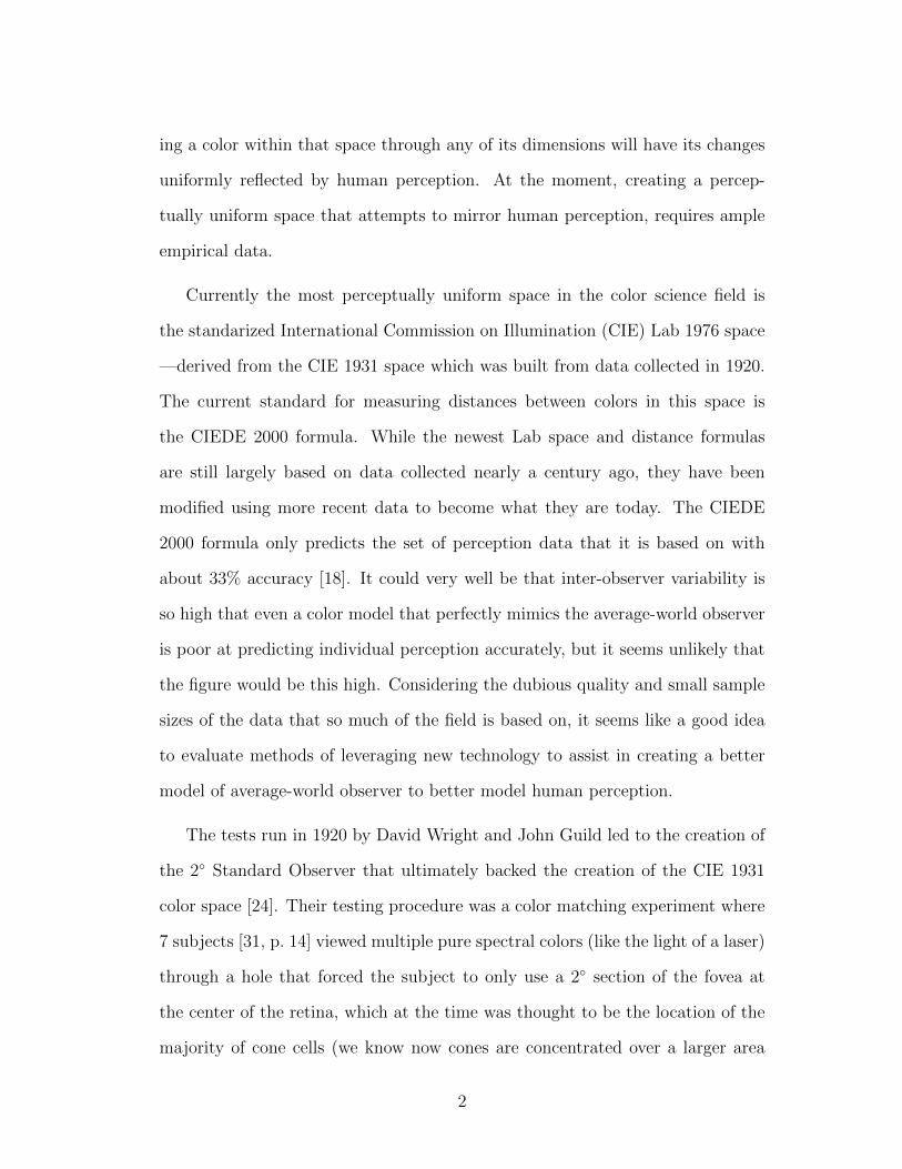
Figure 1.1: CIE 1931 xy Color SpaceDiagram [7]
The recordings from this ex-
periment led to the creation of
the CIE Standard Observer func-
tions (Figure 2.5), which show us
the mixtures of light required by a
color-normal person’s three cones
to create a particular color experi-
ence. Through a series of transfor-
mations this diagram can be tran-
scribed into the CIE 1931 XYZ
chromaticity diagram [17].
In 1964 after decades of crit-
icism, the 1931 standard was re-
tired and replaced. Some of the criticism arose from other testing that seemed to
challenge the testing the standard was based on, or highlight the lack of percep-
tual uniformity in the derived Lab space [17, p. 364]. A large part of this criticism
came from the results of MacAdam, who using one subject, mapped ellipses on
the CIE 2◦ chromaticity diagram, the boundaries of which encapsulated all colors
which the observer could not tell the difference from the color at the center of
the ellipse [20, p. 142]. Tests like MacAdam’s, despite using one observer, helped
advance the field. His results were used as a guide to “warp” existing spaces into
more perceptually uniform ones, and are still heavily referenced today.
Although a wealth of the research in the field of color science is from the
3

mid 20th century, it should not be discredited. The efforts made then sparked
the mathematical study of the field and were valiant ones given technology and
knowledge available at the time. This said, experimentation has not advanced
significantly since then, while we have proven that those experimental methods
even when carried out carefully, still can lead to large variability and error [18].
Knowing this gives hope that maybe a different approach that embraces the
nature of noisy data, by gathering statistically significant amounts of it can help
us draw better conclusions in the future.
1.1 Problematic Perception
In attempting to quantify how humans perceive color there are three layers to
keep in mind: the hard to predict physical factors that affect the way an object
reflects and gives off light, the varying physiology of humans, and the unique
black box that is the brain.
Figure 1.2: How Humans Perceive Colors [25]
4

Considering these variables and challenges there have been what can be de-
scribed as heroic attempts in the last century to understand and quantify the
human perception of color. Improvements in modeling human perception can
only truly come from empirical data [20, p. 31]. This is the field’s largest source
of error and headache. A large contributor to the color science field, Rolf Kuehni,
sums up the need for better data in his 2008 paper, Color Distance Formulas: An
Unsatisfactory State of Affairs, making a case that even the best current formu-
las only have at best a perceptual modeling accuracy of about 65% when tested
on current color perception data sets [18]. Kuehni attributes this unsatisfactory
measure at least partially to the fact that current formulas are based on “various
sets of empirical difference perception data established with different kinds of
materials, under different evaluation condition, and with different observer pan-
els” [18]. The derived formulas are then often compared back to some of the very
datasets that created them to be verified and mark the field’s progress. There is
no real alternative to using empirical datasets to create an “average observer” to
derive these formulas, but through gathering data that is better than what we
have we could potentially create an improved model of the “average observer”
and in turn a better model of color difference.
1.2 Limited Data
Ultimately, colors are psychological experiences and while many are quick
to point out that our understanding of neurological processes is improving, no
matter what advances we make in spying on these internal processes, a proper
understanding of the connection between what can be objectively measured and
subjective experiences created in our minds (ie. consciousness) is far off. To this
5
day “there is no detailed scientific explanation of the color vision process or the
vision process in general” [20, p. 23].
Color scientists have noble goals in maintaining rigorous testing procedures
in a field that relies on empirical data from the less than scientifically sacred or
mathematically rigorous platform of consciousness, but ultimately well-controlled
data still leaves us making conjectured leaps to create our models. This obviously
makes the data gathered the crux of our current understanding. Restrictions in
testing such as controlled light booths, expensive color-swatch sets, and other
variable-limiting conditions (such as restricting subjects’ fields of view to the 2
or 10 degrees where cone cells are densest in the fovea) have helped us obtain
data with rigor, but have resulted in small and arguably somewhat homogeneous
data sets.
Subjects can disagree significantly about the perceived magnitude of difference
between two samples of color [13, 18]; so “for the data to have statistical useful
meaning, they should represent the “world-average color difference observer” [20].
Based on existing data Kuehni thought this might require upwards of 60 color-
normal observers [20]. Most of the existing experimental data used to the fit color
difference formulas have used significantly less observers [20]. Trying to gather a
relatively large amount of observational data using such rigorous restrictions has
not yet proven practical or been incentivized enough for a contending model to
be created. As Kuehni states, reaching such a goal will likely take a well-funded
and orchestrated study [18]. Because of these reasons there currently aren’t any
significantly better datasets or new competitive color models. Therefore it may
be worth considering new alternative methods of gathering data such as crowd-
sourcing.
If the reason for this unsatisfactory state of affairs truly is a lack of data as
6

opposed to the quality of the data collected, it may be worth exploring crowd
sourced data collection as a new experimental method. Even if this method
proves not viable it could help us understand the importance of quality versus
quantity of color perception data.
My thesis proposes new methods and tools for crowdsourcing color perception
data collection via mobile devices rather than controlled light rooms with tiled
samples in order to gather a massive, and potentially more comprehensive data
set. This data could potentially be used in new, previously impractical ways to
draw insights about how location of individuals, time of day, device profiles, etc
affect perception. This method also makes it relatively easy to record additional
experimental information such as how long observers spent on parts of the ex-
periment and opens to door to ongoing testing with the same observer by pushed
updates that allow for testing of new perception experiments when needed. Af-
ter statistically accounting for noise and device shortcomings, the usefulness of
the data gathered via this method is admittedly still a bit dubious, but there is
great potential in a quantity over quality approach—the extent of which is cur-
rently unknown. I believe given a large enough dataset with the right statistical
approach many of the envisioned shortcomings would ultimately have negligible
effect on the accuracy of the conclusions drawn (this effect may be amplified on
small or just-noticeable difference color difference data). Such a large and po-
tentially global dataset could give us new insights into inter- and intra-observer
variability, how environmental and testing variables affect perception, and more.
So while it is unclear if a less groomed but potentially massive data-set of color
perception data could help improve our current models of perception, exploring
the idea is certainly a worthwhile endeavor.
7

1.3 Crowdsourcing Solution
Given the ubiquity of mobile devices with their increasing color accuracy [26],
it makes sense to try to leverage their pervasiveness to gather more voluminous,
varied data to attempt to advance the field. Currently if someone wanted to
create a new color model they would need to reinterpret preexisting data, buy or
create color testing samples along with a controlled light viewing equipment, or
build new experimental equipment. Crowdsourcing requires neither a grant-sized
budget to build or buy new testing equipment nor physical access to a diverse set
of willing test participants. This thesis aims to cover the foundations required to
understand color and human perception and to investigate and provide possible
tools and future directions we can take to bring color data collection and the color
models and formulas that rely on them to new heights of perceptual accuracy.
As outlined, while promising, crowd-sourcing as a means of data-collection is
problematic. Digital screens found on mobile devices use device-dependent RGB
color spaces and represent a fraction of the colors humans can perceive [10, 20].
This means that even if we understand the perception of this limited subset of
colors perfectly we would not be able to safely extrapolate that understanding
to all of the colors humans perceive. Even if we can build better RGB displays
with larger gamuts, creating all human visible colors by mixing three base colors
is fundamentally impossible. While new technology like quantum dot displays
are just beginning to enter the consumer realm they would likely only improve
representation of the visual spectrum from the 20% seen in typical LCDs to 60%
[10].
Until very recently most mobile devices had poor color management even if
they had decent color reproduction. Essentially without color management there
8

is no guarantee that a color displayed on one device will appear the same on
another. Newer devices like Apple’s iPhone 5 are color managed and use the
device independent sRGB gamut meaning color can more strictly be controlled
and predicted [16, 26]. Despite this revelation, even sRGB still only represents a
subset of visible colors (see Figure 1.3); that said it still comprises a substantial
amount of the object colors we see day-to-day [5] and if we can make progress
modeling perception of the RGB gamut more accurately, that progress would
likely spill into the rest of the visible range to some degree.
The problems reproducing all colors aside, knowing what color a particular
viewer is seeing on mobile devices can become further complicated when we con-
sider the effects of surrounding light, screen brightness, viewing angle, and the
fact that screen pixels produce light rather than just reflect it they way real world
objects do. Testing on a mobile phone will never be the same as a controlled light
booth, but there are some rudimentary ways in which we can mitigate these con-
cerns to a degree. The first of which is to group data by device; by doing this
we can better guarantee a group is seeing the same colors. By controlling screen
brightness we can make sure all observers are using the same brightness settings.
By recording ambient light via device sensor or front facing camera we can roughly
estimate ambient light (although we cannot capture the spectral distribution) to
either again group data, throw out outliers, normalize variance, or just study the
affects of surrounding light. By recording gyroscope and accelerometer data we
can potentially determine device angle to assist the user in holding the device
at the right angle, or know if they have moved the device significantly during
the test. By recording all of this additional data I believe we should be able to
filter or adjust the collected data enough such that the noise is not statistically
significant.
9

Figure 1.3: sRGB gamut drawn inside the CIE 1931 chromaticity dia-gram [7]
10

While there is no logically sound way to verify a tool for measuring perception,
we can try to use the tool to reproduce existing results from other experiments
as a rough means of affirmation. In the case that the tool provides better, but
different data than existing tests it will be hard to confirm that it is valid. That
said, considering all of the variables mentioned it is unlikely this tool will collect
more accurate data on a test by test basis, but by analyzing the overall results
we should hope to see similar results to other tests.
While I cannot claim to be color scientist let alone a mathematician or statis-
tician, I’ve studied and tried to understand the field to the best of my abilities so
that I can apply my expertise as a computer scientist to help advance the color
science field by way of new color discernment and discrimination testing tools
built to tap the masses.
11
CHAPTER 2
Background
2.1 Color
Color is arguably the most important sense humans have for navigating, un-
derstanding, and internalizing the world around us. Color itself is a vague term;
a more clarifying way to define color is as a color experience, however, for simplic-
ity’s sake we will just refer to this as color. At its core, the experience of vision
is formed by a small range of electromagnetic waves that are detected and inter-
preted by the roughly 120 million photosensitive cone and rod cells in our retinas.
Only 7 million of those are cone cells that help us detect color, the majority of
which are packed into a 0.3mm across circular area1 called the fovea [20, 3]. From
here a complex patterns of nerves interpolates this information in ways largely
unknown before further processing and interpretation in the brain [20, p. 39].
Most of us are trichromatic and have three kinds of cone cells. A non-trivial part
of the male, global population is dichromatic, causing partial color blindness.
1Tests that refer to a 2◦ observer restrict observer viewing to this dense, cone-only area ofvision.
12

There’s evidence that an unknown, small portion of the female population may
be tetrachromatic having slightly extended color vision [17, 15]). These three
kinds of cone cells are most sensitive to what we refer to as long, medium, and
short wavelengths, which roughly associate with the colors red, green, and blue
respectively. Purely talking about the signals our brain receives these are the only
real color inputs we receive, but once in the brain these signals are combined to
form new color experiences like yellow (from reds and greens) and magenta (from
reds and blues). This is to say that even when we produce a pure wavelength of
yellow light, the color we perceive is actually being formed from stimulation of
the long and medium wavelength cones. The spectrum of color we can perceive
is generally referred to as hue, and while it is only one part of what makes up a
color, as we’ll see later is regarded as one of the most important aspects when
humans differentiate between colors [17, 20].
2.2 Modeling and Ordering Color
There are many colorspaces in which we can quantify and numerically repre-
sent colors. Different colorspaces often define new component systems for break-
ing down colors, but often just warp and transform the space to better fit a set
of data or situation at hand. Most people tend to think of color in three compo-
nents: hue (what we tend to think of as defining color), saturation (the strength
of the color from grey to pure), and lightness (how light or dark a color is). There
are other component systems where the space’s dimensions are based on concepts
like opponent colors, or even on the abstract tristimulus responses of the cones.
Still, all of our current models are likely over simplifications of how colors are
actually created and held in the human mind. There is no sound reasoning aside
13
from familiarity and convenience that most color spaces are Euclidian in nature2.
In order to improve our simple models over the years we have warped the spaces
into contorted shapes that attempt to better represent perception, and when
that hasn’t worked we’ve modified the way we measure distances in that space
via distances formulas, which we will discuss in detail later.
Because of the nature of the perception, it is challenging to pare the prob-
lem down into simple numbers and to understand the perception of colors with-
out taking into account their context, but we can still come close. Effects like
metameric matching (objects that appear to be the same/different colors under
different light sources), the Helmholtz–Kohlrausch effect (see Figure 2.1), and
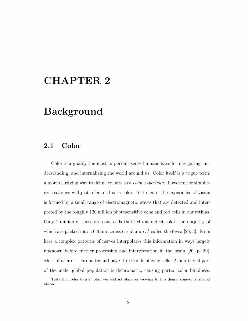
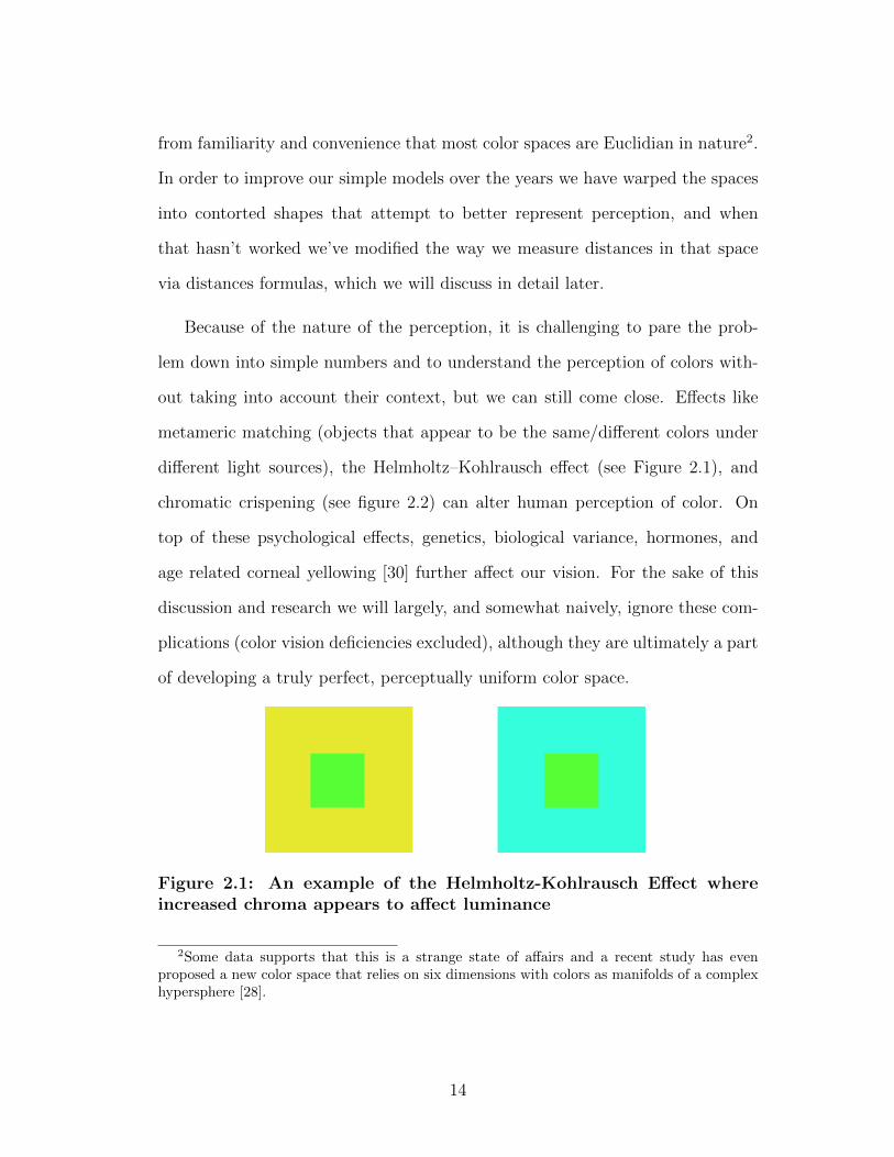
chromatic crispening (see figure 2.2) can alter human perception of color. On
top of these psychological effects, genetics, biological variance, hormones, and
age related corneal yellowing [30] further affect our vision. For the sake of this
discussion and research we will largely, and somewhat naively, ignore these com-
plications (color vision deficiencies excluded), although they are ultimately a part
of developing a truly perfect, perceptually uniform color space.
Figure 2.1: An example of the Helmholtz-Kohlrausch Effect whereincreased chroma appears to affect luminance
2Some data supports that this is a strange state of affairs and a recent study has evenproposed a new color space that relies on six dimensions with colors as manifolds of a complexhypersphere [28].
14
Figure 2.2: An example of chromatic crispening. The center colors arethe same, while the surrounds chroma values differ.
2.3 Perceptual Uniformity
Quantification of color with accurate attention to human perception has been
an ongoing struggle first documented by Ancient Greeks; it remains unsolved
today and some say is impossible to solve [17]. Put simply, forming a perceptu-
ally uniform space means designing a color space with humans in mind before
machines, one in which a measured distance between two colors points is propor-
tional to their perceived distance. That is to say around each color is an imaginary
sphere of arbitrary size at which all colors on its surface appear equally different
from the center color, and if the radius were to be doubled all of the colors on the
new sphere’s surface would appear twice as different from the same center color.
As mentioned there are many external and internal variables which complicate
our understanding of perception by way of being largely private and subjective,
and thereby unobservable and unverifiable. It can be argued that without so-
lidifying our understanding of these pillars of perceptions we cannot make any
scientifically sound headway in our understanding of human perception of color,
which while true, as Kuehni says “appears simply to address the fact that at this
point in time we do not have an understanding of consciousness” [20]. This is
where the field of psychophysics (the study of the psychological connection be-
tween physical stimuli and mental experiences) draws scientific criticism. In the
15
absence of an analytically rigorous foundation we must do our best to empirically
draw and rigorously test the observable and coincidental relationships of human
perception.
Since perceptual uniformity is not something can be logically solved even
if we could measure the physiological responses of our cones (including the in-
termediate cells between the cones and the brain whose purpose we still don’t
understand [20]), more accurately we would still be lacking clarity on the final
black box step of the brain where the final color experience is formed. Therefore
all color spaces that aim to achieve greater perceptual uniformity must be based
on experimental data3. While standards bodies such as the Commission Inter-
nationale de l’Eclairage4 (CIE), Optical Society of America (OSA), and others
have described standard spaces and data sets, the field is divided when it comes
to following standards. In the past, standards have been created out of necessity
of a divided field, or community discoveries and new experimentation.
2.4 Established color spaces
Color spaces provide an abstract mathematical way to model and understand
colors and enable quantification of colors as coordinate tuples using axes that are
appropriate for the task at hand. For instance while RGB provides a suitable
model for manipulating the colors of display hardware by representing pixels,
CMYK is a more fitting model for print work by representing ink. We can move
colors between spaces but there can be a loss of accuracy in the process through
3It’s important to note that many spaces are naively labeled as perceptually uniform whenthey really are just striving for perceptually uniformity and may only come relatively close toit.
4Translates in English to International Commission on Illumination.
16

gamut clipping, which occurs when a source color space can model more colors
than the target one. Often moving from one space to another requires additional
information especially when moving from abstract spaces to the more tangible
ones where say how lights interact with and change colors is important.
There seemingly isn’t a particularly sound reason that color should be mod-
eled using a 3D Euclidean form but whether out of the convenience of its famil-
iarity or because most of us have three types of cones, they typically are. 3D
color spaces can generally be divided into two camps: those sized by the abstract
principles of a task (eg. RGB, CMYK, or HSV), and the rest which all have
scales that attempt to balance each other to for a gestalt of perceptual unifor-
mity. Spaces that attempt perceptual uniformity often feature new axes and odd
contortions so that a Euclidean distance between two color points is proportional
to human perception of color difference. A helpful way to understand the con-
cept of perceptual uniformity is to look at a space where it is poor such as RGB;
Looking at figure 2.3, if we measure the 3D Euclidean distance between A and
B along the RGB axes their color difference is X, the same is true for C and D,
but anyone with normal vision will disagree that the pairs are equally different.
2.4.1 RGB
The RGB color space is based more on display technology than human per-
ception. In RGB colors are defined by their red, green, blue components. The
space is represented by a cube of equal length axes with white at the combined
maximums and black at the combined minimums of the origin. The entire gamut
of possible color (in RGB space) fits neatly into a 3D Cartesian cube, but dra-
matically fails at being perceptually uniform. This is easily evidenced by looking
17
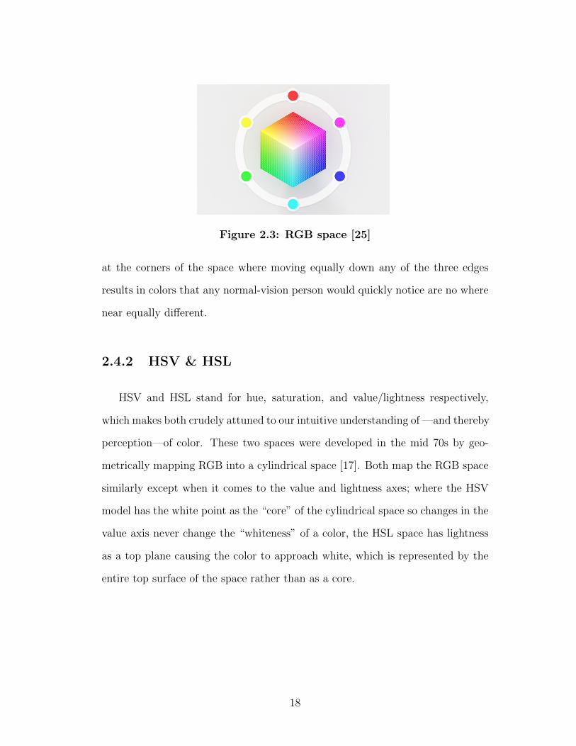
Figure 2.3: RGB space [25]
at the corners of the space where moving equally down any of the three edges
results in colors that any normal-vision person would quickly notice are no where
near equally different.
2.4.2 HSV & HSL
HSV and HSL stand for hue, saturation, and value/lightness respectively,
which makes both crudely attuned to our intuitive understanding of —and thereby
perception—of color. These two spaces were developed in the mid 70s by geo-
metrically mapping RGB into a cylindrical space [17]. Both map the RGB space
similarly except when it comes to the value and lightness axes; where the HSV
model has the white point as the “core” of the cylindrical space so changes in the
value axis never change the “whiteness” of a color, the HSL space has lightness
as a top plane causing the color to approach white, which is represented by the
entire top surface of the space rather than as a core.
18
2.4.3 CIE XYZ
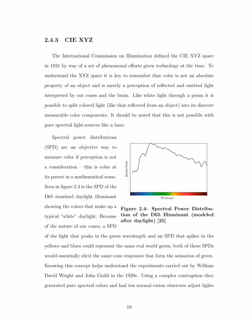
The International Commission on Illumination defined the CIE XYZ space
in 1931 by way of a set of phenomenal efforts given technology at the time. To
understand the XYZ space it is key to remember that color is not an absolute
property of an object and is merely a perception of reflected and emitted light
interpreted by our cones and the brain. Like white light through a prism it is
possible to split colored light (like that reflected from an object) into its discrete
measurable color components. It should be noted that this is not possible with
pure spectral light-sources like a laser.
Figure 2.4: Spectral Power Distribu-tion of the D65 Illuminant (modeledafter daylight) [25]
Spectral power distributions
(SPD) are an objective way to
measure color if perception is not
a consideration —this is color at
its purest in a mathematical sense.
Seen in figure 2.4 is the SPD of the
D65 standard daylight illuminant
showing the colors that make up a
typical “white” daylight. Because
of the nature of our cones, a SPD
of the light that peaks in the green wavelength and an SPD that spikes in the
yellows and blues could represent the same real world green; both of these SPDs
would essentially elicit the same cone responses that form the sensation of green.
Knowing this concept helps understand the experiments carried out by William
David Wright and John Guild in the 1920s. Using a complex contraption they
generated pure spectral colors and had ten normal-vision observers adjust lights
19
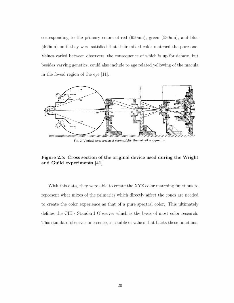
corresponding to the primary colors of red (650nm), green (530nm), and blue
(460nm) until they were satisfied that their mixed color matched the pure one.
Values varied between observers, the consequence of which is up for debate, but
besides varying genetics, could also include to age related yellowing of the macula
in the foveal region of the eye [11].
Figure 2.5: Cross section of the original device used during the Wrightand Guild experiments [41]
With this data, they were able to create the XYZ color matching functions to
represent what mixes of the primaries which directly affect the cones are needed
to create the color experience as that of a pure spectral color. This ultimately
defines the CIE’s Standard Observer which is the basis of most color research.
This standard observer in essence, is a table of values that backs these functions.
20
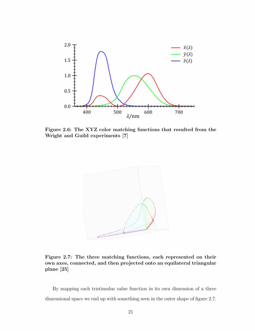
Figure 2.6: The XYZ color matching functions that resulted from theWright and Guild experiments [7]
Figure 2.7: The three matching functions, each represented on theirown axes, connected, and then projected onto an equilateral triangularplane [25]
By mapping each tristimulus value function in its own dimension of a three
dimensional space we end up with something seen in the outer shape of figure 2.7.
21
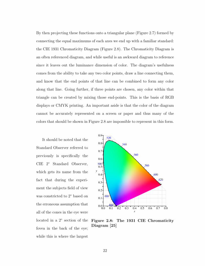
By then projecting these functions onto a triangular plane (Figure 2.7) formed by
connecting the equal maximums of each axes we end up with a familiar standard:
the CIE 1931 Chromaticity Diagram (Figure 2.8). The Chromaticity Diagram is
an often referenced diagram, and while useful is an awkward diagram to reference
since it leaves out the luminance dimension of color. The diagram’s usefulness
comes from the ability to take any two color points, draw a line connecting them,
and know that the end points of that line can be combined to form any color
along that line. Going further, if three points are chosen, any color within that
triangle can be created by mixing those end-points. This is the basis of RGB
displays or CMYK printing. An important aside is that the color of the diagram
cannot be accurately represented on a screen or paper and thus many of the
colors that should be shown in Figure 2.8 are impossible to represent in this form.
Figure 2.8: The 1931 CIE ChromaticityDiagram [25]
It should be noted that the
Standard Observer referred to
previously is specifically the
CIE 2◦ Standard Observer,
which gets its name from the
fact that during the experi-
ment the subjects field of view
was constricted to 2◦ based on
the erroneous assumption that
all of the cones in the eye were
located in a 2◦ section of the
fovea in the back of the eye;
while this is where the largest
22

concentration of cones is, quite a few lie outside this range leading to the creation
of the 10◦ Standard Observer in 1964 [17] which as expected is slightly different
and recommended by the CIE as most appropriate for representing the response
of human observers.
In summary the XYZ space is a mathematically defined color spaces that
represents all color experiences a normal color observer can have. It is often used
as a base from which other color spaces are created and can serve as a useful
intermediary when translating between color spaces.
2.4.4 CIE Lab
The CIE Lab space (technically L*a*b*) was developed by the CIE in the 70s
out of a need to unify many disparate color spaces and distance algorithms that
were quickly popping up in industries dependent on color. The L component
of the space represents luminosity and ranges from 0-100, while the a and b
components represents red-green and blue-yellow ranging from -128 to +128;
These two color pairs are opponent colors that don’t generally exist at the same
time [17].
After MacAdam first plotted his ellipses (representing sets of colors that were
within just noticeable difference from reference colors) on the 1931 CIE chro-
maticity diagram he set out to apply linear transforms to the space in such a way
that ellipses would become equally-sized circles and thus the space perceptually
uniform according to his data. Many others made similar attempts during the
50s and 60s to little success. Ultimately amongst increasing new visual color dif-
ference data sets, formulas that relied on MacAdam’s ellipses were worse. In 1948
R. S. Hunter started making tristimulus based colorimeter devices that could de-
23
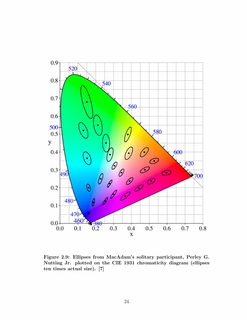
Figure 2.9: Ellipses from MacAdam’s solitary participant, Perley G.Nutting Jr. plotted on the CIE 1931 chromaticity diagram (ellipsesten times actual size). [7]
24
termine CIE tristimulus values of real life colors. Hunter proposed a new color
model with three axes (L, a, and b) as a translation of the XYZ space. The
translation of the space was later revised to agree more closely with the Munsell
color difference data (discussed later). By the 1960 there were at least a dozen
or so datasets with related color models and new ways of measuring color differ-
ences, all created out of necessity by the industries relying on color measurement
and reproduction (textiles, food, paint, printing, etc) [17]. In 1973 Kuehni found
poor levels of correlation between all of these models and their data sets, and
that they were generally poor at representing the average observer [17]. Various
groups and individuals continued down the path of ellipsoid fitting; finally in
1975 R. M. Rich, F. W. Billmeyer, and W. G. Howe modeled ellipsoid fitting on
a computer with great accuracy [17]. In 1976, out of necessity for an industry
standard, the CIE established the Lab space we know today. It didn’t make
any advancements over existing functions and even drew debate about its quality
compared to some of the existing functions it sought to replace, but ultimately a
compromise was reached and it was deemed a standard [17].
The CIE Lab space has become the standard form of color measure it was
intended to be. The space still draws criticism though, partially because the full
range of the space actually exceeds human vision and contains colors that don’t
exist in human vision, but mainly because it still lacks strong perceptual unifor-
mity. So while the space was formed with a goal of perceptual uniformity, it falls
short. Lab space is fairly accurate in its perceptual modeling of luminosity, but is
weakly perceptually uniform in the a and b axes, which affect the chromaticity.
Humans are more sensitive to change in hue than any other color parameter (a
phenomenon called hue superimportance) making improving perceptual unifor-
mity in axes that adjust hue challenging.
25

Since 1976, modifications, transformations, and translations of the space have
been proposed. As we’ll discuss, most of these changes have been rolled into
modified distance formulas used within the space rather than changing the space
itself. While there are other potentially better ways to model color, the CIE Lab
standard has served well enough to provide common ground until such a time
where a significantly better space can replace it.
2.5 Color Atlases
Where color spaces attempt to quantify colors on a continuous spectrum color
atlases take a discrete approach, defining sets of specific, unique colors and map-
ping them onto planes of hue, brightness, etc. Color atlases were arguably one of
the first practical ways color was ordered. There have been many color atlases,
but we will discuss the two most important ones.
2.5.1 Munsell
The Munsell color order system was created by Professor Albert H. Munsell
around 1905. It was the first 3D color order system that represented colors cylin-
drically in the three dimensions of hue, value, and chroma (similar to saturation)
with an attempt at being perceptually uniform between steps in any dimension.
In the 1930s the USDA adopted the Munsell color order system as a standard
for quantifying the colors of soil samples [8]. The Munsell system was refined in
the 1950s and 1960s by the Committee on Uniform Color Scales of the Optical
Society of America; through a series of perceptual experiments they completely
revised the Munsell system and ultimately replaced it with the OSA-UCS color
26
Figure 2.10: The Munsell Color Order System [7]
order system [17]. The Munsell system continues to have widespread use and is
referred to and relied on in various industries from food quality control to car
paint [8].
2.5.2 Optical Society of America Uniform Color Scales
(OSA-UCS)
The Optical Society of America developed the Uniform Color Scales while at-
tempting to improve the perceptual uniformity of the Munsell color order system.
Through the development of new experimental data they found that modeling
color with perceptual uniformity in a Euclidean space was not possible, but that
they would come as close as possible. After studying 38 uniform color scaling
studies a 500 color set was modeled in 3D rhombohedral lattice based on a cuboc-
27
tahedron. Essentially OSA-UCS is a continuous enclosed space like any other;
being based on the XYZ space using a 10◦ standard observer and a D65 illuminant
it is simply another way to discretely model color [17].
2.6 Color Distance
Quantifying the magnitude of difference between something that tastes salty
and something that tastes sweet seems like a bit of a ridiculous task, yet this is
not different from what color distance formulas attempt to do. Color distance
formulas serve as numerical representations of how different two colors are, as
perceived by humans, a problem that has been shown to be provably impossible to
do with perfect accuracy [20]. As Kuehni puts it, “any model short of duplicating
in a robotic fashion the complete color vision system will be found limited and
inadequate in specific circumstances. . . and then there remains the issue of inter-
observer variability and its causes and imports” [20]. In the absence of being able
to replicate the visual system, to at least quantify it relatively well we rely on
empirical human experiments to build a model of the average world observer’s
color perception, with the purpose of shaping our mathematical models to fit
that average observer’s perception accordingly.
Many 3D color spaces have been built in an attempt to capture this average
perceptual uniformity into their shape such that a Euclidean distance (the square
root of the sum of each dimensional difference squared) is perceptually uniform no
matter where the colors chosen lie in the space nor how different or similar they
are. Models can only be as good as the experimental, subjective data they are
based on though and whenever new datasets are gathered they tend to disagree
with the existing data to a non-trivial degree [17]. Often this leads to new distance
28

formulas that are far more complex than a simple Euclidean distance. These
distance formulas are the crux of the field and forefront of research.
There are many different experimental color perception tests to test for dif-
ferent sized magnitudes of difference between colors, from large to just barely
noticeable. On top of that, there are dozens of variables (from presentation of
colors, to size, to illumination, to how questions are asked) that can affect the del-
icate subjectivity of the problem at hand [9]. Even when testing is done properly
there is considerable error from inter-observer variation, and even intra-observer
variation between testing sessions when conditions are maintained [13]. In the
end even after creating a perfect world average observer, our mathematical pre-
dictions of the magnitude of difference a person will detect may only really be
accurate for 20% of the population [20, p. 132]. These points, while discouraging
also bring up a whole new facet of study around how different people perceive
color, when their perception changes, and more, but before moving onto these
goals we should first focus on improving our current best distance formulas to the
best of our abilities while there is definite and measured room for improvement.
2.6.1 The Curent State of The Art: CIEDE2000
Near the end of the 19th century Hermann Helmholtz, one of the largest
contributors to the visual perception and experimental psychology fields proposed
measuring the difference between two colors using a Euclidean distance [20]. In
the 1930’s Dorothy Nickerson attempted to more accurately model perception
of difference by introducing a psychological basis that took into account some
of the strange effects of perception. Her work indicated that the well-respected
Munsell system might not have had perceptually uniform axes [17]. In 1942
29

David L. MacAdam published a new set of experimental data. In MacAdam’s
experiment one observer repeatedly mixed RGB primaries to match 25 colors
(selected relatively evenly across the CIE chromaticity diagram). After gathering
over 25,000 trials, MacAdam was able to derive the now iconic ellipses (see Figure
2.9) representing colors within a range of just noticeable difference (JND) [24].
Although these ellipses are still widely referred to today, when tested against other
wider datasets that measure color perception of object colors they perform poorly
[20]. The procedure of drawing ellipses to represent difference data remains today.
A presumed reason that MacAdam’s data might not match up to further studies is
that color matching may happen at the physiological-level more than at the post-
processing level of hue and chroma evaluation in the mind. MacAdam’s single
observer data, while significant, cannot be taken to represent the average observer
and what they perceive as just noticeably different. Even MacAdam recognized
this in his 1942 publication: “some variations in judgment are inevitable. No
doubt the ideal method would be to make a large number of matches at each
point in the colour chart and then to analyse the spread of the observations, but
in practice this would be an impossibly lengthy process” [24].
Following MacAdam’s work many new studies emerged testing color difference
perception of object colors to create ellipses5 around reference colors. Fitting color
ellipsoids to be spherical using mathematical transforms has become the standard
process by which distance algorithms are created and improved [17]. Around the
mid and late 1900s a significant amount of new data was gathered. With each new
set of experimental data came new difference formulas, and “in 1973 Kuehni found
that 13 different formulas were in use in color-related industries”, but that “levels
5These ellipses almost always are more elliptical than circular and tend to “point” toward thesomewhat-central neutral white point because of the heavy significance hue plays in perceivedcolor difference.
30

of correlation between visual and calculated data for all. . . were unsatisfactory”
[17]. Eventually in the 1970s, out of need more than revelation, the CIE proposed
a new standard: the CIELAB space and its respective Euclidean measure of
difference.
Following a rash of new experimental datasets and distance formulas, the
most recent crown jewel of the CIE is CIEDE2000, —the result of mathemat-
ically fitting of three combined ellipsoidal datasets (RIT-DuPont, Witt, Leeds
and BFD-P) as well as six other considerations of perceptual effects that the
CIE tried to account for6 that weren’t always accounted for in previous formulas
[13, 17, 20]. Despite best efforts, the exceedingly complex CIEDE2000 formula
has shown to be anything but a large improvement over prior formulas and is
still not anywhere close to perfect.
6The six perceptual effects are hue super importance, relative change in chroma differencewith respect to chroma location, lightness crispening based on surround lightness, the fact thatthe ellipse of the white-point is still an ellipse, hue difference with respect to hue location, andellipse rotations in the negative b axis.
31

CHAPTER 3
A New Way to Test
3.1 We Require Additional Data
Often color science research papers concede to some degree in conclusion that
while best efforts were made, due to the noise of variability, a larger, more di-
verse dataset might have made for stronger results [13, 19, 21, 22]. Additionally
gathered datasets are often hard to compare to one another since they are all
collected slightly differently. This has slowed field-wide progress and not greatly
contributed to our knowledge about the degree to which these differing environ-
mental conditions affect results. In addition to all this we’re beginning to see
evidence that observer variability might be something that cannot simply aver-
aged out, and instead will require us to come up with many different color models
tuned to different groups of the population [19].
All of this is unclear from the relatively small amount of data typically gath-
ered [18, 13]. As mentioned earlier, the study of psychophysics stands on the
unsound ground of consciousness, so rigorous testing methods are necessary for
32
both respect and to not add additional variables to observing the complex device
of the mind (and body to a degree). While carefully manufactured paint/fab-
ric samples and calibrated light booths are invaluable assets in studying color,
they are exceedingly expensive and require finding and bringing in test subjects
one-by-one for lengthy experiments. Even experiments that use digital displays
typically require custom setups and relatively large budgets or sponsorships for
the results gathered [39]. The field bemoans more data, yet gathering it is often
prohibitive and archaic.
3.1.1 CIE Guidelines for Coordinated Research
In the Fall of 1978, the CIE published a paper titled CIE Guidelines for
Coordinated Research on Colour-Difference Evaluation with the goal of unifying
research in the field shortly after the standardization of CIE Lab 1976. It was
understood that the CIE 1976 standard was a stopgap that would ultimately
need to be refined [17]. The task at hand was to establish a comprehensive set
of color perception data focusing on small, medium, and large color differences
under different viewing conditions. The authors admitted that the task was
complex and may never be completed, but thought substantial progress could
still be made with a strong collective effort. The established guidelines suggest
breaking testing into four steps, with an end goal of forming contours of equal
perceived colour difference (∆E) from a particular color via a provided difference
equation. The guidelines of the steps are as follows.
33
Step 1: Study of Methodology
Step one dictates that experiments should be conducted in the neighborhood
of five standardized color centers (roughly a grey, red, yellow, green, and blue) the
last four of which are means of the four tetrahedra studied in the OSA Uniform
Color Scales [9]. Observers should be tested to ensure that they are normal
trichromats and color discrimination should be further tested if possible. The
guidelines recommend repeating experiments 4 times with at least 20 observers.
The guidelines outline three different techniques of tests, summarized as col-
orimeters (light mixing devices), color difference simulators, and object colors
(sample swatches). In regards to testing finite object colors, the CIE estimated
that it would take about 50 samples per color center, well distributed along stan-
dard vectors from a color center. Essentially all of these tests involve comparing
colors to a reference color in one way or another.
A couple of methods are suggested for comparing object colors, the first be-
ing the Rich-Billmeyer-Howe method where pairs of samples are judged for ei-
ther matching or not matching; repeatedly testing the pairs helps establish if
color pairs are consistently perceivable as different. A second method of compar-
ison with a constant color difference provides observers with two pairs of colors,
one being greyscale. Observers are asked to judge whether the difference be-
tween the greyscale pair is greater than or less than that of the standard pair.
Again, this test repeats the testing of pairs to test for consistency. The third
suggested method of comparison is the visual scaling method which is a catchall
term for a group of experimental methods often used in psychology and sociol-
ogy studies, but also psychophysical studies, where the end result is a ranking
of tested items. Paired comparisons (discussed later) is a comparative visual
34
scaling method, with associated statistical procedures that have been developed
specifically for psychophysical tests.
Step 2: Study of Experimental Parameters
Step two suggests investigating the effects of the following parameters on per-
ceived difference: sample size, illumination level (luminance level), sample sep-
aration, texture, colour surround (focusing on neutral surrounds and surrounds
that are similar in color to the samples), luminance factor, size of ∆E of samples,
observer variability, duration of observation, and monocular versus binocular ob-
serving.
Step 3: Study of Color-Difference Perception of the Whole Color Space
Step three is to derive a set of fitting coefficients constants throughout the
color space by following a decided set of conditions (described in Step 2) using
the data from the conducted experiment.
Step 4: Derivation of a Distance Formula
Step four is to derive a new color distance formula from the data obtained in
Step 3 and to test it in field trials.
3.1.2 Established Experimental Methods
The CIE guidelines for coordinated research recommend one of three kinds of
previously mentioned testing procedures. Through investigating dozens of color
perception experiments conducted over the last century with a focus on the last
35

few decades, we found a myriad of experimental set ups, but all more or less
largely fall into the following four categories described in detail below.
Color Mix Matching
Color mix matching tests (like those used by MacAdam in the early 1900s)
generally rely on mixing primary colors to match a reference color, with the
end result being a set of colors that the observer has mixed and decided were
indistinguishable from the reference. While this test could be implemented on a
mobile device, its value is questionable for a couple of reasons. First, the spectral
pure wavelength lights meant to represent wavelengths of peak recognition by the
cones, lie on the edges of the chromaticity diagram and cannot be recreated by
any RGB display. We could forgo this requirement and use the RGB primaries
instead, working within the gamut of the device to match colors. Second, while
there are many clever ways to let observers mix colors (via knobs, sliders, or even
by tilting the device), it is hard to give observers the same level of control seen
with physical knobs, but that is a bit of a weak argument; the larger problem
is that given a reference color and a few simple controls, observers are likely to
end up mixing colors in a repetitious way when more random results would be
expected within the range of indiscernible difference. This could be somewhat
averted by techniques such as switching the order of the mixer controls between
tests. Ultimately, if the end goal of such a test is to find colors which observers
find indistinguishable from a reference color then it seems it might be simpler
and faster to generate colors close to the reference and ask the observer if they
can tell the difference.
36
Color Discrimination
When exploring the idea of mimicking a color discrimination test inspired by
the Farnsworth Munsell 100 Hue Test (FM 100 Hue Test) [8] it quickly became
apparent that this test, while useful for testing personal color vision discrimi-
nation and possibly drawing correlations between color discrimination abilities
and personal/experimental attributes (gender, age, ethnicity, light source, view-
ing angle etc), was not useful for contributing to the model of the world average
observer. The test itself is designed, “to separate persons with normal color vi-
sion into classes of superior, average and low color discrimination and to measure
the zones of color confusion of color defective people” [8] and can score in such
a way because it prescribes a correct color ordering. Ultimately this type of test
doesn’t help us understand colors within just noticeable difference (at least for
superior color observers) and likely cannot help us understand discernment of
larger color differences. This said, a color discrimination test similar to the FM
100 Hue Test is likely a great measure to use before experiments to check for
color deficiencies in a known and measured way. There may be other more useful
ways to use color discrimination tests to gather the data needed to improve the
average world observer model, but this type of test on a mobile device is probably
too time consuming for the kind of results it delivers.
Contrast Matching
Color matching is used in many recent color discrimination studies [39, 36].
The basic premise is that while there is a yes/no answer to the question of can an
observer tell if there is a discernible difference between two colors, it is harder to
ask an observer how different two colors that are clearly different are. The usual
37
strategy is to provide a reference pair of greyscale colors and to ask the observer
if the difference between a provided color pair of colors is greater than, less than,
or equal to that of the greyscale reference pair. Another strategy is to give the
observer a set of greyscale pair samples and ask them to choose the one with the
closest match in difference to a provided reference color pair.
It is my opinion that this is currently the best method for measuring medium
to large color difference discernment, but it is an awkward test to give comparing
greyscale samples to color ones and the test’s origin seems to be driven by pre-
computing technology. A possible digital variation of this test that may be easier
on the observer by allowing the observer to adjust the contrast between the colors
in the greyscale pair until the observer is satisfied that its difference matches that
of the colored pair. This comparison still seems awkward and hard for users to
judge.
Color Difference Discernment
A color difference discernment test can be carried out in a number of forms
but in its simplest form tests if a user can discern the difference between two
colors or not. This is obviously only useful for testing the threshold of just
noticeable difference around a reference color, but can be modified to test for
more. This simple, binary test seems to serve as a modern replacement for color
mix matching tests, but as it is quickly becomes less than useful with color pairs
outside of the just noticeable and small difference range.
38
3.2 The Proof of Concept
Cheaper, quicker color difference evaluation using digital displays has largely
been ignored for the last couple decades for a couple of good reasons [17, 20, 39].
However, despite their shortcomings and considering recent improvements we
cannot continue to afford ignoring digital alternatives. Mobile devices with ever
improving color reproduction [26] and a wealth of sensors provide a relatively
easy means to gather new, dense experimental data at a scale researchers like
MacAdam once called impossible.
How digitally gathered datasets compare to physical ones has only begun to
be explored; it is currently unclear if the results of digital tests (using colors that
are in gamut) match up to more established physical ones [17, 39]. It is also likely
that this form of data gathering will be very noisy from inter-observer variability
[39], but with enough observers, tests, and previously unrecorded experimental
data, we may be able to mitigate these problems enough to make meaningful
advances. It is possible that in this trade-off of control for scale we will not be
able to advance our understanding of perception further than we already have;
regardless, it is a worthwhile endeavour to explore the wealth of new experimental
opportunities crowdsourced color perception experimentation on mobile devices
provides, even if only to prove that it is not yet possible and to help understand
why.
After surveying the advantages and shortcomings of existing color tests, it is
clear that the field could benefit from new creative ways to test the degrees of color
difference perception. From this survey and examination of the CIE Guidelines
I propose a new, arguably more robust method of experimentation based on the
statistical method of paired comparisons, to help cope with the additional noise
39

that can come from digital and crowd sourced testing, and to help highlight inter-
and intra-observer variability. This variation of a color difference discernment
test uses a center reference color and two comparison colors placed on either side,
and asks the observer to choose which color is closest to the reference (Figure
3.1). This kind of test is unique in some ways, but is related to existing tests
[36, 19, 9]. Additionally, by conducting this test in a crowd sourced manner via
mobile devices, the test itself can be iterated, and performed more rapidly at a
scale never before tested. In addition, this method of experimentation is highly
extensible and adaptable to changing experimental conditions, evolving data sets,
and new hypotheses.
While each individual comparison the observer makes is a discrete test, the
strength of this experimental method relies on the information that can be gleaned
from a completed test session. The combination of information from each individ-
ual comparison test, along with what can be inferred from a session of comparison
tests (plus additional information provided by the mobile device being tested on
regarding environmental and testing conditions) allows us to identify poor judges,
poor testing environments (environment, device, etc), and even poorly designed
tests to a degree.
By testing the same observer with the same color pair multiple times, test-
ing multiple observers with the same test, and overlapping sets of tested colors
with other observers, we can potentially stitch together a larger continuous set
of results. After we have a large pool of test results we can filter and purify
noise out of the data and draw new insights on inter- and intra-observer variabil-
ity. Through crowdsourced testing, we essentially observe if the variables were
controlled (filtering accordingly) rather than trying to control the variables.
40
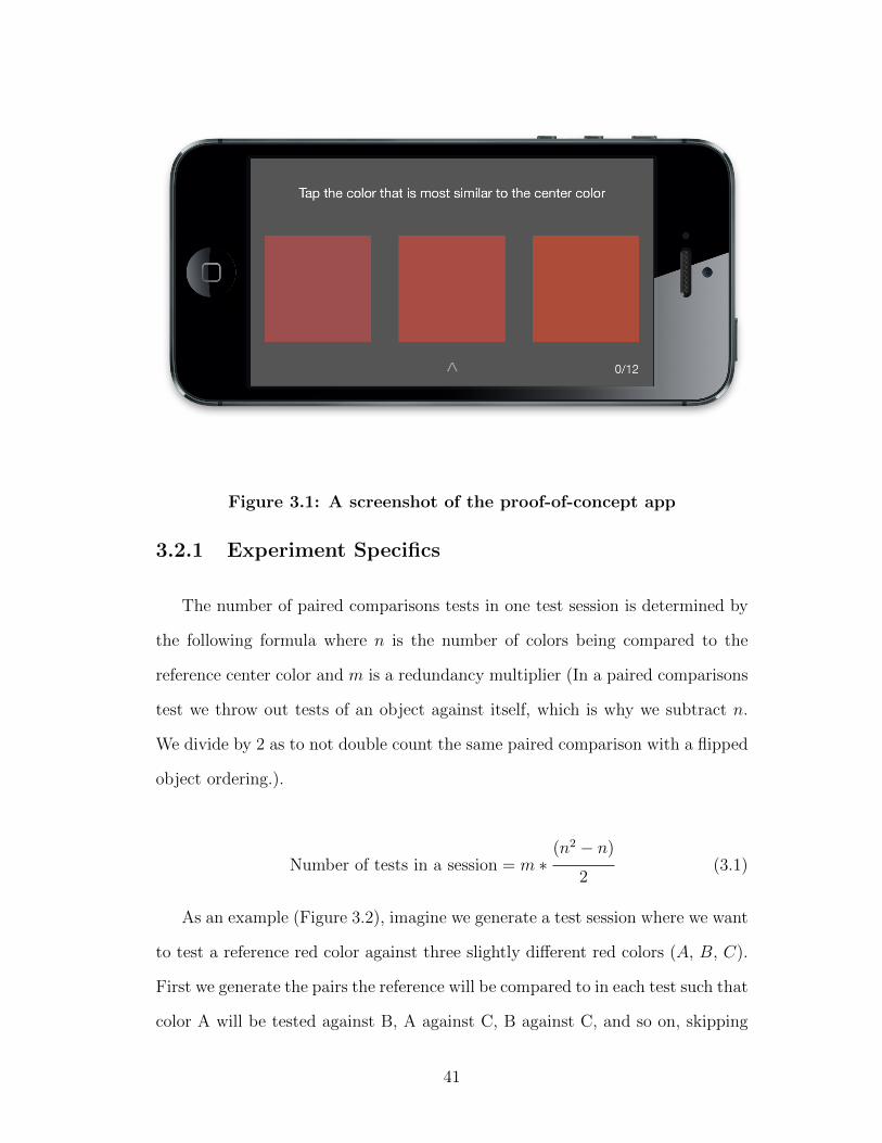
Figure 3.1: A screenshot of the proof-of-concept app
3.2.1 Experiment Specifics
The number of paired comparisons tests in one test session is determined by
the following formula where n is the number of colors being compared to the
reference center color and m is a redundancy multiplier (In a paired comparisons
test we throw out tests of an object against itself, which is why we subtract n.
We divide by 2 as to not double count the same paired comparison with a flipped
object ordering.).
Number of tests in a session = m ∗(n2 − n)
2(3.1)
As an example (Figure 3.2), imagine we generate a test session where we want
to test a reference red color against three slightly different red colors (A, B, C).
First we generate the pairs the reference will be compared to in each test such that
color A will be tested against B, A against C, B against C, and so on, skipping
41
testing colors against themselves. We then generate the same pair tests m more
times to ensure that an observer will see the same pair multiple times to test for
consistency. An observer that disagrees with their own judgements enough will
have their results thrown out unless a large enough portion of the population also
disagrees with themselves on the same pair, which would mean those two colors
are hard to discern from one another. After all the pairs are generated, their
order (including the order of the colors within each pair) is randomized. This
randomization can happen for each observer or just once before the test is given
to multiple participants.
After generating a set of tests, the observer is shown each pair of colors
with the reference in the center and asked to choose which color in the pair
is closest to the reference color. Time is not limited or recorded for each test,
but could be. Each of the three color patches are equally-sized and positioned
with equal space between them to reduce the known illusory impact of size [34]
and distance1. The color squares are placed on a neutral grey background in
an attempt to reduce the bias of the chromatic and lightness crispening effects
(this effect causes a measurable increase in the perception of difference between
two colors when the surrounding color is close to the samples in lightness or
chroma); most researchers attempt to minimize this bias by consistently using
a measured neutral grey [34, 13]. Between making color selections, the color
patches (excluding the reference) are briefly replaced with the same neutral grey
used as the background to mitigate a burn-in effect (this brief break likely is not
long enough to counteract the illusory effects of staring at a sample for a long
period of time, but could be adjusted accordingly and is better than nothing).
1The farther apart two colors are the more similar they appear. When two colors are side-by-side with no separation, differences are especially apparent [34]
42
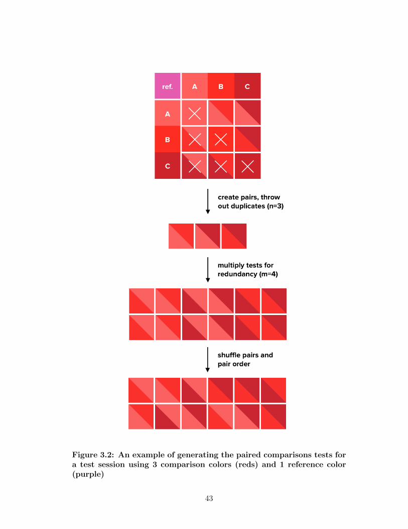
Figure 3.2: An example of generating the paired comparisons tests fora test session using 3 comparison colors (reds) and 1 reference color(purple)
43
While each test is relatively quick, the number of tests required for each
additional color increases exponentially. For example, using our Equation 3.1,
testing 3 colors with triple redundancy takes 18 pair tests, while 6 colors balloons
to 90, which can be reduced to 60 if only double redundancy is used. This,
however, is not impeding since crowdsourced test sessions can be organized such
that they are repeated with similar judges/environments, or even partially overlap
to connect smaller datasets into more meaningful larger ones.
3.2.2 Paired Comparisons
Thurstones Law of Comparative Judgment and the Method of Paired Comparisons[38]
is a widely cited method of statistical analysis for quantifying and ranking pref-
erences of things that are typically hard to quantify and directly compare to one
another. Paired Comparisons makes it relatively easy to rank things like foods,
job options, election candidates, etc. The method itself describes an experiment
design that can be analyzed by a set of statistical methods to rank its inputs and
analyze the validity of the results based on the consistencies of observers. The
basic premise relies on putting every option to be compared against one another
in the style similar to a double round-robin tournament (see the top illustration
in Figure 3.2). The observer is then presented one pair at the time to choose
between based on the question being asked. For each pair the winner is assigned
a point; the score of each comparison is recorded separately for further analysis.
Once all pairs have been tested, scores are tallied per row, representing all of the
comparisons for which that object was chosen (in Figure 3.2, if for the two tests
in row A, A was chosen in the first pair, and C was chosen in the second pair,
the score for row A would be 1). These row totals can then be used to rank the
choices. There are two validity checks to run before using this data however.
44

Using Paired Comparisons Data
One of the benefits of Paired Comparisons is how it inherently captures judge
consistency information. One way to check for consistency is by looking for
the number of circular triads an observer makes. Triads are formed when votes
contradict the transitive property. If someone prefers A over B (A > B) in a
paired comparison and then B over C (B > C), we can say that that person
should prefer A over C (A > B > C ≡ A > C). In the case of two choices,
a disagreement might just signify a difference between the three that is within
just noticeable difference (in other words are perceptually the same), but in the
case that a loop is formed (A > B, B > C, C > A) there is a disagreement
and a circular triad is present. These triads occur because either the objects
being compared are imperceptibly different to the observer either due to personal
perception, environmental conditions, or just poor test taking2.
Formulas are available for calculating total number of triads in a set of paired
comparisons for an observer and for creating a coefficient of consistency by com-
paring found triads with total possible triads. When a judge has a consistency
coefficient that is anomalous with the group, then we can identify that they may
have lower perception of differences relative to the group or that their testing en-
vironment was relatively faulty. When a measured majority of judges have poor
consistency coefficients, it might be a sign of a bad test, or imperceptible differ-
ences. Additionally, if a majority in the whole population of judges forms the
same triads there may be an imperceptibility of difference between those objects.
2All of these assumptions can be more-or-less confirmed by comparing results to the globalresults and to recorded environmental variables such as light, device movement, etc.
45

3.2.3 Following the CIE Guidelines
The CIE Guidelines were kept in mind while designing this experimental
method, with considerations given to the fact that guidelines were published in
1978, long before color experiments using digital displays could be conducted.
Largely this experimental method hopes to follow Steps 1 and 2 to be a means
of providing data for future research following Steps 3 and 4.
Step 1
Being a digital experiment, almost any color center can be tested, granted it
and the range of colors around it being tested fall into the gamut of the device
space. It is important that the experiment be run on a device with a known gamut
so that the mapping of device-independent Lab colors to device-dependent RGB
is accurate. In our testing Apple’s iPhone 5 and 5s were used3, both which
have a known and consistent sRGB gamut. As for the test itself, we determined
that a visual colorimeter or color-difference simulator testing approach did not
make sense considering the medium, and that a test that modeled object color
experiments was more apt. Typically, the limiting factor of object color testing
has been having a limited number of samples, creating them, making sure they
do not degrade, avoiding metamerism, and making sure they are not fluorescent4.
Almost all of these concerns essentially become non-issues on a digital device with
a known, well-controlled gamut5. This is not to say there are not other concerns
with digital reproduction of color (discussed more later). Running an experiment
3Pilot study experiments were run exclusively on an iPhone 5s4Fluorescent in this sense means emitting light from absorbing light (for example a substance
that glows blue under UV light in normal daylight containing invisible UV light).5However even quality displays with faithful consistent color reproduction across devices can
degrade different over time or have defects off the factory line resulting from inadequate qualitycontrol.
46

like this in a digital crowd sourced manner makes the recommended experiment
repeat and observer counts (of at least 4 and 20 respectively) suggested by the
standard, trivial to meet.
The paired comparisons style experiment we use falls under the suggested
visual scaling method and the raw data gathered should be comparable to other
similar studies. It should be noted that we did test experiments that modeled af-
ter the other two suggestions of the guidelines (the Rich-Billmeyer-Howe method
and comparison with a constant color difference method), but determined the
paired comparisons method to produce more robust and versatile data, and to
be the easiest for observers to understand.
Step 2
Step 2 is about testing the various parameters that are known to affect color
difference perception6. By the nature of our experiment being digital and crowd
sourced, testing the effects of all but two of the parameters described (texture of
samples, and monocular vs. binocular observation) should be relatively simple.
By targeting observers that have already taken a pilot test with an identical test
with one tweaked parameter, we should be able to build an understanding of how
these parameters effect perception.
Simple experimental attributes like sample size, sample separation, color of
surround, duration of observation, and size of ∆E can all be easily tweaked and
tested. Furthermore with crowdsourcing, it is possible to test the fine-grained
effects of slight experimental parameter changes by automatically adjusting pa-
rameters and generating new tests to send out, based on currently received results.
6The quantified degree to which these parameters effect perception is largely disputed andunknown [9].
47
For example if we want to test the size of samples we could send out two modified
tests to our n observers who have already seen the original, one with a slightly
smaller sample size, and one with a slightly larger one; based on the results we get
back, we could then choose to investigate (manually or automatically) some finer
grain of in-between sizes where perception is most contentious to help quantify
how that particular parameter affects perception.
Parameters like illumination level and luminance level are more questionable
to test on mobile devices in uncontrolled environments, but still can be tested to
a degree to possibly provide new insights. By controlling the brightness of the
device screen we can test how illumination level affects perception, although it
must be noted that by the nature of being displayed on a screen, the samples are
emitting light rather than reflecting light from an illumination source. Luminance
factor (the ratio of luminance of a sample compared to a perfect diffuser under
the same lighting conditions) is probably near impossible to test, but a similar
variable we can study is the affect of environmental light at the time of testing.
By using either light sensors built into devices (usually used to adjust screen
brightness automatically), or front-facing cameras, we can measure the intensity
of the light in the testing environment to a degree. This information can later
be correlated to changes in perception, or can be used to filter test results by
throwing out tests that either are outside of a certain range or that fluctuated
too much during testing.
3.3 Pilot Study
The first purpose of the pilot study was to build and test a simple iteration
of the application (app) to determine best usability practices and platform lim-
48

itations. The second purpose was to use the built app to collect a relatively
small, but statistically significant, dataset in order to estimate the rough level of
variability in the data and the scale of data that might be needed in a full study.
3.3.1 App details
The app was built for iOS in order to target Apple’s iPhone 5 and 5s; both
devices use a reliable, much studied sRGB display [26, 16]. Sizing and spacing
of the samples was chosen somewhat arbitrarily and need to be studied more.
When choosing sizing and spacing, consideration was given to providing a decent
margin around the samples while making the samples themselves square and as
large as possible. Careful thought was given as to not use borders or markings
near the samples. The small visual indicators and labels used on the screen were
colored in greys and appropriately distanced from the samples. When possible,
subtle animations were used instead of colored markings to convey which areas
of the screen were tappable.
The app was built to set the device’s backlight brightness to 100% upon
launch and to set it back to 100% if the observer changed it during the test.
Whenever the brightness changed, a small explanatory notification was shown at
the top of the screen. Every test used a random test/pair ordering. For posterity
and future studies, this random order of the tests and the colors in the pairs was
recorded for each observer. The time the test was completed was also recorded.
It would have been possible to record the time taken for each pair and the whole
test session, but this information was not recorded or used for our pilot study.
All color data was recorded as the intended Lab color values as well as the sRGB
values after translation.
49
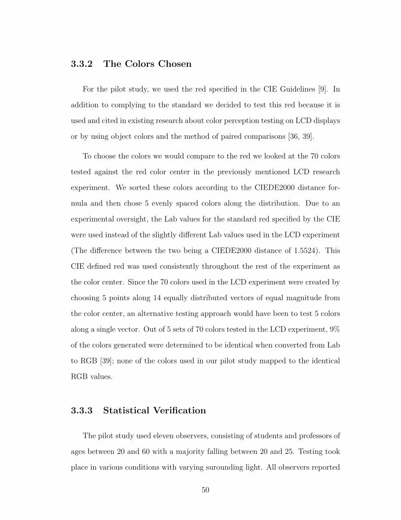
3.3.2 The Colors Chosen
For the pilot study, we used the red specified in the CIE Guidelines [9]. In
addition to complying to the standard we decided to test this red because it is
used and cited in existing research about color perception testing on LCD displays
or by using object colors and the method of paired comparisons [36, 39].
To choose the colors we would compare to the red we looked at the 70 colors
tested against the red color center in the previously mentioned LCD research
experiment. We sorted these colors according to the CIEDE2000 distance for-
mula and then chose 5 evenly spaced colors along the distribution. Due to an
experimental oversight, the Lab values for the standard red specified by the CIE
were used instead of the slightly different Lab values used in the LCD experiment
(The difference between the two being a CIEDE2000 distance of 1.5524). This
CIE defined red was used consistently throughout the rest of the experiment as
the color center. Since the 70 colors used in the LCD experiment were created by
choosing 5 points along 14 equally distributed vectors of equal magnitude from
the color center, an alternative testing approach would have been to test 5 colors
along a single vector. Out of 5 sets of 70 colors tested in the LCD experiment, 9%
of the colors generated were determined to be identical when converted from Lab
to RGB [39]; none of the colors used in our pilot study mapped to the identical
RGB values.
3.3.3 Statistical Verification
The pilot study used eleven observers, consisting of students and professors of
ages between 20 and 60 with a majority falling between 20 and 25. Testing took
place in various conditions with varying surounding light. All observers reported
50
Table 3.1: Colors used in pilot study
CIE Lab sRGB
L* a* b* R G B
Ref. Red 44.4 37.9 23.3 0 .665814 0.298181 0.268118
Red 0 44.278000 37.709999 23.469000 0 .663651 0.297694 0.265869
Red 1 44.306999 35.611000 23.422001 0 .653566 0.306167 0.265891
Red 2 45.726002 37.209000 21.694000 0 .675875 0.314403 0.290424
Red 3 46.313000 37.750999 21.889000 0 .685503 0.318068 0.294655
Red 4 47.866001 36.321999 22.391001 0 .696618 0.338833 0.305284
being color normal (in a proper test this would need to be more explicitly tested
via a test like the Ishihara plates or Farnsworth FM 100 or D-15 test). Five
observers were female, and six were male.
Once we had the data for each observer we were able to sum the results of
each row/color (method described in Paired Comparisons section) to see each
observer’s color ranks. This rank was essentially the result of 8 color pair choices.
In this test, since the colors were chosen to be equally distributed along the 70
sorted colors (sorted in regard to their CIEDE2000 distance from the reference
color) from the LCD research experiment, we would expect observers with perfect
discernment to rank the colors in index order with an row rank score of 16 for
red 0, 12 for red 1, 8 for red 2 and so on.
We then calculated the standard deviation of these ranks for each color across
all observers. The resulting standard deviations and standard error (standard
deviation normalized for the sample size), suggests that on average, observers
only deviated from the average rank by one test for each color. This error is
51

Table 3.2: Expected/Average Rank, and Standard Deviation/Error ofRanks per Color (row totals)
Perfect Rank Avg. Rank Standard Deviation Standard Error
red 0 16 14.82 1.168 0.352
red 1 12 12.45 1.036 0.312
red 2 8 7.09 1.375 0.415
red 3 4 5.27 1.009 0.304
red 4 0 0.36 0.924 0.27872
relatively low, but this pilot study employed a small sample size and only tested
one color center with five colors that were relatively well-spaced in regard to
CIEDE2000 distance. As a sanity check, this superficial analysis suggests that
the test on a mobile device in various settings is a viable testing method to be
explored further, especially when we consider that a more complex analysis of
the data and error would allow us to filter noise and draw more complex insights
of intra- and inter-observer variability.
Because of the variables discussed in previous sections, it is hard to determine
how many observers would be necessary in a statistically relevant sample for a
test of this nature. If we are able to detect a relatively balanced and mostly
symmetric distribution of answers in a substantial pilot test, the Central Limit
Theorem tells us that we will need approximately 30 observers per test to produce
results in the 95% confidence range. Once we take into account the number of
these tests necessary to cover all color centers along multiple vectors, overlap
the tests, account for noise, and inter/intra-observer variability, the number will
surely balloon, but not excessively for a crowdsourced experiment.
52

3.4 Future Work
Unfortunately, executing a full test of the experimental methods described
prior was outside of the scope of this thesis, however, we have thought through
many of the advantages this type of crowdsourced mobile testing can capitalize
on, along with known shortcomings and problems that will need to be overcome
or taken into account.
3.4.1 Crowdsourcing
Crowdsourcing is not a typical method employed in academic experiments
and has only recently begun to be seriously considered and used by researchers,
largely due in part to advancing technology and the internet. With a sizeable
portion of global population carrying highly accurate displays in their pockets,
loaded with sensors, it is suddenly possible to poll a large swath of the population
in a fraction of the time that it takes to get a single person into the lab. The
potential of global crowdsourced experiments and research has only begun to be
explored and understood for what it is worth. We hope that the previous proof-
of-concept and ideas presented here serve to encourage future color perception
research that capitalizes on mobile crowdsourcing.
Examples of Current Experimental Crowdsourcing
Examples of successful crowdsourcing with the purpose of furthering scien-
tific understanding reach back to the 1900s with The National Audubon Society’s
Christmas Bird Count. This experiment, which started at the turn of the century
with 27 citizen scientists, had 71,531 citizen scientist participants in their world-
53
wide 2012 winter count [32]. The iNaturalist iPhone app (a project that started
as a UC Berkeley Masters final project) has a community of over 37,000 global
citizen scientists as of May 1st, 2014 that help record biodiversity by contributing
to a set of over half a million recorded observations [1]. In 2014, following the
disappearance of a commercial jet over the Gulf of Thailand, a satellite company
named DigitalGlobe opened a crowdsourced campaign that allowed anyone to
pour through recent satellite images of the region to flag potential debris and
clues [35].
These are all examples of crowdsourcing that tap engaged citizen scientists,
rather than the average citizen, to collectively solve huge problems. Even though
these projects only ostensibly help the participants, they are all backed by tens
of thousands of volunteers. Considering the over 200,000 user sessions that con-
tributed to popular web cartoonist Randall Munroe’s color naming survey in 2010
[27] and the viral popularity suggested by the nearly 800,000 social shares of X-
Rite’s (parent company of Pantone) digital version of the Farnsworth Munsell
100 Hue Test [8], it is not hard to see how a color perception test distributed as
a mobile app could potentially have a significant number of contributors.
Sweetening the Deal
Sometimes it is not easy to gain significant voluntary participation in crowd-
sourced experiments. In these cases, sometimes the way the data is collected has
to be tailored to benefit the participant. The Track Your Happiness app, which
asks participants questions about their happiness throughout the day, not only
collects meaningful research data, but provides personal insights to participants
along the way. The project began as a doctoral project in 2009 with 1,000 users
and has grown to have over 15,000 highly diverse participants filing a total of
54

650,000 reports as of 2011 [40, 37]. The rate at which people return to use the
Track Your Happiness app multiple times is a great indicator of how providing
interesting feedback to participants can keep them engaged. It is not hard to
imagine tweaking a test like ours to provide participants feedback on when they
perform best, what colors they have the most trouble discerning, and perhaps a
visualization of what colors they have been tested on and how much they have
contributed to a global set of data, to make the experiment more engaging. With
an engaged testing population, new tests can be continually created and sent
down (automatically or manually created) to test new hypotheses, points of high
variability, and experimental parameters such as color swatch size and spacing.
Inadvertantly Contributing
There are other potential methods of crowdsourcing such as following the
reCAPTCHA model. In the reCAPTCHA model, participants online needing to
prove their humanness do so by typing hard to recognize words and numbers,
where one of the two is actually a scan/photograph of a book or house, thereby
helping digitize text and annotate scanned literature [2]. In the reCAPTCHA
model there isn’t necessarily a correct answer for the second word or number, but
when a public consensus is reached it can be considered the right transcription
with high probability. Small color tests could be used alongside other reverse
turning tests to slowly build up a large set of color perception data. This model
is not as feasible for delivering lengthy tests or for tracking participants over time
and across tests, and reCAPTCHAs typically are not seen on mobile devices
where color conditions can be more easily known and controlled.
Another possibility is to pay participants online to participate in experiments
through an online crowdsourcing marketplace like Amazon’s Mechanical Turk ser-
55
vice. Diversity of workers in these marketplaces is questionable with 57% coming
from the US and 32% from India, and the population generally being younger
and college educated [29]. Despite this, a more recent psychology study in 2011
found the workers to be “more demographically diverse than. . . standard Internet
samples and. . . significantly more diverse than typical American college samples”
[12]. The same study found that overall the data gathered “met or exceeded the
psychometric standards associated with published research” [12]. Costs for ad-
ministering medium length surveys on the order of around ten minutes generally
vary, but appear to not cost more than $0.50 [12, 29]. There are many other
considerations to be had when building an experiment for deployment through
Mechanical Turk, but it is nonetheless a cheap and promising crowdsourcing
method. At the moment Mechanical Turk is a web only tool, making careful con-
trol of the devices used by observers relatively impractictal (or even impossible).
3.4.2 Mobile as a Platform
Color Reproduction and Light
Some of the obvious problems that come up when discussing using mobile
devices for color testing is lacking color-reproduction, variance between displays,
brightness settings, surrounding light conditions, viewing angle/position, and re-
flectance of the screen. While none of this is ideal, it is important that we strive
for consistency in our data and where we cannot guarantee consistency, then we
record all the pertinent data that we can.
As far as color reproduction goes, RGB screens even at their best cover no
more than an estimated 35% of the gamut of human vision [10]; even with 6
primary colors they cannot cover more than 96% of human vision. In 1980,
56

Michael R. Pointer created the Pointer’s Gamut (see Figure 3.3), which sought to
capture the range of reflected object colors that we see most day-to-day (based on
4089 samples), while leaving out more specular colors such as those seen in the sky
[5]. This irregular gamut serves as proof that while our displays are not perfect,
they arguably can capture the most important colors. By targeting devices with
known gamuts that have measurably tight tolerances (such as Apple’s iPhone 5
and 5s, which have a consistent sRGB gamut [16, 26]) we can assure that we
are able to reproduce colors consistently across devices and within a significant
portion of the Pointer’s gamut.
By targeting a single, reliable device, we can take into account parameters
like its maximum brightness, and reflectance of the screen to a degree. This
naively ignores such things as backlight degradation, and cases or films that
observers might have covering their screens. By recording or controlling the
screen brightness we can help take the brightness variable into account, and by
asking the user about films or cases before testing we presume we should be able
to filter out compromised data relatively well.
Knowing surrounding light conditions can be tough; on the screen we can
surround color swatches with neutral colors, but factors such as external light
and even the color of the phone bezel could affect the results. Ambient light can
be measured fairly well through device light sensors if available7 or more roughly
via the front-facing camera.
While many tests restrict human vision by having the observer look through
eyepieces or keep their head at a certain distance from the samples with samples
7The front-facing light sensor on iPhones is questionably accessible via a public API, butuse of the API apparently results in Apple App Store rejection [4]. It could still be possibleto distribute such apps not through the App Store, but obviously it would be much harder toscale.
57
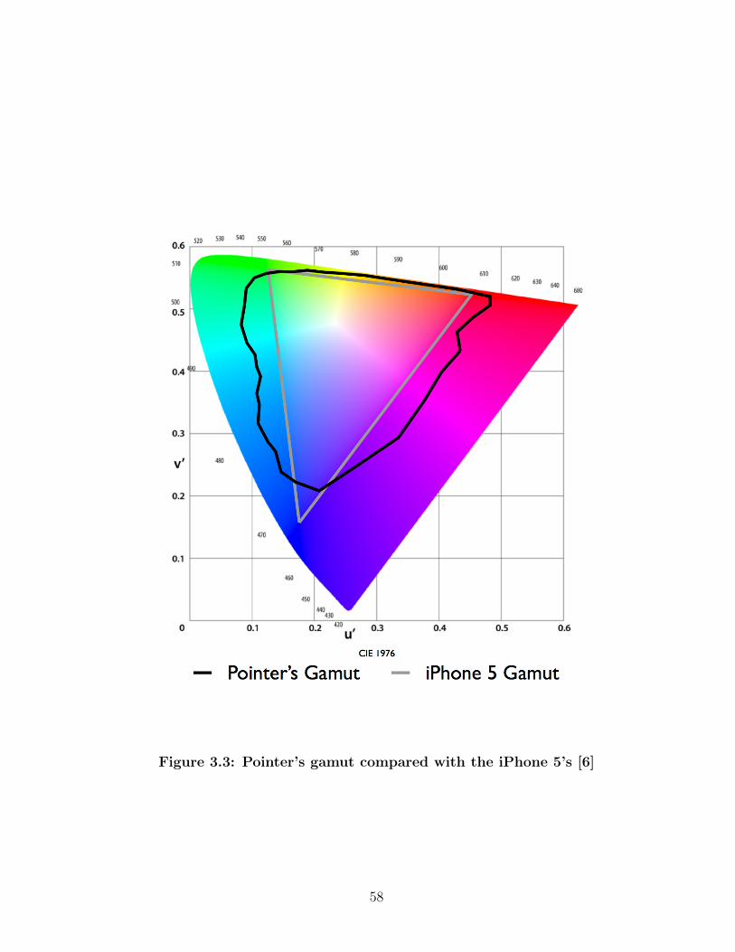
Figure 3.3: Pointer’s gamut compared with the iPhone 5’s [6]
58

at a controlled angle relative to the eye and light source, a self-administered
mobile test will be held unpredictably. While it is unclear how much relatively
small movements or differing angles affect perception in a test like this, tilting the
device at various angles, bringing it close or farther from the eyes while testing
is likely to have an effect. While there’s no easy way to determine the angle
of the device relative to light sources in the room or to the observer’s eyes, by
recording accelerometer and gyroscopic data during testing, we can determine
certain behaviors and levels of movement and filter tests accordingly.
Capturing Additional Data
An interesting example of the type of extra data we can easily gather with
a mobile crowdsourced test is how long the observer takes to decide on a test
choice. In our pilot test we observed observers taking significantly longer to de-
cided between color pairs determined to be closer using CIEDE2000, while pairs
that were farther away were answered relatively quickly. Going off of this assump-
tion, it may be useful to collect the time taken to complete each test as a means
to strengthen determining where observers contradicted themselves. Observers
can explicitly contradict themselves through their pair choices; by analyzing this
in tandem with the time taken to decide, we may be able to determine whether
a pair decision was difficult because the colors were indistinguishable from one
another, or because they were perceived as equally different from the center color
(for example we might expect observers who regularly flipped their decision on
a pair but answered quickly, to not see the difference between the pair colors,
whereas observers that answered regularly, but took a relatively long time decid-
ing on those pairs might have been more likely to have had difficulty choosing
between the two because the colors seemed equally distant from the center). This
59

timing data could also be used more simply to strengthen knowing which pairs
observers contradicted themselves on (in actuality or though relatively lengthy
deliberation).
It is known that the length staring at a sample can affect its perception as well
[13] so by recording the time taken on each test we may be able to throw out tests
where the observer could have been staring for long enough to be affected by an
after-image. Additionally, by using timestamps and app data we can determine
if the observer finished a test in one sitting or if they took their time between
samples (making it more likely the environmental variables changed), and throw
out or filter their data accordingly.
One of the biggest insights that may come from a study of this scale is a better
understanding of inter-observer variability. Inter-observer variability is already
thought to vary widely [19], therefore it may be that even our best model of
a world-average observer does not represent us individually with high accuracy.
There are innate differences between us all both neurobiological and cognitively
that introduce variability into how we each perceive color. Physical changes such
as macular degeneration [11] can further cause us to perceive color differently
than others. According to Kuehni, even with the various ways we can fit formu-
las to observer data, “such a formula can be considered accurate for the mean
observer. . . but it will represent the judgments of only about one third of real
observers to within ±20% of the calculated value” [19].
By asking observers in a widely crowdsourced test basic questions about age,
sex, ethnicity, known vision impairments, and by administering basic color dis-
crimination tests before our own paired comparisons testing, we may finally be
able to model individual perception more accurately by realizing divisions in the
population by which we can group observers.
60
CHAPTER 4
Conclusion
Accurate understanding of color is a cornerstone of many industries, yet our
current standards perform poorly, with an accuracy of predicting existing empir-
ical data around 65 percent. While the physics of color remains measurable, the
psychological experience and many of its intricacies is not. Despite this, we can
continue to strengthen our models and understanding of perception with creative
and concerted, empirical experimental efforts. In order to develop a better un-
derstanding of color perception, we need as Kuehni puts it, “a widely controlled
and comprehensive effort” [18].
In understanding perception, we need to not only gather more data, but to
study how the variables in our experiments affect perception. Additionally we
need to better our understanding of the world-average observer and its pertinence
to our models. These questions can be tested at a large scale while gathering color
perception data through a crowdsourced mobile app.
Crowdsourced mobile testing as a method needs to be investigated further,
but promises to be a potentially viable way to improve our understanding of the
61
many facets of color perception at a scale, speed, and level of granularity not
yet seen by the field at large. Ultimately, even if this method doesn’t further
the development of our color models and standards it provides an innovative use
of paired comparisons, mobile crowdsourcing, and can shed new light on how
experimental parameters and conditions affect perception.
We hope the ideas and proof-of-concept outlined here help to inspire and
encourage future research which will bolster and reinforce our understanding of
our most relied upon sense. Please do not hesitate to contact the author for any
clarifications or questions1.
62

63
BIBLIOGRAPHY
[1] About inaturalist. http://www.inaturalist.org/pages/about.
[2] Google recaptcha. https://www.google.com/recaptcha.
[3] Hyperphysics. http://hyperphysics.phy-
astr.gsu.edu/hbase/vision/retina.html.
[4] iPhoneDevWiki. http://iphonedevwiki.net/.
[5] The pointer’s gamut.
http://www.tftcentral.co.uk/articles/pointers_gamut.htm.
[6] TFT Central.
http://www.tftcentral.co.uk/articles/pointers_gamut.htm.
[7] Wikimedia commons. https://commons.wikimedia.org.
[8] X-rite. http://www.xrite.com.
[9] Cie guidelines for coordinated research on colour-difference evaluation.
COLOR research and application, 3(3), Fall 1978.
[10] Quantum dots unleash high-color-gamut performance in led-backlit
displays. LEDs Magazine, October 2011.
64
[11] A. D. Broadbent. Calculation from the original experimental data of the
cie 1931 rgb standard observer spectral chromaticity co-ordinates and
color matching functions, 2008.
[12] M. Buhrmester, T. Kwang, and S. D. Gosling. Amazons mechanical turk:
A new source of inexpensive yet high-quality data? Perspectives on
Psychological Science, 6(1), Jan. 2011.
[13] L. M. Crdenas. Evaluation of variability in visual assessment of small color
differences. Master’s thesis, North Carolina State University, 2009.
[14] P. A. Garcia, R. Huertas, M. Melgosa, and G. Cui. Measurement of the
relationship between perceived and computed color differences. Optical
Society of America, 24(7), July 2007.
[15] V. Greenwood. The humans with super human vision, June 2012.
http://discovermagazine.com/2012/jul-aug/06-humans-with-
super-human-vision.
[16] C. Heinonen. The iphone 5 display: Thoroughly analyzed, September 2012.
http://www.anandtech.com/show/6334/iphone-5-screen-
performance.
[17] R. G. Kuehni. Color Space and Its Divisions: color order from antiquity to
the present.
[18] R. G. Kuehni. Color difference formulas: An unsatisfactory state of affairs.
COLOR Research and Applicaiton, 33(44), August 2008.
[19] R. G. Kuehni. Variability in estimation of suprathreshold small color
differences. COLOR research and application, 34(5), October 2009.
65

[20] R. G. Kuehni and A. Schwarz. Color Ordered: A Survey of Color Order
Systems From Antiquity To the Present.
[21] I. Lissner and P. Urban. Improving color-difference formulas using visual
data. 2010.
[22] I. Lissner and P. Urban. Upgrading color-difference formulas. Optical
Society of America, 27(7), July 2010.
[23] M. R. Luo and B. Rigg. Chromaticity-discrimination ellipses for surface
colors.
[24] D. L. MacAdam. Visual sensitivities to color differences in daylight.
Optical Society of America, 32(5), May 1942.
[25] M. Meyer. Mark meyer photography. http://www.photo-mark.com.
[26] M. Meyer. iphone 5 color, September 2012. http://www.photo-
mark.com/notes/2012/sep/25/iphone-5-color/.
[27] R. Munroe. Color survey results, May 2010.
http://blog.xkcd.com/2010/05/03/color-survey-results/.
[28] M. Nolle, M. Suda, and W. Boxleitner. H2si - a new perceptual colour
space. In Digital Signal Processing (DSP) 2013 18th International
Conference on, pages 1–6, July 2013.
[29] J. Ross, I. Irani, M. S. Silberman, A. Zaldivar, and B. Tomlinson. Who are
the crowdworkers?: Shifting demographics in mechanical turk. In CHI
’10 Extended Abstracts on Human Factors in Computing Systems, CHI
EA ’10, pages 2863–2872, New York, NY, USA, 2010. ACM.
http://doi.acm.org/10.1145/1753846.1753873.
66

[30] S. M. Salvi, S. Akhtar, and Z. Currie. Ageing changes in the eye. 82(971),
2006.
[31] J. Schanda. Colorimetry: Understanding the CIE System.
Wiley-Interscience, August 2007.
[32] S. M. Scully. 11 reasons the christmas bird count rocks, Dec. 2013.
http://mag.audubon.org/articles/conservation/11-reasons-
christmas-bird-count-rocks.
[33] G. Sharma, W. Wu, E. N. Dalal, and M. U. Celik. Mathematical
discontinuities in ciede2000 color difference computations. IST/SID
Twelfth Color Imaging Conference.
[34] S. K. Shevell. The Science of Color. Elsevier, 2003.
[35] D. Stout. Crowd-sourcing campaign launched to find missing jet, Mar.
2014. http://time.com/19510/crowd-sourcing-campaign-
launched-to-find-missing-jet/.
[36] D. Strocka, A. Brockes, and W. Paffhausen. Influence of experimental
parameters on the evaluation of color-difference ellipsoids. COLOR
research and application, 8(3), Fall 1983.
[37] TED. Want to be happier? stay in the moment, Nov. 2012.
http://www.ted.com/talks/matt_killingsworth_want_to_be_
happier_stay_in_the_moment/transcript.
[38] L. L. Thurstone. A law of comparative judgment. Psychological Review,
34:273–286, 1927.
67
[39] P. Urban, M. Fedutina, and I. Lissner. Analyzing small suprathreshold
differences of lcd-generated colors. Optical Society of America, 28(7),
July 2011.
[40] J. Wortham. If youre happy and you know it tell your phone, July 2009.
http://bits.blogs.nytimes.com/2009/07/29/if-youre-happy-
and-you-know-it-tell-your-phone.
[41] W. D. Wright. A re-determination of the trichromatic coefficients of the
spectral colours. Transactions of the Optical Society, 30(4):141, 1929.
68
Top Related