


Languages
Pages
Legal


1 Basic elements
Corporate identity manual

The Woqod mark
Protecting the Woqod mark
Standard use sizes
Colour variations of the Woqod mark
Using the mark on different backgrounds
Incorrect use
Primary corporate colours
Secondary colours
Tinting corporate colours
Using the Star mark as a graphic device
Primary typefaces
Secondary typefaces
Using Imagery
Corporate strapline
1.1
1.2
1.3
1.4
1.5
1.6
1.7
1.8
1.9
1.10
1.11
1.12
1.13
1.15
1 Basic elements Contents

STAR MARK
WOQOD MARK
WORD MARK
THE WOQOD MARKThe Woqod mark is made up of 2 elements:The star mark and word mark.
THE STAR MARKThe star mark is our symbol, a dynamic burst of energyfrom a Sidra flower. The star mark is unique, vibrant andbold.
THE WORD MARK
The word mark is the way we write our name. The lettershave been specially drawn in Arabic and English forms.
Whenever possible, the mark should be used as awhole ie, the star mark and the word mark appearng intheir fixed relationship.
The star mark, the word mark, the sizerelationship, letter spacing, colours, keylinesetc. have all been detailed and considered.
No alterations should ever be made to themaster Woqod mark.
1.1 Basic elements The Woqod mark

REGULAR USE VERSION
SMALL USE VERSION
Mea
sure
Bar
A
Mea
sure
Bar
A
PROTECTIVE AREA
PROTECTIVE KEYLINE
HORIZONTAL VERSION
PROTECTIVE AREA
PROTECTIVE KEYLINE
Mea
sure
Bar
A
MINIMUM SIZE
Mea
sure
Bar
A
25 m
m
40 m
m a
nd b
elow
Basic elements Protecting the Woqod mark
REGULAR USE VERSIONThe regular use version is the preferred version of theWoqod mark. It should be used in all print applicationswhere the mark will appear larger than 40mm acrossmeasure bar A.
PROTECTIVE AREAThe dotted blue keyline indicates the protective area.This area is intended to ensure a clear surround to theWoqod mark. No other text, logos, or informationshould encroach on this area.
The star mark has its own protective white keylinearound the star. It ensures that the star mark stands outwhen placed on dark coloured backgrounds.
SMALL USE VERSIONThe small use version of the Woqod mark should beused in situations where it will be reproduced at sizesbetween 25mm–40mm across measure bar A. Thecharacter spacing in this version of the mark has beenadjusted to ensure best legibility at small sizes.
The same principles are used to establish the protectivearea for the small use version.
MINIMUM SIZEAs a general rule, the Woqod mark should not bereproduced below 25mm across measure bar A.
HORIZONTAL VERSIONIn special situations the horizontal version of the Woqodmark can be used. It should be used in situations whereheight is restricted and the regular use version is notpractical. For example, the horizontal mark is suitable foruse on vehicle livery.
ARCHITECTURAL VERSIONSSpecial versions of the Woqod mark have been createdspecifically for use on forecourt architecture. There is oneversion for Woqod totem signs, and another version forthe Woqod canopy fascia. Details of these versions willbe given in the Retail Identity Manual.
1.2
A4 BROCHURE FRONT COVERA4 ADVERTISING
SIZE 1 – 50 mm SIZE 2 – 30 mm SIZE 3 – 40 mm SIZE 4 – 27 mm
A4 BROCHURE BACK COVERA4 ADVERTISING
A4 STATIONERY BUSINESS CARDS/NAME BADGESENVELOPES
50 m
m
30 m
m
40 m
m
27 m
m
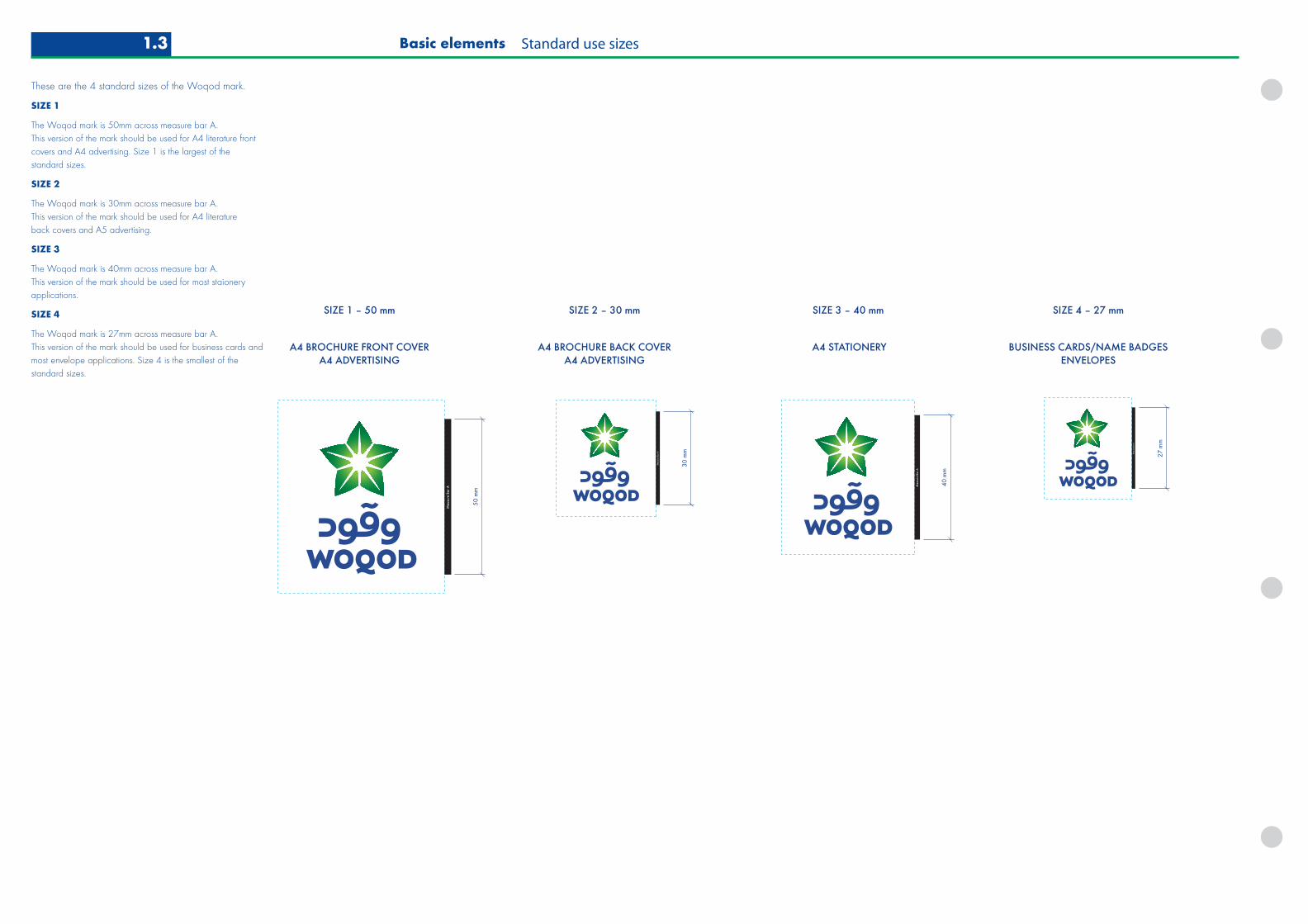
These are the 4 standard sizes of the Woqod mark.
SIZE 1
The Woqod mark is 50mm across measure bar A. This version of the mark should be used for A4 literature frontcovers and A4 advertising. Size 1 is the largest of the standard sizes.
SIZE 2
The Woqod mark is 30mm across measure bar A. This version of the mark should be used for A4 literature back covers and A5 advertising.
SIZE 3
The Woqod mark is 40mm across measure bar A. This version of the mark should be used for most staioneryapplications.
SIZE 4
The Woqod mark is 27mm across measure bar A. This version of the mark should be used for business cards andmost envelope applications. Size 4 is the smallest of thestandard sizes.
Basic elements Standard use sizes1.3

SOLID BLACK VERSIONTWO COLOUR VERSION WOQOD BLUE VERSIONMATCH TO PANTONE 662
WOQOD GREEN VERSIONMATCH TO PANTONE 355
GREYSCALE VERSION
FOR USE IN BLACK AND WHITE APPLICATIONS WHERE WHERE PRINT QUALITY CANNOT BE GUARANTEED, SUCH AS FAXES AND MATERIAL FINISHES, SUCH AS EMBOSSING AND ENGRAVING.
FOR USE IN SITUATIONS WHERE ONLY TWO COLOUR REPRODUCTION IS AVAILABLE, OR WHERE REPRODUCING THE GRADIENT IS NOT POSSIBLE EG, PAINT FINSHES.
FOR USE IN ONE OR TWO COLOUR PRINT APPLICATIONS SUCH AS INTERNAL COMMUNICATIONS.
FOR USE IN ONE OR TWO COLOUR PRINT APPLICATIONS SUCH AS INTERNAL COMMUNICATIONS.
FOR USE IN BLACK AND WHITE APPLICATIONS WHERE WHERE GOOD PRINT QUALITY IS ASSURED, SUCH AS BLACK AND WHITE ADVERTISING, AND LASER PRINTED DOCUMENTS.
Wherever possible the mark should be used in its fullcolour version. If this is not possible, the mark may bereproduced in one or two colours. There are 5 versionsavailable for various situations:
TWO COLOUR VERSION
This version has a solid green star mark, it does not usea gradient fill effect.
The two colour mark can used in 2 colour printapplications, such as internal communications, orapplied as a paint finish to industrial storage buildings.
WOQOD BLUE AND GREEN VERSIONS
These versions have a solid star mark, and do not use agradient fill effect.
The Woqod blue and Woqod green marks can used in1 or 2 colour print applications, such as internalcommunications.
No other colours should ever be used.
GREYSCALE VERSION
This is a version of the mark that retains a gradient filleffect, but uses only black. This version of the mark canbe used in black and white applications where a goodprint quality is assured, such as black and whiteadvertising and laser printed documents.
SOLID BLACK VERSION
This is a version of the mark that should be used inapplications where print quality cannot be guaranteed,such as faxes and material finishes, such as embossingand engraving techniques.
Basic elements Colour variations of the Woqod mark 1.4

DARK PHOTOGRAPHIC BACKGROUNDS
WHEN APPLYING THE WOQOD MARK TO A DARK BACKGROUND, USE THE REVERSED OUT WORD MARK VERSION.
WHEN APPLYING THE MARK TO A LIGHT BACKGROUND, USE THE BLUE WORD MARK VERSION.
LIGHT PHOTOGRAPHIC BACKGROUNDS
USE THE REVERSED OUT WORD MARK VERSION ON COLOUR PHOTOGRAPHIC BACKGROUNDS WHEN THERE IS INDUFFICIENT CONTRAST FOR THE BLUE WORD MARK.
COLOUR PHOTOGRAPHIC BACKGROUNDS
WHEN APPLYING THE WOQOD MARK TO A COLOUR PHOTOGRAPHIC BACKGROUND, USE THE BLUE WORD MARK VERSION WHEN THERE IS SUFFICIENT CONTRAST BETWEEN IMAGE AND WORD MARK.
COLOUR PHOTOGRAPHIC BACKGROUNDS
USING THE MARK ON DIFFERENT COLOUREDBACKGROUNDS
Each version of the Woqod mark has an option with theword mark in a solid colour (blue, green or black), andan option with the word mark reversed out white. It isimportant that the correct version of the Woqod mark beused at all times.
When there is sufficient contrast between the colourword mark and the background image, then this versionshould be used. However, if the background image isdark, and a coloured word mark would not be visible,then the reversed out word mark version should be used.
Illustrated here is the full colour Woqod mark. Theprinciple is exactly the same for colour variations of theWoqod mark.
1.5 Basic elements Using the mark on different backgrounds
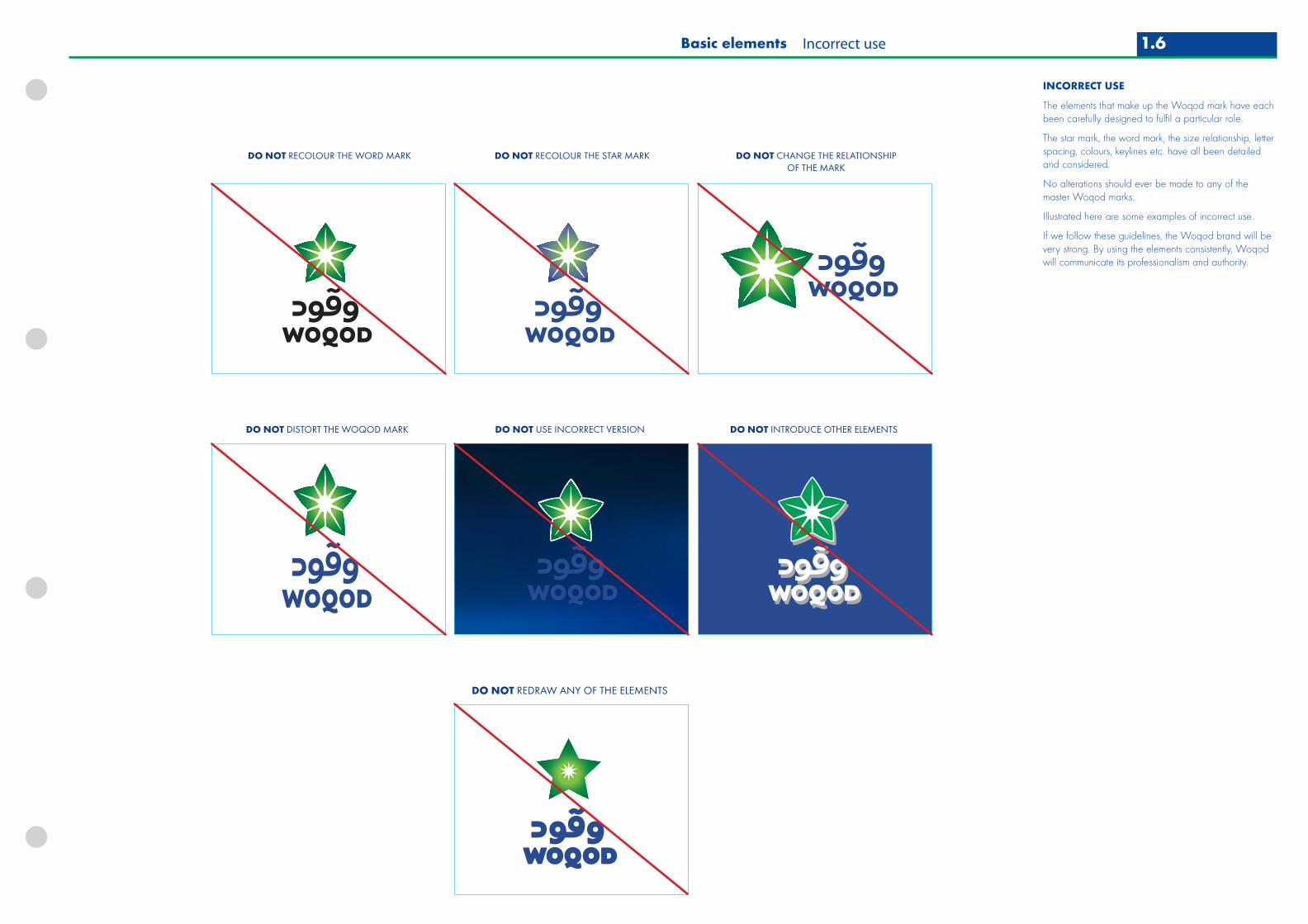
DO NOT RECOLOUR THE WORD MARK DO NOT RECOLOUR THE STAR MARK DO NOT CHANGE THE RELATIONSHIPOF THE MARK
DO NOT DISTORT THE WOQOD MARK DO NOT USE INCORRECT VERSION
DO NOT REDRAW ANY OF THE ELEMENTS
DO NOT INTRODUCE OTHER ELEMENTS
INCORRECT USE
The elements that make up the Woqod mark have eachbeen carefully designed to fulfil a particular role.
The star mark, the word mark, the size relationship, letterspacing, colours, keylines etc. have all been detailedand considered.
No alterations should ever be made to any of themaster Woqod marks.
Illustrated here are some examples of incorrect use.
If we follow these guidelines, the Woqod brand will bevery strong. By using the elements consistently, Woqodwill communicate its professionalism and authority.
1.6Basic elements Incorrect use

WOQOD BLUE
PANTONE 662
CMYK: C 100 M 90 Y 0 K 10
RGB: R 0 G 34 B 128
WEBSAFE: 003399
RAL: 5002
SCOTCHCAL: 3630-157 (SULTAN BLUE)
WOQOD GREEN
PANTONE 355
CMYK: C 100 M 0 Y 92 K 0
RGB: R 0 G 153 B 51
WEBSAFE: 009933
RAL: 6024
SCOTCHCAL: 3630-156 (VIVID GREEN)
WOQOD PEARL
PANTONE 7501
CMYK: C 0 M 7 Y 30 K 8
RGB: R 223 G 210 B 179
WEBSAFE: FFFFCC
RAL: METALLIC FINISH TO COLOUR MATCH RAL 1015
RENAULT PAINT REF: M191 BEIGE (TBC)
PRIMARY CORPORATE COLOURS
The Woqod brand is identified by three strong primarycolours.
WOQOD BLUE
Woqod blue is applied extensively to the corporate andretail identities. The Woqod mark frequently appears ona Woqod blue background, for example on the canopyand totems.
All secondary signage is Woqod blue, as is the majorityof corporate literature.
WOQOD GREEN
Woqod green is designed to sit next to, and complimentWoqod blue. It is used as edging detail and isilluminated at night on the canopy. In literatureapplications Woqod green is used to highlightinformation next to Woqod blue.
WOQOD PEARL
Woqod pearl is applied as a distinctive pearlescentcladding material to station architecture. As a softercolour it compliments Woqod blue and green.
Basic elements Primary corporate colours1.7

WOQOD LIGHT BLUE
PANTONE 299
CMYK: C 82 M 10 Y 0 K 0
RGB: R 0 G 160 B 226
WEBSAFE: 0099CC
WOQOD DARK GREY
PANTONE WARM GREY 7
CMYK: C 0 M 9 Y 14 K 44
RGB: R 158 G 148 B 141
WEBSAFE: 999999
WOQOD COOL GREEN
PANTONE 556
CMYK: C 52 M 0 Y 50 K 20
RGB: R 116 G 161 B 142
WEBSAFE: 669999
WOQOD LIGHT GREY
PANTONE WARM GREY 4
CMYK: C 0 M 6 Y 12 K 31
RGB: R 189 G 182 B 176
WEBSAFE: CCCCCC
WOQOD COOL BLUE
PANTONE 5435
CMYK: C 16 M 3 Y 0 K 18
RGB: R 165 G 184 B 201
WEBSAFE: 9999CC
SECONDARY COLOURS
Woqod secondary colours provide a palette of coloursto support the primary brand colours.
Secondary colours should be combined with one ormore of the primary colours to create flexible andconsistent corporate communications.
Basic elements Secondary colours 1.8

WOQOD BLUE
90%
80%
70%
60%
50%
40%
30%
20%
10%
WOQOD GREEN
WOQOD PRIMARY COLOURS
90%
80%
70%
60%
50%
40%
30%
20%
10%
WOQOD PEARL
90%
80%
70%
60%
50%
40%
30%
20%
10%
WOQOD LIGHT BLUE
90%
80%
70%
60%
50%
40%
30%
20%
10%
WOQOD DARK GREY
90%
80%
70%
60%
50%
40%
30%
20%
10%
WOQOD COOL GREEN
90%
80%
70%
60%
50%
40%
30%
20%
10%
WOQOD SECONDARY COLOURS
90%
80%
70%
60%
50%
40%
30%
20%
10%
WOQOD LIGHT GREY
90%
80%
70%
60%
50%
40%
30%
20%
10%
WOQOD COOL BLUE
TINTING GUIDE
The colours that make up the primary and secondaryWoqod colour palettes may be tinted to extend therange of colours.
Woqod colours should only be tinted to therecommended values shown here. This will ensuresufficient colour contrast and reliable reproduction.
USING TINTED COLOURS
Pale tints shown opposite (20%–40%) should only beused for differentiating quantities in charts and maps,and on forms where pale tints will be overprinted byblack text, and may be required not to reproduce whenphotocopied.
Basic elements Tinting corporate colours1.9

CROPPING THE STAR MARK, EXAMPLES
PRINT APPLICATIONS
SCALE WIDTH OF THE GRID TO THE SHORTEST DIMENSION OF THE DOCUMENT
EXAMPLES OF PRINT APPLICATIONS SIGNAGE EXAMPLEFLOOR IDENTIFIER
CROP MUST INCLUDE A MINIMUM OF 3x3 ADJACENT SQUARES OF THE GRID
Develop and deliverinnovationto all aspects of our business
Develop and deliverinnovationto all aspects of our business
The star mark in keyline form on a level 3 document. Keyline to be 0.5pt
4 colour version of the star mark on a level 4 document cover and used as a tint within the text pages of a level 1–3 document.
Short sub-headingBody copy ad minim veniam, quis nostrud exerci tation ullamcorper suscipit lobortis nisl ut aliquip ex ea commodo consequat. Duis autem vel eum iriure dolor in hendrerit in vulputate velit esse molestie consequat, vel illum dolore eu feugiat nulla facilisis at vero eros et accumsan et iusto odio dignissim qui blandit praesent luptatum zzril delenit augue duis dolore te feugait nulla facilisi. Lorem ipsum dolor sit amet. Consectetuer adipiscing elit, sed diam nonummy nibh euismod tincidunt ut laoreet dolore magna aliquam erat volutpat.elit esse molestie consequat, vel illum dolore eu feugiat nulla facilisis at vero eros et accumsan et iusto odio dignissim qui blandit praesent luptatum zzril delenit augue duis dolore te feugait nulla facilisi. Lorem ipsum dolor sit amet, consectetuer adipiscing elit, sed diam.
Orem ipsum dolor sit amet, consectetuer adipiscing elit, sed diamnonu mmy nibh euismod tincidunt ut laoreet dolore magna aliquam erat volutpat. Ut wisi enim ad minim veniam, quis nostrud exerci tation ullamomlla facilisis at vero eros et accumsan et iusto odio dignissim qui blandit praesent luptatum zzril delenit augue duis dolore te feugait nulla facilisi. Lorem ipsum dolor sit amet, consectetuer adipiscing elit, sed diam nonummy nibh euismod tincidunt ut laoreet dolore magna aliquam erat .
Dignissim qui blandit praesent luptatum Delenit augue duis dolore te et, consectetuer adipiscing elit, sed diamnonu mmy nibh euismod tincidunt ut laoreet dolore magna aliquam erat volutpat. Ut wisi enim ad minim veniam, quis nostrud exerci tation ullamomlla facilisis at vero eros et accumsan et.lor sit amet, consecet, consectetuer adipiscing elit, sed diamnonu mmy nibh euismod tincidunt ut laoreet dolore magna aliquam erat volutpat. Ut wisi enim ad minim veniam, quis nostrud exerci tation ullamomlla facilisis at vero eros et accumsan et iusto odio dignissilor sit amet, consecet, consectetuer adipiscing elit, sed diamnonu mmy nibhwisi enim ad minim veniam, quis nostrud exerci tation ullamomlla facilisis at vero eros et accumsan et iusto odio dignissilor sit amet, consecet, consectetuer adipiscing elit, sed diamnonu mmy nibh
RUNNING FOOTER 0000 RUNNING FOOTER
RUNNING HEADER
Pull-out vel illum dolore eu feugiat nulla facilisis at vero eros et accumsan et iusto adipiscing elit, sed diam nonummy
Main heading in two colours, running over two or three lines.
Short sub-headingBody copy ad minim veniam, quis nostrud exerci tation ullamcorper suscipit lobortis nisl ut aliquip ex ea commodo consequat. Duis autem vel eum iriure dolor in hendrerit in vulputate velit esse molestie consequat, vel illum dolore eu feugiat nulla facilisis at vero eros et accumsan et iusto odio dignissim qui blandit praesent luptatum zzril delenit augue duis dolore te feugait nulla facilisi. Lorem ipsum dolor sit amet. Consectetuer adipiscing elit, sed diam nonummy nibh euismod tincidunt ut laoreet dolore magna aliquam erat volutpat.elit esse molestie consequat, vel illum dolore eu feugiat nulla facilisis at vero eros et accumsan et iusto odio dignissim qui blandit praesent luptatum zzril delenit augue duis dolore te feugait nulla facilisi. Lorem ipsum dolor sit amet, consectetuer adipiscing elit, sed diam.
Volutpat lorem ipsum dolor sit amet, consectetuer adipiscing elit, sed diamnonu mmy nibh euismod tincidunt ut laoreet dolore magna aliquam erat volutpat. Ut wisi enim ad minim veniam, quis nostrud exerci tation ullamomlla facilisis at vero eros et accumsan et iusto odio dignissim qui blandit praesent luptatum zzril delenit augue duis dolore te feugait nulla facilisi. Lorem ipsum dolor sit amet, consectetuer adipiscing elit, sed diam nonummy nibh euismod tincidunt ut laoreet dolore magna aliquam erat .
Lorem ipsum dolor sit amet, consectetuer adipiscing elit, sed diamnonu mmy nibh euismod tincidunt ut laoreet dolore magna aliquam erat volutpat. Ut wisi enim ad minim veniam, quis nostrud exerci tation ullamomlla facilisis at vero eros et accumsan et iusto odio dignissim qui blandit praesent luptatum zzril delenit augue duis dolore te feugait nulla facilisi. Lorem ipsum dolor sit amet, consectetuer adipiscing elit, sed diam nonummy nibh euismod tincidunt ut laoreet dolore magna aliquam erat .
Dignissim qui blandit praesent luptatum Delenit augue duis dolore te et, consectetuer adipiscing elit, sed diamnonu mmy nibh euismod tincidunt ut laoreet dolore magna aliquam erat volutpat. Ut wisi enim ad minim veniam, quis nostrud exerci tation ullamomlla facilisis at vero eros et accumsan et.lor sit amet, consecet, consectetuer adipiscing elit, sed diamnonu mmy nibh euismod tincidunt ut laoreet dolore magna aliquam erat volutpat. Ut wisi enim ad minim veniam, quis nostrud exerci tation ullamomlla facilisis at vero eros et accumsan et iusto odio dignissilor sit amet, consecet, consectetuer adipiscing elit, sed diamnonu mmy nibhwisi enim ad minim veniam, quis nostrud exerci tation ullamomlla facilisis at vero eros et accumsan et iusto odio dignissilor sit amet, consecet, consectetuer adipiscing elit, sed diamnonu mmy nibheuismod tincidunt ut laoreet dolore magna aliquam erat volutpat. Ut wisi enim ad minim veniam, quis nostrud exerci tation ullamomlla facilisis at vero eros et accumsan et.
Sit amet, consecet, consectetuer adipiscing elit, sed diamnonu mmy nibh euismod tincidunt ut laoreet dolore magna aliquam erat volutpat. Ut wisi enim ad minim veniam, quis nostrud exerci tation ullamomlla facilisis at vero eros et accumsan et iusto odio dignissilor sit amet, consecet, consectetuer adipiscing elit, sed diamnonu mmy nibhwisi enim ad minim veniam, quis nostrud exerci tation ullamomlla facilisis at vero eros et accumsan et iusto odio disilor sit amet, consecet, consectetuer adipiscing elit, sed diamnonu mmy nibh veniam, exerci tation ullamomlla facilisis at vero eros et accumsan et iusto odio dignissilor sit amet, consecet, consectetuer adipiscing elit, sed diamnonu mmy nibh
RUNNING HEADER
Table title
Duis autem vel eum iriure dolor in hendrerit in vulputate velit esse molestie consequatDuis autem
vel eum iriure dolor in hendrerit in vulputate velit esse molestie consequat
Lorem ipsum 000 000 000
Duis autem 000 000 000
Vel eum 000 000 000
Iriure dolor 000 000 000
Hendrerit 000 000 000
Duis autem 000 000 000
Vel eum 000 000 000
Iriure dolor 000 000 000
Hendrerit 000 000 000
Dolore esit 000 000 000
Duis autem 000 000 000
Vel eum 000 000 000
Iriure dolor 000 000 000
Hendrerit 000 000 000
Duis autem 000 000 000
Vel eum 000 000 000
Iriure dolor 000 000 000
Hendrerit 000 000 000
WIDTH OF STAR = SHORTEST DIMENSION OF DOCUMENT
Basic elements Using the Star mark as a graphic device
USING THE STAR MARK AS A GRAPHIC DEVICE
The star mark can be used separately from the Woqodmark as a graphic device that can be cropped andused as a keyline or colour tint.
The star mark should be scaled so that its width matchesthe shortest dimension of the document eg, for A4, thestar should be 210mm wide; for DL it should be 99mmwide.
A positioning grid should then be laid over the star. Thegrid should divide the star into 4x4 squares.
The star mark can now be positioned on the document.
It is important that the crop of the star mark must includea minimum of 3x3 adjacent squares of the grid.
1.10
abcdefghijklmnopqrstuvwxyzABCDEFGHIJKLMNOPQRSTUVWXYZ0123456789
WOQOD FUTURA BOLD
WOQOD ALKHALIJ
PRIMARY TYPEFACES ARE USED FOR SUB-BRANDING AND SERVICE OFFERS
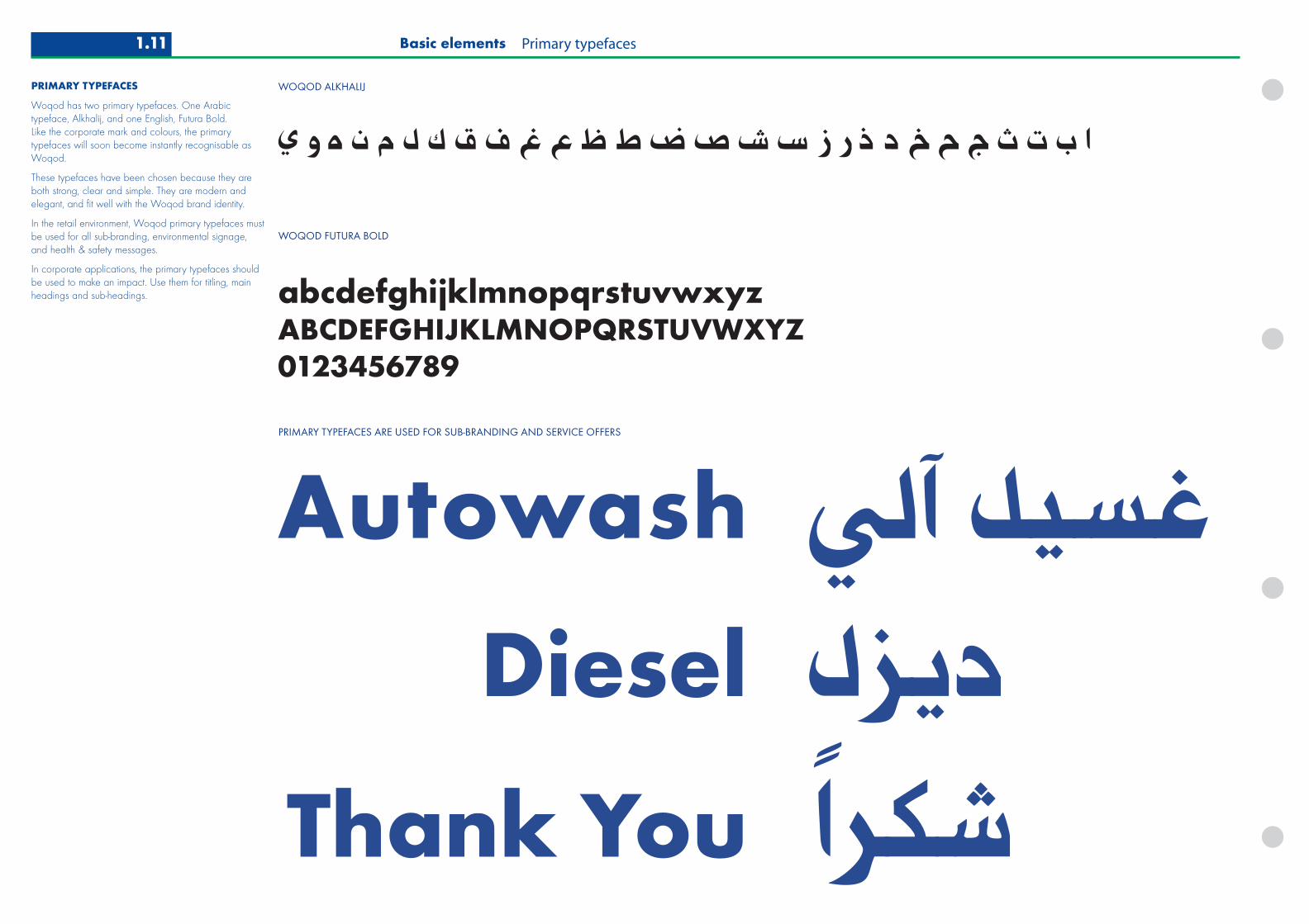
PRIMARY TYPEFACES
Woqod has two primary typefaces. One Arabictypeface, Alkhalij, and one English, Futura Bold. Like the corporate mark and colours, the primarytypefaces will soon become instantly recognisable asWoqod.
These typefaces have been chosen because they areboth strong, clear and simple. They are modern andelegant, and fit well with the Woqod brand identity.
In the retail environment, Woqod primary typefaces mustbe used for all sub-branding, environmental signage,and health & safety messages.
In corporate applications, the primary typefaces shouldbe used to make an impact. Use them for titling, mainheadings and sub-headings.
Basic elements Primary typefaces1.11

SECONDARY TYPEFACES
Myriad Roman
abcdefghijklmnopqrstuvwxyzABCDEFGHIJKLMNOPQRSTUVWXYZ
Futura Book
abcdefghijklmnopqrstuvwxyzABCDEFGHIJKLMNOPQRSTUVWXYZ
Myriad Italic
abcdefghijklmnopqrstuvwxyzABCDEFGHIJKLMNOPQRSTUVWXYZ
Century Gothic
abcdefghijklmnopqrstuvwxyzABCDEFGHIJKLMNOPQRSTUVWXYZArial
abcdefghijklmnopqrstuvwxyzABCDEFGHIJKLMNOPQRSTUVWXYZ
DEFAULT TYPEFACES
SECONDARY TYPEFACES
A set of secondary typefaces has been specified tosupport the primary typefaces.
These typefaces have been chosen because they areclear and simple. They are modern and elegant, and fitwell with the Woqod brand identity.
Secondary typefaces should not be used tocommunicate key brand information, statements orsignage around the retail environment.
Clear specifications for the use of secondary typefacesare provided in section 1.4 literature.
Futura Book
In corporate applications, Futura Book can be used forbody text applications and address details.
Myriad Roman and Italic
In corporate applications, Myriad can be used for bodytext applications, introductions and notation etc. The twoweights (roman and italic) provide flexibility acrosscorporate applications.
Default typefaces: Century Gothic, Arial
In lieu of the corporate typefaces, default typefaces maybe used for system generated word processing andelectronic applications such as Powerpoint®. Century Gothic is a headline font and is a suitablesubstitute for Futura. Arial can replace Myriad or Futura.Both are available as system fonts on all PCs.
Basic elements Secondary typefaces 1.12

ENGAGING PEOPLE IMAGESCLOSE-UP, PERSONALITY
INVITING PRODUCT IMAGESQUALITY, FRESH
FRESH, VIBRANT ABSTRACTSWOQOD COLOURS, THEMES
USING IMAGERY
Woqod imagery should be compelling and dynamic.
Images should engage people with clear, directmessages about energy and life, they should be positiveand inviting.
Whene selecting an image to use, ask yourself thesequestions:
• What is the message I want to communicate?
• Does the chosen image deliver that message clearly and simply?
IMAGES SHOULD…
• Look natural and real
• Show people, life or energy
• Have strong composition
• Focus the viewer’s attention on a definite object, relationship or event.
DON’T USE IMAGES THAT ARE…
• Obviously posed and unreal
• Clichéd or unoriginal
• Boring and lack focus or clear message
• Studio manipulated or gimmicky
1.13 Basic elements Using imagery

CLOSE-UP PEOPLE IMAGESPOSITIVE, FRIENDLY, WHITE BACKGROUND
ENERGETIC IMAGESINNOVATIVE, DYNAMIC
REFRESHING PRODUCT IMAGES
DYNAMIC CONSUMER IMAGESPROFESSIONAL AND REAL
FRESH, VIBRANT ABSTRACTSWOQOD COLOURS, THEMES
1.14Basic elements Using imagery

Develop and deliverinnovationto all aspects of our business
www.woqod.com.qa
Driving energy
Develop and deliver innovationto all aspects of our business
www.woqod.com.qa
Driving energy
Main HeadingSub heading
Develop and deliver innovationto all aspects of our business
www.woqod.com.qa
Driving energy
Develop and deliver innovationto all aspects of our business
www.woqod.com.qa
Driving energy
Develop and deliverinnovationto all aspects of our business
www.woqod.com.qa
Driving energyDevelop and deliver innovationto all aspects of our business
www.woqod.com.qa
Driving energy
Develop and deliver innovationto all aspects of our business
www.woqod.com.qa
Driving energy
a b c d
e f g h
Develop and deliver innovationto all aspects of our business
Main HeadingSub heading
www.woqod.com.qa
Driving energy
STRAPLINE EXAMPLE
www.woqod.com.qa
Driving energy
SIZE 1
www.woqod.com.qa
StraplineSIZE 3 SIZE 4 SIZE 2
www.woqod.com.qa
Straplinewww.woqod.com.qa
Straplinewww.woqod.com.qa
Strapline
CORRECT EXAMPLES
INCORRECT EXAMPLES
CORPORATE STRAPLINE
Straplines communicate key brand promises to ourcustomers. It is recommended that straplines alwaysappear with the Woqod web address, and that theelements are positioned on the front cover of corporatecommunications (as shown).
It is recommended that straplines are not used on level 4literature (internal communications).
Use only approved corporate straplines.
Be sure that the straplines are relevant to targetaudiences. For example, customer-facing straplinesshould not be used on B2B publications and vice versa.
Specifications for four standard sizes have been shown.
POSITIONING THE STRAPLINE
The recommended position is in the bottom left (seeexamples a–d).
e Do not use the strapline as a heading
f The recommended position is in the bottom left
g Care should be taken not to affect the legibility of thestrapline when placed over photographs or graphics.If necessary, the strapline can be moved along thebaseline of the document (see example c).
h The clearspace around the Woqod mark shouldalways be respected, and no other elements shouldbe combined with it.
STANDARD SIZES
SIZE 1
‘Strapline’ 34pt Myriad italic upper and lowercase,ranged left
‘web address’ 15pt Futura Bold lowercase, 25pt linefeed, ranged left
SIZE 2
‘Strapline’ 29pt Myriad italic upper and lowercase,ranged left
‘web address’ 13pt Futura Bold lowercase, 22pt linefeed, ranged left
SIZE 3
‘Strapline’ 20pt Myriad italic upper and lowercase,ranged left
‘web address’ 9pt Futura Bold lowercase, 15pt linefeed, ranged left
SIZE 4
‘Strapline’ 17pt Myriad italic upper and lowercase,ranged left
‘web address’ 7.5pt Futura Bold lowercase, 13 pt linefeed, ranged left
1.15 Basic elements Corporate strapline
Top Related