
Third Draft of of Shaft Fatigue Analysis_Joe-Rencis-Comments_2-2.pptx
Upload
ecciCategory
view
134download
1
ZCR comments as following list below:
No1) ZCR Logo: Could you please make it more clear and sharp edge? It may come from using a transparent background.
No2- No3) The font is different: Could you edit the font to be the same all over the web unless there is a reason. In addition, Could you change the black color of the font to be a dark grey? It would be better for comfortable reading.

No4) Please change the font to be the same. I think, Arial match to this website rather than Time Roman.

No5: Same as Comment 4
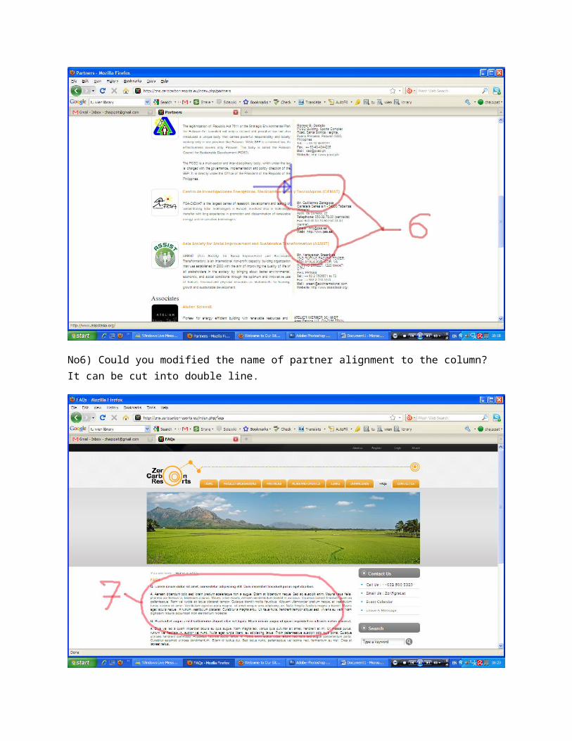
No6) Could you modified the name of partner alignment to the column? It can be cut into double line.
No7) I found the text in FQAs is quite small. Could you please enlarge it to the same as the size of other context?

No8) Same as comment 4
Conclusion
1) Using the same font or similar. Unless there is a reason behind2) Avoid the black color. Please use a dark grey instead. I think it also look nice with your
yellow heading font as you did.3) The light grey may be added when you would like to priority some contents.
I think the theme website look very nice. These are my comments. We can discuss more on the Skype meeting tomorrow.


![НЧ серія 2 вип.1312 Web 1.0 - - Web-Web 2.0 - Web 1.0 Web-Web-Web 3.0 - Web 2.0 -Web 4.0 - Web 3.0 Web 3.0 [21]. Web Wiki - Web 2.0 - p2p - BitTorrent](https://static.fdocuments.in/doc/165x107/604fe6567e4bd54eef1cba33/-2-13-12-web-10-web-web-20-web-10-web-web-web-30.jpg)