
X men Poster Analysis
3
X-MEN DAYS OF FUTURE PAST
Transcript of X men Poster Analysis

X-MEN DAYS OF FUTURE PAST
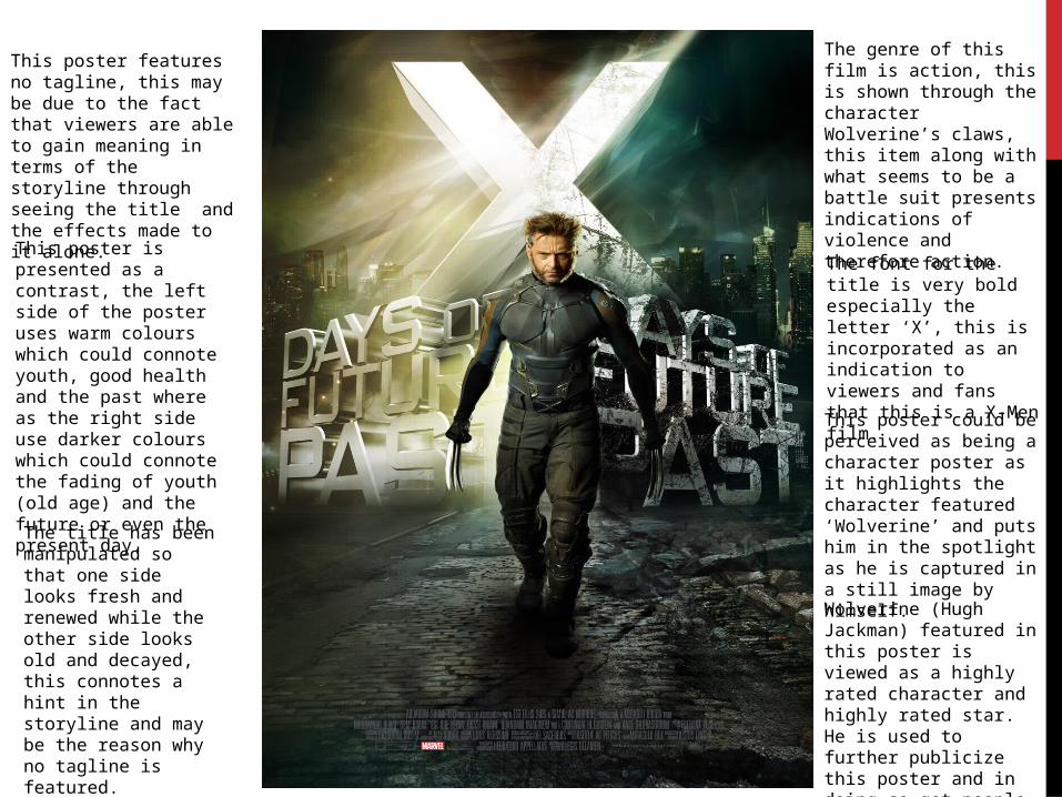
The genre of this film is action, this is shown through the character Wolverine’s claws, this item along with what seems to be a battle suit presents indications of violence and therefore action.
The font for the title is very bold especially the letter ‘X’, this is incorporated as an indication to viewers and fans that this is a X-Men film.
This poster features no tagline, this may be due to the fact that viewers are able to gain meaning in terms of the storyline through seeing the title and the effects made to it alone.
This poster is presented as a contrast, the left side of the poster uses warm colours which could connote youth, good health and the past where as the right side use darker colours which could connote the fading of youth (old age) and the future or even the present day.
This poster could be perceived as being a character poster as it highlights the character featured ‘Wolverine’ and puts him in the spotlight as he is captured in a still image by himself.
Wolverine (Hugh Jackman) featured in this poster is viewed as a highly rated character and highly rated star. He is used to further publicize this poster and in doing so get people to go and watch the film.
The title has been manipulated so that one side looks fresh and renewed while the other side looks old and decayed, this connotes a hint in the storyline and may be the reason why no tagline is featured.
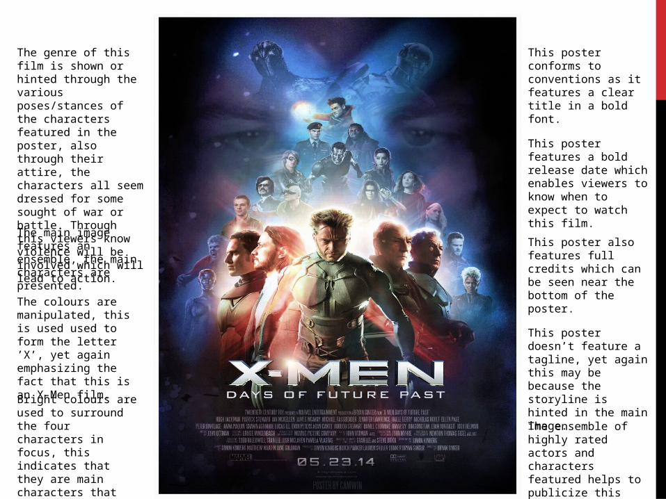
This poster conforms to conventions as it features a clear title in a bold font.
This poster features a bold release date which enables viewers to know when to expect to watch this film.
The genre of this film is shown or hinted through the various poses/stances of the characters featured in the poster, also through their attire, the characters all seem dressed for some sought of war or battle. Through this viewers know violence will be involved which will lead to action.
This poster also features full credits which can be seen near the bottom of the poster.
This poster doesn’t feature a tagline, yet again this may be because the storyline is hinted in the main image.
The main image features an ensemble, the main characters are presented.
The colours are manipulated, this is used used to form the letter ’X’, yet again emphasizing the fact that this is an X-Men film.
Bright colours are used to surround the four characters in focus, this indicates that they are main characters that there are vital in the duration of the film.
The ensemble of highly rated actors and characters featured helps to publicize this poster