WORKING IN PRODUCT & ENGINEERING AT … IN PRODUCT & ENGINEERING AT NANIGANS ... Work Smart, Play...
22
Advertising Automation Software AN INSIDE LOOK: WORKING IN PRODUCT & ENGINEERING AT NANIGANS The Product and Engineering teams at Nanigans are building the world’s best software for marketing teams to manage their digital advertising in-house. At Nanigans, we love technology. We spend our days solving complex challenges, crunching data, thinking independently, and driving innovation. Our work-hard, play-hard culture is one where everyone operates with both high integrity and an entrepreneurial spirit. Our Product and Engineering teams are lead by industry veterans. On the following pages, you find a collection of blog posts written by our team. You’ll get a glimpse into the technical questions we’re solving, the culture we’re building, and the world- class software we’re developing. Are you up to the challenge? Join us. There’s no B.S. here. Work matters, results matter, and titles and seniority matter a lot less. We’re team-oriented and thinkers from the top down.
Transcript of WORKING IN PRODUCT & ENGINEERING AT … IN PRODUCT & ENGINEERING AT NANIGANS ... Work Smart, Play...

Advertising Automation Software
AN INSIDE LOOK:
WORKING IN PRODUCT &
ENGINEERING AT NANIGANS
The Product and Engineering teams at Nanigans are building the world’s best software for marketing teams to manage their digital advertising in-house.
At Nanigans, we love technology. We spend our days solving complex challenges, crunching data, thinking independently, and driving innovation. Our work-hard, play-hard culture is one where everyone operates with both high integrity and an entrepreneurial spirit.
Our Product and Engineering teams are lead by industry veterans. On the following pages, you find a collection of blog posts written by our team. You’ll get a glimpse into the technical questions we’re solving, the culture we’re building, and the world-class software we’re developing.
Are you up to the challenge? Join us.There’s no B.S. here. Work matters, results matter, and titles and seniority matter a lot less. We’re team-oriented and thinkers from the top down.

Nanigans | Advertising Automation Software 2
Startup Engineer Jobs: Work Smart, Play Hard
“Are you joining a company or a fraternity?”
That was the question one of my friends asked when I described Nanigans to him a few weeks after I started here as a user interface engineer last July, describing some of the perks and culture.
Nanigans is a company that brings out employees’ creativity by being just a little silly. We have some absolutely brilliant people working on some complicated technology with a taxidermied squirrel butt hanging on the wall and an inflatable zombie shark staring from a stand-up desk.
I came to Nanigans after years in the corporate world of local media, working on in-house projects as part of a much smaller team than the few dozen specialized software engineers that work on Ad Engine. I went from a world of cubicles to an open office plan, from a world of dress shirts and khakis to a wear-what-you-want dress code.
If we had a Facebook-style saying, it would be “Get Stuff Done.” And we do. The secret sauce is a combination of the right people and the finely tuned yet spontaneous environment.
The Right People
Nanigans’ hiring process focuses on getting people who can Get Stuff Done, no matter the background or education.
An Inside Look: Working in Product & Engineering at Nanigans
Todd Dukart
Software [email protected]: tdukartTwitter: @ToddDukart
60 State St. 12th floorBoston, MA 02109Phone: 857.277.0364Fax: 617.275.8966www.nanigans.com
Todd DukartSoftware Engineer, UI
Todd joined Nanigans in 2013 as a user interface designer, after a career spanning nearly a decade in New England’s local television networks working as a digital developer, producer, and manager.

My background is certainly unconventional: a degree in broadcast journalism and close to ten years working on the websites for various local television stations and web software projects at a corporate office of a station group. I’m basically self-taught, both on the job and as a hobby.
Starting the same day as me was a recent Harvard grad with a minor in computer science. He worked on a really cool software project to help HIV patients in South Africa.
There are things all engineers here bring to the table: creativity, mutual respect, and the right balance between flexibility and convention.
We’re divided into skill groups and functional teams; for example, I’m a front-end engineer by skill, and I mostly work on our targeting, custom audience and FBX features. But I’ve also dipped my toe into some back-end engineering since I have some skill in that too and I’ve pitched in on projects that have nothing to do with my functional team.
The Right Environment
Most Nanigans engineers sit in our office on the twelfth floor of a building on the border of Boston’s financial district and the North End. Even our vice presidents and CTO sit at the same size desks as the rest of us. Our open floor plan encourages creativity and the sharing of ideas.
The office is full of whimsy: a large area set aside for beanbags when you need new surroundings, silly décor like a taxidermied squirrel butt and a cat statue with sunglasses, and the occasional Nerf gun. Our breakout rooms have “creative” titles — Zuul, Roomcoin, and a couple references to strangely named files in our codebase.
Then the perks help keep us fed and at our best: free catered lunch from various restaurants, snacks and drinks in the kitchen, and even adult beverages we can break out during weekly social hours or even just some evening coding sessions.
And there’s a lot of mutual respect between management and employees. The adult beverages aren’t behind lock and key, we can work from home when we need to, and there’s little paperwork. In exchange, we don’t abuse the privileges and make sure to Get Stuff Done.
Startup Instability – Or Not
Several years ago I almost joined a much different startup, but I was hesitant; I figured it would either soar or fail spectacularly. Fortunately I turned down the offer, since it turns out my fears were realized.
But Nanigans isn’t your typical startup. The company that ultimately failed had little revenue and was spending boatloads on getting their first big product out the door. Nanigans, on the other hand, has been around for years and has plenty of revenue. Unless you’ve lived under a rock for the past few years, you’ve heard of some of our biggest clients.
Nanigans | Advertising Automation Software 3
An Inside Look: Working in Product & Engineering at Nanigans

Our management team keeps us informed about the state of the company, and although a lot of those numbers are confidential, trust me, they’re good. We’re drawing talent away from much larger and more established companies — even the guy who built one of the biggest Facebook ad technologies we use.
We’re global. A lot of our revenue comes from the United States, but we’re growing rapidly in Europe, Asia and Australia. (I have yet to convince my boss that we need a UI site visit in Sydney.)
Stuff We Get Done
I’ve touched a lot on Getting Stuff Done, and I’ve self-indulgently capitalized it every time. Sure, ad tech isn’t one of those industries you can brag about to your friends — “I built a clean Website Custom Audiences UI” isn’t exactly the most interesting party talk — but there’s still a lot to be proud of here.
As a UI guy, I don’t want our clients to notice my work. To me, good UI is easy and stays out of your way. There’s work to do to meet that goal, as with any software, but since I started here a year ago we’ve come a long way.
Nanigans | Advertising Automation Software 4
An Inside Look: Working in Product & Engineering at Nanigans

Nanigans | Advertising Automation Software 5
Better Whisky Drinking Through Data Science
Nanigans is known for its hardworking, fun-loving culture so our love of Whisky Data Science should come as no surprise. This post is a discussion and visualization of the tasting profiles of Scotch whisky from 86 distilleries. We use a form of dimensionality reduction to create a tasting map that shows similarity between different whiskies. As a big fan of the amazingly smoky Laphroaig from Islay, I’d also like to identify some good candidates for my next Scotch to try.
The Whisky Dataset
Our dataset, courtesy of the University of Strathclyde in Glasgow, Scotland, consists of tasting notes from 86 different Scotch Whiskies. Each whisky is scored on 12 different categories on a scale of 0-4. These ratings provide distinct features from which to organize the different whiskies. The features we have are:
An Inside Look: Working in Product & Engineering at Nanigans
Brian ScannellSenior Optimization Engineer
Brian is a senior optimization engineer on Nanigans’ data science team, joining in 2013 after spending 6 years as a systems engineer at Raytheon.
BodySweetnessSmokyMedicinal
SpicyWineyNuttyFloral
TobaccoHoneyMaltyFruity

Dimensionality Reduction with t-SNE
In this example, we have 86 whiskies from different distilleries with 12 features each for a total of 1,032 individual category ratings. Directly visualizing these values can be quite a challenge; imagine a bar chart with over 1000 bars on it for example. To address this issue, we choose to use a dimensionality reduction algorithm to visualize the relationships between datapoints. One primary use of dimensionality reduction algorithms is to project a large dimension dataset, 12 in our case, into two dimensions so that it can be directly plotted and visualized. The goal is to represent the original structure of the high dimension dataset as accurately as possible in a smaller number of dimensions. Dimensionality reduction is often used to visualize a low dimensional representation for facial recognition, handwritten characters, country statistics, or any other source of high dimensional data.
One such state-of-the-art algorithm is t-distributed Stochastic Neighborhood Embedding (t-SNE), originally described by Laurens van der Maaten in 2008. This algorithm measures pairwise distances between datapoints in the original high dimensional space and creates conditional probabilities that represent pairwise similarities. These probabilities are calculated using the Gaussian distribution, which determines how quickly our perception of similarity falls off as a function of distance between datapoints. t-SNE will create a mapping of points in 2 dimensions that have pairwise probabilities that resemble those of the high dimension mapping, with one exception: the low dimension similarities are calculated using the t-distribution, which is the secret sauce from which t-SNE derives part of its name.
Interestingly enough, the t-distribution was first described by William Sealy Gosset in 1908 while working at the Guiness Brewery in Dublin, Ireland for analysis with small sample size. The pursuit of better drinks has been pushing the envelope of data science for over 100 years!
A visualization of the whisky dataset is shown below. Move your mouse over the datapoints to trigger a radar chart showing the tasting notes for that particular whisky!
Nanigans | Advertising Automation Software 6
An Inside Look: Working in Product & Engineering at Nanigans
See the interactive visualization at http://nani.gs/1miHSy3
CHECK IT OUT

The t-SNE visualization above represents our entire whisky dataset in a simple 2 dimensional map. Datapoints near each other should have similar tasting profiles, while datapoints far apart should be more different. This can be verified by inspecting some of the features using the interactive visualization. For example, Laphroaig in the lower right corner has high smoky, body, and medicinal features, and I assure you that the smokiness of Laphroiag cannot be overstated. Near Laphroiag is a cluster consisting of Caol Ila, Clynelish, Ardbeg, Lagavulin, and Talisker, which all have similar features, especially smoky.
This map could be used to provide insight to make better purchasing decisions. Hosting a Scotch tasting? You may want to try whisky from a wider variety of distilleries to provide a full exploration of the different tastes of Scotch. Simply pick a handful of distilleries that are as separated as possible on the visualization. As for me, my next purchase will be a smoky bottle of 18 year-old Caol Ila.
Nanigans | Advertising Automation Software 7
An Inside Look: Working in Product & Engineering at Nanigans
Nanigans | Advertising Automation Software 8
How to Create a Table That Can Display One Million Records
If you were to create a PHP script that creates a plain HTML table with one million rows, you’ll immediately run into a few problems trying to load it in a browser:
It requires downloading hundreds of megabytes (depending on row size)The browser will create millions and millions of DOM elements and run out of memory
As a result, it will freeze and crash.
Developers have known that this is a foolish thing to do for a long time. This is why most long tables on the web are paged. From a usability point of view, having a million rows seems absurd since a user can never reasonably view all of them.
So how (and why) did we build a table that supports 1 million rows?
Background
The fundamental strategy behind Nanigans success is that we create a lot of ads (an “ad” for this discussion is a creative design and some targeting parameters that is pushed to an ad network like Facebook). By “a lot”, I mean sometimes over a million ads. We use automation to distinguish between ads that have good value (see predictive lifetime value), and ads that are likely throwing money away. Good ads survive, and bad ads are killed. We iterate some new ads and rinse and repeat.
An Inside Look: Working in Product & Engineering at Nanigans
60 State St. 12th floorBoston, MA 02109Phone: 857.277.0364Fax: 857.350.3614www.nanigans.com
Josh Breckman
Senior Software [email protected] Skype: josh.a.breckman
Josh BreckmanSenior Software Engineer
Josh joined Nanigans in 2013 as a senior software engineer after spending six years as an engineer at Quantia Communications and two years as an engineer at General Dynamics.
Our customers need to able to see where their money is going, as well as learn insights about what worked best so that the next ads they create can perform even better.
Current Solution
Our current intelligence tool is effectively a thin wrapper over MySQL. There are a number of “views” (which are basically GROUP BYs) and a number of filters that can be applied (which are WHERE clauses). Your view gets translated to a massive SQL statement, and loaded onto the screen. We render one screen worth of rows at a time, and every row is a fixed height.
This has worked pretty well for a number of years. Customers dig into data by looking at it aggregated across one dimension, applying a filter and then looking at it across a different dimension. This works pretty good for medium sized data sets, but for huge amounts of ads we started to see serious performance problems (the joins that were required hit a wall when we had millions and millions of rows). To add to the fun, every “drill” into the data was another query, which compounded our performance issues.
Requirements
So we set out to build a better intelligence tool for our customers with the following requirements.
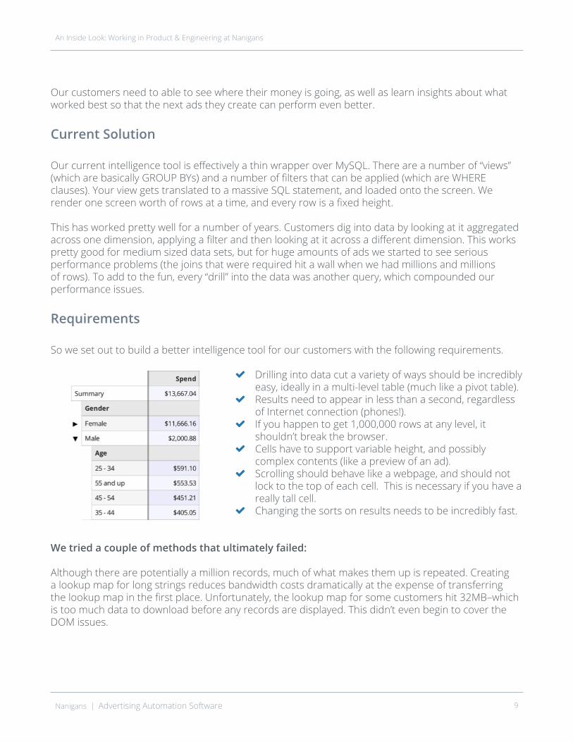
Drilling into data cut a variety of ways should be incredibly easy, ideally in a multi-level table (much like a pivot table).Results need to appear in less than a second, regardless of Internet connection (phones!).If you happen to get 1,000,000 rows at any level, it shouldn’t break the browser.Cells have to support variable height, and possibly complex contents (like a preview of an ad).Scrolling should behave like a webpage, and should not lock to the top of each cell. This is necessary if you have a really tall cell.Changing the sorts on results needs to be incredibly fast.
We tried a couple of methods that ultimately failed:
Although there are potentially a million records, much of what makes them up is repeated. Creating a lookup map for long strings reduces bandwidth costs dramatically at the expense of transferring the lookup map in the first place. Unfortunately, the lookup map for some customers hit 32MB–which is too much data to download before any records are displayed. This didn’t even begin to cover the DOM issues.
Nanigans | Advertising Automation Software 9
An Inside Look: Working in Product & Engineering at Nanigans

1. We tried taking advantage of some nifty HTML5 local storage options. We would sync up record changes on load of the app, do basic aggregation in the browser and pull performance data from the server as needed. This was a fun experiment, but to sort the data by performance, you really need the entire data set. Again this failed before we really tackled the DOM issue.
2. We tried an infinite scroll solution, which was better, but still suffered from the same problems that most infinite scroll solutions have. An inadvertent action could remove all context of what you’re looking at, it wouldn’t be clear via the scrollbar how much data was actually there, DOM elements would be left over at the top in case you scrolled back–which means you still run out of memory if you made it to the bottom of the table.
3. We tried creating a “row group” widget for each set of 50 rows. In its initial state, it starts empty and attempts to approximate its height. If the scroll window of the browser was close to the widget, the widget would fetch the row data to make sure it was ready. If the widget became visible on the screen, it would actually fill itself with row data. If the widget goes offscreen again, it would adjust the height estimation, and empty itself out again.
This was real progress. The bandwidth requirements were low, the scrollbar behaved like Excel, and we reduced our DOM requirements by over 50x. Unfortunately, if there were a million rows, that would still result in 20,000 row groups. Updating each of those on each scroll event was impossible.
The Solution
Instead of building a massive list of “row groups”, we tried using the DOM to aid us in building a search tree. Rather than building one “row group” for every 50 rows, we build 10 “row groups” and divide all rows evenly among them. The first “row group” is responsible for rows 1-100,000, the second for rows 100,001-200,000, and so on. Again, the row height estimator played a very important roll.
The big difference is that if a “row group” was visible and it covered more than 10 rows, instead of filling itself with all 100,000 rows, it would subdivide into “row groups” again. Rinse and repeat. By applying this algorithm recursively, we reduced our need for 20,000 DOM elements down to 60. Searching for row groups that should be shown is now a tree search and incredibly fast.
This reduced the front end of our table problem to a logarithmic solution. Increasing our data size 10x only adds 10 DOM elements to the mix. We are only limited by our backend and the maximum height of a page that the browser can render (32 million pixels +\-).
Nanigans | Advertising Automation Software 10
An Inside Look: Working in Product & Engineering at Nanigans

Conclusion
Of course, we didn’t go into any details on how we actually render rows. There are many solutions to this including a traditional table element, sized divs, or something more extravagant like display:box. This approach is really a way to build a massive list of arbitrary elements and it just happens to work great for a table.
All of this assumes that there is a backend that can serve any number of pre-computed rows incredibly fast, as well as build queries based on arbitrary aggregations. We’ll explore more on this in an upcoming post. Stay tuned!
Nanigans | Advertising Automation Software 11
An Inside Look: Working in Product & Engineering at Nanigans

Nanigans | Advertising Automation Software 12
How to Boost Performance with In-Memory, Multi-Dimensional Analytics
Nanigans’ ad optimization platform, Ad Engine, leverages data to provide the best ROI (return on ad spend investment) for our customers. Making this data easily accessible in a myriad of dimensions is pivotal to analysis. Scarecrow is the backend engine that replaces our original Placement Analysis utility focusing on high performance despite large data size (a million+ ad placements) with the ability to incorporate multiple, custom pivots across an ad’s creative, audience, and performance over time.
Background
The original version of Placement Analysis utilized MySQL to execute and aggregate data. The UI and middle tier would generate a query that would combine the necessary data and then group and sort as needed. When tables were small and our data model relatively simplistic, this performed as needed but as the number of ad placements increased and our data model fragmented across many tables, performance would degrade linearly, if not worse. The reason is the Cartesian joins across the 7-10 large tables was simply too expensive. In addition, it only allowed for grouping and sorting at one tier and in the new Placement Analysis the requirement was to be able to do this on multiple levels or tiers (for instance group by audience, then creative, and then time).
Requirements
An Inside Look: Working in Product & Engineering at Nanigans
60 State St. 12th floorBoston, MA 02109Phone: 857.277.0364Fax: 857.350.3614www.nanigans.com
Keith Wright
Director of Data [email protected] Skype: keithwrightbos
Keith WrightDirector of Data Services
Joining Nanigans in 2012, Keith was previously the director of game development at JNJ Mobile/MocoSpace for three years. He also has held engineering roles at Zeer and PTC.
High performanceDecouple data model from query engineAllow for multi-tier pivoting
High availabilityLinear scalability

Solution
Storing the raw data in MySQL is still useful as the vast majority of the data is relational in nature and MySQL provides ACID transactions. To achieve the performance required and support multi-tier pivoting, Scarecrow loads all of the required MySQL data into memory but breaks it into two types:
Placement metadata such as creative, and audiencePerformance time based data
Placement metadata is always kept in memory and is immutable. Loading this data often requires joins across many tables and can be slow, however, once in memory it can be accessed very quickly. Recent performance data is always kept in memory while older data is retained based on user access. Changes to data are then streamed into Scarecrow to ensure the query results represent real-time metrics.
The query engine acts upon the data in memory using data agnostic actions (i.e. group, sort, where, having). It is important to note that the data model and data access layers are completely decoupled from the query engine. The paths given to the query engine refer to fields within the object using reflection and support expressions against those fields. This allows for using Scarecrow to analyze other future data objects beyond just placements.
The Scarecrow query engine uses a procedural language to process the data called Chirp. Here is an example:
In this case, placement metadata for site 1234 is utilized and first filters out any placements whose audience min age is 15. The results are then grouped by audience gender and creative title and sorted by image and bid type. Attach then combines metadata with today’s time based performance data and groups it by hour. Finally, the having step filters any aggregate data for each hour to only include those whose click through rate is greater than 50%. Data is represented as a tree with aggregate summaries at each non-leaf node.
The result is that loading Placement Analysis for a customer in the old solution with 1 million placements would take between 20-30 minutes, while Scarecrow will execute a more complex query in under 2 seconds.
Nanigans | Advertising Automation Software 13
An Inside Look: Working in Product & Engineering at Nanigans
GET(1234)WHERE(EQUAL,placement.audience.minage,15)GROUP(placement.audience.gender,placement.creative.title)SORT(0,placement.creative.image,DESC,placement.bidtype,ASC)ATTACH(1234,TODAY,HOUR)HAVING(1,GREATER_THAN,placementperformance.clicks/placementperformance.impressions,0.5)

Scale and Availability
The remaining two items (linear scalability and high availability) are addressed using a peer-to-peer cluster. Data is divided throughout the cluster by the site that owns it. These “shards” of data are then distributed to a cluster of Scarecrow instances so that the data usage is as evenly distributed as possible as our most scarce resource is memory. The assumption is that a site’s data will easily fit in the memory space of a given node (in practice even our largest site easily fits on a node). As the number of sites increases (and thus the total data space), we simply add nodes to the cluster and rebalance. The peer-to-peer nature of the cluster allows for high availability by self-monitoring. If a node goes down, the other nodes will load its shards and evenly distribute. Client requests are sent to a load balancer which distributes requests randomly through the cluster. The node receiving the request then forwards to the node owning the shard of data responsible for building the response. This allows for the addition or removal of nodes from the cluster without impacting the client. Because we only return one page of data at a time, the cost of tunneling through a node is insignificant.
In addition, code deployment is done via rolling restart where a node is stopped, its data distributed throughout the cluster, the node restarted, and the cluster rebalanced. This eliminates any downtime and the need to fetch data from the database.
Takeaways
The old methodology of storing data in a centralized location such as MySQL is no longer feasible as data scale explodes. Standard NoSQL solutions attempt to address this problem while providing high availability however their ability to answer ad hoc queries is severely limited. Scarecrow utilizes the best of both worlds by understanding and storing the relational nature of data with the ability execute ad hoc queries. This is possible by distributing the data across a peer-to-peer cluster and storing the data in optimized format completely in memory.
Nanigans | Advertising Automation Software 14
An Inside Look: Working in Product & Engineering at Nanigans

Nanigans | Advertising Automation Software 15
Why Classic A/B Testing Fails
Social media platforms like Facebook are now being asked the perennial advertising question: How effective are my ads? Initial hype and seemingly obvious synergies are giving way to hard questions about how exactly advertising on Facebook generates value. According to a New York Times opinion piece Can Social Media Sell Soap? some are not impressed. The online advertising industry as a whole needs to step-up to this challenge and construct new ways to answer this basic question.
Traditional ways to measure ad lift or efficacy are not always up to the task. The classic approach for testing is the A/B approach. Split your audience into two groups – the A group is exposed to your ads; the B group sees public service ads (PSAs). Measure the different responses from the two groups and calculate the “lift” from your ads. Sounds simple. It is not always that easy.
We don’t drive in cars to measure the speed along different routes. Advertising is the same. We want results, and getting to our destination is more important than measuring how we get there. Traditional A/B testing does not play well with this focus and many of its assumptions are themselves untestable. Take, for example, the assumption that we can have an “unexposed” audience on Facebook. Really? Users don’t stop seeing ads in other media. What we need is to expand the testing toolkit that marketers can use to understand the role of Facebook advertising in the context of their whole marketing plan.
Additional challenges include finding a balanced split in regard to other characteristics that affect ad campaign effectiveness (both market and user characteristics), the multitude of challenges caused by limited data as we go down the conversion funnel, and controlling for possible differences in bid and pacing dynamics across the A/B split.
At Nanigans, we are developing new ways to do measure effectiveness. Take again, the assumption that we need to do A/B splitting of audiences. Why not just show brand and PSA ads to users in the same audience, and measure not lift but the effect the ads have on speeding up the actions of users based on which ads they happen to see? Some users will first see a PSA ad and then organically convert sometime later. Others will see a brand ad and also convert afterwards. Do the brand ads make users convert faster? This is a measurement methodology that complements the reality of marketing campaigns. It measures how the Facebook ad helped to drive value within the context of the overall campaign and doesn’t take credit for driving the action.
An Inside Look: Working in Product & Engineering at Nanigans

Nanigans | Advertising Automation Software 16
Analyze and Discover Ad Insights with Performance Analysis
At Nanigans we work to provide all-in-one solutions that help advertisers measure, manage, and optimize their ad campaigns.
Today we released a new reporting tool focused around helping advertisers easily view and take action from ad placement information. Performance Analysis functions as an advanced pivot table to help advertisers sort, filter, and drill-down into their most important data.
Performance Analysis delivers:
Complete insight into campaign performanceInsight into attributes and metricsCapability to take optimization actions on placementsAbility to filter and see data in any wayData export for easily downloading and sharing campaign reportsFaster results than ever before
Complete Insight into Campaign Performance
We’ve made great strides in making reporting easier, and more robust, all while delivering additional insight through Performance Analysis.
Using Performance Analysis advertisers can sort, filter, and drill-down into any information they would like. For example, if an advertiser wanted to see which creative was working best you can easily show performance by image or video and then sort each by your key metrics such as ROI, LTV, CTR, CPC, and more.
An Inside Look: Working in Product & Engineering at Nanigans
Jeffrey Vocell
Head of Product [email protected]: @Jvocell
60 State St. 12th floorBoston, MA 02109Phone: 888.507.4456Fax: 617.275.8966www.nanigans.com
Jeffrey VocellHead of Product Marketing
Joining the Nanigans team from SiteSpect in 2014, Jeffrey has deep experience in product marketing. He co-founded Trendslide, a mobile business intelligence dashboard company acquired by Dyn in 2013.

Discover Insight from Attributes and Metrics
Performance Analysis helps advertisers view, sort through, and visualize multiple dimensions of campaign data. Configure tables with the attributes and metrics that matter by adding predefined audiences, creative elements, data-related attributes or placement details, followed by the metrics that determine campaign success.
Once the selections have been made simply drag and drop to re-order metrics for a complete campaign dashboard.
Filter and See Data in Any Way
Easily sort, re-arrange, and filter data to see how campaigns are performing. Using the powerful capabilities built into Performance Analysis, find important patterns and trends in data that connect campaign performance directly to what matters to the business and advertising goals.
Take Actions on Placements
View all surrounding data about individual placements and then based on performance data, take optimization actions for any number of placements.
Nanigans | Advertising Automation Software 17
An Inside Look: Working in Product & Engineering at Nanigans

Some of the actions you can take on placements are:
These options allow complete control over all placements and the ability to optimize each through the Performance Analysis.
Export Campaign Performance Data to Share with Colleagues
Using data within Performance Analysis advertisers can export report information that in CSV or TSV format. Data export allows advertisers to select the level of data they want the report to aggregate data at. For example, if a report includes gender, age, and placement this data can be aggregated and exported at any level.
Faster, More Reliable, and Better Performing Than Ever Before
Performance Analysis was built from the ground-up to be fast, robust, and seamlessly handle large amounts of data. This new reporting tool allows advertisers to sort, filter, and find trends in massive amounts of campaign data in a faster way than ever before.
Nanigans | Advertising Automation Software 18
An Inside Look: Working in Product & Engineering at Nanigans
Pausing and un-pausing a placement or set of placements.Adjusting bidsAdjusting budget
SchedulingMuch more…

Nanigans | Advertising Automation Software 19
5 UX Priorities for a SaaS Future
Let’s face it – advertising technology is complex. From the technology that routes requests through myriad servers and exchanges in a matter of milliseconds to the sophisticated bidding algorithms that control spending to the tracking protocols that collect and organize conversion data, it’s a tangled web of systems and lingo that makes up an increasingly important part of the marketing ecosystem.
At Nanigans, we pride ourselves on having a firm grasp on all this complexity. Our culture strongly encourages attacking and solving highly complex technical challenges, and much of our success in the marketplace can be attributed to our ability to provide a product that aptly handles this complexity for our clients. But as we complete the shift toward becoming a true SaaS company, it’s critical that we begin to strip away the unnecessary layers of complexity while continuing to empower our users by giving them the transparency and granular control they often need.
Aside from the naturally complex nature of our industry and our product, we face several UX challenges that must be considered when designing products and experiences for our customers:
Our users spend lots of time in our product, so seemingly small flaws can be magnified because they’re encountered many times in the course of a session;Many of our users are incredibly sophisticated and analytical marketers who demand high-performance and expert functionality, but;We must also accommodate many other types of users who often have simpler user-cases and could benefit from a simpler interface;
An Inside Look: Working in Product & Engineering at Nanigans
Austin Gardner-SmithSenior Director, Product Design
Joining Nanigans in 2014, Austin builds interfaces and experiences for the next generation of performance marketing tools. Prior to Nanigans, he spent nearly three years at Hill Holliday, working to establish and evangelize the agency’s content marketing and service design practice areas.

We are deeply integrated with other platforms, which forces us to make decisions about which patterns and language to adopt and which to translate for our own use; andWe are moving incredibly quickly to deploy new products and features on tight timelines and often don’t have time to utilize “traditional” usability testing methods.
1. Progressive Disclosure
For us, progressive disclosure is about making a process simpler by helping users focus on a single decision at a time. In many cases, our features require multiple pieces of input from users in order to function correctly. Presenting all of these input fields at page load can cause confusion and anxiety for users, so we’re creating more controls that allow users to opt-in to a specific feature set before displaying the dials and switches that go along with it.
2. Onboarding
We know that first experiences are a critical piece of the overall user experience and set expectations for the rest of a product. For a piece of software like ours that requires significant setup and technical implementation, it’s even more important. To serve this need, we’ve dedicated an entire cross-functional team comprised of folks from product, UX and engineering to address the specific challenges associated with getting people up and running on Ad Engine.
3. Contextual Help
Providing help documentation has long been a cornerstone of good UX, but taking users to knowledge base articles outside of the product or littering screens with subtitles and help text is certainly less than optimal. One of the biggest issues we’ve recently tackled as a UX team has been creating and enforcing a consistent contextual help pattern via a combination of user-activated tooltips for field definitions and popover-style help dialogs for more immersive content like tips or explanations that appear on focus. This has helped us move closer toward the optimal balance between providing users the help they need and bombarding them with information.
4. UI Consistency
Getting buttons, text, and navigation elements to remain perfectly consistent across screens may seem like a no-brainer, but in practice these things can require lots of work under the covers to ensure that everything is up to date and in line. Anyone who’s worked on a large web project over the course of multiple years knows that CSS has a natural tendency to bloat and double back on itself, even when everyone is making a real effort to adhere to standards and best practices. Pre-processors (we use LESS for almost all of our styling) can help, but they can’t erase the problem without human help. Getting these details right makes a big difference to users – consistency of styles builds confidence in consistency of performance – and therefore is a big priority as we sharpen our focus on SaaS.
Nanigans | Advertising Automation Software 20
An Inside Look: Working in Product & Engineering at Nanigans

5. Feature Segmentation
Fact of the matter is, some users are more advanced than others. By way of training, experience or use-case, their needs are more sophisticated than most – sometimes by a long shot. Many of these users are among our best, longest-term customers and we love them dearly. But that doesn’t mean that our interfaces should necessarily conform to the highest common denominator. As we go forward, we’re placing more emphasis on segmenting features by user type, putting the most complex ones behind ‘Advanced Settings’ toggles that allow our power users access to the tools they need while keeping less sophisticated users from shooting themselves in the foot by tweaking configurations they haven’t yet mastered.
There are many more UX techniques and considerations in our toolkit, but as we look forward to life as a purely SaaS company, these five principles serve as guideposts that help us understand what to focus on and where to put our energy.
At the end of the day, our application will never sport one of the reductive, almost alarmingly simple interfaces that seem to dominate the headlines of the tech rags and design blogs these days. It was never meant to be, and for us as a UX team, there is a great challenge – and an even greater satisfaction – in designing complex products and experiences to be obvious, fluid, and eminently useful.
Nanigans | Advertising Automation Software 21
An Inside Look: Working in Product & Engineering at Nanigans

nanigans.com
60 State Street | 12th Floor | Boston, MA 02109