What Is the Objective of This Chapter? Sample Green Belt Certification...
27
1 18 Six Sigma Green Belt Certification What Is the Objective of This Chapter? The objective of this chapter is to prepare you for the Six Sigma Green Belt examination. Once you have passed the Green Belt examination, and completed a Six Sigma DMAIC project that has been approved by a Six Sigma Master Black belt, you will be a Six Sigma Green Belt. Sample Green Belt Certification Examination Questions with Answers Green Belt certification examinations assume that you have successfully completed the Champion certification examination. This section only presents questions beyond the Cham- pion certification level. However, Green Belt certification examinations are cumulative in that they cover the material required for both Champion and Green Belt certification. NOTE A laptop computer with Minitab 17 and Microsoft Word is required to sit for the Green Belt certification examination. Minitab is one of the most popular statisti- cal software packages for Six Sigma. You can rent or purchase Minitab from www. minitab.com. Minitab with control charts only exists for PCs. Question: What is data? Answer: Data is information collected about a product, service, process, individual, item, or thing. Because no two things are exactly alike, data inherently varies. Each characteristic of interest is referred to as a variable. Data can also be words, sounds, and pictures, to name a few types.
Transcript of What Is the Objective of This Chapter? Sample Green Belt Certification...
1
18Six Sigma Green Belt Certification
What Is the Objective of This Chapter?The objective of this chapter is to prepare you for the Six Sigma Green Belt examination. Once you have passed the Green Belt examination, and completed a Six Sigma DMAIC project that has been approved by a Six Sigma Master Black belt, you will be a Six Sigma Green Belt.
Sample Green Belt Certification Examination Questions with AnswersGreen Belt certification examinations assume that you have successfully completed the Champion certification examination. This section only presents questions beyond the Cham-pion certification level. However, Green Belt certification examinations are cumulative in that they cover the material required for both Champion and Green Belt certification.
NOTEA laptop computer with Minitab 17 and Microsoft Word is required to sit for the Green Belt certification examination. Minitab is one of the most popular statisti-cal software packages for Six Sigma. You can rent or purchase Minitab from www.minitab.com. Minitab with control charts only exists for PCs.
Question: What is data?
Answer: Data is information collected about a product, service, process, individual, item, or thing. Because no two things are exactly alike, data inherently varies. Each characteristic of interest is referred to as a variable. Data can also be words, sounds, and pictures, to name a few types.
2 A Guide to Six Sigma and Process Improvement for Practitioners and Students
Question: What is attribute data?
Answer: Attribute data (also referred to as classification or count data) occurs when a vari-able is either classified into categories (defective or conforming) or used to count occur-rences of a phenomenon (number of patient falls on a particular hospital floor in a particular month).
Question: Give some examples of attribute classification data.
Answer:
n Percent of accounts receivable older than 90 days per month. Either the account is over 90 days or it isn’t over 90 days; there are only two categories.
n Percent of employees off sick by supervisor by day. Either the employee is off sick or not; there are only two categories.
n Percent of occurrences of surgery delays in an operating room by month. Either the surgery is delayed or not; again, there are only two categories.
Question: Give some examples of attribute count data.
Answer:
n The number of data entry errors on a patient chart by chart n The number of cars entering a hospital parking garage by day n The number of surgeries performed on the wrong patient per year
Question: What is measurement data?
Answer: Measurement data (also referred to as continuous or variables data) results from a measurement taken on an item of interest, or the computation of a numerical value from two or more measurements of variables data. Any value can theoretically occur, limited only by the precision of the measuring process. This type of data can have decimal points.
Question: Give some examples of measurement data.
Answer:
n Height by person n Waiting time by patient n Revenue by month n Cost by line item by store by month
Question: What is a bar chart?
Answer: A bar chart presents each category of a count attribute variable as a bar whose length is the frequency or percentage of observations falling into a particular category. The width of the bar is meaningless for a bar chart, but all bars should be the same width.
3Chapter 18 Six Sigma Green Belt Certification
Question: What is the purpose of a Pareto diagram?
Answer: Pareto diagrams are used to identify and prioritize issues that contribute to a prob-lem we want to solve. Pareto analysis focuses on distinguishing the vital few causes of prob-lems from the trivial many causes of problems. The vital few are the few causes that account for the largest percentage of the problem, while the trivial many are the myriad of causes that account for a small percentage of the problem.
Question: What is a line graph?
Answer: A line graph is a graph of any type of variable plotted on the vertical axis and usually time plotted on the horizontal axis.
Question: What is a histogram?
Answer: A histogram is a special bar chart for measurement data. In the histogram, the data is grouped into adjacent numerical categories of equal size, for example, 100 to less than 200, 200 to less than 300, 300 to less than 400, and so on. The difference between a bar chart and a histogram is that the X axis on a bar chart is a listing of categories, whereas the X axis on a histogram is a measurement scale. In addition there are no gaps between adjacent bars.
Question: What is a dot plot?
Answer: Similar to a histogram, a dot plot is a graph of measurement data in which dots that represent data values are stacked vertically on the horizontal axis for each value of the variable of interest.
Question: What is a run chart?
Answer: A run chart is a type of line chart that has multiple measurements for each time period, called subgroups. Time is the x-axis and the variable of interest is plotted on the y-axis; remember there will be multiple data points on the y-axis for each time period on the x-axis.
Question: What is the mean?
Answer: The most common numerical representation of central tendency is the arithmetic average or mean. It is the sum of the numerical values of the items being measured divided by the number of items. Because its computation is based on every observation, the arithmetic mean is greatly affected by any extreme value or values, so be careful because you may get a distorted representation of what the data are conveying!
Question: What is the median?
Answer: The median is the middle value in a set of data that has been ordered from the lowest to the highest value. Half the observations will be smaller than the median, and half will be larger. The median is not affected by any extreme values in a set of data.
4 A Guide to Six Sigma and Process Improvement for Practitioners and Students
Question: What is the proportion?Answer: Often data are classified into two non-numerical conditions, such as broken versus not broken, defective versus conforming, operating versus not operating. The proportion or fraction of the data possessing one of two such conditions is a meaningful measure of central tendency.
Question: What is the range?Answer: The range is simply the difference between the largest and the smallest data points in the data set. It is calculated by subtracting the smallest number from the largest number.
Question: Give an example of the range.Answer: Given the following data: 34, 12, 23, 29, 31 15, 21, 19, compute the range.
Range = largest value – smallest valueRange = 34 – 12 = 22
Question: What are the variance and standard deviation?Answer: The variance and standard deviation measure how far the values in a data set are spread out around the average. A variance or standard deviation of zero indicates all the values in the data set are the same.
Question: Compute the variance and standard deviation from the following data:39, 29, 43, 52, 39, 44, 40, 31, 44, and 35.
Answer: Let’s use the example of our time to get ready in the morning to help us understand variance and standard deviation. The times to get ready are listed in Table 18.1.
Table 18.1 Time to Get Ready for Ten Days Used to Calculate Variance and Standard Deviation
Time (X) Difference Between X and Mean Squared Differences Around the Mean39 -0.6 0.3629 -10.6 112.3643 3.4 11.5652 12.4 153.7639 -0.6 0.3644 4.4 19.3640 0.4 0.1631 -8.6 73.9644 4.4 19.3635 -4.6 21.16
Mean = 39.6 Sum of differences = 0 Sum of squared differences = 412.4
5Chapter 18 Six Sigma Green Belt Certification
To calculate the variance we take the following steps:
1. We subtract each value from the mean; see the middle column in Table 18.1. 2. We square those numbers and add them up to get the sum of squared differences,
which is 412.4, as you see at the bottom of the right column in Table 18.1. 3. Finally, we divide the sum of squared differences by the number of observations (10)
minus one, which gives us 412.4/9 = 45.82.
To calculate the standard deviation we simply take the square root of the variance, which is 6.77.
Question: Explain the meaning of the range, variance, and standard deviation.
Answer: The following statements summarize what you need to know about the range, vari-ance, and standard deviation:
n The more spread out, or dispersed, the data are, the larger will be the range, the vari-ance, and the standard deviation.
n The more concentrated or homogeneous the data is, the smaller will be the range, the variance, and the standard deviation.
n If the values are all the same (so that there is no variation in the data), the range, the variance, and the standard deviation will all be zero.
n The range, variation, or standard deviation will always be greater than or equal to zero.
n The range can be a deceptive measure of dispersion if there are extreme values in the data set.
Question: What is skewness?
Answer: Skewness is a measure of the size of the right or left tail of a unimodal (one hump) distribution. There are three types of skewness: symmetrical, positive or right skewness, and negative or left skewness.
Question: If the distribution of output from a process is unimodal, symmetric, and bell shaped, we call this distribution the normal distribution. The normal distribution has some properties that are worth mentioning here to improve your understanding of the standard deviation. What percentage of the data in a normal distribution lay between the mean and plus or minus two standard deviations from the mean?
Answer: If you create a region under the normal distribution that is plus or minus two stan-dard deviations from the mean, then 95.44% of the output from the process that generated the normal distribution will lie in that area.
Question: Construct and interpret the control chart for the following data. Consider the case of a large health system that has had several complaints from several pathologists concerning a supposed problem with a manufacturer sending cracked slides. Slides are pieces of glass that

6 A Guide to Six Sigma and Process Improvement for Practitioners and Students
pathologists place biopsies on so they can be examined under a microscope. This allows the pathologist to assist the clinician in confirming a diagnosis of the disease from the biopsy. According to the pathologists, some slides are cracked or broken before or during transit, rendering them useless scrap. The fraction of cracked or broken slides is naturally of concern to the hospital administration. Each day a sample of 100 slides is drawn from the total of all slides received from each slide vendor. Table 18.2 presents the sample results for 30 days of incoming shipments for a particular vendor.
Table 18.2 30 Days of Incoming Slide Shipments for a Particular Vendor
DaySample
SizeNumber Cracked
1 100 142 100 23 100 114 100 45 100 96 100 77 100 48 100 69 100 3
10 100 211 100 312 100 813 100 414 100 1515 100 5
DaySample
SizeNumber Cracked
16 100 317 100 818 100 419 100 220 100 521 100 522 100 723 100 924 100 125 100 326 100 1227 100 928 100 329 100 630 100 9
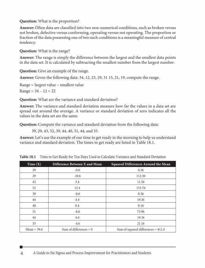
Answer: These data are appropriate for a p chart (see Figure 18.1) because each slide is clas-sified as cracked (defective) or not cracked (nonconforming). The probability of a cracked slide is assumed to be constant from slide to slide, and each slide is considered independent of the other slides.
The process lacks control. On day 1, the proportion of cracked slides (14/100 = 0.14) is above the upper control limit, and on day 14 the proportion of cracked slides (15/100 = 0.15) is above the upper control limit.
Question: Construct and interpret a control chart for the following data. Consider the num-ber of add-ons (unscheduled patients) in an outpatient clinic in a hospital. Many times patients are added on to the regular schedule at the last minute or the same day. This is problematic as the capacity of the clinic is limited and add-ons create problematic wait times,
7Chapter 18 Six Sigma Green Belt Certification
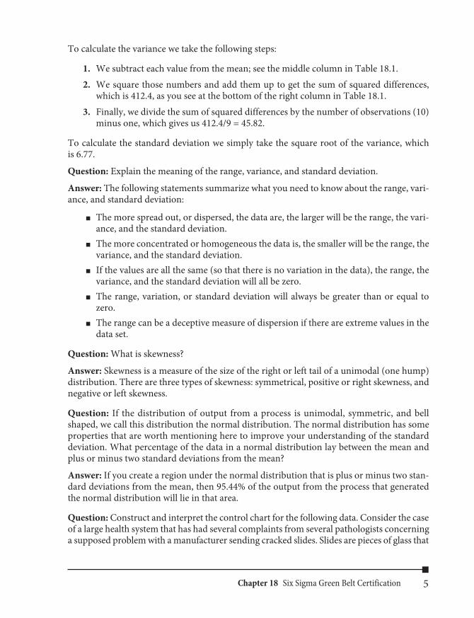
usually too long for patient satisfaction to be at an acceptable level. A process improvement team collected data on the number of add-ons per day at one of its outpatient clinics. Results of these data collections produce the results in Table 18.3.
Figure 18.1 P chart of number of cracked tiles
Table 18.3 Number of Add-Ons per Day for 50 Consecutive Days in an Outpatient Clinic
Day Add-ons1 132 193 94 215 186 137 188 199 19
10 1511 1112 913 16
Day Add-ons14 1215 1616 1217 1418 1419 1420 1321 1422 1123 1724 1125 1526 21
Day Add-ons27 1628 1529 1830 1931 1032 1433 1434 1235 1636 1237 838 1239 20
8 A Guide to Six Sigma and Process Improvement for Practitioners and Students
Day Add-ons40 2441 1142 1043 10
Day Add-ons44 545 1746 1447 11
Day Add-ons48 2349 1350 8
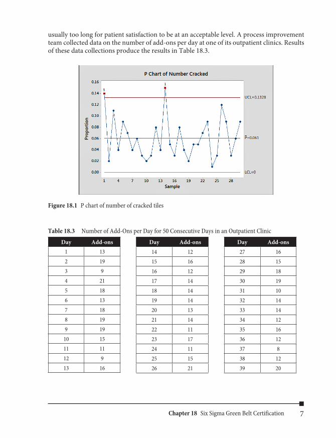
Answer: The assumptions necessary for using the c chart are well met here, as the clinic days are considered to be the areas of opportunity; add-ons are discrete events and seem to be independent of one another (see Figure 18.2). Even if these conditions are not precisely met, the c chart is fairly robust or insensitive to small departures from the assumptions.
Figure 18.2 C chart of the number of add-ons per day for 50 consecutive days in an outpatient clinic
The number of add-ons appears to be stable around a center line or mean of 14.32.
Question: Construct and interpret a control chart from the following data. Consider a pathology department of a hospital who needs to provide diagnosis of GI biopsies in a timely manner. There are many steps in the process including extracting the biopsy from the patient, lab processing, reading, and sign-out by the faculty. The hospital administration is concerned with the turnaround times for GI biopsies taking too long. Turnaround times for 100 consecutive GI biopsy cases is shown Table 18.4.
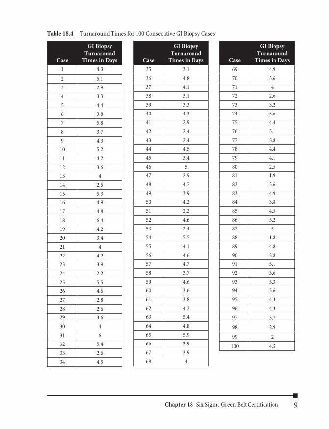
9Chapter 18 Six Sigma Green Belt Certification
Table 18.4 Turnaround Times for 100 Consecutive GI Biopsy Cases
Case
GI Biopsy Turnaround
Times in Days1 4.32 5.13 2.94 3.35 4.46 3.87 5.88 3.79 4.3
10 5.211 4.212 3.613 414 2.515 5.316 4.917 4.818 6.419 4.220 3.421 422 4.223 3.924 2.225 5.526 4.627 2.828 2.629 3.630 431 632 5.433 2.634 4.5
Case
GI Biopsy Turnaround
Times in Days35 3.136 4.837 4.138 3.139 3.340 4.341 2.942 2.443 2.444 4.545 3.446 547 2.948 4.749 3.950 4.251 2.252 4.653 2.454 5.555 4.156 4.657 4.758 3.759 4.660 3.661 3.862 4.263 5.464 4.865 5.966 3.967 3.968 4
Case
GI Biopsy Turnaround
Times in Days69 4.970 3.671 472 2.673 3.274 5.675 4.476 5.177 5.878 4.479 4.180 2.581 1.982 3.683 4.984 3.885 4.586 5.287 588 1.889 4.890 3.891 5.192 3.693 5.394 3.695 4.396 4.397 3.798 2.999 2
100 4.5

10 A Guide to Six Sigma and Process Improvement for Practitioners and Students
Answer:
Figure 18.3 I-MR chart for the turnaround times for 100 consecutive GI biopsy cases
The bottom portion in Figure 18.3 is the moving range chart and the top portion is the indi-vidual value chart. First, the moving range chart is examined for signs of special variation. None of the points on the moving range chart is outside the control limits, and there are no other signals indicating a lack of control. Thus, there are no indications of special sources of variation on the moving range chart. Now the individual value chart can be examined. There are no indications of a lack of control, so the process can be considered to be stable and the output predictable with respect to time as long as conditions remain the same.
Question: Construct and interpret a control chart for the following data. Consider a large pharmaceutical firm that provides vials filled to a specification of 52.0 grams. The firm’s management has embarked on a program of statistical process control and has decided to use variables control charts for this filling process to detect special causes of variation. Samples of six vials are selected every 5 minutes during a 105-minute period. Each set of six measure-ments makes up a subgroup. Table 18.5 lists the vial weights for 22 subgroups.
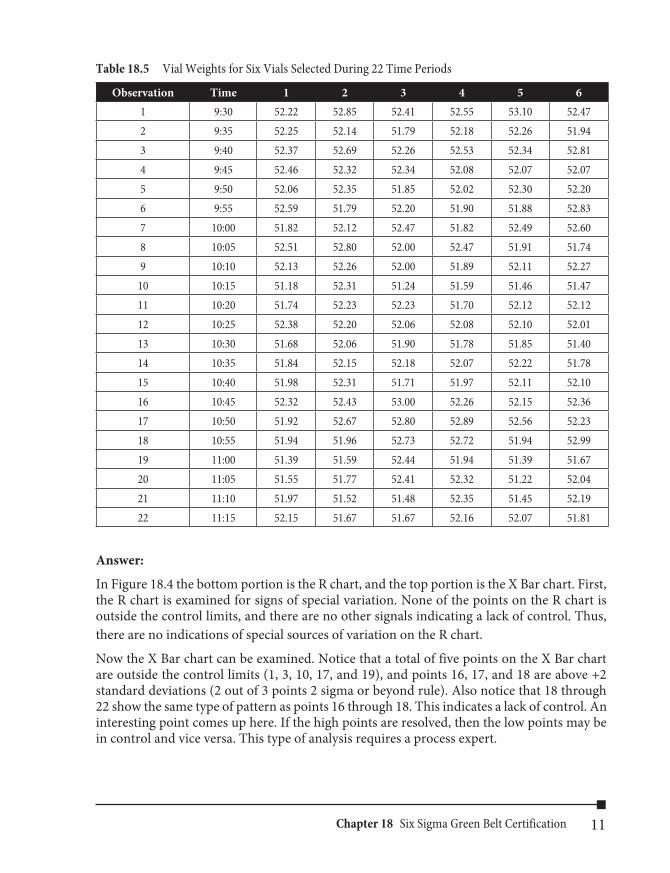
11Chapter 18 Six Sigma Green Belt Certification
Table 18.5 Vial Weights for Six Vials Selected During 22 Time Periods
Observation Time 1 2 3 4 5 61 9:30 52.22 52.85 52.41 52.55 53.10 52.472 9:35 52.25 52.14 51.79 52.18 52.26 51.943 9:40 52.37 52.69 52.26 52.53 52.34 52.814 9:45 52.46 52.32 52.34 52.08 52.07 52.075 9:50 52.06 52.35 51.85 52.02 52.30 52.206 9:55 52.59 51.79 52.20 51.90 51.88 52.837 10:00 51.82 52.12 52.47 51.82 52.49 52.608 10:05 52.51 52.80 52.00 52.47 51.91 51.749 10:10 52.13 52.26 52.00 51.89 52.11 52.27
10 10:15 51.18 52.31 51.24 51.59 51.46 51.4711 10:20 51.74 52.23 52.23 51.70 52.12 52.1212 10:25 52.38 52.20 52.06 52.08 52.10 52.0113 10:30 51.68 52.06 51.90 51.78 51.85 51.4014 10:35 51.84 52.15 52.18 52.07 52.22 51.7815 10:40 51.98 52.31 51.71 51.97 52.11 52.1016 10:45 52.32 52.43 53.00 52.26 52.15 52.3617 10:50 51.92 52.67 52.80 52.89 52.56 52.2318 10:55 51.94 51.96 52.73 52.72 51.94 52.9919 11:00 51.39 51.59 52.44 51.94 51.39 51.6720 11:05 51.55 51.77 52.41 52.32 51.22 52.0421 11:10 51.97 51.52 51.48 52.35 51.45 52.1922 11:15 52.15 51.67 51.67 52.16 52.07 51.81
Answer:
In Figure 18.4 the bottom portion is the R chart, and the top portion is the X Bar chart. First, the R chart is examined for signs of special variation. None of the points on the R chart is outside the control limits, and there are no other signals indicating a lack of control. Thus, there are no indications of special sources of variation on the R chart.
Now the X Bar chart can be examined. Notice that a total of five points on the X Bar chart are outside the control limits (1, 3, 10, 17, and 19), and points 16, 17, and 18 are above +2 standard deviations (2 out of 3 points 2 sigma or beyond rule). Also notice that 18 through 22 show the same type of pattern as points 16 through 18. This indicates a lack of control. An interesting point comes up here. If the high points are resolved, then the low points may be in control and vice versa. This type of analysis requires a process expert.
12 A Guide to Six Sigma and Process Improvement for Practitioners and Students
Further investigation is warranted to determine the source(s) of these special variations. The next step is to eliminate the bad special causes of variation and instill the good special causes of variation. Once this is done, the next step is to reduce the common causes of variation in the process.
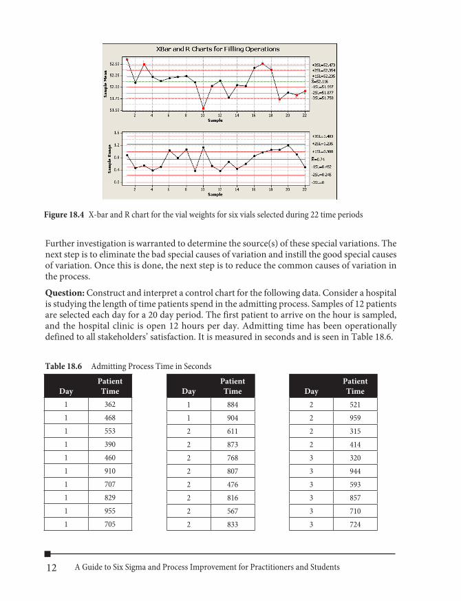
Question: Construct and interpret a control chart for the following data. Consider a hospital is studying the length of time patients spend in the admitting process. Samples of 12 patients are selected each day for a 20 day period. The first patient to arrive on the hour is sampled, and the hospital clinic is open 12 hours per day. Admitting time has been operationally defined to all stakeholders’ satisfaction. It is measured in seconds and is seen in Table 18.6.
Table 18.6 Admitting Process Time in Seconds
Figure 18.4 X-bar and R chart for the vial weights for six vials selected during 22 time periods
DayPatient Time
1 3621 4681 5531 3901 4601 9101 7071 8291 9551 705
DayPatient Time
1 8841 9042 6112 8732 7682 8072 4762 8162 5672 833
DayPatient Time
2 5212 9592 3152 4143 3203 9443 5933 8573 7103 724

13Chapter 18 Six Sigma Green Belt Certification
DayPatient Time
3 5453 5263 3483 4563 5763 8554 6214 9274 9484 8174 6414 7644 9864 4304 7434 4514 6454 9965 6805 7945 6505 7805 4425 3725 6275 8825 7565 5485 7675 7456 7596 6656 7306 9306 369
DayPatient Time
6 6356 3136 8436 2646 6636 9916 4317 3727 8357 8847 9307 6677 7477 3907 6447 3397 6647 2457 8938 3708 2948 4808 5588 5028 5958 8478 5448 8538 8768 7448 8169 5309 8819 9439 383
DayPatient Time
9 3169 6119 7789 5319 8969 7729 7199 670
10 49410 91410 87010 27210 66210 34810 44710 30610 75110 44510 71710 38711 65911 91911 60311 89711 31911 49911 79911 48211 61511 49711 43011 76512 27412 75412 428

14 A Guide to Six Sigma and Process Improvement for Practitioners and Students
DayPatient Time
12 81112 91612 33212 76512 96112 43712 69212 38012 56613 79713 25313 82913 85713 89813 38713 91813 90013 69113 60013 45013 77514 67814 67914 35114 66314 63814 92814 25814 33814 44614 93614 58414 53515 99715 205
DayPatient Time
15 89315 73415 47415 63115 74615 64215 48415 52515 68515 35816 24216 47416 96616 82316 51516 61716 89416 51916 63616 54716 99316 85817 59417 81717 38117 46217 42917 78617 90117 27817 47217 88517 99117 55718 368
DayPatient Time
18 85018 51018 68818 20118 79518 97718 71518 25318 31018 41218 81319 80619 57519 34819 29819 48719 69719 24919 66819 53319 98519 28419 70720 49720 78520 80620 26320 43520 33720 65920 53720 78620 60720 46620 564
15Chapter 18 Six Sigma Green Belt Certification
Answer:
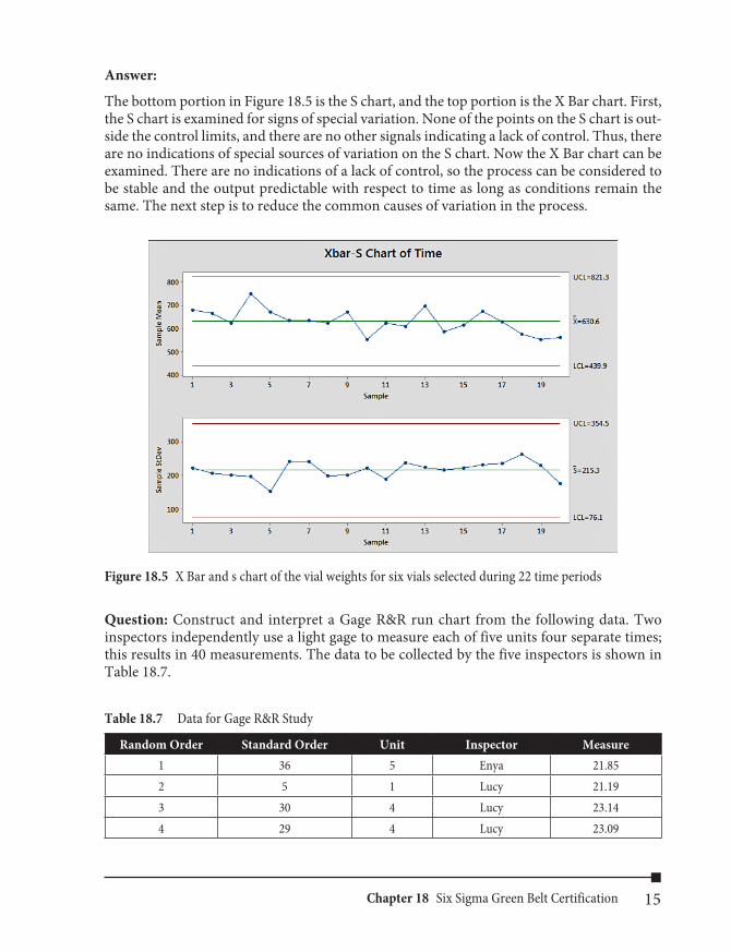
The bottom portion in Figure 18.5 is the S chart, and the top portion is the X Bar chart. First, the S chart is examined for signs of special variation. None of the points on the S chart is out-side the control limits, and there are no other signals indicating a lack of control. Thus, there are no indications of special sources of variation on the S chart. Now the X Bar chart can be examined. There are no indications of a lack of control, so the process can be considered to be stable and the output predictable with respect to time as long as conditions remain the same. The next step is to reduce the common causes of variation in the process.
Figure 18.5 X Bar and s chart of the vial weights for six vials selected during 22 time periods
Question: Construct and interpret a Gage R&R run chart from the following data. Two inspectors independently use a light gage to measure each of five units four separate times; this results in 40 measurements. The data to be collected by the five inspectors is shown in Table 18.7.
Table 18.7 Data for Gage R&R Study
Random Order Standard Order Unit Inspector Measure1 36 5 Enya 21.852 5 1 Lucy 21.193 30 4 Lucy 23.144 29 4 Lucy 23.09
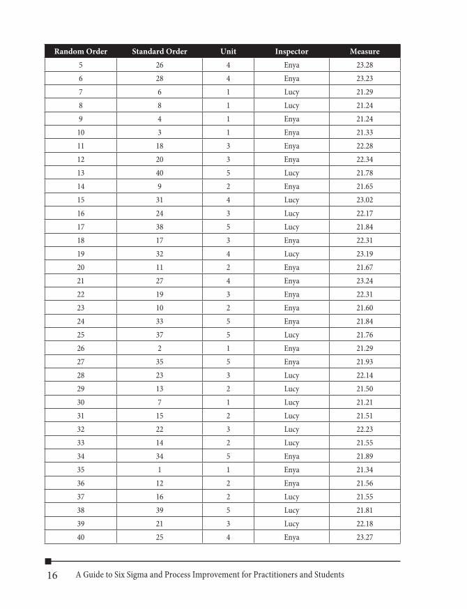
16 A Guide to Six Sigma and Process Improvement for Practitioners and Students
Random Order Standard Order Unit Inspector Measure5 26 4 Enya 23.286 28 4 Enya 23.237 6 1 Lucy 21.298 8 1 Lucy 21.249 4 1 Enya 21.24
10 3 1 Enya 21.3311 18 3 Enya 22.2812 20 3 Enya 22.3413 40 5 Lucy 21.7814 9 2 Enya 21.6515 31 4 Lucy 23.0216 24 3 Lucy 22.1717 38 5 Lucy 21.8418 17 3 Enya 22.3119 32 4 Lucy 23.1920 11 2 Enya 21.6721 27 4 Enya 23.2422 19 3 Enya 22.3123 10 2 Enya 21.6024 33 5 Enya 21.8425 37 5 Lucy 21.7626 2 1 Enya 21.2927 35 5 Enya 21.9328 23 3 Lucy 22.1429 13 2 Lucy 21.5030 7 1 Lucy 21.2131 15 2 Lucy 21.5132 22 3 Lucy 22.2333 14 2 Lucy 21.5534 34 5 Enya 21.8935 1 1 Enya 21.3436 12 2 Enya 21.5637 16 2 Lucy 21.5538 39 5 Lucy 21.8139 21 3 Lucy 22.1840 25 4 Enya 23.27

17Chapter 18 Six Sigma Green Belt Certification
Answer:
Figure 18.6 Gage R&R chart
A visual analysis (see Figure 18.6) of the data in Table 18.7 indicates that repeatability (within group variation) is good. Good reproducibility is demonstrated by the similarity of the squares connected by lines and the dots connected by lines, for each unit. Reproducibility (one form of between group variation) is good. The Gage run chart shows that most of the observed total variation in light gage readings is due to differences between units, which indicates a good measurement system.
Question: What is a flowchart, and what are two types of flowcharts?
Answer: A flowchart is a tool used to map out (draw a picture of) a process. There are two types of flowcharts; they are:
n Process flowcharts—Flowcharts that describe the steps and decision points of a pro-cess in a downward direction from the start (top of the page) to the stop (bottom of the page) of the process.
n Deployment flowcharts—Flowcharts organized into “lanes,” which show processes that involve various departments, people, stages, or other categories.
Question: Define Voice of the Customer (VoC), and explain the four stages of a VoC analysis.Answer: Voice of the Customer analysis involves surveying stakeholders of a process to understand their requirements and needs. Stakeholders can include customers, employees, investors, regulatory agencies, building and grounds, the legal system, and the environment, to name a few possible stakeholders of a process.
18 A Guide to Six Sigma and Process Improvement for Practitioners and Students
There are typically four stages when conducting the Voice of the Customer analysis:
1. Define/segment the market. (Identify the stakeholder groups.) 2. Plan the VoC. (Identify who will be interviewed and who will interview them, estab-
lish a time schedule, and prepare the questions.) 3. Collect the data by stakeholder group. 4. Organize and interpret the data.
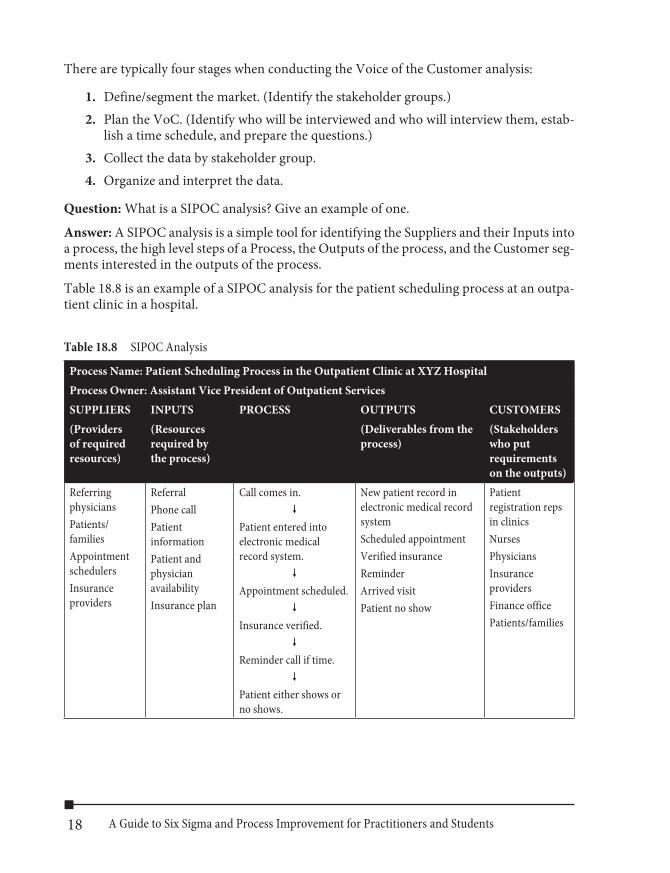
Question: What is a SIPOC analysis? Give an example of one.
Answer: A SIPOC analysis is a simple tool for identifying the Suppliers and their Inputs into a process, the high level steps of a Process, the Outputs of the process, and the Customer seg-ments interested in the outputs of the process.
Table 18.8 is an example of a SIPOC analysis for the patient scheduling process at an outpa-tient clinic in a hospital.
Table 18.8 SIPOC Analysis
Process Name: Patient Scheduling Process in the Outpatient Clinic at XYZ HospitalProcess Owner: Assistant Vice President of Outpatient ServicesSUPPLIERS INPUTS PROCESS OUTPUTS CUSTOMERS(Providers of required resources)
(Resources required by the process)
(Deliverables from the process)
(Stakeholders who put requirements on the outputs)
Referring physiciansPatients/ familiesAppointment schedulersInsurance providers
ReferralPhone callPatient informationPatient and physician availabilityInsurance plan
Call comes in.�
Patient entered into electronic medical record system.
�
Appointment scheduled.�
Insurance verified.�
Reminder call if time.�
Patient either shows or no shows.
New patient record in electronic medical record systemScheduled appointmentVerified insuranceReminderArrived visitPatient no show
Patient registration reps in clinicsNursesPhysiciansInsurance providersFinance officePatients/families
19Chapter 18 Six Sigma Green Belt Certification
Question: What is an operational definition and give an example of one?
Answer: An operational definition promotes understanding between people by putting com-municable meaning into words. An operational definition contains three parts: a criterion to be applied to an object or group, a test of the object or group, and a decision as to whether the object or group meets the criterion.
n Criteria—Operational definitions establish Voice of the Customer specifications for each CTQ that will be compared with the Voice of the Process outputs in the Test step of an operational definition.
n Test—A test involves comparing Voice of the Process data with Voice of the Cus-tomer specifications for each CTQ, for a given unit of output.
n Decision—A decision involves making a determination whether a given unit of out-put meets Voice of the Customer specifications.
Example:
Susan lends Mary her coat for a vacation. Susan requests that it be returned clean. Mary returns it dirty. Is there a problem? Yes! What is it? Susan and Mary failed to operationally define clean. They have different definitions of clean. Failing to operationally define terms can lead to problems. A possible operational definition of clean is that Mary will get the coat dry-cleaned before returning it to Susan. This is an acceptable definition if both parties agree. This operational definition is shown here:
Criteria: The coat is dry-cleaned and returned to Susan.Test: Susan determines whether the coat was dry-cleaned.Decision: If the coat was dry-cleaned, Susan accepts the coat. If the coat was not dry-cleaned, Susan does not accept the coat.
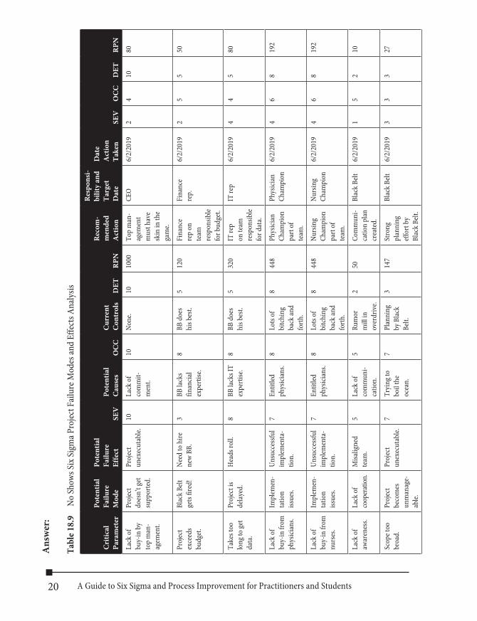
Question: Give an example of an FMEA.
20 A Guide to Six Sigma and Process Improvement for Practitioners and Students
Ans
wer
:
Tabl
e 18.
9 No
Show
s Six
Sigm
a Pro
ject F
ailu
re M
odes
and
Effe
cts A
naly
sis
Cri
tical
Pa
ram
eter
Pote
ntia
l Fa
ilure
M
ode
Pote
ntia
l Fa
ilure
Ef
fect
SEV
Pote
ntia
l C
ause
sO
CC
Cur
rent
C
ontr
ols
DET
RPN
Rec
om-
men
ded
A
ctio
n
Res
pons
i- bi
lity
and
Targ
et
Dat
e
Dat
e A
ctio
n Ta
ken
SEV
OC
CD
ETR
PN
Lack
of
buy-
in b
y to
p m
an-
agem
ent.
Proj
ect
does
n’t g
et
supp
orte
d.
Proj
ect
unex
ecut
able.
10La
ck o
f co
mm
it-m
ent.
10No
ne.
1010
00To
p m
an-
agem
ent
mus
t hav
e sk
in in
the
gam
e.
CEO
6/2/
2019
24
1080
Proj
ect
exce
eds
budg
et.
Blac
k Be
lt ge
ts fir
ed!
Need
to h
ire
new
BB.
3BB
lack
s fin
ancia
l ex
perti
se.
8BB
doe
s hi
s bes
t.5
120
Fina
nce
rep
on
team
re
spon
sible
for b
udge
t.
Fina
nce
rep.
6/2/
2019
25
550
Take
s too
lo
ng to
get
data
.
Proj
ect i
s de
layed
.H
eads
roll.
8BB
lack
s IT
expe
rtise
.8
BB d
oes
his b
est.
532
0IT
rep
on te
am
resp
onsib
le fo
r dat
a.
IT re
p6/
2/20
194
45
80
Lack
of
buy-
in fr
om
phys
ician
s.
Impl
emen
- ta
tion
issue
s.
Unsu
cces
sful
impl
emen
ta-
tion.
7En
titled
ph
ysici
ans.
8Lo
ts of
bi
tchi
ng
back
and
forth
.
844
8Ph
ysici
an
Cham
pion
pa
rt of
te
am.
Phys
ician
Ch
ampi
on6/
2/20
194
68
192
Lack
of
buy-
in fr
om
nurs
es.
Impl
emen
- ta
tion
issue
s.
Unsu
cces
sful
impl
emen
ta-
tion.
7En
titled
ph
ysici
ans.
8Lo
ts of
bi
tchi
ng
back
and
forth
.
844
8Nu
rsin
g Ch
ampi
on
part
of
team
.
Nurs
ing
Cham
pion
6/2/
2019
46
819
2
Lack
of
awar
enes
s.La
ck o
f co
oper
atio
n.M
isalig
ned
team
.5
Lack
of
com
mun
i-ca
tion.
5Ru
mor
m
ill in
ov
erdr
ive.
250
Com
mun
i-ca
tion
plan
cr
eate
d.
Blac
k Be
lt6/
2/20
191
52
10
Scop
e too
br
oad.
Proj
ect
beco
mes
un
man
age-
ab
le.
Proj
ect
unex
ecut
able.
7Tr
ying
to
boil
the
ocea
n.
7Pl
anni
ng
by B
lack
Belt.
314
7St
rong
pl
anni
ng
effo
rt by
Bl
ack
Belt.
Blac
k Be
lt6/
2/20
193
33
27
21Chapter 18 Six Sigma Green Belt Certification
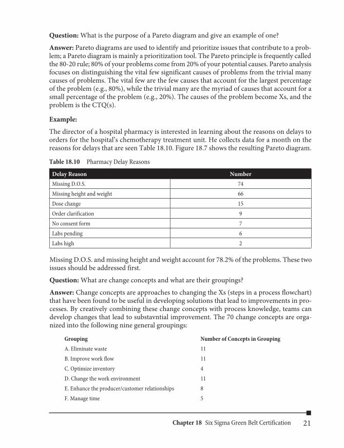
Question: What is the purpose of a Pareto diagram and give an example of one?
Answer: Pareto diagrams are used to identify and prioritize issues that contribute to a prob-lem; a Pareto diagram is mainly a prioritization tool. The Pareto principle is frequently called the 80-20 rule; 80% of your problems come from 20% of your potential causes. Pareto analysis focuses on distinguishing the vital few significant causes of problems from the trivial many causes of problems. The vital few are the few causes that account for the largest percentage of the problem (e.g., 80%), while the trivial many are the myriad of causes that account for a small percentage of the problem (e.g., 20%). The causes of the problem become Xs, and the problem is the CTQ(s).
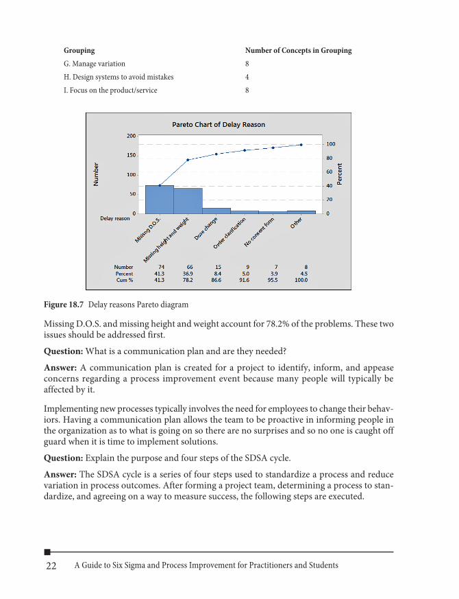
Example:
The director of a hospital pharmacy is interested in learning about the reasons on delays to orders for the hospital’s chemotherapy treatment unit. He collects data for a month on the reasons for delays that are seen Table 18.10. Figure 18.7 shows the resulting Pareto diagram.
Table 18.10 Pharmacy Delay Reasons
Delay Reason NumberMissing D.O.S. 74Missing height and weight 66Dose change 15Order clarification 9No consent form 7Labs pending 6Labs high 2
Missing D.O.S. and missing height and weight account for 78.2% of the problems. These two issues should be addressed first.
Question: What are change concepts and what are their groupings?
Answer: Change concepts are approaches to changing the Xs (steps in a process flowchart) that have been found to be useful in developing solutions that lead to improvements in pro-cesses. By creatively combining these change concepts with process knowledge, teams can develop changes that lead to substavntial improvement. The 70 change concepts are orga-nized into the following nine general groupings:
Grouping Number of Concepts in GroupingA. Eliminate waste 11B. Improve work flow 11C. Optimize inventory 4D. Change the work environment 11E. Enhance the producer/customer relationships 8F. Manage time 5
22 A Guide to Six Sigma and Process Improvement for Practitioners and Students
Grouping Number of Concepts in GroupingG. Manage variation 8H. Design systems to avoid mistakes 4I. Focus on the product/service 8
Figure 18.7 Delay reasons Pareto diagram
Missing D.O.S. and missing height and weight account for 78.2% of the problems. These two issues should be addressed first.
Question: What is a communication plan and are they needed?
Answer: A communication plan is created for a project to identify, inform, and appease concerns regarding a process improvement event because many people will typically be affected by it.
Implementing new processes typically involves the need for employees to change their behav-iors. Having a communication plan allows the team to be proactive in informing people in the organization as to what is going on so there are no surprises and so no one is caught off guard when it is time to implement solutions.
Question: Explain the purpose and four steps of the SDSA cycle.
Answer: The SDSA cycle is a series of four steps used to standardize a process and reduce variation in process outcomes. After forming a project team, determining a process to stan-dardize, and agreeing on a way to measure success, the following steps are executed.
23Chapter 18 Six Sigma Green Belt Certification
n Standardize—Each employee flowcharts the process under study; usually their job. They are then brought together and agree upon a best practice flowchart that takes the best aspect of their individual flowcharts and eliminates the worst aspects of their individual flowcharts. Basically they move from their individual current state flow-charts to a new, and hopefully improved, standardized future state flowchart that all employees using the flowchart agree upon and follow. Standardization can dramati-cally reduce variability in the outcomes of a process. It is also a great test of a work-force’s ability to exhibit discipline in the way they do their jobs. Personal discipline to follow the standardized flowchart, or an improved flowchart, is critical to a successful Six Sigma organizational transformation.
n Do—Each employee uses the new, standardized flowchart, and they collectively gather data of their efforts so the results can be analyzed in the Study step.
n Study—Employees analyze the results of the experiment or test on the new standard-ized flowchart to see whether it had the intended outcome.
n Act—Employees decide whether to adopt the new standardized flowchart, and if the answer is yes, they lock it in with documentation and training, or modify the plan and repeat the SDSA cycle. If the answer is no, the team goes back to the beginning and tries again.
Question: Explain the purpose and four steps of the PDSA cycle.
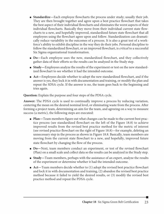
Answer: The PDSA cycle is used to continually improve a process by reducing variation, centering the mean on the desired nominal level, or eliminating waste from the process. After forming a project team, determining an aim for the team, and agreeing on a way to measure success (a metric), the following steps are executed:
n Plan—Team members figure out what changes can be made to the current best prac-tice process (see standardized flowchart on the left of the Figure 18.8) to achieve improved results from the revised best practice method for the metric of interest (see revised practice flowchart on the right of Figure 18.8)—for example, deleting an unnecessary step in the process as shown in Figure 18.8. Basically, team members are moving from the current state flowchart to a new, and hopefully, improved future state flowchart by changing the flow of the process.
n Do—Next, team members conduct an experiment, or test of the revised flowchart (Plan) on a small scale and collect data so the results can be analyzed in the Study step.
n Study—Team members, perhaps with the assistance of an expert, analyze the results of the experiment or determine whether it had the intended outcome.
n Act—Team members decide whether to (1) adopt the revised best practice flowchart and lock it in with documentation and training, (2) abandon the revised best practice method because it failed to yield the desired results, or (3) modify the revised best practice method and repeat the PDSA cycle.
24 A Guide to Six Sigma and Process Improvement for Practitioners and Students
Question: Explain how Kaizen works.
Answer: Kaizen works as follows: The PDSA cycle is turned, and at the Do stage employees make small and rapid modifications to the Plan stage and determine their success in the Study phase of the PDSA cycle. The small and rapid changes to the plan find any problems with the plan, display the problems, clear the problems that stand in the way of the plan, and acknowledge the correctness of the modification to the plan. Next, employees study the results of the effort by viewing the critical metric (CTQ), and finally, act. Kaizen or Rapid Improvement Events are typically conducted on processes where the root cause is known but the solution to eliminate the root cause is not.
Standardizedflowchart
Revised bestpractice method
Improved bestpractice flowchart
Figure 18.8 Standardized and revised best practice flowcharts

25Chapter 18 Six Sigma Green Belt Certification
Question: Explain the purpose of the DMAIC model.
Answer: The easiest way to explain the DMAIC model is to think of it in terms of the CTQ (Y) is a function of one or more Xs. For example, suppose that it is believed that patient wait-ing time is affected by insurance type, physician, and availability of an examination room. This could be stated as follows:
Patient waiting time is a function of insurance type, physician, and availability of an exami-nation room.
If we call Patient waiting time CTQ, insurance type (X1), physician (X2), and availability of an examination room (X3), then we can write the relationship between the CTQ and the Xs as follows:
CTQ = f(X1, X2, X3)
where:
n CTQ is a measure of patient waiting time. n f is the symbol of relationship. n X1 is insurance type. n X2 is physician. n X3 is availability of an examination room.
The five phases of the DMAIC model are Define, Measure, Analyze, Improve, and Control. They are aimed at finding change concepts that will modify how the Xs are performed with the intention of moving the CTQ (Y) in a specified direction, reducing variation in the output (Y), or both.
Question: Construct and explain the structure of a dashboard.
Answer:
Table 18.11 Generic Managerial Dashboard
Mission Statement: A mission statement is a declaration of the reason for the existence of an organization. It should be short and memorable, as well as noble and motivational.President Direct Reports
Potential Process Improvement Projects or Tasks
PresidentialObjectives
PresidentialIndicators Area Objectives
Area Indicators
Presidential objectives that must be achieved to attain the mis-sion statement.
A key indicator is a mea-surement that monitors the status of a key objec-tive. One or more presi-dential indicators show progress toward each presidential objective.
Area objectives are established to move each presidential indicator in the proper direction.
One or more area indicators show progress toward each area objective.
Process improvement projects or tasks are used to improve or inno-vate processes to move indicators in the proper direction.

26 A Guide to Six Sigma and Process Improvement for Practitioners and Students
Question: Give an example of a matrix that could be used to prioritize potential Six Sigma projects. Explain how the matrix works.
Answer:
Table 18.12 Project Prioritization Matrix
Evaluation Criteria Weight Project A Project B Project C Project DCriteria 1 Weight 1
Criteria 2 Weight 2
Criteria 3 Weight 3
Criteria 4 Weight 4
Criteria 5 Weight 5
Criteria 6 Weight 6
Weighted average of potential projects
In Table 18.12, the cell values are assigned by top management, and they evaluate the strength of the relationship between each criteria and each potential project.
They are defined as follows:
0 = no relationship between criteria and project1 = weak relationship between criteria and project3 = moderate relationship between criteria and project9 = strong relationship between criteria and project
Each cell value is then multiplied by its respective weight and summed so that each potential project has a weighted average. The projects are then prioritized by weight, which ranks them in terms of importance to the organization based on the evaluation criteria. Obviously this is not an exact science and is subjective in nature, so it is still possible that management will make an executive decision to go with a project that is lower on the list due to reasons they deem important.
Question: What is the non-technical definition of Six Sigma?
Answer: Six Sigma management can be defined as the relentless and rigorous pursuit of the reduction of variation in all critical processes to achieve continuous and breakthrough improvements that impact the bottom-line and/or top-line of the organization and increase customer satisfaction.
27Chapter 18 Six Sigma Green Belt Certification
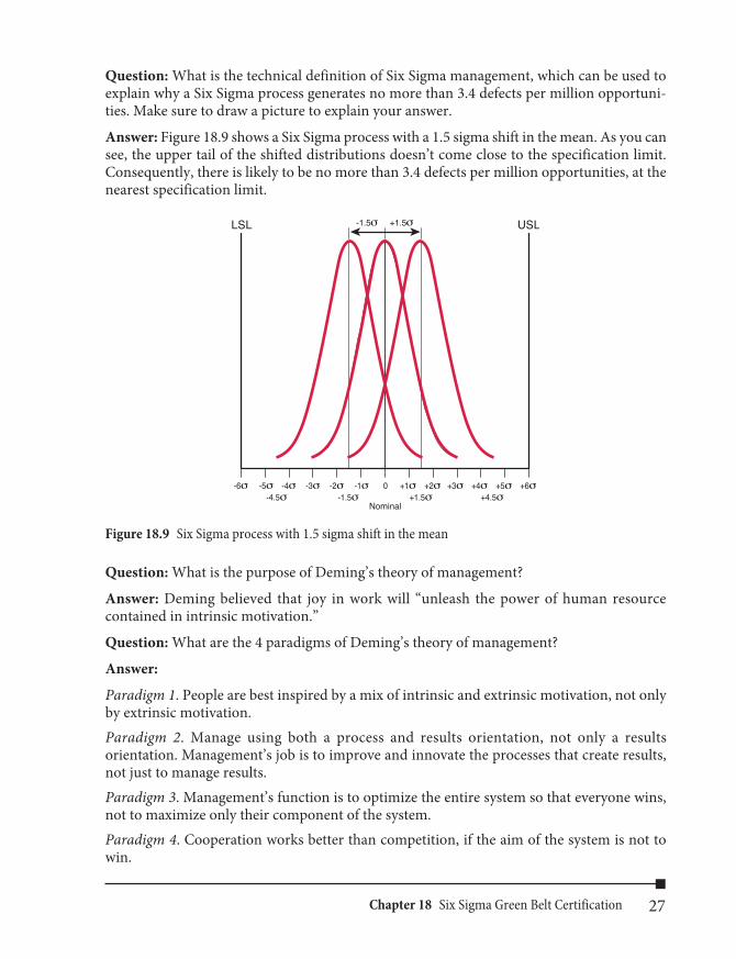
Question: What is the technical definition of Six Sigma management, which can be used to explain why a Six Sigma process generates no more than 3.4 defects per million opportuni-ties. Make sure to draw a picture to explain your answer.
Answer: Figure 18.9 shows a Six Sigma process with a 1.5 sigma shift in the mean. As you can see, the upper tail of the shifted distributions doesn’t come close to the specification limit. Consequently, there is likely to be no more than 3.4 defects per million opportunities, at the nearest specification limit.
USLLSL
-4σ -3σ -2σ -1σ 0 +1σ +2σ +3σ +4σ +5σ +6σ-5σ-6σ
Nominal-4.5σ -1.5σ +1.5σ +4.5σ
+1.5σ-1.5σ
Figure 18.9 Six Sigma process with 1.5 sigma shift in the mean
Question: What is the purpose of Deming’s theory of management?
Answer: Deming believed that joy in work will “unleash the power of human resource contained in intrinsic motivation.”
Question: What are the 4 paradigms of Deming’s theory of management?
Answer:
Paradigm 1. People are best inspired by a mix of intrinsic and extrinsic motivation, not only by extrinsic motivation.Paradigm 2. Manage using both a process and results orientation, not only a results orientation. Management’s job is to improve and innovate the processes that create results, not just to manage results.Paradigm 3. Management’s function is to optimize the entire system so that everyone wins, not to maximize only their component of the system. Paradigm 4. Cooperation works better than competition, if the aim of the system is not to win.

![[SAMPLE QUESTION] APMG International Lean Six Sigma Green Belt Certification](https://static.fdocuments.in/doc/165x107/60c4857f063d665a7f2dd148/sample-question-apmg-international-lean-six-sigma-green-belt-certification.jpg)