What I Will And Won't Use
6
WHAT NOT TO USE IN A MAGAZINE - FONTS There are many important aspects of designing a magazine, a very important aspect is what not to use. Font choice, colour scheme and many other things are important when designing a magazine, and what NOT to use is important. There are many fonts available, however some are completely unusable for magazines. For example, you would never use Comic Sans as it is extremely unprofessional Another example of poor typeface is Jokerman, which is terrible. These would be bad as they are unreadable and unprofessional, as well as being generally ugly.
-
Upload
09smisebmedia -
Category
Education
-
view
34 -
download
1
Transcript of What I Will And Won't Use
WHAT NOT TO USE IN A MAGAZINE - FONTS
There are many important aspects of designing a magazine, a very important aspect is what not to use. Font choice, colour scheme and many other things are important when designing a magazine, and what NOT to use is important. There are many fonts available, however some are completely unusable for magazines.
For example, you would never use Comic Sans as it is extremely unprofessional
Another example of poor typeface is Jokerman, which is terrible.
These would be bad as they are unreadable and unprofessional, as well as being generally ugly.
WHAT NOT TO USE IN A MAGAZINE - COLOURS
Colour scheme is very important to a magazine, just like font choice. What you would not use is a ridiculously bright colour scheme with opposing colours, for example
THIS IS EXTREMELY BAD, AS THE COLOURS ARE CLASHING AS WELL AS TOO BRIGHT
As you can see, colour scheme choice is important.
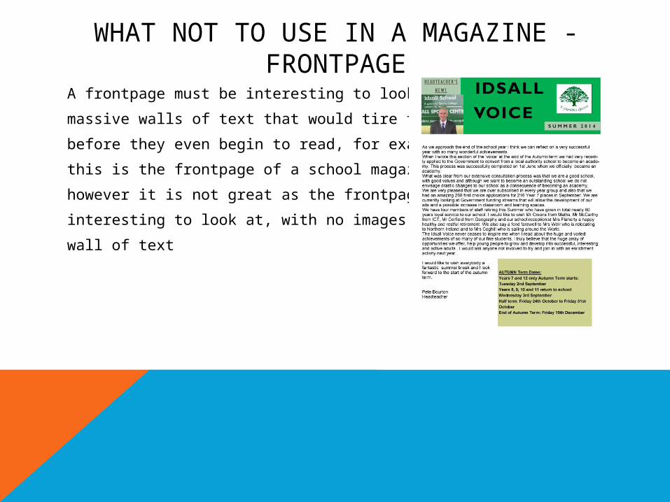
WHAT NOT TO USE IN A MAGAZINE - FRONTPAGE
A frontpage must be interesting to look at, not have
massive walls of text that would tire the reader
before they even begin to read, for example
this is the frontpage of a school magazine,
however it is not great as the frontpage is not
interesting to look at, with no images and a large
wall of text
A combination of serif and sans-serif fonts often looks good on a magazine front, cover, I am considering using
Trajan Pro for headlines and other info
In combination with
Franklin Gothic for subheaders and other text
WHAT I WILL USE - FONTS
Colours are extremely subjective, and I am still deciding on colour scheme, however so long as the colours are not massively clashing there should not be any major issues.
However, a good example of a colour scheme is this powerpoint
WHAT I WILL USE - COLOURS
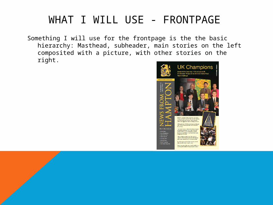
Something I will use for the frontpage is the the basic hierarchy: Masthead, subheader, main stories on the left composited with a picture, with other stories on the right.
WHAT I WILL USE - FRONTPAGE