
Web-Site Design Best Practices - Home - UC Small …sfp.ucdavis.edu/files/184178.pdfWeb-Site Design...
21
Web-Site Design Best Practices Nicholas M. Pasculli president
Transcript of Web-Site Design Best Practices - Home - UC Small …sfp.ucdavis.edu/files/184178.pdfWeb-Site Design...
Web-Site Design Best Practices
Nicholas M. Pasculli president

Good web design,
with its unique look, feel and functionality, is what brings a website to life. It’s what makes visitors want to click around and even bookmark the site for return visits.

Page Layout Basics
• Be consistent, logo, header, navigation colors, fonts, alignments
• Informative page titles • Footer contact info • Keep compelling information
above the fold 1024x768 • 10-second rule • Smartphone and tablet display

Browser Compatibility
• Test on all popular browsers
• Browsers to pay attention to: – Internet Explorer
– Firefox
– Google Chrome
– Opera
– Safari (Mac & Windows)
– Tablets and smart phones

Navigation
• Navigation links clear & consistent
• Navigation is easy to use for target audience
• Have clear text links in footer
• Avoid use of Flash
• Make sure there are not broken links

Color and Graphics
• Limit color scheme to 3-4 colors + neutrals
• Be consistent in color use • Text color needs sufficient
contrast • Make sure graphics are optimized • Graphics have a clear purpose • Caution when using animated
images
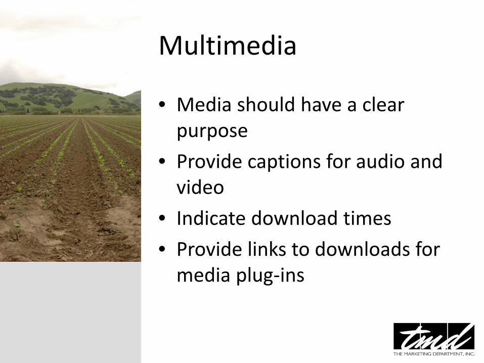
Multimedia
• Media should have a clear purpose
• Provide captions for audio and video
• Indicate download times
• Provide links to downloads for media plug-ins

Content • Use common fonts throughout and
be consistent in size and color • Use headings, bullet points and brief
paragraphs • Meaningful and useful (timeless) • Organized and flow • Make information easy to find • Error free • Text hyperlinks use a color • Graphics should convey meaning

• Test your writing style using readability formulas that gauge how easy it is to get through content. http://read-able.com/
Content
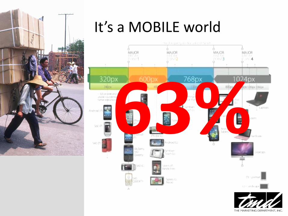
It’s a MOBILE world
63%

It’s a MOBILE world • Give mobile users a quality
browsing experience
• Program using responsive design
• Cross platform testing

It’s a MOBILE world • Create a responsive design site • Fluid content and image grids
with breakpoints • Use HTML5 guidelines and
doctype

Site Design
• Directory editors look for sites with good design
• Visitors will stay longer and your site will score higher
• Your design should cater to the needs of your visitors

Rules of Thumb for Web Design
• The web is not on paper • You are a guest in your reader’s
environment • Your reader is smarter than you
think • Don’t try to be cool • Leave the reader in control • Provide redundant navigation

Site Design Etiquette
• Each of the following is rude when it comes to web design – Telling the reader to get a new browser
– Expecting the reader to resize their page to fit your design
– Playing background sounds that the user can’t control
– Setting type size or font in ways the reader cannot override
Design Do’s
• Provide simple navigation
• Include social media badges
• Offer multiple forms of content
• Have a blog
• Make your site responsive
• Use content management systems (ie: WordPress)

Design Don’ts • Use Flash
• Build complex navigation
• Build more pages than needed
• Overly self-promote, use the 80/20 rule (educate/promote)
http://www.loungelizard.com/web-design-blogs/design/top-10-worst-website-designs/

A few good resources
• http://www.mobify.com/go/mobile-web-design/
• http://www.fueldeck.com/blog/25-resources-for-best-practices-in-web-development-2013/
• https://developers.google.com/webmasters/smartphone-sites/
• www.thebestdesigns.com
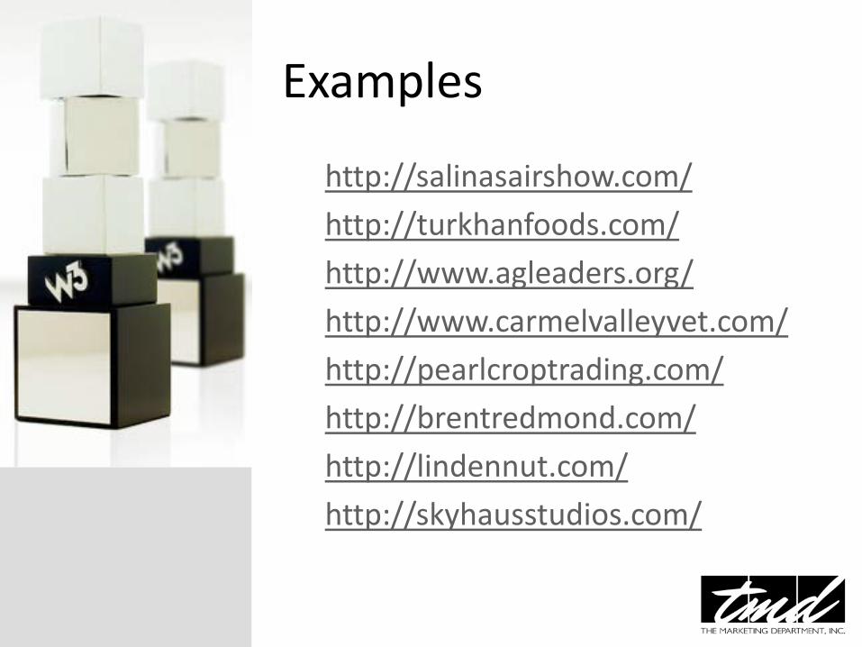
Examples
http://salinasairshow.com/
http://turkhanfoods.com/
http://www.agleaders.org/
http://www.carmelvalleyvet.com/
http://pearlcroptrading.com/
http://brentredmond.com/
http://lindennut.com/
http://skyhausstudios.com/
Thank you for your attention Time for your questions
To see samples of TMD’s work
Please visit our website
www.tmdcreative.com

![49269545 Pasculli Amelia Un Pensiero Del Ballo in Maschera Fantasy for English Horn and Piano[1]](https://static.fdocuments.in/doc/165x107/5572136a497959fc0b9241f2/49269545-pasculli-amelia-un-pensiero-del-ballo-in-maschera-fantasy-for-english.jpg)