Web-based Supplementary Materials for Visualizations for ...fewster/McMillan_Fewster_GenePlot... ·...
19
Web-based Supplementary Materials for Visualizations for genetic assignment analyses using the saddlepoint approximation method, by L. F. McMillan, R. M. Fewster Web Appendix A: Map of Great Barrier Island The data used to demonstrate the visualization method are from ship rats captured on the large island of Aotea/Great Barrier Island, and on Kaikoura Island and the Broken Islands, smaller landmasses off the coast of Aotea. Web Figure 1 shows all the locations where samples were captured. The three islands labeled as Motutaiko, Flat and Mahuki are the Broken Islands and contribute 62 samples. Aotea samples used throughout the main text comprise the 58 samples from western Aotea, sampled at locations marked Fitzroy, Red Cliffs, and Mainland. Sample sizes quoted in the text differ slightly from sample numbers marked on the map because some samples had missing data at five or more loci and were excluded from analyses. Web Figure 1: Rat sampling locations on the Great Barrier Island archipelago. Sample sizes are shown in brackets. 1
Transcript of Web-based Supplementary Materials for Visualizations for ...fewster/McMillan_Fewster_GenePlot... ·...

Web-based Supplementary Materials for
Visualizations for genetic assignment analyses using
the saddlepoint approximation method,
by L. F. McMillan, R. M. Fewster
Web Appendix A: Map of Great Barrier Island
The data used to demonstrate the visualization method are from ship rats captured on
the large island of Aotea/Great Barrier Island, and on Kaikoura Island and the Broken
Islands, smaller landmasses off the coast of Aotea. Web Figure 1 shows all the locations
where samples were captured. The three islands labeled as Motutaiko, Flat and Mahuki
are the Broken Islands and contribute 62 samples. Aotea samples used throughout the
main text comprise the 58 samples from western Aotea, sampled at locations marked
Fitzroy, Red Cliffs, and Mainland. Sample sizes quoted in the text differ slightly from
sample numbers marked on the map because some samples had missing data at five or
more loci and were excluded from analyses.
Web Figure 1: Rat sampling locations on the Great Barrier Island archipelago. Sample sizes
are shown in brackets.
1

Web Appendix B: Minimum and maximum of the LGP
distribution
The distribution by which we characterize a population is the distribution of log-genotype
probabilities (LGPs) for all possible multilocus genotypes that may be drawn from the
posterior distribution of the allele frequencies for that population.
The posterior distribution of allele frequencies at a single locus is given by
p ∼ Dirichlet(x1 + τ, x2 + τ, . . . , xk + τ) (1)
where xi is the observed frequency of allele i in the sample from population R and τ is
the parameter for the Dirichlet prior distribution of allele frequencies.
Given the posterior allele frequencies, we can calculate the minimum and maximum of
the LGP distribution. We initially calculate the maximum and minimum at each single
locus and define νi = xi + τ and N =∑k
i=1 νi. For a single locus, the maximum possible
LGP is given by: log
[ν1(ν1 + 1)
N(N + 1)
]if ν1 + 1 ≥ 2ν2 ,
log
[2ν1ν2
N(N + 1)
]otherwise,
(2)
where ν1 is the largest of all the νi, and ν2 is the next largest (possibly equal).
The minimum possible LGP is given by:log
[2νkνk−1
N(N + 1)
]if 2νk−1 ≤ νk + 1 ,
log
[νk(νk + 1)
N(N + 1)
]otherwise,
(3)
where νk is the smallest of all the νi, and νk−1 is the next smallest (possibly equal).
The maximum and minimum of the multilocus LGP distribution are found by summing
over all the loci.
2

Web Appendix C: Saddlepoint approximation
as applied to the LGP distribution
For a single locus L, any genotype aL arises with probability P(aL) given by equation (5)
in the main text. Thus the single-locus LGP distribution acquires point mass P(aL) at
value log{P(aL)} for every genotype aL. Recall that log{P(aL)} serves as a measure of
genetic fit and we are aiming to characterize the probability distribution of this measure.
Let Y L = log{P(aL)} be the random variable representing the single-locus LGP, and let
genotypes at locus L be indexed by g = 1, 2, . . . , kL(kL + 1)/2 where kL is the number of
allele types at locus L. Write αg = P(aLg ) for each g. Then each genotype aL
g contributes
point mass αg to value Y L = log(αg).
The moment generating function (MGF) for a random variable Z is given by:
M(t) = E(etZ) .
The MGF of the target LGP distribution at a single locus L is thus given by:
M(t) =∑y
P (Y L = y) exp(ty)
=∑g
αg exp(t logαg)
=∑g
αt+1g . (4)
Derivatives of the MGF are given by:
M (r)(t) =∑g
(logαg)rαt+1
g . (5)
The cumulant generating function (CGF) and its derivatives for a single locus can be
calculated accordingly. Since the CGF is the log of the MGF, and genotypes are assumed
to be independent across loci, the multilocus CGF, K, is the sum of the single locus
CGFs, and the derivatives are similarly defined.
The saddlepoint approximation to the multilocus LGP distribution can then be calculated,
using a numerical method to find the root of the equation
K ′(s) = y , (6)
where y is the value of the random variable Y representing the multilocus LGP at which
we wish to calculate FL∗(y).
Technically, the LGP distribution is discrete. However, in most cases it is well-approximated
by a continuous distribution, particularly when the number of distinct allele types at each
locus is higher than about 4, due to the large number of possible genotype probabili-
ties. The saddlepoint approximation is an approximation to the (undefined) continuous
distribution that, in turn, approximates the discrete target LGP distribution.
3

Web Appendix D: Evaluation of saddlepoint CDF and
empirical CDF
We tested the saddlepoint distribution using many simulated populations. For a given
simulated population P we calculated the SCDF and generated an ECDF based on 100,000
simulated genotypes, then calculated the values of both the ECDF and the SCDF at 1000
evenly spaced points over the range of the ECDF. We then took the result sP to be the sum
of squared differences between the SCDF and ECDF at those 1000 points. Since different
sets of simulated genotypes can produce different ECDFs for the same population, we
repeated the procedure 10 times with different sets of simulated genotypes to obtain SP
as the mean of sP over the 10 replicate ECDFs for population P . Thus SP is the mean
sum of squared differences for a single population with a single set of randomly simulated
allele frequencies.
We then simulated many populations. Web Figure 2 shows SP for populations generated
with NL = 2, . . . , 10, where the maximum number of allele types k ranges from 2 to 10,
with 10 population replicates for each combination of k and NL constituting 10 different
draws of allele frequencies as described in the main text. Within each of those population
replicates we generated 10 replicate ECDFs as described above, and summarized the
ECDF results as SP for each population replicate. Web Figure 2 illustrates that the
SCDF provides a suitable approximation to the LGP distribution for a population.
Web Figure 2: SCDF vs ECDF at 1000 points for simulated populations. The x-axis shows the
number of loci NL for each simulated population. The y-axis shows the discrepancy measure
SP for each of 90 results at each value of NL, denoting 10 replicates for each setting of the
maximum number of alleles k = 2, . . . , 10.
4

Web Appendix E: Comparison of GenePlot,
STRUCTURE, GENECLASS2 and DAPC
We provide a comparison of our GenePlot method with the popular software packages
structure and geneclass2 by displaying the output of each program applied to the
same dataset. We also provide a comparison of GenePlot with the Discriminant Analysis
of Principal Components (dapc) functionality within the R package adegenet.
Web Figure 3: structure bar plot of ship rats captured on Kaikoura Island, the Broken
Islands and Aotea between 2005 and 2008. The red bars correspond to cluster 1, the green bars
to cluster 2 and the blue bars to cluster 3. Individuals 1 to 60 were captured on the Broken
Islands; individuals 61 to 120 were captured on Kaikoura; individuals 121 to 177 were captured
on Aotea. Cluster 1 mostly corresponds to the Broken Islands samples.
We ran structure (Pritchard et al. 2000, Falush et al. 2003) with the admixture model
and without location priors. We used options without correlated allele frequencies, with
10,000 burn-in iterations and 10,000 final iterations. We tested the number of clusters, K,
from 1 to 3, running 5 replicates for each value of K. The runs used consecutive random
number seeds starting at 1. We found K = 3 had the highest likelihood. Web Figure 3
shows the results for the run with the highest likelihood using K = 3. structure uses
a clustering algorithm, and without location priors it does not use any location data to
assign samples to clusters; instead, it allots each sample a fractional composition of the
three estimated clusters. This fractional composition is intended to indicate the estimated
proportion of the individual’s genome that originated in each of the three clusters, but it
is commonly interpreted in studies as the probability that the individual originated from
each of the three clusters.
5

The structure results in Web Figure 3 indicate that there is one clearly-defined cluster,
specifically Cluster 1 in red, and two somewhat overlapping clusters depicted by green
and blue. The results do not reveal other information about genetic subsetting between
clusters, or the variance of genetic fit within a cluster.
The sample marked with a circle corresponds to the rat circled in Figures 4 and 5; the
sample marked with a square corresponds to the rat marked with a square in Figures 4
and 5. The circled rat stands out as somewhat anomalous in the GenePlots in Figures 4
and 5, but this is not apparent from the structure output in Web Figure 3.
We ran geneclass2 (Piry et al. 2004) on the Kaikoura, Broken Islands and Aotea refer-
ence samples, using the assign/exclude option for individuals, with assignment threshold
0.05. We used the Rannala and Mountain (1997) Bayesian computation method, without
the probability computation from Paetkau et al. (2004). geneclass2 uses the leave-one-
out method by default if no separate assignment samples are provided (query samples
in our terminology), because it assumes that the reference samples are to be assigned.
Thus, to supply assignment samples, we entered the reference samples again with renamed
populations. This ensured geneclass2 displayed results consistent with the GenePlot
shown in Figure 5, which does not display the leave-one-out method. Web Table 1 shows
a selection of the results to illustrate the geneclass2 output; figures are quoted to the
precision returned by geneclass2. The full table (not shown) contains 177 rows. The
rats marked with circle and square correspond to the rats marked with circle and square
in Figures 4 and 5. When a sample possesses the full complement of 10 loci, the columns
marked -log(L) correspond to the negative LGPs as plotted on the GenePlots in Figure 4.
The “Assigned sample” column in the geneclass2 results shows the population in which
each sample was captured, renamed as Brok2, Kai2, and Aotea2 respectively to switch off
the leave-one-out option as described above. Some individuals have higher scores for pop-
ulations they were not found in. For example, the rat marked with a square in Web Table 1
was found on Kaikoura. From Web Table 1 there appears to be substantially stronger
support for Aotea than for Kaikoura. However, Figure 4 in the main text demonstrates
that, seen in context, the rat has a similar fit to both Aotea and Kaikoura, and lies within
a region of high overlap between the two populations; its origins can therefore not be
determined conclusively. This underlines the importance of viewing the absolute measure
of fit shown in the GenePlot. Interpreting only the relative fit to different populations,
in the absence of the context displayed on the GenePlot, can lead to misleading conclu-
sions. The same rat is marked with a square on the structure plot in Web Figure 3.
Although there is a strong mapping between Cluster 1 in the structure output and rats
sampled on the Broken Islands, there is no clear mapping between Clusters 2 and 3 and
the sampling locations of Kaikoura and Aotea. The rat marked with a square exhibits a
moderate signal of overlapping membership between Clusters 2 and 3.
We ran dapc (Jombart et al. 2010) from the R package adegenet (Jombart 2008, Jom-
bart & Ahmed 2011), a method that performs principal components analysis on raw
6

Assigned rank score rank score rank score Brok Kai Aotea Nb.
sample 1 % 2 % 3 % -log(L) -log(L) -log(L) of loci
/Brok2 Brok 100 Kai 0 Aotea 0 8.041 15.224 17.351 10
/Brok2 Brok 99.999 Kai 0.001 Aotea 0 7.265 12.556 12.663 10
/Brok2 Brok 99.999 Kai 0.001 Aotea 0 6.636 11.58 14.787 10
/Brok2 Brok 99.2 Aotea 0.46 Kai 0.34 7.968 10.434 10.301 10
/Brok2◦ Brok 100 Aotea 0 Kai 0 12.765 25.858 22.818 10
/Kai2 □ Aotea 72.848 Kai 27.151 Brok 0 15.391 10.52 10.091 10
/Kai2 Kai 88.056 Aotea 11.944 Brok 0 22.442 8.968 9.836 9
/Kai2 Kai 72.033 Aotea 27.967 Brok 0 26.611 11.079 11.49 10
/Aotea2 Aotea 99.796 Kai 0.204 Brok 0 23.98 15.336 12.647 10
/Aotea2 Aotea 99.649 Kai 0.351 Brok 0 27.841 17.888 15.435 10
/Aotea2 Aotea 99.963 Kai 0.037 Brok 0 20.609 14.641 11.205 8
/Aotea2 Kai 60.495 Aotea 39.505 Brok 0 27.868 14.034 14.219 10
/Aotea2 Brok 98.869 Aotea 1.13 Kai 0.001 8.199 13.399 10.141 10
Web Table 1: Selected geneclass2 results for the Broken Islands, Kaikoura and Aotea popu-
lations. The rank and score columns show the populations ordered by their corresponding scores
for each individual.
diploid allele counts, and then performs discriminant analysis on a reduced number of
the principal components. The input data format for dapc is a table with one row per
individual, and columns corresponding to every allele type at every locus. The cell values
are 0, 1, or 2, corresponding to the number of alleles of each type that the individual
possesses. A principal components analysis is performed on these allele-count variables
with values 0, 1, and 2. The user then selects how many of these principal components to
use for the subsequent discriminant analysis. We ran dapc on the combined data from
Kaikoura Island, the Broken Islands and Aotea using 50 principal components and two
discriminant components. The number of principal components used for the discriminant
analysis should not be larger than the smallest reference sample; 50 is the default number
of principal components. After the first two discriminant components the remaining dis-
criminant components did not significantly improve the results. Web Figure 4 shows the
probabilities of membership for each population and each rat, and selected individuals are
shown in Web Table 2; Web Figure 5 shows the scatter graph of the first two discriminant
components, with points labelled according to their original population membership. As
for the structure and geneclass2 results, two individuals are marked with a circle
and a square, corresponding to the two marked individuals in Figure 5; the conclusions
in Web Table 2 for these two rats are almost identical to those from geneclass seen in
Web Table 1.
Web Figure 6, the default dapc plot when applied to only the two populations of Aotea
and the Broken Islands, uses only one discriminant component as the other components
do not significantly affect the result. We used only 30 principal components in the PCA
stage as there are fewer observations than in the combined dataset with Kaikoura Island.
7
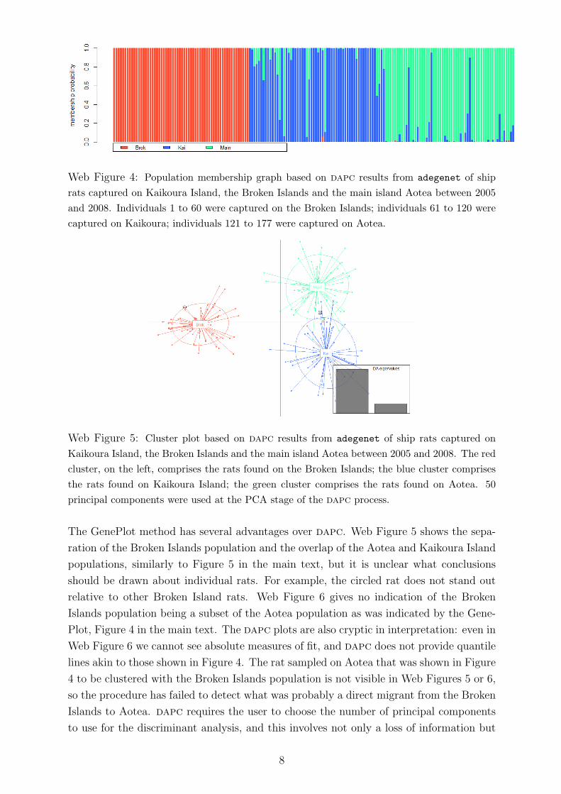
Web Figure 4: Population membership graph based on dapc results from adegenet of ship
rats captured on Kaikoura Island, the Broken Islands and the main island Aotea between 2005
and 2008. Individuals 1 to 60 were captured on the Broken Islands; individuals 61 to 120 were
captured on Kaikoura; individuals 121 to 177 were captured on Aotea.
Web Figure 5: Cluster plot based on dapc results from adegenet of ship rats captured on
Kaikoura Island, the Broken Islands and the main island Aotea between 2005 and 2008. The red
cluster, on the left, comprises the rats found on the Broken Islands; the blue cluster comprises
the rats found on Kaikoura Island; the green cluster comprises the rats found on Aotea. 50
principal components were used at the PCA stage of the dapc process.
The GenePlot method has several advantages over dapc. Web Figure 5 shows the sepa-
ration of the Broken Islands population and the overlap of the Aotea and Kaikoura Island
populations, similarly to Figure 5 in the main text, but it is unclear what conclusions
should be drawn about individual rats. For example, the circled rat does not stand out
relative to other Broken Island rats. Web Figure 6 gives no indication of the Broken
Islands population being a subset of the Aotea population as was indicated by the Gene-
Plot, Figure 4 in the main text. The dapc plots are also cryptic in interpretation: even in
Web Figure 6 we cannot see absolute measures of fit, and dapc does not provide quantile
lines akin to those shown in Figure 4. The rat sampled on Aotea that was shown in Figure
4 to be clustered with the Broken Islands population is not visible in Web Figures 5 or 6,
so the procedure has failed to detect what was probably a direct migrant from the Broken
Islands to Aotea. dapc requires the user to choose the number of principal components
to use for the discriminant analysis, and this involves not only a loss of information but
8

ID Brok Kai Aotea
Bi39 0.999 0.000 0.001
Bi40 1.000 0.000 0.000
Bi41 1.000 0.000 0.000
Bi49 1.000 0.000 0.000
Bi50 1.000 0.000 0.000
Bi53 ◦ 1.000 0.000 0.000
Ki015 0.000 1.000 0.000
Ki016 0.001 0.953 0.046
Ki017 0.000 0.717 0.283
Ki018 □ 0.000 0.235 0.765
Ki020 0.000 1.000 0.000
Ki021 0.000 0.060 0.940
Web Table 2: Selected dapc results for the Broken Islands, Kaikoura and Aotea populations
showing the estimated probability of membership of each cluster.
Web Figure 6: Cluster plot based on dapc results from adegenet of ship rats captured on the
Broken Islands and Aotea between 2005 and 2008. The left, red peak comprises the rats found
on the Broken Islands; the green, right peak comprises the rats found on Aotea. 30 principal
components were used at the PCA stage of the process.
also a trade-off between increasing the power to detect cryptic population structure and
over-fitting the clusters so that the discriminant functions perform poorly on individuals.
By contrast, the GenePlot method has the same settings for every run and uses all the
information contained in the genetic data. Finally, for plots of two populations, the Gene-
Plot method also provides additional information about population structure by showing
quantile lines and by indicating whether one population is a subset of the other.
9
E.1: Comparison of GenePlot and DAPC with simulated data
We tested the classification accuracy for GenePlot against that of dapc from the adegenet
package using data simulated with Easypop (Balloux 2001). We ran 10 replicates of the
hierarchical stepping stone model with 2 groups of 6 populations each, all of size 100, us-
ing random mating for 3000 generations, with a migration rate of 0.01 within the groups
and 0.001 between groups. We used 30 loci, 50 possible allelic states, 0.0001 mutation
rate and free recombination between loci. Web Figure 7 shows an example replicate in
GenePlot (leave-one-out mode) and Web Figure 8 shows the same replicate after run-
ning dapc. Web Table 3 shows the misclassification rate for individual assignments. All
individuals were assigned to the population for which they had the highest LGP or prob-
ability. In the case of missing-data individuals, we used LGPR
I as defined in Section 4
for the GenePlot assignment; we could alternatively use LGPRI (LI) for such individuals.
Misclassified individuals are any individuals assigned to a population that is not their true
population of origin. Although we favor assignment using the exclusion method defined in
the main text, this is not available in dapc, so we assigned all individuals to their single
‘best’ population. Despite dapc being customized for classification, as opposed to the
GenePlot method which is focused on calculating absolute measures of fit, Web Table 3
shows that the GenePlot method produces a much lower classification error rate for this
scenario, some 3-20 times lower than that of dapc.
Additional assessment of dapc and GenePlot results from many scenario simulations (as
described in Web Appendix F) showed that whereas dapc often shows populations as well-
separated clusters, GenePlot gives a clearer view of when the populations are genuinely
distinct and when they are poorly differentiated.
Replicate dapc errors GenePlot errors
Count Rate Count Rate
1 84 0.070 14 0.012
2 73 0.061 14 0.012
3 78 0.065 23 0.019
4 165 0.138 9 0.008
5 58 0.048 9 0.008
6 131 0.109 17 0.014
7 96 0.080 16 0.013
8 74 0.063 10 0.008
9 69 0.058 12 0.010
10 61 0.052 16 0.013
Web Table 3: Misclassification results from dapc and GenePlot for 10 replicates of data
generated in Easypop with the hierarchical stepping stones model, using 2 groups of 6
islands (12 populations in total) of 100 individuals each for 3000 generations, with a
migration rate of 0.001 within groups and 0.01 between groups. GenePlot was run in
leave-one-out mode. Individuals are assigned to the population for which they have the
highest probability or LGP.
10

Web Figure 7: GenePlot (leave-one-out mode) of data generated in Easypop with the hierarchi-
cal stepping stones model, using 2 groups of 6 islands (12 populations in total) of 100 individuals
each for 3000 generations, with a migration rate of 0.01 within groups and 0.001 between groups.
Web Figure 8: Cluster plot based on dapc results from adegenet of data generated in Easypop
with the hierarchical stepping stones model, using 2 groups of 6 islands (12 populations in total)
of 100 individuals each for 3000 generations, with a migration rate of 0.01 within groups and
0.001 between groups.
11

Web Appendix F: SNPs
Although it was developed for microsatellite data, the GenePlot methodology and code
can be applied directly to data from biallelic loci such as single nucleotide polymorphisms
(SNPs), without requiring any adaptation of the algorithm. Running GenePlot on SNPs
may incur an increased computational cost due to the typically much higher numbers
of loci involved, but this is not significant except when using the leave-one-out method.
Web Figure 9 shows the saddlepoint and genotype simulation approximations to an ex-
ample distribution of simulated biallelic data from 1000 diploid loci. The distribution
is extremely smooth and the distribution is well-approximated by the saddlepoint PDF
and CDF. There is a minor discontinuity in the saddlepoint PDF at the mean of the
distribution but, as seen from the closeness of the saddlepoint and empirical CDFs, it
is of negligible magnitude for the CDF estimates used for visualization and assignment.
Note that the SPDF is derived from the SCDF, and is used only for diagnostic plots such
as those in Web Figure 9; it is not part of the GenePlot procedure.
Web Figure 9: The left plot shows the CDF of an example multilocus LGP distribution with
1000 biallelic loci. The wide grey line shows the empirical CDF based on 500,000 genotypes
simulated from the population distribution (ECDF). The solid black line shows the saddlepoint
approximation to the CDF (SCDF). The ECDF is hard to see due to the closeness of the
approximations. The histogram in the right plot shows 100,000 log-genotype probabilities for
genotypes simulated from the population distribution (EPDF) and the solid line shows the first
derivative of the saddlepoint approximation to the CDF, which we denote SPDF. The right plot
is truncated to better show the central part of the histogram.
We tested GenePlot with two sets of simulated biallelic data, to represent SNPs. The
first set of simulations uses various scenarios in which populations split and merge, akin
to the scenarios used in Falush et al. 2003. The scenarios are shown in Web Figure 10;
the population sizes are shown in Web Table 4. In scenario H, the splitting of the larger
population into two populations of size NL and the merging of one of those populations
with one of the smaller populations happens instantaneously between Stage 1 and Stage 2.
12

Web Figure 10: Scenarios for simulating population data, where at each stage the populations
are bred for ng generations. Thick lines show the larger populations, thin lines show the smaller
populations. The ancestral population is the size of all the final populations combined.
Scenario Ancestral Stage 1 Stage 2
A NL+ NS NL and NS NL and NS
B NL+ 2NS NL, NS and NS NL, NS and NS
C NL+ 2NS NL+NS and NS NL, NS and NS
D NL+ 2NS NL and 2NS NL, NS and NS
E NL+ 2NS NL, NS and NS NL+NS and NS
F NL+ 2NS NL, NS and NS NL and 2NS
G NL+ 3NS NL, NS , NS and NS NL, NS and 2NS
H 2NL+ 2NS 2NL, NS and NS NL, NL+NS and NS
Web Table 4: Population sizes for simulation scenarios shown in Web Figure 10. NL and NS
are the larger and smaller population size parameters used in the simulations, and range from
100 to 10,000.
When simulating SNP data for these scenarios we tested population size parameters NS ∈{100, 200, 500, 1000} and NL ∈ {100, 200, 500, 1000, 10000}, NL ≥ NS and took samples
of size 50 from each population to use in GenePlot. We used 1000 loci and simulated
distinct generations, each bred by selecting random gametes from random individuals in
the previous generation.
We also simulated biallelic data in Easypop, producing 10 replicates of the island migra-
tion model with 6 populations each of size 100, using random mating and migration rate
0.05 for 3000 generations. We used 1000 loci, 2 possible allelic states, 0.0001 mutation
rate and a recombination rate of 0.1 between adjacent loci to simulate strong linkage.
Web Figure 11 shows example GenePlots from these simulations. The GenePlots for
the scenario simulations used leave-one-out; the GenePlots for the Easypop simulations
used the standard method to reduce computational cost. The GenePlot construction is
the same as that for microsatellite data. The first two plots in Web Figure 11, showing
Scenario H with ng = 50, show how much more distinct the final populations are if the
13

large populations are reduced in size, such that genetic drift and the merge of Pop 1b
with Pop2 have a greater impact on the genetic structure. The middle-left plot shows
how reducing the number of generations of breeding reduces the level of differentiation,
even for the same population sizes, although Pop 3 is still distinct from the other two
populations. The results from Scenarios A to G have similar interpretations to those from
Scenario H.
The middle-right plot in Web Figure 11 shows an example of the Easypop simulations.
Although the populations appear to be poorly differentiated in the first two principal
components, these do not explain a high proportion of the variance; more separation is
exhibited in lower principal components (not shown). The bottom two plots show that
the populations are well differentiated pairwise.
14

−150 −100 −50 0 50 100 150
−15
0−
100
−50
050
100
150
●
●●
●
●
●
●
●●●
●●
●
●
● ●
●
●●
●
●●
●
●
●●
●
●●
●●
●
●
●●●
●
●●●
●●
●●●
●
●●
●
●
● Pop1aPop1band2Pop3
PC1 %var 0.95
PC
2 %
var
0.04
7
−150 −100 −50 0 50 100 150
−15
0−
100
−50
050
100
150
●● ●●
●●
●
●●
●
●
● ●●
●
●●● ●
●●●●● ●●
●●●
●●●● ●●●
●● ●
●●
●●
●●
●●● ●
●
● Pop1aPop1band2Pop3
PC1 %var 0.87
PC
2 %
var
0.08
2
−50 0 50
−50
050
●
●●
●
●● ●●
●
●
●
●●
●
●
●
●
●● ● ●
●
●●
●●
●
●
●
●
● ●
●
●
●
● ●
●
●
●
●●
●
●
● ●●
●
●●
● Pop1aPop1band2Pop3
PC1 %var 0.61
PC
2 %
var
0.34
−50 0 50 100
−50
050
100
●● ●
●●
●●
●●
●●● ●
●
●●●
●●
●●
●●
●● ●●
●
● ●
●
●● ●
●
●
● ●
●
● ●●
●●
● ●●
● ●●● ●
●
● ●●
●● ●●
●
●● ●
●●
●
●
●
●
●● ●
●
●● ●
●
●●
●
●
●
●●
● ●●●● ●
●
●●●●
●
●
●
●
●
●
●
●●●
●●●
●● ●
●
●
●●●●
●
●
●
●
●
●
●●●
● ●●
●● ●● ●
●●
● ●●●
●
●
●●●
● ●
●●
● ●●
●
●
●●
●
● ●
●●●
●
● ●●
●● ●
●● ●● ●
●●●
●● ●
●
●
●
●
●
●
●
●●●
●●
● ●●
●●
●●
●
●
Pop1Pop2Pop3Pop4Pop5Pop6
PC1 %var 0.35
PC
2 %
var
0.19
−300 −280 −260 −240
−30
0−
280
−26
0−
240
Log10 genotype probability for population Pop1
Log1
0 ge
noty
pe p
roba
bilit
y fo
r po
pula
tion
Pop
2
●●
●
●
●
●
●
●
●
●
●
●
●
●
●●
●
●●
● ●
●●
●
●
●●
●
●●
●
● ●
●●
●
●
●
●
●
●
●
●
●●●
●
●
●
●
●
●
●
●
●
●
●●
●
●●
●
●
●
●● ●
●
●
●
●
●
●
●
●
●
●●
●●
●
●
●●
●
●●
● ●
●
●●
●
●●●
● ●
●
●
1% 99%
1%
99%
● Pop1Pop2
−320 −300 −280 −260 −240
−32
0−
300
−28
0−
260
−24
0
Log10 genotype probability for population Pop1
Log1
0 ge
noty
pe p
roba
bilit
y fo
r po
pula
tion
Pop
3
●●
●●
●
●
●
●
●
●
●
●
●●
●
● ●
● ●●
●
●
●●
●
●
●
●
●●
●
●
●
●
●●
●● ●
●
●
●
●●
●●
●●
●
●
●
●●
●
●●●
●
●
●
●
●
● ●●
●
●
●●
●
●
●
●
●
●
●
● ●●●
●
●● ●
●●
●
● ●
●
●
●
●
●
●●●
●
●●
1% 99%
1%
99%
● Pop1Pop3
Web Figure 11: GenePlots based on simulated biallelic data to represent SNPs. The top two
plots show simulated data for two examples of Scenario H with ng=50; the top-left plot has
NL=10000 and NS=500; the top-right plot has NL=1000 and NS=500. The middle-left plot
also shows an example of Scenario H with NL=1000 and NS=500 and ng=10. The middle-right
plot shows an Easypop simulation with 6 islands, each of size 100, bred for 1000 generations
with a migration rate of 0.05 and recombination rate between adjacent loci of 0.1. The bottom
two plots show two pairs of populations from the same Easypop simulation.
15

Web Appendix G: Linkage disequilibrium
The metholodogy underlying GenePlots involves an assumption that genotypes at different
loci are independent within individuals, in other words that there is negligible linkage
disequilibrium. To investigate the influence of linkage disequilibrium (LD) on our results,
we first estimated LD for the ship rat data from Kaikoura Island, the Broken Islands and
Aotea; Web Table 5 shows that the estimates are low for all three populations. Here, ∆ is
the composite disequilibrium measure defined in Schaid 2004 and Zaykin 2004; r2 is the
mean of the squared correlations over all locus pairs, as described below.
The correlation between a given pair of alleles A and B, at a given pair of loci 1 and 2, is
calculated with the genotype correction as defined in Zaykin (2004) and Schaid (2004):
rAB =∆AB√
{pA(1− pA) +DA}{pB(1− pB) +DB}, (7)
where pA and pB are the estimated frequencies of allele A at locus 1 and allele B at locus
2 respectively. Here, DA = PAA − p2A is the difference between the observed and expected
levels of homozygotes of allele A, and similarly for DB. Define r212 for loci 1 and 2 to be
the mean of r2AB estimates over all allele pairs where allele A is from locus 1 and allele
B is from locus 2. The overall mean LD estimate across all locus pairs, r2, is a weighted
mean of r212 across locus pairs, weighted by the number of allele types at each of the two
loci.
Population r2 ∆
Combined 0.010 0.006
Kaikoura Island 0.019 0.010
Broken Islands 0.026 0.014
Aotea 0.023 0.011
Web Table 5: Linkage disequilibrium estimates for data from Kaikoura Island, the Broken
Islands, Aotea and the combined populations.
We also calculated LD estimates for simulated data sets based on the scenarios in Web Fig-
ure 10. The data sets for scenarios A to H do not include explicit genetic linkage, but
they do include LD from other sources: LD caused by variation in ancestry among indi-
viduals, and “background LD” that occurs in all finite-sized populations due to sampling
error during random mating of each generation. We ran all eight scenarios for 10 loci,
with 5 or 10 initial allele states in the ancestral population, where the population sizes
tested were as for the SNP simulations in Web Appendix F and with ng = 50. We tested
whether LD affects misclassification rates by selecting a subgroup of runs displaying the
highest estimates of r2 and another subgroup of runs displaying the lowest estimates of
r2 from each set of replicate runs with the same parameters. Within each set of replicate
runs, we then randomly paired up runs from the high and low LD subgroups. We used
10 pairs of runs for each scenario and each combination of NL and NS. For a given run,
16

we used the highest estimated r2 among populations in that simulation rather than the
overall combined-population r2, because the GenePlot LGP calculations are conducted
separately for each reference population. The misclassification rates were calculated using
the exclusion assignment method as described in the main text, using the 1% quantile
LGP for each population as the exclusion threshold. Web Figure 12 shows the paired
differences in LD and differences in misclassification rate.
The concern regarding LD is that loci that are highly differentiating between two or more
populations may be correlated with each other, and combining the data from these loci
as if they were independent would overstate the level of population differentiation. The
opposite is also a risk: that correlation between low-differentiating loci would understate
the level of population differentation. However, Web Figure 12 indicates that higher LD
does not lead to higher error rates, and in fact the parameter sets with the most varied
levels of LD are also the ones with the lowest error rates. The pairs with the lowest error
rate differences typically had error rates near zero for both of the paired runs.
Web Figure 12: Linkage disequilibrium versus misclassification rate differences for pairs of runs
with high and low r2. Left plot shows paired differences; middle plot shows the low r2 runs;
right plot shows the high r2 runs.
We also tested LD with the biallelic/SNP data simulated in Easypop with a recombination
rate of 0.1 between adjacent loci, instead of free recombination between all loci, to simulate
a high degree of linkage. Web Table 6 shows the LD estimates r2 for the whole data set
and the largest population-level r2. The table also shows the misclassification results
from the Easypop SNP simulations, using three different assignment protocols. Using the
protocol of assigning an individual to the population for which it has the highest LGP, the
misclassification rates are around 6%. An alternative assignment protocol is the exclusion
method that is commonly used with GeneClass results (Manel et al. 2002), where the
individual is only assigned to a population if it has LGP below a given threshold for all the
other populations. This method is preferable to the method of choosing the highest LGP
population because it does not assume that the true source population is among those
17

studied, allowing for the possibility of migrants from other unidentified populations. If the
individual has LGP above the threshold for more than one population it is not assigned,
and is labelled as “NA”. The thresholds chosen for exclusion were the 1% quantile LGPs
for each population. The results for misclassification errors under the exclusion method
where “NA” is not counted as an error show that about 3% of individuals were misclassified
after exclusion, and the results for exclusion where “NA” is counted as an error show that
approximately 40% of individuals were not assigned. All other individuals were assigned
correctly to their true source population and had very low LGP with respect to the other
populations. These results demonstrate that even with a low recombination rate between
adjacent loci, denoting high linkage, and a exclusion threshold of 1%, the proportion of
incorrectly labelled individuals is very low, and the exclusion method can be used to
avoid over-confident assignment where there is poor differentiation between populations.
The 1% quantile is a stringent threshold: a low threshold increases the proportion of
individuals who are not assigned because their LGP is higher than the threshold for more
than one population.
Replicate Overall Max pop. Choose highest LGP Exclusion Exclusion
r2 r2 NA is not an error NA is an error
Count Rate Count Rate Count Rate
1 0.00236 0.00848 31 0.052 12 0.020 274 0.457
2 0.00262 0.00892 28 0.047 13 0.022 168 0.280
3 0.00271 0.00876 35 0.058 25 0.042 181 0.302
4 0.00264 0.00900 43 0.072 23 0.038 209 0.348
5 0.00257 0.00927 47 0.078 26 0.043 273 0.455
6 0.00247 0.00926 32 0.053 18 0.030 267 0.445
7 0.00254 0.00911 40 0.067 15 0.025 262 0.437
8 0.00241 0.00886 36 0.060 10 0.017 318 0.530
9 0.00260 0.00905 37 0.062 19 0.032 269 0.448
10 0.00257 0.00924 36 0.060 17 0.028 236 0.393
Web Table 6: LD estimates and misclassification results based on the GenePlot method under
different assignment protocols, for 10 replicates of data generated in Easypop with the island mi-
gration model, using 6 populations of 100 individuals each for 1000 generations, with a migration
rate of 0.05 and a recombination rate for adjacent loci of 0.1.
References
[1] Balloux, F. (2001). EASYPOP (version 1.7): a computer program for population
genetics simulations. Journal of Heredity 92, 301–302.
[2] Falush, D., and Stephens, M., and Pritchard, J. K. (2003). Inference of population
structure using multilocus genotype data: linked loci and correlated allele frequencies.
Genetics 164, 1567–1587.
18

[3] Jombart, T. (2008). adegenet: a R package for the multivariate analysis of genetic
markers. Bioinformatics 24, 1403-1405.
[4] Jombart, T. and Ahmed, I. (2011). adegenet 1.3-1: new tools for the analysis of
genome-wide SNP data. Bioinformatics 27, 3070-3071.
[5] Jombart, T., Devillard, S. and Balloux, F. (2010). Discriminant analysis of principal
components: a new method for the analysis of genetically structured populations BMC
Genetics 11, 94.
[6] Manel, S., Berthier, P., and Luikart, G. (2002). Detecting wildlife poaching: identify-
ing the origin of individuals with Bayesian assignment tests and multilocus genotypes.
Conservation Biology 16, 650–659.
[7] Paetkau, D., Slade, R., Burden, M., and Estoup, A. (2004) Genetic assignment meth-
ods for the direct, real-time estimation of migration rate: a simulation-based exploration
of accuracy and power. Molecular Ecology 13, 55–65.
[8] Piry, S., Alapetite, A., Cornuet, J.-M., Paetkau, D., Baudouin, L., and Estoup, A.
(2004). GENECLASS2: A software for genetic assignment and first-generation mi-
grant detection. Journal of Heredity 95, 536–539.
[9] Pritchard, J. K., and Stephens, M., and Donnelly, P. (2000). Inference of population
structure using multilocus genotype data. Genetics 155, 945–959.
[10] Rannala, B., and Mountain, J. L. (1997). Detecting immigration by using multilocus
genotypes. Proceedings of the National Academy of Sciences 94, 9197–9201.
[11] Schaid, D. (2004). Linkage disequilibrium testing when linkage phase is unknown.
Genetics 166, 505-512.
[12] Zaykin., D. (2004). Bounds and normalization of the composite linkage disequilibrium
coefficient. Genetic Epidemiology 27, 252-257.
19