Navigate Texas Weather Stormy weather Hot weather Wonderful weather.
Upload
fataa-naufalCategory
view
245download
2description

STUDENT CHARTS
Interpreting weather charts for Key Stage 4
Introduction
Weather systems
Fronts
Relationship between isobars and wind
Understanding station plots on a weather map
Plotting a station plotIntroduction
Weather charts consist of curved lines drawn on a geographical map in such a way
as to indicate weather features. These features are best shown by charts of
atmospheric pressure, which consist of isobars (lines of equal pressure) drawn
around depressions (or lows) and anticyclones (or highs). Other features on a
weather chart are fronts and troughs. These are drawn to highlight the areas of most
significant weather, but that does not mean that there is nothing of significance
elsewhere on the chart.
Weather systemsHigh pressure or anticyclones
Anticyclones are areas of high pressure, whose centres are often less well defined
than depressions, and are associated with quiet, settled weather. Winds blow in a
clockwise direction around anticyclones in the northern hemisphere, this is reversed
in the southern hemisphere.
Fig 1: An anticyclone

Low pressure or depressions
Depressions are areas of low pressure, usually with a well-defined centre, and are
associated with unsettled weather. Winds blow in an anticlockwise direction around
depressions in the northern hemisphere, this is reversed in the southern hemisphere.
Fig 2: A depression
Fronts
Early weather charts consisted simply of station plots and isobars, with the weather
being written as comments, like ‘Rain, heavy at times’. During the 1920s, a group of
Scandinavian meteorologists, known collectively as the Bergen School, developed
the concept of representing the atmosphere in terms of air masses. Since the air
masses could be considered as being in conflict with each other, the term ‘front’ was
used to describe the boundary between them. Three types of front were identified
which depend on the relative movement of the air masses.
Cold Front
A cold front marks the leading edge of an advancing cold air mass. On a synoptic
chart a cold front appear as a blue line with triangles. The direction in which the
triangles point is the direction in which the front is moving.

Warm Front
A warm front marks the leading edge of an advancing warm air mass. On a synoptic
chart a warm front appears as a red line with semi-circles. The direction in which the
semi-circles point is the direction in which the front is moving.
Occlusion (or occluded front)
Occlusions form when the cold front of a depression catches up with the warm front,
lifting the warm air between the fronts into a narrow wedge above the surface. On a
synoptic chart an occluded front appears as a purple line with a combination of
triangles and semi-circles. The direction in which the symbols point is the direction in
which the front is moving.
Troughs
Fronts describe thermal characteristics. They also happen to be where there is
significant precipitation. However, precipitation is not confined to fronts. Drizzle in
warm sectors or showers in cold air occur fairly randomly, but occasionally, lines of
more organised precipitation can develop. These are called troughs.
Isobars
Isobars are lines joining places with equal mean sea-level pressures (MSLP).
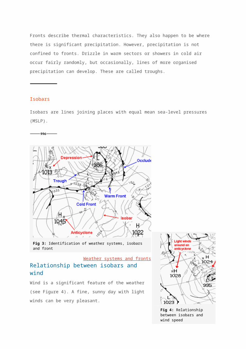
Fig 3: Identification of weather systems, isobars and front
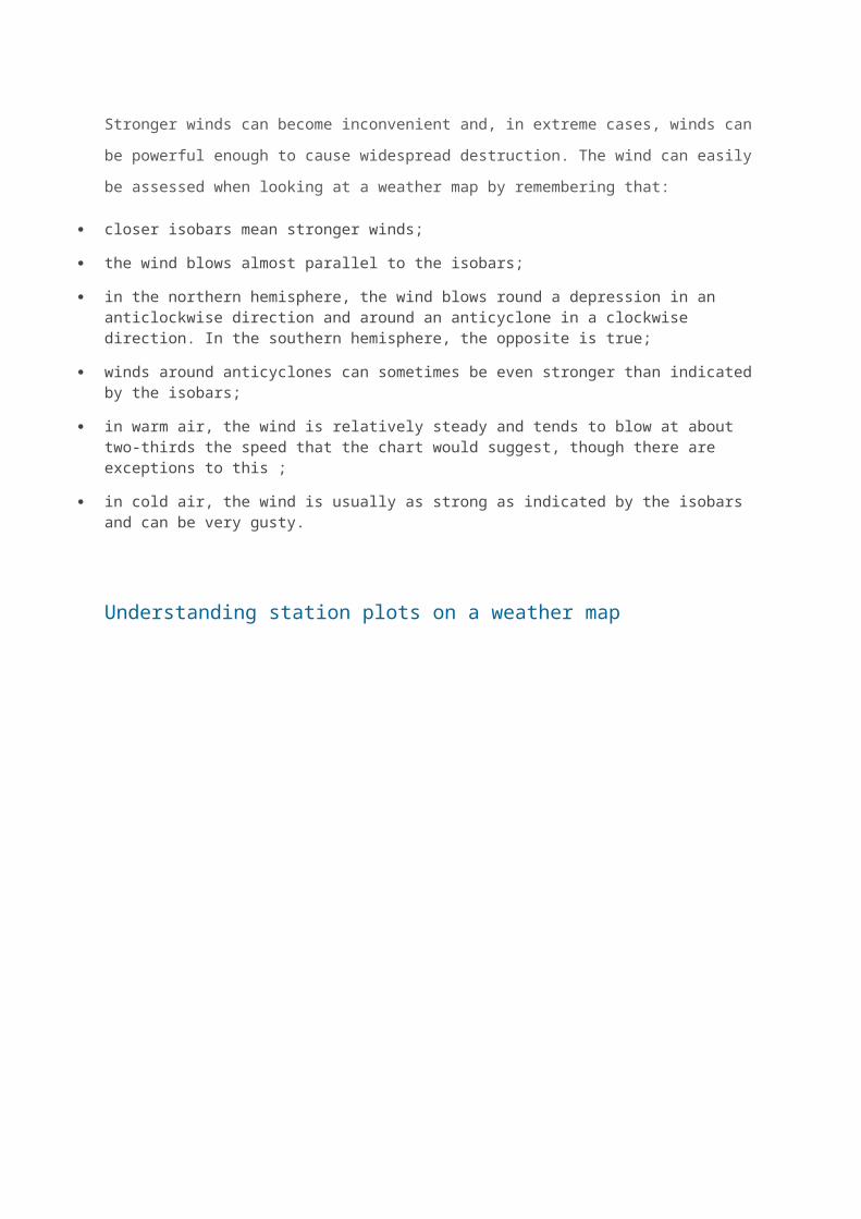
Weather systems and frontsRelationship between isobars and wind
Wind is a significant feature of the weather (see Figure
4). A fine, sunny day with light winds can be very
pleasant.
Stronger winds can become inconvenient and, in
extreme cases, winds can be powerful enough to cause
widespread destruction. The wind can easily be
assessed when looking at a weather map by
remembering that:
closer isobars mean stronger winds;
the wind blows almost parallel to the isobars;
in the northern hemisphere, the wind blows round a depression in an anticlockwise direction and around an anticyclone in a clockwise direction. In the southern hemisphere, the opposite is true;
winds around anticyclones can sometimes be even stronger than indicated by the isobars;
in warm air, the wind is relatively steady and tends to blow at about two-thirds the speed that the chart would suggest, though there are exceptions to this ;
in cold air, the wind is usually as strong as indicated by the isobars and can be very gusty.
Fig 4: Relationship between isobars and wind speed
Understanding station plots on a weather map
Good quality observations
are one of the basic ‘tools of
the trade’ for a weather
forecaster.
The weather conditions at
each individual station can
be represented on a surface
chart by means of station
plot.
This means that information
which would take up a lot of
space if written on to a chart
can be displayed in a quick
easy to understand format.
Figure 5 shows an example
of a plotted chart.
Fig 5: An example of a plotted chart
The land station plot can represent all the elements reported from that station, these
typically include:
Air temperature
Dew-point temperature
Wind speed
Wind direction
Visibility
Atmospheric pressure and three-hour tendency
Cloud amounts
Cloud types
Cloud heights
Present weather
Past weather

Traditionally station plots for manned observing sites were based around a central
station circle. However, increasingly, automatic weather observations are replacing
these and being plotted on weather charts. To differentiate between the two,
automatic observations are plotted around a station triangle. Each element of the
observation, with the exception of wind, is plotted in a fixed position around the
station circle or triangle so that individual elements can be easily identified.
Fig 6: Plotting positions on a station circle
Fig 7: A typical coded manual observation
Fig 8: A typical coded automatic observation
Plotting a station plot
Total cloud amount
The total amount of the sky covered by cloud is expressed in oktas (eighths) and is
plotted within the station circle for manned observations or station triangle for
automatic stations, by the amount of shading.
The symbols used for both manual and automatic observations are shown below.
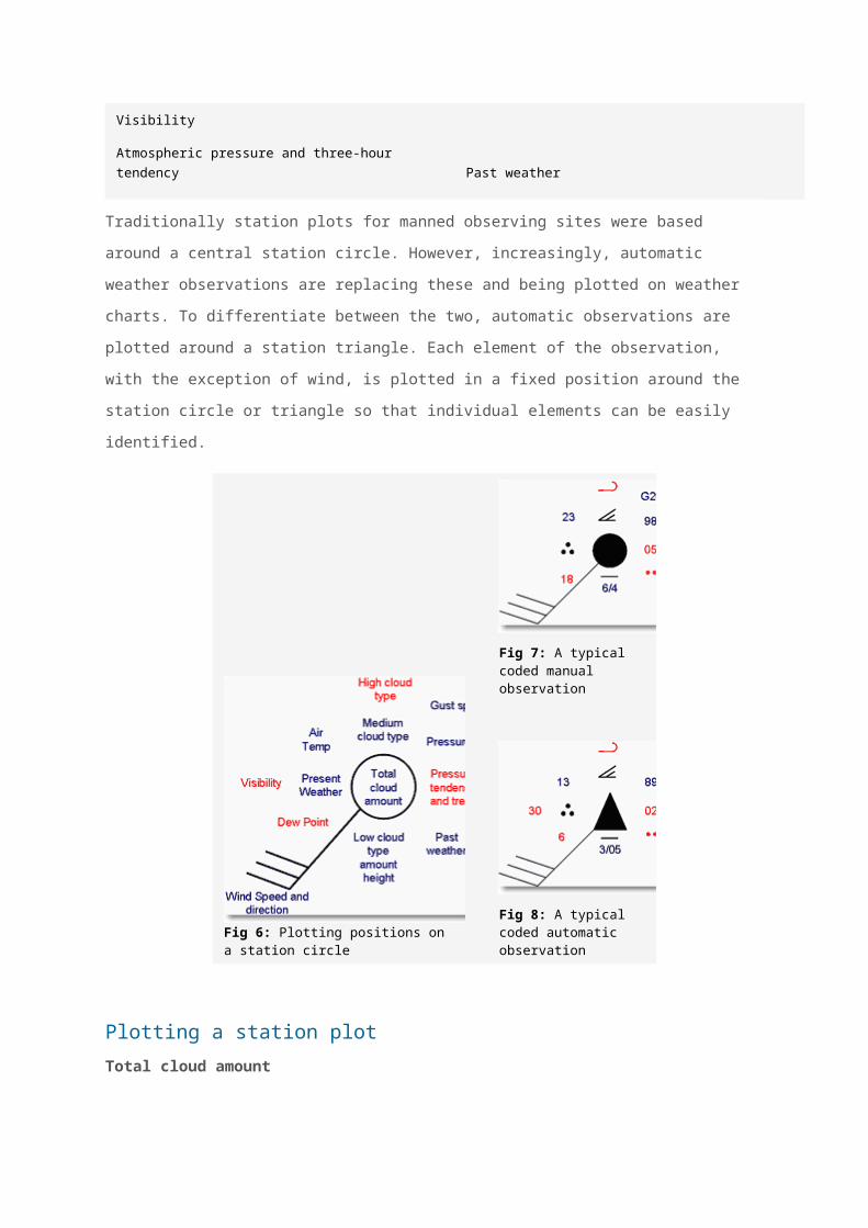
Fig 9: Symbols for manual cloud cover
Fig 10: Symbols for automatic cloud cover
Wind speed and direction
The surface wind direction is indicated on the station plot by an arrow flying with the
wind. Direction is measured in degrees from true North. Therefore a wind direction of
180 is blowing from the south. The wind speed is given by the number of ‘feathers’
on the arrow. Half feathers represent 5 knots whilst whole feathers indicate 10 knots.
A wind speed of 50 knots is indicated by a triangle. Combinations of these can be
used to report wind speed to the nearest 5 knots. The symbols used are as follows.
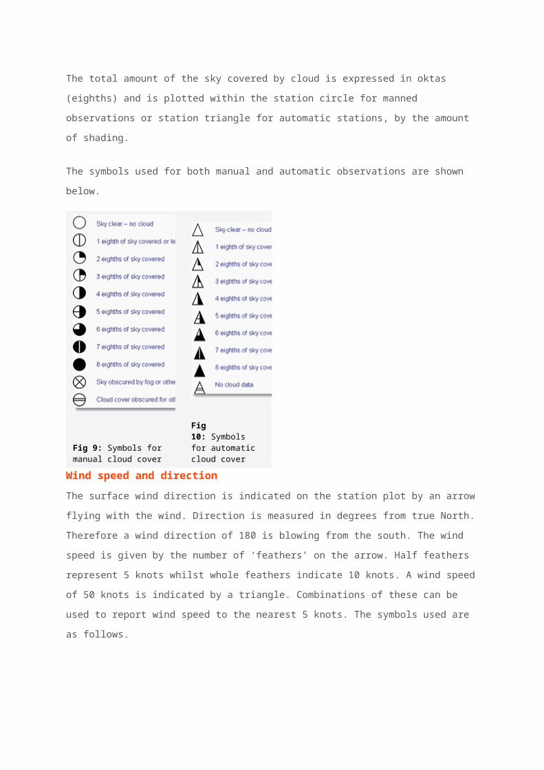
Fig 11: Symbols for wind speed
Air temperature
Air temperature is plotted to the nearest whole degree Celsius, i.e. 23 would indicate
23 degrees Celsius.
Dew point temperature
Dew point temperature is plotted to the nearest whole degree Celsius, i.e. 18 would
indicate a dew point of 18 degrees Celsius.
Pressure
Pressure is recorded in millibars and tenths and the last three digits are plotted.
Therefore 1003.1 would be plotted as 031 and 987.1 would be plotted as 871.
Present weather
In total the Met Office has 100 codes for recording the current weather at the time of
the observation. Different types of weather are represented using different weather
symbols, a key to which can be found below.
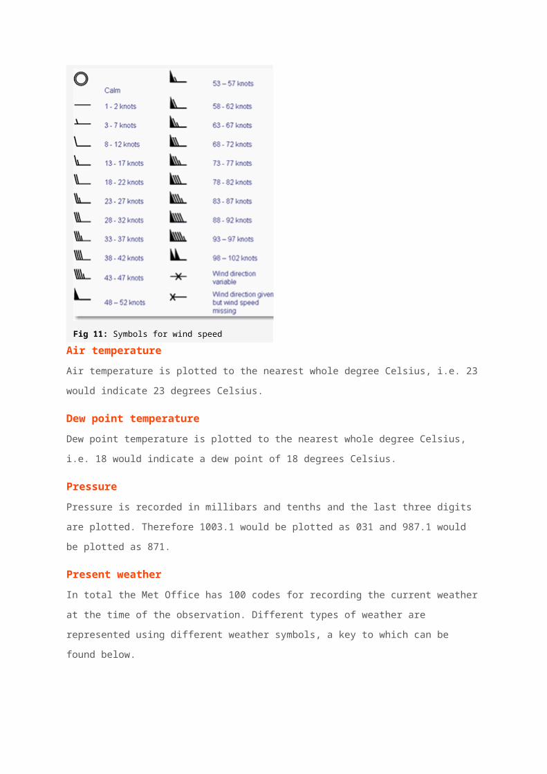
Fig 12: Symbols for present weather

Fig 13: Symbols for present weather
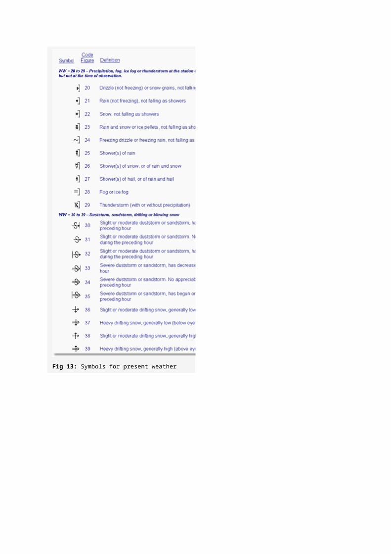
Fig 14: Symbols for present weather
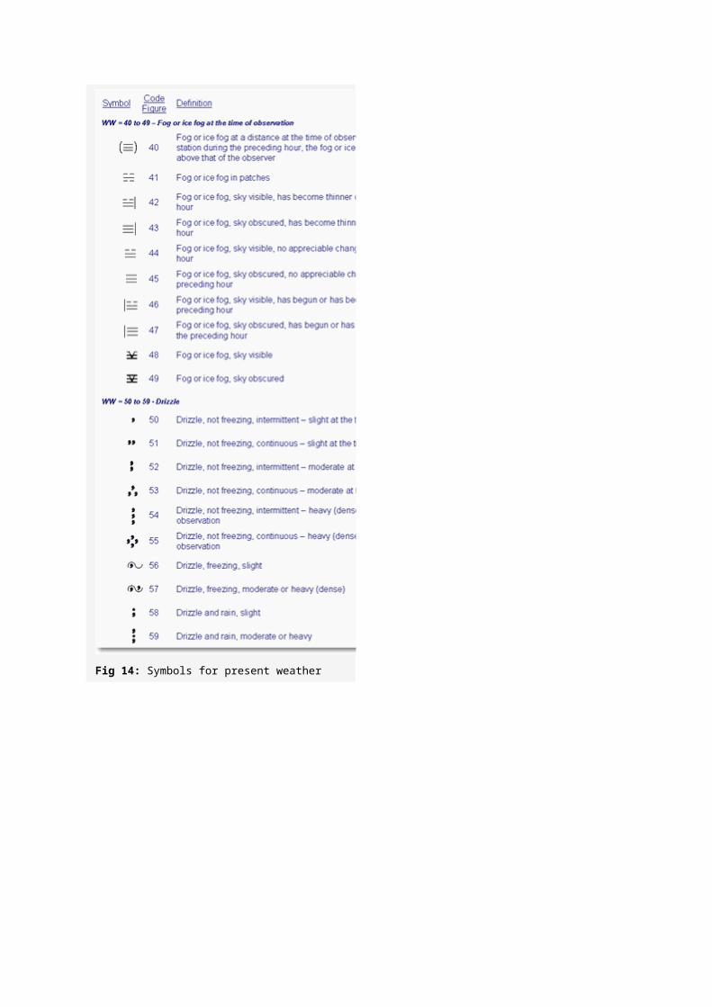
Fig 15: Symbols for present weather
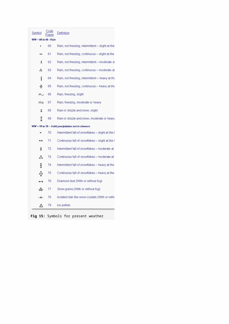
Fig 16: Symbols for present weather
Past weather
A simplified version of the present weather plots is used to indicate past weather.
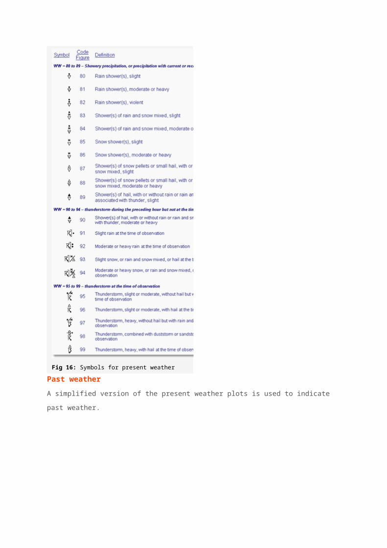
Fig 17: Symbols for past weather
Pressure Tendency
Pressure trend shows how the pressure has changed during the past three hours, i.e
rising or falling, and pressure tendency shows by how much it has changed. The
tendency is given in tenths of a millibar, therefore ’20′ would indicate a change of
two millibars in the last three hours. Pressure tendency is indicated by the following
symbols.
Fig 18: Symbols for pressure tendency
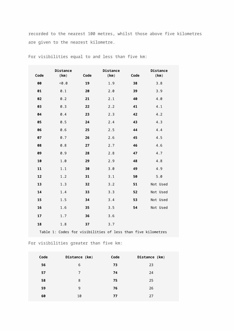
Visibility

Visibility, which is how far we can see, is given in coded format, in either meters or
kilometres. Visibilities below five kilometres are recorded to the nearest 100 metres,
whilst those above five kilometres are given to the nearest kilometre.
For visibilities equal to and less than five km:
CodeDistance
(km) CodeDistance
(km) CodeDistance
(km)
00 <0.0 19 1.9 38 3.8
01 0.1 20 2.0 39 3.9
02 0.2 21 2.1 40 4.0
03 0.3 22 2.2 41 4.1
04 0.4 23 2.3 42 4.2
05 0.5 24 2.4 43 4.3
06 0.6 25 2.5 44 4.4
07 0.7 26 2.6 45 4.5
08 0.8 27 2.7 46 4.6
09 0.9 28 2.8 47 4.7
10 1.0 29 2.9 48 4.8
11 1.1 30 3.0 49 4.9
12 1.2 31 3.1 50 5.0
13 1.3 32 3.2 51 Not Used
14 1.4 33 3.3 52 Not Used
15 1.5 34 3.4 53 Not Used
16 1.6 35 3.5 54 Not Used
17 1.7 36 3.6
18 1.8 37 3.7
Table 1: Codes for visibilities of less than five kilometres
For visibilities greater than five km:
Code Distance (km) Code Distance (km)
56 6 73 23
57 7 74 24
58 8 75 25
59 9 76 26
60 10 77 27
61 11 78 28
62 12 79 29
63 13 80 30
64 14 81 35
65 15 82 40
66 16 83 45
67 17 84 50
68 18 85 55
69 19 86 60
70 20 87 65
71 21 88 70
72 22 89 >70
Table 2: Codes for visibilities of more than five kilometres
Low cloud type
The type of low cloud present is provided in coded format, using the symbols below.
Fig 19: Symbols for low cloud type
Medium cloud type
The type of medium cloud present is provided in coded format, using the symbols
below.

Fig 20: Symbols for medium cloud type
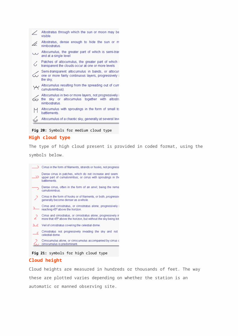
High cloud type
The type of high cloud present is provided in coded format, using the symbols below.
Fig 21: symbols for high cloud type
Cloud height
Cloud heights are measured in hundreds or thousands of feet. The way these are
plotted varies depending on whether the station is an automatic or manned
observing site.
For automatic stations, indicated by a station triangle, the following codes are used.
Code Height in feet
00 <100
05 500
10 1000
15 1500
20 2000
… …
50 5000
60 6000
Table 3: Cloud heights for automatic stations
For manned stations, indicated by a station circle, the following codes are used.
Code Height in feet
0 0-149
1 150-299
2 300-599
3 600-999
4 1,000-1,999
5 2,000-2,999
6 3,000-4,999
7 5,000-6,499
8 6,500-7,999
9 8,000 or above
/ Cloud height unknown
Table 4: Cloud heights for manned stations
Gust speed
Gust speeds are measured in knots and proceeded by the letter G. Gust speeds are
normally only recorded if they exceed 25 knots and are plotted as whole knots, i.e.
G35 indicates a gust of 35 knots.
Example
The decode of this station plot is as follows:
Type of observation: Manned
Total cloud amount: 8 oktas
Wind Speed: 28-32 knots
Wind direction: South-westerly

Air temperature: 23 degrees Celsius
Dew point temperature: 18 degrees Celsius
Pressure: 1004.2 millibars
Present weather: Continuous moderate rain
Past weather: Rain
Pressure tendency:Falling 0.5 millibars in the past three hours
Visibility: 6km
Low cloud type: Stratus
Low cloud amount: 6 oktas
Low cloud height: 1000 feet
Medium cloud type: Altostratus
High cloud type: Cirrus
Gust speed: 45 knots
Exercise
Why not try decoding the following observational plots.
1) 2) 3)
Web page reproduced with the kind permission of the Met Office