
Vodafone Digital Guidelines FINAL 14.8.13
26
Vodafone Visual Identity Digital guidelines 15.08.13
description
Vodafone branding guidelines
Transcript of Vodafone Digital Guidelines FINAL 14.8.13
01
Vodafone Visual IdentityDigital guidelines
15.08.13
Vodafone Visual Identity Digital guidelines
02Sections: 0 1 2 3 4
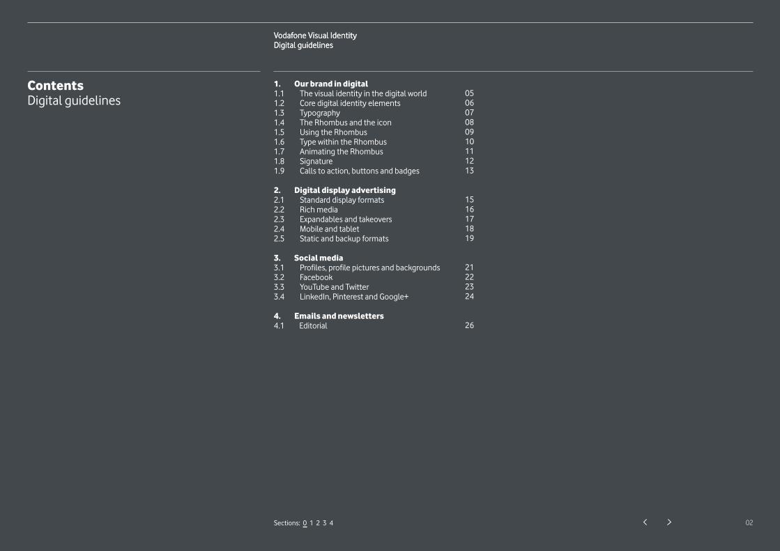
ContentsDigital guidelines
1. Our brand in digital1.1 The visual identity in the digital world 1.2 Core digital identity elements 1.3 Typography 1.4 The Rhombus and the icon 1.5 Using the Rhombus 1.6 Type within the Rhombus 1.7 Animating the Rhombus 1.8 Signature 1.9 Calls to action, buttons and badges
2. Digital display advertising2.1 Standard display formats 2.2 Rich media 2.3 Expandables and takeovers 2.4 Mobile and tablet 2.5 Static and backup formats
3. Social media3.1 Profiles, profile pictures and backgrounds 3.2 Facebook 3.3 YouTube and Twitter 3.4 LinkedIn, Pinterest and Google+
4. Emails and newsletters4.1 Editorial
050607080910111213
1516171819
21222324
26
Vodafone Visual Identity Digital guidelines
Vodafone Visual Identity Digital guidelines
15
2.1
Discover
the Samsung
Galaxy S4
Vodafone
50%x
Headings Vodafone Bold 20pt on 21pt leading
Flexible spacing
CTAs Vodafone Regular 15pt on 26pt leading
Signature Vodafone Bold 20pt on 26pt leadingVodafone Regular
Sections: 0 1 2 3 4
Digital display advertising
Type within the Rhombus
Type is centered within the Rhombus and aligned
to the principal canvas edge opposite to the icon.
The safe zone from the canvas edge and the icon
is 50% of icon size. Copy always ranges left or right
Power to you
Vodafone Visual Identity Digital guidelines
04
Our brand in digital
1.1 The visual identity in the digital world 05
1.2 Core digital identity elements 06
1.3 Typography 07
1.4 The Rhombus and the icon 08
1.5 Using the Rhombus 09
1.6 Type within the Rhombus 10
1.7 Animating the Rhombus 11
1.8 Signature 12
1.9 Calls to action, buttons and badges 13
1.
Sections: 0 1 2 3 4
Vodafone Visual Identity Digital guidelines
05
1.1
Sections: 0 1 2 3 4
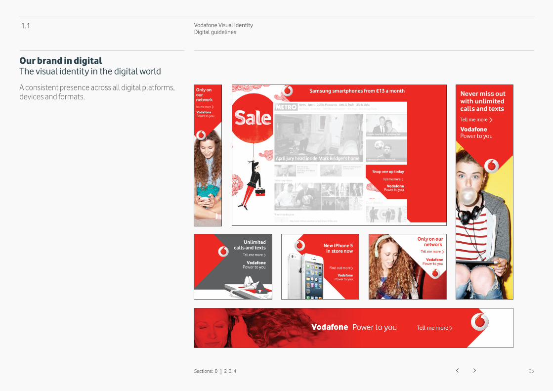
Our brand in digital The visual identity in the digital world
A consistent presence across all digital platforms, devices and formats.
Vodafone Visual Identity Digital guidelines
06
1.2
Sections: 0 1 2 3 4
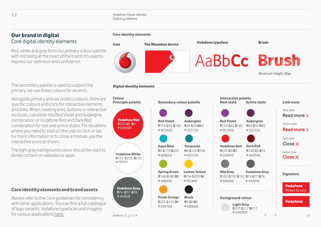
Core identity elements
Digital identity elements
Vodafone typeface Brush
ColourPrinciple palette
Interactive paletteRest state Active stateSecondary colour palette Link icons
Signature
Read more
Close
AaBbCc
Our brand in digital Core digital identity elements
Red, white and grey form our primary colour palette, with red being at the heart of the brand. It’s used to express our optimism and confidence.
The secondary palette is used to support the primary, we use these colours for accents.
Alongside primary and secondary colours, there are specific colours and icons for interactive elements and links. When creating links, buttons or interactive modules, use either the Red Violet and Aubergine combination or Vodafone Red and Dark Red combination for rest and active states. For situations where you need to instruct the user to click or tap for more information or to close a module, use the interactive icons as shown.
The light grey background colour should be used to divide content on websites or apps.
Core identity elements and brand assets
Always refer to the Core guidelines for consistency with other applications. You can find a full catalogue of logo variants, Vodafone typefaces and imagery for various applications here.
Vodafone
Vodafone Power to you
Minimum height 30px
Vodafone Visual Identity Digital guidelines
07
1.3
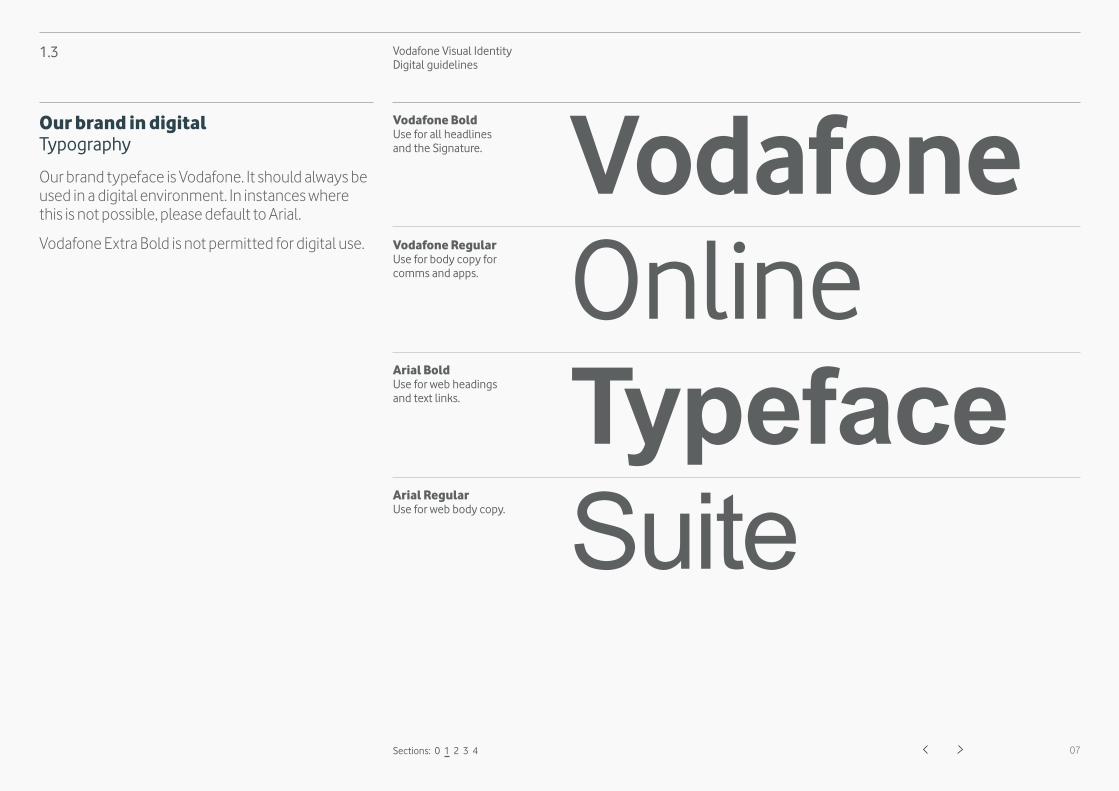
VodafoneOnlineTypefaceSuite
Vodafone BoldUse for all headlinesand the Signature.
Vodafone RegularUse for body copy for comms and apps.
Arial BoldUse for web headings and text links.
Arial RegularUse for web body copy.
Sections: 0 1 2 3 4
Our brand in digital Typography
Our brand typeface is Vodafone. It should always be used in a digital environment. In instances where this is not possible, please default to Arial.
Vodafone Extra Bold is not permitted for digital use.
Vodafone Visual Identity Digital guidelines
08
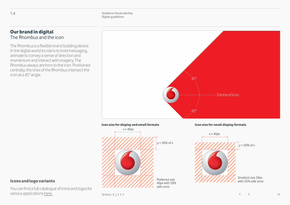
Icon size for display and email formats
1.4
Sections: 0 1 2 3 4
Preferred size 40px with 50% safe zone
Smallest size 20px with 25% safe zone
x = 40px
y = 50% of xy = 50% of x
x = 40px
Icon size for small display formats
45°
45°
Centre of Icon
Our brand in digital The Rhombus and the icon
The Rhombus is a flexible brand building device. In the digital world its role is to hold messaging, animate to convey a sense of direction and momentum and interact with imagery. The Rhombus always anchors to the icon. Positioned centrally, the lines of the Rhombus intersect the icon at a 45° angle.
Icons and logo variants
You can find a full catalogue of icons and logos for various applications here.
Vodafone Visual Identity Digital guidelines
09
1.5
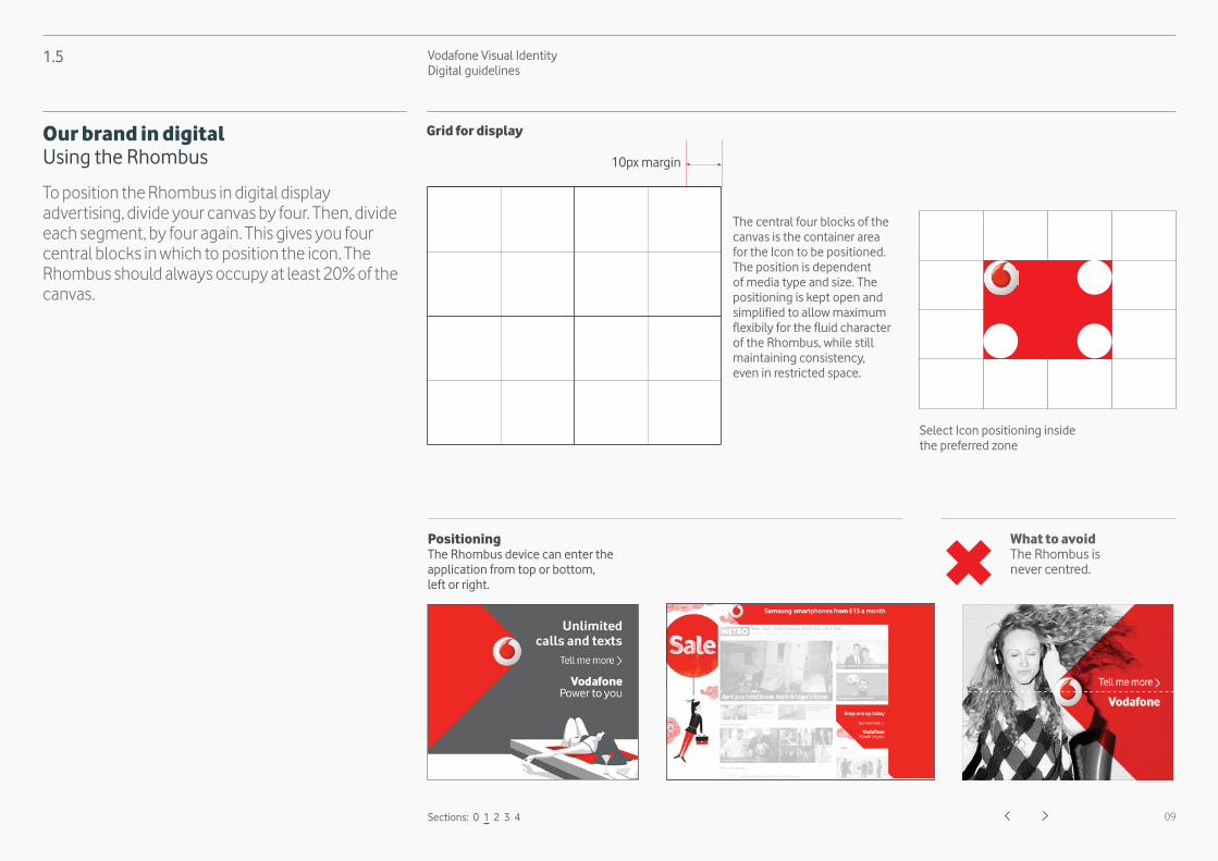
PositioningThe Rhombus device can enter the application from top or bottom, left or right.
What to avoid The Rhombus is never centred.
Sections: 0 1 2 3 4
Select Icon positioning inside the preferred zone
10px margin
The central four blocks of the canvas is the container area for the Icon to be positioned. The position is dependent of media type and size. The positioning is kept open and simplified to allow maximum flexibily for the fluid character of the Rhombus, while still maintaining consistency, even in restricted space.
Grid for displayOur brand in digital Using the Rhombus
To position the Rhombus in digital display advertising, divide your canvas by four. Then, divide each segment, by four again. This gives you four central blocks in which to position the icon. The Rhombus should always occupy at least 20% of the canvas.

Vodafone Visual Identity Digital guidelines
10
1.6
Discoverthe Samsung
Galaxy S4
50%x
Headings Vodafone BoldMinimum 14pt on 15pt leading
CTAs Vodafone RegularMinimum 12pt on 22pt leading
Signature Vodafone BoldVodafone RegularMinimum 14pt on 15pt leading
Sections: 0 1 2 3 4
Digital display advertising Type within the Rhombus
Type is centered within the Rhombus and aligned to the principal canvas edge opposite to the icon. The safe zone from the canvas edge and the icon is 50% of icon size. Copy always ranges left or right according to where the flat canvas edge falls.
Power to youVodafone
Vodafone Visual Identity Digital guidelines
11
1.7
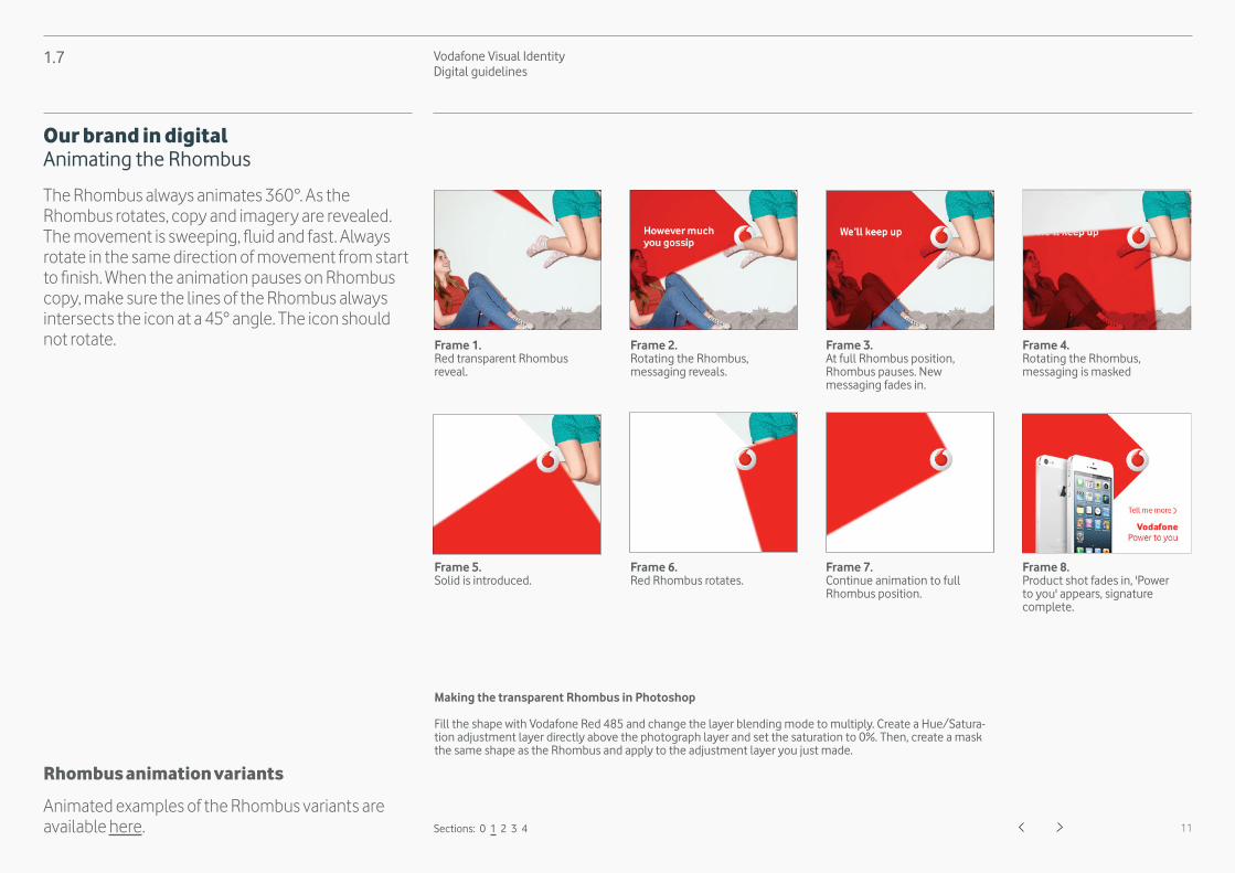
Frame 1. Red transparent Rhombus reveal.
Frame 5. Solid is introduced.
Making the transparent Rhombus in Photoshop
Fill the shape with Vodafone Red 485 and change the layer blending mode to multiply. Create a Hue/Satura-tion adjustment layer directly above the photograph layer and set the saturation to 0%. Then, create a mask the same shape as the Rhombus and apply to the adjustment layer you just made.
Frame 2. Rotating the Rhombus,messaging reveals.
Frame 6. Red Rhombus rotates.
Frame 3. At full Rhombus position, Rhombus pauses. Newmessaging fades in.
Frame 7. Continue animation to full Rhombus position.
Frame 4. Rotating the Rhombus, messaging is masked
Frame 8. Product shot fades in, 'Power to you' appears, signature complete.
Sections: 0 1 2 3 4
Our brand in digital Animating the Rhombus
The Rhombus always animates 360°. As the Rhombus rotates, copy and imagery are revealed. The movement is sweeping, fluid and fast. Always rotate in the same direction of movement from start to finish. When the animation pauses on Rhombus copy, make sure the lines of the Rhombus always intersects the icon at a 45° angle. The icon should not rotate.
Rhombus animation variants
Animated examples of the Rhombus variants are available here.
Vodafone Visual Identity Digital guidelines
12
1.8
Vertical stack
Vodafone + Power to you
Vodafone + Power to you
Vodafone only
Vodafone + Power to you
Sections: 0 1 2 3 4
Our brand in digital Signature
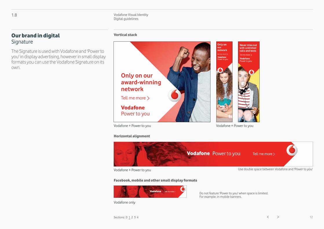
The Signature is used with Vodafone and 'Power to you' in display advertising, however in small display formats you can use the Vodafone Signature on its own.
Do not feature 'Power to you' when space is limited.For example, in mobile banners.
Use double space between Vodafone and 'Power to you'

Vodafone Visual Identity Digital guidelines
13
1.9
Text link with arrow Text link with cross
Badges Buttons
Upgradetoday
Rest state
Read moreRest state
Close
Primary call to action must be in purple.
Primary call to action
When on red, the call to action is white.
Purple badge permitted in digital only.
2px corner radius
Primary call to action - when on red
Secondary calls to action are grey.
Secondary call to action Button radius
Rest state Active state Rest state Active state
Rest state Active state
Sections: 0 1 2 3 4
Our brand in digital Calls to action, buttons and badges
For consistency across digital only use these buttons, badges and calls to action.
Active state
Use grey for text linkswith red arrow.
Read moreActive state
Use grey for text linkswith red cross.
Close
Vodafone Visual Identity Digital guidelines
14
Digital display advertising
2.1 Standard display formats 15
2.2 Rich media 16
2.3 Expandables and takeovers 17
2.4 Mobile and tablet 18
2.5 Static and backup formats 19
Sections: 0 1 2 3 4
2.
Vodafone Visual Identity Digital guidelines
15
2.1
MPU 300 x 250
Leaderboard 728 x 90
Skyscraper 120 x 600
Wide skyscraper160 x 600
Sections: 0 1 2 3 4
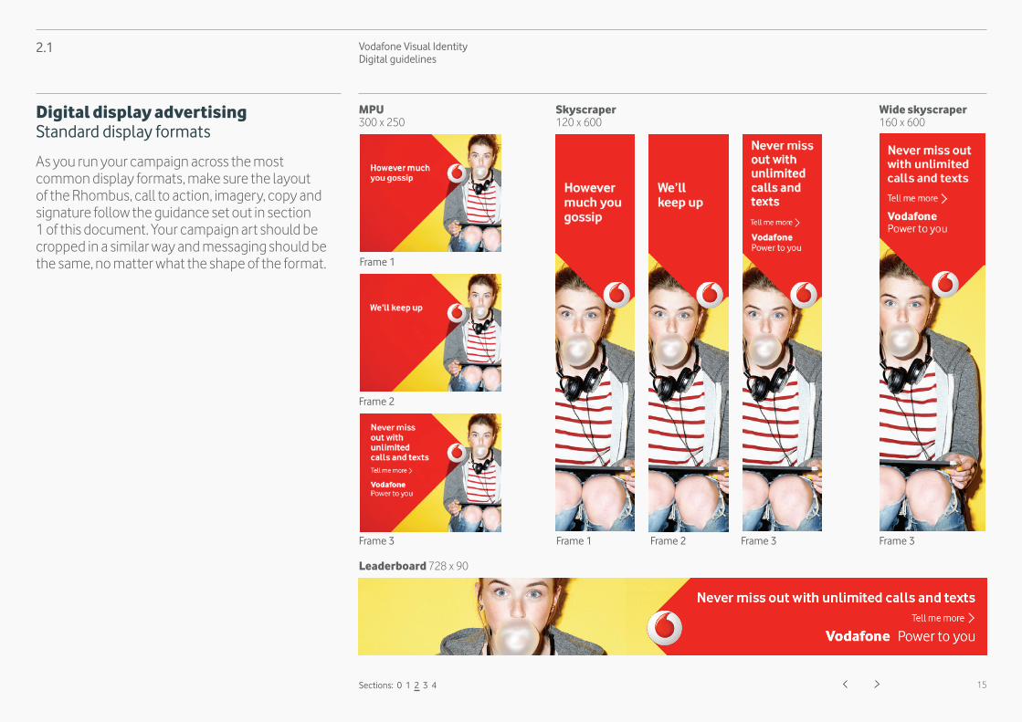
Digital display advertising Standard display formats
As you run your campaign across the most common display formats, make sure the layout of the Rhombus, call to action, imagery, copy and signature follow the guidance set out in section 1 of this document. Your campaign art should be cropped in a similar way and messaging should be the same, no matter what the shape of the format.
Frame 1 Frame 2 Frame 3 Frame 3
Frame 2
Frame 3
Frame 1
Vodafone Visual Identity Digital guidelines
16
2.2
Animation Video Interactive
Frame 1
Frame 2
Frame 1
Frame 2
Frame 1
Frame 2
Frame 3 Frame 3 Frame 3
Sections: 0 1 2 3 4
Digital display advertising Rich media
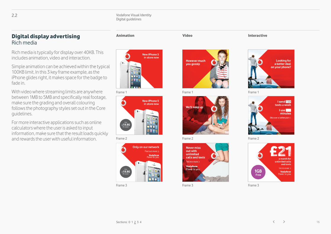
Rich media is typically for display over 40KB. This includes animation, video and interaction.
Simple animation can be achieved within the typical 100KB limit. In this 3 key frame example, as the iPhone glides right, it makes space for the badge to fade in.
With video where streaming limits are anywhere between 1MB to 5MB and specifically real footage, make sure the grading and overall colouring follows the photography styles set out in the Core guidelines.
For more interactive applications such as online calculators where the user is asked to input information, make sure that the result loads quickly and rewards the user with useful information.

Vodafone Visual Identity Digital guidelines
17
2.3
Sections: 0 1 2 3 4
Digital display advertising Expandables and takeovers
As with standard display formats, follow the guidance set out in section 1 of this document.
Multiple format page takeovers should make use of all the available space to showcase a dynamic use of the Rhombus. When possible, use of the Icon should be limited to one per page and displayed in the most prominent banner. Synchronised display formats should work together as one piece. Use discretion and best practice to align elements on the page.
Expandable display formats should be responsive and animate effortlessly when activated by the user. If you can, include a reward on click such as triggering a video to play.
Expandables Takeovers
Vodafone Visual Identity Digital guidelines
18
2.4
Mobile formats Size varies by plataform and device.
Mobile expandable ad
Sections: 0 1 2 3 4
Landscape
Closed
Portrait
Expanded Landscape mobile format
Digital display advertising Mobile and tablet
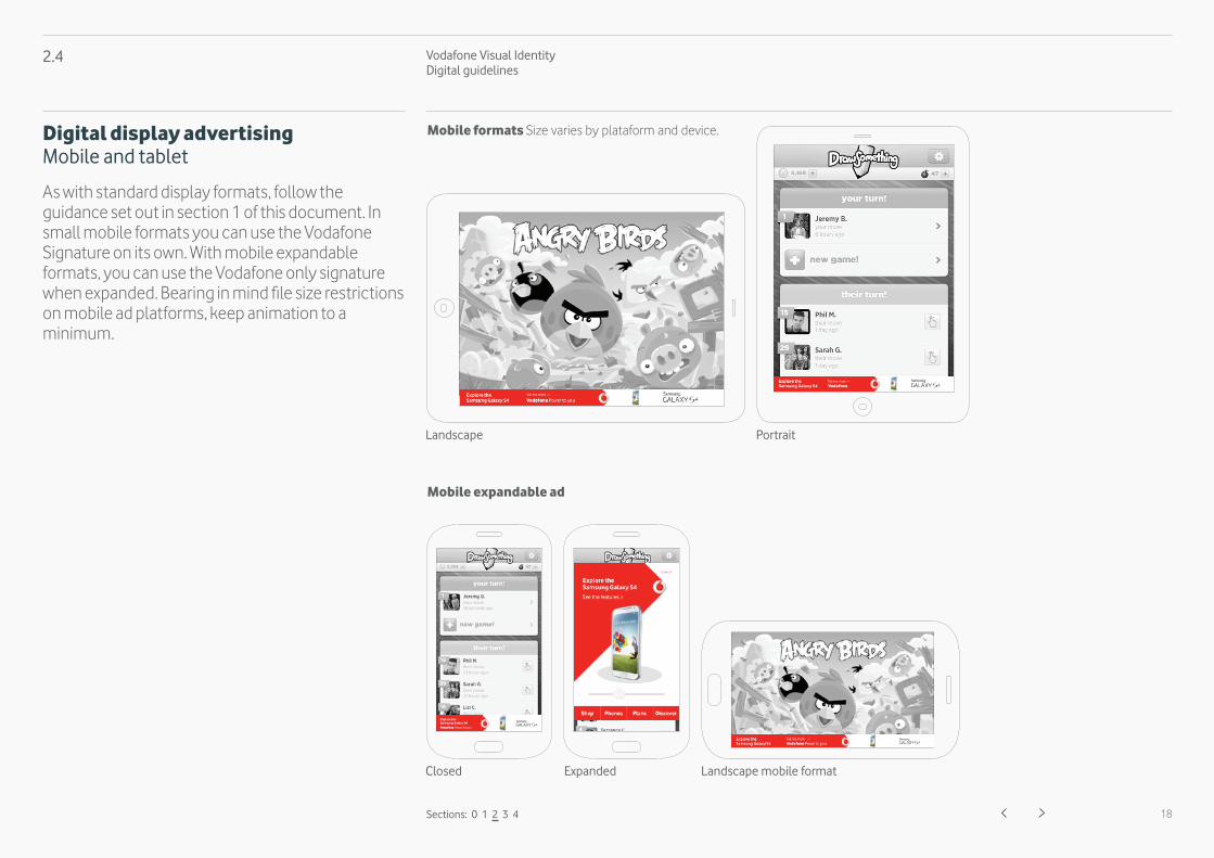
As with standard display formats, follow the guidance set out in section 1 of this document. In small mobile formats you can use the Vodafone Signature on its own. With mobile expandable formats, you can use the Vodafone only signature when expanded. Bearing in mind file size restrictions on mobile ad platforms, keep animation to a minimum.
Vodafone Visual Identity Digital guidelines
19
2.5
Sections: 0 1 2 3 4
Digital display advertising Static and backup formats
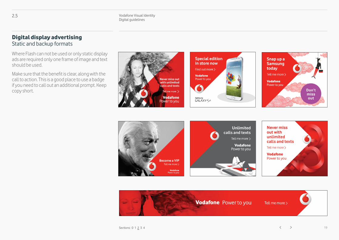
Where Flash can not be used or only static display ads are required only one frame of image and text should be used.
Make sure that the benefit is clear, along with the call to action. This is a good place to use a badge if you need to call out an additional prompt. Keep copy short.
Vodafone Visual Identity Digital guidelines
20
Social media
3.1 Profiles, profile pictures and backgrounds 21
3.2 Facebook 22
3.3 YouTube and Twitter 23
3.4 LinkedIn, Pinterest and Google+ 24
Sections: 0 1 2 3 4
3.
Vodafone Visual Identity Digital guidelines
21
3.1
Profile picture Backgrounds
Never use the Rhombus icon lock-up for profile images.
y =25% of icon size
width of icon
y
Safe area of 25% on all sides.
We use the Rhombus as a background image to create maximum impact.
When it's not possible to use a background image, bring the brand personality to life through other areas of the page.
YouTube
‘Vodafone’ + ‘country name’ written in full in the local language.
ExamplesVodafone Spainyoutube.com/VodafoneEspaña
Vodafone’ + ‘country name’written in full in the local language.
ExamplesVodafone Spainwww.linkedin.com/companies/VodafoneEspaña
Google+
Vodafone’ + ‘country name’written in full in the local language.
ExamplesVodafone Spainplus.google.com/VodafoneEspaña
Vodafone’ + ‘country name’written in full in the local language.
ExamplesVodafone Spainpinterest.com/VodafoneEspaña
Sections: 0 1 2 3 4
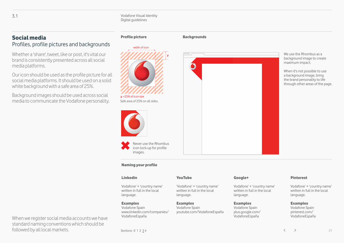
Social mediaProfiles, profile pictures and backgrounds
Whether a 'share', tweet, like or post, it's vital our brand is consistently presented across all social media platforms.
Our icon should be used as the profile picture for all social media platforms. It should be used on a solid white background with a safe area of 25%.
Background images should be used across social media to communicate the Vodafone personality.
When we register social media accounts we have standard naming conventions which should be followed by all local markets.
Naming your profile
Vodafone Visual Identity Digital guidelines
22
3.2
Sections: 0 1 2 3 4
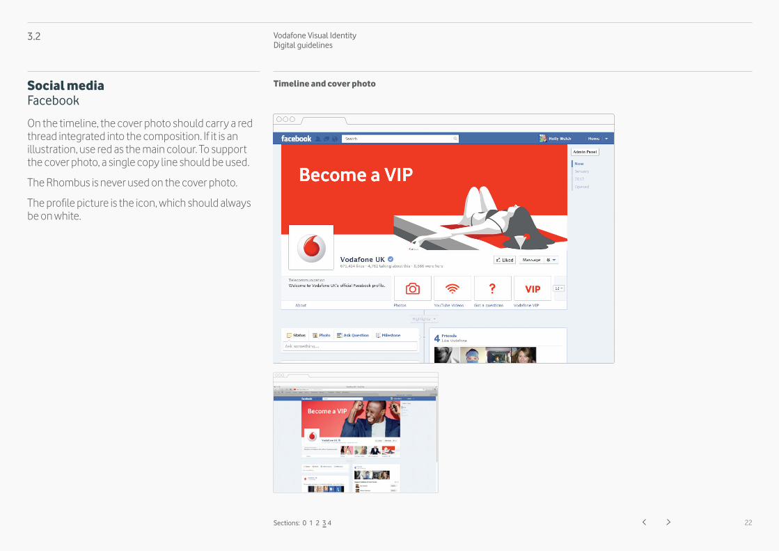
Social mediaFacebook
On the timeline, the cover photo should carry a red thread integrated into the composition. If it is an illustration, use red as the main colour. To support the cover photo, a single copy line should be used.
The Rhombus is never used on the cover photo.
The profile picture is the icon, which should always be on white.
Timeline and cover photo
Vodafone Visual Identity Digital guidelines
23
3.3
Sections: 0 1 2 3 4
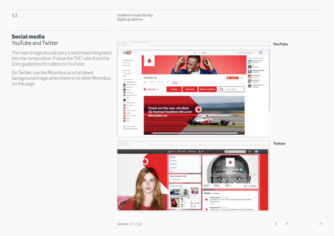
Social mediaYouTube and Twitter
The main image should carry a red thread integrated into the composition. Follow the TVC rules from the Core guidelines for videos on YouTube.
On Twitter, use the Rhombus as a full bleed background image when there is no other Rhombus on the page.
YouTube
Vodafone Visual Identity Digital guidelines
24
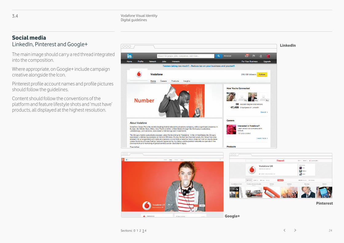
3.4
Sections: 0 1 2 3 4
Social mediaLinkedIn, Pinterest and Google+
The main image should carry a red thread integrated into the composition.
Where appropriate, on Google+ include campaign creative alongside the Icon.
Pinterest profile account names and profile pictures should follow the guidelines.
Content should follow the conventions of the platform and feature lifestyle shots and ‘must have’ products, all displayed at the highest resolution.
Google+
Vodafone Visual Identity Digital guidelines
25Sections: 0 1 2 3 4
Emails and newsletters
4.1 Editorial 26
4.

Vodafone Visual Identity Digital guidelines
26
4.1
Sections: 0 1 2 3 4
Emails and newslettersEditorial
Use the Rhombus on the left hand side in the main header of email templates. For emails, there are 5 types of module that you can use. The first module should always be the 'Intro' module. Content modules that follow are 'Sales', 'Editorial', 'Account' and 'Social & Legal' which should always appear last.
Intro module
Editorial module
Account module
Social & Legalmodule


