VITA - Texas Christian University
22
VITA Kirstin Mullins
Transcript of VITA - Texas Christian University

VITA
Kirstin Mullins

V I T A T H E S I S
Vita

M U L L I N S | 2
table of contents
intro
thesis
methodology
research results
marketing and promotion
design considerations
actions taken
conclusion
V I T A T H E S I S
4
5
6
10
18
22
24
38

V I T A T H E S I S
Thesis StatementThis project involved an overview of the considerations one would need to make in order to market and brand a food reactivity testing company that provides an easy way to get food reactivities tested and gives consumers the right tools to maintain their new diet after they get their results. This was accomplished through extensive research into food reactivities, at-home medical testing kits, diet programs, a target market, competition, branding, UX and UI design within food reactivity testing companies, and general design concepts. The final results included a logo and brand identity, package design, publication design, advertising, and application and website design.
IntroWhen you picture someone who lives a healthy lifestyle, you probably imagine someone who exercises often, takes time to relax, and eats healthy foods. You might imagine someone who puts lemon in their water, drinks tea instead of coffee, and eats only fresh, organic peaches and blueberries from Whole Foods. While this may sound like a healthy lifestyle to you, it isn’t for me. If I were to eat any of those foods I just listed, I would break out in hives, joint pain, and fatigue.
It wasn’t until I saw Dr. Rector, a wellness doctor in Southlake, Texas, that I was introduced to the concept of food reactivities. I completed a food reactivity test, and received my results six weeks later. With more mainstream, expected items on my results list such as dairy and gluten to random foods such as lemon, peaches, and basil– my list was extensive, and I found myself barely eating anything because I didn’t know what to eat. I reverted back to my old diet, and my symptoms returned as well.
The problem with the current food reactivity testing market is that it’s expensive, you have to go to your doctor’s office, wait weeks to get your results, and when you finally get your results, you only receive a long list of foods that you can’t eat but no knowledge of how to maintain your new diet. However, if a food reactivity testing company provided an easy, cost effective way to test reactivities and the right tools and information to maintain that new diet, more people would not only test their reactivities, but actually keep up with it.
M U L L I N S | 4

V I T A T H E S I S
M U L L I N S | 6
Descriptive research was used to gather information while qualitative research was primarily exploratory research. This qualitative research was used to gain an understanding of underlying reasons, opinions, and motivations behind consumers’ decisions. Sources included published works on UX and UI design, food reactivities, food allergies, and at home testing kits. Many online articles, academic journals, and books. A phenomenological study was conducted to gain a better experience of what the process of getting your food allergy results back looks like for consumers. Based on the research, the sources provided detailed background information, target market demographics, marketing and promotion solutions, and design considerations.
Books & ArticlesThe Plant Paradox: The Hidden Dangers in “Healthy” Foods That Cause Disease and Weight Gain was written by Dr. Steven R. Gundry. He was a cardiologist that found health and happiness through eliminating foods from his diet.
The Path to Eating Well with Multiple Food Sensitivities and Allergies is a cookbook that provides foods free of over forty allergens including Beef, Corn, Sesame, Peanuts, Gluten, Soy, Eggs, and Dairy written by Jackie J. Torell, a chef in Nevada that suffers
Frank McCown was read to gain a deeper understand of the history and evolution of user interface as it has grown and developed. He worked for Lockheed Martin as a software engineer previously and currently teaches in the Computer Science department of Harding University.
The Essential Guide to User Interface by author and UI specialist Wilbert Galtz not only defined UI design, but also stressed the importance of and demonstrated how to incorporate well-designed systems into peoples’ lives seamlessly.
“Facts and Statistics” by Food Allergy Research & Education presents the statistics of the amount of people with food reactivities and allergies.
“IgG Food Intolerance Tests: What does the Science Say” from Science-Based Medicine discusses the public knowledge and opinion of food reactivities and the science behind it. It was written by Scott Gavura, BScPhm, MBA, RPh, a Canadian pharmacist that specializes in cancer therapies and in pharmaceuticals.
“The Epidemic of Food Allergies and Sensitivities” by Dr. Christine Maren–a holistic doctor located in Colorado–was read to understand the growing need for a solution in this underdeveloped market.
“Why your company needs a defined brand and website” was written by BlueHost, a popular hosting site, to define the importance of good websites for generating
from forty different food sensitivities. A review noted that this book was “more than just a cookbook, the author’s story and recipes offer much needed hope to those struggling with food sensitivities and allergies.” This book assisted with content for the recipe books.
The Food Intolerance Handbook: Your Guide to Understanding Food Intolerance, Food Sensitivities, Food Chemicals, and Food Allergies by author, food specialist, and food analyst Sharla Race discusses the science behind food reactivities and why they occur. History of the Graphical User Interface by
Methodology

V I T A T H E S I S
M U L L I N S | 8
growth and development align with consumer interaction.
“10 Key Reasons why Packaging Design is So Important” provided insight on the necessity of creating good, shareable package design. DCP is a UK based, international digital creative packaging company.
“What’s Up with The Cookbook Industry Today” by the LA Times, a reputable newspaper and news source, was observed to understand if there is a need for more cookbooks in a crowded industry. App Download and Usage Statistics
(2018) explained the necessity of apps and provided excellent statistics for understanding the importance of apps. Business of Apps is an apps specialist that provides statistics, guides, and insights into app trends and significance.
Apple Human Interface Guidelines was studied to determine basic app requirements and accessibility regulations for app creation.
Colour Design by Janet Best, a color management specialist, goes into the psychological responses to color and studies how that can be best used to market a product.
UI, UX: Who Does What? A beginner’s guide to the tech industry? by Lo Min Ming, the cofounder of Pixelapse, gives a straight forward answer to the difference between UX and UI design and what to expect from each industry.
ObservationsEverlywell is a main competitor of Vita that anot only tests food reactivity but also tests hormones, general health, and chemical imbalances. This website provided great insight into credible copywriting for food reactivity testing. Everlywell lacks a hyper-personalized experience that could push the company to the next level.
YorkTest is a food reactivity testing company that lacks good design practices but gives an insight to what the industry leaders are relying on for customer acquisition and maintenance. Yorktest also lacks the personal experience that EverlyWell lacks.
Apple Health was observed for its personalized platform and its ability to maintain progress throughout one’s health journey. The ability to also sync with other devices provides a great connection to heighten the personized experience and create a hassle-free experience for the user.
Weight Watchers was studied for its personal profile pages and its progress-tracking systems. As people’s bodies and symptoms change, it is important to document that and understand how their diet is affecting their overall health.
MyMonthlyCycles is a menstruation cycle tracker app that allows users to track their symptoms as it aligns with their ovulation cycle. The iconography utilized in this app provided great insight into good UX design for symptom tracking.
Phenomenological StudyPhenomenological research is the inductive, descriptive research approached that aims to describe an experience as it actually is lived by that person. I placed myself in the consumer’s mindset and completed two separate food reactivity tests–one from MRT+ and another from EverlyWell.

V I T A T H E S I S
M U L L I N S | 1 0
Food Reactivities vs Food AllergiesFood allergies and food reactivities differ greatly from testing to symptoms. A food allergy is an Immunoglobulin E (IgE)-mediated immune response. The reactions for food allergies are rapid onset and include hives, flushed skin, swelling, vomiting, wheezing, or dizziness. Food allergies can be life-threatening.
A food sensitivity, intolerance, or reactivity is an Immunoglobulin G (IgG)-mediated immune response. Although the symptoms are less severe for a food reactivity than a food allergy and cannot be life-threatening, they can have serious life-altering effects. The symptoms of food reactivities include bloating, abdominal pain, headaches, acne, brain fog, eczema, major fatigue, joint pain, migraines, and GI complications and continuing to eat those items can eventually cause greater life-altering conditions (everlywell.com).
Many people suffer from these symptoms; however, most don’t associate their pain, fatigue, or GI distress with the foods they are eating, or they are unaware of how to determine which foods are causing which symptoms.
Food Reactivity TestingFood reactivities are most commonly, but not always, tested by alternative practitioners or D.O.’s rather than M.D.s. Typical testing includes blood tests, vega tests, K-test, hair tests, and applied kinesiology, with blood tests using the Hemocode System as the most popular. The Hemocode system is a finger prick test used to identify different immune-system-based food reactivities. Food intolerance testing and awareness has been consistently increasing in popularity over the past decade, but many people are still unaware of the availability and the benefits.
These tests typically check somewhere between 98 – 250 different food items for reactivities. After doing the tests, the patient receives a list of low, medium and high reactivities and a thick packet on every food that typically has those items in it (Gavura).
Research Results

V I T A T H E S I S
M U L L I N S | 1 2
CompetitionSince food reactivity testing and awareness is relatively new and growing, the market is growing and full of missing gaps of opportunity for a new company arising. The main competition in the food reactivity testing market is Allergy Test, YorkTest, and EverlyWell. Each of these companies provide food reactivity testing, but none of them provide sufficient posttest results to aid the consumers with maintaining their new elimination diet.
EverlyWell provides food reactivity testing along with female and men’s health testing, hormone testing, and many other tests. Their variety of tests is their unique selling proposition; however, EverlyWell lacks any posttest tools, removing the relationship with the consumer after they get their results back.
YorkTest focuses on food reactivities, lacks cohesive design, and lacks posttest elements.
Allergy Test provides food allergy and reactivity testing; however, the name comes across as allergy-only and the lackadaisical branding reads as unprofessional and not trustworthy. They also advertise primarily on Groupon, creating a sense that the company is failing and relying on discounts for sales.
Current Popularity Nutritionist Dana Angelo White, M.S., R.D., A.T.C. wrote in support of these exams that “various methods of food sensitivity testing have been around for decades, but a new wave of testing options complete with mail order convenience has expanded the availably.” She notes that “these quick and simple methods have revitalized people’s interest in getting testing to assess which foods might be causing their [symptoms].” Both food allergies and food sensitivities are increasing in children today due to the abundance of hormones and over-processing of our foods; however, many people do not associate their symptoms with a food intolerance. Dr. Christine Martin wrote that “other than lactose, food sensitivities are not well understood. Nonetheless, they are also becoming more prevalent.” Restaurants and customers are becoming more aware of food sensitivities by the year. Projections show that trend to be on a steady increase (White).
According to Food Allergy Research and Education, 65% of people will become lactose intolerant in their lifetime. And those are just the people with lactose intolerance, not including the less traditional food reactivities like mushrooms, basil, lemon, etc. And with more people growing an intolerance due to the abundance of hormones and over-processing of our foods, now is a great time to enter this market (“Facts and Statistics”).
“Other than lactose, food sensitivities are not well understood. Nonetheless, they are also becoming more prevalent.”
Dr. Christine Martin

V I T A T H E S I S
M U L L I N S | 1 4
TRIAL 2:
Two years later, I decided to do another round of reactivity testing. This time, I purchased the kit online from EverlyWell, a food reactivity testing company that I saw on Instagram. The kit was $170 (with an additional 20% off coupon) and was going to be sent in the mail. With this test, I looked forward to finding similarities between my last results and these results, and was glad that I didn’t have to go to a doctor’s office to get my blood drawn.
The testing kit that came in the mail was straightforward and clearly drew out what I needed to do. A QR code also linked to a video on their website that demonstrates how to do the testing. The finger prick did hurt, but that was expected and paled in comparison to driving to my doctor, sitting in the waiting office, and then getting poked and prodded with multiple needles. The next step is to drip blood droplets onto 5 circles on a piece of paper, stick it into an envelope, and put it in the mail.
It took 7 business days to get my results, which was short enough for me to maintain my excitement but also long enough for me to lose my motivation. This test was not an impulse decision; however, once you send off your results, you do begin to lose motivation to keep the diet the longer you have to wait.
When I got my results, I was even more
Phenomenological Research
TRIAL ONE:
The MRT+ was recommended to me by my doctor due to its ability to test for chemicals that could also be causing migraines. This test cost $600 and required me to go to my doctor to get it done. They took six vials of blood from an IV and sent it off to a lab in Florida. The results took six weeks to get back, and during that time my motivation and excitement for this lifestyle change severely diminished.
When I finally received my results, I was overwhelmed. I received a long list of 22 foods I was told I could never eat again (many of which were significant, common foods such as dairy, gluten, and cane sugar). There were also foods that surprised me such as basil, blueberries, lemons, and coffee or tea.
They were depicted in a bar chart (green for no reactivity, yellow for mild reactivity, and red for high reactivity). In addition to a business-card sized list of foods I should avoid, they also sent a large spiral-bound information packet that explained reactivities and what the next steps were.
I was looking forward to receiving more information about my new diet; however, I was met with a generic packet that proposed a diet filled with foods my test told me were off-limits. This packet showed where the common places all of my foods could be hiding–which was helpful–but when I typed it up, it basically left me with white rice, bell peppers, and water. I was overwhelmed and frustrated and I felt like I could not eat anything. These emotions all lead to the eventual return of my old diet, along with my old symptoms.
overwhelmed. EverlyWell tests 96 foods–and I showed a low reactivity to 68 foods and a moderate reactivity to 26 foods. At first I thought that meant that I couldn’t have any of the 96 foods that they tested and I almost closed my browser immediately. After closer inspection, I realized that they rate every item on their list regardless of how low the reactivity level appears. They recommend eliminating the moderate reactivities first, and then following up with the low reactivities if you are still experiencing symptoms. I did not agree that they should show every food this way. The MRT+ was much more successful in allowing you to notice all of the green (no reactivity) foods compared to EverlyWell that featured every food as a reactivity on some level. Their method made it much easier to ignore the results immediately with the thought “I can’t be reactive to all of that, I’ll just eat everything then!” They never sent any additional follow up in the mail other than a survey and they never provided any tools whatsoever to help you maintain the new diet either, leading to a lack in follow through. If MRT+ provided not
only the results but also tools that were
personalized to my own reactivities, I believe
that I would have maintained my new diet
(at least for a much longer period of time).
At first I thought that
meant that I couldn’t
have any of the 96
foods that they tested
and I almost closed my
browser immediately.
V I T A T H E S I S
M U L L I N S | 1 6
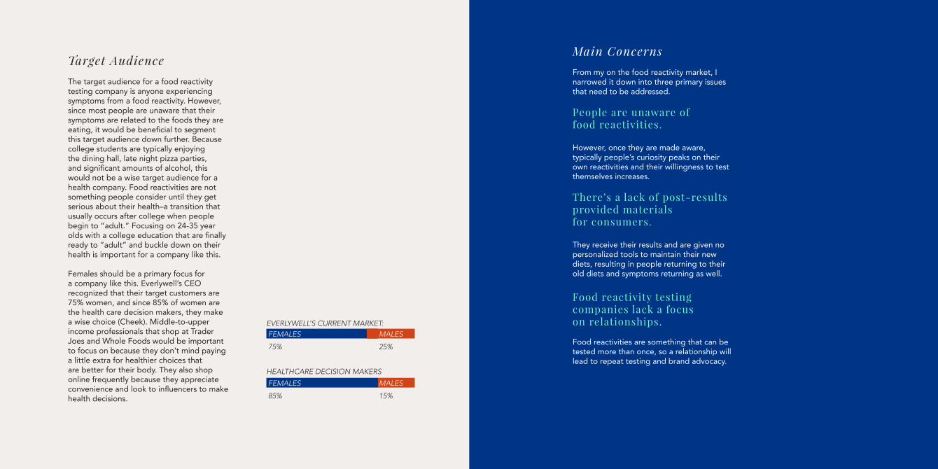
Target Audience The target audience for a food reactivity testing company is anyone experiencing symptoms from a food reactivity. However, since most people are unaware that their symptoms are related to the foods they are eating, it would be beneficial to segment this target audience down further. Because college students are typically enjoying the dining hall, late night pizza parties, and significant amounts of alcohol, this would not be a wise target audience for a health company. Food reactivities are not something people consider until they get serious about their health–a transition that usually occurs after college when people begin to “adult.” Focusing on 24-35 year olds with a college education that are finally ready to “adult” and buckle down on their health is important for a company like this.
Females should be a primary focus for a company like this. Everlywell’s CEO recognized that their target customers are 75% women, and since 85% of women are the health care decision makers, they make a wise choice (Cheek). Middle-to-upper income professionals that shop at Trader Joes and Whole Foods would be important to focus on because they don’t mind paying a little extra for healthier choices that are better for their body. They also shop online frequently because they appreciate convenience and look to influencers to make health decisions.
Main ConcernsFrom my on the food reactivity market, I narrowed it down into three primary issues that need to be addressed.
People are unaware of food reactivities.
However, once they are made aware, typically people’s curiosity peaks on their own reactivities and their willingness to test themselves increases.
There’s a lack of post-results provided materials for consumers.
They receive their results and are given no personalized tools to maintain their new diets, resulting in people returning to their old diets and symptoms returning as well.
Food reactivity testing companies lack a focus on relationships.
Food reactivities are something that can be tested more than once, so a relationship will lead to repeat testing and brand advocacy.
EVERLYWELL’S CURRENT MARKET:
HEALTHCARE DECISION MAKERS
FEMALES
85%
FEMALES
75%
MALES
15%
MALES
25%

V I T A T H E S I S
M U L L I N S | 1 8
WebsiteWebsites create a grounding point for users to interact with a brand and gain a clear understanding of what companies have to offer. They can learn more about food reactivities, purchase their kits, view their results, and obtain their personalized tools to help them succeed.
According to Machielle Thomas, a content manager for popular website host Bluehost, 79% of customers that have trouble navigating a website will exit the site and search for another to complete their task, making a clean, straightforward website imperative (Thomas).
The website for Everlywell features an explanation of food reactivities along with their other tests, access to your online portal, a blog, and facts that back up the legitimacy of its testing. It features mostly iconography and illustration and their pastel color palette (EverlyWell).
Yorktest’s website features more imagery of people eating together and looking happy. It is not a well-designed website in the fact that it is hard to read, lacks hierarchy and professionalism; however, the images of happy people living their best life provides a good basis for consumers to place themselves in that environment (Yorktest).
Package DesignThe kit that the user receives will contain the tools and information they need to complete their at-home testing successfully. Clear copy, consistent branding, and a positive experience is vitally important. From the alcohol wipe and bandages to the envelopes the user sends their results back in, there are a lot of branding opportunities that the competition are currently not taking advantage of. According to DCP, a package design agency, 74% of 18-25 year olds want to share an image of product packaging through social media if the packaging is attractive. By creating a package design that is shareable, Vita can grow and develop a following organically through word of mouth (DCP).
Everlywell’s package design featured a simple, design of white with pastel circles across the front. People share this package all over social media–especially when doing product reviews. The inside features a 2-step process. The left side opens up to the medical bloodwork elements, whereas the right side opens up to the biohazard bag and testing card. This format was easy to use and simplifies what could otherwise be a complicated process. They provided ample instructions along with a link to a video online on how to complete their test. My main issue with their instructions is that it includes actual photos of people poking their fingers with the finger prick and dropping blood, which is not a very attractive sight, especially for someone who is already nervous to prick their finger.
Marketing & Promotion

V I T A T H E S I S
M U L L I N S | 2 0
AdvertisingA brand cannot survive without advertising. It creates an emotional or circumstantial association of a brand with a value, event, or memory for the consumer. This association is vitally important for the brands survival and success. Consumers are much more likely to purchase a product after seeing an advertisement for that brand. Advertisements are also imperative for a food reactivity testing company’s success because of the low knowledge of food reactivities by the general public.
These advertisements should be informative and focus on the benefits of removing these items from your diet—not on all of the items you can no longer eat.
As the main competition, Everlywell utilizes a very social media heavy advertising program. The company promotes on Facebook, Blog Content, Twitter Marketing, Youtube Reviews, Referral Marketing, and affiliate programs (Everlywell).
Recipe book With increasing presence of apps like Pinterest and bloggers putting out recipes every day, the market for a recipe book crowded; however, according to expert Mark Rotella, senior editor at Publisher’s Weekly, the physical cookbook market is flourishing. People are also more attracted to personalized recipes for their food allergies or tastes compared to generalized recipes (Rotella).
A huge opportunity that’s currently not being capitalized on in the food reactivity testing market is personalized cookbooks. Instead of consumers receiving their results in a long list of foods they can’t eat, I designed a company that would provide a personalized cookbook based on an individual’s reactivities; this model would not only enhance the relationship with the consumer and the brand, but also encourage them to maintain their new diet.
Blog PostsThe competition utilizes an owned blog and other influencer’s blogs to promote their product and create a lifestyle focus on eating the right foods. Articles consist of topics like improving blood sugar levels, improving health, and how weight affects testosterone. This creates a focus on a healthy lifestyle instead of just promoting the company.
App DesignPeople use apps to entertain themselves, make purchases, interact with brands, or maintain personal accounts. The current competition is not using apps at this moment, but that would further their communication between its users and the way that they interact with their results. Apps like WeightWatchers and MyPeriodTracker have great user profiles and ways to document an individual’s process and symptoms. Apple Health also provides a personalized experience for users. These apps that provide personal methods of tracking health offer great insight on app personalization.
An app would be an easy way for food reactivity testing companies to grow their relationship with their customers and begin to improve on their post-results provided materials and is currently a majorly missed opportunity.

V I T A T H E S I S
M U L L I N S | 2 2
LogomarkInstead of leaving the logo to be just typographic, such as Canon or Netflix, a combination mark should be utilized. That’s where a typographic logo is matched with a logomark or symbol such as Target, Nike, Adidas, or Puma. These logos provide the consumers with an idea of the company’s product or service just by looking at the logo. This method is also frequently utilized by medical companies to showcase whether it provides medical attention to children, animals or if there is a specialty.
Since food reactivates are not commonly known, the mark needs to reflect the nature of the company as well as the name. The combination mark should reflect the medical aspect of the company, but also the food element and the positive, personalized components as well.
Color TheoryThere is a science behind each color and what psychological meanings it has to the viewer.
For example, greens reflects organic growth, calm serenity, and balance. Yellow provides a youthful energy. Red offers feelings of passion and also subliminally reflect our own life force–blood (Olsen).
The current competition used light pastels with greens, reds, oranges, blues, and purples. Utilizing a more natural, organic color palette reflects a clean, healthy lifestyle. However, there is an energy lacking from each of their color palettes. After eliminating bad foods from my diet, I felt revitalized and reenergized. Sticking with pastel colors is a missed opportunity instead of capitalizing on this new heightened energy.
ImageryFrom cavemen to DaVinci’s Vitruvian man to medical textbooks, artists have been using their craft to study the human form since the beginning of time. Author Dr. Tsafrir and Dr. Ohry wrote that “as it became clear that knowledge of the human body and all its systems was essential to the practice of healing, texts were accompanied by illustrations which became an integral part of the teaching process” (Tsafrir, Ohry).
Nobody wants to see someone doubling over in stomach pain or experiencing hives or diarrhea–so instead of solely utilizing photography, illustration and geometric shapes will be utilized to reflect the symptoms people experience along with the process of generating results. Stock images of people living healthy lives eating non-reactive foods are important to consider, adding legitimacy and credibility to the brand as well as allowing the viewer to place themselves in those scenarios.
In order to explain the process of generating results and describe what food reactivities are, illustrations will be utilized. People do not want to see real blood come out of a finger or watch someone get their finger pricked. Illustration provides an easy way to explain instructions without disgusting or scaring the viewers. Illustration is also a great method to explain chemistry to consumers because you can depict cell interactions and reactions without showing real cells under a microscope.
Design Considerations

V I T A T H E S I S
M U L L I N S | 2 4
Brand IdentityIn Latin, “vita” means life. Similar in origin, “vida” is a Spanish word for life. Vits also resembles the word “via” which means path or road. From these definitions, Vita was chosen as the brand name. Vita provides the pathway to a healthier lifestyle and opens the door for symptom-free living.
A serif type treatment for the logo was chosen because serifs establish credibility with a brand. Playfair Display has a heightened x-height which provides a humanistic element to the brand and adds a playful nature to ensure the logo isn’t too sterile. Futura was utilized for body copy and headlines because it is a modern sans serif and is associated with advancement in technology. Utilizing a highly-legible sans serif like Futura offers a nice contrast paired with the serif Playfair Display. The script typeface Oklahoma was introduced to be used primarily for the consumer’s names and to place a focus on the personalization of each kit.
The color palette was chosen with high-energy, vibrant colors. With competitors’ colors traditionally staying muted with a lot of white, this not only allows Vita to stand out against the competition but also places a focus on the energy of the brand. When reactive foods are removed from one’s diet, a new, profound energy is introduced to their lives. By overlapping these bright colors, it references the overlapping symptoms that will be navigated through
Actions TakenBased on the results of the research, a number of exactions were created including brand identity, web design, app design, a recipe book, a testing kit, and advertising.
once they use Vita. The introduction of a light pink represents the “path” or “way” for consumers to transition into this lifestyle change. The layout style is clean with an emphasis on color and geometric shapes to enhance the energy of the brand.
The logo is a combination mark including the name Vita along with a mark that reads as both DNA and a leaf. The DNA strands references the idea that your results are as individualized as you are and references that your food reactivities are something that chemically exist in your blood and that a lot of it can be traced back to DNA. The leaf at the top symbolizes the stage of growth in one’s health journey by joining the Vita community. This blossoming experience marks the beginning of one’s journey into a healthier life and the growing leaf reflects that.
Vita

V I T A T H E S I S
M U L L I N S | 2 6
Web DesignA website was created as a grounding point for users to interact with Vita and learn more about how the testing process works. Within the menu bar, there is a section called “the science” that heightens the credibility of the brand. The website features more photography to add legitimacy and help the users focus on the benefit of using the product instead of the technical and difficult aspects.
StationeryStationery was created that reflects the brand’s energy and colors.

V I T A T H E S I S
M U L L I N S | 2 8
AdvertisingThe most important aspect of advertising for a food reactivity testing company is to educate consumers that the symptoms that they assume are normal, and that their symptoms may be caused by the food that they are eating. There is a solution. The secondary element would be to show them that Vita provides you personalized results in addition to your results.
The print advertisements were created to provide a straightforward, simple way to associate everyday symptoms with foods that show up on reactivity testing kits. They all follow the structure of “_______ gives me _________,”or “_______ makes me ________” with informative body copy that every day symptoms can be caused by food reactivities and that there is an easy solution to discover what is causing those symptoms. This campaign is converted into social media ads as well as web ads.

Reactivity KitThe physical kit that will be mailed out to those getting their reactivities tested was designed to be highly energetic. The outside of the kit needs to be attention grabbing and visually pleasing for three reasons.
There are informative pamphlets on the inside of the box so that the user knows what should be included in their kit and can produce successful results.
Everything that is on the inside of the box were branded to Vita, unlike the competition that utilizes generic materials on the inside.
1. Users would see it on their front doorstep from driving up the driveway.
2. Users would get excited about opening the kit to see what is inside.
3. Users would be motivated to share a photo of the box coming in on their social media pages.
V I T A T H E S I S
M U L L I N S | 3 0

V I T A T H E S I S
M U L L I N S | 3 2

V I T A T H E S I S
M U L L I N S | 3 4
Results KitWhen a Vita member gets their results, they get the standard thick packet of foods they can’t eat. However, the user will also receive a recipe book printed for them, along with access to a personalized code allowing them to interact with their results on the Vita app.

V I T A T H E S I S
M U L L I N S | 3 6
V I T A T H E S I S
AppThe Vita app serves three main functions.
First, it helps users monitor their progress as they do their elimination diet. They can track the severity of their symptoms as they eliminate and reintroduce certain foods.
Secondly, it acts as a place to store your food reactivities and results, and address how they change over time. As you retest your reactivities, the app tracks your changes and makes future predictions if you maintain your current diet.
Thirdly, it monitors your diet and provides you with an updated list of Vita’s recipes provided in your personalized cook book, and allows you to store any that you find.
ConclusionThrough careful research and understanding, Vita was crafted to solve the three main concerns within the food reactivity testing industry.
People are unaware of food reactivities. But through informative advertising, a clear website, blog posts, and word-of-mouth, Vita can inform consumers about food reactivities.
There’s a lack of post-results provided materials for consumers. This was solved by providing a personalized cookbook full of recipes they can eat along with an app that stores all personalized results materials.
Food reactivity testing companies lack a focus on relationships. But with continued outreach from Vita, personalized results, a community created through social, blog posts, and the app, Vita places a large focus on consumer relationships and in turn will create repeat customers and brand advocates.

V I T A T H E S I S
M U L L I N S | 3 8
“10 Key Reasons Why Packaging Design Is So Important.” DCP, 20 Sept. 2017, dcp-uk.co.uk/10-key-reasons-why-packaging-design-is-so-important/.
“4 Reasons Why Blogging Is Important for Your Business.” Wishpond, 17 Mar. 2017, blog.wishpond.com/post/47804902390/4-reasons-why-blogging-is-important-for-your-business.
Apple Inc. “Human Interface Guidelines.” Human Interface Guidelines - Design - Apple Developer, developer.apple.com/design/human-interface-guidelines/.Best, Janet. Colour Design. Woodhead, 2017.
Curle, Melinda. “EverlyWell Marketing Strategy: Testing The World - ReferralCandy Blog.” Word-of-Mouth and Referral Marketing Blog, 10 Oct. 2018, www.referralcandy.com/blog/everlywell-marketing-strategy/.
Dogtiev, Artyom. “App Download and Usage Statistics (2018).” Business of Apps, 16 Feb. 2019, www.businessofapps.com/data/app-statistics/.
“Facts and Statistics.” Food Allergy Research & Education, www.foodallergy.org/life-with-food-allergies/food-allergy-101/facts-and-statistics.
“Food Intolerance Tests | Determine Your Food Sensitivities.” YorkTest, www.yorktest.com/us/.
Gundry, Steven R., and Olivia Bell Buehl. The Plant Paradox: the Hidden Dangers in “Healthy” Foods That Cause Disease and Weight Gain. Harper Wave, an Imprint of HarperCollins Publishers, 2017.
“IgG Food Intolerance Tests: What Does the Science Say?” Science-Based Medicine, 2 Aug. 2014, sciencebasedmedicine.org/igg-food-intolerance-tests-what-does-the-science-say/.
“Innovative at-Home Health Testing.” EverlyWell: Our Home Health Tests - Results You Can Understand, www.everlywell.com/food-allergy-vs-food-sensitivity/.
Kabula, Jillian. “The 8 Most Common Food Intolerances.” Healthline, Healthline Media, 25 Jan. 2018, www.healthline.com/nutrition/common-food-intolerances.
Ming, Lo Min. “UI, UX: Who Does What? A Designer’s Guide To The Tech Industry.” Fast Company, 7 July 2014, www.fastcompany.com/3032719/ui-ux-who-does-what-a-designers-guide-to-the-tech-industry.
Rochlin, Margy. “What’s up with the Cookbook Industry These Days.” Los Angeles Times, Los Angeles Times, 4 Nov. 2016, www.latimes.com/food/dailydish/la-fo-cookbooks-20161026-story.html.
“The Epidemic of Food Allergies & Sensitivities.” Dr. Christine Maren, 5 Mar. 2018, drchristinemaren.com/food-allergies-and-sensitivities/.
“The Meaning Behind Your Chosen Typeface.” Pluralsight, 15 Feb. 2015, www.pluralsight.com/blog/creative-professional/meaning-behind-chosen-typeface.
Thomas, Machielle. “Why Your Company Needs a Defined Brand and Website.” Official Bluehost Blog, BlueHost, 22 Jan. 2018, www.bluehost.com/blog/websites/why-your-company-needs-a-defined-brand-and-website-9534/.
Tsafrir, J. and Ohry, A. (2001), Medical illustration: from caves to cyberspace‡. Health Information & Libraries Journal, 18: 99-109. doi:10.1046/j.1471-1842.2001.d01-16.
White, Dana Angelo. “Should You Take a Food Sensitivity Test?” Food Network, Food Network, 23 Apr. 2018, www.foodnetwork.com/healthyeats/food-and-nutrition-experts/2018/4/food-sensitivity-testing-.