


VISUALIZING SDG & COVID-19 DATA IN DIFFERENT REPORTING …
38
VISUALIZING SDG & COVID-19 DATA IN DIFFERENT REPORTING AND DISSEMINATION MATERIALS Ms. Heather Page & Ms. Dewi Glanville Workshop on SDG & COVID-19 Data Visualization Toolkit: UNSD-FCDO Project on SDGs Monitoring 17 & 18 August 2021 | Virtual
Transcript of VISUALIZING SDG & COVID-19 DATA IN DIFFERENT REPORTING …
VISUALIZING SDG & COVID-19 DATA IN DIFFERENT REPORTING AND DISSEMINATION MATERIALS
Ms. Heather Page & Ms. Dewi Glanville
Workshop on SDG & COVID-19 Data Visualization Toolkit: UNSD-FCDO Project on SDGs Monitoring
17 & 18 August 2021 | Virtual
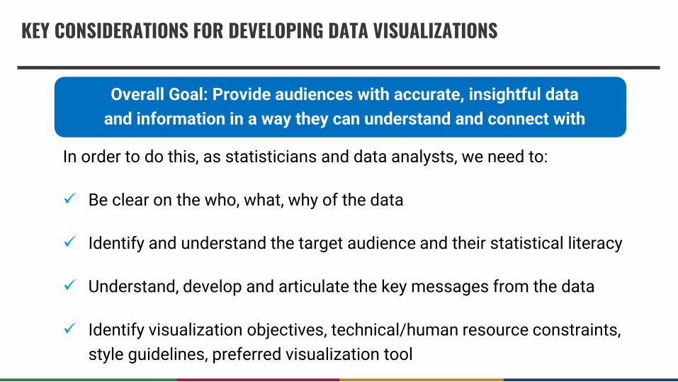
In order to do this, as statisticians and data analysts, we need to:
✓ Be clear on the who, what, why of the data
✓ Identify and understand the target audience and their statistical literacy
✓ Understand, develop and articulate the key messages from the data
✓ Identify visualization objectives, technical/human resource constraints,
style guidelines, preferred visualization tool
KEY CONSIDERATIONS FOR DEVELOPING DATA VISUALIZATIONS
Overall Goal: Provide audiences with accurate, insightful data
and information in a way they can understand and connect with
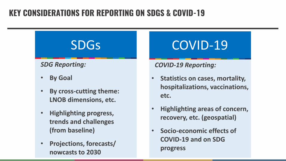
KEY CONSIDERATIONS FOR REPORTING ON SDGS & COVID-19
SDGs COVID-19SDG Reporting:
• By Goal
• By cross-cutting theme: LNOB dimensions, etc.
• Highlighting progress, trends and challenges (from baseline)
• Projections, forecasts/ nowcasts to 2030
COVID-19 Reporting:
• Statistics on cases, mortality, hospitalizations, vaccinations, etc.
• Highlighting areas of concern, recovery, etc. (geospatial)
• Socio-economic effects of COVID-19 and on SDG progress

UNSD SUSTAINABLE DEVELOPMENT GOALS REPORTS (INCLUDING OVERVIEW INFOGRAPHICS)
• Collaborative process with over 50 UN agencies to develop the global picture of progress and challenges to implement the SDGs
• Summary key messages are included in the overview infographics which cover all 17 Goals and LNOB-- this section includes icons, graphs and concise key messages to convey the overall trends in each Goal
• Each Goal includes a short summary of a selection of indicators accompanied by graphs/charts, introduction and photo
• Every sentence is checked for accuracy against a statistical annex and global indicator database (231 indicators, 561 data series)
PROCESS
1. Gather Data
2. Develop key messages, short summaries and headlines
3. Sketch/Design
4. Feedback
5. Review and revise

• Know target audience
• Keep it simple and easy to review
• Focused: one topic a time
• Focus on the flow: streamlined
• Create your short key messages with data
• Work with graphic designers or easy-to-use tools and programs
• Choose appropriate icons
• Balance visual and written information: collaborate with others and look for data visualization inspiration
• Review and revise
KEY CONSIDERATIONS FOR DEVELOPING INFOGRAPHICS
• Makes data easy to digest
• Helps identify patterns
• Helps narrate a broader story
• Makes data more memorable
• Easier to focus on interesting trends
• More reader-friendly than regular charts/pies
Why infographics are helpful: Best practices:
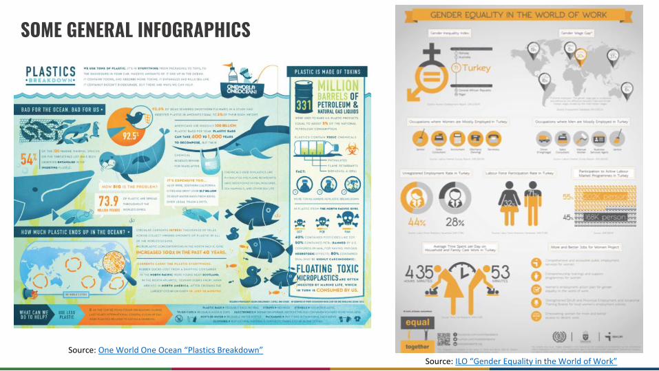
SOME GENERAL INFOGRAPHICS
Source: One World One Ocean “Plastics Breakdown”Source: ILO “Gender Equality in the World of Work”

SOME GENERAL INFOGRAPHICS
Source: New Zealand as a village of 100 people: 2018 Census Source: Infographic.ly ”World Poverty Statistics”
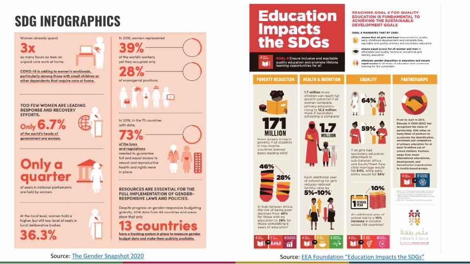
Source: The Gender Snapshot 2020 Source: EEA Foundation “Education Impacts the SDGs”
SDG INFOGRAPHICS

Source: India VNR 2020: Decade of Action Taking SDGs from Global to Local
Source: The Sustainable Development Goals Report 2021
SDG INFOGRAPHICS IN REPORTS

Source: Sustainable Development in the European Union
SDG REPORTS
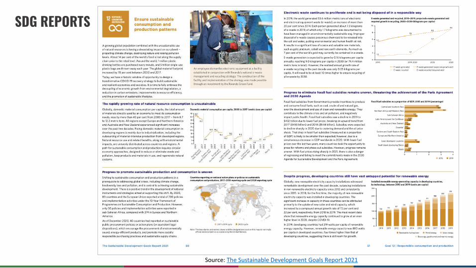
SDG REPORTS
Source: The Sustainable Development Goals Report 2021

Source: Post-Pandemic Outlook on the Sustainable Development Goals Through a CSR LensSource: The Gender Snapshot 2020
COVID-19 INFOGRAPHICS

SOME EXAMPLES OF WHAT TO LOOK OUT FOR FROM THE SUSTAINABLE DEVELOPMENT GOALS REPORTS’
INFOGRAPHIC DEVELOPMENT
Identify the problem and indicate your answer in the chat

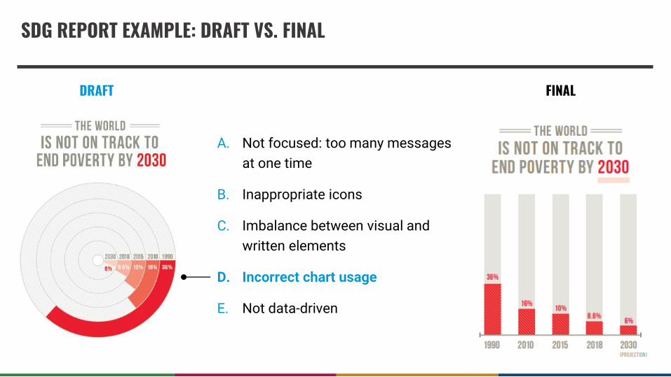
WHAT IS THE PROBLEM?
A. Not focused: too many messages
at one time
B. Inappropriate icons
C. Imbalance between visual and
written elements
D. Incorrect chart usage
E. Not data-driven

DRAFT
FINAL
A. Not focused: too many messages
at one time
B. Inappropriate icons
C. Imbalance between visual and
written elements
D. Incorrect chart usage
E. Not data-driven
SDG REPORT EXAMPLE: DRAFT VS. FINAL

A. Not focused: too many messages
at one time
B. Inappropriate icons
C. Imbalance between visual and
written elements
D. Incorrect chart usage
E. Not data-driven
WHAT IS THE PROBLEM?
DRAFT FINAL
A. Not focused: too many messages
at one time
B. Inappropriate icons
C. Imbalance between visual and
written elements
D. Incorrect chart usage
E. Not data-driven
SDG REPORT EXAMPLE: DRAFT VS. FINAL

A. Not focused: too many messages
at one time
B. Inappropriate icons
C. Imbalance between visual and
written elements
D. Incorrect chart usage
E. Not data-driven
WHAT IS THE PROBLEM?

DRAFT FINAL
A. Not focused: too many messages
at one time
B. Inappropriate icons
C. Imbalance between visual and
written elements
D. Incorrect chart usage
E. Not data-driven
SDG REPORT EXAMPLE: DRAFT VS. FINAL
RESOURCE SLIDES:HELPFUL RESOURCES FOR DEVELOPING DATA VISUALIZATIONS

PROCESS FOR DEVELOPING AN INFOGRAPHIC Resource slide
Source: UK ONS “Infograhpic Guidelines”
Source: See the rest of the process at Venngage “Data Visualization” process
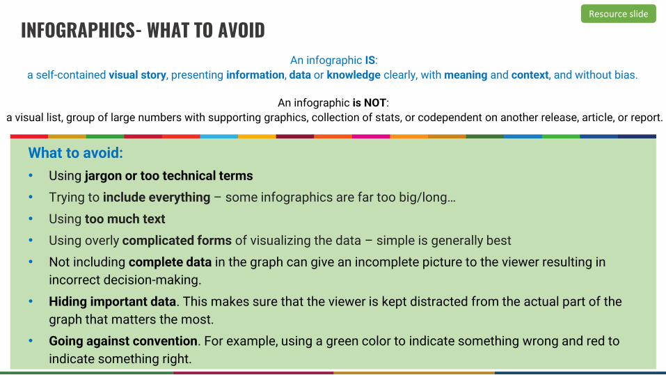
INFOGRAPHICS- WHAT TO AVOID
What to avoid:
• Using jargon or too technical terms
• Trying to include everything – some infographics are far too big/long…
• Using too much text
• Using overly complicated forms of visualizing the data – simple is generally best
• Not including complete data in the graph can give an incomplete picture to the viewer resulting in
incorrect decision-making.
• Hiding important data. This makes sure that the viewer is kept distracted from the actual part of the
graph that matters the most.
• Going against convention. For example, using a green color to indicate something wrong and red to
indicate something right.
Resource slide
An infographic IS:
a self-contained visual story, presenting information, data or knowledge clearly, with meaning and context, and without bias.
An infographic is NOT:
a visual list, group of large numbers with supporting graphics, collection of stats, or codependent on another release, article, or report.
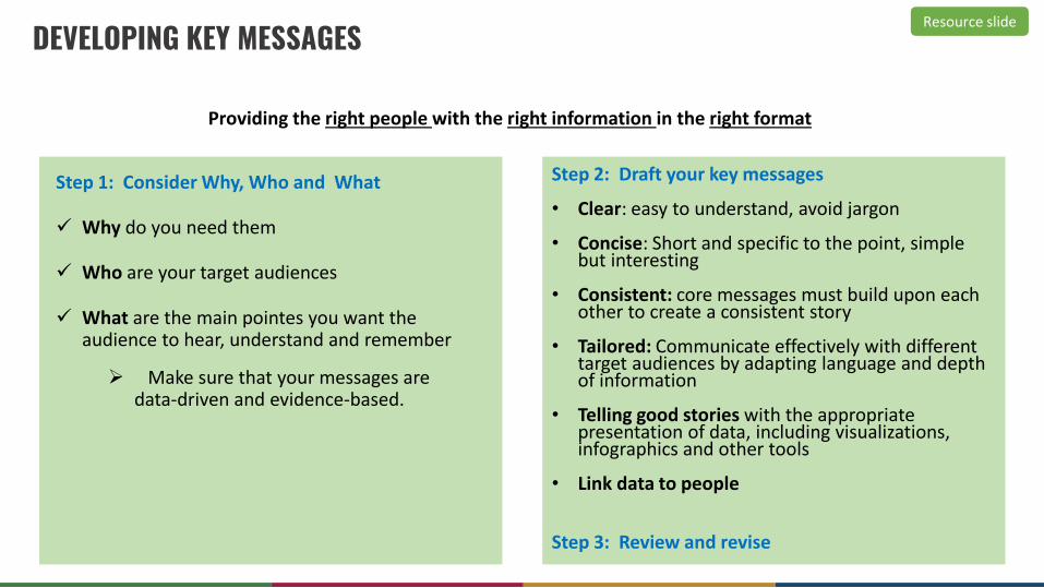
DEVELOPING KEY MESSAGESResource slide
Step 1: Consider Why, Who and What
✓ Why do you need them
✓ Who are your target audiences
✓ What are the main pointes you want the audience to hear, understand and remember
➢ Make sure that your messages are data-driven and evidence-based.
Step 2: Draft your key messages
• Clear: easy to understand, avoid jargon
• Concise: Short and specific to the point, simple but interesting
• Consistent: core messages must build upon each other to create a consistent story
• Tailored: Communicate effectively with different target audiences by adapting language and depth of information
• Telling good stories with the appropriate presentation of data, including visualizations, infographics and other tools
• Link data to people
Step 3: Review and revise
Providing the right people with the right information in the right format

DRAFTING A HEADLINE Resource slide
How to draft a Headline
• Know your audience
• Write the key messages first, then the headline
• Simple and clear, but powerful and pervasive
• Pick the most important issue and be specific
• Create a sense of urgency
• Check out newspaper, magazine headlines for inspiration
• Write several different headlines
• Pick the best one after consultation
KEY MESSAGES (Extreme poverty in the world):
o The share of the world’s population living in extreme poverty declined to 10 per cent in 2015, down from 16 per cent in 2010 and 36 per cent in 1990. More than a billion people have lifted themselves out of poverty over the last 25 years.
o However, the pace of change is decelerating.
o Nowcast shows the 2018 rate of extreme poverty at 8.6 per cent, and baseline projections suggest that 6 per cent of the world’s population will still be living in extreme poverty in 2030 if current trends continue.
o Extreme poverty remains stubbornly high in low-income countries and those affected by conflict and political upheaval, particularly in sub-Saharan Africa.
EXAMPLE
POSSIBLE HEADLINES (Extreme poverty in the world):
• It is becoming less likely that the world will keep its promise to end extreme poverty by 2030
• Progress against poverty continues but has slowed, jeopardizing achievement of the Goal
• Conflict and political upheaval have slowed earlier progress to end extreme poverty globally
• Ending poverty by 2030 will require an intense focus on sub-Saharan Africa
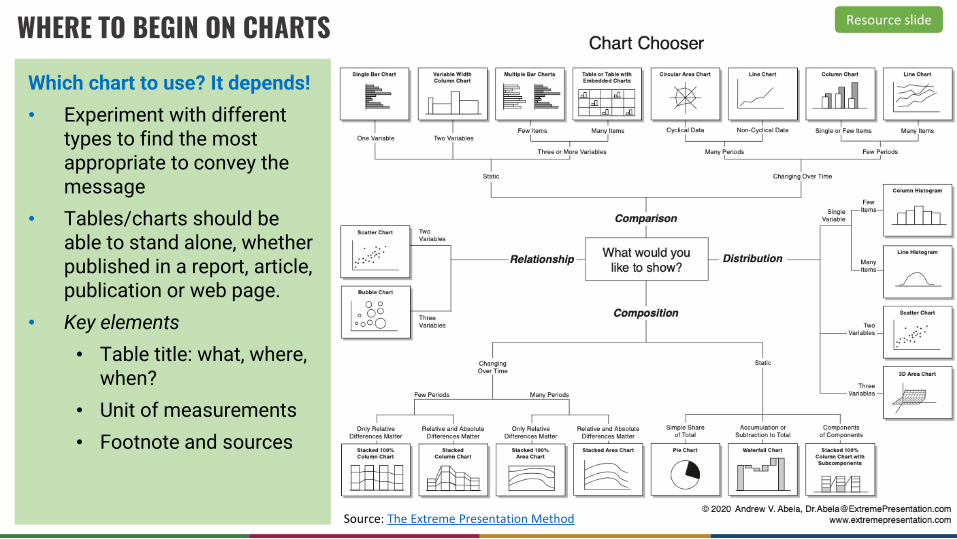
Which chart to use? It depends!
• Experiment with different types to find the most appropriate to convey the message
• Tables/charts should be able to stand alone, whether published in a report, article, publication or web page.
• Key elements
• Table title: what, where, when?
• Unit of measurements
• Footnote and sources
Resource slide
Source: The Extreme Presentation Method
WHERE TO BEGIN ON CHARTS

THE IMPORTANCE OF ACCURACY
Ensure what you include:
• Makes sense
• Your percentages add up (or you have explained what they mean if it is not clear)
• Your graphs accurately display the information you include
Resource slide
Examples of what not to do

Resource slide
Source: “Infographic of Infographics”

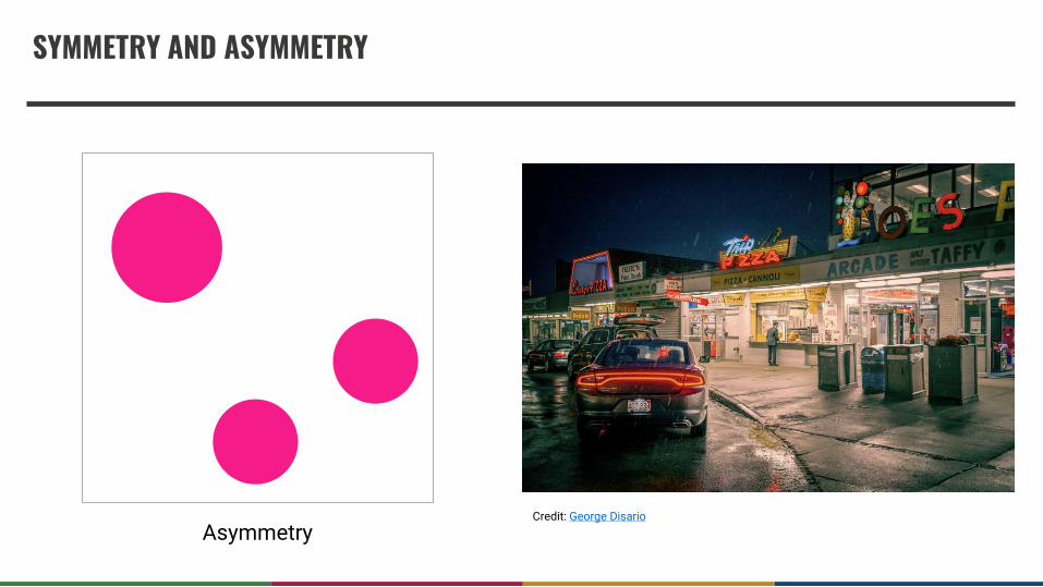
DESIGN CONSIDERATIONS
• Symmetry and Asymmetry
• Scale
• Framing
• Hierarchy
• Grids
Graphic Design Basics

SYMMETRY AND ASYMMETRY
Symmetry Asymmetry

SYMMETRY AND ASYMMETRY
Symmetry

SCALE
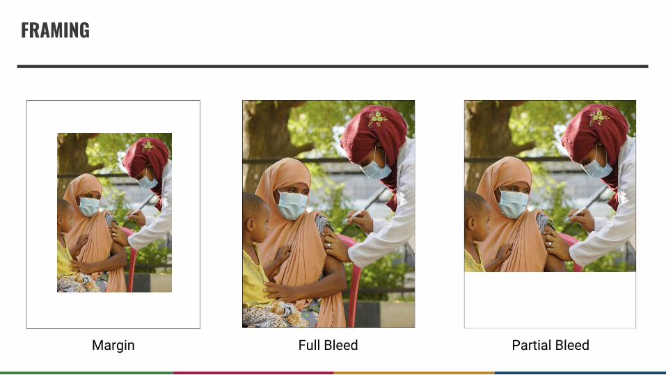
FRAMING
Margin Full Bleed Partial Bleed
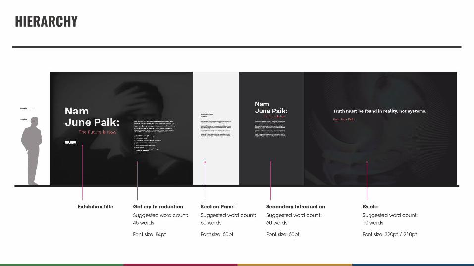
HIERARCHY

GRID

THANK YOU!