
Visualizing Data to Inform Decision Making, Strengthen ... Data to Inform Decision Making,...
35
Visualizing Data to Inform Decision Making, Strengthen Advocacy, and Assess Performance Mason Forando Data Informatics, HANYS Photo Credit: http://medcitynews.com/wp‐content/uploads/lightbulb‐idea.jpg HANYS 2016 Healthcare Communications Conference Albany, NY Nov. 2, 2016
-
Upload
nguyenthien -
Category
Documents
-
view
213 -
download
0
Transcript of Visualizing Data to Inform Decision Making, Strengthen ... Data to Inform Decision Making,...

Visualizing Data to Inform Decision Making, Strengthen Advocacy, and Assess PerformanceMason ForandoData Informatics, HANYS
Photo Credit: http://medcitynews.com/wp‐content/uploads/lightbulb‐idea.jpg
HANYS 2016 Healthcare Communications ConferenceAlbany, NYNov. 2, 2016
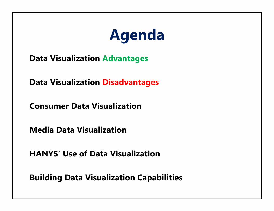
AgendaData Visualization Advantages
Data Visualization Disadvantages
Consumer Data Visualization
Media Data Visualization
HANYS’ Use of Data Visualization
Building Data Visualization Capabilities
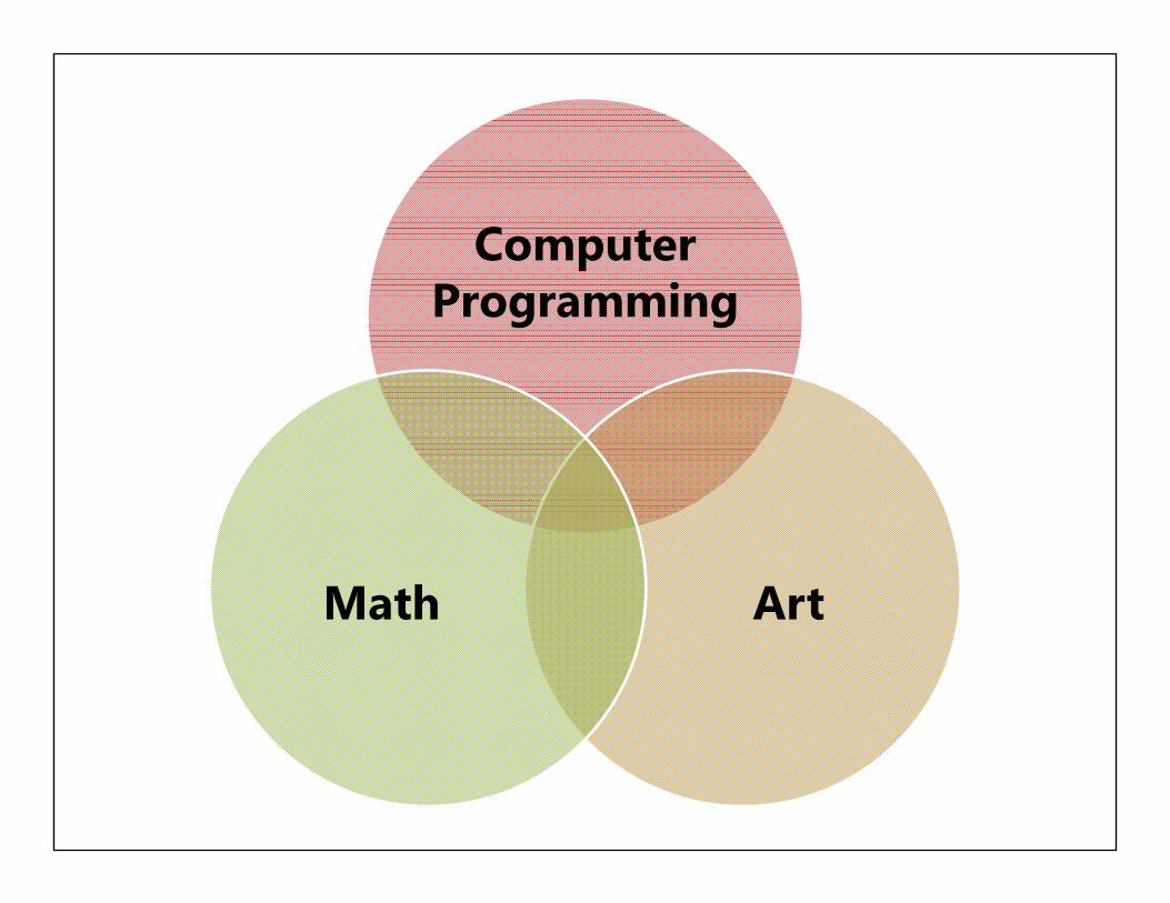
Computer Programming
ArtMath
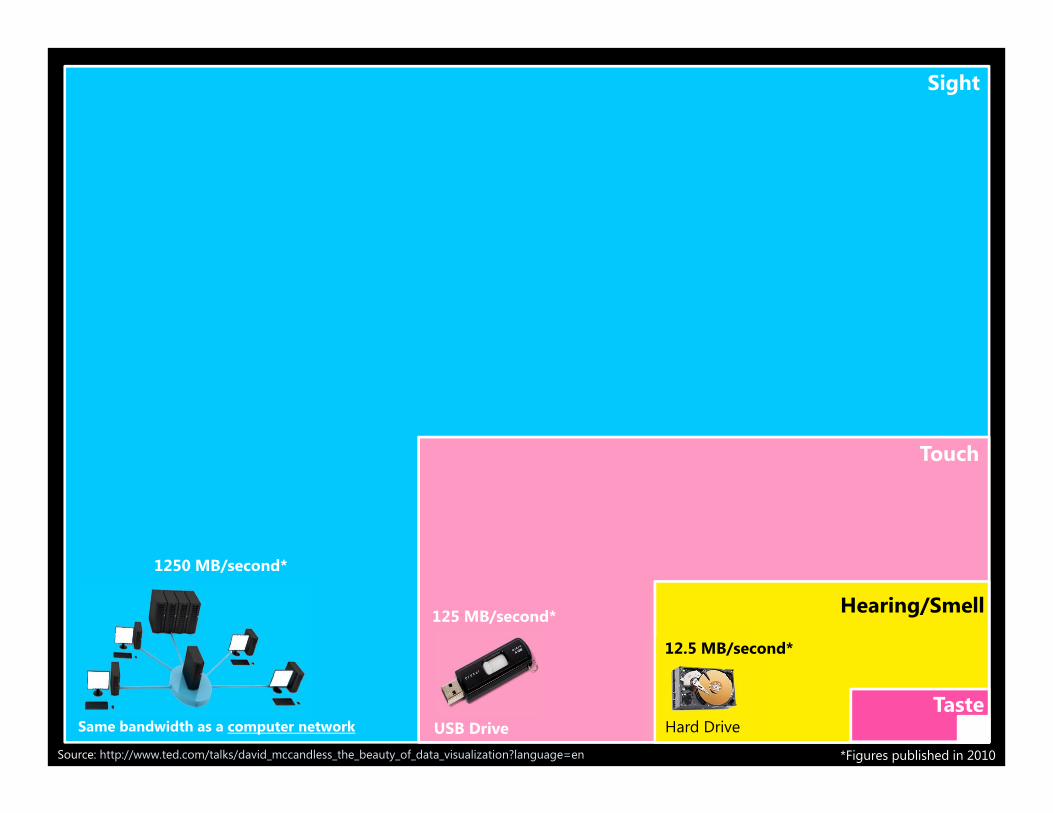
Source: http://www.ted.com/talks/david_mccandless_the_beauty_of_data_visualization?language=en
Sight
Touch
Hearing/Smell
Taste
1250 MB/second*
Same bandwidth as a computer network
125 MB/second*
USB Drive*Figures published in 2010
12.5 MB/second*
Hard Drive

Similarity
Continuation
Closure
Proximity Figure & Ground

Response Time
Message Retainment
Pattern Recognition
Information Context
Simplify the Message
Show the Big Picture
Consumer Engagement
Data Visualization Advantages

Response TimeRapidly communicate the structure of data set:
Relationship between data pointsComparison Groups and Benchmarks Distribution and OutliersPatterns and Trends
Enhanced through visual cues and text:ColorSize ShapeAnnotations
Data to Pixel (Ink) Ratio:Spreadsheet/Table vs. Data VisualizationText vs. Data Visualization
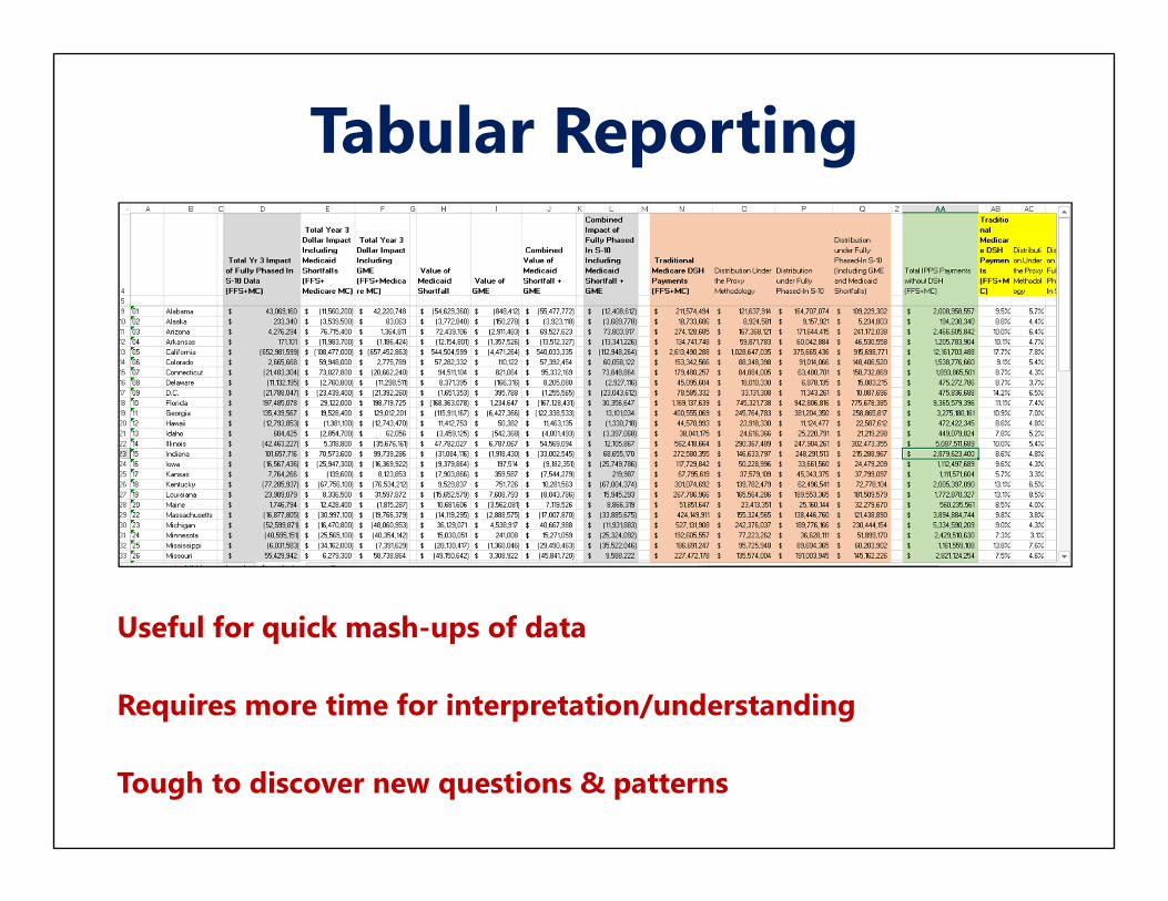
Tabular Reporting
Useful for quick mash-ups of data
Requires more time for interpretation/understanding
Tough to discover new questions & patterns

Impact of DSH Policy Alternatives by StateACA Formula Change Shift from Proxy to S‐10 Shift from Proxy to S‐10
(Incl. Medicaid Losses & GME Costs)
*Table shows change in Medicare DSH payments as a percent of total Medicare Inpatient payments
This data visualization shows: Consistency of ACA’s reduction across statesRedistributive Effect of PolicyEffect of Potential Policy to Include Medicaid Losses and GMENeed to retain the proxy until S-10 is ready and transition over time

Message Retainment: Texas DSH Policy ImpactACA Formula Change Shift from Proxy to S‐10 Shift from Proxy to S‐10
(Incl. Medicaid Losses & GME Costs)
*Table shows change in Medicare DSH payments as a percent of total Medicare Inpatient payments
This data visualization shows: Consistency of ACA’s reduction across statesRedistributive Effect of PolicyEffect of Potential Policy to Include Medicaid Losses and GMENeed to retain the proxy until S-10 is ready and transition over time

Information Context
Put data points in perspective against:Regional, Statewide, or National BenchmarksSimilar HospitalsPrevious Time Periods National BenchmarksCritical Values
CMS’ Hospital Star Preview Reports:Includes summary score and star ratingLacked Statewide comparisonNo information on Star Rating cutoff pointsStatistical Significance from other Star Ratings

Pattern Recognition
Source: http://blog.plot.ly/post/68951620673/why-graph-anscombes-quartet
Four different data sets
Same Mean, Variance, and Correlation
Summary statistics do not tell the complete story
Data Set I Data Set II
Data Set III Data Set IV
Anscombes Quartet
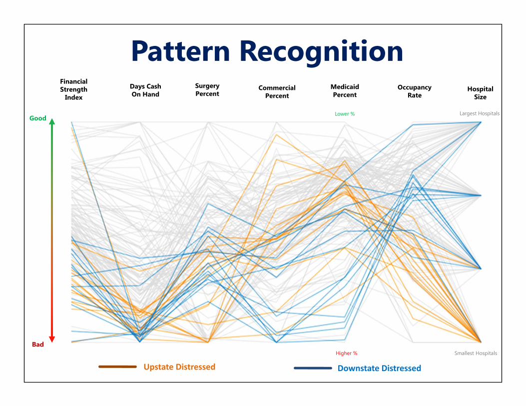
Pattern Recognition
Upstate Distressed Downstate Distressed
Financial Strength
Index
Days Cash On Hand
SurgeryPercent
CommercialPercent
MedicaidPercent
Lower %
OccupancyRate
HospitalSize
Good
BadHigher %
Largest Hospitals
Smallest Hospitals
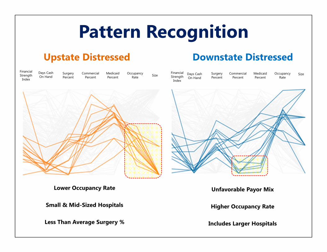
Pattern Recognition
Financial Strength
Index
Days Cash On Hand
SurgeryPercent
CommercialPercent
MedicaidPercent
OccupancyRate Size
Financial Strength
Index
Days Cash On Hand
SurgeryPercent
CommercialPercent
MedicaidPercent
OccupancyRate
Size
Upstate Distressed Downstate Distressed
Lower Occupancy Rate
Small & Mid-Sized Hospitals
Less Than Average Surgery %
Unfavorable Payor Mix
Higher Occupancy Rate
Includes Larger Hospitals

Simplify the Message
The CMS’ Star Ratings Oversimplify 64 Quality
Measures and 7 Domains of Performance into a
single metric.

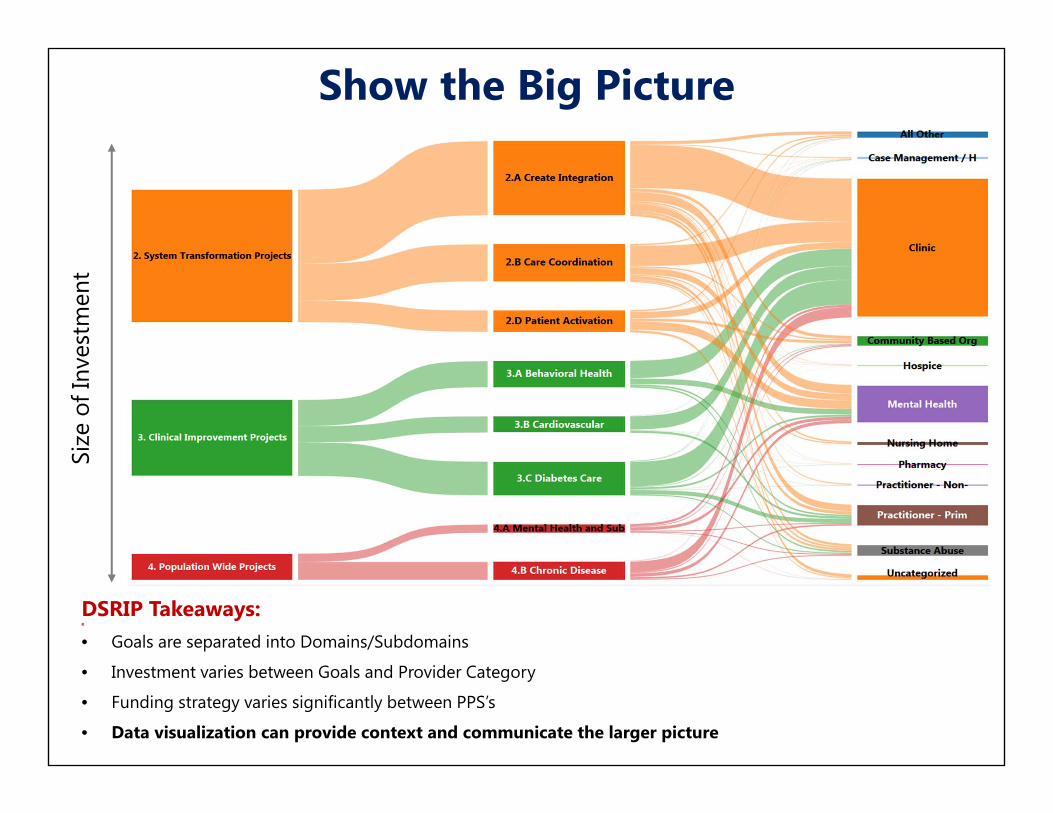
Show the Big Picture
Flow of funds by goal reported in Percentages (of Provider Category Spend)
Difficult to compare project investment between Provider Categories
Show the Big PictureSi
ze o
f Inv
estm
ent
DSRIP Takeaways:R
• Goals are separated into Domains/Subdomains
• Investment varies between Goals and Provider Category
• Funding strategy varies significantly between PPS’s
• Data visualization can provide context and communicate the larger picture

Consumer Engagement
Too much information, Not enough time
Limited Attention Span
Grab attention with visual
Guided LearningConsumer ExpectationsProvide Information Rapidly
http://hsnewsbeat.uw.edu/sites/default/files/sites/default/files/documents/Health%20Affairs%20infographics%20article.pdf

Data Visualization Disadvantages
Data Precision
Misinterpretation
Encoding Errors
Limitations on Media
Expensive/Time-Consuming to Develop1 1,800,000
2 2,100,000 3 1,900,000 4 1,800,000 5 1,900,000
1 1,800,000 2 2,100,000 3 1,900,000 4 1,800,000 5 1,900,000

Consumer Data Visualization

Data Visualization in the Media
New York Timeshttps://flowingdata.com/tag/new-york-times/
Mike Bostockhttps://bost.ocks.org/mike/D3 (Data Driven Documents)https://d3js.org/
Census.gov
Albany Tableau Users Group (ANYTUG)
Arcadia Solutionshttp://datagallery.arcadiasolutions.com/index.html

Kaiser Health

Kaiser Health (Hospital Stars)

Kaiser Health (cont.)

Kaiser Health (cont.)
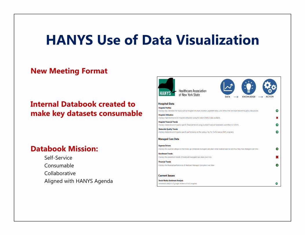
HANYS Use of Data Visualization
New Meeting Format
Internal Databook created to make key datasets consumable
Databook Mission:Self-ServiceConsumableCollaborativeAligned with HANYS Agenda
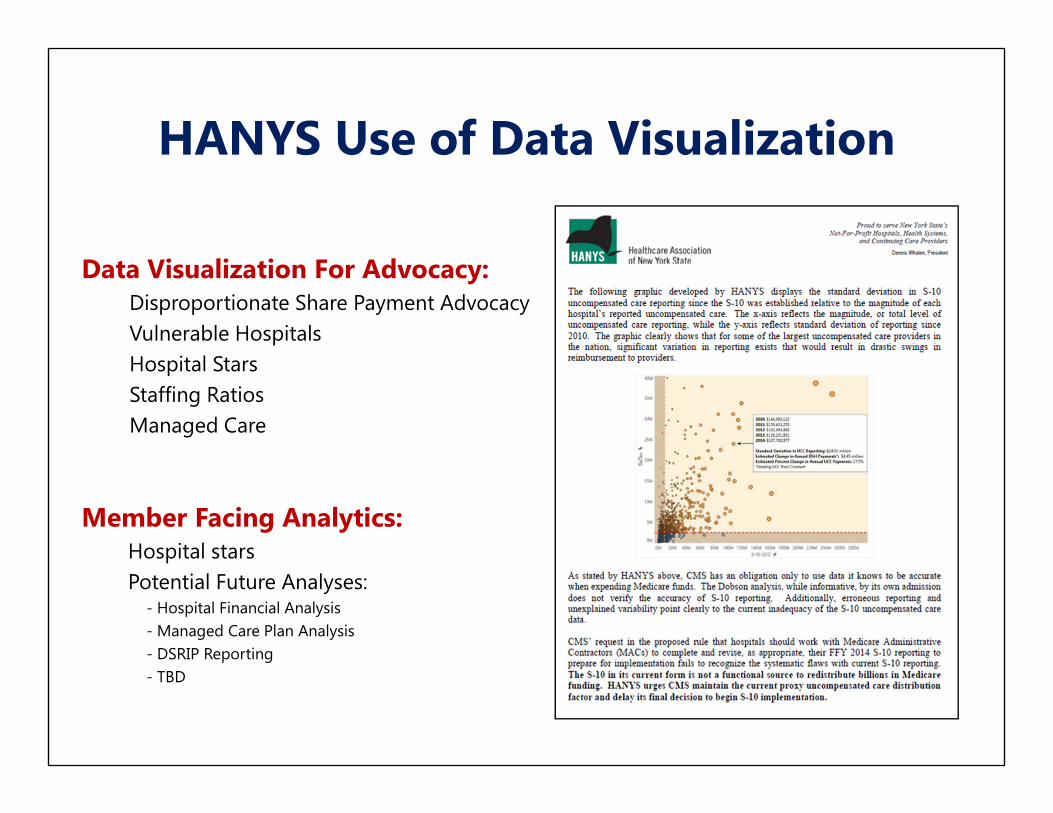
HANYS Use of Data Visualization
Data Visualization For Advocacy:Disproportionate Share Payment AdvocacyVulnerable HospitalsHospital StarsStaffing RatiosManaged Care
Member Facing Analytics:Hospital starsPotential Future Analyses:
- Hospital Financial Analysis- Managed Care Plan Analysis- DSRIP Reporting- TBD
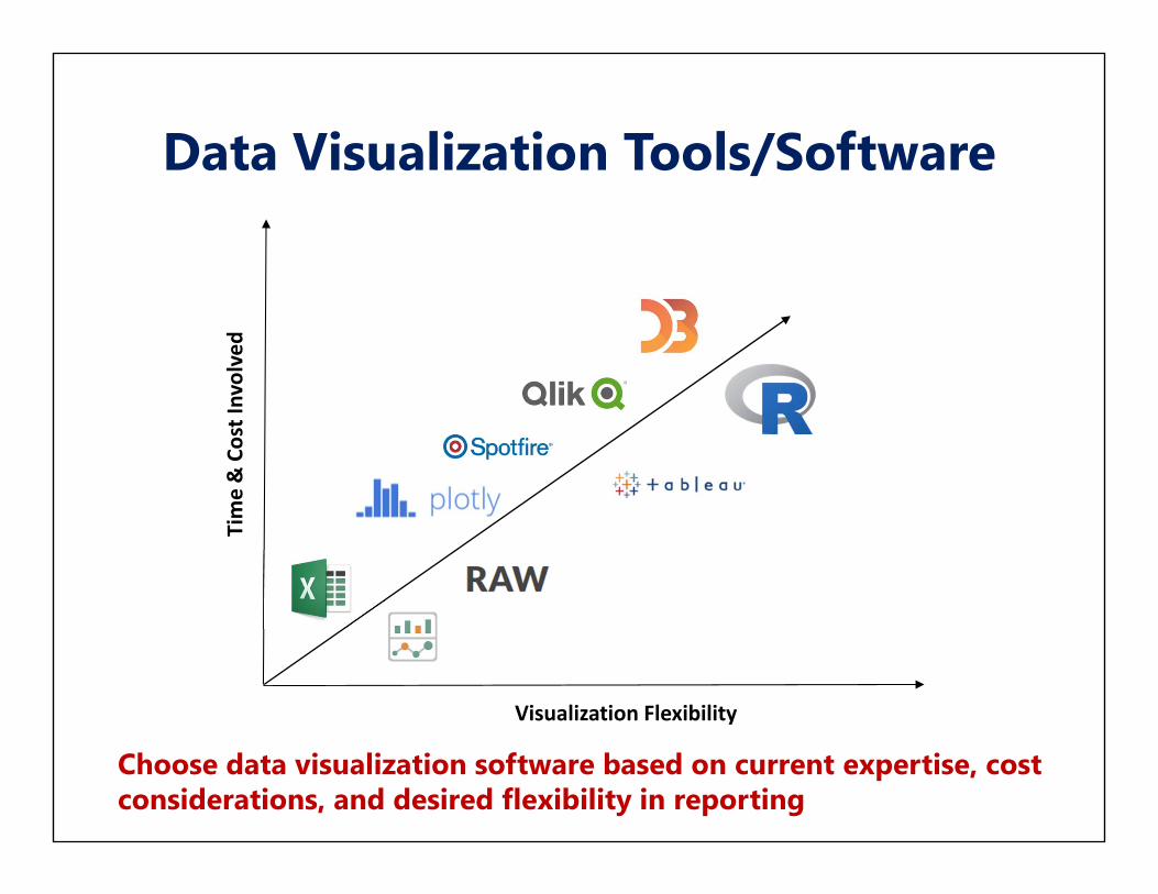
Data Visualization Tools/Software
Visualization Flexibility
Time & Cost Involved
Choose data visualization software based on current expertise, cost considerations, and desired flexibility in reporting

Excel 2016/Power ViewCost-Effective
Minimal Training/Support Required
Mapping Capabilities
Excel Web Apps
New Visualizations (Excel 2016/add-ins)
http://www.vertex42.com/blog/help/excel‐help/6‐new‐awesome‐chart‐types‐in‐excel‐2016.html
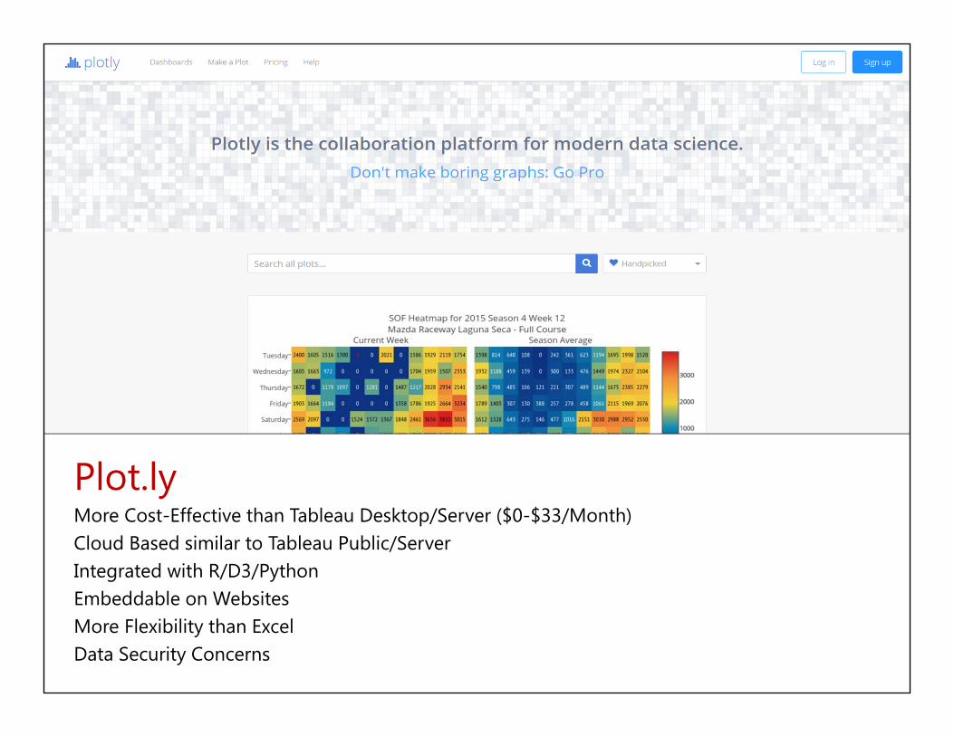
Plot.lyMore Cost-Effective than Tableau Desktop/Server ($0-$33/Month)Cloud Based similar to Tableau Public/ServerIntegrated with R/D3/PythonEmbeddable on WebsitesMore Flexibility than ExcelData Security Concerns

Can be expensive depending on distribution modelTableau Reader (Free)Tableau DesktopTableau Server
Create modern visualization within weeks of training
Tableau Support Communityhttps://community.tableau.com/welcome
Default Visualizations look good without much work
Can be publicly posted on Tableau PublicPHI Considerations
Competitors:QlikviewSpotfireDomoPlot.ly
Tableau Reader/Desktop

JavaScript based Programming Language
Developed by Mike Bostock (former New York Times employee)
Highly flexible for visualizing data
Requires sophisticated developers & lengthy development time
Embeddable on Webpages
Client side data limitationhttps://d3js.org/

http://datagallery.arcadiasolutions.com/
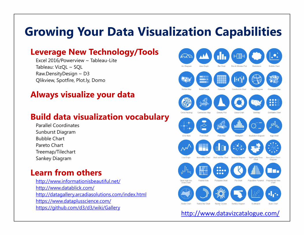
Growing Your Data Visualization Capabilities
Leverage New Technology/Tools Excel 2016/Powerview ~ Tableau-LiteTableau: VizQL ~ SQLRaw.DensityDesign ~ D3Qlikview, Spotfire, Plot.ly, Domo
Always visualize your data
Build data visualization vocabularyParallel CoordinatesSunburst DiagramBubble ChartPareto ChartTreemap/TilechartSankey Diagram
Learn from othershttp://www.informationisbeautiful.net/http://www.datablick.com/http://datagallery.arcadiasolutions.com/index.htmlhttps://www.dataplusscience.com/https://github.com/d3/d3/wiki/Gallery
http://www.datavizcatalogue.com/

Questions